Type-setting in CSS: Using typography to enhance your design
Hi, my name is Martine Downden.
And today we're going to talk about one of my favorite topics-typography.
From painting with our hands to using more sophisticated tools and mediums, throughout history, we can see a thirst for knowledge and for the communication of said knowledge.
Whether we're presenting things of the day-to-day life, such as what we see in the paleolithic Lascaux cave paintings in France or more religious events, or even business transactions, leaving a mark that communicates a concept or idea is as old as humanity itself.
As history progressed.
And so did our knowledge.
We came up with more sophisticated ways of being able to disseminate these ideas to a broader audience, but at what cost?
If we look at some of the beautiful illuminated books of the middle ages, and then we look at the average webpage, we see a definite change in treatment of text.
And so it should be.
When looking at the web today, we have many more concerns and constraints than we did when monks are painstakingly copying books, page by page with a quill.
We also have a much broader audience.
We worry about legibility, accessibility, localization, and we still worry about aesthetic.
But often when we think of that aesthetic, we forget to think through what the words, letters, paragraphs look like either out of time, not knowing it's possible or simple oversight.
We do not seem to spend quite the time on considering our typography as we do other aspects of our aesthetic.
But what does that word typography mean anyway?
From the Greek 'tupos' meaning impression and the Latin 'graphia' to write, comes to us, the word typography, the art of designing with type: typography.
How do we achieve this on the web?
When thinking about typography, the first question is "what type face should I use?" A typeface is a specific design of an alphabet identified by its name.
Displayed in this slide are Montserrat used for the title and Raleway for the text.
In our CSS we can use the `font-family` property to say set out typeface.
But there are so many to choose from.
So how do we choose?
With an abundance of choices out there, the sheer amount of options are simply overwhelming.
We therefore look at the anatomy of the letter in order to categorize them into groups.
When looking at typefaces, it's tempting to look at the alphabet in its entirety, using a sentence like 'the brown fox jumped over the lazy dog'.
Because it contains one of each of the letters.
However, capital R T W, and lowercase H A E and G are probably going to be sufficient as they usually give the most info about the type itself.
I and L can also be really helpful.
To further differentiate between types of typefaces, they have been conveniently grouped by type.
There are four categories into which they're often grouped: serif and sanserif.
The finishing strokes that project from the main stroke of a letter are called 'serif'.
Serifs originated with the Roman masons who terminated each stroke of the letter, carved into a slab of stone with the serif to enhance the appearance.
Not all types have serif's.
Types having no serifs are called san serifs meaning without.
The display type is used to attract attention.
And it's usually used at a size greater than 14 points.
Most fonts are proportionately spaced, meaning that the letters have different proportional widths depending on their design.
So for instance, an 'I', in Times Numora or in Garamond which are all proportionally spaced fonts is much narrower than an M for example.
Monospace font are the exception.
With the invention of the typewriter came the need for fonts designed for this new technology.
The fonts that were introduced for the typewriter and what we still think of typewriter fonts are basically slab serif fonts or monospace, but there's a crucial difference to these fonts compared to the other fonts that came beforehand: every letter takes up the same amount of space on the line.
If you're a developer, the typeface you use for your code editor is more than likely mono spaced.
When choosing a font, it's important to understand that bold, italics, medium, slab and so forth are usually not programmatic variations of a singular set of glyphs.
Think back to the printing press.
A printer could not magically make a specific character they were using slantier, or bolder.
They had to use a different piece of metal or wood that was the different glyph.
The same goes today.
If you want to have access to multiple variations of the font, you need to make sure that they're available and loaded on your website or machine.
In our CSS we can dictate which typeface will be used by the browser for any given element.
To accomplish this, we use the `font-family` property to which a number of font family names will be passed.
It is important to provide fallbacks, especially if you don't specifically provide the font either via CDN or static file, because if the user's device does not have that font loaded and do defaults are provided the browser will use whatever its default is, which is obviously not ideal.
When importing a font family, we also need to make sure we import all of the variations that we intend to use.
`font-weight` allows for keywords, but also numerical values.
Here I'm trying to use 800 and 300.
The top header is set to have a weight of 800, which I would expect to show much bolder than what it does here.
Knowing that by default, the keyword bold is equal to 700.
My second header doesn't look right either.
It should be thinner since it's set to 300, and regular text which is the rest of my body of texts should be around 400.
This is because the browser will try to find the closest value it has to what is entered and I've not imported the variations that I am using.
Once I correctly import the 300 and 800 variations, we notice the font's weight are correctly applied.
Now I've been saying all along that each variation is its own set of glyphs, right?
Well, that's where the waters get a little murky.
Oblique is not a type inside of a font family.
It will programmatically skew the shape of the glyph by number of degrees.
Italics, on the other hand, is a type inside of the family.
Notice the 'f' in the word 'of'.
In italic the letter looks different from the oblique counterpart, which is the regular version of the glyph that has been slanted because obliquecause applied to it.
The reason I present these together is because they technically interact in a.way . If the device displaying the data knows of an italic version of the type and you give the element a font-style of oblique, it will still render the italic version.
On the flip side, if it doesn't know about italics and you ask for italics, it will go ahead and skew.
And this is important for two reasons.
One, the fact that the glyphs of the italics may not be the same as in the regular font, and 2 oblique allows for passing in an angle.
In order for this to work, the website or machine can not know of an existing italics version of the typeface.
Using oblique, you can indicate how much you want the glyph to be skewed, but this will only work if the machine or website does not have a version of the typeface that is italics.
Another way we can edit the appearance of our letters is using text shadow.
This works very similarly to box shadow, taking the same values, but instead of being applied to an element it's applied to the text.
This effect can be fun, but caution needs to be taken as to not hinder the legibility.
We've talked a little bit about the glyphs themselves.
Let's look at some of the ways we can manipulate the spacing of the written content.
Here we have the beginning of the epic Beowulf.
Adding some space between the lines would improve the legibility of our text.
In typography terms, the amount of space between the lines is called 'leading' because in the days of the printing press, the amount of space between the lines was controlled by adding or removing bars of lead.
The CSS property name is line-height.
The line-height property can take a number or a value with units.
When adding a unit however, we must take care that it works correctly and is relative to our font-size.
In this example, the line height is blanketly applied to all paragraphs, but a portion of the text within the paragraph has a much bigger font size making the text overlap and rendering it illegible.
If we use a number with no unit, the line height will be appropriately scaled for the text size eliminating the overlap problem.
It will also scale better if the page is zoomed to increase the text size.
By default research shows that for large bodies of text, a line height minimum of 1.5 is needed for content to be easily legible.
To further embellish our paragraphs we can apply drop caps.
These were often seen in manuscripts when the first letter of the paragraph or text is much larger than the rest and ornamented.
Although we do not have a built-in drop cap property in CSS, we can use the CSS pseudo element `first-letter`.
We can select the first letter of the paragraph using p:first-letter, float the letter and then manipulate it to make it fit nicely.
In this case, I changed the font family, color and size.
I then gave it some margins to adjust its position slightly compared to the rest of the text.
Much like first letter, we also have access to the pseudo element `first-line` which as the name implies affects the first line of the paragraph.
Unlike first child, or first of type, which allows us to find last of or nth of, line and letter only have first of however, which is unfortunate, but with first-line reflow works correctly.
And when the screens width as narrowed or widened, we still only apply the properties to the first line.
We've styled our headers, added a drop cap, and styled the first line.
Let's turn our attention to the links inside of our text.
Links by default are underlined.
The property used to apply the underline is `text-decoration`, which is the shorthand for combining text-decoration-line, text-decoration-color, text- decoration-style, and text-decoration-thickness.
Any of which can be manipulated.
teXt-decoration-line property allows us to choose where the line is positioned.
Not at all, under, over or through.
It can also take multiple properties, which means you can technically put all three over, under in through at the same time.
Text decoration style allows us to pick a style type for the line.
The styles to choose from are similar to those of border.
They include `solid` the default for links, but also double, dotted, dashed, or wavy.
Another way we can control the positioning of the underline is by using text-underline-position.
However, the support is still a bit shaky, depending on the values used.
Beowulf is a poem, which means it has some pretty set line length and breaks.
Most bodies of texts are not so fortunate.
So let's change our text choice to Peter Pan instead.
You may have noticed that I am using actual texts for my example, and not lorum ipsum.
This is not just because of my love for books, but also because I don't know about you, but I can't read lorem ipsum, which makes it really difficult to gauge the readability of my styles when applying them or therefore use actual content that I can actually read.
Both Beowulf and Peter Pan were copied from the Gutenberg project.
On a narrow screen the styles we have actually looked pretty good.
On a very wide screen though this would not be any fun to read.
An excessively long line makes eye-tracking quite difficult.
Let's look at some strategies for identifying what an ideal line length would be.
In the print world, a general gauge to identify if the line length is going to be readable is to take the glyphs that form the alphabet all in a row.
The width between one and a half to two alphabets is considered to be ideal.
On the web, this becomes a bit of a difficult game to play because everything is variable.
A sheet of paper never changes size, our screens on the other hand are a different animal.
We do have a unit of measure that can help us though.
CH.
This is a relative unit of measure whose base is the number zero in the font being applied.
If I set my section to have a max width of 54ch, 54 zeros, and the font sizeis applied to the section, and a margin of zero auto, our text is centered to the page and capped at a readable width.
There are many units of measures seldom use in CSS.
I encourage you to take a look at them because some of them can be very powerful depending on your situation.
This is what our text looks like with a width of 39ch or about one and a half alphabets worth of width.
And 54ch, or two alphabets.
Much nicer to consume.
With narrower amounts of content, we could consider columns, especially on large screens to capitalize on our available real estate.
And CSS does have a property for that.
I can set a column width, and a column gap on my section and without manually adding any divs, the content will split into however many columns of 39ch width I can fit.
On the surface this looks great, except that the user has to read down including scrolling the entire first column before they have to scroll back to the top to read the next.
Not ideal.
We can fix this by indicating a height, but now we have a left to right scroll.
That's not ideal either.
So why am I even presenting this option?
Because of print.
When in a print situation, there's the concept of a page and the columns will form properly on a page appropriately moving back up into the top of the second column before continuing to the next page.
So the column property is a great solution for CSS, specifically targeting print, which we can achieve with the print media .query.
Let's go back to the web world and continue looking at some of the options for our text.
We did a lot of work to embellish our first paragraph.
Let's give the subsequent ones a little bit of love.
A common convention is to indent paragraphs.
To accomplish this, we can use the text-indent property, which will take a value and unit.
This will much like when you hit tab on the beginning of a paragraph in Google Docs or Word indent just the first line and not the rest.
The other thing we can edit is how our text is aligned.
We have four options for text alignment: center, left, justify, and right.
Although at a glance justify might look like the cleanest, there are some pitfalls here to avoid.
Because justifying text alters the white space between words, we can get an unsightly effect called 'rivers'.
This is when it looks like the text has striations of white space in it because of the extra space added to stretch the lines so that they begin and end at the same spot.
This in turn decreases legibility.
For Latin languages written left to right, like English, text-align left is considered to be the most readable.
Just like we can edit the space between our words by adjusting text-alignment or the space between our lines with line-height, we can adjust the space between our letters, a term in the typography world known as 'kerning'.
This is often done manually to logos-famously the Google logo in the not so distant past-to give it a polished finished because fonts are designed so that the space between any given letter will generally look OK, that cannot be optimized for every possible scenario.
So we sometimes choose to do this by hand.
We can also choose to do this for visual effect.
We can add a kerning in CSS using the CSS property letter-spacing.
You may recall that when discussing selecting letters, our only option is the pseudo element first-letter.
This is still true when dealing with kerning.
Therefore letter spacing will apply to the entire element it is applied-to in this case, the link to the next chapter of the book.
By setting the letter-spacing size to .5ch we are saying that we want half a zero's worth of space between each letter.
Much like most things that involve editing white space between our words and letters, editing letter spacing can easily make texts difficult to read and is therefore best reserved for small bits of content, such as headers rather than long bodies of text.
Font variants are yet another way we can customize the look of our text.
We are going to focus on two areas of the options available to us-ligatures and numbers.
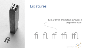
A ligature is when two characters are joined into a single glyph.
Most often seen between FI, FL, FF, FFI or FFL.
They are a way to break up the monotony of characters in an alphabet.
Not all typefaces have them, but if the one being used does, we can choose how, and if they get displayed using the font-variant property.
Although beautiful, they can be detrimental in some cases.
I would not choose to use them in a website designed for young children learning how to read, for example.
So they are very much a case by case situation.
Personally, I'm partial to them.
I find them lovely, but this is not going to be universally true.
We have talked a lot about letters, but not so much about numbers.
There are two ways by which numbers are aligned.
'Old style', where numbers will bleed above and below the baseline and 'modern style' where they're all at the same height and aligned to the baseline.
We can choose how our numbers behave there with as well as how fractions display again, through the font-variant property.
For the table of contents, displayed here, the top examples numbers use old style number versus the bottom one, which uses lining-nums.
And I could not talk about font-variant without mentioning small-caps, which is also applied to the bottom example where the text is written in all upper case letters, but the letters that are capitalized have larger capital letters than the letters that are not.
Probably the most common use of font-variant.
text-transform also allows us to capitalize letters.
However, it does not understand context.
So even when its words we often don't capitalize in a title such as 'the' or 'and' they will still get capitalized.
It will capitalize the first letter of all the words.
Although I know `float` has gotten a bad reputation over the years because admittedly, it can be difficult to work with at times, when it comes to text, it does really shine.
We used it for making a drop cap earlier, and we can also use it to wrap text around our images.
We can even use float in conjunction with CSS shapes for some really awesome effects, but that's a different talk for a different.
All of the code shown in this presentation can be found on my GitHub account, so feel free to check it out for yourself.
You can find more of my work at martine.dev and can find my books on CSS and accessibility on Amazon.
Thank you for listening.
Have a great rest of your conference.
From hands, to chisels, quills, the printing press, and now the web, a written record of our existence has been a constant throughout history. Languages, and how they are depicted, have evolved alongside the tools we use to render them. Often overlooked in design, text content is an integral part of the visual aspect of an application and CSS allows us to control and manipulate its look and feel.
In this talk we will cover a little bit about the history of typography leading up to where we are today, how to make decisions about fonts and their usage in our application, and the CSS properties that allow us to manipulate our type for a polished beautiful design.