Responsive patterns with subgrid
Hello, I'm Rachel Andrew.
I'm a technical writer on the Chrome team at Google and also a member of the CSS working group.
And I'm going to talk about responsive patterns with sub grid.
The subgrid value for grid-template-columns, and grid-template-rows gives you the ability to inherit track sizing and number of tracks from the parent grid into a grid item.
For a feature that's basically a new value for a couple of existing properties, it opens up an awful lot of possibilities.
So in this short talk, I'm going to take a look both at how subgrid works and some of the patterns that you might want to use it for.
The demos I'm going to be showing all work in Firefox and also in Safari technology preview.
And if you go to my notist page, which is linked from these slides, you can find these demos and play with them in one of those browsers.
I'm pretty hopeful though, that we're going to see subgrid in all browsers this year-it's currently been worked on by the Microsoft team and implemented into Chrome.
It's also included in Interop 2022.
This is a cross-browser initiative to improve the web platform by fixing bugs and implementing some new features that developers are really keen to see in the platform.
So what is subgrid?
And why might you need it?
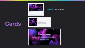
So this is really the standard pattern for showing how subgrid works.
This is a pattern that, you know, you might get from a designer.
You want to create something that looks like this.
And you got a set of cards and they've got neat headers and footers, and they all appear to line up really nicely as visual rows.
Until we end up with more content in one card than another.
And I think we've all probably implemented something like this.
That looks really, really neat when it comes from design, because they've used exactly the same content everywhere, and then it hits the real world and it doesn't look quite as good.
Now we're in a better situation than we used to be in because we can get cards that all line up and become equal height because they're grid items.
The card internals, however, are displaying in normal flow at the moment, and they've got no relationship to the grid on the parent.
And this is a fundamental thing about the `display` property in CSS: values of display do not inherit.
To understand the problem, CSS has this concept of normal flow, that's block and inline layout, and it's pretty much the first thing that you learn about CSS.
Some things are block, some things are inline, and it can be worth thinking when you're talking about layout, that CSS will always try to go back to this normal flow.
And so this is why the values of display don't inherit.
You make a container, a grid or a flex container, and they become a block box.
The children become grid or flex items, but their children then return to normal flow.
So, this is a really simple flex example.
We've got a normal flow heading here, then a paragraph we've then got a box, which is display: flex.
So the image and the content become flex items.
But inside the content, you can see we've got another heading and some text, and that's just gone back to normal flow.
And that's pretty much what you want a lot of the time.
So card internals, in our case, don't participate in that grid layout.
They can't be placed on the tracks defined on the parent grid.
And you know, that is generally useful.
If the layout methods inherited you'd constantly be resetting things, you know, kind of every level you'd have to change the value of display.
But the problem comes at the times when you've got cards like this, where you do want to place children of grid items on the same grid.
So now I've created a nested grid on the card and you can see I've selected that card using the grid inspector, but the grid lines, you know, you can see they're not lining up with any other cards.
So to get that to happen, we need our grandchildren to participate in grid layout.
And that's what's subgrid does.
The subgrid value for grid-template-columns and grid-template-rows solves the issue because it lets you declare that the children of a grid item become a subgrid.
So let's have a look at how this works.
So I'm using a really simple component here.
I've already mentioned you can make a grid item into a grid.
That's what I was doing with the cards.
You add display: grid to the item and declare rows and columns as needed.
So you can nest grids as far down as you want.
But, those rows and columns are going to be independent of the item that the grid sits on.
So the only way to kind of make it look like it lines up is to do some fairly careful sizing.
And we kind of know already on the web, that's probably not going to work out too well.
And there's always, you know, loads of content that's going to appear from somewhere and push everything out.
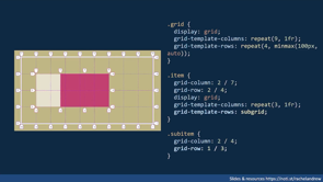
So the CSS in this example defines the outer grid.
That's the box with the white border.
We've got an item that sits on that grid, which is dot item.
And that item is also a grid with column and row tracks.
And the sub item is sitting on that.
So with the Firefox grid inspector, you can see the outer grid on the parent with the white border.
We could inspect the inndergrid.
I've got some fixed height rows here.
This grid doesn't fill the container.
You can set both grids in the grid inspector and you'll see, there's no relationship between the lines of the parent and child grid.
So we've started right over with a brand new subgrid.
Now, subgrid will let us selectively opt grids onto grid items in the grid layout.
So keeping with our example, we could create a subgrid for columns by setting grid-template-columns, to subgrid, rather than its own track listing.
The child now use the grid defined on the parent for column tracks.
So you can see there now the child item, their grid tracks are all lined up with the parents there.
Now when placing the sub item, we use the track numbers on the sub grid.
We could create a subgrid just on rows.
So in this case, I've still got the columns defined on the nested grid and they don't line up with a parent, but I've subgridded the rows.
So I've now got two row tracks and the sub item is, is stretched over those.
You can also create a subgrid in both dimensions.
Now, if you do this, the number of tracks in both rows and columns, so therefore the number of grid items that you could display inside the grid are completely tied to the dimensions that have been assigned to it by the parent.
So you could only really do this if you knew exactly what was going into that component.
So we've looked at the real basics.
Yeah.
Essentially, you know, you just need to set how your grid item to have grid-template-columns or grid-template-rows: subgrid.
Now, as with all of CSS, there's some subtleties, there are a few things you might not immediately think about.
Now.
I mentioned briefly, but it's worth pointing out the line numbers of the sub gridded item start with the first line of the sub grid.
So here in this example, subgrid column line one is line two of the parent grid.
So when placing items in the sub grid you use the sub grid line numbers.
So it's essentially just like a grid that you've created columns and rows on, but you've got the sizing and number of these tracks from the parent.
Here's something that's quite useful.
Line names on the parent are passed into the sub grid.
So if you name lines on the parent grid, they will get passed into the sub grid and there'll be added to any names that are defined there.
The line names and any line can have lots of names.
So if you've already defined some names that they'll just get passed in and you'll have those as well, and then you can use them when you're placing items.
So here I've got col-start and col-end on my parent and they're passed into the sub grid.
So then we could potentially use those when we're in, when we place our sub item.
You can add some additional named lines to the sub grid-they're added after the sub grid keyword.
So it looks a bit like this.
So you say grid-template-column: subgrid, and then you can name the lines if you want to do that.
So if you want to do something like this, this is the CSS that we would end up with.
So you can see on our parent we've got our col-start and col-end on our item.
We've got our, we've declared subgrid and then we've named some lines and we could use either the parent line names or the ones you'd find on the sub grid to place items.
If you've defined a gap with the gap property, your column-gap, or row-gap up on the parent, the subgrid by default will just inherit the gaps.
So the gaps will appear on the sub gridded item two.
And you can see the gaps here.
Inheriting down into the sub grid using the grid inspector.
Now you might not want that.
You might want to get rid of the gaps, you know, setting up to zero, or you might want larger gaps on your sub gridded component.
So you can change those.
You can just use the gap property as normal, and that will change the gaps on the sub gridded item.
You can see here now, this is what would happen if I set the, the row gap there to to zero.
And it's almost like I've got a kind of negative margin there sort of pulling the bottom down into the gap.
So you can change your gaps.
And finally sizing of items in the subgrid can change the size of the parent tracks.
So if there's something larger inside the subgrid you know, as long as your, your parent track sizing, isn't a fixed size it will change the size of the tracks, which we can see if we look at our card example here.
So, this is how we'd get our captions to line up across the grid.
We create a subgrid for grid-template-rows and make the card span over the sub grid.
And we've got rid of the gap from the parent grid and you can see that the, the card sort of header and footer, now they all sort of line up because essentially everything is in the same row of the grid.
And so that's, that's kind of how we can solve that pattern.
And as you can see, because where we've got more content, say in the second card there, now you can see how that has grown and the whole track has grown.
So there's space underneath the the, the short amount of text in the, in the other cards, in that row.
So, as I mentioned at the start, that card use case is pretty much the standard "this is why we need a subgrid".
And there's, there's lots of similar patterns like that which are fairly standard, but I think there are some other patterns it's going to help us solve.
So let's take a look at a couple of those.
Now, when we're using grid layout, we can target line minus one of the grid for rows and columns.
And that will be the end line of the grid.
However, something that confuses people quite a bit is that it's only the end line of the explicit grid.
Now the explicit grid is the one you create with grid-template-rows, and grid-template-columns.
So when you've created by, you know, giving track sizing to grid-template-rows and grid-template-columns, that gives you the explicit grid and it's that, that you can get at with minus one.
So here I've got five explicit grid rows and the small items are filling into those rows.
Now because I've got explicit rows, I can stretch the large item from row one to row minus one.
But remember line minus one is the end line of the explicit grid.
And quite often we don't define rows in our grid.
We define the columns and then we just let the rows be created by grid, depending on how many items come in.
And so we end up with something like this and we can't stretch that item anymore from the start to the end, by using minus one, because minus one is now just the first track, basically, because we haven't got an explicit grid of any more tracks.
So, this is what we've got here.
We're just using grid-auto-rows.
We're creating an implicit grid.
And so we can't do that, nice, you know, stretch one item to the end.
So there isn't a way to target the end line of the implicit grid right now.
But we can do this by using subgrid and an extra wrapping element.
So because we've got subgrid, we can put the repeated items into a container, which has a subgrid for columns.
So essentially we've got a permanent grid here which has the, the, that large pink item is in one column.
We've then got.
Another item which had, which is stretched over four column tracks containing all of the other items and using a sub grid to maintain the sizing of tracks right across the layout.
So it can still respond to the overall size and which is probably what we want with the pattern like this.
We want that first item to be the same width as all the other items.
So it's in its own column, then we've got the rest of the things inside a wrapper.
But basically all of those white items are now in one row, because they're sort of nested one level down and that means the full height item can stretch full height without us needing to know how many items that are.
So you can see there, the pink items directly inside the permanent grid, white items in a container, which is a director of the parent and has sub grid as a value for grid-template-columns.
It basically takes us away from this need of having everything a direct child of the grid in order to be able to have it, you know, react to the tracks of the grid, which is incredible useful for things like this.
But it's also useful for any structures in HTML that have, you know, for semantic reasons, for example we need to have a number of elements nested.
Forms are a very, very good example of this.
You know, to have a good accessible, semantic form, you often end up with quite a lot of components nested.
And if you want to say, have a grid on the form element itself or on a parent of that form element, but you then want, you know, labels and fields and so on to lay out on the grid, that's where you can use subgrid to great advantage.
Because it doesn't matter that you've got those elements that you need in order to make the form work well for everybody, you know, you can just turn those into a sub grid and make everything line up.
There's also this rather nice pattern.
Now, I've talked about this before.
I'm not going to go into detail about how it works.
I'll include a link in my resources but this can also be enhanced with subgrid.
So what we've got here is we've got a pattern where we have items, you know, it's sort of a middle column into which most of our content is going to be placed, but sometimes you want to have a full width component.
Now the nice thing with subgrid this sort of uses a naming.
So we can place items, you know, in a column which is main or a column, ... which is the full width one.
The way that subgrid enhances this is it lets us target the main sort of section when it's nested inside the full width section, which is quite a common thing you want to do, you kind of want to have your background stretch full width, but then you want the something placed inside that to line up with the rest of the content.
So that's something that subgrid is going to let us do is sort of enhanced this very very simple and, and really rather nice to use layout to get our centralized column of content with some full width elements.
But by being able to then place items inside the full-width pieces, using the same naming.
So this is playing on the fact that your line names inherit down into the grid layout.
And then really, I just want us to think a little bit about the future because we've got a whole bunch of really cool stuff coming into CSS at the moment.
And as well as subgrid making its way into our browsers, probably a little way behind that is going to be container queries.
Now, I know they, you know, there've been other people at this conference talking about container queries, but I think it's something that we're actually all rather excited that we're going to get.
And as I was starting to play around with these demos, I realized that a mixture of container queries and sub grid is really interesting.
Because once you've got a grid and you can say make that the grid element, use a container query to figure out how big it is that then gives you some information you can use on your component.
You know, perhaps you only want, sort of enable the subgrid once you know you've got enough space to lay out the component inside.
Now it turns out that Safari technology preview right now has both subgrid and container queries available to use.
When I was first writing this, I was thinking "oh, it's a shame we don't have a browser that has both", we actually do Safari Technology Preview has both at the moment.
So if you want to have a play around that's the browser to use.
In my examples is a very simple example where I'm basically looking to see whether my grid component has you know, a min-width of 600 pixels.
And if it does, I then use display grid and grid-template-columns: subgrid, and lay out this, just this very simple component ends up being laid out into, into two tracks rather than one.
But what this means of course, is that the items in the subgrid can align with items outside the component.
I think there's all sorts of very cool things that could be achieved by combining the fact that we've got container queries and subgrid.
So that's definitely something to be looking at, as I say: Safari Technology Preview, it's right there.
I think this is where the fun is with all of this new CSS.
You know, we've got all of the browsers are implementing new stuff at the moment.
It's really exciting.
And it's combining it and thinking of ways to combine this stuff in order to solve some of the patterns that have been a bit of a struggle for us, and I've shown you a couple of those today.
I hope you play with subgrid.
Hope you're excited about it coming.
It's been quite a long time since it's first shipped in, in Firefox.
But do play around with it, play around with my demos.
Think about how it can solve other patterns other than just lining up your cards.
Because I think there's probably lots and lots of stuff it's going to be helpful for.
And thank you very much for listening and do check out all the demos and these slides at that URL.
Thankyou.
We were all pretty excited when CSS grid layout subgrid landed in Firefox, but in the long wait for it to make it to Chrome, it’s a value that has had little attention in the past year. However, it is on the way, and in this talk, I’ll show you some interesting patterns that it enables, so you’ll be ready to take advantage of these new layout possibilities.