CSS and SVG–the state of the Art
(upbeat 8-bit music) - Good morning, everyone.
Can you hear me? Okay, I need to get my mouse working and play. Okay, so I'm gonna be talking about the current state of the art when it comes to CCS and SVG, in particular.
When it comes to JavaScript, that is a little bit outside of my scope, not because I don't do JavaScript, but because most of the things that are happening in the JavaScript world have to do with frameworks and I'm not the biggest fan of frameworks, not because I don't like them, but I just don't need them in my work at the moment, so I'm not really into everything that's happening there. I'm gonna get straight in because, as John mentioned, I have a lot of things to cover.
A couple of months ago, I saw this tweet on Twitter. Someone said that, when JavaScript got hard because it's so flexible, people innovated and improved the language. When CSS got hard because it's so flexible, people got defensive and pigeon-holed solutions. I completely disagreed with this and so did other people and here I'm gonna quote Keith J. Grant.
He says that, and I totally agree, CSS is going through a period of innovation and rapid improvement right now that matches or even outpaces what happened in JavaScript two or three years ago.
There are a lot of things that are happening in the world of CSS today.
There are a lot of things that are currently possible and already there in the world of SVG, even though SVG is not currently being worked on, that's fine.
You still have a lot of things in there to discover and a lot of things that most people don't even know exist, so I'm gonna cover just a little bit of that. I wanna start with web typography.
One of the most important and most exciting new additions to web design is the addition of variable fonts. A variable font is a single font file that acts like multiple fonts.
The variable font stores multiple variations of a type family, so you don't need to have and load multiple font files for different font styles anymore. Upon loading the one variable font file, it can serve all of the loading, it can serve all of the variants from just one binary. You can choose which variation you want to display in your CSS, just like you can do with any other font face. So, you have only, in Lord of the Rings term, one file to rule them all.
I'm a huge Lord of the Rings fan.
Therefore, the first advantage to variable fonts is that they improve page load times tremendously, which in turn improves the overall user experience and the performance of your applications or products. Variable fonts use the concept of axis to determine the variable aspects or characteristics of the font.
For example, this image shows the acumen variable font rendered in 63 different styles, all from one font file. The image shows the width and the weight variations of acumen along the width axis and the weight axis. You can combine different versions of the font, morphing between the different styles, for example, you may change the weight, but not the width, which means that you gain a lot more precise control over how you display and render your font faces.
With as many font width and weight variations and acumen, for example.
Your text can be skinnier, wider, thinner than ever before. There are five axis predefined as four character tags in CSS at the moment.
We have the weight, the width, the italic axis, the slant, and the optical size.
The font can have variations along any of these axis and the more axis the font varies on, the more varying instances it has and the more variations it has.
In addition to the five registered axis, you can also define your own axis of variation with their own four character tags.
So, they are custom.
This enables designers to vary almost any aspect of the font, any aspect imaginable of the typeface, such as the contrast, the X height, the serif shapes, the shape of the serifs, the grunginess.
It's also possible to create an axis that affects only a single glyph out of all of the glyphs in a font file.
For example, an axis that adjusts the length of the Q, the tail of the Q, or maybe just the axis varies a few glyphs inside of the font with particular features, such as axis that shortens or lengthens ascenders and descenders.
For example, the following video shows the Amstelvar variable font that comes with a grade axis, which enables the variation of the weight of the characters, the weight without affecting their width.
This is extremely useful if you want to change the weight of your text on the page, but you don't want it to affect the break points. This is extremely useful and this is only one of the things that can be done with variable fonts.
Using variable fonts in CSS is straight forward. Remember the four character tags that I mentioned before that defined the different axis? This is how you use them.
So, if you want to specify the width of the current text that you're using, you add the width axis, the four character tags, with the weight that you want, but the weight doesn't have to be multiples of 100 anymore, so it doesn't need to be 600.
This was a very kind of bad example that I have here. It could be anything between the range of one to 999, so the weight can be 271, for example.
Defining variable fonts in CSS is also straightforward. It is almost the same as the way you currently define fonts and the font face rule, but the most relevant thing you may notice in this declaration is the value for the font weight.
So, instead of having a specific font weight style or font weight value, you have a range right now and the range is between one and 999.
To make use of the weight axis and for the font weight properties to work as you expect, you use a range to define the font weight, not a specific number.
With variable fonts, your weight doesn't have to be limited. I mentioned that earlier.
It doesn't have to be limited to multiples of 100: 100, 200, 300, 500, 600, whatever.
You don't need that.
You can do anything between one and 999.
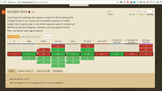
Now, support for variable fonts isn't at its prime yet, but everyone is really, really excited about variable fonts and I expect maybe within a year or so, it's gonna have cross-browser support, but variable fonts do render in browsers that don't support them, so they can be used as a progressive enhancement, but you obviously have no control over which weight, or which variant, or which instant of the font is going to be displayed.
So, to get around that, you need to serve non-variable single style fonts to these browsers.
So essentially, the way we already do this you add the declaration for the variable font at the top and then, you add the declaration for the other fonts as well.
Now, you can define all the font rules like that and then, apply the variable font within a supports rule as an enhancement, which brings me to a quick introduction to the supports rule here.
This is essentially feature detection in CSS. So, instead of using JavaScript to check for feature support and then, adjusting your styles based on that, you don't need to use JavaScript anymore.
You can do that in your CSS and according to whether or not a feature is supported. Here, I'm checking for font variation settings, which is related to variable fonts.
So, if a browser supports this property, they probably support variable fonts and then, the fonts inside of it, the variable font here is going to be applied as an enhancement to your text.
You could also do it the other way around and place the font face declarations inside of a supports rule.
Either way, it's good to know that all browsers that support variable fonts also support the at supports rule, feature detection, so you can and probably should be using variable fonts as an enhancement today.
There are a lot of variable fonts currently available. You can find a very large collection at V-Fonts.com. This video shows just a few of the examples, the things that you can vary about the font. You can do weight, the first one had different axis as well. You can do the contrast, italic.
I like this one here because the serifs, the entire... You can see that.
And this one is also really great 'cause the colours change. As the width changes, the coloured lines change and width changes the overall font itself.
This one also changes a little bit, the characters. You have a lot more.
I think there's a really exciting font at the bottom. I'm waiting for that one.
Okay.
So, there are also other playgrounds created specifically for playing with variable fonts and seeing how they work and what things about them can change.
Axis Praxis is one of the most popular ones. There is also type details recent font playground. Now, whatever tools you decide to use to explore variable fonts, they're all worth spending some time on because variable fonts are here to stay and they are one of the biggest and most important advancements in the world of web type and web design today, and performance.
Variable fonts are also available in Adobe Photoshop and Illustrator, so if you work with any of those or you know anyone who works with those or you work with anyone who works with these, they can also use them.
So, they're available in the character panel. You can choose the name of the font, you can see the variable.
It's part of the name.
And then, you click on this here, this little button, it brings up sliders for each variation that you can play with.
And here's a list of resources and sources that I borrowed images from for this section and that I highly recommend checking out if you want to learn more about variable fonts. Another thing, one of the most wanted and most anticipated and most waited for features in CSS is CSS Custom Properties, also known as CSS Variables. So, I'm gonna say CSS Variables all the time, but one of the things you need to keep in mind is that they are Custom Properties.
If you write your CSS using a pre-processor like Sass for example or Less, then you already know one of the things that CSS Variables can do, but they can do a little bit more because... I'm gonna say Sass Variables because I use Sass most of the time.
Sass Variables are static, which means that they compile to static CSS, they don't exist at one time inside of the browser.
The browser does not see them, does not know them. As soon as the CSS is compiled, they don't exist anymore. Pre-processor variables are also defined globally. You define them outside of any rule sets and then, you use them anywhere you want on the style sheet. They cannot be locally scoped.
They require compiling the style sheet on every change, which means that if you want to do some kind of theming, if you want to theme your interface, and you want to create different versions of the style sheets, you're gonna have to reload and request every style sheet for every change in the theme. CSS Variables on the other hand are special because they are a different kind of variables. They are custom properties.
So, what does that mean? Custom means that both the property name and the value can be author-defined.
You can define them.
The only requirement is that the property name needs to be prefixed with an empty prefix.
So, at the top here, we have the prefixes that we used to use and the we only have very few of today, like webkit, moz, MS vendor prefixes.
Variable fonts use the same notation, except that you don't have any vendor prefixes. It's an empty prefix and the reason the CSS specification did not use the dollar sign or anything is because they wanted CSS Variables to work with pre-processors.
So, if you still want to use a pre-processor for its other features, you can do that all the while also using CSS Variables.
Because CSS Variables are properties, they need to live within a rule set, which becomes their scope.
This enables you to scope locally scoped variables to specific elements.
So, unlike Sass Variables, that are always globally scoped, CSS Variables can also be locally scoped.
Now, even though CSS Variables cannot be defined outside of any rule set, you can still create global scopes by putting them in the rule set for the father of all elements, which is the root element; and because they are properties, they are subject to the rules of the cascade and inheritance, which means that any property that is defined on the root element is going to be inherited by every other element on the page. This makes them global.
So, you can also scope variables to elements by defining those variables within that element's rule set. The variables defined in the navigation in this example are scoped to it an are available to all of the children inside of it, but not to other elements outside of it. CSS Variables are used...
I'm giving these basics of CSS Variables just because I need to cover them before I get into the examples and how to use them or what they are beneficial for.
CSS Variables are used as values for other properties by calling them using the var function.
For example, we have variables here defined in the navigation and then, one of those variables is used as a background colour for the links inside of that navigation using the var function that takes the variable as a parameter.
Variable values can be changed based on contexts, such as when the element matches as different CSS selector and again, if you keep in mind that the variables are just properties just like any other CSS property, this all makes sense.
CSS Variables...
This is the last tip before I go to the examples; they can also be used and modified inside media query blocks, but not in the query part of the media query.
So, you cannot check for support of the variables like that. So, if you have a media query here and I have a variable inside of it, this is not valid, but you can change them inside of a regular media query and you can change the value of the variable here. CSS Variables...
I've set it so many times so far.
They make theming possible without requiring an extra issue request for a new style sheet every single time the user changes the colours. For example, suppose you are giving your user the ability to change certain colours on your interface, so you give them sort of a component, they can switch to different themes or just adjust certain colours.
Normally, if you were to change the styles of the UI, you need to change those styles inside of your CSS, recompile that CSS, request it again, and then inject it or just apply it to the page. This is not necessary with CSS Variables.
Because of their nature as CSS Properties, you can change the UI without additional requests. Harry Roberts, one of my favourite front end developers, wrote an article about this on his blog.
So, suppose you have a theme set up in CSS where you have your global variables defined and then, you're using those variables everywhere in the style sheet of the design, you have variables for colours, you have variables for line height, font size, and stuff like that.
When the user gets the ability to change the colours, for example, what they're essentially getting is the ability to change the value for these custom properties, which will then be automatically applied everywhere in the style sheet.
So, you don't need to reload the page because as soon as you inject the values here inside of an inline style, those values will override the value of the properties and the style sheet so it just works out of the box without a refresh. You could also use, for example, local storage to save the values that user has chosen and you've got theming with a performance benefit of not requiring an extract peer request.
CSS Variables, which is one of my favourite aspects of it, it makes it possible to write less more maintainable CSS. For example, suppose you're building a pattern library and you are creating multiple button styles. All the buttons share the same base styles and only differ in terms of one or two styles for each button variation.
Typically, the CSS for such use case would look something like this.
Now, CSS Variables can be used to refactor this code so you have overall less CSS, like so.
So, we had this and now, with CSS Variables, we have this. That's less than half the amount of CSS.
So, we define the characteristics and the variables inside of the main button rule, at the top, and then change only the value of the variables. You're not changing anything else.
You're not really repeating any property declarations anywhere.
You're just changing the value of the variables. In this case, it's when the element has a different class name.
Last but not least, CSS Variables can be used to make UIs more accessible in a very elegant and maintainable way, particularly when coupled with also one of my favourite CSS features, which is the prefers-reduced-motion user query. Prefers-reduced-motion was introduced in CSS Media Queries level five.
It is used to detect if the user has requested the system to minimise the amount of animation or motion it uses.
It is essentially the web implementation of the IOS reduce motion option, which Apple introduced after they realised that the animations in IOS seven were triggering vestibular disorder symptoms in users that have motion sensibility.
Apple introduced the prefers-reduced-motion media query which queries the system and resolves to true or false depending on whether or not the user has that option, the reduced motion option, checked in IOS.
If they do, the browser will parse and apply the code in between the brackets for the first media query, prefers-reduced-motion reduce.
You can also remove the reduce and it will default to that, this value, and it lets you provide a different alternative experience for those users.
This is very important to make your products in general more accessible because some users literally cannot stand animation, so you want to be able to cancel those out if the user wants you to.
An example might look something like this.
So, I have an element, it has a CSS animation applied to it and then, if the user has the reduced motion option enabled, you cancel out the animation duration, which means you're zeroing out the animation duration, which effectively cancels the animation completely. Now, suppose you have multiple elements with animations and you want...
This code is not supposed to be readable, so if you can't read it, it's fine.
I just have multiple elements and each of them has an animation that I'm cancelling out the animation for each of them inside of it's own prefers-reduced-motion query. So, suppose you want to do all of this and you want to make it more manageable.
To start refactoring this code, you can start by creating a variable that holds one value that changes in the media query, which is the duration.
So, let's do it for one element first.
I have an animation here.
I put the animation duration inside of a variable and then, I'm using that variable inside of the animation declaration and then, inside of the prefers-reduced-motion media query I just changed the value of the animation duration to zero, which cancels out the animation at the top. This looks better.
So, one of the rules to remember when you're refactoring your code with CSS Variables is that the only thing that changes in the media query is literally the only thing that changes about the element, which is the value of the animation duration.
So, make sure that the only thing that changes inside of your media query in general is the value of the variable.
Don't do any property declarations.
But, we have multiple elements on the page whose animations' durations also changes and we need to cancel out, so we can benefit from declaring a global animation duration variable inherited by all elements and then changing it where it needs to change for every element, like this. So, I have a main animation duration defined here and then, I'm using it for different elements and then again, I'm cancelling out, but this is still not optimal.
Okay, so if you have another element using this variable, you have to cancel it out for the other element as well. There is still repetition here.
So, the code can be improved even further.
Instead of zeroing out the same variable for all of the elements, we can zero it out once. So, I have it defined here in the root element and then, when the user prefers-reduced-motion, I turn the value into zero and then, all of the other declarations in the style sheet that rely or depend on that variable will automatically be zeroed out.
So, you can cancel animation everywhere on your product using just one variable in one place.
Now, you may be wondering, this works great if all the elements have the same animation duration, obviously, but what happens if you have different elements that have different animation durations? Well, that's fine because you can still keep the exact same structure and change the value of the animation duration for other elements, like so. So, you're still using one animation duration here and then, using the calc, you can calculate different animation durations for different elements, but they're all still dependent on that one global configuration flag, so to speak, and then when you want to cancel it out, you cancel it out over here and it affects the entire UI. That's it for CSS Variables.
Web Layout.
In recent years, CSS Layout has come to age, new specifications for flexible and complex one and two dimensional layouts have been replacing hacks that we've always used, like tables.
I wasn't around when tables were used, but I know that people used them.
Tables, floats, absolute positioning, inline blocks, we used to do all kinds of hacks in order to create complex layouts and we still couldn't create a lot of the layouts that we wanted.
Now, the flexible box layout module, also known as Flexbox, was the first of these dedicated layout modules.
I'm going to quote someone, there's a guide to Flexbox on CSS-Tricks, and because English is not my native language, I like to quote other people because they say things more eloquently than I could possibly do.
So, Flexbox aims at providing a more efficient way to lay out, align, and distribute space among items out of a container, even when their size is unknown or dynamic, thus the word flex.
The main idea behind the flex layout is to give the container the ability to alter its items' width and height, and even order if you want, to best fill the available space.
A flex container expands its items to fill available free space or shrinks them to prevent overflow.
You get to control that.
Flexbox relies on the concept of vertical and horizontal axis within a container to align the components inside of it and distribute the space between and around them. With Flexbox's vertical centering, so if you want to do vertical centering, which has been the bane of existence for most developers for many years right now, if you want to centre things vertically, all you need to do with Flexbox is tell the container to centre that element along the vertical axis and the horizontal axis.
Two properties, two lines of the CSS, literally. I'll show you an example shortly.
With Flexbox, things like stretching elements, for example, along the vertical axis, you can tell the container to stretch all of the elements so that they all have equal heights.
This can be used to create the Holy Grail of layouts where the main content and the sidebar have the same height, which is also one of the layers that we used to hack our way around it before.
Now, the best way to show the flexibility of a Flexbox, no pun intended, is with the help of an interactive demo. So, let me just quickly switch to mirroring. So, this is a Flexbox playground, it's on Scotch.IO, that's the website.
There are a lot of Flexbox playgrounds available, but this is the one that I found most useful for this talk. So, this yellow container here is the Flexbox container and we want to see what it can do to the elements inside of it.
By default, all of the elements are going to be as soon as you declare the yellow container to be a flex container using display flex, all of the elements inside of it are stretched out to be equal in height.
Now, a flex container by default is going to make sure that all of the items fit in one row, regardless of their width.
So, if I increase the width of these items, at some point they reach a maximum and even if I keep increasing it, the browser's not gonna increase it anymore because the container wants to fit all of those items inside one row.
You can change that and you can tell it that you don't want them to be fitted in one row, you want them to wrap, so you change the flex wrap property value to wrap and you have wrapping elements. So, I'll go back to the default here.
You can also change the flex direction.
I mentioned there is a vertical axis and there is a horizontal axis.
Suppose that for some reason you have a component that needs to have all of its contents flowing on the vertical axis.
You can do that by changing the value of the flex direction. So by default, it's row.
You can change it to row reverse, which reverses the order of the elements.
You can do that, you can also change it to column, which stacks all of the elements vertically. There's also column reverse, which is vertical, but reverses the order.
Back to row.
I also want to decrease the size here again. Now, one of my favourite things: justify content and align items.
So, justify content is used to determine how the space is distributed between and around the elements on the horizontal row.
So, if I say I want the content to be justified to the flex end, it moves them to the end of the line. If I want them to be centred, it centres them. If I want to distribute space between them, it distributes it like that so that the first element is on the edge of the container and the last element is on the other edge and then, if I want the space to be around them, it will be distributed equally around them. This is useful for navigations, for example. If you have a navigation and you want the items to be spread out and that navigation like that, you can set the display of the navigation to flex and then, you use the justify content to align the items automatically.
Now, I want to centre it back again and then, I want to go to the align items.
Align items is used to do exactly the same thing, but on the vertical axis.
So, if I change the align items to flex start, they items are not going to be stretched anymore. They're going to be aligned to the start of the vertical axis.
They can also be flex end.
There's also centre.
Ta da! Vertical centering.
So, display flex on the container, justify content centre, align items.
Centre, you've got vertical centering.
There's also baseline.
It's not going to be very obvious here because you need content inside of the elements here to see how baseline works.
Align content, I'm not going to get into that. So, these are the most important things that you can do. You can stretch items, you can move them, you can centre them, you can wrap them, you can not wrap them, all these things are possible with Flexbox. So, jump back.
So, we did the live demo.
A lot of the common components, and even page alignment challenges, can be solved using Flexbox.
A short while after Flexbox was created, Phillip Walton created the Solved by Flexbox website, which shows a lot of the things that CSS can do. So essentially, writing cleaner, hack-free CSS to achieve a lot of the things that we used to achieve using hacks before.
There are things like Holy Grail layout with the sidebar and the main content having the same height, we have input add-ons, the media object layout. So, this is the Holy Grail layout, for example, and navigation, main content, and a sidebar here. This is what the HTML would look like, three main containers, and then the CSS you would specify display flex on the container, flex direction column, and then set the display to flex and flex one on the body, and essentially just a few lines of CSS.
You also have things for add-ons.
The most important thing here and one of the most useful applications for Flexbox is with forms.
What we're doing here is we're making sure that each one of those inputs, the text input, is always as wide as it can be, no matter how many elements you add next to it or before it, you want to make sure that it always stretches to get the most amount of space.
You can do that by specifying flex equals one, which means you are essentially telling the browser that you want to give it as much of the space as you can. Also, just a few lines of CSS.
And there are many different examples on the site that you can check out.
Now, although CSS Flexbox can be used to lay out pages, it remains limited when it comes to creating complex grid layouts.
More complex layouts can be created using the CSS grid space specification, but before we get to that, I want to quote Tab Atkins, one of the editors of this specification when he said, Flexbox is for one-dimensional layouts, anything that needs to be laid out in a straight line, or in a broken line, which would be a single straight line again if they were joined back together.
Grid is for two-dimensional layouts.
Flexbox is appropriate for many layouts and a lot of page component elements, as most of them are fundamentally linear.
Grid is appropriate for overall page layout and for complicated page components, which aren't linear in their design.
The two can be composed arbitrarily, so once they're both widely supported, which they currently are, I believe most pages will be composed of an outer grid for the overall layout, a mix of nested Flexboxes and grids for the components of the page, and finally block, inline, table layouts for the leaves, the small components, the atoms in atomic design words, where the text and the content live.
Flexbox gets easier with practise and I say that because, even though I've been using it for a few years now, I still can't remember the values for all of the properties and sometimes the property names, so I need to always find the cheat sheet and find the property names and values there. However, implementing it on more complex layouts can get a little bit out of hand, so it's generally recommended to use it for small application components and simpler layouts. Today, Flexbox is also used as a fallback for Grid because CSS Grid is only supported in the latest modern browsers, including MS Edge.
It is also supported in IE 11, but IE 11 supports an older version.
I'll get to that shortly.
So Flexbox, which is supported in IE 10, for example, can be used as a fallback for CSS Grid in IE 10. CSS Grid, it is the most powerful layout system available in CSS today, specifically designed and created to allow the creation of two-dimensional layouts, giving you the ability to control both columns and rows of a grid.
It can be used to layout major page areas or small user interface elements.
Now, CSS Grid comes with its own terminology. A grid has lines, duh.
Grid has lines.
And the areas where these lines intersect, the small cells, are called a Grid cell.
A combination of multiple cells, a rectangular area, is called a Grid area.
Grid also has Grid tracks.
A track is just a common name for a row or a column. A Grid track is a grid row or a grid column, and you also have the Gutter, which is the space between columns or tracks. The creation of a grid, I'm not covering a lot about CSS Grid at all, so this is a very quick overview just so you can see what's possible today.
So, in this example here, the creation of a grid is you have a container, you set the display to grid, and then your grid template needs to have columns and rows. You define those columns and rows and the grid template columns and grid template rows' properties.
So in this case, I have 150, 150, and 150, which means three columns, each 150 pixels wide. You can change these, you can use the fraction unit, which is kind of a flexible, extremely powerful unit in CSS Grid, which allows you to create very flexible and amazing layouts, essentially.
So, you specify the number of values that you have here to determine the number of columns you create. I have two rows, each 150 pixels height and I added a grid gap, and then I have the container that contains six items and as soon as you define these here, the browser is automatically going to lay out all of the items here inside of that grid by default, unless you explicitly tell it otherwise.
If you don't want the items to be placed like that, you can change it.
You can also define grids using grid area names, which is also one of my favourite things.
So, you have the grid rows and columns defined, but in order to make it easier for you and for other designers, in order to make placement feel more logical, you can do something like this.
You have grid template areas, header, header, header, sidebar, content, content, sidebar, content, content, footer, footer, footer.
Probably better without the highlight in this case. So, what we're doing here is one, two, three, three columns, one, two, three, four, four rows, and each one of these has a name.
Now, when you want to position your elements inside of those areas, you can do that using the grid area property.
So, you have a header, a sidebar, multiple content sections, a footer, and your content, and then you can place them like that.
This technique makes a lot of sense.
Now, if you inspect this layout, which I by the way borrowed from the Mozilla documents, docs, if we inspect this layer using the Firefox grid inspector, which is a indispensable tool today if you're working with CSS Grid, you can activate the grid or visualise it by clicking on the container and then checking the grid option here.
When you check it, you're able to visualise the grid. So, we have the areas here.
We have header, header, header, sidebar, content, content. These are the names that we had in our CSS. You can also notice that grid lines have numbers by default. You can even name those grid lines and then, when you position your items inside of the grid, instead of telling the browser that I want my item to be positioned, add column tow, row four, you can have grid line names just like we had here, like a sidebar start, sidebar end, and you can position your items inside of there. There's a lot of things that's possible in CSS Grid, but I definitely can't go much over here.
You can do whole workshops on CSS Grid, but the best news is that CSS Grid can be used in production today and especially so when used with the supports feature query. Jeffrey Zeldman once said, when responsive design meets Mobile First, starting with the narrowest width and building up from there, what you're doing is progressive enhancement. You'll even see this layering in the way that the style sheets are structured.
When working with CSS Grid, starting with Mobile First is usually the most recommended approach and if you can use CSS Grid as an enhancement and provide a different one column layout, for example, to non-supporting browsers, then Mobile First with the supports rule is the best way to go. Browsers that don't support CSS Grid would show the one-column layout and this is what I'm currently using on my own website, so if a browser does not support CSS Grid, you get the mobile one-column layout and then, using the supports rule, I'm adding or applying CSS Grid to larger screens as the screen gets larger.
But if you still do need to...
I'm a freelancer and I know that maybe some day, I've had the best clients in the world so far, but maybe someday I'll have a client that says, okay no, I want my layout to be exactly the same in IE 11, at least.
The good news is that there is a series of... No, wait.
Before I get to that.
It's worth mentioning that Jeremy Keith, he's one of the people who talk the most about progressive enhancement and advocate for it, he says that you could jump through hoops to try to get your grid layout working in IE 11, but at that point, the amount of effort you're putting in negates the time-saving benefits of using CSS Grid in the first place.
So, CSS Grid allows you to create really complex layouts easily and quickly, so if you're gonna have to spend days and hours recreating those layouts using floats and hacks and stuff like that, then it's probably maybe a good idea to not be using CSS Grid at all, but if you do want to use CSS Grid and you still want to provide a decent fallback or a similar fallback for IE 11, there's the series of three articles on CSS Grid that covers everything you need to know to get the grid working with the old syntax in IE 11. There are many, many supportive examples of Grid usage out in the real world, real examples.
My favourites start with Design Genome Project for InVision, which was designed by Daniel Mall, one of my favourite designers.
This project chose one of CSS Grid's most powerful capabilities, the creation of white or negative space.
You have a grid, you have a number of cells, and when you place your content into that grid, you can place it into any grid cell, leaving any other grid cells empty, thus creating white space.
It's worth noting here that if you do want to do that, if you do want to live cells empty and place your items not really arbitrarily, but in different cells, please make sure that if the user is going to use keyboard navigation, make sure that the order still make sense, and if they're gonna have to jump from one cell to another, make sure that it's not gonna kill them in the process.
So, when it comes to ordering and re-ordering content, CSS Flexbox and Grid give us extreme power, but with great power comes great responsibility, so please make sure that they are still accessible. Another example, which blows the minds of everyone who sees it, including myself, is Lynn Fisher's personal website.
Although it seems simple at first, the magic unfolds when you view it on different view port sizes or simply just resize the screen if you're on desktop. She has a completely different layout style for different view port sizes.
It's really beautiful.
I just enjoy looking at this video all the time. Unfortunately, I don't have too much time to do that, so if we inspect her website, you're gonna notice that she's also using CSS Grid for the site and changing the position of the content inside of the grid as the view port size changes. So, I've activated the grid.
She's using a 10 column grid.
And if I go into mobile view, the grids disappear for some reason, so just check and uncheck again to show them. And then, if I resize the page, this is the grid on mobile, it's 10 columns, and as the view port size changes, it's a flexible grid, so she's probably using one F R for all of the columns, I think, which means that they are flexible. CSS Grid and the real world.
Oh, okay.
I'm not gonna cover CSS Shapes unfortunately 'cause I don't have much time, but yeah, we can create layouts like these using CSS Shapes on the web today.
I'll jump straight to images.
Now, what does CSS have to offer for dealing with images? It has currently two powerful couple of properties that allow you to scale and fit images inside of a particular box and you get to decide how you want them to display. So, sometimes you may want or need to have all of the images or videos or inputs or whatever on a page to have the same height and width values.
An example of this is avatar images, which are usually square and rounded.
The image you end up using on the page may not always have the same dimensions.
So, if you're offering a user, like if you have a Word Press site, and you're offering the user the ability to upload their own images, probably they're not gonna be uploading square images and you may not want to do the cropping and the resizing on the server.
You can do that using CSS today using these two properties: object fit, which fits the content of the image or the... Using object fit, the contents of an image or video can be set to scale up or down, shrink, stretch as necessary, and then object-position allows you to change the position. It's best explained visually.
So, these are the values.
I have an original image here, which is rectangle, and then I'm going to place it inside of a square area on the page.
So, I have an image element and I want that image to be square, but the image that it's referencing is not really square.
So, if I change the values of the object, I have fill, I have contain, I have none, cover, the first example fills the image inside of my square without...
I think the aspect ratio's been stretched vertically, so yeah, it hasn't been preserved.
Contain, makes sure that the image is going to fit inside of the square without scaling it up as much as possible.
So, even if it means leaving absent white space at the top and the bottom, cover will stretch the image as much as possible while preserving it's aspect ratio to fill the entire square area.
It is centred by default.
You can change the position using the object position. The object-fit-none does not do any kind of scaling. It's just going to load the image and place it sort of like a background-centered background and you have scale-down, which is similar to contain. However, browser support for object-fit and object-position is not really that good, especially if you need to support Edge.
Currently, I think it's 15.
Yeah, so it's not really that good.
You can use it as an enhancement, but I don't know if I would do that because if the browser does not support it, the fallback is not going to be that elegant. But the good news is that SVG can fill in here, so this session is a quick overview of some things that you can do with SVG.
We can replicate the function, the object-fit and object-position functionality using SVG because SVG is a document format, not just an image format, and it's a document format with super powers. The two most powerful properties in SVG are the viewBox and the preserve-aspect-ratio. These two are cousins, so to speak.
I can't get into too much detail, but let's just say that this snippet here, instead of displaying an image tag and then using object-fit and object-position to scale and position the image inside of that box, you can use this snippet instead.
Using the viewBox and preserve-aspect-ratio, you have an image inside of your SVG, the image has a width and a height equals to 100%. When the image is equal to 100% width and height, it means that it scales to fit the dimensions of the viewBox.
The viewBox's value is the coordinate system inside of the SVG, the coordinate system inside the SVG campus, so I'm making sure that the image fits the entire SVG campus and then, using preserve-aspect-ratio, it takes a line and meet or slice.
I can't do the positioning and scaling outside the scope, unfortunately.
It's one of my favourite things.
So, you can do something like this.
The SVG has a width and a height 140 pixels. It's square.
And then, the viewBox would have...
So, if the image uploaded by the user, in this case here I specified the width and height to be 100%, then the dimensions of the image go into the viewBox.
The viewBox in this case, the internal coordinating system of the SVG does not have the same aspect ratio as the SVG view port, which means that you end up with exactly the same scenario as we saw before with the red square and the image inside of it and then, using preserve-aspect-ratio, you do all kinds of positioning inside of it. One thing that's missing in this snippet is the title attributes because if you're going to replace an image tag with this SVG snippet, you want to make sure that it's accessible. An image tag has an alt attribute and you should always keep that, even if it's presentational, even if the image is presentational, keep the alt attribute and leave it empty, it's fine, but as long as it's there.
There's no alt attribute in SVG, but there is the title attribute, the title element instead, which does exactly the same thing to SVG as the alt attribute does to an image.
I've written an article that explains how this works if you wanna check it out.
SVG content is accessible.
You can make the content accessible by adding title and description elements.
A good example is making an icon or a set of icon accessible, which is particularly important when the icons represent a certain action and are not accompanied by text.
The back to top button here is a very good example because it's usually an arrow and if a screen reader, if a user tabs to that icon, the screen reader is not going to know that this is actually an icon to go back to top, so you can use SVG to display that icon inline and then, inside of that SVG have a title that says back to top.
You have the aria attributes here that are needed to make sure that screen readers understand that this description here actually tells them what the icon does, and this is a little bit outside of the scope of this talk here, but this... Yeah, okay.
So, this path here, this is my icon, but I have an image here at the top.
Images inside of SVG don't have a source attribute. This is one of the things...
I didn't really wanna cover it anyway.
So, an image inside of an SVG, an image element, does not have a source attribute like an image in HTML does, it has an xlink:href.
So, what we're doing here is I'm keeping the xlink:href empty and I'm giving it a source, even though the source is not valid.
This is a fallback technique.
So, if a browser does not support SVG at all, it's going to ignore the SVG tag it doesn't understand, it's going to ignore the title element, it's going to ignore the path and the SVG, but when it sees an image element with a source attribute on it, it's going to assume that you've made a mistake and that you actually meant to use an image element, so it's going to convert it to an image and reference this icon instead as a fallback, which is pretty cool.
SVG text is accessible by default.
SVG text embedded using and SVG text element is just like HTML text: searchable, selectable, and accessible to screen readers.
So, you can create creative text effects similar to those that you can create in Photoshop and other graphics editors, but instead of using images to display this text, you're using real text inside of an SVG and then applying those effects using SVG filters, which can do something like this as well.
I have a knockout text and the background changes in the background.
You can see it through the text and this is done using a few lines of SVG.
I have the real text inside of the SVG here. This is searchable, selectable, and accessible and I have a filter defined here using two steps. If I apply that filter to the text, I get the knockout effect.
SVG has filters, blend modes, lighting effects, textures, and much more.
Even though CSS already has a set of filters, the 12 filters to be specific, these filters are very, very limited.
They actually were imported from SVG in a very limited manner, so they can do very, very limited things, whereas SVG filters can do a lot more.
You can create things...
I saw a demo on YouTube that created this effect using Photoshop using these steps.
So, there are certain steps.
You have an image that your are going to use as a displacement map to displace the text and create that 3D effect.
You start by de-saturating the image, reducing the amount of detail by blurring it, saving it as a displacement map, you create the text, and then you apply a distortion filter using the image as a displacement map, reuse the original image as the background, put them on top of each other, use blend modes. With SVG, you can do exactly the same thing using the available SVG filters.
You fill the filter regions, the background de-saturate using the colour matrix, add a Gaussian blur using the Gaussian blur filter primitive, you create a displacement map, you apply that to text. This is too much, I know.
I just want to give you a quick overview of what's possible. Exactly the same steps that you can do in a graphics editor a lot of the times you can recreate them using SVG filters and this is what the code would look like.
Again, it's not meant to be readable, it's just an example of the things you can recreate from graphic editors in SVG.
SVG also has lighting effects and it has noise generation and if you combine lighting with noise generation, you can create textures inside of SVG like clouds and fire and all kinds of things, awesome stuff. SVG is self-contained and has element queries kind of. I mean, it technically does.
So, there are seven different ways to embed SVGs on a webpage and unless you're embedding the SVG inline, when you have a media query inside of the SVG and you can totally have images inside of an SVG, the value inside of the media query here, max width for example, that's going to be the width of the SVG itself, not the page.
So, in this case I have a logo.
A logo's a very good example.
If the screen is scaled too small and the logo has too many details, you don't want to show those details because they're unreadable anyway, you can add media query to your SVG and change the styles inside of your logo.
Last but not least, just one minute, I want to quickly go over CSS Houdini.
Now, when people talk about Houdini, they are indirectly referring to a set of lower level CSS specifications written in collaboration between Apple, Google, Microsoft, Opera, HP, and Mozilla engineers.
The purpose of this specification is to be presented and accepted by the W3C to become CSS standards. They're aimed at introducing a new set of APIs that will, for the first time, give developers the power to extend CSS itself and the tools to hook into the styling and layer process of a browser's rending engine. The set of APIs enable developers to take control and invent new CSS properties or polyfill existing ones that are not cross-browser compatible, but wanting access to hooks is not just about creating really great and awesome demos.
The main points are to normalise cross-browser differences and invent or polyfill new features so that people can use them today.
JavaScript libraries like Angular and JQuery or any other library, this is their main selling point, they provide you with an API that allows you to do things cross browser without having to worry about cross-browser inconsistencies.
Now, imagine if you can do exactly the same thing with CSS. Imagine how much nicer it would be if you could use any CSS property and know for sure that it's going to work exactly the same in every browser.
This is the dream of Houdini and this is the future that the task force, the Houdini task force, is trying to make possible. Phillip also goes on to say that, even if you don't ever plan on using CSS Houdini yourself, you probably want other developers to do it because once a polyfill is out there it can be used by everyone.
Some Berlin developers have already started experimenting with CSS Houdini and my favourite Houdini experiments are by Vincent De Oliveira.
He creates all of these things on the left are things that are not currently possible or implemented in CSS, but he created them using CSS Houdini.
So, you have conic gradients, slanted backgrounds, corners, check boxes, you have this hover effect that's currently not possible. You can do that and I think I'm gonna jump into rough edges.
So, the syntax is very similar to CSS, but the values change.
He also created these rough boxes.
You can do that.
So, you define this rough box effects in your CSS. You can have these slanted backgrounds.
I just want to get to the last one, the SVG path layout. I think I'll jump to it right away.
Yeah, this is my favourite thing.
So currently, you cannot define non-rectangular layouts, but it would be awesome if we could do I using SVG, so what he's doing here, he's using an SVG path to lay out elements and if you edit the path, you edit how those elements are laid out on the page. This opens up the door for so many possibilities and these are just a few examples.
I learned everything that I know about Houdini from this article by Phillip on Smashing Magazine and there's a really good accompanying article on the Google Developers Blog.
Yeah, so the future of CSS looks very, very bright. There's already a lot of thing that are currently possible. I know that there are a lot of things that are coming in the future as well.
SVG is not being worked on at the moment, but there's already so much in it that can be used and done today.
So yeah, until we see what's coming in the future, we can use what we already have today and I hope that you're looking forward to using these things and the things that are coming in the future, as well.
Thank you very much for listening.
(crowd applauding) (upbeat 8-bit music)
With so much of the front end focus on JavaScript, and frameworks and libraries like React and Angular, front end developers can lose sight of the ever increasing sophistication and richness of CSS and SVG.
In this session, Sara Soueidan, one of the world’s foremost experts in these technologies will bring us up to speed with what’s now, and what’s next for the Web platform in relation to typography, layout, animation and visual design.