Practical Web Animation

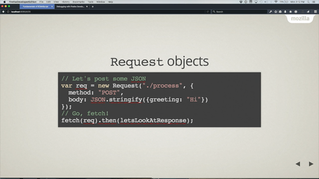
[Music] you please make a very very welcome it's Lizzie Linn huh yeah they already mentioned that I'm from Salzburg a lecture at the University I write about mostly fronted on my blog and you can talk to me on Twitter if you want to but let's get started with the web animation part so when we build new applications where we grade the building efficient workflow workflows are using webpack and functional CSS but most of the time we have a limited budget and also limited time and a lot of people rather optimize other things than do web animations so why is that I think it's because a lot of people see web animation as kind of the sparkles that are on top of a project and of what it makes it more fun but most of the times you don't have time to do it but the thing is it's it's really useful it can be really useful for user experience and I want to tell you why it is but when we do web animation we also have to think who we're building our application for so animation can be really useful for example if you build for a younger audience where it can make everything more playful and explain different steps like for applications for children animation can be really useful but maybe an elderly person might prefer to read some information in their own speed and then the image might be distracting and maybe they don't need the animation like a younger person what maybe so one part of web animation is the user so who are you building the animation for what goal does the animation have and the second part is the browser so the browser needs you to build your animations in a certain way so they're performant your animation is going to run differently on a mobile phone where you have less performance so you have to think about how the browser works on desktop on mobile here made a little chart that because I work at a university and I should have a scientific chart so soprano there's a user there's a lot of keywords on hard and easy web standards are important so make sure you you use web standards and it's going to make it easier to build accessible applications and then you can do different things you can take care of browser support you can build an animation to increase orientation in the user you can build animations to give attention to the user and you can optimize your animations for the render engines of your different browsers so there's a lot of different things that come together when you do web animation so when we animate with the browser there are four things we can animate really cheaply one is one is the position so transform translate X for example or translate Y or 3d transforms scaling so making objects bigger or smaller rotating objects and animating the opacity so fading in in and out this is what that looks like in CSS so we can translate it scale it rotated and every-every transform looks a bit different so scale for example takes the value from zero to one but then rotate takes degrees so you have to kind of learn these to use it right and then you can chain them and the order order matters for those properties so there's a really great pan showing that but on Wilson so if you translate something first and then rotate it and then scale it and then translate it again it will end up in a different space than if you scale it first then wrote it then translate it so think about those those things when you use it so let's say we want to animate a little menu and if you wouldn't know about the transform property what you might do is give it a left property and then add a transition on all CSS properties and then give it a class that animates this left property and this is really unperformed because left is a layered property and it's really unperformed for the browser to animate and I'm gonna tell you why if you want to do a menu animation in a more performant way you use the transform property with a translate X and then transition only the transform not all CSS properties but let's look at why animating left is not performant so when we change something in the browser your JavaScript event or we our CSS with for example a hover we have some kind of visual change that needs to re-render something and then the browser after the change needs to recalculate the new style so something happened you have add something and it needs to figure out how the element looks and then it needs to redo layout so for example if you change with margin left the browser has to find out how much space each element takes and how much space the other elements next to it take in how much space the elements inside of that element take so it has to do a lot of styrene calculations if we skip that step and don't animate layout properties we can also animate paint properties these are properties like background back shadow outline and this is more performant because we don't need to recalculate the whole layout but it's not the most performant step so the most performant step is the composite step it's mostly only transform and opacity and this is important to limit yourself to the composite step at most of the times I mean you can also animate paint or layer properties but then you need to test if it's performant on now enough on all the devices and all of this happens in one frame so if you take really long on layout and recalculating you will need get less frames in the end so by limiting yourself to this you you get more frames and it will be more performant so limit yourself to transform and opacity will make it easier for you to create performant animations and then if you do a lot of animation what you can do is to promote elements or new layers if they're animate that often and consistently like a menu or some element that's consistently moving and we can create new layers by using the will change property or 3d transforms or some kind of 3d effect these are is a list of things that create new layers so we'll change 3d animated 2d transforms also create new layers like animations being on top of a compositing layer and animated CSS filters also create new layers I built a small demo for you to demonstrate that so here we have creature turtles each turtle has their own death and if I wouldn't know about transform I might animate some layered property like marchin so I'm giving it a marching when I'm hovering it and then I'm adding a transition to animate it smoothly and now when we have ABC well the other turtles are affected as well because I'm recalculating the layout and I'm changing their properties and we only have one layers layer if we go to the layers tab what we can also do is turn on paint flashing this is really useful to see what needs to be repainted so here I see if I have a one tell all the other turtles need to be repainted as well and I can also turn on the FPS meter to track how many frames per second I have so now instead of animating margin its animate transform translate Y and then transition the transform and now if I have a troll I see well only this turtle is repainted if I go to a lay step I see I still have only one layer and if I hovered a turtle in the middle or the first we see the last turtle also needs to be repainted when I'm hovering that turtle because it's on top of the other turtles so I could add a will change transform and then I'd get a layer for each turtle and if I hover the trolls now there's no repainting because they don't affect each other but if we use layers it's important to not create too many layers because each layer takes up memory in your browser and you don't want to take up all your browser's memory that's why you should only create a few layers if you animate something consistently and then remove them if the animation is finished via a class 4 exam and then the last part with animations is in the browsers is to religious test them you have the performance tab you can record some animation here with this then you get lots of colors here these red bars show you that you have two little frames per second so there's some problem here and this summary is very useful to just get a general overview of what's happening the paint flashing shows you what needs to be repainted and the FPS meter shows you if you have enough frames per second and then the layers is also useful to attract your memory and see how many layers you're creating or if you're creating actual layers you don't need via applying some CSS that creates layers and here in the bottom with the summary tree this tracks back to how the rendering works in the browser so if you have lots of rendering you're probably changing some property here that has to recalculate layout if you have lots of scripting your childr script might be expensive and you're doing calculations and javascript to take too long and if you have lots of painting maybe you shouldn't animate a paint property or doing too much painting so look just by looking at this you get an idea of what might be wrong in your animations this is the first first part about the browser now we want to think about the users so how can I do animations that are actually useful to the user one useful use case is orientation and transitions so when we have a site we have different pages and we can just jump from A to B and then site a looks like this since IB looks totally different that's possible but by transitioning between those two sides we can make the information space more understandable to the user so here's a little example of a website they always transition from each side to another side and then slowly fade in the different elements and by doing these subtle transitions that users often don't even notice that are there it's more understandable what changed in this website so animation can help to reorient the user to show to him what changed and it can also help to explain the relationship between the different information spaces and also between the different elements and I have a little example in guchi s for you but you could also do this this in react or without a framework with barber chairs for example and the links to the whole code isn't open so you can look at these later so this is a little application that has two buttons and then I can click one button if I click location animation comes in front of it left if I click date the animation comes in from there right this looks quite easy but it's not too easy if you think about it because if you click location the animation has to come in from the left and then it should slide out to the right and with with theta it's the other way around so it should come in from the right and slide out to the left so we have two different animations we want to apply depending on which button we're clicking on in view we simply track or view some of you its location or date and we we save this in our state and then our navigation takes this new state and changes it if we click one of the two buttons and then and what we have in view to create transitions is this transitions property and we can wrap it around components that are attached or detached so this is only attached if the viewers location and this is only attached if the view is state and if we have this transition component around our components we get this different CSS classes we get enter classes we enter we enter to relief we leave to and we can use those in CSS to create our animations so we need this wrapper the transition needs some kind of which we're going to use in CSS and the mode out in Chester's well first transition an element out that's being detached and then transitioned a new element in so wait until the other one is gone and then we have some default States on our objects like that there with the ball and that we want to transitions that transform and we can also have two different transition timing functions for if they're entering or if they're leaving and then we have this enter class which equals to this so when it when it's entering define how it should animate before it it's coming in so it should be not visible and it should be on the left and then you define the leaving class so it should go to the right and it should be non visible and then here we're using different timing functions because when it's coming in it should get slower towards the center and when it's going out it should start slowly and then get quicker towards leaving and for doing the different animations so for having dynamic transitions where we bind a transition state to the transition so we can adapt in a in a state what transition we want to show so if the view is state we want to show a different transition than if it is something else and that makes it possible to have different dynamic transition depending on what's happening in your application the next good use case is perceived performance there is a really great quote by Chris Harrison that says human perception of time is fluid and can be manipulated and purposeful in productive ways it's from a paper called pasta progress bars and what they found in this paper is that by animating the progress bars their perceived duration of the loading experience was reduced by love % so just by using animations the people who viewed this animation thought there was less time passing which is good to give some more information on this there's a really good book called usability engineering and it has some information on how timing feels to the user so Siri 0.1 seconds feels instantaneous to user with one-second delay the user will feel the pass and with 5 to 10 seconds it will be hard to maintain the user's attention and he might just leave because it's taking too long so we can use animation to show that something is loading to give some indication of how the progress is going in your application when he's waiting or she's waiting we can help with lazy loading and hinting for example by showing a skeleton screen of what content is being loading like YouTube or Facebook are doing and we can use idle times to inform the user this is really useful when you're having some kind of process like a booking or something and you have to load and process something on the server and then you can give some information on how how it's going on and what's happening next so the user can use this idle time for something useful the example for perceived performance is a little loading example I built but first I will explain how the web animation API works so the web animations API is a fairly new API we can use in JavaScript to do animations and we do it by getting an element and then calling the dot animate function on any Dom element and then a dot animate function takes two arguments the first one is the keyframes object or array and the second one is a timings object of how the animation should run house passed it is how much delay it should have for the keyframes we can either have an object with the differences as properties and then these are the different stages so this will be 0 percent and this will be 100 percent or we could have an array and then each object is one keyframe so at zero percent I have no path city in this color and opacity I have at 100% I have a pass city one and another color and then the timings object takes all the all the additional and information of the animation timing so like the duration that it takes two seconds how often we should run the iterations the direction and if you look at this and have done CSS animations before it looks really familiar because it's using a lot of the rendering how CSS animations work so this is a CSS animation like we already know that has some keyframes at 80% and 100% and then we call the animation with the animation keyword and if we want to do the same animation in the web animation API we would get the element we'd call it that animate function and then we'd have two different keyframes and this 80% and 110% translates to the offset in the keyframes so the officer can be from 0 to 1 and then 0.8 would be 80% in the animation and then we have the timing separately from the keyframes and that has the same keywords like alternate and is in it is out and iterations it's kind of the same as the CSS animation so the example I built is a little loader of the pixel pioneers logo and there's three different parts for animating so we're animating the text we're animating the watch and we're animating the needle of the compass so for the text we have a clipping mask that we're animating with transform scale because transform is very performant then for the watch we're animating the opacity for the compass and for the needle we opacity and the transform to make it rotate so what does the market look like it's a SVG I got from the website and we need a clip pass on our text to animate so we define a clip path and the clip path has two width and the height of the view book so it's just as big as the whole SVG and we give it an idea and then we use this clip path here on the text and now it's fully scaled so the text will be with visible this is our basic markup and then we do the animation in JavaScript so we get all the elements we define some custom easing some cubic this year eating's because these will feel more natural in the animation they will be quicker or slower depending on if it's animating in or out and then we're defining the duration for our whole animation so we have a duration of two seconds we make the basic easing as sign out and we wanted to iterate infinitively and Direction alternate is saying well and it made it to this state and then go back again to the starting state and then we call animation on each object so the text clipping we want to animate first so all we need to do is give it an array with keyframes we want to go from 0% scale x 0 to 100% scale X 1 here's a title and then the needle is animated differently so in on a needle we're animating the opacity and the transform what's important that if you animate multiple properties all properties need to be in all key frames so you couldn't just skip this because you need to have each property in each keyframe and here I'm using the same duration as for the text so I start the animation at 50% so until 50% it's not visible and not rotated and at 50% I'm actually starting the animation and that's how it synched with the other animation so it's starting in the 50% of the other text animation and then I can define different easing 's and different keyframes so here I'm finding an easing sign in to make it slow down towards the end there was what it looked like if you look at the needle it kind of gets slower when it's like at the end position what's interesting about the web animation API is that the animate object returns and animation objects or the function returns an object and we can have control over our animation via this object so I could for example add a click listener on my body and then increase the playback rate of this animation object my animation returned I made a little example of this so we think about that it would be clicking all the time so now it's just speeding up the animation whenever I'm clicking it makes it more than a Meg and I can control my animations with this animation objects and it has different functions so I can pause my animation I can play my animation I can cancel my animation so make it go to the starting state I can finish my animation or I could reverse it or I could increase the playback rate like we saw just now and then the animation object also has callback functions like an unfinished function which is really useful to play another animation once the previous animation is finished to kind of sequence different animations and then I also have an on cancel function that calls a function when an animation is canceled - for example remove Dom element because you don't need it because the animation has been cancelled another thing I want to talk about is animation accessibility so it is actually CSS not the web animations API but here we're looking at the prefer reduced motion media query and what we can do with verbal is for CSS variables is for example to define all my timings with a variable and then if my user prefers reduced motion I could just set the timing to zero and then the animation would not play because they don't want any animations and then with the web animation API I can also look at the prefers reduced motion query and then I could get all my animations so we can have the document get animations this gives me all my animations in my document also I think this is as animations then we can cancel all the animations to make them not run if they prefer reduce most motion and this is important because a lot of people don't want animation because they can get motion sick and you shouldn't force animations on users this is a big problem with for example parallax effects where a lot of things move around a lot and it makes users with sickness leave because they don't they can't look at it and why should you use it well it's an API by the browser there is no extra travel script like for big animation libraries and you can render animations over the composite compositor thread so you don't have any JavaScript stalling so a lot of the animation libraries run over JavaScript and if your travel script is stalling your animations also won't run and this doesn't happen with the web animations API and it gives you more power than with just CSS animations especially if you chain a lot of animations and have a lot of animation sequencing it's very hard to read in just CSS because you have to write a lot of code and it's easier with the web animations API and the browser support is pretty good now so it's in the new edge version now it's in Firefox Chrome Safari so it's in all the major browsers and it's fine if you have IE to fall back to no animation so kind of progressively enhance in the modern browsers and no animations if the browser doesn't support it the last part where animation is really useful is attention and feedback there's a really good book by Rachel Nabors it's called animation at work which is kind of a practical web animation and she says that feedback indicates indicates causation between two or more events of news to connect the users interaction with the interfaces reaction what does this mean well you can use animation to give a reaction to some user input like clicking a button or filling out a form you can show the cause and effect of a user's input so if for example they entered something wrongly you can show them well you did a mistake there maybe you should look again and you could make system activity visible so to show and once they submit a form that you're still processing processing it and that they should be waiting and not just leave there's a good code penned by David crocheted and it's not working oh yeah which is kind of a password and create and it's validating it's showing you that it's validating and then it's saying invalid password and like animating the color and having kind of like a very visible animation and if it's correct it has a different animation to show it's correct which gives the user feedback and show us them well you've done something right or wrong and then the second part is attention you could show possible actions on a page so attention with attempts you have to be careful because it can take something away from the user when he's trying to do something else but you could use attention animation to show possible actions in your application you could teach the user about a process use animation to do storytelling to show how a process works because there's easier of them showing with motion is easier than reading along text and then animation is also really good for reinforcing breading and just adding some fun so maybe they've done a lot of things and then you show them a little fun animation to make it nicer to use stripers really good at this so do you have a lot of these small interface animations and showing how it works so for example they have these animations for the different banks and check-out options you can use or here they have some different coding languages for the developers and it animates in between and it makes it more fun to stay on the site and to keep the attention of the user so the last part and demo I want to show you is a reactive animation and the reactive animation this a researcher called Colonel Elliott and he's saying a reactive animation is one involving discrete changes due to events so in JavaScript we have a lot of events we can listen to and then due to those events we can adapt some kind of animation to the user input how Elliott also has a really funny website with like gifts the spinning around but what the interesting is that you can read all his papers and the functional reactive animation was the one it was just talking about which is from October 2007 so anyway we can do reactive animation really well with JavaScript and CSS variables because it kind of like splits the events from what we're actually changing and we can set a CSS variable in JavaScript by getting an element calling the style and then calling the set property function and then we have first a variable name and then the variable value we want to set and then we can apply any variable in in CSS so instead of setting the transform in our JavaScript which is setting the variable and then we are applying the change to the element we want to change with the VAR keyword in CSS and if you do animation you have to be careful with setting CSS variables because they're always inherited from their parent and if you set them in a global scope all the child elements need to recalculate if you change something continuously so for animation you should set them at the most local specific level to decrease recalculation so I found this card on the conference website that is what I animated the work yeah so we have this kind of 3d effect and it's moving according to how the mouse is moved and translating according to how the mouse is moved there's different parts to this on how to do it so first we have this outer card which I call dot panel it's a class and we need to set the variables on this panel I just chose to call the variables x and y and I chose for availables to be between minus 1 and 1 depending if the mouse is left or right or top or bottom and then we have two different elements and since their variables are inherited from the parent all the different child elements will have access to those variables and I just translate the X and the y of the elements and this is what kind of gives it the parallax effect and then for items I want to appear more in the front I'm giving them a higher value of translation so this will make them look like they're in front and not in the back and then for the JavaScript part and calculating and reacting to the event we need to get our panel element we need to define some variables and then we're listening for a mousemove event on our document and here we're calculating our X and our Y which should be values from 1 to minus 1 so what we do is we take the event the mouse event the client X which is a pixel value according to the window we divided through the window inner width which gives us the value from zero to one then we subtract 0.5 so now we have a value from minus 0.5 to 0.5 and multiply it by 2 so we have a value from minus 1 to 1 and this is something we can really work with in CSS more easily than pixel values and to improve the performance of our animation we're calling the Dom update so setting the CSS variables inside a requestanimationframe function so the requestanimationframe function is a function that runs dumb updates more performant ly when the frame is ready and then we have our update function that just sets the properties the X and the y and then resets the requestanimationframe so it can be called again when the calculations are done for the rotation of the panel in the back I used matrix 3d because I thought it was interesting and I wanted to learn about the matrix 3d and if you've done computer graphics stick not that easy to understand but here using a cart with my variable and then multiplying it with a really low value and this will kind of rotate my card and that will show you why and then I'm transitioning my transform here so the card gets animated smoothly so what is matrix 3d you say well I haven't used it before and I was kind of like well how do I use it what does it change with to put my variables and then I found this tool by Eric Meyer which is called the matrix or solutions tool and what you can do in this tool is you add some CSS transforms and it's kind of dark now but it kind of like chose you to 3d changes here and then here in the bottom you can click the red pill and then you can add some more things but then you could also click the blue pill and then you kind of want to try to click the blue pill but then it's all gone and you need to type it again and you can we want to rotate our card so here is a rotate Y by 40 degrees and we see already it's not rotating in a 3d space and here are few a little bit of understanding for the matrix D D function so it can do like rotate 3d rotate exported right translation perspective and depending on what you're trying to do for example if you want to rotate X you would need to enter the cosine the cause and the sine of the degree you want to rotate it or if you wanted to scale you'd need to change these different values for scaling x y&z and what we wanted to do is rotate our card according to the mouse input so we just change this value here on top according to our variable and X and according to a variable on Y so it will change it in a 3d space and we could also have done this with rotated Y if we set a perspective on a parent so this is a lot easier to read but if you learn about matrix 3d it can be quite useful three years with CSS variables and without if you don't have a perspective on a parent it won't be rotated in a 3d space and then the differences in the translation kind of created this 3d parallax effect where one element seemed more in the front or more in the back and that's all that needed so these are translated by 30 pixels this is only translated by like 6 pixels and the card is rotated with a matrix 3d or rotate why why are these so great well JavaScript and CSS variables easy to debug because you see your variables that are being set in the Dom you don't have excessive down manipulation so you just set the X and the y variable on the parent and then use it in all your child elements without needing to set all transform on every child element so they kind of still not independent they're great if you want to multiple child elements and a really great for reactive and physics animation because you're doing all your updates in JavaScript and then doing the different transforms in CSS and also you can transform individual properties in the beginning we saw that we can change we can change different transform properties and sometimes you only want to change the rotation but not that translation and instead of rewriting the whole thing you can just use a variable to change that the last part I want to talk to you about our animation principles so the timing and the easing there's a really good article by Vall hurt that's called how fast should your UI animations be and she talked about the different timings for animation so for really small distances hover effects fading scaling shorter animation timings - up to 200 milliseconds a good if you have really large movements on your page maybe you should go more up to 500 milliseconds the same for complex eating's so very complex eating's like bouncy things they take more time so you should give them longer timings and you already saw that I used some sign eating's there's a website called easing studnet and it has a lot of different CSS things you can use and to copy to code but then there's also eating's that can be only done in JavaScript like these are more complex eating's with more curves so like elastic easing bouncy easing there's also examples for those on the website but you can only do that in JavaScript and if you're using green sock or chip which is a very popular animations library they have this ease visualizer to kind of show you about what's the difference between ease in and the ease out and the timing and you can kind of learn about the different eating's and preview them ease out sign of feels more reactive and instantaneous it's because it starts quicker so often for example for hover effect is out sign will be better than like it is out in norther or ease-in ease-out and very complicated eating's need more time so the elastic easing just give it longer timings and when an element is moving into the screen it should probably get slower towards the end so for moving something into the screen it's better to use a ease out so it gets slower to the end when it's into the center and then when it's moving out of the screen it should probably start slower and then be quicker towards the end so ease in would be better alright that's most of it to recap some good opportunities for animation to use them in your applications that are actually useful are to make idle times more useful and interesting to guide the user through a process and give him some more or show him some more information to explain relationships between different information spaces or between different elements that are appearing or disappearing and to get the users attention if you really need it to show him that he's done something wrong for example here are some more resources you can look at so the animation at work book by Rachel's neighbors is very useful for just learning about how animation works how we process animation how can you prioritize animation in your developer team there is a twitch channel by they were Khurshid and Steven Shaw they life called lots of UI animations which is very useful in just learning how to code animations there's a slack channel with lots of people who do web animation also WebGL and canvas and all kinds of things that you can talk to a lot of the people that write blog posts and that are in the animation community developers the Google developers also has some basics to know about animation like the rendering I told you about and there's also a newsletter by Rohan that always sends out new animations that are useful before I leave there's one really really good quote by had a decade that says users should only notice your animation if you need to attract their attention in that one moment otherwise microinteractions and other transitions should be so seamless the users don't even notice that there is animation so very visible animations aren't often the best animations a lot of good animations are not that noticeable and slowly transition between different things and make everything easier and nicer to use so animate 40 years don't create obstacles think about people who have motion sickness through animations don't create up the obstacles thank you you
Web Animation is an essential part of great user experience, leveraging cognitive load and helping to provide appropriate user feedback. This talk examines web animation from a practical standpoint and when to use it, explains how to keep your animations performant across browsers and explores the animation options we have on the web today.