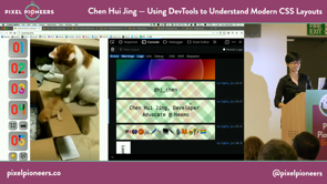
[Music] you hello everyone and this is my first time in Bristol and I've barely been here five days but the city has really grown on me vain and all so really big thank you to Oliver for giving me the opportunity to speak here now I normally use slides in my talk often if it means to supplement the ideas I'm trying to put forth but they will be no slides today instead of using dev tools to illustrate the point that I'm trying to make and how this talk even came about is rather accidental to be honest so basically what happened is that about late last year a colleague of mine good friend fellow modes of the text Iike Alex was giving a talk about dev tools and a meet up and he was like hey do you want to come and I was like yeah and then but do you want to give a talk and I was like no but eventually what happened was we served on him seeding all the CSS E bits to me while he talked about the JavaScript stuff and because there was no time I built a web page and talked through dev tools using that and an end of it Alex was like hey you know that make a pretty interesting talk and so here we are now I learned a lot of cool things about dev tools from Alex and one of the things that stood out to me was that the dev tools console can totally be styled up using CSS but just like support of CSS on actual web pages kind of differs between browsers this is also the case for CSS support in the browser console so case in point this is a really fancy CSS only top title in my console and let's see how it looks like in Chrome it's it's all right I guess and this is what it looks like in Safari it's like mm-hmm so I don't know I think it looks way better in Firefox so it's just such perfect yeah so my name is Eugene schoolís my name is Roy doing I'm a developer advocate we're next mall next mole is a communications API for messaging voice authentication and recently videos and this multiple of us in the audience so come have a chat I also have a lot sticker stickers are your thing you can come get some from me I'm also an avid lover of emojis and those pretty much some of what I am as a person if you're curious about any one of them come ask me about that later as well and finally just to prove a point I'm like just to prove that Firefox really does support the most CSS properties it's the only one that does writing vertical so it's like vertical writing in your console I love it now when I started building stuff on the web I quickly realized that aligning stuff horizontally was way more straightforward than doing it vertically and I started thinking about why that was for historically web technology started out from text document beginnings and a lot of the initial HTML tags and CSS properties were focused around text formatting for languages that were mainly laid up horizontally from top to bottom languages like English and French boxes on the web behaved very similarly but ever since designers and developers realized that the web could be used for more than just academic paper style layouts they've been complaining about how hard it is to do layout on the web and I don't blame them because for a very long time it was hard to layout anything resembling those gorgeous designs that our print counterparts could achieve on posters in magazines than the like but I do think that things are changing for the better so when I refer to more than CSS layouts I'm talking about layouts that are built with flexbox with great with the box alignment properties because conceptually these are properties that were crafted especially for doing layout on the web and they're different from the prior techniques we've used to have like HTML tables for layout or even loads because these were more clever uses of properties that was whose intended purpose was not layout to begin with but resourceful developers like yourselves spun plenty of workarounds and hacks to work with whatever features were available at the time and these days we have a much more robust all set for doing layouts on the web so the first thing that I want to cover today is content-based sizing and I'm going to apologize in advance to the people sitting in the back this is as much as it can zoom I'll be mostly talking about dev tools so I'll try to talk over whatever it is I'm showing so sorry to the people at the back so the concept of automatic sizing has always existed because browsers have always managed to figure out how much space content should take up without any intervention from us content would just reflow without overlapping really good default feature but what we have in a very reefs in a relatively recent CSS specification known as intrinsic and extrinsic sizing is that it we now have the option we as authors of webpages have the option of assigning automatic widths to the elements on our page so the width and height sizing properties now can take in three additional keywords which are min content max content and fit content so in this first set of items here they're sized with min content and it is the smallest size that a box could take that doesn't need to overflow so if you have inline content they will break into multiple lines now line breaking is a lot more complicated than what most people give it credit for because there is a lot of nuance involved depending on the language that you're using one thing to note is that browsers will not break words right so in the first set it's English again I'm going to read it out this is an English sentence and the longest word here is content and the browser will treat the word content with the full stop at the end as a single unbreakable entity and that's what ends up being the width of this first box but for languages like Chinese or Japanese and this is a string of Chinese characters the line line breaks occur per character so you end up with a width that is 1m because Chinese Han characters are square characters and every character is displayed within a box now East Asian scripts also use something called full width punctuation so if I add a comma right here then the box becomes two M's instead of one so that's for Chinese but then you also have certain South East Asian scripts like thigh and I don't not sure if anybody beats thigh in the audience but if I bring your attention to this second line of content it's exactly the same content as the first except it's sized with something called Max content and Max content is a box's ideal size on a given axis when it has infinite amount of space so if there is no limit on the amount of space it can take up the content will just take up as much space as its required to lay out the entire line without breaking so if you notice at this thigh sentence again sorry to those at the back thigh is a language that is written without spaces between words so if you don't read by I guess you wouldn't know whether this is a word a sentence of phrase for the browser des browsers pretty smart so the longest word in this thigh sentence is actually the second word to Capri oak and that ends up being the width of the box and that's how it works now thick content which is the third key word is unfortunately an unsupported value at the moment so come down here and what you can see in the dev tools it will kindly tell you oh hey invalid property value but that's fine it's alright rich content is not a fixed value like the previous two key words it is a range and in this arrange between the main content value and the Max content size or the length percentage defined in the function that was a mouthful so it makes more sense if if I explain it now all the but even though it's not recognized as a width it's it works if you put it in a grid that in context so this is this is relevant so right now what we have here is three three sets of content three different languages the content within the second and third are exactly the same exactly the same Chinese characters in all three and you can see we've gone through mini content so that's why it looks like this we understand what max content is what content is is a range so let's make this smaller I'm gonna resize this so as it goes as it shrinks it's gonna hit the main content width so it matches the 1st and 3rd match that's the minimum width milk content but as it grows as this more space it grows grows grows but it stops it doesn't reach its max content width because of the 300 that we've put inside we've because of this 300 we put inside fit content so that is the cap so the browser is going to take the smaller of the value max content or the cap so if I change the cap to something longer say 500 and then I grow the browser some more it grows and this length of content is not 500 pixels and neither is this this is about 400 ish but the browser's not going to expand to 500 because if that is the smaller of the value so that's the point I'm trying to make it's really tiny you can't see I'm going to trust me trust me when I say it's 462 pixels wide so that's how the content works so the next part that I want to cover is is flexbox like slots or it's known as the layout model where nobody knows the exact size of anything so but hopefully I can help shed some light on this apparent mystery and right now Firefox is the only browser with a flex box inspector so that's why I think that Firefox really shines in this regard especially if you are using flexbox in a lot of your work so how we can toggle it there are several ways to toggle this so if you're in the inspector you can see there's this tag and you can click on it to toggle the overlay what's helpful is that also it tells you what flex actually does it's a recent development so that's kind of fun you could also go to at the rules panel there's this odd there's this like two square icon thing I mean designing icons as heart so you can toggle it from there as well one more place is the layouts panel from Firefox where you can just click on this big old toggle thing and what this flexbox inspector does is yes it gives you an outline of each of your Flex items and if you've got any free space this is a bit of a texture here to tell you that the Flex containers that big this free space if you look at the layout bit it'll tell you the Flex direction here it says roll it'll tell you the rep status here it's just no rep but more importantly it tells you what the browser does to your Flex items when you apply a display flex on the parent container and I'll explain this in more detail in the upcoming examples one thing to note when we use flexbox is that the specification recommends that we use keywords for the Flex items because they cover the most common use cases and these keywords are initial which is actually the default value if you applied a display flex on a parent container and nothing else on the children the browser recognizes it as flex initial then you also got none which makes your Flex items completely inflexible you've got Auto and you can put in a single positive integer and this will be resolved to flex grow now I say resolved because the browser understands numbers so when we put in a keyword value the browser does some things to it and we can actually see how the browser resolves these English words into numbers by going to the computer tab and you can activate browser stars because these are things that we've been explicitly write the browser did it oh boy no no come on seriously I'm sorry if you can't see at the back very exciting things happen there's a spinning beach ball of death I'm gonna give it five seconds other and then I'm gonna restart my computer I'm sorry - nope nope this is this has happened oh man I should have restarted my browser be like and oh alright oh this is looking good good what do you what do you reckon yeah ok John applause please oh sorry thank you thank you so I'll buy you a drink later like thanks for saving so where was I ok um thanks items right so I'm just going to toggle this back on please don't give me another spinning beach ball of death otherwise we'll have something to say with to the IT department where I work um so anyways back to this so it seems that the sizing of Flex items depends on a number of factors there's like the amount of free space available this the amount of content within the Flex item and the starting width of the Flex item the exact algorithm to calculate the size of an item there has been sort of tweaked with by the browser it's a bit complicated but it is outlined in the specification if you're interested now I think things get a bit clearer in terms of understanding how flex works once we all get a better understanding of what Flex basis actually is so if I put a fixed value of a hundred pixels as a flex basis value on a flex item it's not surprising that some people are going to expect well my my I put 100 pixels there the item ought to be a hundred pixels but that's because we're very used to having control over our sizing instructions not so much when we start using something like flex box flex basis is actually the starting point from which the size of the item is being calculated so the key idea is it's the starting point because if your flex item is allowed to grow or shrink odds are your ending final size is not going to be a hundred pixels so now let's move on to the second example still working yes so I have two sets of items here they have three flex items each so the first two items got exactly the same content the first item has the word word in it very meta the second one is says this is a sentence and the third one is some other random content so just to have a contrast there's more content in in the second set now both of these have display flex on the parent and nothing else on the children which means that the Flex items are all flex initial that resolve to the values of zero one and auto to have a flex grow value of zero means that the items not going to grow even though this infinite amount of space so if I go up to here there's all this extra space the items are like no I'm good where I am not gonna grow there but there is a flex value of shrink which is set to one so all of the Flex items are going to start shrinking at the same rate the moment there isn't enough free space so to explain the situation of why even though there's exactly the same content in the first and second if there is not enough free space just now we were at this point you'll notice that oh hey this is a sentence is distributed differently for the first and the second and why that is is because of the impact of having a lot of content in the third so the moment I hit this particular point there's not enough space both this is the sentence and the really long line is going to start shrinking so that's why by the time we get to this point this is a sentence on the second set has already done a considerable amount of shrinking but the one of the first time now I'm fine I don't need to shrink at all so that's the reason why these two even though it's exactly the same content different size now a flex basis of auto again a reminder I let's see I had a yeah this is sort of like a legend so flex initial resolves to a flex cure factor zero shrink one and the base this is Otto so when there is a flex basis of Otto and the width of reflex items I'm going to go back over what is this the width of the makes Luis great we have a fantastic IT department just singing you know so if we go back to these flex items I'm not set and explicit with if you look at the rules it's just a simple border there's no sizing involved so which means that the width of my items are auto the Flex basis is also auto so in this scenario what the browser is going to do is say okay Flex basis will be content and what content is is that it is an automatic with that's determined by the content that's contained within your Flex item so we can see this if we go to the Layout tab so this is really really useful you select the box and it tells you the content size which is in this case I'm gonna media as 211 I'm just gonna ignore the decimal points so I'm gonna highlight this one and we can see okay it's it's nine hundred and thirty-four that is the actual content size but because there isn't enough space I've shrunk it so at this point the dev tools is going to tell you that oh we did something we did something to your item we shrunk it it says the item was set to shrink and it shrank by three hundred and forty eight pixels that is why you have an ending size of about 586 the moment that I saw these numbers it started to make sense to me so that's Auto but now there's sort of a hierarchy of what the starting size should be so when I come to this this particular I've highlighted this particular box and I'm going to give it an explicit width of say 200 pixels in that case the starting size now becomes 200 pixels so then the browser starts calculating from 200 I haven't even so because the Flex grow for this specific use case is zero the ending size does end up to be 200 so there is a case for this but when there so with and but if there's also a flex basis so now I'm going to do a flex basis of so 0 1 let's set the flex flex basis to 300 pixels oh oh sorry so this means that the Flex basis is 300 and now the Flex basis is it trumps it Trump's the width so if you go back to the Flex inspector it tells you now that the starting size is 300 so that's the sort of hierarchy of starting sizes now if I like do some more browser resizing because clearly this is what we do in our day jobs resize the browser now if I could if I start drinking again first and second I'm gonna start shrinking the moment there isn't enough space it will continue to shrink continue to shrink until it hits its minimum content and then everyone else starts to shrink but the point here is that at the end of the day min content will end up being the same because the content in the first and the second sets of items are exactly the same now for the next example down here I want to cover the difference between having a Flex basis of auto and a Flex basis of zero so again two sets of items this time they have exactly the same content the content matches top in bottom now both the items are allowed to grow in strength as compared to the first one you didn't we didn't allow them to grow this one it's allowed to grow so it's like shrink is kept to one to make things easier to observe but these three flex items have different growth factors so for the first one I've set it to 4 grow factor of 1 the second one is a growth factor of 2 and the last one like non growth factors 0 the only difference is that this first set has a flex basis of auto second one flex basis of 0 and you can see distinctly different end results so the available free space in the first set of content is actually the total width of the container at this point it's it's this total width minus the widths of the content within all three items so if you can see my cursor this bit here and this bit there that's all the free space that it is because the content widths are not considered free space so we go to the Layout tab I'm gonna highlight this it'll tell you that okay there was a lot of free space the item was set to grow how much growth you ask a hundred and thirteen pixels and if I compare this with its adjacent item which was set to grow at a growth rate of two the browser also yes indeed I have grown it twice by two hundred and twenty six the numbers actually do match up but keep in mind that it's the amount of growth that was allocated so if you look at the content on the page itself you'll notice that this first item is not half of the second item it's not like it's not as if the second item is twice the width of the first if you did want a tsunami if you didn't want an end effect of that what you have to do is to have a flex basis of zero and this makes sense if we look examine it so the second set does have a flex basis of zero now if we look back at the inspector it's going to tell you content size is zero because we said it we like ignore the content so the amount of free space in this second scenario becomes the total width of the container - this bit at the end because this content size still has to be respected so that amount of free space that the browser can now give out to the items that are set to grow is all of this all of this is free space that can grow so if we look it says the flexibility was set to grow like all of it so its final size is three hundred and fifty six and if we look at the second one it's seven hundred and twelve so that is really exactly twice so if this is a particular sort of end result that you need from your Flex items you'd want to use a flex basis of zero I think that's the difference and if we understand and this it stops being so confusing because a lot of times I think we set it all so anyway like it's not double I don't understand why I made it grow twice so that's that's pretty much the reason why and next but next bit is going to be aligning flex icons now aligning being able to align items I think is a big plus with the newer CSS layout properties and and these are defined in the box alignment properties and the Flex box inspector does allow us to visualize the free space in which your Flex items can maneuver around so I'm going to go back here and toggle the overlay so you can see outlines of your Flex items and all the free space that you get to play with box alignment properties were actually meant to be used across layout models meaning block flexgrid all these formatting models but for now they can only be used with Flex and grid now my trick for remembering which properties apply to which axis is that my brain associates the word justify with you know text editing software we see week software's and they've got these four icons at the top that let you align text justified text left center right so in my brain it's like as long as it's the direction that text flows that's justified and because we only have two options the other word is a line naturally it means the opposite which is like the vertical so that's the trick that I use to remember you don't know if it helps you when using flexbox there are a total of six box alignment properties but only four are available for flex box justify items and justify self you don't actually do anything if you put them on a on a flex formatting context a kind of a nifty new feature i'm using firefox nightly so maybe that's why I had a spinning beach ball of death I don't know please don't sue me but if we set like a justified items value which is not valid right and it's really blur but there's this eye icon and if you hover over it the browser's got five boxes dev tools is gonna explain to you why it's not working so that that's that's relatively new so if you've got a copy of nightly we can give it a try it's on by default nightly so anyway justified runs it doesn't work what does work is justify content so justified content letters adjust flex items along the main axis so if I search this the center switch this to end these are positional keywords that allow us to move all the Flex children along the main axis but you've also got a set of key words that start with space and these are distribution keywords so you can see that what they do is distribute the free space between the Flex items now these these flex items they are stretched by default to the full height of the Flex line so let's say I have let's say the content the container sorry is much higher so say like 19 vh it's still stretched but the moment I apply a value of like a line items say maybe start the items revert back to that their original with that's how they're supposed to look like they're supposed to be sized but then you get nice annoying little gaps here that you may not want in your layout so what we could do is we can pack these lines together with a line content so if I do like end it's gonna squish all your lines back together this is free space that's fine you can sort of centralized it as well what is one of the more interesting values for a line items though is this value called baseline so I'm just gonna get rid of these so it looks clearer so without baseline without baseline you'll see that the content within my Flex items is solved like it's madness it's pretty hard to read if you had a design whereby you the text in your Flex items to be related maybe it could be a sentence this is kind of hard to read so if you trigger baseline what it does is it aligns the text within each of your differently sized flex items along a line so if that was a design scenario you had in mind this particular value might be helpful now we if we move on to some real-world use cases for Flex this is actually my favorite use case which is Auto margins Ottomans are your friend so unlike the current implementation in block formating context using machine at margin Auto will actually Center your item right smack in the middle of your container don't have to worry about anything else because what it does in a flex formatting context is equal amount of space on the top and the bottom equal amount of space on the left and the right so even if I had multiple items let me just duplicate boxee box here duplicate in this case you and if I highlight it if you'll see that it is again equal amounts of space for that particular item top bottom left and right so if you only had one item inside your Flex container and you needed it's centered instead of using the box alignment properties you could just slap on a margin Auto on the item and call it a day one thing to note is that if free space has already been distributed to Auto margins if you apply alignment properties on top of that they're not going to have an effect because all the margins have already been the margins have already stolen all the free space left after flexing and a relatively common use case for these auto margins is this navigation bar where you sometimes have one lonely end link that's supposed to be over on the other side of your navigation bar what we could do make use of auto margins we set a margin or left of auto ticket to the side and you can also take advantage of the box alignment properties to get everything Center aligned which is something that has been quite tricky in the past but now it's gotten much better and last year's case is for cotton based layouts because they are also popular these days the point I want to make here is that feel free to change the Flex direction when necessary because yes the default is role which is solve horizontal in most cases but if you can see here if I said it the Flex direction to column I get the advantage of being able to push this and this is so so common then I'm it's a bit low but you'll see that you have a card and then there's some random call-to-action in the bottom and you need the call-to-action kiss the bottom of your card when you've got content that's not the same height what you could do is you can just make your main content grow so once I do a flex of one the call-to-action just gets pushed to the bottom so it's like an two line sort of solution for this very common use case it is very basic because there's going to be an use case where you have call to actions of varying heights and that's why you need to pay a lot of attention when Rachel covers her toe on subgrade in the afternoon because subgrade is the perfect solution for that particular use case I'm running out of time so I'm going to move on to something called flexible sizing just out of curiosity as anybody actually used great a plate with grid knows what it does that's brilliant that's great but well no not you're just starting out with grid or if you're already even using it in production Firefox still has one of them still has the best grid inspector at the moment and again there are multiple ways you can toggle the overlay I might start speaking a bit faster so I apologize em so what we can do now is you can still do this toggle it from the inspector you can do it from the rules click on this nice little waffle icon which is much better than the Flex box icon you can go to the layout panel where you can select the grid of your choice that you want to see the overlay for recently Firefox start supporting oh hey multiple grid overlays which is great if you're using multiple grits on the same page like me or if you're doing Nesta and grits and you want to check alignment that's actually very useful you can actually change the color of the overlay I think the defaults look pretty so that's fine and you have options you can extend gridlines or not it's not very clear I apologize but all these tools are very useful if you're using grid for like the whole page layer or even just components that you want lined up but they're far away from each other so that's the grid inspector but the point I want what I want to cover here is specifically on flexible sizing so we're gonna do a comparison of what these different flexible sizing units can do so previously we've always used relative units like percentages or even the relative the newer viewport units but the limitations with those units is that they make your elements change size at the same rate so I'm gonna show you an example of this so this is sized using percentages so the image is 65% the main content is 35% the problem with this sort of this sort of sizing is that it works best but at this point maybe and maybe around from here to here it's kind of okay but the moment you get more give it more space like oh my god the cats too big or if you go very small like ah and like that's too small or no it's out of the page so you what we end up as developers or designers is that you end up inviting a lot of media queries to cater for this because this constant same rate of change I feel is very limiting but what's interesting about the newer CSS properties is that you can have variable rates of change so grid introduces this thing called an fr unit which is a fraction of free space available we also have a min/max function when we use the grid format in context it's again it's a range value which is really fun together with other intrinsic sizing values that we've covered earlier like fit content and then we've got the age-old Auto this whole set of sizing units gives us the ability to have variable rates of change so again there's gonna be a lot of browser resizing coming up so this is like your day job at a conference I'm sorry so ever versus auto right so let's this is a legend so you don't get confused showers in green and auto is in blue so whenever there's any extra space at all fr is the greediest size value you'll take all of it they'll absorb all of it so if you see when they're combined together fr and auto or fr always takes most of the space that's fine if there is no fr size column presence Auto is like fine I'll take the free space I'll grow forth to all available space I'll take it but if ever is present I'll be fine fr you do your thing those he'll stay in they'll stay in their own lane but when there isn't enough space because all this even though everyone gets all the space when there's a lot of it it's also the first to get space taken away from it right so when there's not enough space the F our column is gonna shrink first it's not only going to shrink it's going to shrink until there's nothing left it will shrink till the minimum content size but you'll notice that Auto keeps it keeps the max content with for as long as it possibly can I'm referring to example 3 right now in the third one do you like boxers keeps its with all the way until all the space has been taken away from fr before it starts shrinking of course at the end of the day all of them end up with min content but there is a difference in the behavior when they're interacting with each other and the next set I want to compare is actually fit content with min contents of fit content is the orange bit min content is the yellow bit both of these sizing values let's say they behave similarly and that they are both arranged and they arranged with a maximum and a minimum limit so min max will take in two arguments the first one is the minimum size you allow it to shrink to while the second argument is the maximum size allow it to grow too then it can maneuver within this space you've given it when there is an inner space fr takes everything so that's pretty obvious in the first one but if you look at blue and orange which is Auto and fit content you'll notice that the moment fr gets all its space taken away Auto and fit content boom they behave similarly they shrink and the same way they hit the minimum size at the same rate but when there's lots of space Otto if we look at the second one Otto will take up the free space so now let's move on to the second example this is now a min content and Otto and then a fit content so without fr present Otto takes over that absorption of free space that's fine it also gives up all the free space and the moment it hits its max content and actually stops drinking it doesn't shrink anymore what what happens is that the yellow bit the yellow column starts shrinking so it will shrink it will continue to shrink for a while but then you notice at some middle ground everyone starts shrinking again now exactly what this point is I can't really tell you but this is because they are coordinating themselves all three of these columns they're coordinating coordinating themselves to reach the minimum size at the same time so if we continue to shrink we now know that the yellow column minimum size is 200 for the blue and the orange it's the main content size so they will all shrink and hit the minimum size at the same time and conversely when space is given to it the blue so look at the blue one the blue column will grow together with the yellow column because they're spaced both of them aren't growing having a good time the moment it hits its max content they stop the blue the blue column stops growing and let's and says hey min max column go ahead do your thing until you reach your maximum size before it takes over again so I think this particular behavior it's a new right and no we'd haven't really got our heads around to that this is a thing but I think what it does is that it gives us a lot more options for say editorial design that adapts better to a wider range of viewport sizes so I've got a very basic example here it could be a header for a feature article for example and these are two different examples they look very similar at a large viewport but if I shrink it you'll start to notice the same problem it's the cat for the first one we're like at a smaller viewport in Saturn the image is too small the text looks funky but if I use and let's just close this this this this one which is sized with the variable sizing units it performs much better at the extreme viewports and I've not had to do media queries for this it just behaves as it is one good thing about grid this also allows us to do overlap very very easily with positioning values so this is just something to consider especially if you're doing editorial style design and your designers are complaining that the designs are so boring yeah I know you've got options now you've got options to be creative at very different viewport size us and I've ran out of time because I restart my computer so I'm just gonna wrap up by saying that I'm really really excited for all of this to become mainstream and to have more designers and developers start considering these possibilities in their designs so if any of you are still a bit on the fence like I don't want to use flexbox I don't want to use bit no just a real thank you very much [Applause] you =