What’s New In CSS 2021
You'd better be so excited for what's coming new in 2021! I want every single one of these CSS features, some of them are available now via plugins or PostCSS or polyfills.
But some of them they're just too hard to recreate with any sort of JavaScript or CSS preprocessor, and so we have to wait for the native implementation and it just kills me how some of this stuff looks so fun and takes so long to get into the browser.
But there's exciting news on this horizon because I have 31 different features I'm going to tell you about today.
We're going to go through them rapid fire because I don't have enough time to really dive into each of these as much as they need, but what I have done is sort of organized them from really high, risky items, into items that are quite stable.
And the idea here is that we can start in the beginning of this talk with things that are just fragments of an imagination, and maybe they've been written down into a document so that it can be like better just, you know, shared with other people.
But we'll end with things that are quite stable and are things that other speakers at this event might even be talking about because they're that available, but still new.
Here is the exciting Table of Contents of the 31 features.
Go ahead and take note: how many these do you know? How many of these do you not know? Some of these I barely know, and the only reason I'm going to sound like I know anything about them is because I made these slides.
So let's dive into each of these.
They're really exciting, and I want to start with the high risk-y ones - rad styles that might not ever make it into CSS.
Yeah, but just because it's risky doesn't mean that we don't want to learn about it or think it's interesting.
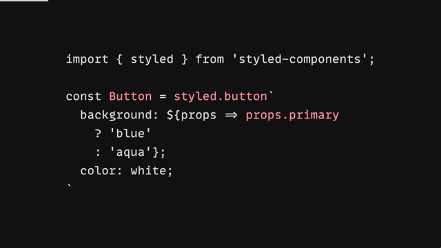
So let's dive into our first rad style, our risky style called Conditional Values.
Now this is a proposal by Lea Verou.
You should definitely go follow her if you are interested in CSS at all, she's kind of amazing at all of it.
And she has an unofficial draft that you can go read.
So this kind of makes this proposal a little bit more solid than just a proof of an idea, which is kind of nice.
Now the key here is it's Conditional Values.
These are like the ability to put a little mini media query inline where you put a value.
So normally a media query, which is a conditional, is this concept where you sort of like: "If this is true, here's a bunch of rules and selectors to go through." What this is saying is, "If this is true, if 100 viewport width is greater than 500 pixels, then I want my flex flow to be a row.
Otherwise I want it to be a column." Now that's really, really cool.
We've just saved a whole bunch of typing by allowing this inline JavaScript-style ternary, conditional to be put right into our CSS.
Let's look at another example.
So here we have a multiple background example where you can essentially in JavaScript or in CSS, you can make multiple backgrounds very easily with just a comma.
And what this is showing is that we can return multiple layers depending on some conditions.
So if the variable - so we have our 'if' statement here - "If our variable raised is true, here's a linear gradient to put in this space, and then here's a second color." So we have multiple backgrounds being presented conditionally based on some custom properties.
Hopefully that looks really interesting because I think it is.
And then here's our last example.
We set our - set this custom property here, and then we nest three different 'if' functions here to see: whichever one is going to be true will return a value.
So, since it's "small", will be returning "2em" - both of these will return nothing.
Right? Okay.
So that's our experimental exploration number one called Conditional Values.
And let's look at our next one.
This is called the Switch.
Now a switch and a conditional are kind of similar.
They both have this concept of a condition that needs to get met, right? So here's our available inline size.
This is our condition.
And if that's true, we're going to put in this set of columns, right? So we're looking at grid template columns.
If the width of this container is above 1024 pixels, here's a sort of nice layout that has a nice wide center.
So we're kind of going to distribute our space there.
Otherwise we're going to use this two column layout and our default here - which is what always comes with the switch - is 1fr.
Now this does introduce two interesting things.
We have the Switch function, which we've kind of gone over at a high level, but this magical value here, this available inline size.
Now this Switch proposal was initially created for the problem of container queries.
It wanted to help people make decisions based on their parent size, and so that's why available inline size here is a keyword.
This Switch proposal was essentially presenting new keywords that could represent values that were unchangeable by the user, but that could be used intelligently to change layout.
This is the Switch proposal, check it out from Brian Kardell.
It had some links and some steam.
I'm curious if this ever goes somewhere one day, I'd be excited about it.
It's pretty neat.
Now let's talk about some Relative Units.
Now, relative units probably don't sound very new.
We have em and rem, so let's actually start with em so here: more things like em right, more things like em and we have border- radius.
This is 2 line-height, and this is cap-height.
Now, em and rem they're relative because they are specific to a context of a font size.
Like the font is bringing the ability for this relative unit to even become a length.
So with em you could have one em in three different places and it actually equals three different lengths.
So what we're showing here is that CSS is giving us more of these we're getting line-height and cap-height as the available, as a unit for us to use as a length.
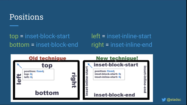
Now let's look at logical viewport units.
Now, these are interesting because we have viewport width and we have viewport height.
We have vw and vh.
Now it's getting really popular with logical properties - and make sure to catch Elad Shechter's presentation, I know it's going to be awesome on logical properties - that these are logical equivalents of those viewport units.
So viewport units are relative.
They can change.
They're not absolute, right? If your status bar goes up and down or other things change the view port, like your iframe gets changed, your viewport height will change.
And so this is allowing you to use the same concept of toggling and reacting to a viewport size, but using the inline and block syntax.
So we have 10 viewport inline, and 25 viewport block.
So it's like 25% of the viewport block direction.
So kind of cool stuff there.
And we have some that are "more like rem" (.more-like-rem ) And this is "root line height".
So just how we got 2 line-height here, and we have 2em somewhere, we can now have 2 root line height, which would reference the root font size and the line height that was set there.
Super interesting stuff.
Here is Houdini Layout.
Oh, and by the way, there's no support for these right now.
They're spec'd and stable and some browser will implement them and then we can use them.
But for now, they're not really very usable.
Let's talk about Houdini.
So the problem that Houdini wants to fix is: we're sending a lot of JavaScript over the wire to do really cool and interesting layouts and special effects with paint.
Anyway, the idea here is that JavaScript is always on the main thread and it's always sort of crowding this memory space for getting all this work done, and it's always late to the party, so if it's trying to follow scroll, if it's trying to do something like that, it's getting to the event after everything's already changed.
Houdini brings your logic and your interesting layout, your interesting paint idea, your interesting animation, and they bring it into the engine.
They will take your logic and run it alongside the other engine logic, treating you like a native layout mechanism.
So that's what Houdini Layout is.
It's your ability to sort of receive a number of child items.
Your function and JavaScript will receive all the DOM nodes and then it's on your function to return their position in placement.
This allows JavaScript and the browser to sort of unite and learn a new trick that can be performed at the browser level.
So it's really fast, really performant and will always be there on time and saving, you know, performance.
So we have Houdini Masonry, and the way that you would use these from CSS as CSS developers, you and I is, we would say: 'layout masonry'.
So it has this new layout function.
And then, this is the name of the layout function that was registered in JavaScript.
and this would get called for every one of these classes that got matched and it needs to return a new layout.
And this gets really intense, but that's its intent here is to help us make custom layouts that are built naturally and natively alongside the browser instead of bolted on.
So here's another example with Packery.
You can go find some of these.
There are - this works in Chromium and behind some flags and you can go try out the masonry and packery layouts, or even make your own layouts.
This is experimental and you can try it so, kind of interesting.
Houdini Layout.
Let's talk about scope.
So this is @scope.
This is the whole reason that folks use BEM or CSS modules and all these different tools is because we need to manage scope.
Everything in CSS is global - as I'm sure Mark Dalgleish will remind us all - that everything in CSS is global.
So how do we grab a hold of them? Here is a native CSS strategy called @scope.
And so here's a technique that we might do today: we'd have a card and in order to sort of protect our scope, we'll use BEM and we'll say, "card header".
This is fine.
But in the future, in this scope proposal, we could say, "@scope card, here's my header." So this is the intent that's coming from here is this card header is trying to just scope it to that one item, but this is still sort of global.
This is not.
This is scoped to card.
This header style will only be applied if it is inside of a card.
And what gets even cooler here is you can extend this beyond to having a, well here, I'll scroll over again and we'll get both of these examples up.
You can say a "from" and a "to".
Now that lets you essentially say the start and the end of the scope of something, and this is according to your tree, so you could specify how many layers deep into the tree that this style even goes.
And I think that's really interesting, especially if you want to sort of like scope themes.
So our themes would compete less in the DOM because well, if we're not in the light-theme scope, then we don't have to worry about this anchor selector, this color plum affecting color purple.
They've been scoped appropriately, so they don't stomp each other as much.
I think that's just really interesting.
This is a proposal by Miriam Suzanne, who you will hear present about - I don't think she presents about scope today, but she's presenting about tons of other things that I'm only going to mildly mention in here, but follow her on Twitter, you'll find all these proposals.
They're really well done and really well spec'd out.
You can go learn more about @scope.
And that is it for our super high risk styles which means we can move on to rad moderately risky styles.
Hmm.
I wonder what's in here.
Oh, but you know, don't worry, there's nothing exciting happening in the moderately risky items, especially not container queries.
Oh, wait, those are available.
You can try those out on Chromium Canary right now.
Look, here's the demo we recorded just a few days before this, this is super exciting stuff.
There's a lot of really powerful things it can do.
It's being actively developed, it's being actively spec'd, there are folks all over this trying to bring this to CSS now.
I put it in the moderate area because you can test it and it's getting so much love and attention that I don't think it's as risky as some of the other items that we've talked about already.
So let's talk a little bit about how it works.
So it has an interesting requirement that the container to be queried here - so that's why I've given it that name - needs to have the contain property on it.
And we're going to talk about contain a little bit later, but when "contain" is applied, it gives the browser the ability to know with surety that this is not going to affect all the other layouts on the page and it sort of can treat it very specifically.
And with that specific sort of containment concept here, it allows us now to query the inline size of our nearest element that has contain set on it.
So the child item here gets to say, "if I'm inside of my nearest container that has contain set, if the inline size is less than 240 pixels, then I want to change my flex direction to a row." That's it at its conceptual - it's conceptual simplicity is - a parent has said, "I contain things" and a child says, "My nearest container, I need to query the size of you so that I can make a smart decision." And it will find it and then allow you to query on it.
So if you think that this should be different or you have any ideas there, the spec is still in active development, but look at some of these more cool demos.
I love this one, seeing how each of these is adapting to the amount of space that they're given is really, really cool.
That's not something that a media query would have made very easy.
Let's also look at this example here.
So we're saying, "@container, the inline size is less than 20 characters, we want to apply this style." So it's going to look to see - maybe it's a card container or card component.
And this image is looking to see if its container is too small.
And if so, I want a box of an image, right? This is pretty typical.
You can kind of squeeze down and you get a circular image.
Anyway, I thought that was a fun example.
Then here's one that I just threw in here for funsies, because it's using nesting and nesting we'll talk about as well in a little bit, but what we have here is we have a section, let's say this section is inside of like an article.
And it can say, "Well, uh, I'm going to nest.
If my parent article has an inline size of less than 60 characters, then go ahead and..." you know? So this section will become this: "&...make my padding inline one character." So we're giving this conditional that brings in the context of this parent selector into this and allows us to, keep our container queries in with our elements themselves.
And I just think that's super awesome.
So again, there's, I think there's a whole talk on that today.
It's going to be awesome.
Miriam, you kick butt, keep kicking butt, and I'll be watching your talk.
Let's move on.
I don't have enough time to dive into these deeper.
Okay.
Let's talk about Leading Trim.
Now this isn't leading trim.
This doesn't have to do with leading directly, but it does have something to do with it sort of indirectly and we'll get there real quick.
So just like this image shows, what we're trying to do here is chop off the excess in a text box on the web.
Now the web has always rendered itself as a safe layout mechanism.
It always opts into showing every part of a character and every part of text, as much as it can.
And that's - some people don't like that, but honestly, I think it's what's kept it alive for so long as everything's always legible by default.
Now that means that if we have a letter box that's like this, our letter inside is like that, right? Our letter "a" is sort of inside of a safe box, right? There's a safe box and that box is safe in case we have something like a "g" that needs to go down really far and that descender can go down to the bottom of the box.
Now, if we look closely right here, we can see that is getting trimmed off.
Our descender is going down below and look, our ascender right here even kind of extends a little bit above.
Now that's important because we want that.
What we want to do is trim directly to the sort of cap height here, and then we'll manage our spacing ourselves, whether or not that means we're gonna use padding or leading we have options.
And it means that we've shrink-wrapped our text, which is not something that's very easy to do today.
Often people will use leading, or not leading, but line height 0.9 or 1.0 or something to try to shrink the letter box to fit.
But it's never perfect and results in these awkward solutions.
And so what Leading Trim will let us do is trim that off, which then unlocks things like baseline alignment grids, and all the sort of things that we've loved from traditional typography and baseline alignment we can do it in the web here.
And just a couple more examples.
Now the proposal in spec has been mostly managed here by fantasai, at least from what I know.
And there's a draft you can go read and a nice little article that talks about more about leading trim.
All right, I'm going to burn on through to the next one.
This is Houdini Paint.
Houdini paints! We talked about Houdini Layout, which was the ability to teach a new display property to the browser and run alongside of it.
Well, now we're teaching it new ways to paint so we can paint new backgrounds on images, new border images, all sorts of stuff because of Houdini Paint.
What we do is we bring in a JavaScript file, that's again like a Houdini one, which is a worklet.
I don't think I mentioned that earlier, but these are worklets, which means they sort of run in a sandbox environment.
They're not like a JavaScript module, even though they are just JavaScript, but this is important that they're worklets because they run off the main thread and that's going to be alongside the browsers natural processes.
So, what I've demonstrated here is, I've created a Houdini static gradient that essentially emulates a lot of the syntax of a linear gradient, but paints these squares along the canvas.
And this is made possible because when you call my paint function here - so you specify in your background that you want to do paint - so this is just the layout Houdini worklet where we said, "display layout," and then we passed in the name of a specific layout.
This one is passing in the name of a paint function, and that paint function takes a direction, a color and a size, and it will return a gradient for you.
Super cool.
Let's check out a powdered gradient example.
So there's two different ways to call these.
One way is through custom properties, so we have this gradient direction, gradient color, and gradient size.
These three properties will be available for this function to access when it goes to draw.
The other way to do this is through functional parameters.
You might think of an linear gradient where you pass every parameter with comma separators.
So here, we're calling paint.
We're going to pass it the name of what we want to paint, the direction, the color, and the size, right? All of them can be passed in line.
Each of these strategies has a specific thing that they're better at the functional arguments here versus the custom properties argument here.
They each have different things that can be nice, like these can be nice to animate, but these can be nice here.
Because they can - you can make individual ones - I could write three different powdered gradients here as a multiple background image because they're not all sharing the same three custom properties, they each get their own individual arguments.
So kinda fun to think about how to formulate and create your own custom paint jobs for the web and what sort of parameters and options you want to pass.
It's all on you.
We get to make whatever we want and it runs alongside the browser in a much more native way.
It's very cool stuff.
Here's a really cool example I shared in another video.
I just love how geometric and organic and random.
I just love these things that sort of are really hard for the web to do because they're dynamic and robust.
But with something like this, we don't have to send images over the wire.
We could use a Houdini Paint worklet and paint unique backgrounds per page load, and I just think that's really exciting.
We're just making this so much more alive and we're bringing more of the user's presence to the table and I just like this idea of unique experiences.
So anyway, I just loved the math dot random function too, being able to use that in background was really fun.
In this ..link too, there is a really nice draft you can go read.
The Houdini Paint API is polyfillable.
And if you go to Houdini.how, which is where this link will take you, you can go see these examples, how to use them and how to put them in your projects today.
That's why they're moderately risky is - you can use these as a nice upgrade path, the browser support for the paint API is pretty good, getting better.
And that's that for Houdini Paint.
Let's talk about @scroll-timeline.
Scroll-timeline: the problem here - so we're deploying a lot of JavaScript that follows the scroll position of something else in order to keep something else in sync.
It's like scroll syncing and scroll triggering, essentially orchestrating relationships between two different elements with scroll.
Now, scroll-timeline seeks to remedy all of the JavaScript solutions by providing a CSS and JavaScript API to creating scroll linked animations.
What I show here is a slash that's rotating with the scroll position.
So I showed there - my mouse was changing the scroll, but now I'm using touch to change the scroll.
I've used a scroll snap point view here to get that.
And then what I do is I link the scroll position of that scroll snapping space to the rotation of this slash, and as the speed and the velocity and all the natural things that come from your gesture against the scroll, they're translated directly into the timeline of another animation.
So let's look at how that works.
The first thing that we can do is we can check for support really easy.
We do that by looking to see, "Hey, do you know what the animation timeline property is? Do you accept a random value?" And if it says, "Hey, I know what this syntax means", that means you're good to go to write a timeline.
So let's check this out.
Here is our first scroll timeline.
We're going to use the bare minimum kind of properties here so that I can explain this as fast as possible, but we're going to create a new @scroll-timeline called scroll-fade, and we're going to give it a time range of four seconds.
So it's almost like "how long is this timeline...
do you want it to feel? And there's a relationship with four seconds here that's in the spec that I think you should go read if you're interested in what that means.
So now we make, we make a keyframe animation, so we need to animate something.
So the timeline is different than the animation.
The animation that I want to do here is I want to fade in and out the opacity based on scroll position of something.
And I want to fade in to opacity 1 and back to opacity 0.
I want to reveal something as they scroll down the page.
So I'm going to make a keyframe that points to opacity 1.
And I will link that with the scroll-timeline, so that as someone scrolls that will gradually become opacity 1.
And I do that here on this nav, and here I'll even pull this over so we can see the demo on the right.
See how as I'm at the top, it's opacity 0, and as I start scrolling down, it fades in.
We set opacity 0 as the default., we declare that there's an animation on this element, it's called fade-in.
We want to fade-in this to opacity 1 or the time of one second.
And we want to do this linear, in terms of easing, and bi-directionally so we want to go in and out.
- we want to be able to crossfade both directions.
And then here's the cool kicker.
We say the animation timeline - we're changing the timeline.
This is no longer going to animate just based on the screen refresh rate.
This is going to animate based on the scroll-fade timeline, which is going to go look at the length of scroll of that scroll-targeted area, which is the body in this case, that's the default, and as the body is scrolled, it will tick through an animation.
So if you think like, an animation is usually a timeline like this, right? There's a start and a whole set of items and an end, and maybe even some keyframes that are in here.
What we've done is we've set - the scroll position of the window is that timeline, we have a top and a bottom of the scroll.
And then as you go through that, that is what is being played through as the playhead in an animation.
So it's really cool stuff.
I find this to be some of the most exciting stuff in demos that I've built all use scroll-timeline, especially in usage with scroll snap points and grid.
- there's just a match made in heaven there.
And I just really love the way to orchestrate this relationship between elements.
It's in the moderately risky area because the browser support is behind flags, but there are polyfills and I just, I just love it.
It's so much fun.
So check out these different links if you want to learn some more.
Let's move on to.
Spelling & Grammar.
So in the browser, you can set spellcheck and contenteditable on an element.
And so contenteditable makes it so that, you know, Command+B will bold items and you can delete characters, and it treats text as if you're in a text area and spellcheck says, "Hey, while they're editing that text, would you underline items as they're incorrectly spelled?" and this totally works today.
So there's nothing new about this, but what is new is this pseudo selector - that little squiggly that shows up when you mess up a word, right? Like right here, that's drawn by the browser, and we have no access in CSS to be able to style that.
Well, that's what we want to change with this spec and proposal, is that if there is a spelling error or a grammar error, can I set that to my brand color? If I'm an app that is a text editing app, can I build into this my own custom presentation tier for these items? And this is going to enable that.
Kind of cool - Spelling & Grammar.
Here's a grammar example: I can make a neon wavy underline instead of what you get for default grammar-error.
And spelling- error I can do whatever I want also.
So kind of cool.
Let's check out :target-within.
Target-within is piggybacking on the idea of :focus-within.
So if you think about target, where your ID of your element is matching the hash of the URL bar, this is saying that "a child of mine is matching the URL bar" and that gives it the opportunity to update its display style based on that, and there's a lot of different use cases, but essentially this one is in a spec and it's just waiting for some implementation because it's very straightforward and it's piggybacking on kind of already paved paths.
So I'm gonna skip over :target-within.
I believe this one is Lea Verou's also - I should've put her her name right here but anyway, it's kind of a cool one and will allow you to do some more robust layouts and modifications based on the target property.
Let's talk about nesting.
This is one of my favorites.
I use nest - I've been using nesting for a couple of years through PostCSS plugins.
And the draft was written by Tab Atkins almost five or six years ago, but it is solidifying now and it's being considered for prototyping in various browsers.
So we will have native nesting sometime soon, so exciting.
Okay, so here's how it works.
I find it to be a little bit more rigid than what you would get in Sass or Stylus, but it is far simpler to understand.
And I hope to help show that to you by telling you just one or two things that it does, and even though there are only a few things it can reach very far Alright, we have a selector here called article and its color is dark gray.
And if we have a nested anchor, we want to color its link color.
So now what the "&" here is doing is not necessarily the same way that we used "&" in Sass.
This is very much a wild card that it represents the parent context in totality.
So it's very similar to what you had before, but it's much more literal.
Anytime you use "&", it is as if this is here in this place.
So we're saying "article, direct descendant, a." So let's look at another example.
We have a code > pre here and it's saying "@media hover".
So if this browser can hover items, then I want to add a hover selector to this context.
So: code, direct descendant: pre:hover we're essentially just taking this entire context and sticking it right here.
And that's the essentials of what's happening.
Now, there's one exception, which is here: @nest, and that's why I've written this demo next to it.
So if we look at this, it's almost the exact same nesting example, we have a "code" and a "pre", we're looking to see if the condition has the ability, if the browser has the ability to hover, and if we do, we want to nest a style, right? So now we're going to use the nest "@" property, and what this lets us do is be a little bit more explicit that we're nesting.
So the "&" symbol needs to be at the beginning.
If you use an @nest it allows you to put "&" anywhere in the next selector.
So this allows you to do something like, well, we'll see it over here: where we can use...
essentially like a parent selector.
So we have an article here and we're going to say,"@nest, section, colon, focus-within, direct descendant, article." So we've taken this and we've actually transferred it right over here to the end of another selector.
We've essentially wrote "@nest", started a brand new selector that's got all sorts of new stuff in it, and then gone, boop, here's the context of where we're nesting right in there, and we can say "color: hotpink;".
This is very much like the ability to reach into a parent in the context of a child, and I use it in some really fun ways.
And here is my last example with nesting: This is a "main" that's - the padding set is to var space small - but we're going to nest a media query and we're going to tuck our "&" up into here so that it looks a little bit more slim in terms of our nesting strategies.
So we're going to say a"@ media, if the width is greater than 540 (and we're going to go into some more of these really cool media queries here in just a second), if the width is greater than 540, then main has some padding of space large.
So this main gets transferred right here into "&", but if we do this kind of - I've been doing this to sort of tuck it in and just let me get straight forward.
I'm only changing one property.
So this is kind of like a strategy I use when I want to be really minimal.
I stole it from JavaScript.
It's the same thing I'll do there where I kind of like tuck things in with curlies and parentheses into one line.
Anyway, that's my strategy.
I really like it.
This draft is super exciting and I can't wait to use it more in native and to see it in dev tools, it's going to be amazing.
All right, let's talk about Cascade Layers.
So this is also known as @layer, and what's really important about this and the problem space is - you have so many different styles coming in from your page, and sometimes they're at the top.
Sometimes they're at the bottom.
Sometimes you own the style.
Sometimes the style is coming from somewhere else.
Sometimes the style came from npm.
Sometimes you bundled.
Sometimes you didn't bundle.
There's just so many origins.
So many types - first party, third party, all these styles are coming in and they essentially append or they prepend or JavaScript loaded more styles and stuck them here , and they stuck them there and took them over here.
There's all these places to stick styles and no great way to orchestrate all of it, or at least to articulate areas for these things that are coming in asynchronously to go into.
So that's essentially how I see this, as the problem space: this is a place for me to name various layers of my CSS style stack.
And then say, "You, style, go here.
This group of styles goes here", and that allows me as the style orchestrator to be very explicit about the waterfall of styles that happen.
And when I import things, I can put them into the right spot, like my resets and stuff will always go at the top.
My third-party styles and stuff will always go with the top underneath the resets.
And then all my user styles can start to pile in underneath, and I can name these things.
They're almost like a symlink where you can stick styles.
And so let me just briefly cover that.
So here's declaring a layer called reset and passing some styles in there.
Now later, any other style sheet that is aware of the concept of a layer called reset can add more styles to it at some other time.
It can be loaded 10 seconds later, but the styles can be added into the layer called reset and essentially create this workflow as if it was there the whole time, and the browser will read it and go redraw and make sure that the specificity and the origin and the flow is all correct.
There let's look at another example, you can set these layers on import, so we can import a file and then say: "It goes to this layer here." We'll import a file, "It goes to this layer." Super cool.
Here's some more examples.
So we're just creating layers, creating layers, and then we can load one and send it to a layer.
It's just really, really neat stuff.
Another example: @layer creating three in a row.
Another one: one we're appending there.
So it's kinda like this one was three in a line, and this was all in one line.
So kind of different ways to do the same thing here, very CSS friendly.
We have @layer framework themes.
So look at this one, it's namespace.
We have framework.theme, and now we can explicitly put paragraph styles into the framework theme layer.
That's just so cool.
And then another way to sort of visualize that here is layer framework, layer theme.
So cool.
Cascade Layers is a spec and it's quite stable and I think it's getting some implementation interest, so we will see cascade layers coming in soon as well.
Can you believe all of the stuff that's almost here? It's just amazing! Okay so.
Foldables.
These are in the moderate risk because there's a polyfill and the CSS styles are available behind flags, and so you can go prototype with a lot of stuff and dev tools is even ready for it.
That's kind of what I showcase here is we've got the surface duo setup here with the split down the center.
So this is as if this is folded in half and you've opened it.
And I was able to use CSS over here.
So see: (screen spanning: single-fold-vertical) So I'm saying, "If the screen is spanning and there's a single fold in the center, I'm adjusting my grid template." And look at that.
I made it so that we have a section over here.
This is - this side is over here on the left and then the main body scrolling area is over here on the right.
And I was able to use CSS Grid, a media query, and the Foldables API and the spanning to easily handle that use case.
And it was kind of fun and cool.
I'm really excited about it.
The way that a lot of it works is you get this access to the environment variables.
So the fold width, there's a few.
Here's fold-left.
So you can use these environment variables as a template column, and here it is even as a gap.
Look, so I'm only using a gap.
The gap is an environment fold width - if there's no fold, there's no gap, but if there is a fold, there's a gap.
That's just really neat stuff.
We've got an example here with the media query "spanning." So we have @media, spanning, this is how we know we're in the foldables and then we're using the keyword to see what kind of fold we're getting.
This is a single fold in the vertical space, and we can set some new styles here or use, you know, a set of flex basis that's the size of the fold left.
So it's something we can use too on that aside.
So really interesting stuff with Foldables.
I'm excited as more devices become foldable.
I would like a foldable device in my pocket.
That just sounds really nice.
And I'd love it to CSS could just intelligently stick items in different - of the different quadrants.
That is just so cool.
Color Level 5.
I could do a whole talk on this one.
This one's going to be so hard to be quick.
All right.
So what I have here is an image that's showing - the browser is picking a color dynamically based on background.
So I'm changing the background color in dev tools here.
I'm just dropping the - it looks like lightness in hsl and as I change it, the browser's picking a dynamic color based on a Color Level 5 function called color contrast.
And it's just so cool.
All right.
So Color Level 5 though is more risky than Color Level 4.
We're going to talk about Color Level 4 today, too.
So let me just kind of re-cover what is going on in here.
So we have a new function in Color Level 5.
Color Level 5 is mostly about mixing and allowing you to sort of grab the reins on color spaces and do a lot of more reaching into deeper color spaces and deeper color manipulation.
There's just a lot more to color than we think there is.
We have so many displays these days, and so many displays are high definition.
We need access to these colors and we need a good way to manage all these colors, cause it's getting hard.
So we have this 'color-mix' function, right? Mix red and white, we can get pink.
We can specify a hex color, which is, I think pretty much the primary use case here is: a designer has handed you a hex for the brand of the site, and you need to go mix a text color and another text color and all these like ancillary colors.
And now you can just use "color-mix".
There's also "color-adjust", which we'll get to in a second, but look, I'm just mixing the brand and I'm saying I want 25% of this brand to remain after I mix with black, so it should be a nice dark text color.
Same here.
This one's just a little less dark, so still more in the brand here.
It's like you're saying, "How much of this do I want to keep?" And you can go read the spec to see how color mix works.
There's all sorts of cool stuff in there.
Let's look at "color-contrast".
So this is the one I was talking about earlier.
You essentially pass in a color that you want to contrast against (and this is why the vs is here), and then you specify which colors should be compared against that base, and it will pick the one that is the highest contrast.
We're talking right now about how to make the color contrast function a little bit more robust.
But it's intent is you shouldn't be doing so much manual calculation of your contrast.
You should be creating accessible interfaces and letting CSS look at all your colors and find the most meaningful one that meets a criteria.
So we'll talk about that more later over the next couple of years, I'm sure.
That's going to be a really, really cool function.
Here's another good use case here is I've just, I get to throw...
so, text on a background.
So here's my brand background blue, and then I could say, "Well, here's all my different custom properties I made.
Hey CSS, which one contrasts the most with that?" You know, like, "Pick it.
Cause I don't, I don't really care.
What I care about is legibility.
So CSS, would you do that with the color contrast function?" That's in Color Level 5.
Here's the "color-adjust" function.
So this one should look more familiar to Sass users where you're just sort of saying, "Here's a brand color and I want you to adjust the lightness negative 50% or adjust the lightness negative - or plus 50%." And so we have all these different keywords that should look really familiar for adjusting your color.
Then we have "relative-color." And so this is a syntax that I like to think of a lot like - ES6 is de-structuring, where we can take a color, like here's our hex, and we say, "From that hex, we're going to break out the three channels: lightness chroma and, hue." And if you notice here in the lightness, I've actually set it to 75%.
If I used the letter L like we see here, then it would just take the lightness that it found here and place it here.
But in this case, I've set it to something absolute I've said, no, I want 75% lightness to remain, but the rest of the chroma in here to come through on that color.
And then what you can also do is after you de-structure (so this is like setting something absolute) - I essentially obliterated the lightness that came from the color and set it to something new.
But what's interesting here is I'm doing a calculation on it.
So I'm taking the chroma and I'm subtracting 20% all inline, so I'm saying, "From this color, give me those channels.
Let me perform calculations on those channels and I'll return them to you as a color value to use as a relative change." And it's really, really cool.
I love that one.
There's a lot of really neat stuff to do inside of the relative-color syntax.
And here is Safari.
You can use this in Safari Tech Preview 122, and look: we have the "color-mix" function and we have the "color-contrast" function.
We also have LCH and we'll get into Color Level 4 stuff in a bit.
If you are interested in that, go check out the draft.
There's all sorts of activity happening in colors, and it makes me really happy.
Let's talk about Masonry.
This is native Masonry.
I can see an example here.
I have it pulled up in Firefox.
Firefox is the browser that can currently do this and you can see as I'm changing here, I'm going to change some column sizes and look - Masonry updated it, just like it always would.
And it's just so neat that that's getting built into it.
And that's getting built in on top of grid, and so we can look at the styles here.
So we're going to say, "Display grid." We're going to set the grid template columns to repeat for 1fr, so we've set four even columns, but I want the grid template rows to be masonry.
And look at that, just a few lines of code and we have a masonry layout that's pretty matching - it matches a lot of what gets used in the industry today.
Here's another example, this is an inline masonry grid.
This one also has a masonry-auto-flow: next; We can go read the spec about what that means more.
And we have another grid here - this is inline-grid, but right to left.
And I think that's important that the grid spec here is not just going to work in one language mode, it's going to work in all of them and it must.
And then here's a kind of cool little shorthand, so we've got a repeat for 2em with the / masonry.
So our columns are four 2ems, but our rows are masonry.
So that's going to be what pulls them up and kind of makes them do that shrink wrap effect that we saw in our example over here, right? The shrink wrap effect, see - they kind of pull upwards into that space there.
Super cool! Native masonry coming.
There's a draft.
Go check it out, try it out in Firefox, build some demos, have some fun, it's awesome stuff.
Here's Media Queries Level 5.
There's a couple of features in here that I want to call out.
They're just, I just use them all the time and I'm currently using them with the PostCSS plugin, but you could probably use these in other ways as well, and here is the syntax.
I just think this reads so much easier.
If the width is less than or equal to 320 pixels, do this.
Right? It's essentially like, "Is this a tiny iPhone?" Then here's some styles for it.
But normally what we'd have to write here is "max width is 320", and I don't think "max width 320" - it just doesn't read the same as "min width is less than or equal to 320".
So I just like the way that this reads, I think it's so nice.
You'll find this in all sorts of my style sheets.
Now, this is also cool.
This is called "custom-media", and this is in Media Queries Level 5.
There's no current implentations of this, but essentially it lets you just stash a media query into a named property.
And then you can use that named property, just like this: @media ( --motionOK) { Let's do a transition.
And I think that makes a lot of sense.
So at the top of your file, you can sort of name a bunch of common media queries and use them natively throughout your CSS.
Preprocessors have been letting you do this forever, but this is something that would allow native CSS to do it, right? Pretty common theme that you'll see, preprocessor features making their way into CSS, I think is pretty healthy.
Here's a nesting example.
All right.
So I've got a card and I'm nesting my cool named custom property media query, and I'm using nesting to easily add that transition.
And I just love how all these things come together.
I have so much fun writing these little fake pseudo-codes and this one here, so we have a range being specified in media Queries Level 5.
We have 1024 pixels - if the width is less than 1024, but greater than 320, apply these styles.
And I just think that it just reads really nice that clamp and that constraint is exactly how my mind thinks about it.
So here's the link to the spec.
Here's the link to browser support.
Browser support isn't great, but since we have preprocessors and plugins that help us, you can start using the syntax today.
And I think that's really important, that makes it less risky, I think.
Okay.
That was it for all of the moderately risky items.
I can't believe that we made it through them and let's check out the rad styles that are low risk, so what are things that are even more available and even more tangible for you to take home, let's check them out.
So even though these are low risk, some of them might still require "@" supports, they might require a polyfill to get it across all browsers, and a lot of these don't work in IE11.
So yeah, take that with a grain of salt.
To me that still means low risk and an upgrade path, but it's on you to decide how risky it is.
These are my opinions, so I hope I represent these accurately, but let's look at the first one.
This is Color Level 4.
Now there's all sorts of goodies in here, and what I've shown as this first example is - here's a really nice gradient in sRGB.
This is the way that you write colors today.
Whether this is with the RGB function, hsl function, et cetera.
You're picking colors from a color space about this big.
Let's just say, it's this big, it's about as big as my head.
Let's say that that's RGB and that's where you've been picking colors all this time.
In Color Level 4, they introduce a couple of new ways to choose colors, which also unveil a new color space that's bigger.
So imagine you were picking colors from here and now you have a syntax that allows you to pick from colors that are much larger, and that's what you see on the right.
I've used LCH to create the same gradient or something similar, but that's reaching into those additional colors that are outside of the range that sRGB can do, and it turns out they're way brighter and way nicer, and look at the difference in our gradient.
We have a much more vibrant and smoother gradient over here than this one, which looks kind of greyed-out and dull.
It's kinda surprising that we're even excited about the gradients that we get from sRGB cause look at the ones in LCH, they are so nice.
Okay.
So that was just a teaser.
We'll get into a little bit more of that in a second, but let's start out with some of the things we've got in Color Level 4 that are stable, and you can use today, which is "hex-with'alpha." Look at this: we have a hex color here that's 0f0, and then 8 is the alpha.
So this is a longer hex value that includes alpha information at the very end of it.
So, kind of cool.
That's usable in pretty much all browsers today.
We've also got functional notation and this is very stable as well.
And this is the notation where we used to say hsl and hsla or rgb and rgba, but with the functional notation, we've gotten rid of all the commas.
So notice there's no commas here and we've also gotten into this slash scenario.
So if we want to add alpha to a color, we don't have to change our function name.
We can just add a slash and pass in - that will pass in there.
And notice it takes a percentage or it takes a decimal point, and so this is kind of cool.
We've essentially gotten rid of commas, gotten rid of hand managing and juggling two different function types.
We have one function less to write, and more ability, and this is usable pretty much everywhere.
I love the functional notation.
You'll see it in all this stuff I make.
I'm a big fan.
Now let's get into lab and LCH.
These are new ways to talk about color.
These are relative color and they're perceptual color spaces.
I know that's a lot to hear and it is a lot to take in, but they are very powerful, very meaningful.
And I'm really excited about them coming into the spec here.
Not only just because I can pick more vibrant colors than I've ever picked before, but because I can pick something that's based on a human.
So as a UX engineer and someone that really builds things for people, the concept of a perceptual color space is important to me.
RGB is a math color space.
It's even shaped like a math shape.
Whereas the perceptual ones are not, they are oriented towards people and what people can see and the way that we perceive colors.
So they're formatted and they're structured, so that accessing colors is going to end up being more human centric.
It's very cool stuff.
Go study more if you want.
But the syntax that we get is something like this.
So I call this "ux-gray" because we're looking at lightness, chroma hue.
The lightness is at 50%, it's the middle, and I have no chroma, no hue, so I'm gonna get a 50% gray, but I'm getting a ux 50% gray.
I'm not getting 50% gray in RGB's interpretation that.
I'm getting what a bunch of scientists have decided was very middle gray for humans.
I think that's really cool.
And so I'm calling that "ux-gray", and then I've got a "rad-pink" here, and the reason I write rad pink is because while I had the lightness at 50%, the chroma is at 200.
I've actually turned this up past what might even be available, because if a display can, it will make those pixels even brighter, it will turn up the intensity on them in order to represent a chroma that is as intense as you're requesting.
So the concept of like even having a new color space, that's this big, it's sort of potentially even bigger, because you're asking for - you're requesting a color from a point over here and whether or not it can do it, it will give it to you.
So it's a request for a color in a very brighter, deeper space and its CSS, so you can always provide nice fallbacks, but I love this option of relative color as opposed to absolute color.
It's very, it just comes in handy for all sorts of cool things.
So then here's "rad-pink" and this is in lab as opposed to LCH.
LCH is very close to hsl.
Lab is a little bit different, but has some cool powers, and here's another lab color as well.
Notice that we can go into the negative of lab.
So lab goes positive and negative in these two.
Anyway, there's all sorts of syntax to learn inside of there, we'll get into it later, but here is an example from a color picker in Photoshop.
So notice I picked - well here, it's about to restart.
So I picked a really hot pink in hsl and RGB - notice it's like the peak of what I can do, but I switched to the lab color picker and look at this brighter pink! Look at all those more pinks I have access to, and look at the difference.
Which pink would you like to be the most vibrant on your site? The lab pink.
So I think that's really interesting to look at how these color spaces are allowing you to pick the most vibrant colors from their display.
Here's a screenshot from the dev tools in Safari, where they've allowed you to look at...
this is a "display-p3" - so we're going to talk about the "color" function in just a second - but what I like about this visual is they're showing you the cutoff of sRGB, and then they're showing you, "Right so here's the cutoff, all of these colors are all the new ones you get." These are also all the colors you currently can't use, and you have no access to it.
Honestly, look at them.
They're the most bright and vibrant colors on that display.
So it's kind of a bummer, but it's also really fun, because Color Level 4, this is getting stable.
We're getting these abilities now, and it's going to be only better as we continue to reach into these colors that are in these displays that we're putting our apps and our sites on.
We want to tap into that brightness into that vibrance.
This is how you're going to do it.
And the last thing here to talk about is this "color" function.
So notice it's "color" and you pass in the type of syntax that you want to use as the first parameter.
And what this color function allows you to do is reference all these other colors, so that you can make sRGB, you can make lab, it can do "display-p3", it could do LCH, but the fact that you're able to pass a string here, or like an identifier means that you could create your own color profiles or your own color spaces, and access color from them using your own custom syntax.
That's why it's there.
It's very cool.
And there are use cases for this, especially.
So anyway, that's ColorLevel 4.
I probably spent too much time on it.
I'm going to burn on through to HD Color.
HD Color is this concept of, "Can this display do a high definition color, like HDR color?" Like you've probably bought a display.
It's millions of colors and you're like, "All right, whatever, that's high dynamic range." And what they want you to essentially do is not know how dynamic this display is, because that would be a fingerprinting vector for a site to track users.
What they want to do is just indicate whether or not it's high or low, and then you can know if you can access the colors in that deeper range.
So essentially it's a very generic way for you to know if the display can or can't without knowing any specifics about the display, because that would be a way for you to track users.
So, "If this display can show high dynamic range colors, then use this super dynamic neon glow color from "display-p3", which is essentially reaching into the peak of both of these channels and pulling out the brightest bits.
Kind of cool.
And you can see that working here in Safari.
So I've got a @media (dynamic-range: high), and I'm passing in a color and you can see the color is valid and being represented.
And then again, just to another display here of- I was using that color in a dynamic range, which means this is a really safe thing for me to do.
I'm using this in sites because Safari will show these dynamic colors and Safari is stable and I'm able to just upgrade my colors, so if you visit a site that I've made with these colors on Safari, you'll be getting a very vibrant color set, and you'll probably think to yourself, "Wow, why are these so bright and vibrant?" It's because I've tapped into the higher quality colors of your display, but none of the other websites on the world are doing it, and it's just, it's just amazing stuff.
So that was HD Color as a media query, and that was following Color Level 4.
It's just so, so much amazing stuff.
Now we have Typed Custom Properties.
This is also called @property, and the idea here and the problem space is: you can make custom properties, but they have no rules.
They're rule-less, and they just can take anything, which makes them hard to animate, it makes them hard to be predictable, and it makes them have no errors and people can't use them and they break silently, et cetera.
What @property lets you do is say, "I'm going to create a new custom property.
I'm going to call it hue, and I'm going to give it a default value.
I'm going to specify whether or not it inherits, and I'm going to tell you what kind of type it is." Now, this is so cool and critical.
Not only do we get error handling and sort of - you can't pass in anything that would break it, you get this ability for the browser engine to know that it's not about to receive any different types of values - it's only going to be getting numbers.
And by that being kind of explicit and set upfront, there's a bunch of interesting browser features that get unlocked.
There's things that we can now interpolate on, or that we can transition that we couldn't before, because they used to be too fuzzy and too unknown, but now we've defined them and we get to unlock some powers.
So what do I mean? Let's look at this keyframes rainbow, and it's saying "to hue: 360", so we're just setting a custom property that's an angle, and it would have been a part of an angle "@" property, and that lets us make this really nice example.
Jay built this, and now we can transition just the hue as it goes through all this, . as it goes through the rainbow,
with just some nice simple keyframes, and we're changing the angle of the hsl hue rotation.
Let's look at this one here.
This is saying, "@property, milliseconds is going to be a number which starts at 0." So then we're going to create a counter - and here I'll just show the little preview over here - create a create a counter that looks at those milliseconds, that custom property, and it says, "We're going to make an animation that runs infinitely every 1 second, and it's going to step100 times in that one second." And so then we're going to call that count function and we're going to go: "to' --milliseconds: 100;" and we can see that that counter is that value of milliseconds is getting incremented by the browser.
One, two, three, four, five, six, seven, eight, nine, ten.
And then that counter is being used as a value in a CSS element, and we can see CSS only having a high quality counter , being built right in there just because we typed a custom property and now it knows how to interpolate it as it's changing.
Really powerful stuff.
There's really cool articles out there that can show you more what that can do.
I just can't spend enough time on it.
Let's talk about Content Visibility.
So.
Content Visibility: have you ever had like something that you hide off screen because it's not needed yet, and you're trying to save memory and RAM and other things on the browser, because maybe you have a whole lot of things competing to layout on this page? Well, Content Visibility allows you to say, "Hey browser, here's a hint.
This item, this section, this DOM node, it's content visibility is: "I'm going to set it to auto", which allows me to then say, "Here's the size that it sort of needs." And what this allows the browser to do is, when it's looking at laying out a really long document, it now no longer needs to layout the whole thing, because you've given it hints about each chunk and each chunk can can kind of say, "Here's my visibility, I'm gonna need this." Anyway, the browser essentially can take these hints and make really smart decisions about its render times, and it can make rendering much faster because you've articulated which items are okay to hide, essentially.
It does have some accessibility implications being worked out, but I don't think that should stop you necessarily because it's in some interesting use cases that you might be hiding, accessible items.
So just be careful with the usage.
Don't say something is invisible if it actually needs to be visible and there's some other roles.
So as with most CSS with great power comes great responsibility, but go check this one out, I think it can really help your page load times.
Now we have aspect-ratio.
There's a talk definitely being given about aspect-ratio and it's going to be awesome.
It's a feature that I feel is very stable.
I've deployed it in production using @supports and just sort of reverting to, you know, a defined width and height, whereas I don't need to do that in the more upgraded version, and the upgraded version, look what it can do here - it can transition between a 1:1 box and a 16:9.
The browser will automatically transition your aspect ratio in Chromium Canary right now, super exciting stuff.
And the way that aspect-ratio works is you define one width or one height, and then you say the aspect ratio and how that should work, and this is the same as saying 1 dash 1 which will make a box, so if the width is 200 and the aspect-ratio is 1,1 the height will be 200.
Now that one's not that exciting of an example, but if you set aspect-ratio to one, like on an image with a square class, you set the width to something relative.
Now you will always be a square, no matter where you are and you're fluid and responsive.
You're a fluid, responsive square, which is something that padding hacks and other things had to do beforehand.
And here's how you can transition it.
So we've got our aspect-ratio to 1:1 we set the transition to aspect-ratio, and then what I was doing in that previous demo is if the orientation switches to landscape and I'm using the nesting selector here to grab my transition it, I set the aspect ratio to 16 by 9, and the browser will interpolate between those over half of a second, and I get a nice animation between my aspect ratios and it's just so cool.
All right, let's talk about :::marker.
Marker is the free dot that you get at the beginning of a list.
It's this.
That is free.
Well, in this case, I've changed them.
So you have an ordered list and those numbers are free, and the marker is essentially the name of the box and the element that gets created here.
It's a pseudo element, and by getting this new marker pseudo class, we can customize these.
And so here's a good example of how I'm doing this.
I'm looking at every li on the page and I'm setting its content to the list item.
So that would be what it's naturally making - is that number or the dot, and then I'm adding this little character after it and it changing its color.
So there's only a certain number of things that you can change on a marker, but I think it's really important that you can change them at all, and you can target them so easily.
And if we look over here, I can look at all the markers and I can also change them to SVG.
So I can start to do some really kind of dynamic and robust things that were really difficult to do before.
Like in order to change a bullet color before I'd have to wrap my bullet in another "div" and sort of hand manage the way that the divs are doing color, and it was very messy.
So now we don't have that and we have the marker pseudo element that we can target, and it's really nice.
That's nice and stable, and I think it makes for a nice upgrade of your bullets.
Let's talk about Conic Gradients.
I'm a huge fan of these.
I think they're a little misunderstood because they can look funny by default.
Like who wants that? I don't think very many people want this gradient design.
I mean, it's cool, but it's kind of too funky.
The syntax, though is really straightforward.
I just made a conic gradient - here's color one, color two.
Color one starts up here in this area and goes all the way around until it hits color two, and that's the way that it draws.
Now, knowing that it works that way, it actually has a lot of super rad potential.
And so what I did here, here's a good example of where you can sort of resolve this hard edge is just pass a third color, deep pink to rebecca purple to deep pink, deep pink to rebecca purple to deep pink again.
So now I've completed the circle and the colors blend very nicely that way.
So let's look at another example here.
And this is where I have found a lot of success with conic gradients - is making them very subtle and beautiful by tucking them into corners, using some of the fun syntaxes available.
So if I got a background conic gradient, I can say, "At bottom left", and that puts the conic gradient starting point right here for the center of all the rotational activity, and I can say, "Deep pink to cyan"; deep pink up here to cyan over here.
Now, the reason that this looks so soft is cyan is very hidden, where all we're seeing is this arc of cyan and pink together, and it makes for this really subtle effect that isn't quite linear.
Like if you look, it's not a straight line, but it's also not circular, it's an arc.
Anyway, I'm mesmerized by the fact that it's just a little bit more organic feeling, and it's not that much CSS.
And so there's, I've built a little inspiration site.
You can go check it out.
It's conic.style and the browser support is getting really good, and the spec is awesome, and I just love Conic Gradients, I'm finding more and more use cases for them every day.
Ok, let's talk about Containment.
Now, this is the thing that unlocked container queries, right? We have an article here.
We specified its - "contained", its content, and this lets the browser make smart decisions about this element.
You're again providing a hint that this is a self-contained element.
Don't worry as much about this and the whole overall page being affected by it.
It's containing its stuff and giving it its own block formatting context - essentially, establish this as a more foundational element, firm it up a little bit.
And that allows us to do some interesting things like create container queries and the container queries are enabled because Containment has blocked this element from affecting everything else on the page, so it kind of prevents the cyclical features or the cyclical errors that were happening in most of the container query proposals.
Containment has unlocked that and can unlock some other things and can kind of be a nice little thing to go experiment with.
Like, for example, if you contain "layout", margin collapsing never escapes the element.
So you could have a margin all around all your elements, essentially recreating gap and put a containment on there, and it would trim off all the margin that was bleeding out of the box.
So if you go read the spec, you'll find that there's some cool little tricks in there like that, and the browser support's pretty good, and it can be a nice little upgrade, right?.
See how I just kind of tuck it at the end here - "contain: size"? It can be a nice way to use it.
All right.
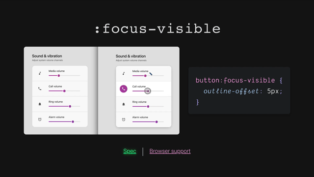
Let's talk about :focus-visible.
So focus visible, if we see over here as I'm interacting with my mouse, I'm getting the outline, and as I'm interacting with my keyboard, I get the outline.
But over here, I'm interacting with my mouse and I'm not getting the outline; interact with my keyboard, and I do get the outline.
And that's the critical difference here is :focus-visible is saying, "Should the focus be visible?" It's a browser heuristic that is intelligent enough to know whether or not you're using your mouse or your keyboard, and so this allows you to more specifically handle focus so you're not just kind of giving focus to everything, 'cause this was a problem.
A lot of designers or developers would remove focus because they'd interact with a button with their mouse, like you see here.
And they're like, "That outline is ugly" and they'd go remove it or something, and then no-one would ever get a focus.
But this :focus-visible lets you target specifically, "If an interaction is spatially relevant or is occurring spatially like as a visual spatial navigation, give them the focus outline." And I think that's really nice.
Also browsers now are shipping with this by default, and that's essentially what you're seeing down here is - I haven't actually changed it.
This is Chrome stable and this is Canary.
Canary, the user agent by default is using :focus-visible now and older Chrome was using focus.
This is also :focus-visible as the default for Firefox and Safari, so we've moved forward into this model where mouse interactions do not create the outline, but keyboard does, and I think it's just really nice.
And you can also opt into using that manually for your own styles with :focus-visible.
Now, we have :focus-within.
:focus-within is similar to :target- within that we talked about earlier, but this is saying, "If a child element has focused..." Like see how I'm interacting with this element? Notice how, even though the thumb is being interacted with the whole area is turning a different color, the box shadow is raising up as we interact with it - watch as we interact...
See? The box shadow shows up and this color icon highlights, color icon highlights.
We have three different elements reacting to a child, nested focus interaction.
I think that is just amazing, and I love the way that I can make a UI feel alive with this.
And you can use it here.
Just colon, focus-within.
It's very powerful, very fun, very great way to animate your interfaces, because while people are interacting with it, you can highlight all the different interactive areas.
All right.
Let's talk about Logical Properties.
I'm going to keep these kind of short because I know Elad is just going to just make this look awesome.
But the idea here is, most of the way that we've been styling on the web before this has been very physical based left, and right.
So it's like me saying, "I want to shake your right hand." But what if I wanted to shake your dominant hand? Then if I'm asking hundreds of people around the world and they don't have a right hand, I'm not making that awkward conversation where I reach out and I don't get it.
I'm asking for a logical hand, your strong hand, your dominant hand.
These are user-specific.
Each user who brings themselves to this table and approaches me is going to have a different intrinsic value for what their dominant hand is, and so what am I essentially doing by asking for a dominant hand is I'm giving up the responsibility of managing left and right.
I'm just saying, "I want to shake your hand on the one that's good to shake." Logical Properties are very, very similar.
If you think about an underline on text, right? This is a bottom underline, but it's only a bottom underline because we're reading Latin text.
This is English, right? We read it from left to right, and the text blocks go from top to bottom.
So while the underline looks like it's on the bottom, if we rotate this text into different language, the underline actually shows up on the left.
It's still under the word, but it's now physically looks like this.
So this is why physical descriptions can get really complex if you're dealing with an international layout because, what top and bottom mean are very firm, and they're very absolute.
Whereas a Logical Property is very contextual, and relevant and relative.
So if I say, "max-inline-size" instead of "'max-width", this 40 characters will work in any international layout, as opposed to width which would have only worked in a Latin layout and I'd have to go manually adjust to something else.
Not only do we get international cross-cultural layouts with only one style definition with Logical Properties, we also get some cool new shorthands.
So if we look over here, we have padding, padding-inline.
This is going to be the same as padding left and right in English, but in a different language, it would be the inline and inline end of that word in how the paragraph flowed.
Same thing with text-align.
We're not saying, "text-align: right;", we're saying, "text-align: end;" Where's the end of [where] your line is writing - that's where we want to align to.
So we got a shorthand freebie here, which is shorthand, short for left and right, essentially.
Bt this one isn't a shorthand, that's just kind of cool that it's there.
And here's another one that's shorthand margin-block, similar to top and bottom, but depends on the way that the document is rendering text.
And here's another good example I like to use, which is button, border-inline.
Have you ever made a button where just the left and right borders are hot orange and then the top and bottom are transparent? And then you have to write all four border sides because you don't have a hot key to get just the left and the right? Well, now you do! You can say,"border-inline, one pixel solid current color", and you get that effect.
It could also say, "border-block" and you'd get a line on the top and the bottom in English for free or in a different language it would be on the top and the bottom, according to that language.
It's just so cool.
I've pretty much fully flipped my mentality over into Logical Properties.
There are a few edges that are still getting worked out, so that's why they're low risk.
I wouldn't say this is worth your full investment, but it is absolutely worth your brain power and your concerted efforts to work towards having a logical property-based layout.
Anyway, Elad, I'm looking forward to your talk there.
Let's talk about 'is' :is()) and 'where' :where() pseudo selectors.
So these are new ways to select things.
You can see it's used here.
It's "is", and then you pass in any number of items inside of the functional, pseudo select your parameters here.
And what it will do is it will find all of these, and then it will expand out into giving them each their first letter; text transforms to uppercase.
So instead of what we would have written before - it would be: "'a:first-letter, h1:first-letter, h2::first-letter...", right? And that would've been a lot of repetition.
We can now group them up together here and then reference a new sort of context for them to be styled, and so not only does this help you stay DRY (don't repeat yourself), but this can help you do some interesting tricks in terms of specificity, you can help you do other things.
And it also turns out that the "is" pseudo selector is essentially what has unlocked CSS nesting.
Now "is" and "where" are pretty much in every single browser, except IE I think, and so it's worth noting that the foundation is there for nesting, and that's just really exciting.
Let's talk about "where" really quick.
So "where" is kind of special - "is" and "where" are special.
"is" will take the first, well, it will take the most expensive specificity item in the list and make that the specificity of the whole selector in general.
Whereas "where" - if you notice here, I've put an ID and an element selector - "where" will nullify all of these and it acts as if everything that's in there is worth zero.
So if you want to zero out specificity and not deal with specificity at all, you can throw it inside of a 'where' and it's kind of cool.
So it allows you to escape specificity in some ways.
Whereas this one is sort of a little bit of a specificity trap in some ways.
I think it can, you gotta be careful with "is".
Anyway, that's "is" and "where".
There's lots of great support and I wish I had more time to talk about it, but I don't.
Let's talk about Data Saver next.
So this is - on your operating system, you've got this ability to say, "I want to be in a data saver mode." Or even in your browser, early Opera had this, where you could browse the internet in a light mode or a data saver mode, and what they would do is constantly try to shave off and compress files for you so that you were only downloading as little as possible to your device.
It's being very respectful to your request for reduced data.
So it was proposed that CSS got this.
We've already got "prefers reduced motion" and "prefers a low contrast", and some of these other kinds of nice preference things that are in your operating system or in your browser.
So how about Data Saver? And the way that it works is very straightforward.
If the user wants to reduce data, we can go grab a smaller image.
So avif is really tiny and we can go grab something that's tinier because they want it, or we can even just draw a linear gradient here or put an SVG.
So we have this opportunity to request fewer expensive elements if the user is in a state of preferring reduced motion, and I'm hoping Kilian goes into some of this too, cause he's got some really great articles and demo examples of how to use this.
For example, we've got prefers-reduced-data over here, "no-preference".
So this user is all in on being able to download expensive stuff.
Well, let's go get that megafile font file and just download it because, well, they must be on some sort of hot network and it's no big deal.
So we'll go get that expensive font and you can sort of do that respectfully by putting it behind a reduced-data media query.
JavaScript also has this ability to look at client hints and sort of check similar features, so you can also do data saver UX from your JavaScript.
Okay.
Let's talk about 'cue' (::cue()) and "cue" is, if you are watching a video with subtitles, you're looking at the "cue" element in work, and that usually has a black background with white text.
Well, the idea with "cue" is: Well, we have an HTML video element, that "cue" element is present in the DOM, but we currently don't have a way to style it, so, how about we use CSS to style it? And this is how we do it.
We can set the color to white and the background color to, look at this, it's like a really dark, transparent black there.
Very typical sort of subtitles text, but what we can also do is, using that functional aspect of this selector we can pass in certain elements that might be present in that "cue", like bold - your subtitles can bold certain words so this allows you to target those bold words in the "cue" and give them special styles.
Super cool stuff.
This has pretty good - I don't think this has great support right now, but since it's so minimal, it's just like a few extra things to CSS -I felt it was low risk and you could go throw that in and eventually all your videos would start to have this branded, closed-captioning experience and that would be really neat.
CSS is just cruising, isn't it? That was 31 items.
I have no idea how much time we're at right now.
It's probably a lot.
I hope that that was worth your time.
I just have a blast learning about all these.
I want every single one of those.
I don't think there's one in this list that I don't want.
And I want to give a shout out to Sass and PostCSS for enabling so many of these things, for inspiring so many of these things, it's just an incredible set of folks that have worked on this and an incredible set of community that just keep these things alive, keep them on fire and just keep them growing.
I mean, CSS wouldn't have 31 features potentially coming out over the next couple of years if it wasn't for folks and the community being so active, and I love it.
So thank you, hover conf.
I had a great time putting these slides together.
You'll find the links.
I appreciate all the time.
I hope you learned something new and I'll see you later.
If you want to hear this stuff hot, follow me on Twitter, take it easy y'all.
Bye.
From risky and may never be in your browser, to stable and just released yesterday; follow Adam as he strolls through proposals, specs and supporting tools for all the this new CSS hotness.