Grids All the Way Down
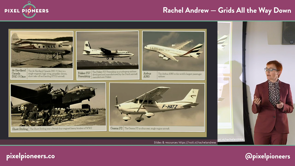
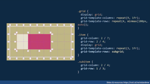
Two years have passed since Grid Layout launched across all major browsers. However, as it was landing and becoming available for us to use in production, work on the spec continued. Due to this work, Level 2 of the Grid Specification contains the most wanted feature as people come to grips with the spec — subgrid.
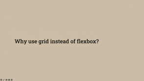
In this talk Rachel will explain what subgrid is, the problems that it will solve for web designers and developers, and the things that it will make possible. She’ll also take a look at some of the other things that are coming to CSS Layout, and how you can get involved in pushing all of these new things forward.