The Future of Web Design Part I: Layout
(upbeat music) - [Instructor] Okay, hello.
Hope you're going to see my slides on the screen. I'm waiting, we see anyway, yeah.
So I've been doing this Web thing for a very long time while we wait to get my slides up here.
Oh, here we go.
I haven't gotten them on my screen, but I've gotten up there.
That'll probably do.
Oh no, there we are.
See, I've been doing this this for quite a long time as I've just been introduced.
I'm kind of not intending to retire until they have specialist old folks homes for web developers.
(laughter) Because then we can all go and sit there and talk about Netscape 4 and it's gonna be brilliant. (laughter) So that's kind of what I'm hoping for.
And until then I'm going to be hanging around doing Web stuff and I'm carrying on kind of talking about this stuff.
And the thing is, I've been doing this for over 20 years really, and last year CSS was actually 20 years old. So I kind of predate CSS in terms of me being a web developer.
And the thing about CSS is that it made it to that age without any real kind of layout system.
And obviously we could do layout, we haven't been just doing things just single column all of this time and mostly that's been by kind of hacking at the way that CSS works.
So the fact that if you have floated things and you give them a size, they'll sit up next to each other. And we can do layout and it's not a very intuitive way of doing lay out. If ever tried to teach somebody from the starting point say, right, this is how you do layout in CSS and teach them floats and so on.
It's not very intuitive.
And so it's not surprising that a lot of us ended up kind of using frameworks and things to do that layout stuff because it seemed very time consuming.
And we'd rather be doing something else than working out percentages and putting them into our style sheets.
And I think we became used to the fact that layout a lot of things on the Web were basically a series of hacks.
That's kind of how things worked.
We just sort of hack at CSS and sometimes we get the effect that we would like. But for the first time we've got a real system for doing layout in CSS.
So then that's been designed so that we can actually do layout in a relatively intuitive way.
And here you probably think about these sort of headline specs that I've been talking about for the last few years, Grid and Flexbox.
We have to remember these sit on top of flow layout, which we've had forever.
The way that element is display on the page in block and flow layout.
We also have things like multi-col which often gets forgotten.
I have to talk about multi-col because I'm one of the editors for the spec, so I need to make sure that people will remember it exists. We shouldn't forget some of the other things that are coming into browsers now.
We've got CSS shapes which is us getting away from everything looking like a little box.
And things that transforms, scroll snapping and even variable funds which are going to be hearing about later.
Now all of these are ways to add delight and interest, real typography and graphic design to our layouts. But these things are held together, they're held together as a system by some crucial key components.
We've got writing modes, which are very hard to talk about without starting to talk about logical properties and values.
We've got alignment.
And now we've moved away from giving everything a size ourselves, whether that's an absolute length in pixels or ems or whatever or whether we're talking about percentages, which really would just resolve to lengths. We're moving away from that to something which is taking it sizing more from the content of items.
Sizing in CSS becomes really important too. And more than ever, we've got ways of providing great experiences to our users no matter what kind of device they're on or the capabilities of those devices.
So also we have media queries, there's a new level of media queries which has got more features in there to help us to tailor the experience to the devices that people have.
And then we have feature queries which allow us to ask the browser what it supports in CSS and give people the right kind of experience depending on support.
Those things really go together.
So it's these kind of behind the scenes players that I want to concentrate on today.
Rather than just looking at Grid or Flexbox and I've got quite a lot of examples of those things. Because learning about new layout isn't really about learning the set of properties and values that are in the Grid spec or the Flexbox spec. It's really about understanding these new concepts that come from the specifications which tie everything together.
If you understand those, then the rest falls into place as will any other new spec that comes along in the future because they're like to built on these building blocks too. So I'm going to start not with Grid or Flexbox, but actually with writing modes.
Now, writing modes obviously about the writing mode of the document.
Kind of at some point we realised that the Web wasn't just all written in English.
And some of those other languages aren't written in horizontal top to bottom mode. They've written in other writing mode and so we've got this specification which deals with writing mode.
And it's a really good place to start when we talk about layout.
Because even if you never ever deal with a language which it isn't sort of horizontal, top to bottom, you're going to be coming up against things that are part of writing modes.
Because our new layout methods care about which way up they are.
So if you have a horizontal, top to bottom writing mode like English or Arabic, it doesn't matter if your text goes left to right or right to left. It's still a horizontal top to bottom writing mode. Then you have an inline dimension which runs horizontally. So the inline dimension is always the plain along which sentences run in your writing mode. And to the block dimension, that is the direction in which our blocks are placed in that writing mode. So in English, they're placed going down the page. And if you were in a vertical writing mode then the inline dimension runs top to bottom because that's the way the text runs, if you're dealing with vertical text.
And the block dimension runs horizontally.
Now you can use writing modes because you want to type something which is in that writing mode.
But you can also use them creatively.
You might want to display text vertically if you want, that's something you might want to do as a creative thing.
But this idea of having inline and blocked dimensions rather than talking about horizontal and vertical is key. All of these slides and things I'll be posting later and this is a demo by Chen Hui Jing on Chinese type a natural demonstration of Chinese type on the Web. So once you start to think about writing modes, then the fact that web design is kind of tied to the physical dimensions of a screen that starts to seem a little bit strange.
And so we have this spec called logical positivism values. So if we have, say a simple Grid Layout here. Now if I want to change that to a vertical writing mode, we've got a width of 500 pixels.
So as we go to our vertical writing mode, use a vertical rl here, the Grid flips, all the items flip, but the width stays 1.the same Because it's a width, it's tied to the physical dimensions of our screen here. So if I change that to inline size, I'd say logical property, now it's the inline size that is 500 pixels, not the width.
Which means that as we change writing modes that inline size stays the same.
So the actual whole thing kind of turns on one side rather than the width staying the same and the items inside switching their writing mode. So all of this is defined in logical properties and values level one. It's essentially just a set of mappings.
It's basically saying, well, if you are talking about width and height, we're going to have inline size and block size. We've got things like margin block start and margin block end.
So always thinking about the start and the block dimension, the start and the inland dimension, rather than having left and right and top and bottom. It's a fairly straightforward spec to read because they are just mappings for things that you already know about, things you're already using in web design.
Browser support for this stuff is getting there at the moment Firefox has the best support and Chrome have recently implemented a whole bunch of these writing modes.
This article I wrote for Smashing Magazine has a bunch of little demos.
At the time of writing, they all worked in Firefox, I think pretty much all of them now work in Chrome as well. So can go through and you can play around with these logical properties and values and see how they work.
And understanding writing modes turns out to be key in understanding alignment.
And because once you realised our layouts are not pinned to the top and left or the bottom and right of the physical screen, but instead of kind of tied to the flow dimensions of the text, then alignment in Grid and Flexbox starts to make a lot more sense.
Because people often telling me they're very confused about whether they should align or whether they should justify when using Grid or Flexbox. It's kind of a question that comes up again and again. So when do you align things and when do you justify them? There's actually rules behind there, so let's have a look. So if you're in Grid Layout and I think that alignment, and a lot of these things a lot easier to understand in Grid and Flexbox because in Grid we always have these two dimensions to work with. We always have block and inline.
So if you have properties that begin with align, then they always work in the block dimension. And if you have properties which begin with justify, then they always work in the inline dimension. And I remember this, because if you think about justifying text, if justify the text, that happens along the line. So justify works in the inline dimension, therefore along the line, along the row.
So we can have a little look at that.
So I'm working with align-self here on my item four that big item.
And if we say align-self start, it moves to the start on the block dimensions, so it's moving up to the top because I'm in English here. So that's what's happening there.
So then we can say align south end and it goes down to the bottom.
Again, it's on the block dimension there and we could centre it, using align-self centre. Then if we wanted to use justify that's going to work on the inline dimension. So sort of along the row there.
So you can say justify self centre and the little box moves into the centre.
We're working within its Grid area here, whatever's been defined as that Grid area.
And we can say justify self start.
If we'd go up to our Grid and change the writing mode, I'm already using inline size here so that I'm not using a width, so draws stay looking the same and we tip it to the side. You can see that those alignment properties still work in the same way.
If we're aligning on the block, it's going to be the block dimension.
It doesn't matter if the thing is tipped on one side. If you're doing any kind of Grid stuff, then using the Firefox Grid inspector, which is what I'm using here, allows you to see the Grid area that that item is being aligned inside.
So if you haven't played with the Firefox Grid inspector and you're doing anything with Grid Layout, grab yourself a copy of Firefox, I would recommend getting Firefox Nightly because they're still working on the Grid inspect, so you get all the fancy new tools if you use Firefox Nightly in development.
So it's really worth doing.
It's worth noting that Mozilla are putting an awful lot of work into tools for designers. Whereas Chrome have kind of gone down the performance tools and that kind of stuff is in Chrome.
Mozilla and Firefox are putting a lot of tools for people who want to do design.
So they've got a really good shapes inspector for CSS shapes, for example.
They've got the Grid tools, they've got Flexbox tools. So if you're actually designing in the browser, then the stuff in Firefox is incredibly useful. So thing is you might be working in a right to left language.
So that doesn't change the writing mode, but it does change direction in which things work. So it won't change anything about the block dimension, but it will change what happens with start and end on the inline dimension because they've now switched. If you're in a right to left writing mode, then you're start on the right rather than the left. So here I'm going to just change my direction to rtl and justify to start starts on the right hand side of the Grid.
Because that is line one if you are in a right to left writing mode. So it's kind of worth knowing that that could happen as well if you switch the direction of your text.
Now there's something else you might want to align and that's actually the Grid tracks.
We've been looking at aligning an item inside it's container and bumping it around, but we've also got align content and justify content.
Which allow you to kind of deal with spare space in your Grid container.
Now you don't often have, I think when you think of a Grid, you tend to think, well, I've created a Grid and I'm filling it with columns and rows and I've got no spare space.
If you do have spare space, in this example, my fr units don't add up to one, so I get some spare space at the side of my container.
Then you can mess around with that and sort of align that using align content and justify content.
So that allows us to deal with the space.
So at the moment, everything's aligned to start because that's the default.
If for say align content and the spare space gets moved to the beginning because all the tracks get moved to the end. Again on the block dimension because we're working with align.
And we can pop the items in the centre of the line content centre.
Justify content works on the inline dimension so we can justify content and place all the items then into the centre and get proper centering both horizontally and vertically if we want or move them to the end.
We can also do that space between that you might know of doing from Flexbox.
The interesting thing with space between and Grid tracks is that space everything out including items which cross over the sort of area that's now been spaced.
So items can get quite a lot bigger than you might expect when you use to sort of space between space around. Because you've obviously got items that span tracks, that's something you need to be aware of when you're using those properties in Grid Layout. And so again Firefox inspect is a good way to see what's going on there. Now, for a long time i worked at a workshops and taught this stuff all day.
I would start with Flexbox because it's been around for longer and then I'd go onto Grid.
And I discovered that everyone was really confused about alignment in Flexbox because actually alignment in Flexbox seems a bit more confusing.
Because we can change the Flex direction.
So we're not just dealing with the writing mode of the document, we're also dealing with the fact that we could change the direction that the items go from row to column.
So in Flex Layout, we think about the main axis and cross axis rather than just thinking about block and inline. So the align properties in Flex Layout work on the cross axis and the justify property, and we only have one justify property in Flexbox that works on the main axis.
The main axis is the one that you've set Flex direction, row or column, that's your main axis.
The cross axis is the other one.
But otherwise, they kind of work in the same way. So here I have got my display Flex working in English, so that means that the items are displayed as a row. So just to find the items, will move them to the end of the row.
And we can use space between and that space is them out. So then we're working in the inline direction. Now if I change my direction to column, that's now my main axis.
So the items are now in a column and justify content works on that axis, on the main axis. But then we could change the writing mode.
So we could change the writing mode to a vertical one vertical rl, so now the column is running that way, it's running horizontally.
But still they justify content property works in exactly the same way.
So if we set it to Flex start, they all move to the start. So that's kind of the extra float that's sort of complexity and Flexbox, but really it works exactly the same way.
If you're justifying, you're doing that on the main axis. And so on the cross axis, we can distribute space if we've got wrapped Flex lines and some extra space to distribute.
And the default is stretch and we can say align content Flex start and that's moving them all on the cross axis to the start and Flex end, just really the same as in Grid. And if we change our writing mode, you should kind of expect, it's just going to tip the whole thing on its side. But again, it's all working in the same way. And finally with our align-self in align items, we can bump items on the cross axis.
So we're kind of moving them into the up and down inside the space that they're in inside the container. And we can move them to Flex start or Flex end and move them around but again, working on the cross axis when we're doing that. And if we change our Flex direction, then the cross axis is going to be the other dimension, but it all works and exactly the same way.
So it's consistent alignment.
It seems a little bit strange when you first look at it, but once you realise actually these things are doing exactly the same thing. Grids and Flex Layout are working in exactly the same way. You just have to remember which way, whether we're using align or justify, but the whole thing works in the same way because we've got a sort of underlying system here. And the block alignment spec where all this stuff now lives. That includes information for doing this alignment in block layout.
So at the moment, if you want to centre to an item both horizontally and vertically, the best way to do that, and really the only way to do that is to turn the thing into a Flex container. You could turn into a Grid container, but kind of a single item Grid is a bit weird. So you turn your, your container into a Flex container and then you can use the align and justify properties to centre to your item, that's fine.
In the future, you should just be able to use those alignment properties on any old box. So you could float something and then have something inside which is aligned, without needing to make it into a Flex container or what have you.
At the moment you can't do that.
It's in the spec.
We're waiting for some browser to actually start shipping code that makes that work. But something we are getting is a part of box alignment, the gap properties.
So in multi-column, we have column-gap and we've had that for years to space out your columns in multi-column column layout.
Grid Layout started out with Grid gap, Grid row gap and Grid column-gap.
They were renamed to row gap, column-gap and gap put into box alignment, which means that we can have them in other layout methods. The layout method that is most interesting about that is the fact that we're going to get that in Flexbox and we actually have a browser implementation of gaps now in Flexbox.
Because Firefox have shipped it.
So with our gaps, if we've got a Flex over wrapped Flex Layout here, which doesn't have any gaps now until we get the gap properties, if you want to create sort of gutters between your Flex items, you have to use margins. Which means you then end it with margins on the outside and you have to use negative margins to get rid of the margin you've got on the outside. And that's another of those hacks that we've had to do in the layout.
And it seems a bit nasty once you're used to working with Grid.
So in Firefox, you can sort of play around with this and you can add some gaps.
So we can have a row gap of 20 pixels and that just kind of works as you'd expect and column-gap will space things out.
And you can also use gap to set both ones just exactly the same as in Grid Layout.
S0 you can try that out in Firefox now and hopefully we will see it in other browsers really soon. As this is a really good example of how specifications are evolving.
So, we have some thing which we've worked out for one spec, this is something we have in Grid and then you think, well hang on, why haven't we got that in Flexbox? And so then the spec evolves and we start to be able to use it in Flexbox. And we're finding these specifications like box alignment, like sizing and kind of gathering up all these useful things which kind of apply to lots of specs.
And putting them there so that we can use them in other layout methods and in things that haven't been invented yet. And the fact that we have these layout methods which behave in consistent ways because of these other specifications, it's why they sort of questioning, should I use Grid or Flexbox.
The answer really as well, try them both and see which works best for the pattern that you're trying to build. They work in very similar ways in one way and very different ways than another.
So you kind of need to work out what's best for what you're trying to build.
No one ever goes around asking me whether they should use font size or colour. We use both and so we can use both good in Flexbox. You can have Grid items which become Flex containers and Flex items which become Grid containers if that's useful.
Just play around with the components you're building and see which works best.
It's all native CSS, the fact it's in two different specs really is irrelevant and it's all going to be working in a fairly consistent way. So you can actually switch between the two. You could have a Flex component with a Grid component that comes after.
And they should all be able to line up with each other, which is really nice.
And really the reason that they will line up with each other, it's stuff to do with sizing.
Sizing is another place where we have sort of consistent themes across layout method. And obviously they're going to behave slightly differently because, for instance, Flexbox is one dimensional and Grid is two.
So, Grid has to look at everything down a track, for example, to work at how big that track is. But they kind of work in consistent ways in terms of when they're working out, how big things are. So something that people often assume they first come to Grid Layout, they think that the fr unit will give you equal width tracks.
Now it only does if your content is pretty much the same. If you have a much bigger item in one of your tracks then what the fr unit is actually doing is sharing out available space.
So we've now got less available space.
And so we don't have three equal with the tracks anymore because actually what we're doing is distributing what's left over to the other items.
Now if you did want to make Grid Layout have exactly equal width tracks, even if that caused some nasty sort of overflow because were then gonna manage that content, you can do that with minmax.
And basically then you're saying these trucks don't have any size themselves. And then the max is going to be one fr.
So if there's small amount of content, you'll get your sort of three equal width, but if one of them is going to break out of the box, it will just break out of the box.
Because you've said, well, I want this to be equal no matter what's inside. Now we have similar things with Flex Layout, if Flex Layout works slightly differently because the whole idea of Flex Layout is, hey, I've got a bunch of stuff, please display it in a reasonable way.
But we have some sort of similar things going on here. And in a Flex Layout, if you say, Flex grow, Flex shrink one and auto for the sizing, again, with distributing available space.
What's left over after I've laid out the items. If you instead make your Flex space is zero, you get equal weights items because you're saying this item has no actual width to start with.
And don't look at its content, start from nothing, and then distribute the space.
So kind of understanding this sort of sizing is really important.
We've also got some interesting key words which expose the underlying sizing stuff that's going on. So I've got an example here.
Again, if three tracks in a Grid Layout.
Now we have this keyword called min content. And what min content will do, if you set a track to be min content, it will try and get as small as it possibly can do. So it will shrink right down and everything will wrap if it can.
So it basically become as big as the longest word if you've got text in there.
And that's min content.
We've got the opposite, we've got max content. So if min content makes your track as small as it possibly can be, then max content is going to do the opposite. It's going to become as big as it can, but no bigger. So it's going to stretch out and take up as much space as it can.
But obviously that could cause an overflow because it's not going to rap anymore, so that's why that's not the default way we lay things out on the Web because we try to avoid having overflows.
There's also a keyword called fit content in which you pass in a value.
And what fit content does, it act like max content. So it'll try and unravel and get as big as it can do. It'll hit that value you've passed in and at that point it will start wrapping.
Content on the Web, kind of does this sort of fit content sizing by default. By looking at what space is left over and then fitting into it, but this is a way you can control it.
Those content based keywords work everywhere the Grid Layout work.
So you can actually use those.
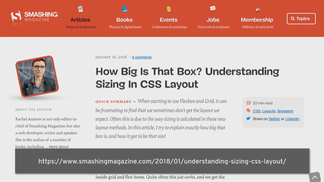
They're very useful for creating Flexible components. I've been talking and writing quite a lot about sizing. I think sizing is very, very important.
Understanding how big things are in your designs. Now we're not just giving everything a length. So this article kind of digs into some of that sizing in CSS layout.
And I think the sort of clever squishy sizing we've got with Flexbox and Grid, they kind of lead into this idea of not needing so many media queries. And something I'm seeing of people jumping through extraordinary hoops to try and avoid using media queries.
Media queries are still really useful.
I think you probably need to use fewer of them now that we've got these abilities to make things sort of fit into containers and have as many items that will fit.
And we're not having to sort of change the sizing of stuff directly.
But they can be incredibly useful to kind of really tweak that design for different break points.
It can really help us enhance the layout and there's a level four of media queries which is kind of starting to get implemented in browsers. This is going to bring us some new ways to write media queries and more sort of elegant syntax to them, but also some new possibilities.
So you've got this idea of media features.
So what features does this environment have? Because detecting viewport width turns out to be a fairly clunky way of working out what kind of thing the user has in front of them. There are better ways for us to understand what the person is using.
Now one of those things is to look at the pointer that the user has and this has been implemented in a few browsers. So you can say, well, do you have a coarse point? Now a coarse point is something like a finger. That's a fine thing you're using to select stuff. So you might want to make some design decisions about, how big the heat area is for a link because someone is on a touchscreen device. And if you're using a mouse or trackpad, you've got a pointer that you're using.
That seen as a fine pointer.
So we can detect those, and that might give you some information about the kind of environment the user has. It's not just about screen size as we know, you know, I'm presenting here from a Windows machine that screen pulls off and it's been a great big touchscreen. So we're looking at, what are people actually using and then we can really tailor the environment. You might also want to look at things like, can you hover? Does the device you, are you able to see the hover state? That tells you something about the environment as well as so you can have a look at those.
And then we have feature queries and they really should be seen as kind of the same thing as media queries. Media queries and the media features are looking at, what is the user sat in front of? What do they got in their hands? How are they interacting with the website? Feature queries have a look at the browser and say, well, what does this browser support? Because we're getting all of this new CSS all the time. Brand new stuff is coming into CSS and we want to know if our user has support for that. So we can test.
So here I'm just doing a very simple test.
I'm saying now, I'm setting so to display none and then I'm checking, I'm saying at support do you support display Grid? If the browser does support display Grid, I then run the code inside the feature query. We looked exactly the same as major queries but we're checking for support of something rather than for sort of features of the device. And this here is a useful piece from Jen Simmons there, just going through how to use feature queries. Feature queries are supported in everything. They're not supported and old IEs, but it doesn't matter because what you tend to do with feature queries, it's a bit like mobile first design with media queries. You do your simple thing first, then you test for support and then you do your more fancy thing, I mean, once you know you've got support.
So it doesn't actually matter if you're sort of base level is fairly simple and you're building on top of it.
You don't need to worry about the things that don't support feature queries and don't support the thing you're testing for because that is going to ignore that block of code because that's how CSS works.
If the browser comes across something that doesn't know about, it just goes, well, I don't know what that is, and just ignores it and kind of moves on.
It makes it easy to do that sort of backwards compatibility. And the thing is, people are sort of like, oh, well, you know, we could use Grid if it wasn't for IE, whatever.
And there's always something new coming along the way you're thinking, well I can't use this because of this old browser and that's never ever going to change.
Because we're going to keep inventing new CSS and it's never gonna be a case of as the CSS Working Group, we devise some new CSS and then sort of bang it goes into all browsers on everybody's computer immediately.
That's just not realistic.
So actually knowing how to cope with that and how to develop sites that kind of evolve as the people using it, as they upgrade and it just sort of enhanced itself, that's really important and that's really what feature queries let you do. So along the lines of new things coming into CSS. We've pretty much finished the spec for Grid Level 2, which includes the subgrid feature and browsers are starting to implement that and I think Firefox or certainly got something in the works. So, so good kind of solves this problem.
If I'm given a layout like that by a designer and what they've done is they have used exactly the same text in every part of the components.
And you're all laughing because it's happened to all of you. So, this comes along and then you put it into the CMS don't you, and then this happens.
And then your designer comes back and says, oh, no, no, no, no, no, no, no, I wanted those too all lineup.
And you're like, the Web doesn't work like that. (laughter) Now I see my role in the CSS Working Group is kind of to make the Web work like that.
Because we find these problems and let's fix them. Let's fix them in a good way, and that's what subgrid is going to let us do. So essentially, if this was a Grid Layout and those items, each box was an item, what we could do is we could have a three row Grid Layout, declare a subgrid on the Grid item and it would then use the rows to find on the parent. Which would mean that those headers could all line up with each other.
That's in the subgrid spec.
That'll be a very simple thing to be doing once we've got to subgrid in browsers.
But again, it's not going to appear in all browsers simultaneously and there's always gonna be people using old browsers. So knowing how to use feature queries and been able to say, well, an ideal world, if they've got subgrid we'll have this lovely lined up component.
If it don't have subgrid, okay, it's going to be a bit wonky.
It's readable, no one dies.
That's kind of how we need to be thinking about this stuff and using what we've got in CSS to enhance the layout as people's devices and browsers improve.
Now, I like to be really positive about all this stuff, but I think that as we're inventing new CSS, we are also inventing new problems.
And some of those problems do not become apparent until stuff gets in front of users and gets into browsers. One of the things that we see with Flexbox and Grid particularly is the possibility for content reordering.
You can kind of disconnect the way things are in the source, which is what browsers follow.
If you're tabbing around, or if a screen readers reading things out and then what you can see visually.
And you can imagine that, if we reorder things with Grid Layout or with Flexbox, or just switch the direction of items, your tab order basically is broken.
So that's a potential issue, you'd be very careful. A good test really is, can you still keep or navigate around your site? And does that still make sense.
If you're using a lot of sort of switching things around using Grid Layout, take care of that.
We also have a sort of fairly recent issue that came up with display contents.
Display contents is a really useful, sort of new, sort of a value for display, which lets you do a kind of interesting thing. I've got a Grid here now, as we know, only the direct children of the Grid become Grid items. So those nested items are not Grid items, they're nested inside that box.
Now, if we set display contents on item three, which is the box they're nested in, essentially it is removed from the display and there was nested items now become as if they were direct Grid items.
Should be really, really useful if for instance, you have a list in the, so Ul element is the direct child of the Grid but actually you want the list items to be the Grid items. It lets you have semantic markup but still lay things out as you want.
That should be excellent except every single browser managed to implement this with a bug that removed the accessibility information from the accesibility tree.
So it stopped being a list basically, or if you did it to a table, that would stop being a table. Now the specs says not to do that, but obviously it wasn't clear to browsers because that happened and they all did it.
They are fixing it, but at the moment we've got to be pretty careful if we use display contents because we may well render that component not to be a list as far as someone using a screen reader. And hopefully that's going to be fixed.
This post goes into some detail about what the books, I also list the actual books on browsers so you can go and say, hey browser can you fix this please quickly. Because display contents could be incredibly useful for Flex and Grid Layouts but you have to be quite careful with it at the moment. And I think we're gonna see this sort of stuff. We're developing lots of new things and there's a possibility that we get things wrong or browsers get things wrong and we need to sort of fix it up.
So as you're using new things, do keep testing for accessibility and just checking that we're not doing something. And if you do something that's problematic, shout about it. You might be the first person to have spotted that problem. And so what's next? And really I see, on the status bar it's written I see it is important to get feedback from web developers into the working group. And it's something that I can do because I'm a web developer myself.
I'm not someone from a browser vendor and I speak to lots of web developers and they tell me the sort of things that they're struggling with.
So when you hit the edges of what you can do, let us know. We're only inventing new CSS because you need new CSS. So it's not some sort of academic exercise where we're just playing around and thinking, hey, this would be cool.
We want to know what you want so that we can fill those needs.
And what I've been showing you today is all come from filling needs.
And things are moving so much more quickly now. Things get developed more quickly and they get into browsers more quickly.
So your feedback really does count.
Anyone can actually raise an issue over on the CSS Working Group GitHub repo and you may not know, but all of the issues on CSS are just on GitHub like any other project.
A lot of the discussion is very academic, but not all of it is.
Some of it is, what should we call this thing. In fact, we spend most of our time discussing what we should call these things, endless amounts of time.
So, if you have a look in there, you may well find that if I get those questions, if we're discussing that stuff, I often tweet and say, hey, we're discussing what we should call this thing. What do you think? Because that's interesting.
It's not straightforward because obviously CSS has to work for all of the world and sometimes things sound like a really good idea in English and a terrible idea and other language.
So it's things like that we often do ask and if anything that's raised there will get discussed at some point when that specs up for discussion.
And our discussions, we log them in IRC and we post the IRC log to the GitHub issue so you can kind of follow along and see what's happening with CSS.
So, that's kind of interesting if there's things that you would like to see. And then once we've invented new CSS, this stuff is getting into browsers so quickly now. I just sort of pulled up some of the stuff that got into some recent browsers.
So Firefox 62, shapes and their shape path editor that I mentioned, variable fonts.
Firefox 63 had those gap properties for Flex Layout, which haven't been specified for very long there and there. If we look at Chrome, Chrome 69, scroll snap, display cutouts or did you not choose thing, conic gradient is right in there, edge, fairly recently variable font.
So we're getting all this stuff into browsers at an unbelievable rate.
And because of the way we can use things at feature queries, you can start to use it and start to explore it and start to enhance your layouts with it.
I don't think there's ever been a more exciting time to be a web developer. It's why I'm still excited about it because we're still inventing all this new stuff and it's why I enjoy participating to make it better. And I hope that seeing all this stuff and starting to use it will make you excited about it too.
So thank you very much for listening.
You will find slides and code and all sorts of that url. Thank you very much.
(applause) (upbeat music)
Rachel will take you on a tour of what we have now and what is coming next, with plenty of practical advice and takeaway code examples, so that you can start to use these features in your own work.
- What are the key things we have learned since Grid landed in browsers in March of 2017?
- How have websites started to use Grid? How does it fit together with the rest of layout?
- What new features are landing that we can take advantage of?


