Designing Across Cultures
- Design
- internationalization
- internationalisation
- emoji
- visual design
- illustration
- localization
- localisation
(upbeat electronic music) - So, thank you for being here.
And I'm really really excited to be back.
I had a exhibition 10 years ago down here so I'm really happy that I get a chance to actually speak after 10 years.
So we're gonna be talking about designing across cultures. Ooh.
I'm so sorry.
Actually, just joking.
(laughter from audience) This is a massive screen, actually.
Technology designed by human, and we are human, right, make mistake is normal 'cause to err is human. And normally we don't get excited when we see a technology failure or we see a error page. However, there is this error page or failed page every single time when social media, Twitter, goes down. I actually designed the artwork, this is back in 2006 or seven.
And social media company Twitter was using it during 2008 to 2013, for those of you had no idea. But for those of you know, you know you're OG users of the internet.
But what's really interesting for me as the person who came up with the artwork, originally it's called Lifting a Dreamer, 'cause whales don't fly, is to see users from around the world started to get inspired and created their own versions of what it means to them, of lifting a dreamer. Or, people also came up with names, calling it the Twitter fail whale, 'cause every single time when Twitter fails, people see it. This is actually from Denmark, it's a design from the actual Lego designer, we made it opensource so that kids can build their own, as well.
This is actually in Singapore as a public announcement from the government. And also cakes around the world.
And why do we only stop in cakes? We also have Fail Whale Pale Ale beer label contest, this very appropriate when it's in Australia. We also have the Fail Whale martini.
This is in New York, when I first came over 10 years ago I had seven, I was smashed.
(laughs) And also it has a lot of fashion trends as well, this is from like fashion around the world. On the very right is during Halloween in Adobe, there's a developer actually made this own hat. And to my surprise, there's also, someone love it so much in Florida and tattooed it on the leg.
You know, like, the Internet is amazing when you see something like that.
And also I was very fortunate to be able to create this piece of artwork for those of you who might know, if you're into comedy, for standup comedian and for talk show host Conan O'Brien for his new show on TBS, it's called the Conan Pale Whale, 'cause he's very pale.
What's more exciting is that this whole phenomenon of combining art onto the tech product, or use it as a user interface, has becoming the very first forefront, pioneer, to lead this movement that all the companies from tech community or Silicon Valley and beyond started to implement 404 page by introducing art pieces into their product. And this is just very recent, I just came back from New York City, that the whale was nominated as the, actually honoured as Timeless Design Finalist. But for me what's more interesting is, how can I make the work? It's not about me, it's about the community. This is actually the power of the community. And so, a little bit about me, my name is Yiying Lu. Yi means happy, Ying means creative, and Lu means land. And I was born in Shanghai, China, moved to Sydney here for uni, I came here after high school in 2002.
And I did study in UNSW and UTS, and then I then did an exchange study in London for a little bit.
Now I live in San Francisco but I do travel here a lot. That's why my accent is all over the place, and I call this the Yiyinglish.
If you haven't heard about it, you just had. So, I started my own studio back in 2007 and I've worked with a lot of global companies, but I also have a passion for advertising, and I have been sort of serving with a lot of advertising agencies around the world. In the last three years, I've been the creative director of a VC firm called 500 Startups, and I'm also affiliated with NYU Shanghai Programme of Creativity and Innovation.
Last summer I was invited to go to Shanghai to be the first creative in resident for IDEO China to co-create with people in the company.
My passion is, or my life mission is, try to see the word. If you look at any product, a lot of times we are focusing on the function. But if you look closer of the word function, and look very very close, the first three letters are fun. And so I am really really interested in and passionate about finding this element of fun. And it's the enjoyment, the amusement, or lighthearted pleasure that makes our life balanced. Because I believe that work should be incorporate with life, and you should always find this balance.
The work, the function, shouldn't be the heavy thing that you just feel like carry on the burden. It should be very nicely balanced.
So the fun and the function should coexist. And if you look at the work of the Microsoft blue screen of death, which you see early on, the actual content is the same.
The content, or the message, that this particular display is having the same message, which is, something is wrong with our tech, please bear with us. But the way of expression or the form is different from the Twitter whale.
In this case, this one is using colours and shapes whereas this one is more focusing on using linguistics. However, not everybody speaks English.
So for someone, say, for example, is from Arabic country or China, their first language is not English.
And so if they don't speak the English, they look at the screen, they wouldn't have any idea what's going on. However, graphic art, colours, shapes, transcend the linguistic barrier.
And it could really reach the global audience in an instant. And I think that's the reason why that Instagram became such a popular app, that everybody feel a lot more engaged to use it. And that's also probably the reason why that it's easier for global audience to respond it and also to engage, interact with it.
And so my interest is really kind of to integrate. I for integrate, this is the first tip I'd like to offer, which is to encourage and enable more specialists from different areas to work together, and then put the fun into the functional.
The second example I'd like to show you is N for nurture. And I'm sure most of you, John was encouraging you guys at using emoji, so I'm not sure how many of you are aware, so these four emojis, the dumping, the takeout box, the chopstick and the fortune cookie are in your phone from last year November, I actually designed the original Unicode version which is the official version for it. And I wanna kinda share with you the design process and also kind of the fun story behind it.
This was back in 2015, I got a text message from my friend Janet Lee who's a writer and also a founder from San Francisco, originally from New York. We met in New York 10 years ago and both of us moved there in 2015.
And then she invited me to go and have dumplings with her. And I realised, there is no dumpling emoji. I texted back and said, I can't believe there's no dumpling emoji.
And then she's like yeah, good point.
I'm like, this conversation doesn't go anywhere. But then I go back, and I thought, wait a minute. I'm a designer.
I have imagination.
I could probably make it happen.
So I came back, and I came up with my very first serious dumpling emoji, I call it the bling bling dumpling, 'cause it blinks.
So I sent it back and she's like, I love it, and then, because she also is very deeply interested in publishing, she used to write for New York Times, and she said, you know what, we should publish it.
And also, we also had friends around the world to come and have dumplings together for a party, and we realised that dumpling's very universal. Georgia have khinkali, Japan has Gyoza, Korea have mandu, Italy have ravioli, pierogi, pelmeni, empanadas, kreplachs, momos, as you can see, I've done some research. What is really mind blowing is that one of the most common kind of dumpling in China, this is during my research in IDEO Shanghai last year, 'cause people are like ask me, oh, so what, like, what's up with wonton, like, can you tell me a little bit of wonton.
I was like, actually I have no idea, even though I was born and raised.
So the most common kind of dumpling in China is called wonton, in English it's wonton.
In Chinese, Mandarin, it's hun dun.
What blows my mind is I realised that the Chinese character wonton is originated from hun dun, which is primordial chaos, no joke.
These things are related.
Okay, wait for it, if you haven't got it yet. In the Ming dynasty, which is in 1300 to 1600, in the Classic Mountain and Sea, it has an illustrated version of wonton which is the primordial chaos.
This really opens up a whole lot of discussion, because if you think about it, the reason why dumpling is so universal, and every single culture has dumplings, like, just do some research online, Google them.
The reason why is, if you think about it, it's a primordial chaos in your mouth, 'cause you don't know what's inside until you take a bite. It's like a Schrodinger's cat.
You don't know what's inside the dumpling unless you take a bite, you can find out whether it's vegetarian, or pork or seafood.
So every single time when you eat a dumpling, metaphorically, you're opening up a new universe. (laughter from audience) So, this is very important work, so we decided to have this really serious organisation which is called emojination.
By the way, if you don't know what emoj, it's not from emotion, it's actually Japanese pronunciation of drawing language in Chinese character, which is emoji. So emoji is not coming from emotion.
And so we had a very serious campaign on Kickstarter, we also tried to raise awareness and also raise funds, and in the meantime we realised that the company, or the organisation that is in charge of our language keyboards on our phones, universally, for billions of people, is this non-profit organisation that is based in Silicon Valley called the Unicode. So people from the Unicode, they are volunteers from Apple and Microsoft and IBM, so all the people that is dealing with linguistic, they come together, and this organisation has exist for more than 25 years. So these people are super passionate about language, and also culture, and they came to us after they see our campaign, they're like, this is great. We love your bling bling dumpling, but, if you look at the existing emoji that has been published, most of the food doesn't have any face.
But I'm like, actually, if you look at the fries. Has a lit - but they're like, never mind! We would like to have it no face.
So I took off the expression, but then, they also gave me a tip, which is, the newer versions of food are 45 degrees.
And so I had to kind of look at and eat more dumplings and put it in 45 degrees, come up with 45 degree, and then they came to me and they said, you know what, we have a lot of requests of takeout boxes and chopsticks and fortune cookie, maybe you can submit it together as a set.
Again, this is not my work, it's not my job, guys, this is my calling.
(laughter and applause) So I came up with this and I went over and presented, one of the chair is Peter Edberg accepted, and my friend Alolita who's one of the board, at the time she was working at Twitter, Tweeted on Twitter, obviously.
And what's really interesting is that because the magical of the internet, Bobby, who's a expert in linguistic language and culture that based in Taiwan, Tweeted back in realtime and said, actually, 'the figure, crossed chopsticks' 'means impolite in China and Japan to the elders'. Guys, like, I'm Chinese, born and raised.
I didn't know about that.
And it's true, because if you think about it, linguistically speaking, the Chinese language also have the simplified Chinese and also traditional Chinese, which is more complicated. So as you know, that language lost in translation is just like, we're saying brekky instead of breakfast, and sunny instead of sunglasses, it's the same thing. So a lot of things are being shortened.
But the shrimp on the barbie, for example.
So in a way, a lot of etiquettes are being, if nobody's remembering it or carry it, or nobody's really advocate for it, then it will be forgotten.
So I wanted to kind honour that piece of etiquette, I did some research and it's actually valid. So I did some research and I realised that this is actually something that was very much a big deal in the past.
So instead of having it crossed, I made it sort of semi-parallel, because if you put it parallel, also people will think it's a drumstick.
So you have to be very careful when you design, and also doing user testing, it's extremely important. And internet really allows you to be able to do user testing in realtime, which, I think it's amazing.
So, this was the redesign after Bobby's suggestion, and I Tweet about it, and in autumn 2017 which is last year, finally they are available on your phone.
Yay! (applause) And the other really good news is, if you guys know, today is the debut of the peacock emoji.
So that's another thing that I collaborate with another friend, we made a peacock emoji during a emoji hack-a-thon two years ago.
Again, it's my calling, it's not my job.
So this one is second takeaway, which is N for nurture. Which is be ready to capture ideas anywhere, and then execute them with people who can help and cultivate and foster its development.
'Cause if you think about it, this is really kind of coming from an impulse. If I, when I receive the text message and realise the dumpling emoji doesn't exist, if I didn't do any action, there probably wouldn't be a dumpling emoji today. So take action, and also be really ready to capture the idea. The third one is S for synthesise.
So this is a really fun exercise, and this is a exercise actually I did, a project I did, while I was in Australia about five years ago.
So I'm not sure how many of you are aware, but this is a real estate company, they're based in Sydney, the headquarters in Sydney and they're also national wide now.
When the CEO came to me, this is their original logo, I didn't design that, and he said, well, our name is Home 789 because seven symbolise for rise, eight symbolise for development, and nine symbolise for sustainability according to Chinese. He's Australian Chinese, so he always wanted to figure out a way to combine the Chinese characters into the brand. But it's very challenging, because if you look at the original Chinese character with the English character of home, they look completely different.
It's very hard to integrate them together, if you just look at these two characters.
There's nothing really kind of in common.
And so then I kind of traced it back to the origin of the Chinese character, 'cause it's coming from the oracle all the way down to the modern character.
Because it's a pictorial language.
What's really interesting is if you look at the second one, that's more pictorial representative, it's actually a little pig inside a roof.
So basically, according to our ancestor, if you have a roof on top of a pig, you have a home. So that notion gave me a lot of assurance, and also it gave me some inspiration of, how can I actually make the 789 into the form of this animal, which is a pig in this case. So I kinda, this is my first draught which is combine the 789 interlocked into the character of pig, and then put it underneath the roof, which is the very first version.
And I sent it to the CEO, and he look at it, he's like, oh, I like it, but I would love to have my advisor to give you some tips.
And I said, is your advisor a designer? Like what is the background of your advisor? He's like, oh, my advisor is a fung shui master. And firstly I was like oh, this is really interesting. And I have no idea how the fung shui master is gonna give me design feedbacks.
But I kinda hushed my kind of, my critical mind, and I said look, if he is a fung shui master and he has been in business for the last 30 years, he must have something really interesting and different to say.
So why don't you keep a open mind and then see what the fung shui master will have to offer. And so I had a call with the fung shui master and he was, I think he was in China at the time, I was here in Sydney. And he said, look, I really like the design, but, in fung shui, we like things that is organic and not too sharp, we don't like sharp corners. So I would suggest you to get rid of the sharp corners, and also I would suggest you to link things that is separate from each other.
So if you look at the number eight and also the little two strokes on the side, maybe there's a way you can integrate it with the eight, and also if you look at the red area, which is the sharp corners, is there any way you can find out a solution that you can make it more rounded and more organic. So I said, okay, well, I'll do my best, and I'll see what I can do.
So I did the second version, which is making the eight into like, almost like a ribbon kind of thing. So it's integrating with the two strokes.
But the challenge is the very top, which is the top radical, this is a radical in Chinese. And if you look at Wikipedia, this is the rooftop, right, and it has a very distinctive look.
And this is in Wikipedia, you can actually see, this is one of the radical.
They're like Tetris, like tetrominoes.
So this radical looks exactly like that, you can't really change too much.
This is according to my initial reaction, you can't really change too much 'cause that's how it looks like.
It's like alphabets.
And then I kinda did research and realised, this name is called treasure hijab.
And I though oh, that's interesting, where is that treasure coming from? 'Cause that's the name of the radical.
So then I did research and I realised the treasure hijab treasure is coming from the yuan bao, which is the ancient currency that used within China throughout the ancient times. And it has a very organic look.
And I thought, well, if the treasure hijab, that radical, is coming from or inspired by this Chinese currency, why don't we just kinda simplify that and then make it into the roof? So this is the new, or the final solution, of the Home 789, which is having the treasure hijab on the top, and this is the final character or emblem of the home, the Chinese character home.
If you read Chinese, you probably will be able to recognise it.
And this brand have been very consistently winning branding excellence awards in the last three years. So, again, this is a very fun exercise but also a very useful exercise by doing a lot of research, trace it back to the history. Another project I did, this was also around 2014 and 15 is I did this project for the China Australia Millennium Project, which is CAMP.
It's actually originated from here during the Visit Sydney festival, and my friend Andrea Miles is the CEO and also founder of the project.
So the China Australia Millennial Project is the world's first bi-cultural incubator for young Chinese and Australian entrepreneurs. And it was a three month incubation programme that brings 100 young Chinese and young Australian people together, and they're having 15 different thinking tanks to work with. So the challenge here is that we're gonna have a very unified identity for this event.
And in the same time we have to also symbolise the fact that there will be like all these participant coming to Sydney to be face to face and working on these 15 different thinking tanks. So here are all the challenges of this project. Number one, we are gonna have a unified design or visual identity branding for a bi-cultural incubator, which symbolise for growth.
Number two, it needed to reflect the duality, in this case, Australian and Chinese.
Number three, it also needed to reflect the multidisciplinary aspects of the project, because it has 15 thinking tanks, and it's still growing. So how do we do, or came up with an idea, that meets all the criterias? So when I got the project I was very excited, 'cause I was like, yes, I love challenges.
And I came up with this solution which is using tangrams. It is a ancient Chinese puzzle, and it's, in English it literally means the seven board of skills. The beauty of this is that it's a mathematic game, and it contains or consists of seven flat shapes. And when you put it together it can create almost infinite possibilities.
So this really gave me a lot of confidence to kinda exercise the idea of growth.
And if you look at the idea of, and we have a very kinda in-depth conversation with the team, and they said, our programme is like a incubator, it's like incubating butterflies.
In a way that you guys, the people who are participant are like caterpillars, and then when we put them together in the incubator like cocoons, and in the end they became the butterfly.
So in a way this whole process of growing can be represented from the tangrams.
The other really beautiful thing about tangrams is that you can also to use it to represent the duality, which was in this case the butterfly.
And I'm using two colours to symbolise for the Australia and the Chinese.
The other aspects of this is that because it is a little bit abstract to just show it, some people get it, it's a butterfly, some people don't. But the fun thing here is that people, and the end of the day it's two kinds of people, or two culture, or two country of the people meeting together, it's a meeting point.
So the Chinese character of people, ren, it looks like the little antennae of the butterfly. So when you put it together, it's people meeting, but it also kind of makes the closure of the butterfly so that people can recognise it as a butterfly. And this is the China Australia Millennial Project logo. The other really fun thing here is that it also can be in all kinds of different combinations. So as you can see underneath it, it's all kinds of different incubation programmes, this is how the two colours works in the Town Hall, during the gala dinner, and also being used on different collaterals throughout for the event in the end. And this is how the butterfly looks like next to the City Hall, on the website, etc. So this is the China Australia Millennial Project. So the takeaway I'd like to kind of emphasise is, S for synthesise.
The way to synthesise is to combine a number of things such as different ideas, styles, or systems into a coherent whole.
And the next project I'd like to introduce is P for personify, this is also one of my favourite project. Again, it's from here, it's from Australia. It's a company originally called Go Sushi, by the way, I didn't design that logo.
They came to me around two thousand, I think it was 2008, 2009, and they're like, it was during kind of financial crisis.
The founders were like oh, we have really good sushi, but we don't really have many people like, buy into it. And I'm like, I wonder why, and I said, maybe you should start from your logo.
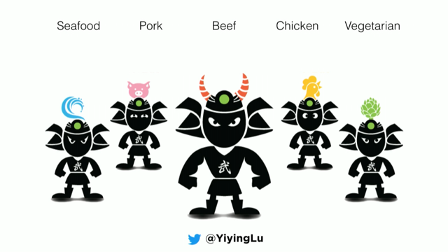
So we had a discussion and then had a team came up with the name Wasabi Warrior, and I came up with the entire character of the wasabi warrior.
So it looks very serious with the whole look and feel, but the fun thing is that later I kind of wanted to extend the family of the wasabi warrior, because if you look at the ingredient of sushis, you can see from seafood, pork, beef, chicken, vegetarian, have all kinds of different ingredients inside. And I thought it would be really great to actually simplify and symbolise the ingredient into the characters. So that on their helmet, you have the actual symbolic or pictorial ingredient of the food, or sushi. So you have the ocean warrior, the porky warrior, beefy warrior, and each of the warriors are different brothers, they have different characteristics. And you have the strongest ones, you have very calm ones, you also have the youngest brother, etc, looks a little bit goofy.
So that's the brothers overall, but the other really fun thing to do is to integrate the brothers and the look and feel into the shop. So now they're very successful, they are now open more than 50 stores in Australia and also worldwide.
This is in Australia, and you can see the interior has the brothers kind of hidden in the wallpaper, kinda like Easter eggs and also integrated with the posters. They recently opened their new store in Hong Kong and also Philippines.
So it became a very successful business for the last 10 years.
So the takeaway I'd like to give you is P for personify. Because if you really think about it, businesses are run by people too.
And giving personalities to your product and service, it will really help the user to resonate with what you do, which, obviously, in this case, leads more sales. The next example is also one of my favourite, is I for infuse.
This is a project I did for Disney Shanghai about three, four years ago now.
This is how it looks like now, they opened two years ago in Shanghai, China, and the castle is one of the world's biggest castle in the Disney resort.
When they came to me, the floor plan actually looked like this, this is back in 2014, 15, and they came to me and they said look, we're about to be open in about a year and a half, and the biggest challenge for us is not the infrastructure, the hardware, it's to find people.
Because any organisation at the end of the day, you can have the most amazing architecture, you really need to have the human resources, the talent, to build it together and to operate them together. So we need to find about 10 thousand talents around the world, and mostly locally actually in China. So how do we do this? We already have a idea of the campaign, so this campaign we will have Mickey stands for magic, Simba stands for growth, Mulan stands for courage, Elsa stands for dream, and Snow White stands for female leadership. (chuckles from audience) It's a joke, guys, I do that in Silicon Valley all the time. And so, for teamwork.
So we want them all together in a family, because these are very key personalities of Disney, but we also need to figure out a way to make it look coherent.
Because at the moment they kind of, they're kind of scattered.
Even though they're very Disney, but how do you make it distinctly Chinese? And also how do you make it look more cohesive that is coming from the same family.
Because if you look at it, it's not even like different genders, it's like different species. So that was the biggest challenge.
So I was looking at it and I thought okay, well this is fun. Because I really thought it would be really nice to kind of having the Chinese folk paper cut into the design and sort of integrate it together with all the characters.
So in this case, Mickey, I was doing a lot more research and using the lucky cloud, which is a motif that is also being used in the Beijing Olympic games and a lot of ancient times, these are kind of folk-y patterns. And integrated with the kind of more traditional shoes that little babies wear, and these, these tradition are not necessarily being carried out because these are more sort of folk-y and old-time traditions, but if we don't keep reminding the younger generation of this, people are gonna forget about it.
So I thought it would be really nice to get them into the actual design.
And Disney was actually quite happy with it. So this was the integration of the pattern and also the tradition, tiger, which is protective, into the Mickey.
Secondly Simba, that's another really tough call. 'Cause when they came to me they said, we wanted to have the big Simba, this is the first draught. I showed them, they're like, ah, it looks kind of pensive, you need to make it more active, and also can you integrate the little Simba together with the adult Simba, 'cause we wanted to have this notion of growth. But I'm like, if you put them together, the adult Simba become Mufasa.
But they're like, we trust that you will figure out a way! And I went back and I watched the animation for like three times, and I did figure out a way, which is, use it as part of the tattoo.
If you watch The Lion King you probably would know what I'm talking about, as a tattoo, onto the body. And I showed this to them, they're like, ah, it's good, but the colours maybe, it would be nicer to have more layers of colours, but also the hair is kinda messy.
Get another hair dresser, integrate with multiple colours and more totems from Africa, so I kinda did a nicer hairdo, better hair, and also integrated the African totems in the background.
Mulan in this case was also quite fun.
Because the first draught I sent it to them, they said oh, it's good.
But again, we want this heroic pose.
We want her to be this nice female energy and male energy combination, we don't want just too soft, we want this kind of strong but also still feminine touch. Like it needed to have this balance with it. And maybe changing the pose.
So I changed the pose, which all of a sudden, the energy level changed, and they said, it's great. Perhaps you can also integrate some visuals into the clothing and also into the cloth of the horse. And I suddenly realised that the name Mulan actually means magnolia flower.
If you happen to know Chinese, you might know, and if you watch the animation you would see the magnolia flower is a reoccurring theme in the animation because that's what her name means in Chinese. So I integrated the magnolia flower into the horse and also into the cloth, and into the background. So that's Mulan.
Elsa in this case, is not Chinese at all. (laughter from audience)
And the first thing is, how do you make Elsa Chinese? First I kind of needed to also come up with a power pose, so in this case, they approved this power pose. And the challenge here can be resolved by using paper cut style applying onto her hair. 'Cause all of a sudden, it still remain that authentic look, but it adds the Chinese element by applying that visual style into her hair.
And then also adding more sort of northern or Scandinavian paper cut in the background of the snowflakes and also the magical sprinkles around.
Snow White, that's also really challenging, 'cause they said, we don't just want the CEO, we want the whole group, we want the whole team. (laughs) So the challenge here is is how, like, it looks really busy here already, but how do you make it look coherent but still every single character has a integrated way. So I was looking at how do I actually integrate the leaves and also the motif of animals into her dress, and this is the final solution.
So this project was debuted in 2015 and 16, and it was online and offline into pamphlet and also apps, website, and it was successfully recruited 10 thousand people out of 70 thousand applicants in Shanghai.
So that was Disney Shanghai, I for infuse.
Because sometimes what you're looking for is already inside of you.
The target market's local customs should be recognised, respect, infused into the design.
The second to last one, this is R for research. This is a project I did for 500 Startups.
So 500 Startups, if you don't know, it's a VC firm and we empower startup company around the world. So they have invested about two thousand, I would say two thousand companies in the last 10 years, and they expanded it to India in 2016.
So the challenge here is that we need to come up with a Indian localised logo for 500 Startups that globally it was using the Arabic number 500, and in Hindi, however, the 500 Arabic number looks like 400. This is actually true.
And so I'm like, super confused, I was like, oh, does that mean that if you speak Hindi locally you get like, hundred dollar off? Obviously we cannot use that.
Because basically the Hindi five, number five in Hindi, the Arabic number in Hindi looks like a four. So we kinda needed to spell it out, which is 500 in Hindi. But then the second challenge is that my local team member told me that there are about 122 languages spoke in India. And Hindi is just one of the 20 plus official languages spoken there, not everyone in the country speaks Hindi. So I gotta figure out another way to integrate all these languages into one coherent logo. So that was kinda tough in the first place, but then I looked at the colour of the flag, and I thought, well, this is actually quite interesting, maybe we can just use the 14 or 15 different languages across on the border, just like the 500, integrate it with the three colours, so that's the solution. It's actually quite simple, but it's a complex text. This one is also another one for 500 Korea. So when 500 expanded to Korea, we have the offices inside the Google Seoul, which is the Seoul campus in Korea.
And the Campus Seoul, which is a Google Space, were the sponsor, and they wanted to throw an event to empower female entrepreneur and founders. So the idea was we need to have a logo that designed for female founders, Korean-focused, it needed to also reflect the 500, and also the Campus Seoul, which is a Google Space. So all these elements needed to be putted together into a unified logo.
So the first thing I did is looking at the English female versus the Korean Hangul character of female. They don't have anything in common.
Secondly I look at 500, and the Korean Hangul of female. Actually I realised that there is two circles that is the common element.
Then I realised that I can actually put the common element together and use the Hangul character radicals as the tetrominoes, put it together.
So this is a integrated 500 but also you can have the (foreign language) which is the female characters of the Hangul.
And then reverse the colour, putting the Google logo underneath it, this is the 500 Korean female event sponsored by Google. So this is the final element on stickers and also on all the collaterals with the female founders, was the background during the event.
So that was 500 Korea in Google for female founders. The takeaway of this one is R for research. Design research is really important because it broadens your mind, and it also provides better understanding of the world. And in this case, you are becoming a better designer. So the next one is going to be the last example, and I'm really excited, because this is the E for engage. So, this is a project I did for a company called visual.ly. Visual.ly is a, it's already been acquired in 2016. So visual.ly was, I think 15, 16, sorry.
It was a largest infographic platform in 2011 to 2013. In 2014, the company decided to pivot to become a creative content marketplace.
So they're not only just doing infographics, but also they're appeal to a broader audience, and also they want more content creators and users to use their platform.
The founders approached me and said, look, we're gonna announce this pivot at this, one of the most beloved and also interactive event called South by Southwest, I'm sure some of you know, which is in Austin, Texas, and usually around 50 thousand people coming every year, probably now more than that. And in order to grab the attention, they're gonna have the event at the space which is with thousands of companies, small company and larger company, they're competing attention with NASA.
And next to them they have, like, New York Times. And they're this small startup that only have like a month and a half to actually come up with something, with a limited amount of budget.
So when they came to me they said, we would love to integrate our original logo, which I didn't design, but it needed to be reflected in design, but we also needed to mention this new slogan, which is Content is King, because now we are a content platform.
And so during this conversation, I was in Sydney, one of the CEO is in San Francisco, and the CTO, I believe, or COO, was in Tel Aviv. So we're having this phone call and I kept hearing them saying Content is King, Content is King over and over. And I thought, why don't we just visualise the content king? So I came up with this visualisation (triumphant music) of the content king. So the problem has solved here is that to have a Content King that integrated with their slogan, which is Content is King, but it also integrated with their original logo. In this case you are not overtaking their logo, you're integrating with the original logo and using the colour to reflect in the actual campaign. We used the Content King as posters around in town, in the Austin Convention Centre, and we also created the visual.ly photo booth props, so I made them into different props that people could carry, so this is the team with the props on day one. They also had some fun kinda doing some user testing. The beauty of this is that their booth actually has all these, like, a realtime photo booth that people could interact with these stickers. Mind you, this is before Snapchat, this is real life OG stickers.
And people actually had a lot of fun.
Like I was so taken away by the fact that people genuinely responded very well towards these real life stickers. And they are also more willing to interact and engage with the team and know what they're actually working on, and why is it a Content King, and the team also had a lot of fun, and people are more willing to give you their information once they get to know you better.
We also made stickers and bags, we made the bags twice as big as the official bag, that was a really nice hack, 'cause everybody walking away with the bag. We also made the King onto the 6th Street, which is the music festival, and it temporarily become kind of a viral sensation, people started to really kinda Tweet about it on the internet, even some people take it in Nevada. Anyway, so this campaign was very successful, and successfully helped them to raise, I mean, it's a teamwork, it's not just a campaign, but they were able to raise eight million dollars, and they were successfully acquired the next year. So sometimes a very effective marketing campaign or creative campaign can really give a huge push with a startup company.
Now, here's the takeaway.
So Content is King was popularised by Bill Gates in 1996. Now, this quote has been around for 22 years, and I'd like to tell you, or propose, that now it's 2018, Engagement is the Queen.
If we put meaningful content and engaging form together, if we put tech and art together, this is where the innovation happens, this is where the magic happens.
And this was also recently, I was giving a talk at Apple Union Square in San Francisco, somebody actually suggested me to watch the video of iPad 2 launch where Steve Jobs giving this speech. So I found this speech, which is 20 second, and I really wanna play it here so that his message can get across.
(applause) - So, I've said this before, I thought it was worth repeating.
It's in Apple's DNA that technology alone is not enough. That it's technology married with liberal arts, married with the humanities, that yields us the result that makes our hearts sing. - So...
I wanted to sort of continue from Mark's talk in the morning about technology.
I think so often we get so trapped, what's new, what's next, what's the next tech innovation. But one thing I think we need to keep in mind is, at the end of the day, tech is the medium, it's the tool, it's ultimately serves the humanity. And while we are focusing a lot on tech innovation, I think we also should, and very much need it, to keep, continue, advocate, and continue encourage. Not only our generation but also younger generation to flourish, the realm of art, the realm of humanity.
Only we marry the tech with humanity, we marry tech with art, can really yield the result and can really create the magic together.
So this is my talk, and if you had a chance to look at all the key takeaways, it actually creates this word inspire.
And I think that, as a designer, a lot of times we're not only doing work, try to inspire others.
Firstly you need to create work to inspire yourself, you really need to make the work that make yourself feel inspired first, and then you can really kind of make it into a much bigger impact.
So inspire, I hope this talk can give you some ideas. Please stay in touch, and these are my, all the way to connect with me on the internet. Or, you can just find me in person, I will be here for the next two days, and thank you so much for your attention.
(applause) (upbeat electronic music)
