CSS: Current, Soon, Someday
(quirky music) - I get really excited about new and emerging CSS, and sometimes I speak to other developers about new features, and I often hear things like, "Yeah, that's great, but we can't use that in production." "It could be a few years before we can use that." "Browser support is too low." "We need to support IE, IE10, IE9." "Oh, I don't know, maybe we can use Modernizer." And then I find it interesting when clients have no idea why they have asked for certain browser support specs. I've actually seen specifications that are so old that no one remembers who wrote them or why their sites need to look perfect in IE9 and Firefox 28.
There's loads of awesome CSS properties available to us, and thanks to progressive enhancement, we can use so many of them right now.
I mean, that's unless you're assuming that sites need to look the same in every browser, which might make things a bit trickier.
So, I used to work at Clearleft, as you know, a digital agency in Brighton, and now I work at Ansarada, and both companies have the same approach to browser support.
So this is actually Clearleft's main principle. "The user should be able to access all content" "and accomplish core tasks." So, with this approach, it's possible to support older versions of IE, for example, while at the same time providing a different visual styling and behaviour to newer, more advanced browsers. So, CSS shapes is a really nice and simple example, and this is something we can give to browsers, which support it really easily.
So, I want the text around this image to flow around the circle, like this, and so the image is floated left, with some margins, and then I've used the shape pallette, so a property to make it flow around the circle. Browser support isn't amazing, but in this case, it really doesn't matter, because when shape-outside isn't supported, the text just wraps in a square like we used to. So, in this case, it's really easy to give browsers which support CSS shapes a much nicer layout, and this is because CSS is forgiving.
Browsers ignore lines of CSS they don't understand. That's how CSS works, right? Great, so, that works, it looks good.
But we can do better.
We can make the CSS shapes example much better, because we now have feature queries.
Feature queries have changed everything.
They actually detect browser support, so it's a bit like Modernizer, but it's all in CSS, so we don't have to rely on Javascript at all here. With feature queries, you can write a conditional statement in your CSS so that you can see whether or not a particular CSS property or value is supported, and then you can apply a block of code depending on the answer, so they look like media queries.
You write @supports, and then it's like an if statement. Inside the brackets, we say, "If shape-outside: circle is supported, then do everything inside the brackets, and then if it's not supported," "then just don't apply the rules." So, here's how we can improve the CSS shapes example from earlier.
So, remember how the text flowed around the circular image when shape-outside is supported, and then, when it's not, it's in a square? Well, let's just tell the browser to only add border-radius when shape-outside is supported in the browser. So, now that looks better.
Even if the browser does support border-radius, it won't apply shape-outside, so it'll only apply shape-outside if it's supported. So, here's the default style, and here's the enhancement. Both look really nice.
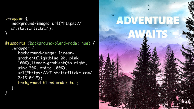
Blend modes is a great example of CSS that feature queries empower us to use more of. So, in this example, we've got two background images. We have an image, and then we have two linear gradients, and then there's a blend mode applied to them so they blend together.
And so, this is what you see in most browsers which support blend modes, and then this is what you see in browsers that don't support blend modes. So, the image and the gradient aren't blending, the text isn't readable and, in this situation, no, we can't use blend modes.
But with feature queries, we can only apply the gradient and blend mode when blend modes are supported by the browser. So, this is now the fallback in browsers which don't support blend modes.
It looks so much better, and we can actually use it now. This is the difference between using it and not using it. So, initially, we might look at this and think, "Uh, no, that's nowhere near enough browser support" "to use this in production." But don't dismiss it, because @supports changes everything. We can definitely use this now.
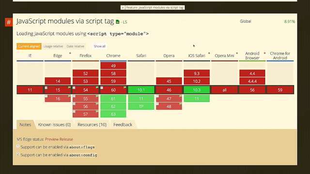
So, what's the browser support for @supports? Well.
(audience laughs) 92% of browsers support it, so it's really good, and if @supports isn't supported, it just won't execute what's inside the query, which is fine, because whatever is inside @supports is just an enhancement.
Awesome, this is great.
This is one example, and this is what I'm really excited about at the moment, CSS Grid. So, CSS Grid has given us this magical line of CSS, which creates a responsive grid, just like that. No media queries, and it's all down to this value for grid-template-columns.
And this is what it means.
Auto-fit means, "Fit all of the items" "into the width of the browser." Minmax allows us to set a minimum size and a maximum size for each column, and this is how the responsiveness happens. So, in this example, each item has minimum width of 265 pixels, and then when more space is available in the browser, it will be divided equally between each item, so that they just use one fraction of the space each.
And then, repeat means, "Repeat what's inside the brackets for each item." CSS Grid is handling everything here.
Even if you apply a grid gap, so, this a value of 10 pixels, CSS Grid is still recalculating this every time it resizes. It's all being handled for us.
And another useful thing is that we also don't need to add divs anymore.
We used to add extra divs to create rows and things like that in the past.
We don't have to do that now, which is really useful. So, this is exciting.
CSS Grid has made it so easy to create a responsive grid now that it's almost kind of boring to do this. It doesn't really feel like there's enough challenge in building a standard 12 column grid or whatever anymore, because we can do it with one line of code. We have the tools to be so much more creative with layout now.
So, a quick clarification.
I've been asked recently if grid should replace Flexbox and things like that.
Obviously, the main difference between Flexbox and CSS Grid is that Flexbox is for laying out items in a single row or a column, and CSS Grid will handle rows and columns, hence the term grid.
They can definitely be used together.
I built the site for Leading Design Conference at Clearleft last year, and this is the grid on the Speakers page.
It looks nice, but I actually used a hackey combination of floats and margins to get it to look like this, because CSS Grid was still behind a feature flag back then, which is beyond frustrating, because CSS Grid would have been so perfect for this, but I've since rebuilt it using Flexbox and CSS Grid, so I think it's a good example of how they can work together.
This is the individual speaker card, and the card itself is the parent.
It has display: flex applied to it.
So then, its children, which are the image and that blue box, Card-secondary and Card-primary, now wrap into a horizontal row by default.
And then Card-primary, the blue box, is also a flex parent, so that I can wrap the speaker name and the title vertically.
They wrap horizontally by default, so I had to apply flex-direction: column to make that happen.
And then, in order to get the speaker's name and the job title, so, the speaker name to stick to the top and the job title to stick to the bottom, I applied justify-content: space-between.
Did you know that Flexbox has better browser support than border-radius? This is a tweet from Jen Simmons last year, so it's actually increased now, it's much better, Flexbox is supported by 97% of browsers now. So, yeah, obviously, you have to be more careful with how you use Flexbox in comparison to border-radius, but this is awesome. I'll sure be using this all the time.
So much green, here we go.
I'm back to the Leading Design grid.
This is how I built the layout for the grid. In comparison to my original hackey version, there's much less code, and it's much easier to read. I used the grid-column property to specify grid tracks for each card, and then nth-child allowed me to fake some kind of randomization around where they get placed on the grid, so every time the site manager adds a new speaker to this grid, she doesn't know whereabouts it's going to end up in the grid, so it's actually quite fun as well.
So, this is how I defined where each tile should be placed. Using the grid-column property, I specified start and end tracks.
So, for this one, as you can see, it starts on track two and it ends on track four.
Then I decided to add a few lines of Flexbox as a fallback for browsers like IE and Edge, where the content overlapped quite badly.
The CSS Grid styles are inside a feature query, as you can see down there, so that it's only used by browsers which support it. And something to note is that I found autoprefixing this a little bit tricky. The CSS Grid implementation in IE10, 11 and Edge is based on the 2011 spec, whereas Chrome, Firefox and Safari used the current spec. So, there's been many changes to the spec, including values and properties and behaviour of properties, so using IE10, using the IE10 version of grid for fallbacks is a little bit complicated.
It's just because the specs vary so much, so, just running autoprefix, it doesn't quite do the job. It misses things.
So it is, in this case, I actually found it easier to just manually add prefixes myself and adjust the settings in autoprefixer, so just manually add prefixes for CSS Grid. So, I know that sounds like a bit of a headache, but actually, the good news is that all the versions of IE and Edge are consistent with their support and prefixes, so unlike Flexbox when it was released, it's much easier to work with, and this is because it's been developed behind a feature flag for the last five years, so a lot of problems have been ironed out before we've even started using it. So, don't be put off CSS Grid by any early Flexbox problems, because it's so much easier to work with.
And if you're wondering, "Wait, hang on," "do fallbacks mean writing the layout two or three times?" Well, no, because if you work with the approach that sites don't need to look the same in every browser, then you don't have to do that.
In many cases, it's possible to provide simpler styles for older browsers rather than building out the exact same same layout loads of times.
I saw a really excellent example and writeup of a progressively enhanced layout in Smashing Magazine last week by Manuel Matuzovic. So, he starts with HTML and element styles, so really basic here, and then he adds some simple floats to create the first layout, and then we get some Flexbox styles and CSS Grid styles, so you get the idea.
Just progressively enhancing that.
I actually quite like it, it's just a little addon, but I like that he's added that little slider to illustrate the progression in the demo.
It's a really nice example.
So, the article is on Smashing Mag.
It's a great read, so I really recommend having a look if you haven't already.
These slides are on Speaker Deck, so you don't have to write down links if you're interested. Rachel Andrew has written a really useful post outlining all the different fallback options to CSS Grid, which I found really, really useful.
She probably knows everything there is to know about CSS Grid and Flexbox, as does Jen Simmons. There's loads of great resources on her site, too. I've learnt loads from them.
This is another good tool.
Firefox Nightly has some great tools for inspecting CSS Grid elements.
This is a screenshot for my grid from earlier, where it outlines all of the tracks there.
I enabled it just by clicking on the icon next to the display: grid rule.
And then if you open the layout tab, you find more tools. You can change the colour of the lines, perhaps to add a better contrast against the content, things like that.
You can display line numbers.
There's loads of stuff to play with in there, so it's a great way to visualise and understand more about CSS Grid, so I recommend having a look at that. CSS Grid Layout Module is one of the most exciting developments since responsive design.
So, as long as it makes sense for us in our projects, I really hope that we can get the best out of it as soon as possible. So, we have just seen one example of randomization on that grid just there. And so this is another one, which I think is really fun. I love the cicada principle for faking the randomization of patterns.
So, computers can't generate random numbers, right? Like, Math.random in Javascript isn't actually random. The best we can do in all cases is to provide a pseudo-random seed value which is based on a variable that can't be predicted, so, like exact time. And the key to making this sequence seem random is to introduce plenty of variables so that it's too difficult to predict.
So, that makes sense.
Why is it called the cicada principle? Well, a cicada is a rather grim-looking little bug. I don't know if you've seen them before.
I hadn't until I looked at this.
There is the kind called the periodical cicada. They simultaneously emerge in masses every seven, 11, 13 or 17 years, then they find a mate and then they die.
So, it's not much of a life, but the interesting thing is that these numbers are all prime numbers, and the reason for this emergence in prime number cycles is so that they avoid the cycles of their predators, and they have a better chance of surviving. And so, I used the cicada principle on the UX London site to make it look like the speakers get this random, distorted blobby shape applied to them at random, and the nth-child rule is how we can target all of the items in the grid, which are in prime number spaces, so we can get 2n, 3n, 5n, 7n, etc.
But this doesn't quite target enough items to make it look really random, so there's another layer using nth-child, using more prime numbers like this.
So, the number that goes before N is every prime number, and then the number which is added to it is the previous prime number.
So, for 2n+1, two is the next prime number, and one is the previous prime number.
And then inside each nth-child rule, each image gets four different border-radius values, all sort of skewed, and then there's a very slight rotation just to create the blobbiness, and then I tweaked that on Hover.
What's everyone talking about at the moment in CSS? Well, that is CSS variables, of course, or custom properties, as per their proper name. 72% of browsers currently support custom properties, and they have some incredibly powerful features, like the ability to modify values in Javascript and the ability to update CSS custom properties in realtime. Custom properties can be dynamically scoped, whereas variables and preprocesses like Sass are always static, and that is a huge difference.
So whilst you can update the values of preprocesses or variables at different points during compilation, when they're rendered to CSS, the values are static. They stay the same.
Whereas CSS custom properties are not.
So, we could, for example, set some default styles like we have here, a Sass variable a custom property. And then we could add some property declarations to the elements which make use of these variables, so, in this example, the button inherits its background colour from the custom property called brand-color, which is set in the root, and then it gets its text colour from the Sass variable text-color.
And then, we can update the values if we want to. So, text colour is a static variable, and in this example, it changes to white before HTML and CSS is rendered, whereas the brand-color value for button two changes to rebeccapurple, and it's dynamically scoped and it's changing in real time.
Mike Riethmuller, who is here today somewhere, I think over there, yep, I can see him.
He's provided us an excellent example in CodePen of how you can use custom properties to build a responsive grid, so you should definitely talk to him about that. He also demonstrates how custom properties give us a new approach to responsive design.
He highlights that they can provide a link between logic and implementation of design, so we can use fewer media queries, which I think is really exciting.
And so, I recommend you check out his blog post on this, if you haven't already, madebymike.com.au.
Another feature that CSS preprocessors have given us is the ability to manipulate colour.
In Sass, we might want to generate a colour that is close to another colour, but slightly different, perhaps, so we might want to lighten it or darken it, saturate it, mix colours, whatever.
Well, CSS Colour Module Level 4 is in W3C Working Draught, so in CSS, we can use the color-mod value to do exactly what we'd achieve in Sass.
We can adjust multiple parts of a colour in the same function.
We could set the base colour using a custom property. There's no preprocesses used here, this is just native CSS. But don't get excited, because there isn't actually any browser support yet for the colour function. But there might be someday, and this is a point because there is a Java specification, so in the meantime, you can visualise it using colorme.io by Tyler Gaw.
So we've recently seen some very powerful functions like calc and custom properties become native to CSS, which were previously only available in some form in preprocesses, and at least four more features that we currently see in preprocesses have Java specs in CSS, so maybe it's a sign that CSS preprocesses can be seen as a roadmap for future CSS, a bit like JQuery has been to Javascript, perhaps.
You know, sites like, you might not need JQuery, demonstrate vanilla JS methods, it starts down in JQuery.
So, who knows? Thanks to preprocessors, maybe someday we'll be saying, "You might not need preprocessors." Of course, there's so much more to play with. I only have 20 minutes.
I'm coming to the end of my time.
The best way to keep on top of new CSS is to check out the list in w3c.org.
All specifications which are being explored, refined, tested, completed, are listed on the site. This is also a really nice site by Jonathan Neal called What's Next for CSS, so you can easily see what state a feature is at. You can see the spec and polyfills if you want them. So, let's not just use emerging technologies, let's help make them better.
Browser makers want to hear from developers. If you experiment with new CSS or you find bugs or you have anything to say about them, then you can send your feedback to the CSS working group. Feedback on specifications can be raised as issues on Github, W3C and then csswg-drafts.
Rachel Andrew makes a really good point here. If you don't test and offer feedback on new CSS, you are trusting future tools to people who do. So, you can try out new CSS and you can shape the new CSS, because the CSS of someday may soon become apparent. Thanks.
(audience applauds) (quirky music)
Thanks to progressive enhancement, we can make use of many new CSS features, even though not everyone uses a browser that supports them. We’ll take a look at examples of CSS that we can use now and what we can use with care. And it’s not all about using new CSS; we can all play a part in its development, too.