The State of Web Fonts
(cheery music) (audience claps) - Thanks very much.
Everyone hear me okay? Not too loud, not too soft? Good, excellent. So, as John mentioned, I'm Chris Lilley.
(audience laughs) Well, okay, one of them.
And John did a good job in introducing me, so I'm just gonna whip through these.
I'm Technical Director at W3C.
I used to be on the tag for three years and then stopped. I'm currently also in charge of what they call Web Core Strategy, which those of you who were here yesterday would have heard me talk about, about new and up coming stuff, from whether we should standardise, and what's happening in that space.
I also started SVG, in the sense that I wrote the requirements document and got enough people convinced that they ought to work together rather than separately, to actually produce something. And I chaired the group.
Also one of the co-authors of PNG.
Worked on CSS working group, first chair, and stuff like that.
Currently editing CSS4 font, sorry, CSS4 colour. Web fonts, I was involved with that, the group that produced that font face, also, WOFF 1.0, WOFF 2.0, and being involved in chromatic fonts, which are known as the standard.
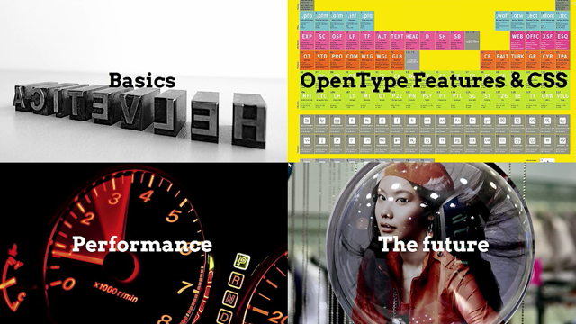
So, topics for today.
Firstly, we're gonna go through some basics about web fonts, just to make sure we're all on the same page. In that vein, how many people, first of all, how many people here produce content of some sort on the web? No, no, how many people, don't, no, that's fine, that's not fair.
And if you do, do you use web fonts at all? And thinking back five years ago, did you use web fonts? Yeah, right. Yeah? Okay, so you all use web fonts, pretty much. But do you use them like the best they can be? Do you use everything that can be done, or do you just sort of slap a font together from type kits and say, I'm good? So I'll make sure that we're all on the same page and then I'll move onto the interesting stuff, the fancy features, OpenType features and CSS. Then we're gonna do a quick bit about performance, not that much, but just a little, because you know, it's always good to look at performance. And lastly, a crystal ball.
We're gonna have a look at the future, which isn't that close, the future actually is. CSS4 fonts got published, first public working draught, two weeks ago. And I'm gonna be telling you all about that, and some other things.
So firstly, basics. Quick question, why is that text back-to-front? Why is it, why is it reversed? Anyone know? - It's an ink stamp.
- Yes, that's right. That's right.
This is metal type, you put ink on it, you press on the paper and it comes out right around. Okay, so first of all, what is a character? A character is a number, it's a codepoint, it's part of unique code.
And it's not just a number, but it also has properties. It tells you, for example, I am a numeral, or I am punctuation, or this sort of thing.
I am a left or right character.
And then a glyph is a visual representation of one or more characters.
It can be multiple characters.
So, quick test. This is how many characters? - [Audience] Two.
- Nice. Yes.
This is actually two characters.
If you think it's one character, you're using the wrong code point.
Do not use the legacy thing for FI, otherwise all the web searches will not work anymore. But you can if you really want to be horrible. And this is one glyph.
What about this one? How many characters is that? There are multiple correct answers.
(audience laughs) - It depends on the normalisation form.
- It depends on the normalisation form.
Excellent. Full points to Gryffindor.
(audience laughs) Yes, this can be a E with a accent, or it can be an E with a combining accent.
And how many glyphs is it? - One. - One, yes.
Except in SVG fonts, which I hope nobody is using anymore, where it could actually be two, and you could have different colours on them. (audience laughs) And it could actually come from both one or two fonts. Hopefully not, 'cause otherwise you get the ransom note effect.
But it can happen.
Okay, so you all know now about what are the differences between a character and a glyph, which is great.
So here's some examples now.
Here's some names, Myriad Pro, for example, which is a font family, and that family has several faces in it.
One, two, three, four, five, in this case.
Properties and descriptors.
Let's have a look at this.
So what have we got? We've got @font-face, nothing shocking there. It has a font family, and it has a font weight, bold. And then down here, we've got an h1 with the font family and the font weight.
Why do we have it twice? What's the difference? Anyone know? No. Okay.
The, the ones in the @font-face are called descriptors. They are telling you what the font can do.
They are saying this particular thing, if you download this font, you get a bold weight.
Whereas on the h1 there, we're saying, we want the h1 to be in bold. Use a font which is bold. Okay? And then it will go through the fonts that you have, in this case only one, but you normally have a list of them.
Match and find the first one it can find that matches everything else you asked for, and it's bold. So that's an important thing.
Properties and descriptors.
By the way, in JavaScript, because of some rather nasty things that happened, you will actually find descriptors as if they're properties on a style object. Do not let this confuse you.
They're really the same, and also we're trying to fix that in CSS4 fonts, so I'll tell you about that later.
But meanwhile, they are totally different things, honestly. So, just summarising what I just said.
Descriptors tell you about the individual font faces and properties are requests for styling that will match that.
So, font stacks. You normally don't just save one particular font.
You give some fallbacks, right? That was particularly important in the early days of the web, when we didn't have reliable downloadable fonts at all. And therefore, you had to say, basically, what you wanted to be on Windows, what you wanted to be on Mac, et cetera, put them in. You can tell which machine you're developing on by which order you put them in.
But there are better uses for that.
So firstly, it's the first font that, A, exists, and B, has the right glyphs, which is used, not necessarily the first one.
So here's a common problem.
You've got a website and it's got a substantial amount of Japanese on it, and it also has some English, and also Japanese itself, uses in Latin characters.
And hopefully not too shocking to let you know that the Latin glyphs in Japanese fonts tend to suck quite frequently.
So a common trick is to use fallback like this. First of all, you give a Latin face which you like, and then you give the Japanese one, on the assumption that the Latin one doesn't have any Japanese characters.
And this works very well, until the guy who is designing the Latin one says, actually, I think I'll add kana, there's not very many kana, I'm gonna add some of those as well.
And then suddenly they're taking them from the wrong font.
But you can't put them round the other way, 'cause one of them has to be first.
So there is a way around this.
Any guesses what the way is around this? By the way, just...
- Say which-- - Sorry? - Say which character points that you want to use from each. - Yes. Exactly. Do you know how to do that? - Unicode range. - Yes, excellent.
10 points to Slytherin.
(audience laughs) So the Unicode-range descriptor tells you what part of, and it could use a single character, or whatever. So here's an example.
So we've got this Japanese thing, and as you can see from the Unicode range, this covers firstly the yen character, and then kanji, and then hiragana, and then katakana, obviously.
(audience laughs) (Chris sighs) Okay, I have to do a public apology.
I came up with this syntax, I asked what people thought, and nobody said anything, someone said, "Oh, it looks fine, Chris.
"It will be okay." Unicode was just new in those days.
People always just wrote it with U-plus, which on one ever does anymore, and it's a pile of poop. I'm sorry.
But we've got it now.
It's stuck in the web platform, we're not gonna get it out again.
(audience laughs) So here's an example.
We want to do a nice, swishy ampersand like this, in the middle.
And of course, we believe fervently in the separation of content presentation, and therefore we're not gonna stoop so low as to put a spanner on the ampersand.
Instead, we're gonna use the Unicode range. So here's an example.
So I'm gonna add this one first.
And now the whole thing changes as you would expect to this sort of swishy thing.
And now I go...
(typing) And suddenly it's just the one character that I want it to apply that to and then the rest goes into the next font in the fallback. Pretty easy. Just to show that this is true, there's the source of this.
There is no markup around this.
It's just all done using styling.
Okay. That's the basics of it.
You now know the basics.
OpenType features. So if you use desktop publishing programmes or design for print at all, you'll be familiar with this sort of stuff. This is how you make type font for this nice and interesting, relaxing and easy to read.
And if you use it on the web, then you probably wish that you could do that too. Here is an example.
This is quite an interesting font.
It has some fairly interesting swashy forms and ligatures, and generally looks quite nice.
It doesn't look like a font you can switch it on though, to make it do that.
So OpenType features are optional stylistic controls. There's a base rendering and then you can switch on different knobs and make it do more and better stuff.
And in CSS3, we introduced the capability to actually control these from the style sheet, so you can say, for this particular element I want these features, and for that one, I want those features.
It depends whether it's a heading, whether it contains a lot of numbers, all this sort of stuff.
So I'm gonna show you some examples of this. By the way, this, although it's been introduced for awhile, people didn't use it.
Why didn't they use it? Because we didn't have reliable font download. And if you just, depending on platform fonts, you don't know what people have got, and different people have got different ones, so basically, you tend to be very cautious as to actually applying this stuff.
However, once you have reliable font download, you know the font is gonna be used, 'cause you're providing it.
And then you can use it to its full potential. So the, all of these syntax examples I'm gonna show you can use font-variant property, which is nice and high-level and tells you exactly what it means, and it's poorly supported, which is why I'm doing these slides in Firefox. Because it wouldn't work in any other browser currently. On the other hand, there is another syntax which uses cryptic, low-level, four-character codes, and is generally horrible and nasty, but it does actually work in all browsers.
In the spirit of optimism, I'm going to use the less supported format and hope that things change. Story of my life. (audience laughs) Okay. So, here we go.
Here's two lines of numbers and text, and you can see that in the top line, it's upper-case characters, and the numbers seem to fit well with it.
They're all lining up quite nicely.
And in the bottom line, there are lower-case letters, and the numbers look too prominent.
They're too high up.
And we can fix that very easily.
We can set it to old style numbers, at which point we have ascenders and descenders on numbers as well.
Obviously this is something, depends on what you're doing. If you've got a heading and it's in capitals, you would leave it by the default titling numbers, but if you've got it in the lower case, then you can set it like that.
So this is a very easy thing to do.
It's just one property, and then it looks nicer. Here's another example. Fractions.
A lot of fonts will have, for example, a half, or three quarters, or something like that, already encoded in them, nicely done.
And you can use superscript and subscript and try and make the thing yourself, but it's generally not going to look as good, and you're certainly not gonna have 13/27s or something as a fraction in your font.
But by setting font-variant-numeric to diagonal fractions, suddenly, puh-tum.
It just does it by itself automatically.
Also notice that these are actually still remaining the numbers that you put in, so when you're googling for them, you'll actually find these numbers, rather than finding some weird code point, which is like an obscure fraction.
Here's another one.
If you were to quickly look at those three numbers, you might be tempted to think that the one that begins with eight is the larger one, because the others begin with one and two, and they kinda line up, and maybe 89,000 is a bigger number.
But it actually isn't, of course, and the problem is that the ones are small and they compress off and therefore we can't visually see where the columns are on the numbers.
Of course, you can fix that by turning one of the space fonts on it, at which point your text looks horrible.
Instead what you want is to say just the numbers are not to be proportional. Just the numbers are to be tabular, and then they all line up like that, but any text around them would still be proportional spaced. So this is great for tables and things like that, where you want people to be able to check numbers in columns and compare like with like. So again, a very easy fix.
Just set one property and you're done.
Okay, this is the same font I showed you earlier. Font-variant-ligatures is what we're gonna play with now. Normal is of course the initial value for that property, which means, do whatever you do, browsers.
Discretionary-ligatures, now we've got an r-o ligature, we've got an l-e ligature.
Did anyone notice where the f-l was already a ligature before I started playing with it? It was, yes. But we can get rid of that too. We can set it to font-variant-ligatures none, which tells it not to have ligatures, even the ones it would normally have.
You should almost never do that.
(audience laughs) But you can. Sometimes you would want to do that. By the way, there's a, I was gonna have a slide on this and I never got time, and it always annoys me when I think about slides that I should have had next, but I know I don't. So in Turkish, does anyone here speak Turkish or know about it? Turkish is a very nice, logical language.
It has a dotted I, like our I, and it has a capital letter which has a dot on it, as you would expect for the capital of that letter. And it also has a dot-less I, and the capital of that has no dot, as you would expect logically.
Everyone else gets it wrong, mysteriously.
So you might think doing like this would be quite a useful thing, because if you have an f-i ligature, and it's Turkish, then you don't know whether it was originally a dotted I or a dot-less I. But actually you don't need to do anything like this for that.
You just set the correct language in your markup, and the font, an OpenType font will do the correct thing.
It will apply a ligature on f-l, or f-i, rather, so that, that you can see visually the difference between the two. That would have been so much easier with a diagram, Chris. (audience laughs) (Chris sighs) I'm spitting myself off on stage for not having done the slide that I wanted to. Okay, font-synthesis.
Sometimes you download a font, you're only downloading the one face, and then you say, bold, and well, you want bold to happen but you didn't download a bold.
And maybe it would find another font you got installed in your system and use that instead but that would look hideous.
So instead what the browsers tend to do is they synthesise it.
They kind of fatten up the character and make a bold. Or if you ask for italic, they will, well they can't generate an italic, but they can slope the thing.
It looks kinda ugly, but, and it's not really an italic, it's an oblique, for anyone that likes fonts, but there we are.
So the font synthesis property, this is the initial value, weight and style, and it says, what that means is yeah, go ahead and synthesise both the fake bold and the fake italic.
But we can change this to one of these other values. Okay. Now we've told that you can synthesise bold, you can't synthesise italic, so it didn't.
And there's also one where it's none.
At which point, I still have a bold.
This is due to the bug in Firefox, where it insists on synthesising bold, even if I told it not to.
And I can change this to different fonts and see what they do, for example.
Yeah, go on, synthesise italic of the italic. Oh! My eyes.
(audience laughs) So in general, this is quite good, but previously you had no control over this. If the browser decided to fake up a face for you, there was nothing you could do about it. Now you can. Font-kerning. Do people know what kerning is? I guess it's, generally familiar with the term. Yeah. It's the space in between the letters which depends on the particular letters.
So a W has got lots of space at the bottom and not much space at the top, and so on.
So auto is the initial value.
Again, initial value means whatever the browsers are doing before we started standardising this.
We're gonna have to let them, for web compatibility. But in fact, what would be a more reasonable value would be normal.
You see no change here.
Why do you see no change? Because in Firefox, which I'm using here, font-kerning is on by default, whereas some other browsers, for example Chrome, it's off by default, because they think it makes it a bit faster, which may or may not be true.
If you happen to care about consistency across browsers, so in other words, you want them all to look more similar, then just setting font-kerning to normal will force it to be on in those browsers in which it was off, and therefore you'll get more consistent rendering across browsers. And just in case we weren't clear, letter-spacing is spacing between individual glyphs, and it's not the same as kerning, but you can use them together.
You can make them bigger, and you can make them smaller. In fact, you can make them negative.
Don't ever do this. This is terrible.
You should never want to do this.
I just feel dirty doing this.
Okay, good. How are we doing for time? Excellent. Performance. I'm going too fast, aren't I? So but let's talk a little bit about performance. The first thing you can do if you're using downloadable fonts is to subset it. A modern font will tend to have support for many, many languages, and it's quite common that your website doesn't actually use all those languages, or if it does, it might have separate pages with different languages, and again, you can subset things.
Subsetting fonts is a good way to go.
Subsetting the glyphs. So for example, if you know that your site has no Chinese and no Japanese, you can save a lot from your font by just dropping those glyphs.
Do not, however, be tempted into going into the OpenType tables and start dropping those. In browsers, there's a thing called the OpenType Sanitizer, which checks for fonts to make sure they're not evil and bad and broken, because a broken font can actually bring down your OS, which is a little-known fact.
That was the reason that Windows NT 4.0 was faster than Windows NT 3.5, by the way, because the font rendering got moved into the core, which meant that it was faster, and could also bring down your OS. Lovely.
(audience laughs) So, there was a version of the OpenType Sanitizer which actually threw away GSUB and GPOS, because they weren't very much used and they didn't seem to see much of a difference, the people who were testing it, in English. And that meant that since you got Arabic, then basically you just got unreadable mess, because it was really dependent on those tables. Now it is, GPOS is also used for kerning, so, and also OpenType Sanitizer is being fixed, so that's good. But generally, if you're gonna throw away OpenType tables, make sure you know what you're doing and what the effect would be.
But throwing away glyphs, that's pretty easy to do, and there are various tools that will let you do it. So now I'm gonna talk about WOFF.
Actually, I'm gonna have a little digression. For anyone who was here yesterday, you can go to sleep for roughly 90 seconds. I went to a typography conference maybe five years ago, and it was full of typographers, learnedly expounding on, we are the last generation of typographers. Our children will not know typography for we will be bankrupt because those nasty web people are stealing all our fonts and think they should all be free.
Meanwhile the browser developers were going like, those evil font developers they want thousands and thousands for each font, don't they know that we should just be able to use them freely, how can we do this? And furthermore, what about font piracy? If someone uses a font that they're not allowed to on a particular website, and our browser doesn't check and actually uses that, we're an accessory.
We've helped them break copyright.
We could be sued. We'd have actual financial liability. So that point, like five to seven years ago, there were two camps, both of them pointing at the other one, saying you, the world is gonna end because of you. This is not a good situation for producing a standard or producing something technical that works. It turned out though, once we got these people in the same room, that the font foundries did not actually want the RM, for example.
They didn't want like a cast iron sandbox.
All they wanted was a note that said, by the way, this is a link for the licence, and this is where you get this font from, and if you're using it, you should have this licence.
And the important point is that if you use it, and you're not allowed to use it, that's a matter between your lawyers and their lawyers and the browsers don't have to do anything explicitly. In the WOFF 1.0 spec, we said that although you could put metadata in it, which includes links to licences and whatever, the browser is forbidden from rendering any differently whether their metadata is present, or absent, or what it contains.
So it's an absolute. You are not, the browser's not a policeman.
The browser does not get involved in copyright disputes. And it turned out that the font founders were totally cool with that. They didn't want, they knew that people were gonna steal stuff, but they just wanted to be able to prosecute them and that sort of thing.
So it turned out that WOFF was great.
Within about three years, the foundries were saying, our entire catalogue is now available as a web font. You can licence it as a web font for this many page views a month, whatever. Or you can licence it differently, for this many computers for print.
And life is wonderful.
We can sell people the same font twice. We love it. Now, the web has helped us get back into profitability. It's amazing how things can turn around really fast. Okay, so let's now talk about what WOFF actually does. Basically, it slaps a header on the top.
It puts some optional metadata at the bottom, and it gzips each individual table.
Why gzip? Because it was already in the browser. HTTP was already using it, PNG was already using it, the image format, so it was a very small add.
And we found that WOFF compression really helped. But we can do better.
Once WOFF 1.0 was deployed, we started designed WOFF 2.0.
So I'm gonna show you a figure here.
There's thing called xmin, xmax, and ymin, ymax, which are the corners for this, the box for the ecliptic glyph.
And there's also a thing called the left side bearing. Now if you look, the distance from the axis to xmin is exactly the same as the distance for the left side bearing.
These are measuring the same thing.
It's storing both things in the font.
Why is it doing that? Because of various historical reasons.
Software will look in a particular place for information. It won't go hunting around it, just looking in one place.
So the simplest, the most backwards compatible way is to basically stuff this anywhere that anyone historically has ever looked.
This does not make for good compression.
So in WOFF 2.0, we go around looking for this duplicate information and throw it away, and then reconstruct it at the other end.
Similarly, the glyf thing, which is where the actual outlines for the glyphs live. There's also different data types and they're packed together in rather nasty ways. You've got long things and short things, and whatever, bare fields, and all sorts of stuff.
So in WOFF 2.0, what we do is we separate that into seven different streams by type, compress each stream separately, and once we decode it, then again we reassemble it. Again, this improves compression tremendously. There's also a table called loca, which is basically an index for each glyph of where it starts. It's like a binary offset. But since we're reconstructing the glyph table, we don't have to store this information at all. We know where it's coming, 'cause we've just written it, so we actually throw this entire table away. We don't compress it, we just throw it away and then recalculate it on the end.
So there we are. That's WOFF 2.0 compression. Oh yes, one another thing I forgot to mention. We use a new compression called Brotli, which is better than gzip and gives us more compression. Once we've done all this, redundancy removed, we then compress it better too.
Since Brotli is also now being used in HTTP as well, 'cause it's generally quite good.
So there we are. If we, if we consider 100% to be the size of an uncompressed font, then WOFF 1.0 will typically get it down to 45% of that, and WOFF 2.0 will get it down to 32%.
So that means, if you've got an OpenType font with TrueType glyphs, you're compressing it by 68%, which is 25% better than WOFF 1.0.
If you've got CFF glyphs, postscript glyphs, you get less compression, but still pretty good. A little word about WOFF 2.0 and mobile.
This isn't something you have to worry about. It's just kind of an anecdote.
We found out that you have to balance decompression time with the download speed.
So there's a temptation to think, okay, for mobile, it has to be really small.
Yes, but, the last 2% shaving off that last 2% makes it so complex in the encoder, that it spent twice as much time decoding it. You've saved a tiny little bit of download time and your CPU's threshing away, trying to decode that stuff.
Whereas backing that off a little bit gives you actually noticeably better, visibly better performance.
Again, not something you have to worry about that. We just, we documented that in this specification and gave the right setting so that you don't get this effect.
On the plus side, for WOFF 2.0, the memory for decompression is pretty much the same as WOFF 1.0, so there isn't a big penalty there.
So you can use WOFF 2.0 pretty much everywhere and using fallbacks, you can actually say WOFF 2.0 or WOFF 1.0.
'Cause WOFF 1.0 you absolutely can use everywhere. Okay. So let's have another look at performance. So on the left hand side, we have an @font-face, which you now are intimately familiar with it. And on the right hand side we've got an object there which by analogy you can see exactly what it does, right? It's got a font-family field, it's got the URL, it's got a format, and then it has some properties like weight and style. Properties in the JavaScript sense.
These are actually descriptors in the CSS sense. Don't worry. It gets easier.
But anyway, looking at this, and I'm not thinking too much about it, you can see this is exactly equivalent.
We've declared this.
And what you then do, simply, is you use the font loading API, which gives you a promise when the font has actually loaded, and when that resolves, you flip a class on the body to say basically, okay, use this font now.
So you can sit there for ages, and it will download the font, and once it's loaded, it will quietly substitute that in.
So that's quite nice.
It gives you much more control.
You can decide which fonts, and which ones have failed, and so on.
It does mean that you're using JavaScript, though, which is fine, but it shouldn't be the only way to do things.
Okay. We're now onto the future.
The future started about a year ago, but that's fine. That's the way things are like in standards. So continuing with the theme of performance and font download and controlling it, I'm gonna explain to you the phases of font display. As soon as you request a font over the web and it starts to load, a timer starts and the first thing that happens, the first phase, is called the font block period. This is where, if the font hasn't downloaded yet, you will see nothing.
Actually what you're seeing is invisible text. It's still rendered with text, but the text is invisible, so when the font eventually comes in, the space required for it should be about right and you don't want to see too much threshing on your page. So that's called the block period.
Some browsers can go to town on that and block you for an awful long time and that's really irritating and we wish they wouldn't do that.
Then there's the swap period.
This is where, if the font hasn't downloaded, you use another font which has already loaded, which you've already got, which you're already using, and you use that as a fallback.
So there's no additional searching or potentially additional triggering another download. It's like, okay, I need to change the fallback font, use something that I've already got, and it comes. And the last thing is the font failure period. This is where we say, okay, it's not gonna happen. We're gonna use something else, we're going to the next one in the stack and see whether that font exists, and so on. So, in CSS 4 fonts, there is a new descriptor on our font face called font-display.
And it has effect on these three periods, the block time, the swap time, and failure time. And of course, as with then everything with CSS, when we add something new, we have to have an initial value, which means do whatever you're doing before for backwards compatibility.
So don't ever use the value auto, 'cause you're doing nothing, and it means that we don't know what's happening in any of those.
Here's a more reasonable one.
You can say block, and that gives you a short time, about three seconds, of blocking.
(coughs) Excuse me. And then an infinite swap time, so basically whenever the font comes in, minutes later, it will be swapped in and used. So here's another value, which is swap.
Swap means you have a zero-second block time. You don't block at all.
You will use whatever font is available from the beginning, and you have an infinite swap time.
So basically you will display something from the start and you will display the correct font when it eventually arrives.
And now there's the fallback value, which means an extremely brief block time, a hundred milliseconds, just to avoid threshing the page.
A three-second swap time, and then if it goes past three seconds, just don't use the font, even if it arrives, just don't mess with it, don't mess with the layout, just keep using whatever the fallback was, and by fallback I mean the next one in the font stack. Lastly, there's the optional thing, which has a very brief block period, hundred milliseconds, no swap time, and immediate failure. So basically, depending on how important the font is that you're using.
If it's critical to your brand, you'll use one value.
If it's pretty and nice but kinda doesn't really matter, you'll use a different value, and it's up to you how you want those set.
Okay. That's enough for performance. More future stuff. I'm sure we all mourned the lack of illuminated manuscripts lovingly written on vellum by monks, at an incredibly slow rate, because you know, you have this beautiful colour, and colour is needed in type, and ever since the typewriter and things like that, we haven't really had much in the way of colour. And there was such an up-swelling from mediaeval monks that eventually we decided we had to have coloured fonts. There was, that was the reason. True story. Okay, it wasn't the reason at all.
This was the reason we had to have coloured fonts. Lovely. So, anyway, we needed colour fonts.
And preferably, we didn't want pesky pixelated fonts. We wanted actual, real vector fonts.
About four or five years ago, I was at a typography conference and there was a chap there who had gone around India looking for sign painters, traditional sign painters who paint hand-painted signs for like, fruit stores, and this sort of thing, or shops. And this was a long-running tradition that they had for painting these.
And they did this in these bright painted colours like that. He went round and he talked to them about the need for fonts and he wanted to sort of revive an Indian font industry, so he asked these people to design fonts for him. And they agreed to it and they did.
And they developed, they delivered them on bolts of cloth like as long as the stage, with all these beautiful colours painted on, and then he had to say, actually, by font I meant like, you know, black and white. And they're like, why? Oh, okay.
So what he started doing therefore was selling fonts in groups.
And what you did was you took the base layer and you put that in black and then you put the other layer and you put that in red, and then you did that and you lined it all up and all straight, so it all lined up, and that's kind of an ugly way to do things. I mean, okay, it looks like that. It looks very pretty. And in print, no one can tell the difference, but on the web, you can actually see it. This is a mess.
This is not really, you can have the same text there multiple times, your SEO would be all messed up, 'cause it thinks you're trying to cheat it. It's gonna be inaccessible. It's generally horrible.
Don't ever do this.
But that was the only way.
A few years ago, there was an effort from ISO to standardise colour font formats.
There was some software, early software, that allowed you to do it.
This is a screenshot of one of them.
So what I did was I took those different fonts, there was like nine I think, brought them in, made them into layers, and assigned colours to them all.
And this uses a format for COLR and CPAL.
CPAL is the palette and COLR holds the colour glyphs. They're TrueType outlines, so that means you get hinting, so that's good. But they're solid colours.
So each layer can only have a single solid fill. Still though, we've got this, and it's multicoloured, and it's real text. You know, I can...
Yeah, it's editable text and it looks quite nice. So what do you think? Is that cool? Is that interesting? Is it pretty? Is this good? Is that a good thing for the web? - Yes. - No, it's not, it's terrible.
(audience laughs) This is awful. To...
Just think again about what I said.
I took these fonts in to a specialised tool and I put these colours into the font and I saved it out, and there they are, there's these... This is not how we do things on the web.
Where did the styling go? Why can't I now control that from CSS? Okay, that was a trick question.
(audience laughs) In CSS4, we have a thing called font, so first of all, these fonts can have multiple palettes, in particular, they can have a bright and a dark one. So if you're displaying text on a dark background, you will use one palette, and if you have a white background, or light background, you'll use a different one.
And there could be a high contrast palette for accessibility.
So you can choose between those.
Very interesting though, you can have a new app rule called font-palette-values, 'cause we don't care about typing, now we have auto-complete, so we can have nice long names like that, which overrides the built-in palette.
Let me give you an example.
So of this, there's another format by the way, called SVG. So one of them...
I should explain this first, people will get confused. There was originally SVG fonts, which was a quick hack that we did for SVG, just to make sure that we could actually have fonts, in particular on mobile phones, where there was no access to system fonts usually. Do not ever use this anymore.
At one point, it was the only format that would download on iPhone or something, but that was like millennia ago, don't worry about that. Do not use SVG fonts.
On the other hand, and the reason you shouldn't use them is because their internationalisation story is basically a joke. It's terrible. It's a quick hack.
On the other hand, there's nothing wrong with the SVG format itself.
So there's this new thing, and also again, an ISO standard.
You draw the glyphs in SVG and you put that SVG inside an OpenType table. So all the rest of the font are based on all the OpenType rules.
You've got the same accessibility and internationalisation aspects, but you've got nice SVG glyphs.
And then, as I said, you can use in CSS4 at palette values, you can change the palette.
So there's another example.
This one is actually an SVG and OpenType font being displayed.
That's another reason I'm using Firefox, because it does both of them.
Et cetera. Blah-blah-blah.
Okay. So we've got real text that's coloured and we can change it using the style sheet like this. Okay? So we say @font-palette-values, and then we give our new palette that we're producing a name of some sort. I called it autumnal just because I was stuck for something to write. And then we say which font family applies to it, and which are the palettes it applies to, 'cause there could be more than one and we're overwriting.
You don't have to write all the colours.
You might just override a few.
And then there are these horrible descriptors which are basically integers, and some people are very upset about that, so this might change.
But in the meantime, they're basically integers, indexes into the palette, which you can change like this.
So for example.
I set that now to lime, or I can change the, the colour.
Why is this not? What? Oh my god. I've broken my own demo just before... It might, it might.
I can't believe I screwed this.
This has been working for ages.
And then it wasn't. Oh, just lovely.
Oh... (audience laughs and claps)
Thank you, Leia.
You're so good at helping me debug my own stupid mistakes. She really is.
Okay, so now I can change the colours of the individual palette entries and it effects the font.
Woohoo. Great. So that's how it works.
It's not a great syntax, and obviously you can use whatever you want, any colours, HSL, or keywords, or anything you want, RGB, whatever you want. CSS variables as well, if you want to do it like that. So this is, and now a much more web-like way of having multicoloured fonts on the web.
You control it from your style sheet like you always should be doing.
I mentioned earlier that in CSS3, you could control font synthesis or bold, fake bold and fake italic.
There's also fake small caps, which is kind of horrible.
When the browser does small caps, it basically renders the text smaller, and then moves it up.
And it doesn't look good. It looks too thin. Whereas some fonts actually have, as an OpenType feature, small caps.
So this lets you disable small caps and use proper small caps.
Also, you know the generic font family, serif, sans serif, et cetera, fantasy. Does anyone, has anyone, ever, ever, either used or heard of anyone using the standard font family, fantasy? Once, for a test. Okay, but there are some new ones. So emoji is one.
Saying you want this to be emoji, therefore probably more colourful one's on. One for math is setting an equation.
One fangsong, which is, and I was reading about this, like I think I know, and I've had it explained to me. So you know how there's serif fonts and sans serif fonts. Well, in Chinese fonts, there's a similar thing. There's a style that has big sort of terminals, and things like that, and there's a thing that looks very like sans serif. And there's a thing that looks kind of like script, which is drawn with sort of brush-like strokes, but there's also a fourth one which is missing, which is an informal serifed thing, with slightly slantedness.
This has a name and it's Fangsong.
And it was missing, so if you're doing Chinese typography, you basically had three of the four categories that you wanted. So we're adding a fourth one. Okay, quick question here.
First of all, I'm setting font weight to 400. And now, I'm setting it to calc nine times 100. What is the result? Do I get 400 or do I get 900? Hands up for 400.
Whoa. Hands up for 900.
Hands up for people who either don't care or haven't been paying attention.
(audience laughs) Thank you, sir. 10 more points for Slytherin. Okay, so actually the answer is 400. Why? That looks, that 400 looks suspiciously like a number, but it isn't. It's one of the set of, thank you, well done.
Enumerating strings, which look like numbers. 100, 200, 300, 400.
This also means that when you animate it, you can only go between these.
You can't, it's kinda horrible.
And the OpenType spec never said that.
The OpenType spec says it's a number between one and 999. But, especially OSes tend not to do that, and they, Windows tended to go onto little certain numbers off them and whatever. This is all changing, because in CSS4, a font weight is actually a number from one to 999, like OpenType spec says it here.
And we, the reason that's more important and more interesting, is because CSS4 introduces support for variable fonts. So traditionally, what you want it to do, if you have multiple weights, say you've got a light, and a book, and a black, then you download three separate files, and you've got those three things.
But, A, that's three downloads and three requests. And B, it doesn't give you anything in between, and okay, if you might, if you really don't care about bandwidths and you want to impress the client, you might download seven different weights. But then you got the italics as well, so that's 14. Variable fonts, what they do instead, is they say, here is what we call the central, or the most characteristic glyph.
And then if you want to make it bold, you move these points like this, and these points like this, so it's a bunch of little glyphs, which go into a new table.
And there are pre-defined axes, so the weight, the width, the slant, if you've got oblique fonts, optical sizing, some things look, have a different design, if they're designed to be big or small.
And even more interesting, custom axes.
You can have, you can make a font and say, here's an axis that does, I don't know, swoopiness, or formality, or whatever you want to call it. As long as you can draw things, and say I want you to go from here to here, the cool thing is, you download one font, you tell it how you want it, and it instantiates itself to the exact font that you asked for.
Isn't that super cool? So here is an example.
I'm afraid this is a GIF, because the only implementation of this that I am aware of is in recent builds of Mac OS, OSX, with recent Safaris, and I don't have that, nor am I using it at the moment.
So this is a font being animated.
You can see that the weight is being animated. You can see that the x-height is also being animated. As it gets thinner, the x-height is increased to make it more legible.
So that's two axis being animated at once, because of course, since the font is designed to be instantiated on the fly, it didn't take people very long to realise, that means we can animate them, right? And some people are like, eh, ah, I'm not sure, and all the font designers are like, yes, yes, yes, please, please, please.
So it's like, okay, fine, we can animate them. (audience laughs) So here's the conceptual diagram, which is a bit crystal lattice-y.
We've got in red, the central glyph, and then we have a bold axis, and we have a condensed axis, and a third axis, which frankly I'm not quite sure. It was Erik Van Blokland that drew this.
He sort of explained it to me over dinner and said, and then you know, the sort of, the size of the bold, which is a custom axis. And I guess the bottom we've got this sort of a wide loop, and at the top we've got a narrow loop.
This is the sort of thing that font designers obsess about.
So there, we've got these three axes, and we can interpolate between them as much as we want.
So here's a concrete example.
We've got an @font-face.
This looks very similar to what you've seen before, except we've got these ranges.
Font-weight. This font now goes from 100 to 900, which means it can provide anything in that range. And font-stretch, which is again, more, more poop emojis. I couldn't find a better name for condensed and expanded, and it means that people keep thinking you're actually stretching the font, which you should never do.
It's a bad name. It doesn't mean that.
It just means condensed and expanded axis.
So this is doing from 50% condensed to 200% expanded. And then font-style, we've got an oblique.
It can do any angle on this particular font between -10 degrees and 40 degrees.
So that's the capabilities of the font in the descriptors. And then, in the actual style rule, we've said we want a font weight of 234.
You can pick any number that's within that range. And a font stretch of 80%, a little bit condensed. And we want it to be oblique at 24 degrees, and we want to switch off optical sizing.
No particular reason why we do that.
It's just for an illustration.
The default value for optical sizing is on. So there we are. You've download one, and of course you'd have other rules, which had different values of this.
You want less condensed, or more bold, or whatever it was. Remember I mentioned earlier, that it was the font, the long-hand font thing which had nice meaningful names, and then there was this horrible little four-character thing that was ugly but was supported? So actually, if you use font-variation-settings, you can set it like this.
Also notice that the, the range of numbers is kind of awkward.
Some of them are sort of 0.2 to 0.8, and some of them are three to seven, whatever, they don't have nice, normal ranges.
By doing that, you can, for the moment in Safari, if you've got a recent technical preview, do things like animation.
So we're animating the weight from 0.3 to 3.1 on the internal axis that the font has.
What that actually maps to on a 100 to 900 scale depends on how the font designer did it.
So really, the low-level settings are strict experimentation right now, and I hope again that the high-level settings is what people actually use.
Still, it's pretty cool.
You can do stupid shit like this.
(audience laughs) This is a font which is made from one animated square, and that animated square is repeated to make actual glyphs, and then the glyphs are being animated on their weight, and yeah.
Yeah, it's cool. You can do that, once.
(audience laughs) Here's a more practical example.
So you notice as this dollar sign gets bolder, the strokes start to bump into each other.
So for the lighter weights, we've got the line going all the way though, but on the heavier weights, we've simplified it to just the top and bottom, so it's a similar visual look without being as cluttered.
That's actually, thank you, that's actually animating the GSUB table, which says, substitute this glyph with that glyph, when a particular condition is true.
Here's a more interesting example.
Oh, what are we animating here? We're slightly animating the x-height, or the height of the middle bars of the letters. We're animating the weight.
We are slightly animating the, checking the space in between the characters as well, between the glyphs. And the end result is, as you can see from this white rectangle, this text occupies the same space throughout the animation. It doesn't get longer and shorter.
It's being specially designed to do that.
Flip that around and imagine you have a headline that you want to take up exactly 8% of the viewport, but the viewport could be different sizes on different phones or different devices.
So you could actually imagine instantiating a font that exactly fits that space, so that you get your biggest, boldest headline that you can possibly get for this particular device that you're using today.
All with one download, and all the different sites download the same font.
They just instantiate it differently.
In other words, this is a responsive design technique. I was talking with Jason Pamental and he opined like this, once I explained this to him.
"Most significant development for design on the web, "since responsive design itself." And since he wrote a book about responsive design, he probably has a fairly good view on that. Lots of people are really excited about this. Although it's fairly new, and as I said, the first working draught is only a couple of weeks ago, it was about a year now, a bit less than a year, since variable fonts were announced at the ATypI Conference in Warsaw, and it looks like all of the browser vendors and all of the OS manufacturers are on board with this. They're all adding having support for it.
The support for it in Windows 10 with one of the updates. The creator's update added support for it everywhere. iOS is getting support for it.
OSX is getting support for it.
I think we're gonna, this is one of the, I was telling people yesterday about some of the incredibly long times that it takes to standardise something.
This one's gonna be one of the other ones.
It's coming in pretty fast.
It's coming in hard.
All of the people are doing it, all at once. And I think we should see actually usable stuff with it. In a year or two at most, we'll be all depending on it and using it.
So that's me. Thanks very much.
I hope that was interesting and helpful to you, and I'll be around all like this evening and tomorrow if people have questions.
Of course, I can take questions now too.
(audience claps) (cheery music)
It seems like only yesterday we were having to use all manner of image replacement techniques just to use more than the most basic set of fonts on the web. But with CSS Level 3 OpenType font features, the widely adopted WOFF format, Chromatic Fonts, and more recently OpenType variable fonts – a single font file that behaves like multiple fonts – the capabilities opening up for typography on the web are extraordinary.
In this session, Chris Lilley shows us what’s possible today, and in the near future.