Performant, accessible animations with CSS & a dash of JavaScript
(upbeat electronic music) - So I'm Wing Ho and I do a bit of accessibility work. And today I'll just go through how we can do some animations, continuing the theme of this morning.
And so we'll spice up our web work with some fancy animations.
Straight off the bat, we've got a little animation. Consider this animation.
It's a box, kind of slides up to the page and it's fading in as it's sliding up.
So here's the code for it.
There's a bit of styling at the top.
And so here we're animating on two properties here, the opacity and the top.
And that transitioned in properties just to say, spin 600 milliseconds, animating the top and opacity properties.
Two problems with this animation.
First is the way we're animating is sub-optimal. We can improve the performance of that.
And secondly, we've broken the accessibility of it. So I'll show you how to...
I'll get into the performance side of things first and then we can look at how we can make the animation accessible.
And so, when we talk about performance, we can be talking about a whole range of things. And when we're doing performance in the context of animations, it's happening in the browser. So we're gonna dive deep into how the browser renders things out.
And with browsers, there's this magical thing that we wanna target, called 60 fps.
And that means 60 frames per second.
So the reason why we target 60 frames is your digital display is typically rated at 60 hertz.
And so each second it can update 60 times.
If we know that we've got 60 updates to do a second, that leaves us about 60 milliseconds for each frame.
And if we take a browser I've had into account, we can say, we'll call it 10 milliseconds to do each frame. And as soon as you spend more than that 60 milliseconds, you're going to make your animations look crap. You're gonna encounter jank.
Your animation's not gonna be smooth.
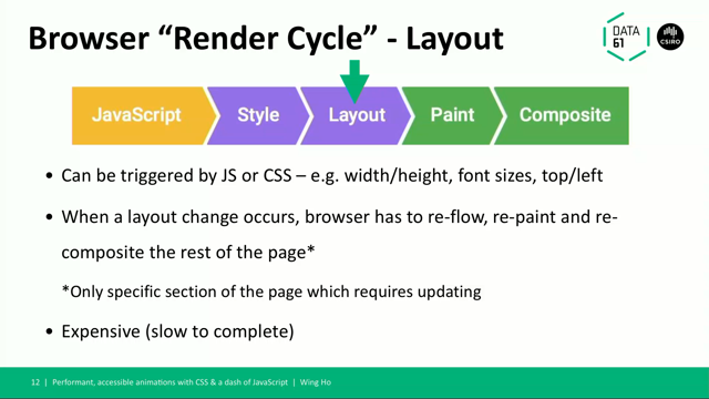
So knowing that we've got a 60 millisecond window, what needs to happen in there ? This is the browser render cycle, so again continuing on the theme of today.
So the browser gets your HTML, and it lays out the HTML executes any JavaScript that it needs to. And then it applies the a whole bunch of styling things, so we'll dive a little deeper into how this is done.
So it's got the HTML and it creates the document object model from that.
And with that done, it needs to know how to lay out all your elements on the page.
And so the first thing it does is figure out out to lay out everything all the positioning of all your elements.
Like, things like your width and height, your font sizes, or your like top and left, positioning relative to the document.
And every time a layout change occurs, your browser has to go in and figure out the new positioning of everything else, because you're kind of nudging your elements off the position.
And your browser has to go in and recalculate all of that.
Some browsers will do a little bit of optimization to only render the parts that have changed. But you generally want to avoid animating in the layout step.
Next step we have the paint.
So once everything is laid out, it goes into the all your elements and fills in all the colours.
So things like background image, text colour shadows, that goes in and does that.
But this is also expensive, you don't want to animate on any of these properties.
Finally we've got the composite part.
And so the two properties that you can play with here that you can play with here are opacity and transform. And within transform you have a whole bunch of things that you can play with, like translate scale, rotation.
And you want to aim to limit all of your animations to these two properties, because it's happening at the end, if you animate on these, it doesn't have to do all the steps beforehand.
And so, going back to our very simple sliding box, we can improve this.
So we're animating on a property which triggers a layout update here.
Which is the top property.
And so if we think about what the animation is actually doing here, it's a box that's moving on the Y axis by 200 pixels.
And so I'm gonna show you this one small trick that browsers just don't want you to know, and that is you can actually do the exact same animation on with a transform.
Because the box is moving on the Y axis so you can do that same thing with translate. You don't have to use top for that.
And so we this is the syntax it's just using translate Y to say move things on the Y axis. And so with this one small change, we've managed to move our animation from this part of the cycle into the composite side.
The next another thing you can use is the will change property.
And so this kind of hints to the browser that your element will be changing, as the name suggests.
So you can promote these elements to say, hey browser I'm going to be doing something with this. Do your thing, and optimise for that.
And you typically provide another value of the property that you're going to be playing with. So, in the box example you'd say I'm going to be changing the top.
You want to use this sparingly, because if you say you don't want to walk away from today and apply this to like the root start.
One of two things is going to happen.
The first thing is, your browser's just going to crash. Cause it's going to run out of memory, cause you're stuffing all this stuff in there. OR two, it's just going to ignore that rule because if you're saying everything is important, it's not going to be able to prioritise anything and it's just nothing is important right.
Why do we care? It's very easy to forget the kind of the five devices that we're developing on.
A lot of us are extremely fortunate to be working on these powerful computers, but users might be on some low spec mobile device. And if you continue developing on your laptop, and you don't actually use these devices, you're probably not going to be developing experience you think you are.
Unless you actually go in and use these devices. So make sure you go in and play with whatever you're developing on the range of devices. And so, if you can do it, why not.
So you get better battery life, smoother experience, and users are going to be happier.
Right, so that's the performance side of things. And so we'll jump into how we can make this accessible. This is a sliding box.
But it's a box that's fading in, right? And there's a problem with animating on opacity. Does anyone understand why this is a problem? For accessibility? The problem with opacity is your browser is still rendering out that particular element. And so, opacity zero it's still in your browser's still going to do all the calculations for it as if it's opacity one.
It's just visually different.
You're not going to provide a consistent experience with users who are using specific technology like screen readers.
They're gonna still catch onto all of these elements, and when you as a sighted user, you're not intending for them to use it.
So what are our JavaScript free solutions? We can play with display:none.
There's also visibility of hidden.
So display:none will remove your element from the flow completely.
So it's going to remove that render pipeline it's going to skip this element completely. And so it doesn't take up space in the DOM. Whereas with visibility of hidden, it's gonna render as if it was there, allocate the layout, the spacing for it.
It's just you can't see it.
And the screen reader's also going to skip it. You can also use ARIA hidden as a attribute, but you're going to need JavaScript to toggle this. The problem with these two solutions is that it breaks our CSS transition.
This is the visibility:hidden example.
And so on entering of the slide, it comes sliding in, but we've broken half of our animation, we've lost that second part. And what's happening here is your browser is seeing that second active property, and it's just jumping straight into one.
So it's triggering that immediately, and you don't see that animation.
If we try to do this with display:none, we've actually completely broken our animation. And what's happening here is your browser doesn't have... Because it's display:none, the initial state is that this element does not exist.
And so because it doesn't exist, it doesn't know where to be...
It doesn't have a root position for it to animate from, like a starting anchor position.
And that's why we just break an animation with this. So how do we fix this? We can actually animate the visibility property. By adding a delay.
And this is what it looks like.
We simple toggled the visibility of the 600 milliseconds as passed.
That's just shorthand to say transition delay 600 milliseconds to visibility.
And if I play that here, we can see that our animation is back.
With the visibility property.
So we fixed, we can go home now.
But there's actually a couple of catches, some limitations.
You can only transition or delay the visibility property, you can't transition the display property to solve this particular scenario, this particular problem, because your browser's never going to be rendering out that starting position.
And so you can't do it with display: none.
And it's also not scalable, right? So imagine you're trying to do a very multi-step animation where you've got something like flying in, and another thing fades in, and all this other things. Each time you add a new step, you're going to have to go back and change your delay.
And you don't want to do that, we want to make things easy for ourselves.
That's where our good friend JavaScript comes into play.
And so we add a smidgen of JavaScript, to maximise our accessibility.
And we can do this by listening for the transition end or the animation end events.
So every time your browser finishes transitioning or animating something, it'll fire off this event. And using this we can model our animations around this intermediary state where you've got your initial state, you've got your animation state, and then you got your end state.
And then this allows us to...
This gives us more flexibility around how we structure our animations.
And just a bit more about transitioned.
It triggers when your transition has ended. So what you do is you check that the that particular event is the expected property.
So like if you've got a multi-step animation check that it's the last thing that's happening. And so once that comes in, you just go in and clean up your animation.
Whether that be your toggling CSS classes or removing other attributes.
Or you can just delete the element from the DOM completely, if that's what you want.
This is what it looks like with JavaScript. You just grab the element, add an event listener, and just do whatever you want, all that cleaning up within that function.
And here would be like a small sample of CSS where you'd say if it's not in the active state, and it's not in the transitioning state, please apply the visibility.
What is best? You gotta pick the correct thing for your particular design case.
So, you want to think about whether your element needs to stay in the flow of the DOM.
Or if you need that space allocated for it. Or if you need to remove that completely.
And you're going to need to toggle your ARIA roles in any case.
And so if we consider this design, where we've got four check boxes and a bit of white space here.
And we know that we're gonna have some kind of element popping up, you're gonna want to use visibility of hidden here, because otherwise your footer stuff at the bottom is gonna be up at the top.
And so your footer thing is just going to be jumping all around when you've got that result coming in. Whereas if we've got an element that's just kind of appearing outside of the flow of the DOM, you can just use display:none.
And if you've got a scenario like this and you want to use display:none over visibility:hidden because that way your browser's not going to waste time or cycles rendering out that particular element, cause you don't need it.
And so this whole talk I've been talking about this thing, this sliding box.
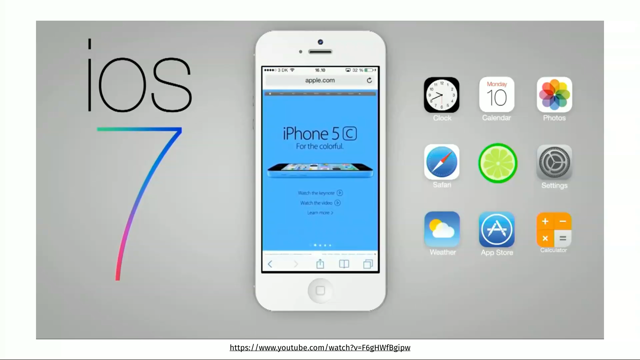
And you might be thinking, oh Wing well I don't have any sliding boxes on my site, why do I care? And so well how'd I get started with sliding boxes? This is the Apple website from a while back. And so if we click on the burger menu, the bar menu, it's a box, kind of slides in from the top. And so I've kept the example very contrived, very simple so that we can focus on the technical aspects of it.
But the expanders are everywhere.
Modals, menus, docs, test notifications.
You can apply this plan to all of these things. And let your imagination run wild.
So I'll touch briefly on accessible modals. So when you've got a modal, it tends to be outside the flow of your Document Object Model, your DOM. And so, if you're a keyboard user a screen reader, you're going to have to make your user...
You have to pull your user's focus into that box, so they can interact with it.
And the other thing you want to do is, you want to make sure that users stay within that modal. So that they don't accidentally come out of the modal and start interacting with things when they shouldn't be.
And you want to make sure that your users can actually close the modal.
And what I mean by that.
Imagine this, you're using your website, your computer, but you can't use your mouse, because you've broken your arm.
You were doing Crossfit.
And so today you're just going to be a keyboard user for the day.
And so you're browsing a website, and you're like oh, OK cool.
You click and article, and this thing comes up in your face. And so you're trying to think, oh how do I close this thing. Oh there's a little X in the corner, I'm just going to try to tab to that.
But this is a special X.
This is a X that is actually a spare with an on click handle.
And the problem with a span on click handle you can't actually reach this with your keyboard. So, you as a user who's just using the keyboard you're just gonna exit this website, never to visit back again because you can't close this damn thing.
And so please please please use buttons.
You get all the accessibility benefits for free. Just don't do the top one.
Don't do def or span with on clicks.
And so if you're like me and you write react all day everyday, you'll be please to know that there is a library that handles all of this stuff that I just talked about, in a nice wrapped API.
It's called React Transition Group.
Great for managing the mounting and un-mounting of your components with animations.
And so, you still need to keep the browser and the cycle in mind.
This doesn't mean that you can do all the, just animate on any property that you like. And so, to quickly recap, we want to make our animation performant.
So restrict your transitions to opacity, or transform or pops when you can.
And just do a couple of will-changes for your final optimizations when you want to make them accessible.
Ensure that the experience that you're providing your sighted users is the same as those of your assistive technology users.
Make sure your users don't get trapped in modals. And just fix up your opacity animations with a combination of visibility:hidden, display:none and ARIA attributes.
Some other resources that you can go in and have a look at.
RequestAnimationFrame, that was mentioned today. Csstriggers.com is a website that tells you what part of the render cycle of the particular CSS property is going to trigger is across different browsers. Use your browser dev tools to profile the performance of your animations.
Cause it's very hard to actually visibly see whether something's actually changed or not. So if you have a way to quantitatively measure then do that with your dev tools profile.
And there's also a technique called a FLIP, which is First Last Invert Play, which lets you it turns the way you think about how you animate things with top or left layout properties.
And then it translates that into a transform animation that you can use that will be performed.
And I want to quickly do a live demo cause I've got a bit of time.
So, I hope this works.
Alright so this is the Apple website.
I'm just gonna turn on voiceover, which is IOS's...
(automated computer mumbling) I will just close that.
So this is Mac OS's screen reader, that comes ships with every Mac.
And so, I will just...
(computer robot mumbling) I'll put that really quiet.
And so this is the experience that you'd have. So you can see there's a outline here.
(computer mumbling) Alright I'm just going to mute that.
So pull that up here, so you can see.
The logical flow of this is that you'd expect to go, alright, button here, there's an Apple icon here, shopping bag, end of list, and you jump into the main. And that's totally cool.
So this is another tab where I've actually changed one small thing on this list here, which is the visibility property I've just disabled the visibility of hidden.
Right here.
And what that does is even though this menu is closed, and I try to scroll through the items.
Once, there we go.
Alright.
So we'll go in here again.
And so we try toggling through again.
Apple icon, shopping bag, end of list.
And you expect to be jumping to iPhone X after this point, but you're catching all these. Like what am I doing, I'm pressing it, but nothing's happening.
And that's because that menu is still inside the DOM and your screen reader doesn't know not to skip all over that.
And so don't do this.
Make sure your users can actually use the website the way that you expected to.
Thanks for your time.
(audience clapping) (upbeat music)
Animations have potential to add detail and flair to your user experience, but may introduce some issues for assistive technology and render performance. It’s now common practice to include some animation in web apps to enhance user experience.
We’ll go over common accessibility issues with CSS animations, why people may not be aware of the fact that some of their CSS animations are not accessible, and some simple ways this can be resolved with minimal JavaScript. We will also do a quick dive into the performance differences across various animation methods.