Not in Kansas anymore: A new frontier for web design
(funky synthetic music) - Hello everyone.
I hope you all had a good lunch.
This is the first time I've attended a Web Directions conference, and I'm thoroughly enjoying myself.
Now, one of my interns saw this title slide and he asked me, "What does this even mean? "Isn't Kansas a place?" Which, really made me rethink my future decisions when it comes to having cultural references in my talk titles.
But, anyway, as John said, I'm from Malaysia, very proud of that, and I used to play basketball full time, which is what kick-started my work career.
Now, I really, really love CSS, enough to write about it and stand up on stage and speak to everyone about it.
And I also happen to be a Mozilla tech speaker, which is an initiative by Mozilla, which supports technical evangelists in regional communities around the world by providing resources and funding.
Now, I grew up in Malaysia and Singapore, two countries, which are literally next to each other. And I spent most of the first 18 years of my life, commuting across the border to go to school. Now, both countries are a melting pot of cultures, races, and languages, and all around me I could see street signs in Jawi, and Latin characters, storefronts with signs painted in Chinese, in Malay, I read novels in Chinese, storybooks in English, because all around me, the physical world was filled with writing systems in all directions.
But in the digital world, and this is what I grew up with when I was a kid, everything was horizontal, top to bottom.
And, when you're a kid you don't really think too much about these things.
You kind of assume this is the way the world works, right? That in the digital world, things would always be, you know, left to right, almost always in English, but when I got older I did a bit of digging. And it turns out, that of the world's 7.6 billion people, only 5% are native English speakers.
But 52% of websites are in English.
Now this ratio doesn't really sit very well with me, to be honest.
For example, there are an estimated 315 million Arabic first language speakers in the world. That's about 4.1% of the world's population. Percentage of Arabic-language sites on the web, 0.6%. Studies done by the Internet Society have shown that while cost of access is a barrier in getting people online, many non-internet users claim that the internet's simply not relevant or of interest to them. If the internet is meant to enhance the free-flow of information and ideas across the world, then creation of content on the web shouldn't largely be limited to just English-speaking communities.
Diversity of thought and perspective in the online world will be greatly enhanced by the participation of cultures and societies who speak all kinds of languages.
So internationalisation is one of the priorities at the W3C because it is crucial that a technology meant to be ubiquitous, supports the creation of local content across the world. That every writing system can be correctly rendered on the web.
So let's talk a little bit about the web now. It's less than 30 years old.
And it is really a completely new medium.
But as human beings we have a tendency to reconcile something new with something familiar. For the web, we sort of drew a parallel with print. We used terms like webpages.
But a key distinction from print, however, is an additional degree of separation between the creator and their final content. As such, we cannot have the same set of expectations when it comes to handling the web as a medium. This is a medium where you cannot directly manipulate the canvas, in the case, the viewport of the browser. Instead, what we do, is we write code as instructions to the browser, to tell them how we want our designs to be rendered. So, like John mentioned, intrinsic web design, this is a term coined by Jen Simmons, who introduced it to the world at An Event Apart, earlier this year.
Intrinsic.
Miriam-Webster defines intrinsic as, "Belonging to the essential nature or constitution "of a thing." Think about the essential nature of the web. It is a dynamic medium.
The only medium I know of where the same source can result in vastly different outputs.
Now, some may call it a bug, I call it a key feature.
This is a medium that allows our designs to morph and adapt as the viewport changes.
One that requires a different mental model to design for. Web Designer, Ezequiel Bruni had this wonderful quote about what he thought intrinsic web design meant. That CSS was no longer a limitation, instead it has matured into something that can empower designers and developers.
Now other mediums have had more than a hundred or even thousands of years to develop and evolve. With the web, we've only just gotten started. Now I first got the idea of comparing CSS to a sports team sometime last year when I started experimenting and building layouts with Grid.
Because I found that as powerful as Grid was on its own, it worked even better with complementary properties like Flexbox and Objectfit, for example.
To me, CSS is a holistic technology.
Sure, you can use the properties in isolation, but the full power of CSS comes through when properties are used in combination.
Now, I'm not sure how many sports fans are in the audience today, but this talk is pretty similar to a scouting report, featuring properties that are very useful for doing layout on the web, and how they can work really well together to handle certain situations.
Now I didn't really think much about layout on the web until a few years ago, when I was stuck in a crowded subway train after work. All of us were literally shoulder to shoulder and I'm kind of tall-ish, at least in Singapore, so I found myself inadvertently peering over the shoulder of the guy standing in front of me.
He was entertaining himself, reading a Chinese novel on his phone, looks something like this.
And I found myself thinking, wouldn't it be nice to have a traditional, vertical layout for Chinese novels on a phone? Like those I read back in the day? Something like that instead? At the time I wasn't sure if something like this could even be done on the web.
What I discovered, and some of you might find this hard to believe, is that vertical text was supported by Internet Explorer since version 5.5.
It was based off a much earlier version of the spec, which originated from SVG though.
Chrome started supporting vertical text in 2010. This was followed by Safari in 2011, Opera in 2013, and finally Firefox in 2015. And these are websites that have won the Tatayoko Web award, which is an award that seeks to recognise designs that challenge the norm of horizontal layouts, as well as to increase awareness amongst designers and developers of the existence of new CSS capabilities that push the boundaries of web design and typography. Although vertical writing is native to East Asian languages, that doesn't exclude you from using vertical text simply because you don't design for those languages, no. If anything, the fact that browsers now better support vertical text, allow us to draw design inspiration from more sources than ever before.
Once I realised that the web could be more than horizontal, left to right, 12-column grid designs, which somehow almost always feature a hero image, it was like a switch flipped in my brain.
This, this is no longer the web I first used to surf Magic the Gathering web rings, or play Neopets on, no.
The web has evolved, from a medium marked by limitations, to one full of possibilities.
This is a talk about possibilities.
Take vertical layouts, for example.
Even if you're designing for a horizontal-only language, like English or Hebrew, there are subtle ways you could insert vertical text into your designs to add some flavour, without compromising the reading experience. Try it for labels on card-based designs, or text in blockposts, cases where text is not critical to the understanding of the content.
Or maybe even headers for sections on long-scrolling pages. Vertical layouts are not a new thing.
It's just that the web hadn't reached a level of maturity that could do them well until recently.
With the release of CSS Grid last year, it seems that we've hit yet another milestone for web design.
The web is literally growing up before our eyes. From a time where layout was non-existent, to hackish methods like tables and floats, to what we have today.
Modern CSS gives us a wider vocabulary with which to communicate with the browser. And so, we can leverage these new capabilities that browsers now have for better art direction, for more creative layouts, for fresher designs, that break out of the cookie cutter moulds that we're so used to seeing on the web.
Now, a lot of great graphic design, can be found from posters, from record labels, book covers, things that we encounter on almost a daily basis. Something like this, a trilingual magazine cover, with both horizontal and vertical text.
A design like this can be done with native CSS and Symantec Malcolm.
All the text can still be selected, copied and pasted, recognised by Assistech technologies.
This poster is by Edward McKnight Kauffer, one of Europe's most influential poster artists in the 20s and 30s, and he was already using vertical text 100 years ago. Another one by Kauffer with some diagonal layout going on there, vintage cover of Architectural Design magazine with a radial text layout.
This book cover by Cora Lee Bickford Smith for the Craftsman, I'm particularly fond of, because it's not too difficult to recreate something like those vertical pencils on the web. In fact, there are multiple ways we can do this. We can do it with CSS transforms.
Even though transforms are most often used for animations, static transforms can be pretty useful as well. As an aside, I sort of got side tracked when preparing the slides for this talk, because it somehow got it in my head that it'd be fun to create CSS trading cards. Some people have asked me to get these printed. I wouldn't mind, though, if there was enough demand, so let me know.
Now the general idea, for CSS pencils, we start off with an unordered list, then each pencil can be a list item.
We then style each list item to look like a pencil, then lay them out vertically.
Steps, right? Mark-up is very basic.
But we do need the additional P-tag inside of that list item for styling purposes. Without it, I would only have two pseudo-elements to play with and that's not enough to create a pure CSS pencil.
Now, a key property for making a list item look like a pencil, is borders.
The border property is, in my opinion, an underrated CSS property.
If you've read Lea Verou's brilliant book, CSS Secrets, or watched her talk on the humble border radius, you may already know this.
Now, the erasers are before pseudo-elements, while the tips of the pencils are after pseudo-elements. The tips are created using CSS triangles technique, which makes use of the fact that on the web, borders meet as diagonals.
Now there are four 2-D transform functions available to us, and we'll use the rotate transform to get the pencils vertical.
The trickiest part about using transforms is that you have to keep in mind the transform origin, and how the browser deals with transforms to begin with. Transforms bring the element in question into its own layer, and takes it out of the normal document flow. So, if you're trying to rotate elements that are supposed to be part of a larger layout, which is super common-use case, you might end up with unwanted overflows or overlaps. A friend of mine tried to transform an entire website, this is what the talk earlier was talking about, not having a good offline experience, probably not...
It's fine, this doesn't matter because you can see from the video there that diagonal scrolling is now a viable possibility. Now another way to vertical layout on the web is via the writing mode property.
And my research into type setting Chinese vertically on the web, led me to discover the existence of an entire specification dedicated to writing modes.
This specification covers all sorts of international writing systems, extending and replacing the unicode, BD, and direction features defined in CSS 2.1.
It also introduces a number of rules and properties that are required to properly support vertical text layout in CSS.
This table summarises what happens to your text when the different values of writing more are applied. The default is the top horizontal top to bottom, and to change the writing direction to vertical, we can use vertical-rl, right to left, or vertical-lr, left to right.
But when we rotate text, it's not only the lines that change direction. Each line contains individual letters or characters, and they have an orientation as well.
For text-orientation, the initial value is mixed. Browsers are smart enough to tell which languages can be typeset both vertically and horizontally, or in one direction only.
So, Chinese characters, for example, will always be displayed upright.
Horizontal-only languages, like English or Arabic, will have their characters rotated when vertical. So the text-orientation property allows us to control this, and make all the characters upright or sideways, if that's what you want them to be.
Now, sometimes, numerals and abbreviations occur in vertical text.
The text-combine-upright property, lets us typeset these characters upright and fit them in the width of a single character space. Currently, no browser supports the digits value, which allows us to dictate how many digits or letters are acceptable to squeeze into this relatively narrow space. The allowed range is supposed to be between two to four characters, but right now we only have an all-value.
So this means that if you have a particularly long word, say, maybe, I don't know, kangaroo or Melbourne, the browser will obediently squish the whole word into that single character space.
You can try it out, it's a very funky effect. Now with writing mode, the markup is exactly the same if you wanted to do the CSS pencils thing, but the CSS becomes quite different, because presently, we still rely heavily on the physical directions of left, right, top, bottom, when it comes to styling elements.
But these physical directions don't really make as much sense with a vertical writing mode.
For this use case, all the borders will have to be re-calibrated.
We can't just slap on a vertical-lr to the transforms example and call it a day. If you compare the code for this, I'm going to try and scroll, with the transforms version, you'll notice that even though the words are rotated and flowing from right to left, the direction of margins and paddings still adhere to our perspective.
So, for example, the padding on the left of the pencil text, this bit between the eraser, it's actually padding top, not padding left. It's very disorienting to me.
So, luckily, we have an up and coming new player on team layout, which is CSS logical properties. What this does, is that it uses values, like blockstart and blockend, in-line start and in-line end, which are relative to the block flow of the page, and allow the same code to be used, regardless of writing mode.
I highly suggest reading Rachel Andrew's in-depth article on Smashing Magazine to gain a better understanding of the specification.
The first public working draught of the spec was published in December of last year, and I'm eager to see it developed and more widely implemented, because, honestly, browser support is very limited. Now, I can't in good conscience talk about web layouts, without mentioning flexbox.
If you try to print out the entire flexbox specification, it's about 87 pages long, and there's a very good reason for that, because it defines a new layout mode, designed for laying out complex applications and web pages. I'm obviously going to milk this pencils example for all its worth, so now let's just increase the number of pencils. And, let's say we want to make them a mixture of both vertical and horizontal pencils.
So, this is becoming a much larger scale layout situation. But, flexbox is still capable of handling it. It's versatile like that.
The cool thing about flexbox, is that it can do space distribution and content alignment, like nothing we've seen before.
Think of it as a layout super-property.
Flexchildren can be laid out in any flow direction, which means they can flow from left to right, right to left, top to bottom, or even bottom up, if that's what you want. Display order can also be reversed or rearranged, but that does have accessibility implications and should be used with caution, Items within a flex container are laid out like a long daisy chain.
But even if they wrap around, there's actually no relationship between the rows and the columns.
It's just one really long row, or one really long column, that wraps around when there's not enough space. The property that controls flow direction is aptly named flex-direction.
And with this, we can actually reorder flow of content. So, if we change this to wrap-reverse, just notice the colours of the pencils, it actually goes in the opposite direction, and we can also change flex-direction to column, and that's where you get the bottom up.
And, between these two properties, you can come up with various permutations of how you want your content to flow.
Now, again, I want to emphasise that this merely changes the visual order of flex items and not source. So, screen readers and keyboard controls will still respect source order.
But the point I'm trying to make here is that things on the web don't necessarily have to flow from top to bottom, left to right, all the time. Now flexbox is pretty neat, but there are some things that it doesn't do well, like creating full page layouts.
A full page layout requires a position scheme that recognises the relationship between rows and columns of content.
Flexbox can't really do this.
It's just a daisy chain, remember? But grid can.
I never talk about grid without quoting Rachel Andrew. So, here's a good one.
That "Grid works from the container in, "while other layout methods start with the item." Think about how we've done layout in the pre-grid era.
Say we wanted to create a simple three column uniform grid.
One approach to creating such a grid, is to use the inline-block technique.
For a three column grid, we'll set the display of the items to inline-block, and then give them all a width of a third of the container. Then you get three neat columns.
It's almost the same if you use floats, because you also need to set a width on each item. But, again, three neat columns.
Even if we're using flexbox to ensure that our items line up in three columns, we have to make sure that the flex space is a third of the container.
Again, the properties that we are applying go on to the item themselves.
For all three techniques that I just described, there isn't actually a grid.
It just looks that way because we forced the items to line up with each other.
But with grid, there actually is one.
We define its rows and columns and then we place items on that grid wherever we want to. We are freed from the limitations of having elements lined up next to each other all the time.
This means that our layouts can be canonically non-sequential now.
We don't have to mess around with non-positioning or spacer divs, or any of those workarounds, that we used for vertical spacing anymore.
Here, this is a 6x6 grid, and six grid items that I've arbitrarily placed in the grid, and CSS grid makes it really simple and intuitive to have vertical white space in the layouts because all you have to do is define which row or column you want it to be, so I just change this value, you can sort of shift things around.
If I change the row value, I can send it up and down, and by simply changing a single value, we can do vertical white space.
It's like placing chess pieces on a chessboard. So we're done with pencils now, but like I mentioned, there's a lot of great graphic design that we can draw inspiration from.
For example, this is a page from Lazlo Molinari's book, Malore, Photography, Film.
I'm butchering the pronunciation because I can't speak German, but this is a striking design with broad black borders, and content aligned in different configurations. So, if you want such a design on the web, grid alone is not enough.
The code shown here has been abridged and it is slightly cut off, to show mainly just layout code.
But even the gear and arrows here are pure CSS made with a box shadow trick, but in order to align the internal content of each grid child, let's see if I can find the code, in order to align the internal content of each grid child without disrupting the rendering of those thick black borders, we'll have to make each grid child itself, there we go, a flex parent.
Because by default, the value of a grid app's alignment is stretched, where it fills up the entire space of the grid cell. But once alignment is applied to the grid item's contents, it will shrink to fit the contents, and then your borders end up on the contents instead of along the grid cells.
So by making each grid item a flex container, this allows us to use box alignment properties to adjust the position of the grid item's content while keeping the borders at the edge of the grid cell. So this is the point I was trying to make where CSS works better when you use them together, instead of just in isolation. Another thing that grid makes a lot easier, is overlap. Now, we could have achieved an overlap effect with absolute positioning, but removing an element from the document flow, usually brings about a lot of unwanted consequences. But with grid placement, overlap can be easily achieved without disrupting the rest of the layout at all. So, this is from another vintage publication, English painter, Charles Hayter's A New Practical Treatise on Three Primitive Colours. Totally doable on the web.
Again, this code is abridged, but placement is a matter of defining which row and column you'd like your element to appear in. And how many grid cells you want it to take up. It's perfectly acceptable to have multiple elements occupy the same space on your grid.
And of course, this demo was an excuse to play with CSS blend-modes.
Blend-modes work the same way as in a graphics editor, like Photoshop.
And Una Kravets has written and spoken extensively about CSS blend-modes.
She even created this, CSS Gramme, a library for creating Instagram filters, with CSS filters and blend-modes.
Possibilities.
Now this poster for Braun is by German graphic designer and photographer, Wolfgang Schmittel.
It's a very griddish design, right? So no surprises that such a design can be done on the web, using CSS grid.
But when we take into account how dynamic the web is, how we are designing for a medium whereby we have absolutely no control over how our designs will be viewed, things get a bit more interesting.
So it's probably a better idea to start considering aspect ratios over absolute dimensions when it comes to designing web layouts.
Responsive aspect ratios used to be really tricky to do on the web, but not anymore.
Designing with viewport units, is the next step in embracing the dynamism of the web. By sizing elements relative to the width and or height of the viewport they are viewed in.
So, Sara, earlier today showed us how viewport units can be used for responsive topography, by scaling font sizes relative to the viewport. But I would like to see more people using these units in layout-level sizing as well, because values like vmin and vmax, they allow us to move from prescriptive sizing to adaptive sizing.
No more micro-managing pixels.
I hope John's happy about that.
This demo is sized with vmin, which allows the entire slider, I think that's called a slider, it's not really a carousel.
Let's call it slider.
This allows the entire slider to scale, according to the size of the viewpoint, keep its aspect ratio, and never overflow its edges, because vmin tells the browser to size things as a percentage of the width or height of the viewport, depending on which side is smaller.
This is a CSS unit that adapts to its context in a consistent manner, which is why we can do aspect ratios now.
But sometimes using viewport units for heights can result in rather funky results when the window is resized to the extremes. I have been told by non-developer friends that this resizing the browser a thousand times a day is not normal behaviour.
I don't know, I do it all the time.
This is why I want to reiterate the power of using CSS properties in combination.
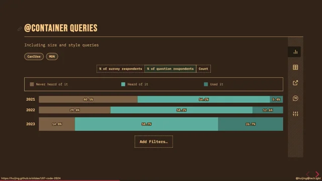
Because media queries can act as guard rails to literally stop your design from going over the edge. Even though the most common media query is width, the level for specification defines 18 media features that are available for use as conditions, like height or orientation, and there are even newer ones in the level five specification that Sara mentioned this morning, like prefers reduced motion or light level. But somehow we're not seeing them being used very often on the web at the moment.
Now, a design like this looks great in landscape mode. And it can still sort of look alright on a small screen as long as it's viewed in landscape, right? And, conversely, because I have a couple of friends in the data science department, they like to read a lot of papers, and they have their really huge 27-inch monitors in a portrait mode orientation.
I think you can see where I'm going with this, that absolute dimensions may not be the perfect media query when it comes to designs like this. But thankfully we have aspect ratio media queries. And they're especially useful for designs that utilise viewpoint units.
But there's no limit to how want to combine multiple media queries to make your designs fully adaptable. So, remember when Sara showed us the CSS masks browser support table earlier? Now, I'm going to introduce you to a bunch of related CSS properties.
And these are relatively newish, and they all fall into the category of making things on the web not rectangles, because, let's be honest, the web today is just a bunch of boxes, right? Just stacked in different configurations.
Now, support for...
I need to fix the internet problem, because, otherwise, the point I'm trying to make is just not good.
Well, so this is CSS Shapes, right? And, CSS Shapes is something that Sara herself had written about back in 2013.
Personally, I really love CSS Shapes.
The CSS nerd that I am, I have a CSS properties leaderboard in my head and, trust me, shapes is up there.
Because shapes allow us to do...
Hey, oh no.
Why is it not working? Shapes allow us to let content flow around arbitrary shapes, like circles and polygons, or even images, yes, images like Beyonce, looking like a boss, as long as there's transparency on your image, text can flow into those alpha channel spaces. And, for CSS shapes to work, you do have to float your shaped element or image, so that the text can flow.
That's a limitation of shapes.
Now, clip-path and mask, are sort of similar in that both of them allow us to hide parts of an element on a page.
Neither of them have particularly good browser support either.
But, such techniques are very useful for creating unique layouts and even spice up interactive animations when we throw in some JavaScript, like this. This is really cool, right? You can do an X-Ray effect, that's done with mask, actually.
Can you imagine the possibilities for this? Interactive Beyonce spotlights on your websites, that's what's possible.
Now let's have one more, one more.
CSS Exclusions.
Terrible browser support, really.
CSS exclusions define arbitrary areas around which in-line content can flow, so it's very, very similar to CSS Shapes, but it's a little bit more powerful because you don't have to float your element for it to work, but again, I don't know what's going on there.
Luckily, we have something called feature queries, because browser support is one of the most often raised concerns when we discuss newer CSS features, or when we tell people, "Oh, try out this new cool thing." We're like, "Browser support's really red though." So, it's an understandable concern.
Nobody wants their site to look broken, especially when it comes to layout-related properties. So, feature queries, my friends.
It is a conditional that checks if the browser supports a particular property or not. If it doesn't, the entire block within the at supports rule is ignored.
It looks very similar to reader queries, follows the same sort of syntax, and this means that if you want to structure our code in this manner, we have to start out with the basic layout that works everywhere, before laying on styles, that are based on the features that we want to use. Not browsers, but features.
By organising our code in this manner, the browsers that do not support support feature queries, or the specified property will still get styled, while those that do, they get a different look.
So we're really making use of the C in CSS. CSS is cascading style sheets, not cascading shit storm, as so many people try to tell me. Now this is an image, which is the header for a CSS tricks article, and it caught my eye because, you know, it was diagonal. It's kind of special.
And it looks almost exactly the same if you try to recreate it in HTML and CSS.
Almost.
With feature queries you can do quite a lot of things, for example, display a message, inform a user that a feature is not supported with pseudo-elements, and having a fallback.
In this case, it's I11 I'm testing on, I'll just show the original image, no big deal, but more often, the feature query should contain code that acts as an enhancement to a design that works in all browsers.
And, there's nothing stopping you from using a combination of feature queries and media queries to cater for different browsers, on different devices.
With feature queries, we don't have to revisit our code base to rewrite things when a browser gets updated, because the code is not browser-specific, not like the browser walls of the 90s, no.
It's feature-specific.
And once a feature gets shipped, your design will be updated automatically.
You don't have to go back and update your code when a browser's updated.
So this example makes use of a combination of feature queries, for both grid and CSS shapes. So if you're on a legacy browser, you'll get the simplest design, which is all the way on the left there, but everything still gets styled, no problem. For now, Firefox users don't get to see the CSS shapes effect because as we've seen in the browser table, not supported yet, never mind.
But once Firefox ships CSS ships, everybody gets this right hand side look, which is what Chrome uses at the moment, because Chrome does support CSS shapes, which is that triangle thing going on there. Even CSS exclusions can be styled this way, because if you remember in that whole sea of red, by some miracle, somehow it somehow supports CSS exclusions and not everyone else.
Maybe the terms exclusions is more literal than we expect it to be.
But, even something like that can be used as an enhancement, so for browsers that do support it, go ahead and let the text wrap around both sides of Beyonce, but for everyone who doesn't, it's fine to just use floats to just give a standard non-broken layout anyway. Now, it used to be that a new feature or bug fix would take a really long time to fix, ship. And this was true in the earlier days, like before, I don't know, 2008.
Browsers were updated like about once every 6 months, maybe. But these days the upgrade cycle has shortened immensely. Look at how dense it is in recent years.
The new features and bug fixes are shipped faster than ever before, and the manner in which they are shipped has also evolved. Now, my favourite example to talk about this is, the release of CSS grid.
Now, most major browsers shipped it in March of last year. Before that, CSS grid was sort of an early access feature, for developers who had to turn it on via browser flags. So this allowed developers to actually test out grid, play around with it and provide feedback to browser vendors and spec writers on what was working for them, what was not, which is a much better way of doing things than vendor prefixes the resulted in the mess that was flexbox.
But, by October of last year, 75% of web users around the world, were using a browser that supported grid.
And, today, that number is 87%.
This is a pretty amazing statistic.
And, this sort of a method of developing features behind a flag, allow for much more coordinated release, when the specification is sufficiently mature. Like I said, flexbox was pretty messy when it came out, and that's why a lot of people tried not to use it, because you had Legacy, Syntecs, and then you had the new Syntecs, and then you had to have autoprefixer for everything, otherwise things would break.
Even now there are flexbox bugs in I11 that will never get fixed.
So, grid will not have these sort of teething problems. It's much easier to get enthusiastic about new CSS features these days because they ship and become widely supported much quicker than before.
And the same goes for bug fixes.
Every major browser engine has a pretty open process for raising bugs.
And raising bugs for a particular feature sends a signal to browser vendors that developers like us want to use this feature. And this encourages them to prioritise related bug fixes. It's a win for everyone.
By taking the time to submit a bug report, you gain com points, you get your bug fixed, and you're actually making the web better for all of us. Now, I want everyone to move away from a "why bother" mindset to a "why not" mindset. Because whenever you come across a new feature that seems interesting or might be useful to you, just go ahead and try it out.
Don't worry so much that, "oh but this browser doesn't support it," or "that browser, it's all red, what can I use?" No, just go ahead.
Try it out.
Build something with it, anything.
They almost don't have to be grand, monetizable side projects it can be an excuse to spend several hours on the web searching for the perfect photo of Beyonce. Now, building demos, writing articles, or even just starting a conversation on Twitter, all of this helps build awareness of new CSS features, and act as feedback to browser vendors and specification writers, on what developers, like you and I, are looking out for on the web platform.
This is in line with what Phil spoke about earlier, about getting involved and participating in discussions on standards and things like that.
All of you can help me make the dream of having text flow around both of Beyonce's elbows, a reality one day. There's also talk about possibilities.
Now, you don't need to use any of these techniques or properties that I covered, if they don't fit your use cases today.
But knowing what the web is capable of, and what you can potentially build with it, is the act of growing your web design toolbox. So, you can be sure that when the time comes, you have a vast array of tools at your disposal, to create a masterpiece for the ages.
Thank you all for your kind attention.
(applause) (funky synth music)
The web is a unique medium on its own and we need to establish a new normal for the web, breaking it free from the shackles of static print design. This new normal involves ceding control of our designs to the browsers that render them rather than constantly engage in this battle to dictate where every pixel should fall. Modern CSS gives us a comprehensive set of tools that lets us embrace the fluidity of the web.
We’ve always been trying to transfer ideas and concepts from a static medium like print, onto a dynamic medium like the web. But their difference in nature has caused quite a bit of grief, and this talk suggests taking a different approach to designing and building for the web, a way that better suits the nature of the medium.