(electronic music) - Good morning.
First of all, thank you so much for coming and I hope you're ready for this session.
I hope you've grabbed your coffee cause it's gonna be long, it's gonna be a little bit fast. I'll try not to be too fast though.
So not a long while ago, I think it was just a couple of months ago, I read this excellent presentation by Eric Bailey, one of my favourite accessibility people on the internet. His presentation was called, designing for inclusion with media queries.
And one of the slides that caught my attention the most is the one in which Eric says that, responsive design is adapting design to an unknown browser. Whereas inclusive design is adapting design to an unknown user.
I love this definition a lot and I think that it makes a lot of sense but there was a question that was stuck in my head all the time.
I just kept thinking that, isn't inclusive design a subset of responsive design? Or at least, shouldn't it be? After all, when I think about these two words, responsive and design, responsive means that it responds to something, and design is, well what is design? So, what do you respond to? The word design actually answers the responsiveness part. I mean, after all design is something that humans do for humans.
Design is meant to solve human problems in a way that responds to human needs.
So responsive design should, by definition, respond to human needs and therefore be inclusive. And I strongly believe that one of the main skills that a good designer should have is empathy. Having the ability and willingness, most importantly, to understand you user needs, know how they think, and how they behave, and incorporating that understanding to every aspect of the process.
Without empathy it's hard to get people to genuinely care about other people.
Get them to care enough for them to put in effort to make sure that what they're designing and building does not exclude people or leave people out. So when I think about responsive design, I think that it is design that responds to different user device requirements which is the official responsive design definition that we know today.
It's also design that responds to user context and environments.
And it's also design that responds to different user needs and preferences.
So as a front-end developer whose job is to build responsive designs today I've learned to think about accessibility from the get-go as a main part of my job.
And since HTML, CSS, and SVG are the three main tools that I use in my job everyday. I believe that I have two main responsibilities when it comes to building websites or applications. Don't use CSS and SVG in a way that breaks the default accessibility of the web because the web is accessible by default and only we can break it.
And use what tools HTML, CSS and SVG have to offer to deliver more usable products. After all these tools are there and they're available so not using them would mean that we're missing out on a lot of the benefits that they offer.
And who doesn't really want to make their products better? Right? Who doesn't want people to love their products? And answering this question, it helps to be reminded that people ignore designs that ignore people, as Frank Chimero said.
So if a designer doesn't have the usability of their design set as a top priority.
The design is doomed to fail eventually.
So in this talk I want to go over a few of the tools that CSS and SVG offer us, and some of the things that we can do to make our products and interfaces more inclusive.
Starting with responding to reduced motion user preferences. So, you can find a lot of examples in the world of components and user interactions that leverage animation and motion to enhance the overall user experience.
Animations aid in increasing the understandability and the accessibility of an interface.
There are some really amazing examples that you can find on websites like dribble. Animations can, then can orient and give context, they can direct focus and attention, they can show cause and effect, provide feedback to UI interactions, demonstrate functionality and behaviour, express a brand, show personality and a lot more but animation is outside the scope of this talk. There are excellent resources written by animation experts all over the web that teach you everything you need essentially to take advantage of animations and use them as an effective tool to make your products better. My favourite resource, which this slide was inspired from is Val Head's book that covers how to create purposeful, functional animations for the web. I've read this book and I highly recommend it. So if you are into animation as a usability tool I highly recommend the book.
But animations can also make people sick.
So, I'm gonna be quoting James Craig here in a blog post on Webkit.
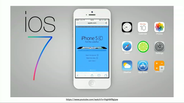
In 2013 Apple released iOS 7 which included heavy use of animated parallax, dimensionality, motion effects, motion offsets and zoom effects.
Animation was used as a tool to minimise visual user interface elements while reinforcing a user's understanding of their immediate and responsive interactions with the device. After the release Apple realised that much of the animation effects in iOS were triggering the vestibular disorder symptoms in users that have motion sensitivity.
People with vestibular disorders have a problem with their inner ear.
It effects their balance as well as their visual perception of the world around them. Symptoms of vestibular disorders include vertigo, and dizziness, and balance, and spacial disorientation, vision disturbance, hearing changes, cognitive or physical changes and a lot more.
So when it comes to UI animations, certain types of motion acts as triggers for these symptoms and are very, very problematic if used on websites today. Some of these triggers are, scaling and zooming because they give the illusion that the viewer is moving forward or backward in physical space even when they're not.
You have 3D effects that are combined with blur effects, spinning and vortex effects, spiralling and spinning movements in general, multi-speed or multi-directional movements such as parallax effects, people tend to go crazy with those.
Dimensionality or plane shifting and peripheral motion. Peripheral motion is essentially like when you are in a car and you are reading a book your eye and vision is focused on that book but everything around you is moving.
For some people that is okay but others, including myself, that is too much to stomach. So there are sometimes on the web you can find that. Like, you have text that you're reading and there are moving elements around the text and the background.
That is not good.
So since ios7 included a lot of these animation effects Apple later introduced a reduced motion toggle in the ios accessibility settings, which enables users to disable a lot of the animation effects used in the system.
Sometime after that, Apple engineers proposed and implemented the prefers-reduced-motion media query. Introduced in CSS media queries level five and which is used to detect if the user has requested the system to minimise the amount of animation or motion uses.
So this user query is essentially the web implementation of their reduced motion toggle. That is available in iOS.
This kind of query's also known as a user query. So user queries are like media queries but they respond to user preferences hence the name, user query.
Web designers and developers, also from the blog, they can use this feature to create styles and serve alternative animations that avoid large areas of motion and motion sickness triggers experienced by some site visitors.
So if those visitors have specified a preference in iOS systems for reduced motion you can actually respond to that using that media query. A very simple example might look something like this. So, I have an element that has an animation set on it and then using the prefers-reduced-motion query I can disable the animation.
So I'm zeroing out the animation duration which effectively cancels animation.
So if the user has the reduced motion enabled in their system preferences the browser will parse and apply the code in-between the brackets of the media block here. Now in this example the animation duration has been zeroed out, so that effectively cancelled it but in real life you will probably have multiple animations that need to be stopped, right? So you have different places, the style sheet may be multiple style sheets and you need to be able to cancel all of them.
Having to reset every single animation or every single animating element in a very large application can easily get out of hand and propose a maintainability nightmare.
This is where CSS variables come in.
So using CSS variable you can write code that responds to user preferences and yours in a more elegant and a more maintainable way. So let's go back to the previous code.
How can this code be improved using CSS variables? So first you need to declare a variable for the value that changes about the element. In this case it's our animation duration.
So the previous code here, for example just for one of these elements can be refactored like this. So I define a variable.
Variables in CSS are custom properties.
They're known as variables but they're actually CSS properties.
They are custom, meaning that you get to specify the name and the value for them and one of the things that is required is for them to be prefixed with and empty prefix. So remember when we use to, or sometimes we still have to use like Webkit prefixes or MS prefixes, these two dashes are exactly the same except that we don't have an actual prefix in-between. It's an empty prefix.
So I have the variable there, I've defined the animation duration inside of it and then I'm using that variable inside the animation property.
CSS variables are called or used by using them as a parameter for the var function in CSS. So in order to use it I have to put it inside of the var function and then inside of the media query the thing that changes about the element is the only thing that changes about the element which is the value of the variable.
So I'm not declaring any animation property or any animation duration properties in the media query anymore.
Now, but remember we have multiple elements on the page, so how bout declaring, like if I go and have to declare one variable for every element on the page I haven't really changed anything.
It's still a maintainability issue.
So we can do something.
We can create a global variable.
Global variables, by default, first thing to know, CSS variables, because they're properties, not variables, like size variables, they need to be defined inside of a rule set. When you define a variable inside of a rule set that variable is going to be scoped towards, to that element.
So you have an element that has a rule set. The variable defined there is scoped to that element. But if you define those variables on the root element they are going to be inherited because they are properties again.
They are going to be inherited by all of the elements on the page.
So you are essentially creating a global variable this way. They're also, because they are custom properties they are also subject to the cascade and inheritance rules, so just like normal properties. So what I've done here is I've created a variable on the root element and then I'm using that variable inside of the element, element, and then I'm zeroing it out again.
So if you have another element I still have, we still have a little bit of a problem here. So even though the variable is global I'm using it in both of these elements and then again I have to zero it out for both of these elements.
That's still not very optimal.
So we can optimise it even more.
Instead of zeroing this variable out for every element you can do it only once on the root element itself. This is much cleaner, right? So defining and changing the variable value in one place like this, makes the styles a lot more manageable as well as easier to read. So you may be wondering, one of the things that probably some of you have noticed already is well, this works very well if all of the elements on the page have the same animation duration. What if you have different animation durations and you probably will, it's fine, it can still work. You can still define any kind, any other animation duration relative to that variable by using that variable inside of a calc function, doing a little bit of calculations.
So even though I have a different animation duration here on the second element, it still depends on that one element, on that one variable, and if I zero that variable out all of the calculations are also going to become zero and the animations are going to be cancelled. So, in other words, we've conceptually set a global configuration flag that turns other dependent values on and off depending on its own value, which is specified and defined in one place. This is a maintenance dream come true.
And this is one of the things that CSS variables can do. It can help us create and write much more manageable and generally, less CSS.
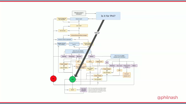
So, to sum the section up, the main takeaways are, motion can be a great tool for increasing usability and engagement but certain visual effects trigger physical discomfort in some viewers. Avoid vestibular trigger animations where possible, use alternate animations when a user enables the reduce motion by taking advantage of the reduced motion. I literally forgot the whole syntax, whatever. Remember that the web belongs to the user, not the author. So always adapt your site to fit their needs. Another thing you can do to improve the usability of your product is to provide options that respond to users needs and preferences, more specifically, providing option to customise the look of the interface to the user's needs.
One of the most useful things you can do to make your UI more inclusive is to offer the option to adjust the size of the text to allow for better legibility. Many user interfaces out there already usually offer this in a form of a couple of options. So you have small text and you have large text as the example in the video shows.
Using CSS variables, creating such a text size adjuster, it's called a text size adjuster, is fairly simple. So you start by defining the default font size inside a variable in the root element.
Again, now a quick and important note about the syntax I'm using here before moving on to the text switcher thing, I'm using the calc function to combine the viewport units with fixed units.
Viewport units allow you to scale the text so that it responds to the size of the viewport. 1vw, one viewport width is equal to 1% of the viewport width.
So if the viewport becomes smaller, so does the text. An example is the heading for example whose size is set to be equal 10 viewport width. The size of the heading changes as the viewport size changes but the main downside to using viewport units is that the size of the text can get easily out of hand and too small or too large to read. Ideally we would be able to set a minimum font size using a property like min font size or max font size but sadly we don't have those in CSS yet.
So Mike Reithmiller who's, I don't think is here yet but he will be here today, he came up with a brilliant way to do it, to get minimum and maximum font sizes in CSS using the tools that we already have.
More specifically, by combining viewport units with pixels inside of a calc function.
By doing so you are essentially telling the browser to scale the text up above the 16 pixels value by incrementing it by 3% of whatever the viewport width is. This means that 16 pixel becomes the minimum font size and the viewport gets to increase the size or, yeah, just increases actually, it doesn't increase beyond, below 16 pixels. You can take it even further and set a maximum font size by specifying a range, also in a calc function.
The formula is a little bit more complex but certainly not difficult.
I've memorised this for ten minutes I think when I first learned about it but it's impossible. So every time I need to write this formula right now I just bring up this slide.
As Mike says, it appears that, I'm quoting Mike here, it appears that by using calc and viewport width we can get responsive typography that scales perfectly between specific pixel values within a specific viewport range.
This means that you can have perfect smooth scaling between any two font sizes over any viewport range.
The font will start scaling and stop scaling exactly where you want.
Now I can't get into the details of this formula at the moment, especially since I'm not using it in the demo anyway.
So back to our example, I set a default flexible font size in the root element and I changed the value of that font size variable when the root has a class name of large applied to it. Then I use that variable on the page anywhere I want. For example on the body element, the body element first start, so you've defined again a global configuration and you're using that everywhere you need to on the page. You can take it even further and establish sort of a responsive scale that is based on that base font size.
This makes maintaining all the font sizes and scales between them, proportionality between them also possible and all depend on one variable. Now, once the main variable and all the independent variables are in place it's time to handle the class switching on the HTML using JavaScript.
Very basic JavaScript code.
So what I'm doing here is, I have two radio buttons. We have small font size and large font size. So essentially two options, and one of them is going to be the one that is acted by default, so it's usually better, I think I would personally mark it off as set of radio buttons. One is check by default and one is not.
So I'm using JavaScript here to check for which one of these radio buttons is checked, get the value of that radio button, small or large, and then apply that to the HTML. So this demo can still be improved further. Now, what if the user doesn't like the font size and the options that you provided? Like some, I for one, sometimes if I do change the font size, maybe I don't like that particular size the designer has chosen for me.
A better way to make it even more inclusive is to offer them a range of font sizes instead of two, a couple of specific font sizes. And what better way to do that other than using the input type range in HTML? So I have the minimum font size of 13, the maximum font size of 24.
You can change that as well, of course.
As the user moves or slides through the range slider they are stepping one pixel at a time so they can choose any font size in-between this range. Using the range element you can give the user more control over which size they want the text to be. But this technique would be very clunky if we had to add and remove class names as the user changes the values using the range slider. Like, seriously imagine if every value had a specific class name and you apply that. So thanks to the live nature of CSS variables there's a better way that you can dynamically change the font size of the whole page without having to set and onset class names. You see, CSS variables, unlike Saas variables, I always say Saas because Saas is what I use. Of course it's the same for less or Stylus or whatever else, any other processor.
Unlike Saas variables, CSS variables are live variables. So Saas variables require compiling the style sheet and once the style sheet has been compiled those variables are not there anymore.
The browser does not see them.
But they don't exist on runtime but CSS variables do. This means that even after the CSS is compiled and runs in the browser, those variables are still there. And changing them, because they are properties, CSS properties, CSS properties are there, and if you change the value of a CSS property, like if you have a style sheet and you inject in-line styles in your page changing some property values they're going to be applied to the page without needing any refresh, without needing any extra http request.
It's exactly the same with CSS variables.
So once again, we can listen for when the value of the range slider changes, the we set the value of the base font size variable. So you have the variable for the base font size, you just change the value of that based on the current value of the slider.
Now CSS variable can be set and unset using JavaScript, just like other CSS properties and they can be inline in the HTML.
So I'm setting the property, which is my custom property, here I'm giving it a specific size.
Again, I want to make sure that it is flexible. It is going to be inline.
I have an HTML tag, style, inline style, and this is my CSS. Because CSS variables are properties they are there and you can handle them and deal with them just like any other CSS property. And then use local storage to save the user's preference for subsequent visits and you're done.
Now before I move on I want to mention something very important like, that's when using viewport units alone, if you only use viewport units without mixing them with pixels or ems, the font size of an element, if you set the font size of an element using only viewport units, that element becomes un-scalable. So let me repeat that.
I'm, see the scale up there? I'm increasing, I'm scaling the page up because I want the font size to increase but it doesn't increase.
Because if you're using viewport units the browser is going to always fix the font size to that viewport relative to the viewport size you already have.
So it is better to not use viewport units alone. And by combining viewport units with other units we give the user back the ability to zoom the text in and out.
Remember when I said, don't break the default accessibility? So by default text is zoomable, and if you've only used viewport units you've broken that. So what would also be useful in addition to providing a text size range is providing custom colour themes for the interface.
So we'll take the concepts we've discussed with CSS variables and stuff so far further and talk about creating a theme switcher which provided the user with the ability to switch between custom defined themes.
Now, just like in the previous section the process is straight-forward.
Set up initial variables.
Set up some inputs and use JavaScript to listen to those input changes, and change the value of those variables using JavaScript. Now, it would be useful if you could provide the users with the ability to switch to a high contrast theme when they're using your interface out in strong daylight, or a dark theme if they're using it in a dark environment such as when, you know, under the sheets at night. Who doesn't do that? Now the CSS media queries level four, specification, introduced a new media query, light level media query which has been deferred to media queries level five specification which means that it's currently not supported. This media query is used to query about the ambient light level in which the device is used to allow you to adjust the style of the document in response.
Again, using CSS variables it's possible to respond to ambient light changes in a very elegant way. So you have a theme, I have just two colours here. I'm using those colours everywhere and then I'm changing the value of those global configurations depending on the media queries used, the light level media queries. Unfortunately as I mentioned, this media query currently has no browser support.
There is another way you can do that using, you can sense for ambient light changes, using the JavaScript ambient light events API. It's part of the HTML5 Device APIs, allows access to device's light or photo sensor, and is plain, and simple JavaScript.
So the code could look something like this. It allows you to listen for when the device detects a light level change and adjusts your theme accordingly. Now, for it to work you need a browser that supports the API and a device that has a light sensor that it can access and unfortunately this API also has bad browser support. Now we could always use it as an enhancement of course for browsers that do support it.
That's my mouse, it's there okay.
So since we currently don't have any standard way to listen for ambient light changes and then respond to that it is best if you can provide some sort of theme switcher for your users because providing options to users is one of the main principles of inclusive design.
Giving users a choice of colour modes or themes allows them to personalise the interface not only according to usability issues but also according to personal preferences, maybe they just don't like your taste in colours. It's always good.
It makes the interface more usable and also more pleasant. And night modes are particularly useful because they make reading in the dark easier on the eye and can avoid things like migraines and other light sensitivity disorders.
And all this can be done in the performance way because you can't change the themes.
You can create a theme switcher without having to request any style sheet.
So we avoid extra http requests and it just works out of the box.
So, dark themes.
When we talk about creating a dark theme for a light, the first technique that most people talk about, this is code time, so every section I have talk time and I have code time, so now it's code time. And when we talk about creating a dark theme for a light the first thing a lot of developers I know usually bring up is the using the CSS invert filter. So you use the CSS invert filter to literally invert the colours of the UI.
I don't like this, no.
(laughing) I liked possible, and it works just fine, sort of. This technique is probably not the best way to create a dark theme for a products.
Why? So, I applied this invert filter to the code website as a test while creating the slides for this talk. The first two things that I noticed that are actually a requirement for this technique to work are, let me just apply it there, all elements need to have the background colour so that the browser can convert that.
If the container does not have a background colour you can easily end up with text, so the colour of the text was inverted from black to white, but because the background was not really white, it wasn't inverted to black. So I end up with text that is unreadable.
And another thing is that you will probably, of course, want to un-invert all of the images on the page. This is why, on the previous code I had un-inversion done. But the most important downside to this technique as you may have already seen as I was scrolling, should I repeat that? Let me see if I can scroll again.
I like scrolling so I'll probably be scrolling I think. Yeah, so I added the background colour to the section that had text invisible and that fixes it. And I'm un-inverting images.
Okay now I have to scroll again I think.
Yeah, did you see, yeah I told you I like scrolling, this choppiness here? This jank? The most important downside to this technique is as you've seen right now, is that it comes with a performance cost.
The filter applied to large areas causes jank. Jank is any stuttering or choppiness that a user experiences when there is motion on the screen such as during scrolling, transitions or animations. And this jank problem is not something that are just so on the code websites.
So it's not because of the code website.
I also applied the inversion filter to smashing magazine. And also did it on my own website which is very performant and I still got it there as well. So the takeaways here are, invert colours is a handy way for reading pages in dark settings, sure.
Using the CSS invert, performance can take a serious hit and cause page jank on scroll, and colour inversion does not increase the contrast of the colours on the page.
So the colours that you're already using in your design are not accessible.
Inverting them is not going to make them anymore accessible. Although the colour swapping may improve perception for some users but it's not going to be anymore accessible.
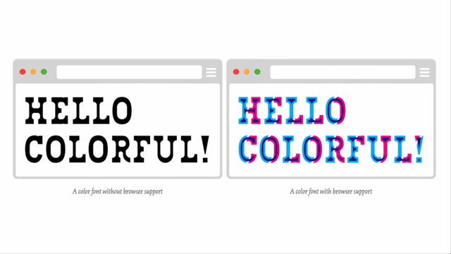
So before starting to, before we get into our theme, no before I get to that, before you actually start thinking about theme-ing your interface make sure that the default theme colours are accessible to boot because all subsequent themes might be effected by that. This is particularly true if you use my favourite, currently my favourite colour format which is HSL. So, HSL stands for hue, saturation and lightness. Hue is specified as an angle within the colour wheel. Missing an image here, relative to red.
So red is zero and all of the other colours are relative to that, along with the, from zero to 360 degrees. Once a hue is specified, that hue can be tweaked by adjusting the saturation and the lightness level, similar to what's possible in graphics editors of course. This makes HSL a far more intuitive than RGB because you can guess at the colours that you want and then you can tweak them.
Whereas with RGB is not that simple.
HSL makes the creation of variations so we're slowly getting to theming.
It makes the creation of variations of the same colour much easier and faster.
I think you can already imagine how handy HSL can come when it comes to creating colour themes. So Marcin Wichary recently wrote an article in which he attempted to create a dark theme for an app interface he was working on.
In addition to organising the CSS code with CSS variables like we already did and a few other really nice tricks.
This is one of my favourite articles that I've read in awhile so I highly recommend reading it if you want.
It's a nice short case study using a lot of modern CSS techniques to create a dark theme. But not now you know.
One of the things he found useful was to use HSL a colour values which makes colour relationships and shifts easier to manage and understand. So suppose we have this code sample here.
I have HTML again, I have a set of variables, I have a main hue, I have an accent colour, and then I have a set of other colours or variables that use, that are dependent on those two main colours. So I'm creating variations of those colours for different places on the page.
And then if the user activates a dark theme, I'm using a data attribute here, what I'm changing in this example, can you spot it? Can you tell what I'm changing? Luminance.
Yeah, the lightness, exactly.
So one of the ways you can create a dark theme, you can preserve the hues that you already have but darken them.
Of course some of the things would have to be inverted. Like black would be white and white become black but you can keep the main colours that you already have if you like them that much, and make them darker for dark themes.
Now once we got all the dark theme colours in place all we need to do is trigger the theme change using JavaScript again.
You can create a data theme attribute like the one that I've done here.
I prefer data attributes to classes but I always make sure that I mention all of the ways that you can do something, just in case. So in this snip it here, I'm setting and removing the data theme attribute on the root HTML element. I'm only dealing in this example here with two theme spheres and since the light theme is the default theme all I'm doing here is adding or removing the dark theme attribute if it's activated.
But if I were switching between different custom themes, multiple ones, I'd probably be changing the value of the data theme attribute instead of removing it by setting the value to whatever value that the user has chosen in the theme switcher.
One more thing you can do to enhance the theme switching experience is to add a transition so that the colour changes between the themes does not happen abruptly. This particular snip it is from Marcen's article. We're slowly getting to my favourite part of the talk. So seeing that code in action, it looks like this. This technique where a dark them is created, so I'm using exactly the same colours but they're darker. It is one of the ways to create dark themes, sure. You can also create multiple different themes by changing the main hue and changing the accent colour and you get different themes as well.
Now, let me repeat this, can you spot something wrong here? You have to speak louder.
Icons, exactly.
So the icons here, the colour was not customizable. I changed everything on the page but the colour of the icons was not changed.
Can you guess why? They're black, I did this colour change on the page but the icons did not change.
No, it is SVG, but the SVGs are embedded as a background image.
And when an SVG is embedded as a background image in CSS you can not really style it.
There is no way for you to access the contents of the SVG and change them.
That is one of the limitations of using SVG as a background image.
You also don't have any animations and stuff like that. So it's static, it's fixed sort of and can not be changed. And, well you can however, work your way around it. You can colourize those icons in a way.
There are also, again here are two different ways that you can use, one of them is, I really don't like it, using CSS filters.
So this technique here, you can check the code. I don't know if it's readable to everyone.
I'm so sorry.
It works by using CSS filters to invert the colours, black to white or white to black using the invert function. If it's black you can also use the brightness function with a very, very large value which inverts it to white but the one condition here is that the icon can not be completely black.
So it can not be #000, it has to be something that's not fully black for this technique to work. So you switch from black to white, white to black using the invert or brightness, then you use sepia, the sepia function to activate the colour mode.
So instead of being in black and white you get into the colour mode.
Then using the hue rotate you switch the different hues on the colour wheel and then using saturation and brightness you tweak those colours.
And guess what? It is completely guess work.
(laughing) I was, maybe you would, I don't know, but I don't know what colour I'm gonna end up with. This technique is nifty and clever but it's mostly guess work as I mentioned.
And it only works if the icons are not 100% black and because the icons in my demo are 100% black it didn't work, it wouldn't work for them and I don't want to use it anyway.
You can learn more about this technique if you're really interested in these three articles. So there is another way to style the SVGs that I used as a background image in CSS is by using CSS masks.
So, when using CSS masks the SVG shape, the icon, becomes the mask instead of background image, it becomes a mask.
The mask is used to clip the element.
So it's a background image applied to an element. That mask is used to clip the element to the shape of the icon.
This will clip out any text, borders, outlines and content in the element which is not desirable. So you, english, skip that.
So create a before pseudo-element on the element itself and apply the mask to that pseudo-element and then position the pseudo-element any way you want within that element.
And the background colour of the pseudo-element determines what the colour black, here's a live example.
(laughing) So I have an element here.
I have the icon applied to it.
That's my CSS there.
I have a background image, background position, background repeat, background size, I don't have a background colour on the element because I don't want to and I have my outline.
So the thing about masks and mask properties in CSS is that they have almost exactly the same properties and values as background image as background properties. So you can literally go and just replace background with mask and all of the properties will work out of the box.
So what happened here? The element was clipped to that icon and because everything is white you can't really see anything, but as soon as I apply a background colour to the element you can now see that background colour.
This is the background colour of the element. But everything inside of that element was clipped. Text, outline, everything et cetera.
So what we're doing is we demote, that's the word. We demote the icon into a pseudo-element and apply the mask to that.
So all I'm doing here is I added the pseudo-element, I'm styling it right now, width 1m, height 1m just to make sure that it scales with the text. And position, the rest of the code here is just a little bit of tweaking.
And then I do exactly the same thing for the Facebook icon at the top.
This is really nifty and it works but the only limitation is that it works with monochrome icons.
So if you need your icon to have, if you have an icon that actually has multiple colours inside of it, it's not going to work for this.
But the nice thing is that the background colour of the element defines the colour of the icon so you can even use gradients if you want.
Yeah, this works.
This technique was first discovered and written about by Noah Bloan, I think.
It's super clever and it works, yeah, but browser support for masks is not good and it hasn't been getting a lot better in the last few years. So I would recommend in this case getting rid of all of the icons in that case if you can because we already have text and the icons are sort of only like decoration so if you can get rid of them I would do that. If the icons need to convey meaning and maybe even have a specific functional, so they are not just decoration, I would inline them. All the time, even if I'm not theming.
Usually when I'm using SVG icons if that icon has an essential meaning to convey I always inline it, and there are ways that you can make it accessible and stuff like that. Yeah, so there is that.
Another reason that it is better to use inline icons is that when the user chooses, this is the introduction to the second section, when the user chooses to change their screen's theme to a theme provided by the operating system, that theme may already by default remove CSS background images or at least change them somehow in a undesirable way.
So you see, whether or not you provide custom themes and especially if you don't provide the users with an accessible high contrast theme, some users will resort to operating system, OS provided themes that enable them to increase the contrast of everything, including your own products. So, if the user interface that you are building is not designed in a way that is capable of adapting to external changes like that it may end up being completely unusable.
So in this session I want to talk about one specific foreign environment that we need to be able to adapt our interfaces to in which is Windows high contrast mode.
An article published gov.uk is, accessibility blog, said that some users choose to change the appearance of websites to make them easier to read.
For example, a user with low vision might increase the font size or a dyslexic user might change the font itself.
Another change that users might choose to make is to alter the colours used by the websites. There are a lot of different reasons that they would do that and a lot of different ways that they can do that. So since a lot of users do this by default because they want to make their interfaces easier to read and use, Windows has, starting from Windows 7 and IE10 plus to MS Edge, provides users with a high contrast mode which is designed to help people with contrast sensitivity issues.
When high contrast mode is activated the colours of the operating system change to offer a better contrast and the colours are propagated from Windows high contrast into the site's styles. This is code then here.
So that it offers a truly accessible experience. Now, I know that a lot of you might be thinking but this is probably an Edge case right? Who uses this? Maybe not a lot of people do.
I for one, when I was testing and doing things for this talk I switched to high contrast mode and it's been in high contrast mode since on my virtual machine because I like it and I think it looks much better than a lot of colours. And sometimes it doesn't have to be just disabled people who use this.
Sometimes power users use this as well.
Maybe if they're working outside in the sun the UI would otherwise not be, you know, usable. So one way to make it more usable is to increase the brightness of the screen and to increase the contrast as much as possible. It's not very pretty, but it makes it usable. Cause you know, people want to sit outside. So high contrast matters and it can be the criteria that makes or breaks an experience for a lot of users, including your future self. After all, it helps to remember that we're all only just temporarily abled.
So when we're building and designing accessible products we're not only just doing it for subsidive people with disabilities, we're also doing it for our future selves.
So, back to Windows high contrast.
Since we know that a lot of users might be using it it's important for us to know a little bit more about it so that we can know what to do with our interfaces to make them adapt and work well with it.
So Windows high contrast mode provides users with a selection of four ready made high contrast themes as shown here.
The user can choose between high contrast one, high contrast two, high contrast black, and high contrast white.
In addition, the users can redefine any of the colours used, and save their own custom high contrast theme.
Little video here.
So if I don't want my hyper links to be yellow, I like yellow but, I wanted to demo it so I changed them to pink, for example, it gives you the ability to save this theme and give it a name, and then you apply it.
And then you can see that the pink is showing up there now instead of the default one. You can delete it as well if you want.
And if I go back to code pen you can see that all of the links have been switched to pink. So there is a limited set of colours and the user can actually change them and customise them. Internet Explorer and Edge have vendor prefixed ms high contrast media feature which allows developers to detect if the user is currently in Windows high contrast mode and to apply specific additional style rules in that situation. But regardless of which specific colour scheme a user has chosen, ms high contrast active, which is the last one here, it will evaluate to true when any of these high contrast themes are enabled. So if you use that media query you don't really know which theme is enabled and you don't really know which colours are being used so there is no way for you. This is really evil but I like it.
There is no way for you to know what colour you should use. So what do you do about that? We have a limitation.
But we can't really know exactly what the user has activated when ms high contrast active revolves true.
And even in the first two queries here where we check for one of the two light and dark colour themes, we still can't be sure what colour themes are being used because, as I mentioned, the user can customise those colours. So all it can do is ensure that the styles that we have work well in high contrast settings within the limitations set by the high contrast themes colour palette.
So when you want to tweak your products interface to work in high contrast mode you should not bother trying to predict what colour the user has set. This is very liberating honestly if you think about it. That's why the media queries do not offer too much information about the current theme in use. So it is recommended that you don't force any colours on the user when they choose to enable high contrast mode.
You have to let go.
It's difficult, but you have to let go of the desire to control the interface design and allow the colours to be a tool to facilitate user interaction as opposed to being an aesthetic tool.
But you should, instead, try to make the small changes, small nudges to nothing major, to make sure that the interface is still usable in high contrast mode.
But, so you have a limited set of colours.
It would be very useful if you are able to sort of get, we don't really need to know the actual values but it would be good if we could use those kind of colours that are currently in use regardless of what they are, in our CSS somehow? That is why, this is from Greg Whitworth, Witworth, I hope I'm not butchering his last name. So Greg's article is fantastic introduction to high contrast mode if you want to read it. So he says that, to make this easier, using the colour themes in high contrast mode, we mapped the Windows high contrast colours to CSS system colour keywords so that you can utilise the specified colours without needing to know them. So the text colour that is currently used in high contrast mode is mapped to windowText, and you can use this keyword, windowText in your CSS. Hyperlinks are not mapped to anything.
They apply the colours to the links directly. Selected text is mapped to highlightText and highlight. So the text itself, and the background of that text when it is highlighted.
Button text is mapped to buttonFace and background is mapped to window.
So you don't know the actual values, hexadecimal values, but you know the keywords and you can take advantage of those.
So to make these things possible you can optimise for high contrast but without really trying to know the values. So these six colours, this is my handwriting on iPad, don't judge it.
So these six colours that they user chooses and that we don't know the values of are the colours that we can use in our CSS within, inside of the high contrast media queries to optimise our product for users of high contrast mode. Using the keywords, map to these colours.
So in summary, while these media queries appear to be really beneficial, they don't really provide us with a lot of information. So yeah, that is true.
But there is still a lot that you can do and that you should do to optimise your interface within these limitations.
So let's go over a few of the most important things you can do that have a very big, really big impact on your interface, your products in high contrast mode. Step number one, I'm gonna start going a little bit fast because I'm running out of time and I have a lot to cover more.
So, don't use CSS background images to deliver content or convey information.
That's why I said if you have icons don't use them as background images.
For icons use inline SVG and style the SVGs in system colour keywords.
Background images will not be rendered in contrast mode. Even if you have backgrounds they will be removed in Windows and in IE10 plus and earlier versions of Edge. So avoid delivering content where you have background images.
Not only is the text inside of an image anyway not really accessible or selectable but they will also be removed.
That said, yeah okay so I have a demo here.
So one way that you can make your SVGs accessible in high contrast mode is that instead of specifying a specific fill colour you can go into the high contrast mode media query and then you can tell the browser that you want the fill colour to be equal to windows text. So now the colour of the icon is equal to the colour of the text.
Again, this works for monochrome icons the most but it still works.
So generally speaking, icons if they are essential, make sure that they are monochrome and that they are inline and set the fill colour inside of the high contrast media query to, you can also use current colour.
You can also choose any one of the other colours here. I have the highlight colour, which is blue, and so I am now using it on that icon.
This is just for, as an example.
That said, Microsoft Edge in latest versions, it will no longer remove background images and instead will render an opaque layer behind the text. But users can still enable the removal of background images. So you could keep your background images but I highly recommend testing because you could end up with something like this.
It looks kind of broken, this stripe homepage does. It looks a little bit broken to me.
I don't know how it looks to you.
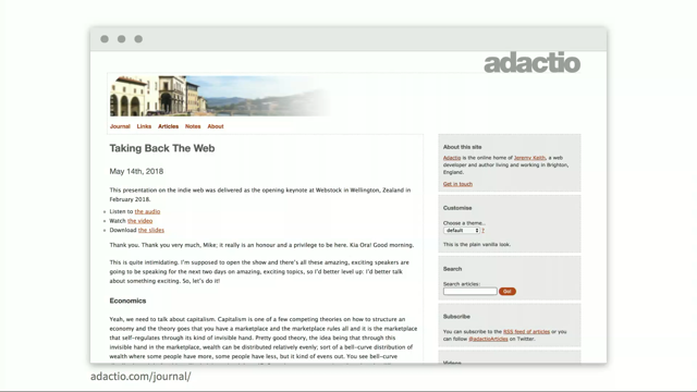
And initially it looks like this but the background images, I mean they were kept but they have a lot of opaque layers behind the text. Or you might find that you UI looks just fine such as Harry Roberts' site.
So he has his image in the background, the image is still there, the text looks fine. It's okay.
So just make sure that you test background images. Tip number two.
Replace shadows with borders or add outlines. Use system colour keywords as we did before, or make them transparent and let the OS style them. So box shadows will also be removed in high contrast mode. So you can adjust your components to replace shadows with borders in the high contrast media query. You could also use one of the system keywords to, like for example here, so we had a box shadow. I would remove it here.
I forgot to remove it.
And instead, you could not remove it because it's gonna be removed anyway.
So I could add a border and the border, instead of using system keywords you can also make sure that the border is transparent. This will allow the OS to take over colourizing it for you. So I would do it this way.
Another thing that you can do to all of your elements to make them generally more accessible in high contrast mode is to add a transparent outline.
So the reason I am saying outline and not borders is because borders effect the box model of the element and eventually kind of effect the entire layout but outlines don't.
So you can add a transparent outline to any element. And then in hight contrast mode that outline is going to be converted into sort of a border. Borders are important in high contrast mode because the eye needs to hang onto something. So if you don't have any background images anymore, if you don't have any box shadows or stuff like that, you need to be able to visually separate elements somehow and borders is one of the main ways to do it. Tip number three, similar to the previous tip here, if your element has a background colour that background colour is going to be removed in high contrast mode.
Make sure to apply the border instead.
It can be transparent or you can use keywords. No I don't really need the demo here honestly so I'm just gonna skip over it.
Buttons are also most likely going to need borders as well. So you can use this transparent outline or borders technique on button as well.
So because the background colour is going to be removed you can add a transparent outline and you will know that in high contrast mode the button is going to end up with a border, which it should.
The same concept also applies to text inputs and other form elements.
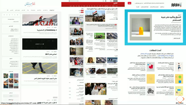
So these photos that I borrowed from gov.uk's accessibility blog also show a bug that their team found when their form inputs are rendered in high contrast mode.
Don't worry about the small text, you don't need to read it.
The buttons that had no borders needed borders in high contrast mode.
That can be fixed with a transparent outline. And the text inputs also lost the background so they had to exclusively set the background colour on them for high contrast. So it's essential that you test your interface in high contrast.
Also all of the photos are copyright and owned by gov.uk.
Tip number four, ensure that images with transparency, png images, have enough contrast.
If you can't do that, provide an opaque version with a background colour of the images instead if you can. One of the examples here is my own website. So while working on the slides for this talk I'm learning about high contrast mode I started testing my website and I realised that there is some work that needs to be done. I don't have a lot of images with transparency except for the SVG and png client logos on my homepage. So you can see the Cobe, the Telus, and the Schiphol logos are exhibiting very low contrast in high contrast mode. So one of the ways that I can fix it is to make sure that the png is not really a png. It has a background colour just like the signature at the top.
Another solution is to make the logos monochrome to begin with.
So a wonderful example is Stephan Nitch's website. So he has these logos, white logos on a dark background. In high contrast mode they are still white on a dark background.
Another way some other people do it is for example, Harry is using png images.
So he has pngs with a pink background and in high contrast mode this is how they look. And I don't really like how they look here. So again, Harry is using a png with a background and Stephan, I'm not saying that Stephan's logos look better in high contrast mode because he is using SVG because he did not really optimise them for high contrast mode.
It just so happened that they are light and they had a dark background and when you switch to light on dark in high contrast mode they look just fine.
But if you use the light contrast theme they become literally invisible.
So you will need to make sure to check them and make sure that they are ready.
Again, this is how you could do it.
You could have a logo, the logo inside of the SVG, the SVG would need to be inline and then you set the fill colour to be current colour when current colour is the value, no current colour is a variable in CSS that has been around ever since CSS has been around and essentially what it does is the browser checks what the current colour of the text is and it uses the text colour as a value instead of current colour here.
Another example where images need to be used with high contrast to avoid breaking the interface experience is if you're using png image sprites to style checkboxes and radio buttons. This example is from Greg's article as well. So if you're using something like the demo at the top, in high contrast mode the icon disappears completely so you can provide the png with a white background if you really need to do that.
And this is his excellent article.
I would however, improve on Greg's technique because the way that I currently style checkboxes and radio buttons does not use sprites at all.
So there are currently two ways to style them. One of them is to, you would have a sprite like that with a checked and unchecked styles and inside of your CSS you apply it as a background image and then if the checkbox is checked you change which icon inside of that sprite is showing. Again, this has limitations.
High contrast mode looks ugly, et cetera.
So using much less CSS and without requiring extra http requests, because the SVG would be inline you can do something like that.
So not only do you create more delightful experiences but it's also easier to make this work in high contrast mode.
So instead of using an SVG sprite you would have an SVG that is inline in the page here. So I have a label, I have the inputs, and the SVG is labelled as inline inside of the label. I have a path here that has no fill and that path has a stroke.
Those of you who are familiar with the line drawing technique in SVG recognise how this works.
And then, when the checkbox is checked I animate that line drawing.
I would love to go into details of this but it's outside of the scope right now.
So there's this article by Jake Archibald, he is the one who wrote about this technique first to begin with.
So I highly recommend it.
And since again, the SVG is inline you can use fill, current colour, and it's going to work in high contrast mode by default. There are a lot of, okay yeah it also has an interactive demo that shows you how the technique works but unfortunately I'm going to skip over it.
There are even more examples of things you can do and really delightful ways you can style checkboxes and radio buttons.
You can find some of these on code webs as well. Tip number five, remove any UI elements that don't make sense or provide much value. So if you have a theme switcher and the user is using high contrast mode you don't really need that theme switcher anymore. An example is this Smash magazine, so we built that and it was completely red so they offered, a lot of people didn't really like the red so they offered this switch here that allows you to turn the red off. In high contrast mode it doesn't make any sense as you can see, so make sure you remove that. This also applies to any kind of theme switchers and customizations because they don't make sense. They just look like some elements that are just there and are broken.
Tip number six, and this is one of my absolute favourite things that I've learned in awhile. Seriously I think this whole talk could be I mean okay but this thing is my favourite thing here.
Do not use colours to convey information.
We've already covered this before.
It's important but there's this very specific use case. So colour swatches that are expressed in design systems, they are usually created as empty elements which have zero semantic meaning really and where the colour is shown by applying it as a background colour on that meaningless div, right? So if you view that in high contrast mode you don't see any colours anymore, which is very funny.
So yeah, you should be able to deliver the colour values and preserve them in high contrast mode somehow.
I only found this article awhile back when I was subscribing to Taylor Hunt's RSS feed. He has a way to semantically mark up colours in a way that preserves those colours regardless of the environment that you are viewing them in. So Taylor discusses how he can mark them up. One of the ways is, he suggests using input type colour, and disabled input type colours because a colour is a colour, okay? Now ideally, instead of using disable you would use read only.
So it's a colour that's only read only.
But read only is, I don't think you can use read only on this kind of input anyway. Taylor says that this kind of mark up is ideal because it's a colour semantically.
You can give it a name with a label.
It's value is accessibly exposed by assistive technology. It will show up the correct hue no matter where you view it. User style sheets, leave it be because if the user wants to change the styles of your website it's not gonna change those colours. With appearance and some webkit pseudo-elements you can also style it just fine.
Now he also mentions that he would prefer read only but the spec only allows it on other types of input.
However, I mean sure this is the ideal way to mark it up but support for input colour is not that good. And the main reason is the lack of support in Safari on Mac OS and iOS.
So this is not a reliable way to mark up colours yet. In the meantime Taylor suggests that we can use SVG. SVG comes to the rescue a lot of times when CSS and HTML can't do things.
So this has much better support as it works back to IE9. Yeah, so you would have a rectangle of colour inside of that SVG, that rectangle will always be coloured everywhere and it works just fine.
Another perfect application is the colour swatches and theme switchers.
So I also created this demo for this talk and those swatches at the top that allow you to choose the theme, they are also empty divs with a background colour and if I view them in high contrast theme, I mean sure, I should remove the switcher completely in high contrast theme but this is also, like another use case for it. I have two minutes I think.
I'll just cover this really quickly.
So computers in general, and web browsers specifically, can be operated with keyboard alone.
So website users can, by default, use the tab key to jump between focusable elements.
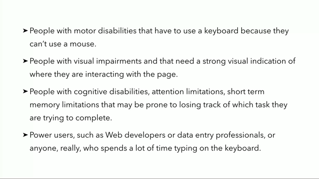
And there are a lot of people who do that, who do navigate websites using a keyboard.
Those include, but are not limited to people with disabilities such as, people with motor disabilities that need to use a keyboard because they can't use a mouse, people with visual impairments that need a strong visual indication of where they are interacting on the page.
People with cognitive disabilities, attention limitations and stuff like that and then there are people on the other side of the spectrum who are power users such as us.
Web developers or data entry professionals or anyone really who uses keyboards a lot.
So you need to be able to tab through pages in a good way without breaking that experience and it's very important for keyboard users to tell where they are on the page.
This is why browsers include a default outline around elements that are currently in focus so that people belonging to any category that are using keyboards know where they are on the page. Focus styles are so important that a visible focus is a requirement for a site to be considered accessible under the Web Content Accessibility Guidelines.
This is why designers must take care to ensure that it is easy to tell which item on the page is currently in keyboard focus. How? The answer is simple.
Avoid overriding default focus styles unless you are providing a better focus indicator than the one provided by the browser.
So I mean, how many of you have done this? We all have done it at least once in a lifetime, right? So it's a very small snip it but it has a really big impact on your webpage so probably should avoid that. Unless you are specifying a better alternative. So it might actually be a good idea to do this and to override the default styles in the browser with better ones because as it is, the fact that different browsers have different focus styles and some of these focus styles are not really that good.
So for example, Firefox and IE show a thin dotted outline as a focus indicator and this indicator can be really difficult to see sometimes, unlike the shiny blue outline that is in Chrome.
So there's a chance to enhance the default focus indicators by designing more effective ones but what makes a more effective focus indicator? It has to have good contrast, it needs to complement the shape and size of the element, colour scheme should be complimentary but also stand out, doesn't need to be the same for all elements and it should be the same across all browsers.
Ideally the best case scenario, the focus indicator is only applied when the element perceives keyboard focus not mouse focus. So a lot of designers usually avoid using focus styles because they don't match the aesthetics of the design, especially when using a mouse.
So if you apply this by default if you apply focus styles using the focus, selector, this is applied to any element that is focused even if they are using a mouse. But as it so happens CSS now has a focus visible class, not class, selector, which allows you to apply focus styles when the element focused only using a keyboard.
So there is really no justification or no, you should not skip focus styles.
Just add them and use this.
However, browser support is not really that good so you can use a polyform or you can use another technique, and I'm completely out of time so unfortunately I cannot cover that.
So I have these resources.
The last section is about designing better content links. You should not remove underlines, you should keep those underlines.
You have text decoration skip ink property in CSS, I'm so sorry, which allows you to create really nice underlines.
They skip the descender so they look nice.
They also, you can also colour the underline, giving it a really nice colour.
But the only thing about this property is that browser support is not yet good but you can use it as an enhancement.
And it also has a limitation in that you cannot control where the line is under the words. So you might have to hack your way around it using different techniques.
One of those techniques is this last slide, I promise. Here.
Yeah, so you can use CSS gradients.
What's happening here is you have the text, you add the text shadow to the text and then you, the line here, the underline is actually a gradient background but instead of having the background fill the entire element size, it has width 100%, height, one pixel or two pixels, whatever you want the thickness to be and then you position it at the end under the text, and so it looks like an underline but it's not really an underline.
Yeah, so takeaways from this talk, I'm out, okay thank you.
(applaud) (electronic music)