- So, to kick this off, we are very fortunate to have Sara Soueidan, who's name I have been butchering from the (chuckles) moment I met her.
To her, great, she's been giving, that's great, she's been giving me such stick about it.
So I welcomed her into my office by a very famous Arabic greeting, which I will not pronounce because she laughed so much when I did it, that my heart was broken.
I worked for weeks on welcoming you into my office in Arabic, in your mother tongue, but I butchered it. Alright.
- [Voiceover] And I've got to make him feel guilty about it. - So Sara, over the last couple of years, has been increasingly well known for the knowledge that she drops around SVG.
And it's really interesting to me that SVG has actually been a done technology, it's been really, really well supported all the way back to IE9.
And there were even great ways to use it prior to that in older versions, way back to IE6 and the work of a good friend of many of us in this room, Dmitri Baranovskiy, with Raphael, a library they give you at JSAPI to work with SVG even in those old browsers has been there, and yet we just haven't been using it.
And I've been promoting it and talking about it, but it's been great to see over the last couple of years Sara really becoming a champion for this technology. So if you don't use it much today, I hope after the end of today you realise just what it is capable of.
What it can help deliver for your users, and just how widely supported it is.
So to hopefully get you as excited as SVG as I clearly am, would you please welcome Sara Soueidan.
- [Sara] Thank you.
(Applause) I don't usually really like it when someone puts a lot of pressure on me before the talk, but he's right, this is going to be intense, it's going to be fast, I hope you had your coffee. And I'm already speaking fast, so um, alright, so this is gonna be a technical talk sort of, I tried to make is as less technical as possible, but failed of course, because it's SVG you have to have a lot of code in there.
Okay, so first of all, my name is Sara Soueidan, It's pronounced like that, all these vowel letter spelling is German/French. I spent eight years of my life in Germany, and we got the spelling from there.
So I've been using that one, but it's pronounced "soo aye dahn." I'm a freelance front end developer from Lebanon. Arabic is my first language, so when it comes to language, don't set too many, too much high expectations. I'm the co author of The Smashing Book Number 5, I write a lot about SVG, I've been doing that for a couple of years. I co authored The Smashing Book 5, I'm the author of the Codrop CSS Reference, I was all about CSS before I got into SVG.
I no longer maintain that reference, someone else is going to be doing that, though. And I'm a huge SVG advocate, obviously.
Someone made an April Fool's joke post a few, you know, on April Fool's.
There was this post where they had these imaginary answers from designers and developers, myself included. So they had this answer, and we all supposedly answered it. And they said, "What's the best way to build websites today?" And apparently, my answer was, "You don't need CSS, you don't need JS, SVG is all you need." And I even, I even implemented angular JS entirely in SVG without a line of Java Script, and it's IE5 Plus compatible.
(audience laughing) SVG.
Alright, so this is my second time n Australia, and I'm extremely excited to be here.
It was my first time in Sydney, I was very happy to visit there, it's fantastic. But it's my second time in Melbourne.
I came here last year around the same time of the year to speak at CSSConf AU.
I gave a talk, it was entitled Building Better Interfaces with SVG, and that talk was all about showing how SVG is much better than CSS when it comes to solving certain design problems. I was very, actually, too biassed towards SVG even though all the use cases, SVG did win them, but I've learned over the last year to start looking at CSS and SVG, not as competition, but as you know, instead of looking at how they can, of how they compete with each other, I'm starting to look at how they can complete each other. So, SVG can be used to extend the capabilities of CSS while CSS can be used to enhance what SVG already has to offer.
As a matter of fact, a lot of the features that we have in CSS today, including but not limited to filters and blending modes, for example, have been imported from SVG, including CSS tranformations as well.
But the features that have been imported, that we have in CSS are, they're very primitive. Like we have a handful of CSS filters, we're gonna see them in the talk.
And there's only so much they can do.
While SVG filters, the original features, filters, they can do so much more.
They give you a lot of control, a lot of features. So if we want, you know, I was listening to a podcast a couple of days ago where Dmitri Baranowskiy was being interviewed. And he said something, he's a huge SVG advocate, he created Raphael, he now has the Snap SVG library, which is the modern alternative to Raphael, and it's also called the jQuerie of SVG.
He says, "Even though," I mean he's like the SVG guy, but he always says that, "use the right tool," which is wise words of course, "use the right tool for the job." So if there's something, if you need more control and you can do that with SVG, then by all means use SVG. But this talk is focused on how SVG can extend CSS, so we're gonna be seeing how SVG can be used via CSS, and how CSS can be used to enhance SVG.
So I'm usually very curious as to how developers use SVG, and whether or not they do.
I ask a lot of questions over Twitter, I do some polls every now and then.
The results were sometimes disappointing because I expect developers to be using SVG more, but they're hindered by browser support.
But you know, a note on browser support, which is not really part of this talk.
SVG supported IE9 Plus, all modern browsers. You have seven ways to embed SVG on a web page. For every way, you have at least, at least two ways to provide fallback for non supporting browsers. We have tools to automate the process, we have tools to create SVG sprites, to replace icon fonts and other PNG images where appropriate.
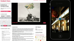
So there's really no reason not to be using SVG today. One of the particular, there was one use case that I was particularly interested in, was the use of SVG in Living Style Guides, also known as pattern libraries.
And I know they have several names, and they're sometimes used interchangeably, so I'm gonna be using Style Guides.
So specifically, I was interested in whether SVG was being used as for the icons on logos, focused on logos actually, and how it was used. Because of the different ways that SVG can be embedded on the page, I was curious, like okay, how are they using it? So I asked a question, I didn't get any answers. It's like nobody was using SVG in pattern libraries. But I did get only one answer from someone, I forgot, I forgot the timer again, nevermind. So I got only, I got an answer from someone who said that he imports the SVG images into the pattern library, or the style guide, via HTML parsers.
That's not really SVG specific, that's not something for SVG.
You can import anything via an HTML parser, right? So I didn't really get the answers that I wanted. So I went to styleguides.io, which is a website where you can find all kinds of resources about style guides, tutorials, videos, resources, and a lot of examples of existing style guides on the web today, and these are only a few of them here. The scroll bar, you can see the scroll bar, there's so much of them.
So, one particular use case that I was interested in, is how SVG is used for showing different variations of a logo inside a style guide.
You know, when you're creating the brand identity, you usually have, usually, not always, but you usually have multiple variations of the same logo, depending on where it is rendered. So, for example, a logo rendered on a background, on a light background image has a different colour scheme than the on that is rendered on a dark background image. Right, so I interested, the LinkedIn logo is an example where the background of the N changes depending on the background colour of the logo.
Slack is also another example, these four lines, they are either coloured or they are white, or maybe, I don't know if there are any other variations, yeah, they are white, there is grey, it all depends on the background.
Now if you inspect these, these are only just one image PNG, but to be fair, this is not a living style guide. So, I looked into style guides that were available. I looked into The Lonely Planet, and okay, so I didn't see any logo here.
I was, I'm gonna say a little too lazy to keep looking and I didn't have a lot of time before the talk anyway, so I have, they are using SVG's for the icons, so I was interested in how they're embedding them because there are, like I mentioned, a lot of ways to do that.
I inspected it, and it turned out they have this diff, and so it's not inline SVG, and they're usng SVG, this is an SVG image and it's being used as a background image for the element. So they are using SVG, which is good, but they're not really taking advantage of all the potential that SVG has to offer. So this is the sprite that they're using on the right, and so, if they want to change the colour of an icon, they have to go back to the sprite, if you're a developer, you're gonna have to go to the designer, ask them to change it, to add an icon, change the colour of an icon, and then get the sprite back and embed it one more time. I got some feedback from designers in Sydney, and one of them said that it really is time consuming whenever a developer asks for some changes like these and they have to go over the sprite all over again, make the changes and send it back.
If you want to change or add anything, you're gonna have to do that via the sprite and it's just not flexible.
There is a better way.
And indeed, there are other style guides using other ways. So this is the Salesforce, yes, the Salesforce style guide. If you look at the icons that they're using here, they're using, they have an SVG inside the document, it's an inline SVG, inside the SVG you have the use element, and how many of you know what the use element is? Perfect, I will have something new.
Okay, inside the use, note the shadow root here. There's a shadow root.
Inside the shadow root, I'm gonna talk about what this is later, inside the shadow, we have another SVG.
So, this doesn't look very familiar, but when you're embedding this SVG using this particular technique that I'm gonna talk about, you're not going to be writing all of these. But, just a note here, that you have SVG, use, and then a shadow root.
Why is this better? This is more flexible because if you want to change, let me pause this for a second, so, if you want to change the background, I'm gonna be doing that for that icon here, but what if you decide to change the background of the icon? Not the icon itself, but where the icon is being rendered? If you want to change the background colour, you may want to change the fill colour of the icon itself. Right, instead of having to use a sprite, or instead of using a sprite and then having to edit that sprite, and then bring it back again, if you're using this technique, inline SVG, you can do that in the CSS.
So, but I can change the colour of the background of the SVG. I can either remove it or change the value, I removed it, obviously.
And then, using just one line of CSS, you can specify the fill colour and you can get multiple variations for your icon, or your logos from the CSS. You don't have to go to the designer to ask them to create anything new, it's just one line of CSS.
You can have multiple occurrences, multiple variations of a logo, which is what I'm interested in.
You could have multiple variations and you can create, you can create the themes, if the designer decides that they want to change one colour, maybe, in all of the icons, they don't have to do anything. They'll just say okay, please change that blue colour into pink.
And you can do that.
So how does it work? This is how it works, I'm gonna explain the details next. So, you define a logo, there's an element in SVG called Symbol.
It has an ID logo, viewBox, not now.
Okay, inside the symbol, you have all of the contents of the logo, so if you've created a logo in Illustrator, you export it, you have an SVG code, you place that SVG code inside the symbol.
And then, if you want to display multiple variations of the logo on the page, so you want to show the logo, for example, three times, you use the use element to reference the ID, to reference the logo, and you give each use a class name.
Now, note here, note here that the use is empty. I'm gonna get back to this later.
So this is basically how it's done online, so this, inline. So this here, what we saw here, SVG inline, use, and then shadow root, the shadow, you're not dealing with the shadow at all. All you're doing is this.
Symbol, you're defining it somewhere, it can be internal or external, depending on the browser support you're after, and then you display multiple variations on the page. Now, when using CSS every instance of the logo can be styled differently, so multiple live variations. Why am I saying live variations? Because when you have a symbol defined, and then you're using, it's using the use element, these copies, sort of copies, are live copies. So any changes you make to the original logo in the symbol are going to be reflected on all of the instances, on all the ratios, even if you have an animation, if you add an animation, they're all going to be animated the same way. So if you need to change the colours, you can do that in the CSS.
Now, a quick overview to get an idea of what the symbol does, what the use does, and how different they are from other elements. Now there are four main elements in SVG that are used to group elements together.
They're defined templates of sorts, a symbol is an example of them.
And then reuse or instantiate those templates in different places on the page.
You have G, defs, symbol, and use.
The G is short for group, and it's used to group together logically related elements.
For, ah, so, okay, it's exactly the same as when you right click, group elements in Illustrator, for example, you group them.
So, how is it useful when it comes to code? If you have an animation, for example, suppose you have a group of elements that you want to animate at the same time, while also maintaining the spacial relationships between these elements, you just put them in a group. I shouldn't have said "just," there's a lot of talk about "don't use just." So, you wrap them in a g, and then animate the g, all of them are going to be animated at the same time and they're gonna be maintaining the spacial relationship between each other.
It's also very useful when you want to apply the same style to all of the elements, but you don't want to go over each and every one of them to do it. So you ah, "just" apply the style to the group, and it's going to be inherited, in most cases. More on that later.
The defs element is used to define elements. You can put anything in there.
You can put actual elements, or you can put stuff like linear gradients, for example.
In SVG, you can use a linear gradient as a full colour for text, as a stroke colour. So, the thing about defs is that everything that you put inside of defs is not going to be rendered on the page unless you call it.
So we can define the linear gradient inside the defs element, you don't want it to be rendered, but then you call it somewhere inside the SVG, you use that linear gradient as a fill colour to an element, and then it's going to be rendered.
Now, if you want to define elements, sort of templates, and to be reused somewhere else on the page, that's where I would use the symbol element. The symbol has the advantages of both the group element and the defs element.
So everything inside of the symbol is not going to be rendered on the page unless you call it.
So, in the logo example earlier, you define the logo, or maybe if you're creating an icon system, you define the set of icons and symbols, and then you use those icons in different places on the page.
Now, it has an advantage over them in that it accepts a viewBox attribute.
The viewBox attribute is it's kind of hard to sum it up in just one line, so we can say that it allows, it allows you to scale to fit the contents of the symbol into any viewport.
Now the viewport of the SVG is the actual width and height. So when you set a width and a height on an SVG, that's the viewport and then the contents of the SVG sort of like an iframe, are scaled to fit into that viewport.
The viewBox is necessary for that, and without the viewBox, you cannot make any SVG responsive. So always make sure it's there.
The use element is used to reference any templates that you've defined earlier, and put them anywhere on the page that you want. Now notice that the SVG use element, this is again the slide that we saw earlier, so we're defining a symbol, and then we're using that symbol in different places. But the use element is empty.
So we have the symbol here, all of this content. It's not being displayed on the page.
And then when you're using use, just this one line of code, all of that content is displayed wherever this use is. Remember the shadow root that we saw? That's the shadow dom.
If you're viewing, if you were inspecting that page in Firefox, I don't think they've added that feature, you cannot inspect the shadow dom in Firefox, but you can in the Chrome def tools.
All of these contents of the symbol are copied, are cloned into a shadow dom, which is basically copying these into somewhere in the code in the page, but you just don't see it in the dom. It's hidden in a shadow root.
Okay, so it's its own document, and it's hidden from the dom that you can access.
I think I already said that.
Since the elements of the use, inside of the use, are copied into a shadow dom, you cannot access them using CSS.
So if you want to style the contents of the logo, for example, the first, these variations here, we have logo default, logo light and dark, and dark and light.
If you want to access the contents of those, you cannot do this.
You can't say use path, for example, use dark and light, the dark and light use, access the path inside of that use, and then give it a fill of white.
Or maybe access the circle somewhere and give it a fill black, you can't do that. So, how do you style the contents of use? You have your logo, you've displayed it in multiple places on the page.
How do you style those variations? First, before we get into that, we have to go over a few notes about CSS inheritance in SVG. So, styles applied to a g or use, in that case, because use is also a wrapper element, are inherited by all of their content.
Okay, so if you have two elements inside of use, they're going to inherit, for example, the fill colour that you set on the use.
If an element has a style applied using a presentation attribute, presentation attribute is the width attribute, the height attribute, the fill attribute, the stroke attribute, these attributes that are actually, that would normally, for example, be style properties in CSS, they're called presentation attributes.
So if you have a fill attribute on an element, and that element is also inheriting a fill colour from the parent, from it's ancestor, the fill attribute is going to override the inherited style.
But it's going to be overridden by any other style declaration in CSS.
Okay, presentation attribute styles are overridden by any other style declaration, whether that style declaration is in a style attribute, a style tag, or an external style sheet.
So let's put that to practise.
If you set a fill colour on the use, this example here is from an article by Fabrice, Fabrice Weinback, he's German, so I'm not sure if I'm pronouncing his name correctly.
If you set a fill colour on the use, both the path and the circle will inherit that colour. That's what we mentioned, assuming that there are no presentation attributes.
But you don't want them both to have the same colour. You want each one of them to have a different colour, so how do you do that? Does anyone know, just by raising their hands? Yeah, you don't count because you already know. (audience laughing) (chuckles) Okay, there's only one.
Okay, so this is where CSS Variables come in. So when it comes to styling the contents, you have to think from the inside out.
As soon as you have created your logo, you have to determine what elements are going to change their colour.
And then, instead of specifying colours for those elements, you're going to put CSS Variables where the colour would go, and then define the value for that CSS Variable, we're going to see some code now, and then define the value for that CSS Variable in CSS. That way, the variable is going to sort of pull the value from the CSS into the shadow dom. Or in other words, you're leaking the styles from the CSS into the shadow dom.
So this is how it works.
And example of the Sass logo here, so we have the circle doesn't have any presentation attributes, it doesn't have a fill colour specified.
So when you set fill on the use element, that colour is going to be inherited by the circle. Alright, the path does have a fill attribute, so that fill, the value of the fill attribute is the one that the browser's going to use. But the value is what, it's a current colour. Current colour is a variable in CSS.
What the browser does when it sees current colour, it goes and looks for the value of the colour property of that element, whether you set the colour property on that element itself, or inherits it.
It just, it looks for the value of the coloured property, which is the current colour, that's why it's called current colour, and then it uses that value as a value for the property, which is calling current colour.
(audience laughing) I know, okay so in this case, fill is inherited by the circle because it doesn't have any presentation attributes, and the path pulls the colour of the colour attribute.
So the fill in this case, of the path is black. For other variations, Sass black on white, for example, you have fill white, colour black.
Maybe in the other case, which is the opposite, you have fill black, which is going to be inherited by the circle, and colour white for the path, and then any other variations that you want. So basically, you know that these two elements are going to change their value, so you don't give them any values, you only use variables. Now, this is, this can be, on using current colour, is useful if you only have two elements that are changing their colours inside SVG, but what if you have more? What if you have more elements, like three elements? And each of those elements has to change their colour? So the fill colour can be inherited by one, the colour value can be inherited by another element, but how do you change the colour of the third element? We need more CSS Variables.
Okay, and luckily we do.
This technique, this brilliant technique, was first written about on Codepen by Amelia Bellamy Royds, she is brilliant.
She's, in about a year or so, she's now an invited expert in the SVG working group, she's fantastic. So this is all her idea.
So, again, we put the variables where we expect the colour changes to be.
So we have the primary colour, tertiary colour, maybe secondary colour.
These elements that don't have any variables are the elements that are not gonna change at all. Okay, so only the ones that are going to change get the variables, and then you define the values for these variables in the CSS.
So in this case, we have three variations of the logo, okay, every use, every variation which is a use element gets class name, and for every use you specify the value for these variables.
And they are going to reflect.
So we have symbol, a logo defined in a symbol, one, two, three uses, each use gets a class name and for each one of them you define the values for the variables.
All in the code, no matter if you change the color's theme, just go into the CSS, change the colours in the CSS, and bam, you're done.
Okay, it's a little technical, but it's brilliant, it's one of my absolute favourite CSS techniques, SVG techniques.
Now there's a note here about what you're seeing, like we have fill, style, fill, and then the variables. Okay, when it comes to inheritance, as I mentioned, the fill colour that's inside a style attribute is going to override the fill attribute, right? Okay, so if a browser supports CSS Variables, it's going to use this declaration and ignore that one. But, I've kept that one.
Always keep that one.
Presentation attributes are a great way to provide fallback. So if a browser does not support CSS Variables it's going to fall back to the default colours of the logo. Except in Safari, there's a bug that it doesn't fall back to that value, but I've already filed it and I think they're working on it, I hope.
And if a browser does support, ah, I should have added an example here.
So, what if a browser does support CSS Variables, but the variable value that you provide in the CSS is not valid? What if you gave an invalid colour value? Well, in that case, it would add something here. Primary colour, comma, and then you add the same value here, the fallback. So the variable function, it takes the name of the variable, comma, another colour value, a six, you know, hashtag f f f, yeah, so you put the fallback in here.
So if a browser doesn't support variables, it's going to ignore the whole thing here and use that. If a browser does support variables, but the variable value is invalid, it's gonna use the background, the fallback colour inside the declaration.
Everything I mentioned about styling the contents of use, variables, fallbacks, two variables, multiple variables, and more in this article at Codrops. Okay, so since we're talking about icons and iconography, how many of you still use icon fonts? Okay, I've got a lot of convincing to do, then. Don't use icon fonts.
You should be using SVG, and here's why.
All of these are from an article by Chris Corriere so I have a link to the article in the end, including the imagery all from his article. He has this cage match style article that compares icon fonts to SVG's.
And here is why SVG wins.
SVG icons are resizable up and down without losing, they are resolution independent, they are pixel perfect, almost, sort of, yeah, ignore that.
They are pixel perfect, they look sharp everywhere. Browsers consider icon fonts as text.
So the icons are antialiased as such, and that can lead to icons not being as sharp. In this example here, Chris switched from icon fonts on Codepen to SVG, the icon font looked blurry on certain resolutions, but SVG's didn't.
While icon fonts can be controlled using CSS, you can only control them using the handful of font styling properties in CSS, like size and colour, and maybe if there's kerning or something.
But with SVG, you get all of that and more. You can create multicoloured icons.
With icon fonts, you can't create multicoloured icons, but there's this hacky technique where you layer multiple icons on top of each other, and then each layer has a different colour, and it's too hacky, just don't attempt it, so use SVG. So, you can create multicoloured, you can even animate the contents of an SVG icon, but with icon fonts you cannot do that.
The size and position of an SVG is predictable and behaves just as it's expected to as long as you have a viewBox, and it can be, but it, with icon fonts, it's frustrating. Like you have a pseudo element, and then it's, it depends on the line height, the vertical align, the letter spacing, word spacing, how the font glyph is designed. Does it naturally have white space around it, or does it have kerning information? Then the pseudo element displays type effects, if those properties have an effect or, it's, use SVG, definitely.
I got a question after giving the talk in Sydney from someone, he was convinced by all of these arguments that we're giving.
But he had this one problem, he said, okay, SVG is perfect on all accounts, but icons, if you have an icon font that's going to scale with the size of the text, but in SVG, can you do that with SVG? The answer is yes, instead of using pixels for example, to set the size of the SVG, if you use M's, in this case, for example, the icon is square, use one M by one M, it's going to scale with the text. Because M is the unit relative to the font size. So as the font size changes, the size of the SVG changes as well.
Icon fonts are subject to many weird and forced failures. There's a lot of browser problems with icon fonts that are outside the scope of this.
I'm not even familiar with all of them, because there's so many of them that I didn't even bother to read them.
But one of the first failure scenarios is using an ad blocker or a content blocker. How many of you use that on mobile? Because web fonts have a big impact on performance, so if you don't have them, if you block them, the site does get faster, unless the web font is embedded in a really progressive, say, way.
In the correct way, it wouldn't have that amount of impact. So anyway, if the font is blocked, the icons will not show. And you can end up getting all sorts of different emojis that have nothing to do with the icons that you intended to show.
SVG is right there, it's an image format, it's not blocked by content blockers, and it's also, Opera Mini, if you have users using Opera Mini and you care about them, which you definitely should, Opera Mini does not support icon fonts at all. So, use SVG.
When I asked Bruce Lawson why it doesn't support it, he said icon fonts, ah what did he say? I dont' remember.
Icons are what SVG is for.
He said we don't support, we don't, Opera does not download icon fonts.
Icons is what SVG is made for.
In this example, Chris changes the web font. He doesn't remove it, he just changes the web font that is used on the page and you end up with these rectangles.
But, Github switched already from icon fonts to SVG, I'm not sure what this blurry image is about, I don't know why they have it in there.
But this article explains why they made the switch and why SVG is better, so definitely give it a read. Icon fonts are not semantic.
You have these empty elements, and you give them classes, and you apply the icons as pseudo elements, they're not semantic.
But SVG is an SVG image format, so they have semantics written all over them. SVG also comes with a default mechanism to make them accessible, we have title and description elements to make the contents of an image accessible, but with icon fonts, I think you can use ligatures, there was an article, a link to the article there, you can provide basic accessibility, but that only works in IE10, IE10 and above with web fonts. Accessibility can be baked into reusable elements, so if you have the symbol, if you define the symbol, and then you reuse that symbol multiple places on the page, if you place the title and the description, they shouldn't be empty by the way, this is just an example. If you place the title and the description into the symbol, then wherever you reuse that symbol, these accessibility elements are going to be copied with it. So it's going to be accessible wherever you use it. Browser support.
Icon fonts do go back to IE6.
SVG's don't, but we have many ways to create SVG sprites, if you're going to make the switch.
There are three different ways to create sprites. One of them is ridiculously similar to icon fonts. So if you're really stuck on the icon font workflow, I've got something better for you.
There's this tool called Grumpicon, it also has a sister, Grunticon, which is a Grunt plugin. It creates the SVG spreads for you.
So, the SVG icons are displayed the way you use them, it's very similar to the way you use icon fonts. You have an empty element, if you're really keen on empty elements.
You have that empty element, and you apply a class to it, and then inside the CSS, the icon's going to be applied to that element as a background image. But, what's really nice is you don't even have to do that. Like, with icon fonts, you have to set the pseudo elements and stuff, you don't have to do that with SVG. Grumpicon generates all the icons for you, puts them in a CSS file, all you have to do is include the files in your project, there's one script that it generates.
Put that script at the head of your page, and then use, just you know, have an empty span somewhere and give it a class name, and it works.
If a browser does not support SVG, it does all of the feature detection for you, it does all of the switching for you, it provides the fallback for you, and you don't have anything to do extra.
Put the files, all the generated files, put them in your project, put that script at the beginning of the page, It's not, it doesn't have a bad impact on performance because these are one of the most performance aware folks on the internet, I love them.
So, put that script, and then use the icons. Just put those empty elements wherever you want them and give them class names and you're done.
Very similar to icon fonts, support goes back to IE6. Again, all the fallback, they are taking care of it for you. And this is a guide that explains how you can use them, how you can use Grumpicon.
There are two other spriting techniques, but those are outside the scope of this article, outside the scope of this talk.
Now, if you're finally convinced, I hope you are, and you want to make the switch, how do you do that? There are tools to help make it easier.
So, there's Icomoon app, which enables you to, you can upload your web font, and it's going to generate all the icon fonts for you, and then you can use them as a sprite.
It also even generates an SVG sprite if you want to use it as well.
There is Font Blast, which is an MPI module. Again, it also converts any icon font into individual SVG files and then you can use them any way you want. And if you're using Fontello font in particular, there's Fontello SVG, which converts the icons into SVG icons for you to start using.
So, there's no excuse, stop using icon fonts. (audience laughs) All about the difference and comparison, everything that I mentioned in this article by Chris Corriere.
We're done with, sort of, the code part.
There's gonna be a little bit of code in the end again. Now image editing, how can, I've talked at the beginning of the talk about how SVG can extend the capabilities of CSS. And image editing is only one area of that. So, a couple of years ago, maybe, it was really popular, remember when Medium used to display these big header images that are monotone, either colour tinted, either black and white, or had these colour tints.
So right now, I don't see them a lot everywhere, but they're available on the Offscreen Magazine. These are the colour tinted ones, the header is the black and white one.
Before CSS got improved, and before people started getting into SVG, they would create this image in Photoshop and then embed it on the page. If they wanted to change the colour for any reason, they would go back into Photoshop and then change it, and then embed it.
With CSS, it's no longer necessary.
If you want to create a black and white image, you can do that using one line of CSS.
Of course, if you're using it as an enhancement, then this is all you need.
If you need cross browser support, you're gonna need some prefixes and the old syntax for IE as well.
But browser support, I'm going to try to keep you optimistic, so I'm not going to get into browser support at all. These are all the filters that are available in CSS today. They are very limited, each one of them takes only one parameter, for example, the brightness you can give it a value, it specifies how bright the image gets, you can invert colours, you can set opacity, drop shadow, which is similar to box shadow, but drop shadow is very similar to box shadow, but you know, the CSS, an element in CSS is considered a box, a rectangle, even if it's a paragraph that contains text, it's still considered a box.
So when you apply a box shadow, the box shadow is applied to the rectangle, not to the text, text itself.
But if you use drop shadow, the shadow's going to be applied to the contents of that element.
So you would see the text getting the shadow, not the box, which is pretty awesome by the way. Sometimes, okay, so if you don't want the black and white and you want it to be colour, colour tinted, this is how I would personally do it in Photoshop, because I'm not a designer and I don't know better. So we would have two layers.
One of them is the image, and the other one is the colour that you want it to be tinted with.
And then using blend modes, not filters, you blend these two layers together.
In CSS, we have two properties.
The background blend mode, and the mix, there's a dash between the blend and the mode. The background blend mode and the mixed blend mode. These two properties allow you to blend together elements or background images in CSS.
So the background blend mode enables you, if you have multiple backgrounds in an element, or if you have only one background image and the background colour, the background colour still counts as a background layer. So you can combine or blend them, blend the background layer, not lawyer, layer with the background image, and you achieve the effect similar to this one. So the way you would achieve the colour tint is to have an element, background image, URL of the image that you want, background colour, and then you set the background blend mode to luminosity, and you get the colour tinted, tinted effect. The mixed blend mode property is very, it does the exact same thing, except instead of applying the blend mode to the background layers, if you have two elements on the page, two separate elements on the page, and you want to blend them together, use the mixed blend mode.
It's the same, they have the same values, but one of them is applied to background images and the other to elements.
Blend modes can be used to blend multiple background images or element, this is a live demo I have created. You can upload your image.
Because, who really knows what the result of a blend mode is going to be without trial and error? I don't, so I usually just go over all of the blend modes, apply each one of them, and then when I get the effect that I want, I just use that.
So this demo allows you to do that.
You can also, this shows an example of the mixed blend mode. You have text, the text has a colour and maybe even a background colour.
And then using mixed blend mode, you can blend it into the background to get these different effects.
Okay, you can, there are, there's a bunch of blend modes in CSS, but the blend modes in CSS do not allow you to control each and every channel.
For example, this effect here, this cannot be achieved using just one line of CSS or one blend mode. CSS, okay, this is what I said, they do not offer channel per channel colour control, but SVG filters do.
I think I had a video here somewhere.
Well, I did have one, I don't know where.
So, in Photoshop you have this option where you open this panel, this RGB panel, and you start playing with the values.
Change the red values, the green values, the blue values. You can omit one layer, one channel, the r for example, and then you get a mix of magenta, which is blue and r, g, b, which you know, you can control every channel.
But in CSS you can't do that, but in SVG you can. So we have this filter, the filter element inside the filter element go the different filter effects. One of these effects is called feColorMatrix. F E means filter effect, colour matrix is a colour matrix, which as you can see, has, well, it's a matrix.
The first column is for the R channel, G B A and the fourth is, I really don't know. But yeah, okay, R G B A, and ignore that.
And then you can colourize images by omitting and mixing colour channels.
So, again, like I mentioned, you can play with the shadow and highlight tones via alpha channels, the fourth, the, this is the fourth row, yeah.
It affects the overall alpha channels while the fourth column affects luminosity on a per channel basis.
You can read more on this article by Una Kravets, and this is a visual explanation of how the matrix works. Again, by Una in her article as well.
Okay, so we have this filter in SVG.
How are we gonna use that? We can use that using CSS.
So, the CSS filter property can literally be extended so you'll be able to apply SVG effects in CSS like that. The filter property accepts a URL notation, so you define the shadow, this effect here, my filter, give it an ID, and then you reference it in CSS, then you apply to the elements.
Although not all browsers support SVG filters on effects on HTML elements, it really depends.
It's still a work in progress.
Now, if you have an image, an HTML image, I M G, and you applied an SVG filter to it, then it doesn't work in all browsers.
And you want to work around that.
You can use SVG again to do something that would normally not be possible in CSS. So we have here, this is actually from a comment someone posted on Una's article.
So instead of using the HTML IMG tag, you can use the SVG image tag, you link to the image that you want, give it a height and a width, and you define your filter here.
And then you apply your filter, this is it here, you apply the filter to the image, to the SVG image. This is very similar to HTML.
Very similar, and you can embed it inline in the pages, but instead of just using one line of HTML, you use these three, two lines of SVG and you get that effect cross browser.
And this is the effect that they had.
The colours are well, not really necessary too, right now. And this is how you can extend CSS filter effects from SVG. Content clipping.
This is another example where SVG extends CSS. So, SVG comes with a set of predefined basic shapes: circle, ellipse, inset, and polygon.
These allow you to define basic shapes that you can use with properties like shape inside, shape outside, and clip path. I think Jen is going to be talking about these shapes tomorrow? Yeah, so, the shape's properties allow you to change the flow of content, instead of flowing in rectangular areas, you can flow them around, just like print magazines, and inside circles, around circles, around arbitrary shapes. Now, the clip path property, it takes, it allows you to clip the content.
Usually, most of the times, they are images. So you have an image, and you wanted to clip, to clip it to a specific shape, you can do that using a clip path property. Now, it accepts either a CSS basic shape or an SVG clip path as a value.
CSS basic shapes don't allow you to create a shape like this one here.
This is a curve, and in CSS you cannot create curves like that.
But you can do that in SVG.
So, the SVG clipPath element is used to define, obviously, a clip path.
You can put anything in here.
You can have one element or multiple elements So, in this example here, I know I'm going fast but there's a lot of content to cover.
So we have the clipPath element here, multiple circles, I have multiple circle here, and then I'm applying this clip path that has an ID, and I'm applying it via CSS using the clipPath property to an image, and this is the result that you get. You can have as many elements as you want.
You can even have text in there.
So this is an example, clip paths are really, really nice. This is an article by Chris Corriere where he generates the clip path randomly using a JavaScript script.
So he creates these polygons using the CSS polygon syntax, so he creates them dynamically in the CSS, in the JavaScript, and then applies them via CSS so that you don't get the exact same sketch effect on different images. Clip paths can also be animated.
This example, this is a recreation of C.J. Gammon's profile.
C.J. Gammon works for Adobe and he does all kinds of interactive and really awesome stuff.
This is the effect on his profile, this is also a clip path, each, on each and every image, and when you hover over the image, that clip path is animated.
So clip paths can be animated as well.
This app was created by C.J. Gammon.
These animations here, these transitions from one page to another, these are also clip paths in CSS masks.
Again, if you want to get more creative, use SVG, and apply those via CSS.
How about clipping videos? This is one of the most frequently asked questions that I get, I have a long article about clipping in CSS and SVG and I get a lot of questions from designers asking me how to clip videos. Theoretically, it should be possible.
Ignore, well, do not really ignore it, but this screenshot here is just for the link on the top. And when I share the slides you're gonna, this is what you're gonna be looking for.
So theoretically, you can have an iframe on the page, and apply a clip path to that iframe, and it would work. But practically, it's not that easy.
Browser support for SVG effects on HTML elements is not good generally speaking. But there is a workaround.
Just like we did with the image before, we can, the element that we want to clip, we have it inside the SVG, and then we apply the clip path to it inside the SVG. But this time it's a little more complex.
So we define our clip path here, and then I'm gonna start from the inside out. The iframe here is referencing a video.
Alright, you cannot embed HTML in an SVG document unless you use the foreign object element.
So the foreign object tells the parser that we have a foreign object here, which is an HTML, inside the SVG, which is XML.
So you wrap your video in a foreign object, you put that foreign object in the SVG, you wrap it in a g again, and then you apply the clipPath to the g.
And this is how you clip a video.
So, instead, because SVG in some browsers, cannot be applied to HTML elements, you bring those HTML elements into the SVG. But, okay, this is um, this, this table here, this is the support table which shows which features are supported in which browsers, and whether or not they can be applied to SVG elements, or HTML elements.
This is more of a live demo.
It's created by, her name is Yulia, but she's known as Yaksil, she has all these fantastic demos using SVG and CSS on Codepen, so definitely check it out.
This is a live demo, so if you open this page in different browsers, you can see what effects are being applied and what effects cannot be applied. Okay, and you have this tool here, if you want to create a clip path and you don't want to do it manually, this tool allows you to create all kinds of CSS clip paths only, not SVG's.
With SVG you can draw the shapes that you want in Illustrator, and then export them as SVG, and then put them inside a clip path and apply that to the elements that you want. Now, there's a problem here with this approach. This does work, this does apply a clip path to your video, but, in Chrome, Chrome, Safari, and Opera, so basically Webkit and Blink, as soon as you hit play, the clip path disappears. This is a known bug, actually I think it might be three bugs, and I don't know if they're working on them, but too bad. So, another thing, text shadows.
In CSS we can create all kinds of creative text shadows using the text shadow property, but there's only so much it can do.
It has, we have horizontal distance, vertical distance, and blur radius.
For the box shadow property, we also have the spread radius, for example, which enables us to define the spread, not just the blur.
So, because we only have these three parameters in CSS there's only so much we can do.
If you want to create effects like those that you can create and Photoshop, you can do that using SVG, not CSS. So you can, you can specify, okay.
Colour, opacity, angle, distance, spread, size, you can even specify the contour of the shape you're using. One of the, okay, you can add noise.
And then you can specify the shape of the shadow. This is actually just a GUI for SVG Photos created by Michael Milleni on Codepen.
Okay, so using SVG filters, we can create text effects that are not possible in CSS.
These are possible in Photoshop, but not in CSS alone. And this is the generated code.
Now, I don't think anyone will be really interested in writing this kind of code to create that effect that we ended up with here, but luckily we have this GUI, and worst case scenario, you can always create the filters that you want in Illustrator, and then export them and use the code. But there's something to note here.
Instead of using these filters here, which is what I personally used to do, use the filters that are available in the SVG filters drop down.
Because if you use these, the browser is going to apply the filter effect to the image that you have, but once you export it from Illustrator, it's going to be exported as a bitmap image, not as SVG code.
If you want SVG code, use the filters here. This is an example, if you want to blur the text, you go into the SVG filters section, select Blur, and then File Export.
File Export, not File Save As.
File Save As is still available in Illustrator. It exports your SVG as SVG, but there's a lot of junk in there.
The new export is called File Export, it exports really clean code.
Make sure that the font is saved as SVG because otherwise, the text is going to be converted to outlines and it's not going to be accessible, or searchable, or selectable anymore.
So Font, SVG, and then you can export it, but I just showed code here.
So we have the filter here inside a defs, and then it's applied to the text, which is real text. And you can use, just like the Blur here, you can create any filter you want and then copy the code here, and then use it in your page. Creative text effects can also be created using SVG and CSS. This is how we would do it in Photoshop, or how Chris Courriere would do it.
You would have, again, text, image, and then you would clip the image to the text. In CSS, okay, after creating that image, in order to display it on the page, you would hide the text using one of the different image replacement techniques, hide the actual text, use the image as a background image, and you have the text.
But that text cannot be searchable, it cannot be selected for example, by the user. And if the image is not high resolution, it's gonna look blurry.
Today, I don't know why there hasn't been any progress on this.
So we can clip images to text using these, they're only available with the webkit prefix because I don't know if they have been standardised at all. So you have the text fill colour and the background clip. Using the background clip property can clip the background to text, and you need to make sure that the text fill colour is set to transparent so that the background shows through. This is not really well supported, I've never used it. Only in this demo, just to showcase how it works. Now in SVG it's very different.
You have multiple ways to create, to add fill to text like that.
You can use a clip path as we mentioned earlier, you can have anything inside the clip path. In this case, we have text.
And then you apply this clip path to the image and it's clipped to the text.
Another thing you can do it, you can apply a gradient to text.
Again, I said (foreign language), which is Arabic. You can also apply the fill colour here.
We've defined inside depths, we have defined a linear gradient, and then we use that linear gradient as a full colour for the text.
Another thing is we can define a pattern, define a pattern, inside the pattern you can put anything, including GIF's, or "jifs," G I F's, put them inside the pattern, apply the pattern to your text, and you can create all kinds of crazy effects. In this example here, we have a G I F image, and this here, we have animated patterns, and then this is an animated stroke.
So you can create really creative text effects using SVG, via CSS depending on the browser support you want, or just using SVG.
This is all about techniques for creating textured text. And the text is fully, in SVG, as long as you don't convert it to outlines, the text is going to be fully selectable, searchable, and accessible. You can use that as an enhancement.
Type lockups, another thing we can do in SVG. A type lockup is a typographic design where the words and characters are styled and arranged very specifically. Like the design is literally locked in place. You have, it comes from locking up type, as in actual wooden or metal blocks of type, arranged together with other blocks of wood and metal to make a design that you can literally clamp together, ink, and press on paper.
You can create these things, this is an example of a poster, print poster, you can totally create this on the web today using SVG.
So this is an example, this is another example. If you want to use HTML, it's not going to be as easy because we have content flow, which is going to affect the way you place things together.
So, SVG is the way to go for this.
There are a lot of examples if you check Pinterest, or maybe even Dribbble, you can find a lot of them. The way you create them has nothing to do with code in this case.
Just download the fonts that you want, instal them on your machine, fire up your favourite graphics editor, create them, move the elements around, add effects, add images, etc., export the images, but make sure you export the text as SVG text, not as outlines, because otherwise it's going to lose, like the text is not going to be text anymore. If it's turned to outlines, it's going to become outlines, shapes, parts, it's not text.
So, make sure you save it as SVG text.
And export and embed.
And it's going to be 100% responsive, only if you make it so, which is what I'm gonna talk about next.
Typical examples of type lockups are logos. This is just one of them.
And if you are using text inside of logos, do convert the text to outlines, because otherwise if the web font is blocked, or if it's not loaded, if it fails to load for any reason, you're gonna lose the brand identity if the font is really, it is usually, a big part of the identity in a logo. So do convert them to outlines.
Using CSS, SVG can be responsified, and this is what we're gonna do next.
I don't have a lot of time, so I'm gonna go over them quickly.
So these responsive logos have been very popular for awhile. Once you resize the screen, come on, me, come on, me, fast, okay, the contents of the logo changes.
Okay, they are using SVG but I think I did inspect it here, yeah, so every one of these logos, instead of using just one SVG, which is what they can do, they have again, just like we saw with the, I think it was The Lonely Planet style guide, they have one SVG sprite which contains the different variations, and when the viewpoint size changes, they change the position of the background. But they can do better.
You don't need multiple images, you can do that with only one image.
So making the SVG responsive.
Okay, um, okay I think I can skip a little bit of that. Okay, to make as SVG responsive, okay, first thing. Make sure the SVG viewBox is there.
Without the SVG viewBox, it will not scale at all. Keep the width and the height attribute, because they're gonna work as fallback if the browser, if the CSS does not load, the browser is going to be using those.
And if the CSS loads override the width and the height attributes in the CSS, embed the SVG using one of the different ways that we have, and apply a hack or a fix to make it work cross browser, depending on whether or not you need it.
So if the SVG is embedded using an image, picture, or object, or embed, which is no longer used, the default size for replaced elements in CSS is 300 pixels by 150 pixels.
SVG is a replaced element.
So if you don't set it within a height, by default the browser is going to give it 300 pixels by 150 pixels.
If you set the width to 100%, so that it's responsive, all browsers are going to honour that except IE. IE is going to make the width fluid.
But he's, he's, it's going to fix the height to 150 pixels, which is pretty dumb.
So in order to make the height responsive, you have to tell it that the width is 100%. But this is the hack.
So to make an SVG responsive cross browser, if you're embedding it using one of these techniques, set this rule and it's gonna work.
If you're embedding it using an iframe, you have to apply the padding hack.
Now, how the padding hack works, you wrap the SVG or the iframe in this case, in a container, collapse the container's height, okay, so you have the SVG hanging down, okay, because the container doesn't have any height anymore. And then you apply a padding to the container using a specific rule we're gonna mention now. And then you set a positioning context on the container. And then you pull the SVG back up using absolute positioning.
Why does this work? We're gonna go over it now.
So, we wrap the iframe in a container, we set the height of the container to zero, the width can be anything you want.
Now the padding top is height, SVG height over SVG width times the width of the container that you want here.
Now how, why does it work? The padding, when you apply a padding to an element in CSS, if you set the padding and percentage, say for example, padding equals 25%, that 25% is going to be relative to the width of the element, not the height. Even if you set padding top, padding top 25%, it's going to be one quarter of the width, not the height. So using this technique, you can, once you've applied a padding to the element, you've given it height anymore, the height is no longer a zero, right, so we had zero, and then you expanded it using the padding. And you established an aspect ratio, because the padding, which is the height, is now relative to the width.
The aspect ratio, you need to make sure that the padding, the value for the padding is, use this rule. So you're using the aspect ratio of the SVG to create an aspect ratio on the container. And then you position that iframe back up, because once you've applied the padding, it pushes the iframe down.
So you pull it back up using absolute positioning, give it width and height 100%, and now it scales with the container.
I know it's complex, not really complex, but the way I'm saying it makes it sound so. But it's really not.
It's a rule, literally.
Like every time I want to apply this, I open this rule up because I haven't managed to memorise it yet. Now you can also make the SVG content adaptive. See the examples of adaptive logos that we showed. We don't need multiple images.
You can have, this is an example of a logo. Depending on the screen size that you have, or the viewport size, you can hide elements, you can change the colour of some elements, and if the text becomes too small to read you can remove it entirely.
You can do that using CSS Media Queries.
So I'm selecting here, I'm changing media or max width to 150 pixels.
When we're at 250 pixels and below, the pass id in some elements changes.
On 200 pixels, the pass id of another element is removed, maybe the fill colour changes, one SVG, CSS Media Queries inside the SVG, and you've got an adaptive image.
You don't need multiple images, you don't need a sprite. One thing to note here, which is fantastic, is that SVG Media Queries are element queries. So when you set Media Query with max width equals 250 pixels, that width is the width of the SVG, not the viewport. Not the page viewport.
Only when the SVG is embedded inline, does the Media Query apply to the width of the page itself. One image, CSS Media Queries, no sprite required. Now the future, this is the last section, just a couple of slides left.
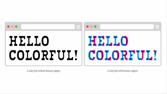
Again, what SVG is going to make possible in the future, we can create multicoloured fonts.
And this is, the future is actually now.
This font exists, it's multicolor, as a fallback, if the browser does not support this one, it's going to apply that one, so it can be used as an enhancement.
Right now, we have this font available on Typekit. So, it's also getting a step closer, maybe using SVG, a coloured variation of this font can be created as well. And a lot more possibilities coming, but I need more than 15 minutes to go over them. And this is the article explaining how the multicoloured font has been created. Thank you very much.
(applause)