- One of the key challenges since the beginning, well, of the web really, well when the web started it didn't even have images. And then we realised images were really expensive to download.
So does everyone remember the low source attribute, right? Is that making any sense? So, for the younger ones in the audience there actually used to be an attribute in html that you could point to a lower source that the browser would download before it could download the really big one, right? This is going back into the early '90's.
So, we actually had a responsive like solution, I guess. But certainly in the rise of the multi-screen and particularly once we had multidimension, you know, levels of resolution, the challenges of images and getting the right image in the right format, at the right size and resolution for your device or context has been increasingly challenging. There have been a number of goes at solving this over the last kind of five or six years but luckily in the last year or so we've sort of centred on one.
And we're gonna learn about that next.
So our speaker Matthew Kairys, he teaches this sort of stuff at university. It's Monash right? - [Matthew] Yeah.
- Right, I got it right that time.
As well as doing this stuff in the wild and he's gonna tell us all about the current ways we can deal with responsive images, in particular with this picture element which is now pretty well supported.
So would you please welcome Matthew to tell us all about responsive imagery.
(audience applauding) - [Matthew] Thanks for that John.
Well, it's a short presentation, I'd like to just walk you all through some simple examples of how you can actually integrate responsive imagery in your designs and applications because I'm gonna have a few sort of significant advantages we'll be going over. Before we begin though, I just wanted to get a show of hands how many of you are actually using responsive images today? Cool, looks a bit less than half.
Similar to Sydney as well.
There was a poll made by Smashing Magazine on Twitter in the last few months and basically it found that 60% of designers hadn't been using responsive images. Might be a bit unusual considering we're at a responsive sort of conference, but the main reason for it is that many of still have legacy websites that we're working with and we might have outputted an image that was optimised and great resolution at the time. That means we can't really get a double density sort of resolution easily out of that image and that sort of poses a lot of problems.
The outside issue is that we've got a lot of content management systems as well that make it sort of difficult to work with multiple versions of images of different levels of resolutions.
So that can be quite a challenge.
But there's quite a few different benefits that we can use by leveraging responsive images. So, the first sort of main one is that we've got devices of various sort of different context.
We've got mobiles, tablets, smart watches, if you're crazy enough to try and browse the web on that. But because we've got so many different resolutions we have to cater for, that means that we should be supplying images that are specific for those devices.
If we've got smaller images for smaller device screens that means we can have the browser download fast images, so that'd be a very good sort of performance benefit for mobile devices.
It also means that we can basically have the images rendered a lot faster as well.
If you're trying to present a very large image to a small device like a mobile, you might not necessarily have the right processing power to display the image quickly and that can actually impact the rendering performance of the page as well. Lastly there's a good chance of actually improving how we can actually display images on the web as well. The picture element in particular which I'll be discussing at the end, lets us sort of inflate images to show them in different sort of contexts.
But means that we can actually display entirely different images based on how the web page is being used or how the screen is rendered for the page as well. So before I begin I'm going to go over the image element first and some sort of attributes we can use so you can quickly us responsive images in your design today.
There's particularly two sort of approaches in this. The html 5.1 justification outlines that we can target images based on the device specific ration, so the density of the pixel display or dots per inch.
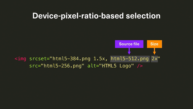
And also viewport-based selection where we can actually base these widths based on the resolution of the entire sort of screen. So that's sort of set up, fixed width images and also fluid width images. So the srcset attribute that you can use when imagining elements today is basically just a comma-separated list of images that you potentially want to use.
So, rather than just having one image you might have multiple versions of an image. What you do is you outline what the resolution is for each particular image and the browser is the one that determines which imagine is to be displayed to the user. In this case if we got an example of just like a simple logo the imagery element is still rendered for older browsers that don't understand the srcset attributes. So, things like I6, it will still render a normal image. But if you have a more dense sort of screen you can outline different resolutions that can be used across browsers.
So, in this case we've got two extra images that are basically saying it's 1.5 and two times the device pixel ratio.
So, most of you are probably aware that we've got retina based screens on, for example Macs and iOS, as a quick example they have twice resolution over sort of normal displays. And this is where we can sort of target those displays and have, output an image that won't look blurred or fuzzy, that sort of thing.
You don't have to just stop at two times while it's more sort of common sort of example we are getting screens that can sort of go beyond that as well.
So, while we've got images outlines that keep the image elements, the browsers are only going to download one of them. It's gonna work out which particular one is the most suitable for that particular browsing context and just download that.
It's very unlikely that your browser resolution density is just gonna change randomly.
So the next attribute that you could sort of use for viewing image elements is the sizes attribute. So, same sort of principle but the difference here is we've sort of outlined the conditions that these images can be downloaded.
So it might be the width of the display, for example, it's the most common sort of one.
And we could use media queries that we know and love in that sort of example.
As an example here, if we've got an image of particular sort of Sydney Harbour Bridge, we might have the base of the image, so Sydney Harbour small. But we've also got the srcset using the W descriptors so we don't have to use the density descriptor. So we could actually outline what the actual width size of the image is and what is the most appropriate one. We've also got a media query here basically it's saying if the max width of the page is for example 48 em will we use that particular image at 100% viewport width. And the other bit, let me just go down here, that last bit is the fallback size so there's no other sort of condition so you could have multiple sort of media conditions place on a particular slice element slice attribute it will fall back to that particular size.
So this could be a usually a good size to set for that one is the max width of the particular image.
Otherwise, you can always use the viewport width if you so choose.
So, showing how that would actually look, that particular example.
The image is getting rendered based on the sort of attributes based on the sizes element, so in this case using 100% viewport width.
And then later on it goes to 80 when it needs to, because it's to big for that particular condition. So, that's just a real quick example of how we can use the image element.
I'll actually have a quick drink.
And we can sort of have some conditions to make sure it would render how we'd want it on the desktop or some other devices.
So that's just a real quick sort of way you can set it up. And like I've mentioned before because it's used in the image element, if any browser just doesn't understand this attribute, they get ignored and they'll just download the normal images at one source. The good sort of news is that for most browsers, as long as you ignore Internet Explorer, I suppose, most browsers tend to support this sort of approach. But even if you are Internet Explorer, you don't understand what those attributes are, it's still gonna render quite well.
It's just gonna use the low resolution that you sort of defined in that sort of case. And it also means that you won't work with media sort of queries that outline those conditions. So, the main element and sort of focus for this talk is the picture element.
So, this is a particular element that's been developed for quite some time.
It's only been quite the last year or so that a lot more browsers have been supporting this particular element.
As an example, Safari only just recently supported it in the last month in the most stable versions. So, the idea of this picture element is that we sort of wrap it around an image. So that we still have the normal image element existing so that way if we do have browsers that don't support the picture element we still get the picture outputted, so its great in that sort of progressive enhancement approach. It gives us a lot of sort of flexibility in being able to sort of define a lot more sort of media conditions, so we're a lot more focused in sort of our directive sort of approach.
Whereas before this browser was sort of choosing when to display a certain image.
Here we could outline when it should be downloading different images or use just one particular image.
So, for all those of you that worked to solve the video html file element, we also use the source element that's in that for the picture element.
So, this lets us provide alternative images to display based on certain conditions.
So we use media queries that we know and love. And the real sort of benefit of this approach by having the source element is that we actually reuse different file formats. So, with the image element we have to basically just stick to one particular image type, so it might be jpeg or png, whereas in this sort of approach, we can go,"Okay, I might have png as my sort of base layer image but I might use web-pay or some other format you want that outputs the browser that supports it." So, if you look at this sort of example, so we've got a picture that basically saying, that for the, well look at the image out first, we've got a small cat but in the picture element of the source attributes, we are basically saying that if the minimum width is 960 pixels, we'd use a large cat, otherwise if it is 480 pixels we'd use a medium. And it determines when to actually show those particular images.
To give you an example of how that would work because we're able to actually define different sort of sizes and able to use different images as well, this is when we can actually use a bit of image cropping approach.
For example, this could be really useful for things like if you're reading a news article on a mobile device. You might have emphasis on a story on some sort of person. On a mobile device you obviously don't want to see the person and the background, you might be able to only show just the person's face, whereas if you were on desktop browser, you would be able to show a much more in-depth image. So it give us that sort of flexibility.
The other approach you would use generally in this sort of web application or web design is that most interfaces tend to have that sort of hero image for the web so you've got, like, a header and you're showing some sort of product.
You could sort this sort of approach to basically show an image based on what the device is. So if it's a really small screen, you could assume that it's a phone, if it's a bit larger you'd think tablet.
So you might be able to show the image of the application being used on that particular device as being shown.
So it's very flexible in that sort of regard. Potentially, I think the most sort of beneficial approach of this picture element is that rather than just ignoring sort of, the media queries and showing different images and having a bit more decision in that direction, is that we could outline exactly different image formats. There are a few obscure ones, for example, jpeg excel and jpeg 2000 which are outlined there, but the webpage formats supported by about 40 to 50% of browsers, and it can sort of like save bandwidth by about 50% on average for png images.
So if a particular browser understands any sort of file format, so it goes from the top down, if it understands up to the file format it will stick with that particular image.
So, Internet Explorer would be able to use the first sort of jpeg excel one, which is a bit more of an optimised jpeg sort of format, we sort of focus on clarity. Jpeg 2000's been supported by Apple for a little bit. And it's basically much more of compressed ratio jpegs with better quality as well.
And webpays basically came from Google when they bought the VP8 sort of codec and made into an image format.
And the only real browser that doesn't support anything of those sort of formats is Firefox.
So, with this particular element being used a bit more, they might actually start adding some more support as long as those supports are open source mantra. Cool, so the real benefit of this approach though is that if you do just make some quick versions of different images, doesn't have to be retina-size or anything like that, you could easily have some bandwidth settings so that the user is able to download pages a lot faster and that can have a sort of impact on your business if you want to increase sales and so forth. So, what I think is the most common sale elements where you could probably use the picture element today is for a logo.
While most browsers tend to support SVG already, you might have some circumstances where you need to support I6, I feel sorry for you if you do still, but we can have an image basically outlining the logo that's in png format or the alternative tag, and then, so that would work in all sort of browsers, and then we could also just outline, well if you do support SVG, just use that instead. That way you can have a quick sort of resolution independent logo image and designs today pretty easily. One thing I'd like to point out though is for the tag, you only need to find that for the image element. Basically the picture element overrides the source and chose that particular image instead.
It has the accessibility information still assigned with it as alternative text. So, what's the support like? Again, pretty good if you ignore Internet Explorer and maybe some of the old Android versions. I'd just like to point out, Safari 9.3 is actually the current stable version on iOS.
So currently on iOS if you've got the latest version you will actually be able to use the picture element. So that can be a particular, it's a good time to actually start potentially experimenting with the picture element and looking at it if you need to integrate with your products. That means that most of the browser supports are there, like I wouldn't never get it, but it means that we can easily support most current versions. So, having trained you that pretty quickly, seems pretty good.
Might be able to interject that into applications quite fast and so forth.
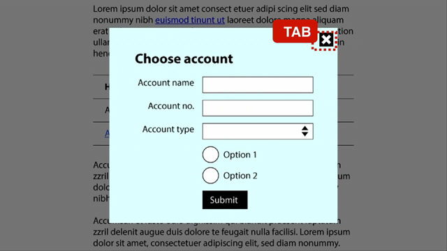
What's the catch? I particularly like this tweet where someone tried to look into the picture element and tried to find it for a particular picture. You can see that it can be very verbose.
We've got a lot of different image formats sort of outlined for one particular image, we have to sort of have a lot of different media queries and so forth.
It can get a bit out of hand, so I think if you want to sort of integrate this sort of approach, you need to change your work flow, you need to rely on automated tools to produce the images and potentially the media queries that go with it as well. It does sort of blur the lines between content and presentation; there's a lot of, sort of, presentational mark-up that's now in html, which has been unfortunate, but images are a lot more complex than pure html, so might need to have that sort of trade off. So there are a few tools out there that will help you. If you use, Gulp, there's a particular library called Gulp Responsive that will let you type a lot of this sort of query and get all the images generated for you. There's also some cloud-based services like Imgix and Cloudinary that will produce images for you and just link to that particular resource as well. So regarding comparability, I did say that generally if you know Explorer, it's also web but it's not that good. This is a very sort of popular polyfill for this particular element, so it's called Picturefill. It works with quite a lot of Android versions, it's in third iteration, so it's been quite well tested and has a lot of sort of glitches that it tries to fix. A lot of browsers used to support picture elements had bugs of some sorts along the way so this tries to fix that.
So while Chrome and all that should be alright, if any companies are using an old version they will make sure that sort of fixes those particular cases.
So if you do want to support a lot of different browsers that don't have picture element, Picturefill is a really great solution for that. The other sort of group I'd like to point out is the one probably responsible most for the picture element and transforming the industry of general support is Responsive Issues Community Group.
They've been pushing this sort of support for quite a while and it's great to see that it's actually being implemented now.
But they actually have a lot of sort of good articles about how to use responsive images as well on their website.
Thank you.
(audience applauding) - Thanks so much Matthew.
We've got time for a couple questions while we set up our final speaker for this session. So who has a question for Matthew? There's a lot in there, a lot of valuable stuff. Come on, there's gotta be questions.
Oh, over here.
- If you're trying to get down to just having one optimal image to cover a broad range of devices and maybe orientations as well, is there a good sort of average that you can apply so you've got the best of both worlds, so small bandwidth but good quality? - Yeah I definitely recommend using the x descriptors, so you're basically saying you're targeting a particular pixel-density.
That would be the quickest solution because you'll be able to support devices that have that high resolution like displays or retina screens. So that way you only need two images.
But if you use something like picture element, then you can just change the image format quickly using that descriptor and to support that in terms of the bandwidth savings as well, so. If you use the media queries, you kind of have to have a catchall sort of thing of everything but the other part is quite faster.
Does that sort of answer your question? - [Audience Member] Yup, thanks.
- Cool.
- [John] Anyone else? There's gotta be a lot in there, lot of questions. Oh Kevin in the front.
- Looking at the very large picture tag that Brad Frost was tweeting and complaining about, I wonder if anyone's thought of taking the entire contents of that tag and making that a file format for describing images.
Obviously with http1 where every additional request is a bad thing, that's not desirable, but maybe as we've seen with http2, maybe that's something we could look forward to. - There is something that I cut out of my slides because I would've gone over 20 minutes.
They're actually called HTTP Client Hints.
It's supported by Chrome at the moment.
The idea is that the browser notifies the server of what sort of like what the screen resolution is, or what sort of pixel-depth it is, and the serve understands that information and can send a pixelated image sent back.
That means you actually only need the image element, so that was one particular approach but the issue is that the client needs to understand it and I think the issue is more a lot of servers would need a lot of more complex technology to actually send images back but, yeah, I think actually having one format to describe all the images would be a great sort of approach though.
- [John] Any more questions? I think it's all a bit overwhelming at times. I feel your pain.
Last chance to ask a question of Matthew before we move on to Chris.
Going once, alright.
- [Matthew] I should have had Fritos.
- You should have had Fritos, you could've bribed them, that's the secret.
Alright look that was a great presentation, thanks so much to Matthew, let's give a big thanks for that. - [Matthew] Thank you.
(audience applauding)