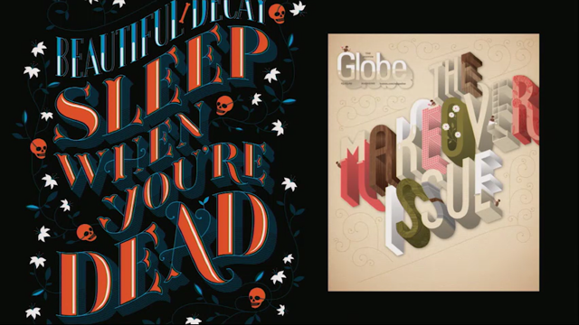
The crucial role of typography in branding
(applause) - [Michael] Checking, are we good? Great.
Good morning everyone, I hope you can hear me, I'm sure you can hear me.
Press this timer.
Okay, that's me.
I'm not that Michael Johnson, or that one.
Or, there are a lot of Michael Johnson's okay. Just to let you know in case you were wondering. A very good painter, a really good animator at Pixar. And I'm definitely not that Michael Johnson, okay. So it's a very very common name.
Kind of wish I could go back 54 years and have a chat with my Mom and Dad.
Anyway, moving on.
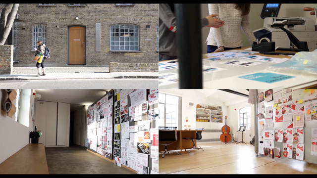
I have a little office in London called Johnson Banks. And here we are, lots of metal walls and instruments and all that kind of thing.
And we basically do branding.
So I'm a bit of an interloper at this conference. I'm not going to talk about padding at all. I'm very rarely going to talk about kerning. I might mention fonts though, and my job really is to set the scene a little bit.
And I'm a brander by heart, that's what I do. And I'm gonna talk about the role of typography in the work that I do. It is integral to the work that I do. I never really think about it, but when asked to come and talk it is interesting. It forces me to work out how to explain the way that I use type virtually every hour of every day in what I do.
Interestingly though, for years typography in my job was kind of the support.
It wasn't really the main story, if you like. Because if you think about, what was then corporate identity has now becoming branding or brand identity. It was clear that you spend a lot of time on the thing top left, and you didn't really spend much on the thing bottom right, okay.
It was the support.
Typography supported the brand, and that was really all that it did.
And now when I started to get the chance to, I suppose about 20 years ago if I'm honest. I'm really very old, just to warn you, I might fall over at any moment.
I did start to wonder, when I started to get the opportunity to do some significant bits of branding.
I started to wonder if I could blur typography and brand. Whether the famous principle, the Paul Rand principle if you like of the logo is everything and everything else supports.
Could you maybe blur the edges of that? And I started to experiment with this.
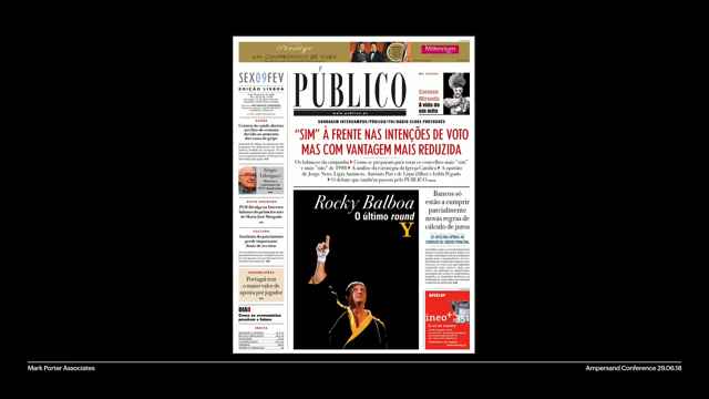
This is an old scheme that's nearly 20 years old. We did this in Paris for a very famous park called 'Parc de la Villette'.
And we basically wrote the name in one particular weight of a condensed Helvetica I think it was.
But we also then started to investigate how we could keep using that typeface in the work that we did. And okay, some of this work does look about 20 years old. The interesting thing about the work is that it's all done with one weight and one typeface.
And this at the time was very unusual actually. It was a really odd thing to do, and people would regularly query me about this.
"Well Michael, where's the support typeface? "Where's the secondary typeface? "What are you doing?" And all I was doing really was creating a brand language if you like, and this is a language they used for eight years. They used the same approach for eight years. And it opened my eyes to what was possible in my world, my kind of branding world.
And I also, I started to work at a time when it became... When I first started being a graphic designer and doing brand identity in the late 80s, it would cost you hundreds sometimes hundreds of thousands of pounds to develop a font.
Now I'm pretty sure you're gonna hear some great font stories and font exploration today. And it really started to change, turn of the decade. If I wanted a font and it wasn't there, then I started to realise that I could draw it. And now obviously this is now easy peasy.
I'm sure you'll hear a lot about this today. So I really wanted a rounded typeface but all the rounded typefaces looked like you were designing something for a playschool at the time. So I just took Futura and then started to round it and then found a great typographer who would help me turn it into a typeface because I was developing this at the time, the insurance company More Than. And I really wanted a way to have a typographic approach where I could embed the logo into a font.
I didn't want to give people a logo anymore, I just wanted to give people a font.
Turns out that this was a bit ahead of the game. This is 20 years old, this work.
And the ability, if you like, to type the logo into a headline and split it up this would give the lawyers heartaches when I did this, but you know, 'less stress more than'.
'More do's than don'ts', that was the cover of the manual. I suppose this was early days of me finding out what you could do with a brand.
How brand and typography in my mind, I guess, they become umbilically linked really.
And here is more of that.
We were meant to write down what it was about. This was meant to be a proper design manual, but then we started to write the little green book and well here we are.
So I was also interested in the way that brands speak, and the tone of voice that brands have, and that's something I'm also really interested in. So inevitably if you write a lot, like I do, and if you're interested in tone of voice, then the way that your words appear on a screen or in print become more and more important. And this idea, if you like, the voice of the brand, is something I talk about a lot, having talked about it for years really.
And I think the penny is really starting to drop now, especially on the web and online.
Because obviously the voice of the brand for a long time was Verdana or if you were lucky you could get Georgia. And obviously what today is going to reveal to all of us, as if we didn't already know, is that the voice of a brand can be pretty much anything you want.
And yes, thanks to the introduction, those of you who live in Brighton, surrounded by, sadly if you don't like it, hopefully you do, you're surrounded by two voices that we've established in Brighton.
This is for the Dome, where we took the scalloped ceiling and we basically put it on the serifs.
And then thought about all the things that Brighton Dome meant, whether it was delightful or diverse or dreamy, or delicious, or discovery. And developed this, this is about seven years old now. And we used a, I suppose I should do...
This is a smart type, I even saw someone with a sticker on. What typeface is it? (soft audience reply) - Very good, look at that, audience interaction. At five to ten, it's amazing isn't it? Yeah, I know, sorry it was such an obvious question. But yeah, Mrs Eaves, this beautiful typeface a kind of a 21st century revamp of Baskerville in case you didn't know.
And here it is, all over Brighton.
And it has been for seven years.
I had to be nice 'cause my client's here.
She's checking her phone though, she's not really listening. I'm sorry, I'm teasing you Marilyn.
(laughs) And then also at the same time, I have to be really nice now, at the same time we started developing the festival identity.
And what we were trying to do, even though Brighton Dome and Brighton Festival technically are one unit, we were trying to establish the two as, we were talking about this this morning, like a groovy Auntie and her, no, a kind of good-looking Auntie and her groovy nephew if you like. So the festival was meant to be edgy and different be able to talk about Hofesh Shechter.
And it itself has a typographic language.
Second prize goes to which typeface that is? Come on, anyone, anyone? (soft audience reply) - Very good, Lubalin Graph.
The front row is killing it, okay? Just saying rows two to wherever.
(audience laughs) And then there was this magical moment of course, when the Brighton Festival had its 50th.
So I thought, oh well this has gotta be, it's just gotta be 50.
Let's have a vertiginous piece of branding and lo and behold it worked.
And it even, see actually when the team at the Dome told me that David Shrigley was gonna do a sort of remix take-over of the brand, I have to admit I was a little trepidatious, I thought oh my goodness. But actually, when I came down in the midst in May and saw it all, I thought well actually that kind of works. It's kind of interesting when you can establish a brand, and you can typographically remix it.
And probably go back to a different thing a year later. It's quite intriguing that, where maybe this is a sign of something that one could do.
Brands are more malleable than we think.
Maybe you could have a take-over on a website for a week. And then go back, it is entirely possible, it's just a piece of code after all.
One of the other things I'm interested in is what happens if you limit the palette.
I'm sure today you're gonna hear about the panoply of options that open to you as typographers and coders and web-heads.
Paradoxically I'm as interested as when you don't look at, in this case, Gotham, the ubiquitous Gotham once described as the Helvetica of the 21st Century. And yes, of course, we all look to these heavyweights down here and thought wow those are really cool. And they are cool, they are still cool.
But interestingly, I also looked at these and thought, ooh they could be really useful.
Paradoxically not used very much.
Because there's a beauty in these and they fitted a job that I was doing at the time for a big famous airline. Virgin Atlantic at the time presented themselves a bit like a basket-case, okay, that's a technical phrase. Hashtag basket-case.
And look, this is what they looked like when we met them. We kind of couldn't believe it, we thought really? Are you really doing this? Look at that thing in the middle.
One italic and then another italic.
We were actually, a kind of head scratcher really. So we set off thinking about, well how can we clean up this famous brand that everybody loves but looks like a basket-case.
And so we started with, and weirdly, roads led to Gotham, strange, and led to Gotham Light.
Now, obviously needed a bit of work (laughs), but eventually we could find a way to write these words in one way of one typeface.
And then you're able to stack it which they couldn't do before.
And then you're able to just flap it down the side of a plane.
Slap it on the belly of the aircraft, so you can see it as it goes over your head.
Still the biggest logo I've done.
And actually clear up, each of these had different logos before and we just basically cleaned it all up.
Turned them into I suppose you might call a 'grown-up' airline.
Well not too grown-up, obviously.
Didn't want them to seem that grown-up.
So he says, looking for water.
Anyway, so it's just an interesting example of how you can take, how far can you go with one, well two ways with one typeface.
Quite intriguing really, 'cause it's my point about establishing a voice.
You're gonna end today, I know you're gonna end today thinking, the next project I'm gonna do is, we're gonna have this variable width, multi-everything, da-da-da-da-da.
But think about it, just think about it before you do, she's laughing because she knows what's coming. Now relatively neutral, weirdly, I suppose, because the Virgin brand is the Virgin brand, isn't it. You don't need a whizz-bang typeface with something like Virgin.
Some instances I think you need to think hard about typography.
I just found this overnight because it took me a while to find it.
You may not know this example, this is a logo for a film done by one of my favourite ever designers of all time, Tibor Kalman.
And the way that they explain this logo for a film that I can find no reference for, it was obviously a terrible film.
But I love the logo.
"We struggled for two months with the Matewan logo "to make it look undesigned.
"We wanted it to look like it was drawn in 1911, "by someone without skill or knowledge but with "an enormous desire to do it well.", we love that line. And we had been approached by a friend of mine who was starting a shoe company as you do, and he actually had been working at Bruno Magli, he was good. And he was an old friend.
And he said he wanted a logo and it reminded me a bit of the Matewan logo.
He wanted something that looked like it was a little bit wrong, that it almost could have been done in 1930, not 1999 or whenever it was.
And I remembered there was a Polish bakery in Swiss Cottage that I would pass sometimes as I drove north to see my relies, and it was called Grodzinski, and I always loved this piece of type.
And I would love the way that the type was fabulously wrong. Just wrong but in the right way, yeah.
And so when Rupert Sanderson, he's now a world famous shoe designer.
So we spent a lot of time making his logo look wrong. I'm telling you now, this is a bad thing to say at a web conference, a perfect design conference, but just go with it.
The 'R' and the 'S' are intentionally a bit shit, yeah? And that loop on the 'R' intentionally wrong. And then the funniest thing about this, Rupert is now, if you don't know, some of the women in the audience will definitely know about Rupert Sanderson, 800 pound shoes and all that.
The funniest thing about this logo is that he regularly gets calls from branding agencies saying, "Don't you think "it's about time you had a proper logo?" (laughs) And this was intentionally designed to look shit. Well, not shit, look at bit kind of, just erm, mmm, crafted. This is something we've done, this is hot off the press. We're working on this at the moment.
This is a film production company.
Again this an example of using something really really weird.
This is a film production company and they make Scandi Noir. And they call themself Twelve Town.
And we started imagining where would Twelve Town be? I was talking about narrative earlier.
"In the heart of a different state of mind, "at the end of a road less travelled, "far beyond any border in a place that could be anywhere. "In the world but feels like nowhere you've been before. "You come to a point where many tracks meet "and somehow it feels like home." So we're actually creating a narrative for a film production company who produces a kind of long-form TV drama.
Really interesting in thinking about how you create this kind of atmosphere around it using this slightly fucked-up American masthead typography. It creates this really interesting impression. Like nowhere you've been before, this is just a little project but I like the attitude of this a lot and we can see where this idea is going to go.
So anyway, that's just a new project in motion. Weirdly, I don't know how much this will come up today but dull typefaces can be very very useful. I know I probably shouldn't say that but I think they can be really helpful.
We were struggling to really sum up a famous university. Cambridge University had come to us and said we need to talk about all the impact that we've had on the world. And we looked it up on Wikipedia and then we realised they're 800 years old, and we were sort of thinking, oh shit, what are we going to do? This is difficult.
And they reeled off, they said, oh we had a conversation the other day, I'll give you an example, a conversation the other day with them and they said, "What should we do about the 100th Nobel Prize? "Have you got any ideas?" (laughs) I'm sort of going, um-mmmm, let me think.
So that gives you just a little glimpse, the most Nobel prizes won by any institution anywhere in the world. And so we're thinking, how do we talk about Cambridge to the world? What it's done and what it'll do next? 800 years of innovation, and a massive impact on the world. It's almost like there are all these gifts for the world from Cambridge, if you like.
And I wrote, "For the world, from Cambridge." And the next thing I wrote on my pad, was these four words: "Dear World, Yours Cambridge." Which is kind of an interesting little shift, a writing shift if you like from the third to the first person if you like.
And I presented it the next day and said, I don't know what you're going to think of this. And from that moment on, 87% of every meeting for the entire summer was taken up by these four words. Because initially they were like, we cannot do that Michael, that's not possible. But we kept saying, well you know, maybe it is possible. Maybe you could do it, maybe you could write a letter to the world about what you've done.
And we started to show them examples.
And paradoxically, the best way to do this was to do this in the world's most boring typeface, Helvetica. "The people who arrive in this city change Cambridge. "The ideas that leave this city change the world." So we started saying to them, look, we can split up those four words and put things in the middle. When you walk around Cambridge and it's covered, there aren't really any walls.
Well there are walls but they're 15th Century, so. Weirdly, the railings, the job that the poster hoardings do in Brighton is done in Cambridge by these black railings, where people put posters. And we said to them, sort of as a joke, why don't you start doing posters about all the amazing things that you've done for the world? That would be interesting, wouldn't it? And we only did these as a sort of joke to warm up meetings. And they really loved these.
So this is Darwin, writing to Humans and cc-ing Apes at the same time, "So I've been thinking about these finches." Famously, his initial work was on finches.
Isaac Newton, did all of his gravity work in Trinity College in 1661.
Four-fifths of Monty Python went to Cambridge. Famous sketch that three people in the audience have seen. And 83 people in the audience have got this album. But actually it's pulsars.
These two, Jocelyn Bell and Antony Hewish discovered pulsars in 1967 and that's the pulsar reading that they discovered. And used 10 years later by New Order, Joy Division, sorry. And we kind of kept going with this, and in a funny sort of way because the design style is so plain it meant that we could do more and more and more.
John Venn went to Cambridge.
"Dear World, I've had an idea for a diagram. "Think you might like it, love it, both.
"Yours, John Venn." Thought you'd like that, you're the kind of audience that would get that kind of thing.
Oh, you'll like this one above: "Dear Quentin, Black, no sugar, yours Paul." Those are the guys that invented the webcam, okay. Now they invented the webcam not because they thought they wanted to change the world, they invented the webcam 'cause they wanted to keep an eye on the coffee pot on a different floor.
And they were really annoyed because they had to walk down fucking floors to, go oh you know, oh geez it's empty. So they invented the webcam to see the state of the coffee. Anyway, we've just had a great time doing this. And 'A', it's been very successful for them. And 'B', I brought it because look what you can do with one weight of Helvetica.
Isn't that interesting? This is letters on the website and eventually, fire. (audience laughs) I already have one fire as type slide, and there it is, beautiful.
Bespoke fonts, now, that's gonna come up today I'm sure. And they do kind of have something incredibly unique. We were talking to an organisation that was raising funds for Cystic Fibrosis.
We kept looking at the 'is' at the end of the word. And kept thinking, well could we do something with that? Thinking well, that's interesting, 'cause it's quite hard to explain Cystic Fibrosis.
It's an internal condition, you can't see it. We started thinking, well, what is it? Is what, exactly? That was a useful question to ask.
Is a fight we must win.
And all the experiments we initially did with this, with 'proper type', if you like, didn't work. And one of my designers came in one day and said, Michael, let's do it with handwriting.
My initial reaction was, we can't do that.
I hate handwriting routes, not possible, can't do it. And then I sort of started to realise that she was entirely right and handwriting was exactly the way to do it. Because it was a way to talk about Cystic Fibrosis but then the humanity of it.
And so we created this handwriting font for it, and it all worked beautifully really.
Not only to talk about nice things on the left-hand side, but to talk about the tough stuff in the middle. And this idea of creating bespoke fonts is something that we've been interested in for years, really. We were talking to the Science Museum.
We were trying to work out if we could redesign the logo but there are seven characters and six characters doesn't work very well.
Oh I know, let's make a ligature.
Well okay, that's all fine, but then we started to realise that if we were doing something that was about coding and decoding then what would be great would be to interpret this typographically. So we started off with one weight, and then we developed another and then we developed another and then eventually there were four styles. You can see they used this for years, on all of their different comms that they did.
And it established a voice for the Science Museum. A voice that wasn't really there before.
They were one of those organisations that had a thing in the corner and then it could have been anyone else's poster really.
And this is their best selling T-shirt of all time, yay. I'm kind of proud of that.
I had one with pi on it that went off the bottom of the T-shirt.
That's the worst selling T-shirt they ever did. (audience laughs) Oh, and there's some little living examples. (electronic music) So taking what was there and extrapolating it into moving image was kind of nice.
I like this one the most, beautiful.
(gentle whimsical music) We worked with the animator who used to work with Walking With the Dinosaurs and they said oh we've got this really great code that we can make things walk.
So we thought, okay, we'll use that.
Quite an odd conversation to have isn't it, oh we know how to make something walk.
The problem about doing stuff like this is sometimes you hit a, what should we say, where it doesn't work out that well.
Some of you may know this, oh, I have one really funny example before I show you another example.
So, back in the dim distant time, I couldn't even find a digital copy of this, I designed a typeface for what was then B-T Cellnet before it became O-2, that's just how long it was ago. You were like, one or something at the time. Anyway, I actually quite liked this at the time. Okay it was 20 years ago, give me a break.
It was kind of like a rounded sans-serif typeface that helped me in the particular project.
Anyway, I'm walking down Baker Street only about two weeks ago and I see this.
And I think, be careful what you start, I suppose, is the moral of this story.
Because yes, I had designed a quite expensive typeface 25 years previously, but look, there it was, on a hot dog stand.
Okay, it was like oh, okay.
And of course when you know the curves of something inside-out, there it was.
And then this is another good example.
We were really proud of this scheme for the Science Museum. But then it got dropped.
They changed it, which was a shame.
And they changed it to this.
Probably redolent of all the other talks.
Variable width this, that and the other.
And the trouble is I didn't know who had designed it, and didn't like it, so this is my Tweet.
"Well we knew this was coming, but still, "bit of a clunker from the Science Museum." 'Bit of a clunker', that's a technical phrase. Dodgy kerning methinks not bitter.
And then there was a fucking Twitter storm about this. Anyway, you know.
It's good to talk about failure isn't it? We were talking about this before I started. Gotta talk about failure, it's important.
Failure makes you stronger, all that. (laughs) Anyway, now, well you can do pretty much everything. Anything or everything.
And I'm hopeful that I will learn as much as you today about.
So, I am, obviously as a brand designer, really interested in the flexibility of a brand and what you can do. And the knowledge that things like this can happen. It's wonderful, the knowledge that people can redesign typeface and then make them move and make them squish and squirm and all those kind of things is really cool. And I'm obviously, this is what today is about. I'm not going to preface that, I'm not even going to anticipate what's gonna be said.
I'm just hoping to learn more about this lovely project that Erik Spiekermann's been doing recently. Taking ancient typefaces and reviving them. Which, is interesting isn't it? That you can do multiple width squish-squash but also you can take something that's 100 years old and just bring it back to life.
And there's all sorts of stuff going on at the moment. All of which is great, in this post-Verdana era, shall we say.
Even free fonts, you know, free fonts kind of the bane of a lot of our lives, but actually I can see it work. There's a community charity that we've been working with. That kind of want to show how community, all the things that add up to community, it all adds up to livability, they call it livability. And they haven't got any money.
So using a free font, well it makes a lot of sense. And actually, dig hard enough, this is Paytone, and you can find something that's really lovely. And they do some really great stuff in the community. And it sort of fits, and they're not spending a penny on this, which is great.
Knitting, nattering, nice cuppa tea.
Paradoxically, I originally presented this in Arial. 'Cause I actually had this, I don't know, is it Machiavellian, no that's the wrong word, but I had this bizarre thought that maybe you could finally design a scheme in Arial. I thought it would just be a really funny joke. Sadly, they didn't agree with me, they went "This is really great, Michael, we love this. "But does it have to be in Helvetica?", I think they said. Or something like that.
But this originally looked like this.
I nearly sold an entire scheme in Arial, although I had to kern it for days, pretty much, just to get one word to look alright.
Anyway, no disrespect to the Arial team.
To end, now that I'm running out of, oh I'm doing alright actually, I'm just talking very fast. I'm sorry about that.
Mind you it's morning isn't it, you can handle it, sorry about that.
Someone came up to me after a talk recently and said, "That was great but is there a transcript?" (audience laughs) I went, oh okay.
Yeah okay, semi-serious, oddly, now we have so much choice. How come everyone's the same? What's going on? Okay, I understand, they look kind of cool those top left ones, don't they? Anyway, so maybe everyone's gonna go back around the diagram.
But you know, this is just weird.
Is it just me? Yeah okay, I'm a brand guy, I'm a brand designer, I make people stand out, I don't make people the same. What is, W-T-F, really.
I mean, no disrespect, but you know, "Oh we've all got our own typeface." Great but they all look the same.
What's going on? And now I think there's a kind of herd mentality which I entirely understand.
And let's say, I'm guessing that Coca-Cola didn't want to pay x-million pounds per year to licence Gotham anymore, or whatever.
Which is probably true actually.
So they just design something that looks like Gotham. It's like, hmmm, okay.
To me that goes in the opportunity missed category, okay? Apologies if I've offended anyone in the audience who worked on that typeface, alright? You can hit me at the break.
This is just getting strange.
In fact, I've started a new company, Spairboon. (audience laughs) Spotify, Airb, Oon, yeah I put them below just so that it helps, is that okay, you've got that? Spairboon.
I wonder when the tipping point will come when everyone goes we all look the same.
Now this has been going on for about a decade, this kind of journey to everyone having the same reductionist, humanist sans-serifs.
And then eventually, at some point in a boardroom someone will say, hang on, what's going on. So basically, I think the choice is kind of yours really. I think that you can continue to build Spairboon, the entity, the organisation, if you wish.
But just think about this the next time you're selling Spairboon in your next meeting. You'll say, I think I know Spairboon.
That's a brilliant typeface, that's really great. Comes in 9000 weights and it's multiple widths, it's fantastic. (laughs) Sorry, I'm being really cruel now.
So I think the choice is yours.
Fit in or stand out, and I'm not gonna say much more or I'll get boo-ed off stage in a minute.
I'm gonna give you one last example, about this really, as it fits with this.
We did this extraordinary project which some of you may know, don't worry if you don't know about it, it's fine. By we were asked by Mozilla, the creators of Firefox, and you know, kind of defenders of the internet. To help them rebrand, and it was an interesting conversation, 'cause they said, we're an open-source software company.
We'd like to rebrand in the open.
We sort of went, yeah yeah yeah, right, good, yeah. Anyway, here's our proposal.
And then we were down to the last 900 from 8,000. No actually, they started with, I know the stats on this, they started with 63 design companies, and then they got it down to five.
And told everyone they wanted to rebrand in the open, and all five went yeah right.
And then they were down to two, and they said look, you're down to the last two.
We're going, oh cool, looking up where's San Francisco on the map.
Oh it's over there, right.
And they said, we're gonna send some questions about the next stage we'd like you to answer in the next stage. And four of the five questions were about doing the project in the open.
And we sort of thought, oh shit they're serious. And so, it meant that we did a lot of strategic work. And then when we got to the design stage we were thinking about where they could go.
So these are the first designs for the new Mozilla logo. Which, not normally on a slide at a conference. Because we put them in the bottom drawer thinking, I liked that one, I'll save that one for the next client. But no, there they all are, in the open.
Yeah, boom. (laughs) I really liked some of these.
I was talking about it last night.
It was quite interesting, it was like doing the I-P check in the open.
You know how you design a logo, some of you will design a logo and go, I wonder if there's someone in Guadalupe who's got that logo, and sure enough, three years later, the I-P lawyer says oh by the say, there's a guy in Guadalupe who's got your logo.
It's a bit of a shit storm over here.
But of course this was all done in the open, as all the Mozillians, as they are called, gleefully sent in examples to blogs.
Reddit was like (mimics aeroplane crashing) of people going, "That's fucking shit.
"I've seen that before somewhere." Anyway, this was all done in the open, which was what you might call a rollercoaster ride. But I'm talking about this project, because buried within these design thoughts, there was a thought that, well actually one of my now ex-designers had had a really interesting thought that could we put the H-T-T-P protocol in their name. It seemed to be a really lovely insight.
We didn't necessarily think that that was the right way to do it, but this idea of putting the protocol in their name was a really lovely thought.
Because if they're part of, the kind of fabric of the internet, Mozilla.
We're also thinking about coding and mono spaced fonts, and this, that and the other.
And we're also looking at some of those Spairboon slides that I showed you with the client.
And saying, do you really want to look the same as all these people? And they go no, no, no, we're looking at this, and thinking about that.
So first of all we started working on the final logo itself. Just really simple.
But there was of course some guy in Holland who wrote and said you've stole my logo, but that was, it happens. And then how it might appear in different colours. But really, the reason it's interesting in this context, we managed to persuade them that they should develop a new font, but not do the same kind of font as everyone else.
So we did this with Peter Bil'ak as kind of a contemporary slab-serif, trying to make them look different, a different voice.
So coming back to, if you like, to the theme of my talk, as finding the voice for a brand.
And in this case, here it is, and it does all of these things.
Really beautifully designed, sort of taking a bit of work that he'd already started and changing it and amending it.
And it means that they can have their own design style. And really the idea of the scheme is that Mozilla is always at the beginning of a sentence, so then the internet flows behind it.
Either champions for a healthy internet, or visuals that would then flow behind Mozilla itself. We're deliberately looking at this crazy, weird, 90s vibe. Which was a lot of fun, actually.
And there's just a little film to kind of sum it up. So a little bit of volume on this would be good. (lively percussion music) So you sort of get the idea.
Actually I suppose, given that all of that was done in the open, and castigated by 3,000 Mozillians, we added it all up, and there's 100s and 100s of web comments.
I think we did alright to come out of that alive, actually. But, that's all I was gonna say.
I was gonna try and keep it short and sweet, and lay the groundwork for what comes today. So hopefully you get my, some of this will resonate. Typography is so important to what I do.
Paradoxically, sometimes the dullest typography can be the most useful.
But also, there are ranges in the scale of this. But it's all critical really to the work that we do. And the brands that you work on, it might be interesting the next time you're working on something like this just to think about the ways that this can be done. So that's it really.
Slightly embarrassingly, I wrote a book recently, and apparently there will be some on sale (laughs) It's a shameless plug, it looks like that, if you want to learn more.
But, anyway, thank you very much.
(applause)