What digital type could do for you
(audience applause) - The tricky part about speaking late in a day at a conference filled with really, really smart people is every single speaker has talked about stuff that I wanted to today.
I tweaked a little bit during lunch but it saves me the explaining parts of a lot of this and I can get to a little bit more about some of the ideas that link them together and maybe even finish a little bit early to get us back on track.
But this is really sort of a step back.
I'm a manager these days, I'm not a developer, I don't even design that much type.
I help much smarter more talented people get things done but I think a lot more about why we're doing all these things and sort of what the implications of them are. For me, it goes back to, it's been a very long career as a typographer and learning exactly how much typography gives us to work with for all kinds of design problems, all kinds of experiences.
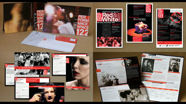
I worked for a long time doing just regular print graphic design particularly for a lot of nonprofit organisations where there's almost like no means to work with. So I did, for years I worked with an arts organisation in New York City called Performance Space 122 that have like random photos come in from 30 different performers over the course of the year and their budget allowed them to licence a typeface family. So we used Line2 ACURA for everything and I had to really, really get to know a typeface and like milk everything that I could add of it to learn what it could do.
This is not so dissimilar to what web designers are doing for a long time figuring out every possible nuance of what Verdana, and Arial and Georgia could do, but people really attach moods and feelings and associations to typefaces in a way that you know can go very, very far and very deep into their feelings about things and we know this from the world of branding and how things work.
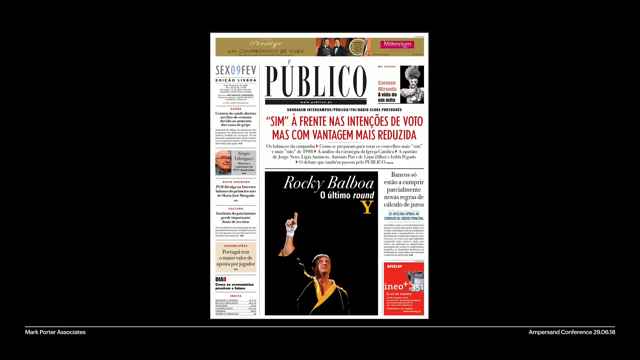
I mean these are just words with a typeface, but like how like evocative all these are, through like repetition and seeing them and see the different contexts that they pop up in. This has been a long hard journey in web design for a while. I mean the earliest days of the web, so this is a Wayback Machine screenshot of the New Yorker website where a really like classic storied visual brand that was based around typography was so deeply broken by what the web made possible in the heady early days of figuring out how all these things worked. And they had to do some terrible things to try to like connect the feeling to what they wanted to say.
They couldn't use the text typeface.
They had a stick with what was available.
They had to work with pictures of words for the headlines to establish a high level visual feeling but pictures of words are terrible things in what's really a text in data driven medium. Not only do they not scale, they were a bit mappy and cruddy but you know you can't do anything with a picture of a word that we can do with the rest of text.
You know, things move along.
We're able to get more sophisticated web design, web fonts really changed this landscape and I'm very, very glad that the world of the web has really taken to this even though I went into type design because I wanted to run screaming from dealing with designing for the web but it came together and I think it's been for the benefit of you know the way things look, the way they function, the way they behave. But it reinforces this idea of like why we get so much from typography. It is functional and that it is just a way to like visually communicate what underlying data is saying. Type is just the vehicle by which things tell us stuff, but this other layer of like the emotional side and the thing that gives us the associations, that's really powerful and you know designers who use type thoughtfully can bring so much more that goes beyond just like this is what we have to say and here's a font and it shows it.
So you may have figured out that I'm starting to get if this ideas like I love typography like clearly I'm a huge nerd on the subject and should be contained but really it's the ability of what text gives us and text being at the core of a means of communication that I think is really, really incredible.
Typography like helps us move past it and get more, get that sort of like touchy-feely stuff in there, but it's that functionality of what text which I think drives what's so great about the web in these digital spaces as a communication medium because it speaks to more than just what people see, it allows what people want to do with a lot of things like words for communicating is great.
When you make the vehicle that gives you the words and transports the words like the ability to function in various ways for different kinds of people with different needs, that's pretty amazing. Text can do all this stuff, Mandy was talking about this earlier.
Like text is not just static.
There's so many different ways of interacting with it that like it meets purposes for so many people. Accessibility comes up a lot.
I mean this is one that I think about quite a lot about why I really appreciate so much text driven work is that it can become information that shared of more than what we see.
I'm getting older, my eyesight's getting crappy, I begin to appreciate more and more how you can manipulate live text so that I can just like to see it comfortably whether my phone is here, or I'm looking across the room. This is all good stuff, scalability is amazing and the functional aspects of being able to edit stuff that's based in text, live digital text is great. It stays like hours and hours of work.
I spent many years as a junior designer like redoing Photoshop coms, redoing visual illustrations, passing them through a workflow of people to get them back up to a final state.
It's nice to be able to type and have something happen. And I think we have been through this journey about how responsive design was like a whole suite of techniques that get us to this place of thinking about live texts being this very like flexible advantageous way of communicating things.
It moved us past this necessity to have pictures of words that didn't allow us to do as much.
You know like prickly as we've got this like plurality of different screens.
We don't have to deal with this nonsense anymore. We can move to things that are more context appropriate, that's awesome.
But when we talk about what type brings to this on top of the level of data, it's more than just making things pretty, making things memorable, that's great.
The fact that you can increase legibility, add this, an emotional layer, that helps people connect or remember things, that's awesome but up until the last couple of years, we've been dealing with a very, very like sort of static approach to what fonts are. They're just sort of an asset that changes the appearance of the text but we're beginning to learn now that we're going through this like sort of shift in what actual font technology is that's been a generation in the making.
I mean we lived with OpenType being what it is for 20 years and suddenly it's expanding.
That's great.
It enables this better kind of richer typographic experience and that's come up an example, example, after example today. But let's step back a minute and think about some of the implications of this because it's allowing all these things but it's kind of at the core of what is difficult about what's happening now too.
So a font is a database really.
I was glad that Ernie showed the TTX of view of a font with like rendered in the XML version.
It's just data.
Its pictures of letters, properties assigned to those letters, properties assigned to how they all work together. So people say that like, "Oh fonts are software," really they've been like a database of stuff but they're starting with like the new specifications to be able to behave more like software which adds like many levels of complexity, although it's cool stuff.
OpenType SVG which is a little bit less complex in a lot of ways than variable fonts but conversely is not as widely supported at the moment but is growing is one step of putting more into the font formats.
As well, a font has traditionally been like a scalable vector graphic.
There are pictures of letters or icons, whatever. This specification says though you can also have like these scalable vector images with colour properties, transparency properties, other kinds of visual things. It's not all new, we've had SVG graphics but there's no reason not to combine them in that same database file, as long as you have properties that give some like parameters to how they can interact. That's awesome.
It let's you do all these fun things.
You know we use fonts to do a lot of illusionary things like so the opulent brush, which like it looks like, it's a beautifully sort of like loosely hand-painted typeface. It makes it feel more organic, that's awesome. But you get an SVG version that suddenly feels like it's on a watercolour.
It takes on more of these pictorial elements so it's a richer kit or a richer tool in the kit and it allows you to do stuff like this and it's still live text.
This is easily edited.
Someone can go and they can correct a spelling mistake. They can play with the two versions of this to deal with different effects but this is just, if you think of these as assets, it's a picture, two little fonts.
That's nice and lean.
It's like easy to wrap your head around.
SVG was really driven like the other colour formats we have by these sort of explosive interest in emoji, that happened, and there was a race to come up with some kind of a solution for delivering emoji to different platforms that led to a few different competing standards for the kind of font format that could do it. OpenType SVG wound up being a harder one to figure out, so we started with the bitmap based fonts.
Well that's great if you are sending an emoji on a phone but what if you want to make a giant display graphic? Well it gets pretty bitmap pretty fast, SVG is scalable.
That gets us past that as well as you get the other possibility of things you can do, the transparency, the gradients and all that. My colleagues who worked on the open type SVG standards have been like trying to crack a lot of the problems and they still are because there are other issues like okay, so SVG has graphics of the colour space, what's that colour space? Is it RGB, is it CMYK is it adapted for different devices? There's still like more territory to go because it starts tapping into the complexity of how different applications and different platforms deal with colour.
So you don't have like a constant idea of what colour is in a font now, because it's now sort of slightly separated between what's on the font, what's the application is having direct but it's still a way of working with straight text and adding all of this richness that you get from more pictorial approaches to that. So you can just have a font and some text rather than like really data intensive like large images, particularly when you want to go big on the web, how much better to do it with scalable typography than having to load like larger and larger images and do maybe multiple versions of them depending on the what great points are for what for what you're building.
So yay! Variable fonts are many orders more complex because it's pulling all of the data and from like font families packing it into one file including all of this information about how those transitions work.
All of the stuff that type designers have been dealing with in their less sort of like the design process and their source files had to be sort of standardised and thought about and specified in order to get tools that are of greater interest to people who use the fonts.
So it requires a little bit more rigour in the working methods of how people have been designing. And again, it begins exposing a few more problems that make people who didn't have to deal with a messy process of designing type before, suddenly have to address how things work.
But this is again really powerful.
We were talking a few of us at the speaker dinner last night that what variable fonts change is sort of like the final stage of the design process because if you've been designing typefaces, you've been thinking about interpolation most likely like all along.
So we've been using interpolation to design typefaces for 20, 25 years now.
But actually having to make that entire design space resolved and accessible to the user means that you can't just sort of like gloss over the the the tidbits that you might finish at the end after you've created static fonts.
So it's lots of potential, a bit more work, a bit more to think about, a little bit more rigour in the practise.
I just want to quickly switch to a couple of things to show you some of these ideas have come up in other talks but I wanted to particularly show how this has been starting to be expressed in Adobe's desktop tools.
There's a big push last year to get a variable fonts into illustrator and Photoshop.
And they wind up with slightly different implementations that kind of connect to the applications already existing approach to dealing with type. So the sort of the complexity gets exposed in some unintentional ways because of what the applications are already trying to do with fonts as they understood them. So for instance if you apply a stroke effect, a black stroke to some white text, you actually see all the overlapping outlines that are now permissible with variable fonts. These allow a type designer to better control the transition of the structures.
These are usually flattened out before a user sees a font, but now they're a valid way of interacting which you know is great because it allows you to work with that fully resolved space but Illustrator, which is very you know attuned to like what's happening with the contour shows what is meant to be sort of like a production mode of thinking.
So like great in some respects, a little bit problematic in others.
But when you want to like look at how things behave as they transform, it is nice to be able to understand what's happening but we have an example in the Acumin demo that we released the Photoshop and Illustrator of that sort of glyph substitution that's designed specific. In source serif, we don't have this substitution but you can even see just sort of subtle things like the way that the position of the bar shifts a little bit as it gets really bold. But the controls are pretty straightforward. They're sliders.
You see sliders and a lot of the interfaces that people have been showing.
The push to get the technology to support new fonts that had to be rendered in entirely different ways, pretty much allow them to go as far as getting sliders in there, but there's a little bit more to think about which is tricky.
So you can do all these cool things.
You can like go between like these vast ranges of the typefaces and get these cool effects and do animations and go from very light to very thick, very narrative, very wide.
Even in a lot of the examples that is about like look at how cool this is. Like you see, you know, it's easy to wrap your head around the concepts with big display typography but what's actually going and make these fonts take off? I think the practical aspects for the kinds of like mundane design that goes on all over the world every day are the sorts of things that really, really show the potential of what this...
I was glad that Bianca talked about Bronstein's test about using the width access to justify text in greater depth, so I can just like zip past it and get to other things, but if you look at sort of the summary of how they, the excess whitespace is minimised, by pulling into the width access of a typeface, that's great.
You can tweak without getting distortion so you have fewer moments in reading text where like something feels a little bit wrong or a little bit awkward by losing all of those rivers or not getting text that is stretched a degree where it looks weird because it's being stretched within a part of the design space that a designer has resolved already.
And even when it's going beyond the parameters where it can be completely invisible like with a very narrow column, you're still going to get some extra space, it's pretty that it's there.
And that's like, this is a day-to-day problem. This just allows things to transparently feel a little bit better like this is the digital version of Beatrice Ward's crystal goblet idea.
You don't need to know about how it's all put together. If it just feels okay, get back to the reading experience. A lot of things that designers who work in like signage or display or or display graphics, things on digital design devices often grapple with, with the way type families are usually arranged is the appearance of foreground/background relationships of text, particularly on digital screens where there is white blasting through the background of the surface people are viewing things on. The white expands so it like, it beefs up against a black background or it crowds in on black text underneath.
So in these examples, those are the exact same weight, so the typefaces above and below but look how spindly the text looks underneath. Well if you tweak even just the weight axis, you can get them to feel the same even though there's actually a pretty dramatic difference in the weight of these two typefaces.
That's really, really useful in hands of the people who've been grappling with these problems in trying to solve them and understand the subtlety of what has to go on here.
And Bianca also showed an example like what you could do if you are just controlling the contrast axis and keeping the width the same.
So there's ways of working with different properties of variable fonts to get really good solid work done that's useful for the people who need to see this stuff, who need to benefit from what's being communicated. If we can take the step of responsive design a bit further and get into this intrinsic design space that Jen was talking about, we can pull in the axis specifications for different fonts to get us to an even better experience for all of these different devices.
Sometimes maybe we want to adjust the width because you get a narrow column on like a vertical screen of a phone.
Maybe in a watch was an entirely kind of like pixels set up, different dimensions or different scale, you want to use an optical size axis, play with the weight a little bit to get it just right and eing screen needs beefier text in order for that text to be clear.
So you may want to bump up the weight a little bit or you want to throw in extra styling because you have enough room for a greater palette of type styles.
This is all stuff that is useful as design solutions. We get into the tricky problem of also what is it to mean to have a type family now as well. I think what's great for the people who use typefaces is that they can do a lot more other kinds of decision-making on their own and have power given over over to them that was otherwise in the hands of type designers before. So myriad was a problem to use for a long time in general graphic design because Apple used it for their branding typeface.
It was very hard to design stuff.
It didn't feel like an Apple product but with myriad, a variable version of myriad, where you could play around with the weight, you could play around with the width, you can tweak it to become a custom typeface that could become your own and with a methodical use of these other parameters, you could establish your own sort of brand personality with an existing typeface.
That's sort of...
You know that flexibility is now put in the hands of the user rather than having to like go back to a type designer who has to endlessly make custom versions of something that they've already thought about. Similar with Acumin.
You can't find really a typeface on the market that has like a five-degree slant but what if that's exactly the personality you want for your brand? These variation settings don't have to necessarily be dramatic in order to make things just so and just right for what's happening.
I want to go back to the desktop applications for a second and look at Photoshop.
So Photoshop has a similar implementation to Illustrator and that it just exposes the appropriate sliders for the typeface I didn't use in Photoshop, you know you have to have the layer active and those sliders come up in a properties panel, not in a character panel.
Again there's a bit of...
There's a bit of a difference based on the sort of the inherent organisation of each application but you can like move things around, you can make changes, you can make your own version of Acumin.
But if you've been playing around with these already in the desktop applications or thinking about it while I was showing this, what's the workflow of the stuff that you make in the applications? They've enabled the sliders.
They've exposed the possibilities of what the fonts do but how do you save those settings? How do you share them? How do you like build them out into a system of other assets? Well at the moment, all you can do is like copy an entire layer in Photoshop or copy in Illustrator text object and like paste it into something else or like make notes of what the access settings are that you've chosen.
There's more to figure out in the desktop applications which have more development of all kinds that are going into them, so the progress is happening slowly and there's debate about like, well so if we extend our organisational principles of this application to this new thing, this is how it ought to be expressed? Another team for different products means like well if we extend our organisational principles, you wind up with something slightly different. And that...
Those differences are I still think complicated for users. There is a next, another wave of development that has to be really hashed out about what is the experience for these.
But if we go back here, you've got this brilliant thing, a very sort of stable syntax for saying this is what I want to do with the font. This is text.
Text can be selected, and copied and pasted and shared.
Those numbers can be accessed or manipulated programmatically.
At the moment, the web is the best place to develop ideas about how this font technology can work. It has the features exposed.
The stuff that Jen was showing for the Firefox developer tools are amazing because they are teaching methods to help people understand what these fonts do in a way you don't necessarily get from the desktop applications which are sort of targeted more towards consumers, everyday users.
They're pitch towards someone who just wants to work and like make things but don't necessarily need to know the guts quite as deeply.
The web is this really, really ripe development area and it's moving rapidly.
You're getting nightly builds of the browsers, nightly builds of the tools, nightly builds of the development tools and that's where all the interesting stuff is happening. And the work that people are showing today that's been happening on the web is what really is going to be influencing what will happen in everyone's desktop applications which move at a slower pace.
Have to be addressed more thoughtfully.
Have much bigger support questions to deal with before they release features.
So like anyone who is working with these on the web is determining what the future of this technology could be, and that's amazing.
And I love that it's exposed even though it feels complicated.
Look how many different things the people who've been talking today have been figuring out about these and sharing as Ernie said.
There's not, this is the work that's not happening behind NDAs and end-user licence agreements, it's collaborative and it's open and it's sharing and I think that's amazing.
The trick is all of this is hard.
By making fonts more robust pieces of software, we're appending a generation of assumptions about how fonts behave and where they fit into like the workflow of things.
I remember when when web fonts were becoming commercial products in a big way, I'd be going to meetings with salespeople at monotype where I worked at the time, talking to agencies and designers and developers you know like the IT departments of companies and it was very, very clear that no one wanted fonts to be complicated.
The jobs that people do already, the development work, the design work, the big campaigns, that stuff is already hard and it's complex.
People wanted fonts to be the things that you just, you pick it, drop it in there, and go about your business.
We're asking people to say no, no, no, no, no, fonts can be so much more.
They can do so much more.
That requires a lot of thought.
It also requires rebuilding everything from the ground up.
Part of what is slow about the adoption of OpenType SVG, variable fonts is that the underlying, the underlying operating systems have to be rewritten to recognise the new font formats and to deal with the properties.
The raster risers that turn that vector data and those database properties into pixels on a screen have to be rewritten to understand what happens about it. The applications have to be updated to like get their hooks into what those capabilities are and figure out what is an interface for them.
The type design tools have to know how to write these new features and these new properties. The specifications themselves are continually evolving. Right now, we have TrueType based variable fonts are the most widely used.
There's the most widespread support of that. The specification also allows what we called CFF2 variable fonts, compact font format which is basically like the kinds of curves that happens when you draw a vector in Illustrator. Adobe's position on that has been for a long time like it's a more efficient format, the hinting can be a little bit more flexible but Adobe drives that and other people have to figure it out either in collaboration with this or like work it out on their own.
So there's a second version of variable fonts which is like trailing behind the adoption of the TrueType based version, but it could also be great.
Those curves also reflect the actual sort of like drawing space that designers work in.
And so that's a lot of layers of figuring out how things ought to work based on top of specification, collaborative open agreement about like what are the parameters for this technology. And everyone, all the work that you're all doing as well as the engineers working on all these software pieces are pushing against those theoretical assumptions about the specification saying, well actually, there's this, there's this problem, there's this problem, there's this problem. This is happening in real time while you're able to do things on the web which is awesome.
And it's incredibly frustrating and it's why there are only some variable fonts available. It's why there's not much of a commercial model available yet, because of the things haven't settled down enough and it's complicated.
But I really can't stress enough how important it is that the people who are experimenting with these things on the web are the people who are driving forward the future of all of these capabilities and the experience that not only designers and developers will have with them but the end users.
Like your mom who just wants to like make a flyer, someone who wants to make a wedding invitation. There's also these layers of adjustment between the people who can build robust tools and the people who just want to use a font and want to drop a thing in.
What's nice about thinking of these new capabilities being software enhancements to fonts, is that a lot of it can be handled by the applications, by things developers build.
So it can still be made easier for people you know with less experience like less professional understanding of how this all works.
And I think that should happen.
We understand the mechanics of adjusting text to justifying to nice tidy legible columns. We understand the behaviour of figure-ground relationships in colour.
We understand the principles of optical sizing. A lot of that can be absorbed into the software and made the responsibility of the people with the expertise so that other people can just reap the benefits of that thinking and that capability and I think more of that has to happen and again it's the web where a lot of that is getting hashed out which is cool.
People have been like dropping the places to get links to all of these things along the way. I have more of the same.
Adobe type has been publishing their source fonts for some years now.
We have the full source data, all of the working files up on our GitHub page. The prototype variable font that we released is like a model of how to construct things. We've since made source serif, source sans, source code also available as variable fonts as in TrueType and CFF2 format.
Source code Pro actually has SVG glyphs within it, so there's testing material for seeing how SVG behaves in the context of other kinds of fonts.
And there's going to be more.
We're moving towards getting to have variable versions of the source han fonts which max out the open type character limit and are going to have like complex interactions of variable fonts.
So there's places to go to get at least some fonts that you can either use as reference to build things off of to like poke at and see how things are put together, to drop into tools that you're working on just to see what's possible and I cannot encourage you enough to do that because it's like the tinkering.
It's the exploration.
It's be like amazing super fun experiments that are going to help all of that software that moves at a slower pace, really figure out what people are looking for. What are they asking for, what are they demanding? So like make those demands and build the things so we can get to this place where this doesn't become like a fly-by-night technological novelty but actually becomes a robust new capability of how we practise typography and communicate with people. And I think that's it.
Thank you.
(audience applause )