Bringing blue notes to the web
(applause) - Hi, thanks very much.
Alright, let's get organised and stop shaking. That's the key.
So I'm here today to talk to you about how I made these. These are 12 responsive Blue Note album sleeves. While this talk is very much the story of how I made all of these.
It's also about, you know, another passion of mine, really. It's about bringing the graphic design I sort of fell in in love with about 15, 20 years ago, into the browser.
As well as the climb thing, I'm a guitar player and a DJ. And I used to play in funk and hip-hop bands back in the 90s in Leeds.
And there's this amazing scene 'round there that had an incredible melting pot of music. You could go out and listen to something like gangster being mixed into Reuben Wilson, Miles Davis, mixed into A Tribe Called Quest, Fela Kuti mixed into Coldcut.
It was just insane, this incredible melting pot of music that had a really, really, really powerful and striking visual language.
And it really just sort of drew me in basically and I fell in love with it. And here, is what I've called a floorboard mood board. This is my landlady's floor.
We all have stuff on it from that era, really. And this is a guy called Ian Swift who did most of these things.
You can see in the design and stuff he's really sort of tipping his hat to the old Remal sleeves.
So I'd like to talk a little bit about some of the motivations behind my choices, really. One of the main things I really wanted to do was to build sleeves that were radically different from anything we see on the web today, really.
You know, it had tag-log for its heart which clearly these do.
I decided to start experimenting, trying to get my head around new and old properties.
I also wanted to make things beautiful really, make things that have a lot of wow about them. And obviously, you know, because I care about it, I wanted to make things that were standards compliant, accessible, and that, you know, just functioned reasonably well. So the code had to be DRY, more or less did that. Didn't always work out, a very steep learning curve. It was virgin territory for me really.
I didn't really know what I was doing basically. So I had to sort of like, think on my feet a lot. But, I got there in the end.
So, these two sleeves.
Lee-Way allowed me to use clipping path.
It's the first time I'd used it.
I really got some decent results with this. I think the typeface is Clarendon, and the other one, the smaller one is Trade Gothic. Cornbread, this allowed me to use transform rotate, it's a bit hacky.
But you know, I got some decent results with it I think. These two sleeves I chose because, these are more for layout really.
And again, these were a bit sort of hacky I thought. But I sort of got around these problems later with grid. And I found grid to be absolutely amazing at helping me sort of solve certain problems 'cause this sleeve, the Hub-Tones sleeve, is uses what's called the padding-bottom trick. and Una-Mas that was a, I feel a bit dirty admitting in front of all these people, but that actually used absolute positioning, initially, but got around that with a grid as well.
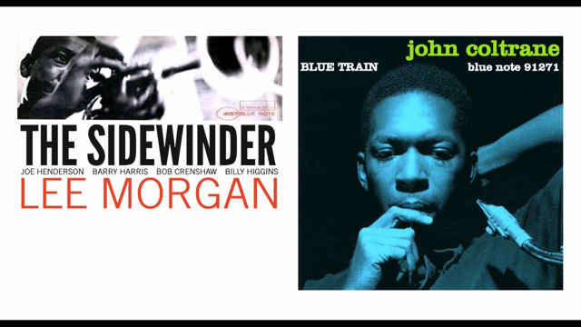
These two sleeves, these are like, iconic, I think, really, very much sort of how I think people imagine Reid Miles' stuff when they see it. I class these as house sleeves, and sort of, I felt that when I was learning these really, I wanted to sort of get into patterns, or understand the patterns that Reid Miles used really, in his layout and how he set type, really.
Sidewinder is very compact, in top two-thirds, of the sleeve.
Half the content in there is white space at the bottom. And then Blue Train.
This is just all about the image, really, and the type is just placed where there is available space. Blackjack and Feelin' the Spirit they were similar choices, or chosen for similar reasons, both I classed as house sleeves.
These two, I want to focus a little on these because they're very simple, I think they're absolutely stunning. And I found when I was making these that a little goes a long way.
There's another thing I'm really, really passionate about, you know, sort of being a developer and still felt you need to learn, sort of bombarded with knowledge and stuff, and you must learn this, you must learn that, and thirty tips to make an amazing Sass developer. And these I just found really simple to mock up. The Cooker, this was just a header and a footer element. And then my h1, I just text-aligned left, and h2 I text-aligned right.
And that was it, it's that simple.
There's a bit of more evolved technology going on there 'cause I used font-face to pull the type face in and viewport width to actually make the type shrink and expand, but it's pretty straightforward. Art Blakey and the Jazz Messengers, this was initially just laid out in a h1, and I absolutely adore this sleeve.
It's probably my favourite because I had to get in, and style each line and work really hard.
So within h1, I just used some line breaks, wrapped these in a span, and then within that span attached a class. I started to work with letter spacing to get the sort of look and feel that I wanted. And I really really enjoyed that process, it made me feel a little bit like a craftsman, you know, almost like a typographer really. You know, like someone might've worked with type back in the day.
One thing I did use on my sleeves, that's from yesterday, was what's called a padding-bottom hack.
I was asked last night about how to incorporate this. This is probably going to be a bit redundant with grid I think, but essentially this is how I made the sleeves shrink and expand.
It is really important to me that when they'll be viewed on whatever view port width or device size that they sort of retain their structural integrity.
They didn't adapt or anything like that.
I want for them to stay the same, so this is a really important part of that. Really simple technique.
You have a wrapper and a container.
Your wrapper, you set to 100 percent width, max width is 600 pixels, and then the magic is in the container where you have a height of zero, and a padding-bottom of 100 percent.
And then obviously put your background region and then set it to cover, so that worked really really well. And, just incidentally, all the code I talk about here is on my blog.
I've got a blog, stevehoneyman.co.uk/blog, it's easy to remember.
Twitter: stevehoneyman It's, again, really easy to remember.
Yes, if you go to the blog, all the code's on there and there's also a repo with all this stuff in, and the link's at the end of the talk, and also there's links in that blog post.
So definitely go and check that out, and just sort of play. I want to talk about fonts as well.
Fonts are sort of, I don't know, I found these, to use a computing term, pretty boolean.
They were like, on or off.
And what I mean by that is I could either use them or I couldn't.
So if I could solve the font, if I had to identify it first, you know, like what is it, find out what it was, then get it and maybe afford it, I was generally good to go. If I couldn't get the font then it just, I don't know, sort of a bit of hiding to nothing, really. This sleeve is an example of a sleeve I could put together really really easily because I had the font. It's New Aurora Condensed and I just sort of took the original, did some measurements in Photoshop, worked out percentages and where I wanted to lay things out and just put the font in, you know, and it was super easy to make.
The logo, as well, I'm quite proud of the logo. I did that on Christmas Day this year.
So it mostly got around my friends, I think. So yep, I made that this year, and that's just shapes, really easy.
So an example of what I think didn't really work out that well, Feelin' the Spirit again, if you compare this to the original, the band names that was just sort of a bit, The type is Trade Gothic and it was sort of a slightly finer extended version really.
So I couldn't really match it.
This is as close as I got.
I quite liked it, and I sort of give myself a pass for this, maybe six out of 10, or something. This isn't one of my sleeves, but this is when it start to go really wrong because I couldn't actually find this font.
This breaks my heart a little bit because it's the sleeve that inspired me to start this project really. I feel I've got a little unfinished business when I was ready with this.
I couldn't make this image because I couldn't find the font.
Same with this Dexter Gordon sleeve.
I thought I'd have this done in the morning type thing, it's Trade Gothic, I thought it was gonna be done easy, and literally hours later I had each letter wrapped in a span.
I was using translate 2D on it to try and extend it and I was just starting to cry.
I was really struggling.
Midnight Blue again, this is Aurora Condensed and again, the font is sort of stretched a bit so that made it hard to copy, and the g in the midnight is some sort of bespoke letter.
And also, if you notice, on the bottom of the d there is a little, almost like on the bottom of a bowl, there's this a sort of lip.
Which, again, I had no idea how to make that in CSS. But the reasons I mention these, they might seem a little bit like fails in terms of the project. I've heard a lot about variable fonts recently and I'm really, really, really excited about that. Because I think with all of these, I could probably tackle these with variable fonts.
If we go back to that first one, if we could just lower the x height.
I see that being able to happen.
or with things like Feelin' the Spirit where I couldn't quite match the back of that letter, again, I should be able to do that with variable fonts. Lowering and lengthening, ascenders, descenders, that kind of thing, that's gonna happen.
And also, I think those little blippy-type things, like little hooks and spurs on the end of letter forms, I think that could happen too, hopefully so. I'm incredibly excited for that because I think, then from my perspective, as a designer, developer, I can start to function a bit more like, I don't know, I don't know, artistically, I think.
Like have an idea and make it happen.
So I'm really, really, really excited.
I'm really looking forward to that happening in the future. So, moving on, I wanted to talk about responsive typography, and how I incorporated that. This is obviously just making the text shrink and expand like that, within the viewport. I used two methodologies.
One was to reset a HTML element to viewport width, with the font size, and the other was to use CSS locks. Viewport width: this sleeve was done in viewport width on the HTML reset, and it's incredibly easy to do. I'm gonna try and do a demo now, so.
Wish me luck.
Sorry, it's sort of buffering for some reason. It is gonna happen.
There we go.
So that's the responsive type, squishing, doing its thing. So, to make that happen is really really easy. Here's my really crude reset.
HTML element, you just font-size with 1vw.
(microphone feedback) Sorry.
And then on your classes, I just used named classes. You could use your nth of type or something like that. But I just named each line, it was just easier that way. I've just set the font size in ems, and that makes it fluid. One thing to remember is that, these sleeves are all 600 pixels wide, and that was just an arbitrary decision I made. And if, obviously, you've got a monitor that's 2,000 pixels wide, at some point, if you try and load the image, your type's just gonna go massively across the screen 'cause it's sized to the viewport.
So what I did was just reset it when I needed it to stop shrinking or expanding. Really simple: media query, minimum width, 600 pixels, you just switch it back into pixels and that just locks it, effectively.
Again, The Sidewinder, this is a more, I used a more complex version of that on this. I used CSS locks and calc for this.
With this, I wanted to use the reset.
I tried to use the reset but it just didn't really work out. It just started to break and I think that's because the browser just didn't have enough information to calculate how to handle the type.
So I used CSS locks and calc for this and I've got another demo coming up.
There we go.
Buffering.
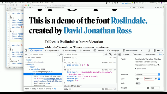
So again, note this sleeve and everything is maintaining its structural integrity and that's obviously the padding-bottom trick at work there. So the calc, this is what calc looks like.
Looks a bit scary, but it's actually really easy to work out.
I set a base line, a base font size for this. For the h1, we'll talk about the h1 for this example, that's 37 pixels.
And then, my first lock happens at minimum-width of 180 pixels so that's when things start to happen with the fluid styling, and that's basically what this calculation does effectively is per unit of viewport width you provide it with a number which is how many pixels to actually increase the font on that viewport width, that per unit of viewport width. So it's just a ratio, really.
Then we used our second lock here, this basically, again, the section pixel says right, stop.
I want you to switch back to pixels now.
In this case, 127 pixels.
It stops at 600 pixels, then switches back to 127 pixels. So, how to make this, I sort of just rattled this description off for you.
Again, it's on my blog, so do check it out.
And also, I should mention a guy called Florens Verschelde, who wrote a brilliant article, I've linked to this in my blog, called Maths of CSS Locks and everything that I've learned is explained on that. So to get you your fluid formula you subtract your starting font-size from your finishing font-size. So 37 pixels from 127 pixels is 90 pixels.
Subtract your starting viewport from your finishing viewport, so that's 180 from 600 which is 420.
Divide 90 into 420, which is very sort of responsive design 101 really, to get us that number.
And then that gives us the basis of our equation. We'll then put that in calc and times it by 100 viewport width.
To actually get that really finely grained tighter control you have to do this though, it's a bit, I'm a little bit unsure actually how this works. Essentially you do another reset, I think.
I'm talking about this sort of -1.556 bit at the end here. And to get to that number, you subtract your equation from your starting font size, times that viewport width. And it gives you plus or minus 1.556 pixels, which you then convert into ems.
It's sort of hard to describe it, really, but just take the code and play with it.
Practise with it, or just do what you like with it, really. So yeah, that's it.
In conclusion, or as I'm wrapping things up a little bit, I want to talk about grid here a little bit, 'cause grid I found incredibly powerful.
It's helped me get 'round the layout problems I had initially. This is Cornbread, the remix, as I funnily call it. I've put some texture and stuff in the background. I've used a blend mode on the image.
And I missed a trick, really, in that I didn't put blend modes on the Cornbread lettering. But, another demo.
So yeah, this was done with grid, and again, it's the same effect, really.
I used calc for the type.
Sorry about the folder appearing.
For those of you who haven't really used grid much, I'm assuming most people have, really, but for those of you who haven't, definitely check it out. It's really easy.
I haven't been using it that long and I learned really quickly.
Jen's Layout Land is amazing, great resource, as is Wes Bos's free course, so use that.
This is what the grid for this looks like.
I just simply assigned areas where I wanted my content to go, really.
Which is, essentially, when I saw this, I just thought, I'm playing battleships, really. At that point the penny drops, I'm like, I can do it, I'm in a grid, because it's battleships.
Also, one thing that I'm really excited about with the grid is that we can separate our source, our code, from our HTML for our presentational code. And what I mean by that is that, with this layout, for instance, if we look at this layout, our eyes follow the colour 'round.
We see Una Mas, Kenny Dorham, a list.
And to the source side, we probably want h1, h2, list, and then a footer, which is gonna be desperately hard to do without using absolute positioning and stuff. Grid makes that really really easy.
You have your original source, and you just tell grid where you want these things to go. And that frees us up so much, because we can start thinking about putting type wherever we want it and then building things around it. The potential to bring those kind of things I was talking about, the graphic design that I really fell in love with, gets closer and closer and closer, I think. So, more of the conclusion, really.
This, I'm determined to go back and make this. But it is phase two.
It might be quite a long time.
I imagine it'd take a long time.
I'd like to go and make things like this, as well. I think this is possible.
And when I was looking at this, this reminds me of something Rich said in one of his blog posts about 24 ways about setting type big.
Type becomes a hero image, almost, with this, like hero text, and I'm really really into that idea of just using text.
And might have a go at this.
We'll also do some Wu-Tang stuff, because it's squares, and it's Wu-Tang Clan, and a see-through thing. And just to finish of, as well, I want to talk about a piece of work that I'm doing. So this is where the standard of graphic design plummets. That said, one of my pieces of work is very much based on this sort of stuff I've learned through doing all these Blue Notes sleeves. It's very much the next area I want to focus on, which is getting into the whole funky graphics thing, but putting lots of texture and atmosphere in things. This image has a background image, which then has pseudo elements on it.
And those pseudo elements in this case are just dirty old piece of photocopied paper. And then a halftone bitmap, and then they're all blended in. Different levels of opacity, too.
The drummer, again that's a background image, I produce two pseudo elements, if I want.
In this case, yeah, I used one, I think, two maybe. Anyways, a black and white image, then with a bitmap on top of it.
And again, I've used blend modes to blend those in. The tat at the bottom, that's a piece of old photocopy stuff that I blended in.
And the little sine wave, that's blended in, as well. And I chose a sine wave because of Bernard Purdie, and he used to hit them really hard.
So, I quite like the sort of idea of it.
That's the poster.
So that's something we can do in Wordpress, as well, I used advanced custom field to allow the user to be able to set all those layers. That's where I'm at with the story of how I brought the sleeves into the browser, really. That's kind of it.
This is where you can find me, other than Twitter. That's my blog.
All the stuff I've talked about is on the Blue Notes post. And there's a repo for you to just take and check out, do what you like with.
I just have this one last thing, is that I'd love the conversation to continue. If you've been inspired or motivated by anything you've seen or heard me talk about, please do just come and hit me up on Twitter, in the bar, in the break or something like that.
It'd be fantastic to share ideas, be corrected where I've got it wrong, most likely. That'd be amazing, to continue the conversation that way. But, thanks for having me.
(applause)