(upbeat music) - Okay so, I'm sorry I couldn't make it yesterday 'cause I was so dizzy I, literally there was one of the drawings, paintings on the wall.
It has people inside of it.
I was so dizzy I saw them moving.
(audience laughs) So I was worried I might end up collapsing on stage, so we postponed it to today.
So, I'm going to, yeah, there were a couple of sections that I couldn't quite cover well yesterday, so I'm gonna go over one of them which I did cover but really fast.
So I'll go over that a little bit fast again, or kind of. And then there's the last section, and after that, if we have some time we'll begin to either Q and A or if you want me, I can go over one of the other presentations.
Honestly, I'm just having fun today, so, so whatever you want, I'm totally open for that. So, um, yesterday I talked about animation, motion, and UIs, and how you should make your UIs more accessible by giving your users the ability to disable them. So you can use the prefers-reduced motion media query to enable that and when, then we talked about providing users with options.
Options to customise the UI, such as providing a ring slider for the text size, and then we talked about theming. Using CSS variables and we also talked about Windows high-contrast mode and some of the things that you can do to optimise your interfaces for that.
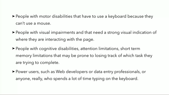
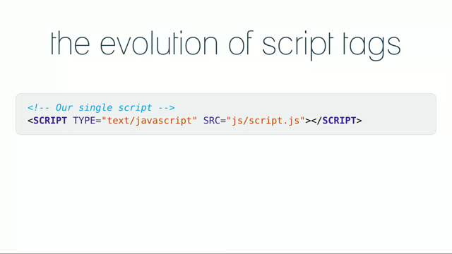
And now I'm gonna talk about two more things that you can do to make sure that your UI is accessible using CSS and SVG. So the first one is not breaking keyboard accessibility. We talked about, we said that computers in general and web browsers specifically can be operated using a keyboard, tabbing through with a key board. Website users can by default see where they are on the page and jump from one element to the other, and there are a lot of people who do navigate websites using a keyboard.
Those include people with motor disabilities, people with visual impairments that need a strong visual indication of where they are on the page, people with cognitive disabilities, attention limitations, short term memory limitations, and there are also the people on the other side of the spectrum, power users, such as us web developers or people who do data entry. Essentially anyone who does a lot of work on keyboards. They prefer to do all of the stuff on keyboard in general. So it is very, and it's very important for keyboard users to tell where they are on the page.
That's why browsers include a default outline around elements that are currently in focus. So that people belonging to any of these groups can benefit by being able to discover where the focus is located.
Focus, um, styles are so important that a visible focus is a requirement for a site to be considered accessible under the Web Content Accessibility Guidelines. That's why designers in general, and also developers, like if you're a developer working with a designer, if the designer does not include any underlines, make sure you, like, to fight for it.
So, they should take, they must take care to ensure that it is easy to tell where the item, which item on page is currently in focus.
How? It's simple.
You can start by avoid, by avoiding to override the default browser styles unless you are providing a better focus indicator. So default browser styles usually don't match the aesthetics of the design, everybody knows that, and can feel inconsistent with a project's visual styles, which is why they're frequently left out, or actually disabled.
And this means that you're leaving a lot of users in the dark, and this is especially true because they're applied as a result of mouse, or mouse-pointer interactions.
I mean, every single designer that I've worked with, and whenever I tell them that we needed focus styles, they were like, "Ugh, but I don't want them to show on mouse interactions." Like, most of the times I've won the battle of including it, except for my last client, the designer was, he was very, stubborn, a little bit, so let's say.
So we ended up with a middle ground, so instead of having a focus style that would persist when you click on it, I had it animated.
So I did have an outline, but I animated the outline in and out so the user would initially see where they are, but if they missed the animation, it's essentially had to un-miss.
But it was better than nothing, honestly.
So yeah, we tend to disable it by default, and I know that a lot of us, maybe all of us, have at some point in our lifetime done this. Yeah, it is a very small, seemingly harmless declaration but it has a huge impact on the unusability and the accessibility.
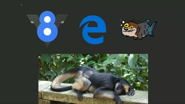
That said, it might actually be a good idea to override the default focus styles because not all default browser focus styles are the same or are as accessible as they should be. For example, Firefox and IE show a thin dotted line as a focus indicator and this indicator can be difficult to see sometimes, unlike the shiny blue outline that Chrome has. So there is a chance to enhance the default focus indicators by designing one, uh, more effective ones.
But what makes a more effective focus outline? It needs to have good contrast, so that it shows. It needs to be complementary to the shape and size of the element.
So if you have a non-rectangular element, and then you have rectangular outline, that's gonna be ugly, even if you have it just on focus, right? And I'm thinking SVG in this case, 'cause you can tab through SVG elements.
Um, yeah.
So the colour scheme is complementary, should be complementary, but also stand out. It doesn't need to be the same for all elements. I've done that, and it's usually usually appropriate, 'cause the focus styles for links can and should be maybe different from focus styles for navigation sometimes. And it should be the same across all browsers. This is the most important thing.
And ideally, in the best case scenario the focus style would only be applied when the keyboard to focus is in action, is active, not mouse interactions.
By default, in CSS when you apply the focus style using the focus selector, it is applied when the element receives any kind of focus, even if it's mouse indication.
This is not desirable, because suppose that, one of the examples that I saw online that someone pointed out is, if have you a slider for example, or any kind of button really, and the user clicks on it, and he see, or they see the focus style, and if they don't click anywhere else on the page, the button is going to look like it's stuck somewhere. So, the focus styles in this case on mouse are not really desirable.
But it so happens that CSS now has introduced a new selector which is focus visible, which does exactly the same thing. And by the way, focus visible is different from focus within, I think it's focus within. The focus within is when an element has an, one of it's children being focused. That is, that one is amazing because it allows it to do things that are very similar to having a parent selector in CSS, but that's not part of this talk.
So focus visible does exactly the same thing as focus, except that it only triggers the focus styles when the user tabs through those elements with a keyboard. However, browser support for focus visible is currently very low.
Only Chrome supports it, and so we're presented with two options.
One of them is to use focus visible and add the focus. Ideally, in the future we should be able to replace all of the focus, um, CSS with focus visible, so wherever you have focus you can replace that with focus visible, but it's not as easy yet. So it's not supported.
You can use a focus visible polyfill, or if you prefer a CSS only solution, you can use focus visible as an enhancement in addition to focus.
So you can have focus and you can have focus visible as an enhancement, until one day you're able to discard focus, and that one day is not very near in the future, unfortunately. So the other solution is to use focus visible as a pure CSS enhancement, and when we talk about CSS enhancement, we usually think of the @supports rule, which checks for support of a certain feature, and if the test returns true, the styles inside the supports block will be applied. Now you could define the focus styles as normal outside, and then cancel them inside of the supports rule and replace them with focus visible.
This works and I would personally do that today. However, this code in the snippet does not work because the supports rule does not currently allow selectors like that inside of the condition. So you can't have a selector or pseudo-selector like that inside of the condition of the supports rule. So, there's another way around this.
Patrick Lauke has written an excellent article in which he discusses the current state of focus visible and backwards compatibility. He suggest another CSS-only way to focus, to use focus visible today.
The solution is, this is going to be a mouthful. The solution Patrick suggests is to use the not negation pseudo-class and to paradoxically define styles not for focus visible but to undo focus styles when it is absent, and then using focus visible, if we want it to provide additional stronger styles for browsers that support it.
As Patrick says, this works even in browsers that don't support focus visible, because although not supports pseudo-classes as part of its selector list, browsers will ignore the whole thing when using a pseudo-class they don't understand or support.
Meaning that the entire button focus not focus visible block is never applied.
Honestly, I have to read this a few times in order to make sense of it.
Um, yeah, so the most important point Patrick emphasises in his article besides this technical usage part is that if you care about backwards compatibility, and you should until you can absolutely guarantee without any doubt that all of your users will have a browser that supports focus visible, and I don't think that's gonna be anytime soon, you will always have to either polyfill or use the combination of focus with the not focus visible, um, selector, plus optional adding of focus visible for stronger styles. So this summary of this section is really frustrating, honestly.
It is, generally speaking, it's to never remove focus styles unless you're replacing them with a more appropriate focus style.
And now with focus visible, we are able to design better focus styles and not really discard them. Personally I would use the focus, and then supports rule.
Actually no, we can't do that.
Yeah, so I would use this hacky CSS for the time being, and if the user is on a modern browser, they will get the keyboard styles only when they're tabbing through the keyboard, and if they're on an older browser they will get them with a mouse pointer, unfortunately.
Yeah.
The next section is, we're gonna talk about designing better content links.
There's also a hack in here where, this is actually a really nice hack.
So, the Web Content Accessibility Guidelines tell us to make sure that we do not rely on colour alone to distinguish links, and even explicitly suggest using underlines. Usability researchers and practitioners also generally suggest that underlines are the clearest way to indicate a link that lives within content. Academ, academic researchers confirm that there is a cognitive load to even having links in blocks of content, but when you have them you can reduce additional cognitive load by making them apparent and underlines performed well in researches. Now, what I want to emphasise is when we're talking about underlines in this section, we're talking about content links.
Not links in navigations, not links elsewhere. More specifically, content links.
This article by Adrian Roselli, he talks about a lot of, he has, I highly recommend reading this article. If you're not convinced that you should be reading underlines, the aim of the article is to hopefully convince you to do it.
And even if you're not convinced, at least it's going to convince you to make sure that you make sure that your links are as accessible as possible.
Adrian mentions a sort of known fact in his article. That the thought of using underline causes a lot of angst and disagreement among designers, because many designers see the underlines as the culprit that messes up with the aesthetics of the design, just like focus indicators.
But who said that underlines need to look ugly? You know, if you can design underlines in a way that gives you enough flexibility to control how they look, how they behave, how the colours and stuff like that, then there's no reason really to not add them.
The best way to apply a basic underline, in general, when it comes to design is to make sure that the line itself skips the descenders so that, because that would be aesthetically better. We currently have a property in CSS that enables us to do that.
So by default underlines in CSS used to not skip descenders. They used to cross them.
After some time, we got the text decoration skip property, with the value, ink.
Using that value, you would tell the browser to skip the descenders, and then that value was moved into another property, which is now known as the text decoration skip ink.
So text decoration skip ink is the property that you can use today in order to tell the browser to skip the descenders.
It has two values.
One of them is to tell it to skip, and the other one is to not skip it.
So, this property column currently only works in Chrome and Opera.
In fact, the text decoration skip ink is applied by default to underlines in Chrome. I'm using Chrome here, so as soon as I applied the text decoration, you can see that it's already skipping underline. Uh, I mean descenders.
So it's applied by default in Chrome, and even if you don't explicitly set it.
So, these are the things that we can currently do with underlines in CSS.
You can add an underline, you can skip it, you can specify the colour of that underline. Of course, the colour needs to have enough contrast and this probably does not, so, don't judge this one here. You can also change the position of the underline. So you can, unfortunately, you don't have a lot of control. So you can tell it to go under, which is way too much, and I wouldn't personally do that.
So yeah, we currently have that.
So in order to create similar outlines in CSS, because this property is not supported everywhere, you can again use it as an enhancement in the supports rule. I would do that.
But if you need the underlines, or if you really just want them to look everywhere, there are other ways to do it.
Kinda hacky, but really awesome.
So, I worked, I built the front-end foundation for the new Smashing Magazine, or the current Smashing Magazine upside a few years ago. And one of the design requirements was that we had these underlines that skipped the descenders.
The text decoration skip ink property was not even existent back then.
So we had these underlines that skipped the descenders, and the underlines needed to have different colours, and even different thickness that would be relative to the font size and thickness.
So if the font is really bold and big, you want the underline to also be bold and big, and thick.
So there was an article also by Marcin Wichary, whom I mentioned yesterday. He writes really good articles.
Like, he doesn't write as often as I would personally see other people do, but when he writes, he writes really insightful things. So he has this article that is a few years long, uh old. He talks about crafting underlines on Medium, and one of the things that he needed to do was to make sure that the descenders were skipped. And in the article, he says that the ideal technological solution for underlines in general would be, you should be able to change the width of the line. You should be able to change the distance from the text. You should be able to change the colour.
You should be able to clear the descenders, and perhaps have a separate style for visited links. Now, most of these things are already possible with this text decoration skip ink and text decoration properties in CSS.
The one thing, the one main important thing is controlling the thickness of the line and the position relative to the text.
We can't, I don't think we can currently do that in CSS, so another option is to use a hack.
So there's this article called "CSS Underlines Suck" in which the author talks about multiple different ways, hacks essentially, to create underlines in CSS. There are different ways you can do it, and each one of them has pros and cons.
The one that did work for Smashing Magazine, there was one particular technique which happened to work for Smashing Magazine. It still has its own limitation, as you're gonna see shortly, but it still worked for us and as long as it works you can use it.
That technique uses background images and linear gradients in combination with text shadow to create these underlines. The article includes a fantastic 3D demonstration that I'm gonna show shortly, but how the technique works is in this video.
I recorded this video yesterday, here, while I was preparing for yesterday's long session. So I have a heading, I have a background.
I deliberately added this background to the body just for demonstration purposes because, as you're gonna see, we would need it.
So we have, I'm gonna start here.
Okay, so I have my heading.
I'm gonna start by adding a linear gradient to that heading. It's gonna be black, okay.
So this is a background applied to the heading. Now we want to turn that background into a line. So I want the size of that background to be 100% by 0.1 M, so it's got, the size of the background now literally is 100% by 1 M, but by default, background repeat in CSS.
So background repeat is equal to repeat by default. If I change that to no repeat, you can see that the background is now 100% by 0.1 M in size. Now I wanna change the position of that background, so I move it down.
You can use keyboards left and bottom inside of background position.
So, this works just fine, we're getting closer. Just a quick note here, I'm using zero point, I'm using Ms because I want to make sure that the thickness of the line is relative to the font size. You can use pixels of course, but probably shouldn't. So yeah, I have a thickness that is relative to the font size.
I have it down there, but as you cans see, it crosses the descenders.
We don't want that.
So in order to avoid that or to fix that, we add a text shadow.
And when you add a text shadow, I'm gonna be without a microphone now, so I have a shadow.
That shadow has the same colour as the background. That colour is the same colour as the background on the body. And, yeah, so now it works. (audience laughs)
And you can move, you can move the background position up and down so you can control where you want the line to be, on the text.
And it works just fine, so if you see, why does this work? Let me, we can look at this 3D.
So we have the text layer.
We have the text shadow layer, which is right behind the text layer, and then we have the background layer, which is the line there.
So the background of an element is behind the text shadow, and because the text shadow is in front, it covers that background, and so it looks like the line is not crossing the descenders.
Even though it still is, but in the background. And then you have the background of the entire thing, page, and the text shadow needs to have the same colour as the background.
Otherwise this technique does not work, because the text shadow needs to be the same colour as the background.
Yeah, and it works.
So, as you can imagine, if you have text on, with an image background, this technique is not gonna work. Because text shadow and background need to have the same colour.
Now in the Smashing Magazine design, we did not have any text on images, so it was safe to use this technique and it works just fine. So, the code that I had for Smashing Magazine looked something like that. I have the colour of the text specified.
I had the background image linear grade, linear gradient, which also uses the same colour as the text. Of course it could use a different colour.
If you want the text underlines to be a different colour, you would change that.
The text shadow, I have the positioning and all of that set, and it works out.
Of course this code can be improved here.
Instead of manually setting the colour on the background image, if you know that you are, that text underline is always gonna have the same colour as the text, you can replace the colour declarations with current colour.
I mentioned current colour.
I don't know if it was yesterday or at leaders. So essentially cur, what current colour is is it literally picks up the current colour of the text, which in my case is blue, and it uses that as a value.
So the linear gradient here uses the colour of the text, which is blue.
Well, things get a little bit more complicated, as I mentioned, if you have multiple link variations. So we have black with blue underlines, red with grey, and you know.
So, if you're using, this is one of the things that SAS can, or a pre processor can help us with, using mixins in this case.
Because repeating that same declaration for every single link style is tedious.
So you can create a mixin.
In my case, I called it underline.
That takes the shadow colour, the border colour, and the border width.
I should have called it underline, not border, really. So, every time I want to add a custom underline to an element, I would do it like that. I would call the mixin, I would give it the shadow and underline colours that I wanted, and um, yeah, it'll work.
Now one thing that you need to remember when you work with this technique is, when these text is selected, the background behind the text is probably gonna have a different, like the highlight colour is gonna be different than the background that you have behind the text initially.
So you'll want to adjust, probably just remove the text shadow, because otherwise you're gonna end up with text that has shadow, and it would look completely unreadable.
So the takeaways from my talk yesterday were that when using motion in UI, use it responsibly. Listen and respond to user's reduced motion preferences and adjust the UI accordingly.
Give the user choice.
Providing choice makes your product friendlier and allows the users to customise it not only to their visual needs but also to their personal preferences in general.
Test and optimise your product for custom high-contrast modes.
Make your links more accessible by adding underlines. They don't need to suck.
You can get creative, but within accessibility limitations. And never remove focus styles unless you're replacing them with a better more cross-browser consistent focus indicator. Yeah, so these are just the two sections, and it's 20 minutes, straight, perfect.
I did not plan this.
So, look.
I'm up here.
I can end this presentation right now, or I can do a Q and A, or if you want me to do something extra, I'm open for suggestions. Okay, so we're done? 'Cause, um, other speakers.
Yeah, sure, okay. (audience laughs)
So, thank you. (audience applauds)
(upbeat music)