Improving Accessibility through Design Systems
Introduction
Nathan Curtis introduces Homer Gaines, highlighting his expertise as a front-end developer with a background in behavioral psychology, neurology, and graphic design, and his role as a certified accessibility professional.
Homer Gaines: Background and Career
Homer shares his journey as a front-end developer since 1994, his involvement in accessibility since 2001, and his experiences building three design systems over his career.
Improving Accessibility Through Design Systems
Homer discusses his approach to enhancing user and developer experiences by focusing on accessibility in design systems.
The ADA and Web Accessibility
Exploring the Americans with Disabilities Act (ADA) and its application to the web, Homer emphasizes the importance of understanding and complying with accessibility laws and guidelines.
Dispelling Myths about Disability and Technology Use
Homer addresses common misconceptions about people with disabilities and their use of technology, stressing that disabilities are not always visible and impact a wide audience.
Design Systems and Accessibility
Using his experience at Guru, Homer illustrates how integrating accessibility into design systems can solve unique challenges and create unified, user-friendly interfaces.
Accessibility and Design Aesthetics
Homer emphasizes the balance between beautiful design and accessibility, advocating for thoughtful design that considers all users.
WCAG Guidelines and Accessibility Principles
Discussion on the Web Content Accessibility Guidelines (WCAG) and their four main principles: Perceivable, Operable, Understandable, and Robust.
Headings and Semantic Structure
Homer highlights the importance of using headings correctly for accessibility and SEO, and the common mistakes made in design systems regarding headings.
Accessible Copywriting
Focus on how design systems can guide accessible copywriting, emphasizing clarity and simplicity to accommodate a diverse audience.
Links vs. Buttons: Accessibility in Interaction Design
Homer clarifies the use of links versus buttons in web design, stressing the importance of semantic HTML and its impact on accessibility.
Empathy and Accessibility
Discussion on the types of empathy – cognitive, emotional, and compassionate – and their role in understanding and improving accessibility in design.
Q&A with Nathan Curtis
A Q&A session where Homer reflects on the evolution of his views on accessibility and discusses the integration of accessibility in team workflows and design thinking.
Nathan Curtis: it's my pleasure to introduce Homer Gaines.
He is a front end developer with a background in behavioral psychology with a focus on neurology and graphic design.
But these days you can find him leading teams that bridge design and development and also serving as a certified accessibility professional.
So please help me welcome Homer Gaines [applause].
Homer Gaines: Oh, don't be doing that.
I don't, brother.
Mic check.
One, two.
Everybody got me all the way in the back.
Cool.
Oh my gosh.
I'm try not to pass out when I get up here.
Alright, so we got this thing blinking in and out.
So I will do my best to work with the audio as well.
I like to move around if I'm moving around too much or if the feedback gets too much, let me know.
I'll probably just settle it down like this.
as Nathan said, my name is Homer Gaines.
I am a certified accessibility professional.
I am also a front end developer.
I've been doing this since, 94.
So I've been in this game for a minute, and I've been doing accessibility since 2001.
And I've had the privilege throughout my career to work with some really talented people, and I've built three design systems over my career.
And it's been a lot of fun.
and one thing that I've been able to do is take my educational background and what I've learned throughout my career and combine them all together to try to make, the environments in which we work, even from just a user experience, but also the developer experience, a better place for all of us, because one, we like to work with tools that do what they're supposed to do, right?
Reduces stress.
If we reduce stress, we love what we're dealing with.
The same with our users.
When they're using our applications, when we reduce the stress that our users face when they're using our applications, they like to come back.
And we as developers and product engineers and so forth, we love it when people use our tools.
what I want to talk to you today about is improving the accessibility, which is actually the user experience, through your design system.
I'm going to focus on three different areas today.
Design, content, and the dev side.
Each of these individual areas I could definitely dig into and do an entire keynote just on one.
So I'm just going to give you the high level of what to expect.
This I hope will pique your curiosity and get you to dig a little bit further into the information that I'm going to provide to you.
Even outside of this, I am always available.
I am not that type of person that gives a talk and then disappears.
I'm on the social medias.
All of them.
Hit me up.
You have questions, find me.
I'm happy to talk about it.
So let's talk about design and everything.
So we're going to go into ADA.
Americans with Disabilities Act.
We've had it since 1990.
All right.
how this applies to the web is with Title III, and that's what the DOJ actually enforces.
Title III states that if you have a brick and mortar, Then you should The floor is soft right here.
What happened to Homer?
Yeah, he took a spill into the orchestra pit.
Oh my gosh!
Hold up, can we start that over?
Anyway, when you're working with accessibility, you're dealing with the DOJ.
The DOJ is going to enforce the accessibility rules that we have in place, okay?
I strongly advise that at some point in time, you go to ADA dot gov.
Read over the documentation that is there.
This bill is really interesting because it's being talked about here at the government level here in California.
And it is AB 1757.
It is a new accessibility bill that, like I said, has not been signed off yet by Governor Newsom or anything, but it is definitely in the works.
It is something that is really interesting because It will force the hands of companies to make sure that the products that they are working on and building are accessible.
The legal language around it is sketchy at the moment, so it has not been fully approved.
But this is probably one of the strongest regulations that I've seen, to date, come out, so we'll see.
It's got folks in a panic, but it is definitely something to be aware of, especially everyone who lives here in the state, alright?
I hear this a lot.
People with disabilities don't use our applications.
Couldn't be furthest from the truth.
I know for a fact, I would bet money, and I'm not a betting person, I'm not a gambling person, but I would bet money that everyone in here works with someone that has a disability and you don't even know about it.
I would bet money that there are people in this audience who have a disability, and you haven't told anyone in this audience about that.
That's the misconception.
Reason being is that when we mention people with disabilities, this is what comes to mind.
You have the young lady who is walking with her dog, and she has a cane.
You have the two gentlemen all the way at the end using ASL, sign language, to communicate.
You have the gentleman here in the wheelchair.
Mobility issues.
Or you have the young lady with prosthetic limbs.
These are all disabilities that we can perceive with our eyes.
We can see this.
But not all disabilities are visible.
In fact, many of them are cognitive, especially after COVID.
I give a talk where I talk about the, the effects of COVID on the brain and how that affects our ability to just do common tasks.
There was a story that I was reading about a young lady who was a cybersecurity analyst and she contracted COVID.
And she's one of the long haulers who was diagnosed with long COVID after the fact.
And it got to the point to where her long COVID was so bad that she had to keep a post it note next to the mirror to remind herself of the procedural steps that she needed to take in order to be able to brush her teeth.
Reason being, COVID virus, we thought it was a respiratory thing.
It's neurotropic, which means that it can also affect the central nervous system and the brain.
And the areas that it affects in the brain impact, frontal lobe, which is attention and focus, and the parahippocampal gyrus, which affects short term memory.
And if anybody's following me, almost sounds like ADHD.
And those who have ADHD have also stated that when this happens, it makes it harder to manage.
Do these people who have these cognitive disabilities forget or stop using technology?
No.
No more than we do.
No more than anyone else with a disability that already uses technology.
So we have to be cognizant and aware and be sensitive to the needs of others.
Especially when someone says, do people with disabilities use our applications?
I don't think that they do.
And this is where design systems come in.
for three and a half years I worked for a company called, Guru.
We were a knowledge base company.
And it started off with me and myself, and my lead designer, Jake.
Jake's amazing.
He and I started looking at the design system that was like a side project, and we started putting this thing together.
And one of the things that I realized as I was going through the code base was that we had tons of components that were written several different ways, used throughout the application to the point to where the application looked like it was actually built by separate teams all underneath the same umbrella.
Nothing was unified.
At the same time, each of these individual iterations had very unique accessibility issues that had different solutions to solve if we were to keep them separate.
It didn't make sense to do that.
So what do we do?
We brought everything into the design system.
We made the decision to make sure that all of our components were going to be accessible first.
And the good thing about these components is this, they're reusable.
The bad thing about components is that they're reusable.
Garbage in, garbage out.
There's a study out there, WebAIM.
They do this every year.
this was a fun fact that popped up.
1, 000, yeah, 106,245 errors on one homepage.
Now, either the developers just gave zero Fs when they woke up in the morning and chose violence when they decided to build this application.
Not sure, but I can guarantee you that they used a component in this that was built incorrectly and it was just replicated this many times on that page, therefore it brought forth these many errors.
And that's why.
Garbage in, garbage out.
So what we have to do with our components.
From design, to content, to dev, you start with an accessibility first mindset.
I have a lot of engineers who will approach me and say, Hey, I have this new design system and it's 100 percent accessible.
Full transparency, you tell me something is 100%, it's game on.
Game on.
You gave me just, I'm coming off with the gloves and I'm testing your stuff.
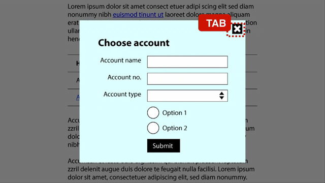
And the one thing that I like to do first is hit the tab key.
And if I hit that tab key and I can't see where I am inside your application, using your design system, I know good and that your stuff is not 100%.
We have to be careful with saying that.
Me, even as an accessibility professional, I will not guarantee 100%.
There is a site out there that a guy did, I can't remember his name right now, but he built the site, I should say he built a code pen.
It gets a 100 percent passing score on Lighthouse, but it's completely unusable.
Completely unusable.
That's not how accessibility works.
And accessibility is not necessarily a silver bullet either.
The solutions that we put forth work in this particular scenario, but may not work in this particular scenario.
That's why we have guidelines that we have to follow.
And these guidelines allow for flexibility and interpretation.
But you have to go through extensive testing and working with it.
Designers, who has a custom focus ring inside their design system?
Not a lot.
Few of you.
How many times have you seen just the regular old focus ring from the browsers.
Or, how many of you have seen CSS with, hover or focus none?
That's throughout CSS.
What you've effectively done is removed an indicator for individuals who do not use a mouse, that use a keyboard or any other method of input to be able to navigate your inputs.
And when I say inputs or controls, I'm referring to buttons and anything that is natively focusable.
But a lot of designers do not think about putting Focus Rings around their elements.
Jake.
Sounds like I was about to say Jake from State Farm.
But Jake.
We didn't have native focus rings in the Sage design system that we were building.
And I had to explain this to him and I had to show it to him.
And at first when he looked at it, he goes, I do not like seeing these things around that.
I said, yes, but the beautiful part is we can customize it and make it on brand.
So it doesn't seem like it's just something that was shoehorned in.
And after a couple of months, Jake would start to ping me when he noticed that he would be out on the web browsing somewhere, and he would notice that focus rings weren't there.
And it felt weird to him not to see them, and he started to recognize and understand the importance of it [ audience laughs].
I get this from designers all the time, too.
Just hilarious to me.
My design is beautiful!
Yeah, but it's not accessible.
Don't get me wrong.
I'm not bashing on designers.
I started my career in this as a designer.
I get it.
We're designing initially.
We're thinking, yeah, this is gonna go in my portfolio and everything.
But then as you mature into your career, you start to realize you're not designing for your portfolio.
You're designing for the user.
And just because we design for the user does not mean that what we put out is still not our best work.
But now what we're doing is that we're putting forth thoughtful work.
Work that goes beyond just this, the mouse.
We're now starting to design applications and user interface that are more robust, that work in different form factors, that work on different devices.
We are starting to meet our users where they are, not where we expect them to be, or not where we plan for them to be.
And we can do that by using tools such as WCAG 2.
2.
We had 2.
1 up until a couple of weeks ago.
2.
2 has come out.
Web Content Accessibility Guidelines.
It's broken into four sections.
Perceivable, Operable, Understandable, and Robust.
These are the main four sections.
Perceivable means that the individual is able to perceive using their senses what is going on.
Operable means that they are able to work and interact with what they perceive.
Understandable means just that.
They are able to understand what is happening, not necessarily understand the content.
It's not just limited to what they're reading, but it's understanding the metaphors that we have set forth and the patterns that we use online.
Just as Donnie was talking about with mental models.
And what Jacob Nielsen said, people don't spend a whole lot of time on your application because they're all over the web.
And because they're all over the web, they build these mental models based on the interactions that they have.
And when they come and use your product or visit your site, they're expecting the same type of interactions.
All right.
And then robust.
Robust means that we are doing what we can to make sure that our work is available to all of the users on a variety of technology.
So usually when we talk about accessibility from a design perspective, the first thing that pops up is contrast or use of color.
That's the low hanging fruit, but it doesn't just end there, but contrast is still one of the largest problems that we have and it gets replicated in our design systems.
Jake showed me, after he did an audit, we had close to 23, something like that, shades of gray.
In the design system, different views had different shades of gray that were doing the same thing.
Take something as simple as a border.
Why do we have different color borders?
Why weren't we using just one color for the border throughout the app?
Garbage in, garbage out.
Replicating a bad pattern throughout the rest of the system.
So we started to focus on that.
1.
4.
1.
Use of color.
The WebAIM report showed that 83.
6 of the homepage failed the contrast minimum.
It's because of the use of color.
Color should not be used alone just to convey information.
It needs something else to go along with it so that those who cannot perceive color can still understand what that UI is supposed to be doing.
This is a screenshot of how we laid out our color system.
we had the color off on the far left, we had a sass variable, we had our hex, but then we also had this thing called an accessibility class.
The accessibility class was really unique because what I did is that I wrote a Sass function that looked at our current color palette.
And based on that particular color, it would flip the text to either our dark color or white so that it would be accessible against that color background.
And all our devs needed to do was just apply this particular class and they didn't have to worry about it.
At the same time, our designers didn't have to worry about conveying this information in the Figma files that we were using.
Because it was already handled on the code side.
So a lot of the contrast issues that we had throughout the app were solved as soon as we implemented this.
Now granted, it was a legacy app.
The code base was 10 years old.
We had to take the time to go in and replace all the legacy spots that we were implementing this.
But once we did It worked like a charm.
Color contrast is very important.
These are the different areas inside the WCAG that pertain to color contrast.
We have info on relationships, use of color, contrast minimum, contrast enhanced, non text contrast.
Kind of difficult to read, right?
Jake and I were working with one of the developers who was there.
His name was Min.
And we were talking to Min about a particular UI element on the screen.
And Min stopped us halfway.
He was like, I don't know what you guys are talking about.
I can't see it.
I was like, what do you mean you can't see it?
Jake and I are just fine.
Jake and I are on Macs.
Everybody knows, notoriously, Mac screens are amazing and they're already calibrated.
Min was not on a Mac.
He had a LG screen or something like that.
So I stopped and said, what's your brightness set to?
He said 100%.
I said, okay, cool.
You got the sun turned on.
I said, have you ever calibrated your screen?
He said, no.
Most users don't.
So as soon as we turned his brightness down and actually calibrated his screen, the gray color that was being used was visible to him Now, if you think about it from the terms of accessibility, that would be called a situational impairment.
Because it's just a temporary situation that he was in that was actually correctable.
It wasn't actually that he had a disability that prevented him from seeing it, but that could also illustrate what happens when somebody is using your application and it's backlit.
Say, for instance, the sun is over them.
Your UI can get washed out.
That's why these contrast minimums are important.
At a minimum, you want to aim for 4.
5 to 1 for contrast minimum.
Start there.
Start to look at your color palettes and see if those color combinations that you have meet these thresholds.
If you do pass this threshold, great.
That means that your color palette will most likely be able to be perceivable visually by individuals with low vision and even some forms of colorblindness.
But if your numbers fall below 4.
5 to 1, you may need to rethink those color palettes.
We're all familiar with Jacob Nielsen's, heuristics, correct?
To go deeper into this, I have a blog that's called writebadcode dot com.
On there, I wrote a blog post that actually maps Jacob Nielsen's heuristics to all of the success criteria with inside the WCAG.
This is specifically for designers to help you understand how design actually fits into the Web Content Accessibility Guidelines.
when you have a chance, take a look at it.
Now let's talk about headings.
We get headings wrong all the time.
And the reason we get headings wrong all the time is because, in school, when we're working with word processors, we're not taught about semantic structure.
We choose a heading based on how it looks.
It's the large one, it's the medium sized one, it's the small one, and we go forward from there.
we've taken those bad habits from this pseudo print world into the web.
Info and relationships.
What ends up happening is that when you use the wrong heading, or as a designer, when you tell a developer in your specs to use a particular heading based on its size, you could be setting the structure of this document up for failure from an accessibility perspective, from an SEO perspective even.
A university in Australia did a, did a test, survey, and they found that 64 percent of people who had disabilities and used screen readers that were either students or faculty use headings to navigate around their site.
64%.
That's a large number of people.
So imagine if your headings are incorrect, you could be possibly presenting the information incorrectly or providing the wrong context to your users.
And this is usually what happens inside of our design systems.
We have a style directly related to a particular HTML element.
Heading, font size.
Heading 2, font size.
Heading 3, font size.
This is how we end up with this type of structure.
H3, H1, H2, H1, H5 That's because built on how it looks.
It's not the semantic way to approach it.
Semantically, you would have one H1 on the page, as many H2s as you need, as many H3s, and so forth, all the way down to H6.
I did an audit where I came across someone who invented an H9 [audience laughs].
Don't do that.
Please.
Please.
But this is how it happens.
So what I propose is that in your design systems, if you do have your fonts set up that way, consider doing it like what I have over here.
You add a class to that particular component that sets the size.
We did this inside of our Sage design system.
And what was interesting is that when the devs started using it, they went through and they added the H1s then they complained about the size not changing.
And we said, exactly, we said, what we want you to focus on first is getting the semantic structure correct.
Then we had a prop that allowed them to choose whether or not it was the large, medium, or small font.
And when I started to show them how that actually worked, it actually cleaned up a lot of the heading issues that we had with inside of our application.
And by doing this, any of our users who were using a screen reader, they were able to come through.
And now, if they chose to just navigate via headings, say, for instance, they wanted to navigate via heading twos.
All of the twos would show up correctly with the correct context.
Instead of having them jump all over, it was in a logical reading order, which is smooth.
Those of us who are able to see, perceive webpages, that is how we read.
So for those who have to use a screen reader to be able to go through the content, that is how they perceive the content.
Body copy.
I know we have some copywriters attending.
This is for you.
Design systems can also contain rules around how copy is written.
If you need to, talk with whomever is managing your design system to make sure that you can get this information in.
Sid.
Sid was the copywriter that was on our team.
She was amazing.
When I explained to her how copy affects individuals from an accessibility perspective, she jumped into it.
She looked for every resource and even shared it with the other copywriters that were on the team, and they all went out and started studying how to write accessible copy.
And then afterwards, she actually wrote up the documentation that explained, do this, do not do this, as it pertained to copy.
And once we started to implement those rules in the design systems, and the developers started picking up those components, it started to clear itself up.
And it was amazing.
But body copy, how it pertains to the WCAG, readable, language of the page, the reading level, and the labels or instructions.
One thing, how we write our copy, we want to use the clearest language.
We want to make sure that it's simple.
Reason being, I learned this statistic not too long ago.
Literacy does not equal education.
78 percent of the adult population in the United States is literate.
However, 54 percent have a literacy of 6th grade or lower.
So when we're using industry terms and industry jargon, we may be completely missing the mark with those who are reading our content.
We think that it's clever, and it may very well be clever, but who's it serving?
We need to make sure that we have these rules established in our design systems as well, so that our copywriters are more mindful of the content that they're putting together.
Body copy, use conversational tone, be mindful of using industry jargon.
We've seen this.
We still see this to this day, right?
Click here.
What does that mean?
What does it mean?
There's no context.
No context whatsoever.
You know why?
Because we're focused on the mechanic.
Click here.
We're focused on the mechanic.
That's all we've done.
We just told somebody to click here.
But when someone is using assistive tech, this is what that looks like.
What are those links at the top?
How unique are they?
menu link, This is what it looks like to someone who uses Rotary in a screen reader.
There's no context provided for these links.
So what we want to do, instead of focusing on the action, focus on the subject.
Make that your link.
Again, rules that you can establish inside your design system.
Do not focus on the action.
Focus on the subject.
[sneeze in audience] Bless you.
Because if someone were to come and they're using a screen reader and all they're doing is navigating by the links, this is what they see.
Tell me more.
Tell me more about what?
Oh, more about accessibility.
Ah, I know what that is.
I got the context for it now.
Thank you.
And for my devs [sighs, audience laughs].
I still have to explain this.
This one here.
I don't know how old this argument is, or this question even.
Simple rule.
When do you use a link versus when do you use a button?
You use a link.
If it changes the URL, period [applause].
And I said I, no.
If it does not change the URL, it's a button.
Then this is where it gets really sticky.
Even in the accessibility community.
Pick your battles with this.
Like I said, I know what it's like to be a designer.
I'm not harping on designers.
I know what it's like to be a dev.
I'm a dev.
Sometimes when you design something, it looks better as a button as opposed to text that has an underline, right?
Okay, cool.
Semantically, if it is the correct element, then it's doing the job that it needs to do, that it's supposed to do.
So if you have a link that you're going to design and it looks like a button, but you have other buttons, it is a control, as long as it is doing what it needs to do, especially for those who are using assistive tech, because screen readers have different modes.
And those modes are determined by the interactive elements and controls that it comes in contact with.
Links change the URL, buttons do not.
Like I said, I'm keeping this high level.
I can go all day on this side, but we can update that inside our design systems as well.
Oh, did it break?
Yes, it did.
Let's go this way.
Alrighty, cool.
Jimmy Johnson, Jefferson, rather, he asked this question a couple of days ago, and I was like, Wow!
The responses on Twitter were, very heartbreaking.
Someone called me cynical one day after a talk, because I sound like some old cantankerous dude that's up here just complaining about how devs don't do what they need to be doing on the web, right?
The answers to this are why sometimes I come up on stage and I have teeth.
A lot of people said it wasn't worth their time.
Cool.
I'm gonna put out a new framework for devs to use.
It's gonna be amazing.
I don't have time to write the documentation.
Good luck.
Oh, I got this new application that is out.
I don't have time to write a help section.
Oh, I got this new product that I want to advertise.
I don't have time to write the content.
I don't have time is not a good excuse.
What you're doing is that you're depriving people the dignity of independence and the ability to do things on their own and use your product just like everyone else.
when someone tells me It takes too much time.
It's too hard.
It's not worth it.
Cool.
Who else do you feel like excluding?
It takes empathy.
There's three types of empathy.
Emotional, cognitive, compassionate.
Cognitive.
Our ability to understand what someone is going through.
Relate to them.
Relate with that person.
Emotional?
Put yourself in their shoes.
sit with someone that you know needs to use assistive tech and understand the struggles that they have to go through.
Take the time yourselves, open up your Macs, turn on VoiceOver, and try to use VoiceOver on your application and see how frustrating it is.
That way you get an idea of what other users who have to use assistive tech are going through.
Me?
I use screen readers just about every day.
Not because I have a visual disability.
It's because they help me read faster.
Okay?
Compassionate.
Empathy.
This is now where that drive comes in for you to actually act on it.
This is what makes you want to make your products better.
Make your content better.
Make those components better.
Write that copy better.
Be mindful of how your UX is affecting your users.
Because not everyone uses a mouse.
Not everyone uses a keyboard.
Some people use binary switches.
Some people use joysticks.
And it's not always a screen that, you know, has a pointer on it.
Sometimes it's touch interface.
But we have to act on it.
I'm going to read this because I do not have this memorized.
Haben Girma.
She is a deafblind lawyer.
I love this.
She states that ableism is incredibly limiting.
And we need to be aware of ableism and all the different ways it comes into our technology.
People with disabilities don't use our application.
That's ableism.
Thinking that people use our application in one particular way, with a mouse, that's ableism.
Using empathy to step outside of yourselves.
To improve the ecosystem that we work in every day on products that we love.
Side projects that we want to love, but we know good and it acts up like a bad child sometimes.
We want to do better.
We need to do better.
So let's just do better.
Thank you very much.
After you, kind sir.
Have y'all noticed that these chairs weren't actually snapping the whole time?
My fear, and as clumsy as I am, I just knew I was going to sit in this bad boy and it was going to fold up on me as I sat in here.
Nathan Curtis: I think you look fantastic.
last night it was so nice to get to know you, at the Spanker Center, and I found that we had shared experiences, we've had parallel paths, we've been in the industry for a while.
And I wonder if have your beliefs or views around accessibility changed or evolved over this period, and if so, how?
Homer Gaines: Oh yeah, man.
it definitely changes the older I get, when I first started thinking about accessibility and working with accessibility, uh, I was in my late 20s, and in your late 20s you're invincible.
and for me then, accessibility was just about checking the box.
So if I did what I needed to do, cool, it was accessible.
It was also a naive way of thinking it.
But me also thinking that everyone else was invincible because that was the mindset that I was in.
But then as I grew up and matured in this industry, eyesight changed, hearing changes, meeting people who had legacy code work and legacy dev experience and how their lives were changing, I started to realize accessibility is not as static.
We all plan to get old.
And just because we get old doesn't mean that we stop learning or using technology.
We have parents who are using smartphones.
They didn't have smartphones when they were growing up.
They had rotaries or whatnot.
So just because we age doesn't mean that our ability to interact with technology will cease.
So I started to learn that I needed to start building, focusing on building products today that I want to use tomorrow.
So that's how it evolved over time.
Nathan Curtis: So let's zoom in on that progression of time to a much narrower context about how accessibility fits.
And one of your slides boldly said, accessibility first.
And I've heard other people frame it as, let's embed accessibility so it's pervasive.
It's throughout.
It's essentially ever present.
And so I wonder How do you position when you're teaching accessibility?
How do you position its role in the moments of how teams work?
Homer Gaines: How to position it in the moments in which teams work?
Nathan Curtis: And to get something done.
Homer Gaines: Oh, that goes back to the fundamentals.
So when you start to think about accessibility first, speaking from a, as a dev, am I going to use a div as a button?
Or am I going to use the actual button for what it is?
Am I going to use ARIA labels?
Okay, so those are the different decisions.
These are the different examples that we have inside the code base.
So when we start to think accessibility first, I then question, why are you using the div?
Oh, I use the div because that's all I wanted to do.
That's not an accessibility first mindset.
So now we get the developers to start thinking, what are the benefits of using the button versus the div?
And then we show how those benefits actually affect the assistive tech that is being used.
A div has no semantic meaning whatsoever.
So when a screen reader comes around it, it never gets to it because one, it's not a focusable element.
So we lose focus there.
That goes back to the WCAG.
Robust.
Operable.
Can't operate it.
You can't work with it.
It's gone.
It's not robust enough because it's no longer a control that anyone outside of a mouse user can use.
So that's the first thing to teach.
You've already failed in here.
So how do we correct these two?
Oh, we use ARIA attributes.
Okay, cool.
You want to use ARIA attributes and you want to use some other HTML attributes.
You add a tab index of zero.
That makes it focusable now.
Cool.
You still didn't answer the question of the semantic.
Oh, that's when we use ARIA, role equals button.
So now you've added all these extra attributes to a div just to make it accessible, barely, when all you needed to do was just use a button.
And when you show the simplicity of using that, using the correct semantic element first, as opposed to what I consider hacks.
You do that enough times, especially if it's a component, the component, you build it in there.
But you teach the fundamentals first, so that way the components are built correctly.
So now the devs are starting to think, oh yeah, I can quickly do this, oh wait, hold up, should I do this?
What is the correct semantic element that I need to put in here?
And then once they start doing that, the lesson is taught.
And not only did I show them that.
I taught them that.
It's teaching them how to fish.
Now the devs start to do it naturally.
They start thinking about it and moving forward, and they make fewer mistakes.
Those fewer mistakes create less friction.
Less friction leads to happy users.
Nathan Curtis: Let's keep talking about focus, but let's shift the focus to design.
Cool.
And, let's shift to components, and components are made of visual attributes that are based on a foundation that we embed in all sorts of design tokens, and all those design tokens are overwhelmed by essentially color tokens.
And so when we're making design systems, there's such a focus on color contrast.
And one of the things your talk made me think about is that's a good problem to solve.
It's a worthy problem to solve.
But it can give a sense of achievement or accomplishment.
And it made me wonder, is that the most important problem to solve?
Is that the thing causing the most destructive?
Or is it just the thing that we can see that we know we can easily measure and understand how to do it?
And do designers, and all of us, need to make sure we're focused on is it all the problems, or are there other problems we should focus on more than just color contrast?
Homer Gaines: Yes, there are other focuses outside of color contrast.
Color contrast is one of those low hanging fruit that's easier to fix.
There was a, at a previous company, there was a young developer or young designer that I was working with, and when I did an audit of the site, I found that the color gray that he was using for elements did not pass the contrast at all.
And the one thing that I've learned that has to be taught is that you have to take the boogeyman out of accessibility.
As soon as you tell someone that something is not accessible, especially from a design perspective, the designer thinks, Oh my gosh, I got to change this thing drastically and it's just going to ruin my creative vision.
Nathan Curtis: It's a threat to their vision.
Homer Gaines: It's a threat, exactly.
Put the baby down.
The baby's fine.
There's nothing wrong with the baby.
To illustrate this change to him and that it wasn't as drastic as he had pictured it in his head, I made the change and didn't tell him [audience laughs apprehensively].
He didn't notice [audience laughs].
Nathan Curtis: [long pause] I'm going to move on to the classification of types of empathy.
Cognitive, emotional, passionate.
Yeah.
The way you presented them, and maybe my perception of how they were formed, it didn't feel like three siblings.
It felt like a progression.
A deepening, because maybe it's because I'm so used to the call to action being the last thing and the compassionate had action in it.
Am I thinking about it the right way?
Is it a progression?
And whether or not it's a progression or just three siblings, concepts, how do you use that in how you talk to individuals when talking about accessibility?
Homer Gaines: Yeah, usually that comes out when I do an empathy session where, I'm showing someone how to use a screen reader for the first time.
that is me effectively, it's bad to say that it's, that I'm putting you in that scenario or I am allowing you to experience what it's like to, say, be blind and you have to use a, a screen reader.
The reason that comes off as negative is because it almost feels like you're putting on a costume.
I don't want that to come across, but I want people to understand the challenge that others are faced with.
You can be perfectly sighted and try to use a screen reader and still have a level of frustration.
One, because auditory, you're not used to that feedback that's coming back.
It's overwhelming.
It's a cognitive overload, especially when something is coded incorrectly.
Or it's actually frustrating when you realize that if you are only locked into this particular tool, you can't do anything else outside of that.
You have no recourse.
You have no hack to get through it.
as I'm taking individuals through those three steps of empathy, yes, it is.
Here, let me put you in this position.
Let me put you in this situation.
Let's see how you respond to this situation.
All right, cool.
Did you like it?
No, I did not like it.
What did you learn?
I learned that what I put together really does not work, even for me as a sighted person.
It did not work.
Cool.
What are you going to do about it?
So you're right.
Yeah, it's like a progression that goes through.
Some people get stuck on one particular one.
Maybe that's them.
Maybe that's the one that they, as a person, needs to work on.
But when you take all three, it is a progression.
Sit here.
Understand what it is.
If you're uncomfortable, cool.
You're uncomfortable.
Fine.
Now what do you do to get comfortable?
Now, your users.
What do you do to make them comfortable?
Nathan Curtis: So you talked a lot about what you want.
I'll tell you what I want.
I want more Homer Gaines.
And particularly, I want more periods of Homer Gaines.
When you said, if it changes a URL, use a link, period.
I'm not ever going to forget that.
Do you have one or two more of those you want to just stand up and do again?
Or do you have any other periods?
Homer Gaines: Do I have any other periods?
Yeah, this is for my devs out there.
First rule of ARIA, don't use ARIA.
Period [audience applauds].
It even says it in the documentation.
But do people read the documentation?
Nathan Curtis: No, never.
They don't read it.
Homer Gaines: No.
Like 7 percent of documentation is ever read at any point.
Which is wild.
But yeah, yeah, that's another one.
That's a good one.
He's really putting me on the spot for this one, right?
I'll tell you one later, I can't think of it right now.
Nathan Curtis: Alright, let's put a period on this one.
Let's thank Homer Gaines, thank you so much.
Thank you.
We'll be back for another one at the bottom of the hour.
An accessible design system is the foundation for inclusive digital experiences. It encompasses a set of guidelines, principles, and components that enable designers and developers to create products that can be used by people with a wide range of abilities. By taking an accessibility-first approach, design systems can help improve accessibility by allowing us to reuse inclusive patterns and build reliable components that are easy to test.
Keypoints by Amy Lee–find the original article here.
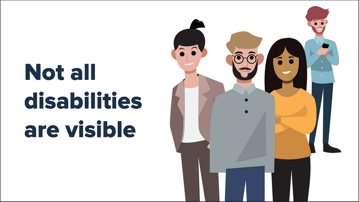
Incorrect assumption: “People with disabilities don’t use our products”
You’ve seen people with guide dogs, rolling around in wheelchairs, or having a prosthetic limb. In the US, 13% of the population reports a disability (i.e., about 1 in 8 people). Given the stigma around telling people you have a disability, the number is undoubtedly higher — the CDC estimates 1 in 4 people.
But what about the people with invisible disabilities? It’s not just color blindness, but as Homer points out, modern life now includes:
- Long COVID symptoms
- Attention deficits
- Anxiety
- Depression
- Memory loss
Considerations for disabled people have been around since the passage of the ADA in 1990, and now California’s AB-1757 accessible website bill is on the horizon. Accessibility must be an integral part of product development; we should not ignore it. WebAIM reports that, in 2023, 83.6% of home pages failed contrast minimums. Fun fact: the most errors detected on a single home page were 106,245!
My commentary: Disability can be a very personal thing, and many people choose not to disclose their disabilities. By sheer numbers, disabilities are very common. Designing a site or an app should always consider accessibility best practices.
As product developers, we should always try to empower people. Part of this is not forcing people to disclose their disabilities. Part of this is allowing users to use the technologies they want to access our apps. We should use standards, make semantic code, and do research to find gaps in our implementations.
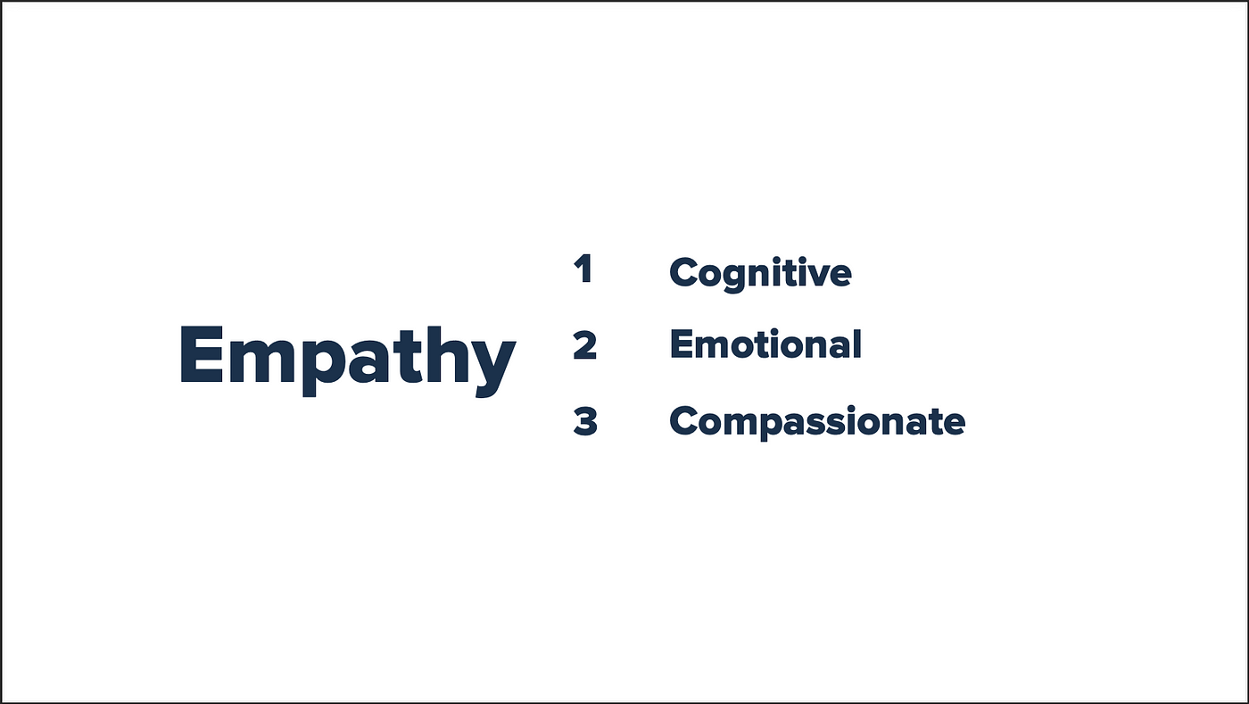
Empathy comes in different forms, including:
- Cognitive Empathy: Our ability to understand what someone may be thinking and how they feel.
- Emotional Empathy: Puts us in the person’s shoes, so to speak. Even more so if you can relate to what that person is going through.
- Compassionate Empathy: Makes us react and do something. Drives us to make change.
Homer spoke at length about why caring about the user experience should be part of our mission. He showed a post from Jimmie Jephson: “Most developers ignore accessibility, why is that? Why do you ignore it?”Accessibility shouldn’t be about ticking boxes in a checklist or just reducing the amount of WCAG failures. Homer gave this example: developers wouldn’t ship a code library without any documentation, so why shouldn’t the shipped product have alt text?
My commentary and hot take: Homer drove home the point of caring about the products we make. It truly doesn’t take that much more effort to care. So, if you are not putting alt text or striving for accessible UIs, maybe you should ask this question: is this even the right career for you? Ignoring the needs of a significant percentage of your user base feels like laziness. Products are always under time pressure to be shipped, but if you create reusable patterns in your design system, this helps remove the burdens.
I have seen people in positions of power asking for difficult-to-implement and difficult-to-make-accessible patterns. I have seen designers and developers ignoring accessibility with an “it’s good enough, ship it” and “a disabled person wouldn’t use our app anyway” attitude. The worst part of ignoring accessibility is it misses all the benefits like better discovery, faster-loading UIs, reusing built-in technologies.