Factoring human behaviour into our digital workplace designs
(light synthesiser mamba music) - Thanks Josh.
Okay here we are.
I'd just like to point out this is obviously gonna be a good presentation because the last one I did I tripped up the stairs getting onto the platform. (audience laughing) So, so far so good.
Okay.
Hello everyone I hope you're all enjoying your conference. I do have to confess this is my first Web Directions speaking and even attending. What I'm gonna talk to you today about, factoring human behaviour into our digital workplace deigns. Good long topic, I like it.
But, as Maria told us yesterday afternoon, we need to start with people.
So, today I'm going to talk about people.
The people how will be using our designs and what we need to know about those people in order to make our designs successful.
I'd like to start by confessing that I don't have any former qualifications in UX design.
Mainly because when I started this some time ago there was nothing around, but I have picked up one or two things over the years. But I do have a degree in anthropology which makes me pretty interested in people and culture. Occasionally I work with websites but the majority of my time is dedicated internally to business working on intranets digital workplaces. And that's where I'll be drawing my examples from today. Can I just ask people, who works on intranets and digital workplaces? Is it all of you or just some of you? Okay subset, okay great.
And what I'm talking about today when I say design, I'm talking about things like designing the contents structures of an intranet, the page design, sketches, wireframes, getting it to a prototype scenario.
Over the years I've had many successful projects. But I have had a few projects where my designs were not implemented or dramatically changed. I'm some cases I know it was due to old technology that couldn't implement new concepts.
And in often the case it was actually the politics that got in the way, as in that's a really great design, we'd really like that, but the boss wants this. You may have come across it yourselves.
But sometimes I know some of my earlier design work really probably did miss the mark.
And typically they were projects where I for various reasons didn't get enough time with the people that were gonna be using my intranet or digital workplace.
And so I didn't get to understand what their needs really were.
Now, I know it's really important to keep up to date with what is happening in our design world. And I think it's always great to be thinking about trying new design ideas.
But just to employ or apply the latest new ideas misses the concept of human-centered design. Good design ideas cannot stand alone.
Context is important for the design process to be successful.
Sometimes, when time is short, budgets are limited, I'm sure you've never had that happen to you, we miss that really vital step of understanding the people who will be using our products and our services.
And this can result in some pretty poor outcomes. And for me this step cannot be missed.
If we don't get out and talk to people how do we know what their challenges are? When we are undertaking our design work I think there are two aspects we have to factor in. There are the explicit needs that are unique to the particular group that we're designing for. And then there are the implicit human behaviours that are common across all groups.
And I'm just gonna look at a little bit of both of these in the next few minutes.
When we start any project of course we have to define the who, who are we designing for and what are their specific needs? For an intranet or a digital workplace it's our workforce. And I deliberately used that word, workforce, rather than our employees or staff.
Because so many of us these days work in organisations where delivering our products or services actually relies on the work from external people and organisations. So we potentially need to factor them in as well, and we need to find out as much about our people as possible.
Now, we might start by getting some demographics from the HR department, I'm sorry people in culture. (audience laughing) But ultimately, we've got to get out from behind those desks and ideally talk to our people and observe how they work. And I don't care how long you've been in an organisation, things change, so get out there and talk to people. I know it's hard, but we talked about earlier today it's very, very necessary.
So we start this with user research.
There are many ways of doing user research. I tend to use a bit of a mix of techniques typically being one-on-one interviews, workplace observation, and occasionally exploratory focus groups.
In particular, I'm a big advocate of one-on-one interviews. Yes, I know they are time consuming, but with practise they yield a heap of information, valuable information.
In my interviews I do tend to ask all kinds of probing questions about a person's role and how they do it, as well as questions that will expose to me the context of how this person is working.
In fact only last week I did a whole lot of interviews for a client down in Tasmania, and the feedback at the end of about the second day was, these people are really worried why you're here. They thought you were gonna talk about the intranet. And I said I did, but there's no point in me asking what do you think of your intranet, because they'll tell me, "I can't find anything and search doesn't work." That's not very useful for me.
So I need to explore a whole lot of other things. Now on the previous list there was a number of things, I'm only just gonna touch on a couple.
The first one I want to talk about that perhaps sometimes we sort of forget a little bit about because we're often sitting comfortably at our desks in our offices, away from 37 degree heat, quite happy with life. But my utility company that I've been working with recently, 50% of their work force is field based.
Either reading metres, fixing water leaks, testing water sources, managing sewage treatment. That cohort of staff spend the majority of their days outside regardless of weather, and in Tasmania there's quite a lot of that. And they use iPads for the administrative component of their work. So for people like these we need to design an interface that works well outdoors, we start thinking about accessibility, contrast of the fonts used, the contrast used so they can see whether it's a really bright sunny day, or whether it's a grey and dull day.
Another group that I sometimes think can be neglected when we think internally is the customer service staff. Their needs are often quite different from everybody else, because they may have an angry customer standing right in front of them or on the end of a phone. They have to be able to find the information quickly, they have to be able to read it, absorb it, and come up with an answer for that customer in a really quick amount of time.
So thinking about location and devices that people are using is really, really important.
Cultural differences, I won't touch too much on this because it's been touched on a bit. Are you designing for a global organisation? Or one that has a multi-cultural audience? Are there cultural differences that we need to consider? We've had some really great talks in this conference from Ni Yang, Sid this morning, and then Jennifer just before.
For example, do cultures that we are dealing with, do they have different ways that we need to impart messages? Do they read messages differently? What symbols or images should or should we not be using in our designs? And I think Jennifer highlighted that quite beautifully in her presentation. Another example, intranets are often the hub of corporate collaboration.
Does the design of the collaborative tool need to consider how teams impact across different cultures? Where a culture is very hierarchical and difference to seniority is important, open collaboration may not be easy to achieve. So we've got to think about who our audience is and what the challenges will be.
Now, as you can tell culture on its own is a really big topic, so rather than spend too much more time here, a useful resource that I think you might find of value is The Culture Map by Erin Meyer.
While it focuses mainly on face to face interaction I think it does raise a number of interesting cultural differences that can be valued when you're looking at your intranet and digital workplace designs.
The next area that I've learned is actually quite important, and it's something I learnt quite some time ago, is the consideration of mindset.
Sometime ago I did a work for an organisation where there was a really large group of lawyers as part of their workforce.
The person who'd called me in to help with designing the intranet said to me that the organisation was really wanting to be more collaborative, but the lawyers just wouldn't be part of it. Could I help? So I rang a friend, who was a legal librarian and asked what am I gonna do in this situation. And she told me you have to remember that the moment lawyers start at university they are encouraged to hoard and protect knowledge in order to become highly paid specialists and as such, sharing information is not a natural state to them.
I'm sure some could probably argue with me on that one. However, while that didn't stop me from suggesting or going down a collaboration path, what it did was give me great essential background to how we were going to approach the project and what we were going to need to do in order to bring these people on board.
Another group that often I find in the same sort of boat is engineers, and you may have worked with engineers yourself. These are typically people with very set thought patterns. They're very logical and prescriptive, and I think that matters when we're testing for their needs. We need to be clear what will work well for them. When I do tree testing and usability testing, which I do quite a lot, I'm actually often surprised that people think so differently from me.
It's weird.
Actually, I do no longer think I'm just weird. I now know that they have different mindsets to me, and I appreciate, recognise, and value that, and then work that in to my designs.
So that was just a couple of examples of explicit needs that I look for in my user research. But there are many other design principals that we need to be aware of in our design activities. So much of how we respond to the online experience is actually subconscious.
You might ask someone to look at a webpage, and tell you do you like it or not? Almost instantly they'll probably give you a response. Oh, they love it or they hate it.
But if you then stop and ask them why, why do you feel that way, their response might be a little slower.
And that's because their reaction was subconscious, but they have to think about the reasoning. So, as such we have a large range of design principals that have come through from the study of psychology and neuroscience. Now, I'll have to confess I was woefully ignorant of most of these concepts that I'm about to cover over now, but I thought it was time to do a little research behind some of the design principals.
I learned early on about one or two of the most common design principals, such is the F pattern of website reading, which I'm sure you're all familiar with.
It's the most common pattern we use when we scan blocks of text to see if it's useful for us, which we do online, and especially for intranets where we often have volumes of content.
We need to design the text on our pages for this behaviour, but I was wondering to myself originally, oh I wonder if there are other principals like this. Yeah, there were.
Now, some I weren't aware of, and others I actually did know about I just didn't realise they had sort of fancy labels. So I said oh there's really quite a few of it, it's a bit more research.
Oh and then I found this book, 100 Things Every Designer Needs To Know About People. This is from Susan Weinschenk, which you might be familiar with.
She is a behaviour psychologist.
She also has another book called 100 More Things. (exhales) So actually quite an overwhelming list of things that our brains do that we're not always aware of, but probably should have some awareness of in order to be able to have good designs, I'm only gonna touch on one or two.
But let's start with the basics.
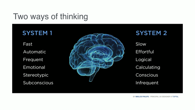
Now, if you were here for Sid's session this morning, you're going to be very familiar with this concept if you weren't already, but I was pleased to learn in my research that the human brain is lazy, biassed, and prone to shortcuts, so it's not just me. Neuroscience tells us that there are two ways of thinking, we have our fast thinking and our slow thinking, our fast thinking is very active, our slow thinking is very analytical.
We'd always try to go to the first style of thinking more often than not.
So, the other thing I learnt was that while comparatively small compared to the rest of our body, the brain consumes 25% of our body's oxygen. Therefore, the brain is lazy, as a survival mechanism. I think it's a really great excuse.
It relies on pattern recognition and shortcuts, so less energy is spent consciously processing every situation.
So we need to consider our lazy brains into our designs. Now, on that line the first and foremost principals of design is the principal of least effort. It's also my favourite one.
To put this another way, don't make your users have to think too much. Great quote from Jared Spool, the design shouldn't even be obvious, we can just go and do our task.
This is an example of an intranet from a shipping company, and I really think this is quite good at not making people think.
They've designed an interface which brings together information from a whole range of backend systems, all about each individual ship.
So this ship, where is it, is it on time, what is it carrying, where is it, when is it coming back in for dry dock, a whole lot of stuff.
Beautifully I think presented on a single page. For me, that's simple yet there's a lot behind there. And of course, you're probably all aware of this book from Steve Krug, who's the principal component of Don't Make Me Think.
Great book.
The next one is human attention, and I do have to say particularly from probably the styling of my presentation you've realised that is how my brain actually looks a lot of the time.
We're often overwhelmed by information and therefore our brain tries to always find shortcuts on how to make sense of stuff.
I want to very briefly play just a short video which you will probably be familiar with, but then again you might not.
Is it gonna work? Okay, I'm running low on time so I'll move on. - [Narrator] The Monkey Business Illusion - Okay, I'm moving on.
Did anyone not see the gorilla? Or we all see it.
Yep, a few hands went up.
Now once it's pointed out if you play that back at some stage, it's just on YouTube, you'll realise that once you know about it you can't miss it.
There's also the curtain in the back went from gold to red, or red to gold, whatever it is. This is also really relevant for our users. I just wanted to show this page, because Department of Human Services, Centrelink, Medicare, et cetera.
The knowledge base of their customer service staff, they needed to know an awful lot of information to deal with customers.
As you can imagine, lots of information along with a pretty complex and stressful job. I was asked to do some user research some time ago and the project team said, "Could you find out how people find the new tabs that we've added?" 70% had never seen them.
Although they worked with this screen open all day every day.
When they found them, behind there was very useful information and they were really excited by it, but this is our brain short cutting.
We expect to see all this other stuff.
We don't expect to see it, and therefore our brain says we're not going to do it. So, there's many other of these laws too, and I think in terms of design systems we must have an idea of why we do our designs. We must have an understanding of some of these things. There are laws such of Hick's law or too many options, too many options and this will increase our decision time. That's a very old intranet from many, many years ago. Probably takes it to the extreme.
But we've got to think about brain laziness. We need to address those sorts of things.
That's the one I want, sorry about that.
Miller's Rule which is different to Miller's law that Sid talked about this morning, again this is the most contentious law that you're probably all familiar with.
Many people use this rule to say you must not present the user with 7 +/- 2 options.
Now there's a lot of discussion about that, so I won't go into that at the moment because I'm about to run out of time.
But, again I urge you to look at some of these things. I've only touched on a few things today, so you can find many more examples to explore. But over the years, my research and experience has made me understand the importance of these design principals.
Not only for our current online web world, but as we move into the world of immersive design. There's gonna be a lot of change in technologies, and the ones we're designing for.
But humans and human behaviour will not change. So I think there's value in going down this path. So while you might not remember anything I've covered today, the next time you start a design project I urge you to stop and think deeply about the people who will be using your designs and their explicit needs, and their implicit needs. Thank you.
(light synthesiser mamba music)
Most of us are aware of the ‘F reading’ pattern, but are there other common human behaviours that we should be including in our designs?
In this talk, Amanda will look at a few ideas from other disciplines, such as anthropology, neuroscience and psychology that should be considered when designing internal user interfaces.