Mise en mode
Introduction
Nathan Curtis introduces Donnie D'Amato, founder of Design Systems House and lead of the UX Core Library at GoDaddy. He is also an instructor at Parsons School of Design and the author of Gridless Design.
Donnie D'Amato's Opening Remarks
Donnie D'Amato begins his talk titled 'Mise en Mode,' expressing gratitude towards Jina and his coworker Sean Rice for their support, and his wife Jen for her patience.
Donnie's Professional Background
Donnie introduces his role at GoDaddy and his connection to the design systems community through his work and teaching.
Design Systems House and Community Engagement
Discussion on Donnie's participation in Schema, Figma's design systems conference, and the importance of building trustworthy relationships in design systems practice.
The Humor in Design Systems
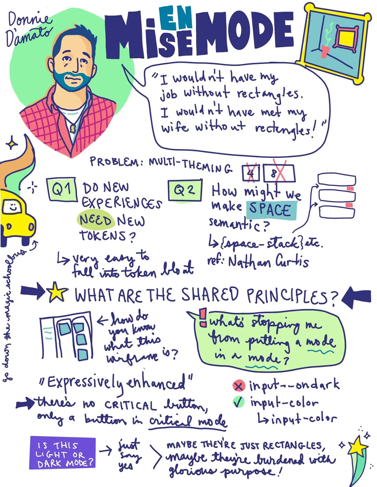
Donnie talks about the humor often found in design systems work, using an example of rectangles on the internet.
Impact of Rectangles in Design and Life
Exploring how simple design elements like rectangles have significant impacts on our careers, relationships, and societal structures.
Exploring New Design System Experiences
Donnie poses questions about design system experiences, exploring how to manage new experiences and tokens effectively.
Simplifying Design Systems
Discussion on simplifying design systems by reducing the number of tokens and managing them more efficiently.
Making Space Semantic in Design Systems
Donnie addresses the challenge of making space semantic in design systems, questioning traditional naming conventions.
Linking Design Concepts
Exploring the connections between different design system concepts and approaches, focusing on their shared principles.
User Familiarity in Design
Donnie discusses the role of user familiarity in design, using examples of project management tools and wireframes.
Mise en Mode: A New Design Paradigm
Introduction of 'Mise en Mode,' a concept for enhancing user experience design through nested collections of modes.
Reconceptualizing Design Components
Discussion on the idea of components existing within modes, rather than as standalone elements, using examples from Atlassian and GitHub.
Conclusion: Reframing Design Experiences
Donnie concludes by emphasizing the potential of Mise en Mode to provide designers with creative freedom while maintaining system integrity.
Q&A Session with Nathan Curtis
A Q&A session where Donnie addresses questions about his spatial model, the role of modes in design, and future explorations in design systems.
Nathan Curtis: All right, our next speaker is Donnie D'Amato.
Donnie specializes in crafting experiences for companies of any size as founder of Design Systems House, he is not just a generous moderator, with all of his time on the Twitter, Mastodon, and Design Systems Slack communities, while Jina did start it, Donnie's doing all the heavy lifting right now, and can we give Donnie a hand for that?
That takes a long time.
He's also the lead of the UX Core Library at GoDaddy.
He's an instructor of user research and interaction design at, Parsons School of Design.
And he's the author of Gridless Design.
I think we might hear a little bit more about that in this talk, so please help me welcome Donnie D'Amato.
Donnie D'Amato: Thank you, Nathan.
Hi, folks.
I'm just waiting for the mute.
Mic is good?
Mic is good.
Can it be good?
Is it good?
It's good, great.
I also would like an image.
Is my laptop off?
Okay, my laptop is off.
Let's turn the laptop on, so we'll have some images.
And I'm pretty sure this won't happen again, as long as we're I'm on this.
Perfect.
Okay.
Things are working.
Alright.
the name of my talk is mise en mode.
for the folks who speak French to the audience, don't get ahead of me.
Alright?
We're gonna get there.
before I begin, I want to thank Jina for giving me a platform and a community to speak to.
I want to thank, my co worker Sean Rice for ensuring me that I wasn't completely crazy.
And I want to thank my wife, Jen, for listening to this talk dozens of times, and is now equally thankful that I'm across the country.
my name is Don D'Amato.
where's my click?
Come on now.
There she goes.
I am the founder and chief architect of a startup called Design Systems House, where we're dedicated to the future of design systems.
I'm interested to know how we could take what we're doing today beyond and for the past four years I've been working at GoDaddy as a principal engineer at the UX Core Component Library.
And in the evenings I teach user research and interaction design at Parsons School of Design in New York, where I live with my wife, who also happens to work in design systems.
That's where the design systems house comes from.
And it was about a year ago that my wife and I were both invited to go to Schema, which is Figma's design systems conference.
And it was chock full of amazing talks.
Actually, Nathan and Jules actually both spoke at that.
One of those talks was by Lauren Lepreet.
Who walks the audience down her journey in gaining influence in her organization.
Yeah, give it up for Lauren.
And I think this is a very important thing for us because at the end of the day, design systems are for people.
No matter all the components and tokens and documentation that we need to manage every single day, it means very little without that buy in and adoption.
So building these trustworthy relationships is key to success in our practice.
The final slide of her talk was this one.
They're just rectangles on the internet, right?
Collective chuckle across the crowd, myself included, right?
It's common for us to joke about what we do, yeah?
There's no shortage of this on the internet, right?
Here we have someone who's made a, inverse kinematic, soft body 3D model.
And here we have someone who's You know, saying, we're arguing about rectangles being gray or dark gray, right?
And, for what?
At the end of the day, though, in retrospect, I'm thinking that I wouldn't be in this room without rectangles.
I wouldn't have the same career I would have without these rectangles, right?
I wouldn't have met my wife without rectangles, online dating.
In fact, rectangles are changing humanity.
They're, rectangles are making the world go round, socio economically speaking.
And I didn't know it then.
But I come to find out that these rectangles may be a different gateway to a whole new design paradigm.
One that you might be excited about, like Nate here.
Nate is looking for a multi brand theming framework supporting product expressions and brand constraints with governable sub themes.
By the way, if Nate, make sure you tweet this out at him because he has some FOMO right now, and if he sees his name on the thing, it's gonna go crazy.
But anyway, it sounds like he's going to have a better chance asking for a pony this year, right?
There's a lot of stuff that we need to do.
However, I think that the work that I've done over this past year may have solved for this.
So, if you're ready, and you've all signed your waivers we're going to go on a magic school bus, inside of my brain, and it's wild and crazy, and hopefully we come out in one piece and maybe we learn something.
Does it sound good?
[scattered applause] No, no, no.
Does it sound good?
[wild applause] Okay, we're still awake.
That's fantastic.
Alright, so in order to do this, we have to ask ourselves a couple of questions.
The first question that I want to ask is, do new experiences need new tokens?
And the way to demonstrate this is like this.
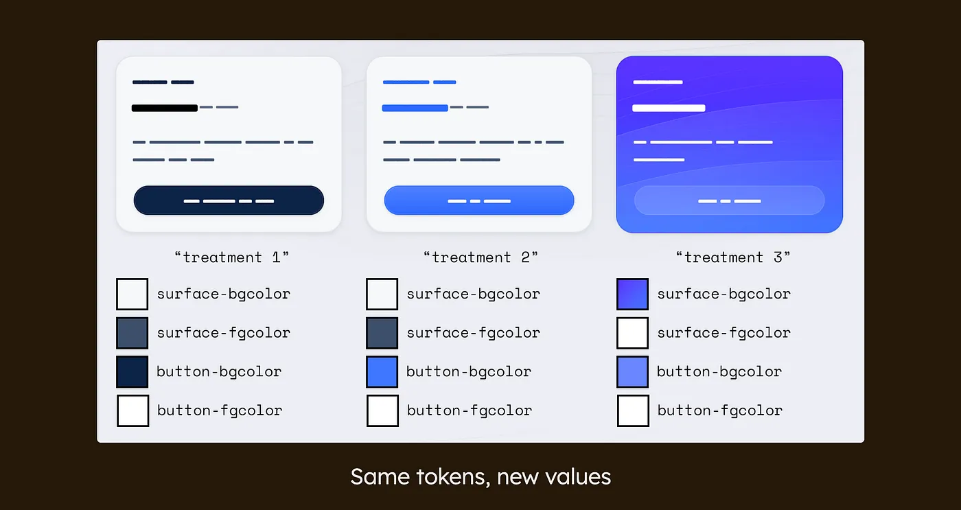
We're gonna have this, product page, or pricing page, much better.
Pricing page that has several different tiers in it, and each one of those tiers has a different kind of treatment to it, right?
And maybe this, standard pro and enterprise.
And again, the task at hand here is, using the system that we have, we need to support these slight variations using, the system, maybe tokens, right?
So how might we do that?
I might look at the first one, and I might say, Okay, that looks a little bit similar to the rest of the page.
That's a regular primary button.
So we have tokens that describe all that.
That's good.
That second one there, that has the same surface, so we have tokens for that.
But that button is not the same as the primary button, so I need different tokens to support that, right?
that third one, that's crazy, all right?
We need tokens for the surface, we need tokens for the button, so we have a whole bunch of different tokens.
And maybe that looks like this.
so you have a whole bunch of tokens that you have to introduce to support all those different variations, and maybe that's okay.
Maybe it's okay for this amount of tokens to support that, those variations.
that's manageable to you, right?
What harm did we do?
What happens if we need to add an input to these elements?
That's more tokens.
What about if that input needs to convey an error state?
that's also more tokens, right?
And before long, you may double, or even in this case, triple the amount of tokens that you need to manage to get these kinds of treatments, right?
And I don't know about you folks, but I'm trying to manage fewer tokens, not more, right?
I have more important things to be doing, oh, I don't know, getting buy in and adoption, right?
easy stuff.
So how do we make this simpler?
let's think of a simple example.
Come on!
There she goes.
We've seen this before, right?
It's a light colored page with a dark colored footer, right?
Very common kind of treatment.
We've seen this before.
So again, same kind of question.
How would we support this using design tokens, right?
So what you might do is something that looks like this.
You'll have the, text color on top that represents the black.
And then because that text is on a dark background, I would create a token that says text on color for the white.
that's happened before.
And again, same problem, we're increasing the number of tokens every time we introduce something like OnDark, or Contrast, or Inverse, right?
And I wrote about this, it's called the OnDark virus, because I find it to be an infection across systems.
It keeps bloating these token sets, where I think we don't need to do this.
Because the way that I look at this, I consider the footer as like a mini dark mode, and in the same way, we do not change the token names between the light mode and dark mode, I don't believe that we need to change the names between the higher and the lower scopes.
So that means that we keep these token names the same between the top and the bottom, and we just change those values.
And in that way, we can support both of those treatments on the same page without increasing the number of tokens.
And of course, the big benefit of that is No new tokens.
That sounds really great to me.
going back to our previous example, here we have those treatments again, and they have the exact same token names across all four.
All we're doing is changing those values, and we get the treatments that we're looking for.
No introduction of accent or on accent.
Gone.
Okay.
Cool.
So that's the first question.
On this very scientific scale of emoji of understanding, we should be sitting somewhere around here.
I hope.
The next question I'm about to present is not like this.
It took me about six months to fully realize.
A lot of thinking, a lot of asking, a lot of research.
and it is required to reprogram the way that you think in order to accept what I'm about to show you.
So that means that we're going to be maybe somewhere around here.
Stay with me.
The next question that we need to ask is this one.
How might we make space semantic?
All right, so we've already solved semantic tokens for color and topography.
But what about these other design concepts like, like space, right?
Can we make space semantic?
Now most systems out there will either use t shirt sizing or proportional naming in order to distribute their spacing tokens.
But neither of them, or actually many of them, are not semantic.
And this is the reason why.
This is how I think about it.
Button background color is a semantic token and the reason that I think it is a semantic token is because by the name itself I know exactly where it goes in my library.
It goes in the button background color, right?
Seems very clear.
Space 4, on the other hand.
I can't tell where that goes just by the name alone, right?
I need a lot more context, a lot more information to know where to place space for in the library, right?
And because of that, in comparison between these two things, if I was to categorize them, button background color being semantic and, space for being not.
But I still wanted to answer that question.
Could we make space semantic?
And I think we can.
Now again, after that six months of research, it was very important to me that whatever I landed on, it was visually representing what we've expect from the community, right?
the space that we're expecting when we're applying this to these interfaces.
And I was highly influenced by Nathan's article on space and design systems in 2016.
So much so that I've stolen an example right out of his article.
Great artist, Steele, right?
So that's what I'll do now.
So we have three identical cards here, and the first one has no markup on it, so we can see exactly what the final result is.
The second one is using basically something out of Nathan's recommendation with tokens that are introduced as space inset medium, space stack small.
And this is similar to many of the systems that are out there, and for good reason.
Anytime I select a token, I have a pretty good understanding of how much space I'm going to get from that token.
The third example is the result of my exploration called complementary space.
And in it, there is a single spacing token.
And the amount of space that token represents depends on the region where that token exists.
So the outermost region is 32 pixels potentially.
Then the region inside of that, that token represents 16.
And then the region inside of that, the token represents 8.
So instead of the tokens being the scale, the regions are the scale.
And then we've reduced the decision about which token to use down to a binary one.
Is there space here or not?
Now, if you want to learn more about this approach, you can go to complementary dot space on the internet.
That site uses a version of that approach.
And folks who have experimented with it have also reported back positive results.
I'm actually fairly proud of the discoveries that I've made here.
Okay.
We did it.
We made it.
We got past that weird one.
There's your achievement for today.
You'll get your trophies in the mail, I promise.
going through those two questions though, I realized that the work that I did describing the OnDark virus and the results that I got from the complementary space project were actually basically the same.
We have a, token that exists across experiences that just changes its value based on its placement.
Right?
That's what's happening in both of these results.
And again, separate units of work, right?
I didn't want to have these things necessarily combined.
It wasn't something that was in my plan.
It just so happened that they ended up being the same result.
Because of that, it gets me another third question here.
How, how are the, what are the shared principles in these approaches, right?
How are they in common?
Essentially, how did I get here?
And this is the way I thought about it.
I could ask you, what is this a wireframe of?
But I think it's a more interesting question to ask.
How do you know?
Now, I think many of you probably have an idea of what this is a wireframe of.
You might have even been triggered when you first saw it because you forgot to close a couple of tickets, right?
This is a wireframe of a project management tool, right?
But again, that question, how did you know, right?
It doesn't say project management here.
It doesn't say JIRA.
There's no branding.
So how?
How did you know?
What this was, well, it's because we've seen it before, right?
Our prior experience is informing this newly introduced one, which is Jacob's Law of Familiarity, which goes on to say that users prefer experiences that seem familiar.
And that makes sense because the re the users, they don't read need to relearn anything, right?
Their experience meets their expectations.
And in fact, a project management wireframe should be immediately identifiable and different from a social media feed in order to be most successful.
Even if the layout changes due to right to left languages or responsive reflow, the purpose, hierarchy, and methods of user input should persist as a blueprint for how a certain experience should behave.
And from here, we can add personality.
Now, hopefully the video plays, and if it doesn't, it's okay, we'll just talk about it.
Come on.
Or, we'll just not even go to the slide.
Oh, okay, there it goes.
The video is not playing anymore.
But it's okay, I'm not going to restart it, it's okay.
Because I can explain what's going on here, and some of you might have even seen this live.
Here, during the keynote at Config.
Dylan moves this predetermined app structure into these sections, and each app is actually created with these Figma variables.
But when he moves it into the section, that section provides new values to this app structure in the form of a mode.
So he gets the dark and Japanese mode, he gets the German and config mode.
And that was very exciting to see, right?
The crowd was going wild.
Every time we moved the rectangle, the crowd was like, Woo!
Color!
But I saw more potential in that because of all the work I did earlier.
Because I'm looking at this and I'm saying, What's stopping me from putting a mode inside of a mode, right?
Yo dawg, I heard you like modes.
So we put a dark mode in your light mode so you can stop making more tokens.
that's where I got the idea of, come on now, mise en mode.
So, mise en mode means placement in mode.
It comes from an art history term called mise en abyme, which is the idea of putting a smaller piece of art in a larger composition.
So here's an example of mise en abyme.
If it decides to come on, go, okay.
So we have the large coat of arms here from the United Kingdom of 1816, and inside of that we see a smaller one.
And inside of that we see the smaller one.
Now in the case of user experience design, Mise en mode is the idea that the experience can be sliced up into a nested collection of modes where any one of them can be what I call expressively enhanced with new values.
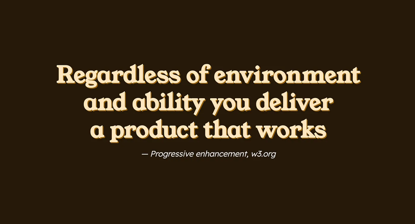
Now what does expressively enhanced mean?
expressively enhanced is the idea that if something fails, just like progressively enhanced, we still provide a experience that works, right?
Actually directly out of the W3, site, it talks about how there's, regardless of environment or ability, we still deliver that product that works, right?
So that's the progressive enhancement idea.
In the same way for mise en mode, we're talking about expressively enhancing.
So if we go all the way back to our first example where we're talking about the, possibility of introducing text on dark, right?
Imagine if we went, continued down that path and we had, and we added that input to these elements.
And we need to include input on dark.
what happens if we've forgotten or, missed in the process or down the pipe, that value doesn't get assigned to input on dark, right?
what might happen is that might become inaccessible or unusable because that token doesn't exist.
And the system has no way of knowing what the fallback is for it, right?
Because it's a completely new token.
So if it doesn't come down the pipe, I don't know what to do, right?
I have no other reference.
It doesn't exist on the page otherwise.
Now, if you're about to tell me that, oh, I've already solved for this.
I have a very special config that provides fallback values and, can, place this stuff with no problem.
That makes me believe that your system looks a little bit like this.
And I don't know about you, but I feel like I need a degree in graph theory to understand the relationships going on here.
I personally don't think this is okay, right?
Things should be simple, and I think that's what mise en mode does.
Mise en mode provides the ability for these tokens to be the same across scopes, right?
And because this is an entire mode, all those values are curated together.
So one shouldn't be missing.
They should be all together at the same time.
And if those values fail then the higher scope says, no problem, fam, I got you.
I have values for all that stuff.
You'll look exactly like the rest of the page, no problem.
And we, again, deliver that experience that works.
Simple.
I'm about to make things even more simple.
I'm about to take some components away from you.
What if I told you that I don't believe that there's anything such as a critical button?
Only a button that exists in a critical mode.
Okay, done.
Hold on a second.
Hold on a second.
Now you want me to put an entire rectangle around a single button?
That's overkill.
Not going that far.
I don't think that's what you intend to do.
Here's an example out of Atlassian.
This is their danger modal.
And as we can see, we can have this danger button, inside of here, very clear as day.
But the entire experience is conveying the idea of being critical, right?
They have the critical icon there, the headline, the messaging, everything is trying to convey the idea of being dangerous, right?
Not just the button.
So regardless of your opinion about which one of these two things should be first, I believe that the delete button in this case is actually a primary button.
It's the primary action that they're trying to convey here.
But it's displayed in a critical way, okay?
And in that case, that means that there's no critical button, as much as there is stuff that is trying to make the primary button display as critical.
Here's another example right from GitHub.
This is the edit profile experience.
And here we can even see the comparison between what you could call the normal scope above, with the headlines and borders and such, and buttons, and then the danger zone below, which gives that slight variation, just to show the danger that occurs underneath this area.
So using Mise en Mode, and thinking about it in this way, we can change the way that we, or enhance our messaging, or we can even portray a new brand, right?
We can make this look like Home Depot, or Delta, or Clarity.
We could have co branding on the same page.
Oh my God, two brands on the same page.
Amazing.
We could do a lot with this.
We could round the corners on stuff.
We can flourish the topography.
We can purple the gradients.
We can go absolutely mad with power.
ha, Look at my creation.
But with great power comes a great question.
This comes from community member, Mike Myer, who asks, Is this light mode or dark mode?
Take a second, audience.
Think about it.
Show of hands.
Who thinks this is light mode?
Who thinks this is dark mode?
Who has no idea?
I'm with you.
What is this for?
Is this for readability?
Is it for battery power management?
Is this to portray a new brand?
Is this for another user entirely?
Why, designer, do you need this?
And that's the challenge in our practice.
Because every time that we ask why in a new treatment, a designer has to go on defense.
And they have to attempt to convey the reason why they've done this, right?
And as humans, it's hard for us to articulate our needs, right?
And it's a lot easier for us to just avoid that conflict and go rogue.
Eject it from the system.
What if we didn't have to ask why?
Why not just say yes?
Just say yes to, what is Jeopardy Mode?
Why won't we do this?
Before mise en mode, I would look at this and I would have to do a cost benefit analysis in my head, right?
This treatment against all the support that I would need to do in order to make this happen, right?
And I'd come to some conclusion that I would need to add more tokens, and those tokens need new values, and those tokens need to be applied to new variants.
And those variants need to be attached to new components or existing components.
And then those have to be published to the library.
And then that library has to go out to all the other applications.
And it's just too much work for just a few colors, right?
The juice isn't worth the squeeze.
Does it really matter if the rectangle is gray or dark gray?
for the folks that are making these decisions It matters.
They want that rectangle to mean something more.
And for us, making sure that we have a design system that is a successful product, we need to support our users, right?
We need that adoption.
And in order to do that, we create these systems, these efficient factories of letting these creative juices loose.
Look at him!
So confident in his system, right?
We all know what he's thinking.
He's thinking about how mise en mode is unlocking his creative freedom of expression for all his designers.
Okay?
He gets it.
Okay, and he understands how mise en mode is going to be the thing that supports this using these blueprints of user familiarity and these rectangular boundaries of influence, right?
He gets it clearly.
To be serious, when we quite literally reframe the way that we think of our experiences using mise en mode, I believe everyone gets what they want.
The designers get the freedom of expression that they've been looking for in that system.
And us as system maintainers, we get what we want for our designers to be using the system that we care so much about.
maybe they're just rectangles on the internet.
Or maybe they're rectangles burdened with glorious purpose.
Okay, so that's the end of my talk.
I have one more slide though.
All the resources I've been showing you today, actually this talk in particular, is actually available at mode dot place on the internet.
You can go there right now.
In fact, you've already seen it.
Because I have been presenting it.
This entire time, this is the site.
so if you've gotten nothing out of this talk, maybe you've been inspired to take your personal site and when you want to present it as a portfolio piece, maybe it's the same place.
Anyway, thank you for your time today, and maybe I'll see you on a rectangle in the internet.
Nathan Curtis: That was a head spinner.
I loved it.
It's what I do.
also, I'd like to give, can we all give Donnie, a hand.
This is, from what I learned last night, your first talk to a, I don't know if this is the right criteria, but a large paid audience.
And I thought it was fantastic as a first talk.
It's a great job.
Donnie D'Amato: Thank you.
Nathan Curtis: Great job.
there's a lot of opinions in this talk, and I'm an opinionated kind of person too.
help me understand at the beginning when you said, I'm reducing the number of tokens needed, when, for the sake of simplifying what you did, you went from essentially a 12 by 1 stack of choices.
To a 3x4 grid of choices.
And what I see still there is, there's still 12 things to specify.
There's still 12 cells to fill with a choice.
are you really reducing the count, or are you creating more structure so there's clarity and ease by which they need to be specified?
Donnie D'Amato: Certainly the latter, yeah.
I think one of the big problems in our what we do is naming things, right?
Hashtag naming is hard.
And if we don't have to name as many things, right?
I think the job becomes a lot easier.
And we're able to, define these things a lot more clearly.
As opposed to trying to figure out what's the best name for this thing.
Is it on dark, or contrast, or inverse?
that is removed entirely.
And now, the tokens are reduced to just basically the concept of the page and its property.
And all the other variations that could exist from there are outside of that scope, and it's a different conversation entirely, and actually, from the oration that I did with the big book at the end, what really happens is all that work that, that you could be doing that introduces that token into the ecosystem actually vanishes because all that token stuff occurs outside of the system so that it allows those folks, because that's the real bottleneck, is introducing that token.
You need to do all that work.
If you don't have to introduce a new token, everything happens much faster.
Nathan Curtis: So I'm not going to spend too much time lingering on your spatial model, but I do want to understand, it seemed to rely upon a, essentially, a relationship between where the space applied is applied relative to its depth within a construct.
Donnie D'Amato: That's correct.
Nathan Curtis: hopefully I don't lose the audience here.
If you have a similar display in a different part of the page that is at a different level of starting depth in the nested hierarchy, like, how do you start to relate those different choices across more than just the one component that you have?
Do you really, at the top level of that, Cards, context, or scope.
Do you set the starting point there, and then it gets smaller and smaller in space after that?
Donnie D'Amato: Yeah.
Disclosure as well.
One of the things when I was releasing complementary spaces, I had sent it to Nathan, so he's a little bit more familiar then introducing in here, but what I believe in that is that you have this outer scope of space that you start with, and then it reduces in each time, and you as a designer would choose when that changes as you go down.
So if it's not appropriate for the density to change, then don't mark it as a change, right?
It's not every single rectangle as you go down.
It's a curated experience of, okay, this table, because it's so deep into the experience, needs to be more dense, more compact, and therefore I have essentially nested it a lot of times to get it that more compact.
Meanwhile, your hero image, which is usually very spacious, that's also typically at the highest level of the page and therefore isn't nested so much.
as we go down, of course, the area that we have to work with even gets smaller and we end up sticking more things in there to make it more compact.
So that's why it seems to work in many of the cases that I've tried.
Nathan Curtis: And that leads really well into the next question I have, which is, this is not a judgment.
We need you and many of us exploring models to clarify this and simplify the expression of this stuff.
And you gave a time bound, you said, I think, six months.
Yes.
You really sunk yourself into this.
And more in general, how do you think about when you have an answer?
Versus when you convince yourself you have the answer.
And if that answer is for you, or if that answer is for all of us, what makes you think about the scope of applicability of the choice Donnie D'Amato: you made?
It's challenging because, one of the key words that we say all the time is it depends, right?
Because there's different things to take into consideration.
looking at Michelle's talk from earlier, where she showed the IKEA pages, right?
And where the Japan experience legitimately had more content than the other two experiences, right?
And it's entirely possible that requires more than just what we've been doing, right?
Because it's just, something that I may not have been considerate of when I considered, made this, this exploration.
Because in that, it's entirely possible to miss pieces, right?
You can't cover everything all at once, all the time.
So we make these potential generalizations to answer some questions, right?
Because again, that second question of can we make space semantic, and this is an approach to do that.
Is it the approach for you?
Or the masses?
Maybe not.
I recognize that wholeheartedly that's a reprogramming, right?
But I also think it's the same reprogramming that we did for semantic tokens as a whole.
Because we stopped saying color blue 500 on the button, right?
We figured that out.
Most of us are very comfortable with saying, no, that's primary button background color, right?
We can change that color somewhere around the system.
So all I did was expand on that, right?
And could we go further?
But in order to do that, you need to reprogram the exact same way that we did with color.
Nathan Curtis: One of the journeys I've been on this year in making the Figma plugin, that does layout and spacing specs is, as I interview designers and talk about auto layout and think about the relationship to how they're expressing it through specs, one of their speed bumps or maybe even a wall they run into is nesting.
They don't understand or they don't see the world in a nested context.
So you're a teacher, you're an instructor at Parsons, like how do you teach or groove designers to understand the impacts and the role of nesting in their designs?
Donnie D'Amato: I think it's the same way that we think of components, right?
Like the way that we identify as a component, which is its own bag of crazy that I'm going to research actually next year, but I think many of us have this predetermined, notion of how to identify a component.
I think it's the same muscle that says, okay, not, this is not a component, but yet a different expression on the page that's different from the rest, and I think this is, even marketers do this, I think, without noticing it, because they'll say, oh, I want this section to be pink, right?
that's, internally I believe that they mean that expression to be something different, I want it to stand out, right?
And they're saying it without saying it in the same terminology that I'm using here.
But it's still that thing that they need, and they know that this section, this part of the page, should be different from the rest.
So they're really identifying it in the page, even though if it's not necessary or not, that's different.
Because the other thing about this too is In order to do this, you need to change your mental model.
And I know for many folks, that come from more traditional background, it's hard for you to change your mental model.
So maybe that's not a problem to give them as this idea of, it's a nested experience.
But instead, for us to understand how it works underneath, for us to give them what they want, right?
So when we go ahead and, they, say, I need this to be pink.
We just tell them, no problem, put "data pink" in this container and you'll get it.
Don't worry, I've got everything else in the back, right?
They don't have to do any publishing or anything like that.
It's just mark it where you want it and you get it.
Nathan Curtis: When you start to rely on modes, you're really shifting the target, or really the place where you manipulate something from, oftentimes, a set of properties that you configure.
Or, if you're doing more hard coded, decisions, the actual, all the other fields that you're putting hard coded values in.
But really, modes feels like It's yet another space where we do configuration.
And with this new place that we're going to be using modes, in Figma, literally, or maybe just conceptually like you're approaching it, how do you see the choice of this goes into a moded context versus that doesn't?
When do you route a decision to one place or the other?
Donnie D'Amato: Yeah, so that goes with kind of the middle part of the talk, which was identifying that blueprint of user familiarity.
Where you have this blueprint, this low fidelity blueprint, like I talked about at the panel yesterday, where that's the underlying structure that is expected for an experience.
That's the thing that we need to maintain.
From there, we add the personality, right?
That hot pink that we need to add to have that expressively enhanced in some new way.
So if we're able to separate that and say, okay, if this experience wireframe, then I no longer, I can separate those concerns and say, okay, the wireframe, I need to identify the tokens that describe that wireframe.
Because in that wireframe, I don't have any expression in the wireframe at all.
From there, that's where the expression gets added, because now we have all the tokens that describe what the experience is supposed to be functionally.
And then we have the form on top of that.
That's function, form follows function, right?
That's the whole kind of practical application of it.
Nathan Curtis: imagine that you've created or, started to drive your group to adapt to this moded model, and across different tools, many of them still have a high degree of compositional power.
And you have some people that want to work with this moded mindset of inheritance up and up the, the nested chain.
And you have other people that still want to operate in a very object specific configurable way.
How much does everybody need to change to really adapt to do stuff the same way?
Or, if they achieve the same experience outcome on the other end, is that still okay?
Donnie D'Amato: I think of the same kind of impact as responsive design, in its ecosystem, only because we still have folks in the industry that don't get responsive design.
And it's been years, decades probably, maybe, at this point, right?
Where that methodology that we introduced to make experiences more inclusive seems to many of us as table stakes, right?
this is just the way that you do it, but there's still people who can't do it because it, again, it's not part of their, daily mental model.
And I, not to compare myself to responsive design in such a, impact that it's had, but this is a different design paradigm again.
And it requires, like I said earlier, a reprogramming that some people are going to get, some people are going to have some struggles with, and some people that won't.
in anywhere that you try to drive adoption, you're going to have difficulties.
And just like I said yesterday, I have a difficult time selling the concept.
Like, all the stuff here that I went over, I get it.
Because I've been in it.
And it's the selling part, the storytelling part, that makes it really hard for me to convey these concepts.
Because it's all in my head.
It just all makes sense to me.
And how do I communicate?
I think there's a lot of potential for this to work.
But, I think we're gonna have to wait and see.
And I think that's the biggest challenge for me, is, how to communicate this properly.
And I tried here, and I've tried through commentary space and other things like that, to try to, do this kind of work.
And like I said in the talk as well, some people have experimented with this and actually have gotten, again, those positive results in saying, actually, yeah, This does work, again, if you reprogram this, but it takes time.
Nathan Curtis: Part of establishing those models also means that they're going to get complicated.
they're going to get really rich with a lot of the layers and decisions that you put in them.
And with that richness comes potentially rigidity.
And how do you, have you thought about how other designers or other collaborators approaching the model that you have?
It might be somewhat sophisticated.
And does the model enable sort of extension?
And if so, can they extend small parts without having to define or break the rest?
And or, can they override small parts to do a certain portion their own way?
Have you thought about that kind of, Sort of evolution of the model amid a group of collaborators?
Donnie D'Amato: Admittedly, no.
just because again, the concept was so new, essentially I mentioned the config in there, and that's like where the light bulb hit moment, where it's oh my God, these things are the same and we could do this in the middle.
So it is a new concept in terms of the approach itself.
so not widely adopted or even really, All the edge cases found and things of that nature, so it's entirely possible, but at the end of, exploring something for any one experience, you go, it doesn't work for my case because of this reason.
And I'm fine with that, too.
I think that's really important to know, is that while it sounds like I'm selling you the idea of Mise en Mode on here, it's not that I care about you using it.
It's more about that I care about reconsidering the way that we think about how we curate an experience.
there has been a lot of best practices out there.
I had a slide that had all of the, blog posts that talk about naming tokens there.
Yours and mine included.
And, that seems like a common pattern to look at what people have done to see what they did and then have solutions from that.
And we were talking about this, I think, last night.
is that I do the reverse.
I come up with a solution, and I see if it matches anything that's out there.
And I think sometimes when that happens, sometimes you get alignment, sometimes it works, but sometimes you come up with something that's different and worth exploring more, because maybe it fits a model better than what we've been doing before.
Like just what we were talking about between the semantic tokens and whatnot, we saw color and topography, that was, we did.
But spacing, we never really figured out, and I wanted to know if we could, and it just so happened that the same mental model came together, only because, if I was to look at other stuff, I would, I don't think I'd ever get there.
Nathan Curtis: so you started with your explorations of inverting the display at various nested modes or moments.
Then you talked about space.
You hinted at stuff you're gonna do or think about next year.
Yeah.
So where do you go next?
What's on your Donnie D'Amato: mind?
so next year I am very interested in the idea of what is a component, and mostly from the idea of that we're interested in metrics.
Now there's a lot of tools that are coming out there.
lro is an example that's interested in an omelet.
I'm a researcher that are interested in providing these kind of quantitative metrics about the system.
And I'm apprehensive, admittedly, in trusting the way that they're being measured.
I don't know that for sure.
And admittedly, I will also say, I haven't read through extensively the tools that are doing this.
But, I'm interested to know how we might identify what a component is versus what one is not.
Brad Foss did his talk about atomic design dead earlier, a couple months ago.
And in it, he re introduces the idea of atomic design and how people argue about the taxonomy.
And he clarifies it in his mind about what an atom actually is.
But when I saw what he says an atom is, I look at that and I go, I could break that down further.
And not into design tokens, into, what potentially would be subatomic.
that introduces a, okay, what is actually a component?
And then on top of which, you can go to the totally opposite side of the spectrum and go, this card is a component, but it's composed of other components.
is the whole thing a component when we measure it, or is it the individual pieces?
and then also, what's 100 percent of adoption, as we call it, right?
Does that exist, in terms of, not necessarily something to strive to, but even just something to measure, that goalpost.
Does that exist as a, if we were to imagine something as 100%, what does that look like from a definition standpoint?
So that's next year, and maybe there'll be a talk on that.
Nathan Curtis: my dad saw me in a talk last year for the first time professionally, and his first takeaway when I said, so what'd you think, he goes, If you thought about quarks, and I was like, oh my god, dad, stop.
And so maybe when you explore this next year, I can invite him to that talk too, and we can have a discussion.
Thanks so much, Donny.
Sounds good.
Everybody, a warm thank you for Donny.
The recap of a year long research and development journey revealing how we might take semantic responsibility away from design tokens in favor of nested modes.
https://mode.place
Keypoints by Amy Lee–find the original article here.
Donnie walked through his discovery process of “Mise en mode”:
- Use the same token names but apply theming. Therefore, you do not have to create new tokens to get a different UI style.
- Use the same space token name but change its value depending on its placement.
But one of the main things that triggered Donnie’s thinking was Figma’s 2023 Config conference, which showed off brand new Variables with Modes. How might we create modes within a page that can affect token values?
Donnie then talked about the advantages of progressive enhancement. Since the page has a primary mode, then that serves as page defaults. And for child containers that may not have a mode set, the tokens should “fall back” gracefully to the page mode defaults.
My commentary: Now, in 2023, design tokens are so prolific. The modern challenge isn’t getting people to adopt design tokens; it’s how to manage too many design tokens! Donnie attempts to simplify the problem by having a few tokens within a container be semantic and styled with a “mode.” I think it’s a valiant attempt to advocate for reuse.
Where “mise en mode” differs from theming is that theming is often page-level and contains all theme overrides for all tokens. Where “mise en mode” differs from BEM is that the Block level is often a component, and that affects all components; there isn’t a good way to describe Block-within-Block.