New in ‘22 — the CSS browsers will ship this year
Hi, I'm so excited to be here, to talk about the new CSS that's new in '22, there is so much happening right now, both in the CSS working group and in browsers, implementing new CSS, taking things to a whole new level.
So.
How do we know what new CSS is coming?
Well, all new CSS gets born in the CSS working group.
That's the place where all the ideas get proposed ,debated for years.
Figured out all the tiny minute details written down in a specification, a CSS specification.
And then that document is what browsers can take to start implementing those new ideas in the browser.
And of course what's most important to you, the web developer is when is it that those things are going to be available in browsers?
When can you use them?
On your website, your web app for your users?
Well, a great place to answer that question is caniuse.com where you can search for any new technology and see a result, a data visualization of the results for that particular thing.
Where this row here is the list of all the current browsers where a green box means full support and a red sort of slight diagonal slash box is no, no, that browser doesn't yet have support.
The bright green box means full support.
And you can see in the row below that is the row of future browsers of what's coming next.
What implementations are happening right now?
The work work in progress where you can see the status of Firefox nightly and beta Chrome, Canary, and dev, and beta and Safari technology preview.
Another really interesting place to look at this year is the Interop 2022 project over on web platform tests.
Earlier this year, Mozilla, Apple, Google, Microsoft, Iagalia, and Beacoup all came together to have a debate, propose things, to be included in Interop 2022 and choose a subset of the automated tests that are at web platform tests to use in creating a metric for, a score for Interop in 2022.
And we picked particular technologies that we wanted to encourage each other, other browsers to make sure are interoperable you can scroll further down on the dashboard page and see the 15 focus areas that make up this year's metric-things to implement bugs, to fix implementations, to complete.
So you should expect that these scores will go up over the course of 2022.
That's sort of the whole point of the metric was to find things that needed to get done and to do them this year.
So there's an interesting list here of things that hopefully are the ones that you need most to have improve the interoperability.
I have to say looking at all the things that are happening in 2022, I cannot remember a time when there was this much new CSS coming all at once.
I mean maybe, maybe when CSS3 was new, although things like rounded corners were so much more simple than the kinds of technology that's coming today in browsers.
So I don't know, buckle up.
I'm going to go fast.
I'm going to try to go fast through a whole lot of things because there's a lot to cover.
So let's start with architecture.
Which is kind of weird because typically not much at all has changed in several decades of CSS, as far as how do you architect your CSS?
How do you structure the code itself?
Maybe media queries and feature queries could be two instances that you could argue are things that change the way we architect our CSS, but mostly the way we do things today, is the same way that we did them at the very beginning when CSS was brand new.
But this year there are big things happening, big changes coming to how you might start to architect your CSS into the future.
It will make it easier to reuse CSS, especially since now so many sites are using component-based systems or design systems thinking about components, reusable code and it will make it much easier to solve sort of the pain points of a very big projects that stick around for a long time with large teams.
Why did the CSS working group start working on some of these problems around CSS architecture?
In some ways do you remember like, I don't know, three to five to six years ago, there just seemed to be all this angst around CSS around hatred of just how terrible of a language.
It's not even, it doesn't even count as a programming languages.
It's a terrible, terrible, we should get rid of it.
We should try to avoid it.
We should just put all of our CSS in JavaScript.
We should just inline all of our CSS.
We should just never use the cascade.
We'll just take all of the, every property and every value in every possible combination of property and value together and make a class out of it, and just give you a library of classes and you apply all those classes and you never have to write your own CSS.
You don't have to deal with all this like weird crap, cause it's so terrible and bad.
Like rather than allowing that pressure to sort of destroy CSS, folks looked at well, there must be a good reason for this frustration, there must be some sort of need that's not being fulfilled by CSS.
So what can we do so that people want to double down on the good thing about CSS and understand the way that CSS works, the robustness of it, and like the declarative nature and all the good things about that, instead of turning to destroy it.
So yeah, so let's-look container queries, of course.
First up container queries.
This has been the number one most requested feature, addition to CSS that folks have wanted for a long time ever since really responsive took over.
So of course, responsive web design, media queries are what unlocked that ability to have one set of code to work on any size screen where you can change the style in your layout based on a conditional.
And so in this example, I've got a component with a photo, a caption.
It goes in a box and I want that layout to change so that when I don't have very much space, it can be really small.
And when I have a lot of space, I can blow it up to be bigger.
And with media queries from, you know, 2010 forward, I could write code that works, that does this by measuring the size of the viewport.
But what about when I don't want to think about the viewport, I want to just have one chunk of CSS for my one component and that component might be in the sidebar and it might be in the main content column and there's different amounts of space in those different places on the screen.
And I want the layout to justchange I want the layout to be based on the size of the container that it's in marked here in pink.
I want it to measure the space that it's inside and then adjust accordingly.
So that's what container queries do.
Where I can write @container with greater than 56rem or with less than 32rem.
And then conditionally apply CSS based on the size of the container.
And in fact that can use width, height, inline-size, or block-size, which are logical properties actually are better to use or aspect-ratio in this statement.
And notice it's using new query syntax with a less than sign or greater than sign.
Super cool.
Instead of using a min-width and max-width and doing it sort of the older way, it uses the new way.
So oh, but this alone, just writing code, just writing this code alone is totally not going to work.
There's more CSS that you have to write.
I also need to specify which containing block I want the browser to use for the measurement.
Where is the container?
It's no longer just a viewport.
So there's a whole lot of boxes, divs, or other elements that could be the container.
So I, as the person writing the code need to specify which element is the container.
I have to say this one, it's this one right here, which is a little bit different than say a flex container or a grid container where it's always the direct parent of a particular item.
Container queries aren't like that, which is cool because you can use kind of any box, not just the direct parent box, but it also means that you have to specify which where the box is, which one is the box.
It's required.
It's also what is preventing the browser from ending up in a situation where there's some kind of infinite loop, where the component changes size based on the container, and then the container changes size based on the component and the component changes size ... like that's the reason that it took so long to come up with container queries, because we didn't want to end up on these infinite loop situations.
So, you've got to stop the looping by saying where you want to contain layout, where you want layout to stop adjusting and start being the place that other things can look at.
Also you can use a name and you can name a container.
I can say my container name here.
I've said my main content, I just made up a name also kind of handy because if you've got a bunch of media queries container queries, and you want to point them at different, have different containers and different different components use different containers or maybe one component uses one container for the inline size and a different container for the block-size you can totally do that by using names and skip over certain containers and go to a container that's further up in the DOM, by pointing to the name.
So, the best place to learn more about container queries is to go read the text of this containment level three specification, which is where container queries have been defined.
There's a lot of blog posts out there, especially over the many years with all kinds of ideas and proposals about how container queries might work.
Or, query, element queries, sometimes people used to call them all of those things, most of those things are now totally out of date.
So just sort of doing a search on the web doesn't necessarily find you the right information.
I'm sure that there will be new blog posts coming and they'll be correct.
And they'll be awesome.
Maybe you'll write one, but meanwhile, the best place to find out the correct information, and it's always true, the best place to find out the correct information is to read the CSS specification.
Totally.
You can totally read it.
Especially the editors draft, which is where the most recent ideas have been written out.
It's the one true source of how it's gonna work.
So you can see here that level three of containment defines inlineosize.
It defines the container-type and container-name properties.
It tells you how to use the container shorthand, if you want to, instead of typing out container-type and container-name, there's the shorthand, just `container`.
The @container rule has a bunch of examples of how to use it.
And it tells you, explains more details about how the conditionals that you can use inside the @container rule with height, inline-size block-size aspect-ratio, orientations.
And then there are two more things in the spec.
So one.
Container query units.
Which are a lot like viewport units, but instead of referring to 1% of the viewport width or height or whatever, whatever it is referring to 1% of the container's width, height, inline-size, or block-size or cq-min, or cq-max, which maybe you'll want to use this to open up a whole new way to do responsive topography or fluid topography based on container sizing.
And the other second, which is something I don't think anybody ever is thinking about or asking for, but wow.
Style queries where instead of saying, "Hey, the conditional, if this container is a certain size", instead, we could say, "Hey, if a certain font is being applied, then I'd like you to also apply this color.
Or if a certain background color is being applied to this container, then I'd also like you to apply this particular border treatment." talk about re-architecting your CSS.
This part of the spec though, is not very fleshed out yet.
There's not a lot of text here.
So I'm not sure that this is going to belong, that are new in 22.
It really might be something further off into the future, but think about it and maybe try some ideas out and let folks who were working on these specs and working on these implementations know if you think that this might be helpful or not, maybe it's too much, maybe it just makes life way too complicated.
But maybe we'll end up loving it, I don't know.
But the thing, the thing that everybody has been asking for of course, are the size queries part of container queries.
Querying size.
So let's look at browser support.
How are we doing?
Well, container queries is in Chrome Canary behind a flag.
That's where experimental work has been going on for the last 2 years.
To figure out the details of how exactly to make it work, whether or not it was possible to make it work.
All those experiments at Chrome, thank you chrome, have been based on some ideas that were written up, thought about talked through at Mozilla, like two to three years ago.
Was came from a whole lot of conversations that people have had over the many, many years, like eight or nine years.
So thank you to everybody who's been part of that conversation and advocating for this technology.
I know a lot of folks that felt like, ah, browser makers don't care, CSS working group doesn't get it.
They're like, oh, why haven't they created it yet?
Why didn't they make it you know, 10 years ago?
People got it.
They understood, we all knew that this would be really big.
There was this just this complicated question about whether or not it would be possible at all because of this infinite loop problem.
So it took quite a lot of time for a lot of really brilliant people to kick around a bunch of ideas, to finally settle on the one that we have today.
Which is going to make it possible for this to really happen.
So now you can do your part by trying it out and seeing whether or not it does what you need it to do and help us finish that conversation before it starts shipping in browsers.
Cause there still is time to make it make, make a change before it ships.
But once it ships of course, then we really don't want to be changing it.
So you can try it in Chrome Canary.
You can enable it.
You have to enable it by going to Chrome colon flag, a crook.
So you type in the URL bar, Chrome colon slash slash flags, and then scroll down and find the enable CSS container queries flag, and turn it on.
Or you could just go to Safari technology preview where it's on by default already right now.
And just try it out.
Like I said, make test cases see whether or not it's going to work the way that you want it to.
So container query is exciting.
Next.
Let's talk about cascade layers.
So this has a lot to do with that drive among folks who were frustrated with CSS to put all of their CSS in JavaScript or inline everything, or put !Important on everything.
It feels like sometimes people just don't really understand the CSS cascade and maybe we need to all help each other.
Maybe we need to come up with new teaching materials to explain the CSS cascade to folks or specifically, I mean, specificity so that people really understand specificity.
So let's, let's do a tiny, tiny, quick review of specificity, right?
Here, I've got an h1 with the word "hello" inside of it.
And there's a class of `class` and another class of `c1` and another class of `c2`.
And I've got some CSS.
So CSS, this h1.class gives a color of purple and h1.c1.c2 gives the color of blue and h1, no class at all, just h1 gives a color of green.
So quiz time, which color is this text?
It's blue.
It's blue because h1.c1.c2 is the strongest selector of those three selectors.
If they tied, then the last one would be the one that would apply, but because they're not tying, it doesn't matter what the order is.
It matters which one is strongest and having an element plus a class plus a second class is giving you more power than any of the other selectors, right?
That is specificity.
So the other thing that comes into play besides specificity, when it comes to determining which CSS gets applied is this thing called 'origins'.
So all of the styles that you a web developer write go into what's considered "author styles" in the style sheets.
Oh.
But if you write some inline styles, those have more powerthey're more powerful than the author styles in the style sheet.
And, oh right.
There are user agent styles that apply that are coming from the browser.
And back in the day, they were user styles that a user might put into the preferences.
It's not so much common today, but this is where in the cascade that those go and ah yeah!, !important.
We all know about !important where it flips over this priority.
And all the important styles are going to beat all of the other styles, whether they're from author styles or not, but there's not just important other styles.
There's also important inline styles.
There's also important user styles and important user agent styles.
And you can see this kind of mirror effect, where the order of the layers and the way that they layer coming from each of the different origins is different than it's flipped when from the regular version to the important version.
And animations and transitions are also in there.
So there's quite a different number of places that CSS that can come from.
And it doesn't matter.
The specificity is calculated inside of each of these different layers.
Specificity in one layer has no effect on specificity in another layer.
Everything from one layer is going to beat everything from another layer.
Well what if we take this idea about how origins work, these different layers work and extend that into what you as a web developer can do, give you the ability to create custom origins of a sort, custom layers.
Give them their own names and have the same thing happen.
This flip happen when importance is applied.
You could then use those different layers to accomplish a lot of different things.
So for instance, you might have a reset style layer with a design system layer with a unlayered all the styles that are unlayered being the most powerful of all of the three.
You could take all of your old styles with all sorts of crazy specificity and people trying to beat each other and just sort of shovel that into a junk drawer and start fresh with new styles in its own layer, giving it the ability to always beat everything that's in the layer of old styles.
You could have, take your framework layer of bootstrap, perhaps, or another kind of framework and separate it from other third-party libraries that you're using, from your ad network's code that's coming in and put all of your own custom layers for your website in their own separate place.
Or you've got a, maybe a content management system where you've got sort of the content management system itself with the styles that it's bringing in the plugins that it has and the theme and different layers inside of your theme.
There's so many possibilities it's not really designed to have like dozens or hundreds of layers.
You don't want to be making a layer for each and every component.
It's more like a giant bucket of things to put in one layer and a separate bucket in which to put to use as a second layer.
So let's look at the code and how this works.
So, here I can say `@layer reset`, that's the name that I'm giving it, I've got some styles.
`@layer base`, some more styles.
`@layer custom`, some more styles.
And you notice like, okay, so reset is declared first, base is declared second, custom is declared third.
So what color is this word hello?
What could it be?
Well, it's going to be green because, the, the last layer is the layer that's the most powerful.
Or here, let's say, okay, I've got `@layer reset` with some styles, a bunch of styles that have not been put inside of a layer at all, and `@layer custom` with some more styles.
Which one is the most powerful, what gets applied?
Well in this case the text is blue because the unlayered styles are the most powerful at all, of all.
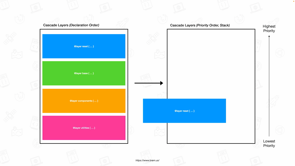
If you look at this diagram again, you can see layer A, B, C, where C is the most powerful, and that unlayered is even more powerful than that.
Oh, and then look at importance with unlayer important is the least powerful of the important, when layer a is the most powerful of the important.
So important is going to be even more important to understand how it works and also maybe use it, you know, like even more, we want to not be using important unless we really, really have to because of this particular way that it's going to work.
So here's one last way that you can use this, write the syntax for cascade layers, where at the top I've got `@layer custom, base, reset`, separated by commas.
And then I go, okay, @layer reset, here's some styles, @layer base here are some styles, @layer custom, here are some styles.
You notice actually that the order in which I'm writing styles is different than the order in which I declared them at the top.
And this is sort of the stand in for representing like well maybe I've add to my base styles all over the place in different files, all over the cascade.
Well, how does the browser know which layer is most powerful in this situation?
So in this particular example, like what color is the word "hello" going to be at this point?
Well, it's going to be purple.
It's going to be purple because that first declaration, the very first time that I initialize or declare a layer that's, what's going to determine where in the order it goes.
And then I can mention that, use it define more and more and more code using that layer over and over and over again, all over the place.
I can be really messy with it, but it doesn't matter how much happens later.
What matters is the order in which you got declared first.
So, because reset was declared last of the three, the very first time that it was declared it's the most powerful, and so therefore purple is the color that gets applied.
So cascade layers, super powerful.
And, it's got tremendous browser support now in April, May, 2022, It shipped in Safari, Chrome, Firefox and Edge practically at the same time in February and March of 2022.
But can you use it yet?
Well, since this so fundamentally changes the way that we structure our CSS, there may not be an easy way to progressively enhance it, at least, I've seen anybody suggest a way to progressively enhance it yet.
I haven't seen any tools that do anything to help with that yet.
So probably most of us are going to want to wait until more of the browsers, mobile browsers have adopted it.
And more of the users who are hesitant to upgrade, who are hanging around on low older browsers or are, are upgraded to the proper, newest version of the browser that the like to use.
So maybe we don't use it on our production websites just quite yet, but definitely.
I mean, how often do you completely restructure all of the CSS in the first place anyway, and that's usually a multi-year project if you've got a big team.
So this is the time to start thinking about it and maybe this, the time to start using it in order to launch a project in a couple of years, or maybe use it internally on internal tools to get your hand, your head wrapped around it and to really understand what this is like so that you can use it in a bigger, more production-heavy way in the future.
That's just my personal recommendations.
I mean, that's not nothing official, so you know, do what you want for sure.
But it's exciting.
It's exciting to have something that could really fundamentally change how we use CSS and make it more powerful for big, massive websites and now's the time to start experimenting with it and really understanding how it works.
So next let's talk about has.
So you know, next to container queries another really highly featured request that developers have had for, from CSS is some kind of "parent" selector.
You can see in the CSS state of CSS survey from last year "parent selector" was right up there.
So.
What is, yeah, well `:has` serves the needs of a parent selector, but it's actually so much more at the same time.
So let's take a look.
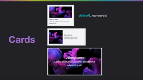
Let's say for example, I have a figure with an image inside of it.
Although actually sometimes it's a figure with an image inside of it with a figcaption as well.
And let's say I have different treatments for styling, a different design, depending on whether or not there's a caption when there is a caption I want to have some extra space around padding on my figure to sort of push everything in into the center and put a background color on the, on the figure yeah, on the figure.
But when there is no caption, I just want the image to be full bleed, edge to edge.
So I know how to do the version on the left, but how do I get it to conditionally apply code to the figure only if a figcaption is inside of itself?
Well, has lets us do that where I can say figure:has figcaption, which means apply this code to the figure, but only if it has figcaption inside of it [makes soundof explosion] .There's so many times when I remember for years as a front end developer as I was a learning CSS.
What I still really didn't know if I knew what I was doing, I'd just be like, "how come there's not a way to do this?
I don't understand.
There's gotta be a way to do this right ?" There wasn't but there is now.
So here are other ways that it can be used.
So this first example, the following selector matches only `a` elements that contain an image child.
So not just an image in general inside the a, but a direct child of the a.
By writing :a:has(> img ), a direct child.
The folllowing selector matches the DT element immediately followed by another DT element.
So it's not even inside of itself then, it's not a DT inside a DT it's a DT sibling next to the DT, by writing dt:has(+dt ). That's why it's not just a parent selector.
It's a sibling selector, cousin selector, it can look at all over the DOM, not just deep down inside of itself in the DOM.
The following selector matches section elements that don't contain any heading elements.
So section:not(:has (h1, h2, h3, h4, h5, h6)).
Oh, if you swap :not and put it in a different place, it means something different.
So section:has(:not (h1, h2, h3, h4, h5, h6)) which means any section element that contains anything that's not a header element.
So the section has a paragraph inside of it.
Then it has something that's not an h1, h2, h3 really powerful.
It can be combined with any other selectors in CSS, providing a wide range of things that are possible.
And really changes the kinds of CSS that you can write.
The idea has been around for decades.
It's not a new idea.
So why didn't we get this a browsers twenty-five years ago?
Well, it was all about performance.
You know, computers are faster now than they've ever been.
And browsers are faster now than they've ever been.
And a GPU can be used in ways that it wasn't able to be used before.
So there's just better faster, newer ways to handle very complex computations and :has brings on some very complex computations.
So for years we didn't think it was possible, but finally now Igalia did some work for a client to really look at the possibility of doing :has.
Last year or the year before, and that spurred on the team at WebKit to really take another look and see if we could figure out how to make it work in a way that would be fast enough.
And, and we did so here it is, :has is coming.
We shipped :has in safari in March of 2022, when Safari 15.4 was released, Chrome engineers are working on their implementation now, and Firefox had said that it's on their roadmap.
So look out for :has in 2022.
It's part of the Selectors 4 specification.
And there's a lot of other interesting things happening when it comes to selectors.
Now, the CSS working group might end up having to put some limitations on how it works in order to keep this super fast performance across all browsers.
So keep an eye out.
There may be some limitations that show up later, but but right now it seems like pretty much anything goes and it's pretty exciting.
So wrap your head around it and see what you might want to do with it.
So what about the other top feature requests from web developers?
Things you might want in CSS-nesting scoping, mixing mix-ins, sub-grant color functions.
These are all also part of the top seven in the 2021 state of CSS survey results.
So let's look quickly at a few of those.
Nesting; if you've ever used Sass, you know, that nesting can be super helpful.
It changes the way that you structure your code.
In fact, nesting might be the last thing keeping you using a CSS pre-processor.
There is a specification where work is happening to try to define CSS nesting.
The proposal right now is to add an @nest rule, but there's still some details that need to be worked out about the syntax and some quandaries about whether or not it's okay if CSS moving forward actually breaks Sass going backwards.
Maybe it is, and we'll just like, make this in text really simple and clean and beautiful.
Maybe we really don't want to break Sass.
So in that case, the CSS syntax might have to be more clunky and I don't know there's debates happening.
It's, you know, going to take a while to figure out, but so right now, no browser support.
I don't see it coming in 2022, but it is being worked on.
Hopefully it will happen, maybe not, but hopefully.
The other thing is scoping.
It's another thing that frustrates developers who are used to scoped languages, being able to scope things in other programming languages.
So they get frustrated that CSS is global everywhere.
But, it's another idea that's been discussed for a really long time.
In fact, if you search for CSS scoping on the web, you're going to find all kinds of things that are not the current conversation.
This is not the specification that's being discussed.
This is not a CSS rule that's being considered anymore.
This is not, this particular rule is not gonna happen.
This page on MDN, ignore this page.
This is not going to happen.
If you want to see the work that's happening, it's actually in the CSS cascade specification in level six, level five is cascade layers.
So level six is.
Some early ideas, some early thoughts about how maybe scoping could work in the future.
If you look at section 2.5 scoped styles you can read about it.
And in fact here is the maybe how the syntax will work.
Maybe it sorta would create this sort of donut where you would say from this selector to this selector, because right now we're used to, you know, "Hey, this selector and all down into the DOM apply this CSS", but it might be like "at this selector to this selector and then stop and don't apply it inside that selector, only apply it between the two." Maybe we'll see again, not 2022, but maybe something for the future.
What we should think about now, what we're going to have soon is container queries, cascade, layers, and :has, and this alone is mind blowing.
So.
Start wrapping our head around it.
Let's talk about layout subgrid.
So subgird, not new, of course, but it's looking like 2022 is the year of subgrid.
And this is the year we're going to get support and a lot of other browsers.
Subgrid of course is a way in which you can get a grid nested inside of a grid where those two grids are going to talk to each other.
Where in fact, a grandchild or great grandchild or a great, great, great, great, great grandchild can be all part of one big grid.
You can create a grid.
That's going to go across levels of the DOM instead of just one level.
There's a great section on MDN that explains the whole thing.
And in fact, actually I was trying to make an example and I realized, you know, I've got here, a grid applied to each one of these cards.
Each one of them is a figure and they have a grid.
So there's seven grids on seven figures, and then there's a grid on main and all of those grids are tied together.
But when you go to use a grid inspector, it's actually really helpful to be able to turn on all of those grids.
This is something you can do in the grid inspector inside Safari, and it's super performant.
You can scroll up and down and it's going to be really fast really, beautifully, scrolls beautifully.
So you might find that handy.
You might want to open up Safari and try that out.
Another tool inside Safari that is in Safari technology preview right now is an alignment editor where, you know how you, it's always really hard to remember justify, content, self, items, align content, self items, which is, which is which one is this way in which one is this way and, okay, well, I got the right property, but then what did all the values and exactly space evenly in space around in which one is the one I want.
Anytime you're using any of those properties, once you've got them into the center pane in CSS, you can click on the little icon next to the value.
You can see the icon, the icon is going to show you which direction the, is going to be effective very quickly.
So you can realize, oh, if you've got the wrong, wrong one, you can switch to another one.
And then it also, when you click on it, it brings up this little overlay, which shows you all the different ways in which spacing can be applied.
And you just kind of like click through them all very quickly and see the effect on the page.
Which can be very, very handy.
So how is support looking for subgrid?
Well, it's been in Firefox since December 2019.
And it's now, currently in Safari technology preview.
Edge is working on the implementation for Chromium all the Chromium browsers.
So hopefully we'll see it in all of the browsers sometime this year, sometime soon.
It's definitely time to start learning it.
And it's definitely time to start using it because subgrid can be progressively enhanced most of the time, pretty beautifully.
So even if only a smaller portion of your users have access to it at the moment you may be able to ship it into production and just have more and more and more users get the better and better and better version throughout the year as more and more and more browsers ship subgrid.
Pretty exciting.
Finally after all these years with grid to now have subgrid.
Next, let's talk about the new viewport units.
So a lot of folks are very excited about VH or VW, being able to measure the viewport and turn it into viewport units.
There's lots of reasons to do that.
But also there are a lot of folks who are frustrated with mobile screens because on mobile screens and really it's all the mobile browsers they'll change the size of the interface on the top and bottom as a user scrolls in order to make the best experience for the person using the browser on a small screen.
But it changes what the height of the viewport is while the VH unit always is the longest possible length and it doesn't change at all.
So folks who've been frustrated.
They want a better unit.
Well, now we have a better unit.
So if you always want the shortest length you can use SVH.
If you always want the longest length, you can use LVH.
And it's clearer that you're getting the longest length.
And if you want a unit that's going to adjust and dynamically match the size of the viewport as the viewport size changes, then you can use DVH.
You can have it any which way you want.
It took a while to figure out how to do this, because it was, there were all sorts of reasons to do it one way and all sorts of reasons to do it another way.
And finally, folks at the CSS working group realized, oh, we, we need to define all the options because there's good reasons for all of them.
There's also widtha.
So SVW.
LVW, DVW, there's also an inline and block versions of this and there's min and max versions of these.
So that's a lot of your new units.
But it especially applies to height when you're thinking about a mobile context.
So what's browser support look like it's in Safari 15.4 on both Mac OS and iOS.
It's in Firefox, nightly.
Chrome is working on their implementation.
I think it's in Chrome preview, the Chrome Canary Chrome Dev as well behind a flag.
And of course, where this really matters is on those mobile devices.
So it may take a little while for it to trickle down and get to all the mobile devices, but pretty exciting to finally have a real robust, official solution to this frustration that people have had for a while.
Let's talk next about dialog, backdrop and inert.
Another really highly desired set of technologies that folks have wanted.
dialog is an element.
The :backdrop pseudo class goes with that element, and inert is an attribute that you can use in HTML.
I put them in this layout section because these tools mean that you don't have to be responsible for creating the layout of an overlay, just let the browser do it.
It's much more robust.
It's much, much more accessible.
And it's easier.
It's easier to use, than you try to figure out how to create an overlay out of your own CSS and other kinds of code.
If you want to learn more about dialog, you can look at this article on webkit.org.
And it's got a good example where I click on the button and you can see, oh, this overlay appeared.
The dialog element itself, I can style.
And the backdrop, the area behind the overlay is, is the area that you can style using the :backdrop, pseudo element.
And browser support is pretty good.
For dialog and backdrop both Safari and Firefox have been implementing it.
Now that it's accessible.
Folks didn't, browsers didn't want to implement the older version of dialog because it really wasn't accessible.
So there was a lot of work that was needed in the writing the specification for it.
But once it reached the level of accessibility that it really needed to be at, Firefox and Safari, we're happy to implement it.
Also this dialog and :backdrop are part of Interop 2022.
So any remaining bugs or inconsistencies between browsers are gonna really get looked at with a higher level of scrutiny and figured out over the course of 2022.
And inert is a pretty great attribute that you can apply in CSS-I'm sorry, in HTML, which you may use in conjunction with dialog and backdrop, you might also use it someplace else, but basically it gives you a way to say, "Hey, this particular part of the DOM, this particular part of the HTML is going to be inert.
Please ignore it during, at the moment", like whatever state you can have, JavaScript, for example, apply and remove the inert attribute.
So for example, let's say when a dialog appears you want to make all the rest of the content on the page, inert, so that a screen reader doesn't get stuck inside that world.
Like if it's not supposed to be visible than a screen reader shouldn't be able to get to it either.
And inert gives you a robust way to say, "Hey, this stuff over here, just kind of like turn it off for a little while".
It's not hiding.
It's not a visual display: none.
It's not removing it from the DOM.
It's still in the DOM, but it's just saying like, please make this inert.
And inert is supported in Safari 15.5 beta right now.
So all of these technologies, these three are going to be really useful for building rich, interactive interfaces, more easily and robustly and accessibly.
So speaking of rich interactive interfaces that are also accessible let's look quickly at forms.
Focus-visible,.
So focus, you know, being able to style focus has been something we've been able to do for a while, but focus-visible is an improvement to that.
So the focus ring around the input field, an element, a link there's a really complex heuristic there that makes a determination where the operating system is deciding, the browser's deciding whether or not to show that focus ring so that if someone's using a mouse, it doesn't apply.
But if they're using a keyboard, it does.
But if they're using this particular kind of accessibility device, it does.
If you are using this other kind of accessibility device it doesn't.
And as a web developer, you didn't really have any way to replicate that heuristic.
Custom, adding custom styling to focus meant it was always going to be visible, but if you use focused-visible, instead, you've got a way to have it only appear your styling, your custom styling only appear if the browser would have applied the browsers version of that focus.
So the code looks like this: focus-visible {outline: solid, thick, magenta}, where I get to just say focus-visible.
Here's what I would like my styling to be.
Simple, but really powerful and a great solution.
You can read more about this on webkit.org and it's got pretty good browser support now, including Safari 15.4, which just came out in March.
So let's talk about accent-color very quickly.
So you know, all those default styles for different form controls in a browser, they all tend to have this one highlight color.
For instance, these from iOS are, have blue as a highlight color.
Well, what if you don't really want to like, restly all the forms, but you'd like to apply a particular color, maybe your company's brand color or your favorite website, your favorite color on your personal website.
You just want to change.
You just want to keep the default styling, but just adjust the accent color.
You can use the accent-color property to apply a custom color to be the new accent color.
And it's got really great browser support across most of the, all the rendering engines in many of the browsers.
But of course, if you want to remove all of the default styling of a form and then apply, be a hundred percent responsible yourself to apply all of your custom styling, then there's the `appearance` property, which you may have known for many years as the -webkit-appearance property.
Every browser implemented -webkit-appearance because it was so incredibly useful, but it still wasn't really fully specified at the CSS working group.
And, it didn't become an official property until much later.
And so over the last two years everybody's been implementing the standardized version, really polishing their implementations and making them interoperable, making them consistent, making them conform to the spec.
We still need some of the mobile browsers from Chromium to pull in this new implementation, but appearance works really well across all the browsers.
And you can start using it instead of the prefixed version.
Maybe you want to throw in the prefix for some of those other older browsers, but, but going forward, appearance going to, is in really great shape.
And there's a new value of the appearance `auto` value as browsers are finishing up their implementations, they're adding appearance: auto So good news for appearance.
And then bonus real quick bonus, speaking of not needing prefixes one of the things that we've been doing on the WebKit team at Apple is reducing the need for WebKit prefixes, by implementing many of the, you know, the official finished property where we can.
So in Safari 15.4, we implemented the non prefixed versions of appearance, mask, along with mask-image, mask-size, mask-repeats X and Y, mask-origin, backface-visibility, text-combined-upright, print-color-adjust the match-parent value for text align.
And we removed some of the non-standard prefix properties, things that actually never made it to becoming web standards.
We went ahead and removed those older ideas.
So feature flags are much better way now to try out experiments, nobody's implementing any new prefixes so it's great to go through and kind of clean up all the old prefixes and either move them official specs, real properties or to remove, remove support entirely.
And so then there's even more, there's so much more in CSS shipping in 2022, but I'm completely out of time.
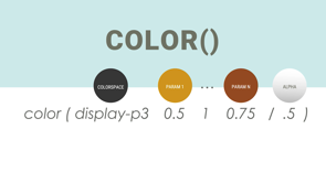
But there's new syntax for picking colors, there's support for wider color spaces like p-3 on the web, broader support on the web for colors, like color like p-3 there's ways to change the color palette of a color font.
There's an IC unit that's super useful in type setting Chinese, Japanese and Korean scripts.
There's full support for text-decoration-skip-ink, which is great for adjusting underlines and over lines.
There are trigonomic functions now inside calc, if you want to do trig in calc.
But I just could not fit everything into this talk.
So I just have to like drive by that list and tell you, check it out.
Keep up with what's going on.
Because this really is a year to learn more about CSS, the great new features, all of them are intended to make your job easier.
So it's worth you taking the time to learn about them.
One place that you can learn about things that I encourage you to check out is the WebKit blog webkit.org.
A lot of the engineers who work on Safari and WebKit write for that blog as well as engineers who work on the other WebKit browsers.
Yes, there are other WebKit browsers.
In fact uh, at webkit.org, you can download Safari technology preview and try out the latest technology that's in Safari, getting ready for a future version of Safari.
There's also Epiphany for Linux.
If you're on Liinux and you want to have a WebKit browser, there's a preview browser to try out this technology.
That's a great one.
There's also documentation for web inspector, all the information about how to use web inspector is all on webkit.org.
And there's also a feature status page for all the different features that folks want to know what the status is.
If we're planning to implement or not, this is one of the places you can see what WebKit is officially stating to the world-here is our intention with these particular web technologies.
So I hope this is useful.
Thanks so much for your time.
Whether you’ve been writing CSS for a year, or for two decades, it seems we always need more from what browsers provide. A lot of great solutions to long-standing problems are landing in 2022.
Come hear about many of the most requested additions to CSS — including parent selectors, better viewport units, tools for dealing with !important battles, subgrid, wide gamut color, color font palettes and the #1 most requested, Container Queries