Defensive CSS
Thank you so much.
Okay.
It's really nice to be here.
It's like my first time and I'm like enjoying it.
But but not not like for for like, for like thing and like sleeping, but yeah, I'm like Okay.
Almost 2 years ago I published an article called.
Which is like basically was like a listing of like CSS steps and back then I didn't like, thought about this it just was like a listing like of CSS steps, but it's good.
I think it's a good over one 100 K page views in less than two weeks and that thing actually has like got, good me got like got me to think about this into why not like to turn this like into a standalone thing.
I just did that.
So now it's, kind like a well known fact that I, unknown content can like, cause CSS issues okay.
Be it like having a alone content or maybe a short content or having an image with having an list, like an image like with a different aspect ratio.
Here we can see this this kinda like an example where where we have a headline and on the right side we have this view all link.
Okay.
So when we change the text in here, we need to think about what should happen.
Do we want the headline to to of like run into a new line?
Or do we wanna to have each one of them like in the same like in a new line?
None of them is actually bad, but the idea is that we need to think about that.
We need to decide what should happen when the content become like this.
And for the same component here we have this list of cards and each one has a thumbnail.
Okay.
And for now it looks good, but when we change the image to something that has a different aspect ratio we will end up with that.
So the image looks like this.
And in this case I would like to ask is the image that that we will use in here will will have always like the same aspect ratio?
And if not what we should, do about it?
Modern CSS made our life really easy.
So now we have things like flexbox and CSS grid and CSS has and the min-max and we have so many things, but with all of that, we still face layout issues.
And that is not because of CSS, of course.
It's because sometimes we write CSS without actually thinking about what should happen when the content changes.
So here we have this this kinda like vertical design.
We have like headline and it takes, and it looks good.
And the person who actually built this design said, 'Hey the design is ready, and it's just looks fine.' Okay.
So when when I tried that and I tried to place some content it looked like this.
When we added like a very long content it seems like the ??? has a fixed height and that has led like the content is kinda like blowing out as you see here.
And the same thing also apply for the image.
The image actually has a fixed height.
So when we replace some when we replace that image we ended up with that issue.
And as you see all of these like issues in here is just because just like I replace the content.
We can take something from this design, which is this one.
So here we have this kind, like guard component.
We have an image we have a name.
Okay.
In this, like such a like in such a case we can think about all the all those edge cases.
When we have a no title or when we want to.
Let's say like the add to action or something else, or will we have an image with a different aspect ratio.
And that has led to this thing.
It's all about writing CSS and thinking about what should happen if we change the content.
And it's, not only for people who write CSS, but it can be be like very useful in cases like when we design things or when we test things.
So when we design we, can design with unknown content in mind.
So here is the same example, but let me show you this first.
We can we can actually think with what if' content what if, we like, have a like a very long title or what if we replace this let's say this maybe this kind of image with something that has a different aspect ratio.
So it's, like designing with thinking about kinda like all the edge cases we will have.
And when we write CSS, we can think of it as an advanced CSS reset.
We can overflow to like all the h1 and, the h2.
And like these things or maybe we can add object fits to like, to all the images we have.
And when we test things it can be really helpful to have this this kind of listed like a common list of CSS issues that we should test for.
And for me, I like to think of these CSS features as as a way that can that can that can actually help us in fixing issues.
So we have things like the min the min-height the min-width the flex-wrap and also sorts of these things.
Okay.
Now let's get into some CSS tips.
The first set is all about images.
So as the first one is about having like max-width.
On the left we have the same image, and on the right we have like the same example, but without max-width.
We need to make sure to to include max-width so we can have all the images like within like, within their space they have.
Next is having let's see, like a background image.
In in this example we have an image and on the right we have the same one.
But when we resize the screen that's that kind of image will actually repeat on the x-axis.
What what we can do is to simply just add background-repeat: no-repeat.
And this will fix the issue.
Here we can see that in action.
So when I resize and and have no-repeat the image will just stay within this block or this parent.
And when we have repeats it'll look like this.
Okay.
Next is about image dis distortion.
Here we have this card component.
For now it looks good, but when I change the image to something different, to something with a different aspect ratio it'll look like that.
In in this case I would simply add object-fit and make and make make the image like feel the whole space.
And here again, we can see that in action.
So when I resize, I notice how the image is getting distorted.
And when I turn the object-fit fit, it'll actually fill fill the space it has.
Okay?
Next is having a text over an image.
In, in this example we have a text over an image, and for now it looks fine, but when that image fails to load we will end up with that.
If we are using an H…, if if if like we let's see, like we are using an HTML image tag we can add a background color and it'll work like in the case when the image fails to load.
So that can help sometimes.
Okay.
The next set of tips is about flexbox.
So the first one is about flex-wrap.
In this this example, we have this list.
Okay.
We have the we have display flex.
Okay, so when when like I resize we will go this this kind of scroll bar.
And the effects in such a case can be simple, which is to add flexwrap: wrap and that will fix the issue.
And here we can see that in action.
So when I turn the lex-wrap on they will just flow into a new line without being like, bad looking.
Okay.
Next is it's, like a default thing.
In flex box.
So here we have this HTML.
We have an image and then we have a div that contains an h2 and a h3, and a p element.
Okay.
When we have flex box in here, and when we add a very long like text element that's that's this image will will kinda like stretch to fill the space and we can fix that by simply adding align-self to the image, and it will just like align let's like on the start of this parent element Okay.
Here we can see that in action.
So when I resize, okay, notice how the images is getting the full height, and when I turn align-self on, it'll just stay at the top.
Okay.
And next is the flex min content size.
This is this is like a very lucky, tricky thing.
So here we have we have an element let's say that on the left you have an image and then we have a name.
So when this name let's say I got like a very long word.
It'll blow out like this.
And the first thing we must think of is that okay, we can use this is overflow-wrap and it'll just fix it.
But no this won't actually fix that.
What we can do is to reset the min-width because let's, is like a flex item will that kind of like the min width for it will be equal to the content.
We need to reset that.
And here we can see that in action too.
So when I resize notice how the content is, It's like blowing out and now when I reset the min-width, it's all good.
Okay.
And next is avoiding the space between.
When we use that for spacing it can look good when when we have a fixed number of items.
But when we let's say that that we have three items this this kind of list will look like that.
So it's not good.
And like instead of that we can simply use gap or maybe margin and things like that.
And here's the video.
So when I resize, notice how the spacing is kinda like messy, but when I change it to gap and resize, it just looks normal.
Okay?
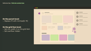
The next set is is like all about CSS grid.
So the first one is the min-content size.
Okay.
So here we have this main section and then we have an aside.
Okay.
When the main section there is there is kind like a scrolling like element in here.
Okay.
But when we have that, it will it'll like, cause like that section to actually blow out.
And the reason here is like the same with the min-content with flexbox because the min-content of this section will be equal to the to how let's say to how much items it's it has in here.
So the text again, can be maybe we can replace the one of our with min-max, or maybe you can add maybe like we can add min-width we have so many fix its for that.
But the one I will go for is the min-width.
So here we can see that too.
Notice that when I reset the min-width the section will scroll normally, but without min-width, it it'll just blow out.
Okay.
Next is about the auto-fit and and auto-fill.
And I think that each time I use them I like, need to look into that figure because the fun fact is that when we use auto-fill it's won't fill this space it has, but from its name, it says that, okay, it's it like we'll fill the space.
But when we use auto-fit it'll actually fill the space.
So it's a little bit odd for me.
Okay.
Here we have this kind of a grid, okay?
And we have we have like auto-fit.
Okay.
So when we have four when when we have four items it'll look good.
But when we have only one item, it'll fill the whole space.
And that is not good, of course.
And we can simply replace it with auto-fill so it won't fill the space.
And here, we can see that.
When we have only one item and we are using min-max, it's won't fill that space.
And here we can see that in action too.
So when I resize, notice that now we have like two empty spaces because I because I'm using the auto-fit in here.
Okay.
So next is about CSS grid fixed values.
So when, we use let's say like a fixed with for a column, and when we resize the screen like this we will have an issue.
The fix will be really simple which is just to use like, Hey I want to apply, like this grid.
We need when we have that kind of space @media min-width blah, blah, blah.
Okay.
And the next next few things is is like about content.
The first one is about long content.
Here we have this card component where we have a name, and next to that name there's an action.
When we have a very long name it can cause that action like to move into the next line.
The fix here can can be simply to use a flex: 1.
. And we will also need to reset the min-width just in case we have very long content.
Or maybe you can we like trucate and add those dots at the end as you see here.
But I, might not do that in and like all the cases because maybe the content is like important and we don't want this thing.
Okay.
We can see that in action too.
So notice that when I like turn it off it'll truncate and….
Okay.
The next step is about having a space between the items.
So here we have this headline, and on the right we have an icon.
Okay?
When we have very long content in here that icon will end up like colliding with the text.
And in this case the effects can be reasonable which is just maybe we can add margin or gap or a padding or anything else.
Okay.
And here we can see that.
This this, kind of block in here is is actually the, the spacing.
So when I resize it'll it'll have a safe space between the headline and the link.
Okay, next is about fixed sizes.
So here we have this this hero section with this fixed, height.
And when we have a very long content it'll cause that text to blow out and the fix can be re can be very simple, which is just to show min-heights like instead of using, height.
And the same thing can also apply to width.
So when we have a fixed-idth for an element that contains text it can get like really bad when we replace the text with something like this.
So yes, we need to replace that with min-width too.
And here we can see this example in action.
So when I replace the min-height replace the height with a min-height it'll look good.
Okay.
Next is is about like scroll bars.
Okay.
Here on the left we have a box.
And we have some content and when the content is long we have a scroll bar, but on the left sides the content is short, but we still have a scroll bar because we are using overflow-y scroll.
And this will show the scrollbar at at all cases.
And what we can do instead is to replace that with overflow auto . So now when we replace that thing the scrollbar will show only when we have long content.
Okay.
And next is about the scrollbar the scrollbar gutter.
On the left we have a block with text.
Okay.
It looks fine, but when when the content become like really big that content will shift because it's it's need, to reserve this is space for a scroll bar.
And so the content will shift.
So what we can do now is we can reserve this space and when the content actually grows it won't cause a Layout shift.
I can show you that in a, in action here.
So I notice that when I add the content it's, kinda shifted to the left.
But when, I reserve the space and then add the content it'll just it'll just be fine.
And we we won't have any shifts.
Okay.
Next is about the scroll chaining.
In this example when we scroll all the way down and keep scrolling the body element will actually scroll too.
So now we can fix that by resetting the by, resetting the the overscroll behavior.
And what will that do?
Is that it'll contain the scrolling within that space.
As you see in this in this blue outline.
And here, notice that when I when I scroll down and keep scrolling, the body will will scroll.
But when I reset the overflow overflow-scroll and keep scrolling it'll just stay within that box.
And that was was like the whole thing.
Please try to write CSS in a way that can help, like to prevent issues.
And because that can actually it can save so much time and like instead going, Hey, I want to test this whole thing.
No we can rightly assess from the start that can actually account for like, all type of content.
And that was all.
Thank you so much.
CSS has developed so much over the past few years. We have Flexbox, grid, and container queries (soon). Having said that, CSS allows you to build any layout you want. Unfortunately, we still don’t care too much about preventing CSS issues upfront.
Ahmad will discuss defensive CSS, a term he coined to describe CSS that is future-proof and defensive. As a result, we can prevent or at least reduce layout issues. Moreover, designers can use the defensive concept to design components that account for some edge cases.