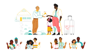
Designing for Emotion
Aarron Walter–Designing for Trust
(upbeat music) - Hi everyone, Aarron Walter here.
I wanna talk to you about the interesting intersection between design and psychology and how design can shape the way we feel.
But to do so I wanna start by looking at a simpler time. Back in 2011, when the world was not quite as upside down as it is today, I had a different view of the world and a different view of the web that we were building on.
In fact, you could say I had the spirit of the revolution in me, the revolution that Sir Tim Berners-Lee created when he created the World Wide Web in the 90s. The idea with the web was to bring us together, to make us feel connected, to be the platform for equalising our learning, our economies and our cultures.
But if you're a student of history, like I am, you know that revolution start with great ideals, that often have an evolution.
Revolution turns into an evolution where those ideals get put to the test, and oftentimes things don't come out as we anticipated. We have a gap between the good intentions that we bring to our work whether you're a designer, a developer, a product owner, whatever your role is in making things and putting them into the world.
We come to our work with good intentions, we wanna make things that help people, but sometimes unintentionally the outcomes of the things that we make, end up creating chaos, creating mistrust, a lack of belonging, a lot of negative outcomes that we don't anticipate. Fast forward to today, 2020 when the world is upside down and there's a lot of emotion that's on top for us. Sir Tim Berners-Lee, as he reflects on the World Wide Web and what he created and his intentions with the platform. He said this in Vanity Fair interview recently, "We demonstrated that the Web had failed instead of served humanity, as it was supposed to have done, and failed in many places.
The increasing centralization of the Web ended up producing with no deliberate action of people who designed the platform, a large scale emergent phenomenon which is anti-human." I think it's a fascinating phrase, this anti-human phrase, 'cause so much of what we've seen in the world, so many headlines about data breaches, about identity theft, about upending democracies around the world, by using the platforms and the tools that you and I we've been creating for many years probably, we created an outcome that is anti-human that excludes people, this platform that we've built that can bring us together, I think at this point we all can recognise that it's also a tool that can be used to tear us apart. And so when I think about 2011 and that different time, that was when the first edition of my book "Designing for Emotion" came out. And I wanted to challenge the design community, just the software community in general.
Yes we can make functional and reliable and usable software, but that seems like such a low bar.
If we look to the history of design in other disciplines, like industrial design which has been around for a couple hundred years and architectural design which has been around for thousands of years, there was always this aspiration to create something more than just functionality to create something that's emotionally engaging, that's delightful.
In fact, that was the phrase that was on our lips back in 2011, let's design for delight.
Well in 2020, I see that that is a very myopic view of the world.
We wanna make functional, reliable, and usable products, but just designing for delight that's a very narrow aspect of the human experience.
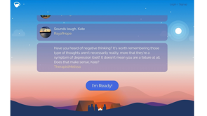
We need to design for all emotions, things like mistrust, fear, anxiety, stress. Maybe you felt a few of those this year in a world where there's a pandemic and they're social upheaval, political turmoil.
We're bringing all of that stuff to the things that we're designing and so are the people who are using the things that we're designing.
So we should be designing for the full spectrum of emotion, not just delight.
So that's what I wanna talk to you about today, I'm gonna share with you some examples of how to do that, and how companies are doing this around the world right now effectively.
I think there's a few lessons that we can learn from their experience.
So let's dive in.
Let's dive in right here, trust and fear, these sit on top for a lot of us in 2020.
And when I say trust, I specifically mean mistrust, a feeling of, you know, not quite trusting what we're seeing unfolding in the world.
There's perhaps no industry quite as fraught with mistrust and fear than banking and the FinTech space. So much of the practises in banking are built to be confusing and misleading.
And so it's interesting to find some institutions that are doing things to try to address some of the mistrust around banking and money in particular, money anywhere you go it's pretty much a loaded topic. People bring a lot of emotion to that topic, and fear is certainly on top.
I talked to a guy named Rudy Adler, who is the co-founder and chief design officer over at Wealthsimple, which is very interesting platform, it's a platform for automated investing.
He told me that, "Banks are distrusted because they have a very confusing way of talking about things and presenting fees.
It's almost like their business model is purposefully confusing." Maybe you felt that a few times.
We know what we do is different, It's hard to explain automated investing to someone who's never heard that phrase before, let alone someone who's never invested a penny. We wanted to make a site that provided information as simply, clearly and beautifully as possible. And we wanted a central metaphor that you know, is fun, elegant, and the opposite of tech confusing. This is what Wealthsimple homepage looks like. The metaphor that Rudy was alluding to is, a Rube Goldberg machine.
And if you Google Rube Goldberg machine, you're gonna see lots of fun, crazy contraptions, where a boot hits a series of dominoes that hits a chicken who lays an egg that rolls down a ramp and one thing causes another thing.
I mean, that's kind of what's happening with automated investing, you invest money and there's an algorithm that helps you optimise for, you know, high returns. Wealthsimple's website is interesting, they're trying to take the edge off around fear and mistrust that comes with banking and around money in general. You'll find the typical things like social proof of different organisations recommending Wealthsimple here, but what's interesting is the high production value, the 3D animation, the clarity of communication, the simplicity of what's happening here.
It's so clear, in fact Wealthsimple ended up winning a Webby for this website.
It gives the impression that if the craftsmanship that went into create the marketing website is this sophisticated. What's behind the scenes? The algorithm for investing your money must be equally as sophisticated.
So that's one way that they address fear and stress around investing.
And also just make it clear that this is what automated investing is, and it's not so scary.
Once you've signed up and you've invested some money, they start to show you your portfolio.
Things get really scary when the markets take a downturn, like they did earlier in 2020, most banking products show you a very narrow timescale. They show you 30 days, they show you 60 days, they show you 90 days.
And when there's a big downturn, a bear market, it seems like that downturn is as if your life savings just fell off a cliff into the Grand Canyon and probably will never come back again.
But if you know anything about the markets and investing, you know that the markets tend to go up into the right over a long period of time, if you just change your timescale. That's exactly what Wealthsimple does, they default to a very long timescale, like four years. So you can see that cliff that you thought you fell off, it's just a pothole.
It's not good times right now, but stick with it, the worst thing you could do in an economic downturn is sell all of your holdings.
Because if you do, you realise lour losses, what were just paper losses are now actual financial losses. And now you have to get back into the markets again, to grow your money and that can change everything if you're retiring soon.
Apple is also very focused on fear and building trust with their customers.
Specifically around privacy.
They're trying to position themselves against their biggest competitor, which is of course Google, who offer a tonne of great services and hardware, but that tends to be subsidised by the fact that those services are free and they're advertising to you in Gmail, in you know, various platforms that they offer.
Apple is trying to take a different tack and they spend a tonne of time on stage when they're announcing new hardware on their website, and even in the packaging, when you purchase some of their products.
Their hardware, their services, everything that they're building, they're specifically optimising as competitive advantage, for privacy, your data will not be shared, your data will be encrypted.
Even if the government tries to get into your phone to get information, they're not gonna give that out to people, or so they say.
Designing for inclusion and empathy is as fundamental to the human experience as it gets, which is why we need to be thinking about this when we're designing for emotion.
I've been super impressed with Project Inkblot, it's run by Boyuan Gao and Johanne Manton.
They created something called Design for Diversity and it's a framework that can guide you and your team, to help you understand how to design inclusively all the time.
If we're not thinking actively about how to include people into the products that we're designing, then we are more than likely probably excluding a lot of people which of course is bad for business and I think just is bad morally.
Let's look at some examples, I wanna dig into their framework.
First thing in their framework is a question that you can pose to your team.
It is what's the worst case scenario of what we're designing and who would be the recipient of that thing? This is a way for us to put our biases out in front of us, it's a way for us to identify our good intentions and the gaps with the outcome.
We have good intentions of when we create products, but sometimes even if we have good intentions, what we make, it has a big impact on people that we didn't expect. And I wanna give you an example, a specific example, Airbnb, it's a company that is often admired as you know, having strong leadership, led two co-founders who are designers who met in design school at the Rhode Island School of Design.
They are well-funded, they have a team of diverse people, a lot of investors who believe in diversity and inclusion as well.
They have a lot of advantages in many ways, and yet their platform which is designed around creating trust, trust between the host and the guest, the host would feel comfortable to invite some stranger into their home, yet when they created this platform, it inadvertently played into biases.
And we've seen this globally, but we especially see it where I live in the United States. "Applications from guests who have distinctly African-American names are 16% less likely to be accepted by hosts, relative to identical guests with distinctively white names." I'm citing a study done by Benjamin Edelman, Michael Luca, and Dan Svirsky.
This is one, but there have been many others, maybe you've seen the hashtag on social media, Airbnb while black, where so many black guests at Airbnbs have been denied hosting, mistreated at Airbnbs as well. Airbnb has intentionally designed a platform to build trust and to be inclusive, they even have a mission statement that is to make anyone feel like they belong no matter where they are in the world.
That's powerful.
So what the lesson is here from Airbnb, is that we need to build mechanisms into our design process, we need to follow up on the outcomes of our best intentions. We do a lot of user research ahead of time when we're planning to design a product, but do we do anything after we ship? Do we follow up with communities who might be impacted by what we're creating? Or as we're designing, do we think to co-create with communities who might be impacted by what we're creating? I've talked to Brian Chesky about this problem, he's the CEO co-founder at Airbnb.
And he saw the phenomenon hashtag Airbnb while black as an existential crisis for the company.
And if you Google Airbnb and Project Lighthouse, you see that they're taking extensive measures to try to address this problem.
It's super impressive.
Nonetheless, here is a model company in many respects who have fallen into this trap.
So the rest of us, we need to keep this in mind that any one of us can fall prey to this gap between good intentions and bad outcomes.
Let's take a look at the second question in the Project Inkblot framework.
Question two is who might you be excluding? Who might you be excluding as you're designing your product? For that matter who might you be excluding in meetings as you're making plans to design this product? Are you excluding different perspectives from people in engineering, maybe in product, legal, customer support, sales? It's a good question to ask us to help us be better collaborators and partners in our teams.
One way for us to answer this question in the design context is to create an all people statement.
An all people statement is a claim that what you're making, will work for all people in all conditions. And of course, once you create an all people statement that creates an opportunity for the team to poke holes in it and find gaps in what you're making.
Here's an all people statement, if you're designing a communications platform where you could send and receive messages, we might create an all people statement that says, "All people can express themselves in their messages using emojis." Is that true? What if someone has a certain religious affiliation? What if someone is of a different gender identity? What if someone's from a different part of the world? What if someone has a different set of abilities and disabilities? All those things would create opportunities for us to look at the problem from a different angle.
It's ideal to have a diverse team, but if you have a small team of like two or three people, we can't represent all different perspectives. There are things we can do, engaging the community, engaging different people in the company, there's a lot of things we can do to be creative to get different viewpoints on that problem that we're trying to solve.
But in all people statement is a great way to put biases out in front of us and really challenge those and start to think about the problem from many different angles. This whole conversation about designing for inclusion and empathy, ultimately leads us to this, the idea of designing belonging experiences, where our customers, the people who are using our products feel like they belong, as they're using our products. This is a topic that I feel very connected to. I'm the father of two African-American boys, and they show me the world from a different perspective. I grew up a white male in the United States, and in many respects, I enjoy a lot of privilege in my life. And so do my kids, if I'm honest they enjoy a lot of privilege as well, but there's a history in the United States of bias that's built into the culture, in fact the world, that my children confront on a regular basis. Just a few weeks ago we were playing a game on the living room floor, we were playing Candy Land on a Sunday morning. And my son Bellamy here who was six at the time, he's seven now and Olivia who's 10, Bellamy looked at the board and we started a conversation, I said, "Bellamy, who do you think designed this game?" And he looked at it and said, "I think a white person designed this game." And I said, "Oh, really, what makes you think that?" And he said, "All the characters on the board are white." And you know, it was a small cut, it was a small cut for me, and I know it's a small cut for my son.
Something that, you know, if you grow up feeling like, you know, your perspective is always represented in books and movies and popular culture games, we see ourselves in those popular culture manifestations. And if you're not represented, you don't feel that sense of belonging.
We like to think that kids have this naive view of the world, but even Bellamy at six years old sees this and feels this, lack of belonging in a lot of pop culture. This is Diogenes Brito, who is a designer at Slack. And he knows what that feels like, the small cuts that add up time and time again over a lifetime. Not feeling seen, not feeling a sense of belonging. He was designing a small campaign for Slack. Maybe you've seen those buttons on websites, Add to Slack or Send to Slack, where you just pass a piece of information over to Slack to share with a colleague or a group.
When they launched that Dio was asked to design some assets for that campaign.
And one of those assets was a hand coming down from a cloud, holding the Add to Slack button, kind of a joke play on the idea of, you know, sent from heaven here's this button that you've been waiting for to add things to Slack easily.
And when designing that, Dio was just using some stock illustrations that Slack had on hand.
And he decided to change the colour of that hand from a white hand which was the default, to a brown hand. And he thought to himself, it's not a big deal, I don't wanna make it a deal, but it kinda is a big deal that it's the right thing to do.
And so he made the change and they launched, it looked like this.
And people started to respond on Twitter and social media in kind of an unexpected way given that this was not a major ad campaign.
Here's Kaya Thomas she said, "Really appreciate the brown hand in this graphic, I'm so used to seeing flesh coloured hands in graphics. It may seem like a small thing but when you see graphics over and over, excluding your skin colour, it matters." Even that phrase it's flesh coloured what does that mean? Historically that's meant white, it is the colour of white skin, but the world's a big place and there are lots of skins colours.
Dio wrote about this in Fast Company.
He said, "Why was the choice and important one, and why did it matter to people of colour who saw it? The simple answer is that, they rarely see something like that.
These people saw the image and immediately noticed how unusual it was.
They were appreciative of being represented in a world where American media has the bad habit of portraying white people as the default, and everyone else as deviations from the norm." It's a small cut that adds up over and over again, making that conscious decision to be inclusive, can be really revolutionary and can make people feel like they belong.
Those people who designed that Candy Land game that I was playing with my kids, do I think they were racist? No, I think that they just were not thinking about designing inclusively, like Dio was.
Jennifer Hom who's one of the principal illustrators over at Airbnb, she's thinking about designing inclusively and building it into their design system.
So it's easy for any designer to design, to create a sense of inclusion and to create a sense of empathy and belonging.
That existential threat that Brian Chesky conveyed to me when I talked to him about the hashtag Airbnb while black, one of the ways that Airbnb is confronting that is through the concept of priming.
You probably know this concept very well from the story of Pavlov that experiment, where he rang a bell and then fed his dog and the dog's mouth watered.
And he repeated that process over and over again, until he could just ring the bell and not feed his dog any food and the dog's mouth would water.
It's a way of setting the expectations in the mind, priming the mind for what's gonna happen after what you see. And with Jennifer Hom's work by designing a design system with these illustrations that has people of different colours, couples of different ethnicities, not always matching, people of different ages, people of different abilities, putting that in every step of the customer journey, it primes people to say, this is the Airbnb experience, whether you're hosting or you are a guest, expect to see people who don't look like you, who have a different background and a different perspective, and it's gonna be okay, it's gonna be welcoming because the mission of Airbnb is to make anyone feel like they belong no matter where they are in the world. It's a very, very powerful thing to do.
This is the power of designing for emotion. A different approach, let's shift gears a little bit here.
Using personality to design for emotion.
Personality is a very powerful thing in our lives. It connects us with a lot of emotions, it's that mysterious something, that energy that connects us together interpersonally, and if we're honest, sometimes it repels us as well. It's helps us come together as a group and stay together as a group.
And it can also be used very effectively in product design to help people feel connected to a product, to tell a story in a product and shave off some of the negative feelings that people bring to our products.
Perhaps no other product right now does this better than Headspace.
It's currently one of my favourite apps in 2020, I spent a lot of time meditating, I'm an early riser I wake up at about 5:30 in the morning and I meditate.
And I find that Headspace is the tool that brought me into this practise, because it felt like, you know, for me that meditation was a bit like shouting into the void.
Am I doing this right? My mind gets distracted all the time.
Maybe I'm just not good at this.
Headspace uses character animation, colour, storytelling to convey a sense of personality that says, your head is a messy space and that's okay, it's okay to be stressed, it's okay to have anxiety. This is a place where you can work on that and make a progress.
Anna Charity who used to be the head of design there, She wrote, "The mind is a complex place and it isn't always an easy place to inhabit, which is why meditation is so valuable.
We knew we had to develop a style that translated these ideas in an approachable and relatable way. Animation and illustration became integral to the brand. By using characters and storytelling, we could break down the barriers of a tough subject matter and present it in a lighthearted but sensitive way. Characters are a great vehicle to represent the weirdness inside your head.
It feels playful and memorable as a result." So Headspace is using personality in their design, to design for stress, to design for anxiety, all those negative feelings that are especially on top right now in 2020.
And it's helped them create a category, a new product type of mindfulness product, that is a category where they have competitors as well. Personality also can influence our perceptions, our perceptions of a product and make it feel more valuable, more useful, more attractive.
This is a totally different type of company, they're called Goodr, they sell inexpensive sunglasses that you can buy for about 25 bucks.
What separates them from pretty much every drugstore in any city on any corner, is that they tell a story around every single product and really build personality into the brand. Every product has these crazy names, like this one Merlin's Squirrel Fetish.
That's actually the name of a product, a set of sunglasses that you can buy and wear, they are kind of fun, fun colours looks a little cool, hip, but it's also telling a story, a story about, you know, what it feels like to wear this product, to use it. The types of people who are fun and do things a little differently, and that makes it attractive, they're inexpensive sunglasses, but they're glasses that when you wear 'em and people say, "Oh, those are cool, where'd you get those?" "Goodr these are called Merlin's Squirrel Fetish." And you've got something to talk about, it's a social connection.
It makes us feel good to have that personality connection with a product that changes the human experience, this perception that, you know, my experience I feel good wearing these and therefore life is a little bit better.
That is changing the human experience.
There's some science behind this of course, if you look at Significant Objects, this is a study done by Josh Glen and Rob Walker. They did a deep dive into understanding how stories around products and personality and products change our perception of value, make something more attractive and make us more willing to pay a lot more money for that object.
So these two researchers they went to a bunch of antique stores, junk shops and bought a bunch of chotchkies little objects like this ceramic cow for about 25 cents here, 75 cents there.
They invested a total of $128, and then proceeded to spend a good bit of time writing detailed stories about each one of these products, that made them feel interesting, meaningful, attractive and ultimately more valuable to the people who ended up buying them.
They listed them all on eBay, and they sold them for a 28 times return on investment or $3,612 and 51 cents, that's better than most venture capitalists can do on any given day. What makes that attractive, is in reading that story about that product and feeling connected to that story that changes the person's perception of that object, changes their connection to that product, and it feels more attractive.
It's the reason why Paul Newman's Rolex Daytona watch sold for 17,000,000 just a couple years ago.
What makes that watch more special than any others, is probably it's less functional and less reliable and less usable than say an Apple watch that you can get for three or $400, but the story, the feeling of wearing that object, that it was Paul Newman's, that it's special, that it's unique.
There's a lot of personality that Paul Newman had, that is in that object that makes it infinitely more valuable.
Now, if designing for personality seems like a heavy lift, it's a lot you'd have to do.
You could approach things differently by designing just a moment, just a small piece, when we approach any problem that feels big, the best way to solve the problem is to cut it into smaller pieces.
Designing moments is something we can do by thinking about the customer journey.
The customer journey has ups and downs, peaks, and valleys, where things are really great that, you know, your customer just signed up for your product, they used it for the first time, they did something that was empowering that made them feel competent and satisfied, the goal that they were trying to achieve.
Or there's a valley maybe where things are difficult, it's time consuming to do that, get your content into your CMS for the first time, or maybe they bring a lot of heavy emotion to the product for the first time, whether that's Headspace or some other product, that valley moment.
Both of these are opportunities for us to design a moment, not an entire experience but just designed for the emotions that people bring to that moment.
Let me show you a couple examples, I wanna start with the valley, when things are worst.
Intuit is a company that's definitely popular in the United States and it has a global presence as well. They make a lot of different types of financial products for keeping track of your business finances, your books, bookkeeping, they also make something called Turbo Tax and it's a tool that's very popular in the U.S. to file your taxes with the government very quickly and easily, in fact you can even do it on your phone.
Filing your taxes is not fun, no matter where you are in the world, I'm sure. But as you're filing them if you are married, filing jointly, that's what we say here in the U.S. and your spouse has passed, it's a pretty heavy moment. And in fact, you have to declare that to the government that your spouse has passed away.
And in the process of filing your taxes, there is that checkbox, if you check that box that says acknowledges that your spouse has passed away in the past year of the filing, think about this humanity of that moment, that feeling of sadness, that feeling of loss, of that you're just doing something very functional filing your taxes, but it feels so heavy. You might even have a sense of fear because if you were not the person in the couple that was handling the finances, keeping track of the receipts, filing the taxes, you might have a steep learning curve, and a lot of fear that you're not doing this right. Checking that box is a heavy, heavy thing.
And in Turbo Tax when you check that box, they just show a short message that says, "We're sorry to hear about your loss, you can count on us to help you get their tax return done right." It's a really small thing, it's really probably took minimum amount of time to do and I doubt any designer or copywriter or developer had to go to their boss and ask, "Is it okay if I write this in?" They probably just added that in very easily and shipped it, but recognising the humanity of the moment, this valley moment in the customer experience, it's affected a lot of people who have written into the Turbo Tax team like this person who said, "I finally got around to doing taxes yesterday. After our information was transferred from last year's return, it asked if either of us had passed away. I entered the information that my husband died on June 15th, and a screen came up that said we're sorry for your loss. I sat there and stared at it crying for a few minutes. It was so cathartic.
Please pass onto the team how much that one little sentence meant to me. Whoever thought that up must be a very caring person." It's a very powerful thing and it changes the relationship that your customers have with your company and your organisation.
Of course, I don't think the Turbo Tax team was designing that moment really, as a marketing gimmick or to get, you know, specific relationship building, they were trying to do the right thing and meet the person where they were.
They call this an ownable moment.
In fact at Intuit, since their founding in the 80s, they've always had this principle, this principle that's guided the company, designed for delight, let's delight our customers. The Turbo Tax team, has the same perspective that I do, which is that that's very myopic.
And instead they use this phrase an ownable moment, let's create a moment that we can own, we recognise the emotion of this moment and design something that meets people where they are.
Garron Engstorm who used to be on that team wrote, "Emotional design is not just about delight and positive emotion.
In reality, emotional design is about all emotion, good and especially bad.
If the user's feeling uncertain or feel fearful, don't shy away from that or sweep it under the rug. Instead lean into that emotion.
Let the user know you understand where they are emotionally and offer a way to put them at ease." Now lets take a look at a peak moment.
This is actually how I got into the topic of designing for emotion recognise that there's this magical intersection of design and psychology, and it could be used for really positive things. Back when I was at MailChimp running the design team, I had been a customer for many years before I joined and I recognise that part of the customer journey where you're designing something, an email and it's supposed to go out, it takes a lot of time to write, takes a lot of time to design the assets.
So by the time you hit the send button and it goes out to everyone, it just feels like someone should come in the room and high five you and celebrate with you, or maybe bring you a beer which is what I really wanted. So we'd ended up designing a moment in the design process that looked something like this.
You go through a final pre-flight checklist, you're about to send, you send it out.
And there's a celebratory moment, a high five that comes from Freddie who's the chimp, high five your campaign is on the way.
And you can literally high-five Freddie's hand and he would high five you back.
And the more you do it, the redder his palm gets, it was a fun thing and it was something that so many customers recognised and celebrated and as it turned out, people posted it on Twitter, on Facebook, on Instagram, on social media, everywhere.
Literally thousands and thousands probably hundreds of thousands of social posts of people high fiving their screen or saying, you know, I high five my screen every time I send an email campaign.
We weren't trying to do this to get like marketing cred here or get more people to, you know, take our product viral, it certainly did help our product grow substantially. It was just a thing that we were trying to do to meet people where they were, to design that moment, to own that moment and recognise that this is how you feel at the moment as a user, let's do something to celebrate it in this case.
We accidentally discovered something interesting, some science of moments that timing turns out to be really key to designing a moment and where that moment plays.
Now, I'm gonna talk to you about colonoscopies, which you probably didn't see coming in this presentation. There's something called The Peak-End Rule that was discovered by Daniel Kahneman and Amos Tversky. You probably know who Daniel Kahneman is.
You've maybe seen his Ted talks, or at the very least heard of his book, "Thinking, Fast and Slow," which many of us have read. They discovered something very interesting with a group of patients who went through a colonoscopy, which is a very uncomfortable and in some cases a painful procedure.
They looked at two groups.
One group had an 11 minute procedure and another group had a 13 minute procedure. Now, if you were guessing who reported that their procedure was worse, you might think the 13 minute group would say like they've got a longer procedure and colonoscopy is something you want done very quickly, you don't want to hang out, that they would be the ones to report it to be worse. It turns out that's not the case, it was actually the 11 minute group that said that the colonoscopy was awful, they didn't wanna that at all.
And that was because the last 30 seconds of the procedure was actually painful.
And Tversky and Kahneman discovered that, there's actually two different parts of our brain, that's experiencing the world.
They called it one part the experiencing self, that's the part that's taking in the inputs and in this case with the colonoscopy, it's pain of the experience.
And then there's the remembering self, who cannot take in and record all of the inputs that we take in on a regular basis and so they selectively choose certain pieces to remember, and record that in longterm memory, we record that in long-term memory so we know what are the good things to repeat and what are the really negative things to avoid, it's a survival mechanism.
And what Kahneman and Tversky discovered is that, especially when the experiencing self has something at the end of an experience, the last part of the procedure in this case, that when that is acute, if it's acute in a positive way, if it's acute in a negative way, we are more likely to encode that into long-term memory and take that with us.
So that's unintentionally what we discovered with Mailchimp that high five moment, it's at the end of the workflow and therefore that was more memorable and it also accidentally led to action.
We didn't have a tweet button or anything there on the page, but it was when people were done with their work, that memory was formed and they took action to tell other people about it.
We tapped into the remembering self.
Now, let's talk about the business case for emotional design.
In some of these examples, you've probably have picked up that there are some clear business advantages of creating emotionally engaging experiences. Maybe you've heard of Sam Altman, he's the chairman of Y Combinator, which is a very famous incubator that's produced some of the most famous tech companies on the planet.
He's a business person, not a designer.
And he said, "It's better to build something that a small number of users love, than a large number of users like." I think that's interesting because as designers this is our philosophy we wanna create products that people really love, that feel engaging and are really well-built.
We identify with the folks at Wealthsimple who produced a really high degree of craftsmanship in their work. But Sam Altman is looking at this from a business perspective.
When you've got people who love your product, they are less likely to leave, or in business we call that churn, so you have a lower churn rate.
They are more likely to spend money, to pay money with you that might be an upgrade process, or if you raise your prices down the road, they're more likely to stick with you and pay that money because they love it and they couldn't imagine their life without it. And they're certainly more likely to tell other people about that, that can help you build a business. This is a strong foundation to create a commercial business on.
The reality is that we are designing in an agile world where we're partnering with engineers and product folk who want to ship very quickly and they want to think about things in a very quantitative way.
And a lot of times designing for emotion it feels squishy, it feels unquantifiable and how can we actually confirm that this is worth doing? If it's, you know, has business business advantage. Pretty much every developer I've ever worked with has said something to the effect that, "Emotional design, that sounds like a nice thing to do, but we can add that after we build our MVP." I just think that that is a very fundamentally flawed way of thinking about software design.
Because when you download a product and you use it on your phone, for example, and it's not very good, it's not what you expected, what do we do? We delete it.
Do you ever, you know, let's say two, three months down the road think, I bet they've been iterating on it, I bet it's gotten better, let me download it again and give it another try, chances are you don't, so few of us do.
And that tells us that that first impression is really, really important, if we're just designing functional products as our MVP, and that's how we de-scope by functionality and we don't think about making it reliable and usable, and ultimately emotionally engaging out of the gate, we're missing the opportunity to capture that audience out of the gate and keep them with us.
And there is a concept that a psychology principle called the primacy effect, which is essentially what this is, it's the first impression.
Our first impressions shape our understanding of what is to come next, are our biases or expectations of what will be to come. And if that first product, that MVP is really terrible, it's not, you know, satisfying our needs functionally, and with reliability and usability and emotional engagement, the primacy effect dictates that what comes next is probably not gonna be our expectations are very low and not good. So when we think about what an MVP is, a minimum viable product, we shouldn't be thinking of it as just a slice of functionality that we go to market quickly with. Instead we should think of it this way, it's a slice of functionality, reliability, usability, and emotionally engagement out of the gate. Emotional design it helps us achieve business goals in many ways and I just wanna show you a few examples. We saw Headspace earlier, this was a category that did not exist just a couple of years ago, mindfulness meditation apps and now there's Calm and there's many others out there as well, that are really being successful. They're growing usage, especially this year, of course, and Headspace pretty much created this category. If you would've told me a couple of years ago that my phone would help me live a more mindful life, I would've said that seems rather impossible, very unlikely, but Headspace through using designing for emotion, by designing with personality, by meeting people where they are emotionally, that addressing the stress and the anxiety that they bring to the product, they've been able to establish this category and be successful and ultimately get investment as well.
We saw Wealthsimple, that that's helped them with customer acquisition and retention, they designed to create a trusting relationship with their customers by addressing a lot of the fear and mistrust people have around money and investing. And then once they're in the product to address the fears that people have when the market goes the wrong way, it goes down, if there's a bear market, it helps keep them in the products, they don't sell everything off and close their account. Maybe you've used Duolingo, it's a great product to teach you how to speak a different language. They use a host of different emotional design techniques for good and that good is to keep us learning longer sessions, learning that language, learning new words, new phrases, and also bringing us back on a regular basis so we are learning more frequently.
I saw this firsthand as one of the first people hired at MailChimp as the person who founded the design team there, we saw growth of our product and we saw increased market reach by designing for emotion in so many different ways, I shared the one example of the high five, but there are so many other ways that we did that by thinking about Voice and Tone, we made voice and tone.com and how we spoke to people and considered the emotion of the moment.
There were so many things we did that helped us tap into emotion and be more successful as a company. And I think this story about Slack is a fascinating one, and it really illustrates the business value of emotional design.
Slack came on the scene as a former video game company turned enterprise chat tool, when there was already a market leader, which was HipChat created by Atlassian, it was very successful and Atlassian had it tied into Jira and many of their other products suite.
It seemed almost impossible to go up against an incumbent and be successful.
And yet Slack did, they ended up defeating HipChat over the course of a couple of years and taking their market share.
So much so that Atlassian ended up shutting down HipChat and saying, "Well, that didn't work, let's create a brand new product." And that product was also defeated by Slack who kind of created this different approach. And finally Atlassian just said, you know, "We're gonna invest in Slack and that's okay, we're just gonna see that space over to them." Guy named Andrew Wilkinson who is the CEO of MetaLab, his team worked on the early design of Slack and he said that, "When you hear people talk about Slack they often say, you know, it's fun.
Using it doesn't feel like work, it feels like slacking off, even when you're using it to get stuff done. But when you look under the hood, it's essentially identical to every other chat app out there.
You can create a room, add people, share files and chat as a group, or direct message one another. With Slack, a bubbly, bright UI, delightful interactions and hilarious copywriting come together to create a personality.
A personality which has triggered something powerful in its users, they care about it.
They wanna share it with others.
It feels like a favourite coworker, not a tool or utility." They were consciously designing personality into Slack, they were consciously designing for emotion, that led to at this point, more than 12,000,000 daily active users, over 95,000 paying customers, that's not individuals those are companies and a $15.5 billion market cap.
That's really impressive considering the headwinds that they had had when they came into the market and it was achieved in no small part by designing for emotion and thinking about the product, every single layer of the user's needs.
Every step of the way.
How do we integrate emotional design into our process? Let me walk you through a few simple steps. First, we need to investigate the emotional needs of our customers, and we do that by spending time with them.
The more time we spend with them, we start to get a sense for what they're hearing, what they're seeing, what they're saying and doing, their behaviours in the world, and what that leads to is how they're thinking and feeling. It helps us understand their pains and their gains. This is a simple tool, this is called an empathy map, and we can use this as we're interviewing customers and talking with them to start to get a sense for the emotions that they bring to the products that we're making.
I also encourage you to check out what Matter-minds studio has created, they've created these emotion centred design methodologies, and they've published them for free on medium, you can take a look at a lot of these and use these on a regular basis to better understand how your customer base is thinking about your products and just what emotions are going through their life as they're in the circumstances where they're using what you're making.
Next we should map the customer journey, we should look at the customer journey and start to identify those peaks and valleys. Instead of trying to transform the entire customer journey, just find a moment, what's an ownable moment? Whether that's a peak or a valley that you could design for, and make something that's meets people where they are. Finding our moments, it could be, you know, a positive thing or a negative thing, but finding that moment is really key.
And fourth, consider how to measure the impact of that moment.
Everyone's got a different set of metrics, a different set of, OKRs that we use to try to understand how successful we are with, what we're designing and what we're making. So your mileage is gonna be different, with different circumstances.
Consider how you might measure the impact of the moment, whether that's a checkbox where someone acknowledges that they've lost a loved one, or a high five moment. There's probably some sort of metric that we can think about where that influences churn on boarding, any number of things.
Here's my challenge to you as I wrap up here, let's revisit what it means to design for emotion. I used to think that this was designing for delight, but in 2020, actually a little before 2020 I realised that that's a very narrow view of the world, and ultimately a narrow view of what it means to be a human being.
We've got a lot of emotions swirling inside of us, everybody's got a noise inside their head.
And if we know that maybe we could design better products by thinking about that and optimising for those moments. Of course, I'm just scratching the surface on this topic of designing for emotion.
The second edition of my book took me more than a year to write, it's very different than the first edition and if this is interesting to you, if this is something that you and your team are thinking about, it might be worth checking out.
In the meantime thank you so much for your time and attention today.
If you wanna follow up and talk more, you can find me on Twitter, double A, double R, O-N, Aarron. My name is spelled in a funny way because my dad misspelt my name at the hospital.
Thanks so much.
(upbeat music)
These are intense times and we’re all feeling a lot of emotions. Tuning into your customers’ emotions—fluctuating from fear and uncertainty to joy and hope—is essential to connecting what and how you design to those you’re designing for.
Aarron Walter shows you how to bring designing for emotion—all emotions—into your process so you can create better, kinder customer experiences.
Designing for Emotion
Aarron Walter: VP of Design Education – Invision
Aarron is going to talk about the intersection between design and psychology and how design can shape the way we feel. But to do so, let’s go back to a simpler time: 2011. At that time Aarron had a much different view of the world and the web. He had the spirit of revolution in him that Sir Tim Berners Lee had.
The idea of the web was to bring us together, to make us feel connected and to create a platform for equalizing our learning, our economies and our cultures. But history shows that revolutions start with great ideals that often turn into evolutions and deviate from what we anticipated.
There is a gap between good intentions that we bring to our work but sometimes unintentional negative outcomes result from products we create.
Fast forward to 2020. Tim Berners Lee recently said:
We demonstrated that the web had failed instead of served humanity, as it was supposed to have done, and failed in many places. The increasing centralization of the Web ended up producing – with no deliberate action of the people who designed the platform – a large-scale emergent phenomenon which is anti human.
Anti human is a fascinating phrase. So many headlines we’ve seen recently are about data breaches, identity theft, upending democracies, by using the platforms and tools that our community has been creating for many years. We have created an anti-human outcome. This tool that can be used to bring us together is also a tool that can be used to tear us apart.
Aarron’s book Designing for Emotion came out in 2011. At that time he wanted to challenge the design and software community to set the bar higher than creating usable, reliable and functional software. If we look to other design arenas such as architecture and industrial design, there is a rich history of creating something beyond functionality, to also be emotionally engaging and delightful. Let’s design for delight was a common catchphrase in 2011.
In 2020 that now seems a very myopic view. We want to keep usability, reliability and functionality top of mind, but designing for delight covers only a very narrow conception of the human experience. We need to design for ALL emotions, including mistrust, fear, anxiety and stress. This year highlights this need, and we should be designing for the full spectrum of emotions, not just delight. The rest of this talk will dive into some examples of how and who is doing that and what lessons they may have to offer.
Trust and fear. Or mistrust and fear. There is no industry currently as fraught with mistrust and fear as banking and the fintech space. So many practices in this industry are designed to be confusing and misleading, but there are some institutions trying to address this.
Rudy Adler at Wealthsimple:
Banks are so distrusted because they have a very confusing way of talking about things and presenting fees. It’s almost like their business model is purposely confusing…We know what we do is different – it’s hard to explain automated investing to someone who’s never heard the phrase automated investing, let alone to someone who’s never invested a penny. We wanted to make a site that provided information as simply, clearly, and beautifully as possible. And we wanted a central metaphor that was fun, elegant, and the opposite of tech-confusing.
Demo of Wealthsimple’s homepage. The metaphor Rudy was referring to is a Rube-Goldberg machine, which you can Google and find crazy contraptions. Automated investing works the same way – you invest money and there is an algorithm that helps you optimize for high returns.
Wealthsimple’s website is an interesting case study of a site designed to try and take the edge of mistrust and fear around banking. Tools such as social proofs as on the site, but more remarkable is the high production value – the clarity of and simplicity of the communication. Wealthsimple won a Webby for this site, so if the craftsmanship for the marketing website is this sophisticated, it gives the impression that the behind the scenes algorithm must be equally as sophisticated.
Once you’ve signed up and invested, you see your portfolio. When markets take a big downtown things get scary and lead to panic reactions, and typically banks only show a short timescale. But markets do rebound over time, and Wealthsimple defaults to a four year timescale. Perceptual cliffs become mere potholes.
Apple is another good example of a company who differentiate themselves from major competitor Google by positioning their competitive advantage as optimizing their products for privacy. Your data will not be shared, encrypted or given out, even when asked for by the government.
Designing for inclusion and empathy are as fundamental to the human experience as it gets.
Project Inkblot by Boyuan Gao and Jahan Mantin created a framework called Design for Diversity which can guide teams in inclusive design. If we aren’t actively thinking about inclusion in product design, we are very likely excluding. which is both bad for business and bad morally.
Some examples of this framework. Question 1: What’s the worst-case scenario of what we’re designing, and who would be the recipient of that? This is a way to put our biases out ahead of us. Good intentions aren’t enough.
Airbnb as an example of the gap between intention vs impact. Often admired for good leadership, well funded, and diversity of staff and investors. Yet the platform is fundamentally built on trust between host and guest. But the platform is still inherently biased, particularly in areas such as the United States. A 2015 study found that
Applications from guests with distinctively African-American names are 16% less likely to be accepted relative to identical guests with distinctively White names.
(See more of this study here)
Airbnb designed an inclusive platform to build trust and also have inclusivity written into their mission statement, but the mechanisms were not built in and so unintended bias is able to occur. As designers, we need to follow up on our intentions and co-create with the communities we might be impacting.
Brian Chesky (CEO and co-founder at Airbnb) now recognizes the problem and is taking extensive measures to address it through their Project Lighthouse Initative. Nonetheless, this is a lesson that we all need to learn.
Question 2 in Project Inkblot – Who might you be excluding? This covers both users and members of your team.
In a design context, one way to cover this is to come up with an ‘all people statement’ – a claim that what you are making will work for all people in all conditions. Once you create this, you can also find the gaps. For example the statement All people can express themselves in all messages using emojis. Is this true? What about people with different abilities, gender expression, geography?
All of this leads to belonging, and how we design belonging experiences. Aarron resonates strongly with this on several levels; he is the father of two African American children, he grew up a white male in the US and enjoys significant privilege. His kids do too, but they still face inherent biases that he does not.
Recently they were playing a board game and his 6 year old son pointed out that all the characters on the board were white. If you are not represented in popular culture you don’t feel like you belong.
Another example of the impact of these small cuts over time is illustrated by the story of Diogenes Brito, a designer at Slack. He designed a small campaign for them and one asset used on a sharing button featured a hand coming down from above, a play on the button being sent from heaven. Dio changed the colour of the hand from the default white hand to a brown hand. Upon launch, people had really strong positive reactions. In Dio’s words:
Why was the choice an important one, and why did it matter to the people of colour who saw it? The simple answer is that they rarely see something like that. These people saw the image and immediately noticed how unusual it was. They were appreciative of being represented in a world where American media has the bad habit of portraying White people as the default, and everyone else as deviations from the norm.
Making a conscious decision to be inclusive can be revolutionary.
Airbnb is working with the concept of priming addressing their inclusivity systems (think Pavolv’s dogs). By priming the mind we can be more inclusive.
Jennifer Holm, designer at Airbnb is using illustrations depicting people of different colours, ages, family structures, and abilities. Putting this imagery in every aspect of the customer experience primes users to see the Airbnb experience as diverse, and to expect to encounter people who differ from you regardless of whether you are a host or guest. This is an emotionally powerful strategy.
Another effective approach we can use is personality, which also connects with many emotions. A great example is Headspace, which Aarron is an avid user of. Headspace uses character animation, colour, and storytelling, to convey a message that says your head is a messy space and that’s ok. This is a space you can work on that.
From Anna Charity, Headspace’s former head of design:
The mind is a complex place, and it isn’t always an easy place to inhabit, which is why meditation is so valuable). We knew we had to develop a style that translated these ideas in an approachable and relatable way. Animation and illustration became integral to the brand. By using characters and storytelling, we could break down the barriers of a tough subject matter and present it in a light-hearted but sensitive way. Characters are a great vehicle to represent the weirdness inside your head; it feels playful and memorable as a result.
Headspace uses personality in their design to design for stress and anxiety which is particularly helpful in 2020 and in doing so have already created a new mindfulness category.
Personality also influences our perceptions. Goodr sell cheap sunglasses and what separates them is that they tell a story around every product which builds personality into the brand. Crazy ames like merlin’s squirrel fetish tells a story about the product. Creates a social connection and talking point.
There is a scientific basis for this. A study by Joshua Glenn and Rob Walker called Significant Objects examined how stories and personalities around products change our perception of value. For the study, they spent $128 on small trinkets from antique stores, then created detailed stories for each, and sold them on ebay for $3612.51, a 28x ROI. Better than most venture capitalists on any given day! By connecting to the story, customers perceive higher value. Same phenomena as celebrity memorabilia – see Paul Newman’s Rolex Daytona selling for $17 million USD – less reliable and functional than an Apple Watch, but the story and feeling of wearing it channels his personality and makes it more valuable.
Designing moments is one way to break this process down. Think about the customer journey – goes through peaks and valleys and satisfaction varies. Both of these offer opportunities for designing moments.
Valley moment when things are worst. Intuit, who make tax and finance software have a product called TurboTax. Filing taxes is not typically fun, particularly if you are filing jointly with a spouse who has recently passed away. You have to check a box letting the government know this, which creates a heavy emotional moment for the user. When you check the box in Turbotax a short message comes up saying We’re sorry to hear about your loss. You can count on us to help you get their tax done right. This is a small thing but in recognizing the emotional moment for the user it has a powerful impact, as evidenced by one customer who wrote:
I finally got around to doing taxes yesterday. After our information was transferred from last year’s return, it asked if either of us had passed away. I entered the information that [husband] died on June 15, and a screen came up that said ‘we’re sorry for your loss.’ I sat there and stared at it, crying, for a few minutes. It was so cathartic! Please pass on to the team how much that one little sentence meant to me. Whoever thought that up must be a very caring person.
This likely wasn’t a planned marketing gimmick, just an example of a designer trying to do the right thing. Intuit calls this an ‘ownable moment’.
Peak moments. Prior to joining Mailchip’s design team, Aarron had been a customer, and recognized that a lot of effort went into email design. By the time he hit send he felt like he’d earned a high five or a beer. So they created a high five moment from Freddy (the Mail Chimp) right before users sent out campaign emails. It was interactive, customers could also high five Freddy and have him high five back. This quickly went viral which was a great bonus but it was never intended as a marketing tool. This also led to some accidental discoveries on the science of moments. Timing was key.
Now we’re gonna talk about colonoscopies. Daniel Kahneman (who wrote Thinking Fast and Slow) and Amos Tversky came up with the peak-end rule. They studied the length of colonoscopies and predicted that patients whose procedures went longer would report their procedure was worse than shorter procedures, but the reverse was true. This is because the last thirty seconds is painful. Kahneman and Tversky discovered that the brain has two different parts that it uses to interpret experiences. They called these the experiencing self and the remembering self.
When the experiencing self feels something acute during the last part of a procedure we are more likely to encode that into long term memory. This is what was going on at Mailchimp. By adding the high five feature at the end of a long process, users noticed and stored it more.
There is also a business case to be made for emotional design.
Sam Altman, chairman of Y Combinator says it’s better to build something that a small number of users love, than a large number of users like.
Designers have the same philosophy. People who love your product are less likely to leave, more likely to spend more money with you and tell others about your product.
We are designing in an agile world and partnering with engineers and product people who may want to ship fast and think quantitatively. Designing for emotion is squishy and hard to quantify. That sounds nice, but we can add that after we build our MVP? Every developer ever.
This is a fundamentally flawed way of thinking about software design. If you download an app that you don’t like, you delete it. How often do you download it again later? It has to be emotionally engaging out of the gate.
Psychology principle called ‘the primary effect’ First impressions shape our biases and expectations of what comes next. So when we think about what an MVP is, we should think larger than a slice of functionality we can quickly bring to market but a slice of functionality, reliability, usability and emotionally engaging.
Emotional design helps us achieve business goals in many ways such as
category creation (as seen earlier in Headspace example), customer acquisition and retention (as seen in Wealthsimple example), session length and return rate (Duolingo’s language product is a great example of this), and growth and market reach (as seen in Mailchimp example).
Slack is an excellent example of the business value of emotional design. Slack went from video game background turned to enterprise chat and was against Atlassian’s Hipchat which was highly successful already. Slack eclipsed Hipchat by embedding emotion consciously.
Quote from Andrew Wilkinson of Metalab
When you hear people talk about Slack they often say it’s “fun”. Using it doesn’t feel like work. It feels like slacking off, even when you’re using it to get stuff done. But when you look under the hood, it’s almost identical to every other chat app. You can create a room, add people, share files, and chat as a group or direct message one another. With Slack, a bubbly, bright UT, delightful interactions, and hilarious copywriting come together to create a personality which has triggered something powerful in its users; they care about it. They want to share it with others. It feels like a favourite coworker, not a tool or utility.
Slack now has 12 million daily active users, 95, 000 paying customers, and a $15.5 billion market cap.
How do we integrate emotional design into our process? First, investigate the emotional needs of our customers through spending time with them to understand what they think and feel. Tools like empathy maps can guide this process.
Also check out Matter-Mind Studio’s Emotion-Centred DesignToolkit which is free and downloadable.
Map the customer journey and identify peaks and valleys. Don’t need to transform the whole journey, just an ownable moment to meet people where they are. Find your moments, whether positive or negative.
Your mileage may vary! Consider how to measure moments. We all use different sets of metrics, think about how you can influence churn, onboarding, or other elements.
Aarron’s challenge to you is: Let’s revisit what it means to design for emotion. Designing for delight is a narrow view of the world and of what it means to be a human being. This talk scratches the surface of the topic but if you are interested in a deeper dive the second edition of Aarron’s book Designing for Emotion is now available. Thanks and feel free to reach out via Twitter. Aarron NB Two ‘A’s and two ‘R’s in Aarron coz his dad messed up his name at the hospital!