DesignOps: The Future of Design, as a Service
(lively music) - So as you heard my name is Mark Dalgleish. I'm here from Melbourne, here in Australia. I work at Seek in Melbourne, a brand that I'm sure needs no introduction if you're from Australia, but if you're not it's the leading destination for finding a job in Australia.
I just made that up (mumbles).
I've been working there for about a year now in the space of design system ops or design ops for short, and this is a movement that's really been up and coming. Trying and solve some really big problems in our industry. For us at Seek, but I think generally for the industry it's been an inevitable progression for us. Like a lot of companies we've been slowly migrating away from a big monolithic application to a series of micro services and this of course has a big impact on design and how we work across teams.
The creation of a static style guide is basically a necessity once you start moving in this direction and you've got multiple designers on multiple projects that will need to (mumbles) around a single brand.
Slowly of course that turned into a design system, was word, but that's, it's something that you basically kinda have to do if you wanna be able to do this well at scale and that's what has been happening at Seek as well. For us kinda of a turning point was this medium post by Kaeng who at the time worked for Salesforce and now works for Shopify, and this is where he kinda unveiled this idea of really trying to crystallise this idea of a new role of design Systems Ops.
Engineers embedded in the design team.
Really it's about providing a dedicated development bridge between design and engineering.
Engineers really dedicated to the craft of design full time. This is so that we could ensure that our design systems would no longer fall between the cracks.
Something that really can happen quite easily in the early days of a design system.
Particularly if it's coming up from the trenches. This trend is really starting to catch on in the industry. We've seen design systems leaders like Airbnb starting to use this term, talking about design ops and how it allows them to manage effective design at scale, and there is even a design ops summit.
A conference that happened this week in New York. So it's really starting to catch on as an idea in the same way that we saw with DevOps recently. Relatively recently.
From this vantage point of working in this role to me it's really clear that web design is changing and it's due to change in a really big way that's gonna impact the way we work everyday, but to put this in proper context I wanna step back a little bit to 99, that's when I started in web development or at the time as I called myself a web designer. We didn't really differentiate the two, and maybe you could tell from the products. I didn't work on Seek at the time but this is what Seek looked like in the late 90s. Pretty sweet, aesthetic.
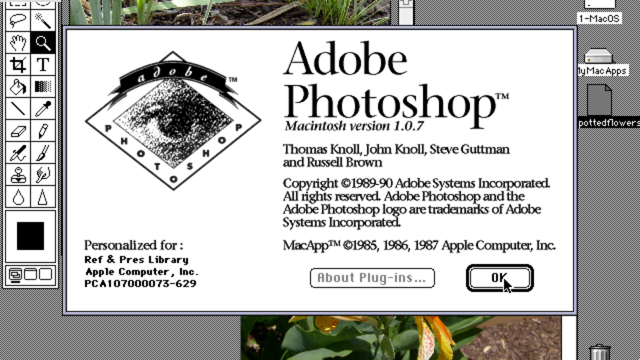
Of course this over time led to the rise of the popularity tools like Photoshop and like legitimate designers coming into the practise and really beefing up design on the web, and I think that really led to kinda of a separation over time.
Web design and web development really went their separate ways.
In some ways for the better, in some ways for the worse, but here we are.
At some point of course we started to migrate from these ornate designs that these designers with Photoshop attended to come up with and we moved towards flat design. So when our applications started to look like this, things started to change a little bit.
Suddenly it was more about strong colour choices, clean lines, topography, wide spacing layout. It was not so much about how great you're at Photoshop, it was more the kinda basics of design really, and what that meant is we really had to re-think how we build for the web as well or how we build for digital in general.
That really led to the rise of Sketch, basically taking the role of Photoshop, or what Photoshop used to be in the web design industry. This is a noisy stage.
Can you hear that? So the big thing that Sketch really brought to the table for UI design was the idea of symbols.
Repeating patterns throughout your document because ultimately when you're building a UI so much of what makes it usable is the fact that you repeat these patterns over and over again. Every time you use a visit to a new part of your product they shouldn't be graded with a whole new set of patterns and outwards be starting to reflect that need. Now we weren't working I low level detail like we were in Photoshop anymore.
Symbols were scoped to each document though. This was a real problem because it meant if you wanted to take the work you put into these symbols and start to move that value across the whole organisation, you had to do a little bit of leg work to make that happen. If we wanted to share our symbols across projects, how do we actually achieve that? In the earliest days of course people would just copy and paste symbols from one document to another and eventually we migrated towards copying and pasting from Dropbox.
It was slightly better but still kinda stuck in this world of really just kinda ad hoc collaboration at the lowest level.
There has been a bunch of tooling come out to try and address this problem.
One of the big leaders in this space is the plugin for Sketch by NVision called Craft, and for me the real standout plug in is the library plug in, which basically tries to solve this problem by having a centralised library for all of your symbols. So over time your team can start to consolidate all of their work in one place and really all that work you pour into perfecting these symbols can start to disseminate through your whole organisation over time.
This is really key to having consistent UI design in your organisation.
Of course Sketch has many challenges.
It really kicked off a bit of a revolution in terms of people really realising that there was a lot of demand for more specialised tools.
The big up and coming talk at the moment, at least the people I talk to if Figma.
It's really aiming to replace Sketch.
One of it's key strengths is that it's web-based, that's obviously a good thing for this crowd. Not Mac-only like Sketch.
That of course brings all the benefits of any web-based tool where you don't have to deal with low level, foul system concerns, upgrading software, all that stuff. Being a UI design tool in this new era, of course it comes built in with it's own way of managing repeating patterns as Figma cause some components and of course it follows the same ideas, the same principles, but going a step further Figma of course incorporates a team library built right in.
So they recognised of course that these symbols, these components they need to be shared across the different documents throughout your organisation. They can't be solo per team per designer.
So this is becoming kinda table stakes for a modern UI design school.
Sketch of course is followed in turn with similar feature now of shed libraries and another great benefit of this is it enables you to update your documents over time.
This is what it looks like to migrate from an older symbol to a new symbol as the library is updated, but how do you manage this library? So you've got all this work, you put in that central location.
We gonna need a bit more structure on how we manage changes over time.
This is where finally in a Version Control. Something that is really standard in the development side of the fence.
It's starting to make a lot more sense for designers as well, because historically, designers just haven't been very at managing versions. In large part just due to the fact that the tooling wasn't there.
Like how else are you gonna do this, right? This is really changing with tools like Abstract. Abstract is yet another plug in for Sketch, and what it really aims to do is bring the power Git to your design work flow.
It's powered by Git under the hood but it's got a nice friendly UI and it's got all that typical workflow that you expect with vision control.
You've got your master branch of course but you can branch off of that, makes some commits, get some reviews.
Get people's comments and feedbacks before merging it back to the mainline.
This sort of stuff is really essential if you wanna start having a real source of truth in your designs system you can't just be making random changes to files on Dropbox anymore.
We gotta go a step beyond that, but what if you wanna go outside of your design team and share your design work with a whole organisation.
There is bunch of tools in this space, UXPin is a really great one which really emphasises the fact that you need documentation to be an output of your design process, not just assets for design tools, and so this is, again, being a major part of a modern design tool is thinking about how design relates to the organisation as a whole, and this is of course just scratching the surface. There is a whole bunch of tools in this space that I could talk about, but I am nit gonna go into the details today, but a the high level really what we're seeing is a move towards this high level UI design tools rather than the low level tools like Photoshop. We're seeing a move towards shared design assets across team boundaries.
We're seeing this collaboration in across teams but also across disciplines, try and share the work and the designs space with non-designers alike and of course buzz word again.
We are heading towards the world of design systems and really thinking about what design means for our practise and how we can work better across these boundaries.
For me what it's really about, is about component oriented design.
That's what UI design, that's what makes UI design different from other ways of working.
The interesting thing is that developers have been on the exact same journey for a number of years now.
If I go back to the early days of my career it was quite different.
There was a big emphasis on semantic HTML, corresponding Deeply Nested CSS, layering on unobtrusive JavaScript.
I am sure many of you in this room have actually worked in this world or maybe even still do today.
We built this as a separation of concerns.
I'm separating out the content, the markup from the way it looked, from the way it behaved, and this made sense, but it made sense within a certain paradigm which is documented or document oriented development.
This paradigm starts to break down a bit once you start to build really rich interactive applications and this is sort of the pain that our industry has been going through is coming to terms with this fact and having to change the way we think.
So I'm obviously gonna jump forward quite a few steps in history here.
I could go on and on.
I will spare you but React really ushered in a new era in terms of thinking about components.
There is a lot of different competitors in the space now. A lot of alternatives, a lot of ways of doing it, but I think React really was the turning point for the industry to fully buy into this.
Guillermo Rauch from Zeit said React is such a good idea that we will spend the rest of the decade continuing to explore its implications.
So there is actually a lot of really great ideas hidden under this, but for our purposes right now the one I really wanna focus on is Components. This idea of component driven development.
What we're seeing now is developers are starting to think more like designers.
A lot more like designers.
They are starting to talk more like designers. Architect there applications more like designers and that's because of the way the technology forces you to think about your architecture. So on the left there is what is the historical view of separation of concerns on the web.
Separating out at an application level, your job description from your CSS, from your HTML. Whereas in this new world of components we still have that separation but it's really a private implementation detail of each component.
Each component has a next higher level name like a Button or Date Picker, Modal.
Internally it might be made up of these things and still written in the traditional ways.
Separating your markup from your job description, from your HTML, but then with modern built tooling we can bring all these together at run times. So we can ensure that really what you shape to your uses is the thing on the left, right? But we don't have to develop that by-hand anymore. We've got the tooling to think at this high level. So that means that your development teams are naturally starting to gravitate towards talking in this sort of user facing concepts, design concepts like text, cards, columns, fields, buttons.
These are now the components that they use to build up applications.
It's not low level technical detail, and so that means when it comes time to build an application in code the code actually starts to look like something your designers could write, because it's at that high level of obstruction talking and design concepts.
If you can get your designers and your developers collaborating on this language, you're getting way, way closer to a road where we can actually collaborate on the same level with the same terms.
So developers of course just like designers have the same problem with wanting to share their code across projects over time and developers have got really really good at this of course.
It used to be a lot harder than it is today and the funny thing is that I think so many of the practise is the way you take for granted today, really were born in an era where things went went easy like they are today, and I think part of what I'm trying to get today is highlighting how our industry actually needs to change because of how much easier things have got. In the old days developers, similar to designers used to copy and paste a lot.
Sometimes from Stackoverflow, don't tell anyone. Eventually we put all those cross browser hacks in a library like jQuery and we got to work in a nice high level again, but when it came to managing this code across projects we had to go to the website, click the big download button.
Take the jobs for four different projects, so you might only do that one or two times with a couple of big libraries.
Things are really different now in final-end space. We've got tools like Node Package Manager, NPM. They say it doesn't stand for that but they're lying. The NPM basically what it allows you to do is pull in from a repository of all the jobs in the world. It's like Stockoverflow on steroids.
So a library like react, right, you can just just instal as easily as this. NPM instal react and this big library with tonnes of work that's come out of Facebook just immediately lands on our machine ready to use. So then any foul on your project, you can just import it and start using it.
It's really a painless process and it's not just job scripting put on NPM. Really NPM is the front front package manager. It's taken a while to get to that point but it's really different world now.
We've got tools like Webpack for example that allow you to treat all your (mumbles) types as part of a module system, coz the work on the web is not just about job description obviously, it's about HTML and CSS images fonts.
CSS Module is a project that I co-created.
Came out of this work and has became a big part of the React community as well, but we've also seen the rise of CSS-in-JS.
Actually co-locating your styles with your components in the same language, in the same file.
Building modular front-end code is easier than its ever been as a result.
So I could go on about lots of different options in this space but one I will highlight for you today is styled components.
So what styled components does is that it allows you to write your CSS in a line in your JavaScript but generate a component from it. So what you can see at the top there is we're actually defining a button and we're saying that our button in this case is a link.
Here are all the styles.
At the bottom there you've got an option of primary that defines the different styling. Now obviously that's some low level technical detail but the important point I wanna make is the thinking that this is actually driving from the developers who work in the space, because what it's actually forcing you to do is actually to build your application component first rather than thinking in low level technical CSS details. You're thinking at the high level of your design language. So that means once you define your styles for a button, consuming it is not consuming a style sheet, it's consuming a fully formed component that's ready to be part of a broader tree of components. So all that low level detail of how you bind the CSS to the component is already taken care of but it's written in a way that makes it easy to share. Sharing modular front-end code is easier than its ever been before.
NPM built in of course is the ability to publish your library.
So if you start building up the set of components you can then hoist it online.
Just by running this command from your machine, and the great thing about the open source community in general, coz this tends to happen with Open Source is that publishing Open Source code to NPM is free. Absolutely free .
So if you're happy for your code to be visible to the public then run that command, it will be available and it will cost you absolutely nothing.
Sharing modular front-end code is more common than ever, and this is really case.
So what we're talking about here is not some edgy case thing that only a few developers do, this is actually becoming main stream practise in the front-end community.
As a result our community started to change the way we think about how we share code.
Developers don't want merely want to consume open source code, they wanna create it, and the tools are there to make this as easy as possible. To highlight that with numbers, I got this from NPM's website just a few days ago and you can see they are up to about half a million packages.
Half a million things that you can just instal with a few commands.
In total in the last month, nearly 30 and half billion downloads.
There is a lot of code flying off NPM just even as we speak. A lot of code flying through there, and all of these things are really distinct products, right. They all have their own documentation, their own fancy names and readme's.
They are all maintained by real people.
It's really amazing to see actually that the community has really changed in the last 10 years. What this means for us as developers as we build our application is that technology powering the worlds biggest tech companies is now available for free.
Just a few commands away, and people are always adding to as well.
People right here in Sydney and Australia, all over the world, they're adding to this big ever growing collection of code with very open licences.
That allow you to use it whatever project you happen to be building.
For me what's really interesting about being in a slightly more niche space like working in design ops is that there is a very long tail of open source, but so many packages, people are really trying to solve lots of different problems at the same time.
So that means for us, for our purpose is building a living style guide is actually easier than its ever been by a long shot. There has never been a better time to start building one. For example we got project like Storybook.
Something you might have seen this before.
Story book allows you to have an isolated development environment for your components. So it lets you stop hard coding your components in the middle of your application, take a step back and actually build them in a living style guide from the beginning. You get to build up examples of what your components look like in their various states. You get to test it in real browsers, real devices and when you're done you actually have living, breathing documentation.
You can hand over to people who need to build with this stuff, and again this is something that you can just take off the shelf for free.
It's a community project.
If there is anything wrong with it, you can go and help contribute to it.
There is no money involved here.
It's just people sharing their hard work in the space and it's really really incredible to see what we can do with it today.
Another big project in the space is Styleguidist, which is again operating that similar space of pushing you towards building a living style guide from the beginning.
This one, one of its key differentiators is has a big focus on documentation.
It really encourages you to write at length about how the components should be used.
This is definitely something that's valuable the further you go down in this direction.
You really wanna go beyond automatic documentation, you wanna start to actually write at length about how this thing should be used or of course you can just roll own.
So I think we started with Storybook and eventually we kinda realised we needed more freedom, we didn't wanna be inside of a framework.
So we just started building our own website. This is what ours look like.
Looks like this is our living style guide, the documentation for it, and this is hosted for free up on GitHub ages of course, but where the action really happens is here in the GitHub repo.
This is where the source of truth really lies. This is where people come in and collaborate and help us move it forward, and what that means is that when we're all done from a development standpoint when we actually wanna integrate this into real projects, just like what we've seen with some of the biggest libraries that people use today. It's available on NPM and you can just instal Seek-style-guide, and this is open source so if you wanna do this on your machine today it would totally work. This isn't private code.
So how do we manage the delivery of our style guide from the website, from GitHub all the way to NPM ready to go on production apps? So for us, for me in particular coming from open source background to make this possible I really wanted to focus on bringing that open source culture internally to Seek and I honestly think that this is the biggest, the biggest way to get success earlier with few resources because in many ways that's what the open source community is about. It's about gathering people's work from all over world to help on this one project.
Even if they've all got other things to do day to day. So the first step in making this possible is to lock down the master branch.
So random changes aren't flying in and makes sure that every change must be a pull request. So pull request if you are not familiar, it's something that you see on GitHub, like this where someone actually proposing a change to the style guide .
You can drill in and you can look at the actual code line by line and see what they've changed.
You get the high level reason for the change that they've made.
You can see the reasoning behind it, any draw backs, any issues that they might have might have encountered.
Open questions.
If they've made any breaking changes to the API and have notes on how I use and how might migrate their applications to the new version.
All that gets captured here and of course people can feed back on it and comment and so on.
The great thing about following this methodology is it means that if you go back over all the changes you get to get a real sense of the progression of the project.
The questions that came up, the responses and so on. It's really really important that you have this kind of rigour around it. Something that's supposed to be the source of truth. All GitHub activity gets published to Slack. That's a big thing for us because what it does is that it makes sure that there is a big visible community around this code. It's not just sitting in a silo somewhere where no one knows about.
We all collectively work on it and own it.
So with the previous pull request that we saw this is what it looks like in Slack.
You get a notification straight away that someone's opened it and you can see there is already a bit of conversation in slack.
This is really good as well for us in the sense that because our style guide is public if there is any question that we don't feel comfortable airing in public we can drop it in Slack.
We do that from time to time.
All these changes have to be approved by two other people.
This is really key, because what this does is it forces us to make sure that every change is circulated enough through the group so that there is a real sense of shade ownership over it.
So people might have some questions about the work, they might be asking you to change a few things, but eventually you should get those two green ticks and you know that you're ready for your work to go on the main line.
Every change gets its own preview site deployed. This is a really critical thing for testing, particularly when we've got multiple devices floating around.
So for example if I was a change the way Button looked, I might wanna jump over to the preview site, open it in a browser and actually interact with it. See the animation, toy with a different states. I might pull out my phone and navigate to this website. I've got a URL, I can send to anyone in the organisation and say, "What do you think? "This is what the new Button looks like." We get to really circulate these changes before we commit to them which is really critical. Of course manual testing isn't enough.
Every change is automatically tested.
Again being open source we get to leverage really great tooling for free.
We use travesia, a continuous integration service, and so every time a change is pushed to GitHub or pull request is opened, a whole suite of automated test and co-quality checks run to make sure everything is as we expect.
If a test has to change we can see that in a dif and we can make sure that those changes again as we expect, and every merged change is then automatically published. This is actually a really critical thing that we get to set up earlier on.
Typically with publishing to NPM it's a manual step, you do it from your laptop, but we use a really great tool called semantic release that just automates this for us.
So that means as soon as you hit that merge button, all of your work immediately get published to NPM. The new version is available straight away, and this happens all the time.
You might not be able to read it there but you can see that at the time of the screenshot at least there were 163 releases of our style guide, and there is more happening everyday.
In fact even as I was preparing to get on stage, people were reviewing and getting ready to merge work even while I am out of the office. It's all just automated.
Of course the code's not enough.
We need to circulate those changes more broadly. So every release automatically updates our documentation. So again as soon as hit that merge button, all the tests pass, code goes out to NPM.
The new documentations gets deployed.
So that means designers develop as ever in between, they get to go to this website and always get the up to date version of whatever the latest code happens to be.
To make this possible, what we are doing is we're really focusing on open cross team collaboration. Making sure that the style guide isn't just something owned by a team.
Often a corner that no one talks to, it's more like an open source project where everyone can jump and contribute to it. It's readily available to every team, that's both from the point of view of who are consuming it.
We have new people inside the company, creating new projects all the time, readily consuming this code, but also contributing back.
If there is ever anything wrong with it they wanna improve it.
They wanna fix any bugs or add any features. They can just straight into repository and start contributing and it's as streamlined as possible. What I think is really interesting is that we're bringing this open source mindset and talking, we're applying it to the world of design and what we've created is this continuous design pipeline, where at any given moment you can pull down the real source of truth of what design at Seek should look like push it into a real application that runs in production as soon as you want, and this really key I think to moving into this world of micro service.
Where new products spin up all the time and they need to be on grand, and a static guideline is not enough in this new world, and for me this is what design ops is all about. This is why it's really a necessary part of this transition because you really need people to look after this.
Design ops is all about managing this workflow. Treating as a real product, as a real like putting engineering efforts into managing this workflow.
Coz as Dominic Mcphee from Shopify said, "The hardest part about design systems "isn't the actual designing or building of it. "It's the process for how you keep it alive and thriving," and in many ways my job is to focus on this problem and make sure that it's never neglected.
What I found though is that for doing for about a year now, what I found really hard is actually managing the culture change.
It's a really big mental shift on how we think about designing and building our applications.
Nathan Curtis from Eightshapes says that, "A design system isn't a project.
"It's a product, serving products," and that's a really key thing to keep in mind. It's having that product mindset.
This isn't just some side project that people kinda spend a few spare minutes on. This is something that you need full time resources on to really empower people in your organisation. To think at a higher level.
As a result developers arguably are the primary consumers of your product because they are the ones delivering your design language to production.
You can have the best design assets in the world, the best sketch library, but if it doesn't make it to the end product, it wasn't enough, and so serving developers need is a really key part of the role and why you need dedicated engineering resources who are really close to the problem space and understand that audience, but how do we fit back to the design process? When you do this for long enough you start to realise that designers are kinda left out of this work flow.
That they don't get to use the end result.
There has been a lot of people thinking hard about this problem and trying to think about how do we get continuous delivery for our designers, it's not just for our code? So if you look at what we've set up, it's very similar to what a lot of people are doing in space.
Our Git repository is the source of truth.
We have the one location where all the files sit. So you might think that we could use a tool like Abstract that we talked about earlier, that allows you to bring the world of Git to the world of design tools.
Checking those design assets.
The problem is of course that Abstract, like a lot of tools operating in the space, uses it's own siloed Git repository.
It hosts the files for you.
It keeps it separate from GitHub or wherever you happen to host your code, and so that creates a real problem when you're trying to unify these two worlds. What we need if we wanna move forward in this space is we need our code and our design assets to sit side by side in the same repository, not in two different places.
As a result we're actually starting to see a new generation of design tools build for true integration without development workflow. Really re-thinking design in this new world. So for example instead of using a tool like Abstract you might wanna use a tool called Kactus, with a really great logo.
What Kactus does basically is kinda at a high level the same thing.
It gives you the ability to manage Sketch files with Git but the key differentiator here from a tool like Abstract is it's not obstructing away the Git repository, it's not obstructing away the file system.
What you see on the left are the actual json files that are embedded within a Sketch file, cuz you might not realise but a Sketch file now is actually just a zip file, a zip file with photos in it and files and human readable json, and that's perfect for (mumbles) where you don't really need it to be hosted by some third party.
So that means suddenly you can start to think of your Sketch assets as a living, breathing part of your single source of truth in the same Git repository.
That means you can start to do interesting things like automatically publishing Sketch files to your style guide's website.
Managing the changes at the same time.
It means you can provide canonical Sketch files for every component.
Again as you make changes to your component you can make changes on both sides of the fence. You can write Sketch plugins to download the latest symbols from NPM if you really wanna go end to end.
That's something we've experimented with at Seek with a little bit of success but that's, it's a tricky thing to get right.
So we've moved forward here.
We've got one repository but we've still got two sources of truth, you've got your Sketch files, you've got your components in code.
How do we bring these two together? Really if we wanna be on the same page, we need our design and development artefacts, we need them to be built from the same materials. Really what we need is shared primitives across these two domains, and again people have been thinking really hard about this problem and funnily enough the answer seems to initially have come from the React community.
Part of why I am so obsessed with it.
So Marcin Treder who is the CEO UXPin actually, the product I talked about earlier, he said on Twitter recently, "How surprised would you be "if I told you that the future "of design might be connected to React primitives?" And this is coming from someone who is very much in this UX design space.
Tom Occhino from Facebook said, "At the beauty of React "is that it is abstract and not tightly coupled to the DOM," or the Document Object Model.
"React can wrap any imperative view system." Obviously that is a bit jargony but what that means in practise is it means that React can actually target different environments not just the browser.
So if you've heard of react you may have heard of React Native.
It's a great example of what this means in practise. Work on real products.
React Native allows developers who are familiar with JavaScript, familiar with React to take their skills and apply them to Native iOS and Andriod apps, but this isn't a web view pretending to be a native app. These are real native applications, right.
React is wrapping the imperative IPIs of the native platforms, presenting them to you in this sort of abstract way through JavaScript.
So Airbnb of course as always there are early adopters on this kind of thing.
They are using this, they're using React Native on their real products today, but some really smart people at Airbnb looked at this and wondered, "Can we apply the same thinking "to our design tools?" Jon Gold from Airbnb said that, "In Sketch, we use symbols and overrides, "in React we use components and properties. "the components are so similar "that it seemed silly not to unify them." As I said earlier, developers and designers are really starting to speak the same language and our tools are really starting to work the same way, and this is leading to some really interesting developments. So in this case it led directly to the development of React-Sketchapp.
React-Sketchapp is an amazing piece of software, that lets you take your react components, if they're written in a cross platform way. If your react components can run in a browser and the native applications, you can now render them to Sketch.
So here in this video what you can see on the left is they're searching through the canonical list of React components at Airbnb. For each one, once they've selected it they can change the properties, update the texts and so on.
They got little check boxes there and text boxes that can change the settings. Once it's ready they can just drag and drop it right there on the app board and what's amazing is that this is being built from the same material that we have used in our real applications.
This isn't some parallel universe where you have to re-build everything.
We're are reading from that same source of truth. We've got websites native apps and design tools all drawing from the one location. So when we collaborate on this space we're really collaborating together, doesn't matter where you consume it.
It's the same source of truth.
We're seeing the emergence as a result of cross-platform, cross-disciplinary design systems that try to service everyone on the organisation.
Not just developers, not just designers but working together.
The problem though, there is a big problem, a critical problem with this approach as great as it is, is that we're still designing pictures not products. What you get at the end is just mock up, right? It's not something you can touch or feel, interact with, you can't throw it on a phone in the same way, right? As Daniel Eden of Facebook said, "Even the most advanced digital design digital tools are based on workflows for drawing mere pictures of interfaces," and the further we get along this road of really standardising our living, breathing components in code, the more this starts to stand out as a problem. As a result, again we're starting to see a new generation of design tools focusing on the use of authentic materials, and by that I mean actually working in the final medium. Not obstructing it away or working in a mere proxy of it, but actually understanding the medium we're designing for. A great example is a tool like Compositor Lab. Which gives you a visual way to see and edit your design system.
You can edit your top hierarchy, you can edit your colour pallet, you can edit your components.
You can build up your design systems, but you do it in a way that's actually built on top of these real primitives.
When you wanna publish your work, you can actually publish it and this case you cab see they've selected styled components as I talked about earlier. They're exporting these components powered by style components in a way that can be published to NPM for your developers to consume right away as a real living, breathing code. Not just a picture of it.
Haiku is another tool on the space that's are needed to do the same thing but solving a different problem.
Haiku is mainly focused on kinda the world of animations.
Here you can see building up this sort of animated emoji and what we've got is your typical kinda design tool layout or everything you expect from this type of tool, but again the key thing is that this is building on top of real primitives that run in a browser and when you hit export, you don't export a picture of it.
You don't export some custom Haiku format, what you export is real React components to NPM. Again, ready for your developers to consume in a real product.
We've got this component-oriented design tools but the thing that's really different about them is that they're building with the materials of the web, not merely imitating them.
Which is what we've been doing since the days of Photoshop, but what if you wanna do high level design. If you don't just wanna design components or your design tokens but you actually want to assemble full pages.
There is tools operating in this space as well. There is a great tool, currently not available to the public but if you follow this on Twitter you can see the development, Modulz Studio. It's actually being built by someone who Colm Tute, who used to work at Marvel, and so this is something that very much resembles your typical so UI design tool.
Dragging dropping components onto the page, but the key differentiator of this product or this approach in general is if you look on the left there is actually a tree of components nested within each other.
That's actually really critical to pay attention to because really that's how developers think about building your product.
They don't think about a canvas where they can just drag and drop absolute position elements across each other.
They really have to follow a certain law, certain laws of Physics, which is that your components have to be nested within each other.
If you wanna layout the page that's a higher level layout component that your component sits within.
Compositor Zero is part of the Compositor suite that I touched on earlier and it builds on top of Compositor Lab by allowing you to drag and drop these components but the difference again is that you see that what you're doing is dragging and dropping components in a tree, not on a Canvas with absolute positioning.
So what we're trying to do now is go the other way. We trying to make sure that designers actually think of it more like developers.
They don't ignore the medium, they actually embrace the constraints and work around them.
A product that I am really excited about mainly because I've actually been able to get my hands on this and use it with real Seek design is Interplay.
It's actually a product build by a couple of people, one of which is here in Sydney, and he can see it in action.
So Interplay here is actually drawing from the Seek living style guide on NPM.
Its actually pulled down our components suite from NPM and if you look on that left pane there, I can search for components in our components suite. Once I found the one I want I can drag and drop it onto that Canvas, but again it's following the same laws of Physics where all these components need to be nested within each other.
When I hit that preview button I see it running in a real browser, but because it's the real product, it's the real components, it's responsive out of the box.
It's got the real Seek header, it's got the real Seek footer.
It's pretty much exactly what the developer would have done if you had asked them to build it, right, and this is becoming possible because of this re-thinking that we're going through and actually treating our design systems as a first class product within our organisations. Now that our design system is a product, it can plug into other products like this, and there is even more to come.
I wish I could show you more, but I've been speaking with a few people who are working on space and it's definitely something that is coming in a big way.
Airbnb of course as always are on the bleeding edge of this stuff and they're experimenting with what this means for our industry if we treated our design systems as a first class product of an organisation like this. Recently on a post Benjamin Wilkins wrote, "We wanted to see how it might look "to skip a few steps in the product development life cycle "and instantly translate our sketches "into a finished product." So what they're looking at doing is saying, if we've got this suite of components that's fully formed, that's ready to run in production, why are we recreating them by hand? Dragging and dropping? Why don't we go to a more natural medium for designers like sketching by hand? So here you can see.
There is a video feed at the top right there, it's a little slow, but it's your typical wire frame style drawn by hand, fed into this camera feed, and they've got this machine learning based algorithm that can pick up and detect what components in your design system that's referring to and actually assemble a real working prototype right there in a browser on the fly, right. Obviously it's early days for this kind of technique but I'm really excited about what this means for the future of design.
What this means for the future of our industry. How are we gonna be designing things 10 years from now if this is what we're doing today, right? It's a very different world we're entering into. I think that the next generation of design tools will be built on a layer of functional components. Something that React has really played a big role in ushering in and it's becoming very much a standard way that you developers building products today, and again this is where design apps comes into the picture.
It's about really investing in you design system as a product.
Allowing you to operate at this higher level and empower the next generation of design tolls while we're at it.
So what does this mean for the future of interface design? Obviously it raises a lot of questions.
When we productize our designer language, it changes the way we think about design in a really big way, but as Colm Tuite from Modulz says, "While innovation in tooling is important "the real challenge is education," and that's a big part of why I'm here today. It's really trying to get people to understand what's changing, why it's changing, where we're heading, and so when we start to try and re-imagine our design processes as we work day to day, this is really what we're trying to head towards, and I think it's a really bright future.
Really working towards and developers truly collaborating. When you look at the kinds of work flow that are starting to become possible and you look at how we design today, let alone how we designed a few years ago, it starts to look really antiquated kinda processes. Speaking completely different languages.
Re-creating our design language over and over again in different mediums.
When our tooling actually has the opportunity finally to bring us together as an industry.
As Kaelig from Shopify says, "The best products are built by teams "with great communication bridges "between designers and engineers," and design systems is really making this a common part of our industry now and design operations I think is really making this possible, not just a pipe dream.
Together as designers, as developers, everything in between, we're working hard to build the future of design as a service. Taking world class design from inside of our design teams, across those team boundaries, across organisational boundaries and out to the wider industry and really re-imagine the entire design process. That's it for me, thank you so much for listening. (applause) (gentle music)
Design systems are playing an ever-increasing role in allowing us to produce world-class design at scale. However, for these systems to truly deliver on their potential, they need to be properly integrated into the rest of the organisation, speaking the same language as those building and delivering products to our end users.
As a result, we’re beginning to see the rise of Design Operations (“DesignOps” for short) within companies like Salesforce, Airbnb and Australia’s own SEEK, with dedicated engineering resources being embedded within teams that historically would have only contained designers. By focusing developers entirely on translating a company’s design language into production-ready code and monitoring its real-world effectiveness, we can empower our design teams to deliver high quality design across large organisations at a pace that simply wasn’t previously possible.
But what does DesignOps look like in practice? How do we ensure developers and designers are speaking the same language? What should your organisation expect from such a fundamental shift in perspective, and how do we measure success? Together, we’ll examine the benefits, challenges and future potential of this approach through the real-life experiences of an engineer who’s been living in a design team for the past year.