Let’s fix the web’s text size
Speaker Introduction and Community Welcome
Bruce Lawson introduces Josh Tumas from the BBC with characteristic humor. Josh thanks the audience, introduces himself as a BBC senior software engineer working on the BBC Design System, and shares that he joined the CSS Working Group two summers ago. He encourages attendees to engage with the community and credits the conference itself with giving him the confidence to apply to join the Working Group, setting up the talk's focus on WCAG accessibility guidelines relating to text scaling.
WCAG Text Scaling Requirements and Established Best Practices
Josh outlines the relevant WCAG success criteria, specifically that websites must support at least 200% text resize without breaking layouts or causing horizontal scrolling. He reviews the established best practices developers have been taught to follow: designing mobile-first and always using font-relative units like rem and em rather than pixel values, including within media queries — rules Josh notes the BBC itself strives to follow.
The BBC's Accessibility Complaint: Text Not Scaling in Web Views
Josh describes a real accessibility complaint the BBC received: users who increased their phone's OS text size found it had no effect on the BBC's live feed page, despite working on other native app screens. He reveals the cause — the page was a website rendered inside a web view — and cites research showing approximately 37% of users globally change their text scale settings on iOS or Android devices, underscoring how serious and widespread the issue is.
How Browsers Handle Operating System Text Scaling Inconsistently
Josh demonstrates that the text scaling problem extends well beyond web views to regular browsers. Chrome on Android does nothing when OS text scale is increased, Firefox performs full zoom rather than text-only scaling, macOS text scaling appears to have no effect on any app, and Windows 11 scales everything including the browser chrome itself. This segment highlights the significant and confusing inconsistency across platforms in responding to accessibility text size preferences.
The Real-World Consequences: Text Scaling Breaks Modern Websites
Josh demonstrates what happens when text-only scaling is enabled via Firefox across popular websites including Google, Bluesky, Apple, LinkedIn, and Disneyland Paris. Navigation bars become truncated, icons overflow, and fixed-width content areas fail to accommodate the larger text. He argues this evidence shows why text scaling cannot simply be switched on universally — websites need an explicit way to opt in to correct scaling behavior, and most are not yet ready.
CSS Working Group Proposals: From Environment Variables to the Meta Tag
Josh explains how he raised the issue in the CSS Working Group with help from two Chrome team members, David Grogan and Phil Rogers, resulting in a formal explainer document. He walks through three successive proposals: a new CSS environment variable called preferred-text-scale, a syntactic sugar unit called pem (preferred em), and finally the approach that gained traction — an HTML meta tag with name=text-scale and a content value of either scale or legacy. He also notes ongoing privacy discussions around fingerprinting risks from exposing the exact scale value.
How the Text Scale Meta Tag Works with REM Units and Media Queries
Josh explains the mechanics of the meta tag solution, clarifying that it works by changing the browser's default font size rather than a CSS-level root override. He addresses a key quirk: media query rem values are always based on the browser's initial font size rather than author-defined values, which is precisely why the meta tag approach was necessary. He notes the feature has limited availability in Chromium browsers already and expresses hope for Firefox and Safari support later in the year.
Testing Your Website for Text Scaling Accessibility
Josh explains how developers can test text scaling behavior on desktop browsers today: using Chromium's font size slider in appearance settings, Firefox's zoom-text-only option, and Safari's hidden option+cmd+plus keyboard shortcut. He recommends combining browser viewport emulation at 320px with text scaling to simulate the most challenging scenario — equivalent to a mobile user who has also zoomed in — and uses a BBC Weather page as a live example of the kinds of breakages to look for.
Design Principles: Starting Scaled Up and Using the Right Units
Josh presents his first four practical recommendations for building text-scaling-ready websites. He advises designing mobile-first with text already at maximum scale, avoiding overriding the browser's default font size with pixel values in CSS resets, using rem units in media queries so layouts respond appropriately when text grows larger, and reserving pixel units specifically for gaps, margins, and padding — where fixed sizing actually improves readability by preventing spacing from growing disproportionately.
Layout Strategies: Single Column Breakpoints and Intrinsic Sizing
Josh covers two further recommendations: switching to single column layouts at around 300px equivalent rather than 320px to give moderately scaled text a little more breathing room, and using container queries as an even more robust alternative that adapts contextually. He also stresses intrinsic web design — never setting fixed heights on elements like navigation bars, using min-height instead so content expands naturally — and recommends Ahmed Shadeed's Defensive CSS website as a practical reference.
Managing Large Heading Sizes and Opting In to Text Scaling
Josh addresses the specific challenge of headings, which can become unmanageable when text scaling is applied at full intensity. He demonstrates a CSS formula using the preferred-text-scale environment variable that reduces the rate at which headings grow relative to body text, and mentions that CSS functions make this pattern more reusable. He closes by encouraging developers to start using the text-scale meta tag now to benefit Chrome and Android users immediately, and highlights a new MDN article covering the full feature.
Audience Q&A: Browser Support, Unit Strategy, and Biscuit Preferences
Bruce Lawson facilitates audience questions covering: whether the meta tag works with pixel font sizes (it does not — only font-relative units scale), whether using pixels for margins and padding is genuinely advisable (Josh confirms yes, with context), the current state of Firefox and Safari support (Firefox approval received that week with implementation potentially arriving within the year), fluid typography and clamp() considerations for the root font size, and why the opt-in mechanism lives in HTML rather than CSS. The session closes lightheartedly with questions about biscuit preferences and the merits of visiting Salford.
Our next speaker is a nice chappy. He works with the BBC. He doesn't know the difference between Britney Spears and Kylie Minogue, we've discovered. And, he was raised by badgers from an early age, and he speaks fluent badger.
So ask him about that later. Without further ado, all the way from sunny England, Josh to Mass. Take it away, Joshua.
Well, thank thank you very much. National treasure, Bruce Lawson. I always call him that. International Absolutely. I just don't know if I have the jurisdiction to make that declaration. So, yeah, what a privilege to be here. Nice to meet you all. My name's Josh. So typical introduction slide here.
So I work at the BBC, senior software engineer. I work on the BBC's design system. One of my colleagues, Nat, is here, solemn barrister. You're welcome. And I also had the privilege of joining the CSS Working Group about two summers ago. So that's been a really wonderful experience. So, you all know the CSS working group, right?
So this conference, I've got to tell you, it is absolutely fantastic. Put your hand up if it's your first time at this conference. Really? Oh, that's so wonderful. There's so many new people here. So how dare you take a seat from people who've been before. No, that's not what that's not what's going on here. Thank you so much for coming.
This is such a wonderful community. It is such a great place to meet people. The only reason why I had the confidence to ask my employer if I could join the CSS Working Group is because of this community right here at this conference putting me at ease, making me feel welcome. So thank you so much for that.
Do, please do take the opportunity to chat to as many people as you can. Just Pac Man yourself into any kind of conversation because, and just, that's what I, I'm an extrovert, that's what I do, but like, just shove yourself in there. It's such a great way to meet people. There's so many people from the CSS working group here so you can lobby us about anything so that we can ignore you.
That's not true. But what we're gonna be talking about today is the font specification or maybe something more in the HTML specification. So we're gonna be talking about stuff relating to these web content accessibility guidelines. So put your hand up if you followed the WCAG guidelines or you try to for your website.
Great. So maybe you'd feel a bit ashamed if you didn't put your hand up then. I don't know. No pressure. So obviously you know resize text off by heart. That is, you don't really. But one that success criterion says that we should be able to resize our text on our websites by at least 200% without anything breaking or without us preventing that from happening.
Likewise, we should be able to when we resize our text or even without resizing our text or zooming, we should be able to do that without the page reflowing. Without you know, know, if you've been on a page where it kind of horizontally scrolls when it shouldn't really be able to do that, we want to prevent that from happening as well.
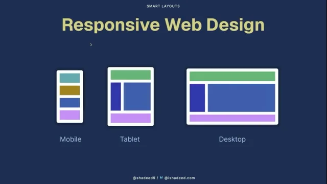
We should be able to only scroll in one direction when we resize our text. And as web developers, we generally have been taught these best practices if you're experienced, if you've been doing this for a while. So the first one is to design your website mobile first. You might have heard that phrase before. So when you're starting to design your website, you wanna start off with that mobile design first and then build up to the desktop.
It's really hard to start off with the exciting desktop design and then drill down from there. I'm gonna get a quick drink because my mouth's getting dry already. And then awkwardly comment on it while I do that because I'm an extrovert and I just have to explain everything I'm doing out loud. Now you have to awkwardly stare at me while I have a drink.
Sorry. So, oh, that's so much better. So, do you ever compare the different water you go to in different countries? Don't go to London. It's awful. So, yes. So what have we got after doing responsive web design, mobile first? So also, you might have been taught this as well. Never ever ever never use pixel units.
Always use font relative units like rem units, em units to style, set sizes on everything on your website. And perhaps even use those units in media queries as well. So we were follow we always follow these rules at the BBC, know, because we're just so perfect obviously and never make any mistakes. That's not true. But so we had this complaint.
So it turns out we're not perfect. So the complaint was this. So we have lots of apps in The UK for for news, sports, weather, and so on. And so our sports app, someone was using the app in The UK. They'd increase the font size on their phone.
And so they go on a settings page like this. This is what it looks like in Android, on Pixel devices anyway. And so you'd increase that slider. And then low and behold you would find your native app, the text has gotten bigger. So they did this as well on our live feed page. So they increased the text size in the same process.
Oh, nothing happened. What's going on here? The text size is completely exactly the same. Nothing has changed. This is an accessibility failure. It is It was a very legitimate complaint that we received about this. But why has this happened? Well it was because this page, dun dun dun, is actually a website. It's in a web view.
So what's going on here? If you don't know, web view is a way of embedding a web page in a browser. It's a bit in in a native app rather. It's a bit like an iframe I suppose. I mean I wouldn't know. That that's that's the most I know about it because I'm not a native app developer.
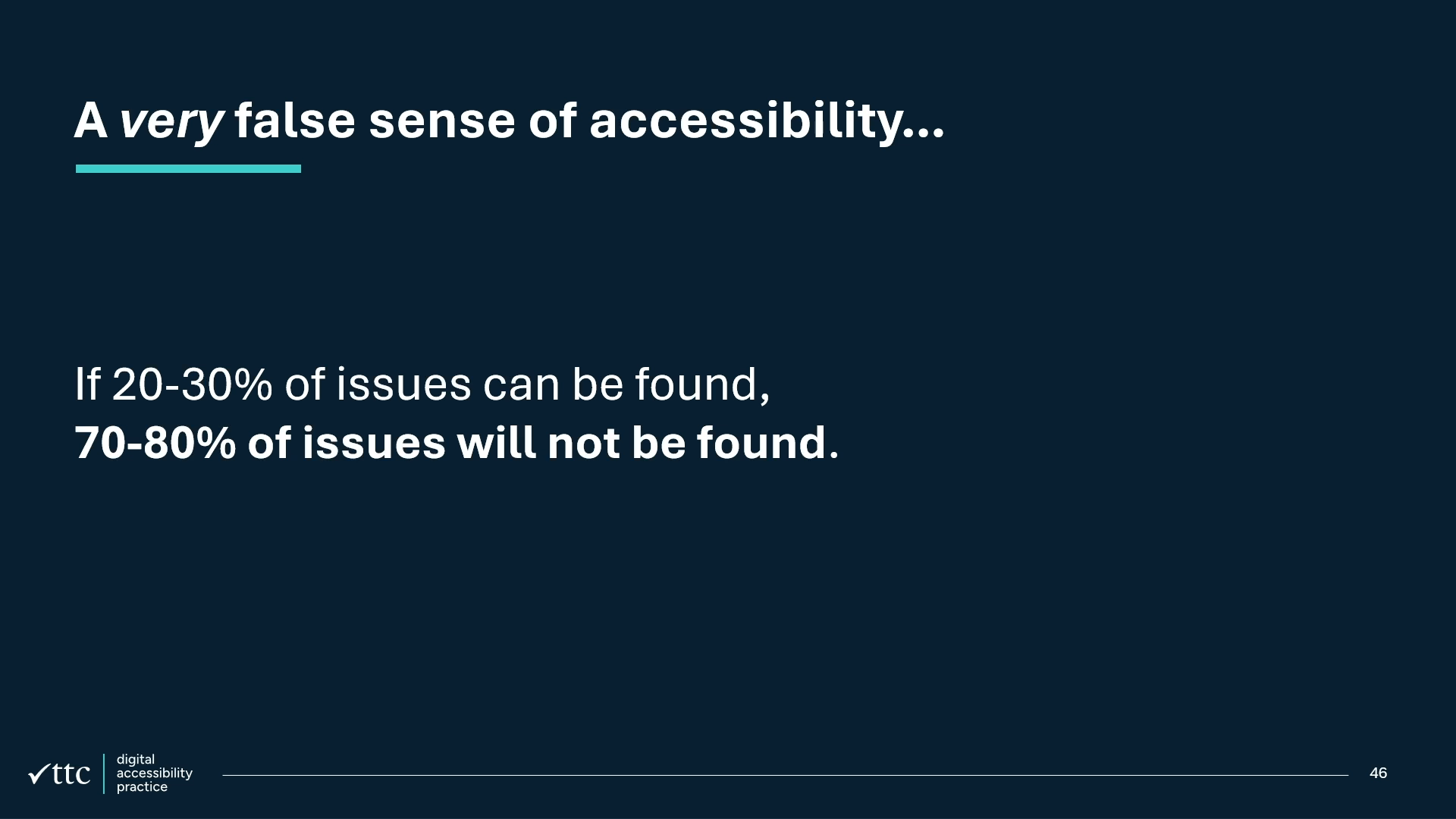
But that's what's going on here. And this is like quite a serious issue because, so there was an organization called Appt, you can check the source there. They did some research that showed about 37 of your users, generally worldwide, will change the text scale on their IOS or Android devices.
Put your hand up if you increase the text size on your phone. So there's quite a lot of people here actually. Maybe not quite as much as 37%. But I just wanna say to you, those of you who have not increased your text size, just wait till you get older, it might happen. So this will affect you too.
It'll definitely affect me one day seeing as my family all seem to get glasses by the age of 40. So we're wondering, well, why isn't this works? Like, we're we're following all the best practices. Why isn't the text getting bigger? We we've been sold this lie that if we just use rem units, the text size will get bigger.
What is going on? Well we can see it's clearly a lot more complicated than that, just as everything else the CSS web group seems to deal with. So what's going on here? So here's what happens if you just, so forget the web view now. If you just go browsing around on your favorite web browser, say you're on Chrome on a Pixel device, Increase the text size and well, lo and behold, nothing has happened.
What's going on here? Put your hand up if you use Firefox or Android. This is probably the only place I'd ever go to where more than one person will put their hand up. I do too. I love it. Are you proud of me, Jake? Oh, thank you. So I think it's great. So now interestingly, when you increase the text size on Firefox, have you seen what happens?
It it does make things bigger, but this isn't this is not the text getting bigger. This is everything getting bigger. This is just normal zoom. So what's going on here is Firefox actually has a little tick box in their settings where you can enable this. This is the default. It will do zoom in response to text scaling.
So that's okay. That's quite helpful actually. Now on Mac OS, did you know that had a text scaling setting as well? If you increase the text scale on there, nothing happens. Not just on like your favorite web browser though. Nothing hap seems to happen on any app. None not even the native apps. Nothing happens on Mac OS when you increase the text scale.
So I don't know what's going on there. That's interesting. On Windows, at least on Windows 11, the opposite thing happens. Like everything gets bigger. Like not just like with Firefox where the content gets bigger. Everything, even like the browser Chrome itself seems to get bigger. So that's interesting. There's quite, as you can see, a massive disparity between how desktop browsers are responding to these settings as well as mobile browsers. But here's the thing.
So within the browser UI itself, you can increase the text size. So we'll talk about it later but yeah they all have settings for increasing the text size in some way. So anyway, as we can see, this is a bit of a problem. So 37% of your users are increasing their text size and nothing is happening when they go on the web.
That's a bit of a problem. So kind of just after I joined the CSS Working Group, I raised an issue on this. And we're basically wondering, so like, oh crap, which was my glass? The one on the left. Oh, it was the one on left. Your left. Thank you so much.
That that could've ended. I'm gonna move this away. Oh is it empty? Oh I didn't even have to worry about that anyway.
Great.
So, where was I? Yeah so in in reported the issue and like, so you'd probably reasonably ask, well why is the text size not just getting bigger anyway? Can we not just do it? We do it on desktop apparently. So why can't we just do it on mobile? And and it's a reasonable question to ask probably.
But well, there's a reason why we don't. So let's see what happens when we increase the text size on a random set of websites. So we'll go on Firefox. We're gonna tick this little ZoomText only box on the settings or you can do it on the view menu in the the menu bar. Or you can even set a specific default font size that you want if you want to do that as well.
Let's go on Google. So what happens is the navigation bar gets completely or partially obscured by the search bar. The icons seem to still get stuck in the top right of the search bar as well. The main content area though seems to be fairly readable. If we go on Blue Sky, again there is a slightly chopped off overflowing menu and I don't think there was a way for me to scroll to see what else was on the menu.
Same on Apple's website, we get a very truncated navigation bar. But at least on this homepage, the main content still seems to flow. On LinkedIn, it gets even worse. Like, so yeah the the navigation bar has again been squashed and single words don't even fit on one line anymore. We've got like the search icon poking out of the search bar for some reason. And then worse still, like the main content area hasn't increased in its fixed width to accommodate this wider, larger text.
So what's going on there? We can see lots of dot dot dot truncation going on. The Disneyland Paris website is an interesting one as well because that has a big hero image on it. And suddenly when the text overflows their navigation bar, now it's not good, got good color contrast either. So as we can see, it's an absolute massacre of navigation bars apparently. Which makes sense because they're probably the main thing on your website that has like a a firm horizontal layout on desktop.
Of course though, in this very contrived specific example, the BBC website is perfect. So I just have to point that out. So that's good. So basically our websites, they're not ready for text scaling are they? They're they're just not ready for this unfortunately. There's quite a lot of areas on the BBC website that really isn't ready for this as well.
So clearly we can't just turn this on. Like we need a way for us as authors, as web developers, to opt in to this correct behavior where we are somehow responding to the operating system setting tech tech scale. So so at this point, very kindly, two people in the Chrome team started helping me out with this.
So that's David Grogan and Phil Rogers. So I wanted to give them a shout out and make sure they get lots of credit for this as well. But basically we together put together what's called an explainer. So this is where we make like a a big document that kind of explains, as the name suggests, how a proposal for a new feature on the web platform will work.
And what we proposed was this. It was a new, did you know CSS had environment variables? So it was a new environment variable called preferred text scale. It took a lot of bike shedding to get to that name. But basically it would work like this. So if the user doesn't touch their text scale settings, then this environment variable would equal one.
If they increase it by a little bit, it would have a value of say 1.25. If they double it, it would have a value of two. So the way you would use it is like this. You might use it in calcs. Say you're setting the text size of a button, then you can just do 16 pixels times whatever the environment variable value is.
But that's a bit of a, sorry I'm gonna use a British word now. That's a bit of a faff. That's a bit of a pain because you probably want to do this in a lot of places and you don't wanna set up all these calcs everywhere. So we came up with this idea of a syntactic sugar called the pen. So the idea is this would be the preferred M.
So there you go. So it would basically just do that calculation for you. Let's go for another drink. I I have Tourette's Syndrome by the way, so if you see my eyebrows moving a lot, it's not because I'm enthusiastic, it's just it's just a tick. So the it's just when you look back and you talk on the livestream and you're like, I've used to move my eyebrows so much. So yeah, this is a bit of a fail as well, this suggestion unfortunately. It seemed like it had good traction but the problem with it was you've already worked so hard to put RAM on your websites and stop using pixel values everywhere.
So why should we be coming along and telling you, oh stop using REM now actually. Use use this PEM value. So we ended up with this third proposal. So it was basically to introduce a new meta tag. So the idea was you would just specify this meta tag on your page and just, it it would just do what you want.
It would just set the new default text size to be whatever the user has set it in their operating system accessibility settings. And that would be great. So you would use that where you would a normal meta tag. So in summary, what we've ended up with in this proposal to solve this problem is this. So we've got this meta tag now, name equals text scale, content equals scale. So it's like an enum.
So the other value is legacy. So we wanted to call it legacy. This is the old behavior that we should not want anymore. The way things work now, that is legacy. And then if we want things to scale, we set content to be scale. But if you need to opt in more selectively or you've got particular situations where you need to get this scaling value, then you can still use the environment variable.
There has been some fingerprinting concerns around this that we're still working on in in the working group. So the concern is if we're just getting the exact text scale value that the user has set, could fingerprint us use that to track you as like an extra way of identifying you like, oh, this person, they set the text scale to this and they've got this dark mode setting turned on.
And you know, if you combine all these settings together, becomes a good way of getting a profile of someone. So people are thinking quite carefully around how to support this value without giving you, oh this user has set their text scale to 1.2567 whatever. So it needs to be carefully done there. So the idea is you would just use it like this.
So you would just set it in your head of your HTML or just remove the head if you're cool. And this HTML pass will add it back in for you. And you would just set it. All the stuff you've done before, it works. So say you've set the font value to two rem. So before that would have been 32 pixels.
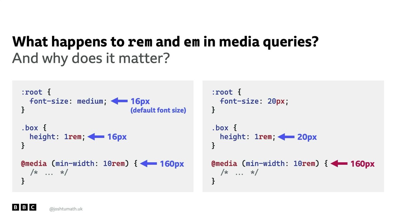
But now the default font size is 32 pixels. So 32 times two is 64. Same with if I used it in a media query. And in the media query itself, again, it would multiply the REM value in the media query. Now why do I talk about media queries? So there's an interesting quirk here with media queries.
So so basically what's going on behind the scenes is so the, in the browser's default style sheet, it doesn't set 16 pixels for the root font size. It doesn't happen in the browser's default style sheet. What's happening is in the initial value for the font property in CSS, The value is called medium.
You probably never use medium, but this is what the value is basically. So median pretty much always equals 16 pixels by convention. No one is saying it must be 16. But by convention, it is 16 unless someone does something in their settings to change this value. So that's what's going on there. If I set one rem, of course, you get 16 pixels.
And then that's the same in the media query. If I put 10 rem, well 16 times 10 is 160. That's great. But if you yourself change the root font size to say 20 pixels, Well, yes, the Oh, hello clicker. Oh. Come on PowerPoint.
Don't let me down. Come on. There we go. I lost focus and selected the text box instead. So yeah, you would get 20 pixels for that value. But, oh come on, don't do this to me. Don't do this to me. Don't fail on me now. Oh, for goodness sake. I have to click a little button now just to progress the slides. So yeah, you would get 160 pixels.
So what what's going on here? Why is it not 200 pixels as we would thought for the media query? Well, there's this little note in the meta media query specification. And it says this. So, oh, let me have a drink before I read this. So relative length units in media queries are based on the initial value, which means that units are never based on the results of declarations. For example, in HTML, the EM unit is relative to the initial value of the font size defined by the user agent or the user's preference, not any styling on the page.
So basically what that means is cry. So basically anything you do in user land or author land to change, to fiddle with any font relative units will have no impact on media queries. It will on Container Queries though, but not on media queries. So this is why we needed the meta tag.
We needed to be able to change the browser's default font size. We didn't just need to provide you as authors a way to set a new root font size. We needed to change the browser's default font size. So very excitingly, this is starting to be implemented in browsers now. So there is limited availability for this in Chromium browsers.
So Chrome, Edge, Vivaldi, and so on. Not yet in Firefox or Safari, so hopefully there'll be progress on that later this year. Really exciting to see this announced at Google IO, so shout out Brahmas wherever you are. Thanks to that Brahmas. Thank you. That was great. So yeah, it's great to be getting the word out on this.
So let's come to the really important part of this talk, which is how do we as authors test our own text scaling? Watch out. You're not gonna be happy with your website. So just to remind ourselves, we wanna make sure in the WCAG guidelines we are at least supporting 200% text size increase.
And when that happens, we don't want to cause the website to kind of scroll horizontally in the process of doing that. But here's the thing. We wanna do better than this. Because the fact is users can and do increase their text size by more than 200%. So at the operating system level, so there's different maximums on each operating system. So at least on Pixel devices, Android, it is only just up 200%, you can increase it.
On iOS devices, it's more. It's actually around 310%. On Windows, it's 225%. And on Mac OS, it's 350%, although it seems to have no effect anyway. And then of course on desktop browsers, I think they can go up to as much as I think 50 per 500% in Firefox and it'll be different in each browser.
But I haven't looked into it. But it is more than this and people do use that. So how do we test it on our desktop browsers? So we saw that desktop browsers do do this. They do support text scaling. So how can we kind of simulate what it would look like on your phone when you increase the text scale?
So this is how you do it on different browsers. So on Chromium browsers, you'll be able to dig through the appearance setting and you'll be able to find in there a setting where you can, on a slider, select the actual font size value that you want. As I showed you earlier on Firefox, you can tick the zoom text only setting.
And when you do that, that will, when you when you do stuff to zoom in, it will just increase the text size instead. So when you're pressing command plus, command minus, it'll just do that. And then also on Safari, it's kind of hidden on there. So you have to hold down the, I'm looking what it's called on my Mac keyboard, the option key and the command key and then press press press plus and minus, and that will actually just increase the text size.
So you'll see that in the the menu bar, the label changes to make text bigger. Suddenly I haven't made the text bigger for myself when I'm trying to read it. So let's imagine you are now a user on a mobile phone on some device. We often imagine that the smallest device width these days is often around 320 pixels. So I suspect you will probably are testing at that range when you test on mobile devices.
But the thing is, when a user has zoomed in by say 200%, so not even talking about text scaling right now, just zooming in. If they've zoomed in by 200%, then that effectively makes the viewport actually 160 pixels wide. So if you've, if you're still supporting like little feature phones like Nokia's, you're you're probably doing a great job here actually.
So yeah, basically what we wanna do is go on your viewport emulator setting on your favorite browser, increase that, decrease that down to 320 pixel width and then start to increase the text scaling. Double it. See what happens. So as you can see in this example here on the BBC Weather website in The UK, it's not looking good.
We've got the logo for weather overflowing at the edge of the page. And in doing so, it's also covering up the search bar. And thankfully the main content doesn't look too bad. But we can see the menu bar at the top starting to get a bit squashed. And if we went over 200, there would not be enough room for all of that stuff to fit horizontally.
So it's a bit of a problem there. So how can we make sure our websites work with text scaling? So what I'm gonna talk to you about now applies whether you're making a brand new website from scratch or whether you are trying to retrofit this in what you have now. And let's start with this. So make sure now, so if you are starting from scratch, don't do mobile first anymore.
Do mobile first with the tech scaled up. So think about it this way. Think about that user like Alex in the room here who has kindly modeled his hand for me in his phone in this photo. What, put your hand up Alex. Where are you? He doesn't want to embarrass. There he is. Look at look at Alex's beautiful hands there modeling this phone. So everyone's actually turned around so look at his hands.
So So yeah, so you can see an example here of where he's increasing the tech scale. And sure enough, we wanna make sure you are designing your website, thinking about those users who have scaled it up to the maximum first. Second thing is don't, try not to touch the default font size in your kind of CSS reset or whatever that you might do on your page. So if we just override the default text scale val, sorry the initial font size in the root element to say 10 pixels, just to make the maths a bit easier when you're calculating things, please don't set it to an absolute length value like pixels because that will just turn off any text scaling behavior.
So likewise, even if you're setting it to 16 pixels, we've got the same problem. What you could do is if you really want to do this, you could use a percentage value. So if you wanted it to effectively equal 10 pixels by default, then you could just set it to 62.5%. That's fine. But I recommend just not touching it all and just leaving the text scale as it is.
The next thing is to be very careful with how you use pixel units for layouts as well. So think back to that LinkedIn example we saw where the kind of main column there wasn't getting any bigger to accommodate that text size. So I've just made a simple website here. Nothing exciting. But of, I imagine, some sort of sport of pet Roomba wrestling. I just got very inspired by this image.
So let's say you're doing a standard website layout. You've got, say, your blog, your news article, whatever it is on a main column. And then you've got a sidebar column. So we all do this. You probably do something like this. Maybe you lay out a flexbox or grid and you have a media query value that, you know, maybe around 900 pixels, something like that, you that's when you display this sidebar.
But any viewport smaller than 900 pixels, you just have a single column layout. Well the problem is, when the user increases their tech scale, suddenly now everything gets a bit squashed in that sidebar. Doesn't have much room to breathe anymore. So maybe what you're tended to do is you now set the width of that sidebar using say rem units rather than the pixel units. And what ends up happening is like, okay, cool, great.
The the sidebar's gotten bigger relative to the text, but now the main content's being squashed. So this is why it's really important to start using these rem units in media queries. As So soon as we do that, the page is like, right, okay, I've only got enough frame at this text scale to have a single column layout.
So let's have a single column layout. And that solves the problem. Also, only, so when should you use pixel units? That's what we wanna know. Because it's not, we're not banned from using pixel units. There are very very legitimate reasons why you should use pixel units. And the way I generally advise people is so use those relative or proportional percentage units for sizing your content.
So we're thinking about text. We're thinking about maybe icons, maybe not icons. People have, people kind of debate that. But make sure your text at least is scaled with these rem units and your layouts as well. But when, so where it's appropriate to use these absolute length units like pixels is basically when you're setting stuff gaps, margins, padding.
So you can see here in this example where we've done that, you can see how we haven't increased the padding in these boxes. We haven't increased the gap in our grid layout. So that content just has that little bit more room to breathe. We're not kind of squashing it in with even bigger padding that takes up loads of room.
And then fifthly, so only use single column layouts on very small viewports. And when we say really small viewports, we're talking about those kind of feature phone sized ones. When, you know, if someone is using a normal mobile phone and they zoom in or they increase the text scale, as we were saying, they've effectively got a smaller viewport now.
So that's where even a simple single column layout just doesn't work for you anymore. So you probably have a card like this on your website. We call them promos in the BBC for some reason. But yeah, you can see here how there's just, you know, if we wanna have an image on the left and text on the right, there's just no room for that anymore.
There's, you can barely fit one word now in that kind of layout. So try and switch that to a single column layout on everything basically. The where, so when we do this, we've chosen like 300 pixels equivalent rather than three twenty pixels for the bit where we switch. And the reason for that is because a lot, probably realistically most users will only zoom in or increase the text scale a little bit. So when they increase it a little bit, like that's normally fine. They do still have a little bit of room for a two column layout.
It's when people start to increase it by 150%, 200%, that's where we need to do these kind of extreme measures. But generally for most people, that 300 pixel equivalent, whatever that is in units, breakpoint, that gives a little bit more breathing room there. But of course, if you're like using container queries everywhere, you don't have this problem. You're probably adapting based contextually on where your component fits within the wider layout anyway.
So you're gonna get the benefits of that anyway. So I mean if you just wanna scrap using media queries in general on your website and just really go for it with container queries, that's gonna help with these kind of scenarios as well. So finally, oh not finally. Sixthly, that's a word I don't use much. Is it sixthly? I don't actually know if that's the right word.
Be careful when setting fixed length values. So you might have heard this idea of intrinsic web design before or intrinsic layout. So always let the content dictate the height of something basically. So if we come back to this example on the Disneyland Paris website, we can see how they must have set some kind of fixed height white background for their navigation bar.
And it's because of this fixed height, when the text gets bigger, that's why it's overflowing. So all we need to do in that scenario is just not set a fixed height. You can either just not set a height at all or if you really feel like you need to set a height, then set a minimum height so that the the kind of background still expands to accommodate that content.
Now, shout out to Ahmed Shadeed, who's been a speaker here in the past. He's done this fantastic website which you might have heard of called Defensive CSS. So rather than me going into all sorts of little CSS tips on how you could make sure your content is intrinsically being laid out, just check out this website. It's fantastic. It's got loads of different tips on how you can do this in lots of different scenarios.
It's really look really beautiful website. Do check it out. Now just a small issue as well. Just a really small issue. Just watch out for massive headings. Because like if you're in a situation where like you've got big text anyway, such as typically a heading, like that heading is probably already big enough of the kinds of people who need to increase their text scale. So if we're making it super massive, we're back in this scenario again where there's only enough room for say one word on a line or, well I'm quite lucky in this example.
I don't seem to have anything more than a eight letter word. Because otherwise, if were talking about anti disestablishmentarianism, then we'd have a bit of a problem here. So you know, you can see here how the body text is still fine. But headings, it's not good. So here's what you can do.
There's lots of different techniques. I think in the CSS working group we want to find out more, find more built in ways of doing this. But this is what we recommend. So think about using some kind of formula to reduce the scale at which stuff gets bigger when it's a heading. Oh, don't take your photos yet because check this out.
If we're using CSS functions, wink wink, new feature, then you can build this in. But basically the idea is due to clever maths, if you do font size multiplied by whatever rate you want to increase the font size by, multiplied by the environment variable for the preferred text scale, minus one, then plus one, that the math's magic means that, you can tell I don't like math's can you?
The math's magic means that we can reduce the scale at which something increases. So say we are setting our level one heading, I can use this function, or I can do it myself. I don't need to use a CSS function of course. I can just copy and paste this. But it, you know, if you do this, you can set the size you want by default to be say Free REM.
And then what it will do is, say you want it to only increase by half the rate of normal. So now if I do this, oh gosh, I've got to do math now. Instead of it being 16 times three for pixel value, now it's gonna be 16 times three times 0.5. So, or something like that.
So that's good. No, I got the math wrong then. Anyway, basically, it will just serve the rate at which it scales. And it works really well at this. So yeah, do check that out. Have a play around with it. And then finally, just be ready to opt in to text scaling. So as we already saw, Chrome already supports this.
And also very excitingly last month, the MDN team added a really lovely article on MDN about how to use the text scale features. So Estelle, put your hand up. Thank you so much for all your hard work on reviewing that as well. And also Chris is not here who who wrote it as well. Thank you for that.
This is what I mean. CSS Day is great. You just get to meet the people who do this stuff. Isn't it so cool? It is cool, isn't it? So, yeah. Oh, didn't forgot to change my slides. So yeah, do check that out on MDN. And that's it. I'm done. Thank you very much. So please fix your tech scaling.
Josh, please bring your your liquid beverage and come and sit on the seat of interrogation.
Thank you. This is why I was terrified. National
treasurer's You've got sit there because the camera wants to pick you up and try and look at the camera.
Great.
Okay. Lots of questions.
Oh, no.
Yeah. Does the text scale meta tag work with hard coded PX font sizes? The answer's yes, I assume.
No. Not? It won't work with hard coded pixel font sizes. So any absolute units you set, like pixels, they will still stay at that exact unit. Whereas if you use font relative ones, then it will scale up. So if you think back to the example I had earlier where we had like padding or margins or gaps, we didn't want them to get bigger. We we still wanted them to stay the same size. So that's why we needed to set those with the pixel values.
Okay. Thank you. Julian opines scathingly. Are you serious about pixels from margins and paddings?
Oh, is that controversial? I'm very serious about this. You should use well, generally, it's contextual, but you should use generally pixel values or your favorite absolute value. You can use inches if you want or centimeters, I don't mind. But yeah, try and set those with the fixed values.
I agree. I agree. And Julian said, loves the talk by
the way.
Okay. Vadim, the the glamorous Vadim McKeev over there by Estelle, works for MDN. Thanks, Vadim. Vadim says, what's the metatech scale REMS strategy for now while Safari and Firefox are not yet supporting it?
Well, great thing about this is you don't need to like you're you're not gonna have to do anything differently, hopefully, Like once those browsers start to support it. I mean right now you can still do all these techniques to test your website well to make sure that the text is scaling and looking good on smaller devices.
So all those techniques are the same. And then you can start using the metatag now and things should work. You should at least get the benefits on Chrome. So Android users will benefit. And then once hopefully Apple and Firefox start supporting it as well, happy days.
Jake, what's the ETA in Firefox? Maybe this year. Nice.
I mean, they only gave us like their actual standards approval officially like this week. So we'll see. We we were waiting for us to put it in the in the WhatWG HTML spec as well. So now there is a PR going out for that as well.
Nice. CSS working group. They rock. Even more now that you've joined. Okay. Matt Anne says, when setting the root font size, you said don't change it. But can we do, like, clamp 12 pixels to VW 24 pixels? Is that a good thing to do, or do you still advise not mucking about with the root forms?
You say that slowly?
I can. I can even
That's let you really helpful. Oh, yeah. Gosh. When someone reads out code, it's so difficult, isn't it? And your brain's taking it. No. So the problem well, maybe. So but oh gosh. Fluid typography is absolutely brilliant isn't it? So if you want to set like a kind of default font size like that where you change the root font size, then you can do the clamp but make sure you're not using pixel I don't know. Make sure you're not using pixel values to clamp it.
Try and use rem values instead because some users like to decrease their font size as well. And so if you're setting a minimum clamp of say 16 pixels, those users won't get the benefit of that anymore. They're like why can't I reduce the font size on your website? So you could look into it a bit more, do a bit of user research. But generally I would yeah advise caution with that approach. But, yes, fluid typography is great.
Excellent. Okay. This is a long and involved question. Oh, no. So I can pass you the phone. Okay. It's about to run out of battery, and the USB thing doesn't work anymore, so it's gonna die. Shep writes, why was it decided to separate the opt in rule into HTML and not keep it inside the stylesheet, e.
G. Like a new rule?
That's a really good question as well. And we I think we did consider that as well. The reason why it had to be in HTML in the end is because really, there's nothing really going on in CSS to prevent this kind of correct behavior from happening. It's just, so I guess if you imagine a theoretical world where we create a new thing to replace HTML, we're not gonna need to set this meta tag anymore to make sure the text scale works. We'd probably just make that the default behavior.
So it's not really a CSS problem going on here. It's a bit like the debate around like when we set the viewport meta tag, should that live in HTML? Should that exist in CSS? And historically, well it's only for historical reasons again that things have worked out that way, why a meta tag. But I think the other issue is we don't really have like a standard way in CSS of setting default values.
I mean I think it was Brahmas actually who suggested the idea of having some way of doing it in CSS. That probably was an option, but again, it's probably one of those things where unfortunately it needs to be a metatag. We did consider other options, but to get that initial font size set properly, it needs to live in HTML land, unfortunately.
It's also like when the viewport meta tag first came out, and friends of mine wrote an at viewport CSS rule. But the trouble is with that is that kind of information needs to be given to the browser really, really early because it can affect the layout quite comprehensively.
Or even stuff like now when you're, downloading images of the pic like, the picture element, stuff like that. Yeah.
Okay. Two questions that are really, really taxing. I'm sorry about this.
Good. Should've done a longer talk, shouldn't I?
Don't worry I I did warn you.
Yeah. You
did. They'll make you look like a chump probably. But somebody called Nat asks, custard creams or bourbon? Oh, don't think.
Well, guess who asked this one?
Yes. I said somebody called Nat.
Are you listening to me? Well, yeah. That's a very good point. Might be having Nat's in the room. So I am religious about bourbon biscuits, and custard cream biscuits in The UK are awful. They just start. Sorry. So, yeah, bourbon biscuits are better.
Loser. Alan asks, is Salford actually worth visiting? No. There you have it. Don't go Salford, but do give it up for Josh Tuma.
Thank you.
People
- Ahmed Shadeed
- Bruce Lawson
- David Grogan
- Phil Rogers
- Vadim McKeev
Technologies & Tools
- Android
- Chrome
- Chromium
- clamp()
- Container Queries
- CSS environment variables
- CSS Grid
- Firefox
- Flexbox
- iOS
- Mac OS
- Media Queries
- preferred-text-scale
- rem units
- Safari
- text-scale meta tag
- viewport meta tag
- Web view
- Windows 11
Standards & Specs
- WCAG
- WHATWG HTML spec
Concepts & Methods
- Fluid typography
- Intrinsic web design
- Mobile first
Organisations & Products
- Appt
- BBC
- CSS Working Group
- MDN
Works
- Defensive CSS