Customisable and the friends we made along the way
Introduction and Bruce Swirsky's Pun Problem

Host Bruce introduces Jake Archibald with characteristic irreverence, prompting a gradual audience chant to bring him to the stage. Jake opens with an anecdote about the peculiar cognitive challenge of listening to Bruce tell stories — never knowing whether a long build-up will culminate in an elaborate pun or simply turn out to be a real life experience — illustrating the difficulty of being primed for the wrong kind of listening.

1993 and the Select Element's 33-Year Styling Dream

Jake traces the origins of the select element to a 1993 email exchange between Tim Berners-Lee and Dave Raggett, who proposed the input and select elements and — even before CSS existed — made developer control over select rendering his very first requirement. Jake then showcases Stylable Select now landing in browsers, highlighting practical demos by Adam Argyle and Una Kravets, and introduces his own programming language picker as the talk's running example.

Why Select Stayed Unstyled: Mobile Wins and Microsoft's Engine Switch

Jake explains why leaving select rendering as a browser implementation detail was initially validated — especially by the iPhone's radically different but device-appropriate picker UI, which demonstrated that platform control served users well. He then covers Microsoft's 2018 decision to abandon EdgeHTML for Chromium, explaining how engineers who joined the Chromium project initially improved select accessibility before being redirected to commercial products, though Microsoft has since become the second-largest Chromium contributor.

Developer Frustration, Open UI, and the Layering Challenge

Jake introduces Greg Whitworth's landmark developer survey, which confirmed that select was the most frustrating form control to recreate, having spawned an ecosystem of large, accessibility-questionable JavaScript libraries. Greg responded by founding Open UI — a W3C community group bridging the CSS Working Group and WHATWG — alongside Googlers Mason Fried and Joey Aja. Jake then frames the two distinct sub-problems of a stylable select: button and picker markup and styling, plus the picker's layering challenge, demonstrating how z-index solutions inevitably break under overflow:hidden.

Popovers and the Top Layer: A History of Breaking Out of Containers

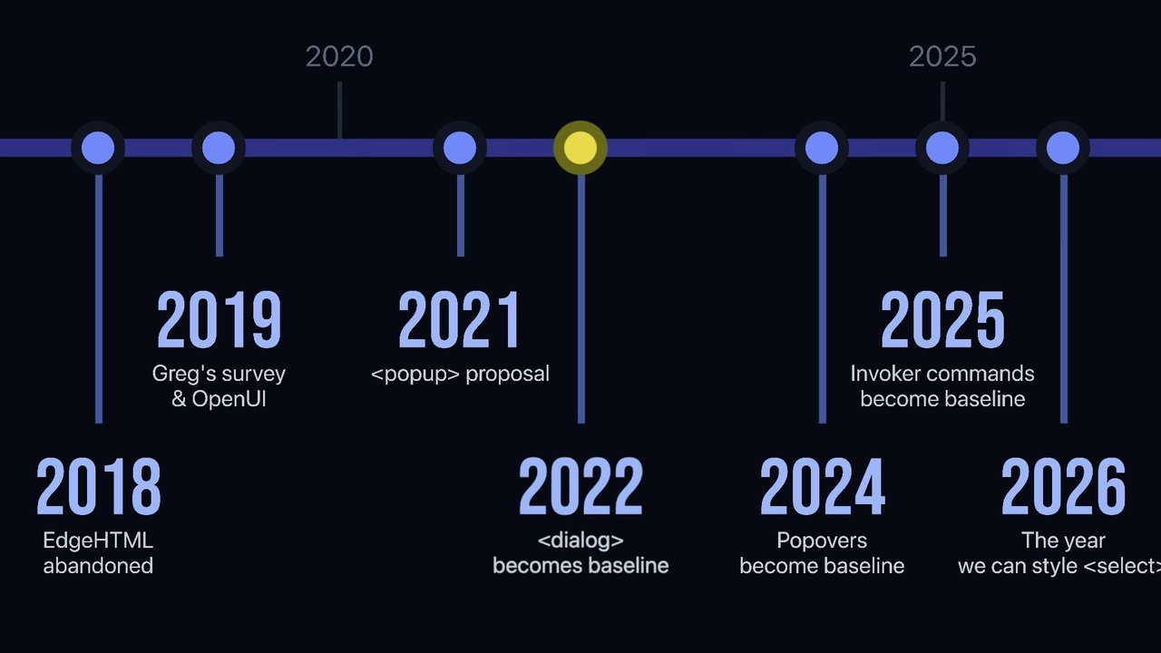
Jake covers the 2021 popover proposal by Melanie Richards and its journey to cross-browser baseline in 2024, explaining the popover attribute, invoker commands, and built-in behaviors like escape-to-close, outside-click dismissal, and focus management. He then traces the origin of the top layer concept back to the Fullscreen API in 2011 (developed at Mozilla and Opera), through the dialog element in 2022, to popovers — noting how each era's needs shaped a progressively more generic layering solution that view transitions have already had to extend further.

CSS Anchor Positioning: Attaching Popovers to Their Triggers

With layering solved by popovers, Jake introduces CSS Anchor Positioning — baseline in 2026 — as the solution to the picker's placement problem, crediting Tab Atkins, Elika Etemad, and Emilio Cobos. He demonstrates how anchor-name and position-area work together to bind a popover's position to its triggering button, including implicit anchor behavior via the command attribute. Jake then dives into the position-area grid model — a CSS-grid-like system extending from the anchor to the containing block — covering spanning, logical values, default alignment, and the new anchor-center value.

Building a Smart Dropdown: Dynamic Sizing and Viewport Fallbacks

Jake walks through building a realistically-behaved dropdown picker, covering anchor-size() for matching the button width, position-try for flipping the picker when it approaches the viewport edge, and the stretch keyword for adaptive height. He introduces calc-size() — needed because intrinsic sizes cannot be used inside min() or max() — to implement sensible minimum and maximum height constraints, producing a picker that shrinks near the viewport boundary before flipping. Jake notes calc-size is currently Chrome-only and recommends a CSS fallback for Firefox and Safari until broader adoption.

Anchor Positioning's Rough Landing and the Opt-In Mechanism Debate

Jake frankly discusses anchor positioning's unstable browser implementation — with demos breaking between Chrome stable releases just months apart and inconsistent behavior across all three engines — reassuring developers that confusion is the feature's fault, not theirs. He then recounts the multi-year debate over how to opt into a stylable select: Greg's CSS appearance:base proposal was initially rejected because it would have CSS trigger a DOM restructure; a new selectmenu element was proposed but pushed back on by Anne van Kesteren and Henri Sivonen who argued for progressive enhancement on the existing select; and ultimately a CSS-based opt-in was adopted, vindicating Greg's original approach.

Implementing Stylable Select: appearance:base and Core Styling

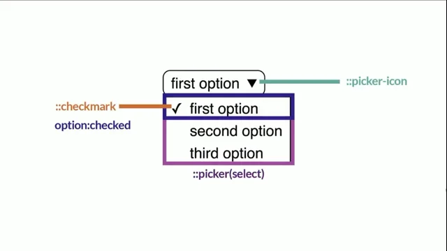
Jake demonstrates the final implementation: appearance:base select opts the button into custom styling, while a separate picker rule independently opts in the dropdown — enabling partial adoption such as styling only the button on smaller screens via media queries. He shows the picker's minimal but cross-browser-consistent default styles, demonstrates styling the picker icon using an animated CSS shape, and covers removing and replacing the default option checkmark using the :checked pseudo-class.

Rich Option Content, selectedContent Element, Option Groups, and Conclusion

Jake demonstrates the expanded content model allowing images and arbitrary HTML inside option elements, then introduces the selectedContent element — a uniquely auto-populating element that clones the selected option into the button for rich display, independently styleable via the cascade. He covers the option group label workaround using a legend element combined with the attr() CSS function (part of Interop 2026), and closes by listing the many platform features — popovers, anchor positioning, calc-size, invoker commands, discrete display animations, and more — that the stylable select story brought into existence, finally fulfilling Dave Raggett's requirement from 1993.

I've always had a good word for our next speaker. Unfortunately, the code of conduct and the law of libel forbid me from from repeating this word. He's quite shy. Earlier, I called his name when I was trying to introduce you to, browser vendors, and he didn't show.

Where were you actually, Jake? Well

I was having

a poo. Okay. So Jeremy Keith informs me that there's a way to summon him to the stage, and, let's hope it works. We're gonna start off really quietly and chant his name and just get louder and louder and louder because he's been working out.

He's a bit of an MMA guy these days. So it's by the way, it is Jank Architects. So Jank Jank Jank Jank Jank Jank Jank Jank. Jank. Jank. Jank architect.

Hurry up. Thank you, Bruce. That was lovely. Right. Let me get my windows in order. I was was thinking about Bruce at the pub last night, and I was realizing one of the He was there, so those are good reasons to be thinking about him. One of the things that I find really difficult, I would say, about talking to Bruce is quite often he's joker, as heard.

But he'll sometimes go on these long jokes that are just a sort of build up to an elaborate pun. So you'll start off and you'll say something like, did you know in my twenties, I was dating a girl from Cambodia who was a trapeze artist? I'm like, oh, fuck's sake. Okay. Yeah. So I followed her around in her traveling circus.

I yeah. Okay. And we had to go to Saint Petersburg, and I'm trying to figure out where the pun is going. I'm trying to beat him to it, you know, so I'm adding up all of the ingredients. But very occasionally then, the story will just stop, and I'll realize, no, this wasn't one of the pun ones. This was just his life experience.

And I And it's it's horrible because I then have to sort of because I'm not in the mindset of listening to the story. I'm trying to figure out the puns, I have to repause the entire conversation to to get back to talking, talking to him. Anyway, okay. That's not what I'm here to talk about. Gonna start with a fact.

The year is 2026, But it was not always so. For instance, it was once 1993. And in 1993, a man wrote an email. And this man was Tim Berners Lee.

He was looking to build out HTML too. Specifically, was interested in graphics, tables, and forms. He talked about adding a field element, and he got a reply from this man. This is Dave Raggett, who along with Tim is one of the people who shaped the early design of HTML. Now Dave wasn't too keen on this field element.

And instead, he proposed an input element for text input and a select element for choosing from a list of options. They didn't know it, but they had just invented ecommerce. A lot of the API laid out in this email is what we have today, but Dave made one thing very, very clear. The very first requirement he laid out for the select element was, as an author, I want control over how a selection menu appears.

The first time a developer asked to be able to style the Select element predated the Select element itself, predated even CSS. So Dave was going to have to wait a little bit for that one. But a mere thirty three years later and I checked on Wikipedia, Dave is still alive.

Stylable Select is landing in browsers. It's currently shipped in Chrome, but it's being actively worked on in Firefox and Safari. It's in preview versions of both of those browsers. Here's some demos. They just show the kinds of things that we couldn't do before. These demos are by Adam Argyle. You might have heard of him.

He'll be the star of the stage tomorrow. We've got images. We've got icons. We've got multiple lines of text. We couldn't do these things before. These are very practically useful demos, think, just nicely designed selects. We've got these ones by Unigravitz, you might have heard of her, another star of the stage tomorrow, showing the different kinds of layouts you can have. We've got a row here.

We've got a grid up there. It all builds up to this demo, I think, by Tamani. This lets you select a fruit if you can. There you go. There's no JavaScript here. This is just a select element in CSS. It's absolutely incredible. For the sake of this talk, though, I'm going use this as an example.

This is the one I've built. It's very derivative of Adam's examples, really. It's just a programming language picker. This is just a select element enhanced with CSS. There's no JavaScript going on here. And because of that, if you look at it in a browser that doesn't support these enhancements, you get this just regular usable fallback. It still works. So I want to cover not just how custom select works and how you can style it and how you can be used as an enhancement today, but just how we got there and the other features that we got along the way.

I'm not sure I can justify it taking thirty three years, but maybe it will become clear why it wasn't just a simple problem to solve. So back to 1993. Dave Raggett wanted control over how the select element was rendered. But the decision was made to make how it was rendered an implementation detail. And as a result, select elements looked different depending on what browser you were using, what operating system you were running.

And in many ways, was a good thing because the looks and interactions of the select elements were immediately familiar to users because it was what they'd already seen in their operating system. Although the interactions of all of these across the operating systems are all pretty similar, That would change in around 2007 with the release of the iPhone. It wasn't the first mobile device to display the web, but it marked the rise of smartphones being general consumer items, I think. The closed nature of the select element meant that smartphones could render them in a very particular way, radically different to what we'd seen before, ways that work much better for devices of that size. We've got the original iPhone skeuomorphic one here on the left, if you remember that.

The middle, we've got what Android does as a kind of overlay. And on the right there is a more modern iPhone, which is a little bit more similar to a typical Select, but still rendering quite different to how it appears on desktop. So this was seen as proof that the decision was correct, the strategy was correct. The developers didn't have control over this rendering.

Devices could do smart platform specific things, and that was a good thing. And that's kind of where things got stuck. For the next phase of the story, we need to travel to 2018, when Microsoft announced they would be abandoning their own Edge HTML rendering engine in favor of Chromium. Satya Natala, this is the Microsoft CEO.

He saw that they had a bunch of engineers working on browser stuff, but they weren't really making anything new. They were just constantly playing catch up. And he didn't feel this was an efficient use of resources when there's another engine out there that was open source that they could just use. But this wouldn't be Microsoft abandoning browser developments like they've been there before. They weren't going to do that again.

So they said that the engineers that were working on Edge HTML would now become significant contributors to the Chromium project. It didn't quite work out like that. This is a graph of Microsoft contributions to Chromium. Started off pretty good.

And then they thought, wait a minute, these engineers could be working on something we sell, like Teams or Office or something. And there we go. Although to be fair, things have gotten way better. And Microsoft is now the second biggest contributor to Chromium behind Google. So all's well that ends well.

But in this part of the story, we're actually in the first set of good times, Microsoft actively working in Chromium. Now Edge HTML was actually pretty good. It did some things that were better than Chromium, some SVG stuff in particular, some accessibility stuff, particularly accessibility around the select element. And Microsoft didn't want to regress on the engine.

They were switching engine. They didn't want to regress on things. So Microsoft engineers set about improving the select elements, particularly the accessibility. But then someone in leadership at Microsoft said, why are we doing this? I've looked around the web and no one's using the select element. So why are we spending time improving it? And they weren't far wrong.

The lack of a stylable select had led to an explosion of libraries that reimplemented the element, some of significant size and questionable accessibility. And that brings us on to Greg's survey. Meet Greg. This is Greg Whitworth. He worked at Microsoft at the time on the Edge team. And he wanted to dig into what was going on with the select element and form fields in general.

And he ran a survey. Some of you may remember it. And he found that the select element was the one most recreated by developers, but not by much. Folks were also recreating checkbox date pickers, radio buttons, that kind of thing. But you also asked developers which was the most frustrating, and that's where select won. Developers were frequently recreating checkbox and radio elements, but it's quite easy to do that. That's not true for date pickers and select boxes, and select is one of the things that comes up more often in designs. This convinced standards folks that this was a problem worth solving. Giving browsers control over the rendering of select had worked out to some extent, especially on mobile.

But the workarounds that developers were now using were ultimately compromising user experience and accessibility. So there needed to be some kind of middle ground where the browser provided the accessibility and the core interactions, but developers could style them to fit their needs. But it was tricky to find a place for that to happen, for that work to happen.

Because like styling, that happens in the W3C, the CSS working group. We've already talked about that. But form elements, they're an HTML thing, and that all happens in the HTML spec. That's the WG. So the nitty gritty work was going to have to be spread across not just two working groups, but two standards organizations. And how the specs work in between them is pretty different.

We've seen it a few times today. By the way, this is the new W3C logo. It's new last year, I think, came out. Some people don't like it. They look at the logo and say, where's the C? Where's the c in the logo? I'm like, yeah, sure. Okay. We've lost the c, but we've gained a big d, haven't we?

Actually, it divides people into people who can see it and those who can't. Let me If I spin it around, does does that can you guys can you see it now? A little peek behind the curtain. There was an internal consultation about this logo before it was released, where lots of people said, don't use this logo. It looks like genitals.

And WPC leadership, they actually had a good counterpoint. They said, no, it doesn't. Alright. And that was that. Anyway, where I was like, yes, Greg. So he knew that working between these groups was going to be hard and there needed to be some sort of bridge between them. So he started his own group. He started Open UI.

And that was formed in partnership with folks from Google and Mozilla. It became a W3C community group, which means people could join it even if they're not W3C members. So it attracted people from all over the industry that worked on this thing. But I will specifically call out Mason Fried and Joey Aja. They're both Googlers, and there's going to be many people involved in this process. But Mason, Joey, along with Greg were kind of the central characters in making this whole thing happen.

They took a look at this and they saw a series of challenges that would benefit from being solved independently. It's two separate pieces of UI for a start. The top part is the button. We call it the button because that's all it is really. You press it, stuff happens. And the bottom part we call the picker. Both of these have a markup and general styling problem to solve.

What will developers type into their HTML and what CSS things like pseudo elements and pseudo classes will be exposed. But the picker has some additional challenges around positioning and layering. And we're going to look first at layering. Take a mock up like this, where the user can choose what format a code example will be in or whatever.

If you were going to solve this, you might use a zed index based solution. And there we go. It will appear to work at first. But at some point, someone is going to add overflow hidden to something and break it. And this wasn't just a problem with custom select implementations, but all kinds of overlays. It was another problem that had spawned an entire ecosystem of libraries and hacks.

Again, some with questionable accessibility and performance. So we needed something to allow an element to stay where it is in the DOM, where it made sense for CSS and accessibility. But it needed to visually break out of its containers and render on top of everything. So a proposal was drawn up in 2021 by Melanie Richards, who was then at Microsoft.

And that was for a new element called the pop up element. This was iterated on. And in 2024, popovers became supported across all major browsers, along with invoker commands in 2025. They are commonly used together, so we're going to look at both. So here's a div.

To make it a popover, you give it a popover attribute. That's it, done. The original proposal was for a new element, but it ended up as an attribute that you can put on pretty much any element. This means the browser can look at the semantics of the elements and apply sensible defaults to the accessibility tree, which is a great thing.

I've used a div here, but you should use whatever fits best. And if there isn't a good fit, have a look at ARIA stuff, ARIA roles, attributes. You can use those too. Popovers, they are initially hidden. You can show them with JavaScript. But the best way is with a button. So there we go. There's a button, in case you didn't know.

I'm going to link it to the popover using the command for attribute and reference the ID. And then I'm going to use the command attribute, which says what I want to happen when the button is pressed. And in this case, it's going to be popover toggle. So we press the button, and the popover appears. There we go, all without JavaScript.

Now it doesn't look like much, but that's kind of great because it doesn't have any default styles that get in the way. It has some that in get the way. But it doesn't have many that get in the way. But you can style it yourself. It comes with default interactions as well. Like pressing Escape will hide the popover.

Clicking outside of it hides the popover. And all of this stuff is configurable as well, like showing one popover hides over popovers. Again, configurable. It has a smart handling of focus. If something has the autofocus attribute inside it or the popover itself has that, it will get focus when it appears. And when you close it, whatever had focus beforehand will get focus again, like just sensible defaults.

The browser also exposes a relationship between the button and the popover in the accessibility tree, which is one of the reasons it's good to use a button rather than just JavaScript, because that link up is really useful for screen readers. If you want a real deep dive into the accessibility of popovers, is the article you want. This is by Hidde de Fries, who's in here somewhere, and Scott O'Hara, who is not in here somewhere.

But this article is great. That's a QR code if you want to scan it. Scott in particular did a lot of the accessibility work around the standardization of popovers. This is the beer that Brahma sells me. Okay. The other thing that popovers solve is this clipping issue.

So if I wrap this popover in a container and I give that container width zero, height zero, overflow hidden, nothing changes. It doesn't impact the rendering. It's inside the container in terms of the DOM, which is great for the CSS cascade and accessibility. But it doesn't render inside the container. It renders in this different layer. It renders in the top layer.

And that renders after everything else and on top of everything else. But this wasn't a concept that was invented for popovers because things came before it. In 2022, the dialogue elements became supported across all browsers, which is similar to popover but for modal dialogues. It also uses the top layer to display on top of everything else and break out of containers.

It took a long time for this to become cross browser. The original spec and Chrome implementation had significant accessibility issues that took time to figure out. Work actually started on it ten years previously. This was back in 2012. It was specced by Ian Hickson, who also did the HTML5 spec. But even then, dialogue was not the first to need this top layer. There was another feature that needed to leave an element in place in the DOM but have it break out of all of its containers. And that came a year previously.

It's the full screen API. And that was developed by Robert O'Callaghan and Chris Pierce at Mozilla, along with Arna van Kestrin at Opera. So they were the first to need this extra layer, although they initially called it the Full Screen Element Stack. But they quickly realized, look, this is going be useful for more things, so we will give it a more generic name.

And that became the top layer. So my point is even these modern features that we get today are built on top of decades of platform development. Although, as we saw before, the problem with calling something the top layer is inevitably something else comes along, view transitions. And as Brahma said, we ended up having to add the topest layer, and there will be more.

We actually called it the view transition layer, which isn't as fun, right? But you can't have fun in the W3C. Except when it comes to logos apparently. I don't know. Okay, where are we at? Let's go forward in time again. So the popovers, they fixed a huge part of the problem.

Back to this mockup docs page, if this picker were a popover, which by the way is fun to say, if this picker were a popover, the picker would pop out. Although it wouldn't look like this. It would look like this. The top layer is position absolute starting at the top left of the document. And then the popovers themselves are position fixed with an auto margin, placing them right in the center of the viewport.

You can change that with CSS. Sure you can. But what we want here is a little bit more complicated. Popovers have solved layering, but we have a positioning problem. So back in 2021, Melanie Richards' original pop up proposal, she identified this problem and proposed a solution for it based on an anchor attribute. But this is a styling issue.

So the idea was developed in the CSS Working Group. And this feature is now known as CSS Anchor Positioning, which became baseline in this year. And I think it's the most complicated part of this story and one of the most complex yet powerful features to land in CSS for a long time. It's difficult to know who to credit for it, but I will call out Tab from Google, Elica from Apple, and Emilio from Mozilla.

They're kind of like the CSS working group trifecta. They do a lot of the CSS work. Not all of it, but a lot of it. So let's dive in. Let's go back to our simple popover example from before. If I give the button an anchor name, I can tell my popover to position itself relative to that button using the same name.

And I can say, position area top. Position yourself to the top of the button. And just like that, there we go. In fact, if a popover is opened via a button using things like the command attribute here, the button automatically becomes the implicit anchor for the popover. So this is enough. This does the job.

If the button moves visual position, either through animation or scrolling, whatever, that popover will stay anchored to the button. Now I know I said this stuff is complicated, and here we are with one CSS property solving everything. But there is a lot of implicit behavior packed into this. Watch what happens when I move the button towards the edge of the viewport. Click. There we go.

Oh. So it's not just solid absolute positioning. It shifts to stay visible in the viewport, which is kind of perfect, but it's just one example of the kind of magic that's hiding behind position area. So let's dive into that further. When you use position area, you are dealing with something very, very similar to a CSS grid.

Here's the grid. It extends from the anchor out to the containing block of the thing that you are positioning. So these are some of the values you can use to position things in particular cells. There are logical alternatives too. So you can say inline start, block start, which is the same as top left in this writing mode.

But yeah, all of these work. And as the anchored element or the containing block move around due to positioning, scrolling, animation, that kind of thing, that grid will change shape like this. Now each of these comes with default alignment within each cell. And here they are. That's the default alignments. But these are just using align self and justify self.

So you can alter that with CSS. Also like CSS Grid, you can span across cells. So if you wanted to position things here, this is top span left. There you go. You can even span across three cells. So this one's bottom. But this one has a new type of alignment as well because it's aligned to the top of the cell, but it's not centered within the cell. It's centered to the anchor.

And this is a new value, anchor center, that you can give both justify self and align self. But again, that's just the default. You can do other things with it. Alright, let's get back to our code from before. Here's where we're at. But let's make this work for something that looks a little bit more like a select dropdown menu kind of thing, a picker.

I'm gonna position it to the bottom, spanning right. There we go. But if I have less content in my popover like this, it's okay but could be better. I could do this. I could say I want the minimum width to be the anchor size width. This is a new function in CSS. When I do that, there we go.

So it will expand to be the size of the anchor. Starting to get somewhere. Alright, instead of using this popover thing, let's bring in the picker from before, the kind of we had. This looks Okay. But watch this. So as we saw before, the positioned element moves to stay within the viewport. It's good that it keeps the picker visible.

That's a good thing. But it kind of obscures the button, which isn't great. But anchor positioning has a solution for this as well. Position try. So here what I'm saying is if there isn't room for the popover, try flipping everything on the block axis. And the result? There we go. Wee. Move it back up. There we go. Excellent.

But I can enhance this further. Instead of the picker flipping as soon as it hits the bottom of the viewport, we can get a little bit more dynamic with the height of the picker. What I'm about to show is what I consider to be the very common basic set of height constraints that you would have for a dropdown menu or a select picker.

I mean basic because of how common I think it would be. That's a pattern that we'll end up using a lot. It's not basic in terms of CSS, so strap in. Alright, first up, rather than the menu being this static size, I want it to be able to shrink a bit when there's not enough space. So if I were to give my picker a height of stretch, which is a new keyword, this would happen.

So it stretches to fill the cell that it's in vertically anyway. This is Chrome only right now, but there is an old WebKit value, WebKit fill available, which works in Safari and Firefox. But I don't actually want this behavior because I want the picker to be its content height usually. So I will make this the max height.

And there we go. And with that in place now, as I get to the bottom of the viewport, it shrinks. But it's kind of hard to tell that that's actually happening. The only thing that sort of gives it away you might not have noticed it. You might have thought it was just overflowing the viewports, but you can kind of tell by the rounded corners that it isn't. But that is not really good enough.

So to fix this, I going to add a margin to the bottom. And there we go. It just lifts it up a bit. Although the popover has now got too small to use, this is a bad user experience, so the solution is probably what you would expect. I'm going to give it a minimum height. So here we go with the minimum height.

It shrinks a bit, and then it flips. There we go. But watch this. Up at the top, there we go. It works again. The surprising bit though is that the margin has worked. Flip block has this weird magic about it that it doesn't just flip the position, it flips a load of other values as well. So our margin bottom there has become a margin top.

This happens with some CSS properties and not with others. Good luck. So we have introduced a bug here. Let's say our menu only has two items. This doesn't look right. We would want it to be the height of the two items. The thing that's making it not the height of the two items is the minimum height that we've asked for.

What we really want is something like this, where we say, I want the minimum height to be whatever's smaller, the content size or this rem value that we've picked up. This doesn't work because you can't use intrinsic sizes in like this, in min functions like this. But you can use them in calc size. Calc size takes an intrinsic size as the first argument, like min content in this case.

And then in this second argument, you use that value. It's renamed itself. It's now size. But you use it in a calculation and that works. And there we go. That's the problem solved. But there's one more problem we want to solve here. If I add a bunch more items to the picker, like loads, it has got too long.

Is not a great user experience. We add more, if you are on a really tall screen You might have experienced this before with some country pickers that use just a normal select. Like, it fills the entire screen, especially if you're one of those freaks that has your monitor in portrait mode. We know you're out there walking among us.

So the solution to this is kind of as you would expect. We should apply a max height, but we already have one of those. It's the same problem we had before, exactly the same problem. We want two values for the max height. So the solution is the same. We use calc size. So again, I'm saying I want to calculate size, but I want to think about the stretch size.

And I want whichever is smaller, the stretch size or 25 rems or whatever we want to pick as our more static size. Problem solved. We now have a popover with sensible minimum and maximum sizes. So here we go. It goes to the bottom screen, shrinks a bit, flips, ta da, and then up to the top of the screen, the opposite will happen. And there we go.

Calc size is Chrome only right now, and it looks like both Firefox and Safari will ship custom select without calc size included. So you can either polyfill that with JavaScript or just put a kind of not quite as good, but reasonable fallback in your CSS. And then as calc size is adopted by more browsers, they'll pick up that better behavior.

Like I said, anchor positioning is a really deeply complicated feature, and it has had a rough landing in browsers. These slides are running in Chrome because I'm wanting to show demos of things that aren't in Firefox yet. I gave a shorter version of this talk back in March. And when I went to update my slides and add stuff for this one, two of my demos here were broken.

And this is running in stable Chrome. And it's only a couple of months. And things have changed in stable Chrome. That meant my demos became broken. They weren't super complicated things. This is a feature that landed in stable Chrome in 2024. But as a feature itself, it is not stable. Shit keeps changing, you know? When I was investigating one of the issues that I found on my slides, I found two more bugs.

In Sara's talk before, you see where the select picker was appearing in the wrong place compared to the select? Was that a custom select? Do you know we were using base select styles on that? Was it just a standalone? Oh, okay. I thought that might have been part of the same bug, because I've seen those kind of mispositionings happening as well.

But I often run into basic examples, not trying anything crazy, just doing what the thing was designed to do, where you get a different result in Firefox, different result in Safari, different result in Chrome. And the spec is really complicated too, so it's really hard to figure out which browser is right, if any of them. I'm not saying this to shit on Chrome or the standards process, although maybe a little bit.

But mostly just to say that if you try and use anchor positioning and it makes you feel stupid, frustrated, or confused, it is not you. It is going to take years for this to get fully stable, especially across browsers. But still, if you persevere with it, work around the bugs, you can do cool stuff with it. Yeah, just be aware that some of the articles you read have been carefully written to avoid those bugs.

It makes it look like, well, like I did here, just do this, just do this, just do this. But that is not how the author of that article or the author of these slides actually found it. Okay, we are getting somewhere. Popovers have solved layering, and anchor positioning has solved the positioning problem. Now we just need the rest to tie it all together, basically the markup and the CSS for a Styleable Select.

Now I'm thirty minutes into a forty minute talk on Styleable Select and I'm only just getting to the select part. But that's mostly because all of the complexity is in popovers and anchor positioning. We just need to bring it all together. The first thing to solve is how do developers switch from the unstylable select to the stylable one, because we can't just break the existing selects out there.

One suggestion was made back in 2021. It was by our friend Greg. He'd left Microsoft at this point. He was now working at Salesforce, but he was still doing little bits of web standard stuff in his spare time. This was his proposal. This was actually part of customizing checkboxes, but the mechanism was intended to be general. So in CSS, you would do something like appearance base, and that would opt you into a generic cross browser, cross platform styling that developers could then alter using the full functionality of CSS. And this was put before the CSS working group.

And representatives from Chrome, Safari, and Firefox gave the idea a resounding no. They didn't like this idea. They didn't like it because of how browser engines typically work. In browsers, you have a DOM tree and that gets styled with CSS and that gives you a render tree. But the render tree can have significant differences to the DOM.

For example, pseudo elements, they can introduce new boxes that are in the render tree only. They're not in the DOM tree. A single DOM node can be split into multiple boxes in the render tree due to things like page breaks, column breaks, like fragmentation, that kind of thing. Parts can be entirely missing from the render tree due to display none. The problem is in these days, modern browsers, form controls are built using DOM, specifically internal Shadow DOM.

In Firefox and Chrome DevTools, you can hit a mode and you can go and investigate that internal Shadow DOM. And because appearance base was going to change the structure of the select elements, CSS wasn't just styling the DOM. It was triggering a different DOM. And then that different DOM would then have to go back through CSS. Things were bouncing between these two models.

It was no longer a linear process, which didn't really work with how browser engines were designed. So instead of that, work began on the select menu element. And this would be a clean break, a new element without legacy parsing or styling issues. But then in 2023, there was pushback. And that pushback came from Ana van Kestrin at Apple and Henry Sivinan from Mozilla. Not the first time I've mentioned Arna.

Last time I mentioned him, he was at Opera. He's now at Apple. I know it's confusing when people go to work for another browser and basically do the same job. Anyway, Arnav and Henry, they pushed back on this select menu proposal. They felt it didn't really justify a new element. They said it would be better to go with a solution that would be a progressive enhancement on top of the existing select element.

So plans changed. Instead of a new element, stick with select, but an attribute or something like that as an opt in. And this would work fine for how browsers were built. The idea of an attribute triggering a different DOM, that happens. That happens in lots of places. That's kind of how you build a web component as well.

But then in 2024, Anna pushed back again, saying this attribute is the wrong solution. This is a styling problem. Styling happens in CSS. Making the switch happen in CSS is going to be harder for browser developers, but it is going to be ultimately better for web developers. And he was absolutely right. The CSS Working Group had to think about it, and thankfully they overturned their previous decision, which is great.

So let the record show that Greg was right all along. Good news for us is, as of this month, Greg is back at Microsoft working on web platform stuff, so we should listen to him a bit more, I guess. Welcome back, Greg. Alright, let's put this all together. Here is a select element, just usual as they come, wherever.

It looks like this. If you open it, it looks like this on a Mac anyway, scaled badly because of the high resolution screen, whatever. To make it a custom stylable select, we opt in with appearance based select. Now it looks like this. But if you click it, you still get the default picker.

If you want the stylable picker, you need to include this. You need to tell the picker to be base select as well. And now the picker looks like this. It looks kind of bad. But it's designed a little bit like popovers to have just basic functional defaults, and they're fully defined in the spec so it will be the same across browsers, across platforms.

And you can take it from there with CSS. It's kind of cool that you can just opt into one part of it as well. You can just opt into styling the button and leaving the picker as it is. And you can even make styling the picker conditional, like in a media query, for instance. If it doesn't look like there's going to be enough space for your custom picker, you can just customize the button and leave the device to do its normal thing for the select, like those things we saw with mobile devices before.

The picker is a popover. You can style it as you would any popover. It has the interactions of a popover. It interacts with other popovers as a popover would because it is a popover. It uses anchor positioning to position itself. You can use anchor positioning properties to adjust the positioning. If I make my picker display flex, which you should only do when it's open because otherwise you're overriding the default display none for when it's closed, now the options go sideways.

Great. I could even rotate them a bit. Look, it looks shit. My point is that you can throw whatever CSS you want at it, and it just works as if you were styling any other element. So I'm not here to teach you basic CSS. Know how to make a couple of boxes that look like that into that. It's just backgrounds and borders, right, and a starting style animation there. But let's look at a few things that are very particular to Select. We've got the picker icon here.

The picker icon is the arrow in the button. Now you can do what you want with that. I have replaced it there with a different, but almost the same arrow, but created with a CSS shape, which means I can animate it. Watch the arrow. Watch, watch, watch, watch, watch. There we go. Again. There we go. It is actually a diamond shape, but I am just moving the outer two points up and down, which is great fun, great fun. Look, there we go.

All right, enough of that. There is also the option check mark, which is kind of this dorky looking tick that you see on the selected option there. You can restyle it or you can hide it. I am going to hide it, Instead, I going to use the checked pseudo Class on the option element there. I can create a design like this, easy peasy.

But one of the major changes to select is in the parser. Previously, you were only allowed options, option groups, and HR elements inside the Select. But now you can have divs, too, just divs. But they become part of the picker, so you can use those for styling purposes, wrapping everything in them, whatever. But the bigger change is to Option Elements, which now allow pretty much any element inside them.

So yeah, I'm going to throw in some images in there. Great. So now it looks like that. And if I select CSS, click, there we go, the button now displays CSS. But it doesn't have the icon in there. So by default, what will happen is for the button, it will take on the text content of the option you selected, so not the image as well.

But you can change that. If you include a button as the first child of the select, it takes over the rendering of the selected item. So it would look like this. Great. You can put whatever you want in a button, images, all sorts, that kind of thing. It feels weird putting a button inside a select. It is not something we've done before, but this is fully supported.

It doesn't get announced differently to a screen reader. It doesn't get announced as an additional button. Screen reader will just see a combo box, which is what the ARIA for a select element is. So in terms of accessibility, it will get the announced value of the combo box. And that only supports text, which is an important detail.

So in my button, if I put an image in there and I put an emphasis tag and I put some text, whatever, it will render like this, which is great. But the screen reader will just hear, cats are amazing. It won't hear the emphasis on R because it loses that semantics. It's just given the value as text.

So keep that in mind when using a custom select. But the best thing to do is to look at accessibility DevTools. We've got them in Firefox or in Chrome as well. And it will show you how this stuff is being exposed to a screen reader. Alright, now you've got your button, which you can update with JavaScript. But this isn't JSDay, so I'm going to use a new element. I am going to use the selectedContent element.

This is kind of weird and unique. This element is populated with a clone of the selectedOptionsContent. It modifies its own DOM. It's not a shadow DOM thing or anything like that. It's light DOM. It's inner DOM. It just replaces it, which is really unusual. There's not really any other element that does that, which means you have a copy of the selected option that you can style however you want. I've styled it exactly the same here, but you could use the cascade to style it differently when it's in the button to when it's appearing in an option, just using regular CSS selectors.

If I select a different option, say SVG, click, there we go, the selected option clears itself out and adds a clone of the new selected option there. Cool. It just kind of works, even though it's weird. All right, the last thing I want to talk about is option group. They work, but they look bad. And you cannot restyle those labels.

You just can't. But there is a fix. You can add a legend element in there, and that takes over the rendering of the label. And once you do that, you can put whatever you want in there. You can put images and such in there and it will render in place of the label. But I'm happy with just text in my label.

I'm going to keep it as a label attribute, as a nice fallback. But I'm also going to be a little bit lazy. So what I'm going to do, I'm going to use the ator function in CSS to write the label attribute to a label custom property in the option group. And then in the legend element, in the before suit element, I'm gonna read that back and output it as content.

And that works. And I can now style it however I want. And this is new behavior. The Atta function's been around for a while, but the particular way this works, the kind of order of operations, is new. This is in the new part of the Interop twenty twenty six behaviors for Atta. It is only spot in Chrome right now, but it is behind a flag in Firefox and it will arrive in Safari as well. I know they are working on it.

It will definitely land this year because it is part of Interop twenty twenty six. And that is about it, really. It was a dream that started way back in 1993. Whole browser engines have come and gone in that time. Foundational concepts have been added to the platform.

We have popovers. We've got CSS anchor positioning, CSS starting styles, discrete animations on the display property. We can do show and hide animations, container queries, scroll queries, anchor queries, invoker commands, animating to height auto, calc size, all features that were part of the customizable select story in some way, but can be used independently. And then there's the new content model for the select itself. It took thirty three years to fulfill a requirement that was laid down in the very first select proposal, but we are finally there. Almost. Now we just need to do multi select.

That's a story for another day though. Thank you very much. Cheers.

Customisable <select> and the friends we made along the way

Jake Archibald

.css-day {
  date: 'June 11 & 12 2026';
  location: 'Amsterdam'
}
#identifier-sponsors {
  Google AG Grid
}

selector-sponsors {
  Polypane
  9ELEMENTS
}
CSS DAY logo made of white rectangular blocks. Black and white photo of Jake Archibald, a man with short hair, smiling and gently touching a small plush fox with his right hand.

LESS IS MORE

.now {

17:10 | Jake Archibald

A slide with the CSS DAY logo in the top right. A bottom bar features the Google logo, AG Grid logo, and an X icon.

.now {

17:10 | Jake Archibald

.now {

17:10 | Jake Archibald

Google

AG Grid

CSS Day logo.

Google logo.

AG Grid logo.

.now {

17:10 | Jake Archibald

.now {

17:10 | Jake Archibald

A slide with the CSS DAY logo in the top right. A bottom bar features the Google logo, AG Grid logo, and an X icon.

.now {

17:10 | Jake Archibald

CSS Day conference logo.

.now {

17:10 | Jake Archibald

.now {

  • 17:10 | Jake Archibald
Logo for CSS DAY in the top right corner.

.now {

17:10 | Jake Archibald

.now {

17:10 | Jake Archibald

CSS DAY

Sponsors: Google, AG Grid

A slide displaying a schedule entry for a speaker. The top right corner features the stylized 'CSS DAY' conference logo. The bottom banner of the slide contains the Google logo and the AG Grid logo.

.now {

17:10 | Jake Archibald

.now {

17:10 | Jake Archibald

The slide header includes a stylized "CSS DAY" logo on the right. At the bottom, there are logos for Google and AG Grid, and an icon resembling an 'XI' symbol.

.now {

CSS DAY

17:10 | Jake Archibald

Sponsors: Google, AG Grid

Stylized text logo for CSS DAY.

Google logo.

AG Grid logo.

.now {

17:10 | Jake Archibald

.now {

  • 17:10 | Jake Archibald

The slide features a CSS Day logo in the top right corner. Google and AG Grid logos are present in the footer section.

.now {

17:10 | Jake Archibald

Logo for CSS Day in the top right corner.

17:10 | Jake Archibald

A black cat sits by a glass door, looking back at the viewer, with a pair of shoes next to it.

you start with

An image of a black cat with green eyes sitting on a mat in front of a glass door, looking over its shoulder. To the left of the cat are a pair of dark hiking boots, and to its right are some lighter-colored slippers. A garden with plants and a wooden fence is visible through the glass door.

Fun fact:

AV people hate it if you start with a blank slide

An image shows a brown cat looking out a window. Outside, a patio with a wicker chair and plants is visible.

Fun fact:

AV people hate it if you start with a blank slide

2026

The year

Timeline 1990 - 1995

A horizontal blue line representing a timeline with vertical markers for the years 1990 and 1995.

Recommendations for HTML

A photo of Dave Raggett next to a screenshot of an email.

Improvements on HTML...

From: Tim Berners-Lee (timbl@www.cern.ch)

Date: Tue, 8 Apr 93 17:48:26 GMT

A portrait photo of Dave Raggett on the left. On the right, a screenshot of an email from Tim Berners-Lee with the subject "Improvements on HTML...".
  • Next message
  • Previous message

search strings

There have been a few

  • Various forms of it
  • Tables
  • Forms

I think we should ge
onto this list. This w
new thing, which w
implement it.

It is important that t
HTML spec is shift
enhanced format m

The new format sho
thing it should incl
which is really a

A split image showing two individuals. On the left, a person with brown hair is partially visible against a textured white wall. On the right, a man identified by the speaker as Dave Raggett, wearing glasses, is shown in a close-up against a plain light background.

HTML

  • [ ] author ]
  • "...T100 etc..."
  • an HTML2 out
  • How to nest OL or UL in the... in UL within a DL list effectively?
  • ...ard we should aim to provide a range of examples for forms.
  • nearest OL or UL in the
  • in UL within a DL list?
  • effectively?

...rd we should aim to

  • ...d a range of examples.
  • ...r forms:

...part the

EN=40 </FIELD>
  • ...suggestion for forms?
  • ...ms based interfaces
  • ...range
  • ...ge
  • ...ay menus
  • ...menus
  • ...le lists
  • ...an expenses claim),
  • ...be handled by the
  • change
  • many menus
  • simple lists
  • (an expenses claim), be handled by the scripting language.
  • way to highlight on to that field.
  • label. An accompanying help text.
  • groups of fields, that you should change the fields with a darker colour background colour when they are has no effect.
  • menu appears. When there are there are lots of those drop-down button and a box Clicking on the with the current
  • and one for selections. HTML tags, so that you and tight control over
A geometric pattern composed of dark rectangular blocks arranged in a grid-like design on a light column, illuminated by purple light from below.
An abstract geometric pattern composed of dark, interlocking rectangular shapes against a light background, illuminated by a purple light from below.
A geometric pattern composed of various sized rectangular blocks arranged in a grid-like structure, illuminated by purple light.

Screenshot of early discussion on the HTML select element

Screenshot of a document or email snippet with partially visible text on the left side of the slide.

Timeline: 1990 to 1995

  • 1993: <select> proposed
A timeline graphic shows the years 1990 and 1995, with a marker at 1993.

2015

2020

A horizontal blue line acts as a timeline, with the year 2015 positioned on the left and 2020 on the right.

2026

The year we can style <select>

Timeline range: 2025-2030

A timeline graphic spans horizontally, marked with the years 2025 and 2030. A highlighted point on the timeline, located between 2025 and 2030, has a vertical line extending downwards.

2026

The year we can style <select>

A timeline is displayed horizontally with markers for 2025 and 2030. A yellow circular marker on the timeline at 2026 has a vertical line extending downwards, pointing to the text "2026".

The year we can style <select>

A conceptual diagram showing a flow from a light source above, down a vertical line, to a styled HTML select dropdown component displaying options with icons and multiple lines of text.

Custom Select Input Demos

Three UI demos showing custom-styled select inputs: a button with an 'Urgent' label, a status selection menu with options like 'Published' and 'Scheduled', and a list of people's names with profile pictures, where 'Priya Sharma' is selected.
A slide demonstrating various user interface elements. The top left shows a dropdown menu with options: 'Reply' (with a curved left arrow icon), 'Reply all' (with double curved left arrows), and 'Forward' (with a curved right arrow icon). The bottom left shows a yellow thumbs-up emoji inside a light gray circle, with a mouse cursor hovering over it. The top right shows an input field with the label 'Where' and the placeholder text 'Everywhere'. The bottom right shows a circular profile picture of a woman with dark hair, smiling slightly against a dark background with blue and purple lighting.
A popup menu shows options: Reply, Reply all, and Forward. The 'Reply all' option is highlighted, with a mouse cursor pointing to it. Below this, a red heart emoji is shown with a mouse cursor pointing to it. On the right, a text input field is labeled 'Where', with 'Italy' entered as text and a mouse cursor next to it. In the bottom right, a circular profile photo of a woman with dark hair is displayed.

Select Your Fruit

A green button with rounded corners labeled 'Select Your Fruit'. An illustration of a person wearing a baseball cap and jacket is in a white circle in the bottom right corner.

Programming Language Picker

Currently displayed selection: HTML

Markup Languages

  • HTML (highlighted)
  • CSS
  • XML
  • SVG
  • Markdown

Scripting Languages

  • JavaScript
  • Python
  • Ruby
  • PHP
Screenshot of a custom dropdown menu for selecting programming languages. The menu is expanded, showing "HTML" as the currently selected language, with categories for Markup Languages and Scripting Languages.

Programming Language Selector

Currently selected: HTML

  • MARKUP LANGUAGES
  • HTML
  • CSS
  • XML
  • SVG
  • Markdown
  • SCRIPTING LANGUAGES
  • JavaScript
  • Python
  • Ruby
  • PHP
Screenshot of a custom dropdown menu for selecting programming languages, with the menu expanded and a mouse cursor hovering over the SVG option.

Programming Language Picker

Currently selected: HTML

Markup Languages

  • HTML (selected)
  • CSS
  • XML
  • SVG
  • Markdown

Scripting Languages

  • JavaScript
  • Python (hovered)
  • Ruby
  • PHP

Screenshot of a custom select dropdown menu, expanded to show programming language options. The top bar shows "HTML" as the currently selected language. The expanded list is categorized into "Markup Languages" (including HTML, CSS, XML, SVG, Markdown) and "Scripting Languages" (including JavaScript, Python, Ruby, PHP). "HTML" is highlighted as selected, and the mouse cursor is hovering over the "Python" option.

HTML

SCRIPTING LANGUAGES

  • PHP
  • Perl
  • Lua
  • Shell
  • PowerShell

TRANSPILED LANGUAGES

  • TypeScript
  • CoffeeScript
  • Babel
  • Elm
A user interface component displaying a programming language picker. "HTML" is currently selected. The picker shows a list of options categorized into "Scripting Languages" (including PHP, Perl, Lua, Shell, PowerShell) and "Transpiled Languages" (including TypeScript, CoffeeScript, Babel, Elm). A mouse cursor hovers over "CoffeeScript".

Programming Language Picker

Selected language: HTML

Transpiled Languages

  • TypeScript
  • CoffeeScript
  • Babel
  • Elm
  • ReasonML
  • ReScript
  • Haxe
  • Dart

Compiled Systems Languages

  • C C
Screenshot of a custom dropdown menu interface element. The element shows 'HTML' as the currently selected option, with an icon next to it. Below the selected option, the dropdown list is expanded, displaying categories of programming languages: 'TRANSPILED LANGUAGES' and 'COMPILED SYSTEMS LANGUAGES'. Each language listed (TypeScript, CoffeeScript, Babel, Elm, ReasonML, ReScript, Haxe, Dart, C C) has a distinct icon or logo next to its name.

HTML

Screenshot of a dark-themed user interface element, identified as a programming language picker. It shows a list of items below an "HTML" label, categorized into "COMPILED SYSTEMS LANGUAGES" (including Rust, Go, Zig, D, Vala) and "JVM LANGUAGES" (including Java, Scala, Kotlin, Clojure). Each language has an associated icon. A mouse cursor is positioned over the "Scala" item. A vertical scrollbar is visible on the right.

HTML

JVM LANGUAGES

  • Groovy

FUNCTIONAL LANGUAGES

  • Haskell
  • OCaml
  • F#
  • Elixir
  • PureScript
  • Prolog

WEB FRAMEWORKS & LIBRARIES

  • React
A screenshot of a custom dropdown menu interface. The menu shows categories of programming languages and frameworks. "HTML" is displayed as the currently selected item at the top. Below, categories like "JVM LANGUAGES" list "Groovy", "FUNCTIONAL LANGUAGES" lists "Haskell", "OCaml", "F#", "Elixir", "PureScript", and "Prolog", and "WEB FRAMEWORKS & LIBRARIES" lists "React".

HTML

Markup Languages

  • HTML (checked)
  • CSS
  • XML
  • SVG
  • Markdown

Scripting Languages

  • JavaScript
  • Python
  • Ruby
  • PHP
  • Perl
  • Lua
  • Shell
  • PowerShell

Transpiled Languages

A screenshot of a dark-themed dropdown menu displaying a list of programming languages, categorized into Markup Languages, Scripting Languages, and Transpiled Languages. SVG is highlighted within the Markup Languages section.

2026

The year we can style <select>

A timeline showing years 2025 and 2030, with a vertical line pointing down from 2026, highlighted by a green circle on the timeline.

1995

2000

A horizontal blue line spans the slide, indicating a timeline with the year 1995 on the left and 2000 on the right.

1993

<select> proposed

A timeline runs from 1990 to 1995, with 1993 highlighted by a yellow circle and a vertical line extending downwards.
  • Markup Languages
    • HTML
    • CSS
    • XML
    • SVG
  • Scripting Languages
    • JavaScript
    • Python
    • Ruby
This slide displays multiple visual variations of a dropdown menu (select element) in both closed and open states, showcasing different styling and interaction designs, including items being selected or highlighted.

HTML

  • Markup Languages
  • HTML
  • CSS
  • XML
  • SVG
  • Scripting Languages
  • JavaScript
  • Python
  • Ruby
Screenshot of a dropdown menu displaying categories for Markup Languages and Scripting Languages. The item 'XML' is highlighted in the list.

Timeline: 1995 – 2000

A timeline depicted as a horizontal blue line, with the year '1995' at its left end and '2000' at its right end.

2007

iPhone released

A timeline graphic spanning from 2005 to 2010, with a yellow marker highlighting the year 2007.
Three screenshots illustrating the different native renderings of an HTML select element on mobile devices. The left image shows an older iOS style with a skeuomorphic bottom picker containing 'HTML' selected from 'Markup Languages'. The middle image displays an Android-style overlay showing 'HTML' selected via a radio button from a list of 'Markup Languages' and 'Scripting Languages'. The right image presents a modern iOS bottom sheet picker with 'HTML' selected via a checkmark from 'Markup Languages'.

Comparison of Select Element Rendering on Mobile Platforms

Three mobile user interface screenshots are shown, illustrating different renderings of a select element or list picker. The left screenshot depicts a skeuomorphic design, characteristic of an original iPhone, displaying a dropdown with "HTML" selected and a list of "Markup Languages." The middle screenshot shows an Android-style full-screen overlay picker with two sections: "Markup Languages" (including HTML, CSS, XML, SVG) and "Scripting Languages" (JavaScript, Python, Ruby), each with radio buttons. The right screenshot presents a modern iPhone rendering of a similar list, where "HTML" is checked with a checkmark, showcasing a cleaner, flatter design.

Timeline from 2015 to 2020.

Key point: 2018.

A timeline diagram features a horizontal blue line. The year 2015 is positioned at the left end of the line, and 2020 at the right end. A yellow circle marks a point on the timeline, from which a vertical blue line extends downwards to the prominently displayed year 2018.

2018

EdgeHTML abandoned

A timeline graphic with a horizontal line indicating years from 2015 to 2020. A vertical line extends from the horizontal line, pointing to the year 2018, marking the event "EdgeHTML abandoned".

2018

EdgeHTML abandoned

A timeline showing the years 2015 and 2020, with a highlighted point at 2018.

A timeline from 2015 to 2020 highlights an event in 2018: EdgeHTML abandoned.

A horizontal timeline shows the years 2015 and 2020 as endpoints. A vertical line with a yellow circular marker points to 2018 on the timeline.

EdgeHTML abandoned

An image of Satya Nadella, Microsoft CEO.

Satya Nadella

Portrait photo of Satya Nadella, CEO of Microsoft, smiling.
A large portrait photograph of Satya Nadella, a bald man wearing glasses and a dark shirt, smiling.
Portrait photo of Satya Nadella.
A portrait of Satya Nadella, CEO of Microsoft, smiling and wearing glasses and a dark t-shirt with some text.
A graph showing a horizontal axis with a tick mark labeled '2023'. The speaker identifies this as a graph illustrating Microsoft's contributions to the Chromium project.

2024, 2025, 2026

A blue line graph illustrating Microsoft's contributions to Chromium over time. The x-axis is marked with years 2024, 2025, and 2026. The graph shows an initial period of relatively high contributions, followed by a noticeable decline after mid-2025, and then a recovery towards late 2025 into 2026, reflecting significant fluctuations.
  • 2024
  • 2025
  • 2026
A horizontal axis, likely part of a timeline or graph, with labels for the years 2024, 2025, and 2026.

2026

A line graph showing a trend over time from 2010 to 2016. The Y-axis ranges from 0 to over 400. The line starts low around 2010, rapidly increases to above 400 by 2013, then shows some fluctuations, and increases again towards 2016.

EdgeHTML abandoned

A timeline graphic shows a yellow marker on a horizontal blue line, with a vertical blue line extending downwards to the text "EdgeHTML abandoned".

2018: EdgeHTML abandoned

A timeline diagram ranging from 2015 to 2020, with a specific marker and label at the year 2018 for "EdgeHTML abandoned".

2018

EdgeHTML abandoned

A timeline graphic showing the years 2015 and 2020. A vertical line highlights the year 2018.

Selectmenu

Screenshot of the jQuery UI Selectmenu demo page, displaying a custom select dropdown widget.

Selectmenu

Chosen (v1.8.7)

Screenshot comparing two web interfaces for enhanced select/dropdown menus: 'Selectmenu' on the left demonstrating various single-selection dropdowns, and 'Chosen (v1.8.7) jQuery plugin' on the right showing examples of standard, multiple, and grouped select elements, and a hidden search option.

Selectmenu

Chosen

Slim Select

Screenshots of three different custom select dropdown implementations: "Selectmenu" showing basic select fields, "Chosen" demonstrating a select element with a search box, and "Slim Select" displaying single and multiple selection examples.

2018: EdgeHTML abandoned

A timeline spanning from 2015 to 2020, with a highlight on 2018 marking the abandonment of EdgeHTML.

Top 10 form controls re-created by web developers

  1. Select: 10.7%
  2. Checkbox: 10.2%
  3. Date: 9.5%
  4. Radio: 8.3%
  5. File: 7.3%
  6. Progress: 6.4%
  7. Button: 5.9%
  8. Dialog: 5.7%
  9. TextArea: 5.4%
  10. Text: 5.1%

Source: gwhitworth.com

Bar chart illustrating the top 10 form controls re-created by web developers, ranging from Select at 10.7% to Text at 5.1%.

Top 10 form controls re-created by web developers

Bar chart titled "Top 10 form controls re-created by web developers". The chart displays several bars with the following percentages visible from left to right: 10.2%, 9.5%, 8.3%, 7.3%, 6.4%, 5.9%, 5.7%, and 5.4%. The specific form controls represented by each bar are not visible in the image.

Which form control gives you the most frustration?

17.3%

A survey question asking "Which form control gives you the most frustration?" with a partial bar chart showing "17.3%".

Which form control gives you the most frustration?

  • Select: 42.7%
  • Date: 17.3%
  • File: 9.3%
  • Checkbox: 8.0%
  • Radio: 6.7%
  • Range: 4.0%
  • Progress: 2.7%
  • Fieldset: 2.7%
  • Text: 1.3%
  • Number: 1.3%

Source: gwhitworth.com

A bar chart titled "Which form control gives you the most frustration?". The y-axis is labeled "Percentage". The chart shows 'select' as the most frustrating at 42.7%, followed by 'date' at 17.3%, and 'file' at 9.3%. Other controls include 'checkbox' (8.0%), 'radio' (6.7%), 'range' (4.0%), 'progress' (2.7%), 'fieldset' (2.7%), 'text' (1.3%), and 'number' (1.3%).

Which form control gives you the most frustration?

  • select: 42.7%
  • date: 17.3%
  • file: 9.3%
  • checkbox: 8.0%
  • radio: 6.7%
  • range: 4.0%
  • progress: 2.7%
  • fieldset: 2.7%
  • text: 1.3%
  • number: 1.3%
Source: gshtworth.com
A bar chart illustrating the percentage of frustration experienced by developers with various HTML form controls.

W3C

Logo of the World Wide Web Consortium (W3C), featuring a stylized 'W' and '3' forming a single symbol, encircled by the text "WORLD WIDE WEB CONSORTIUM".

W3C

Logo for the World Wide Web Consortium (W3C), featuring a stylized 'W3' symbol within a circle, with 'WORLD WIDE WEB CONSORTIUM' written around its perimeter.

W3C

WHATWG

  • The W3C logo, featuring a blue stylized 'W3' symbol inside a circle, which is surrounded by the text "WORLD WIDE WEB CONSORTIUM".
  • The WHATWG logo, represented by a green circle with a white question mark inside.
The W3C logo is displayed, featuring stylized letters "W3" in white against a dark background, with a prominent "D" shape in green.

W3C

A circular logo for the World Wide Web Consortium (W3C), featuring the text 'WORLD WIDE WEB CONSORTIUM' around the edge and an abstract blue symbol in the center representing 'W3'.
A circular logo for the World Wide Web Consortium (W3C), featuring a stylized blue 'W3' or 'W3C' in the center and the text "WORLD WIDE WEB CONSORTIUM" repeated around the perimeter.

W3C

WHATWG

Logo for W3C, featuring an abstract blue 'W' or 'M' shape within a white circle, surrounded by the text 'WORLD WIDE WEB CONSORTIUM'.

Logo for WHATWG, featuring a white question mark inside a green circle.

W3C

WHATWG

A logo for the World Wide Web Consortium (W3C), featuring a stylized blue 'W' shape forming an infinity-like symbol. A green circular logo with a white question mark inside, representing WHATWG.
A green stylized 'W' or trident-like symbol inside a green circle, representing the Open UI initiative.

Open UI

A green circular logo with a stylized letter 'W' inside, next to the text "Open UI".

Open UI

Green circular logo with a stylized Psi symbol inside, representing Open UI. Two circular profile pictures of men, one with curly hair (Mason Fried) and one with a beard (Joey Aja).

Programming Language Picker

Currently selected: HTML

  • Markup Languages
    • HTML
    • CSS
    • SVG
  • Scripting Languages
    • JavaScript
    • Python
    • Ruby
A screenshot of a user interface element displaying a programming language selector dropdown menu. The dropdown is open, showing 'HTML' as the currently selected language. The menu is divided into two categories: 'Markup Languages' (listing HTML, CSS, and SVG) and 'Scripting Languages' (listing JavaScript, Python, and Ruby).

Currently selected language: HTML

Markup Languages

  • HTML
  • CSS
  • SVG

Scripting Languages

  • JavaScript
  • Python
  • Ruby
A user interface component for selecting programming languages. At the top, a dropdown button displays 'HTML'. Below it, a dropdown menu lists languages categorized into 'Markup Languages' (HTML with an angle bracket icon, CSS with a hash icon, SVG with a purple square icon) and 'Scripting Languages' (JavaScript with a 'JS' icon, Python with a blue snake icon, Ruby with a red gem icon).

Markup & styling

  • HTML (selected in a dropdown menu)
  • Markup Languages

    • HTML
    • CSS
    • SVG
  • Scripting Languages

    • JavaScript
    • Python
    • Ruby
A diagram showing "Markup & styling" branching to two components: a dropdown menu with "HTML" selected, and a list of programming languages categorized into "Markup Languages" (HTML, CSS, SVG) and "Scripting Languages" (JavaScript, Python, Ruby).

Markup & styling

Positioning

Layering

An example of a language selection dropdown menu illustrates these concepts:

Initially displayed selection: HTML

When expanded, the menu shows:

Markup Languages

  • HTML
  • CSS
  • SVG

Scripting Languages

  • JavaScript
  • Python
  • Ruby
A conceptual diagram showing three left-aligned headings: 'Markup & styling', 'Positioning', and 'Layering'. Curved lines extend from each heading to a simulated UI dropdown component on the right. The top two lines from 'Markup & styling' and 'Positioning' both point to the dropdown in its collapsed state, displaying 'HTML' as the selected item. The bottom line from 'Layering' points to the dropdown in its expanded state, which is a dark-themed menu. This expanded menu is divided into two sections: 'MARKUP LANGUAGES' containing 'HTML', 'CSS', and 'SVG', and 'SCRIPTING LANGUAGES' containing 'JavaScript', 'Python', and 'Ruby'. Each language entry has an associated icon.

Getting Started

Look, this is just some placeholder text. You should be listening to whatever I'm saying rather than reading this. Seriously, stop! I might say something interesting. I mean, I hope I say something interesting. Oh god what if no one finds what I'm saying interesting? I'm going to have a panic attack.

Configuration

A number of different config formats are supported.

export default {
    output: { dir: 'dist' },
};

A format selector shows 'JavaScript' as the currently selected option, with a dropdown menu displaying other available formats: 'JSON', 'YAML', and 'TOML'.

A screenshot of a code editor displaying a JavaScript configuration file. Adjacent to the code, a dropdown menu for selecting the configuration format is open, showing options for JavaScript, JSON, YAML, and TOML.

Timeline:

  • 2018: EdgeHTML abandoned
  • 2019: Greg's survey & OpenUI
A horizontal timeline graphic spans from 2015 to 2020. Two vertical lines mark specific years: a blue circle for 2018 and a yellow circle for 2019, with associated text below them.

Development Timeline

  • 2018: EdgeHTML abandoned
  • 2019: Greg's survey & OpenUI
A timeline graphic spanning from 2015 to 2020, marking key events: EdgeHTML abandoned in 2018 and Greg's survey & OpenUI in 2019.

Timeline of Web UI Development

  • 2018

    EdgeHTML abandoned

  • 2019

    Greg's survey & OpenUI

  • 2021

    <code>popup</code> proposal

A timeline illustrating key developments in web UI, from 2018 to 2025.

Timeline of Popover Element Development

  • 2018: EdgeHTML abandoned
  • 2019: Greg's survey & OpenUI
  • 2021: <popup> proposal
  • 21: T we can s
A timeline diagram illustrating key milestones related to the development of popover elements, with years 2018, 2019, and 2021 showing associated events. The timeline extends to 2025, and the 2021 event is highlighted with a yellow marker.

Timeline of Pop-up Element Development

  • 2018: EdgeHTML abandoned
  • 2019: Greg's survey & OpenUI
  • 2021: <popup> proposal
  • 2024: Th... e can s... (text cut off)
  • 2025: (Year on timeline)
A timeline graphic illustrating key dates in pop-up element development. A circular profile picture of Melanie Richards.

Timeline of Popup Element Development

  • 2018: EdgeHTML abandoned
  • 2019: Greg's survey & OpenUI
  • 2020
  • 2021: <popup> proposal
  • 2025
A horizontal timeline displays key years and associated events. A circular profile photo of a smiling woman with long blonde hair and glasses is positioned on the right side of the slide.

Web Development Timeline

  • 2021: `<popup>` proposal
  • 2024: Popovers become baseline
  • 2025: Invoker commands become baseline
  • 2026: The year we can style `<select>`
A timeline charting web development milestones from 2021 to 2026.

Invoker commands become baseline

A rectangular graphic with a gradient transitioning from dark red on the left to dark purple on the right is centered near the top of the slide.
<div id="my-popover">Popover content</div>
<div id="my-popover" popover>Popover content</div>
<button class="btn">
	Show popover
</button>
<div id="my-popover" popover>Popover content</div>
<button class="btn" commandfor="my-popover">
  Show popover
</button>
Screenshot of a code editor displaying HTML code for a popover and a button. Below the code, a live rendered "Show popover" button is visible in the bottom right corner, demonstrating the output of the HTML.
<div id="my-popover" popover>Popover content</div>
<button class="btn" commandfor="my-popover">
  Show popover
</button>
A code snippet showing an HTML div with a popover attribute and a button element that targets the popover using the commandfor attribute. Below the code, a rendered button labeled "Show popover" is visible.
<div id="my-popover" popover>Popover content</div>
<button class="btn" commandfor="my-popover" command="popover-toggle">
    Show popover
</button>
A screenshot of a code editor displaying HTML code for a popover and a toggle button. A rendered button labeled "Show popover" is visible in the bottom right corner of the screen.
<div id="my-popover" popover>Popover content</div>
<button class="btn" commandfor="my-popover" command="popover-toggle">
    Show popover
</button>
A code editor displays HTML code for a popover element and a button. Below the code, the rendered popover content 'Popover content' is visible, and a mouse cursor is pointing to the 'Show popover' button.
<div id="my-popover" popover>Popover content</div>
<button class="btn" commandfor="my-popover" command="popover-toggle">
	Show popover
</button>
A screenshot of a web page demonstrating a popover. It displays a 'Popover content' box and a 'Show popover' button, with a mouse cursor hovering over the button.
<div id="my-popover" popover>Popover content</div>
<button class="btn" commandfor="my-popover" command="popover-toggle">
    Show popover
</button>
A screenshot demonstrating an HTML popover. The upper part shows HTML code for a popover element and a button to toggle it. The lower part shows a rendered 'Popover content' box and a 'Show popover' button, with a mouse cursor hovering over the button.

<div id="my-popover" popover>Popover content</div>
<button class="btn" commandfor="my-popover" command="popover-toggle">
    Show popover
</button>
A screenshot demonstrating HTML popover functionality. At the top, HTML code for a div with a `popover` attribute and a button to toggle it is displayed. Below the code, a white box labeled "Popover content" is shown, indicating the popover is open. A "Show popover" button, with a mouse cursor hovering over it, is visible in the bottom right corner.
<div id="my-popover" popover>Popover content</div>
<button class="btn" commandfor="my-popover" command="popover-toggle">
    Show popover
</button>
A user interface demonstration showing a 'Popover content' box and a 'Show popover' button, with a mouse cursor hovering over the button.

HIDDE'S BLOG

Blog Links Speaking About me Contact

Published ON MAR 21, 2024 in accessibility by Hidde de Vries and Scott O'Hara (last updated on 15 March 2023)

On popover accessibility: what the browser does and doesn't do

https://hiddedevries.nl/en/blog/2024-03-21-on-popover-accessibility

One of the premises of the new popover attribute is that it comes with general accessibility considerations built-in. What does "built-in accessibility" that support popover?

See also: Scott's post Popping preconceived popovers, Hidde's talk on popovers, and other posts about popover semantics, positioning popovers and the difference with dialogs and other components.

A circular logo for Hidde's Blog. A QR code. Two circular profile pictures of Hidde de Vries and Scott O'Hara, the authors.

Screenshot of Hidde's Blog post 'On popover accessibility: what the browser does and doesn't do' by Hidde de Vries and Scott O'Hara

Screenshot of a blog post titled 'On popover accessibility: what the browser does and doesn't do'. A QR code is on the left. Two circular headshots of men, representing the authors, are overlaid on the text.

Screenshot of Hidde's Blog on popover accessibility by Hidde de Vries and Scott O'Hara

https://hiddedevries.nl/en/blog/2024-03-21-popover-accessibility
Screenshot of a blog post titled "On popover accessibility: what the browser does and doesn't do". The slide also features a QR code and two circular profile pictures of the authors, Hidde de Vries and Scott O'Hara.

HIDDE'S BLOG

Published ON MAR 21, 2024 in accessibility by Hidde de Vries and Scott O'Hara (last updated on 15 March 2025)

On popover accessibility: what the browser does and doesn't do

One of the premises of the new popover API is that it comes with general accessibility considerations built in. What does "built in accessibility" mean for components that support popover?

See also: Scott's post Popping preconceived popovers, Hidde's talk on popovers, and other posts about popover semantics, positioning popovers and the difference with dialogs and other components.

QR code for this article: https://hiddedevries.nl/en/blog/2024-03-21-on-popover-accessibility-what-the-browser-does-and-doesnt-do

A screenshot of a blog post titled "On popover accessibility: what the browser does and doesn't do". The article is authored by Hidde de Vries and Scott O'Hara, whose circular profile pictures are displayed. A QR code links to the article.

<div id="my-popover" popover>Popover content</div>
<button class="btn" commandfor="my-popover" command="popover-toggle">
  Show popover
</button>

An HTML code snippet showing a popover div and a button to toggle it, with the rendered popover displaying "Popover content" below the code.

<div class="container">
    <div id="my-popover" popover>Popover content</div>
<div class="container">
	<div id="my-popover" popover>Popover content</div>
</div>

The Top Layer

The Top Layer

Invoker commands become baseline

2024

2026

A timeline diagram with three points. The central point is highlighted in yellow. Blue points on either side are labeled 2024 and 2026 respectively.

Timeline of Web UI Features

2018: EdgeHTML abandoned

2019: Greg's survey & OpenUI

2021: <popup> proposal

2022: <dialog> becomes baseline

2024: Popovers become baseline

2025: Invoker commands become baseline

2026: The year we can style <select>

A timeline showing key events and proposals for web UI features from 2018 to 2026.
  • 2018: EdgeHTML abandoned
  • 2019: Greg's survey & OpenUI
  • 2021: `<popup>` proposal
  • 2022: `<dialog>` becomes baseline
  • 2024: Popovers become baseline
  • 2025: Invoker commands become baseline
  • 2026: The year we can style `<select>`
A timeline diagram shows key dates and events in web UI development from 2018 to 2026. A horizontal line represents the timeline, with vertical markers for specific years and corresponding events listed below. The year 2021 is highlighted.

Timeline

  • 2015
  • 2018

    EdgeHTML abandoned

  • 2019

    Gregorius Survey & OpenUI

  • 2020
A timeline diagram on a dark background. A horizontal blue line represents the timeline, with vertical markers. The years 2015 and 2020 are marked at the top of the timeline. Below the line, two specific events are noted: '2018 EdgeHTML abandoned' and '2019 Gregorius Survey & OpenUI'.
  • 2007: Eased
  • 2012: <dialog> developed
A horizontal timeline spanning from before 2010 to after 2015. The years 2010 and 2015 are marked as reference points. Key events on the timeline include '2007: Eased' and '2012: <dialog> developed'.
  • 2011

    Fullscreen API developed

  • 2012

A horizontal timeline graphic with year markers for 2010, 2011, 2012, and 2015. A yellow point on the timeline marks 2011, which is labeled "Fullscreen API developed". A blue point marks 2012.

Timeline

  • 2007
  • 2010
  • 2011: Fullscreen API developed
  • 2012
  • 2015
A timeline with markers for the years 2007, 2010, 2011, 2012, and 2015. Below the 2012 marker, there are partially visible circular profile pictures of two men.

2010

2011

Fullscreen API developed

2015

A dark-themed timeline displaying years 2010, 2011, and 2015. The year 2011 is highlighted with a yellow and a blue dot, and the text "Fullscreen API developed". Below the 2011 marker are three circular profile images of people, likely the developers mentioned.

The Fullscreen Element

The Fullscreen Element Stack

The Top Layer

the toppiest layer

The Top Layer

the view transition layer

The Top Layer

2010

  • The Top Layer
  • Fullscreen API developed

2012

  • <dialog> developed
A timeline showing web development milestones, highlighting the development of the Fullscreen API around 2010 and the <dialog> element in 2012.

Web API Development Timeline

  • 2011: Fullscreen API developed
  • 2012: <dialog> developed
  • ...17: ...eased
A timeline diagram showing development events for web APIs, with years 2010 and 2015 marked on the horizontal axis and specific events highlighted for 2011 and 2012.

Timeline

2020-2025

2018

EdgeHTML abandoned

2019

Greg's survey & OpenUI

2021

<popup> proposal

2022

<dialog> becomes baseline

2024

Popovers become baseline

2025

Invoker commands become baseline

202?

The yo we can style

A timeline graphic illustrating web platform feature development from 2018 to 2025. It features a horizontal line with circular markers for different years, from which vertical lines lead down to textual event descriptions. The marker for 2025 is highlighted in yellow.

Web UI Feature Evolution Timeline

  • 2019: Survey UI
  • 2021: `<popup>` proposal
  • 2022: `<dialog>` becomes baseline
  • 2024: Popovers become baseline
  • 2025: Invoker commands become baseline
  • 2026: The year we can style `<select>`
A timeline diagram illustrating the progression of web UI features from 2019 to 2026. The horizontal line is marked with 2020 and 2025, and a yellow circular highlight indicates the current point on the timeline, approximately at 2023.

Getting Started

Look, this is just some placeholder text. You should be listening to whatever I'm saying rather than reading this. Seriously, stop! I might say something interesting. I mean, I hope I say something interesting. Oh god what if no one finds what I'm saying interesting? I'm going to have a panic attack.

Configuration

A number of different config formats are supported.

export default {
	output: { dir: 'dist' },
};

Options

A screenshot of a documentation page showing a code editor with a JavaScript configuration example and an open dropdown menu for selecting the configuration format, listing options like JavaScript, JSON, YAML, TOML, and XML.

Getting Started

Look, this is just some placeholder text. You should be listening to whatever I'm saying rather than reading this. Seriously, stop! I might say something interesting. I mean, I hope I say something interesting. Oh god what if no one finds what I'm saying interesting? I'm going to have a panic attack.

Configuration

A number of different config formats a

The available configuration formats are:

  • JavaScript
  • JSON
  • YAML
  • TOML
  • XML
export default {
	output: { dir: 'dist' },
};

Options

Screenshot of a UI showing documentation. A code editor displays a JavaScript configuration object, and an open dropdown menu for 'FORMAT' shows options for different configuration file types.

Getting Started

Look, this is just some placeholder text. You should be listening to whatever I'm saying rather than reading this. Seriously, stop! I might say something interesting. I mean, I hope I say something interesting. Oh god what if no one finds what I'm saying interesting? I'm going to have a panic attack.

Configuration

A number of different config formats:

  • JavaScript
  • JSON
  • YAML
  • TOML
  • XML

FORMAT JavaScript icon JavaScript ▼

export default {
	output: { dir: 'dist' },
};

Options

Markup & styling

  • HTML

Positioning

Layering

MARKUP LANGUAGES

  • HTML
  • CSS
  • SVG

SCRIPTING LANGUAGES

  • JavaScript
  • Python
  • Ruby

A diagram illustrating web development concepts. Lines connect 'Markup & styling' to HTML, and 'Layering' to a grouped list containing 'MARKUP LANGUAGES' (HTML, CSS, SVG) and 'SCRIPTING LANGUAGES' (JavaScript, Python, Ruby).

  • Markup & styling:

    • HTML
  • Positioning:

    • MARKUP LANGUAGES

      • HTML
      • CSS
      • SVG
    • SCRIPTING LANGUAGES

      • JavaScript
      • Python
      • Ruby
  • Layering
A diagram illustrating concepts related to web development. On the left, three main concepts are listed: 'Markup & styling', 'Positioning', and 'Layering'. Lines connect 'Markup & styling' to 'HTML'. Lines also connect 'Positioning' to two sub-categories: 'MARKUP LANGUAGES' (listing HTML, CSS, SVG) and 'SCRIPTING LANGUAGES' (listing JavaScript, Python, Ruby).

Web Platform UI Evolution Timeline

  • 2019: Survey UI
  • 2021: <popup> proposal
  • 2022: <dialog> becomes baseline
  • 2024: Popovers become baseline
  • 2025: Invoker commands become baseline
  • 2026: The year we can style <select>
A timeline graphic illustrating the evolution of web platform UI features. A horizontal line represents years from 2020 to 2026. Vertical lines with blue circular markers denote specific milestones: 2021 <popup> proposal, 2022 <dialog> becomes baseline, 2024 Popovers become baseline, 2025 Invoker commands become baseline, and 2026 The year we can style <select>. A yellow circular marker on the timeline highlights the year 2023, which is between the 2022 and 2024 markers.

Web UI Feature Timeline

  • 2019: OpenUI's survey
  • 2021: `<popup>` proposal
  • 2022: `<dialog>` becomes baseline
  • 2024: Popovers become baseline
  • 2025: Invoker commands become baseline
  • 2026: The year we can style `<select>`
A timeline illustrating the progression of web UI features and proposals, marked with years from 2019 to 2026.
2018
EdgeHTML abandoned
2019
Greg's survey & OpenUI
2021
<popup> proposal
2022
<dialog> becomes baseline
2024
Popovers become baseline
2025
Invoker commands become baseline
21
The we can s
A horizontal timeline tracks web development milestones from 2018 to 2025, highlighting proposals and features becoming baseline.

Web UI Element Timeline

  • 2018: EdgeHTML abandoned
  • 2019: Greg's survey & OpenUI
  • 2020:
  • 2021: <popup> proposal
  • 2022: <dialog> becomes baseline
  • 2024: Popovers become baseline
  • 2025: Invoker commands become baseline
  • 202_: Th... we can s...
A horizontal timeline illustrating key milestones in the development of web UI elements. The timeline spans from 2018 into the future, marking significant events such as proposals and features becoming baseline, with the year 2021 highlighted.

Timeline

  • 2021: <popup> proposal
  • 2025: Invoker commands become baseline
A timeline diagram showing years 2021, 2022, 2024, 2025, and 2026. Specific events are marked for 2021 and 2025. A point on the timeline for 2025 is highlighted in yellow.

2021: <popup> proposal

2022: <dialog> becomes baseline

2024: Popovers become baseline

2025: Invoker commands become baseline

2026: The year we can style <select> & position popovers

A timeline showing web platform feature adoption from 2021 to 2026. Each year is marked by a blue dot on a horizontal line, with text descriptions below or above. The 2026 marker is highlighted in yellow.

Web UI Component Timeline

  • 2021

    <popup> proposal

  • 2022

    <dialog> becomes baseline

  • 2024

    Popover become

  • 2025

    Invoker commands become baseline

  • 2025

    The can style & position pop

A timeline graphic showing events from 2021 to 2025 related to web UI components. The text for the 2024 event ("Popover become") and the final 2025 event ("The can style & position pop") appears truncated. Three circular profile pictures of people are shown at the bottom, partially overlapping the timeline text. From left to right: a man with a beard, a woman with curly hair, and a man with curly hair and a beard.

2025

2021
popup> proposal

2022
<dialog>
becomes baseline

2024
Popovers
become baseline

2025
Invoker commands
become baseline

2026
The year
we can style <select>
& position popovers

A timeline diagram showing key development milestones from 2021 to 2026, with the year 2025 highlighted.
<div id="my-popover" popover>Some popover content</div>
<button class="btn" commandfor="my-popover" command="popover-toggle">
    Show popover
</button>
A rendered popover box showing the text "Some popover content" and a button labeled "Show popover" are displayed below the HTML code.
<div id="my-popover" popover>Some popover content</div>
<button class="btn" commandfor="my-popover" command="popover-toggle">
  Show popover
</button>
.btn {
  anchor-name: --btn;
}
A user interface demonstrating a popover, showing a button labeled "Show popover" and an opened popover window displaying "Some popover content".
<div id="my-popover" popover>Some popover content</div>
<button class="btn" commandfor="my-popover" command="popover-toggle">
  Show popover
</button>
.btn {
  anchor-name: --btn;
}
#my-popover {
  position-anchor: --btn;
}
The slide shows an HTML code snippet, a CSS code snippet, and the live rendering of the elements: a button labeled "Show popover" and a box with "Some popover content" positioned above it. The CSS code defines an anchor name for the button and positions the popover relative to that anchor.
<div id="my-popover" popover>Some popover content</div>
<button class="btn" commandfor="my-popover" command="popover-toggle">
	Show popover
</button>
.btn {
	anchor-name: --btn;
}
#my-popover {
	position-anchor: --btn;
	position-area: top;
}
A screenshot showing the rendered output of the HTML and CSS code. A button labeled 'Show popover' is displayed, and above it, a popover containing the text 'Some popover content'.
<div id="my-popover" popover>Some popover content</div>
<button class="btn" commandfor="my-popover" command="popover-toggle">
Show popover
</button>
#my-popover {
position-area: top;
}
A screenshot showing HTML and CSS code on the left, and the rendered output on the right. The output displays a button labeled "Show popover", with a popover box appearing directly above it, containing the text "Some popover content".
#my_popover { ...

center left

Show popover

center right

A user interface demonstrating positioning within a grid-like layout. It features several dark purple rounded rectangular cells, with a central light grey cell acting as a button labeled "Show popover". Partially visible labels "center left" and "center right" are also present within the grid, indicating positional areas.

Grid positioning options:

top left top center top right
center left center right
bottom left bottom center bottom right
A diagram illustrating a 3x3 grid layout. Each of the eight outer cells contains text indicating its position (e.g., 'top left', 'center right'). The central cell is highlighted and labeled 'Show popover', suggesting an interactive element.
  • top left
  • top center
  • top right
  • center left
  • Show popover
  • center right
  • bottom left
  • bottom center
  • bottom right
A 3x3 grid layout is displayed, with each cell labeled to indicate a position. The center cell, labeled "Show popover", is highlighted.

top left

top center

top right

center left

Show popover

center right

bottom left

bottom center

bottom right

A visual representation of a grid layout containing labeled boxes. The labels include "top left", "top center", "top right", "center left", "Show popover", "center right", "bottom left", "bottom center", and "bottom right". A prominent white button labeled "Show popover" is centrally located. The layout demonstrates cell spanning, with the "center right" box appearing taller and spanning two rows, and the "bottom right" box appearing significantly larger and spanning multiple rows and columns in the lower right portion of the grid.
top left
top center
top right
center left
Show popover
center right
bottom left
bottom center
bottom right
A 3x3 grid of rounded rectangular cells. Each cell is labeled with its position, such as "top left" or "bottom center". The central cell, labeled "Show popover", has a white background and a distinct border.
  • top span-left
  • top right
  • center left
  • Show popover
  • center right
  • bottom left
  • bottom center
  • bottom right
A visual representation of a grid layout demonstrating cell spanning and positioning. The grid has nine distinct areas labeled with text. 'top span-left' occupies two top cells, 'bottom left' occupies two cells vertically, and 'bottom right' occupies four cells (two rows, two columns). The 'Show popover' cell is visually highlighted with a light background and a border.
<div id="my-popover" popover>
  Some popover content
</div>
#my-popover {
  position-area: bottom span-right;
}

A button labeled "Show popover" is also visible.

A screenshot of a code editor displaying HTML and CSS code. On the right side, a visual output shows a popover component with the text "Some popover content" positioned above a button labeled "Show popover".
<div id="my-popover" popover>
	Some popover content
</div>
#my-popover {
	position-area: bottom span-right;
}
A user interface example showing a button labeled "Show popover" and below it, aligned to its right edge, a popover element containing the text "Some popover content".
<div id="my-popover" popover>
  popover
</div>
#my-popover {
  position-area: bottom span-right;
}
A split-screen view showing code on the left and its rendered output on the right. The left displays HTML and CSS code snippets. The HTML defines a div with id "my-popover" and the `popover` attribute, containing the text "popover". The CSS targets `#my-popover` and sets `position-area: bottom span-right;`. The right side of the screen shows a UI with a button labeled "Show popover" and, below it, an activated popover element displaying the text "popover".
<div id="my-popover" popover>
  ...picker content...
</div>
#my-popover {
  position-area: bottom span-right;
  min-width: anchor-size(width);
}

Show popover

  • JavaScript
  • JSON
  • YAML
  • TOML
  • XML
Screenshot of a code editor displaying HTML and CSS code on the left. On the right, a user interface element shows a button labeled 'Show popover' with an open dropdown menu below it, listing 'JavaScript', 'JSON', 'YAML', 'TOML', and 'XML'.
<div id="my-popover" popover>
  ...picker content...
</div>
#my-popover {
  position-area: bottom span-right;
  min-width: anchor-size(width);
}
Screenshot of a code editor displaying HTML and CSS code. A dropdown menu with language options (JavaScript, JSON, YAML, TOML, XML) is visible in the bottom right.
<div id="my-popover" popover>
  ...picker content...
</div>
#my-popover {
  position-area: bottom span-right;
  min-width: anchor-size(width);
}

A button labeled "Show popover" is displayed. Below it, an open popover menu shows the following options:

  • JavaScript
  • JSON
  • YAML
  • TOML
  • XML
Screenshot of a code editor showing HTML and CSS code for a popover, alongside a UI component with a 'Show popover' button and an open dropdown menu displaying various file format options with icons.
<div id="my-popover" popover>
...picker content...
</div>
#my-popover {
	position-area: bottom span-right;
	min-width: anchor-size(width);
	position-try: flip-block;
}
A screenshot on the right displays a dark-themed popover menu with options for different file formats: JavaScript, JSON, YAML, TOML, and XML, each with a corresponding icon. Below the popover, there is a light-gray button labeled "Show popover". This visual demonstrates the popover functionality described by the HTML and CSS code.
<div id="my-popover" popover>
  ...picker content...
</div>
#my-popover {
  position-area: bottom span-right;
  min-width: anchor-size(width);
  position-try: flip-block;
}

Dropdown menu items:

  • JavaScript
  • JSON
  • YAML
  • TOML
  • XML

Button: Show popover

Screenshot of a code editor displaying HTML and CSS code. On the right, an open popover menu shows a list of programming language and data format options with corresponding icons, positioned directly above a button labeled "Show popover".
<div id="my-popover" popover>
	...picker content...
</div>
#my-popover {
	position-area: bottom span-right;
	min-width: anchor-size(width);
	position-try: flip-block;
}

Show popover

  • JavaScript
  • JSON
  • YAML
  • TOML
  • XML
A code editor displays HTML and CSS code. The HTML defines a popover element with an id "my-popover". The CSS styles this popover, setting its position-area to bottom span-right, min-width to anchor-size(width), and position-try to flip-block. To the right of the code, a user interface demonstration shows a button labeled "Show popover" with an open dropdown menu beneath it, listing options: JavaScript, JSON, YAML, TOML, and XML.
<div id="my-popover" popover>
  ...picker content...
</div>
#my-popover {
  position-area: bottom span-right;
  min-width: anchor-size(width);
  position-try: flip-block;
}

Show popover

  • JavaScript
  • JSON
  • YAML
  • TOML
  • XML
A screen displaying code on the left and a user interface element on the right. The left section shows HTML and CSS code snippets defining a popover element and its positioning. The right section shows a button labeled "Show popover" with an active dropdown menu beneath it, listing options: JavaScript, JSON, YAML, TOML, and XML, each accompanied by a small icon.
<div id="my-popover" popover>
	...picker content...
</div>
#my-popover {
	position-area: bottom span-right;
	min-width: anchor-size(width);
	position-try: flip-block;
}

Show popover

  • JS JavaScript
  • {} JSON
  • ! YAML
  • TOML
  • XML
A screenshot showing HTML and CSS code examples for a popover element, alongside a UI popover menu. The menu displays a 'Show popover' button and a list of options, each with a small icon: JavaScript, JSON, YAML, TOML, and XML.
<div id="my-popover" popover>
  ...picker content...
</div>
#my-popover {
  position-area: bottom span-right;
  min-width: anchor-size(width);
  position-try: flip-block;
}

Show popover

  • JavaScript
  • JSON
  • YAML
  • TOML
  • XML
A screenshot displays HTML and CSS code snippets related to a custom popover element. Alongside the code, a UI component is visible: a button labeled "Show popover" with a dropdown menu beneath it listing different file formats, each with an associated icon: JavaScript, JSON, YAML, TOML, and XML.

Custom Popover Styling

<div id="my-popover" popover>
	...picker content...
</div>
#my-popover {
	position-area: bottom span-right;
	min-width: anchor-size(width);
	position-try: flip-block;
	max-height: stretch;
}

Popover Menu Example

Show popover

  • JavaScript
  • JSON
  • YAML
  • TOML
  • XML
Screenshot of a code editor displaying HTML and CSS code for a popover element, next to a UI demonstration of a "Show popover" button with an open dropdown menu listing options like JavaScript, JSON, YAML, TOML, and XML.
<div id="my-popover" popover>
    ...picker content...
</div>
#my-popover {
    position-area: bottom span-right;
    min-width: anchor-size(width);
    position-try: flip-block;
    max-height: stretch;
}
A code editor displays HTML and CSS code snippets. Below the code, an interactive example shows a 'Show popover' button with an open dropdown menu containing 'JavaScript' and 'JSON' options.
<div id="my-popover" popover>
  ...picker content...
</div>
#my-popover {
  position-area: bottom span-right;
  min-width: anchor-size(width);
  position-try: flip-block;
  max-height: stretch;
}

Show popover

  • JS JavaScript
  • { } JSON
<div id="my-popover" popover>
	...picker content...
</div>
#my-popover {
	position-area: bottom span-right;
	min-width: anchor-size(width);
	position-try: flip-block;
	max-height: stretch;
}

Show popover

  • JS JavaScript
  • {} JSON
A screenshot of a code editor showing HTML and CSS code for a popover element. Below the code, there's a button labeled "Show popover" and an open popover displaying "JS JavaScript" and "{} JSON" options.
<div id="my-popover" popover>
  ...picker content...
</div>
#my-popover {
  position-area: bottom span-right;
  min-width: anchor-size(width);
  position-try: flip-block;
  max-height: stretch;
  margin-bottom: 1.9rem;
}

Show popover

JS JavaScript

Screenshot of a code editor showing HTML and CSS code for a popover element, with a UI demo area displaying a "Show popover" button and a "JS JavaScript" label.

<div id="my-popover" popover>
  ...picker content...
</div>
#my-popover {
  position-area: bottom span-right;
  min-width: anchor-size(width);
  position-try: flip-block;
  max-height: stretch;
  margin-bottom: 1.9rem;
}
A screenshot of a code editor displaying HTML and CSS code. In the bottom right corner, a popover element is visible with text "Show popover", "JavaScript", and "JSON".
<div id="my-popover" popover>
	...picker content...
</div>
#my-popover {
	position-area: bottom span-right;
	min-width: anchor-size(width);
	position-try: flip-block;
	max-height: stretch;
	margin-bottom: 1.9rem;
}
A screenshot of a code editor displaying HTML and CSS code. On the right, a UI popover element is shown, featuring a button labeled "Show popover" and an open dropdown menu with options: JavaScript, JSON, YAML, TOML, and XML.
<div id="my-popover" popover>
    ...picker content...
</div>
#my-popover {
    position-area: bottom span-right;
    min-width: anchor-size(width);
    position-try: flip-block;
    max-height: stretch;
    margin-bottom: 1.9rem;
    min-height: 16rem;
}

Show popover

  • JavaScript
  • JSON
  • YAML
  • TOML
  • XML
Screenshot of a code editor displaying HTML and CSS code for a popover element, next to a rendered popover UI showing a 'Show popover' button and an open dropdown menu with options like JavaScript, JSON, YAML, TOML, and XML, each with a small icon.
<div id="my-popover" popover>
...picker content...
</div>
#my-popover {
	position-area: bottom span-right;
	min-width: anchor-size(width);
	position-try: flip-block;
	max-height: stretch;
	margin-bottom: 1.9rem;
	min-height: 16rem;
}

Popover Menu Example

  • Show popover
  • JavaScript
  • JSON
  • YAML
A screenshot of a dark-themed code editor displaying HTML and CSS code. On the right, a popover menu is shown with a button labeled "Show popover" and a dropdown list containing "JavaScript", "JSON", and "YAML".
<div id="my-popover" popover>
	...picker content...
</div>
#my-popover {
	position-area: bottom span-right;
	min-width: anchor-size(width);
	position-try: flip-block;
	max-height: stretch;
	margin-bottom: 1.9rem;
	min-height: 16rem;
}
A screenshot of a code editor showing HTML and CSS code, with a popover UI element on the right. The popover displays a list of file types (JavaScript, JSON, YAML, TOML, XML) and a button labeled "Show popover" at the bottom.
<div id="my-popover" popover>
  ...picker content...
</div>
#my-popover {
  position-area: bottom span-right;
  min-width: anchor-size(width);
  position-try: flip-block;
  max-height: stretch;
  margin-bottom: 1.9rem;
  min-height: 16rem;
}
  • JavaScript
  • JSON
  • YAML
  • TOML
  • XML

Show popover

Screenshot of a code editor showing HTML and CSS code, alongside a popover menu with language options and a "Show popover" button.
<div id="my-popover" popover>
  ...picker content...
</div>
#my-popover {
  position-area: bottom span-right;
  min-width: anchor-size(width);
  position-try: flip-block;
  max-height: stretch;
  margin-bottom: 1.9rem;
  min-height: 16rem;
}

Action: Show popover

Screenshot of a code editor or presentation tool displaying HTML and CSS code for a popover element, with a highlighted "Show popover" action in a side panel.

<div id="my-popover" popover>
  ...picker content...
</div>
#my-popover {
  position-area: bottom span-right;
  min-width: anchor-size(width);
  position-try: flip-block;
  max-height: stretch;
  margin-bottom: 1.9rem;
  min-height: 16rem;
}
  • JS JavaScript
  • { } JSON
  • ! YAML
  • ⚙️ TOML
  • Show popover
Screenshot of a code editor displaying HTML and CSS code snippets, with a menu on the right listing options for different file types and a "Show popover" action.
<div id="my-popover" popover>
  ...picker content...
</div>
#my-popover {
  position-area: bottom span-right;
  min-width: anchor-size(width);
  position-try: flip-block;
  max-height: stretch;
  margin-bottom: 1.9rem;
  min-height: 16rem;
}

A popover menu is shown with the following items:

  • JavaScript
  • JSON
  • YAML
  • TOML

Below the menu is a button labeled "Show popover".

Screenshot of a code editor displaying HTML and CSS code, with a UI popover menu displayed in the top right corner.

Styling a Popover Element

<div id="my-popover" popover>
	...picker content...
</div>
#my-popover {
	position-area: bottom span-right;
	min-width: anchor-size(width);
	position-try: flip-block;
	max-height: stretch;
	margin-bottom: 1.9rem;
	min-height: 16rem;
}
  • Show popover
  • JavaScript
  • JSON
  • YAML
  • TOML
  • XML
A screenshot of a code editor displaying HTML and CSS code for a popover element. On the right, a UI popover is shown, triggered by a "Show popover" button, containing a list of items like JavaScript, JSON, YAML, TOML, and XML, each with a corresponding icon.
<div id="my-popover" popover>
	...picker content...
</div>
#my-popover {
	position-area: bottom span-right;
	min-width: anchor-size(width);
	position-try: flip-block;
	max-height: stretch;
	margin-bottom: 1.9rem;
	min-height: 16rem;
}
A screenshot displaying HTML and CSS code snippets. In the top right corner, a UI demonstration shows a 'Show popover' button with an open popover menu beneath it, containing two options: 'JS JavaScript' and 'JSON'.
<div id="my-popover" popover>
  ...picker content...
  </div>
#my-popover {
  position-area: bottom span-right;
  min-width: anchor-size(width);
  position-try: flip-block;
  max-height: stretch;
  margin-bottom: 1.9rem;
  min-height: min(min-content, 16rem);
  }

Show popover

  • JS JavaScript
  • {} JSON
Screenshot of a code editor showing HTML and CSS code for a popover element. On the right, a rendered UI displays a "Show popover" button with an open dropdown menu (popover) beneath it, containing options for "JavaScript" and "JSON".
<div id="my-popover" popover>
	...picker content...
</div>
#my-popover {
position-area: bottom span-right;
min-width: anchor-size(width);
position-try: flip-block;
max-height: stretch;
margin-bottom: 1.9rem;
min-height: calc-size(min-content, min(size, 16rem));
}
A split screen view showing code on the left and a user interface element on the right. On the right side, a button labeled "Show popover" is displayed. Below it, an open dark-themed popover menu shows two list items: "JS JavaScript" and "{} JSON".
<div id="my-popover" popover>
  ...picker content...
</div>
#my-popover {
  position-area: bottom span-right;
  min-width: anchor-size(width);
  position-try: flip-block;
  max-height: stretch;
  margin-bottom: 1.9rem;
  min-height: calc-size(min-content, min(size, 16rem))
}

Show popover

  • JavaScript
  • JSON
  • YAML
  • TOML
  • XML
  • HTML
  • CSS
  • SVG
  • Python
  • Ruby
  • CSV
  • TSConfig
A screenshot of a code editor displaying HTML and CSS code, with an open popover menu titled "Show popover" listing various programming languages and file types with corresponding icons.
<div id="my-popover" popover>
  ...picker content...
</div>
#my-popover {
  position-area: bottom span-right;
  min-width: anchor-size(width);
  position-try: flip-block;
  max-height: stretch;
  margin-bottom: 1.9rem;
  min-height: calc-size(min-content, min(size, 16rem))
}

Items listed in the popover menu:

  • JavaScript
  • JSON
  • YAML
  • TOML
  • XML
  • HTML
  • CSS
  • SVG
  • Python
  • Ruby
  • CSV
  • TSConfig
  • Vite
  • Webpack
  • Rollup
  • Grunt
  • Gulp
A screenshot of a code editor displaying HTML and CSS code for a popover element. To the right, a button labeled "Show popover" is visible, with an open popover menu extending below it, listing various file types and build tools.
<div id="my-popover" popover>
  ...picker content...
</div>
#my-popover {
  position-area: bottom span-right;
  min-width: anchor-size(width);
  position-try: flip-block;
  max-height: stretch;
  margin-bottom: 1.9rem;
  min-height: calc-size(min-content, min(size, 16rem))
}

Show popover

  • JavaScript
  • JSON
  • YAML
  • TOML
  • XML
  • HTML
  • CSS
  • SVG
  • Python
  • Ruby
  • CSV
  • TSConfig
A screenshot of a code editor displaying HTML and CSS code for a popover element. On the right, a "Show popover" button is visible with an open dropdown menu listing various programming languages and data formats with icons.

Code for Popover Styling

<div id="my-popover" popover>
  ...picker content...
</div>
#my-popover {
  position-area: bottom span-right;
  min-width: anchor-size(width);
  position-try: flip-block;
  max-height: calc-size(stretch, min(size, 25rem));
  margin-bottom: 1.9rem;
  min-height: calc-size(min-content, min(size, 16rem));
}
A screenshot showing a button labeled "Show popover" which, when activated, displays a dark-themed popover menu. The popover contains a list of five items, each with an icon: "JavaScript", "JSON", "YAML", "TOML", and "XML".
<div id="my-popover" popover>
  ...picker content...
</div>
#my-popover {
  position-area: bottom span-right;
  min-width: anchor-size(width);
  position-try: flip-block;
  max-height: calc-size(stretch, min(size, 25rem));
  margin-bottom: 1.9rem;
  min-height: calc-size(min-content, min(size, 16rem));
}
A screenshot of a code editor showing HTML and CSS code, with a popover UI element open on the right displaying a list of programming languages like JavaScript, JSON, YAML, TOML, and XML.
<div id="my-popover" popover>
	...picker content...
</div>
#my-popover {
	position-area: bottom span-right;
	min-width: anchor-size(width);
	position-try: flip-block;
	max-height: calc-size(stretch, min(size, 25rem));
	margin-bottom: 1.9rem;
	min-height: calc-size(min-content, min(size, 16rem))
}
  • JavaScript
  • JSON
  • YAML
  • TOML
  • XML
A screenshot of a code editor showing HTML and CSS code snippets. On the right, a dark-themed popover UI element is open, displaying a list of programming language or data format options with icons: JavaScript, JSON, YAML, TOML, and XML. Below the list, a button labeled "Show popover" is visible.
<div id="my-popover" popover>
  ...picker content...
</div>
#my-popover {
  position-area: bottom span-right;
  min-width: anchor-size(width);
  position-try: flip-block;
  max-height: calc-size(stretch, min(size, 25rem));
  margin-bottom: 1.9rem;
  min-height: calc-size(min-content, min(size, 16rem));
}
  • JavaScript
  • JSON
  • YAML
  • TOML
  • XML

Show popover

Screenshot of a code editor displaying HTML and CSS code. On the right, a dark-themed popover is open, showing a list of programming languages/data formats with icons (JavaScript, JSON, YAML, TOML, XML). Below the popover, there is a light-grey button labeled "Show popover".
<div id="my-popover" popover>
  ...picker content...
</div>
#my-popover {
  position-area: bottom span-right;
  min-width: anchor-size(width);
  position-try: flip-block;
  max-height: calc-size(stretch, min(size, 25rem));
  margin-bottom: 1.9rem;
  min-height: calc-size(min-content, min(size, 16rem));
}
A code editor with a dark theme showing HTML and CSS code related to a popover component. On the right, a user interface demonstration features a button labeled "Show popover" with an open dropdown menu below it. The menu contains options with icons: JavaScript, JSON, YAML, TOML, and XML.
<div id="my-popover" popover>
	...picker content...
</div>
#my-popover {
	position-area: bottom span-right;
	min-width: anchor-size(width);
	position-try: flip-block;
	max-height: 25rem;
	max-height: calc-size(stretch, min(size, 25rem));
	margin-bottom: 1.9rem;
	min-height: 16rem;
	min-height: calc-size(min-content, min(size, 16rem));
}

The popover content includes:

  • JavaScript
  • JSON
  • YAML
  • TOML
  • XML
A screenshot shows code for an HTML popover element and its CSS styling on the left. On the right, a user interface element is displayed: a light gray button labeled "Show popover" is positioned above a dark gray popover menu. The menu contains a list of items, each with an icon: JavaScript, JSON, YAML, TOML, and XML.
<div id="my-popover" popo...>
	...picker content...
</div>
#my-popover {
	position-area: bottom;
	min-width: anchor-size(...);
	position-try: flip-blo(...);
	max-height: 25rem;
	max-height: calc-size(...);
	margin-bottom: 1.9rem;
	min-height: 16rem;
	min-height: calc-size(...);
}

CSS Popover and Anchor Positioning Demo

HTML structure for the popover:

<div id="my-popover" popover>
  ...picker content...
</div>

CSS styling for the popover:

#my-popover {
  position-area: bottom span-right;
  min-width: anchor-size(width);
  position-try: flip-block;
  max-height: 25rem;
  max-height: calc-size(stretch, min(size, 25rem));
  margin-bottom: 1.9rem;
  min-height: 16rem;
  min-height: calc-size(min-content, min(size, 16rem));
}

Interactive popover UI demonstrating the result:

  • Show popover (button)
  • JavaScript
  • JSON
  • YAML
  • TOML
  • XML
A screenshot of a code editor showing HTML and CSS for a popover element, alongside a live demo of the popover UI with a 'Show popover' button and an open menu listing languages.
<div id="my-popover" popover>
  ...picker content...
</div>
#my-popover {
  position-area: bottom span-right;
  min-width: anchor-size(width);
  position-try: flip-block;
  max-height: 25rem;
  max-height: calc-size(stretch, min(size, 25rem));
  margin-bottom: 1.9rem;
  min-height: 16rem;
  min-height: calc-size(min-content, min(size, 16rem));
}

Show popover

  • JavaScript
  • JSON
  • YAML
  • TOML
  • XML
A screenshot of a code editor displaying HTML and CSS code. To the right of the code, a popover UI element is shown. The popover contains text "Show popover" in a button-like area, followed by a list of programming language options, each with a corresponding icon.
<div id="my-popover" popover>
    ...picker content...
</div>
#my-popover {
    position-area: bottom span-right;
    min-width: anchor-size(width);
    position-try: flip-block;
    max-height: 25rem;
    max-height: calc-size(stretch, min(size, 25rem));
    margin-bottom: 1.9rem;
    min-height: 16rem;
    min-height: calc-size(min-content, min(size, 16rem));
}

Show popover

  • JavaScript
  • JSON
  • YAML
  • TOML
  • XML
Screenshot of a code editor displaying HTML and CSS code for a popover element. To the right, an open popover menu shows options like JavaScript, JSON, YAML, TOML, and XML.
<div id="m
  ...picker c
</div>
#my-popove
  position:
  min-width:
  position:
  max-heig
  max-heig
  margin-b
  min-heig
  min-heig
}
Screenshot showing HTML and CSS code snippets. The HTML snippet displays a `div` element with an `id` that is truncated, and mentions "...picker c" within it. The CSS snippet defines rules for an element with an `id` starting with "#my-popove", and includes truncated properties like `position`, `min-width`, `max-height`, `margin-bottom`, and `min-height`.
<div id="my-popover" popover>
  ...picker content...
</div>
#my-popover {
	position-area: bottom span-right;
	min-width: anchor-size(width);
	position-try: flip-block;
	max-height: 25rem;
	max-height: calc-size(stretch, min(size, 25rem));
	margin-bottom: 1.9rem;
	min-height: 16rem;
	min-height: calc-size(min-content, min(size, 16rem));
}

Show popover

  • JS JavaScript
  • {} JSON
  • ! YAML
  • ⚙ TOML
  • XML
Code examples for an HTML popover element and its CSS styling. To the right, a user interface element shows a button labeled "Show popover" and a list of content types: JavaScript, JSON, YAML, TOML, and XML.
<div id="my-popover" popover>
  ...picker content...
</div>
#my-popover {
  position-area: bottom span-right;
  min-width: anchor-size(width);
  position-try: flip-block;
  max-height: 25rem;
  max-height: calc-size(stretch, min(size, 25rem));
  margin-bottom: 1.9rem;
  min-height: 16rem;
  min-height: calc-size(min-content, min(size, 16rem));
}

Popover Content

Show popover

  • JS JavaScript
  • {} JSON
  • ! YAML
  • ⚙️ TOML
  • <> XML

A screenshot showing a code editor with HTML and CSS code, and a UI popover menu. The popover contains a "Show popover" button and a list of items with icons, including JavaScript, JSON, YAML, TOML, and XML.

2025

Invoker commands

2024

  • Popovers become baseline
  • The year we can style <select> & position popovers
A small, blurry screenshot of a code example and a UI component, illustrating the styling of a select element or popover positioning.

Timeline to 2025

  • 2021: <popup> proposal
  • 2022: <dialog> becomes baseline
  • 2024: Popovers become baseline
  • 2025: Invoker commands
  • 2025: The year we can style <select> & position popovers
A timeline diagram with a horizontal line and vertical markers indicating key developments in web UI components. Years 2021, 2022, 2024, and 2025 are marked. Blue dots represent `popup` proposal (2021), `dialog` baseline (2022), Popovers baseline (2024), and Invoker commands (2025). A yellow dot highlights the 2025 milestone for styling `select` elements and positioning popovers, accompanied by a small icon showing a browser dropdown menu.
  • 2021: `<popup>` proposal
  • 2022: `<dialog>` becomes baseline
  • 2024: Popovers become baseline
  • 2025: Invoker commands
  • 2026: The year we can style `<select>` & position popovers
A timeline diagram illustrating web development milestones. A horizontal line shows points for 2021, 2022, 2024, 2025, and 2026, with the 2025 point highlighted in yellow.

2021

<popup> proposal

2022

<dialog> becomes baseline

2024

Popovers become baseline

2025

Invoker commands

2026

The year we can style <select> & position popovers

A timeline diagram illustrating key milestones for web UI components, with events listed for 2021, 2022, 2024, 2025, and 2026.

Positioning

Layering

Markup & styling

Positioning

Layering

Selected option: HTML

Markup Languages

  • HTML
  • CSS
  • SVG

Scripting Languages

  • JavaScript
  • Python
  • Ruby
A diagram illustrates three web development concepts: Markup & styling, Positioning, and Layering. Lines connect Markup & styling to a closed dropdown showing HTML. Positioning and Layering connect to an open dropdown list. The open list is categorized into 'Markup Languages' (HTML, CSS, SVG) and 'Scripting Languages' (JavaScript, Python, Ruby).

Markup & styling

  • HTML

Markup Languages

  • HTML
  • CSS
  • SVG

Positioning

Scripting Languages

  • JavaScript
  • Python
  • Ruby

Layering

A diagram showing three main concepts: "Markup & styling", "Positioning", and "Layering". Lines connect "Markup & styling" to an isolated "HTML" item and then to a group labeled "Markup Languages" which includes "HTML", "CSS", and "SVG". A line connects "Positioning" to a group labeled "Scripting Languages" which includes "JavaScript", "Python", and "Ruby". "Layering" has no visible connections to languages.

Key Milestones in Web UI Element Evolution

  • 2021: <popup> proposal
  • 2022: <dialog> becomes baseline
  • 2024: Popovers become baseline
  • 2025: Invoker commands
  • 2026: The year we can style <select> & position popovers
A horizontal timeline illustrating key milestones in web UI component development from 2021 to 2026, with the year 2025 highlighted.

2021: <popup> proposal

2022

2023: Invo...

2024

A timeline showing years 2021 through 2024, with "popup proposal" noted for 2021 and partially visible text "Invo..." for 2023.

2018

2019

  • Greg's survey
  • & OpenUI

2020

  • <Popover>
  • & Custom elements
  • & Anchor positioning
A timeline diagram showing events associated with the years 2018, 2019, and 2020.
  • 2018
  • 2019
    • Greg's survey & OpenUI
  • 20...
    • <po & o op...
A timeline graphic showing events for various years.

The base keyword

Screenshot of a code repository interface, likely GitHub. On the left, a file tree displays project files and folders, including `indicator-examples.png` and `readme.md`. On the right, a document viewer is open, showing a technical proposal titled 'The base keyword'. Below the text, an image displays three checkboxes, two checked and one unchecked, with the text 'Without app...' above them.

From indicator-psuedo/explainer.md:

While the indicator pseudo-element style the control due to the lack of inte

In order to allow an author to opt-in to value to the appearance property. This control/component in order to ensure

base

Similar to the none value; the eleme are not affected by this and remain r and computed values for the elem

Screenshot of a file explorer and a document preview. The file explorer shows the 'indicator-psuedo' folder with 'explainer.md' selected. The document preview displays content from 'explainer.md', detailing the 'indicator' pseudo-element and the 'appearance' property, with a specific section on the 'base' value.

The base keyword value for the appearance property

While the indicator pseudo-element provides authors with a selector to a part within the control, it doesn't allow them to fully style the control due to the lack of interoperability across user agents and operating systems.

In order to allow an author to opt-in to being able to customize a built-in component or control we're proposing a base keyword value to the appearance property. This will inform the user-agent to use the standardized styles and DOM structure for the control/component in order to ensure an interoperable starting point for authors.

base

Similar to the none value; the element is rendered following the usual rules of CSS. Replaced elements other than widgets are not affected by this and remain replaced elements. The widget, MUST render using the standardized DOM structure and computed values for the element.

Without appearance: base

With appearance:

Screenshot of a document within a code repository viewer, identified by the path "standards-explainers / indicator-psuedo / explainer.md". The document content visually compares two sets of checkboxes. The first set, labeled "Without appearance: base", shows five distinct, visually styled checkboxes with varying colors and gradients. The second set, labeled "With appearance:", displays five identical, simple checkmark icons.

The base keyword value for the appearance property

While the indicator pseudo-element provides authors with a selector to a part within the control, it doesn't allow them to fully style the control due to the lack of interoperability across operating systems.

In order to allow an author to opt-into generic styling able to provide full information about the state of the control we're proposing a base keyword value for the appearance property. This appearance: base keyword will opt the element into generic cross-browser styles and DOM structure for the control. The indicator pseudo-element can then be used by developers to apply custom styling to the indicator, providing a styling point for authors.

Similar to <input type=checkbox>, <input type=radio>, <option>, etc. appearance: base would opt a replaced elements other than widgets into the standardized DOM structure and styles that they already provide using the usual appearance: auto value. The widget, MUST represent the replaced elements other than widgets.

NO

Without appearance: base

With appearance:

A screenshot of a markdown document about the `appearance` CSS property, displayed within a web interface. A large red text "NO" is overlaid across the middle of the slide. Below the "NO", there is a comparison of two rows of five checkboxes. The left row, labeled "Without appearance: base", shows two dark gray checked boxes, two blue checked boxes, and one black outlined checked box. The right row, labeled "With appearance:", shows five light gray outlined unchecked boxes.
A diagram showing four rectangular boxes, each labeled 'Node'. Three nodes are positioned horizontally at the top of the slide: one on the left, one in the middle, and one on the right. A fourth node is positioned directly below the top-right node, and these two are connected by a vertical line.

DOM tree

...plus CSS...

Render tree

A diagram illustrating the transformation from a DOM tree to a Render tree. The "DOM tree" on the left shows a hierarchical structure of elements labeled 'Node'. A main 'Node' branches into three sub-nodes. One of these sub-nodes further branches into another 'Node'. The center indicates the addition of "...plus CSS...". The "Render tree" on the right shows a hierarchical structure of elements labeled 'Box'. A main 'Box' branches into three sub-boxes. One of these sub-boxes further branches into an element labeled '::after'.

<selectmenu>

<selectmenu>

<popup> proposal

  • 2018: EdgeHTML abandoned
  • 2019: Greg's survey & OpenUI
  • 2020: <popup> proposal & custom select opt-in proposal
  • 2022: <dialog> becomes baseline
  • 2024: Popovers become baseline
  • 2025: Invoker commands
  • 202X: Partially visible text including "we can & posi"
A horizontal timeline diagram showing key milestones in the development of web UI elements. Years marked on the timeline include 2018, 2019, 2020, 2022, 2024, and 2025. Blue dots mark events, with one event for 2020 highlighted with a yellow dot.

Web Standards Timeline

  • 2018: EdgeHTML abandoned
  • 2019: Greg's survey & OpenUI
  • 2021: `<popup>` proposal & custom select opt-in proposal
  • 2022: `<dialog>` becomes baseline
  • 2024: Popovers become baseline
  • 2025: Invoker commands
  • 21: TI we can s & positi

A horizontal timeline diagram with years from 2018 to beyond 2025, showing key events in web standards development. The year 2021 is highlighted with a yellow circle.

2019
Greg's survey & OpenUI
2021
<popup> proposal & custom select opt-in proposal
2023
<selectmenu> pushback
2025
Invoker commands
2022
<dialog> becomes baseline
2024
Popovers become baseline
2026
The year we can style <select> & position popovers
A timeline diagram spanning from 2019 to 2026, marking key events in web UI element development, with 2023 highlighted by a yellow dot.

2019

Greg's survey & OpenUI

2021

<popup> proposal & custom select opt-in proposal

2022

<dialog> becomes baseline

2023

<selectmenu> pushback

2024

Popup becomes...

2025

Invoker commands

The <select> can style & position p...

A horizontal timeline showing years from 2019 to 2025, with specific events marked under each year. The marker for 2023 on the timeline is highlighted in yellow.

Timeline of UI Element Proposals

2019
Greg's survey & OpenUI
2021
`<popup>` proposal & custom select opt-in proposal
2022
`<dialog>` becomes baseline
2023
`<selectmenu>` pushback
2025
Invoker commands
A timeline graphic illustrating the evolution of UI proposals from 2019 to 2025. Below the timeline, there are two circular profile pictures: on the left, Ana van Kestrin, a man with light brown hair smiling; on the right, Henry Sivinan, a man with short dark hair and glasses looking serious.

2020

  • 2019: Greg's survey & OpenUI
  • 2021: <popup> proposal & custom select opt-in proposal
  • 2023: <selectmenu> pushback
  • 2025: Invoker commands

2022: <dialog> becomes baseline

2018: ML hed

202_: Po become & position

A timeline diagram illustrating web development milestones and proposals from 2018 to 2025. Two circular profile pictures, showing a man with curly light brown hair and another man with short dark hair and glasses, are displayed below the timeline.

UI Element Development Timeline

  • 2018: 18
  • 2019: Greg's survey & OpenUI
  • 2021: <popup> proposal & custom select opt-in proposal
  • 2022: <dialog> becomes baseline
  • 2023: <selectmenu> pushback
  • 2025: Invoker commands

Related Efforts and Proposals

2023: Pop becomes anchorable & positionable

2024: can s & position p

A horizontal timeline diagram with years from 2019 to 2025 detailing web UI element proposals and adoptions. Below the timeline, there are two circular portrait photos of individuals associated with the timeline events: the left shows a smiling woman with short curly brown hair, and the right shows a man with dark hair and glasses.

<selectmenu>

<select base>

2018

ML ned

2019

Greg's survey & OpenUI

2021

<popup> proposal & custom select opt-in proposal

2022

<dialog> becomes baseline

2023

<selectmenu> pushback

2024

Popovers become baseline

2025

Invoker commands

2026

The year we can style <select> & position popovers

A timeline graphic illustrating the evolution of web UI elements from 2018 to 2026, with a highlighted marker for 2023.

Web UI Element Timeline

2019
rvey nUI
2021
<popup> proposal & custom select opt-in proposal
2022
<dialog> becomes baseline
2023
<selectmenu> pushback
2024
Popovers become baseline
2025
Invoker commands
2026
The year we can style <select> & position popovers
A timeline chart showing key web UI development milestones from 2019 to 2026, with events such as proposals, baselines, and pushbacks for various UI elements.

The base keyword value for the appearance property

While the Indicator pseudo-element provides authors with a selector to a part within the control, it doesn't allow them to fully style th[em] due to the lack of interoperability across us[ing] operating systems.

In ord[er to] author to op... or control we're proposing a base keyword value t... proper...zed styles and DOM structure for the control.

base... Simi... are r... and ...ing the usual rules The widget, MUST ...placed elements other than widgets ...g the standardized DOM structure

Without appearance: base

With appearance: base

A large red 'NO' graphic is overlaid on the explanatory text on the slide, partially obscuring it.

Below the main text, two sections display checkbox states for comparison. The section labeled "Without appearance: base" shows three checked boxes (the first two with blue checkmarks on light grey, the third with a white checkmark on purple) and one unchecked light grey box. The section labeled "With appearance: base" shows five simple black checkmarks on a plain white background, indicating standardized styling.

The slide's background is a screenshot of a code editor (likely VS Code or GitHub's online markdown viewer) in a dark theme, showing a file explorer panel on the left with folders like 'indicator-pseudo' and files like 'explainer.md'. The main content area displays the 'explainer.md' markdown file.

The base keyword value for the appearance property

While the indicator pseudo-element provides authors with a selector to a part within the control, it doesn't allow them to fully style the control due to the lack of interoperability across user agents and operating systems.

In order to allow an author to opt-in to being able to customize a built-in component or control we're proposing a base keyword value to the appearance property. This will inform the user-agent to use the standardized styles and DOM structure for the component/control in order to ensure an interoperable starting point for authors.

base: ...placed elements other than widgets conforming to the standardized DOM structure

Without appearance: base

With appearance:

A screenshot of a markdown document displayed in a dark-themed code editor or documentation viewer. The document discusses "The base keyword value for the appearance property." Below the explanatory text, a visual comparison of checkboxes is presented. On the left, labeled "Without appearance: base," five checkboxes are shown, each with a slightly different visual style, suggesting diverse default browser appearances. On the right, labeled "With appearance:", four checkboxes are shown with identical, standardized white backgrounds and black checkmarks, illustrating a consistent appearance.

2019

Survey UI

2021

<popup> proposal & custom select opt-in proposal

2022

<dialog> becomes baseline

2023

<selectmenu> pushback

2024

Popovers become baseline

2025

Invoker commands

2026

The year we can style <select> & position popovers

A horizontal timeline shows a progression of years from 2020 to 2026, with markers indicating key milestones for web UI feature developments. A yellow marker highlights the period between 2023 and 2024 on the timeline.

2019

  • survey
  • UI

2021

  • <popup> proposal
  • & custom select opt-in proposal

2022

  • <dialog> becomes baseline

2023

  • <selectmenu> pushback

2024

  • Popovers become baseline
  • & Greg was right

2025

  • Invoker commands

2026

  • The year we can style <select>
  • & position popovers
A timeline diagram illustrating the progression of web UI features from 2019 to 2026, with specific events and proposals marked for each year. A yellow highlight indicates the year 2024 on the timeline.
<select>
	<option>HTML</option>
	<option>CSS</option>
	<option>SVG</option>
</select>
<select>
	<option>HTML</option>
	<option>CSS</option>
	<option>SVG</option>
</select>
select {
	appearance: base-select;
	&::picker(select) {
		appearance: base-select;
	}
}
A slide showing HTML code on the left and CSS code on the right. Above the code, a rendered HTML select element is visible, displaying "HTML" as the selected option with a dropdown arrow.
<select>
  <option>HTML</option>
  <option>CSS</option>
  <option>SVG</option>
</select>
select {
  appearance: base-select;
  &::picker(select) {
    appearance: base-select;
  }
}
A code editor showing HTML code on the left defining a select element with options 'HTML', 'CSS', and 'SVG'. On the right, CSS code is shown styling the select element and its picker. An interactive dropdown menu is overlaid on the right, displaying 'HTML' as the selected option, with a dropdown list showing 'HTML' (checked), 'CSS', and 'SVG'.
<select>
    <option>HTML</option>
    <option>CSS</option>
    <option>SVG</option>
</select>
select {
    appearance: base-select;
    &::picker(select) {
        appearance: base-select;
    }
}
A split screen showing HTML code on the left and CSS code on the right. At the top center, a rendered select element is displayed, showing "HTML" as the currently selected option with a dropdown arrow.

HTML

<select>
  <option>HTML</option>
  <option>CSS</option>
  <option>SVG</option>
</select>
select {
  appearance: base-select;
}
&::picker(select) {
  appearance: base-select;
}
<select>
  <option>HTML</option>
  <option>CSS</option>
  <option>SVG</option>
</select>
select {
  appearance: base-select;
  &::picker(select) {
    appearance: base-select;
  }
}
The slide displays two code examples side-by-side. A button labeled "HTML" with a dropdown arrow is visible at the top center of the slide, indicating the language of the code on the left.
<select>
  <option>HTML</option>
  <option>CSS</option>
  <option>SVG</option>
</select>
select {
  appearance: base-select;
}
&::picker(select) {
  appearance: base-select;
}
<select>
  <option>HTML</option>
  <option>CSS</option>
  <option>SVG</option>
</select>
select {
  appearance: base-select;
  &::picker(select) {
    appearance: base-select;
  }
}
A code editor screenshot showing HTML code for a select element with options for HTML, CSS, and SVG on the left. On the right, CSS code defines styles for `select` and `&::picker(select)`. Above the CSS code, a visual representation of a custom-styled dropdown menu is shown, with "HTML" currently selected and a list of options (HTML, CSS, SVG) visible, with HTML checked.
<select>
	<option>HTML</option>
	<option>CSS</option>
	<option>SVG</option>
</select>
ect {
	appearance: base-select;
	&::picker(select) {
		appearance: base-select;
	}
	&::open::picker(select) {
A dropdown UI component is shown, with 'HTML' currently selected. When opened, a popover menu displays a list of options: 'HTML' (checked), 'CSS', and 'SVG'.
<select>
  <option>HTML</option>
  <option>CSS</option>
  <option>SVG</option>
</select>
select {
  appearance: base-select;
  &::picker(select) {
    appearance: base-select;
  }
  &:open::picker(select) {
    display: flex;
  }
  option {
    rotate: -10deg;
  }
}
A screenshot of a code editor showing HTML for a select dropdown with options "HTML", "CSS", and "SVG". On the right, CSS styles are applied to the select element, including a `rotate: -10deg;` property for the options. At the top, a visual representation of the styled select dropdown is shown, with "HTML" currently selected and the dropdown open, displaying "HTML", "CSS", "SVG" options, each rotated by -10 degrees.
<select>
	<option>HTML</option>
	<option>CSS</option>
	<option>SVG</option>
</select>
t {
	earance: base-select;
}
picker(select) {
	appearance: base-select;
}
An example of HTML and CSS code is displayed. Overlaid on the right side of the screen, an open dropdown menu shows "HTML" as the currently selected item (indicated by a checkmark), with "CSS" and "SVG" listed below as other options.
<select>
  <option>HTML</option>
  <option>CSS</option>
  <option>SVG</option>
</select>
t {
  earance: base-select;
}
picker(select) {
  appearance: base-select;
}
A simulated dropdown menu is displayed, showing "HTML" as the currently selected item. Below it, a list of options is open, containing "HTML" (with a checkmark), "CSS", and "SVG".
<select>
    	<option>HTML</option>
    	<option>CSS</option>
    	<option>SVG</option>
    </select>
t {
    	earance: base-select;
    	picker(select) {
    		appearance: base-select;
    	}
    }
A visual representation of an open dropdown menu is displayed at the top left, showing 'HTML', 'CSS', and 'SVG' options, with 'HTML' currently selected and marked with a check. Below it, on the left side of the slide, is an HTML code snippet defining a <select> element with these options. On the right side of the slide is a CSS code snippet with rules for styling a select element and its 'picker' component.

HTML

<select>
  <option>HTML</option>
  <option>CSS</option>
  <option>SVG</option>
</select>
select {
  appearance: base-select;
  &::picker(select) {
    appearance: base-select;
  }
}
<select>
  <option>HTML</option>
  <option>CSS</option>
  <option>SVG</option>
</select>
select {
  appearance: base-select;
  &::picker(select) {
    appearance: base-select;
  }
  &::picker-icon {
    /* The arrow in the button */
  }
}
A screenshot of a user interface featuring an HTML dropdown menu (select element) currently displaying 'HTML' with a down arrow icon. Below the UI element, there are two code editor panes. The left pane shows HTML code for the select element, and the right pane shows CSS code targeting the select element and its picker icon.
<select>
  <option>HTML</option>
  <option>CSS</option>
  <option>SVG</option>
</select>
t {
  earance: base-select;
  picker(select) {
    appearance: base-select;
  }
  &::picker-icon {
    /* The arrow in the button */
  }
}
A screenshot of a code editor showing two panes. The left pane contains HTML code defining a <select> element with options for HTML, CSS, and SVG. The right pane contains CSS code related to styling a select element and its ::picker-icon. An overlaying dropdown menu for a select element is open, with "HTML" currently selected and "CSS" and "SVG" as other options.
<select>
	<option>HTML</option>
	<option>CSS</option>
	<option>SVG</option>
</select>
select {
	appearance: base-select;
	&::picker(select) {
		appearance: base-select;
	}
	&::picker-icon {
		/* The arrow in the button */
	}
}
A screenshot of a web page showing a select dropdown menu with 'HTML' currently selected and a down-arrow icon, positioned above two code panes displaying the corresponding HTML and CSS code.
<select>
  <option>HTML</option>
  <option>CSS</option>
  <option>SVG</option>
</select>
select {
  appearance: base-select;
}
picker(select) {
  appearance: base-select;
}
&::picker-icon {
  /* The arrow in the button */
}
option::checkmark {
  /* The checkmark in the option */
}
A code editor displays HTML and CSS code. On the left, HTML code defines a select element with options for HTML, CSS, and SVG. On the right, CSS code includes rules for styling `select`, `picker(select)`, `&::picker-icon`, and `option::checkmark`, along with comments explaining the latter two. Overlapping the CSS code, a custom dropdown menu is open. The dropdown's display element shows "HTML" with an upward arrow. Below this, the options are listed: "HTML" (with a checkmark indicating selection), "CSS", and "SVG".
<select>
  <option>HTML</option>
  <option>CSS</option>
  <option>SVG</option>
</select>
t {
  appearance: base-select;
}
picker(select) {
  appearance: base-select;
}
&::picker-icon {
  /* The arrow in the button */
}
option::checkmark {
  /* The checkmark in the option */
}
option:checked {
  /* The selected option */
}
A code editor displaying HTML and CSS code side-by-side, with an open dropdown menu for a select element that shows "HTML", "CSS", and "SVG" as options, and "HTML" is currently selected with a checkmark.
<select>
	<option>HTML</option>
	<option>CSS</option>
	<option>SVG</option>
</select>
...earance: base-select;
}
picker(select) {
	appearance: base-select;
}
&::picker-icon {
	/* The arrow in the button */
}
option::checkmark {
	/* The checkmark in the option */
}
option:checked {
	/* The selected option */
}
A code editor split into two panes. The left pane shows HTML code for a select dropdown with options 'HTML', 'CSS', 'SVG'. The right pane shows CSS code styling a custom select element, its picker icon, checkmark, and checked option. Overlaid on the right pane is a dark-themed custom select dropdown component. The button of the select displays 'HTML' with an upward-pointing arrow. Below it, the open menu shows 'HTML' (highlighted as selected), 'CSS', and 'SVG' as options.
<select>
	<option>HTML</option>
	<option>CSS</option>
	<option>SVG</option>
</select>
select {
	appearance: base-select;
	&::picker(select) {
		appearance: base-select;
	}
	&::picker-icon {
		/* The arrow in the button */
	}
	option::checkmark {
		/* The checkmark in the option */
	}
	option:checked {
		/* The selected option */
	}
}
A screenshot displaying a web interface with a dropdown menu showing "HTML" as the selected option. Below this, code is split into two panes. The left pane shows HTML code for a select element, and the right pane shows CSS code styling the select element and its options.
<select>
  <option>HTML</option>
  <option>CSS</option>
  <option>SVG</option>
</select>
select {
  appearance: base-select;
  &::picker(select) {
    appearance: base-select;
  }
  &::picker-icon {
    /* The arrow in the button */
  }
}
option::checkmark {
  /* The checkmark in the option */
}
option:checked {
  /* The selected option */
}
A screenshot showing a styled HTML select dropdown component with "HTML" currently selected and a down arrow icon.
<select>
  <option>HTML</option>
  <option>CSS</option>
  <option>SVG</option>
</select>
select {
  appearance: base-select;
  &::picker(select) {
    appearance: base-select;
  }
  &::picker-icon {
    /* The arrow in the button */
  }
  option::checkmark {
    /* The checkmark in the option */
  }
  option:checked {
    /* The selected option */
  }
}

<select>
</select>
  

select {
	appearance: base-select;
	&::picker(select) {
		appearance: base-select;
	}
	&::picker-icon {
		/* The arrow in the button */
	}
}
option::checkmark {
	/* The checkmark in the option */
}
option:checked {
	/* The selected option */
}
  

HTML

<select>
	<option>
		<img src="html-icon.svg" alt=""/>
		HTML
	</option>
	<option>
		<img src="css-icon.svg" alt=""/>
		CSS
	</option>
</select>
select {
	appearance: base-select;
	&::picker(select) {
		appearance: base-select;
	}
	&::picker-icon {
		/* The arrow in the button */
	}
	option::checkmark {
		/* The checkmark in the option */
	}
	option:checked {
		/* The selected option */
	}
}
A presentation slide displaying HTML and CSS code demonstrating advanced styling capabilities for `<select>` and `<option>` elements, including the ability to embed images within options.
<select>
  <option>
    <img src="html-icon.svg" alt="" />
    HTML
  </option>
  <option>
    <img src="css-icon.svg" alt="" />
    CSS
  </option>
  ...
</select>
select {
  appearance: base-select;
  &::picker(select) {
    appearance: base-select;
  }
  &::picker-icon {
    /* The arrow in the button */
  }
  option::checkmark {
    /* The checkmark in the option */
  }
  option:checked {
    /* The selected option */
  }
}
A screenshot of a code editor showing HTML and CSS code examples side-by-side. The HTML code demonstrates a select element with options containing both an image (icon) and text. The CSS code provides styling rules for the select element, its picker, picker-icon, and option states like checkmark and checked. Above the code, a rendered HTML dropdown menu is displayed, with "HTML" currently selected and an arrow icon, illustrating the output of the HTML code.
<select>
  <option>
    <img src="html-icon.svg" alt="" />
    HTML
  </option>
  <option>
    <img src="css-icon.svg" alt="" />
    CSS
  </option>
  ...
</select>
t {
  earance: base-select;
  picker(select) {
  appearance: base-select;
  }
  &::picker-icon {
    /* The arrow in the button */
  }
  option::checkmark {
    /* The checkmark in the option */
  }
  option:checked {
    /* The selected option */
  }
}
A code editor is displayed, split into two panes. The left pane shows HTML code defining a select element with options that include an image and text. The right pane shows CSS code for styling custom select elements. Overlaid on the right pane is an open dropdown menu for the select element, showing options for "HTML", "CSS", and "SVG", each with an associated icon. The select element's button at the top currently displays "HTML" with an upward arrow.

CSS

<select>
  <option>
    <img src="html-icon.svg" alt="" />
    HTML
  </option>
  <option>
    <img src="css-icon.svg" alt="" />
    CSS
  </option>
  ...
</select>
select {
  appearance: base-select;
}
&::picker(select) {
  appearance: base-select;
}
&::picker-icon {
  /* The arrow in the button */
}
option::checkmark {
  /* The checkmark in the option */
}
option:checked {
  /* The selected option */
}
The slide displays a code editor split into two panes, showing HTML and CSS code. At the top, a UI component resembling a dropdown select element is visible, with "CSS" currently selected and displayed, along with a dropdown arrow. The left pane shows HTML code for a select element containing options, where each option includes an image and text (e.g., "html-icon.svg" and "HTML", "css-icon.svg" and "CSS"). The right pane shows CSS code demonstrating how to style the select element and its various pseudo-elements like `::picker(select)`, `::picker-icon`, `option::checkmark`, and `option:checked`.
<select>
  <button>
    Amazing!
  </button>
  <option>
    <img src="html-icon.svg" alt=""/>
    HTML
  </option>
  <option>
    <img src="css-icon.svg" alt=""/>
    CSS
  </option>
</select>
select {
  appearance: base-select;
  &::picker(select) {
    appearance: base-select;
  }
  &::picker-icon {
    /* The arrow in the button */
  }
  option::checkmark {
    /* The checkmark in the option */
  }
}
Screenshot showing a custom styled select element at the top, displaying "CSS" as the selected option with a dropdown arrow. Below it are two code panels: the left panel shows HTML code for a select element containing a button and two option elements with SVG icons; the right panel shows CSS code for styling the select element, specifically its appearance, picker, picker icon, and option checkmark.
<select>
	<button>
		Amazing!
	</button>
	<option>
		<img src="html-icon.svg" alt="" />
		HTML
	</option>
	<option>
		<img src="css-icon.svg" alt="" />
		CSS
	</option>
	...
</select>
select {
	appearance: base-select;
	&::picker(select) {
		appearance: base-select;
	}
	&::picker-icon {
		/* The arrow in the button */
	}
	option::checkmark {
		/* The checkmark in the option */
	}
	option:checked {
		/* The selected option */
	}
}
A customized select dropdown component displaying 'Amazing!' and a dropdown arrow.
<select>
	<button>
		Amazing!
	</button>
	<option>
		<img src="html-icon.svg" alt=""/>
		HTML
	</option>
	<option>
		<img src="css-icon.svg" alt=""/>
		CSS
	</option>
	...
</select>
select {
	appearance: base-select;
	&::picker(select) {
		appearance: base-select;
	}
}
&::picker-icon {
	/* The arrow in the button */
}
option::checkmark {
	/* The checkmark in the option */
}
option:checked {
	/* The selected option */
}
A screenshot showing a rendered HTML select dropdown displaying 'Amazing!', positioned above two code panels: one with HTML code for a select element containing a button and options with images, and another with CSS code for styling the select element, its picker, picker icon, option checkmark, and checked state.
<select>
  <button>
    <img src="..." alt="Cats" />
    <em>Are</em>
    Amazing!
  </button>
  <option>
    <img src="html-icon.svg" alt="" />
    HTML
  </option>
  <option>
    <img src="css-icon.svg" alt="" />
    CSS
  </option>
  ...
</select>
select {
  appearance: base-select;
  &::picker(select) {
    appearance: base-select;
  }
}
&::picker-icon {
  /* The arrow in the button */
}
option::checkmark {
  /* The checkmark in the option */
}
option:checked {
  /* The selected option */
}
A UI screenshot shows a dark gray button with rounded corners. The button displays "Amazing!" in white text, followed by a white downward-pointing arrow. Below this, two columns of code are displayed. The left column shows HTML code for a custom select element containing a button with an image, emphasized text, and regular text, followed by two option elements, each with an image and text. The right column shows CSS code defining custom styles for the select element and its picker, picker-icon, option checkmark, and checked option pseudo-elements, with comments explaining their purpose.
<select>
  <button>
    <img src="..." alt="Cats" />
    <em>Are</em>
    Amazing!
  </button>
  <option>
    <img src="html-icon.svg" alt="" />
    HTML
...
select {
  appearance: base-select;
  &::picker(select) {
    appearance: base-select;
  }
  &::picker-icon {
    /* The arrow in the button */
  }
  option::checkmark {
...
A user interface element styled like a dropdown button, showing a cat emoji and the text "Are Amazing", positioned above two code panels displaying HTML and CSS code.
<select>
  <button>
    <selectedcontent></selectedcontent>
  </button>
  <option>
    <img src="html-icon.svg" alt=""/>
    HTML
  </option>
  <option>
    <img src="css-icon.svg" alt=""/>
    CSS
  </option>
  ...
</select>
select {
  appearance: base-select;
  &::picker(select) {
    appearance: base-select;
  }
  &::picker-icon {
    /* The arrow in the button */
  }
  option::checkmark {
    /* The checkmark in the option */
  }
  option:checked {
    /* The selected option */
  }
}
A split-screen view showing code examples. The left side displays HTML code for a custom select element, including a button, a selectedcontent tag, and options with images and text for HTML and CSS. The right side shows CSS code styling the select element, its picker, picker-icon, option checkmark, and checked option. Above the code, a dark button-like element with a cat emoji, the text "Are Amazing", and a dropdown arrow is visible, representing an instance of the custom select component.

# CSS

<select>
  <button>
    <selectedcontent></selectedcontent>
  </button>
  <option>
    <img src="html-icon.svg" alt="" />
    HTML
  </option>
  <option>
    <img src="css-icon.svg" alt="" />
    CSS
  </option>
  ...
</select>

CSS

<select>
  <button><selectedcontent></selectedcontent></button>
  <option>
    <img src="html-icon.svg" alt="" />
    HTML
  </option>
  <option>
    <img src="css-icon.svg" alt="" />
    CSS
  </option>
  ...
</select>
select {
  appearance: base-select;
}
&::picker(select) {
  appearance: base-select;
}
&::picker-icon {
  /* The arrow in the button */
}
option::checkmark {
  /* The checkmark in the option */
}
option:checked {
  /* The selected option */
}
A presentation slide showing HTML and CSS code examples side-by-side. The HTML code defines a custom select element with options, and the CSS code styles the select element and its pseudo-elements for custom appearance.

# CSS

<select>
  <button>
    <selectedcontent></selectedcontent>
  </button>
  <option>
    <img src="html-icon.svg" alt=""/>
    HTML
  </option>
  <option>
    <img src="css-icon.svg" alt=""/>
    CSS
  </option>
  <!-- ... -->
</select>
select {
  appearance: base-select;
}
&::picker(select) {
  appearance: base-select;
}
&::picker-icon {
  /* The arrow in the button */
}
option::checkmark {
  /* The checkmark in the option */
}
option:checked {
  /* The selected option */
}

Custom Select Element Styling

<select>
  <button>
    <selectedcontent></selectedcontent>
  </button>
  <option>
    <img src="html-icon.svg" alt="" />
    HTML
  </option>
  <option>
    <img src="css-icon.svg" alt="" />
    CSS
  </option>
  <option>
    SVG
  </option>
</select>
select {
  appearance: base-select;
  &::picker(select) {
    ::appearance: base-select;
  }
  &::picker-icon {
    /* The arrow in the button */
  }

  option::checkmark {
    /* The checkmark in the option */
  }

  option:checked {
    /* The selected option */
  }
}
A split screen view displaying an HTML code snippet on the left and a CSS code snippet on the right, demonstrating how to structure and style a custom select element. An interactive dropdown menu, overlaid on the HTML code, shows selectable options "CSS", "HTML", and "SVG", with "CSS" currently highlighted.
<select>
  <button>
    <selectedcontent></selectedcontent>
  </button>
  <option>
    <img src="html-icon.svg" alt=""/>
    HTML
  </option>
  <option>
    <img src="css-icon.svg" alt=""/>
    CSS
  </option>
  ...
</select>
t {
  earance: base-select;
  picker(select) {
  ppearance: base-select;
  }

  &::picker-icon {
  /* The arrow in the button */
  }
  option::checkmark {
  /* The checkmark in the option */
  }
  option:checked {
  /* The selected option */
  }
}

A custom dropdown menu is shown over the code. The selected value displayed at the top of the dropdown is represented by a hash symbol and the text "CSS". The open list of options includes:

  • An HTML icon (angle brackets) next to "HTML"
  • A hash symbol icon next to "CSS" (this option is currently highlighted)
  • A purple square icon next to "SVG"

A screenshot of a code editor (likely VS Code) displaying HTML code in the left pane and CSS code in the right pane. Overlaid in the center of the editor is an open custom dropdown menu, showing "CSS" as the current selection and listing options for HTML, CSS, and SVG, each with a corresponding icon.

<select>
	<button>
		<selectedcontent></selectedcontent>
	</button>
	<optgroup label="Markup Languages">
		<option>
			<img src="html-icon.svg" alt="" />
			HTML
		</option>
		<option>
			<img src="css-icon.svg" alt="" />
			CSS
		</option>
	</optgroup>
	...
</select>
select {
	appearance: base-select;
	&::picker(select) {
		appearance: base-select;
	}
}
&::picker-icon {
	/* The arrow in the button */
}
option::checkmark {
	/* The checkmark in the option */
}
option:checked {
	/* The selected option */
}
A split-screen view shows HTML code on the left and CSS code on the right, demonstrating how to customize a select element. At the top center, a styled button-like element with an SVG icon and the text "SVG" is displayed, representing a customized select dropdown.
<select>
  <button>
    <selectedcontent></selectedcontent>
  </button>
  <optgroup label="Markup Languages">
    <option>
      <img src="html-icon.svg" alt="HTML">
      HTML
    </option>
    <option>
      <img src="css-icon.svg" alt="">
      CSS
    </option>
  </optgroup>
  ...
</select>
ce: base-select;
er(select) {
  ance: base-select;

  er-icon {
    /* e arrow in the button */
  }
  checkmark {
    /* checkmark in the option */
  }
  option:checked {
    /* The selected option */
  }
}
A screenshot of a code editor showing HTML and CSS code. An open dropdown menu is overlaid, displaying language options categorized as 'Markup Languages' (HTML, CSS, SVG) and 'Scripting Languages' (JavaScript, Python, Ruby), with 'SVG' currently selected and highlighted.
<select>
  <button>
    <selectedcontent></selectedcontent>
  </button>
  <optgroup label="Markup Languages">
    <option>
      <img src="html-icon.svg" alt=""/>
      HTML
    </option>
    <option>
      <img src="css-icon.svg" alt=""/>
      CSS
    </option>
  </optgroup>
  ...
</select>
select {
  appearance: base-select;
  &::picker(select) {
    appearance: base-select;
  }
}
&::picker-icon {
  /* The arrow in the button */
}
option::checkmark {
  /* The checkmark in the option */
}
option:checked {
  /* The selected option */
}
}
Screenshot of a code editor displaying HTML and CSS code side-by-side. The HTML defines a custom select dropdown with a button, an option group for 'Markup Languages' containing options with SVG icons for HTML and CSS. The CSS styles various parts of the custom select component, including the picker, picker icon, checkmark, and checked options. At the top, a dropdown element labeled 'SVG' is visible, likely representing the rendered custom select component.
<select>
    <button>
        <selectedcontent></selectedcontent>
    </button>
    <optgroup label="Markup Languages">
        <legend></legend>
        <option>
            <img src="html-icon.svg" alt="" />
            HTML
        </option>
        <option>
            <img src="css-icon.svg" alt="" />
            CSS
        </option>
    </optgroup>
    ...
</select>
select {
    appearance: base-select;
    &::picker(select) {
        appearance: base-select;
    }
}
&::picker-icon {
    /* The arrow in the button */
}
option::checkmark {
    /* The checkmark in the option */
}
option:checked {
    /* The selected option */
}
A split-screen view showing HTML code on the left and CSS code on the right, demonstrating how to customize a select dropdown element. At the top center, a UI component is visible, appearing as a dropdown button with an SVG icon and the text "SVG".
<select>
  <button>
    <selectedcontent></selectedcontent>
  </button>
  <optgroup label="Markup Languages">
    <legend></legend>
    <option>
      <img src="html-icon.svg" alt="" />
      HTML
    </option>
    <option>
      <img src="css-icon.svg" alt="" />
      CSS
    </option>
  </optgroup>
</select>
select {
	appearance: base-select;
	&::picker(select) {
		appearance: base-select;
	}
	&::picker-icon {
		/* The arrow in the button */
	}
	option::checkmark {
		/* The checkmark in the option */
	}
	option:checked {
		/* The selected option */
	}
}
A split-screen code editor showing HTML code on the left and CSS code on the right. The top of the editor indicates "SVG" as the selected context. The HTML code defines a select element with a button, an optgroup for "Markup Languages" containing a legend, and two options for HTML and CSS, each with an SVG icon. The CSS code defines styles for the select element, including pseudo-elements like `::picker`, `::picker-icon`, `option::checkmark`, and `option:checked`, with comments explaining their purpose.
<select>
  <button>
    <selectedcontent></selectedcontent>
  </button>
  <optgroup label="Markup Languages">
    <legend></legend>
    <option>
      <img src="html-icon.svg" alt="" />
      HTML
    </option>
    <option>
      <img src="css-icon.svg" alt="" />
      CSS
    </option>
  </optgroup>
  ...
</select>
select {
  appearance: base-select;
  &::picker(select) {
    appearance: base-select;
  }
}
optgroup {
  --label: attr(label);
}
Screenshot of a code editor displaying HTML and CSS code side-by-side for a custom select component. On the left, HTML markup defines a select element with an optgroup and options including SVG image icons. On the right, CSS styles the select and optgroup, using a custom property to retrieve the optgroup's label. Above the code, a rendered custom select UI component is shown, with "SVG" as the currently selected value.
<select>
  <button>
    <selectedcontent></selectedcontent>
  </button>
  <optgroup label="Markup Languages">
    <legend></legend>
    <option>
      <img src="html-icon.svg" alt=""/>
      HTML
    </option>
    <option>
      <img src="css-icon.svg" alt=""/>
      CSS
    </option>
  </optgroup>
  ...
select {
  appearance: base-select;
  &::picker(select) {
    appearance: base-select;
  }
}
optgroup {
  --label: attr(label);
}
legend::before {
  content: var(--label);
}
A custom select dropdown element is displayed at the top, showing 'SVG' with a document icon. Below it, two panels show HTML and CSS code examples for styling a custom select element with optgroups.
<select>
  <button>
    <selectedcontent></selectedcontent>
  </button>
  <optgroup label="Markup Languages">
    <legend></legend>
    <option>
      <img src="html-icon.svg" alt="">
      HTML
    </option>
    <option>
      <img src="css-icon.svg" alt="">
      CSS
    </option>
</optgroup>
...
: base-select;
select) {
  ce: base-select;
attr(label);
fore {
  var(--label);

A dropdown menu is shown with "SVG" currently selected. The open menu is structured into two groups:

  • Markup Languages
    • HTML
    • CSS
    • SVG (highlighted)
  • Scripting Languages
    • JavaScript
    • Python
    • Ruby

A screenshot of a code editor displaying HTML code on the left and partial CSS code on the right. Overlaid on the right side of the editor is an open dropdown menu. The menu shows "SVG" as the selected item and presents a list of languages, each with a corresponding icon, categorized under "Markup Languages" and "Scripting Languages."

<select>
  <button>
    <selectedcontent></selectedcontent>
  </button>
  <optgroup label="Markup Languages">
    <legend></legend>
    <option>
      <img src="html-icon.svg" alt="" />
      HTML
    </option>
    <option>
      <img src="css-icon.svg" alt="" />
      CSS
    </option>
  </optgroup>
  ...
</select>
select {
  appearance: base-select;
  &::picker(select) {
    appearance: base-select;
  }
}
optgroup {
  --label: attr(label);
}
legend::before {
  content: var(--label);
}
Screenshot of a code editor showing HTML and CSS code in two panes. At the top center, a button labeled "SVG" with an icon is visible.

SVG

<select>
  <button>
    <selectedcontent></selectedcontent>
  </button>
  <optgroup label="Markup Languages">
    <legend></legend>
    <option>
      <img src="html-icon.svg" alt="" />
      HTML
    </option>
    <option>
      <img src="css-icon.svg" alt="" />
      CSS
    </option>
  </optgroup>
</select>
select {
  appearance: base-select;
  &::picker(select) {
    appearance: base-select;
  }
}
optgroup {
  --label: attr(label);
}
legend::before {
  content: var(--label);
}
A screenshot of a code editor displaying HTML and CSS code side-by-side, with 'SVG' visible as a tab or label at the top.

The year

<style>
  select {
    appearance: none;
    -webkit-appearance: none;
    -moz-appearance: none;
    text-indent: 1px;
    text-overflow: '';
    line-height: normal;
    border: none;
    background: url("icon.svg") no-repeat center right;
  }
  select::-ms-expand {
    display: none;
  }
  /* CSS */
  select + .select-wrapper::after {
    content: url("icon-arrow.svg") alt: "▼";
  }
</style>
select {
  appearance: (data: select);
  -webkit-appearance: (data: select);
  -moz-appearance: (data: select);
}
/* <ref-group> */
select {
  content: "▼" / var(--label);
}
select::-webkit-inner-spin-button {
  appearance: none;
}
select::before {
  content: var(--label);
}

Web Platform Feature Roadmap

  • 2021: proposal, select, posal (partially visible text)
  • 2022: <dialog> becomes baseline
  • 2023: <selectmenu> pushback
  • 2024: Popovers become baseline & Greg was right
  • 2025: Invoker commands
  • 2026: The year we can style <select> & position popovers
A timeline graphic displays a series of years from 2021 to 2026, each with associated development milestones described below. A horizontal bar at the top indicates a broader timeline from 2025 to 2030, with a highlighted yellow circle around the 2025 mark.

Technology Timeline

  • 2000: Marked on the timeline.
  • 2005: Marked on the timeline.
  • 20200: iPhone release.
A timeline graphic shows a horizontal blue line with two circular markers. Two vertical lines extend downwards from the rightmost marker.

93

proposed

2007

  • iPhone released!

2007

iPhone released

2012

<dialog> developed

2012

<dialog> developed

2012

<dialog> developed

2018

EdgeHTML abandoned

2018

EdgeHTML

abandoned

2022

<dialog>

becomes baseline

2018

HTML

mentioned

2022

<dialog> becomes baseline

2024

Popovers

become baseline

& Greg was right

2026

The year

we can style <select>

& position popovers

2022

<dialog> becomes baseline

2024

Popovers become baseline
& Greg was right

2026

The year we can style <select>
& position popovers

2022

<dialog>

becomes baseline

2024

Popovers

become baseline

& Greg was right

2026

The year

we can style <select>

& position popovers

Independent Features

  • New features
    • `:has()` (relational selector)
    • Anchor Positioning
    • Invoker elements (part of Popover API)
    • `animate()` to `height: auto`
    • `calc()` size functions
  • New content model for `

Cheers!

People

  • Adam Argyle
  • Anne van Kesteren
  • Dave Raggett
  • Elika Etemad
  • Emilio Cobos
  • Greg Whitworth
  • Henri Sivonen
  • Hidde de Vries
  • Ian Hickson
  • Joey Aja
  • Mason Fried
  • Melanie Richards
  • Robert O'Callahan
  • Satya Nadella
  • Scott O'Hara
  • Tab Atkins
  • Tim Berners-Lee

Technologies & Tools

  • attr()
  • calc-size()
  • Chrome
  • Chromium
  • CSS Anchor Positioning
  • Dialog element
  • EdgeHTML
  • Firefox
  • Fullscreen API
  • Invoker Commands
  • Popover API
  • Safari
  • selectedcontent element
  • Shadow DOM
  • Stylable Select
  • Top Layer
  • View Transitions

Standards & Specs

  • ARIA
  • HTML5
  • Interop 2026

Organisations & Products

  • Android
  • CSS Working Group
  • iPhone
  • Microsoft
  • Open UI
  • W3C