Shadow DOM vs. Modern CSS
Introduction: Why Modern CSS and Shadow DOM Don't Always Mix
The speaker opens with brief introductory remarks before establishing the core thesis: browser support metrics like Baseline and Can I Use only measure light DOM feature availability, not Shadow DOM compatibility. Shadow-specific selectors like :host introduce additional complexity that most documentation ignores. The goal of the talk is to equip developers to make informed, future-forward decisions when incorporating modern CSS features into web component-based projects.
CSS Cascade Fundamentals Inside Shadow DOM
The speaker provides an essential refresher on how styles cascade into the Shadow DOM, covering three key rules. Inheritable properties only apply to shadow elements when they come from ancestor elements outside the shadow root. Slotted content lives in the light DOM, giving global styles priority over shadow :slotted() rules unless !important is used. Custom properties are inheritable by default, allowing them to pierce the shadow boundary, which makes them a popular approach for web component style customization in design systems.
Color Scheme, Cascade Layers, and CSS Nesting Across the Shadow Boundary
Using a social card component as a running example, the speaker walks through three lightweight CSS features. The color-scheme property is inheritable, so the light-dark() function works seamlessly across the shadow boundary, enabling dark mode with minimal effort. Cascade layers do not cross shadow boundaries and must be treated separately per context, though they remain useful within a component for managing competing variant and state styles. CSS nesting is safe for shadow elements as long as :host selectors are avoided, and the speaker demonstrates grouping complex slotted and default image styles together with nested media queries.
Subgrid: Enabling Web Components to Participate in Application Grid Layouts
The speaker introduces Subgrid as the solution to the classic visual alignment problem that occurs when card titles wrap to different heights across a set of components. Subgrid can apply to Shadow DOM content when initialized on the host element, enabling web components to participate in an external application grid. The implementation requires setting grid display on the host, configuring row spanning, and having a nested wrapper element inherit the row definitions — producing shared row alignment across all card instances even though each is a separate web component.
Container Queries and the Subgrid–Containment Conflict
The speaker introduces container queries to handle responsive layout changes in the card component, noting that shadow DOM elements can query containers defined in the external light DOM context. Using :host as a convenient inline-size container allows the grid to rearrange and stack elements at narrow widths. However, a significant conflict is revealed: applying both subgrid and containment to the same element breaks subgrid propagation because containment cuts off layout inheritance as a necessary side effect of preventing style recalculation loops. The recommendation is to design components to opt into either subgrid or container query behavior depending on the visual priorities of their context.
Container Style Queries: Group Opt-In Behavior for Web Components
The speaker introduces container style queries as a powerful (though not yet Firefox-supported) approach for applying an alternate layout to a group of web components simultaneously without setting individual attributes on each one. Because custom property values are inheritable through the Shadow DOM, shadow styles can query custom property values set on light DOM ancestors. The speaker demonstrates applying a horizontal card layout variant to an entire card grid by setting a single custom attribute on the wrapper, and shows that additional container size queries can be nested inside the style query to handle responsive concerns within the alternate layout.
Popover API: Accessing the Browser Top Layer from Shadow DOM
The speaker explains why the Popover API is covered in a CSS talk: it solves the classic stacking context problem by promoting elements to the browser's guaranteed top layer, making z-index hacks unnecessary. For Shadow DOM, encapsulation is actually a benefit because shadow IDs cannot conflict with global IDs. The speaker walks through building a custom tooltip component that accepts popover attributes, making association with a trigger no different than using custom attributes, and introduces the hint popover type for hover-triggered behavior, which currently requires a small JavaScript polyfill until full browser support arrives.
Anchor Positioning: Placing Tooltips Relative to Their Triggers
The speaker introduces CSS anchor positioning to solve the problem of placing the detached popover tooltip relative to its trigger button, noting its presence in Chromium, Safari Technical Preview, and the newly announced Safari 26 beta. Key Shadow DOM constraints are outlined: you cannot anchor a global element to a shadow element, or anchor a shadow element to slotted content, but anchoring within the same shadow root and anchoring global elements to custom elements are both supported. Since anchor positioning styles must live in the same context as their anchor, the speaker presents two implementation options: including the CSS alongside the consuming component's styles, or applying it via the style attribute in the connected callback.
CSS Scope Overview and Talk Recap
The speaker briefly covers CSS @scope, noting it cannot cross the shadow boundary except through inheritance but may apply to slotted light DOM content and offers some utility for flattening specificity without affecting specificity scores. Resources for finding Shadow DOM-specific browser support data are mentioned, including test results on wpt.fyi. The talk closes with a recap emphasizing that modern CSS features are safe to use independently within either context, that most conflicts arise around :host selectors or when features like subgrid and containment interact, and that developers should experiment, file browser and CSS bugs, and share use cases.
Good morning, everyone. I really hope that you have had your coffee because we are gonna dig into some details. But I gotta say that yesterday during drinks, I learned something about Australians, which is as an American, thinking about Australia growing up, I was, like, really fascinated with the flora and the fauna that you have here. But last night, I learned that maybe I have a fun animal fact, which is that in The US, we have not only brownish red squirrels, but also gray squirrels and black squirrels.
So I don't know if that blew your mind or not. My small focus group was very impressed by that fact. Alright. So because we have such a time limit today, I do wanna set some expectations about what we're gonna talk about today. So I do, unfortunately, have to assume a little familiarity with the features we'll discuss. You're still gonna see what they can do, but we won't get to get into a lot of the details there.
Instead, we're gonna spend our time focusing on how modern CSS features work across the light versus shadow DOM boundary. I know that might be a horror term for some of you. I also say that this is not a talk about styling strategies for web components. And rather, the goal is to, if you are working with these technologies, to enable the you to make future forward decisions about incorporating these CSS features, with your team and your projects.
But why is this topic important? The first reason is when you hear the term browser support from something like Baseline or you go look it up on Can I Use, it's really only a measure of light DOM availability? In other words, does the feature technically pass enough tests to say it is supported in that browser?
But we have shadow specific selectors, for example, host, that introduce further support complexities that aren't gonna match your light DOM expectation. So consequently, we have conflicts that can be unexpected since most documentation and tutorials that you find about these modern CSS features are gonna skip the nuances of Shadow DOM implementation.
Not any fault of the author of those materials. They probably just don't have experience with them. What I want you to really understand, though, is that all of the features we'll discuss are workable if they're done independently, either within Shadow DOM or global context, but they may not cross that boundary between light and shadow styles or have more unique conflict points.
So that's what we're gonna focus on for each feature. Now to better understand the impact of modern CSS features in the Shadow DOM, we need to do a quick refresher on the basics of how styles cascade into the Shadow DOM. If you haven't ever been exposed to this before, it's gonna probably feel a little overwhelming.
It is a confusing topic, unfortunately. But if you know nothing else about Shadow DOM, you might have at least heard a rumor about this fact that it can be used to encapsulate styles. So that's true except for the fact that inheritable properties may apply to shadow content. And with the further caveat that inheritable properties apply to shadow elements only if they come from ancestors to the shadow element. So in this example, the shadow DOM paragraph is gaining its size from the shadow DOM style and inheriting the font family from the global body font style.
But the color that is attached to the paragraph selector is not applying because there's no paragraph as an ancestor to our Shadow DOM element. So it is only applying to the light DOM content paragraph. Slotted content is unique because it exists in the light DOM unless you're slotting in another web component.
So for styles, that's going to mean the outer or global context has priority over the inner context of the shadow DOM. And that means that your global style sheet rules will win even above specificity over shadow styles using the shadow specific selector of slotted.
The exception is when you use important, and in this case, the priority is inverted, and the slotted selector regains priority over the global styles. So in this revised example where we've introduced a slot and used a paragraph to populate that slot, the global paragraph style is still responsible for the color of the paragraph since it has that priority, over the slotted paragraph style that is included in the Shadow DOM. If we wanted the slotted styles to win, again, we would have to apply important.
It's also important to know that custom properties are inheritable by default, and therefore, they can cross into the Shadow DOM. This is also known as the ability to pierce the Shadow DOM boundary. And so they are a popular method for style customization for web components, especially from design systems and frameworks, such as in this example where this button component accepts custom properties for both the background and text colors. And the second instance has included a style to customize the background related property.
Okay. Now that those essentials are sorted out, let's move on. To see how the modern CSS features apply, we will be creating this social card component. It will need to handle four light and dark themes, basic responsive behaviors, and an alternate layout variant with its own responsive concerns. Additionally, it will need to play nice with the tooltip component.
We already have our foundational styles in place, but it's time to enable the dark mode colors. And luckily for us, this property pairing will do the trick super quick. Fortunately, the value of color scheme is inheritable, so the use of the light dark function in Shadow DOM will successfully select the right color. So we can set up our application to honor color scheme preferences at our global style sheet level.
And then in our Shadow DOM styles, we'll use light dark for every definition of a color based property, such as for the card's background. So with pretty low effort, we've enabled our card component to gracefully adapt between light and dark themes. Next, let's look at a tool meant to improve CSS architecture, which is cascade layers as applied using the at layer rule.
Now, unfortunately, cascade layers do not cross the shadow boundary beyond any applicable inheritance. What this means in practice is that you cannot make use of or modify the global layer order from within the shadow DOM, and you cannot append styles into global defined layers.
So as in this example, as revealed by DevTools, we have two instances of the layer named components. Due to the cascade rules that we learned, the global layer is winning for the slotted content, causing it to be read. This might go against your intention of trying to append shadow styles into that global layer, but instead, they're treated separately, and there's no impact on the cascade of these rules.
So with that, my recommendation is to expect to treat global versus shadow layers separately if you have this dual system. But good news is that for most components, custom elements, you're gonna have a pretty tight feature set. So usually layers are probably actually unneeded overhead, but they can potentially be a useful tool for managing complex components and especially competing states and variants, such as in this example, again, for a button component, where layers are used to ensure that the hover state style will win over the variant styles.
Using layers, we're able to use a very simple selector instead of trying to increase specificity to match or exceed the specificity of the variant selector. This is useful outside of Shadow DOM as well. Now for a feature I found very useful across light versus shadow DOM stacks, and especially including for our card component, which is native CSS nesting. And there are some issues with using nesting, but they are specifically currently around using the host selectors.
So if you're not using host selectors, you can use nesting no problem. So I wanted to include details for those that are actually interested in this, but I want your takeaway to be that nesting is safe for selecting elements inside contained wholly within the Shadow DOM. So in other words, if you wrap your shadow elements with a containing element rather than style the host itself, you'll be completely safe using nesting. Here's an example of using nesting to handle the card's media area. There's complexity here because we want to handle for both the possibility of slotted content as well as the use of our default image that's provided within the Shadow DOM.
So using nesting, I was able to keep all those styles really clearly grouped together, including the, whoops, the nested media query for dark mode adjustments. Alright. Those are the lightweight topics. So let's get into something a little bit inter more interesting with Subgrid. Usually, subgrid is desired to fix a classic layout problem, which is when designers want to align things visually.
And prior to subgrid being available, we either had to explain to designers that it wasn't possible or use some kind of hack around the issue like fixed heights or truncation. And in our cards, the alignment mismatch is noticeable when the title begins to wrap. The good news on the support front is that Subgrid can apply to Shadow DOM content, when it's initialized on the host. And then from there, you can inherit it if needed to apply to a containing element within the Shadow DOM.
And this means that use of Subgrid enables your web components to participate in an application grid layout. There are a couple steps of using subgrid with our card component to enable the alignment that we're ultimately after. First, we need a grid parent for the components. And note that this is an external div. This is living in global context, and it's serving as the container for all of our card elements on the page.
Second, our component that we want to participate in subgrid has to itself be a grid. So in this case, we are using a nested container for the main card layout rather than using the host, which will become important shortly. But we also need to know how many of either columns or rows we want to make use of for the parent grid.
In this case, we are interested in alignment across rows, and we can see that we have three rows for the card layout grid. Our main card layout is on a nested element inside the shadow DOM, and we need that nested element to behave as if it is a direct child of the parent grid.
So we will force inheritance to get that behavior. This means we'll first set host up with grid display, then direct its child rows to use subgrid, and then direct the host element itself on how to live within that parent grid. Where this shorthand is saying, the starting row is auto depending on placement within the DOM.
And wherever that is, it should span three rows. Finally, on the nested wrapper for our card, we set up grid display and inherit those row definitions. With that all in place, when we select the parent grid layout, we see how the overlay exposes the, shared rows across all of our card components, resulting in the fix for the visual alignment for the content even though each card is a separate web component.
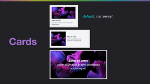
Alright. So our base component's looking pretty good, but it's time to handle some of the responsive concerns. And for those, we'll use container queries. To see why these will be helpful, here's our current card in a larger space where everything fits comfortably. But when it starts to squeeze, having those action buttons next to the title really, really gets narrow, and it's at risk of causing overflow. So we're going to employ container queries to adjust the underlying grid template and stack those action buttons above the title in a narrower space. The awesome news about container queries in Shadow DOM is that you have basic cross browser access to global containers, meaning you can query containers external to the Shadow DOM and modify shadow element styles just like any other container query.
So here's an example of doing just that. As a reminder, for use of container queries in general, a container query cannot style the queried container. And so for our cards purposes, we'll make use of host as a convenient container element because it's always going to match the inline space available for our card.
I do have to add a warning here to not take this little bit of info and go out and make a global rule across your web component system to have host automatically be a designated container. Because in certain context, the elements that are containers can collapse a layout or cause other unexpected results.
So my advice is to always make container behavior opt in in some way for your components and ensure that they work reasonably well without requiring that container query provided behavior. Usually, I treat container queries similar to the olden days of media queries where we do a small space first and build up from there.
So our first step to incorporate is to update our host styles and add the container query rule. And we're going to designate a container named card with the inline size containment. Then we provide a container query for our card element, rearrange the grid template, stack the elements. Easy peasy. Right? But here's the result.
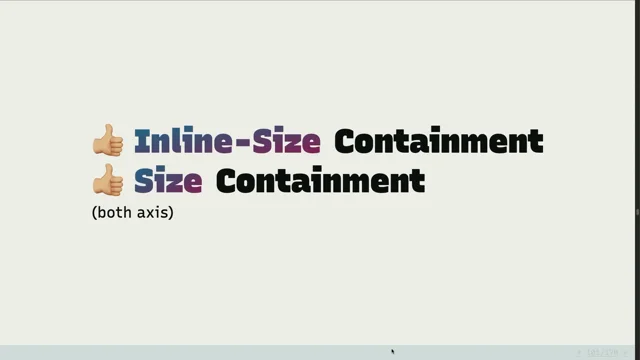
What is happening here? Unfortunately, we've run into a conflict point between subgrid and container queries, and this, conflict is not exclusive to Shadow DOM, but happens anytime and anywhere You try to apply both subgrid and containment to the same element. The reason why is that containment cuts off the propagation of subgrid, and that's a side effect of containing the elements layout.
Containment is a really complicated thing. This is part of what they had to do in order to solve and make container queries available anyway and prevent loops from style recalculations. So consequently, we should set up our component so that in context, it can opt in to either subgrid or container query behavior depending on the content and visual priorities.
Once we remove subgrid, our layout adjustment from within the container query works as we expect, and both variants are shown here. But wait. We have another variant for a horizontal card layout that we want to implement. And, ideally, we would want all cards in a related group, such as all cards part of that layout grid, to be able to opt in to this variant all at once.
What we did for this simple responsive behavior was use container size queries. But for this variant alteration, we can employ container style queries. Now I do have to say for now, this does fall into progressive enhancement territory. We are missing Firefox support. Please, if you are interested in what I'm going to say next or any other use of container style queries, please write posts.
Please put pressure on Firefox. This is amazing for lots of reasons, but especially this one I'm gonna show you. So container style queries enable querying the value of a custom property. Eventually, it'll be the value of any property, maybe, but for now, it's custom properties. And as with any other inheritable properties, those values are inheritable through the Shadow DOM, which means that Shadow DOM styles can query custom property values set on light DOM ancestors.
So here's our big takeaway, an exciting proposition, that container style queries enable opt in styles for a group of web components without individually setting attributes. So knowing that, we'll update our global light DOM styles to accept a custom attribute of layout orientation.
And if it's set to horizontal, we'll assign the corresponding custom property. Then we'll apply it to instances of our layout grid where we want to use that horizontal layout. And then within our shadow DOM styles, we'll use a container style query that will apply when the value of layout orientation custom property is horizontal. Notice that we even are able to nest additional container size queries into the style query so that we can handle the horizontal layout's responsive concerns as well.
Very powerful feature in and out of Shadow DOM. And with that, we have the different layout mutations ready to go. This preview shows the transition from the default layout shrinking down, switching to horizontal layout, and that responsive behavior as well. We have one remaining feature to handle for, which is the tooltip that appears to label the action buttons.
And to help with that, we're gonna reach for the pretty new popover API. This feature is cross browser and considered baseline newly available, but this is an HTML API. So why am I bringing it up in a CSS talk? And to understand that, let's see what CSS problem it helps solve. A classic CSS problem is getting overlay type elements like tooltips to properly appear above everything else, which has to do with stacking context.
The stacking context defines the order things are placed in the third dimension or the z axis. Think of z axis as the layers of DOM elements between the root of the stacking context within the viewport and you, the user, looking through the viewport. If you've used z index, like z index nine nine nine nine nine nine nine to deal with this problem or try to, you've worked with stacking context.
The popover API gives us access to a guaranteed way to be any stacking context, which is by promoting its context to this fairly new browser feature of the top layer. The top layer is guaranteed to be the topmost layer above any other stacking context. It spans the entire viewport, although things you place there can have smaller visible dimensions.
Promoting an element to the top layer breaks it free of any stacking context it may otherwise exist within. In other words, wherever the element lives in the DOM, you don't have to portal it out or do anything else. This top layer access guarantees it will be visible over everything else when the popover is open.
We're reaching for popover because, unfortunately, there is no CSS only way to access the top layer. So how do we create a popover? Super simple. First, we add the attribute popover target to a button with a value that matches the ID of an element with the popover attribute. And just like that, you have a toggleable popover.
The popover will be hidden until it's toggled open from the button, and the default browser style is a fixed position within the viewport, which leaves us the remaining problem of positioning it relative to our trigger. Now some of you might already have spotted a potential conflict for trying to use popover API in the Shadow DOM context, which is use of the popover API, in this declarative HTML method requires the ability to associate the popover trigger with its content via a unique ID. Now on the one hand, Shadow DOM is a benefit here because within itself, we don't need to worry about a shadow ID conflicting with a global ID due to the encapsulation.
However, in a real world, system, you probably want to have a tooltip component that it's that it's its own extensible component and not something you recreate within any other component that needs to display it. Fortunately, custom attributes or elements, excuse me, accept popover attributes.
So, ultimately, this makes associating your custom tooltip with its related trigger really no different than the use of your own custom attributes. For our actual tooltip component, in anticipation of having those popover related attributes, we're first resetting the default browser styles for popovers.
And normally, the slot itself has a browser supplied style of display contents, and that usually essentially prevents it from affecting layout. We're actually gonna go ahead and give it a display value and use it to style the tooltip's content area. That makes the body of the tooltip as simple as including an implicit slot, which ultimately gets filled with whatever content is provided.
Now we can associate the custom tooltip to a trigger wherever we need to using the popover attributes just as we reviewed. We did sneak in one feature that has lower browser support support currently, which is the hint type of popover. This allows showing a popover on hover as well as click while still responding to light dismiss and escape key presses.
For now, we do have to polyfill part of this behavior. It's not that much JavaScript, fortunately. But once Hint is fully supported, the HTML is all you'll need for this solution. Okay. Are tooltips correctly associated with the button, but our remaining problem is positioning it. As you can see right now, it is completely disconnected from the trigger and appearing in that top left corner.
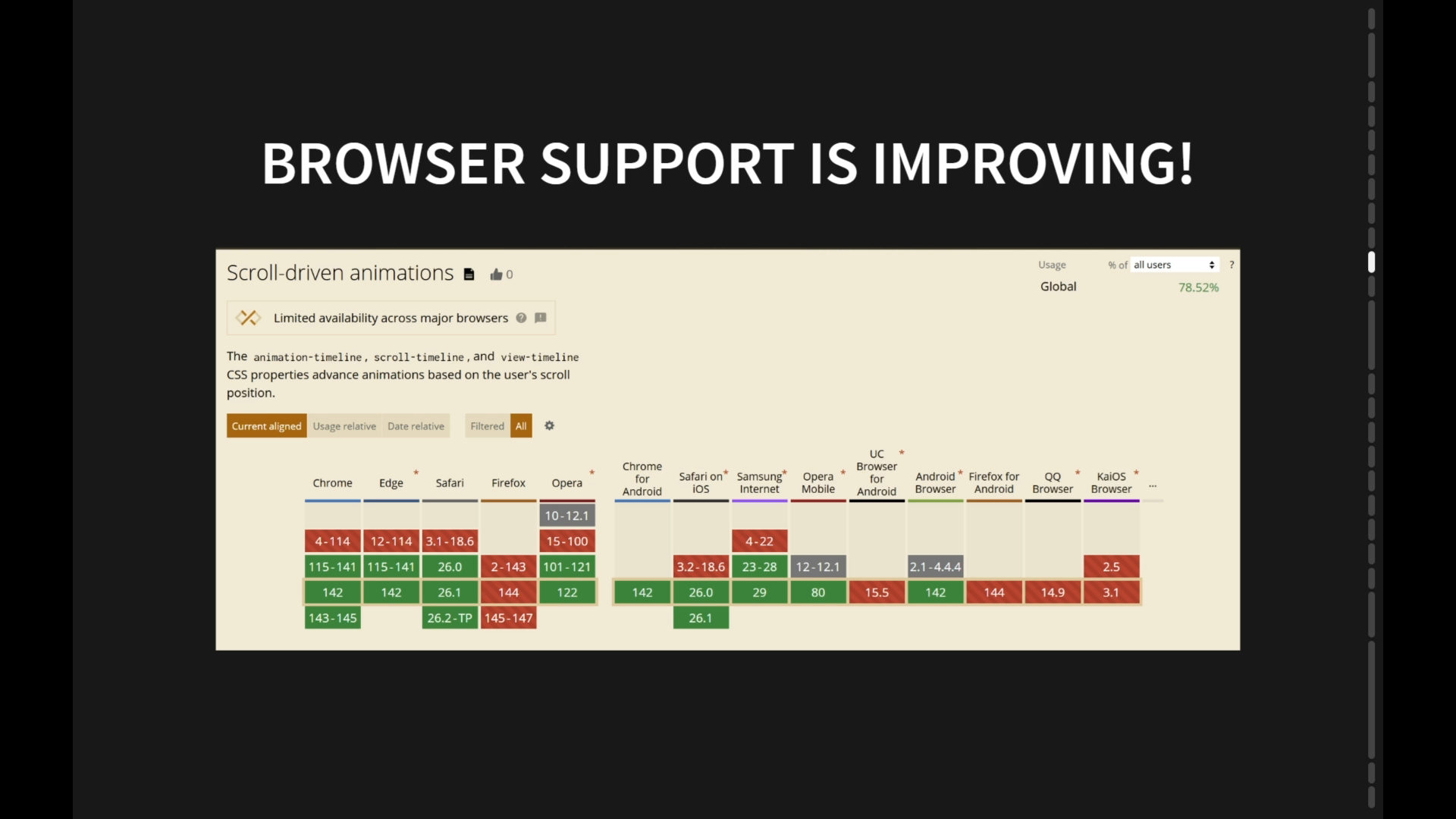
That's partly because the user agent default is set to position fixed, and, also, we reset two other properties for inset and margin. So now it's appearing at the start of the document. To resolve positioning, we'll bring in one of the most modern CSS features of anchor positioning. The spec is evolving, but it is in Chromium, Safari technical preview, and most, notably in the newly announced Safari 26 beta.
Yes. 26. It's also part of Interop 25, meaning it's actively being worked on. So expect to have more full support by end of year. Anchor position elements have their position set relative to a defined anchor. So in this example, our popovers anchor to that favorite button.
And this demo video is from a resource from Yuna showing how you can use this new property of position area to, very simply direct where to place a anchor positioned element. For the use of anchor positioning with non manual popovers, so using the declarative way we've shown, we'll soon only need to apply this property. And the reason we only will need this is because eventually, popovers will have an implicit anchoring reference to their trigger.
Unfortunately, the Safari '20 six release notes specifically stated that implicit behavior is not going to be there yet, so you'll have just a couple more steps, to make that association if you pick this up soon. Now in terms of Shadow DOM, we do have some caveats. You're not able to anchor a global element to a Shadow DOM element, and you're not able to anchor a Shadow DOM element to a slotted light DOM content, but you can anchor a global element to the custom element itself, and you can anchor a global element to slotted content that exists within the light DOM, which is all to say. Oh, and you can anchor within the same shadow DOM.
So just to say that if you are using web components or thinking about using them, just consider how that may work or conflict with anchor positioning. A constraint impacting our current setup is that anchor positioning styles must live in the same context as the anchor, which leaves us two options for actually positioning our tooltip.
The first one is we can include that simple CSS property alongside the styles, such as for the card component where the tooltip component is included. Or option two within our connected callback, we can add the positioning via the style attribute. You can, of course, do more fancy things to accept that as an option, and that results in the style living in the same context as the anchor.
Number two may feel a bit hacky, but I verified this. If we try to apply this style via the host selector for the tooltip component, it actually would fail because that's considered to a different context. I'm at time, so you won't really get into go into scope. Just know it's on the horizon for interop as well.
I didn't actually end up using it for the card component, but I guess the key point I want you to understand if you're interested, because it is another splashy feature, it cannot cross cross the shadow boundary, except for inheritance, but it may apply to your slotted light DOM content. Have kind of an interesting example here of flattening specificity, because scope itself doesn't add to the specificity score.
So I'm going through this kind of quickly. Sorry. We can basically set up something similar as we did into layers. Scope is gonna have more features for you, but because it can't cross that boundary, if you're using slotted content, you might find slightly less utility from using scope except for possibility this idea of flattening specificity. Here's another one.
Take a picture if this actually interests you, impacts your team. Here's more full details of using scope. There again, most of these issues are around the host selector, or conflicts with the ampersand for nesting. Easy to get around if you're not trying to scope on the host. So how do you find the support details that I showed you today? Well, currently, that's not super easy.
One method is digging through the results on w p t dot f y I. Here's some example test results for scope as they relate to Shadow DOM stuff. And I'm gonna warn you that it's not very easy to dig through this. So for my presentation, I did a lot of prototypes to validate, these details.
Okay. We made it. So quickly to recap, I hope you learned some things about how modern CSS features work across the light versus shadow boundary, And know, again, that overall, these features are safe to use independently in each context. The conflicts we saw were mostly around the host selectors, and some use cases require consideration of how your just general web components architecture is and how components coexist, such as when we looked at popovers and anchor positioning and also container queries for a subgrid.
So go forth. Experiment. Get weird. Test this out, Favil Browser bugs and CSS bugs, and share your use cases as well. Thank you.
People
- Yuna
Technologies & Tools
- Baseline
- Can I Use
- Chromium
- Safari 26
- Shadow DOM
- Web Components
- wpt.fyi
Standards & Specs
- ::slotted
- :host
- color-scheme
- Container Queries
- Container Style Queries
- CSS Anchor Positioning
- CSS Cascade Layers
- CSS Containment
- CSS Custom Properties
- CSS Nesting
- CSS Scope
- CSS Subgrid
- Custom Elements
- light-dark()
- Popover API
- position-area
- Top Layer
Concepts & Methods
- Progressive Enhancement
- Stacking Context
Organisations & Products
- Firefox
- Interop 2025