Reducing Layout Shifts Caused by Font Rendering
Speaker Background: From Text Effects to Font Performance
Mandy Michael introduces herself and her talk on reducing layout shift caused by font rendering. She traces her journey from creating text effects on CodePen at Web Directions' Respond conference to developing a deep interest in fonts, variable fonts, and their performance impacts on the web.
The Three Categories of Web Fonts and Why Web Fonts Cause Problems
Mandy explains the three font categories: website fonts (like Arial and Times New Roman), system fonts (OS-specific like SF Pro and Segoe UI), and web fonts (downloaded from a server via CSS font-face). She highlights that web fonts are now used on 87% of websites, making their performance implications a day-to-day concern for developers.
What Layout Shift Is and Why It Matters
Using her dog Jell-O and a Jell-O Ipsum demo, Mandy illustrates how web font swapping causes layout reflow when the fallback and web font differ in size. She explains why layout shift is damaging — it disorients users, erodes site trust, and can cause accidental clicks — making it both a UX and performance issue.
Measuring Layout Shift: CLS and the Tools Available
Mandy introduces Cumulative Layout Shift (CLS), the Core Web Vitals metric that quantifies on-page element movement during load. She walks through how to measure it using Chrome DevTools' Performance tab, WebPageTest's film strip and video views, and third-party tools like Calibre, noting that network speed significantly affects CLS scores.
The Easiest Fix: Using System Fonts Instead of Web Fonts
Mandy presents the simplest solution — switching to system fonts — which eliminates font downloading and layout shift entirely. She shares Octopus Deploy's experience removing two megabytes of fonts by switching to system fonts, while honestly addressing the trade-offs: inconsistent rendering across operating systems and design limitations that make system fonts better suited to tools and dashboards than branding-heavy sites.
Font Performance Basics and the font-display Property
For teams that must use web fonts, Mandy covers standard font performance strategies — WOFF2 formats, subsetting, self-hosting, and caching — and then focuses on the font-display property. She highlights font-display: optional as a particularly effective way to minimise layout shift, explaining how its 100ms window means the web font only renders when cached, dramatically reducing visible swaps.
Fixing Layout Shift with size-adjust
Mandy introduces size-adjust, a CSS font-face descriptor that scales a fallback font's x-height to match the web font's proportions. Using her Jell-O demo with Arial and Oswald, she demonstrates the before-and-after effect, recommends the PerfectDish font fallback tool by Malou for Google Fonts users, and shows the full implementation pattern of creating a named Arial Fallback font-face with the size-adjust value applied.
Fixing Layout Shift with font-size-adjust
Mandy explains font-size-adjust, which adjusts the x-height (or cap height, character width, or IC dimensions) at the selector level rather than in font-face, making it more precise for variable font usage. Using Inter and Arial as a near-matched pair, she demonstrates how the property scales the fallback to match the web font's x-height aspect value, and points to Richard Rutter's tool for calculating that value. She closes with guidance on when to choose size-adjust versus font-size-adjust.
Summary and Recommendations
Mandy wraps up by reiterating that none of the solutions are difficult to implement, and offers a decision framework: system fonts for tooling and performance-focused products, hybrid approaches for sites that need some branding, and font-size-adjust or size-adjust for precise control. She emphasises that visual performance and user experience are as important as API response times, and directs the audience to her GitHub resources.
I am gonna be talking about reducing layout shift, specifically the layout shift caused by font rendering. And I was originally planning on talking about reducing all layout shift, but I realized I wouldn't have enough time to cover everything. So that's why we're focusing on fonts. And because I like to talk about text and fonts, I decided, let's go with that instead of the other stuff.
And if you have seen any of my talks before, you have known that I love talking about text. And it did actually start way back when. And I talked about text effects at Web Directions, when Respond was a conference. And it all started from there. Was making text effects on CodePen with HTML and CSS.
And it kind of developed a bit from there. I started caring about fonts and variable fonts and then performance. And then I somehow ended up in a land where I was interested in performance impacts of fonts and text on the web. And now we're here. This just kind of snowballed, I'm not really sure where all the time went. But I think what I find so fascinating about text on the web is that text is something that's in practically every website and application in one way or another.
I'm sure there's a website on the internet that has no text. But for the most part, it's everywhere. And as a result of text being so fundamental, fonts have naturally become a big part of the web as well, whether you are explicitly adding one or not. But it's not really as simple as fonts on the web. There are a few categories that are important to note.
And I'm sure most of the people here are familiar with website fonts. They're fonts that are assumed to be on the majority of users' systems, things like Arial, Times New Roman, underrated, in my opinion. But you basically don't have to download them. Right? And then the second category, system fonts, very similar to website fonts, but slightly different.
They also don't need to be downloaded because they are on the user's system, but they vary between operating systems. So SF Pro is Mac. Segoe UI is Windows. And Linux and Ubuntu and all that have all their own, as well. And then the last category is web fonts, which can literally be anything, all the Google fonts, any font foundry you go to, heaps of them. These are different, because they're not on your system by default. And instead, you need to download them from a server.
And then you need CSS, font face, to display them in your page. So because you have to download them from a server, they start to introduce some problems. And web fonts are exceedingly popular. They're now used on 87% of all websites on the internet, according to the Web Font Almanac from last year. Great resource, by the way.
Highly recommend you go check out the the, HTTP archive almanacs for all sorts of things. But because they're used on 87% of all websites, that means that we have to deal with the impacts pretty much day to day. So when I talk about layout shift caused by text, I'm talking about this. Please enjoy my dog Jell O and my Jell O Ipsum. Basically, what we're talking about is when the web font swaps in, it causes the layout to shift.
Mainly, this is caused by the fact that there are differences between the fallback font, like Arial or whatever, and the web font. And the sizes of them can change, causing the layout to reflow, text to resize, and then the browser has to redraw everything as a result. Now, this is a simple page. But if there's lots of content around, it's only going to get worse. And the problem with layout shift, and the main reason I wanted to talk about this, is because it really annoys me.
Every time I go to a website and a page shifts, it really bad swear word, upsets and me when I see it. It has a really negative user experience. Right? It's frustrating. You can get disorientated. You're scrolling through your mobile phone, and you're reading, and then suddenly it moves. Or you go to click on a link, and then it moves, and you accidentally click on that stupid ad that's in the middle of the article that you can't get rid of.
Right? It's annoying, and I would like people to not have that anymore. Also, practically, it reduces, trust in your site, because it can feel unreliable or unstable. It also has the performance impacts, as John mentioned. Layout shift directly correlates to a core web vital, which is like a set of performance metrics.
It's called the Cumulative Layout Shift metric, otherwise shortened to CLS, if you don't want to try and learn to say cumulative. And it basically measures how much elements shift on a page as content is being downloaded. There are a few ways that you can measure this. It's quite obvious when your layout is shifting right.
You can see it on the screen. But last year, Chrome DevTools introduced some stuff in the DevTools you can use. If you right click, go to DevTools, go to the Performance tab, you'll see that there is now a Core Web Vitals metrics. CLS is the one we're talking about. That will tell you if it's good or bad, based on what's deemed good or bad.
Red is obviously bad. And then, down the bottom, there's a panel where you can click for layout shifts. And then you can highlight areas on the page that has layout shift. One thing that I want to call out, though, is that little number. It will change, depending on the network speed, if you've got layout shift. So if a website loads really fast, you might not get any layout shift, because everything's loaded in before it's had a chance to move around.
If it's not fast, you can get a bad number. So for example, this is actually from my blog, which has terrible layout shift at the moment because I haven't fixed it. But it's green on a regular fast internet connection. And it's like zero layout shift. Woo hoo. On a three gs network, it's bad. So do keep that in mind when you're testing.
You can also use web page test or other performance tools. When you chuck your website URL in, and it does a run, and gives you all this information about the performance of your website. There's a video column. And if you click Film Strip, you'll get this box down the bottom. Dotted lines mean you've got layout shift, so you can have a look and see what's caused your layout shift is and what's causing it. Another option, which I really like, is the little video option, which gives you a video of the layout shift within your page. I find this is really good for things that aren't as obvious, and you need to figure out what is that slight movement that's going on. Really, really handy.
There's other performance tools you can use. Calibre is a Melbourne based company. They do some stuff as well. Heaps on the internet that you can use. Obviously, just look out for it, too. So if you've identified that you have layout shift, and it is caused by text, how do we fix it? I'm going to say a bad word.
I don't like saying this word, but I'm going to go with it. There's two ways to fix layout shift. It's two and a half. I'll fit the half in somewhere. There's an easy way. I don't like the word easy, and I typically avoid it. But I'm going to lean into it, because I do think it's easy. And then, there's a very easy way.
None of these things, in my opinion, are very difficult to do. If you disagree with me, please come and tell me. I'm happy to be told wrong. But they're pretty straightforward. So we'll start with the very easy way. And the easiest way to not have layout shift, caused by fonts, is to not use fonts, like web fonts.
Now, I'm not gonna say don't have no text in your website and just use website fonts. I would propose that you use system fonts instead. And the reason that I say system fonts and not website fonts do think Arial and Times New Roman are underrated. They've been doing a lot of heavy lifting for a long time, and I think they get a bad rap.
But system fonts, because they're used for the operating systems, they have had a bit more effort put into them design wise. They are variable fonts now, at least SF Pro and Sagoya UI are. So you have access to things like optical sizing and other controls for improving the typography. So they are a bit better than Times New Roman and Arial.
I'll give them that. But the other benefit of system fonts is that they aim to match your typeface on your website to the operating system UI. So this kind of gives you a bit of that native feel. Now, I work at Octopus Deploy. They're a Brisbane based company. And we do deployments, help you manage complex deployments, and try and make that easier. And we switched to system fonts in November last year. It really suited us.
We have a lot of tooling and configuration, so fitting in with the UI and having that native feel makes sense for us. And also, now we don't have to download fonts. And I will note to you, there was two megabytes of fonts in our application, so that's gone now, which is great. Now, looking at these screenshots, these are from different operating systems.
If you're into fonts, you might notice that there are some differences. If you're not into fonts, you might not notice. But what I personally think is very obvious is that middle one is a lot more bold than the others. And this is kind of the problem when you use system fonts. You're handing over your design choices to the operating system.
And as a result, you need to ensure that your UI can handle changes in fonts and the sizes and widths. Because there's no consistency between them, they're quite different. The way characters are rendered are different. The lengths are different. The bolding is different. Line heights. So for example, these are some system fonts across different operating systems. And there's little things in here.
If you're a font nerd, you'll notice them straight away. But the main thing that's different is the width. The line length changes depending on the font that's being used. So you just need to be aware that your UI needs to be robust enough to handle changes in width. At Octopus Deploy, this wasn't a big deal for us.
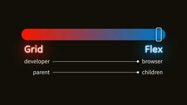
We built with Flexbox and Grid and all those things. So it did actually flow quite well. There was a couple of parts of the UI where we had quite restricted width, and we had to make some changes. So if you're building from scratch, it's probably not going to be a problem. If you're editing an existing code base with lots of vintage code, you might find that you have a little bit more areas to work on to improve that.
For us, line height was the biggest problem. So those are something to keep in mind. So while you'll save time on the performance side you won't have the layout shift it does introduce some design and layout problems as you're working through. So what it comes down to when should you use a system font, and when should you use a web font?
They're not for everyone. They're great if performance is important to you. If you're building tools, admin dashboards, or you want a native feel, really, really good option. They're not so great if you need strong branding, you want your UI to stand out, you know, like an advertising website, marketing, those kinds of things. Probably, system fonts aren't for you.
But remember that you can do a combination of the two as well. You could have your headings in your fancy web font, and you could use system fonts for body or text copy. You don't have to go one way or the other. A combination is doable as well. So if you don't want a system font, you don't want it to match your operating system, you want to have your own, you're going to need to put a bit more effort into how you manage your fonts. And I'm not going to go into this because it would take me way too long.
But don't forget your standard font performance strategies. Use WAF two compressed font formats. Subset your fonts. Limit the variants. Self host. Please case your fonts. These are all really important. I have resources at the end that you can go and have a look at if you want to look into more about this, if you're not familiar.
But it's still very important that you do this when you use a web font. Another thing that you should do is make sure that you choose your font display option with consideration. So font display, for people that don't know, basically determines how your web fonts are going to load. So, for example, whether you leave your text invisible until the web font is ready and then have it load in, or if you render your text in your fallback, And then, when the web font is ready, it'll switch out to your web font.
These are some options that you have when using font display. Font display optional is a really good way to handle or minimize the impact of layout shift caused by fonts. The other options all basically come down to timing or, performance versus aesthetics, really. But with optional, what makes it really great is the way it combines the timing and when the font loads in.
So it's different to the other choices, in that it will start by rendering invisible text for up to one hundred milliseconds. When the web font If the web font is available within that one hundred milliseconds, it will load it in. If it's not available in the one hundred milliseconds, it won't load it in, and it will render the text in your fallback font.
This does mean that sometimes your web font won't load in. So it is a bit of a trade off. But what will typically happen is, the next time somebody comes back to your website, if the font is being cached, it'll load in within that one hundred milliseconds. And the reason that this is recommended if you want to prioritize performance is that it will only render if it's cached, meaning that the text is loaded really quickly.
And the web font is only loaded in for the initial paint in the browser. So it really limits that layout shift that can occur. So really good option. This is the 0.5 part of the easy way. This is a good choice. It may not be for you, but something to consider. So what is the easy way that I was talking about?
There's a couple of things that we can go into, but essentially, what we're going to use is two CSS properties. Both of them aim to render the text in a similar way, regardless of the font that's being used. So the first one is size adjust, and the second one is font size adjust. These are both supported in the major browsers.
Font size adjust landed in baseline thanks for explaining baseline, Zach, by the way. Font size adjust landed in baseline middle of last year, something like that. So I'm going to bring up Jell O again and show you a bit of an example that we'll fix. So here, I've got Arial as my fallback and Oswald as my web font. Now, Oswald is a lot narrower than Arial.
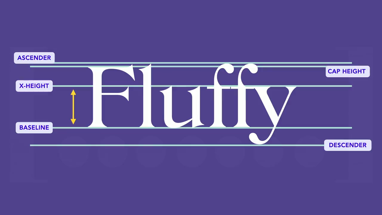
So when it switches in, we get a lot of layout shift. And it's really obvious and very terrible. Please enjoy the picture of my dog for the next end of the section. So the way we can resolve this with size adjust essentially, what size adjust will do is aim to adjust the fonts to match their x height.
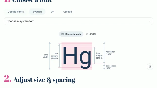
If you don't know what x height is, a very simple explanation. It represents the typical height of most lowercase letters. So it's very similar to the height of the x, although that's not always true. In this example, it's approximately the height of the bottom of the U, the baseline, to the top of the u, which is the x height.
It ignores descenders and ascenders, like the bottom of the y and the top of the lowercase f's. So I made this little demo. It's up on my blog, TextApp. These are at the end in my resources, so don't stress if you want to play with it later. You can actually upload your own fonts into it on the proper demo, but this is on CodePen.
Basically, I've got Arial as my fallback and Oswald as my custom font. And what I'm doing here is adjusting Arial to align as closely as possible to Oswald. And I landed on about 81%. Now, when I did this, I then found this amazing tool by MultiUble called PerfectDish font fallback.
If you're using a Google font, use this. It's way better. You pick the Google font, and it'll spit out all the code for you, which is awesome. So go and use this. He had 81.66 for Oswald. So I went and updated my demo to use decimals because I was like, oh, we can do decimals. Great. So the way that we then use this, you can either copy this if you're using Google Font, or you can do it yourself. I'll quickly run through how it works.
So I'm gonna assume you've already set up your font face for your web font, in this case, Oswald. We're also going to set font face up for our fallback. So instead of calling it just Arial, we're gonna give it a new name with our font family. I'm gonna call it Arial Fallback. You can literally call it whatever you want.
My amazing fallback font. Mandy is the best. Whatever. And then you can in the value for the source, we're going to use local with Arial, so all whatever your fallback is. Then you can add the size adjust property, which, as we've established, was 81.66.
And then over in our selector, wherever we're adding our font family, we can set up our font stack. So we'd have our web font as the first item. And then, instead of just specifying Arial, what we're going to do next is use that name that we've given our font, so in this case, Arial Fallback, and that's what we'll reference for the fallback.
Which means, instead of having regular Arial, we'll have our size adjusted Arial. So instead of having this, where it jumps up and down, what we'll have is this, where it just switches in place. So in this case, I have eliminated the layout shift altogether. It might not always completely remove layout shift.
There is a few things that come into play, like the length of words, characters, all that kind of stuff. But it is possible to eliminate it altogether if your layout allows for it. Now, because Oswald is very different looking to Arial, it's still very obvious that you are having a switch.
We just don't have the layout shift anymore. It's not that big a deal that you can notice it. But I would suggest, when you're picking your fallback, try and pick one that is very similar to, the text that you're using. So if there is a fallback font that is a bit narrower than Arial in this case, you should go for that instead, because it will minimize, how noticeable the swap is.
So the next option is font size adjust. And it works very similar to size adjust, in that it will we can adjust the x height so that they match. And it's aiming to keep that consistent across the fonts. But it also has some other options. It's got character width, cap height. It's also got options for IC width and IC height, which is for the Korean, Japanese, and Chinese characters.
So there's a few options that you can have a look into there, to play around with. I'm going to use x height as an example, because we've already gone through what x height is. And that's what font size adjust will do by default if you don't provide it one of the other options. So I'm going to use a different font this time.
I'm going to pick Inter, because Inter is very similar to Arial. So the shift is a lot less noticeable, but it's still there and will still cause a problem. And it's a really common font that people love to use in their websites. So you can see there's a little bit of shift here. It drops below that little red line that I've got there.
Font size adjust is a bit different to size adjust. Essentially, what we are aiming to put in for our value is the aspect value. And this will be different depending on which property you use. So in this case, it's the x height aspect value. There's a calculation. You don't have to worry about this. This is really just how it figures it out.
But it is determined as a multiplier of the font size. And the output that you get is an adjusted font size for the font. I'll show you this visually. So without font size adjust, we've got Arial and inter. And you can see that inter is a bit wider than Arial. When we apply font size adjust, we're essentially scaling Arial up to render at a larger font size, so that it matches the x height of inter. So it's essentially what we're doing.
If I overlay these, you can see how they are now about the same size. It doesn't align perfectly, because they're different fonts. Nothing's going to match up that well, which is why sometimes you may not be allowed to completely eliminate the layout shift. But the closer they are, like into an Arial, the better this will work. So you're probably wondering, well, how do I figure out what the aspect value is for the font?
Sometimes, this is in the documentation that comes with font. But I know people don't like to read documentation. So there are a bunch of tools on the internet you can use. This one is by Richard Rutter. Really good. Load in your font, pick the font style, font weight, and optical size, and hit Calculate, and it'll give you the aspect value. It is important that you specify the font weight and optical size, if applicable, in the font style, because this aspect value can change depending on these values.
This is one of the reasons that font size adjust is very useful, particularly if you're working with variable fonts and you're changing this stuff regularly. It's a little bit more focused than size adjust, which is quite global. So the way that we use font size adjust, unlike size adjust, it's not in the font face descriptor.
Instead, we use it where we would define, font styles. So for example, on an article element, I've got my font family with Arial as my, second choice font, my font size, and the font size adjust property, with my aspect value. And then, instead of this, where it drops a little bit below the line and we get a bit of layout shift, it'll now switch in like this.
And you might have missed it, because it's really subtle. And the reason that it's really subtle is because Arial and Inter are quite similar in size. So again, this is why it's really good to try and pick a fallback font that, matches with as closely as you can get it with the, other font. Something to consider if this kind of stuff is really important to you. Obviously, it's not going to be the case.
There's a lot of weird fonts out there. But even if it's slightly better aligned size wise, it'll look a lot better when you switch stuff in. So I've briefly touched on this when should you use size adjust versus font size adjust. Size adjust is really good if you want the same thing to apply everywhere. Like in my blog, for example, my headings are exactly the same everywhere. So I use size adjust because it was quicker and easier. Whereas for the body text, I love variable fonts.
So I adjust the optical sizing, the width, all sorts of stuff going on there. So font size adjust was better because it gives you better typographical control over it. And so you can really, really get to the point where you have no layout shift at all because you're adjusting it more accurately. Really, it's up to you. You could just do size adjust and accept that it's not gonna be perfect in every single use case.
Or it's not that difficult to add it in the places that you're using, and defining your fonts, so there is that option as well. I I would say, it takes a little bit of time if you don't understand how you're using variable fonts, if you are using them at all. If you're not using variable fonts, then size adjust is probably gonna cut it for you in most cases.
So with that in mind, you now have a few options to consider when trying to resolve layout shift. As I say, none of these things, I think, are particularly difficult to do. There's tools that help you figure it out. You're basically just copying one line of CSS in or a couple of lines in the case of size adjust.
It's really quite simple to implement. The main problem comes for testing on an existing site. If you're building from scratch, you don't have to do that, because you're testing as you go. So it's really not as hard as it sounds to try and resolve this problem. If system fonts are good for you, if you're building tooling or configuration, like we do at Octopus Deploy, it might be a good option, something to consider.
Less downloading of things is always great. If not, maybe a hybrid approach would suit you better, like using system fonts for your body copy and a web font for your headings really common approach or making use of that font display property that I talked about earlier, and letting the web font load in if it's fast enough. So it's really good if you have people on slower internet connections in other countries, like Australia, who has terrible internet connection.
Good and important to consider. If neither of those options suit you and you want to spend the time, you can use font size adjust and size adjust to really get that control and manually make those adjustments to get rid of the rendering. And performance and user experience is a really important part of what we do. And I know that sometimes performance can kind of be focused on, like, how quick are my API requests?
But this kind of thing really matters as well, and it has a very noticeable visual impact. So making the most of these things in CSS and using them to the best of their ability really is going to make sure that we can deliver the best experience that we can. So thanks very much. My resources are up on GitHub with that QR code.
If you have any questions, I'll be around. Otherwise, I'm on Mastodon and Blue Sky as Mandy Michael. You can come chat to me there about my dog, if you like. Thank you.
People
- Richard Rutter
Technologies & Tools
- Arial
- Calibre
- Chrome DevTools
- CodePen
- CSS Grid
- Flexbox
- Inter
- Oswald
- Segoe UI
- SF Pro
- Times New Roman
- variable fonts
- WebPageTest
Standards & Specs
- @font-face
- Baseline
- font-display
- font-display: optional
- font-size-adjust
- size-adjust
- WOFF2
Concepts & Methods
- Core Web Vitals
- Cumulative Layout Shift
- x-height
Organisations & Products
- Google Fonts
- HTTP Archive
Works
- Web Almanac