Do we even need flex anymore?
Do we still need Flexbox?
Erin Zimmer dives right into the question everyone's asking: do we still need Flexbox with the advent of Grid? The short answer: absolutely. She then introduces various CSS layout modes and their use cases, setting the stage for a deep dive into the world of layouts.
Normal Flow: The Unsung Hero
Zimmer champions the often-overlooked normal flow, the default layout of the web. She argues its importance for content-focused sites and text-heavy sections, even within app-like interfaces. Real-world examples showcase its power and versatility.
Floats Aren't Dead (Yet)
Contrary to popular belief, floats still hold relevance, particularly for their intended purpose: wrapping text around elements. Erin demonstrates how floats, combined with shape manipulation properties, create visually appealing text layouts.
Multi-Column Layout: A Blast from the Past
Erin reminisces about the days of newspapers while introducing multi-column layout. She explains its use cases, properties like column-span, and considerations for viewport size.
Table Layouts: Finding the Right Balance
Zimmer addresses the controversial history of table layouts. She advocates for their use with tabular data, emphasizing the importance of semantic HTML and accessibility while discouraging their use for general layout purposes.
Grid vs. Flex: A Framework for Decision Making
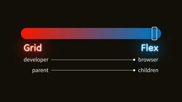
The age-old question arises: Grid or Flexbox? Erin introduces a framework focusing on developer vs. browser control and parent vs. children control. She emphasizes that the "it depends" answer, while frustrating, holds true.
Case Studies: Buttons, Titles, and Date Pickers
Through practical examples like button arrangements, title layouts, and date range pickers, Zimmer demonstrates when Flexbox excels. She highlights its simplicity and responsiveness in handling dynamic content and simple alignments.
When Grid Shines: Fixed Elements and Precise Placement
Erin shifts focus to scenarios where Grid outperforms Flexbox. Layouts demanding fixed element sizes, specific spacing, and parent-controlled behavior, such as a Jira gadget title, showcase Grid's strengths.
Multi-Row Layouts: Knitting Patterns and Ravelry Tags
The complexities of multi-row layouts take center stage. Zimmer uses Ravelry knitting pattern tags as a case study, illustrating Flexbox's superiority in handling dynamic content flowing across multiple rows without forced alignment.
Finding the Right Tool: Card Layouts and Flexibility
Erin explores card layouts, comparing Grid and Flexbox implementations. She highlights Flexbox's adaptability when card sizes vary while acknowledging Grid's strength in maintaining specific ratios between elements.
Two Dimensions Demand Grid: The New York Times Connections
Zimmer introduces her one hard and fast rule: two-dimensional layouts, like the New York Times Connections game, are best suited for Grid. She emphasizes Grid's ability to manage both horizontal and vertical alignment effortlessly.
Lineboxes and the Limitations of Flexbox
Delving deeper into Flexbox's mechanics, Zimmer explains lineboxes and how they affect multi-row layouts. She demonstrates how elements within a linebox interact and the challenges of achieving multi-directional layouts without additional HTML structure.
Complex Layouts: Jira Modals and the Power of Grid Areas
Erin dissects a complex Jira modal layout, highlighting the drawbacks of nested Flexbox containers. She showcases Grid's elegance in handling such scenarios using grid template areas, simplifying both code readability and maintainability.
Key Takeaways: Embrace Both Grid and Flexbox
Erin Zimmer concludes by emphasizing that Grid and Flexbox are not mutually exclusive. She encourages starting with Grid for high-level layouts and utilizing Flexbox for lower-level components, fostering a harmonious balance between the two.
Hi.
So actually we are going to talk about floats.
Yeah, so do we even need flex anymore?
I'm going to come straight out and say it.
Yeah, we do.
So if anyone was just waiting for that answer, we're done.
Today we're going to talk about CSS layouts.
In CSS, a layout mode controls, how the children of an element are laid out relative to the parent.
And they also control whether some properties are available or not.
So like the gap property is only available in flex and grid.
These are the layout modes we're going to talk about today.
Normal flow, float, multi column layout, table layout, flexible box layout, and grid layout.
Flexible box layout is Flexbox's full name, that its mom calls it when she's mad at it.
If you want to read more about them, as always, check out MDN.
We're going to start with normal flow.
So normal flow is the default layout of the web.
It's what you get when you don't do any of the other things.
It's intended for laying out text.
So if you're building a site that is more content focused than app focused, you're probably going to want to use a lot of normal flow.
So for instance, something like this recipe site, has a bunch of different kinds of text, it's all laid out with normal flow.
Or something like this picture book, which is images and text, it's all laid out with normal flow.
Even if you're building something that is more app focused, you're still going to want to use normal flow for situations where you've got text.
So for instance, this Reddit post, full disclosure, this is their design, but my implementation, so they don't implement it exactly like this.
Also, it's not their fonts, but don't tell them.
So the post as a whole is laid out with normal flow.
The section across the top is laid out using grid.
The buttons across the bottom are flex, but then the actual post content in the middle is normal flow again.
And if you're wondering what the vegetable looks like, it's, a duck.
It's not anything rude.
And yeah, I did a talk about normal flow last year, so if you want to check that out on Conffab, if you're interested, in more normal flow stuff.
When it comes to text, though, we do have a couple of other options for our text layouts that make them a little bit more interesting.
And the first of those is float.
And you might be a little bit surprised to have me mentioning float, especially after John said we're not talking about it.
Because you might think it's obsolete, right?
We don't need float anymore.
And that's true to some extent.
So there's a bunch of things that we used to use float for, mostly around having things sit next to each other.
That we, whenever the intended use case of float, and we don't need float for them anymore because we have flex and grid.
But, there is one specific use case of float, like the thing that float is actually intended for still exists, and float is still the best and only way to do it, and that is to have text that flows around something.
If we jump in here, it's going to say, can you read it?
Of course you can read it, it's freaking huge.
If we jump into this, image here, we can give it a property of float, and we can say, inline start, Because Float has been updated to support the new CSS logical direction properties.
And you can see that now the text flows around the image, and everything looks like a little bit more cohesive, it's a bit nicer, it's a bit more exciting?
It gets even more exciting than this, though.
It gets really wild, because we can, we can, use float along with shape, shape outside and clip path, and we can make any shape we want and have the text flow around that.
So I'm not very exciting.
I guess I went with a circle.
But, you can use any shape that you can draw with SVG.
You can make it, the text flow around it.
So that's pretty cool.
The other option for jazzing up our text layouts is multi column layout.
So multi column layout, there's a few people here I think who are old enough to remember newspapers.
Multi column layout is for laying out columns like newspapers.
For those of you who have never seen a newspaper, it looks something like this.
And we can specify these columns just using the columns property.
Not that one, So we can either say that we want a specific number of columns, like three or eight, but that's way too many.
Or we can say how wide we want the columns to be, and then we just get as many as will fit, of that width.
Or you can say I want a certain number of a certain width, and the browser will do its best to figure out what you want.
This gets even more exciting too, because we can also style, we can also style the gaps between the columns.
So we could change this from black to, say lime, or lime green, because apparently those are two different colors.
I guess naming things is hard.
And we can also create, have elements that span across all of the columns, using column span all.
One thing to keep in note though, to keep in mind though, if you are using multi column layout on the web, is to make sure that your content is small enough to fit in the viewport, so people don't have to scroll up and down.
And full disclosure, Paramount Plus don't actually use column layout on this, I made this up.
Because I couldn't find a real world example of someone using columns.
So if you have an example, I would love to see it, you do, excellent.
And if you don't have an example, maybe you should add some columns to your stuff, they're cool!
Okay, moving on from text based layouts, another one that has had a little bit of a controversial past is table layouts.
Way back in the table era of CSS, we used tables to layout everything.
And at some point we thought, maybe HTML should be semantic.
And we I think we went the other way, and there was a bit of a backlash, and everyone was too scared to use tables for anything.
But these days, hopefully, we're at a happy medium where we all get understand that we can and should use tables if we're laying out tabular data.
So what's tabular data?
Tabular data is data that's laid out in a grid where either each column of the grid refers to a specific entity and the rows are properties of that entity.
So here, each column is a pricing plan and the rows are like, how many screens you can use?
How many ads they're gonna show you on your streaming service?
Or, a table can have each row be an entity, and then the columns are the properties of the entity.
So here, each row is an email.
And can I say, how disappointed I am in my spam box?
Because, I was like, I'll just grab an example out of my spam box, it'll be hilarious, there'll be all these lovely young ladies who want to meet me, people offering to increase the size of particular body parts, and, instead, it's just ads that Google has decided I don't want to see for some reason.
Anyway, this is not a table.
They are tables, but not that kind of table.
This, because there's no one, label that you could apply to a row or a column to label that particular entity.
So this is just a grid full of cards.
If you do want to create a table, use the HTML element table.
There is a way to create table layouts in CSS, and I'm not going to tell you what it is because you shouldn't use it.
So instead, just stick with the HTML element.
It's got a bunch of semantics associated with it.
It's got a bunch of behavior associated with it that is going to be much better for accessibility.
It's going to make your users lives better, and it's going to make your job easier because table layouts are wild.
All right, so that brings us to Grid and Flex.
So Grid and Flex are what we use when we want to build customized layouts, right?
We're going to use them a lot when we're building app style web apps, but we can still use them in content if you need to lay out some content in a way other than how normal flow does it.
You can still use Grid and Flex for that, too.
There are some things that you can only do with Grid.
And there are some things that you can only do with Flex.
But there's a lot of overlap between them.
There's a bunch of stuff you can do with either.
And I think most of us just want, an easy way to pick which one's going to be easier without having to do both and then compare them and figure it out that way.
Unfortunately, there isn't a simple answer to that.
There is a simple answer, but the simple answer is, it depends.
And for some reason people get mad when you say that.
So anyway, we're going to start, we're going to think about our layouts using this little framework here.
I should use the new color spaces on that gradient.
That could look way nicer.
We've got, what we're thinking about here is who's controlling the layout.
So there's two aspects to it.
On the one side, is it the developer controlling the layout, or the browser controlling the layout more?
So when the developer's controlling the layout more, we're, specifying exactly how big and where each element is going to sit.
Whereas when the browser is controlling the layout, we just give it all of the elements and say, eh, you figure it out.
So the advantage of the developer controlling the layout Oh, I'm walking the wrong way.
This is the developer's side.
The advantage of the developer controlling the layout is that we know exactly what it's going to look like, right?
We're specifying exactly where everything's going to sit.
The advantage of the browser controlling the layout is that it's responsive by default.
If you give the browser some content, it will lay it out so that it's all visible, regardless of how much content there is or how big the viewport is.
It'll figure it out.
So when we take more control ourselves, we need to do that responsiveness ourselves, so it's a lot more work for us.
So in an ideal world, we want to give as much control as possible to the browser, and just do the minimum and go home early.
The other aspect of this is whether the layout is controlled by the parent, or whether it's mostly controlled by the children.
A layout that's controlled by the parent, is like in a grid, where we're going to specify that we have these specific slots of this specific size, and our content is going to get laid out according to those slots.
If we have an element that's too big for its slot, It's going to overflow onto the next slot, but it's not going to affect the layout of the next element, right?
They'll just overlap over the top of each other.
On the other hand, if the children are controlling the layout, then they're all just laid out next to each other, and the position of each child is just affected by the previous children.
If an element is too big, it's just going to push all of the other children along, they're not going to overlap over the top of each other, but maybe your last element is going to overflow out of the container.
Okay, with that in mind Let's have a look at some examples.
First example is our buttons of our Reddit post before, which I already said are laid out using Flex.
But let's go through the exercise.
So what we have here is a small number of buttons.
It can be a different number of buttons in different situations, so we're not sure exactly how many there are, but we are sure that they're always going to fit in one row.
The size of the buttons is just whatever they need to be to fit their content in them, so they're all different sizes, and we just want them laid out one after the other.
This is the ultimate flex layout.
We've given the buttons to the browser and said, yeah, you figure it out.
And they all just, the position of each button is only affected by the size of the previous buttons.
And this sort of plays out if we compare the implementations in Grid and Flex.
The Flex implementation is just display flex.
It's easy.
The Grid implementation is a bit longer.
But I don't think that's necessarily a problem.
There are definitely situations where longer CSS is better.
We'll see some.
The real issue here is this.
Because we don't know how many elements there's going to be, we need to use this grid autoflow column to tell the grid to keep placing elements on the same row.
And, grid-auto-flow: column is a perfectly valid property of Grid, but it's not one that you use very often.
This code is weird.
If we want to follow the principle of least surprise when we're writing our code, this is surprising.
Let's not do it.
Let's just use Flex.
This kind of holds true even if the layout is vertical.
So this is, like a date range picker.
In large containers, we want it horizontal, and in small containers, we want it to flip around to vertical.
This time, the flex version is longer, because we need to specify flex direction column, but it's also very easy to understand.
Anybody who knows flex knows exactly what this is doing.
The grid version, on the other hand, is shorter, but again, it's weird.
If you see just display grid, I don't know about you, but I look at that and think, did they forget to put the columns in?
Did they put the columns somewhere else?
Do I have to go looking for them?
Or, was this originally a grid layout and then it actually got changed back to normal flow and then we just forgot to delete the display grid?
I don't know.
Again, it's weird.
Just use the flex version.
Okay, so now what if we as the developer, I'll start adding a bit more control here.
So this is the title of a gadget in a dashboard in Jira, everybody's favourite application.
It's similar to the Reddit post in that we have a small number of buttons that changes, we don't know how many there are, but we're confident they'll fit in one row.
The difference here is that we have this title, and we want the title to stretch out and just take up space.
Whatever space is left after the buttons, right?
So it's going to take up all the space.
So this, again, is very much a flex layout.
We're still, mostly the browser is figuring things out.
We're just specifying we want that one thing to stretch out.
And this is, again, 100 percent the children.
And again, we can compare the two layouts, the two implementations here.
So our flex layout is just display flex.
And then we can spec on the container.
And then we can specify that we want the first child element to stretch out and take up the available space.
The grid version, on the other hand, has display grid, that's fine.
We've got that grid autoflow column, which we already said was weird.
And then we've got this grid template columns 1fr, which is so weird that the second time I went through my slides, I went, what was I doing there?
Was that a mistake?
And this is because this row, like the columns here, are essentially 1fr, auto, auto.
But we can't put the autos in, because we don't know how many there are.
So we just have a row that actually has lots of columns, but we're only specifying one of them, and it's weird, don't do it.
Actually, I also wouldn't do the flex version here, because it's very brittle.
What happens if our layout changes a little bit?
Which happens to be something that happens in this particular use case.
So there are situations where you can drag a gadget around a dashboard, and we indicate that by adding the drag handle.
Just on the left here, to the title.
And when we do that The title is no longer the first element, so our layout is broken.
Luckily, that's very easy to fix in Flex.
We can just say, instead of have the first element grow, we can say have the element that has the class of title grow.
We can't do this in Grid.
Because Grid relies on the parent defining slots, we can't say that we want a specific element to grow and take up space.
We can only say that we want a specific slot to grow and take up space, and whichever element is in that slot will have that behavior.
So this one absolutely has to be Flex.
There is a version of this that we can do with Grid, though, which is this one, where we still have the text stretching out, but this time, we want to always maintain the space for the icon.
So this time, the developer is taking a lot more control.
We're saying the icon needs to be a specific size.
We're saying that the text needs to be in a specific position.
And the parent is mostly determining this layout.
The children get a little bit of a look in because the price at the end, like the size of that column just depends on the size of the text content in there, but it's mostly the parent.
So this one we need to do in grid.
We've got our grid template columns specifying that we want that first pixel, that first icon to be 40 pixels wide, then we want the title, the name to take up whatever space is available, and we want the price to be as big as it needs to be.
And then we can use grid template areas to put the different elements in the different positions.
This one, we can't do with flex, because in a flex layout, the children control the layout.
They're always laid out relative to each other.
So there's no way to say, I want this text to always be this distance from the parent, regardless of whether there's an icon there or not, right?
If there's an icon there, it will affect the position of the text.
So this one has to be grid.
Okay, that layout is also slightly more complicated, because it is flowing over onto two rows, so let's have a look at some more multi row layouts.
This is a description of a, part of a description from a knitting pattern on the site Ravelry.
This particular pattern is called the emotional support chicken.
And you can add tags to your patterns, so these are just tags that describe, they make sense to knitters, I promise.
We don't know how many tags there are, because users can add any number they like, so we don't know whether they're all going to fit in one row.
And we just want each one to be whatever size it needs to be to fit the content, and then they're going to overflow into multiple rows depending on how many tags there are and how big the container is.
The other thing here is that when they do overflow into a second row, we don't want the items in the second row to align with the items in the first row in any way, we just want them all to sit one after the other.
So this has taken us right back down the flex end of things.
Again, the browser is 100 percent controlling this layout.
We are not having any input.
We're just saying you figure it out.
And it's mostly the children doing it.
The parent gets a little bit of a look in because the width of the container is going to affect where we wrap, but it's really a children based layout.
So we can do that in Flex.
It's very easy.
Display Flex, Flex wrap.
Do not try saying that fast out loud to a large audience.
It's this one is what you can't do with Grid.
With a Grid, you either have to say how many elements you want in a row, or, you have to say how big the elements are.
You can't just say, browser, you figure it out for me.
And, on top of that, we can't, if we did use a grid layout, then the elements in the second row would align with the elements in the first row, so they'd be all 'griddy', unsurprisingly.
This might change if the masonry layout gets added to grid, but, at the moment, this is how it is.
This has to be Flex.
And there's not really any reason to do it in Grid, yeah, Flex.
What happens though if we add a little bit more control from the developer?
So this time, again, we just want as many as fit in a row, but we're specifying that we want each one to be a very specific size.
This one is actually the one I'm on the fence about.
This, could go either way.
It's half between the developer and the browser because the developer is specifying the size, but the browser is specifying like where things are going and whether it's controlled by the parent or the children actually just depends on how you implement it.
So we can do this in Flex.
We can use display flex.
display flex, flex-wrap wrap, just like we did before, and then we can say that we want each child element to have this particular width.
Alternatively, we can do it with grid, just say display grid, which is way easier to say out loud, and we can do the grid template columns here, which just says we want as many columns as will fit, where each column is this specific width.
Like I said, you could do either here, or here.
I personally prefer the grid, but if you asked me to review a PR that had the flex version in it, I wouldn't ask you to change it.
The reason I prefer the grid is that the layout is all in one place there together, and it's very explicit.
There isn't any way that a child could just override the size, for example.
It, is exactly, you're going to get exactly what you see there.
The disadvantage of the grid layout is that nobody can remember the difference between autofit and autofill, and you, have to look that up every time.
But what if we made this a little bit more flexible?
So this time we have two sizes of cards.
We have large cards for a series that we shot in high def.
And small cards for series that were shot in standard def.
We can still do this in grid.
We just have to do this whole situation with the grid column spans, which is going to be way easier to show than to try and explain with words.
So if we grab our grid, there's our grid.
For some reason, it always makes the lines purple, which is like the hardest color to see.
But, so hopefully now you can see.
This is not lime green or green.
Oh, it looks really yellow up there.
Anyway, we have our grid lines, so now you can see instead of each card being a single column, each card is either three columns for the small ones or four columns for the large ones.
This works, and it's a good solution if the ratio of the sizes is important.
If you needed to maintain that ratio there and always have them three and four, this is a way you could do that.
But for this particular situation, I would use Flex.
The flex version, we just have our display flex, flex, display flex, flex wrap, and then we can just specify for each individual card how big we want it to be.
We can have any number of cards, they can be any relationship in their size, this is a lot easier to manage, so the more flexible we want this layout to be, the better it's going to be to use flex.
Okay, what if we turn that on its head?
Instead of having any number of cards that are a specific width, we're going to have a specific number of cards that are any width.
This is the game Connections from New York Times.
You definitely should not play it.
It's, a thing.
And it's always played on a 4x4 grid.
This time it's still half between the developer and the browser, because the developer's specifying we want four columns, the browser's figuring out how big they are, but now the layout is controlled by the parent rather than the children.
So if we had a really big, long word on this game board, it would overflow onto the card next to it, it wouldn't affect the position of the next card at all.
The implementation has to be in grid.
It looks like this.
Display grid.
And then this is how you make four equal sized columns in grid.
I'm sorry.
That's just how it is.
And we can't do this in Flex.
In Flex, there's no way to say I want a specific number of elements in a row.
Without adding HTML to specify the row, and then we're just adding additional DOM elements for something we could just do in CSS, so just use Grid for this one.
And this actually brings me to my one actual hard and fast rule, which is if you're doing a layout in two dimensions, where you need things to align both horizontally and vertically, Just use Grid.
It's gonna save you a heap of grief.
The reason for this is that when it comes to multi row layouts that are controlled by the browser, only really has one trick for doing this, and it's lineboxes.
When you're doing flexbox, they're called flexboxes, but it's the same general idea.
So when the browser needs to lay out multiple rows of content, it creates, mini containers inside the container, where each mini container has a single row of content, and then it lays out the content relative to those mini containers, which are called blocks.
Flexbox is.
That's where the name comes from.
When elements are laid out in a flexbox like this, they're laid out relative to the flexbox, and things inside a single flexbox can only affect things that are in the same flexbox.
Things in the first row can't affect the layout of things in the second row, and I think the clearest way to, the one easy way to demonstrate that is what happens if we put a flex grow on these.
You can see that the elements in the second row grow a lot more than the elements in the first row because there was a lot more extra space in that flexbox, right?
But they don't share space between the flexboxes, they don't affect each other in any way.
Another aspect of this is that you can have flexboxes that run horizontally like this, or you can have them running vertically using flexdirection column, but you can only have flexboxes running in a single direction inside a container.
If you have a layout that needs to run in multiple directions, then you need to add additional containers to make that layout work.
As an example of that, this is a, modal that we have in Jira, and you can see that it's laid out vertically.
The header and the content are laid out vertically.
The list of charts down the side here is laid out horizontally, relative to the rest of the content, and then the preview here is laid out vertically, relative to the footer.
So, we've got to switch directions a lot.
We can do this in Flex, but we have to add all these additional containers.
So now we've got this nested structure.
The CSS, like no particular part of the CSS is complicated, but because we have this nested structure, you need to keep the whole hierarchy in your mind at the same time to understand how any of it works.
So it's hard to understand.
It's also hard to change.
So say we decided that we wanted this footer instead of just being on the right hand side here, we want it to stretch out across the whole bottom.
If we want to do that in our flex layout, we have to shuffle our HTML around, move things into different containers, and we have to make a bunch of changes to our CSS, which I didn't bother doing because I just implemented it in Grid.
With the Grid version, the HTML doesn't need any additional containers, right?
It just contains the elements that we needed semantically.
The CSS is a bit longer, but I've already said, I don't think that's a problem.
It's longer because it's more explicit, which means it's easier to understand.
In this layout, we have a bunch of set up here where we're just specifying how big the various slots are, and then we can just use grid template areas to assign each element to its slot.
And grid template areas is, we're basically just drawing a map of what this thing look like, right?
Even somebody who doesn't understand grid, could look at this and get a pretty good idea of what this layout is going to look like.
It's easy to understand.
It's also really easy to change.
If we want this footer to stretch out across the whole bottom, the only change we have to make is change this word gadgets to say footer.
And that's it.
We're done.
So it's easy to understand, and it's easy to change.
Okay, so one thing that I think falls out of all of this is that we tend to use Grid for our high level layouts, and Flex for our lower level layouts.
We're using Grid for, laying out the whole modal, but we're using Flex for, laying out the buttons in the footer.
Generally speaking, you're going to use Flex inside of Grid more than you're going to use Grid inside of Flex.
It's not a hard and fast rule, but it's how it usually ends up working out.
Hopefully with that in mind, and our little framework to think things through.
This has given you a better idea about how to decide between grid and flex.
And if you're the kind of person who always just starts with flex and then only switches to grid when it gets too complicated, no shade, we have definitely all done that.
But hopefully now you'll have the confidence to just sometimes start with grid and save yourself a bunch of effort.
I've been Erin Zimmer.
If you want to get in contact with me, I don't know, maybe LinkedIn?
I don't know how social media works anymore.
The slides are up at flex.
Ez.
Codes.
This is absolutely laid out using Float.
And thank you very much.
Modern CSS Layouts are amazing. We can do stuff that developers of an earlier age only dreamed of. And we can make it responsive at the same time. But, how do you decide what to use? Now that we’ve got grid, do we even need flex anymore? What about normal flow? And floats? Is there ever a time for floats?
In this talk, we’re going to look at the intended use case for each of the layout modes, how to decide between them, and when it just doesn’t matter which you use. And yes, we’ll even find a use case for floats.


