Making Single Page Apps accessible – it’s easier than you think
Introduction
Jess introduces the importance of web accessibility and Tim Berners-Lee's vision of a universal web. She highlights the increasing complexity of web technologies and how it impacts accessibility.
The Power of Modularity
Jess explains how single-page applications, despite their complexity, offer a significant advantage for accessibility through modularity. Building accessible components once allows for reusability, streamlining the process.
Defining Accessibility for Developers
Defining web accessibility as the practice of removing barriers to website usage, Jess emphasizes building for individuals with disabilities. She stresses the benefits extend to all users, citing examples like subtitles and color contrast.
HTML: The Foundation of Accessibility
Jess underscores the significance of semantic HTML for web accessibility and SEO. She explains how screen reader users navigate web pages, advocating for the use of native HTML elements over div-based layouts.
The Power of Native HTML Buttons
Jess highlights the often-overlooked capabilities of native HTML buttons. She details their built-in accessibility features, encouraging their use over custom button implementations.
Accessible Forms: Inputs and Labels
Jess emphasizes the importance of accessible forms, focusing on the crucial link between input fields and labels. She explains explicit linking using 'for' and 'id' attributes and discusses solutions for ensuring unique IDs in single-page applications.
Designing for Accessibility: Visible Labels
Jess addresses the issue of designs lacking visible labels. She advocates for collaboration with designers to incorporate them, but also provides solutions for developers to add hidden labels for screen reader users when necessary.
Visible Focus Styles for Keyboard Navigation
Jess explains the importance of visible focus indicators for keyboard navigation, comparing their removal to removing a wheelchair ramp. She explains how to replace default focus styles with custom, on-brand indicators for better accessibility.
Routing in Single-Page Applications
Jess delves into the differences in routing between single-page applications and traditional websites. She outlines the challenges for screen reader users when page titles and focus are not managed correctly during route changes.
Updating Page Titles for Accessibility
Jess explains the importance of dynamically updating page titles in single-page applications. She provides techniques for accomplishing this using lifecycle methods in frameworks like React and Vue.js.
Focus Management: Ensuring a Smooth User Journey
Jess continues the discussion on routing, emphasizing the need to guide keyboard focus during route transitions. She discusses various approaches, including setting focus on the main content area or heading.
Accessible Modals
Jess tackles the complexities of creating accessible modals. She outlines the three key requirements: moving focus, trapping focus, and returning focus upon closing. She introduces the HTML dialogue element and its built-in accessibility features.
The 'Inert' Attribute: A Game Changer for Modals
Jess highlights the 'inert' HTML attribute and its role in simplifying accessible custom modals. She explains how it disables user input and hides content from assistive technologies, making modal implementation more manageable.
Testing for Accessibility
Jess introduces the two main categories of accessibility testing: automated and manual. She highlights the role of both in ensuring a truly accessible web experience.
Automated Accessibility Testing: AI and Linting
Jess discusses automated accessibility testing tools. She highlights the use of AI-powered coding assistants like GitHub Copilot for generating accessible code snippets and linters for identifying issues within the codebase.
Accessibility Testing Tools
Jess explores various accessibility testing tools, including axe core for testing rendered HTML, browser DevTools for inspecting accessibility information, Wave for generating reports and visual markers, and Google Lighthouse for comprehensive audits.
Manual Accessibility Testing: Keyboard and Screen Readers
Jess stresses the importance of manual testing alongside automated tests. She advocates for using the keyboard as a primary navigation method to identify issues and recommends screen reader testing to ensure content is perceivable and understandable.
Mobile Accessibility Testing
Jess encourages testing on mobile devices using built-in screen readers like VoiceOver (iOS) and TalkBack (Android), acknowledging the significant portion of web traffic from mobile devices.
Conclusion
Jess concludes by reminding the audience that the web connects people and accessibility is about creating a more inclusive online experience for everyone.
So does anyone recognize this guy?
It's Tim Berners Lee, the inventor of the World Wide Web.
The reason we all have jobs today.
Thank you, Tim.
And Tim had a vision of a universal web where everyone has equal access regardless of income, regardless of location, regardless of ability or disability.
And it's a great vision, but we're messing it up.
As web technologies have gotten more and more complex and frameworks have become the default, the web has gotten less accessible.
But it doesn't have to be this way.
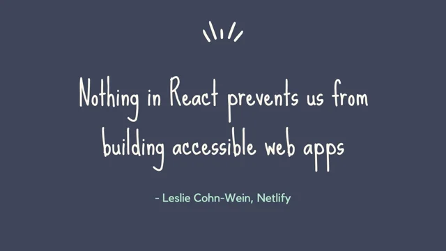
There's nothing inherent in React or Vue that prevents us from building accessible web apps.
It's just that we as developers don't always know what we need to do to make our apps accessible.
So today we're going to talk about how we can still use all these cool frameworks while fulfilling team's vision of an accessible web for everyone.
And the good news is there is something inherent in single page apps that is a plus for accessibility.
And that's that the modularity that single page apps provides means we can build an accessible component once and use it over and over again.
Everything becomes so much easier when we get our building blocks right.
So this is especially true if your organization uses a design system.
Web accessibility is a big, broad topic, but today we're going to be focusing on things that are generally within the control of the developer, and things that give the, the highest impact for the lowest effort.
So some of the things we're going to talk about today could be considered low hanging fruit.
But low hanging does not mean low impact.
Some of the most basic changes we can make can be the difference between usable and unusable.
There are a few ways we can define accessibility, but for the purpose of this talk, we're just going to go with a really simple definition that web accessibility is the practice of removing barriers to using your website.
So making it easier for people with disabilities to consume your content, to purchase your product, to complete the actions they came to do and get on with their day.
But accessibility doesn't only benefit people with disabilities, it benefits all of us.
Many of the things that we take for granted today were first built for people with disabilities.
For example, speech to text, SMS, automatic doors, and audiobooks.
A quote that I heard recently and really liked is that accessibility is usability on steroids.
When we design and code our products for, to be accessible for people with disabilities, we also help people experiencing a temporary or situational impairment.
So subtitles help both your hard of hearing users, as well as people who are in a loud environment.
Sufficient color contrast helps both your low vision users, as well as people who are trying to use their phone in bright sunlight.
To kick it off, we're going to start with HTML, because meaningful markup is the foundation of an accessible website.
Unfortunately, writing good HTML has taken a bit of a backseat in the days of JavaScript engineering, especially for newcomers to the industry where, you know, learning React, happens before they learn HTML.
But getting back to these basics is going to give us the biggest bang for our buck in making an accessible app.
Meaningful or semantic markup, it just simply means using the native browser elements and controls to convey the meaning, purpose and structure of our content.
To understand why the correct HTML is so important, it's helpful to understand how people using screen readers navigate a web page.
Just as sighted users can scan a web page to get the relevant information as quickly as possible, screen reader users can do a similar thing using the screen reader rotor.
So the rotor creates lists of different elements on a page.
So it might be a list of all the headings, or all the links, or all the buttons, or landmarks.
But if we haven't used HTML in the way it was designed to be used, we actually remove that ability.
They would be forced to read out the entire web page to find what they're looking for.
And accessibility isn't the only benefit you get from using HTML correctly.
It's great for SEO as well.
Assistive technologies access your webpage in a pretty similar way to search engine crawlers.
Relying on the contextual information provided by the markup, for example, interpreting that a H1 is the most important content on the page, or that the text within anchor elements describes the purpose and relationship of the link.
If a screen reader doesn't understand your content, there's a good chance that Google doesn't either.
On the screen now, we've got an example of an inaccessible card component, and I'm sure we've all seen markup like this before.
We've got a wrapper div for styling, a heading div, a paragraph div, a button div.
This is what I affectionately call div soup.
So now on the screen, we've got a more accessible version of our card component.
We've replaced the wrapper div with a list item so it can be logically grouped with the other cards.
We've replaced the heading div with a h2 heading element.
So now it'll come up in the list of headings of the page.
We're using a real paragraph and we're using a native HTML button element.
I just want to talk about buttons for a sec.
Native HTML buttons are actually really amazing.
By default, they're focusable by the keyboard.
They can submit data to a server.
They can reset forms.
They can be disabled with a disabled attribute, styled by their active focus and hover states, and their role is automatically reported to the accessibility tree.
Let's look at what we need to do to make our button div accessible.
First we need to make it accessible, sorry, focusable with the keyboard because divs aren't focusable by default.
So we'll add a tab index of zero.
Then we'll need to give it a role of button, so assistive technologies can announce it as a button and a screen ready user knows this is something they should interact with.
We'll need to add a listener for key up or key down because divs have no synthetic click activation.
And we'll also need to code the JavaScript handler to perform whatever that action is.
So we could do all of this, or we could just use an HTML button and get that behavior built in for free.
So next time you need an element to do something, like trigger a pop up menu, open a modal window, toggle an interface, a button element is probably the right choice.
Next I want to talk about the forms.
The internet is full of forms.
Newsletter subscriptions, contact forms, product sign ups, shopping carts.
You'll notice quite a few of the things that make companies money.
And so there's a number of ways we can make our forms accessible, but I want to really focus on inputs and labels.
And I can break this down to two easy rules to remember.
Inputs must have labels, and those labels must be linked.
Here we've got a code for, with a, has a visible label, however the labels and the inputs aren't actually linked in any way.
So this means when a screen reader lands on the input, the label's not announced.
It'll say, edit text, blank.
They'll know they're inside a text input, but they won't know what the text field is for.
Let's contrast this with an explicitly linked label.
And we do this by adding a for attribute to the label with a matching ID on the input.
And when a screen reader lands on this input, the label will announce, edit text, Lego character.
So now it's clear what this input is actually asking for.
Now remember I mentioned that the IDs on a page must be unique.
One of the reasons we all love single page applications is the ability to create reusable modular components.
But this also means we won't always know what other inputs are going to be appearing on the same page.
So if your ID is something fairly generic, like address or name, it might not be the only address or name on the page.
And this can cause really unexpected behavior from forms.
In 2024, we have a bunch of easy options for creating unique identifiers.
Depending on your individual setup and needs, you could use the new built in crypto API and call the random UUID function.
You could import the popular uuid npm package, or even use the React hook useid.
So we can create a variable that combines a human readable name like address with a unique identifier suffix.
And then just pass that variable into the label and input to ensure there's no duplicates on the page.
You might be aware of another approach, where a label can be linked implicitly, so this is where you wrap the input inside of the label, and I know it's more straightforward than what I was just describing, but, it doesn't have as good support with assistive technologies, so explicitly linking them is still always best where possible.
And so what if you've been given a design and you notice that it doesn't have any visible labels?
So this can be a problem for people that use screen readers, but also for people with cognitive impairments who might not be able to infer the meaning of the field.
And it was really common about 10 years ago.
But we're seeing this a lot less now.
First I would suggest have a chat with your designer.
Designers care about their users and they want to do right by them.
So you might find that they're happy to add them in once they understand the accessibility implications.
If that's not successful for whatever reason, you as the developer still have the power to make this more accessible.
You can add a hidden HTML label, and just hide it with the CSS.
If you're using a CSS library like Tailwind or Bootstrap, they already have built in classes, specifically for this purpose.
Otherwise, you can really easily roll your own.
On the screen now is, just as a common CSS way of doing this.
It's a combination of absolute positioning, fixed width and height, overflow and clip path.
And so it just moves the content off screen without affecting any other elements and will still be announced by a screen reader.
And you might be wondering about placeholders.
Are they a valid alternative?
No, sorry, they're not.
Placeholders are popular because they save space and they're minimalist, but they're not accessible for a range of people.
They're not reliably supported by different assistive technologies, so they might be ignored completely.
They can be problematic for people with cognitive impairments, who might forget what the prompt was when it disappears.
They don't have sufficient colour contrast, for people with visual impairments.
But then if you try to fix it by upping the contrast, you're creating a situation where it could be confused as that input already being filled in, increasing the likelihood of submission errors.
An additional benefit of linking your labels, and your inputs is that it increases the size of the touch target.
So when the touch target is, when they're not linked, it's just the input itself.
So think a radio button or a checkbox is quite small.
But when we link our labels and our inputs, the touch target then increases to the whole, include the label area as well.
Imagine you're in a bumpy car, which one would you rather be trying to click?
This increased area can make a huge difference for people who have trouble making precision movements.
For example, someone with hand tremors.
Next, we're going to talk about visible focus styles.
The focus indicators are the styles applied to interactive elements when they receive a user's focus, to show where they are on the page.
They help sighted people that aren't using a mouse as their pointer.
Each browser comes with its own default focus styles.
It's often like a thick blue outline, but the appearance can change based on the device and the operating system that you're using.
And ever since CSS resets became the norm sort of in the 2000s, there's been a tendency to remove these defaults for consistency between browsers, but also because they're considered ugly.
But removing the focus outline entirely is like removing a wheelchair ramp because you don't like the look of it.
When we remove these focus indicators, sighted people get lost.
Imagine you are navigating a retail website, searching for a specific item and your mouse pointer just disappeared and there were no hover styles on any of the links or buttons.
That's a similar experience to what a sighted keyboard user feels when they, when the focus indicators are missing.
So instead of just removing the focus outlines entirely, we can replace the default focus styles with our own on brand styling with the focus visible pseudo class.
Focus Visible only applies, when the browser thinks it makes sense to, so for example, when a non pointer input's being used.
Ideally, we want to make our focus indicators stand out.
Accessibility guidelines recommend two pixels thick and meeting three to one color contrast between the focused and the unfocused state.
And although they don't prescribe how you do this, I personally love a good outline.
For a couple reasons, you can apply an outline to a whole bunch of different types of elements without needing to customize the style per element.
Adding and removing outlines doesn't cause any layout shift because it's not part of an element's box model.
And they aren't automatically removed by forced color modes like background colors and border colors are.
Even better is to offset your outline by a couple pixels.
This means you won't even have to worry about the contrast ratio between the element and its outline.
Next we're going to talk about routing.
So there's fundamental differences in how routing works in a single page application versus a traditional multi page app.
When we click on an internal link on a traditional website, the entire page reloads while it goes and sends a network request.
The loading of the new page means that the keyboard focus gets reset to the top of the page, and that triggers a screen reader to announce the page title, which would have changed.
The combination of these confirms to the user that something has happened and it gives them more context about the page that they've landed on.
So contrast this with a single page application.
When we click on an internal link of a single page app, the route changes, but only the component within the page wrapper gets reloaded.
So this means that the page doesn't refresh, the keyboard focus gets just dropped to whatever component is still on the page underneath.
So that's usually the footer.
And by default, the page title doesn't get updated, and so there's no change of context announced to a screen reader.
There's nothing to tell them that anything's ever happened.
So we need to recreate a bit of that traditional behavior by updating the page title and managing the user's focus.
We'll start with updating the page title.
In single page apps, we tend to set the value once in the global template and then we don't really think about it again.
And to be clear, we're talking about the document title that shows in your browser tab.
So not only does it give context to screen reader users, it's also helpful for people with cognitive disabilities, that, and also to people who have a lot of tabs open at one time.
So imagine you had a bunch of different tabs open from the same site and the title was the same for all of them.
It's really hard to know which tab was for which content.
A simple way to update the page title on routing is to use lifecycle methods in combination with vanilla JavaScript.
Most frameworks will have a method for performing an action when the component loads, for example, useEffect in React or mounted in Vue.
We can hook into these lifecycle methods and manually set document.title when the page component mounts.
If you're using Vue, you can also use the built in beforeEach navigation guard to set the document title to the passed in metatitle, which can be defined when you're defining your routes with Vue Router.
So the second thing we wanted to do was focus management.
We need to Manage where the keyboard's focus is going when we change that route.
In 2019, the Gatsby team conducted some user research to explore different ways that this can be done in a single page app that benefits the broadest range of people with disabilities.
Generally, the conclusion was that focus can be managed, can be moved to the new content and announced.
There's some nuance to how that can be done, so I'll share a link in the resources at the end.
So where you send that focus to is up for considerations.
Options include adding a dedicated skip link, sending to the document body, page wrappers and page headings, but most pages have a H1, and they're generally a good descriptor of the page content, so personally I like them as a good target for focus, and that's what we're going to use as an example today, but there are other options as well.
The first step is we want to make our H1 heading, have the ability to accept focus because they don't by default, and we don't want to put this into the normal tab order, so we'll give it a tab index of negative one.
Then we can add a ref to the heading and use a lifecycle method like useEffect to set the focus to the h1 element when the component mounts.
Now one thing to note is because headings don't normally receive focus, it's going to have, the visible focus indicator that we talked about earlier.
And this is one of those times where that's actually not helpful.
That's probably just confusing.
So in this case, you're all good to remove the outline.
Another time we need to actively manage the user's focus is with modals.
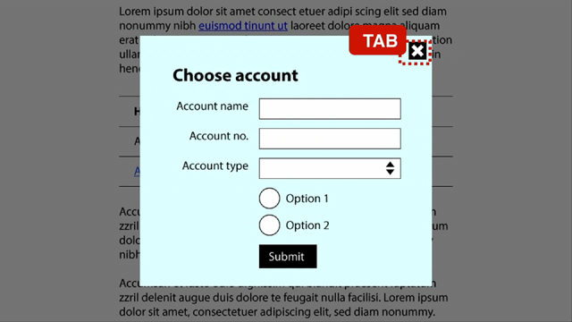
When we develop modals, we need to do three things.
When the modal opens, we need to move focus to it.
When the modal is open, we need to trap the focus so the keyboard user can't access anything outside or behind the modal.
And when the user closes the modal, we need to return keyboard focus to the same place that it opened.
Years ago, Rob Dodson, who has a fantastic accessibility series on YouTube, wrote, Modals are actually the boss battle at the end of web accessibility.
Because until recently, it was really hard.
As someone who knows a lot about accessibility, I used to just suggest people use a ready built plug in.
It was way too hard to roll your own, you're most likely to stuff it up.
Luckily, it's heaps easier these days.
And this is thanks to improved browser support for the native HTML dialogue element.
Although the dialogue element first dropped in Chrome in 2014, it took eight years, to gain support in all the major browsers.
It actually only happened in early 2022.
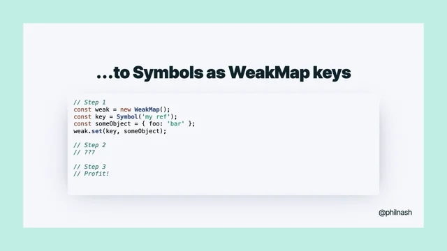
I made Phil's mistake as well of not using little ticks.
If anyone knows when these numbers came out, but 37, that's gotta be, that's yonks ago.
The native dialog element does all the three things that I mentioned that a modal needs to do to be accessible.
It's really easy to use, you can open it with the showModal method built in, and close it with the close method.
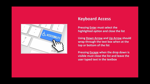
And it can also be closed by hitting the escape key.
That's a pretty standard accessibility feature keyboard users expect that we used to have to add in manually, but we now get for free.
Yay.
The dialogue element also lets you configure, which element the focus should go to.
So by default, it's It just goes to whatever the first focusable element is.
But you might want to customize this for your use case.
For example, if the first focusable element is a destructive action like delete, you might want to focus the least destructive action, or if your modal is like terms and conditions and the user's supposed to scroll down and read everything first, you might want to send focus to the modal heading.
And you've got that option.
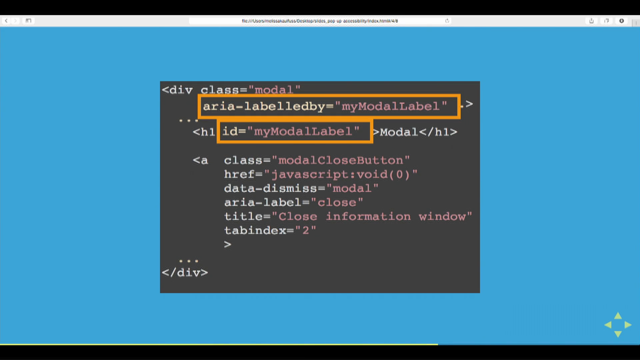
If you still need to create a custom modal for some reason, without the dialogue component, it's now easier to roll your own as well.
And that's thanks to the new inert HTML attribute.
What this does is it disables, all user input for an element and all of its children.
And it hides everything from assistive technologies as well, similar to using array hidden true.
And this can just be added to the main element of the page, that's when your custom modal is open.
Despite a polyfill for Inert being around for a really long time, it's actually only recently been added to the browsers in 2022.
And that's because all the big players work together to ship dialogue, which uses the inert functionality.
And lastly, we're going to talk about testing.
There's two main categories of testing, automated and manual.
You might note that I said automated and manual, because they're both really important pieces of the puzzle.
We'll start with automated tools inside your code editor.
And what would a tech talk be at the moment without talking about AI?
Hands up if you've been using a co pilot or coding assistant.
Not as many as I thought actually, I thought it would be like every hand of, but there's still quite a lot of us.
But what you might not know is that these tools can help us with accessibility as well.
GitHub shared a prompt last year you can use for Copilot to give you accessibility aware answers.
It's quite a long prompt, so I'm not going to put it up on screen, but I'll also share a link to this in my resources as well.
And I've used it myself.
It's pretty decent.
Of course, like all CoPilot suggestions, you want to verify and make sure that it makes sense for your use case.
But this is worth exploring.
Still inside of our code editor, we've got Linting.
Most of us are probably familiar with, Atul, popular Tool ESLint, and another popular extension to this, is a package called ESLint plugin js sax ally.
There's one for Vue as well.
And this checks for around 40 common issues, that'll just appear alongside your ESLint warnings.
So this tool can help us identify any accessibility issues inside of our template, but it's not able to test any of our rendered HTML output.
And so that's where an accessibility testing library like axe core from Deque Labs comes in.
Accessibility issues are shown in your console, and given an importance rating to help you triage the issues that it finds.
Another handy tool is the Accessibility Inspector within your browser, DevTools.
So this gives you a visual representation of the accessibility information available from your HTML to assistive technologies.
So it'll show you the accessible names, roles, and values of different DOM elements.
Jumping outside of our immediate dev environments now, there'll be times when you want to assess the accessibility of a full page or site.
And there's many tools to do this, but two popular ones are Wave and Google Lighthouse.
WAVE is a free browser extension developed by the folks at WebAIM.
It can generate reports, and it also has visual markers, where you can get some more information.
Google Lighthouse is a suite of auditing tools built into Chrome DevTools.
The Lighthouse accessibility audit gives you a score out of 100, and that's based on the weighted average of axe user impact assessments.
And on the topic of Lighthouse, I just want to share with you one of my favourite blog posts.
It's a few years old now, where a developer aimed to build the most Inaccessible website possible while achieving a 100 percent accessibility lighthouse score.
So he was able to get a blank page that nobody could understand.
You couldn't inspect element or anything.
And he still got the hundred percent.
Now the point of the post was not that automated tools suck, it's just that automated testing is the first step.
It can help us pick up basic issues, but it'll only catch 20 to 30 percent.
And that's where manual testing comes in.
The two main tools we use for manual testing, the first one you already have, it requires no special knowledge or experience, and that's your keyboard.
All you need to do is use your website without a mouse.
So what are we looking for?
We want to make sure we know where our keyboard focus is at all times.
We want to confirm that the tab order makes logical sense.
We want to check, that you can reach everything with the keyboard, and then once you have reached it, does it work?
Not long ago, I was doing some accessibility testing, and I had trouble submitting a form with the keyboard.
And when I inspected the code, what looked like a submit button was actually an anchor element with no href and an on click handler.
Whoever coded this button didn't think to add a keyboard handler as well.
So it's worth double checking that interactive elements are actually working.
After you've tested with the keyboard, it's great to run through with a screen reader, particularly when developing like interactive components.
And so there's three main players in the screenreader world.
JAWS is a paid subscription, so you probably won't have access to that.
That's made for Windows.
NVDA is a free software created by Two Blind Australians.
That's also for Windows.
And VoiceOver is built in to all macOS.
So that might be the easiest to test with, but just be aware that it's less likely that your customers are using that particular screenreader.
Given over half of web traffic is from mobiles, you might like to also test on a mobile device.
VoiceOver is what you'll use with the iOS, and on Android you'll use TalkBack.
And these are both built into the operating systems, you don't need to download and install anything.
But I would recommend having a user guide up when you're doing this for the first time.
I don't personally find these controls super intuitive, and it can be really daunting when it's like yelling at you and you're like, oh, I don't know.
So I'll link to some, good guides on how to test with screen readers as well.
So what are we looking for on screen reader testing?
Are all the buttons and controls being announced?
So if you've got a magnifying glass as a search button, is it saying search?
Do we know what it is?
Do the links make sense out of context?
Is the state of the components being expanded or collapsed?
Coming out, for example.
Are all the form labels being announced correctly?
At my workplace, we recently implemented Typeform.
So that our marketing team could create complex forms without engineer support.
And we knew Typeform generally worked with screen readers because we'd already tested it before we agreed to implement it on the site.
So when we were about to launch an important new lead generation form, new campaign, we thought we'll just quickly run it through the screen reader.
But what we found was that every form label was being announced object, object.
Eventually we figured out it was a really weird bug that even Typeform was like.
What did you guys do?
A marketing person had done control B to bold the label text.
And they weren't, it wasn't expecting to be given a node instead of a string.
So luckily able to fix it.
But if we hadn't spent a few minutes running it through voiceover, we wouldn't have known that it was completely unusable for a whole section of users.
It's always great to just quick run through.
So to wrap up, things that we can do as developers to make our web apps more accessible is make the most of HTML, linking our form labels and their inputs, updating page titles on routing, managing the user's keyboard focus, and using the available tooling to test our apps.
And before we all head off to lunch, I just want to leave you with one final thought.
The web does not just connect machines, it connects people.
And that's who we're making our products for, right?
People.
Humans are a diverse bunch with diverse needs and not everyone accesses the web in the same way.
So when you use the techniques we've covered today, you're not just writing code.
You're making the web a better place.
Thank you for having me.

