Cranking View Transitions up to 11

Introducing Brahmos Van Damme and the View Transitions Topic

Bruce humorously introduces Brahmos Van Damme from Belgium with a series of anagrams before handing over to the speaker. Brahmos introduces himself as a Chrome DevRel team member focused on CSS and interactions, shares his background in electronic music and scuba diving, and strongly encourages attendees to start a blog — crediting his own 20-year-old blog with directly landing him his job at Google.

What View Transitions Are and Step 1: Identifying and Naming Elements

Brahmos introduces the view transitions specification, summarising it as enabling rich visual transitions between two states or pages of a website, illustrated with a list item animation and a full-page card transition demo built by Maxi Ferreira. He then introduces the first of three steps: identifying all elements you want to animate by comparing both design states and assigning them a matching `view-transition-name` in CSS, noting you can even morph between completely different element types such as an h2 and an h1.

Step 2: Triggering View Transitions in SPAs and MPAs

Brahmos explains the two ways to trigger a view transition: wrapping a DOM-mutating JavaScript method in `document.startViewTransition()` for single-page applications, and adding `@view-transition { navigation: auto }` in CSS on both pages for multi-page applications including standard websites with links and form submissions. He notes that cross-document transitions are restricted to same-origin navigations for security reasons, that same-document browser support is universal, and that cross-document support in Firefox is forthcoming through the Interop initiative.

Browser Internals: Snapshots, the Pseudo Element Tree, and Auto-Generated Animations

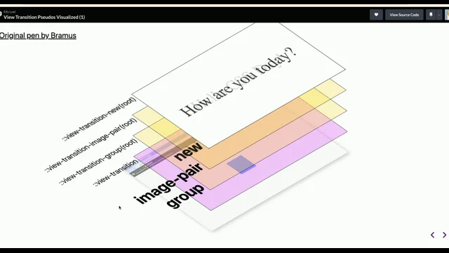
Brahmos explains what the browser does after a view transition is triggered: it captures snapshots of all named elements from both the old and new states, pauses rendering, then builds a pseudo element tree consisting of `::view-transition`, `::view-transition-group`, `::view-transition-image-pair`, `::view-transition-old`, and `::view-transition-new`. He walks through the auto-generated CSS keyframes that handle position, size, and crossfade for each group, and uses a 3D outline visualisation in his demo to show how all the individual pseudo element layers move during a transition.

Step 3: Customizing Animations and Community Demo Showcase

Brahmos introduces the optional third step — customizing animations — showing how standard CSS properties like `animation-duration` and custom keyframes override the browser defaults. He demonstrates practical techniques including directional sliding for the top navigation bar using the `:only-child` selector, and hiding the old snapshot to let a live video continue playing without an unwanted crossfade. He closes the foundational section with a showcase of community demos: a CSS grid gap animation, an Isotope.js recreation with a wobbly timing function, a staggered-title lightbox by Dom Christie, and a multi-page site demo by Jake Archibald.

Cranking It Up: Scroll-Driven Card Demo Concept and DevTools Inspection

Brahmos shifts to advanced territory, first noting the importance of respecting `prefers-reduced-motion`, then drawing inspiration from a Dribbble mockup to frame a scroll-driven card expansion as a view transition between two CSS Grid states. He walks through identifying and naming all the participating elements, triggers the transition with a button for initial testing, and then demonstrates Chrome DevTools' animations panel — showing how to pause, scrub, and slow down the transition timeline to inspect individual element animations and their staggered start and end points.

CSS Code Walkthrough for the Card Expansion Animation

Brahmos walks through the full CSS powering the card expansion demo, explaining how he builds a mental timing timeline to coordinate staggered animation delays and durations for each named element. He covers setting a one-second base duration, re-enabling pointer events so the page stays scrollable during a transition, handling aspect ratio differences between card states, applying the hide-the-old-snapshot trick for elements that remain visually identical, and inverting timing calculations to correctly handle both the expand and collapse directions.

JavaScript Implementation of Scroll-Controlled View Transitions

Brahmos explains how he made the card demo scroll-driven using JavaScript, highlighting the key technique of awaiting `activeViewTransition.ready` to access the fully prepared pseudo element tree. He then shows how to sniff out only the view-transition-linked animations by filtering `document.getAnimations()`, a pattern he borrowed from a Jake Archibald demo. A scroll event listener starts the view transition, immediately pauses all its animations, and then scrubs them by mapping scroll progress to a current time value in milliseconds, giving the user frame-perfect control over the transition.

Compositing Performance: Optimising Animations with the FLIP Technique

Brahmos addresses the performance problem of view transition animations running on the main thread by default, showing how Chrome DevTools performance traces reveal non-compositable animations flagged with a red triangle. He explains that `width` and `height` in the browser-generated keyframes prevent compositing, then demonstrates the FLIP (First, Last, Invert, Play) technique as a fix: reading element positions and sizes from the generated keyframes, then replacing them with `transform`-based animations that run on the compositor. He also covers a time-travel workaround using `getComputedStyle` to handle a Chrome bug before version 137 where keyframe values were reported as `none`.

Smooth Interrupted Transitions Using Relative Additive Animations

Brahmos tackles the jarring effect of interrupted view transitions, where clicking mid-flight causes the animation to skip to its end before starting a new one from a fixed position. He credits Kevin Daugherty with the solution: instead of calculating a new diagonal path, use `composite: accumulate` to stack a fresh animation representing only the remaining directional movement on top of the existing one. The result is smooth continuous motion even with rapid repeated interactions, demonstrated in a live shuffle demo recorded in Firefox to avoid a current Chrome glitch.

View Transitions Toolkit and Element-Scoped View Transitions in Chrome 147

Brahmos introduces the View Transitions Toolkit, a published package he built to abstract the recurring patterns from his explorations, including utility functions for `getAnimations`, `pause`, `play`, `scrub`, keyframe optimisation, and auto-navigation-type detection based on a JavaScript route map. He also introduces element-scoped view transitions, available in Chrome 147, which inject the pseudo tree onto a specific element rather than the document root, enabling concurrent and nested view transitions on a single page — a feature Brahmos calls out as something he wanted for a long time.

Polyfilling View Transitions and Reviving IE Page Transitions

Brahmos first describes his JavaScript polyfill for the view transitions API, acknowledging it cannot fully replicate browser behaviours like pausing rendering, but notes a lighter mock that polyfills only the API surface — removing the need for browser-support checks in application code. He then humorously revisits Internet Explorer's interpage transitions feature, which predated modern view transitions with PowerPoint-style wipe and box effects controlled by meta tags, and reveals a library he built to revive those effects on modern sites by combining the original IE meta tag format with the `@view-transition` CSS rule.

Audience Q&A: Code Attribution, Image Loading, and the CSS element() Function

Bruce hosts a short Q&A. Jake Archibald jokingly challenges whether Brahmos writes any of his own code given the extensive borrowing, and Brahmos explains he inherited both view transitions and the demos from Jake at Google. An audience member asks about image loading during cross-document transitions, and Brahmos describes the current render-blocking limitations and recommends prerendering via speculation rules as a workaround. A final question asks whether the live-projection capability of view transitions could enable the CSS `element()` function, which Brahmos enthusiastically endorses and urges the audience to advocate for via the State of CSS survey.

Our next speaker is from somewhere called Belgium. Yeah. So I asked him if he was gonna do the talk in Dutch or English, but he told me that apparently in The Netherlands, people don't speak proper Dutch. So he was going to do it in English. His name is Brahmus Van Damme, which is an anagram of madman bum raves.

And if you ever heard him speak before, you'll know just how appropriate that is. He's going to be banging on at you about some CSS malarkey called view transitions. An anagram of Brahmos of Brahmos of view transitions is naive bratwurst missions, which I think you'll find is completely accurate.

But nevertheless, give it up for Brahmos van Damme, the naive bum raves.

Thanks, Bruce. I didn't know that. Afternoon. Hi. View transitions cranking up to 11 safely maybe because, yes, I'm gonna show you some things that maybe you could use in production, but maybe you shouldn't. Or I'll I'll let you decide on that.

So hi. My name is Veremis. I'm with the Chrome DevRel team. I'm mostly doing CSS related stuff, interaction y bits, like scrolling animations or the intersection of both. If you have questions about CSS, come ask me afterwards, or come find me and my colleagues right over there in the top right top left corner from here where we have a booth.

And we can talk about a lot of things or point you to to the right people. I'm also up for chatting about electronic music, final records, scuba diving. So that's also possible. It doesn't have to be something tacky. The thing I wanna point out here, though, on this side is I have a blog, and I've had a blog.

Well, it's it's going to celebrate its 20 birthday or anniversary later this year. And I would recommend you yes. Thank you. And I would recommend you all to start a blog if you haven't done so. If you are doubting about it, please start a blog because I can draw a direct line from me having my blog to me landing my job at Google.

It does pay off. So share your thoughts. Share your ideas. We're very, very eager to hear your thoughts. Now I'm I'm not to talk about the history of my blog and so on and so on. I'm here to talk about this thing today, which is the view transition specification. You can read it from top to bottom. Or if you want a one line summary, here it is.

The view transitions specification allows you to create these rich visual transitions between two views of your web page or your website. Now two views or two states. Like, for example, this thing right here, where I have a state where I have four items in the list, and then here I have three items in that list.

And as I remove the purple one, maybe you wanna animate that, have a nice visual transition, like so. I hit the remove icon and whoop, it goes away. And if I add one, it falls in and the rest nicely scoot over. I think this is pretty nice. A more complicated example is this thing right here, where we have two actual pages on our website.

We have the overview page on this side. Yeah. We have the detailed page on there. And instead of you just clicking that black box there and then the layout changing and there you have the detailed page, Or maybe you want to have a nice transition where if you click the box, it nicely grows. The top navigation bar moves away.

You hit back, and so on and so on. As a user, I get this. I click the thing, and the thing then grows and moves around. And I think this is great for UX. This is a pattern that we typically see on native applications. Well, you can also do it on web because, yes, this is a website. It was recorded in Chrome.

So yeah, I think this is really cool. Demo, by the way, built by Maxi Ferreira. Wonderful guy, wonderful demo. Thank you, Maxi, for building that one. I really like this demo. So how do you do it? How do you do it? Well, it's fairly easy. All it requires is three steps. Now of course, as everything with CSS, it's easy.

And then it becomes a bit difficult. And then it becomes like a disaster if you try to do it if you don't really understand it. But my hope is here today to help you explain what and how you can do it. And then hopefully, it should be more easy to do. The first step is you need to identify and name everything that you wanna animate as part of the transition.

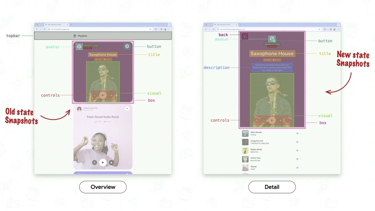
And that is very simple. You just have to look at your two designs, and then you start pointing at things and giving them a name. And you try to look for similarities between the two layouts. So for example, here on the overview page, I recognize the box. And then on the other side, I also recognize the box.

Now I'm not talking about the full card. I'm only talking about the black background box with the border radius on it because we're going to do the Photoshop thing here. We're going to layer everything up in several layers, and all the things that we want to capture are stuff that needs to move from the one view to the other and back.

So I recognize the box on both sides. It's the same box, so we want to morph that box into that box. The same thing with the visual that I have there. I have this photo of this person right there. I also have it on the other side. And then it needs to move to the other side, grow a bit bigger, and so on.

So we keep on identifying and naming all the parts that we see on our two designs, our two layouts. Now what is interesting here is on the detail page, I also have a description that is not there on the overview page. But I do wanna capture it because I want to fade that one in and move that in as part of that view transition.

The same thing with the back button. It also needs to animate as the view transition, as you are transitioning from that page to that page. And also finally, the top bar, we also want to capture that one. Because as I go from the overview page to the detail page, the top bar needs to slide out. If I go from the detail page back to the overview page, the top bar needs to slide in.

So that is the identify and naming part. Now we've only done it on paper here, like on our screen. Of course, we need to do it in CSS. And in CSS, we have a property for that, which is the view transition name property. And then you select your element or elements in both your states, and you give them the same view transition name so that the one from the one state morphs into the other one at the other state. So in both views, the card, well, that's the same selector. But on the overview page, for example, the title was an h two. And on the detail page, the title was an h one. And that is perfectly possible with view transitions, because we're going to capture a few things, which I'll explain later.

So yes, you can totally morph a title into a photo and then a photo into a button and a button into a paragraph. If you want to do that, view transitions has got you covered. That was step one. Step two is you need to trigger the view transition. And for that, you have two options. You have view transitions, same document view transitions, or cross document view transitions. And the same document one is when your document remains the same. So you're basically building application.

The document remains the same, and you are using JavaScript to mutate that DOM. So to add view transitions to that, you take your method that manipulates the DOM. So this one changes it. It doesn't show playlist. It mutates the DOM, but you wrap it in document dot start view transition. And that is the trigger for the browser to do things, to say, Okay, you want to do a view transition from the current state that you have on the screen to this new updated markup that you want to show.

Now, of course, you had a fallback for browsers that don't support it or for older browsers out there. Because browser support currently, it's available in all browsers. Hooray. Nice. But maybe people are running an older version of Chrome. Or maybe people are running a different browser that doesn't do view transitions yet. So there you want to provide the fallback where it says, hey, if you don't speak view transitions, just update the DOM and then be done with it.

Second way to do it, because this was the same document view transitions for single page applications, the second way to do it is when you are building a multi page application, where you're going from one document to another. And a multi page application, also known as a website. Yes. Turns out the web is pretty good at it.

You have a document, and then you put a link on there to another document. The web has been doing that for quite a long time. So navigation, that can be a link, which I already told you. But it can also be a form submitting to another page, because you are also submitting data to that other page. So that's also a navigation.

Now we won't do the view transitions by default there. There is an opt in that you need to do, and that is in CSS. So you add the add view transition rule there. Navigation set to auto. You add it on both pages. And then you will have opted in to doing a view transition between those two documents.

Another asterisk with this is that we won't do it for cross site navigations or cross origin navigations even. They need to be same origin. So I can do view transitions on my own site from one page to the other. But I can't do a view transition from my site to somebody else's website because that would have security implications.

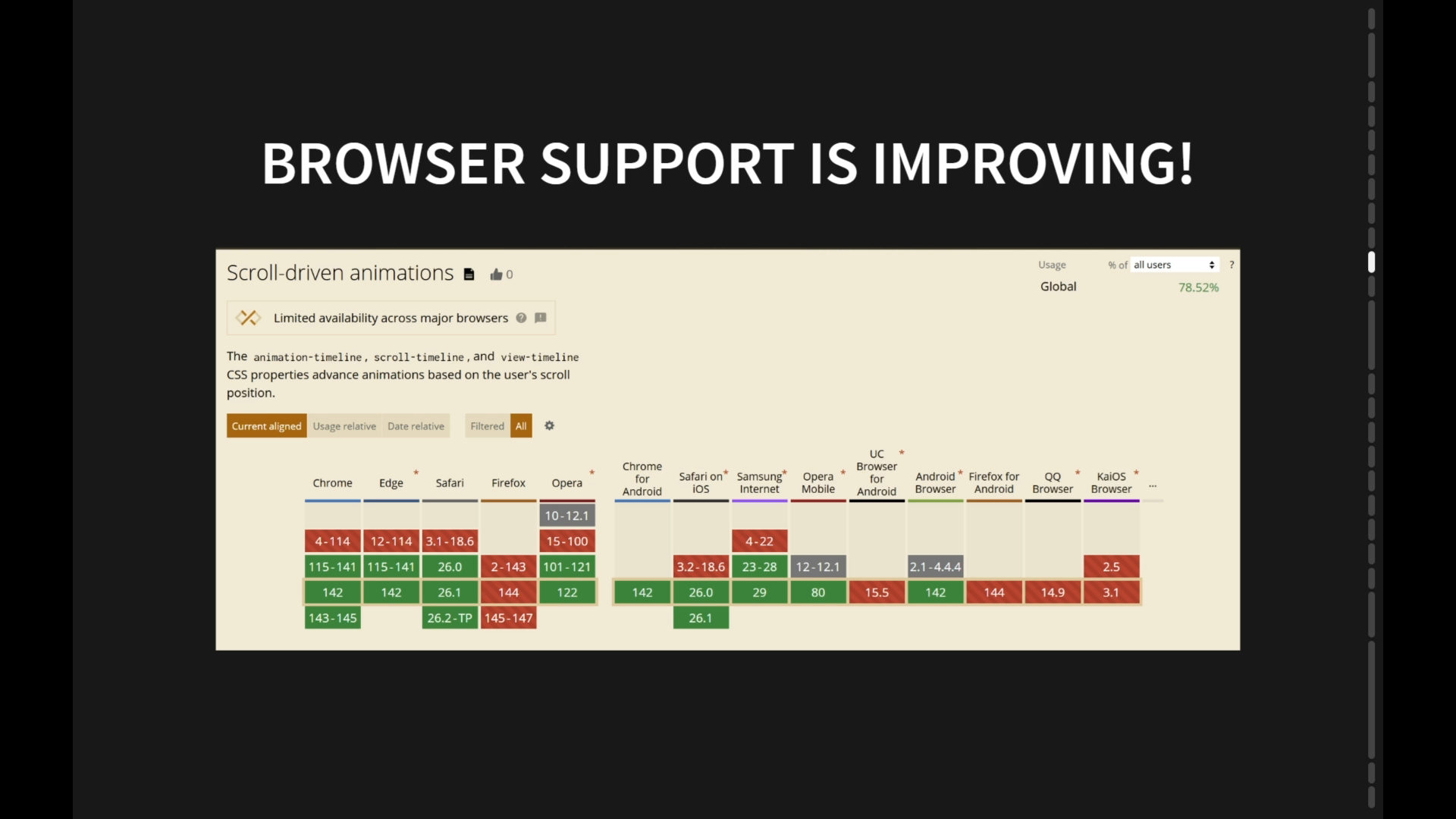
So we don't want to do that. Browser support looks like this. It's currently work in progress in Firefox. And that is thanks to the interop effort. So later this year, we will see cross document view transitions also being available in Firefox. Honestly, I don't really care about this browser support table here because I think view transitions are a real nice progressive enhancement.

If your browser doesn't do view transition, well, you get the status quo right. You click the link and then the content changes, and it just changes. But if you do have view transitions in your browser, well, cool. Then you get a nice and rich visual transition between the two documents. So these here are all the things that we have identified and named. We have the trigger, which was step two.

Something interesting happens here. When you do that trigger, so that is either the navigation for MPAs or websites or the same document one using JavaScript, the browser does something. Namely, from the old view, it will take snapshots of everything that you gave a view transition name. It will then pause rendering. Behind the scenes, it will produce the new frame or the very first frame of the next state.

And then it will capture snapshots from that state as well. So you end up with a bunch of snapshots from the old state and a bunch of snapshots from the new state. Here's an example. Here are the controls. And I already find this very interesting as an example because, yes, the controls are different between the two. Here we have three buttons in the controls, and there we have five. Well, that's not a problem because the browser takes snapshots, and then it will render those snapshots into pseudo elements.

And those pseudo elements being the view transition old, of course, for the one in the old state, and the view transition new for the one in the new state. Now the browser won't just render these in your DOM somewhere. It will use a pseudo tree for that. And that markup looks a bit like well, it looks a bit it looks exactly like this.

And this piece of markup, this pseudo tree gets injected onto the element on which you called your view transition, which is by default, if you do document dot start view transition, the document. If you do the cross document navigation one, then it is also the document or the root element. So this view transition pseudo three gets injected onto the HTML element here or the colon root, as we can also select it.

And we call this element, we call that one the view transition root. Then we have the view transition overlay. Because yes, each and every one of these here has a meaning and a value. The view transition, that one is just an overlay which renders on top of your document. And it even renders on top of the top layer, by the way. So that's like the toppiest layer that we have in a browser where you can render stuff in.

We recognize the old one. That one will fade out. We recognize the new one. That one will fade in. So it's going to do a crossfade by default. Then we have an image pair in there, which is for blend mode isolations because we only want to cross fade those two layers without pixels underneath participating in that cross face.

So we need blend mode isolation. And then finally, have the view transition group, which is responsible for the position and size. You might be like, position and size? But, yeah, if we take a look at our two designs, the x and y position in both states is different. So it needs to move from that position to that position.

And the size also changes. So isolated in the view, this is basically what happens. If I click on the card, then this controls one, it will move around. And then it will do the cross fade from the old snapshot to the new snapshot. So that is happening by default. Now those animations, they are generated by the browser.

So this is user agent generated CSS. And it does this all for you. So you don't have to do anything right now except just calling document start view transition or doing the navigation. We recognize the group one in there. So the view transition group with controls, that one is getting a specific animation to move that controls onto its new position and size, along with new width and height.

Recognize the old one to fade out, and recognize the new one to fade in. And then the asterisk that is used there is to say all the pseudos that you have captured, old, old, pseudos and all the new pseudos, you get to fade in and fade out. If you're curious about the keyframes that were generated, again, this is taken care of by the browser for you.

So this is what the browser generates for you. To move the controls, it uses an implicit end keyframe. So there's no 100% keyframe in there or two keyframe. The styles are written onto that pseudo temporarily while the view transition is running. And then the front key frame says, hey, this is your starting position. And if you can't read matrices, no worries.

If it says one zero zero one at the start, then the first value after that is a translate x. And the second one is a translate y value. So where are you x and y on the screen? And you can see that it will move from those coordinates to those coordinates. And then the width and the height also change.

So again, this is generated by the browser. You don't need to do anything for this. It all works magically. So this is our pseudo tree. Of course, this is only part of the pseudo tree that I'm showing here because we captured more than just the controls. We had the title. We had the card. We had the visual.

We had the top bar and so on, so on, so on. So our c zero three looks something like this, where we have this little mini group, with the group, the image pair, the old and the new for the cards, but also for the visual, the top bar, the avatar, and so on. And each and every group in there will have key frames generated so that it moves across the screen, and then the old and the new ones will automatically fade in and fade out as the group is moving. If you wanna visualize this, because I'm more of a visual person, no worries.

I added a three d option to show you that in the demo. So you click it on. And here I've had outlines to all of the groups. So you can see what is happening to the groups. Like you can see here, top bar with the playlist, it's moving down. And then if you go back, you go into a detail, it's moving up. Take a look here at the visual at that box. If you hit back, the visual moves down.

So that has visualized what is happening with that pseudo tree. So step one, identify a name. Step two, trigger the view transition. And then step three is the next one, which is to customize the animations. But this is totally optional because I've already shown you the browser does a lot of the heavy lifting for you. It generates all these movements on the groups, it fades in and then it fades out.

Now in this demo that I've shown you, there are customizations that have been used. And looking at the code, this is the same code that I've already shown you. If I look at that, I'm like, holy crap. Like, I noticed that this is CSS. Right? So I can just take my own CSS and throw it at it, and that is exactly what you can do.

For example, for a demo, I have done this. I said, hey. You know what? All the groups, you have an animation duration of two seconds. And thanks to some more CSS in the UA style sheet, that duration is inherited onto the image pair and onto the old and the new. All the animations as part of the view transition will last for two seconds.

Another part where this is used is, for example, with the top bar. When you're going from the overview page to the detail page, the top bar, you want to move that away. You want to slide it out. But if you're going back from the detail page back to the overview page, well, the top bar needs to slide down.

I guess here's a demo. Click on the card. Top bar slides up. Hit back. Top bar slides down again. Looking at the pseudo tree, there is something interesting happening here. Because if you take a look at all the groups and then the old and the news, if you look at the one for the top bar, you will notice that there is only either an old one, an old snapshot, or either a new one, depending on whether you're going from overview to detail or from detail to back.

And then to select this one, like when there is only an old one so you can and I put only an old one or only a new one. Well, to select that one, we have CSS. We have the only child selector in CSS. Right? So we can customize it like this. Instead of having the default fade in and fade out animation, we're like, no. No. No.

No. When there's only a new top bar so we are going from detail back to overview, you want to slide it down. And if there's only an old snapshot in that pseudo tree, then you want to slide it up. So this is how you can customize it. Another interesting bit here is the visual. This is the card with the lady, and then you click on it, and then you go to the other page.

If you take a good look at it, there is something really interesting happening here, namely the video keeps playing as the view transition is happening. That's like, oh, holy crap. That's that's pretty cool. Right? And the way that it works is basically when the snapshots are taken, this is what happens. The old snapshot, that one is like a screenshot, actually.

It's like a stale copy of whatever was there. But then the new snapshot, well, that is a live view. It's like a projection of the original element in your DOM, but it gets projected into that new pseudo. So by default, if we use the fade in and fade out animations, we would end up with this where we have the old one sitting on top, the new one underneath.

And if we then do the cross fade, you will have this cross fade from a stale key frame to a video that is playing, and it looks weird. Pay close attention. It's like, Like, I don't want this. I I just wanna see the video. I wanna see the new pseudo. Well, you you can do that. Because you can say, like, oh, I don't care about this one.

I don't care about the old one. I just wanna hide it, and I only wanna see that new one. So the new one shouldn't do the fade in by default. Well again, a bit of CSS. You throw it at it. You say, hey, the old visual, display none. I don't want to see you. The new visual, no animation.

So no fade in. So it will just always be there without doing an animation. And if you then take your two snapshots with the one hidden and the one visual, lay them on top of each other and you play the transition, now the transition is playing. But there's no crossfade happening, so it's all smooth and very nice.

So the TLDR for view transitions is basically this. You have three steps. Identify a name. You then trigger the view transition. And then the browser does a bunch of stuff. It captures all the snapshots. It sets up the pseudo tree then. It prepares all those animations. And then you can customize those animations. And then finally, the browser will play those animations.

And that is your view transition. Some examples. Here is one where I'm toggling the grid gap on a CSS grid, but it's wrapped in document start v transition. So instead of just saying, hey. Your new gap is now two AMs or, like, half an m, I wrap that in document dot start v transition, and then the browser will do this.

Kind of wish that grid worked like this out of the box. I think this is this is nice. But yeah, document dot start view transition wrap wrap it in there. Another demo built by built by Adam. Are where are you, Adam? Built by Adam, which is a recreation of Isotope JS. And what I really like about this demo is that you can also see the bouncy, wobbly effect going on there.

That is done by changing the animation timing function, and then using the linear function to create this little wobble effect. Again, whenever one of the controls change, you wrap that in document. StartViewTransition. And then in JavaScript, you do that DOM mutation. And it will do all the capturing for you as long as you give each and every one there a view transition name.

Another demo built by Dom Christie, where there's this typical lightbox one. You click on the small photo, then it grows into the big one. Now what I really like is this attention to detail right here, where the titles have this nice staggered effect as they are entering, and then they stagger in the reverse as they are exiting.

Really nice demo. I like this one. And finally, a demo built by Jake back in the day, which is a more real website here where you have an overview page and detail. You might recognize some faces there. But you filter it, then it changes. And then what I really like as well is that if you are on a detail and then you click the title back, like the HTTP to a Cree title, it nicely slides back as the button is fading out.

Really, really cool. So yeah, view transitions. Now I've only shared a part of what is there to say about view transition. But I want to move on to cranking it up to 11 to do more crazy stuff that you can do with view transitions. One thing that I do want to call out though here is respect user preferences.

So if the user has prefers to reduce motion set to reduced, then don't run the view transitions or change your animation so that they are more subtle. Like you don't want to move stuff around, but maybe just have the default crossfade. There's a bunch of things that you can do with view transitions. If you do want to know all about this, go check out my talk that I gave at, what was it, JSB, I think, React Brussels a while ago.

That talk goes into detail. Or if you're more a fan of reading, well, good news. We have a lot of documentation up on our website, developer.chrome.com, where you can review everything. It has sections on same document view transitions and also cross document view transitions. All of the info is there. Now what a lot of people don't know is that Maxi Ferreira, he built he built his demo after this dribble mock up.

And if I look at it, there's something interesting happening here. You click the card, and as you scroll, it also animates. And when I see that, I'm like, that's a view transition between two states. Like, yes, there are two states. Well, state one being that one and state two being that one, and then there's a view transitioning happening.

Now it's it's not by clicking a button running by time. It's like by you scrolling through the thing, but that is a view transition between the two states. And the two states, well, there's not a lot of difference between the two states because you can totally, build this with with CSS Grid, and then your grid template areas would look something like this.

And then the small version is just a changed value for grid template, where instead of showing the meta and the title and description and the image and so on and so on, you are just showing the image and title and the more meta and all the rest you don't care about. So that is the only change between those two states.

Now if you want to do a view transition with that, well, I've already told you. Right? You do document dot start view transition. You take your method that updates the DOM. You wrap it in document dot start view transition. Here, I attach it to a button just like to test things out. I go for it. I click on it.

And, oh, it's only doing a cross fade between the whole document. But that is because in the UA style sheet, so that's a style sheet that comes with the browser, It has stuff like the page background is white and the font is Times New Roman 16 pixels by default. Stuff like that goes in there. Well, one of the rules that if the browser supports view transitions, one of the rules in that user agent style sheet is this one. It says, hey, the root element, you get a view transition name of root, which is by default, we're going to capture a snapshot for you if you're doing view transitions so that you have a crossfade. Now we don't want to have that crossfade.

We want to have this. And I've attached it to a button, but, like, this is what we wanna see happen. Right? You want the yeah. Boom. You wanna see the big card move into the small card, and then some some crossfading is is happening. But to do that, we have to do the whole dance again. Right? We have to identify and name everything, trigger the view transition, which we've already done, and then customize the animation.

So step one, identify and name your elements of transition. Again, we get to look at designs, and we get to point and name things. Woo hoo. I see the card over there. Yay. I see a visual over there. Yay. I see a title over there. The more meta block. I see a back button as well. More meta. And then I see a lot of crap on that design that I don't care about, but I do want to animate it. So again, add a view transition name to it so that it becomes part of that view transition.

And to be clear, because there is some confusion about this, when you are doing a view transition from that page to that page, it results in multiple elements being animated, but it's one single view transition. So it's not all those individual elements doing a view transition. No. It's one single view transition that consists of multiple parts moving around. So identify and name all that stuff, but we also need to identify and name something else, namely the tracks list.

Because we don't want that tracks list to just cross fade to that other state. No. We also want to move it so that it moves to the right position. Those are all the names. We do that in CSS. I will show you the code later on. We trigger the view transition. I've already shown you that one. This is a call to document dot start view transition, where we basically just toggle the class.

That's it. And then we customize animations, which is optional. And I will show you a lot of code here to do that. But before I show you the code, I wanna show you what I actually built by using DevTools. Because in DevTools, you can show a animations panel. And then in that panel, you can say, hey. You know what? Whenever you have animations running, pause them.

I don't want them to run. So if I click the button, all the animations are created, but they aren't running because DevTool is preventing that. And if you then click on the card there for that animation that was captured, you'll see all the animations here, and you get this little timeline. If you come from the flash days from back in the day, this will be pretty familiar.

And then once you have that in this state you can also hit this, by the way, like 10%, 25%. You just slow down time. So the animations will run, but just a bit slower. But once you have this thing here, well, you can grab that red line there, which is the play head, and you can scrub the timeline. Is it scrubbing?

Yeah, it is scrubbing. So now I'm controlling time by scrubbing that little playhead right there. And there's a few interesting things happening here in the animation, like for example, the title there. The title, it doesn't animate over the entire duration of the full animation. So the full animation is like the title. It starts a bit later in the animation.

And also, its time is not the full time for it. You can have it visualized here. Like, there's a bunch of dots there where an animation starts and stops and so on. So DevTools, I really like this feature. It's it's nice. Firefox DevTools has it well, by the way. So, yeah, let's take a look at some code.

Right? It's not gonna be x 86 code, so it should be readable for most of you. It is CSS. And here it goes. Oh, yeah. Had to shrink it down and spread it on multiple sides, but here it goes. So basically here, what I do is I set up the parts of the animations. So the title that I mentioned, which is right over here, it should only last for 60%, and it should be delayed 20% into that animation.

So I'm adding some numbers here where I'm building up this mental timeline that I will then use later on in calculations for animation duration and animation delay. So those are all those numbers. The next thing I do here is we set up the base duration. Like you want the entire view transition to last for one second. And then also we want to inherit the animation delay onto those other pseudos. So I told you that the animation duration by default is inherited from the group onto the image pair onto the old and to the new.

That is also true for the animation delay, but not in all versions of Chrome. We only added that one later to the spec. So Chrome caught up later on. So you need that for all the Chrome. Firefox and Safari had it out of the box when they shipped their view transitions implementation. The next thing you want do is you want to disable pointer events on your view transition overlay.

Because as I mentioned, the view transition overlay renders on top of the document, on top of the top layer even. But it also captures all pointer events by default. Now we don't want that because we want to scroll the page while the view transition is running. So we re enable that using just one line of CSS and declaration. They are pointer events.

Then we have a bunch of key frames, side up, side down, and so on. We give all the elements a view transition name. Hooray. Then we deal with differences in aspect ratio between the card because it has some differences. Jake has an article about it on his blog. Go check it out. Then finally, we do the trick like we did with the video.

Like, for some elements, we just wanna show the new snapshot and not the old one. We don't care about it cross fading because they are the same, so we do that here as well. And then we start setting those times. Right? When the when there's only a view transition old for a description, so when we are going from the big card to the small card, we want that animation to start a bit later, and we want that animation duration to be a bit shorter than the rest. And also in the other direction, we do the same thing, but we need to reverse the numbers.

So here we do one minus, and then we also do the base duration minus and so on. We do that for a bunch of other elements and so on and so on. And then finally, we also set the z index minus one on the tracks because we want the tracks to stay underneath the card. There used to be a moment in time when Chrome shipped and it was like a bit jittery and and the list would creep on top of the card, we fixed that, but we still leave it in for the older browsers.

There's no harm for keeping it in right there. And that is the code. And with that, here is the demo. I am scrolling. Oh, I'm clicking the page, of course. And now it's working. So this is how I've I've already shown you this part right here. So with that in place, then comes the next question. Right? We chopped up the problem in several subparts because the next question is, how can I make this scroll driven?

Because now it's just a button, but I wanna scroll as I go. To cut the long story short, there's a bunch of interesting late nights with a lot of versions and a lot of rides that happened. There's some of them that I wanna highlight, but I'm only gonna go into detail of one. Like, one approach that I tried is where I used pointer events to move things forward.

If you were at Beyond Telegram and you saw my talk there, I talked about that one in detail. You You know you that it went nowhere, so I'm not going to bother you with it. And there's also one where I actually built scroll driven animations using the JavaScript variety of the natively built in scroll driven animations. And you end up with a scroll timeline, and I copy that scroll timeline onto the view transition pseudo animations.

Totally works. But Firefox doesn't do scroll driven animations yet, although they will this year, thanks to Interrupt twenty twenty six. Hooray. So I finally resorted to just using scroll event listeners to set up my code. Now what all these versions have in common is this commit right here. And that commit contains this piece of code.

And yes, right now we're gonna move from CSS day to more JavaScript day because I'm gonna show you a lot of JavaScript code from now on. That piece of code right there, this is like the key to unlocking everything. So the first one here is await active view transition dot ready, which is a promise that you can await.

So the thing that I haven't told you yet is when you start a view transition, you get back a view transition object. And on that object, there are a few promises that you can await. You can, hey, wait for the DOM update to be ready. Wait for the pseudo elements to have been created and the animations to be ready. They're not playing yet, but they're about to play.

And also wait for the view transition to be totally finished, maybe to do some cleanup there. So we're gonna await that transition dot ready one so that we have the pseudo tree in place with all of the animations, because then comes the next step of the code where we're gonna sniff out all the view transition animations. There is an easier way to do this nowadays.

In spec, I filed a CSS working group issue for that one. We got a resolution, but no browser supports it yet. So we still need to use this piece of code. What you're basically doing is you're saying, oh, go back. Go back. Oh, yeah. Maybe one detail to note here is that this piece of code, I totally stole it from Jake from this demo, where he had a gesture driven view transition where you drag a button from the left to the right, and it's controlling a view transition.

So thanks, Jake, for the code. I owe you a beer for that one. So back to the code. So what you basically do is we get all the animations on the document. So that's all animations, even including non view transition related animations. So we wanna filter that set of animations. You wanna say, hey. I only care about the animations that are linked to the document because we did document start view transition.

I don't care about the footer having an animation or some spinner spinning. Like, I only want the animations linked to the document. And finally, I only want those animations that are linked to a pseudo whose name starts with view transition. And that way, you end up with a bunch of animation instances that are only linked to the view transition.

So that's the core of the piece of code. Now I want to talk I want to skip to that part right here, the one that listens to the scroll event, because there I'm actively going to use that piece of code. So let's look into detail. I'm adding a scroll listener. Let's checks the scroll position. If you are within a certain scroll range, because you only want the view transition to run when you are at the top of the document and scrolling the first bit of the document, if you are within that range, we are starting the view transition if there is none running, but we immediately pause all of the animations.

If there is a view transition running, well then we scrub through that list of animations. And finally, if we are outside of the range, we skip a transition so that it does its cleanup state. The start view transition and pause the animation's code looks like this. We start a view transition. We store it in a variable, the piece of code that I stole from Jake right there.

And then once we have all of the animations, we pause them. And we say like, hold up, hold up. You're no longer running on clock time. I'm going to control time now. Then we also do a reversal, of course, because if you are scrolling from the small card to the big card, then the animations need to play in reverse.

So we also take that one into account based on the selector. Then updating the animations is also fine. It's also pretty easy once you understand it. You take the scroll progress. So how far have you scrolled? And you get a percentage from that. So it goes from zero to one here, basically. So it's a number. And then on the next slide, we convert that scroll progress to time. So we multiply that scroll progress percentage by the total time so that we end up with something between zero and one thousand milliseconds. And then we apply that to the animations.

Or if they are playing in reverse, we need to do some small inversion. And that's something that I skipped over. You might have noticed in the AKS start view transition and pause the animation. There's also a little bit of cleanup there at the bottom, which looks like this, which says, hey, if the animation is finished, so the animation the view transition has finished, then we want to make sure that the card has this right class.

Because if you have the big card and I start scrolling that way, I add the small class. But during that view transition, if I then change the scroll direction, I want to end up with a big card again. So here I am ensuring that we have the right class at the end of that view transition running. And then we set it to null.

And here is the result. Here is me scrolling through the page and then having the view transition run. Holy crap. I have to speed up. So yeah, this piece of code, it came in really, really handy. I've been using it for other cases as well because you might get some feedback from your colleagues and say, hey, the key frames for view transitions aren't performing enough.

And they're not wrong. If you have something and then your main thread gets blocked, and it's like you will see it right here. The main thread is blocked, and then your animation is janky. And that is because the view transition animations by default, well, they run on the main thread. You can use DevTools for that. So if you do a performance trace, then you see the red triangle there at the top right.

I added that to DevTools. You see the red triangle there. It says, hey, this animation can be composited. And then if you click on the thing, then right here you will see why it can't run on the compositor. How width and height can't be animated on the compositor. And yeah, that's actually true. If you take a look at the key frames, the computer ones, you will see height and width there.

And it's a bit stupid because the height and the width don't change here. Well, in Chrome, we have optimized this. If the width and the height don't change, then we don't force the animation to run the main thread. We let it pass onto the compositer. And maybe some other property can kick it onto the main thread. But of course, if your width and height values change, well, yeah, then we don't have an optimization in place.

You can try and delete the width and height from the key frames and then write them back. Yes, that would work. But again, only works if the width and the height stays the same. And also, had a bug in Chrome before Chrome one thirty seven where the key frames were turned to wrong format. So you couldn't really rely on that one.

So you need to do something else. Right? To solve this, well, the solution is there. We're on your old flip. First, last, invert play, coined by Paul Lewis back in the day. And here's the code for that. You start the view transition. You sniff out the one animation that is tied to the box, and then you get its key frames.

And here are the key frames. And then you start reading values from that one. So from the first key frame, which is the front key frame at 0%, you read out the transform. You cast it into a DOM matrix. And then you get the e and the f. So that's the fifth and the sixth value from that to do the left and the top.

And then you can also just get the width and the height from those key frames. You do the same for the second key frame, the after key frame, so the final destination. And that way, you have the before and the after rectangle of where the box was and where the box will end up at. And then you can use those values to do this, a translate and a scale as a from key frame.

And then you do that again as a to key frame. And these properties, well, the transform property can perfectly be animated on the compositor. So here you now have performed key frames. You can see it in action right here. So I'm clicking and I'm blocking the main thread. You see the one on the right. Yay, it keeps running.

And it also works with different sized boxes in the old and the new states. So that's perfectly fine. If you haven't been paying close attention, there was this mention about Chrome 137 that didn't work. Well, the problem there was if you read the key frames, holy crap. The width and the height said none, and the transform was also none. It's like, that's not right.

So how can you work your way out of that? Well, time travel. Time travel is a solution to a lot of problems. And what you basically do is this right here. So if it's a buggy Chromium by detecting if the value is none for the matrix, you set the animation. You take the animation and you set it to its last position.

At that point, you do getComputedStyle, which gives you the matrix from that transform. And then you use that as a rect author. And then of course, you rewind back time so that the animation starts at the start again. So yeah, out of time. Great movie. If you are wondering, by the way, why don't you just do getBoundingClientRect? We have APIs for that.

All the problem is they use different origins to position everything. So if you do a getBoundingClientRect, that uses the layout. Port. So that one is used by DOM layout. But in view transitions, you use something called the snapshot containing block, which is a bit different because there's this top bar right there at the top, including your address bar.

Safari doesn't do it for some weird reason. I don't know why. So yeah, the address bar right there. So you can't use a get binding client. You want to know more about this, I have two articles about it on how you can create more performant animations with view transitions and dealing with the snapshot containing block. So yeah, that piece of code, really, really interesting, awaiting the free transition to be ready, sniffing out of the animations.

Here's another scenario where it helped me, because interrupted view transitions skip to the end. Like if you start a view transition, it runs from to another position. But then if you start rage clicking and admit it, you all rage click on a website sometimes, you will see that the animation skips skips forward to the end, and then it does a new transition. So this is what's happening.

You wanna move the box to the top right, for example. It starts moving. Then midway, you click again to start a new view transition. Well, the box, it will just skip to the end, and it will start a new view transition from that point. And you don't want that. You want to animate from this mid flight position to the bottom right. So you want to calculate that and start a new transition.

Well, you can do that using the code that I've shown you. But then you end up with a problem where this thing ran for about 60% of the entire land. So that's zero point five nine seconds. And then you start a new animation that lasts one second. There's like a little disconnect if you it's quite jarring. And you can see it here in this demo.

Like, if I click, then I click again, I click again. You'll see, like, it's it's a bit like it's not smooth. So instead of this, like, maybe you wanna, like, calculate that somehow, something like that. You can totally do that. You can grab all the intermediate positions. You can sort those in variables, and then you create an SVG between all those variables.

And then you animate along the path, and then you get something like this where you click and then it dynamically computes a new path. And yes, it's glitchy as hell because Chrome has a glitchy bug there. But you don't wanna check that code. It's the reason why the code pen is still private. And also, there's a reason why I have a gazillion tabs.

Like, I have many varieties of that one. Yeah. Don't don't don't check that one. Thankfully, I met Kevin Daugherty at State of the Browser in 2025. Think he was like, no. No. You need to use additive animations, but not only additive animations. You need to use relative additive animations. So his thing is, like, if you are moving from that position to that position, it goes mid flight, and then you click.

It should end up over there. He's like, don't calculate the diagonal. No. No. No. Calculate the extra animation from the new start position to the new end position, but staggered on top of the existing one. So the remainder that you end up with is this animation in a downwards direction and that animation in that direction. If you then play that one, woo, it goes really, really smooth.

Trevor Guy. I implemented that right here. You can see this is smoother. Right? I recorded this in Firefox because we have a glitch in Chrome. I'm nagging engineering about it. Don't worry. Don't worry. Don't worry. So this is the code if you do want to check it out. The key thing here is composite accumulate at the end so that you stack it on top.

And here's another demo where it's being used. Shuffle, shuffle. And I click shuffle, shuffle, shuffle, shuffle. And it nicely stacks all of the animations on top. So yeah, I did this piece of code. Really helpful. It helped me in a lot of cases. And I was so fed up with typing it over and over again and copying it from code pen to code.

And I was like, hold up. This can be easier. So I abstracted the way in a function, and I've totally shipped the package for you to also import it from. The result is the view transitions toolkit. Can find on chrome. Dev slash view transitions toolkit. And it contains a bunch of utility functions. So for example, here, getting all of the animations.

It's showing the debug here. That is now just to call get animations. Another one to scrub through an animation. Well, now we have pause, play, and scrub functions that you can just pass your view transition object into, and you have control over that one. Another one, the scroll driven animations. I rewrote the demo using that code. So the code now just looks like this, where you import pause and scrub. And then you call pause and scrub.

And that's it. Another one, optimizing the keyframes. That's now just one call. Just optimize group keyframes, and that's it. And then, like here, optimize it. You optionally pass in an identifier there. And then also, one that I really like is autonavigation types, where depending on the page you are coming from or the page you are going to, I'm running a different type of animation.

And this is the code that I use for it. I set up a route map in JavaScript. And then based on that, it will automatically apply types that I can use in my CSS. So if the active view transition type is from index combined with to about, I want to slide from the left and slide from the right. But if it's from the in from a detail to an index or from the index to a detail, I want to morph a specific image.

Now this here relies a bit on JavaScript. We are looking into a way to giving you a CSS only version of that. If you are interested about that tomorrow, during the lunch break, 01:20, I think, is the time, we will have a session there in the Red Cafe. Noam and I will be talking about that. So, yeah, view transitions toolkit.

Check it out. There's more stuff I want to talk about. There's there's two more things that I want to mention to you before I go. One complaint is the document is not interactive while the view transition runs. Yes. And that is totally true because we have the view transition overlay sitting on top of things. Yes, you can re enable pointer events, but you can also use something called element scoped view transitions, which is amazing.

So instead of calling document dot start view transition, well, you can just call any element dot start view transition. And the result is a pseudo triad gets injected only onto that element itself. It's available in Chrome one forty seven right now, not in other browsers. Speak to your local browser vendor representative sitting here on the first row to let them know that you want it, because I think this is a great addition.

This was one of the things that I really used for view transitions. The sudo tree then looks something like this. So instead of injecting it on root, it is injected on the list that you call document dot start view transition on. And here is the result. You have a view transition on just that list, which means you can run two view transitions at the same time.

And you can even nest view transitions. So while this is moving, I'm also moving the list individually. I wanted this so hard, and now we have it in Chrome one forty seven. So yeah, concurrent and nested view transitions. And find out more here on this page, scoped transitions. We have an article on developer.chrome.com.

I'm going to skip this part right here because scoped view transitions uses this under the hood. It's called nested view transition groups. But I do want to close off with this last piece right here. Oh, the second two last pieces right here. One, can you polyfill it? There's also a question I had. No. But, this is a specification.

And like we learned from earlier today, well, you can totally implement specifications. So I went ahead and I implemented it in JavaScript because this whole spec says, well, if you're going from state a to state b, like, all that crap needs to happen in between there. So I'm looking at those steps. I'm like, yeah, I can do most of that in JavaScript, not everything. So the result is view transitions dot j s.

And here it is running. And yes, it is glitchy as hell. Because if you take a look at the steps in the view transitions specification, there are some things that I can't do. Like for example, I can't pause rendering and resume rendering. You don't get to do that. Only browsers can do that. Also there, there's a bit of a thing, some things that you need to fake. So yeah, not really that.

So don't use this in production. Although two weeks later, was like, hold up, hold up. What if I only polyfill the API surface but skip all the animation bits? So don't do this. Only do the rest. And yes, the result is a view transitions mock, which you can import that says, hey, if the browser doesn't do view transitions, we're going to mock it for you.

So you import it. You register it. You're going get rid of this extra check. And then your code basically becomes this. Now this was quite an adventure to make because I needed to make sure that all the timings are the same, similar to the browser, like when you skip transitions. I also added support for view transition types.

I think this will really help you first. Now to really close off this talk is, are there old people here in the room? I consider myself old. You you might remember Internet Explorer. You go like, Internet Explorer did it first. Yes. That is true because Internet Explorer had something called interpage transitions. Just like Microsoft PowerPoint, you can now have transitions and wipes between two pages. It's like, holy cow.

This is cool. So I recorded this over an RDP session to an old box somewhere. So here you can see, like, the wipe down animation. And then you have a circle animation. So cool. So cool. And the way that it worked is that it used these two meta tags. You put it in your documents, and then Internet Explorer did it out of the box.

And you had a duration there, zero point five seconds, and you also had a transition number. And it was like one of these numbers, box in, wipe right, driver. And if you add it to magical number 23, you got a random effect from a whole list. I was like, oh, this is so cool. Let's bring the old school back.

So, yes, I built a library for that. It's IE page transitions, and you can add it to your website. You can set, like, here the the box in I don't have all the effects implemented yet in CS, but, like, the box in the box out. And then I'm going to go from random to random. So come on, hurry up, video, because we're running out of time. No. No. Yeah.

Woah. I like this. Now here, random. Random. Yes. Random. One other random. Random. This is so cool. This is so cool. Now I didn't reinvent the wheel here because we have those meta tags. So I was like, I can just throw the app retransmission rule at it and a bit of JavaScript.

And, like, yes, that's totally how it works. Like, I am reusing the existing meta tags. So browser support looks like this is not in Firefox just yet because of the MPA. Oh, I'm forgetting, Internet Explorer five one five and eight are also supported. And with that, I'm really gonna wrap it off.

I've shown you a lot of building blocks to build here. You can build microinteractions with the transitions, or you can build these curated experiences where you're going from one page to the other. So, yeah, go out there, build a bunch of stuff, Like here, elements go up due transition and so on. I really, really like this. Thank you. And if you have any questions, find me later, or my colleagues later.

Thank you, Brahmos. Madman bum raves. Yeah. Come come to the chair of interrogation, but we're only time for one Half a question. You you you you took a lot of code from Jake. Do you actually write any code yourself? That's that's from a Jake Archibald asked that,

by the way. Yes. But I I inherited view transitions from him. So before, he used to be a colleague of mine. We worked together at Google, Then I inherited view transitions from him, so I also inherited all the demos. So I think it's fine. It's fine. Yeah. He said yes.

It's fine. How are images handled in view transition? Like, I'm using a thumbnail on one page and a larger one on another. Does it cause stutter? Is it prefetched?

What what happens? A very good question. So the thing is that if you go from the one page to the other, we capture the old snapshot that is already there. But then on the new page, well, images load out of band with the rest. So the view transition will basically run whenever the new page is ready enough to render.

But that can mean that images are still loading. There is a halfway around it where you can add render blocking to it. Where you say, hey, hold up and wait until this specific element with that ID is ready in the DOM. Problem is that it doesn't work with images yet because it only checks for the presence of the element in the markup and not has the image actually been loaded.

I have a working group issue for that where I hope to feel like, hey, can we hold off running the view transitions animations until that image is ready? By the way, if you want to speed things up, check out pre rendering. Barry is here somewhere. Barry, where are you? Make some noise. You can pre render your pages.

So from the moment you start hovering a link, it can already pre render the next page, and then you cut down the the time in between your view transition.

The one more question. Okay. If view transitions have got projections projections like like when when you you demonstrated demonstrated with the video Yes. Playing, doesn't that mean that Chrome has all the ingredients required to implement Mars elements of that Mozilla only CSS thingy?

Yes. And that is also one of my personal requests that I would like to see on the web platform. If you also want it, please go to the state of CSS survey and say that you want the element function in CSS, and then maybe that's enough evidence to prove to people in the company that not only I want it, but you also want it.

So be vocal about it. As mentioned earlier today, like, the quickest way to get something in a browser is to complain about stuff. Please complain on your own blogs.

Complain directly to somebody who actually wants to be drinking a beer. That is the best way. We've got loads of questions, but no time. I'm here

all day. Find me later.

He's here later. He he gets a million euros a year salary to answer your questions. So

Can you tell my boss?

Mad man bomb raves.

Cranking View Transitions up to 11
.css-day {
	date: 'June 11 & 12 2026';
	location: 'Amsterdam'
}
Bramus Van Damme
#identifier-sponsors {
	Google
	AG Grid
}

selector-sponsors {
	9ELEMENTS
	Polypane
}
A stylized logo spells 'CSS DAY' using rectangular blocks. A black and white photo shows a man speaking, with a simple drawing of two angry figures in the background. Logos for Google, AG Grid, 9ELEMENTS (with an 'XIX' symbol), and Polypane are also displayed.

LIESDAM

A stylized logo spelling 'LIESDAM' using black geometric blocks on a light background.

.now {

16:15 | Bramus Van Damme

Logo for CSS DAY.

.now {

16:15 | Bramus Van Damme

.now {

16:15 | Bramus Van Damme

Logos for Google, AG Grid, and CSS Day.

.now {

16:15 | Bramus Van Damme

A CSS Day logo is displayed in the top right corner of the slide's header.

.now {

CSS DAY

16:15 | Bramus Van Damme

Logo for CSS Day event, a stylized grid pattern, in the top right corner of the slide.

.now {

CSS DAY

16:15

How are you today?

Bramus Van Damme

View Transitions: Cranking it up to 11

(Safely, Maybe)

Google @bramus - 2026.06.11 (CSS Day) AG Grid

An illustration shows multiple overlapping, semi-transparent rectangular cards or layers, with text '16:15' and 'How are you today?' visible on the topmost layer.

Bramus

https://www.bram.us/

A photo of Bramus speaking on stage, with a background screen showing a JavaScript timeline from 1995 to 1999, marking ES1, ES2, and ES3, and a Google Chrome logo. A separate image displays a stylized, splattered "B!" logo on a dark background.

Bramus

A photograph of a man (Bramus) speaking on stage, with a green background showing a timeline. Below the photo is the Google Chrome logo.

A black square with a stylized white letter 'B' and an exclamation mark, resembling a splash or grunge effect.

Bramus

  • @bram.us
  • @bramus@front-end.social
  • @bramus

https://www.bram.us/

An image of a speaker, Bramus, presenting in front of a screen displaying a JavaScript timeline and a Google Chrome logo. Next to it, a logo with a stylized white 'B!' with a splatter effect on a dark background.

Bramus

https://www.bram.us/

A slide about Bramus. On the left, a photograph of the speaker gesturing in front of a chart with a Google Chrome logo underneath. On the right, a black square with a white, stylized 'B!' logo.

Bramus

https://www.bram.us/

A photograph of Bram Van Damme presenting in front of a chart depicting a JavaScript timeline with version numbers and years, partially obscured by a Google Chrome logo. A second image shows a stylized white 'B!' logo with splatters on a dark background.

Bramus

A square image on the left shows Bramus presenting, standing in front of a green background displaying a JavaScript history timeline. Below this, a Google Chrome logo is visible. On the right, another square image features a stylized white letter 'B' with an exclamation mark, set against a dark, splattered background.

CSS View Transitions Module Level 1

Screenshot of a web browser displaying the W3C CSS View Transitions Module Level 1 Editor's Draft document, with a table of contents on the left and the document's header and abstract on the right.

The View Transition API gives you the power to create seamless visual transitions between different views on your website.

“The View Transition API gives you the power to create seamless visual transitions between different views on your website.”

https://goo.gle/view-transitions

Browser demonstration of view transitions

Left: 4 items

Right: 3 items

Two side-by-side browser windows demonstrating a web page. The left window displays four rounded rectangular cards in beige, light green, purple, and light yellow, each with a delete icon. Below this, a label reads "4 items". The right window displays three cards in beige, light green, and light yellow (the purple card is missing), also with delete icons. Below this, a label reads "3 items". A plus icon is centered above the cards in both windows. The URL bar shows "view-transitions.chrome.dev/cards/spa/".

View Transitions Cards Demo

https://view-transitions.chrome.dev/cards/spa/

A screenshot of a web browser displaying a white page with a plus icon and four colored cards arranged horizontally. A mouse cursor is shown hovering over a trash can icon at the bottom of the third, light purple card, highlighting it in red, indicating a delete action.

Boxes

https://view-transitions.chrome.dev/cards/spa/

Screenshot of a web browser window displaying a web application. The application shows a plus icon at the top center and three rounded rectangular cards horizontally arranged at the bottom. Each card has a small trashcan icon in its bottom right corner, and a mouse cursor is hovering over the trashcan icon of the rightmost card. The browser's address bar shows the URL view-transitions.chrome.dev/cards/spa-auto/.

https://view-transitions.chrome.dev/cards/spa/

Screenshot of a Chrome browser window displaying a web application titled 'Boxes'. The application shows a prominent plus icon, over which a mouse cursor hovers, and three rectangular cards in shades of beige and yellow, each with a trash can icon. The URL `https://view-transitions.chrome.dev/cards/spa/` is also visible below the browser window.

Boxes

A screenshot of a web browser displaying a page with the title 'Boxes'. The page features a large blue plus icon, at which a mouse cursor is pointing, and below it, four colorful rectangular cards, each containing a trash icon in the bottom right corner.

Boxes

Screenshot of a web browser displaying a demo application. The page shows a large plus icon at the top and four distinctively colored cards arranged horizontally at the bottom. Each card has a small trash can icon in its bottom right corner. A mouse cursor is hovering over the trash can icon of the third card, which is purple, indicating an interaction.

Boxes

https://view-transitions.chrome.dev/cards/spa/
A screenshot of a web browser displaying a simple web application. The page shows a large plus sign icon at the top, and below it, three horizontally arranged, rounded rectangular cards. The cards are tan, light yellow, and light beige, from left to right. Each card has a small trash can icon in its bottom right corner. A mouse cursor is hovering over the trash can icon of the rightmost light beige card.

Boxes

https://view-transitions.chrome.dev/cards/spa/

Screenshot of a Chrome browser window displaying a web page from 'view-transitions.chrome.dev/cards/spa-auto/'. The page shows a blue circular button with a white plus icon in the center, which a mouse cursor shaped like a hand is hovering over. Below this button are three rounded rectangular cards arranged horizontally. From left to right, the cards are light brown, light yellow, and light beige. Each card has a trash can icon in its bottom right corner.

Overview

Detail

The slide presents two browser window screenshots side-by-side, demonstrating a web application. The left screenshot, labeled "Overview", displays a "Playlists" page with cards for "Saxophone House" and "Feel-Good Indie Rock". The right screenshot, labeled "Detail", shows the expanded "Saxophone House" playlist, featuring a large image of a man playing a saxophone, a descriptive text, and a list of songs.

View Transitions Demo

Playlists

https://live-transitions.pages.dev/ by Maxi Ferreira
Screenshot of a web browser displaying a demo application. The page shows a list of music playlists. The top playlist card is titled "Saxophone House" and features a man wearing sunglasses and a patterned shirt, holding a saxophone. The second playlist card, titled "Feel-Good Indie Rock", has a pink background and partially shows a person wearing headphones.

Saxophone House

live-transitions.pages.dev/ by Maxi Ferreira

Screenshot of a web browser displaying a webpage for a music playlist titled 'Saxophone House'. The page features a large image of a man in sunglasses and a patterned shirt playing a saxophone, details about the playlist, and a small music player at the bottom showing 'Sthlm Sunset' by 'Ehrling'.

Playlists

Screenshot of a web browser displaying a "Playlists" page. The page shows two music playlist cards. The top card, titled "Saxophone House" by Annabelle Lucero, features a man playing a saxophone. The bottom card, titled "Feel-Good Indie Rock" by Jessica Houston, shows a woman wearing headphones.

View Transitions Demo

live-transitions.pages.dev
Screenshot of a web browser displaying a demo website for view transitions. The page shows a list of music playlists, with one prominent card titled "Feel-Good Indie Rock" featuring a woman wearing headphones, and a mouse cursor hovering over it.

Feel-Good Indie Rock

Screenshot of a web page displaying a music playlist and video player within a browser window.

View Transitions Demo

https://live-transitions.pages.dev/ by Maxi Ferreira

Screenshot of a web browser displaying a music playlist application. The application features a main section with a video player showing a person playing a saxophone. Below this, two playlist cards are visible: one titled "Feel-Good Indie Rock" by "Jessica Houston" with an image of a woman wearing white headphones, and another titled "Peaceful Guitar" by "David Hickman". A mouse cursor hovers near the middle playlist card.

Playlists

Screenshot of a web browser displaying a "Playlists" page. The page contains two music playlist cards. The top card is titled "Saxophone House" by Annabelle Lucero, featuring an image of a man wearing sunglasses and holding a saxophone. The bottom card is titled "Feel-Good Indie Rock" by Jessica Houston, with a blurred image of a person wearing headphones.

Saxophone House

A screenshot of a web browser displaying a web page. The page features a dark background with white text, showing a playlist titled "Saxophone House" by Annabelle Lucero. Below the title, there is an image of a man wearing sunglasses and a patterned shirt, holding a saxophone. A small section at the bottom of the page shows "Sthlm Sunset" by "Ehrling" with album art.

View Transitions Demo: Playlists

Screenshot of a web browser displaying a web application demo. The application shows a page titled "Playlists" with two music playlist cards. The first card is "Saxophone House" by Annabelle Lucero, featuring an image of a man playing a saxophone. The second card is "Feel-Good Indie Rock" by Jessica Houston.

View Transitions Demo

live-transitions.pages.dev by Maxi Ferreira

Screenshot of a Chrome browser window displaying a web application demo. The application features several music playlist cards, including a prominent one titled 'Feel-Good Indie Rock' with an image of a woman wearing headphones, and another titled 'Peaceful Guitar'.

Playlists

A screenshot of a web application titled "Playlists". It displays two playlist cards: "Saxophone House" with an image of a person playing a saxophone, and "Feel-Good Indie Rock" with an image of a person wearing headphones. Below the application, the URL 'https://live-transitions.pages.dev/' and the attribution 'by Maxi Ferreira' are shown.

Saxophone House

https://live-transitions.pages.dev/ by Maxi Ferreira

Screenshot of a web page titled "Saxophone House" displaying a person holding a saxophone, within a browser window.

Saxophone House

https://live-transitions.pages.dev/ by Maxi Ferreira

Screenshot of a web page displaying a profile card titled "Saxophone House" featuring a man wearing sunglasses and a patterned shirt, holding a saxophone.

Playlists App

https://live-transitions.pages.dev/ by Maxi Ferreira

Screenshot of a web browser displaying a music playlist application. The application shows multiple playlist cards, with one expanded to reveal a 'Feel-Good Indie Rock' playlist, playback controls, and an image of a person enjoying music with headphones.

Playlists

https://live-transitions.pages.dev/ by Maxi Ferreira

A screenshot of a web browser displaying a music playlist application. The interface shows a main playlist view with cards for different playlists, including one titled "Feel-Good Indie Rock" featuring a woman wearing headphones, and another titled "Peaceful Guitar."

1. Identify and name elements to transition

CSS view-transition-name property

View Transitions Demo

Screenshot of a web application showing two browser windows side-by-side. The left window displays a "Playlists" page with a list of music playlists. The top visible playlist is "Saxophone House" by Annabelle Lucero, featuring an image of a man holding a saxophone. Below it, "Feel-Good Indie Rock" by Jessica Houston is partially visible. The right window displays a detail page for the "Saxophone House" playlist, showing a larger version of the playlist cover image and title.

View Transitions Demo

Screenshot of two browser windows side-by-side, illustrating a web page transition. The left browser displays a list of music playlists, where a card titled 'Saxophone House' featuring an image of a man playing a saxophone is highlighted with a dotted purple outline and labeled 'box'. The right browser shows a detailed view of the 'Saxophone House' content.

Overview and Detail Views

Two screenshots of a music application interface are displayed side-by-side. The left view, labeled 'Overview', shows two stacked playlist cards. The top card is titled 'Saxophone House' and the bottom 'Feel-Good Indie Rock'. The right view, labeled 'Detail', shows an expanded version of the 'Saxophone House' card, including descriptive text and a list of tracks below it. Both 'Saxophone House' cards feature an image of a person playing a saxophone.

Overview

Detail

Two screenshots displaying different layouts of a mobile application or web component. The left screenshot shows an "Overview" layout with a main section featuring a person playing a saxophone, and a smaller section below. The right screenshot shows a "Detail" layout for the same content, presenting more information below the main image of the person playing the saxophone.
Screenshot of two mobile application screens displayed side-by-side. The left screen shows an 'Overview' list of user profile cards, each containing a circular profile picture, name, and location. The right screen presents a detailed view of a single profile, featuring a larger circular profile picture, name, and location.

Saxophone House

Screenshots of a web application showing a playlist card transitioning to a full-page playlist view, with the card highlighted as "box".

View Transitions Demo

Screenshot of a web application demonstrating view transitions. The left browser window displays a playlist listing, with a 'Saxophone House' playlist card highlighted. This card and its embedded image (a man playing a saxophone) are explicitly marked as 'box' and 'visual' for transition. The right browser window shows the expanded detail page for the 'Saxophone House' playlist, where the image is now larger.

Saxophone House

Screenshot of a web application interface demonstrating view transitions. The left browser window shows a list of playlists, with a "Saxophone House" playlist card highlighted. The right browser window shows a detail page for the "Saxophone House" playlist. Both views feature an image of a man playing a saxophone.

View Transitions Demo

A screenshot of a web application demonstrating view transitions across two browser windows. The left window shows an overview page with a playlist item titled "Saxophone House," featuring an image of a man playing a saxophone and music player controls. The right window displays a detailed view of the "Saxophone House" playlist, with a larger image of the same man, additional descriptive text, and music player controls. Dotted lines and text labels ("visual", "box", "controls") highlight specific UI elements for discussion across both views.

View Transitions Demo

A screenshot demonstrating a web application's view transitions, showing an overview page on the left and a detail page on the right. Both pages feature a music playlist titled "Saxophone House" by "ANNABELLE LUCERO". The overview page displays a card with a main image of a person holding a saxophone and media player controls. The detail page expands this card into a full-page view, including additional playlist description text and a larger version of the same image and controls. Key UI elements are highlighted and labeled to illustrate the transition.

Saxophone House

A split-screen comparison of a music playlist application's UI. The left panel shows an overview page with a playlist card for 'Saxophone House', while the right panel shows the detailed page for the same 'Saxophone House' playlist, featuring a larger visual of a person playing a saxophone and extended descriptive text.

View Transitions Demo

A screenshot of a web application demonstrating UI view transitions. The left side displays a playlist overview with a "Saxophone House" card highlighted. The right side shows the corresponding detail page for the "Saxophone House" playlist. Various elements like buttons, title, visual, and description are labeled on both views to illustrate the transition mapping.

App UI: Overview vs. Detail View

Two side-by-side screenshots of a music application interface. The left screenshot, labeled 'Overview', shows a music player card for 'Saxophone House' with a track visual, play controls, and a list of recommended playlists below, featuring a person wearing headphones. The right screenshot, labeled 'Detail', shows an expanded view of the 'Saxophone House' player, with a back button, additional description text, and a detailed list of tracks below it. Both screenshots have UI elements annotated with labels like 'topbar', 'button', 'title', 'controls', 'visual', 'box', 'back', and 'description'.
.card {
  view-transition-name: box;
}
.overview .card h2 {
  view-transition-name: title;
}

.detail .card h1 {
  view-transition-name: title;
}

2. Trigger the View Transition

Same-Document or Cross-Document

$link.addEventListener('click', e => {
  if (!document.startViewTransition) {
    showPlaylist(e.currentTarget);
    return;
  }

  document.startViewTransition(() => {
    showPlaylist(e.currentTarget);
  });
});

Same-Document View Transition for Single-Page Applications

Browser logos for Chrome (version 111), Firefox (version 144), and Safari (version 18) are displayed at the top right of the slide.
$link.addEventListener('click', e => {
	if (!document.startViewTransition) {
		showPlaylist(e.currentTarget);
		return;
	}

	document.startViewTransition(() => {
		showPlaylist(e.currentTarget);
	});
});

Browser versions: Chrome 111, Firefox 144, Safari 18.

Same-Document View Transition for Single-Page Applications

Three browser icons are displayed: Google Chrome, Mozilla Firefox, and Apple Safari.
  • Chrome: 111
  • Firefox: 144
  • Safari: 18
$link.addEventListener('click', e => {
  if (!document.startViewTransition) {
    showPlaylist(e.currentTarget);
    return;
  }

  document.startViewTransition(() => {
    showPlaylist(e.currentTarget);
  });
});

Same-Document View Transition for Single-Page Applications

Browser compatibility icons for Chrome, Firefox, and Safari are displayed above the code.

Same-Document View Transition for Single-Page Applications


$link.addEventListener('click', e => {
  if (!document.startViewTransition) {
    showPlaylist(e.currentTarget);
    return;
  }

  document.startViewTransition(() => {
    showPlaylist(e.currentTarget);
  });
});
  
  • Chrome: 111
  • Firefox: 144
  • Safari: 16

Logos for Chrome, Firefox, and Safari browsers.

lications

$link.addEventListener('click', e => {
  if (!document.startViewTransition) {
    showPlaylist(e.currentTarget);
    return;
  }

  document.startViewTransition(() => {
    showPlaylist(e.currentTarget);
  });
});

Same-Document View Transition for Single-Page Applications

Browser compatibility icons displaying supported versions: Google Chrome 111, Mozilla Firefox 114, and Apple Safari 16.
  • Chrome: 111
  • Firefox: 144
  • Safari: 16
$link.addEventListener('click', e => {
	if (!document.startViewTransition) {
		showPlaylist(e.currentTarget);
		return;
	}

	document.startViewTransition(() => {
		showPlaylist(e.currentTarget);
	});
});

Same-Document View Transition for Single-Page Applications

Logos for Chrome, Firefox, and Safari browsers are displayed, each with a version number below it.

Single page applications

Applications

Chrome: 126, Firefox: WIP, Safari: 16.2

<a href="/playlists/2">Show Playlist</a>
<form action="/process" method="POST"></form>

Cross-Document View Transition for Multi-Page Applications

Icons representing browser compatibility for Chrome, Firefox, and Safari.

A geometric logo composed of multiple rectangular blocks arranged in a grid-like pattern.

Cross-Document View Transition for Multi-Page Applications

<a href="/playlists/2">Show Playlist</a>
<form action="/process" method="POST"></form>

@view-transition {
  navigation: auto;
}

Browser compatibility icons are shown for Chrome (version 126), Firefox (Work In Progress), and Safari (version 18.2).


<a href="/playlists/2">Show Playlist</a>
<form action="/process" method="POST"></form>
    

@view-transition {
    navigation: auto;
}
    

Chrome 126, Firefox WIP, Safari 18.2

Cross-Document View Transition for Multi-Page Applications

A slide showing HTML and CSS code examples, alongside logos for Chrome, Firefox, and Safari with corresponding version numbers or status indicators (126, WIP, 18.2) for browser compatibility.

<a href="/playlists/2">Show Playlist</a>
<form action="/process" method="POST"></form>
@view-transition {
  navigation: auto;
}

Cross-Document View Transition for Multi-Page Applications

Browser compatibility icons for Chrome (version 126), Firefox (Work In Progress), and Safari (version 18.2).
<a href="/playlists/2">Show Playlist</a>
<form action="/process" method="POST"></form>
@view-transition {
  navigation: auto;
}

Cross-Document View Transition for Multi-Page Applications

Browser compatibility icons for Chrome 126, Firefox WIP (Work In Progress), and Safari 18.2.
<a href="/playlists/2">Show Playlist</a>
<form action="/process" method="POST"></form>
@view-transition {
	navigation: auto;
}
  • Chrome: 126
  • Firefox: WIP (Work In Progress)
  • Safari: 18.2

Cross-Document View Transition for Multi-Page Applications

Logos for Chrome, Firefox, and Safari web browsers, indicating their current support status for the featured technology.
<a href="/playlists/2">Show Playlist</a>
<form action="/process" method="POST"></form>
@view-transition {
  navigation: auto;
}

Cross-Document View Transition for Multi-Page Applications

Browser compatibility indicators show Google Chrome version 126, Mozilla Firefox as 'WIP' (Work In Progress), and Apple Safari version 18.2.

Cross-Document View Transition for Multi-Page Applications

<a href="/playlists/2">Show Playlist</a>
<form action="/process" method="POST"></form>
@view-transition {
	navigation: auto;
}
  • Chrome: 126
  • Firefox: WIP
  • Safari: 18.2
An image showing the logos for Chrome, Firefox, and Safari browsers.

View Transitions Demo

Screenshot of two browser windows demonstrating a web application with view transitions. The left window shows a playlist listing page with a "Saxophone House" playlist card. The right window shows the detailed view of the "Saxophone House" playlist after a transition, displaying its description and song list. Various UI elements like topbar, avatar, title, visual area, and controls are highlighted and labeled.

Overview

Detail

Two screenshots illustrating a mobile music player application interface. The left screenshot, labeled 'Overview', displays the main player view with an album cover titled 'Saxophone House' featuring a person with a saxophone. Below it are controls and a currently playing track, 'Feel Good Salsa Vibes'. Various UI components such as 'topbar', 'button', 'title', 'visual box', and 'controls' are annotated. The right screenshot, labeled 'Detail', shows an expanded view of the 'Saxophone House' album, revealing a tracklist below the main album art and controls. UI elements like 'back' and 'description' are also annotated.

Old state Snapshots

The slide presents two side-by-side screenshots of a music application, illustrating a UI transition from an overview state to a detail state. The left screenshot, labeled 'Overview', displays a list of playlists. A specific playlist entry, 'Saxophone House', is highlighted, with various UI components within it labeled 'avatar', 'button', 'title', 'visual', 'box', and 'controls'. An arrow points from this highlighted playlist entry to the text 'Old state Snapshots'. The right screenshot, labeled 'Detail', shows the detailed view of the 'Saxophone House' playlist, with its components also labeled 'back', 'avatar', 'button', 'title', 'description', 'visual', 'box', and 'controls'. A list of songs within the playlist is visible below the main detail section.

View Transitions: Comparing Old and New UI States

The slide demonstrates the concept of view transitions by showing annotated snapshots of a web application in two different states.

Old state Snapshots (Overview)

The initial state of a media player interface, displaying a list of playlists. Key UI elements identified for snapshots include:

  • topbar
  • avatar
  • button
  • title (e.g., "Saxophone House")
  • visual (media artwork within the card)
  • box (bounding box around the playlist item)
  • controls (play button on the playlist card)

New state Snapshots (Detail)

The subsequent state of the same media player, showing an expanded playlist view. Key UI elements identified for snapshots include:

  • back (navigation button)
  • avatar
  • button (e.g., a plus button)
  • title ("Saxophone House")
  • description (playlist details like "Most popular Saxophone House playlist...")
  • visual (large media artwork)
  • box (bounding box around the detailed view content)
  • controls (play/pause and progress bar controls)

This comparison highlights how different parts of the user interface are identified and captured as snapshots during a transition from an overview to a detailed view, to enable smooth animations.

Two side-by-side screenshots of a web browser interface, illustrating "View Transitions" between an "Overview" and "Detail" state of a music player application. The left screenshot, labeled "Old state Snapshots" and "Overview", displays a page with multiple music playlist cards, with a "Saxophone House" playlist card highlighted. Various UI elements like the topbar, avatar, a button, title, visual area, a bounding box, and controls are outlined with dashed lines and labeled. The right screenshot, labeled "New state Snapshots" and "Detail", shows the "Saxophone House" playlist expanded into a full-page view. This detailed view includes the playlist's description and a list of songs. Similarly, UI components such as a back button, avatar, button, title, description, visual area, bounding box, and controls are outlined and labeled to demonstrate the elements involved in a view transition.

Two grey rectangular boxes, side-by-side, each displaying a set of circular control buttons. The left box shows three buttons: a mute icon, a prominent play icon with a white background, and a thumbs-up icon. The right box shows five buttons: a download icon, a mute icon, a prominent play icon with a white background, a thumbs-up icon, and an ellipsis (more options) icon. All buttons except the play icon have a black background with a white symbol.
A comparison showing two sets of UI controls. The left set contains three circular buttons: a 'no entry' icon, a play icon, and a thumbs-up icon. The right set contains five circular buttons: a cloud icon, a 'no entry' icon, a play icon, a thumbs-up icon, and a three-dot ellipsis icon.

::view-transition-old(controls)

::view-transition-new(controls)

Two gray rectangular control bars, each outlined by a dotted line, illustrating an 'old' and 'new' state for a view transition.

The 'old' bar contains three circular buttons: a blocked symbol, a play icon, and a thumbs-up icon.

The 'new' bar, which is wider, contains five circular buttons: a download icon, a blocked symbol, a play icon, a thumbs-up icon, and an ellipsis (more) icon.

::view-transition
  ::view-transition-group(root)
    ::view-transition-image-pair(root)
      ::view-transition-old(root)
      ::view-transition-new(root)
  ::view-transition-group(name)
    ::view-transition-image-pair(name)
      ::view-transition-old(name)
      ::view-transition-new(name)
A hierarchical representation of CSS pseudo-elements generated during a view transition, showing the structure for root and named transitions, including groups, image pairs, and old/new states.
:root::view-transition
L ::view-transition-group(controls)
  L ::view-transition-image-pair(controls)
    L ::view-transition-old(controls)
    E ::view-transition-new(controls)

:root::view-transition
  ::view-transition-group(controls)
    ::view-transition-image-pair(controls)
      ::view-transition-old(controls)
      ::view-transition-new(controls)
  

The pseudo-element :root::view-transition is labeled as "The transition root".

A diagram illustrates the hierarchical structure of CSS view transition pseudo-elements.

View Transition Pseudo-element Structure


:root::view-transition
  ::view-transition-group(controls)
    ::view-transition-image-pair(controls)
      ::view-transition-old(controls)
      ::view-transition-new(controls)
  • The `:root::view-transition` element is identified as "The transition root".
  • The `::view-transition` element is identified as "The transition overlay", which renders on top of the transition root.
A diagram illustrating the hierarchical structure of CSS `::view-transition` pseudo-elements. Red arrows connect the text annotation "The transition root" to `:root::view-transition` and "The transition overlay, renders on top of the transition root" to `::view-transition` within the hierarchy.

The transition root

The transition overlay, renders on top of the transition root

:root::view-transition
  L ::view-transition-group(controls)
    L ::view-transition-image-pair(controls)
      L ::view-transition-old(controls)
      L ::view-transition-new(controls)
:root::view-transition
└── ::view-transition-group(controls)
    └── ::view-transition-image-pair(controls)
        ├── ::view-transition-old(controls)
        └── ::view-transition-new(controls)

Annotation for :root::view-transition: The transition root. The transition overlay, renders on top of the transition root.

Annotation for ::view-transition-old(controls) and ::view-transition-new(controls): The old snapshot (fades out).

Diagram illustrating the hierarchical structure of CSS View Transition pseudo-elements, with annotations explaining their roles. It shows `:root::view-transition` as the root, containing `::view-transition-group(controls)`, which in turn contains `::view-transition-image-pair(controls)`, and finally `::view-transition-old(controls)` and `::view-transition-new(controls)` as siblings.

:root::view-transition
L	::view-transition-group(controls)
	L	::view-transition-image-pair(controls)
		L	::view-transition-old(controls)
		E	::view-transition-new(controls)
  • The :root::view-transition element is the transition root, functioning as an overlay that renders on top of the document.
  • The ::view-transition-group(controls) element manages the Position + Size of the transition.
  • The ::view-transition-image-pair(controls) element provides Blend Mode Isolation for the transition.
  • The ::view-transition-old(controls) element represents the old snapshot, which fades out.
  • The ::view-transition-new(controls) element represents the new snapshot, which fades in.
A diagram illustrating the hierarchical structure of CSS view transition pseudo-elements, showing how the root, group, image pair, old snapshot, and new snapshot elements are nested and their respective functions during a view transition.

View Transitions Demo

Two web browser screenshots, labeled 'Overview' and 'Detail', demonstrate a UI view transition within a music playlist application. The 'Overview' screenshot displays a 'Playlists' page with multiple music playlist cards, including one for 'Saxophone House' and another for 'Feel-Good Indie Rock'. The 'Detail' screenshot shows the full page for the 'Saxophone House' playlist, featuring its description and a list of tracks. In both views, a media playback control bar is highlighted with a red dotted outline, indicating the element central to the demonstrated transition.

Demonstration of View Transitions

A comparison of two states of a music playlist UI. The left image, labeled 'Overview', shows a grid of playlist cards, including 'Saxophone House' and 'Feel-Good Indie Rock'. The right image, labeled 'Detail', presents a full-page view of the 'Saxophone House' playlist with additional song listings. Yellow dashed lines and arrows indicate the animated transition, scaling, and movement of the 'Saxophone House' card and its play button region from the overview state to the detailed view.

View Transitions Demo

Screenshot of a web browser displaying a demo titled 'View Transitions Demo'. The page shows a compact media control element with three circular buttons: a muted speaker icon, a play icon, and an unmuted speaker icon.

View Transitions Demo

A screenshot of a web page displaying a horizontal control bar with five circular buttons. The middle button is white with a black play icon, flanked by dark buttons with a cloud icon and a bell icon. The first and last buttons are plain dark circles. The control bar is highlighted by a dashed reddish-brown border.

User-Agent Generated CSS (partial)

::view-transition {
	position: absolute; inset: 0;
}
::view-transition-group(controls) {
	animation-name: -ua-view-transition-group-anim-controls;
}
::view-transition-image-pair(*) {
	isolation: isolate;
}
::view-transition-old(*) {
	animation-name: -ua-view-transition-fade-out;
}
::view-transition-new(*) {
	animation-name: -ua-view-transition-fade-in;
}
A red arrow and the text "Move the group" points from the right towards the CSS rule `::view-transition-group(controls)`. The slide displays CSS code related to view transitions.
::view-transition {
	position: absolute; inset: 0;
}
::view-transition-group(controls) {
	animation-name: -ua-view-transition-group-anim-controls;
}
::view-transition-image-pair(*) {
	isolation: isolate;
}
::view-transition-old(*) {
	animation-name: -ua-view-transition-fade-out;
}
::view-transition-new(*) {
	animation-name: -ua-view-transition-fade-in;
}

A red arrow labeled "Move the group" points to the ::view-transition-group(controls) CSS rule.

User-Agent Generated CSS (partial)

::view-transition {
	position: absolute; inset: 0;
}
::view-transition-group(controls) {
	animation-name: -ua-view-transition-group-anim-controls;
}
::view-transition-image-pair(*) {
	isolation: isolate;
}
::view-transition-old(*) {
	animation-name: -ua-view-transition-fade-out;
}
::view-transition-new(*) {
	animation-name: -ua-view-transition-fade-in;
}

Annotation: "Move the group" points to the `animation-name` property within `::view-transition-group(controls)`.

Annotation: "Fade out the old snapshots" points to the `animation-name` property within `::view-transition-old(*)`.

User-Agent Generated CSS (partial)

A slide displaying CSS code for `::view-transition` pseudo-elements. Red annotated arrows highlight specific lines: "Move the group" points to the animation name in `::view-transition-group(controls)`, and "Fade out the old snapshots" points to the animation name in `::view-transition-old(*)`.

::view-transition {
	position: absolute; inset: 0;
}
::view-transition-group(controls) {
	animation-name: -ua-view-transition-group-anim-controls;
}
::view-transition-image-pair(*) {
	isolation: isolate;
}
::view-transition-old(*) {
	animation-name: -ua-view-transition-fade-out;
}
::view-transition-new(*) {
	animation-name: -ua-view-transition-fade-in;
}

This is User-Agent Generated CSS (partial). The code demonstrates default CSS for view transitions:

  • ::view-transition-group(controls) uses animation-name: -ua-view-transition-group-anim-controls; to move the group.
  • ::view-transition-old(*) uses animation-name: -ua-view-transition-fade-out; to fade out the old snapshots.
  • ::view-transition-new(*) uses animation-name: -ua-view-transition-fade-in; to fade in the new snapshots.
A code snippet showing User-Agent Generated CSS for `::view-transition` pseudo-elements, defining default animations like moving groups and fading old/new snapshots, with red arrows and text highlighting these specific animation properties.
::view-transition {
  position: absolute; inset: 0;
}
::view-transition-group(controls) {
  animation-name: -ua-view-transition-group-anim-controls;
}
::view-transition-image-pair(*) {
  isolation: isolate;
}
::view-transition-old(*) {
  animation-name: -ua-view-transition-fade-out;
}
::view-transition-new(*) {
  animation-name: -ua-view-transition-fade-in;
}

User-Agent Generated CSS (partial)

Red text annotations with arrows indicate the purpose of different CSS rules: "Move the group" points to the animation for ::view-transition-group(controls). "Fade out the old snapshots" points to the animation for ::view-transition-old(*). "Fade in the new snapshots" points to the animation for ::view-transition-new(*).

::view-transition {
	position: absolute; inset: 0;
}
::view-transition-group(controls) {
	animation-name: -ua-view-transition-group-anim-controls;
}
::view-transition-image-pair(*) {
	isolation: isolate;
}
::view-transition-old(*) {
	animation-name: -ua-view-transition-fade-out;
}
::view-transition-new(*) {
	animation-name: -ua-view-transition-fade-in;
}
  • The `::view-transition-group(controls)` rule is annotated with "Move the group".
  • The `::view-transition-old(*)` rule is annotated with "Fade out the old snapshots".
  • The `::view-transition-new(*)` rule is annotated with "Fade in the new snapshots".

User-Agent Generated CSS (partial)

Red arrows connect specific CSS rules within the code block to their corresponding descriptive text annotations on the right side of the slide.
@keyframes -ua-view-transition-group-anim-controls {
	0% {
		transform: matrix(1, 0, 0, 1, 250, 408);
		width: 424px;
		height: 180px;
		backdrop-filter: none;
	}
}

::view-transition-group(box) {
	transform: matrix(1, 0, 0, 1, 225, 768);
	width: 620px;
	height: 180px;
	/* ... */
}

User-Agent Generated CSS

@keyframes -ua-view-transition-group-anim-controls {
	0% {
		transform: matrix(1, 0, 0, 1, 250, 408);
		width: 424px;
		height: 180px;
		backdrop-filter: none;
	}
}

::view-transition-group(box) {
	transform: matrix(1, 0, 0, 1, 225, 768);
	width: 620px;
	height: 180px;
	/* ... */
}

User-Agent Generated CSS

Screenshot displaying CSS code related to view transitions.
@keyframes -ua-view-transition-group-anim-controls {
	0% {
		transform: matrix(1, 0, 0, 1, 250, 408);
		width: 424px;
		height: 180px;
		backdrop-filter: none;
	}
}

::view-transition-group(box) {
	transform: matrix(1, 0, 0, 1, 225, 768);
	width: 620px;
	height: 180px;
	/* ... */
}

User-Agent Generated CSS

@keyframes -ua-view-transition-group-anim-controls {
	0% {
		transform: matrix(1, 0, 0, 1, 250, 408);
		width: 424px;
		height: 180px;
		backdrop-filter: none;
	}
}

::view-transition-group(box) {
	transform: matrix(1, 0, 0, 1, 225, 768);
	width: 620px;
	height: 180px;
	/* ... */
}

User-Agent Generated CSS

A screenshot of a code editor displaying CSS rules, including a keyframe animation for view transition group controls and a style block for ::view-transition-group(box).

@keyframes -ua-view-transition-group-anim-controls {
	0% {
		transform: matrix(1, 0, 0, 1, 250, 408);
		width: 424px;
		height: 180px;
		backdrop-filter: none;
	}
}

::view-transition-group(box) {
	transform: matrix(1, 0, 0, 1, 225, 768);
	width: 620px;
	height: 180px;
	/* _ */
}
User-Agent Generated CSS
@keyframes -ua-view-transition-group-anim-controls {
  0% {
    transform: matrix(1, 0, 0, 1, 250, 408);
    width: 424px;
    height: 180px;
    backdrop-filter: none;
  }
}
::view-transition-group(box) {
  transform: matrix(1, 0, 0, 1, 225, 768);
  width: 620px;
  height: 180px;
  /* ... */
}

User-Agent Generated CSS


...tion-old(topbar)
group(avatar)
...n-image-pair(avatar)
...tion-old(avatar)
...tion-new(avatar)
group-image-pair(topbar)
animation-old(topbar)
group(avatar)
group-image-pair(avatar)
animation-old(avatar)
animation-new(avatar)
tion-old(topbar)
group(avatar)
  n-image-pair(avatar)
  tion-old(avatar)
  tion-new(avatar)
A geometric diagram composed of interconnected rectangular blocks, illuminated by a purple light from below. The pattern resembles a complex grid or structural model.
:root::view-transition
  ::view-transition-group(card)
    ::view-transition-image-pair(card)
      ::view-transition-old(card)
      ::view-transition-new(card)
  ::view-transition-group(visual)
    ::view-transition-image-pair(visual)
      ::view-transition-old(visual)
      ::view-transition-new(visual)
  ::view-transition-group(topbar)
    ::view-transition-image-pair(topbar)
    ::view-transition-old(topbar)
  ::view-transition-group(avatar)
    ::view-transition-image-pair(avatar)
      ::view-transition-old(avatar)
      ::view-transition-new(avatar)

View Transitions Demo

https://live-transitions.pages.dev/ by Maxi Ferreira

Screenshot of a web browser displaying a demo application. The application, titled "Playlists", shows two music playlist cards. The first card, "Saxophone House" by Annabelle Lucero, features a man in sunglasses holding a saxophone. The second card, "Feel-Good Indie Rock" by Jessica Houston, shows the top of a person's head wearing headphones. A checkbox labeled "Show in 3D" is visible at the bottom right of the application.

View Transitions Demo

https://live-transitions.pages.dev/ by Maxi Ferreira

Screenshot of a web browser displaying a web application titled "View Transitions Demo". The application shows a "Playlists" section with two music playlist cards. The top card is titled "Saxophone House" and features a person playing a saxophone. The bottom card is partially visible, titled "Feel-Good Ind__", with a mouse cursor hovering over it.

View Transitions Demo

A screenshot of a Chrome browser displaying a "Feel-Good Indie Rock" playlist web page. The web page content is presented at an angle, as if in a 3D transition effect, and a hand-shaped cursor hovers over a back arrow button in the top-left of the page content.

Playlists

Screenshot of a web browser displaying a demo application for view transitions, featuring a 'Playlists' header and two music playlist cards. The cards are shown at an angle, with outlines emphasizing groups for transition visualization. The first card is 'Saxophone House' with an image of a man holding a saxophone. The second card, partially visible, is 'Feel-Good Indie Rock' with an image of a woman wearing headphones.

View Transitions Demo

https://live-transitions.pages.dev/ by Maxi Ferreira

A screenshot of a web browser displaying a web application with a "Playlists" title. The interface shows two playlist cards: "Saxophone House" featuring a person holding a saxophone, and a partially visible "Feel-Good Indie Rock" card.

3. Customize the animations

(Optional)

--$NAME;
A very blurry image showing a young man with light hair and a brown shirt on the right, looking surprised or distressed. A dark, blurred figure or object is partially visible on the left.

CSS

It's a UNIX system. I know this.

Screenshot of a movie scene featuring a young person with light hair and a distressed expression, with what appears to be dirt or a wound on their forehead.
::view-transition-group(*) {
  animation-duration: 2s;
}

Overview

Detail

Screenshot of a web application comparing an 'Overview' page, which displays multiple playlist cards with a highlighted 'topbar' element, to a 'Detail' page, which shows a single playlist's description and tracklist.

Application Interface: Overview and Detail Views

Screenshot showing two application interfaces side-by-side: an 'Overview' view on the left displaying content in cards, and a 'Detail' view on the right showing an expanded single item. Both views feature a section titled "Saxophone House" with an image of a person playing a saxophone. An arrow labels the top section of the 'Overview' view as 'topbar'.

Playlists

https://live-transitions.pages.dev/ by Maxi Ferreira

Screenshot of a web browser displaying a web application with two playlist cards. The top card features 'Saxophone House' with an image of a person playing a saxophone. The bottom card features 'Feel-Good Indie Rock' with an image of a person wearing headphones.

Playlists

https://live-transitions.pages.dev/ by Maxi Ferreira

Screenshot of a web application displaying a list of playlists within a browser window. The top playlist, titled 'Saxophone House', shows a man in sunglasses playing a saxophone, with a mouse cursor hovering over it. Below, a second playlist titled 'Feel-Good Indie Rock' is partially visible.

Saxophone House

Screenshot of a web browser displaying a music playlist or track detail page interface from live-transitions.pages.dev. The page features the title 'Saxophone House', user 'Annabelle Lucero', and an image of a man playing a saxophone. The demo is attributed to Maxi Ferreira.

Playlists

https://live-transitions.pages.dev/ by Maxi Ferreira

Screenshot of a web application displaying two music playlists. The top playlist is titled "Saxophone House" by "Annabelle Lucero" and shows a man wearing sunglasses holding a saxophone. The bottom playlist is titled "Feel-Good Indie Rock" by "Jessica Houston" and shows a person wearing headphones.

Saxophone House

Screenshot of a web browser displaying a music playlist page. The page features a profile picture, a title 'Saxophone House', statistics, a description, and a large image of a man holding a saxophone. Below, a song 'Sthlm Sunset' by 'Ehrling' is shown. The browser's URL bar shows 'live-transitions.pages.dev/playlist/1'.
:root::view-transition
├── ::view-transition-group(card)
│   └── ::view-transition-image-pair(card)
│       ├── ::view-transition-old(card)
│       └── ::view-transition-new(card)
├── ::view-transition-group(visual)
│   └── ::view-transition-image-pair(visual)
│       ├── ::view-transition-old(visual)
│       └── ::view-transition-new(visual)
├── ::view-transition-group(topbar)
│   └── ::view-transition-image-pair(topbar)
│       ├── ::view-transition-old(topbar)
│       └── ::view-transition-new(topbar)
├── ::view-transition-group(avatar)
│   └── ::view-transition-image-pair(avatar)
│       ├── ::view-transition-old(avatar)
│       └── ::view-transition-new(avatar)
⋮
A text-based tree diagram illustrating the structure of CSS view transitions, showing groups for 'card', 'visual', 'topbar', and 'avatar', each with image pairs containing 'old' and 'new' states.
:root::view-transition
  ::view-transition-group(card)
    ::view-transition-image-pair(card)
      ::view-transition-old(card)
      ::view-transition-new(card)
  ::view-transition-group(visual)
    ::view-transition-image-pair(visual)
      ::view-transition-old(visual)
      ::view-transition-new(visual)
  ::view-transition-group(topbar)
    ::view-transition-image-pair(topbar)
      ::view-transition-old(topbar)
  ::view-transition-group(avatar)
    ::view-transition-image-pair(avatar)
      ::view-transition-old(avatar)
      ::view-transition-new(avatar)
...
A pseudo-tree diagram illustrating the structure of CSS View Transition pseudo-elements. It shows hierarchical relationships for groups like 'card', 'visual', 'topbar', and 'avatar', each containing 'image-pair' elements with 'old' and 'new' states. The line for `::view-transition-group(topbar)` is highlighted.

:root::view-transition

	::view-transition-group(card)
		::view-transition-image-pair(card)
			::view-transition-old(card)
			::view-transition-new(card)
	::view-transition-group(visual)
		::view-transition-image-pair(visual)
			::view-transition-old(visual)
			::view-transition-new(visual)
	::view-transition-group(topbar)
		::view-transition-image-pair(topbar)
			::view-transition-old(topbar)
		::view-transition-group(avatar)
			::view-transition-image-pair(avatar)
				::view-transition-old(avatar)
				::view-transition-new(avatar)
:root::view-transition
├── ::view-transition-group(card)
│   └── ::view-transition-image-pair(card)
│       ├── ::view-transition-old(card)
│       └── ::view-transition-new(card)
├── ::view-transition-group(visual)
│   └── ::view-transition-image-pair(visual)
│       ├── ::view-transition-old(visual)
│       └── ::view-transition-new(visual)
├── ::view-transition-group(topbar)
│   └── ::view-transition-image-pair(topbar)
│       └── ::view-transition-old(topbar)
├── ::view-transition-group(avatar)
│   └── ::view-transition-image-pair(avatar)
│       ├── ::view-transition-old(avatar)
│       └── ::view-transition-new(avatar)
└── ...

You can capture elements that are present in only the old or only the new view.

A diagram illustrating the hierarchical structure of CSS View Transition pseudo-elements. It shows `::view-transition-group` for 'card', 'visual', 'topbar', and 'avatar', each containing `::view-transition-image-pair` which further branches into `::view-transition-old` and `::view-transition-new` elements. An arrow from the explanatory text points to `::view-transition-old(topbar)`.
:root::view-transition
├── ::view-transition-group(card)
│   └── ::view-transition-image-pair(card)
│       ├── ::view-transition-old(card)
│       └── ::view-transition-new(card)
├── ::view-transition-group(visual)
│   └── ::view-transition-image-pair(visual)
│       ├── ::view-transition-old(visual)
│       └── ::view-transition-new(visual)
├── ::view-transition-group(topbar)
│   └── ::view-transition-image-pair(topbar)
│       └── ::view-transition-old(topbar)
├── ::view-transition-group(avatar)
│   └── ::view-transition-image-pair(avatar)
│       ├── ::view-transition-old(avatar)
│       └── ::view-transition-new(avatar)
...

You can capture elements that are present in only the old or only the new view.

A red curved arrow points from the explanatory text "You can capture elements that are present in only the old or only the new view" to the line "::view-transition-old(topbar)" in the code structure.

::view-transition-new(topbar):only-child {
	animation: .25s cubic-bezier(.4,0,.2,1) both slide-down;
}

::view-transition-old(topbar):only-child {
	animation: .25s cubic-bezier(.4,0,.2,1) both slide-up;
}

Custom CSS (Snippet)

Custom CSS (Snippet)

::view-transition-new(topbar):only-child {
	animation: .25s cubic-bezier(.4,0,.2,1) both slide-down;
}

::view-transition-old(topbar):only-child {
	animation: .25s cubic-bezier(.4,0,.2,1) both slide-up;
}

Web Application View Transition: Overview and Detail

Two browser screenshots demonstrate a web application. The left screenshot, labeled "Overview", displays multiple music playlist cards, including "Feel-Good Indie Rock" and "Peaceful Guitar". One card features a person wearing headphones with a play button, suggesting a video. The right screenshot, labeled "Detail", shows a single playlist with a larger visual of the same person wearing headphones (a video is playing, indicated by a visible play button and speaker context) and a list of tracks below. An annotation points to the visual of the person in headphones in both views, labeled "visual".

Feel-Good Indie Rock

A screenshot of a web application showing two browser windows side-by-side. The left window displays a list of items, with one card titled "Feel-Good Indie Rock" featuring a woman wearing white headphones. The right window displays the detailed view of the "Feel-Good Indie Rock" item, showing a larger image of the same woman wearing white headphones.

View Transitions Demo

Two browser screenshots demonstrating a web application's "View Transitions Demo". The left screenshot, labeled "Overview", shows a playlist listing page. The right screenshot, labeled "Detail", shows a specific playlist's detail page. A green dotted outline with the label "visual" highlights a video player element of a woman wearing headphones, which appears to transition between the overview and detail views.

Playlists

Screenshot of a web browser displaying a music playlist application. The page shows two playlist cards: one titled 'Saxophone House' featuring a man playing a saxophone, and another partially visible titled 'Feel-Good Indie Rock' featuring a woman wearing headphones.

View Transitions Demo

https://live-transitions.pages.dev/ by Maxi Ferreira

A screenshot of a web browser displaying a "View Transitions Demo" application. The application shows a "Playlists" page with several music playlist cards. One card features a person playing a saxophone, another shows a woman wearing headphones and dancing for a playlist titled "Feel-Good Indie Rock", and a third card is for "Peaceful Guitar".

Feel-Good Indie Rock

Screenshot of a mobile-first web interface showing a music or video playlist item. The interface features a profile picture for 'Jessica Houston', a title 'Feel-Good Indie Rock', and a video player with a woman wearing headphones. Below the video, a mini-player shows 'Sthlm Sunset' by 'Ehrling'.

View Transitions Demo

This demo is from live-transitions.pages.dev/ by Maxi Ferreira.
Screenshot of a web application in a browser window, displaying a 'Playlists' page as part of a 'View Transitions Demo'. The page features several cards: one showing a person playing a saxophone, another highlighting 'Feel-Good Indie Rock' by Jessica Houston with a woman wearing headphones, and a third for 'Peaceful Guitar' by David Hickman. A mouse cursor points to the 'Feel-Good Indie Rock' card.

Feel-Good Indie Rock

Screenshot of a web application showing a music playlist or video player. A woman with headphones is visible in the video frame, with playback controls and details about the current song and playlist.

View Transitions Demo

https://live-transitions.pages.dev/ by Maxi Ferreira

Screenshot of a web browser displaying a web application titled 'Playlists'. The application features several playlist cards, including a video player showing a saxophone player, and a playlist card titled 'Feel-Good Indie Rock' with an image of a woman wearing headphones. Another card is titled 'Peaceful Guitar'.

Playlists

Screenshot of a web browser displaying a "View Transitions Demo" application. The page shows a list of music playlists. The first playlist, "Saxophone House" by Annabelle Lucero, features an image of a man playing a saxophone. The second playlist, "Feel-Good Indie Rock" by Jessica Houston, features an image of a person wearing headphones.

Playlists

Screenshot of a web browser displaying a music playlist application. The application shows a video of a saxophone player at the top. Below that is a card for "Feel-Good Indie Rock" featuring a woman with headphones dancing, with a mouse cursor hovering over it. Another card for "Peaceful Guitar" is visible at the bottom.
::view-transition-old(visual)
::view-transition-new(visual)
Two side-by-side images of a woman wearing white headphones against a pink background. The left image shows her smiling and looking slightly to the right, while the right image shows her with a neutral expression looking straight ahead. Both images highlight a "view transition" concept, contrasting an old visual state with a new one.

::view-transition-old(visual)

::view-transition-new(visual)

Two visual examples illustrating CSS View Transitions. The left image, associated with ::view-transition-old(visual), shows a woman wearing white headphones, smiling with her eyes open and looking slightly right, representing the "old snapshot" or stale copy. The right image, associated with ::view-transition-new(visual), shows the same woman with eyes closed and head tilted downwards, appearing absorbed in music, representing the "new snapshot" or live view. Both images are framed by dashed green borders.

The old snapshot is stale

::view-transition-old(visual)

::view-transition-new(visual)

Two images of a woman wearing white headphones and a pink t-shirt, against a solid pink background, are shown side-by-side, each enclosed by a dashed green border. The image on the left shows the woman smiling, looking slightly to her right, with her right hand near her ear and her left arm relaxed. This image is marked as "The old snapshot is stale" by a red curved arrow pointing to it. The image on the right shows the same woman smiling, looking forward, with both hands raised near her headphones in a more active pose, as if listening intently.

The old snapshot is stale

::view-transition-old(visual)

::view-transition-new(visual)

An illustration contrasting two visual states in a view transition. On the left, an image shows a woman wearing headphones, smiling and touching her ear, labeled "::view-transition-old(visual)". An arrow points from the text "The old snapshot is stale" to this image. On the right, a second image shows the same woman in a slightly different pose, smiling with hands near her face, labeled "::view-transition-new(visual)".

The old snapshot is stale

::view-transition-old(visual)

The new snapshot is live

::view-transition-new(visual)
Two images showing a woman with headphones against a pink background. The left image shows her clearly, smiling and touching her headphones. The right image shows her in a slightly different pose, smiling, and appears somewhat blurred, suggesting motion or a live view.

The old snapshot is stale

::view-transition-old(visual)

The new snapshot is live

::view-transition-new(visual)

Two images demonstrating view transitions. The left image shows a smiling woman wearing white headphones and a pink t-shirt, looking right. It is labeled "The old snapshot is stale" and represents the ::view-transition-old(visual). The right image shows the same woman with a neutral expression, slightly blurred, looking left. It is labeled "The new snapshot is live" and represents the ::view-transition-new(visual).

The old snapshot is stale

::view-transition-old(visual)

The new snapshot is live

::view-transition-new(visual)

Two side-by-side images of a woman wearing headphones. The left image is labeled "The old snapshot is stale" and associated with the code ::view-transition-old(visual). The right image is labeled "The new snapshot is live" and associated with the code ::view-transition-new(visual).

Arrows connect the text "The old snapshot is stale" to the left image, and "The new snapshot is live" to the right image.

The old snapshot is stale

::view-transition-old(visual)

The new snapshot is live

::view-transition-new(visual)
A diagram illustrating view transitions. On the left, an image of a smiling woman wearing headphones, labeled 'The old snapshot is stale', is shown with a dashed green border. An arrow points from this label to the image. On the right, a slightly different image of the same woman smiling and wearing headphones, labeled 'The new snapshot is live', is also shown with a dashed green border. An arrow points from this label to the second image.

The old snapshot is stale

The new snapshot is live

::view-transition-old(visual)

::view-transition-new(visual)

Two images side-by-side, both showing a woman wearing headphones. The image on the left, labeled "The old snapshot is stale", shows her with a slightly different pose and expression compared to the image on the right, labeled "The new snapshot is live". Both images are highlighted with a dashed green border, and arrows point from their respective titles to the images.

A young woman with dark skin and hair smiles while wearing white over-ear headphones, looking towards the right side of the frame. Her hands are up near her face, with one holding a headphone cup and the other slightly raised. She wears a light purple t-shirt. The image is enclosed by a dashed green rectangular border.
An image of a smiling woman wearing headphones, enclosed within a dashed green rectangular border.

View Transition Visuals

  • ::view-transition-old(visual): Don't bother showing this one.
  • ::view-transition-new(visual): Don't do the default fade in.

An illustration contrasting two view states during a transition. On the left, a green dashed outline represents the old visual, with an instruction to not show it. On the right, a green dashed outline frames an image of a smiling woman wearing white headphones against a pink background, representing the new visual, with an instruction to avoid the default fade-in animation.

::view-transition-old(visual) {
  display: none; /* Hide the old snapshot */
}

::view-transition-new(visual) {
  animation: none; /* Don't fade-in the new snapshot */
}

Custom CSS (Snippet)

::view-transition-old(visual)

::view-transition-new(visual)

The slide illustrates CSS View Transitions with two rectangular areas, each outlined by a green dashed border. The left area is empty, representing the old state. The right area contains a still image of a woman wearing white headphones, smiling, and gesturing with her hands against a pink background, representing the new state.

View Transitions

tl;dr

  1. Identify and Name Elements
  2. Trigger the View Transition
    • Snapshots Before
    • Pause Rendering
    • Update DOM
    • Snapshots After
    • Pseudo-tree construction
  3. Customize the animations (optional)
    • Resume Rendering
    • Run the animations
Three thumbnail images are displayed horizontally. The left image shows a partial view of a vintage yellow car. The middle image shows a section of a white paneled wall or structure. The right image shows a minimalist view of a horizon line separating a light sky from a darker lower portion.

Animate CSS Grid with View Transitions (now with expanding squares ... and delays!)

Screenshot of a Codepen demo illustrating CSS Grid with View Transitions, showing a grid of image cards.

Animate CSS Grid with View Transitions (now with expanding squares ... and delays!)

Screenshot of a CodePen web page demonstrating 'Animate CSS Grid with View Transitions'. The page displays a grid of square cards, some with images and some with solid colors, along with control buttons to toggle grid-gap and grid-template-columns properties.

Animate CSS Grid with View Transitions (now with expanding squares ... and delays!)

Screenshot of a browser window displaying a Codepen web application demonstrating CSS Grid animations with View Transitions, featuring a grid of image cards and control buttons.

Animate CSS Grid with View Transitions (now with expanding squares...and delays)

https://codepen.io/bramus/full/ZEqqqOX

Screenshot of a CodePen demo showcasing animated CSS Grid with view transitions. The demo displays a grid of cards, some containing images and others solid colors, with interactive elements for toggling grid properties.

Animate CSS Grid with View Transitions (now with expanding squares ... and delays!)

https://codepen.io/bramus/full/ZEqqqOX

Screenshot of a Codepen web page showing an interactive demo of CSS Grid with View Transitions. The page displays a grid of nine rectangular cards, some containing abstract images, one featuring a solid green color, demonstrating animated transitions.

View Transitions like Isotope JS

https://codepen.io/argyleink/full/VwwBKwj

Screenshot of a web browser displaying a demo titled 'View Transitions like Isotope JS', featuring a grid of colored tiles representing chemical elements.

View Transitions like Isotope.JS

https://codepen.io/argyleink/full/VwBKjwi

Screenshot of a web application demonstrating "View Transitions like Isotope.JS" by Adam Argyle. The page displays a grid of colored blocks, resembling a periodic table, with elements like Antimony (Sb), Argon (Ar), Bismuth (Bi), Cadmium (Cd), Calcium (Ca), Cobalt (Co), Gold (Au), Lead (Pb), Mercury (Hg), Nitrogen (N), Plutonium (Pu), Potassium (K), Rhenium (Re), Sodium (Na), Tellurium (Te), Thallium (Tl), Uranium (U), and Ytterbium (Yb). Above the grid are filter controls ("Show All", "Metal", "Transition", "-lum") and sort controls ("Name", "Symbol", "Number").

View Transitions like IsotopeJS

Screenshot of a web application demonstrating 'View Transitions like IsotopeJS', featuring filters, sort options, and a grid of colored blocks representing chemical elements.

View Transitions like IsotopeJS

https://codepen.io/argyleink/full/VwBKjwj
A screenshot of a web application demonstrating "View Transitions like IsotopeJS", showing a grid of periodic table elements with filter and sort options. The demo is hosted on Codepen by Adam Argyle.

View Transitions like IsotopeJS

https://codepen.io/argyleink/full/VwBKjwi
A screenshot of a web browser displaying a Codepen demo titled "View Transitions like IsotopeJS". The demo shows a grid of colorful tiles, each representing a chemical element with its symbol, name, and atomic number (e.g., Na for Sodium, K for Potassium, Ca for Calcium). Above the grid are filter options ("Show All", "Metal", "Transition") and sort options ("Name", "Symbol", "Number").

View Transitions with Isotope JS

https://codepen.io/argyleink/full/VwwBKiWj

A screenshot of a web application demonstrating "View Transitions with Isotope JS". It displays a grid of colorful tiles, each resembling a periodic table element with its symbol (e.g., Sb, Ar, Au) and atomic number. Above the grid are filter and sort controls.

View Transitions like Isotope JS

https://codepen.io/argyleink/full/VwwBKwj

Screenshot of a web application demoing view transitions, displaying a grid of tiles with chemical element symbols and filtering/sorting controls.

View Transitions like Isotope JS

Screenshot of a web browser displaying an interactive demo titled 'View Transitions like Isotope JS', which features a grid of colorful tiles representing chemical elements with filter and sort controls at the top. The URL for the demo on CodePen is visible at the bottom of the screen.

View Transitions like Isotope JS

https://codepen.io/argyleink/full/VwBKiw

Screenshot of a web application demonstrating view transitions, displaying element cards for Cadmium (Cd), Cobalt (Co), Gold (Au), Mercury (Hg), and Rhenium (Re) with filter controls at the top.

Dom Christie Photography

https://charming-crumble-af45ba.netlify.app/ by Dom Christie

Screenshot of a web browser displaying a photo gallery demo with a grid of nine distinct images.

Dom Christie's Photo Demo

Screenshot of a web browser displaying a photo of a red Ford Mustang, part of a photo gallery or lightbox demo. Two mouse pointers are visible on the left side of the screen.

Photography

A screenshot of a web browser displaying a photography portfolio website. The browser tab is titled "Photography" and the URL is "crumble-af45ba.netlify.app". The website itself shows a grid of images, including a vintage pink car, a coastal landscape with a "SLOW FOR CURVE" road sign, and a photo booth. A mouse cursor is hovering over the image of the vintage car.

Screenshot of Dom Christie's photo demo showing a Mustang

Screenshot of a web browser displaying a close-up image of the red hood and fender of a Ford Mustang, part of a lightbox photo gallery demo.

Photography

Screenshot of a Chrome web browser displaying a website titled "Photography" at "crumble-af45ba.netlify.app". The website features a grid of images, including a vintage red car, a coastal landscape with a road sign, and the interior of a photo booth.

Dom Christie Photo Demo

Screenshot of a web browser displaying a close-up photo of the front fender and hood of a red classic car, likely a Ford Mustang.

Photography

Screenshot of a website displaying a grid of photographic images in a browser window.

Demo by Dom Christie: charming-crumble-af45ba.netlify.app

Screenshot of a web browser displaying a web page with a large image of a red Ford Mustang car.

https://charming-crumble-af45ba.netlify.app/ by Dom Christie

A web browser displaying a website with a grid of nine photographs. The browser's address bar shows 'charming-crumble-af45ba.netlify.app' and the tab title is "Dom Christie Photography".

HTTP 203 Playlist

https://http203-playlist.netlify.app/

Screenshot of a web application displaying a grid of video thumbnails, each with an "HTTP 203" label, title, and date.

HTTP 203

Screenshot of a web browser displaying the HTTP 203 video playlist application, showing video thumbnails filtered by 'Bramus'.

HTTP 203

Screenshot of a web application interface displaying a playlist of videos. The interface features navigation tabs for filtering content by contributors ('All', 'Bramus', 'Cassie', 'Ada', 'Surma', 'Paul') and a grid of video cards. Each card shows an image of two people, a title, and a date.

HTTP 203 Playlist

https://http203-playlist.netlify.app/
Screenshot of a web browser displaying the HTTP 203 playlist website. The website shows a grid of video thumbnails and a navigation bar with filter options for different presenters, with 'Bramus' currently selected.

HTTP 203

Screenshot of a web browser displaying an overview page for a video series, featuring filtering options by speaker (e.g., "Cassie" is selected) and multiple video thumbnails.

HTTP 203

https://http203-playlist.netlify.app/
Screenshot of a web application displaying a grid of video thumbnails for the HTTP 203 series, sorted with filters for 'All', 'Chrome', 'Edge', 'Brave', and 'Opera'.

View Transitions

  • Respect prefers-reduced-motion
  • The snapshotting process
  • Debug with Chrome DevTools
  • Auto naming and view-transition-class
  • Scoped View Transitions
  • Animate the pseudos with JavaScript
  • Handle changes in aspect-ratio
  • Promises
  • Enter/Exit Only Transitions
  • Framework integration
  • Nested View Transition Groups
  • Nested VT Groups
  • Navigation API
  • Construction of the pseudo tree
  • Skip a transition
  • Active Types
  • ...
A light blue iceberg graphic is centered at the top of the slide, representing the "tip of the iceberg" for the discussed topic, with various related concepts listed around it.
  • Respect prefers-reduced-motion
  • The snapshotting process
  • Debug with Chrome DevTools
  • Handle changes in aspect-ratio
  • Active Types
  • Auto naming and view-transition-class
  • Promises
  • Nested View Transition Groups
  • Scoped View Transitions
  • Enter/Exit Only Transitions
  • Framework integration
  • Animate the pseudos with JavaScript
  • Nested VT Groups
  • Navigation API
  • Construction of the pseudo tree
  • Skip a transition
  • ...

A stylized light blue iceberg illustration is depicted at the top center.

  • prefers-reduced-motion
  • snapshotting process
  • debug with Chrome DevTools
  • Handle changes in aspect-ratio
  • Promises
An illustration of an iceberg with a visible waterline, symbolizing the visible and hidden complexities of a topic. Various technical terms related to web development are scattered around and below the iceberg.
  • Respect prefers-reduced-motion
  • The snapshotting process
  • Debug with Chrome DevTools
  • Auto naming and view-transition-class
  • Scoped View Transitions
  • Animate the pseudos with JavaScript
  • Nested VT Groups
  • Handle changes in aspect-ratio
  • Promises
  • Enter/Exit Only Transitions
  • Framework integration
  • Construction of the pseudo tree
  • Navigation API
  • Skip a transition
  • Active Types
  • Nested View Transition Groups
An illustration of a light blue iceberg, with various text topics scattered around it, conceptually representing visible and hidden aspects of a subject.

Supercharge Web UX with View Transitions (2024.10.18 @ React Brussels)

Screenshot of a blog post from developer.chrome.com titled "Supercharge Web UX with View Transitions (2024.10.18 @ React Brussels)".

Smooth transitions with the View Transition API

https://goo.gle/view-transitions

Screenshot of a Chrome browser displaying a documentation page on developer.chrome.com titled 'Smooth transitions with the View Transition API'. The page includes a navigation sidebar on the left and an embedded video player within the main content.

Music Playlist App Interaction by Ehsan Rahimi

https://dribbble.com/ehsan/cinematic

Screenshot of a mobile phone displaying a music playlist application interface. The app features two prominent cards: one for "80s Smash Hits" with an image of a person, and another for "Cinematic Ambient" also with an image of a person.

Music Playlist App Interaction by Ehsan Rahimi
https://dribbble.com/ehsanandcinematic

Screenshot of a mobile phone displaying a music playlist app interface.

Cinematic Piano

Screenshot of a mobile music playlist application interface on a smartphone. The app displays a playlist titled "Cinematic Piano" with a description and an image of a man in a fedora. A currently playing track, "Rsalee Theme" by Max Richter, is shown at the bottom.

Music Playlist App Interaction by Ehsan Rahimi

https://dribbble.com/ehsancinematic

An animated screenshot of a music playlist application on a smartphone. The interface shows a list of playlists, including 'Cinematic Piano' and 'Gentle Piano'. As the user interacts by scrolling, the 'Cinematic Piano' playlist card expands and collapses, demonstrating an interactive view transition.
That's a transition between two states!
Background features faint line-art icons related to web development, including a rocket, satellite, HTML file, browser, map, CSS file, and laptop.
That's a transition between two states!

Me, on a bright day

Saxophone House

Large

Small

Two screenshots display a music playlist interface titled 'Saxophone House'. The left screenshot, labeled 'Large', shows a prominent cover image of a person holding a saxophone, a playlist description, and a short list of songs. The right screenshot, labeled 'Small', shows a more compact header with a small avatar and the 'Saxophone House' title, followed by an extended list of songs, illustrating a responsive layout change.

Saxophone House

Screenshot of a web application showing a music playlist. On the left, a browser window displays the full playlist header for "Saxophone House", featuring a large image of a person playing a saxophone. On the right, another browser window shows the same playlist in a scrolled state, with a compact header and a list of songs.

View Transitions Demo

Two browser windows side-by-side demonstrating a web application's view transitions. The left window shows a detailed view of a 'Saxophone House' playlist with a large header image of a person playing saxophone, artist details, and initial track listings. The right window displays a compact version of the same playlist, showing a smaller header and a scrollable list of tracks.

Saxophone House

Two browser window screenshots displaying a 'Saxophone House' playlist page. The left screenshot, labeled 'Large', shows a prominent image of a person playing a saxophone above a list of songs. The right screenshot, labeled 'Small', shows a more compact version of the same page, with a smaller image of the person and a longer list of songs, demonstrating a responsive layout change.

Saxophone House

Two browser window screenshots displayed side-by-side, demonstrating a responsive web design. The left screenshot, labeled "Large", shows a web page for "Saxophone House" with a prominent image of a musician playing a saxophone above a list of items. The right screenshot, labeled "Small", shows the same "Saxophone House" page in a more compact layout, with a small circular profile image at the top next to the title, followed by a longer vertical list of items. The images illustrate a "view transition" between two different layout states of the same web content.

Responsive Layout Comparison

Two browser window screenshots side-by-side, demonstrating a responsive design for a page titled 'Saxophone House'. The left screenshot, labeled 'Large', shows a wider layout with a prominent image of a person playing a saxophone, followed by a list of items. The right screenshot, labeled 'Small', shows a narrower, more vertical layout with a smaller version of the same image next to the title, and the list of items condensed.
.card {
	display: grid;
	grid-template:
		'meta' auto
		'title' 100px
		'moremeta' auto
		'description' 80px
		'image' auto / auto;

	/* ... */
}
.card.small {
	grid-template:
		'image title' 1fr
		'image moremeta' 1fr / 80px auto;

	/* ... */
}
const toggleCard = () => {
    if (!document.startViewTransition) {
        $card.classList.toggle('small');
        return;
    }

    document.startViewTransition(() => {
        $card.classList.toggle('small');
    });
};

$button.addEventListener('click', async e => {
    e.preventDefault();
    toggleCard();
});
const toggleCard = () => {
  if (!document.startViewTransition) {
    $card.classList.toggle('small');
    return;
  }

  document.startViewTransition(() => {
    $card.classList.toggle('small');
  });
}

$button.addEventListener('click', async e => {
  e.preventDefault();
  toggleCard();
});

Summer Vibes

https://codepen.io/bramus/full/BabWXJv
Screenshot of a Codepen project displayed in a web browser, showcasing a dark-themed music playlist or profile page. The main content features a large image of a man wearing sunglasses and a polka-dot shirt, holding a saxophone. A "toggle" button is visible in the browser's top right corner.

Summer Vibes

https://codepen.io/bramus/full/BabWXJv
Screenshot of a Codepen example demonstrating a music playlist interface titled 'Summer Vibes'.

Summer Vibes

https://codepen.io/bramus/full/BabWXJv
Screenshot of a web browser displaying a Codepen page. The page shows a music playlist titled 'Summer Vibes' by 'BRAMUS Jan 2024', with details like '15 songs 59 minutes' and a description about "Most popular songs for that summer feeling". A large image of a man in sunglasses holding a saxophone is prominently featured. A 'toggle' button is visible in the top right of the browser window.

Summer Vibes

Screenshot of a web browser displaying a music playlist interface titled "Summer Vibes". The playlist shows multiple entries for "Who needs to know?" by "Bramus". A "toggle" button is visible in the top right. The URL `https://codepen.io/bramus/full/BabWXJv` is displayed in the browser's address bar and also below the browser window.

Summer Vibes

Screenshot of a web browser displaying a web page. The page appears to be a music playlist or profile, featuring a logo and "BRAMUS Jan 2024" at the top, followed by the title "Summer Vibes". Below the title, it indicates "15 songs 59 minutes" and a brief description. The main visual is a photograph of a man in sunglasses and a patterned shirt holding a saxophone against a black background. A "toggle" button is visible in the top right of the displayed webpage content. The browser's address bar shows "cdpn.io/bramus/debug/BabWXJv".

Summer Vibes

https://codepen.io/bramus/full/BabWXLv

Screenshot of a Codepen web page titled "Summer Vibes", displaying a dark-themed UI with an image of a person wearing sunglasses and a patterned shirt, playing a saxophone.

Summer Vibes

https://codepen.io/bramus/full/BabWXJv
A screenshot of a web application displaying a playlist titled "Summer Vibes" with multiple entries labeled "Who needs to know?".

Summer Vibes

https://codepen.io/bramus/full/BabWXJv
Screenshot of a Codepen example displaying a web page titled 'Summer Vibes'. The page features a playlist description and an image of a person wearing sunglasses and holding a saxophone.
:root {
  view-transition-name: root;
}

UA Style Sheet

Summer Vibes

https://codepen.io/bramus/full/BabWXJv
A screenshot of a web browser displaying a music playlist interface titled "Summer Vibes". The playlist shows 15 songs for 59 minutes, with a header image of a person playing a saxophone. Below the header, a list of songs is displayed, each featuring an album cover, the title "Who needs to know?", the artist "Bramus", and a heart icon. A "toggle" button is visible in the top right of the browser window.

Summer Vibes

https://codepen.io/bramus/full/BabWXJv
Screenshot of a CodePen example in a browser, showing a dark-themed music playlist titled 'Summer Vibes' with a photograph of a man in sunglasses holding a saxophone. A 'toggle' button is visible in the browser interface.

1. Identify and name elements to transition

CSS view-transition-name property

Large

Small

Two browser window screenshots demonstrating responsive design for a music application playlist titled 'Saxophone House'. The left screenshot, labeled 'Large', shows the playlist with a prominent central image of a person holding a saxophone and several song entries listed below. The right screenshot, labeled 'Small', shows the same playlist in a compact view, without the large central image, displaying a longer vertical list of song entries with small album art.

Saxophone House

Screenshot of a web application interface, likely a music streaming service, displaying a "Saxophone House" playlist. Two browser windows are shown; the left appears to be a detail view of the playlist, while the right shows a scrollable list of tracks with album art, song titles, and artists.

Saxophone House

Screenshot of a web application demonstrating UI transitions between a music playlist detail view and a playlist overview. The left browser window displays a large card element with an image of a person playing a saxophone, which is labeled as "card". The right browser window shows a music playlist page, with a highlighted section at the top for "Saxophone House", which includes a smaller image of a person playing a saxophone and is followed by a list of song tracks.
Screenshot of two browser windows displaying a web application interface. The left window shows a partial view of an interface with areas labeled 'button', 'title', 'visual', and 'card'. The right window shows a music playlist application with a header displaying the title 'Saxophone House', album art, and a 'back' button. The 'back' button and the album art within the header are labeled as 'back' and 'visual', respectively. A list of songs is visible below the header.

Saxophone House UI Comparison

Two screenshots of a music application UI are displayed side-by-side, comparing a 'Large' detailed view with a 'Small' compact view. The 'Large' view on the left shows an embedded media player card featuring an image of a person playing a saxophone, a title "Saxophone House", a description, and playback controls, along with a list of other items below. The 'Small' view on the right shows a reduced player card as a title bar with "Saxophone House" and a small visual/avatar, and the rest of the screen is a list of items. Key UI elements like 'back', 'avatar', 'button', 'title', 'description', 'controls', 'visual', and 'card' are annotated with labels on both screenshots.

Large

  • back
  • button
  • description
  • controls
  • visual
  • card
  • title

Small

  • back
  • visual
  • title
  • card
A presentation slide displaying two annotated screenshots of a mobile application interface, demonstrating responsive design. The left screenshot, labeled "Large", shows a detailed view of an app titled "Saxophone House". It features a header with a "back" button and a general "button" area. Below the header is a main content area containing a "title", a large image of a person playing a saxophone (labeled "visual"), a "description" section, and a list of "controls". The entire main content area is highlighted as a "card". The right screenshot, labeled "Small", displays a more compact version of the same "Saxophone House" app page. It also has a "back" button in the header. Below the header, a scrollable list (labeled "card") starts with a "title" and a smaller "visual" element, followed by numerous list items.

Saxophone House UI: Large and Small Layouts

Two application screenshots comparing 'Large' and 'Small' layouts of a 'Saxophone House' interface. The large layout displays a detailed card with an image of a person playing a saxophone, a description, and controls. The small layout shows a compact vertical list of items.

Screenshot of 'Saxophone House' app showing large and small layouts

The slide displays two side-by-side mockups of a mobile application interface labeled 'Large' and 'Small'. Both show a 'Saxophone House' app. The 'Large' layout features a prominent visual of a person playing a saxophone, with controls and a list below it. Various UI elements like 'back', 'button', 'description', 'controls', 'visual', 'card', and 'title' are highlighted with labels. The 'Small' layout shows a more condensed list view, with a header for 'Saxophone House' and a back button, followed by a vertical list of items, each with an icon and text. Similar UI elements such as 'back', 'visual', 'title', and 'card' are highlighted.
Screenshot of a user interface design, possibly for a blog post or content feed. It shows a header with a back arrow icon, a circular profile picture, a name (Addy Osmani), a date, and several content blocks labeled "MORE META", "ANOTHER BLOCK", and "EVEN MORE META".

View Transitions: Large vs. Small UI Layouts

Large

Small

A comparison screenshot of a user interface for "Saxophone House" demonstrating two layouts: 'Large' and 'Small'. The 'Large' view shows a detailed card with an image of a person playing a saxophone and various UI elements such as a 'back' button, 'title', 'description', 'visual' area, 'controls', and 'card' area, each explicitly labeled with text and arrows. The 'Small' view presents a more compact list layout for the same "Saxophone House" content, also featuring a 'back' button, 'title', and 'card' area, with its elements similarly labeled. The labels on the UI elements suggest a discussion on identifying parts for responsive design or view transitions.
The slide displays two screenshots of a user interface for "Saxophone House", illustrating responsive design or view transitions. The left screenshot, labeled "Large", shows a detailed view featuring a central image of a person playing a saxophone, with various UI elements annotated as 'back', 'button', 'title', 'description', 'visual', 'controls', and 'card'. Below this, there are a few list items. The right screenshot, labeled "Small", presents a more compact list-based view with the title "Saxophone House" at the top, followed by a long list of items, with annotations 'back', 'visual', 'title', and 'card'.

Saxophone House App: Large vs. Small Layouts

Two side-by-side screenshots of a mobile application interface for 'Saxophone House'. The left screenshot, labeled 'Large', displays a detailed view with a central image of a musician, descriptive text, and various controls. UI components are annotated with labels such as 'back', 'button', 'title', 'description', 'controls', 'visual', and 'card'. The right screenshot, labeled 'Small', shows a more compact list view of tracks with the 'back' button and 'Saxophone House' title at the top, and elements like 'title', 'visual', and 'card' highlighted on list items.

Saxophone House

Screenshot of an application interface demonstrating two responsive layouts. The 'Large' layout displays a detailed view with elements labeled 'back', 'button', 'title' (Saxophone House), 'description', 'controls', and a 'visual card' featuring an image of a person playing a saxophone. The 'Small' layout shows a condensed list view for the same application, with a header also showing 'back' and 'Saxophone House' as the title.

Responsive UI Layouts

Large Layout

  • button
  • title
  • visual
  • card
  • tracks

Small Layout

  • back
  • visual
  • title
  • card
  • tracks
Screenshot of a music player application interface presented in two responsive layouts: 'Large' and 'Small'. The 'Large' layout displays a prominent visual element featuring a person playing a saxophone, the title 'Saxophone House', and a track list below. UI components like 'button', 'title', 'visual', 'card', and 'tracks' are labeled. The 'Small' layout shows a more compact version, reducing the visual element to a smaller icon while expanding the track list, with labels for 'back', 'visual', 'title', 'card', and 'tracks'.

Saxophone House

A presentation slide showing two side-by-side screenshots of a mobile music player application. The left screenshot, labeled "Large", displays a full album view for "Saxophone House" with a prominent image of a man playing a saxophone and a list of tracks below. Key UI elements like "button", "title", "visual", "card", and "tracks" are annotated with lines. The right screenshot, labeled "Small", shows a more compact track list view for the same application, with a smaller header and the full track list visible. Elements like "back", "visual", "title", "card", and "tracks" are also annotated. The "Small" version appears to be a minimized or responsive view of the "Large" version.

View Transitions Demo

Elements identified for view transitions:

  • back
  • visual
  • button
  • title
  • card
Screenshot of a web browser displaying a music playlist interface. The playlist features a purple header area with a 'back' button, an album art image, and the title 'Saxophone House'. Below the header is a scrollable list of song tracks, each with an image thumbnail, title, and artist, presented on a green background. Various regions of the UI are highlighted with dashed lines and text labels, indicating elements for a view transition: 'back' (outlining the back button area), 'button' (outlining the back button icon), 'title' (outlining 'Saxophone House'), 'visual' (outlining both the purple header background and the green tracklist background), and 'card' (outlining an individual song entry).

Saxophone House

A presentation slide showing two browser windows side-by-side, illustrating a UI layout transition between a 'Large' and 'Small' view of a music playlist. In the 'Large' view, elements are highlighted and labeled: 'back' button, 'avatar', a 'button', the playlist 'title' 'Saxophone House', a 'description', a main 'visual' (image of a man playing saxophone), 'controls' for music playback, and a 'card' encapsulating several elements, all above a 'tracks' list. The 'Small' view shows a condensed layout where the 'back' button, a smaller 'visual' integrated into a 'card', and the 'title' 'Saxophone House' appear at the top, followed by the 'tracks' list.

2. Trigger the View Transition

Same-Document or Cross-Document

const toggleCard = () => {
  if (!document.startViewTransition) {
    $card.classList.toggle('small');
    return;
  }

  document.startViewTransition(() => {
    $card.classList.toggle('small');
  });
};

$button.addEventListener('click', async e => {
  e.preventDefault();
  toggleCard();
});
const toggleCard = () => {
    if (!document.startViewTransition) {
        $card.classList.toggle('small');
        return;
    }

    document.startViewTransition(() => {
        $card.classList.toggle('small');
    });
}

$button.addEventListener('click', async e => {
    e.preventDefault();
    toggleCard();
});

3. Customize the animations

(Optional)

Codepen - View Transitions

A screenshot of a Google Chrome browser window displaying a Codepen project. The left side shows a web page with a dark background, featuring a playlist titled 'Summer Vibes' and an image of a man with a saxophone. A 'toggle' button is visible at the top. The right side shows the Chrome DevTools, with the 'Elements' tab selected, displaying the HTML structure including a `toggle` button and the 'Styles' panel showing CSS rules and a box model diagram.

Chrome DevTools: Run Command / Show Panel Menu

Screenshot of Google Chrome Developer Tools. The "Elements" panel is visible, displaying the HTML structure for a simple webpage containing a 'toggle' button. A "Run > Command" dropdown menu is open, showing a list of panels that can be displayed, such as 'Show Application', 'Show CSS overview', 'Show Console', 'Show Elements', 'Show Layers', 'Show Lighthouse', 'Show Media', and 'Show Memory'. Each option has a 'Panel' button next to it, and 'Show Application' is highlighted.

Screenshot of Chrome DevTools Command Palette displaying the 'Show Animations' command

Screenshot of the Chrome DevTools interface. The Elements tab is active, showing a basic HTML structure including a toggle button. Overlaid is the Command Palette, with "Run >anim|" entered in the search field and "Show Animations" highlighted among the suggested commands. Below it are language options like Romanian and Spanish, each with an 'Appearance' button.

Animations Panel in Chrome DevTools

Screenshot of Chrome DevTools showing the Elements panel displaying HTML for a toggle button, the Styles panel on the right, and the Animations panel at the bottom which is waiting for animations.

Chrome DevTools: Elements and Animations Panels

Screenshot of the Chrome DevTools interface. The Elements panel displays HTML structure, with the `::view-transition` pseudo-element highlighted. The Styles panel shows CSS rules. The Animations panel is open at the bottom, currently empty, with a "toggle" button visible in the browser viewport.

Chrome DevTools Animations Panel

Screenshot of a web browser's developer tools, displaying the HTML elements structure on the left and the 'Animations' panel with an animation timeline at the bottom, and CSS styles on the right.

Summer Vibes

https://codepen.io/bramus/full/BabWXJv
Screenshot of a web application and Chrome Developer Tools. The web application displays a 'Summer Vibes' playlist with a photo of a man in sunglasses playing a saxophone. The Chrome Developer Tools are open to the 'Animations' tab, showing an animation timeline and properties.

Chrome DevTools Animations Panel

Screenshot of the Chrome DevTools interface showing the Elements tab with HTML and CSS rules, and the Animations tab displaying a timeline with view-transition animations being scrubbed with a red playhead.

Chrome DevTools: Animations Panel

<!DOCTYPE html>
<html lang="en">
  <!-- ::view-transition -->
  <head>...</head>
  <body>
    <main>...</main>
    <button>toggle</button>
    <script id="rendered-js">...</script>
  </body>
</html>
A screenshot of the Google Chrome Developer Tools. The upper section shows the Elements panel displaying a simplified HTML structure for a page containing a "toggle" button. The lower section shows the Animations panel, which displays a timeline of various CSS `::view-transition` animations, with a playhead indicating the current point in time during the animation sequence.

Vibes

Screenshot of a web browser interface with developer tools open. The left side shows a webpage with the title "Vibes" and a "toggle" button. The right side displays the browser's developer tools, specifically the "Elements" tab showing HTML structure (doctype, html, head, body with a main element and a button, and a script tag) and the "Styles" panel showing CSS rules. Below these panels, the "Animations" tab is active, displaying a timeline of various CSS animations like 'view-transition-group-anim-cover' and 'view-transition-fade-out'.

Chrome DevTools: Animations Panel Inspecting View Transitions

Screenshot of Chrome DevTools displaying the Elements and Animations panels. The Elements panel shows HTML including a `::view-transition` element and a `toggle` button. The Animations panel features a timeline with a red playhead indicating a scrubbed position, showing multiple animation tracks for `::view-transition-group`, `::view-transition-image-pair`, `ua-view-transition-fade-out`, and `ua-mix-blend-mode-plus-lighter` over a 700ms duration. Playback controls and speed settings (100%, 25%, 10%) are also visible.

Google Chrome DevTools displaying View Transition API animations

Screenshot of the Google Chrome DevTools interface, specifically highlighting the Elements, Styles, and Animations panels. The Animations panel at the bottom shows a timeline for `::view-transition` animations, with controls for playback speed and a scrubbable playhead.

Chrome DevTools: Animations Panel with View Transition Timeline

The Elements tab shows the main HTML structure, including a toggle button and a ::view-transition comment, indicating a view transition is active:

<!DOCTYPE html>
<html lang="en">
  ::view-transition
  <head>...</head>
  <body>
    <main>...</main>
    <button>toggle</button>
    <script id="rendered-js">...</script>
  </body>
</html>

The Animations panel displays a timeline of various view transition related animations, allowing for inspection and scrubbing of individual animation tracks:

  • ::view-transition::view-transition-group(cover)
  • ::view-transition-image-pair::view-transition-old(cover)
  • -ua-view-transition-fade-out
  • -ua-mix-blend-mode-plus-lighter
  • -ua-view-transition-group-anim-title
Screenshot of Google Chrome Developer Tools. The upper section displays the Elements panel with HTML code and the Styles panel showing CSS rules. The lower section features the Animations panel, presenting a timeline view of several active view transition animations, including tracks for view-transition-group(cover), view-transition-old(cover), fade-out, and view-transition-group-anim-title. A red playhead marker is positioned within the timeline.
Screenshot of browser developer tools, featuring the Elements tab displaying a basic HTML document structure, and the Animations tab active below, showing a timeline of view transition animations with their durations and effects.

Screenshot of Chrome DevTools with HTML structure and Animations timeline

Screenshot of Chrome DevTools. The 'Elements' tab is selected, displaying a simple HTML structure including ``, ``, ``, ``, a `
` element, a `

Vibes

Screenshot of Chrome DevTools displaying the Elements and Animations panels. The Elements panel shows HTML structure for a page with "Vibes" text and a "toggle" button. The Animations panel displays a timeline for view transitions, including elements like "fade-out" and "mix-blend-mode-plus-lighter".

Inspecting View Transitions in Chrome DevTools

Screenshot of Chrome DevTools showing the Elements panel with simple HTML code, the Styles panel on the right, and the Animations panel at the bottom. The Animations panel displays a timeline of view transition animations, including `::view-transition-group`, `::view-transition-image-pair`, and various CSS animation properties like `-ua-view-transition-group-anim-cover` and `-ua-view-transition-fade-out`, with a playhead indicating the current time in the animation.

Summer Vibes

https://codepen.io/bramus/full/BabWXJv
A screenshot of a web application interface displaying a music playlist titled "Summer Vibes" with an image of a person playing a saxophone. To the right, the Chrome Developer Tools are open, showing the 'Animations' panel with a timeline of various CSS/JavaScript animation events like 'fade-out', 'slide-up', and 'view-transition-group-anim'.

Summer Vibes

https://codepen.io/bramus/full/BabWXJv
Screenshot of a web browser displaying a music player interface on the left and its developer tools with CSS animation inspection on the right.

Summer Vibes

https://codepen.io/bramus/full/BabWXJv
Screenshot of a browser window displaying a web page and its developer tools. The web page on the left shows a music playlist titled 'Summer Vibes' with a featured image of a man playing a saxophone. The developer tools on the right display an animation inspector with a timeline view, showcasing controls for animation properties such as move, fade, and ease, with adjustable sliders.

Animating

.title {
	animation: var(--title-animation);
	animation-duration: 60%;
	animation-delay: 20%;
	animation-fill-mode: both;
}

@keyframes title-animation {
	from {
		opacity: 0;
		transform: translateY(100%);
	}
	to {
		opacity: 1;
		transform: translateY(0);
	}
}

But elements in their own view-transition part if that makes sense. To achieve this, the duration and delays are expressed as fractions, which were then used in a calculation to get the actual duration in seconds.

::view-transition {
  --vt-base-duration: 1s;

  --vt-description-duration: 0.5;
  --vt-description-delay: 0;

  --vt-moremeta-duration: 0.65;
  --vt-moremeta-delay: 0.2;

  --vt-title-duration: 0.6;
  --vt-title-delay: 0.2;

  --vt-meta-duration: 0.5;
  --vt-meta-delay: 0.3;
}

/* Apply base duration to all */
::view-transition-group() {
  animation-duration: var(--vt-base-duration);
}

but elements in that card only for a certain part of that entire duration.
To achieve this, the durations and delays are expressed as fractions, which
are then used in a calcuation to get the actual duration in seconds.
*/

::view-transition {
	--vt-base-duration: 1s;

	--vt-description-duration: 0.5;
	--vt-description-delay: 0;

	--vt-moremeta-duration: 0.65;
	--vt-moremeta-delay: 0.2;

	--vt-title-duration: 0.6;
	--vt-title-delay: 0.2;

	--vt-meta-duration: 0.5;
	--vt-meta-delay: 0.3;
}

/* Apply base duration to all */
::view-transition-group(*) {
	animation-duration: var(--vt-base-duration);
}
A screenshot of a code editor displaying CSS code for view transitions, defining custom properties for base duration, and individual durations and delays for description, more meta, title, and meta elements. It also shows a rule to apply the base duration to all view transition groups.

Elements in that case only for a certain part of that specific duration. To achieve this, the durations and delays are expressed as fractions, which are then used in a calculation to get the actual duration in seconds.

::view-transition {
	--vt-base-duration: 1s;

	--vt-description-duration: 0.5;
	--vt-description-delay: 0;

	--vt-moremeta-duration: 0.65;
	--vt-moremeta-delay: 0.2;

	--vt-title-duration: 0.6;
	--vt-title-delay: 0.2;

	--vt-meta-duration: 0.5;
	--vt-meta-delay: 0.3;
}

/* apply base duration to all-of- */

::view-transition-group() {
	animation-duration: var(--vt-base-duration);
}

Elements in that case only for a certain part of that view transition. To achieve this, the durations and delays are expressed as fractions which are then used in a calculation to get the actual duration in seconds.

::view-transition {
	--vt-base-duration: 1s;

	--vt-description-duration: 0.5;
	--vt-description-delay: 0;

	--vt-moremeta-duration: 0.65;
	--vt-moremeta-delay: 0.2;

	--vt-title-duration: 0.6;
	--vt-title-delay: 0.2;

	--vt-meta-duration: 0.5;
	--vt-meta-delay: 0.3;
}

/* Apply base duration to all vt */
::view-transition-group() {
	animation-duration: var(--vt-base-duration);
}
  --vt-meta-duration: 0.5;
  --vt-meta-delay: 0.3;
}

/* Apply base duration to all */
::view-transition-group(*) {
  animation-duration: var(--vt-base-duration);
}

/* Also inherit the delay from the group onto the child pseudos */
::view-transition-image-pair(*),
::view-transition-new(*),
::view-transition-old(*) {
  animation-delay: inherit;
}

/* Allow cursor to send events to underlying page while a VT is running */
::view-transition {
  pointer-events: none;
}

/* Some keyframes to use */
@keyframes slide-up { to { translate: 0 -100%; }}
@keyframes slide-down { from { translate: 0 -100%; }}
--vt-meta-duration: 0.5;
--vt-meta-delay: 0.3;

/* Apply base duration to all */
::view-transition-group(*) {
	animation-duration: var(--vt-base-duration);
}

/* Also inherit the delay from the group onto the child pseudos */
::view-transition-image-pair(*),
::view-transition-new(*),
::view-transition-old(*) {
	animation-delay: inherit;
}

/* Allow overlay to react events by underlying base while > VT is running */
::view-transition {
	pointer-events: none;
}

/* Some keyframes for VT-up */
@keyframes slide-up { to { translate: 0 -100%; } }
@keyframes slide-down { from { translate: 0 -100%; } }
--vt-meta-duration: 0.5;
--vt-meta-delay: 0.3;

/* Apply base duration to all */
::view-transition-group(*) {
	animation-duration: var(--vt-base-duration);
}

/* Also inherit the delay from the group onto the child pseudos */
::view-transition-image-pair(*),
::view-transition-new(*),
::view-transition-old(*) {
	animation-delay: inherit;
}

/* Allow pointer-to-hand events to underlying page while a VT is running */
::view-transition {
	pointer-events: none;
}

/* Some keyframes to use */
/* @keyframes slide-up { to { translate: 0 -100%; } }
@keyframes slide-down { from { translate: 0 100%; } } */
--vt-meta-duration: 0.5;
--vt-meta-delay: 0.3;

/* Apply base duration to all */
::view-transition-group(*) {
	animation-duration: var(--vt-base-duration);
}

/* Also inherit the delay from the group onto the child pseudos */
::view-transition-image-pair(*),
::view-transition-new(*),
::view-transition-old(*) {
	animation-delay: inherit;
}

/* Allow pointer-events to underlying page while VT is running */
::view-transition {
	pointer-events: none;
}

/* Some keyframes to move it */
@keyframes slide-up { to { translate: 0 -100%; } }
@keyframes slide-down { from { translate: 0 -100%; } }

...
  animation-duration: var(--vt-base-duration);
}

/* Also inherit the delay from the group onto the child pseudos */
::view-transition-image-pair(*),
::view-transition-new(*),
::view-transition-old(*) {
  animation-delay: inherit;
}

/* Allow cursor to send events to underlying page while a VT is running */
::view-transition {
  pointer-events: none;
}

/* Some keyframes to use */
@keyframes slide-up { to { translate: 0 -100%; } }
@keyframes slide-down { from { translate: 0 -100%; } }
@keyframes fade-out { to { opacity: 0; } }
@keyframes fade-in { from { opacity: 0; } }

/* Capture all these individual elements instead. Also, don't capture the root. */
:root {
  view-transition-name: none;
}

animation-duration: var(--vt-base-duration);
}

/* Also inherit the delay from the group onto the child pseudos */
::view-transition-image-pair(*),
::view-transition-new(*),
::view-transition-old(*) {
  animation-delay: inherit;
}

/* Allow cursor to send events to underlying page while a VT is running */
::view-transition {
  pointer-events: none;
}

/* Some keyframes to use */
@keyframes slide-up { to { translate: 0 -100%; } }
@keyframes slide-down { from { translate: 0 -100%; } }
@keyframes fade-out { to { opacity: 0; } }
@keyframes fade-in { from { opacity: 0; } }

/* Capture all these individual elements instead. Also, don't capture the root. */
:root {
  view-transition-name: none;
}
  

CSS for a view transition

.view-transition-overlay {
	pointer-events: none;
}

@keyframes slide-down {
	from { transform: translateY(-100%); }
	to { transform: translateY(0); }
}
@keyframes slide-up {
	from { transform: translateY(100%); }
	to { transform: translateY(0); }
}

::view-transition-group(title-text) {
	animation: 200ms cubic-bezier(0.4, 0, 0.2, 1) both slide-down;
}

::view-transition-old(title-text) {
	animation: 200ms cubic-bezier(0.4, 0, 0.2, 1) both slide-down;
}

::view-transition-new(title-text) {
	animation: 200ms cubic-bezier(0.4, 0, 0.2, 1) both slide-up;
}
/*
 * The view transition pseudo-elements need to be disabled from user interaction,
 * otherwise they'll block the entire page (they render in the top layer).
 */
::view-transition {
  pointer-events: none;
}

/* Some keyframes to use */
@keyframes slide-up { to { translate: 0 -100%; }}
@keyframes slide-down { from { translate: 0 -100%; }}
@keyframes fade-out { to { opacity: 0; }}
@keyframes fade-in { from { opacity: 0; }}

:root {
  view-transition-name: root;
}

.card {
  view-transition-name: card;
}
::view-transition-old(*) {
  animation-delay: inherit;
}

/* Allow cursor to send events to underlying page while a VT is running */
::view-transition {
  pointer-events: none;
}

/* Some keyframes to use */
@keyframes slide-up { to { translate: 0 -100%; } }
@keyframes slide-down { from { translate: 0 -100%; } }
@keyframes fade-out { to { opacity: 0; } }
@keyframes fade-in { from { opacity: 0; } }

/* Capture all these individual elements instead. Also, don't capture the root. */
:root {
  view-transition-name: none;
}
.card {
  view-transition-name: card;
}
.meta {
  view-transition-name: meta;
}

Some keyframes to use

@keyframes slide-up { to { translate: 0 -100%; } }
@keyframes slide-down { from { translate: 0 -100%; } }
@keyframes fade-out { to { opacity: 0; } }
@keyframes fade-in { from { opacity: 0; } }

Capture all these individual elements instead. Also, don't capture the root:

:root {
	view-transition-name: none;
}

.card {
	view-transition-name: card;
}

:meta {
	view-transition-name: meta;
}

:title {
	view-transition-name: title;
}

:moremeta {
	view-transition-name: moremeta;
}

:description {
	view-transition-name: description;
}
/* Capture all these individual elements instead. Also, don't capture the root. */
:root {
  view-transition-name: none;
}
.card {
  view-transition-name: card;
}
.meta {
  view-transition-name: meta;
}
.title {
  view-transition-name: title;
}
.moremeta {
  view-transition-name: moremeta;
}
.description {
  view-transition-name: description;
}
.cover {
  view-transition-name: cover;
}
.tracks {
  view-transition-name: tracks;
}
Screenshot of a code editor displaying CSS rules that assign view-transition-names to various elements like .card, .meta, .title, .moremeta, .description, .cover, and .tracks, while setting the :root element's view-transition-name to none.
.card {
  view-transition-name: card;
}
.meta {
  view-transition-name: meta;
}
.title {
  view-transition-name: title;
}
.moremeta {
  view-transition-name: moremeta;
}
.description {
  view-transition-name: description;
}
.cover {
  view-transition-name: cover;
}
.tracks {
  view-transition-name: tracks;
}

/* The card itself should just shrink (not fade) & deal with aspect-ratio */
/* :view-transition-group(card) {
  animation-duration: 300ms;
} */
Screenshot of a code editor displaying CSS-like code for view transitions.
view-transition-name: tracks;

/* The card itself should just shrink (not fade) + deal with aspect-ratio */

::view-transition-group(card) {
	overflow: clip;
}

::view-transition-new(card),
::view-transition-old(card) {
	animation-name: none;
}

/* The title, moremeta, and tracks remain the same. Therefore, don't fade but immediately use the new snapshot */

::view-transition-new(title),
::view-transition-new(moremeta),
::view-transition-new(tracks) {
	animation-name: none;
}

::view-transition-old(title),
::view-transition-old(moremeta),
::view-transition-old(tracks) {
	display: none;
}
}
  overflow: clip;
}

::view-transition-new(card),
::view-transition-old(card) {
  animation-name: none;
}
/* The title, moremeta, and tracks remain the same. Therefore, don't fade but
immediately use the new snapshot */
::view-transition-new(title),
::view-transition-new(moremeta),
::view-transition-new(tracks) {
  animation-name: none;
}

::view-transition-old(title),
::view-transition-old(moremeta),
::view-transition-old(tracks) {
  display: none;
}
/* Slide and fade description. */
::view-transition-old(description):only-child {
  animation-duration: calc(var(--vt-base-duration) * var(--vt-description-duration));
  animation-delay: calc(var(--vt-base-duration) * var(--vt-description-delay));
  animation-name: slide-up, fade-out;
}
    }

    ::view-transition-old(title),
    ::view-transition-old(moremeta),
    ::view-transition-old(tracks) {
        display: none;
    }

    /* Slide and fade description. */
    ::view-transition-old(description):only-child {
        animation-duration: calc(var(--vt-base-duration) * var(--vt-description-duration));
        animation-delay: calc(var(--vt-base-duration) * var(--vt-description-delay));
        animation-name: slide-up, fade-out;
    }

    ::view-transition-new(description):only-child {
        animation-duration: calc(var(--vt-base-duration) * var(--vt-description-duration));
        animation-delay: calc(var(--vt-base-duration) * (1 - (var(--vt-description-delay) + var(--vt-description-duration))));
        animation-name: slide-down, fade-in;
    }

    /* Set timing for various components */
    ::view-transition-group(moremeta) {
        animation-duration: calc(var(--vt-base-duration) * var(--vt-moremeta-duration));
        animation-delay: calc(var(--vt-base-duration) * var(--vt-moremeta-delay));
    }
Screenshot of a code editor displaying CSS rules for view transitions, including animation duration, delay, and names for old and new description elements, and timing for a moremeta group.
::view-transition-old(title),
::view-transition-old(moremeta),
::view-transition-old(tracks) {
	display: none;
}

/* Slide and fade description. */
::view-transition-old(description):only-child {
	animation-duration: calc(var(--vt-base-duration) * var(--vt-description-duration));
	animation-delay: calc(var(--vt-base-duration) * var(--vt-description-delay));
	animation-name: slide-up, fade-out;
}
::view-transition-new(description):only-child {
	animation-duration: calc(var(--vt-base-duration) * var(--vt-description-duration));
	animation-delay: calc(var(--vt-base-duration) * (1 - var(--vt-description-delay) +
		var(--vt-description-duration)));
	animation-name: slide-down, fade-in;
}

/* Sizing for moremeta elements */
::view-transition-group(moremeta) {
	animation-duration: calc(var(--vt-base-duration) * var(--vt-moremeta-duration));
	animation-delay: calc(var(--vt-base-duration) * var(--vt-moremeta-delay));
}
::view-transition-old(title),
::view-transition-old(moremeta),
::view-transition-old(tracks) {
	display: none;
}

/* Slide and fade description. */
::view-transition-old(description):only-child {
	animation-duration: calc(var(--vt-base-duration) * var(--vt-description-duration));
	animation-delay: calc(var(--vt-base-duration) * var(--vt-description-delay));
	animation-name: slide-up, fade-out;
}
::view-transition-new(description):only-child {
	animation-duration: calc(var(--vt-base-duration) * var(--vt-description-duration));
	animation-delay: calc(var(--vt-base-duration) * (1 - var(--vt-description-delay) +
		var(--vt-description-duration)));
	animation-name: slide-down, fade-in;
}

/* Set timing for transition-group(moremeta). */
::view-transition-group(moremeta) {
	animation-duration: calc(var(--vt-base-duration) * var(--vt-moremeta-duration));
	animation-delay: calc(var(--vt-base-duration) * var(--vt-moremeta-delay));
}
::view-transition-old(title),
::view-transition-old(moremeta),
::view-transition-old(tracks) {
  display: none;
}

/* Slide and fade description. */
::view-transition-old(description):only-child {
  animation-duration: calc(var(--vt-base-duration) * var(--vt-description-duration));
  animation-delay: calc(var(--vt-base-duration) * var(--vt-description-delay));
  animation-name: slide-up, fade-out;
}

::view-transition-new(description):only-child {
  animation-duration: calc(var(--vt-base-duration) * var(--vt-description-duration));
  animation-delay: calc(var(--vt-base-duration) * (1 - (var(--vt-description-duration))) - var(--vt-description-delay) +
    var(--vt-description-duration)));
  animation-name: slide-down, fade-in;
}

/* For moremeta */
::view-transition-group(moremeta) {
  animation-duration: calc(var(--vt-base-duration) * var(--vt-moremeta-duration));
  animation-delay: calc(var(--vt-base-duration) * var(--vt-moremeta-delay));
}
}
::view-transition-old(title),
::view-transition-old(moremeta),
::view-transition-old(tracks) {
  display: none;
}

/* Slide and fade description. */
::view-transition-old(description):only-child {
  animation-duration: calc(var(--vt-base-duration) * var(--vt-description-duration));
  animation-delay: calc(var(--vt-base-duration) * var(--vt-description-delay));
  animation-name: slide-up, fade-out;
}

::view-transition-new(description):only-child {
  animation-duration: calc(var(--vt-base-duration) * var(--vt-description-duration));
  animation-delay: calc(var(--vt-base-duration) * (1 - (var(--vt-description-delay) + var(--vt-description-duration))));
  animation-name: slide-down, fade-in;
}

/* Set timing for various components */
::view-transition-group(moremeta) {
  animation-duration: calc(var(--vt-base-duration) * var(--vt-moremeta-duration));
  animation-delay: calc(var(--vt-base-duration) * var(--vt-moremeta-delay));
}

/* Slide and Fade description. */

::view-transition-old(description):only-child {
	animation-duration: calc(var(--vt-base-duration) * var(--vt-description-duration));
	animation-delay: calc(var(--vt-base-duration) * var(--vt-description-delay));
	animation-name: slide-up, fade-out;
}

::view-transition-new(description):only-child {
	animation-duration: calc(var(--vt-base-duration) * var(--vt-description-duration));
	animation-delay: calc(var(--vt-base-duration) * (1 = (var(--vt-description-delay) +
	var(--vt-description-duration))));
	animation-name: slide-down, fade-in;
}

/* Set timing for various components */

::view-transition-group(moremeta) {
	animation-duration: calc(var(--vt-base-duration) * var(--vt-moremeta-duration));
	animation-delay: calc(var(--vt-base-duration) * var(--vt-moremeta-delay));
}

:root:not(:has(div.small))::view-transition-group(moremeta) {
	animation-delay: calc(var(--vt-base-duration) * (1 = (var(--vt-moremeta-delay) +
	var(--vt-moremeta-duration))));
}

::view-transition-group(title) {
	animation-duration: calc(var(--vt-base-duration) * var(--vt-title-duration));
}
:root:not(:has(div.small))::view-transition-group(moremeta) {
  animation-delay: calc(var(--vt-base-duration) * (1 - (var(--vt-moremeta-delay))));
  animation-duration: calc(var(--vt-base-duration) * var(--vt-moremeta-duration)));
}

::view-transition-group(title) {
  animation-duration: calc(var(--vt-base-duration) * var(--vt-title-duration)));
  animation-delay: calc(var(--vt-base-duration) * var(--vt-title-delay)));
}

:root:not(:has(div.small))::view-transition-group(title) {
  animation-delay: calc(var(--vt-base-duration) * (1 - (var(--vt-title-delay)) + var(--vt-title-duration))));
}

::view-transition-group(meta) {
  animation-duration: calc(var(--vt-base-duration) * var(--vt-meta-duration)));
  animation-delay: calc(var(--vt-base-duration) * var(--vt-meta-delay)));
}

:root:not(:has(div.small))::view-transition-group(meta) {
  animation-delay: calc(var(--vt-base-duration) * (1 - (var(--vt-meta-delay)) + var(--vt-meta-duration))));
}

::view-transition-old(meta):only-child {
  animation-name: fade-out;
}

::view-transition-new(meta):only-child {
  animation-name: fade-in;
}
:root:not(:has(div.small))::view-transition-group(meta) {
	animation-delay: calc(var(--vt-base-duration) * (1 - (var(--vt-meta-delay) + var(--
	vt-meta-duration))));
}
::view-transition-old(meta):only-child {
	animation-name: fade-out;
}
::view-transition-new(meta):only-child {
	animation-name: fade-in;
}

::view-transition-group(tracks) {
	z-index: -1;
}
:root:not(:has(div.small)):view-transition-group(meta) {
  animation-delay: calc(var(--vt-base-duration) * (1 - (var(--vt-meta-delay) + var(--
    vt-meta-duration))));
}
::view-transition-old(meta):only-child {
  animation-name: fade-out;
}
::view-transition-new(meta):only-child {
  animation-name: fade-in;
}

::view-transition-group(tracks) {
  z-index: -1;
}
:root:not(:has(div.small))::view-transition-group(meta) {
	animation-delay: calc(var(--vt-base-duration) * (1 - (var(--vt-meta-delay) + var(--
	vt-meta-duration))));
}

::view-transition-old(meta):only-child {
	animation-name: fade-out;
}

::view-transition-new(meta):only-child {
	animation-name: fade-in;
}

::view-transition-group(tracks) {
	z-index: -1;
}

Summer Vibes

https://codepen.io/bramus/full/BabWXJv
Screenshot of a web browser displaying a Codepen demo of a music playlist user interface. The main image features a man wearing sunglasses and a patterned shirt, holding a saxophone, against a black background.

Summer Vibes

https://codepen.io/bramus/full/BabWXJv

Screenshot of a web browser displaying a Codepen demo of a music playlist titled 'Summer Vibes'.

Summer Vibes

Screenshot of a Codepen webpage showing a music playlist titled 'Summer Vibes'. The page features a large image of a man wearing sunglasses and a patterned shirt, holding a saxophone. A 'toggle' button is visible in the top right of the browser frame.

Summer Vibes

https://codepen.io/bramus/full/BabWXJv
Screenshot of a CodePen demo showing a music playlist interface with the title "Summer Vibes".

Summer Vibes Playlist Demo

https://codepen.io/bramus/full/BabWXJv

A screenshot of a web browser displaying a Codepen demo. The main content is a dark-themed card for a playlist titled 'Summer Vibes'. The card includes text like 'BRAMUS Jan 2024', '15 songs 59 minutes', and a description of the playlist. A prominent image on the card features a man wearing sunglasses and a patterned shirt, holding a saxophone. A 'toggle' button is visible in the upper right corner of the browser frame.

Summer Vibes

https://codepen.io/bramus/full/BabWXJv
Screenshot of a web application displaying a music playlist titled "Summer Vibes", showing multiple songs with album art, titles, artists, and a toggle button. The application is running in a web browser.

Summer Vibes

https://codepen.io/bramus/full/BabWXJv

Screenshot of a Codepen demo, showing a web application interface within a browser frame. The application displays a playlist titled "Summer Vibes" with a list of items, each containing a thumbnail image, the text "Who needs to know?", and "Bramus".

“How can I make this scroll-driven?”

An illustration of a computer mouse with an up and down arrow indicating scrolling.

A diagram showing interconnected circles of three different colors (green, blue, yellow) forming branching and merging paths. Green circles represent a main linear sequence with a branch of blue circles diverging and then converging back, and another branch of yellow circles diverging from the main green path.

The one with Pointer Events 😩

A diagram illustrating three horizontal branching paths of connected circles. An initial path of green circles branches into an upper path of blue circles and a lower path of yellow circles. The path of blue circles is labeled "The one with Pointer Events" and has a sad emoji next to it.

The one with Pointer Events

A diagram showing two parallel horizontal timelines or processes, represented by connected circles. The bottom timeline consists of green circles. The top timeline consists of blue circles, branching off from the green timeline. A red arrow points from the text "The one with Pointer Events" and a "dead" emoji to the last blue circle in the top timeline, indicating this specific branch represents the 'Pointer Events' approach which was unsuccessful.

The one with Pointer Events 😵

A diagram resembling a branching timeline or version control history, with interconnected circles representing points in time or commits. A main horizontal path of five green circles is shown. A branch of three blue circles diverges upwards from the main path. A second branch of two yellow circles diverges downwards from the main path. An arrow points from the text 'The one with Pointer Events 😵' to the upper blue branch, indicating that this path relates to pointer events.

The one with Pointer Events 😵

The one with ScrollTimeline Duplication

A diagram illustrating a branching timeline or version control graph. A main horizontal line of green circles represents a primary path. A branch diverges upwards from the green path, consisting of blue circles, and is labeled "The one with Pointer Events" with a dizzy face emoji. Later, another branch diverges downwards from the green path, consisting of yellow circles, and is labeled "The one with ScrollTimeline Duplication."

The one with Pointer Events 😵‍💫

The one with ScrollTimeline Duplication

A diagram illustrating a branching timeline or process flow. A main horizontal path begins with two green circles, then branches. An upper branch shows three blue circles and is labeled "The one with Pointer Events 😵‍💫". The main path continues horizontally with two more green circles, and the final green circle is labeled "The one with ScrollTimeline Duplication". A lower branch diverges from the main path, showing two orange circles.
  • The one with Pointer Events
  • The one with ScrollTimeline Duplication
  • The one that listens to the scroll event
A diagram resembling a timeline or version control graph, showing a series of connected circles. A main line of green circles branches into three paths. The top path consists of blue circles and is labeled "The one with Pointer Events". The middle path continues with green circles and is labeled "The one with ScrollTimeline Duplication". The bottom path consists of yellow circles and is labeled "The one that listens to the scroll event".

The one with Pointer Events

The one with ScrollTimeline Duplication

The one that listens to the scroll event

A diagram resembling a version control history, illustrating a main path with several nodes and two divergent branches. The main path consists of two green nodes, followed by a purple node, then three more green nodes. A branch diverges upwards from the main path after the purple node, leading to three blue nodes, labeled "The one with Pointer Events" with a dizzy face emoji. The main path continues with two more green nodes. A second branch diverges downwards from the last green node of the main path, leading to two yellow nodes, labeled "The one that listens to the scroll event". The main path itself is also labeled "The one with ScrollTimeline Duplication".
await activeViewTransition.ready;

activeAnimations = document.getAnimations().filter((anim) =>
	anim.effect.target === document.documentElement &&
	anim.effect.pseudoElement?.startsWith("::view-transition")
);
await activeViewTransition.ready;

activeAnimations = document.getAnimations().filter((anim) =>
	anim.effect.target === document.documentElement &&
	anim.effect.pseudoElement?.startsWith("::view-transition")
);
await activeViewTransition.ready;

activeAnimations = document.getAnimations().filter((anim) =>
	anim.effect.target === document.documentElement &&
	anim.effect.pseudoElement?.startsWith("::view-transition")
);
const transition = document.startViewTransition(() => {
	// ...
});

// Wait for update callback to be done
await transition.updateCallbackDone;
console.log('updateCallbackDone');

// Wait for the pseudo-elements + animations to be created
await transition.ready;
console.log('ready');
const transition = document.startViewTransition(() => {
  // ...
});

// Wait for update callback to be done
await transition.updateCallbackDone;
console.log('updateCallbackDone');

// Wait for the pseudo-elements + animations to be created
await transition.ready;
console.log('ready');

// Wait for view transition to be done
await transition.finished;
console.log('finished');
await activeViewTransition.ready;

activeAnimations = document.getAnimations().filter((anim) =>
	anim.effect.target === document.documentElement &&
	anim.effect.pseudoElement?.startsWith("::view-transition")
);
await activeViewTransition.ready;

activeAnimations = document.getAnimations().filter((anim) =>
  anim.effect.target === document.documentElement &&
  anim.effect.pseudoElement?.startsWith("::view-transition")
);
Code example showing JavaScript for filtering active view transition animations.
await activeViewTransition.ready;

activeAnimations = document.getAnimations().filter((anim) =>
	anim.effect.target === document.documentElement &&
	anim.effect.pseudoElement?.startsWith("::view-transition")
);
await activeViewTransition.ready;

activeAnimations = document.getAnimations().filter((anim =>
	anim.effect.target === document.documentElement &&
	anim.effect.pseudoElement?.startsWith("::view-transition")
);

Demo: https://simple-set-demos.glitch.me/gesture/ by Jake Archibald

Screenshot of a web browser displaying a simple web application with tabs labeled 'Page 1', 'Page 2', 'Page 3', a search input field, and a main content area with a scrollbar and a right arrow button, demonstrating a gesture-driven view transition.
await activeViewTransition.ready;

activeAnimations = document.getAnimations().filter((anim) =>
	anim.effect.target === document.documentElement &&
	anim.effect.pseudoElement?.startsWith("::view-transition")
);

Demo site

Page 1

This is the content for page 1.

Why not check out page 2?

Demo URL: https://simple-set-demos.glitch.me/gesture/ by Jake Archibald

Screenshot of a web browser displaying a demo site by Jake Archibald. The page shows 'Page 1' with introductory text and a link to 'page 2'. A partially visible interactive circular control icon with a right-pointing arrow and a small 'X' is positioned on the right edge of the content area, suggesting a gesture-driven view transition.

Page 1

https://simple-set-demos.glitch.me/gesture/ by Jake Archibald
Screenshot of a Google Chrome browser displaying a demo webpage titled "Page 1" with body text and a link to "page 2". A right arrow navigation button is visible on the right edge of the page content.
ready;
	.getAnimations().filter((anim) =>
		document.documentElement &&
		nt?.startsWith("::view-transition")
	)
ready;
.getAnimations().filter((anim) =>
	document.documentElement &&
	anim.pseudoElement?.startsWith("::view-transition")
)
A screenshot of a code editor showing JavaScript code.
ready;
    .getAnimations().filter((anim) =>
        document.documentElement &&
        nt?.startsWith("::view-transition")

The one that listens to the scroll event

A diagram showing a sequence of interconnected circles. A main line of three green circles branches into two paths: one leading to three blue circles, and another branching off from the third green circle to two yellow circles. An arrow points to the yellow circles.

The one that listens to the scroll event

A diagram illustrating a sequence of events or states. It begins with three connected green circles. From the third green circle, the path splits into two branches. The top branch shows three connected blue circles. The bottom branch continues with three more connected green circles, then a yellow circle, and finally a purple circle. An arrow points from the purple circle to the accompanying text annotation.

const checkScrollPosition = async () => {
	if (
		(document.documentElement.scrollTop > triggerRange.start) &&
		(document.documentElement.scrollTop < triggerRange.end)
	) {
		if (!activeViewTransition) {
			startViewTransitionAndPauseTheAnimations();
		} else {
			updateAnimations();
		}
	} else {
		if (activeViewTransition) {
			activeViewTransition.skipTransition();
		}
	}
}

window.addEventListener('scroll', checkScrollPosition);
const checkScrollPosition = async () => {
	if (
		(document.documentElement.scrollTop > triggerRange.start) &&
		(document.documentElement.scrollTop < triggerRange.end)
	) {
		if (!activeViewTransition) {
			startViewTransitionAndPauseTheAnimations();
		} else {
			updateAnimations();
		}
	} else {
		if (activeViewTransition) {
			activeViewTransition.skipTransition();
		}
	}
};

window.addEventListener('scroll', checkScrollPosition);
const checkScrollPosition = async () => {
  if (
    (document.documentElement.scrollTop > triggerRange.start) &&
    (document.documentElement.scrollTop < triggerRange.end)
  ) {
    if (!activeViewTransition) {
      startViewTransitionAndPauseTheAnimations();
    } else {
      updateAnimations();
    }
  } else {
    if (activeViewTransition) {
      activeViewTransition.skipTransition();
    }
  }
}

window.addEventListener('scroll', checkScrollPosition);
A screenshot of a code editor displaying a JavaScript function named `checkScrollPosition` and a scroll event listener.
const checkScrollPosition = async () => {
	if (
		(document.documentElement.scrollTop > triggerRange.start) &&
		(document.documentElement.scrollTop < triggerRange.end)
	) {
		if (!activeViewTransition) {
			startViewTransitionAndPauseTheAnimations();
		} else {
			updateAnimations();
		}
	} else {
		if (activeViewTransition) {
			activeViewTransition.skipTransition();
		}
	}
};

window.addEventListener('scroll', checkScrollPosition);
const checkScrollPosition = async () => {
    if (
        (document.documentElement.scrollTop > triggerRange.start) &&
        (document.documentElement.scrollTop < triggerRange.end)
    ) {
        if (!activeViewTransition) {
            startViewTransitionAndPauseTheAnimations();
        } else {
            updateAnimations();
        }
    } else {
        if (activeViewTransition) {
            activeViewTransition.skipTransition();
        }
    }
}

window.addEventListener('scroll', checkScrollPosition);
const checkScrollPosition = async () => {
	if (
		(document.documentElement.scrollTop > triggerRange.start) &&
		(document.documentElement.scrollTop < triggerRange.end)
	) {
		if (!activeViewTransition) {
			startViewTransitionAndPauseTheAnimations();
		} else {
			updateAnimations();
		}
	} else {
		if (activeViewTransition) {
			activeViewTransition.skipTransition();
		}
	}
};

window.addEventListener('scroll', checkScrollPosition);

const startViewTransitionAndPauseTheAnimations = async () => {

const isReverse = document.querySelector('.small') ? true : false;

activeViewTransition = document.startViewTransition(() => {
	document.querySelector('.card').classList.toggle('small');
});

await activeViewTransition.ready;
activeAnimations = document.getAnimations().filter((anim) =>
	anim.effect.target === document.documentElement &&
	anim.effect.pseudoElement?.startsWith("::view-transition")
);

for (const anim of activeAnimations) {
	if (isReverse) anim.reverse();
	anim.pause();
}

// ... (cleanup)

};
}
const startViewTransitionAndPauseTheAnimations = async () => {
	const isReverse = document.querySelector('.small') ? true : false;

	activeViewTransition = document.startViewTransition(() => {
		document.querySelector('.card').classList.toggle('small');
	});

	await activeViewTransition.ready;
	activeAnimations = document.getAnimations().filter((anim) =>
		anim.effect.target === document.documentElement &&
		anim.effect.pseudoElement?.startsWith("::view-transition")
	);

	for (const anim of activeAnimations) {
		if (isReverse) anim.reverse();
		anim.pause();
	}

	// ... (cleanup)
};
const startViewTransitionAndPauseTheAnimations = async () => {
	const isReverse = document.querySelector('.small') ? true : false;

	activeViewTransition = document.startViewTransition(() => {
		document.querySelector('.card').classList.toggle('small');
	});

	await activeViewTransition.ready;
	activeAnimations = document.getAnimations().filter((anim) =>
		anim.effect.target === document.documentElement &&
		anim.effect.pseudoElement?.startsWith("::view-transition")
	);

	for (const anim of activeAnimations) {
		if (isReverse) anim.reverse();
		anim.pause();
	}

	// ... (cleanup)
};

    const startViewTransitionAndPauseTheAnimations = async () => {
      const isReverse = document.querySelector('.small') ? true : false;

      activeViewTransition = document.startViewTransition(() => {
        document.querySelector('.card').classList.toggle('small');
      });

      await activeViewTransition.ready;

      activeAnimations = document.getAnimations().filter((anim) =>
        anim.effect.target === document.documentElement &&
        anim.effect.pseudoElement?.startsWith("::view-transition")
      );

      for (const anim of activeAnimations) {
        if (isReverse) anim.reverse();
        anim.pause();
      }

      // ... (cleanup)
    };
  
const startViewTransitionAndPauseTheAnimations = async () => {
  const isReverse = document.querySelector('.small') ? true : false;

  activeViewTransition = document.startViewTransition(() => {
    document.querySelector('.card').classList.toggle('small');
  });

  await activeViewTransition.ready;

  activeAnimations = document.getAnimations().filter((anim) =>
    anim.effect.target === document.documentElement &&
    anim.effect.pseudoElement?.startsWith("::view-transition")
  );

  for (const anim of activeAnimations) {
    if (isReverse) anim.reverse();
    anim.pause();
  }

  // ... (cleanup)
};
const updateAnimations = () => {
	if (!activeAnimations.length) return;

	const scrollProgress = currentScrollDistance / targetScrollDistance;

	const currentTime = clamp(0, scrollProgress * baseDuration, baseDuration);

	for (const animation of activeAnimations) {
		if (animation.playbackRate === -1) {
			animation.currentTime = baseDuration - currentTime;
		} else {
			animation.currentTime = currentTime;
		}
	}
}
A code snippet written in JavaScript.
const updateAnimations = () => {
  if (!activeAnimations.length) return;

  const scrollProgress = currentScrollDistance / targetScrollDistance;

  const currentTime = clamp(0, scrollProgress * baseDuration, baseDuration);

  for (const animation of activeAnimations) {
    if (animation.playbackRate === -1) {
      animation.currentTime = baseDuration - currentTime;
    } else {
      animation.currentTime = currentTime;
    }
  }
}
const updateAnimations = () => {
	if (!activeAnimations.length) return;

	const scrollProgress = currentScrollDistance / targetScrollDistance;

	const currentTime = clamp(0, scrollProgress * baseDuration, baseDuration);

	for (const animation of activeAnimations) {
		if (animation.playbackRate === -1) {
			animation.currentTime = baseDuration - currentTime;
		} else {
			animation.currentTime = currentTime;
		}
	}
}
const updateAnimations = () => {
	if (!activeAnimations.length) return;

	const scrollProgress = currentScrollDistance / targetScrollDistance;

	const currentTime = clamp(0, scrollProgress * baseDuration, baseDuration);

	for (const animation of activeAnimations) {
		if (animation.playbackRate === -1) {
			animation.currentTime = baseDuration - currentTime;
		} else {
			animation.currentTime = currentTime;
		}
	}
}
const updateAnimations = () => {
	if (!activeAnimations.length) return;

	const scrollProgress = currentScrollDistance / targetScrollDistance;

	const currentTime = clamp(0, scrollProgress * baseDuration, baseDuration);

	for (const animation of activeAnimations) {
		if (animation.playbackRate === -1) {
			animation.currentTime = baseDuration - currentTime;
		} else {
			animation.currentTime = currentTime;
		}
	}
};
const startViewTransitionAndPauseTheAnimations = async () => {
  // ... (start VT + pause animations)

  await activeViewTransition.finished;
  if (document.documentElement.scrollTop > triggerRange.start) {
    document.querySelector('.card').classList.add('small');
  } else {
    document.querySelector('.card').classList.remove('small');
  }
  activeViewTransition = null;
};
Screenshot of a JavaScript code snippet defining an async function.
const startViewTransitionAndPauseTheAnimations = async () => {
  // – (start VT + pause animations)

  await activeViewTransition.finished;
  if (document.documentElement.scrollTop > triggerRange.start) {
    document.querySelector('.card').classList.add('small');
  } else {
    document.querySelector('.card').classList.remove('small');
  }
  activeViewTransition = null;
};
const startViewTransitionAndPauseTheAnimations = async () => {
    // - (start VT + pause animations)

    await activeViewTransition.finished;
    if (document.documentElement.scrollTop > triggerRange.start) {
        document.querySelector('.card').classList.add('small');
    } else {
        document.querySelector('.card').classList.remove('small');
    }

    activeViewTransition = null;
};
const startViewTransitionAndPauseTheAnimations = async () => {
  // _ - (start VT + pause animations)

  await activeViewTransition.finished;
  if (document.documentElement.scrollTop > triggerRange.start) {
    document.querySelector('.card').classList.add('small');
  } else {
    document.querySelector('.card').classList.remove('small');
  }

  activeViewTransition = null;
};
const startViewTransitionAndPauseTheAnimations = async () => {
  // ... (start VT + pause animations)

  await activeViewTransition.finished;
  if (document.documentElement.scrollTop > triggerRange.start) {
    document.querySelector('.card').classList.add('small');
  } else {
    document.querySelector('.card').classList.remove('small');
  }
  activeViewTransition = null;
};
Screenshot of a code editor displaying JavaScript code.
...rt) {
  ...);
  ...ll');
Screenshot of code in a dark-themed editor.
...
...rt) {
  ...);
  ...ll');
...

Summer Vibes playlist

Screenshot of a web browser displaying a dark-themed music playlist or profile page. The page is titled 'Summer Vibes' and shows a circular profile image, the name 'BRAMUS', and a photo of a man wearing sunglasses and holding a saxophone.

Summer Vibes

15 songs 59 minutes

Screenshot of a web application interface, likely a music player or playlist view, displayed in a browser from CodePen. The prominent title is "Summer Vibes", accompanied by an image of a person playing a saxophone. A list of songs with small thumbnail images is visible below the header.

Summer Vibes

Screenshot of a dark-themed music playlist or profile page, featuring a circular profile image of a person with a saxophone, and a larger image of a man in sunglasses holding a saxophone.

Summer Vibes

https://codepen.io/bramus/full/mdowaYX

Screenshot of a web browser displaying a music playlist interface titled 'Summer Vibes'.

Summer Vibes

https://codepen.io/bramus/full/mdowqYX

Screenshot of a web application, displayed within a browser frame, showing a playlist titled 'Summer Vibes'. The playlist features an image of a person playing a saxophone and a list of individual songs.

animations

s().filter((anim) =>
  mentElement &&
  h("::view-transition")
)

"The keyframes are not performant enough!"

Your colleague with DevTools

Regular and Better performing View Transition Animations side-by-side (composited animation vs jank)

https://codepen.io/bramus/full/MYqNVay
Screenshot of a web browser displaying a Codepen project. The project features a purple button labeled 'REGULAR' on a white background.

Regular and Better performing View Transition Animations side-by-side (composited animation vs jank)

https://codepen.io/bramus/full/MYgNVay

A screenshot of a Codepen.io web page in a browser, displaying a blue square button labeled 'REGULAR' at the bottom left.

Regular and Better performing View Transition Animations side-by-side (composited animation vs jank)

Screenshot of a web browser displaying a Codepen demo with two blue rectangles labeled 'REGULAR'.

Regular and Better performing View Transition Animations side-by-side (composited animation vs jank)

A screenshot of a Chrome browser displaying a CodePen demo. The demo page has a light pink background. On the left is a blue square button labeled "REGULAR". On the right, large red text reads "JANK!". A mouse cursor is positioned above the "JANK!" text. The browser's address bar shows the URL https://codepen.io/bramus/full/MYgNVay.

Regular and Better performing View Transition Animations side-by-side (composited animation vs jank)

https://codepen.io/bramus/full/MYgNVay

Screenshot of a web browser displaying a Codepen page. The page is titled "Regular and Better performing View Transition Animations side-by-side" and shows a white background with a blue square button labeled "REGULAR". A mouse cursor is visible above the button. Below the browser window, the Codepen URL is explicitly written as text: `https://codepen.io/bramus/full/MYgNVay`.

Regular and Better performing View Transition Animations side-by-side (composited animation vs jank)

https://codepen.io/bramus/full/MYgNVay

Screenshot of a web browser displaying a Codepen page. The page shows a blue square with the text "REGULAR" inside it, and a mouse cursor pointing to its right.

Regular and Better performing View Transition Animations side-by-side (composited animation vs jank)

https://codepen.io/bramus/full/MYgNVay

A screenshot of a web browser displaying a Codepen demo. The demo shows a white background with a blue rectangular button labeled 'REGULAR' at the bottom left, and a mouse cursor in the center. The browser tab and Codepen title indicate a comparison of view transition animations.

Regular and Better performing View Transition Animations side-by-side (composited animation vs jank)

Screenshot of a web browser displaying a Codepen demo.

Regular and Better performing View Transition Animations side-by-side (composited animation vs jank)

https://codepen.io/bramus/full/MYgNVay
A screenshot of a web browser displaying a Codepen demo. The demo compares view transition animations, with a blue box labeled "REGULAR" visible within the Codepen interface.

Performance Warning: Compositing Failed Due to Unsupported CSS Properties

https://codepen.io/bramus/full/oNQNQdb
Screenshot of Chrome DevTools Performance tab showing an animation trace and a warning that compositing failed due to unsupported CSS properties like height and width. A blue square labeled "REGULAR" is visible in the browser window.

Bramus PRO Animation CSS

https://codepen.io/bramus/full/oNQNQdb

Screenshot of Google Chrome DevTools open to the Performance tab, displaying a performance trace timeline of a web page from Codepen.

A red triangle icon and a red arrow highlight a section of the timeline, indicating an issue.

Below the timeline, a detailed summary shows "Compositing failed Unsupported CSS properties: height & width" for an animation named "ua-view-transition-group-anim-box".

A 'REGULAR' button is visible on the web page being debugged in the browser view.

Compositing failed: Unsupported CSS properties: height & width

https://codepen.io/bramus/full/oNQONQdb

A screenshot of a web browser's developer tools, showing the Performance tab. The timeline displays several animation events, and a red triangle icon indicates a performance issue. A detailed summary panel is visible below the timeline. Two red arrows highlight key information: one points to the red triangle icon, and the other points to the text "Compositing failed: Unsupported CSS properties: height & width" within the summary panel. A blue button labeled "REGULAR" is visible in the bottom left of the screenshot.

Chrome DevTools Performance Tab Analyzing Animations

Screenshot of the Chrome Developer Tools Performance tab, displaying a detailed timeline trace. The 'Animations' section is expanded, showing several purple bars representing animation events like '-ua-view-transition-group-anim-box' and '-ua-view-transition-fade-in'. A red warning triangle and a red error square are visible in the top right corner of the DevTools panel. A red arrow on the slide points towards the 'Summary' tab at the bottom of the DevTools panel.
[
  {
    "offset": 0,
    "easing": "ease",
    "composite": "auto",
    "height": "100px",
    "width": "100px",
    "backdropFilter": "none",
    "transform": "matrix(1, 0, 0, 1, 0, 0)"
  },
  {
    "offset": 1,
    "easing": "ease",
    "composite": "replace",
    "height": "100px",
    "width": "100px",
    "backdropFilter": "none",
    "transform": "matrix(1, 0, 0, 1, 0, 0)"
  }
]
[
	{
		"offset": 0,
		"easing": "ease",
		"composite": "auto",
		"height": "100px",
		"width": "100px",
		"backdropFilter": "none",
		"transform": "matrix(1, 0, 0, 1, 0, 0)",
	},
	{
		"offset": 1,
		"easing": "ease",
		"composite": "replace",
		"height": "100px",
		"width": "100px",
		"backdropFilter": "none",
		"transform": "matrix(1, 0, 0, 1, 0, 0)",
	}
]
[
  {
    "offset": 0,
    "easing": "ease",
    "composite": "auto",
    "height": "100px",
    "width": "100px",
    "backdropFilter": "none",
    "transform": "matrix(1, 0, 0, 1, 0, 0)"
  },
  {
    "offset": 1,
    "easing": "ease",
    "composite": "replace",
    "height": "100px",
    "width": "100px",
    "backdropFilter": "none",
    "transform": "matrix(1, 0, 0, 1, 0, 0)"
  }
]
[
  {
    "offset": 0,
    "easing": "ease",
    "composite": "auto",
    "height": "100px",
    "width": "100px",
    "backdropFilter": "none",
    "transform": "matrix(1, 0, 0, 1, 0, 0)"
  },
  {
    "offset": 1,
    "easing": "ease",
    "composite": "replace",
    "height": "100px",
    "width": "100px",
    "backdropFilter": "none",
    "transform": "matrix(1, 0, 0, 1, 0, 0)"
  }
]

A note with a smiling emoji says: Chrome has optimizations in place for when these don't change.

A code snippet showing two animation keyframes where the 'height' and 'width' properties are identical ("100px") in both the start and end states. Red arrows point from the 'height' and 'width' of the first keyframe to the same properties in the second keyframe, indicating no change. An accompanying note with a smiling emoji explains: "Chrome has optimizations in place for when these don't change."
[
  {
    "offset": 0,
    "easing": "ease",
    "composite": "auto",
    "height": "100px",
    "width": "100px",
    "backdropFilter": "none",
    "transform": "matrix(1, 0, 0, 1, 0, 0)",
  },
  {
    "offset": 1,
    "easing": "ease",
    "composite": "replace",
    "height": "100px",
    "width": "100px",
    "backdropFilter": "none",
    "transform": "matrix(1, 0, 0, 1, 0, 0)",
  }
]

Chrome has optimizations in place for when these don't change.

A JSON code snippet showing two animation keyframes, both setting "height" and "width" to "100px". Red arrows point from these unchanging height and width properties in both keyframes to an annotation next to a smiley face emoji, which states "Chrome has optimizations in place for when these don't change."
[
  {
    "offset": 0,
    "easing": "ease",
    "composite": "auto",
    "height": "100px",
    "width": "100px",
    "backdropFilter": "none",
    "transform": "matrix(1, 0, 0, 1, 0, 0)",
  },
  {
    "offset": 1,
    "easing": "ease",
    "composite": "replace",
    "height": "100px",
    "width": "100px",
    "backdropFilter": "none",
    "transform": "matrix(1, 0, 0, 1, 0, 0)",
  }
]

Annotation: Chrome has optimizations in place for when these (height and width properties) don't change.

The slide shows a code snippet defining two animation keyframes in a JSON-like structure. Red arrows curve from the 'height' and 'width' properties in both keyframes to a text annotation in the middle of the slide.
const keyframes = boxGroupAnimation.effect.getKeyframes();

delete keyframes[0].width;
delete keyframes[1].width;
delete keyframes[0].height;
delete keyframes[1].height;

boxGroupAnimation.effect.setKeyframes(keyframes);

Quick Fix

nimation.effect.getKeyframes();
  • Returns incorrect keyframes in Chrome <137
  • crbug/387030974
tKeyframes(keyframes);

Quick Fix

A red arrow points from the first line of code to the bug details. A small green bug icon is placed before the text "Returns incorrect keyframes in Chrome <137".

roll our own FLIP

Me, going down the rabbit hole


// Trigger VT
const t = document.startViewTransition(moveTheBox);
await t.ready;

// Get the group's animation
const boxGroupAnimation = getAnimation("::view-transition-group(box)");

// Get the keyframes
const boxGroupKeyframes = boxGroupAnimation.effect.getKeyframes();
  
[
	{
		"offset": 0,
		"easing": "ease",
		"composite": "auto",
		"height": "100px",
		"width": "100px",
		"backdropFilter": "none",
		"transform": "matrix(1, 0, 0, 1, 0, 0)",
	},
	{
		"offset": 1,
		"easing": "ease",
		"composite": "replace",
		"height": "100px",
		"width": "100px",
		"backdropFilter": "none",
		"transform": "matrix(1, 0, 0, 1, 0, 0)",
	}
]

// Build rect to represent the old position + size
// based off of the "from" transform value
const oldMatrix = new DOMMatrix(boxGroupKeyframes[0].transform);
const rectBefore = {
	width: boxGroupKeyframes[0].width.split('px')[0],
	height: boxGroupKeyframes[0].height.split('px')[0],
	left: oldMatrix.e,
	top: oldMatrix.f,
};
Screenshot of code displaying JavaScript variables and object creation in a code editor.
// Build rect to represent the old position + size
// based off of the "from" transform value
const oldMatrix = new DOMMatrix(boxGroupKeyframes[0].transform);
const rectBefore = {
  width: boxGroupKeyframes[0].width.split('px')[0],
  height: boxGroupKeyframes[0].height.split('px')[0],
  left: oldMatrix.e,
  top: oldMatrix.f,
};
// Build rect to represent the old position + size
// based off of the "from" transform value
const oldMatrix = new DOMMatrix(boxGroupKeyframes[0].transform);
const rectBefore = {
  width: boxGroupKeyframes[0].width.split('px')[0],
  height: boxGroupKeyframes[0].height.split('px')[0],
  left: oldMatrix.e,
  top: oldMatrix.f,
};
Screenshot of a code editor displaying JavaScript code.
// Build rect to represent the old position + size
// based off of the “from” transform value
const oldMatrix = new DOMMatrix(boxGroupKeyframes[0].transform);
const rectBefore = {
	width: boxGroupKeyframes[0].width.split('px')[0],
	height: boxGroupKeyframes[0].height.split('px')[0],
	left: oldMatrix.e,
	top: oldMatrix.f,
};
A screenshot of a code editor displaying a JavaScript code snippet.

// Build rect to represent the old position + size
// based off of the “from” transform value
const oldMatrix = new DOMMatrix(boxGroupKeyframes[0].transform);
const rectBefore = {
  width: boxGroupKeyframes[0].width.split('px')[0],
  height: boxGroupKeyframes[0].height.split('px')[0],
  left: oldMatrix.e,
  top: oldMatrix.f,
};

Screenshot of JavaScript code defining a `rectBefore` object by extracting width, height, and transform values from `boxGroupKeyframes[0]` to represent an element's initial position and size.

// Build rect to represent the new position + size
// based off of the “to” transform value
// ⚠️ Needs workaround for Chrome < 137
const newMatrix = new DOMMatrix(boxGroupKeyframes[1].transform);
const rectAfter = {
  width: boxGroupKeyframes[1].width.split('px')[0],
  height: boxGroupKeyframes[1].height.split('px')[0],
  left: newMatrix.e,
  top: newMatrix.f,
};
const transform = [
  `translate(${rectBefore.left}px, ${rectBefore.top}px)
  scaleX(${rectBefore.width / rectAfter.width})
  scaleY(${rectBefore.height / rectAfter.height})`,

  `translate(${rectAfter.left}px, ${rectAfter.top}px)
  scaleX(1)
  scaleY(1)`,
];
const flipKeyframes = {
  transform,
  transformOrigin: ['0% 0%', '0% 0%'],
  easing: "ease",
};
Screenshot of JavaScript code defining CSS transform keyframes for animation.
const transform = [
  `translate(${rectBefore.left}px, ${rectBefore.top}px)
    scaleX(${rectBefore.width / rectAfter.width})
    scaleY(${rectBefore.height / rectAfter.height})`,
  `translate(${rectAfter.left}px, ${rectAfter.top}px)
    scaleX(1)
    scaleY(1)`,
];

const flipKeyframes = {
  transform,
  transformOrigin: ['0% 0%', '0% 0%'],
  easing: "ease",
};
const transform = [
  `translate(${rectBefore.left}px, ${rectBefore.top}px)
  scaleX(${rectBefore.width / rectAfter.width})
  scaleY(${rectBefore.height / rectAfter.height})`,

  `translate(${rectAfter.left}px, ${rectAfter.top}px)
  scaleX(1)
  scaleY(1)`,
];

const flipKeyframes = {
  transform,
  transformOrigin: ['0% 0%', '0% 0%'],
  easing: "ease",
};
A screenshot of a code editor displaying JavaScript code. The code defines a `transform` array containing two CSS transform strings, which use template literals to dynamically set translate and scale values based on `rectBefore` and `rectAfter` objects. It then defines a `flipKeyframes` object with `transform`, `transformOrigin`, and `easing` properties.
const transform = [
	`translate(${rectBefore.left}px, ${rectBefore.top}px)
	scaleX(${rectBefore.width / rectAfter.width})
	scaleY(${rectBefore.height / rectAfter.height})`,
	`translate(${rectAfter.left}px, ${rectAfter.top}px)
	scaleX(1)
	scaleY(1)`,
];

const flipKeyframes = {
	transform,
	transformOrigin: ['0% 0%', '0% 0%'],
	easing: "ease",
};
const transform = [
  `translate(${rectBefore.left}px, ${rectBefore.top}px)`,
  `scaleX(${rectBefore.width / rectAfter.width})`,
  `scaleY(${rectBefore.height / rectAfter.height})`,

  `translate(${rectAfter.left}px, ${rectAfter.top}px)`,
  `scaleX(1)`,
  `scaleY(1)`,
];

const flipKeyframes = {
  transform,
  transformOrigin: ['0% 0%', '0% 0%'],
  easing: "ease",
};

Regular and Better performing View Transition Animations side-by-side (composited animation vs jank)

https://codepen.io/bramus/full/MYqNVay

Screenshot of a web application in a browser, demonstrating a side-by-side comparison of "Regular" and "FLIP" view transition animations for performance. The interface includes two buttons, "REGULAR" and "FLIP", and a content area for the animations.

Better performing View Transition Animations side-by-side (composited animation vs jank)

Screenshot of a web browser displaying a CodePen demo comparing the performance of composited view transition animations versus janky animations, with two animated boxes visible.

Regular and Better performing View Transition Animations side-by-side (composited animation vs jank)

https://codepen.io/bramus/full/MYgNVay
Screenshot of a web browser displaying a Codepen example. The page shows two blue boxes, one labeled "REGULAR" on the left and one labeled "FLIP" on the right, demonstrating view transition animations. A mouse cursor is visible in the center.
new DOMMatrix(boxGroupkeyframes[1].transform);
{
    Keyframes[1].width.split('px')[0],
    pKeyframes[1].height.split('px')[0],
    .e,
    f,
"matrix(1, 0, 0, 1, 0, 0)",
  "ease",
  "replace",
  "none", /* ⚠️ Incorrect! */
  "none", /* ⚠️ Incorrect! */
  "filter": "none",
  "none", /* ⚠️ Incorrect! */
  "none", /* ⚠️ Incorrect! */
A code editor displays a JavaScript-like code snippet. The code includes a "matrix" transformation value, followed by several string values, including "ease", "replace", and multiple instances of "none". Some of the "none" values are accompanied by comments reading "⚠️ Incorrect!". One line explicitly shows "filter": "none".
An illustration of the DeLorean time machine from Back to the Future, depicted with streaks of lightning and fire, signifying time travel.
An illustration of the DeLorean time machine from Back to the Future, seen from the rear, with lightning and flames indicating time travel. Its license plate reads "OUTATIME".
if (isBuggyChromium(boxGroupKeyframes)) {
	boxGroupAnimation.currentTime =
		boxGroupAnimation.effect.getTiming().duration;

	const newStyles = window.getComputedStyle(
		document.documentElement, '::view-transition-group(box)'
	);
	const newMatrix = new DOMMatrix(newStyles.transform);

	rectAfter = {
		width: newStyles.width.split('px')[0],
		height: newStyles.height.split('px')[0],
		left: newMatrix.e,
		top: newMatrix.f,
	};
}

boxGroupAnimation.currentTime = 0;
if (isBuggyChromium(boxGroupKeyframes)) {
	boxGroupAnimation.currentTime =
		boxGroupAnimation.effect.getTiming().duration;

	const newStyles = window.getComputedStyle(
		document.documentElement, '::view-transition-group(box)');
	const newMatrix = new DOMMatrix(newStyles.transform);

	rectAfter = {
		width: newStyles.width.split('px')[0],
		height: newStyles.height.split('px')[0],
		left: newMatrix.e,
		top: newMatrix.f,
	};

	boxGroupAnimation.currentTime = 0;
}
if (isBuggyChromium(boxGroupKeyframes)) {
	boxGroupAnimation.currentTime =
		boxGroupAnimation.effect.getTiming().duration;

	const newStyles = window.getComputedStyle(
		document.documentElement, '::view-transition-group(box)');
	const newMatrix = new DOMMatrix(newStyles.transform);

	rectAfter = {
		width: newStyles.width.split('px')[0],
		height: newStyles.height.split('px')[0],
		left: newMatrix.e,
		top: newMatrix.f,
	};

	boxGroupAnimation.currentTime = 0;
}
Screenshot of JavaScript code snippet.
if (isBuggyChromium(boxGroupKeyframes)) {
    boxGroupAnimation.currentTime =
        boxGroupAnimation.effect.getTiming().duration;

    const newStyles = window.getComputedStyle(
        document.documentElement, '::view-transition-group(box)');
    const newMatrix = new DOMMatrix(newStyles.transform);

    rectAfter = {
        width: newStyles.width.split('px')[0],
        height: newStyles.height.split('px')[0],
        left: newMatrix.e,
        top: newMatrix.f,
    };

    boxGroupAnimation.currentTime = 0;
}
A screenshot of a code editor displaying a JavaScript code snippet related to handling view transitions and Chromium-specific bugs.
if (isBuggyChromium(boxGroupKeyframes)) {
  boxGroupAnimation.currentTime =
    boxGroupAnimation.effect.getTiming().duration;

  const newStyles = window.getComputedStyle(
    document.documentElement, '::view-transition-group(box)');
  const newMatrix = new DOMMatrix(newStyles.transform);

  rectAfter = {
    width: newStyles.width.split('px')[0],
    height: newStyles.height.split('px')[0],
    left: newMatrix.e,
    top: newMatrix.f,
  };

  boxGroupAnimation.currentTime = 0;
}
if (isBuggyChromium(boxGroupKeyframes)) {
	boxGroupAnimation.currentTime =
		boxGroupAnimation.effect.getTiming().duration;

	const newStyles = window.getComputedStyle(
		document.documentElement, '::view-transition-group(box)');
	const newMatrix = new DOMMatrix(newStyles.transform);

	rectAfter = {
		width: newStyles.width.split('px')[0],
		height: newStyles.height.split('px')[0],
		left: newMatrix.e,
		top: newMatrix.f,
	};

	boxGroupAnimation.currentTime = 0;
}
An image of a California license plate from Back to the Future that reads "OUTATIME".

“Why not just do a getBoundingClientRect?”

Critical you

"Why not just do a `getBoundingClientRect`?"

Critical you

Layout Viewport

Snapshot Containing Block

Two mobile phone interface mockups are displayed side-by-side. The left mockup, outlined in purple, is labeled "Layout Viewport". The right mockup, outlined in light green, is labeled "Snapshot Containing Block". Both mockups show a browser interface with an address bar displaying "example.com" and a virtual keyboard.

Layout Viewport

Snapshot Containing Block

A split screen showing two smartphone user interfaces side-by-side. The left interface shows a browser with "example.com" in the address bar and an on-screen keyboard below, with a purple overlay highlighting the content area, labeled "Layout Viewport". The right interface is identical, but with a yellow-green overlay highlighting a slightly different content area, labeled "Snapshot Containing Block". Both phone UIs display "12:42" at the top and navigation arrows at the bottom.

Layout Viewport

Snapshot Containing Block

A comparison of two mobile phone screen mockups illustrating browser layout concepts. The left screen shows a browser interface with an address bar displaying "example.com" and a virtual keyboard at the bottom. A purple rectangular overlay with thick dark purple borders highlights the main content area below the address bar and above the keyboard, labeled "Layout Viewport". The right screen shows a similar browser interface. A yellow rectangular overlay with thick dark yellow borders highlights a larger area that includes both the address bar and the content area above the keyboard, labeled "Snapshot Containing Block". The comparison visually distinguishes the boundaries of these two concepts.

Layout Viewport

  • Used by the DOM and Layout

Snapshot Containing Block

Two mobile browser interfaces are shown side-by-side, illustrating the difference between the Layout Viewport and the Snapshot Containing Block. The left interface highlights the 'Layout Viewport' in purple, while the right interface highlights the 'Snapshot Containing Block' in yellow. Both interfaces feature an address bar with 'example.com' and a virtual keyboard.

Comparing Viewports for Layout and Transitions

  • Layout Viewport: Used by the DOM and Layout
  • Snapshot Containing Block: Used by View Transitions
Two stylized mobile phone browser screens are shown side-by-side, illustrating different viewport definitions. Both screens depict a browser displaying 'example.com' with a virtual keyboard open at the bottom. On the left, a purple rectangle highlights the 'Layout Viewport', which covers the main content area of the browser, excluding the top address bar and the virtual keyboard. A label indicates it is 'Used by the DOM and Layout'. On the right, a green rectangle highlights the 'Snapshot Containing Block', which covers the browser's top address bar and the main content area, also excluding the virtual keyboard. An additional red arrow points specifically to the address bar within this block. A label indicates it is 'Used by View Transitions'.

Layout Viewport

Used by the DOM and Layout

Snapshot Containing Block

Used by View Transitions

Two side-by-side illustrations of mobile phone screens. Both screens show a web browser displaying "example.com" in the address bar and a virtual keyboard at the bottom. On the left, a purple-highlighted rectangle is labeled "Layout Viewport" and covers the content area above the keyboard. On the right, a green-highlighted rectangle is labeled "Snapshot Containing Block" and also covers the content area above the keyboard, with an arrow pointing from the top of this block to the browser's top bar (status and address bar) to indicate exclusion.

Screenshot of Bram.us on View Transitions Applied: More performant ::view-transition-group(*) animations by Bramus

https://brm.us/view-transitions-keyframes

Screenshot of a web browser displaying an article from Bram.us, featuring the title "View Transitions Applied: More performant ::view-transition-group(*) animations" and a code example.

View Transitions Applied: More performant ::view-transition-group(*) animations

https://brm.us/view-transitions-keyframes

Screenshot of a blog post from Bram.us about view transitions and animations.

View Transitions Applied: More performant ::view-transition-group(*) animations

view-transitions-group-flip.js

const oldRect = $box.getBoundingClientRect();
const t = document.startViewTransition(updateTheDOMSomehow);

await t.ready;
const newRect = $box.getBoundingClientRect();

const flipKeyframes = {
  translate: [
    `${(oldRect.left - newRect.left)}px ${(oldRect.top - newRect.top)}px`,
    '0px 0px',
  ],
  easing: 'ease',
};
https://brm.us/view-transitions-keyframes-demo/
Screenshot of a web browser displaying a blog post from bram.us. The blog post covers view transitions and includes a JavaScript code example.

Screenshot of Bram.us on View Transitions Applied: Deal with the Snapshot Containing Block by Bramus

https://brm.us/snapshot-containing-block
Screenshot of a blog post on Bram.us, displayed in a web browser.
Interrupted View Transitions skip to the end

A rage-clicking you

"Interrupted View Transitions skip to the end"

A rage-clicking you

Animation CSS grid alignments with View Transitions (Adjusted, 3)

https://codepen.io/bramus/full/wvQvQXp
Screenshot of a web browser displaying a Codepen example. The Codepen shows a single blue square centered on a white background.

CSS grid alignments with View Transitions (Adjusted, 3)

Screenshot of a web browser displaying a web page with a blue square showing a visual effect suggesting a view transition or animation, with pink and light blue ghosting.

Animation CSS grid alignments with View Transitions (Adjusted, 3)

https://codepen.io/bramus/full/wvQvQxp
Screenshot of a Codepen example demonstrating CSS grid alignments with View Transitions, featuring an animating purple square.

Animation CSS grid alignments with View Transitions (Adjusted, 3)

https://codepen.io/bramus/full/wvQvQXp

Screenshot of a Codepen project displayed in a browser window. The project shows a light olive green square box that appears to be animating or repositioning, with a faint purple outline indicating a previous or target position. The Codepen's title is "Animation CSS grid alignments with View Transitions (Adjusted, 3)".

Animation CSS grid alignments with View Transitions (Adjusted, 3)

https://codepen.io/bramus/full/wvQvQXp
Screenshot of a Codepen demonstration in a web browser, showing a white page with a small purple square in the top right corner and a mouse cursor in the center. The browser's address bar displays the URL for the Codepen.

Animation CSS grid alignments with View Transitions (Adjusted, 3)

https://codepen.io/bramus/full/wvQvQXp
Screenshot of a browser window displaying a CodePen demo. The demo shows a single purple square centered on a white background, with a mouse cursor visible to its right.

Animation CSS grid alignments with View Transitions (Adjusted, 3)

https://codepen.io/bramus/full/wvQvQXp

Screenshot of a browser displaying a CodePen embed. The CodePen shows a single pink outlined square on a white background.

Animation CSS grid alignments with View Transitions (Adjusted, 3)

https://codepen.io/bramus/full/wvQvQXp
Screenshot of a CodePen demo page in a web browser, displaying a single purple square centered on a white background.
A browser window displays a white page. A solid dark blue square is in the bottom-left corner. A solid light blue square is in the center. A dashed outline of a square is in the top-right corner. A dotted line with an arrow extends from the dark blue square, passing through the light blue square, and pointing towards the dashed outline in the top-right, illustrating a box's movement from a starting point through an intermediate state to a destination.
A diagram within a browser window illustrates animation transitions. A light blue square is positioned centrally. A darker blue square is in the top-right corner, with a dotted line leading to it from the bottom-left area of the page. An arrow inside this dark blue square points towards the bottom-right. Below it, a dashed outline of a square is in the bottom-right corner, connected by a dotted vertical line from the dark blue square. An arrow inside the dashed square points downwards. This visual depicts an object moving from a starting point, possibly being re-targeted mid-animation to a new destination.

View transition

A browser window displays a white page with three squares and dotted lines illustrating motion paths. A light blue square is near the center. A darker blue square is in the top-right corner, and a dotted outline of a square is in the bottom-right corner. A dotted diagonal line extends from the bottom-left of the screen, passing through the light blue square, and points towards the top-right dark blue square. A dotted vertical line extends from the dark blue square downwards to the dotted outline square. A horizontal dotted line extends left from the bottom-right dotted outline square.

aniboxer.dev

Screenshot of a browser window showing an animation demonstration. A blue square is shown in the top-right, with dotted lines illustrating a path from the bottom-left to the top-right, and then to a smaller dotted square in the bottom-right where a cursor is positioned, indicating interactive movement.
A diagram shown within a web browser window. The browser displays "about:blank" in the address bar and has a "Work" button in the top right. The main content area shows a light blue square in the center, a darker blue square in the top right, and a dashed outline square in the bottom right. Dashed lines illustrate animation paths and timings: a purple dashed line with an arrow points from the bottom left towards the light blue square, labeled "0.59s". A green dashed line with an arrow points from the light blue square towards the dashed outline square, labeled "1s". Black dashed lines indicate the horizontal and vertical alignment of the darker blue square with the dashed outline square.

Retargetable View Transitions Demo

Screenshot of a web browser displaying a white page with a green circular dot and the instruction 'Click anywhere on the page to move the dot to that location'. The browser's developer tools are open on the right, showing the HTML DOM tree and associated CSS styles, with the `` element highlighted.

Retargetable View Transitions

Screenshot of a web browser showing a demo page with an interactive blue dot, a mouse cursor, and the text 'Click anywhere on the page to move the dot to that location'. The right side of the browser displays the Chrome Developer Tools 'Inspector' panel, showing the HTML structure with a highlighted `` element and CSS rules for `body` and `html, body`.

Retargetable View Transitions

Screenshot of a web browser demonstrating 'Retargetable View Transitions'. The browser displays a web page with a yellow circular dot and a purple circular dot, along with instructions to click to move the dot. On the right, the Chrome Developer Tools are open, showing the HTML structure and CSS rules for the page layout.

Click anywhere on the page to move the dot to that location

Screenshot of a web browser showing a simple web page with two translucent circles, one purple and one yellow, and an instruction. The browser's developer tools are open on the right, displaying the HTML structure and CSS rules for the page, with the `body` element highlighted in the HTML tree. A mouse cursor is positioned over the yellow circle.

Retargetable View Transitions, Redux

Screenshot of a web browser demonstrating an interactive webpage with a purple dot and developer tools open, showing the HTML structure and CSS styles for the page layout and dot positioning.
0.59s
1s
A diagram illustrates a sequence of movements. A solid blue square on the left is connected by a dashed purple arrow, labeled "0.59s", to a solid light blue square positioned higher in the center. From this center square, a dashed green arrow, labeled "1s", points downwards and to the right, ending at a light blue dashed outline square.
A web browser window displaying an empty page, framed within a larger light background with subtle technical icon patterns. Inside the browser, a diagram illustrates an animated path between three square elements. A solid blue square is on the left, a light blue square is in the middle, and a dashed outline square is on the right. A dashed purple line with an arrow connects the left blue square to the middle light blue square, labeled "0.59s". A dashed green line with an arrow, showing a curved trajectory, connects the middle light blue square to the right dashed outline square, labeled "1s". The diagram visually represents a multi-segment animation path with specified durations for each segment.
Screenshot of a web browser displaying an animation path demo. The path, represented by a dashed line, connects three light blue squares acting as start, control, and end points. The label '0.59s' is shown along the path.
const $svg = createLineSVG([...intermediaryPositions, rectAfter]);

const $path = $svg.querySelector('#line_path');
const pathData = $path.getAttribute('d');
pathLength = $path.getTotalLength();

const keyframes = {
  easing: "linear",
  visibility: ['visible', 'visible'],
  offsetPath: [`path("${pathData}")`, `path("${pathData}")`],
  offsetRotate: ['0deg', '0deg'],
  offsetAnchor: ['50%', '50%'],
  offsetDistance: ['0%', '100%'],
};

https://codepen.io/bramus/full/YPKijVM/8879924fa74779c696b4fe415d391751

const $svg = createLineSVG([...intermediaryPositions, rectAfter]);

const $path = $svg.querySelector('#line_path');
const pathData = $path.getAttribute('d');
pathLength = $path.getTotalLength();

const keyframes = {
	easing: "linear",
	visibility: ['visible', 'visible'],
	offsetPath: [`path("${pathData}")`, `path("${pathData}")`],
	offsetRotate: ['0deg', '0deg'],
	offsetAnchor: ['50%', '50%'],
	offsetDistance: ['0%', '100%'],
};

https://codepen.io/bramus/full/YPKjyVM/8879924fa74779c696b4fe415d391751

Screenshot of JavaScript code in a code editor.

View Transitions: Retargetable Transitions Demo: Clone + VT Pseudo in sync (v0, initial version)

https://codepen.io/bramus/full/YPKjyVM/8879924fa74779c696b4fe415d391751
Screenshot of a CodePen demo showing a blue circle with the text "Retargetable View Transitions" on a white background. The browser URL visible is for codepen.io.

Retargetable Transitions Demo: Clone + VT Pseudo in sync (v0, initial version)

A diagram showing two circles labeled 3 and 6, connected by a dotted line. Multiple mouse cursors are animated, pointing towards circle 6, indicating an interactive transition demo.

Retargetable Transitions Demo: Clone + VT Pseudo in sync (v0, initial version)

A screenshot of a web browser displaying a CodePen demo titled "Retargetable Transitions Demo". The page content is mostly white with a dark purple circular element in the bottom right corner containing the text "Retargetable View Transitions".

Retargetable Transitions Demo: Clone + VT Pseudo in sync (v0, initial version)

Screenshot of a web browser displaying a Codepen demo titled "Retargetable Transitions Demo". The demo features an interactive white circle with the number '1' inside, and a mouse cursor interacting with it, against a white background.

View Transitions: Retargetable Transitions Demo Clone VT Pseudo in sync (initial version)

A screenshot of a web browser displaying a web application with several interconnected circles. One central circle is highlighted purple and contains the text "Retargetable View Transitions". Other circles are labeled with numbers 0, 2, 3, 4, 5.

View Transitions: Retargetable Transitions Demo - VT Pseudo in sync (v0, initial version)

https://codepen.io/bramus/full/YPKijVM/8879924fa74779c696b4fe415d391751
Screenshot of a web browser showing an interactive diagram. The diagram contains multiple overlapping circles, numbered 0 through 6, and a larger blue circle labeled "Retargetable View Transitions".

View Transitions: Retargetable Transitions Demo - Dev - VT Pseudo in sync (v0, initial version)

https://codepen.io/bramus/full/YPKijVM/8879924fa74779c696b4fe415d391751
Screenshot of a web browser showing a Codepen demo. The demo features a blue circular button with the text "Retargetable View Transitions" on a white background.

Post

Screenshot of the Bluesky social media platform, displaying a user's post and comment section.

Browser Demonstration of Relative Additive Animations

A screenshot of a web browser window displaying an 'about:blank' page. The page features a solid blue square in the bottom-left corner and a dashed outline square in the top-right corner.
A browser window displays an empty page. In the bottom-left corner, two overlapping, semi-transparent blue squares are shown. A dotted purple line with an arrow extends from these squares diagonally upwards to the top-right corner, pointing towards a dotted outline of a square, illustrating a movement or animation path.
A browser window displays a white page with a diagram illustrating movement. In the bottom-left, there's a large solid dark blue square. Near the center, a smaller solid light blue square. In the top-right, a dotted outline of a square. A dashed diagonal line with an arrow connects the dark blue square to the outlined square, passing through the light blue square, indicating a path or sequence.
A browser window displays a blank page. A dotted purple line with an arrow illustrates an animation path, starting from the bottom-left. A light blue square is positioned along this path, and the path ends at a darker blue square in the top-right. A dashed outline of a square is shown in the bottom-right corner.
The slide shows a browser window displaying a diagram illustrating animation paths. The browser's address bar reads 'about:blank', and there is a 'Work' button in the top right corner. Inside the browser's content area, a light blue square is centrally located. A dotted line with an arrow, representing an animation path, starts from the bottom left, passes through the center of the light blue square, and points towards a dark blue square in the top right. Another dotted line with an arrow originates from the center of the light blue square and points towards a dashed-outline square in the bottom right. A large red 'X' symbol is placed on this second dotted line, indicating an invalid or rejected path calculation.
A diagram within a browser window illustrating animation paths. A light blue square is in the center. A purple dotted line, starting from the bottom left, passes through the center square and points towards a solid blue square in the top right. A grey dotted line originates from the center square, passes through a red 'X' mark, and points towards a dashed outline square in the bottom right. A vertical green dotted line extends downwards from the center square.
Screenshot of a web browser showing a blank page. A solid blue square with the text 'Work' is positioned in the top right corner. A lighter blue square with a dashed border is in the bottom right corner, with green and purple dashed lines extending from it, indicating animation paths.

Retargetable View Transitions, Redux K

<!DOCTYPE html>
<html lang="en">
  <head>
  </head>
  <body>
    <div id="view-transition">
      <div></div>
    </div>
  </body>
</html>
body {
  display: grid;
  place-content: center;
}

html, body {
  margin: 0;
  padding: 0;
  width: 100%;
  height: 100%;
}
Screenshot of a web browser with developer tools open. The left pane shows a web page with the text "Click anywhere on the page to move the dot to that location" and two animated dots, one light blue and one purple. The right pane displays the browser's developer console, showing the HTML structure of the page with the `<body>` element selected, and associated CSS rules for `body` and `html, body`. A yellow 'WIP' (Work In Progress) circle is overlaid in the top right corner of the browser window.

View Transitions, Redux

Screenshot of a web browser displaying a web page with animating green circles and a static yellow outlined circle, below which is the text "Click anywhere on the page to move the dot to that location". On the right, the browser's developer tools are open to the Inspector tab, showing the HTML structure with the <body> element and ::view-transition highlighted.

Retargetable View Transitions, Redu...

Click anywhere on the page to move the dot to that location

HTML structure visible in developer tools:

<!DOCTYPE html>
<html lang="en"> event
<head>...</head>
<body>...</body> grid
  ::view-transition
</html>

Annotations on the HTML: The `html` tag is followed by the text "event" and the `body` tag is followed by the text "grid". A `::view-transition` pseudo-element is shown indented below the `body` tag.

CSS rules visible in developer tools:

element {
}
body {
  display: grid;
  place-content: center;
}
html, body {
  margin: 0;
  padding: 0;
  height: 100%;
}

The CSS includes rules for `element` (an empty rule), `body` (setting `display: grid` and `place-content: center`), and `html, body` (setting `margin: 0`, `padding: 0`, and `height: 100%`).

Screenshot of a web browser demonstrating a retargetable view transition. The browser tab displays "Retargetable View Transitions, Redu..." and the address bar shows "https://cdpn.io/pen/debug/".

The main content area of the web page shows "Click anywhere on the page to move the dot to that location". A light yellow circular dot is near the top center of the page, and two overlapping green circular dots are near the bottom left, with a mouse cursor pointing towards them. The green dots appear to be in an animated state.

The right side of the browser window shows the developer tools, with the "Inspector" (Elements) tab selected. It displays the HTML structure of the page, with the `body` element highlighted. Below the HTML, the "Rules" (Styles) panel is visible, showing CSS rules applied to `element`, `body`, and `html, body` for styling the page layout.

Renegade View Transitions

Screenshot of a web browser displaying a web page with a yellow dot and the text "Click anywhere on the page to move the dot to that location". The browser's developer tools are open on the right, showing the 'Elements' tab with CSS rules for the body element, including `display: grid` and `place-content: center`. A yellow 'WIP' (Work In Progress) badge is visible in the browser window.

Rearrange View Transitions, Basic X

Screenshot of a web browser running a demo for View Transitions. The main content area shows a yellow circular dot and the instruction "Click anywhere on the page to move the dot to that location". Developer tools are open on the right, inspecting the HTML and CSS properties, including `display: grid;` for the body. A "WIP" (Work In Progress) label is visible in the top right.

Reorganizable View Transitions, Rex. R

Screenshot of a web browser demonstrating a webpage with interactive colored dots and displaying developer tools open on the right showing HTML and CSS. A 'WIP' (Work In Progress) badge is overlaid on the top right corner of the browser window.

Retargetable View Transitions

Screenshot of a web browser displaying an interactive demo of view transitions with two colored dots and the text "Click anywhere on the page to move the dot to that location". The Chrome Developer Tools are open on the right, showing the HTML structure and CSS rules for the body element.
const delta = `translate3d(
	${old_discrete_x - new_discrete_x}px,
	${old_discrete_y - new_discrete_y}px,
	0px
)`;

const keyframes = [
	{ transform: delta },
	{ transform: 'translate3d(0px ,0px, 0px)' }
];

const effect = new KeyframeEffect($element, keyframes, {
	duration: duration * 1000,
	easing: easing,
	fill: "backwards",
	composite: "accumulate"
});

const animation = new Animation(effect, document.timeline);

https://codepen.io/bramus/full/NPrNrgY/75a434c85ee0409356ecb3218624d7

A screenshot of JavaScript code demonstrating the Web Animations API for element translation and keyframes, including duration, easing, fill, and composite properties.
const delta = `translate3d(
  ${old_discrete_x - new_discrete_x}px,
  ${old_discrete_y - new_discrete_y}px,
  0px
)`;

const keyframes = [
  { transform: delta },
  { transform: 'translate3d(0px ,0px, 0px)' }
];

const effect = new KeyframeEffect($element, keyframes, {
  duration: duration * 1000,
  easing: easing,
  fill: "backwards",
  composite: "accumulate"
});

const animation = new Animation(effect, document.timeline);

https://codepen.io/bramus/full/NPrNrgY/75a434c85ee0409356ecb321218624d7

Retargetable View Transitions: Shuffl

Screenshot of a web browser displaying a page with six labeled boxes (A to F) and a "SHUFFLE" button, with developer tools open on the right, showing HTML and CSS for `view-transition-name`.

Retargetable View Transitions: Shuffle

Screenshot of a web browser demonstrating "Retargetable View Transitions". The browser window displays four rounded rectangular cards, currently showing the letters 'F', 'A', 'E', and 'B' in a shuffled or animated state. Below the cards is a button labeled "SHUFFLE", with a mouse cursor hovering over it. The browser's developer tools are open on the right side, showing the HTML elements inspector.
const activeViewTransition = document.startViewTransition(...);
await activeViewTransition.ready;

activeAnimations = document.getAnimations().filter((anim) =>
	anim.effect.target === document.documentElement &&
	anim.effect.pseudoElement?.startsWith("::view-transition")
);

https://brm.us/view-transition-getanimations

const activeViewTransition = document.startViewTransition(...);
await activeViewTransition.ready;

activeAnimations = document.getAnimations().filter((anim) =>
	anim.effect.target ===

https://brm.us/view-transition-getanimations

import { getAnimations } from "view-transitions-toolkit/animations";

const activeViewTransition = document.startViewTransition(...);
await activeViewTransition.ready;

activeAnimations = getAnimations(activeViewTransition);

https://npmjs.com/package/view-transitions-toolkit

View Transitions Toolkit

A collection of utility functions to more easily work with View Transitions.

https://chrome.dev/view-transitions-toolkit

Screenshot of a Chrome browser displaying the View Transitions Toolkit website. The page features a logo with the letters "VT" and a wrench.

Animations: getAnimations

https://chrome.dev/view-transitions-toolkit

A screenshot of a web browser showing the Chrome Dev website for the 'view-transitions-toolkit', specifically the 'get-animations' page. The page displays information and a code example related to the `getAnimations` function, and a blue interactive box labeled 'Click the document!'.

Animations: getAnimations

Screenshot of the `chrome.dev/view-transitions-toolkit/get-animations/` web page, demonstrating the `getAnimations` function from the View Transitions Toolkit.
chrome.dev/view-transitions-toolkit/get-animations/

Animations: getAnimations

The getAnimations function from the toolkit is a wrapper around document.getAnimations() that returns only the animations related to View Transitions. You can further filter the animations by providing a view-transition-name and/or a ViewTransitionPart.

The Code

The demo triggers a View Transition, randomizes layout, and calls getAnimations to get the animations of the element with the view-transition-name: box:

const t = document.startViewTransition(() => {
	randomize();
});

await t.ready;

const animations = getAnimations(t, "box");

Functions Used

This demo uses getAnimations to read animation details during a transition:

import { getAnimations } from "view-transitions-toolkit/animations";

Read more in the documentation.

Screenshot of a web browser window displaying a page from `chrome.dev/view-transitions-toolkit/get-animations/`. The page is split into two content areas: on the left, a debugging interface shows structured JSON-like animation data, with a specific section highlighted showing `composite: "auto"` and `opacity: 0`. On the right, documentation text explains the `getAnimations` function, accompanied by JavaScript code examples for triggering view transitions and importing the function.

Animations: getAnimations

Screenshot of a web page from chrome.dev documenting the getAnimations function, showing JSON output for animation details on the left and explanatory text and code examples on the right. The URL at the bottom of the slide is https://chrome.dev/view-transitions-toolkit.

Playback Control

Control the playback of a View Transition. Use utilities to pause, resume, or scrub all animations linked to a View Transition simultaneously.

The Code

The demo binds click and input events to the pause, resume, and scrub functions:

document.getElementById("pause").addEventListener("click", () => {
  pause(t);
});

document.getElementById("resume").addEventListener("click", () => {
  resume(t);
});

document.getElementById("scrub").addEventListener("input", (e) => {
  scrub(t, e.target.value);
});

Once the View Transition is paused, use the slider to scrub through the animation, or click resume to let it finish.

Functions Used

This demo uses pause, resume, and scrub to synchronize View Transition playback with a range slider or custom timeline:

import { pause, resume, scrub } from "view-transitions-toolkit/playback-control";

https://chrome.dev/view-transitions-toolkit

A screenshot of a web browser displaying a "Playback Control" demo from chrome.dev/view-transitions-toolkit. The demo shows a white box containing the word "BOX", with "Start", "Pause", and "Resume" buttons and a "Scrub Progress" slider below it. A mouse cursor with a 'no entry' symbol is positioned over the "Start" button.

Playback Control

https://chrome.dev/view-transitions-toolkit

Screenshot of a web browser showing a demo application for "Playback Control" within the "View Transitions Toolkit." The left side of the demo displays a "BOX" element and controls: "Start," "Pause," "Resume," and a "Scrub Progress" slider set at 0.45, with a hand cursor interacting with it. The right side provides explanatory text, JavaScript code snippets, and lists functions used for view transition playback control.

Playback Control

Control the playback of a View Transition. Use utilities to pause, resume, or scrub all animations linked to a View Transition simultaneously.

The Code

The demo binds click and input events to the pause, resume, and scrub functions:

document.getElementById("pause").addEventListener("click", () => {
	pause(t);
});
document.getElementById("resume").addEventListener("click", () => {
	resume(t);
});
document.getElementById("scrub").addEventListener("input", (e) => {
	scrub(t, e.target.value);
});

Once the View Transition is paused, use the slider to scrub through the animation, or click resume to let it finish.

Functions Used

This demo uses pause, resume, and scrub to synchronize View Transition playback with a range slider or custom timeline:

import { pause, resume, scrub } from "view-transitions-toolkit/playback-control";
https://chrome.dev/view-transitions-toolkit
A screenshot of a web browser window displaying a demo of View Transition Playback Control. The demo interface on the left shows a blue "BOX", and buttons for "Start", "Pause", and "Resume". A slider labeled "Scrub Progress" is set to 0.71, and a hand cursor points to the "Resume" button. The right side of the browser window shows descriptive text about Playback Control, JavaScript code snippets demonstrating event listeners for pause, resume, and scrub functions, and an import statement for these functions from "view-transitions-toolkit/playback-control".

Playback Control

https://chrome.dev/view-transitions-toolkit

Screenshot of a Chrome browser window displaying a web page titled "Playback Control Demo". The page features an interactive demo on the left with a "BOX" element, "Start", "Pause", and "Resume" buttons, and a "Scrub Progress" slider. On the right, documentation explains "Playback Control" for View Transitions, including "The Code" section with JavaScript examples for `pause()`, `resume()`, and `scrub()` functions, and a "Functions Used" section showing an import statement for `pause`, `resume`, and `scrub` from `view-transitions-toolkit/playback-control`.

Playback Control

Control the playback of a View Transition. Use utilities to pause, resume, or scrub all animations linked to a View Transition simultaneously.

The Code

The demo binds click and input events to the pause, resume, and scrub functions:

document.getElementById("pause").addEventListener("click", () => {
    pause(t);
});
document.getElementById("resume").addEventListener("click", () => {
    resume(t);
});
document.getElementById("scrub").addEventListener("input", (e) => {
    scrub(t, e.target.value);
});

Once the View Transition is paused, use the slider to scrub through the animation, or click resume to let it finish.

Functions Used

This demo uses pause, resume, and scrub to synchronize View Transition playback with a range slider or custom timeline:

import { pause, resume, scrub } from "view-transitions-toolkit/playback-control";
https://chrome.dev/view-transitions-toolkit
Screenshot of a Chrome browser window displaying a web page titled "Playback Control Demo". The left side of the page shows a demo with a "BOX" element and controls: "Start", "Pause", "Resume" buttons, and a "Scrub Progress" slider set to 0.59. The right side of the page displays explanatory text and JavaScript code snippets demonstrating how to use `pause`, `resume`, and `scrub` functions from the `view-transitions-toolkit` to control view transitions.

Scroll-Driven View Transition

When scrolling the page, the header card will toggle between the large and small state. This is achieved by starting a View Transition that is immediately paused and then scrubbed based on the scroll position.

The Code

Between two scroll positions a View Transition is started and, once started, immediately paused and scrubbed based on the scroll position.

const startViewTransition = async () => {
    document.startViewTransition(() => {
        document.querySelector(".card").classList.toggle("small");
    });
    await document.activeViewTransition.ready;
    pause(document.activeViewTransition);
};
const updateAnimations = () => {
    scrub(document.activeViewTransition, scrollProgress);
};

When scrolling back the animations need to play in reverse. This is achieved by reversing the animations and scrubbing from 1 to 0.

if (isReverse) {
    for (const anim of getAnimations(document.activeViewTransition)) {
        anim.reverse();
    }
}

https://chrome.dev/view-transitions-toolkit

Screenshot of a web browser displaying a demo page titled "Summer Vibes" on the left, which features an image of a man playing a saxophone. On the right, the slide displays explanatory text and JavaScript code snippets related to "Scroll-Driven View Transition".

Scroll-Driven View Transition

When scrolling the page, the header card will toggle between the large and small state. This is achieved by starting a View Transition that is immediately paused and then scrubbed based on the scroll position.

The Code

Between two scroll positions a View Transition is started and, once started, immediately paused and scrubbed based on the scroll position.

const startViewTransition = async () => {
  document.startViewTransition(() => {
    document.querySelector(".card").classList.toggle("small");
  });
  await document.activeViewTransition.ready;
  pause(document.activeViewTransition);
};

const updateAnimations = () => {
  scrub(document.activeViewTransition, scrollProgress);
};

When scrolling back the animations need to play in reverse. This is achieved by reversing the animations and scrubbing from 1 to 0.

if (isReverse) {
  for (const anim of getAnimations(document.activeViewTransition)) {
    anim.reverse();
  }
}

https://chrome.dev/view-transitions-toolkit

A screenshot of a web browser displaying a demo of scroll-driven view transitions. The left panel shows a music player interface with an album cover titled "Summer Vibes" featuring a man playing a saxophone, and a list of songs by Bramus. The right panel contains explanatory text and JavaScript code examples related to View Transitions.
import { pause, scrub } from "view-transitions-toolkit/playback-control";

const startViewTransition = async () => {
  document.startViewTransition(() => {
    document.querySelector(".card").classList.toggle("small");
  });
  await document.activeViewTransition.ready;
  pause(document.activeViewTransition);
};

const updateAnimations = () => {
  const scrollProgress = /* ... */;
  scrub(document.activeViewTransition, scrollProgress);
};

Animations: Optimize

Screenshot of a web page from `chrome.dev/view-transitions-toolkit/optimize/` demonstrating "Animations: Optimize" for View Transitions. The page displays JSON-like code comparing "regular" and "optimized" animation keyframes, two interactive boxes labeled "REGULAR" and "OPTIMIZED", and a right panel with explanatory text and JavaScript code.

Animations: Optimize

Optimize ::view-transition-group animations using performant transform-based animations instead of width and height changes.

The Code

When you click the page, the demo triggers a View Transition and optimizes the "box-optimized" group. This optimized animation is a transform-based animation that animates the scale property instead of width and height. The "box-normal" group animation is not optimized.

document.body.addEventListener("click", async (e) => {
  const t = document.startViewTransition(() => {
    mutateTheDOM();
  });
  await t.ready;
  optimizeGroupAnimations(t, "box-optimized");
});

In addition to optimizing the box-optimized group, the code also artificially blocks the main thread while the View Transition is still running.

Because the optimized animation runs on the compositor, it will not be subject to jank, unlike the default width/height animations.

Functions Used

This demo uses optimizeGroupAnimations to replace width/height animations with performant transform-based animations:

Screenshot of a Chrome web browser displaying a demo page from chrome.dev/view-transitions-toolkit/optimize/. The demo interface shows two sections: on the left, JSON-like code for "regular" and "optimized" animation definitions, with the "regular" section highlighted in blue, and corresponding "REGULAR" and "OPTIMIZED" buttons. A mouse cursor is pointing at the code. The right side contains descriptive text and a JavaScript code example related to optimizing animations.

Animations: Optimize

Optimize `::view-transition-group` animations using performant `transform`-based animations instead of width and height changes.

The Code

When you click the page, the demo triggers a View Transition and optimizes the "box-optimized" group. This optimized animation is a transform-based animation that animates the `scale` property instead of width and height. The "box-normal" group animation is not optimized.

document.body.addEventListener("click", async (e) => {
	const t = document.startViewTransition(() => {
		mutateTheDOM();
	});
	await t.ready;
	optimizeGroupAnimations(t, "box-optimized");
});

In addition to optimizing the box-optimized group, the code also artificially blocks the main thread while the View Transition is still running.

Because the optimized animation runs on the compositor, it will not be subject to jank, unlike the default width/height animations.

Functions Used

This demo uses `optimizeGroupAnimations` to replace width/height animations with performant transform-based animations:

https://chrome.dev/view-transitions-toolkit/

A screenshot of a browser window showing a web development demo page from chrome.dev/view-transitions-toolkit/optimize/. On the left, a debug panel displays JSON-like animation properties for "regular" and "optimized" states. Two blue interactive boxes are visible, labeled "REGULAR" and "OPTIMIZED", with the text "JANK!" next to the regular box. A mouse cursor hovers over the demo area. On the right, the page explains "Animations: Optimize", describing how `::view-transition-group` animations use `transform`-based animations instead of width and height changes. It includes a JavaScript code snippet demonstrating `optimizeGroupAnimations` and explains its benefits.

Navigation Types

Automatically inject from-<name> and to-<name> View Transition Types based on navigation origin and destination.

The Code

The demo uses useAutoTypes with a route map to determine types during navigation. A route map is a mapping of route names to their corresponding URL patterns. In this demo, we use the following route map:

const routeMap = {
	"index": "/navigation-types/demo",
	"detail": "/navigation-types/detail/:id",
	"about": "/navigation-types/about"
};

useAutoTypes(routeMap);

This will set the from-<name> and to-<name> types on the active ViewTransition based on the navigation origin and destination.

For example, if you navigate from the index page to a detail page, the from-index and to-detail types will be set on the active ViewTransition.

In the demo's CSS, we use the :active-view-transition-type pseudo-class to style elements conditionally. For example, when going between the index and about pages, we do a sliding animation

:active-view-transition-type[from-index]:active-view-transition-type[to-about] {
	&::view-transition-group(*) {
		animation-duration: 0.5s;
	}
	&::view-transition-new(root) {
		animation-name: slide-from-right;
	}
}

https://chrome.dev/view-transitions-toolkit/

A screenshot of a web browser displaying a demo application. The browser's address bar shows `chrome.dev/view-transitions-toolkit/navigation-types/`. The demo includes "Home" and "About" navigation buttons. The main content displays "Meet the monsters" and "Which one do you want to get to know better?" above four cards, each with an image of a monster and its name: "Zorp" (purple), "Fluffy" (white), "Bloop" (teal), and "Spike" (green). The mouse cursor is hovering over the "About" button.

Navigation Types

Automatically inject from-<name> and to-<name> View Transition Types based on navigation origin and destination.

The Code

The demo uses useAutoTypes with a route map to determine types during navigation. A route map is a mapping of route names to their corresponding URL patterns. In this demo, we use the following route map:

const routeMap = {
    "index": "/navigation-types/demo",
    "detail": "/navigation-types/detail/:id",
    "about": "/navigation-types/about"
};

useAutoTypes(routeMap);

This will set the from-<name> and to-<name> types on the active ViewTransition based on the navigation origin and destination.

For example, if you navigate from the index page to a detail page, the from-index and to-detail types will be set on the active ViewTransition.

In the demo's CSS, we use the :active-view-transition-type pseudo-class to style elements conditionally. For example, when going between the index and about pages, we do a sliding animation

:active-view-transition-type[from-index]:active-view-transition-type[to-about] {
    &::view-transition-group(*) { animation-duration: 0.5s; }
    &::view-transition-new(root) {
            animation-name: slide-from-right;
    }
}

https://chrome.dev/view-transitions-toolkit/

Screenshot of a web browser displaying a demo page from chrome.dev/view-transitions-toolkit/navigation-types/. The page shows navigation buttons for "Home" and "About", with the "About" button active and displaying content titled "About the Monsters". To the right, there is explanatory text and code snippets demonstrating how to implement navigation types for view transitions using JavaScript and CSS.

Navigation Types

Automatically inject from-<name> and to-<name> View Transition Types based on navigation origin and destination.

The Code

The demo uses useAutoTypes with a route map to determine types during navigation. A route map is a mapping of route names to their corresponding URL patterns. In this demo, we use the following route map:

const routeMap = {
	"index": "/navigation-types/demo",
	"detail": "/navigation-types/detail/:id",
	"about": "/navigation-types/about"
};

useAutoTypes(routeMap);

This will set the from-<name> and to-<name> types on the active ViewTransition based on the navigation origin and destination.

For example, if you navigate from the index page to a detail page, the from-index and to-detail types will be set on the active ViewTransition.

In the demo's CSS, we use the :active-view-transition-type pseudo-class to style elements conditionally. For example, when going between the index and about pages, we do a sliding animation:

:active-view-transition-type[from-index]:active-view-transition-type[to-about] {
  &::view-transition-group(*) { animation-duration: 0.5s; }
  &::view-transition-new(root) {
    animation-name: slide-from-right;
  }
}
https://chrome.dev/view-transitions-toolkit/

A browser window displaying a web demo page from chrome.dev/view-transitions-toolkit. The left side shows a detailed view of a character named Spike, a green dinosaur-like creature, with navigation links for Home, About, and a "Back to All" button. The right side contains text and code examples explaining "Navigation Types" and how to use `useAutoTypes` and CSS for view transitions, demonstrating a route map in JavaScript and a CSS rule using the `:active-view-transition-type` pseudo-class.

Meet the monsters

Which one do you want to get to know better?

  • Zorp
  • Fluffy
  • Bloop
  • Spike

Navigation Types

Automatically inject from-<name> and to-<name> View Transition Types based on navigation origin and destination.

The Code

The demo uses useAutoTypes with a route map to determine types during navigation. A route map is a mapping of route names to their corresponding URL patterns. In this demo, we use the following route map:

const routeMap = {
  "index": "/navigation-types/demo",
  "detail": "/navigation-types/detail/:id",
  "about": "/navigation-types/about"
};

useAutoTypes(routeMap);

This will set the from-<name> and to-<name> types on the active ViewTransition based on the navigation origin and destination.

For example, if you navigate from the index page to a detail page, the from-index and to-detail types will be set on the active ViewTransition.

In the demo's CSS, we use the :active-view-transition-type pseudo-class to style elements conditionally. For example, when going between the index and about pages, we do a sliding animation

:active-view-transition-type(from-index):active-view-transition-type(to-about) {
  &::view-transition-group(*) { animation-duration: 0.5s; }
  &::view-transition-new(root) {
    animation-name: slide-from-right;
  }
}

https://chrome.dev/view-transitions-toolkit/

A browser window displaying a web page from chrome.dev, demonstrating "Navigation Types". The left panel shows a demo titled "Meet the monsters" with four animated monster illustrations named Zorp, Fluffy, Bloop, and Spike, along with "Home" and "About" navigation buttons. The right panel contains documentation and code examples related to implementing view transitions with auto-generated navigation types.
const routeMap = {
  "index": "/navigation-types/demo",
  "detail": "/navigation-types/detail/:id",
  "about": "/navigation-types/about"
};

useAutoTypes(routeMap);

https://chrome.dev/view-transitions-toolkit/

A code example showing a JavaScript `routeMap` object being defined with three routes: "index", "detail", and "about", followed by a call to `useAutoTypes` with the `routeMap` as an argument.
:active-view-transition-type(from-index)
:active-view-transition-type(to-about) {
  &::view-transition-new(root) {
    animation-name: slide-from-right;
  }
  &::view-transition-old(root) {
    animation-name: slide-to-left;
  }
}

https://chrome.dev/view-transitions-toolkit/


:active-view-transition-type(from-detail)↤
:active-view-transition-type(to-index),
:active-view-transition-type(from-index)↤
:active-view-transition-type(to-detail) {
	.monster-overview img {
		view-transition-name: attr(id type(<custom-ident>), none);
		view-transition-class: photo;
	}
}

.monster-overview img {
	view-transition-name: attr(id type(<custom-ident>), none);
	view-transition-class: photo;
}

https://chrome.dev/view-transitions-toolkit/

:active-view-transition-type(from-detail)
:active-view-transition-type(to-index),
:active-view-transition-type(from-index) &
:active-view-transition-type(to-detail) {
	.monster-overview img {
		view-transition-name: attr(id type(<custom-ident>), none);
		view-transition-class: photo;
	}

	.monster-overview img {
		view-transition-name: attr(id type(<custom-ident>), none);
		view-transition-class: photo;
	}
}

https://chrome.dev/view-transitions-toolkit/

View Transitions Toolkit

A collection of utility functions to more easily work with View Transitions.

https://chrome.dev/view-transitions-toolkit

Screenshot of the Chrome browser displaying the landing page for the View Transitions Toolkit, featuring a logo of a stylized "VT" with a wrench.

← MORE THIS WAY

An illustration of a blue neon sign on a dark wall, with an arrow pointing left and the text "MORE THIS WAY". Windows are visible in the dark background.

“The document is not interactive while a VT runs”

You, clicking around

The document is not interactive while a VT runs

You, clicking around

“The document is not interactive while a VT runs”
  • Re-enable pointer-events
  • Use Element-Scoped View Transitions

You, clicking around

A slide features the quote “The document is not interactive while a VT runs”. Above and to the left, a green checkmark and arrow point to the quote, accompanying the text "Re-enable pointer-events". Below and to the right, another green checkmark and arrow point to the quote, accompanying the text "Use Element-Scoped View Transitions". At the bottom center, the text "You, clicking around" is displayed.

document.startViewTransition(...);

View Transition

$list.startViewTransition(...);

View Transition

$list.startViewTransition(...);

Element-Scoped View Transition

$list.startViewTransition(...);

Element-Scoped View Transition

Icons for Chrome, Firefox, and Safari browsers are displayed in the top right. Chrome has "147" below it, indicating support, while Firefox and Safari have an "x" suggesting lack of support.

Element-Scoped View Transition Pseudo Tree

:root::view-transition
  ::view-transition-group(list)
    ::view-transition-image-pair(list)
      ::view-transition-old(list)
      ::view-transition-new(list)
    ::view-transition-group-children(list)
      ::view-transition-group(item-1)
        ::view-transition-image-pair(item-1)
          ::view-transition-old(item-1)
          ::view-transition-new(item-1)
        ::view-transition-group(item-2)
      ...
Browser compatibility indicators: Chrome (version 147) with a green status indicator, Firefox with a red 'X', and Safari with a red 'X'.

Concurrent and Nested View Transitions Demo

Browser support:

  • Chrome: 147
  • Firefox: Not supported
  • Safari: Not supported

Draggable Album Lists

  • album 1
  • album 2
  • album 3
  • album 6
  • album 7
  • album 8

Demo URL: https://codepen.io/bramus/full/bNeydYM

Screenshot of a web application demo illustrating concurrent and nested view transitions. It features two vertical lists of albums, each with a small thumbnail, text label (e.g., 'album 1'), and a 'REORDER' button. An arrow icon is positioned between the lists. Browser icons at the top right indicate Chrome 147 support, while Firefox and Safari show no support (marked with 'x'). A CodePen URL is displayed below the lists.

Demonstration of Concurrent and Nested View Transitions

https://codepen.io/bramus/full/bNeydYM

Screenshot of a web application showcasing two vertical lists of 'album' items, each with a thumbnail image and a 'REORDER' button below. A double-headed arrow icon is positioned between the lists. At the top right, browser icons are displayed: Chrome with a '147' badge, and Firefox and Safari with 'X' badges, indicating feature availability. A mouse cursor points to the 'REORDER' button on the right list.

Run concurrent and nested view transitions with element-scoped view transitions

https://brm.us/scoped-transitions
A screenshot of a Google Chrome browser displaying an article on developer.chrome.com. The article is titled "Run concurrent and nested view transitions with element-scoped view transitions". The page content includes an embedded YouTube video player with a thumbnail displaying a person in a colorful mountainous landscape, overlaid with the text "Where to? Argentina?".
  • Use Nested View Transition Groups
Snapshotted elements bleed out of their container

Everyone

An illustration shows a checkmark next to the text "Use Nested View Transition Groups," with an arrow pointing to a quote that reads "Snapshotted elements bleed out of their container."

Reorder albums with View Transitions in a clipped container with `view-transition-group: contain` (Nested View Transition Groups + Border Duplication)

https://codepen.io/bramus/full/oqNZGyX

Screenshot of a web browser displaying a web application for reordering albums. The interface shows a dark background with three rectangular cards labeled "album 1", "album 3", and "album 8", each with a small thumbnail image. Below the list of albums is a "REORDER" button, over which a mouse pointer is hovering.

View Transition DOM Structure

::view-transition
L ::view-transition-group(albums-wrapper)
  T ::view-transition-group-children(albums-wrapper)
  | L ::view-transition-group(album-1)
  |   L ::view-transition-image-pair(album-1)
  |     L ::view-transition-old(album-1)
  |     L ::view-transition-new(album-1)
  | L ::view-transition-group(album-2)
  |   L ::view-transition-image-pair(album-2)
  |     L ::view-transition-old(album-2)
  |     L ::view-transition-new(album-2)
  | L ::view-transition-group(album-3)
  |   L ::view-transition-image-pair(album-3)
  |     L ::view-transition-old(album-3)
  |     L ::view-transition-new(album-3)
  L ::view-transition-image-pair(albums-wrapper)
    L ::view-transition-old(albums-wrapper)
    L ::view-transition-new(albums-wrapper)
  • Chrome: Supported from version 144
  • Firefox: Not supported
  • Safari: Not supported
A technical diagram showing a hierarchical tree structure of view transition pseudo-elements like `::view-transition-group` and `::view-transition-image-pair`, with elements like `(albums-wrapper)` and `(album-1)` as parameters. To the right, browser icons indicate Chrome is supported from version 144, while Firefox and Safari are not supported, each marked with a red 'X'.

Element-Scoped View Transitions

$list.startViewTransition(...);
Browser compatibility icons showing Chrome with version 147, and Firefox and Safari marked with an 'X'.

“Can you polyfill it?”

Your colleague who thinks websites need to look the same in every browser

CSS View Transitions Module Level 1

https://drafts.csswg.org/css-view-transitions-1/
Screenshot of the W3C Editor's Draft document for 'CSS View Transitions Module Level 1'.

CSS View Transitions Module Level 1

https://drafts.csswg.org/css-view-transitions-1/

Screenshot of a web browser displaying a W3C Editor's Draft document titled "CSS View Transitions Module Level 1".

STATE A

STATE B

A diagram showing two stylized browser windows. The left window, labeled "STATE A", is purple with a layout of various content blocks. An arrow points from STATE A to the right window, labeled "STATE B", which is green and displays a different layout of content blocks.

STATE A

  • Capture Before Snapshots
  • Pause Rendering
  • Update the DOM
  • Resolve updateCallbackDone Promise
  • Capture After Snapshots
  • Construct Pseudo-Tree & Animations
  • Resume Rendering
  • Resolve ready Promise
  • Play and wait for Animations
  • Resolve finished Promise

STATE B

A diagram illustrating a process flow with a series of ten steps. The process begins at STATE A, represented by a purple stylized application window, and concludes at STATE B, represented by a green stylized application window.

  • Capture Before Snapshots
  • Pause Rendering
  • Update the DOM
  • Resolve updateCallbackDone Promise
  • Capture After Snapshots
  • Construct Pseudo-Tree & Animations
  • Resume Rendering
  • Resolve ready Promise
  • Play and wait for Animations
  • Resolve finished Promise
The background features a faint, repeating pattern of line-art icons, including a laptop, globe, rocket, satellite, HTML file, CSS file, map, Chrome logo, and refresh symbol.

ViewTransitions.js

https://github.com/bramus/view-transitions-js
Screenshot of a GitHub repository page for ViewTransitions.js.
https://codepen.io/bramus/pen/KwwBJge
Screenshot of a live Codepen demo, featuring a blue rectangular element at the top, centered above a large white content area.

Codepen Demo: Glitchy View Transitions

https://codepen.io/bramus/pen/KwwBJge

Screenshot of a Codepen demo with a light green rectangular output area displaying two lines of cryptic identifiers.
Screenshot of a web application demo displaying several overlapping translucent green rectangles in the top right, illustrating view transitions.

View Transitions API Steps

  • Capture Before Snapshots
  • Pause Rendering
  • Update the DOM
  • Resolve `updateCallbackDone` Promise
  • Capture After Snapshots
  • Construct Pseudo-Tree & Animations
  • Resume Rendering
  • Resolve ready Promise
  • Play and wait for Animations
  • Resolve finished Promise

https://github.com/bramus/view-transitions-js

A diagram illustrating the sequential steps involved in the View Transitions API process, from capturing snapshots to resolving promises and playing animations.
  • Update the
  • Resolve updateCallbackDone
  • Capture After
  • Construct Pseudo-Tree
  • Resume Rendering
  • Resolve ready
A diagram showing six steps in a process. Each step is in a gray square box with an icon and a text label below. The steps are: 1. A DOM tree icon, labeled "Update the". 2. A refresh icon, labeled "Resolve updateCallbackDone". 3. A camera icon, labeled "Capture After". 4. A text tree structure showing `::v-t`, `::v-t-g`, `::v-t-i-p`, `::v-t-old`, `::v-t-new`, labeled "Construct Pseudo-Tree". 5. A gear with a play button icon, labeled "Resume Rendering". 6. A checkmark icon, labeled "Resolve ready". Arrows connect the steps sequentially.

View Transitions Process Steps

  • Update the
  • Resolve updateCallbackDone
  • Capture After
  • Construct Pseudo-Tree:
    ::v-t
    L ::v-t-g
      L ::v-t-i-p
    L ::v-t-old
      L ::v-t-new
  • Resume Rendering (crossed out)
  • Resolve ready
A flow diagram illustrating a six-step process, with each step represented by a square icon and accompanying text. The steps are connected by arrows. The first step shows a document tree icon with text 'Update the'. The second step shows a circular refresh icon with text 'Resolve updateCallbackDone'. The third step shows a camera icon with text 'Capture After'. The fourth step shows a tree structure of pseudo-elements (like '::v-t') with text 'Construct Pseudo-Tree'. The fifth step shows a gear icon with text 'Resume Rendering', which is prominently crossed out with a large red X. The final visible step shows a checkmark icon with text 'Resolve ready'.

Update the

Resolve updateCallbackDone

Capture After

Construct Pseudo-Tree

::v-t
	L ::v-t-g
		L ::v-t-i-p
			L ::v-t-old
			L ::v-t-new

Resume Rendering

Resolve ready

A horizontal flow diagram illustrating six steps. The first step shows a hierarchical tree structure. The second step displays two arrows forming a circular refresh symbol. The third step features a camera icon, with a yellow warning triangle below it. The fourth step contains a pseudo-tree structure represented as code, also with a yellow warning triangle below it. The fifth step shows a gear icon, which is crossed out by a large red 'X'. The final sixth step displays a checkmark icon.

DO NOT USE THIS IN PRODUCTION. THIS IS AN EXPERIMENT, NOT A POLYFILL.

https://github.com/bramus/view-transitions-js

A yellow triangle warning icon with an exclamation mark.

DO NOT USE THIS IN PRODUCTION. THIS IS AN EXPERIMENT, NOT A POLYFILL.

https://github.com/bramus/view-transitions-js

A yellow triangle warning icon with an exclamation mark is displayed above the text.

But what if I only polyfill the API surface and don't do the animation bits?

Me: a few weeks later

An illustration of a lightbulb.

Rendering Process Flow

  1. Capture Before Snapshots (crossed out)
  2. Pause Rendering (crossed out)
  3. Update the DOM
  4. Resolve updateCallbackDone Promise
  5. Capture After Snapshots (crossed out)
  6. Construct Pseudo-Tree & Animations (crossed out)
  7. Resume Rendering (crossed out)
  8. Resolve ready Promise
  9. Play and wait for Animations (crossed out)
  10. Resolve finished Promise
A horizontal flowchart illustrating a 10-step rendering and animation process. Each step is represented by an icon within a square and a text label below it. Steps marked with a large red X over their icons indicate they are skipped or not performed: 'Capture Before Snapshots' (target icon), 'Pause Rendering' (pause icon), 'Capture After Snapshots' (camera icon), 'Construct Pseudo-Tree & Animations' (tree icon), 'Resume Rendering' (play/resume icon), and 'Play and wait for Animations' (play button icon). The steps not crossed out are 'Update the DOM' (multiple boxes icon), 'Resolve updateCallbackDone Promise' (refresh arrow icon), 'Resolve ready Promise' (checkmark icon), and 'Resolve finished Promise' (checkered flag icon).

Process Flow Diagram

  • Capture Before Snapshots (skipped)
  • Pause Rendering (skipped)
  • Update the DOM
  • Resolve updateCallbackDone Promise
  • Capture After Snapshots (skipped)
  • Construct Pseudo-Tree & Animations (skipped)
  • Resume Rendering (skipped)
  • Resolve ready Promise
  • Play and wait for Animations (skipped)
  • Resolve finished Promise
A horizontal process flow diagram illustrating ten steps. Several steps are marked with a red 'X', indicating they are skipped. Steps related to DOM update, resolving promises, and resolving finished promises are not marked with an 'X'. The "Resolve ready Promise" step has a checkmark icon, and "Resolve finished Promise" has a checkered flag icon.
  1. Capture Before Snapshots
  2. Pause Rendering
  3. Update the DOM
  4. Resolve updateCallbackDone Promise
  5. Capture After Snapshots
  6. Construct Pseudo-Tree & Animations
  7. Resume Rendering
  8. Resolve ready Promise
  9. Play and wait for Animations
  10. Resolve finished Promise
A horizontal flowchart illustrates a ten-step process. Steps 'Capture Before Snapshots', 'Pause Rendering', 'Capture After Snapshots', 'Construct Pseudo-Tree & Animations', 'Resume Rendering', and 'Play and wait for Animations' are marked with a red 'X', indicating they are skipped. The remaining active steps are 'Update the DOM' (represented by a DOM tree icon), 'Resolve updateCallbackDone Promise' (represented by a refresh icon), 'Resolve ready Promise' (marked with a checkmark), and 'Resolve finished Promise' (marked with a checkered flag icon).

view-transitions-mock

https://www.npmjs.com/package/view-transitions-mock

Screenshot of the npmjs.com package page for 'view-transitions-mock'.
import { register } from "view-transitions-mock";
register();

$link.addEventListener('click', e => {
  if (!document.startViewTransition) {
    showPlaylist(e.currentTarget);
    return;
  }

  document.startViewTransition(() => {
    showPlaylist(e.currentTarget);
  });
});

Same-Document View Transition for Single-Page Applications

Code snippet demonstrating JavaScript for view transitions, with a fallback for browsers that don't support `document.startViewTransition` and then the preferred method using it.
import { register } from "view-transitions-mock";
register();

$link.addEventListener('click', e => {
    document.startViewTransition(() => {
        showPlaylist(e.currentTarget);
    });
});

Same-Document View Transition for Single-Page Applications

A code snippet displaying JavaScript for implementing view transitions using a mock library.
import { register } from "view-transitions-mock";
register();

$link.addEventListener('click', e => {
  document.startViewTransition(() => {
    showPlaylist(e.currentTarget);
  });
});

https://www.npmjs.com/package/view-transitions-mock

A code snippet showing JavaScript for importing and registering a view transitions mock, and then using it within a click event listener.
import { register } from "view-transitions-mock";
register();

$link.addEventListener('click', e => {
  document.startViewTransition(() => {
    showPlaylist(e.currentTarget);
  });
});

https://www.npmjs.com/package/view-transitions-mock

"Internet Explorer did it first"

The Gen X (and older) folks in the room

Internet Explorer did it first

The Gen X (and older) folks in the room

Interpage Transitions

Interpage transitions enable you to provide effects for the entire window as a Web page is loaded or exited. When a transition is applied to a page, it creates an interpage transition where the page's entire content becomes the object of the filter. You can apply an interpage transition to a page when it is loaded or exited using the same transitions described in the Transitions section above. Just as programs such as Microsoft PowerPoint enable transitions between slides, you can provide wipes and fades, and create custom transitions when the content on a Web page changes.

Transitions are implemented with meta tags placed in the head section of Web pages. The meta tag specifies the type of transition, as well as whether the transition should occur as the following page is loaded or as the current page is exited.

Interpage Transition Syntax

The syntax for interpage transitions consists of two parts: when the transition should play, and what kind of interpage transition to use. The following two examples show how to apply interpage transitions upon loading and exiting a page.

<META http-equiv="Page-Enter"
    CONTENT="progid:DXImageTransform.Microsoft.Blinds(Duration=4)" />

<META http-equiv="Page-Exit"
    CONTENT="progid:DXImageTransform.Microsoft.Slide(Duration=2.500, slidestyle='HIDE')"/>

The first meta tag causes the Blinds transition to play when the user loads the page, lasting four seconds; the second meta tag causes a Slide transition to play when the user exits the page, lasting 2.5 seconds, written as 2 seconds and 500 milliseconds.

https://brm.us/interpage-transitions

Screenshot of a Microsoft Learn documentation page about Interpage Transitions, displayed in a web browser.

Just like Microsoft PowerPoint enables transitions between slides, you can provide wipes and fades [...] when the content on a Web page changes.

https://brm.us/interpage-transitions

Meta Tag RevealTrans Demo Page

Screenshot of an Internet Explorer 6 browser window displaying a web page titled "Meta Tag RevealTrans Demo Page" from the Influential Computers website. The page has a black background with white text, a logo featuring circuit board components, navigation links, and a "Back" button. Two animated cursor icons are visible near the button.

Meta Tag RevealTrans Demo Page

Screenshot of an Internet Explorer 6 browser window displaying a webpage for 'Influential Computers LTD.'. The page is titled 'Meta Tag RevealTrans Demo Page' and demonstrates a 'Box In' effect. A 'Back' button is visible, and the mouse cursor is an hourglass, indicating a page transition is occurring. The full URL shown below the screenshot is https://www.influentialcomputers.com/meta-reveal-demo.asp.

Meta Tag RevealTrans Demo Page

Screenshot of a Microsoft Internet Explorer 6 browser window displaying a webpage demonstrating various page transitions using the Meta Tag RevealTrans effect, with a "Back" button and a list of transition types.

The RevealTrans HTML Meta Tag Demo

https://www.influentialcomputers.com/meta-reveal-demo.asp

Screenshot of a webpage displayed in Microsoft Internet Explorer 6, demonstrating various page transition effects using the RevealTrans HTML Meta Tag. The page lists effects such as "Box In", "Box Out", and "Circle", along with their corresponding meta tag code. A mouse cursor is pointing at "Circle" in the list of effects.

Influential Computers - The RevealTrans HTML Meta Tag

Screenshot of an Internet Explorer 6 browser window displaying a web page titled "Meta Tag RevealTrans Demo Page" from influentialcomputers.com, demonstrating the "Circle In" transition effect.

Influential Computers - The RevealTrans HTML Meta Tag

Screenshot of a web page displayed in Internet Explorer 6, detailing various HTML RevealTrans meta tags for page transitions. The page shows a table listing transition effects and their corresponding meta tag formats. A mouse cursor points to the "Wipe Down" effect in the list.

Meta Tag RevealTrans Demo Page

Screenshot of a webpage in Microsoft Internet Explorer 6, demonstrating a meta tag reveal transition effect. The page features a dark background with white text, a navigation bar, and a "Back" button.
<meta http-equiv="Page-Enter" content="revealTrans(Duration=0.5,Transition=23)">
<meta http-equiv="Page-Exit" content="revealTrans(Duration=0.5,Transition=23)">

Interpage Transitions Effects

0 = box-in 5 = wipe-down 10 = checkerboard across 15 = split-horizontal-in 20 = strips-right-up
1 = box-out 6 = wipe-right 11 = checkerboard down 16 = split-horizontal-out 21 = random-bars-horizontal
2 = circle-in 7 = wipe-left 12 = random dissolve 17 = strips-left-down 22 = random-bars-vertical
3 = circle-out 8 = vertical-blinds 13 = split-vertical-in 18 = strips-left-up
4 = wipe-up 9 = horizontal-blinds 14 = split-vertical-out 19 = strips-right-down

https://brm.us/reveal-trans-filter

e Transitions Effects

5 = wipe-down10 = checkerboard across15 = split-horizontal-in
6 = wipe-right11 = checkerboard down16 = split-horizontal-out
7 = wipe-left12 = random dissolve17 = strips-left-down

Interpage Transitions Effects

0 = box-in5 = wipe-down10 = checkerboard across15 = split-horizontal-in20 = strips-right-up
1 = box-out6 = wipe-right11 = checkerboard down16 = split-horizontal-out21 = random-bars-horizontal
2 = circle-in7 = wipe-left12 = random dissolve17 = strips-left-down22 = random-bars-vertical
3 = circle-out8 = vertical-blinds13 = split-vertical-in18 = strips-left-up23 = random effect
4 = wipe-up9 = horizontal-blinds14 = split-vertical-out19 = strips-right-down

https://brm.us/reveal-trans-filter

A table listing 24 interpage transition effects, each associated with a number from 0 to 23, such as "0 = box-in" and "23 = random effect".

“Let's bring the oldskool back”

Me, procrastinating.

“Let’s bring the oldskool back”

Me, procrastinating.

“Let's bring the oldskool back”

Me, procrastinating.

ie-page-transitions

https://github.com/bramus/ie-page-transitions

Screenshot of a GitHub repository page for the "ie-page-transitions" project.

bramus / ie-page-transitions

https://github.com/bramus/ie-page-transitions

A screenshot of the GitHub repository page for 'ie-page-transitions', displaying the project's files, commit history, and the top section of its README file, all within a web browser interface.

IE Page Transitions (SPA)

https://page-transitions.style/
A screenshot of a web browser displaying the "IE Page Transitions (SPA)" web application. The application shows form fields for "EXIT EFFECT (CURRENT VIEW)" and "ENTRY EFFECT (NEXT VIEW)", both set to "23 - Random", and a "Go" button.
blocking="render"></script>
A large abstract graphic composed of dark rectangular blocks arranged in a symmetrical pattern on a light background.

Page Transitions Configuration and Browser Support

<meta http-equiv="Page-Enter" content="revealTrans(Duration=0.5,Transition=23)">
<meta http-equiv="Page-Exit" content="revealTrans(Duration=0.5,Transition=23)">

<style>
	@view-transition {
		navigation: auto;
	}
</style>

<link rel="stylesheet" href="ie-page-transitions.css">
<script src="ie-page-transitions.mpa.js" type="module" blocking="render"></script>

Browser Compatibility:

  • Chrome: 126
  • Firefox: WIP
  • Safari: 18.2

A screenshot of code examples, primarily HTML and CSS, related to page transitions. Above the code, there are icons representing Chrome, Firefox, and Safari browsers, each with a version number or status below it.

<meta http-equiv="Page-Enter" content="revealTrans(Duration=0.5,Transition=23)">
<meta http-equiv="Page-Exit" content="revealTrans(Duration=0.5,Transition=23)">

<style>
@view-transition {
  navigation: auto;
}
</style>

<link rel="stylesheet" href="ie-page-transitions.css">
<script src="ie-page-transitions.mpa.js" type="module" blocking="render"></script>

Browser compatibility:

  • Google Chrome: 126
  • Mozilla Firefox: WIP (Work In Progress)
  • Apple Safari: 18.2
Icons representing Google Chrome, Mozilla Firefox, and Apple Safari, each displaying a version number or status.

<meta http-equiv="Page-Enter" content="revealTrans(Duration=0.5,Transition=23)">
<meta http-equiv="Page-Exit" content="revealTrans(Duration=0.5,Transition=23)">

::view-transition {
  navigation: auto;
}
>
<link rel="stylesheet" href="ie-page-transitions.css">
<script src="ie-page-transitions.mpa.js" type="module" blocking="render"></script>
<meta http-equiv="Page-Enter" content="revealTrans(Duration=0.5,Transition=23)">
<meta http-equiv="Page-Exit" content="revealTrans(Duration=0.5,Transition=23)">

<style>
@view-transition {
	navigation: auto;
}
</style>
<link rel="stylesheet" href="ie-page-transitions.css">
<script src="ie-page-transitions.mpa.js" type="module" blocking="render"></script>
Browser compatibility icons are displayed: Chrome (version 126), Firefox (WIP), Safari (version 18.2), and Internet Explorer (versions 5.5 - 8).

VT Morph Number -- Repost

https://codepen.io/una/pen/RNRYQyW

Screenshot of a Codepen page displaying an interactive UI element showing the number 284 with a refresh icon, being hovered over by a mouse cursor.

GET OFF THE BEATEN PATH

DISCOVER HIDDEN CORNERS AND DELIGHTFUL EXPERIENCES NEARBY

  • Lake Marble Viewpoint
  • Farnsworth Creek
  • Black Rock Beach

URL: https://view-transitions.chrome.dev/off-the-beaten-path/mpa/

Screenshot of a Google Chrome browser window displaying a webpage. The page has a main title and a descriptive sentence, followed by three large cards. Each card features a scenic landscape image with a place name below it and a small yellow arrow icon in the top left. A mouse cursor with a circular ripple effect indicating interaction is hovering over the first card, which shows "Lake Marble Viewpoint" and a lake with trees. The browser's address bar shows a URL related to "view-transitions.chrome.dev".

Lake Marble Viewpoint

Screenshot of a web browser displaying a demo page from view-transitions.chrome.dev. The page features a large header image depicting a lake with a forested shoreline and distant mountains under a pale sky. Below the main image, there is a section with placeholder text and three smaller thumbnail images showing beach and waterfall scenes. A mouse cursor is hovering over a back arrow button in a dark circle overlayed on the top left of the main image.

My Patagonia Trip

https://view-transitions.chrome.dev/my-patagonia-trip/

Screenshot of a web application for planning a trip to Patagonia, displaying a list of activities such as "Mountain Hike" and "Trekking on Perito Moreno Glacier", with a sidebar showing "My Patagonia Trip" containing "Mountain Hike". A mouse cursor is hovering over an "Add +" button.

My Patagonia Trip

https://view-transitions.chrome.dev/my-patagonia-trip/
A screenshot of a web application in a browser, showcasing a trip planning interface for Patagonia. The main content displays various activities such as mountain hikes, glacier trekking, and fly fishing in a card-based layout, while a sidebar highlights selected items for "My Patagonia Trip".

My Patagonia Trip Planner

https://view-transitions.chrome.dev/my-patagonia-trip/

Screenshot of a web application interface, displaying a travel planning tool with filter options, a grid of activity cards (e.g., Mountain Hike, Trekking to Perito Moreno Glacier, Fly Fishing, Horseback Riding on an Estancia, Hike to Fitz Roy, Bird watching), and a sidebar titled "My Patagonia Trip" showing selected itinerary items.

Thanks!

A photo of the speaker on a bright green background, standing in front of a chart with text 'JavaScript' and years 1995 to 2023. Below the photo is a Google Chrome logo. Next to this is a black square with a stylized white 'B!' logo.

ECMAScript Versions

  • ES1: 1997
  • ES2: 1998
  • ES3: 1999

R!

An illustration on a light green background depicting a timeline. The timeline marks the years 1997, 1998, and 1999, associated with ECMAScript versions ES1, ES2, and ES3 respectively. Two stylized blue cartoon figures are shown on the timeline, one appearing to punch or struggle with the other. On the right side of the slide, against a dark grey background, is a large, grey, stylized letter 'R' followed by an exclamation mark, rendered with a splattered or textured effect.

.now {

16:15 | Bramus Van Damme

Top right corner features the CSS DAY logo, consisting of a square, blocky, grid-like icon next to the text 'CSS DAY'. The bottom bar displays the Google logo on the left and the AG Grid logo in the center.

.now {

CSS Day

16:15 | Bramus Van Damme

Google AG Grid

CSS Day logo.

Google logo.

AG Grid logo.

Small 'X' icon.

.now {

CSS DAY

16:15 | Bramus Van Damme

Google

AG Grid

A logo for CSS DAY at the top right, featuring abstract interlocking block patterns.

An 'X' icon is at the bottom right of the slide.

.now {

16:15 | Bramus Van Damme

.now {

16:15 | Bramus Van Damme

A stylized logo for "CSS DAY" is in the top right corner.

16:15 | Bramus Van Damme

.now {

16:15 | Bramus Van Damme

A CSS Day logo is displayed in the top right corner of the slide. Sponsor logos for Google and AG Grid are displayed at the bottom of the slide.

.now {

16:15 | Bramus Van Damme

People

  • Dom Christie
  • Jake Archibald
  • Kevin Daugherty
  • Maxi Ferreira
  • Paul Lewis

Technologies & Tools

  • Chrome DevTools
  • CSS Grid
  • document.startViewTransition
  • element-scoped view transitions
  • getBoundingClientRect
  • Isotope.js
  • linear() easing function
  • prerendering
  • Scroll Timeline
  • Scroll-driven animations
  • View Transitions
  • View Transitions Toolkit

Standards & Specs

  • @view-transition
  • element() function
  • prefers-reduced-motion
  • view-transition-name

Concepts & Methods

  • additive animations
  • FLIP
  • progressive enhancement
  • snapshot containing block
  • top layer

Organisations & Products

  • Beyond Tellerrand
  • Chrome
  • CSS Working Group
  • Firefox
  • Google
  • Internet Explorer
  • Interop
  • Microsoft PowerPoint
  • React Brussels
  • Safari
  • State of the Browser

Works

  • State of CSS