Fun with grid lanes
Patrick's Introduction and Early Web Nostalgia
The host introduces Patrick from the Microsoft Edge team, highlighting his work with WebDX and Open Web Docs. Patrick opens with a personal story, showing a photo of himself at 16 surfing the early web, and reflects on the creativity sparked by the constraints of early web design — tables, sliced images, Dreamweaver, and pixel units — drawing a parallel to the spirit of experimentation he still carries today.
Creative CSS Experiments: Playing with New Platform Features
Patrick showcases a series of personal CSS experiments built purely for fun and learning: planet orbit animations using Offset Path and anchor positioning, a Whack-a-Dialogue game using the dialog element, MathML combined with 3D animation, a custom select demo, Pac-Man using Focus Group for keyboard navigation, a CSS Grid-rendered Pong game, and a chaotic anchor positioning demo. He emphasizes that building these experiments helps him learn deeply and push the platform forward — including finding and fixing a Firefox crash.
Why Experimenting with New Web Features Matters
Patrick makes the case for why developers should engage with new web platform features rather than defaulting to copy-pasted patterns, AI-generated code trained on outdated techniques, or abstractions that hide the underlying platform. He argues that using new features, sending feedback, and reporting bugs is how the web evolves — and that a stagnating platform is effectively a dead one. He uses the wind tunnel analogy to illustrate how browser vendors ship prototypes to learn through iteration before finalizing specs.
Introducing GridLanes: What It Is and What It Isn't
Patrick introduces CSS GridLanes (formerly known as masonry), explaining its key characteristics: it is a new built-in layout type, not a special kind of Grid; it is one-dimensional; it supports both column and row directions including reverse; lanes can have different sizes; and item placement is opportunistic. He covers browser support, noting Safari shipped first in March 2024, that his team at Microsoft Edge is implementing it in Chromium, and that Firefox had an earlier prototype. He also addresses the visual order vs. DOM order accessibility concern.
Is GridLanes Something People Actually Want?
Patrick addresses two common objections to GridLanes: whether the layout style is still relevant beyond Pinterest, and whether it is good for users given its seemingly chaotic ordering. He points to State of CSS surveys placing it in the top features missing from CSS, and argues that while it may not suit content requiring strict reading order, it should be available as a creative tool. He then demonstrates playful experiments with 500 and 10,000 animated items in GridLanes to stress-test the layout engine.
GridLanes Syntax: Shape, Orientation, and Defining Lanes
Patrick walks through the core syntax for building a GridLanes layout step by step: using display grid-lanes, choosing orientation via grid-template-columns or grid-template-rows, applying the full CSS Grid track sizing syntax including repeat, fr units, and auto, and controlling item placement with grid-column and grid-row. He also introduces intrinsic lanes — using auto inside repeat — which allows the layout to size lanes based on content when item sizes are unknown in advance. Progressive enhancement strategies are also covered.
Understanding GridLanes Flow: How Items Are Placed
Patrick dives into the most distinctive and complex aspect of GridLanes: its opportunistic flow algorithm. Using side-by-side comparisons with Flexbox and multi-column, he shows how items are placed not in strict row or column order but by always targeting the shortest available lane while trying to respect reading order. He then introduces the new Flow Tolerance property, which lets developers control the trade-off between lane balancing and DOM reading order — stepping through item placement one at a time to make the algorithm intuitive, and explaining why the default value of 1em smooths over minor pixel differences.
Syntax Recap and Real-World GridLanes Design Examples
Patrick summarises the GridLanes syntax — display type, grid template properties, gap, grid-column/row, and flow tolerance — then presents a broad range of practical and creative examples: entry animations, scroll-driven animations, asymmetric two-column editorial layouts, infinite scroll galleries, Kanban boards, testimonial grids, photo galleries with switchable row/column direction, variable-width lane galleries, a recreated Edge blog, a row-direction Gantt chart simulator, and organic diary-style layouts. These examples illustrate how GridLanes goes far beyond Pinterest-style masonry.
Closing Summary and Call to Experiment
Patrick wraps up with a concise summary: GridLanes is one-dimensional, opportunistically placed, supports the full grid track sizing system, and is available today in Safari and behind a flag in Chromium. He closes with an invitation for everyone to reconnect with their inner curious teenager and keep experimenting with the web platform, encouraging attendees to share what they build with GridLanes.
Q&A: Browser Behaviour, Accessibility, Naming, and Syntax Decisions
The host fields audience questions covering: where Patrick's demos are published; what happens if both grid-template-columns and rows are set (currently last wins, under discussion); whether logical property aliases should exist for rows and columns; why item five appeared in an unexpected column (opportunistic placement); favourite units for flow tolerance (lh is a promising starting point); tab order and reading-flow accessibility concerns; how layout reshuffles when an item grows; the rationale behind the GridLanes name (reusing familiar grid properties to reduce learning curve); how layouts reflow across viewport sizes; whether lane-position selectors exist; interaction with upcoming grid rules for secondary-axis lines; and why fill-reverse syntax was chosen over row-reverse.
CSS day always tries to bring folks from all the browsers, and our session is brought to you by a passionate fellow from the Microsoft Edge team. He's not only a fantastic writer and educator in the in various text publications and their own blog. You should have your own blog, like Brahma said. Our next speaker is our next speaker is invested in WebDX and Open WebDocs. WebDX is a community group which they co lead that's focused on baseline and the open web docs is which and the open web docs which is a nonprofit initiative that works for the docs on the web.
They are the folks who work a lot on the CSS docs on MDN, for example. Please give a warm caffeinated round of applause for Patrick.
Thank you. Alright. Hello, everybody. So excited to be here. This is my second time here on this stage. I'm really happy to be here starting with a blank slide of course. Thank you PPK for having me and thank you everybody for being here. So fun with GridLanes. Let's get started. Let's get into it.
I'm going to be dating myself a little bit here. This is thirty years ago. This is me, 16 years old at the time. So you do the math. I am wearing my pajamas here, surfing the Internet or the web in front of the family computer here and having a total blast. Like, I fell in love at first sight with the web, and this was such an amazing experience.
If we zoom in on the screen, some of you might recognize the amazing animated Netscape logo, which was really, like, tremendous. Pages took so long to load that you had time to look at the animated logo, and it was so, so amazing. Looks like I'm browsing my own website here, by the way. Sites at the time were really quite the piece of art, and credit goes to the Web Design Museum website for some of these screenshots. Lots of images, colors, lots of details.
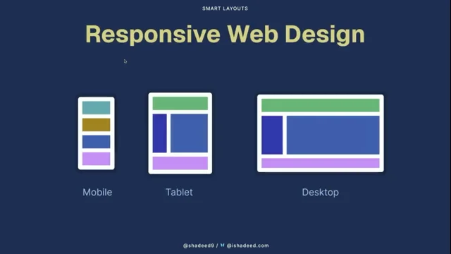
Obviously none of these was responsive, but also columns of content with varying height items in them. Could these be a masonry layout? Maybe. But anyway, at the time, you see, to create any of these layouts, you needed a lot of images, like this fancy box here. It was not just like you couldn't use border radius, background image, and stuff like that.
So you had to use nine elements with each of their own custom made images repeated along the right direction to get that fancy box. If you wanted to do a menu like that that has a hover and a click effect and maybe a fancy font, you'd have to have three images for each of these states and then use JavaScript to swap them on mouse click, mouse hover, stuff like that. I would personally use Dreamweaver because that was like I didn't know any JavaScript at the time and this great, really great fun.
But, like, images were really the name of the game at the time. Right? I would spend time in Photoshop creating, like, a design, something really weird and crappy, of course, and then slice things up into many little pieces, and then reassemble everything in an HTML file with tables inside of tables inside of tables. And of course using pixel units.
As you know, this is the best unit of all. And it was not elegant, but it was like this was all we had. We had to push against the boundaries of the platform of the time. Right? And all of these constraints, they really fueled creativity. And this is this this is always true. Like this is even true today even if the web is much much larger and has many more capabilities.
As soon as you have a boundary of things you can do, you tend to try and push and poke holes and try to go farther than what has really been possible. And so the playground, because to me this is really a playground, it got much, much bigger, but it is still a playground where we can have fun and create wonderful experiences and and just express ourselves. So today I'm still very much this 16 year old kid at heart in front of the computer except I have kids of my own. This is my youngest and we're playing an HTML CSS kind of game that I made.
So I still keep doing those experiments, only I do them for them as an excuse. Let's just review a few things that I just have fun playing with. This is Offset Path. I didn't know about Offset Path animation, so I took some time to learn it and build this thing where planets are animated around their orbits and the little labels.
They stick around with their planets because they are using anchor positioning to do that. And then, of course, you can make it go a lot faster and try to break browsers as you do so because why not? It's always nice to try and break stuff. Here is another one. This is whack a mole except it's using dialogue.
So it's more like whack a dialogue. Each of these divs is containing a single dialogue. It's being shown randomly by Javascript so there's a little bit of Javascript but each dialogue contains a single element that uses the command and command for attributes so that when I click on them to close on their own and I don't have to do JavaScript for that. Flying Math. Because why not?
MathML is a wonderful thing. I didn't know anything about it and it's a wonderful syntax. It's quite easy, quite powerful. And I combined it with three d animation just to have fun and learn a little bit. Jake talked about custom selects. And I was really interested to see whether you could make the picker disappear and only have the options.
And you can, yes. You can remove the size constraints on the picker element and have the options just float on top of the whole page. And I find this a really cool thing that you can do that now. This is Pac Man. Very very simple version. There's no enemies. There's no ghosts. And there is also no JavaScript.
So I am moving with the top, bottom, left, and right arrow keys. And everything happens on its own because I'm using Focus Group. Focus Group is not a well known feature because it's only coming to Chromium right now. It's a great accessibility win. It's just a couple, like a few attributes you can put on your HTML element to get a key arrow navigation for free for your toolbars, menu bars, and whatnot.
So again, trying to use something in a way that wasn't really intended to be used at the beginning. This is Pong. This is the game that I was playing with my son on the previous photo. I'm using the arrow keys to try and play against myself. But what I was interested in was rendering this in CSS Grid.
Every pixel in this game is a CSS Grid cell. And so at each step of the rendering loop, the only thing I'm doing is repositioning the entities by using the GridArea property. And then this one, I was really interested in learning about anchor positioning because this is really amazing and very powerful, but also super complex at times. And so the red popup is the only one that has a click and drag event.
So when I do this, that's the only one that moves. But it's also chained with hundreds of other popups through. Each of them is chained to another one and eventually to the red one with some offset that's random. So you get this wonderful chaotic experience. Anyway, all of this to say that the reason that I'm doing this is, a, because I want to have fun and also learn.
And having this fun helps me to learn a lot more than if I was just scratching the surface. And b, also doing this allows me to push the platform forward a little bit more. And that's going to be one point in my talk is actually when I worked on this demo, I crashed Firefox. And then I reported the bug and the bug got fixed.
And that's amazing. Right? It's helpful for everybody in case somebody else wants to do that as well. I also don't want to seem out of touch. I'm not saying that you all should go and take hours of your life, you know, work or personal life and do these stupid experiments. What I'm saying is the platform's here. It has thousands of features.
They're just waiting for you to use them. So if you heard about a new feature during this conference and you have a new project starting up, maybe think about trying it out for a new project. So why all this? First of all, because computers are fun and we want to have fun. The world is too serious and too sad, so let's just have fun. But also, if I wear my browser vendor hat for a second, this is how the web platform sort of evolves.
If all we do is copy paste from old outdated patterns or use AI that hasn't been trained on the latest patterns, like the latest features, or use frameworks that abstract everything away, if we never really use the actual HTML, CSS, and JavaScript features of the web that are available to everybody, then we don't really get to use them, send feedback to browser vendors about them, and we don't get to push the web as much as we would otherwise.
And users' needs and developers' needs, they keep on evolving all the time. And therefore we must continue to use those new things and report feedback and usage so that we can continue going into the right direction. It would be really sad if we stopped altogether doing that because then the platform would start to stagnate a little bit.
And so altogether we need to keep on filling the pipe all the time with new features that can then become interoperable and standardized obviously. But a stagnating platform is basically a dead platform and we don't want this to happen. Thank you. Just as a kind of an analogy or a tangent on what I just said, I want to make this wind tunnel analogy which is when you are building planes, you don't write the rules for safe flight first and then build the planes.
You actually do the other way around. You prototype, you iterate, you put your planes into a wind tunnel, you see where things break, you discover turbulences, and then you write the rules. And it's a little bit the same with the web platform. You ship something. You ship it in a test version, in a preview version. You let users or developers play with it, and then you learn by iterating on these things.
And then eventually we agree on a final spec. And it takes time and it's very hard. And then we eventually get interoperability. So let's switch gears and talk about masonry, also known as GridLanes, which is another feature that has had a long life of iteration. It's been worked on for many years. It actually appeared on the web many, many years ago without any browser support at all.
People have been wanting to do that for a very long time. So just so we are on the same context, masonry is the common name that people are going to know this as, and this has been made popular by Pinterest. So columns going down with items of varying height in them filling those lanes. But as a high level overview, we'll be talking about those things. First, Grid Lanes is a new built in layout just like Grid, Flexbox, and other types of layout.
It has a new name, so if you've come to know this as masonry, you can sort of forget about it. The new name is GridLanes. Even if I don't like it that much, that's the name. It is not a special kind of grid. It does share a lot of things that are similar to grid, and everything you've learned about grid will come in handy a little bit, but it's not a special kind of grid, and one of the fundamental differences is that it's one dimension.
It's 1D. You get to control the lanes in one direction, for example columns or rows, but you don't get to control the other direction at all. It's also not only vertical. It can be horizontal. It's not only top to bottom. It can be bottom to top, right to left. There's a lot of flexibility we'll talk about. Lanes can have different sizes.
The Pinterest example I showed before, they were all the same size. They can actually have different sizes there. The placement of item is the most weird and that's the thing that you're going to have to get used to. It's opportunistic. It hates empty space, and it's going to try to fill it up. But you can control displacement a little bit.
You can move items to a different lane if you want to. You can make them span different lanes. And the final point to be aware of, and Kevin talked about it as well, is the visual order may differ from the DOM order, and therefore the order in which people using keyboard, for example, screen readers, are going to experience your application.
But that's the same with Grid and Flexbox. Browser support. Safari is the first one to have shipped real support for CSS GridLanes, and that's amazing. It's there since March '4. Spec is not completely finalized. There are still discussions. But as I said before, ship it and then we'll go and talk and iterate. Edge and Chrome are following closely behind.
My team at Microsoft Edge is the one implementing this in Chromium for all Chromium based browsers. You can already enable the flag. It's called CSS Grid Lanes Layout. And you can play with it. We should be able to ship before the end of the year. That's my hope. That's what I'm telling the engineering team about. And then Firefox was actually the first browser to ever ship a prototype version of Grid Lanes.
It was named Masonry at the time. The spec has changed since then, unfortunately, but they have a bug you can track if you want to see progress. Elephant in the room. There are two things that I commonly hear when we talk about this type of layout. One is, is it something that people actually want? Right? Like it's been for years on Pinterest.
I don't like it anymore. It's out of fashion. And that's a fair argument, and you might not want to use it. The thing is, in State of CSS survey 2024, 2025, it's in the top five, top three even features that are missing from CSS. So it is still something that people demand, obviously. And if you haven't filled the State of CSS 2026 survey, should go and do it as soon as you can.
The second thing that I hear about it is, is it actually good for users? It can seem chaotic. Things go into places and you don't know how to read the content in this layout. And yes, so if you're working on something that needs to be read in a very particular order, masonry or grid lanes might not be what you need to do.
Right? Maybe that's not the right answer for what you're trying to do. But let creatives be creative. I think this is something people want. It can lead to very interesting visual results, and I think they should be able to do it. So because I like to have fun, I played with masonry. Here's a masonry layout with 500 items.
They are animated. Their height is animated and they're colored. And just to have fun and see what the browser does with this kind of stuff. It's also stacking from the bottom to the top. But why stop at 500 when you can have 10,000? This is 10,000 items in a grid lane layout. The gap is animated. You can use the gap property.
It's animated. It's a row direction grid lanes layout. The widths are different, leading to kind of a crazy abstract hypnotic pattern. And then this one I really like. Again, as I mentioned, you can stack things from the bottom to the top, and this is what's happening. It's also combined with view transitions here. So when you remove items by clicking on them, the whole stack pulls down. And each one of these lanes, items are placed into that specific lane. It's not allowed to go to other lanes, and so it feels like a stack of balls that has gravity with it, which I kind of liked.
And then just a final one that has two layouts, one at the top going from the top to the bottom with the bubbles, and then the other bubbles at the bottom are going from the bottom to the top. Just playing and seeing how the layout responds, and just for me to understand more deeply how this whole thing works.
So now let's talk more seriously and try to learn more about GridLanes. First of all, I mentioned it. There's a new name. It's GridLanes. Think of it as swim lanes or traffic lanes. Like on a motorway, when there's a traffic jam, you tend to want to get to the shortest lane so that you can reach your destination sooner. That's a good analogy.
Items are going to want to flow as close to the top as possible. So Grid Lanes is a new name. Progressive Enhancement is another thing I want to cover. If the layout you're creating doesn't really depend too much on there being empty space or not, like the one on the left, it's okay to do display grid and then the line right after display grid lanes because browsers that don't support that line, that value, are just going to ignore that whole line and you're going to end up with a thing on the left.
But if the browser supports it, then you end up with a thing on the right. And that might be perfect for you. You can also use the supports rule to detect whether Display Grid Lanes is supported and then have a totally different code for your layout. Shape and orientation is the first thing that usually you think about when you want to design.
When you're working with a designer or you're designing a web page, the first thing you see is the overall shape before thinking about the content usually. And so that's what we're going to be talking about first. So we're going to go through the steps just to learn the syntax a little bit. On the right here I have a stack of divs that doesn't have any layout whatsoever.
It's just a stack of divs. And now we're going to go through these steps here on the left at applying them. So the first thing you want to do if you want a grid lanes layout is use the display grid lanes property or declaration. The only slight difference when I did that was that now the gap property starts applying, so that's why there's a little bit of a jump. Gap works in Flexbox and Grid as well.
So quite nice to have it here. The second thing you want to do is decide whether you want columns or rows. And the way you do this is simply by either using GridTemplate columns or GridTemplate rows. Depending on which one you use, the orientation is going to be different. And those are the same properties that CSS Grid uses.
So let's say I want columns, or let's say I want rows. Either one or the other. Here I only have two columns. They're very boring. We can have more than that. We support the entire grid track sizing syntax. So I could do two FR, one FR, three FR, one FR, and suddenly my lanes have different sizes and my items rearrange within them. And then to further control the shape, the overall shape of my layout, I can continue to do a couple of things.
The pink items here, I can tell them to span two columns. So grid column span two, same as in grid, will work here too. And grid column one will work here too for the blue item to position in all the way to the first lane. So these properties work sort of as expected, except again, you're only controlling one direction here.
Because I chose columns, that's the only direction I can control. Flexbox is very similar to GridLanes in a sense that they're both one direction and they both support either row or reverse, or column or reverse. And this is the things that GridLanes is supporting in Chromium right now as well.
So you can have it be rows filling from the left if it's an English language page, or from the right if you use the fill reverse syntax. And same for columns. When it comes to defining your lanes, I said that the entire grid sizing syntax could be used.
And so you could do 1fr, 1fr if you wanted to. You could use the repeat function. You could use the auto keyword. If you've used CSS Grid, this is all very, very familiar to you. Repeat auto fill min max will work here as well. And then the other thing you can do, which CSS Grid does not support, is intrinsic lanes.
So Intrinsic Lanes is the ability for you to use auto inside of your repeat function. So even if you don't know in advance how wide your items are going to be, you can let the Grid Lanes layout size your lanes based on the content itself. So And if you have a bunch of photos scrolling from a database, for example, they all have natural sizes, you don't know how many times you want to repeat it, that could be super helpful.
Now that we've talked about shape, the general shape, let's talk about flow. Flow is even more important than shape because shape was pretty similar to grid, predictable, easy to understand. Flow is this whole other beast. If you look at these three diagrams from a distance, they all have the same general shape.
If you ignore the colors and the numbers, they all have exactly the same general shape. Flexbox is on the left, and you can see, if you look now at the numbers, that So this is a column direction Flexbox layout that has wrapping. So the items are going to go down one column, and then to the next and then to the next.
Multi column is the same thing. If you want three columns, it's gonna start to fill the first one, then the second, the third. Masonry is totally different. If you look at the numbers, one, two, three, four, five, six, seven, almost like rows. Right? Except there's not a row in sight. If you're doing a column direction, grid lanes layout, forget about the row. Right? There's not going to be any row.
You cannot address the row. It does not exist. If you have items that have almost the same height, then sure, it may look like a row. Like, look, almost a row. But if your items are of very different heights, then it's definitely not a row. And not only is it not a row, because it goes like in this weird fashion, but it's out of order.
Right? It goes one, two, three, four. Right? It goes back and forth like this. So Flow is weird. To further drive home the point, this is Flexbox and you can see again that things go down one column and then to the next. Multi column is almost the same thing, except fragmentation works in multi column. So items are allowed to start in one column and then resume into the next, like item four and item eight.
But the flow is essentially the same thing, going down one column after the other. If you switch to grid lanes, you see a whole reshuffling. And thank you, View Transitions, for making that whole animation possible. Things completely get reshuffled. Right? Show flow now will do this crisscross pattern that almost seems chaotic. I've also heard many times that GridLanes is just like Grid except you don't have gaps.
I mean, it's true in a sense. That's what it looks like. But it's definitely not how things are being placed. This is a grid container. It gives you a grid. Right? Things are aligned in columns and rows. And that's why you have these gaps here. If you remove the gaps, and what I'm doing here is I'm just using negative margin to virtually move these things up so that it looks like a grid without gaps, and now you switch to actual grid lanes, you'll see a bit of reshuffling again because things are not positioned exactly in the same way that works in Grid.
And we'll see why now. So what I'm going to do here now is I have four lanes in my layout. It's column direction grid lanes. And each time I click on the Step button up there, we're going to be adding one more item to the layout. And this is just to show step by step what the algorithm does. And so to understand this, the algorithm will have two things it's trying to do.
One, go to the lane that has that is the shortest every time. And second, respect as much as possible the reading order. This is an English text, English language page, so it's always trying to try to go from left to right. So when I click the step button, we placed an item in the first lane because there was no item yet.
They're all the same size. And so how do we pick the one to place the next item? Well, we go from left to the right, so we pick the first one here. Second goes next to that because again we're going from left to right. Next step, we have two columns that are equally short. Which one are we going to pick?
The next one because we just filled that one line here, so we continue our progression from left to right. So that's where it's gonna go. Now we've filled all of them and we have one line that is the shortest. 107 pixel. So that's the one that's gonna win. Right? Now we have two columns that have exactly the same height.
130 pixel. Which one do we pick? Again, because we can't choose, we go left to right. We just filled that first column, so we're going to the next one, etcetera, etcetera. So that's the whole logic for placement. But that's not enough control for developers. We want to be able to give you more flexibility.
So we'll do that exercise again. But this time we'll talk about something new with GridLanes that does not exist with any other types of layouts, and it's called Flow Tolerance. And the reason this exists is that GridLanes is trying to combine two goals that cannot be combined. One is balancing your lanes, which means trying to have a balanced result where there's no one lane that is much longer than all the other ones. And it does this by filling those lanes whenever there's a space, it goes there.
So at the end, when you have all of your 500 items or whatever in there, they're almost all the same size. And the second goal that it's trying to optimize for is respect as much as possible the DOM reading order, which is English takes here, go left to right, wrap down, left to right, wrap down, etcetera. And those goals are not compatible.
Not always. So that's why there's a new value called flow tolerance, a new property, and you can set it to anything you want. So I'm going to start filling the first four items. And I'm going to set flow tolerance to infinite because I find that it's a good way to understand flow tolerance. Flow tolerance can take a number, like 10 pixels or five rem or whatever. You can also say to infinite.
If you do, that means now all of your lanes are always tied. The system is always gonna assume that all of your lanes have exactly the same amount of space available in them. And so that means it's always gonna go in the reading order. Know, lane one, two, three, four. One, two, three, four. One, two, 34. But you can change this because what happens is that now your lanes are a little bit unbalanced.
Right? You see lane one and three are much taller than the other ones. And that's why you have this Flow Tolerance property you can use to make things exactly how you want them. Because what happens most of the time is you have a lane that is 100 pixels and the next lane is 102 pixels. You don't want to necessarily choose because of that two pixel difference.
Maybe you prefer to go in a reasonable direction so that the user can keep on reading, like scanning the document from left to right or right to left, whatever it is. And so that's why you have that flow tolerance. And the default value is actually one m because it removes these little minor differences of like two pixels or whatever.
So that's Flow Tolerance. Just as a summary of the syntax we've seen, first thing, display grid lanes, new display type. So that's how you opt into the new layout. Then you can use much of the CSS Grid syntax, so Grid template columns or Grid template rows to create the general shape as well as the track sizing syntax with the repeat function, etcetera.
Gap works. Grid column or grid row work depending on which is your direction to place items in a particular lane or make them span multiple lanes. And then the new kid on the block here is Flow Tolerance. Play with it. Have fun. Sometimes infinite is actually what you want. It really depends on what you're trying to achieve.
Let's switch to GridLanes examples so that we can have more of an idea of all of the things you can do with this new type of layout. An entry animation. Why not giving it more of a interesting vibe so that things feel more alive? Or combining it with scroll driven animations.
Right? So that your item starts to flow from the bottom. And there's no like it works really well with grid lanes because things always tend to stack at the bottom of the lane anyway. This is another one that I made, which I wanted to have some kind of a two column layout, but I really wanted more of a one third, two thirds.
So it's like one third for the text, two thirds for the artwork here, and then the other way around here. And you can see that GridLanes is sort of more organic in a way. The text here doesn't always start flush with artwork, and I really like that as a creative possibility that it's giving me. And it's really quite simple to do something like this with GridLanes just because it's trying to eat as much space as it can.
This one here is a demo of infinite loading. It works amazingly well with GridLanes because as you scroll down and you add more items, they are naturally going to stack at the bottom, which is where you want them to go. Right? It's an excellent use case for infinite loading. No JavaScript needed for this kind of stuff. The only JavaScript I have here is like a intersection observer to know when I've intersected the last item and then I start pulling more from the server side and just putting them into the DOM and they just appear where they're supposed to appear.
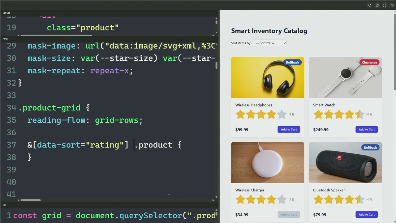
This was another one that I had fun building which is a Kanban board. So maybe your team uses Kanban as a planning tool or whatever. There are four lanes here. They are not all the same size. And items are placed specifically into those lanes. I'm controlling exactly which lane each item goes in by using grid column in that case.
Right? So this box, print number four, has a grid column value of two so that it is in here. And now when I click, I can move things in and out of columns just by using the GridColumn property. You could do this with Grid. You could do this with MultiColumn. You could do this in many, many different ways.
It was really just easy and fun to experiment with GridLane. And again, really easy to do it with this. But there are always tradeoffs, and it really depends on what you're trying to achieve. This one is actually from Kevin, Kevin's website. He has a CSS course which you should totally check out because it's really good. On the course webpage there's a series of nice things that people have said about the course.
Right? And Kevin used multi column, which means that the quotes go from fill each column one after the other, which is fine. I just wanted to recreate it by using grid lanes because the implication is that, let's say those quotes, they come from a database and you want to always have the latest one near the top, then GridLanes gives you that for free.
All of the latest are going to be across the top and then slowly making their way down your layout just by virtue of trying to fill the space. So again, depends on your use case, but that's something that you can do. Here is an example showing a photo gallery where you can let the user switch between rows and columns.
Because maybe that's something that you want to do, and that's something that GridLens lets you pretty easily do. This is a demo showing the fact that you can have your lanes have any size that you want. Pinterest made masonry popular, but it only has the same width for all of its lanes.
And I find this really, really boring. You can change that up. You can have the first and the last be fixed, then the other columns in the middle be adapting to whatever space is remaining. You can have alternating narrow and wide columns. You can have Fibonacci sequence columns. Whatever you can imagine, you can do those things with the grid lane layout. Another one, kind of a photo gallery, because that's usually the use case that lends itself most to this type of layout.
Here demonstrating the fact that you can have items within your layout that start at a particular position and span a certain number of lanes. And that gives us a really interesting, engaging design result, I find. I'm using the Order property here as well, just like in Flexbox, to move the text into a different position within the layout.
I had fun recreating a version of the Edge Blog. We do blog about the web platform stuff quite a lot, so if you want to visit us, that's great. Just seeing what it would look like. And I think not always the best idea. Again, if you have a very strong order in which you want people to read your content, it might not be the right solution.
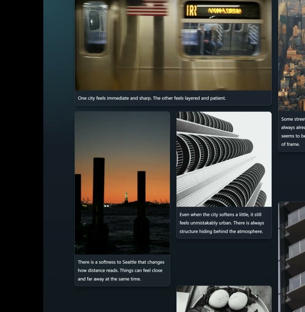
But here, I find that it's okay because you're attracted to a picture or to a title and you don't want to read everything. You just want to have a general impression of the blog and maybe pick a story. Here's another one. Streets of Seattle. Just a nice visual layout I find where you have two grid lanes layout, one filling from the bottom and the other one filling from the top. It's giving you a lot of freedom in expressing yourself. Right? You can really have cool looking results with this type of layout. News websites, they tend to really like GridLanes layout because they really like packing a lot of information densely into small spaces, and so GridLanes also works great for them.
This is a demo. Of course, it's not a real newspaper, but the interesting thing here is that, again, space is used. You can have stories that span multiple lanes if you want them to be more highlighted. Or you can also have things that go all the way across. Here I'm using grid column one slash minus one so that they span the whole tracks of my layout.
Another one here is a photograph gallery where you have some photos coming from the bottom and disappearing when I scroll, and then they appear again at the bottom. Kinda cool, I thought. Here is another one where this is using the API from the Art Institute of Chicago collection. And you can oh, of course, I don't have Internet.
That's fine. And then this one, I had a lot of fun. This is a row direction grid lanes layout which sort of simulates a Gantt chart, another sort of planning tool for teams. Right? You have three teams here. They all have tasks to do over time. And, so I'm using the grid row property to assign those tasks to the right team.
And the height or the width, sorry, of these tasks actually pushes things across. Right? Because some of these tasks span several of my lanes. And so because they come before in the DOM order, they're gonna end up pushing the rest behind. And if I remove them, then everything's gonna try and eat as much space as it can to fill the void and and and therefore, we can be done sooner with a project if you remove all the sprint retros because they are useless.
A couple of other ones, some pictures I took three years ago in Amsterdam. Like a diary, you can have inspirational quotes if you want, photos. It doesn't have to look so rigid. GridLanes is not rigid at all. I find it super organic and I really like the sort of random, almost, results that you can easily get.
And I think this is the last one showing also the organic nature of this thing. You can play around with this. Some of these are GridLanes items. Some are just empty space, they just show some of the background behind It can be used in very, very creative ways. So remember, as a kind of summary, it is not just Pinterest in CSS. It can go a lot further than that.
As you've seen. It can lead to very creative design results. You have the whole power of the grid track sizing system at your disposal, so you can use that. Fundamentally, it's one dimension. If you're doing columns, you don't have rows, you can't control rows. The placement is very opportunistic.
It can seem chaotic, and that's sometimes weird and uncomfortable, but it allows for some strong design decisions still by using explicit placement into lanes or by tweaking the flow tolerance, might end up giving you the results that you want. And finally, you can try it today. Again, Safari. Use it in Safari. Use it in Chromium based browsers by enabling the flag.
And I mean, what I want to close with is you should all remember your inner 16 year old kid and have fun with the the web. Continue playing. Continue having fun. And, you know, let me know what you build if you end up using GridLensLayout. And that's all, friends. So thank you. Thank
you so much. That was excellent. Join me Yeah. At the square table. Right. We've got quite a few questions from the audience. First question that a lot of people are wondering, are you making these examples accessible somewhere? There it is. Yes. Answered myself. Great.
They're all here.
Fantastic. There's a spicy one. I'm gonna skip that. Sid asks, what happens if you use both template columns and rows for the grid lines? Will one win out, or will it default back to a grid display or something?
It is going to I think the last will win currently, but it is under discussion. So the thing that's under discussion is we want to add maybe another property so that you can define both and then you can explicitly say which one you want to win. And that property will also be the one that helps you flip the direction of filling or wrapping.
And that part is still under discussion. We're discussing specifically with Apple on the CSS Working Group and others and Google as well, just to try and make progress on which is the property that will allow you to do that. It's not clear yet.
All right. Jeremy asks, should we have logical properties as aliases for rows and columns? Inline for rows, block for columns?
Yeah. I think, yeah, I think that would be a good idea. I think we should do that also for Grid and Flexbox. Yeah. Totally.
Yeah. CJ saw in your Definitely Not a Row example, the fifth item seemed to be in the third column. Why?
Yes. So that's because of the opportunistic placement of grid lanes, always trying to find the shortest lane. You cannot guarantee that your items are always going to go column one, two, three, four, five. Right? It depends on which one is the shortest. And that's why I said, when it said definitely not a row, it actually said not definitely a row or something like that.
It was a random order. And so Flow Tolerance can help you get rid of that. If you've put Flow Tolerance infinite, then you do get the traditional left to right order or right to left if you're in a right to left language, but it also gives you unbalanced lanes.
Nice. So Brett asks, for flow tolerance, what are some of your favorite units to get the most aesthetically pleasing effects? C key units? I saw you using the LH units. Maybe some insights? Great talk.
Thank you. I don't have a lot of insights yet. I've not been using it enough. This is very, very new. So we need to, like, iterate on this thing. We need to I I need to get my hands more dirty with this thing to see what works and what doesn't. LH seemed like a really good unit, to be honest, because, you know, it fits with your line height, and so then maybe it's more predictable that way.
But I would I would start with that.
This is I I I quite like this. There's two accessibility questions. Paul asks, are there accessibility concerns with tabindex with gridlines?
With? Sorry.
Accessibility concerns with tabindex with gridlines.
Yes. So that's the reason that I said that the visual order may end up being different from the DOM order, which is what your tabbing order is going to be based on. I don't know yet whether reading is it reading flow? Yeah. Reading flow. I don't know whether it's implemented with GridLanes yet. I suspect not. But that would be a good solution for it.
Because yes, if your items are very different in height or width, they're and going to end up being in a totally chaotic order. Right? And so if you tab, you're going to be switching back and forth within your layout, which is maybe going to be weird. It depends on what you're trying to do.
Maybe it's fine, maybe it's not, but yes, that's definitely something to be aware of. Use flow tolerance to maybe fix some of that, and then watch out for reading flow whenever it comes out as supported with grid lanes.
And to follow-up the other accessibility question, because they didn't add their name, besides what you just said, do you have any other recommendations in terms of accessibility?
Not really. I think it really depends on your use case. Be responsible. Test your thing with a keyboard with a screen reader and see what happens.
This question doesn't have a name either, but what happens when an item at the start of the layout gets bigger? Do you get a little grid column dancing at the bottom?
A grid sorry. If a grid lane item is bigger at the start?
So what happens when an item at the start of the layout gets bigger?
Yeah.
Do you get a little grid column dense at the bottom?
So you if if things change, then things move around I think I'm understanding the question this way. Yes. If you change the size of something after your layout has been constructed and rendered onto the screen, then things may change in another kind of weird way. Right? Cause suddenly if that first item takes double the size, then the other item here is not going to fit anymore.
It's going to go down. And because it goes down, something else is going to go somewhere else, etcetera. And if you apply view transition to this when you do so, then everything shuffles around and it's quite interesting to see. But yes, that's something that you need to be keeping into consideration as well.
Steven asks, is there anything you can tell us about the decision to use the name GridLanes rather than say GridMasonry? Yeah.
So I work with people who work on the CSS working group, I don't directly engage with them. So all I know is from other people indirectly. I don't like GridLanes, the name, that much. I know that one of the ideas was to because we reuse so many of the grid properties, like grid column, grid row, grid template column, grid template rows, the idea was let's make it easier for developers to get used to this new thing.
CSS is so complicated already. We spent years teaching them about CSS Grid and Flexbox already. Why add another thing on top of this that changes everything? So the decision and the consensus on the working group was, hey, we settle on these properties. They're the same as CSS Grid. And therefore, we also use a display name that's a little bit similar to Grid. It's GridLane.
So you know it's a special kind of Grid, even though I said it's not a special kind of Grid. But it puts your brain into this mode of like, okay, I'm using grid properties now. Honestly, personally, would have preferred for us to go display whatever, masonry or whatever, something better, and then have a whole set of other properties that are based on that with different names.
Cause I think then you know you have your area of expertise. You know you're using those properties and only those properties and they only apply to that. Cause sharing with other layout systems can sometimes be complicated. For example, what do you do with a grid shorthand? The grid shorthand is already super long and super complicated. No one uses it.
What if it needs to also now encompass grid lane stuff? Is it even compatible? So that's, I think, a little bit of the tension. But again, we are trying to make things progress.
Yeah. Fair enough. Jesper hopefully I'm saying this correctly. Jesper asks, could you demonstrate how some of the grid lane layouts reflow across viewport sizes? You you can do hand
Oh, yeah. No.
Or or you can just describe it out loud.
I mean, it's a little bit like the one of the previous questions where what if one item becomes bigger, things are gonna reshuffle. It would be the same thing here. It's not very different from Grid. If you have a Grid where you have a repeated number of columns by using the repeat syntax and you don't set any position, your items are going to go in a row fashion and then down and then down, etcetera.
So it's not very much different from that. If you resize your window, they're all going to go down into fewer columns and fewer columns, and it's the same thing that's going to happen with grid lanes, except the placement on the other axis is not gonna be aligned. It's gonna be a little bit different. But the same thing is essentially gonna happen.
Funny enough, there's still questions coming in. I'm processing them as you're answering them. Right. Estelle asks, are there selectors to select based on position within a column?
Based on position within a column. I don't think so. No. Not yet. But that would be cool.
Yeah. Good job. All the bright people are in this room right now. Know? I will ask them that. Asks, how will the coming grid rules interact with the green lanes layout? Will it be possible to add lines between items in the secondary axis?
I sure hope that we will be able to do that. Yes. That's the plan. Having lines, like separator lines between lanes, of course, obviously, but then between on the other axis, definitely, that's, like, that's a must have, I think. So the team has not implemented that yet, but this is definitely something that they need to consider.
Fresh, Alexis asks, why row space fill reversed and not row reverse?
So this is also another thing with using the grid syntax because I think the idea was maybe we were going to reuse the grid auto flow property. That's already also pretty complicated and we couldn't It's going to be really hard for me to explain cause I don't really understand it deeply, but it's another kind of tension with the CSS Grid syntax here where we just couldn't come up with a new name here.
And that's fine. There were so many questions. And if an answer is a bit more convoluted, please come find Patrick during the breaks. He'll be here all day. Very excited to talk about, as you know, source of knowledge on the topic. Please go chat with them. Thank you so much. Give a round of applause.
Technologies & Tools
- @supports
- Anchor Positioning
- Chromium
- CSS Grid
- CSS GridLanes
- CSS Multi-column
- dialog element
- Dreamweaver
- Firefox
- Flexbox
- Flow Tolerance
- focusgroup attribute
- Intersection Observer
- Intrinsic Lanes
- lh unit
- Offset Path
- Photoshop
- Reading Flow
- Safari
- Scroll-driven Animations
- View Transitions
Standards & Specs
- CSS Logical Properties
- MathML
Concepts & Methods
- Gantt chart
- Kanban
- Masonry
- Progressive Enhancement
Organisations & Products
- Apple
- Art Institute of Chicago
- CSS Working Group
- MDN
- Microsoft Edge
- Netscape
- Open WebDocs
- State of CSS
- Web Design Museum
- WebDX