Contextualism
Conference Opening and Adam Argyle's Introduction
The emcee introduces Adam Argyle as a CSS champion, CSS Working Group member, and host of GUI Challenges. Adam takes the stage, praises the conference, acknowledges fellow speakers including PPK, and leads the audience in a call-and-response CSS chant—a callback to a memorable and slightly awkward moment from his previous year's appearance that he wants to put to rest properly.
Contextualism: Why Design Systems Are Just Fancy Lego
Adam introduces the central thesis of his talk: most design systems, including the one he works on at Shopify, are 'barely modern Bootstraps' that produce static Lego blocks rather than truly adaptive components. Drawing from the architectural concept of contextualism, he argues that the web platform is uniquely capable of building components that morph to their environment—like a house that becomes a cabin in the woods, a lake house by water, or an igloo in Antarctica—and that developers should go back to their teams and demand more time to build this intelligence in.
Act One: Everything a Component Can Know About the User
Adam opens the first act by cataloguing what a component can know about the user and their device: physical size, orientation (noting landscape is routinely forgotten), pointer type (coarse vs. fine), hover capability, color capabilities, and user preferences including color scheme, reduced motion, reduced transparency, forced colors, and prefers-reduced-data. He emphasizes logical properties as a zero-effort way to handle all reading directions and writing modes simultaneously, comparing it to asking someone to shake with their 'good hand' rather than a specific one.
Knowing the Surroundings: Container Queries, Quantity, and Style
Adam covers the full range of ways a component can know about its immediate environment, opening with design tokens as a starting point that most teams mistake for the finish line. Named container queries let a card know whether it lives in a sidebar or a feed. Size queries reveal exactly how much allocated space a component has. Quantity queries allow components to adapt layout based on sibling count—from zero to 'too many.' Adam also covers style queries for paint-level intelligence, proximity styling, and at-scope's donut scoping to contain selector spread.
Reading the Room: Cascade Awareness, Intrinsic Sizing, and Relative Color
Adam explains how components can derive intelligence from inherited context using light-dark() and currentColor to avoid hard-coding values, framing 'not caring' as a feature of well-designed CSS. He champions intrinsic web design concepts including calc-size() for animating to auto dimensions, CSS shape wrapping for elegant text flow, and the relative color syntax—which he calls more expressive than JavaScript destructuring—for deriving entire palette variations from a single brand token rather than managing hundreds of explicit color variables. He also touches on font-palette and override-colors for adapting color fonts to theme contexts.
Live Color Demo: Open Props v2 Dynamic Palette System
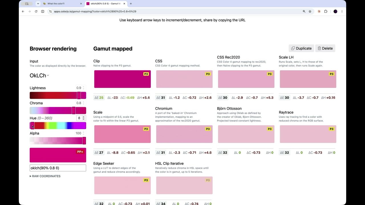
Adam demonstrates an Open Props v2 color system built on OKLCH that generates a full 16-color palette from just three custom properties, showing live hue rotation, chroma toggling for grayscale, and real-time WCAG contrast scoring across all palette combinations. He explains why he intentionally avoids palette inversion in dark mode, instead remapping which section of the palette is used. The segment closes with three strategies for nested light/dark themes—at-scope, color-scheme inheritance, and style queries—demonstrated on his blog nerdy.dev, directly inspired by a talk earlier in the conference.
Adaptive Frosted Glass, Typography Tricks, and Viewport Mastery
Adam demos adaptive frosted glass that automatically adjusts opacity and blur to light and dark contexts via light-dark(), then explains the irradiation illusion fix: using font-variation-settings GRAD on variable fonts to visually thin text in dark mode without changing glyph box dimensions, avoiding cumulative layout shift. He then walks through viewport units (DVH, LVH, SVH), notch handling for full-bleed native-app appearance, fluid typography strategies, conditional border-radius using clamp with scientific notation, and concentric border-radius patterns for visually polished nested elements.
Interaction States, Form Intelligence, and Scroll-Driven Behaviors
Adam catalogues the full range of interactive states components can leverage—focus-visible, focus-within for whole-form visual engagement, user-valid and user-invalid (not colon-invalid, which yells at users before they've typed anything), video playback and picture-in-picture states, popover open/closed, full-screen, placeholder-shown, browser autofill styling, and indeterminate checkboxes. He then covers scroll-driven behaviors: view-transition names applied only to in-viewport cards for performance, natural stagger animations via scroll, stuck scroll-state queries for sticky headers that signal their stuck state, and branded highlight and target-text pseudo-elements.
Component Self-Knowledge: Sibling Identity, Web Components, and PWA Awareness
Adam covers ways a component can introspect its own identity: sibling-index and sibling-count for stagger and arc layout effects, the :defined pseudo-class for web component skeleton states before upgrade, :host selectors, and @supports for graceful capability-based degradation. He addresses print styles owned by the component itself rather than dumped in a separate stylesheet. The segment closes with PWA-specific intelligence—detecting installed state, bleeding into the title bar for a native-app appearance—and content-visibility with an intrinsic size hint for performant off-screen rendering of large lists.
Anchor Positioning, Component Relationships, and Trigonometric Layout
Adam introduces anchor positioning as one of the most transformative recent additions to CSS and demonstrates 'anchor interpolated morph'—a technique using anchor's live x, y, and width knowledge to create FLIP-style transition animations between intrinsic states with no JavaScript and full interruptibility. He also covers matching element widths via anchor, CSS counter nesting, subgrid adoption from a parent container, using a distant scroll container as an animation timeline, cascade layer rollback with revert-layer, and trigonometric angle calculation with atan2 to point elements toward their anchor targets.
What CSS Can't Do Yet—and the Prop-for-That Library
Adam lists everything CSS currently lacks: scroll velocity, global and element-local pointer position, slider and form field values, dirty/touched/pristine form states, select and color input values, and device sensors like battery, geolocation, and frame rate. He then introduces his JavaScript library 'prop-for-that,' which bridges these gaps by writing live custom properties onto opted-in elements. Live demos show pointer-driven gradients, parallax, trigonometric pointer tracking, a ticking clock, scroll momentum, low-battery mode simulation, form dirty/touched state detection, and per-frame video color extraction—all consumed purely in CSS, so developers can stay in CSS while the library handles the JavaScript.
Our final speaker of the day. I cannot believe how fast the day has gone. It's been a wonderful and I it's literally the best person to end the day. And, yeah, I did have when you are an emcee, you have to prepare for the unexpected. And, Adam was here last year, and he got the audience electric with their contagious energy.
The walk the walk the talk is something I think of when I think of Adam. Regardless of job title or employer, Adam is a CSS champion who is also on the CSS working group, host of GUI challenges, and cohost of bad at CSS podcast. I again, please give a very, very warm applause for Adam, who is going to call who is going to be the closing talk of the day. And again, I couldn't think of a better person to do it. Welcome to the stage, Adam.
Thank
you so much. Oh my goodness. I go to a lot of conferences. I've been to so many. This is by far the best fucking one. It's so good. And it's not just the people, it's the content, the depth of which we are learning. I'm learning, and I try to study this shit all day. So I gotta get a couple things out of the way.
First one, PPK, you rock, and you need claps right now. The second one goes out to all the speakers. All the speakers have been kicking, but let's give it up for them again really quick. The sound guy hasn't made just kidding. It's working great.
And then, yeah, we gotta get something off our chest, is I did this weird it got weird last time we chanted CSS together. Like, I I did I think I threw my hands in the air, and it was all like, oh, it's weird. But I think we I think people want to oh, did my computer fall asleep? It did.
We need to do it again. And this time, we're gonna do it just three times. That way it doesn't get weird. I'm gonna count to three, and we're just gonna go CSS CSS all together, and it's gonna be, camaraderie, and it'd be awesome. K. You ready? One, two, three. CSS CSS. Oh, I can't do that. CSS. Yeah. Thank you so much.
I was like, we just gotta get it off our chest. Everyone asked me about it. It's almost like a celebrity who's walking down the street, and they're like, hey. And they quote something stupid that they did in a movie. Like, hey, you guys. And the guy's like, that was twenty years ago. Don't chant that at me. CSS does that to me, but I love it.
Alright. So here's the provocative version of my, title of my, talk if this oh, it was working before it fell asleep. It's off and on the remote. I'm gonna unplug and plug back in this remote because I'd like to be walking around still. That's been fun. Do what? Click the browser? Yeah. Alright. Here's the provocative title if I was a YouTuber, which I'm not, and it would be like, our design systems suck.
I'm serious. I'm kinda getting I'm frustrated at the one I work on at Shopify. I'm frustrated at all the base UI, the shad c n's. They all tick me off. They look the same. They're basically barely modern bootstraps, and it's nothing to say about y'all skills. Like, it's nothing to say about the skills of the team that I'm on. They just kinda suck, and Yuna was showing us how good it could be.
She laid it up. All of these talks are laying up the amazing things that we have in our toolkit. So this particular talk is called contextualism, and I'm going a mega list of every single thing that a component or your page can respond to that proves that this is the best platform to be building on because of this list doesn't exist in any design tools.
This list doesn't exist on iOS. It only exists on the web, and we just need to teach everybody about it. So this is a this is for designers. This is for developers. You need to hand this to the people on your team and say, our components aren't done. Every time I go through one of these slides, you need to think about, is my component leveraging this or not?
It's valuable for the user, for you as a developer, usually the user. And one of the things that's kinda messing me up is we're we're all we make design systems. I'm like, no. You don't. You make a dinky Lego. And then everyone's like, well, I make I make Legos, and then we we orchestrate them all together. Or I make Lego what's the plural?
Is it? It's Lego. So I'm American. Say Legos, and y'all are like, stop doing that. Anyway, we make Legos. It's a terrible thing. That's not what we build anymore. It worked really good at first, and I used to sell Legos too. Was like, you make Legos, you put them together, it works really great. But the ways that we can adapt and the features that we have in the browser are far beyond Legos.
If I go back really quick just to what contextualism is, I saw that from architecture. This is a term I didn't make up. This has been around for a long time. It's anytime you build something that's adaptive to the space it needs to exist in. You think about, like, a cabin. A cabin is made of wood. It's in the woods.
It blends in. It feels appropriate. Everything's right. But what we can do on the web is we can build a cab we can build a house that when it's in the woods, it turns into a cabin. And that house that moves over into next to a lake and becomes a lake house. You move it into the, you know, Antarctica and it becomes an igloo. That's not what Legos do.
Legos are just little blocks, and you're like, but the blue one's next to the other blue one. I don't care anymore. It's boring, and our platform can do way better. And it's ticking me off looking at all the boring stuff that keeps getting built. So I'm hoping that this particular talk gets you pumped about where you're not done yet, where you're gonna go back to your design system and your component library, and you're gonna tell your boss, it's like, we're not done.
There's way more for us to do here. There's a lot more intelligence that I can build into this component. I need more time. And I empathize very much with not usually being given much time on the front end. That also ticks me off. That's a different talk. This talk is an extension of a blog post I wrote about six or eight months ago, something like that.
I was like, components can know. And I wanted to build the mega list, of all the things that components can know about the page. And it is absolutely incredible, and that's why this talk's about actually, all the talks so far have perfectly led up to this exact moment. Yuna's talk led up to this moment. All the talks led up to this moment of all these different things. And so we're gonna see them one by one, and I want you for each slide, ask yourself, am I using this in my design system? Do my components use this to make a better, smarter decision? If I move my card from the footer to the sidebar, does it adapt?
Or do I have to go in and reach in and be like, you're now in the sidebar, and you have to do all this dorky stuff where you have to tell it from the outside in. I want your components to just know and behave. You said you built a system, and I haven't seen systems yet. I've seen blocks that are acting like Legos, and I want you to stop building Legos.
And the other thing is I want you to think about how to combine these things. So first, they're gonna roll up easy. You're gonna have media queries. You'll be like, yeah. Media queries I got prefers color scheme. I'm responding to the user's preference, and I'm like, sweet. Combine that with other things. Unis showed a lot of combinations.
Look at this combination. You put these two things together, the scroll direction plus this, you do an animation, meaningful adaptive results that are owned by the component. That component now is truly able to move. That's another thing that bugs me. Everyone's like, I build component architecture, because it can move other places and maintain its behavior. And I'm like, yeah.
But it's the same dork over there. You build two buttons in a form, and the buttons are like, hey. I'm a button. Next to the other one, hey. I'm a button. And they don't even act like they know each other. There's no relationship there. The form isn't showing that there's buttons that they're everything can know what's inside of it now.
Everything can know what's around it now. Everything knows everything about the user's preferences. And at the end, I'm gonna tell you all the things CSS doesn't know, and then I'm gonna give you a surprise that teaches it to do it. I like having a clicker. This is gonna be really fun. I might lose my voice. I'm loving it. Okay.
Act one. This is where we're gonna talk about the user. The most important part of what's going on here. It's not about us. We like building this is why it's also one of my favorite cons conferences. We build for the user. We like all our tools, but our tools are a means to an end to deliver something beautiful and meaningful.
And so let's go through all the different ways that we can, listen to our users and let I like to think of it like a car. Okay. You get into a car and imagine you sat on okay. Right now, we sit in a car and we get, like we can adjust the seat and and, like, the steering wheel and then the temperature. And that's, like, all we get.
CSS, we wanna get in a CSS car. It gets in. It's like the color changes. It's like Batman. I'm all pimped out and back. It's like we could really form fit the experience to people way beyond the things in the physical world can do like Legos or cars. And I want us to do that. That's because our platform is amazing that way.
So if we look at the device, we've got, hey. How big is the device? Right? A physical size. The device is physical, and that's that's a whole other talk. Anyway, so we got the device size, the orientation. Often, landscape is already forgotten. We're on page one. Are you using landscape? Probably not. You're like, oh, they flip sideways and now it's all squishy and they just gotta deal with it.
You can be there and be thoughtful about it. You designers that are watching this video, hope you're watch think about landscape more. Just like Eunice calling out, don't just build for desktop. There's ways here. The pointer coarse or the pointer fine. You know if it's a sausage trying to tap, like me and my shaky fingers, like, they don't like to tap things, because it's coarse. I like to use a mouse.
Mouse is fine. It stays there and it's rested. It doesn't have tremors like I do. I'm not talking about like stage tremors. I have like little literal tremors. And then media hover is lovely. I wish it was actually reliable. We need a better way to know if someone is on a mobile device or not because the hover query is close.
You can combine the hover query with the width query and an orientation query try to figure it out. It's not that good. And you can know what the color capabilities are. And color is so fun. Isn't it, Leah? Color's fun. Alright. So then we got other preferences. What color scheme do they prefer? Let's adapt it. They get in the car.
Cool. Make it dark. You know, get in the car. Make it light. What's their preference? Reduce the motion if they need it. Reduce the transparency if they need it. Prefers contrast. More forced colors. Prefers reduced data. That's not on there. It should be. And I'm gonna fix that later, but we'll see them. Sneak peek into what I might be delivering.
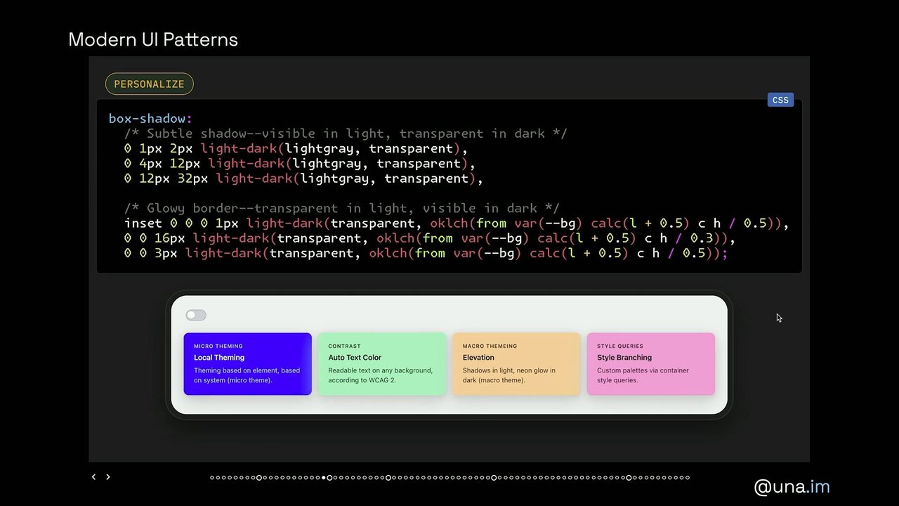
But these are all really important things. And how many of these are you using in your system? You know, is your LEGO changing to these? It should be. A lot of these are just minor additions. The transparency one, I'll show a demo later. You could do adaptive frosted glass, And it doesn't have to be no no transparency. It can be reduced transparency.
You don't have to remove animation. It can be reduced animation. It's really important that you don't just throw your hands up at these things. These are micro moments where you get to shine. This is you get to shine because you know these exist. This whole talk is you know this exists. You have these tools. Apply them. I'm I desperately wanna see new component libraries.
I'm so I already said that. Okay. Anyway, reading and writing. If you just use logical properties, you get it all for free. You don't have to care. Like, I like to think about like you go to shake someone's hand. And if you say, hey, shake me with your right hand, they might not have a right hand, and it might not be their good hand. So why why don't you just say, shake me with your good hand?
Then you're just you're removing any potential for you to screw it up. You're taking yourself and your preferences out of the thing, and you're just shaking someone's good hand. When you use logical properties, you won't be screwing up a right to left language. You won't be screwing up a top to bottom right to left language. You don't have to care what language, and you write it once instead of four times.
And so many dorks are writing it four times. I don't get it. So use logical properties. And so let's talk about the surroundings, the things around your component, the things that this component you truly say a component is portable and can go everywhere. Let's talk about the things that it can respond to. One of the first things is you have it can get design tokens. These things are very common to start at the top.
They come into your component, and now it can kind of look like the rest of them. This is something most of the design systems think, they're done in. They're like, we're all using the same border radius. We're all using the same amount of padding of values so you see visual consistency. That is important. I'm very happy that we have tokens.
However, it's just a fraction of the opportunity. Where am I? So in this particular case, this is one of the ones that really set me off about knowing a a component owning its own presence and appearance anywhere inside of the page. You have container queries now that are just named queries. So in this case, the sidebar says, I'm the sidebar.
And the feed says, I'm the feed. You could also have the class, but it's not the same when you have to use has to query the parent to go all the way back down. And also named container queries compares to Shadow DOM. So if you're using container, if you're using web components, it can know that it's in a sidebar way beyond the roots that it's generally trapped inside of.
And it's also brilliant in that it's owned by the component itself. So this card, this, some sort of callout can adapt to all the different places. I'm talking about that house that knew it was in the forest, that knew it's in Antarctica. That's a named container query. You give your zones of your application names in a macro level, your components can own how they look there.
And that way when someone uses your component library and they go, oh, I wonder what happens when I put it here. And it changes and it looks beautiful. And they're like, someone thought of that, and that makes me happy. I wanna see more of that. I'm really tired that this stuff is not happening more often. Give some things room to breathe.
This is how you know how much space do I have allocated. So, right, it's similar to a name query except it's not a media query. It's not how big is the device. It's how big is the space I'm literally being placed into. How big is my grid cell that I'm placed inside? How big is the sidebar that I'm placed inside?
I am going to adapt myself. I don't need my parents to tell me what to do here. I'm a component. I'm intelligent, and I'm smart. Someone thought about these details, and they knew that the capability was there. They build it in the component. Do it. Quantity queries. How many items are in there? This is so cool. You can be very smart.
If there's only one, make it big. If it's a big list so I really like to think about micro experiences as none is a state that you need to design for. One is a state that you can design for that's even better. Three, five, these can start to adapt and look like a little bento grid. You get into nine, ten, and then you get into too many. And these are all states that you need to think about. Anytime you're rendering a list that's dynamic coming from something, you have to think about quantity queries.
What does zero look like? What does one look like? What does three? What does five? What does nine? What does too many look like? And this should be an elegant thing that this component owns that you don't have to go use JavaScript to do because CSS can do the work. What's inside? Do I have a video? Am I a card with a video?
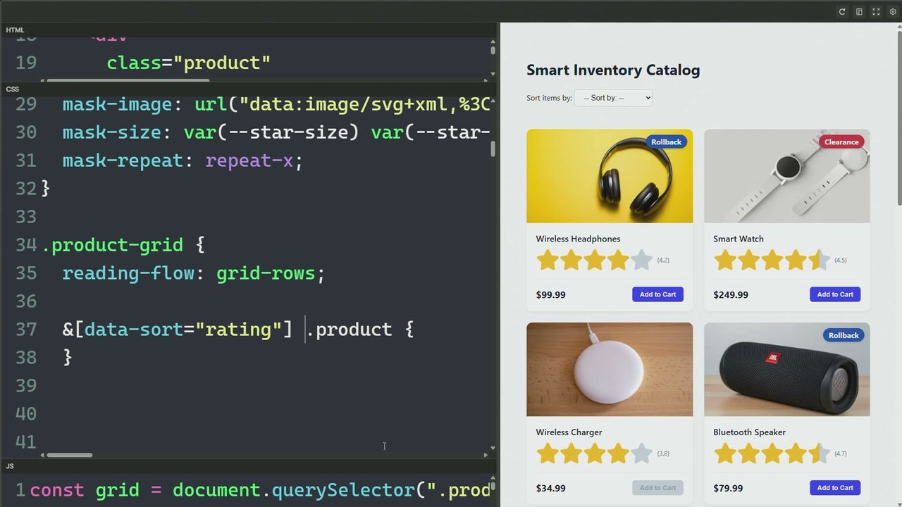
Look different. If I if I if I've got a card with a, like, a aspect ratio image, look different. Do I have checkboxes that are checked inside of me? Forms are one of the other things that really tick me off that are so lame. They can know so much about what's going on. The field set element can know so much about what it contains, and it never adapts.
The legend can look different when you're focused within something. The legend can look different when it's valid or invalid. The form can be counting with CSS counters. How many valid items are in there and how many invalid items are in there? It's not that hard, and it's really meaningful to the user. And that form now doesn't need as much JavaScript.
It doesn't need as much logic because you've built it in. You literally built a system. You didn't just build a block. You built a system. Oh, man. This is so much fun. Okay. Cool. So style queries. These are, now based this has been a hot topic this whole conference. I'm really happy to see it. I've got a again, at the end of this talk, I'm gonna be giving you something that's gonna use a lot of style queries.
Be very excited. But, again, it's like, what's the value of a variable? We had Kevin Powell talking about putting variables on things and the power that can come from that, from meaningful icons, Adaptive intelligent components that don't need so much logic when it's just a paint issue, when it's just a meaningful visual feedback that you wanna give someone. Style queries are one of those tools for you.
We've got proximity styling. So this one's kinda interesting about where am I going to prefer my style to come from? Like, what's my proximity to another class? We have at scope, which allows also donut scoping, which is really nice so that your selectors can have an end and they don't kind of infect the entire tree all the way down.
But you've also got this ability of proximity. How close is my component to another component of another class? And if the proximity is close, you now know you're near something else, and you can be intelligent about that. So, right, we've got named container queries. We've got quantity queries. We have all of these ways for your components to be intelligent, and this list is not done.
It's a mega list of, 80 slides, y'all. Yeah. You're like, dang. My brain hurts already. And already, I've only used two of them in my design system. Crap. He sees me. I see my components also need to work on this. This is a call out for myself. That's why I said our design systems suck, and I'm not calling you out. I'm calling me out too.
And it listing these things out. It's just important for us all to hear all at once. Okay. Here's another one. Read the room. So this one's local context for the inherited cascade. You need to know what's coming in, and you can be intelligent about it. And the light dark function is really cool about that. Current color is cool about that.
You don't have to care. Not caring is a really fun way to work with CSS because CSS the opposite of CSS is overcaring, and that's controlling. And controlling gets you into all sorts of trouble. You do, however, want to build something that's smart and intelligent and is sniffing and, oh, I smell something near me. I should probably adapt.
Or hey, how about you just give me a color and I'll just be the color? I'll use contrast color later and be like, give me a color and I'll contrast against it. You know, a system, a real system. And then you can size to the inner content. Jen Simmons had a really amazing talk about intrinsic web web design.
Right? We went from, like, responsive web design, which I still feel is what we're generally stuck in. Even though Eunice called for the new responsive, we have all these names and don't have anything yet. I don't even think contextualism is a good enough name because contextualism does not encapsulate this ability to morph to more places than one.
It's always been singular, and we need to do something better. But this allows you to look inside your content and say, like, what does my content need? I like to think about this too about people. All of us here are different size, different length. We have different linked arms and everything. And, the things that we get to buy are all getting to, we can adapt to that.
They adapt to us, or we can go buy something that adapts to us. The same thing happens with here. Like, my arm can only bend in a certain way. I have a min content of the way that my arm can bend. That's a really important thing to be considerate about when I'm trying to put a cast on it or something like that.
When you're putting a box around content, ask it. What do you need? What's your max content? What's your min content? I can fit the content. Calc size was the one thing from your slide that I was like, hell yeah, man. The fact that you can put that in there and combine it with something else is very powerful and meaningful, and I'm really excited to see that progress more on the web.
And then you can animate to auto. So you can take the intrinsic values of things and go from one to the next and make it look good. You know that the min value is this, and you're going to some sort of grown value or an an or grown intrinsic value. Animate those things. Make it look intentional. Bring continuity. Let the user see the feedback that growth is happening.
We see these which is summary details, but there's way more use cases for calc size. Find Bramis' article on calc size. It will make you inspired for just all sorts of things. You hover on right. You've got a button. Bramis' pretty much key demo. You hover on an icon, and it slides out a label. The label is form fit to the label's content.
You don't have to define the width of that button. The button fits its content. It's for any language, any writing mode, and reading mode. This is what I'm saying. I'm writing less and reaching more users than you, and I want you to do it too because all of these tools are so incredible. Flow around me. So this is you can say, I've got a shape, and you can watch text go, hey, I'm aware of the shape of this thing, and it looks all elegant around there.
Looks intentional. You're doing something that's form fitting and adapting to the content around it. You can look at the thing before you, and you can look at the stuff after you. We'll see that in a second here. You know, you find you find the state of your proceeding. This is also like a premise of a lot of checkbox hacks and stuff like that where you're looking at, I'm a label.
I've got a checkbox. There's an association here. Generally, you have to put one before the other so that you get the state. But still, you can know if something next to you is done. So this is again, be aware of what's the how many things are inside of me, what kind of things are inside of this component, what's near me, what's the proximity of other classes, what's the zone I'm in based on the named container query.
I hope you're still thinking to yourself, is this in my system? Do my components use this? And how can I combine all these together? Because that is the name of our game. This is how we get inventive. This is how we win, is that we start combining these things altogether. Not that it's a competition, but it is a competition.
A little bit. You can derive things from context. This is the relative color syntax. I love this syntax. JavaScript wishes it had a syntax this powerful, because it's basically destructuring micro variables out of an object, performing operations on them, and sticking them right back in in a nice, really succinct function. So here I'm taking the color and I'm just is that oh, yeah. So the lightness, I'm doing a calc on it.
So I'm like, hey. I need you to to be just a little bit less light than whatever the brand is. And then the chrome and hue or chrome and hue, whatever. Don't care. You can derive things from color. You don't have to be so explicit. You know another thing? I wanna get I am really upset, in a lot of ways.
But the colors that I see into like you see, 13 which who spoke and said there was 1,300 colors or 1,300 variables on the face? That drives me nuts. That's just such an explicit way to go define all these colors when you could be deriving them and have less code that does more themes than those big old blocks of color.
And Open Props was guilty of this. I delivered all sorts of color themes for you, but not in version two, and I'll just give you a little taste of that here in a little bit. Yuna had this in her talk. I don't know if anybody noticed, but the color font that she was using to manage the syntax highlighting was a color font.
She tapped into and changed the color of glyphs inside of that font using, font palette values and override colors. It's a really cool way for a font that exposes these things to CSS For CSS then to adapt those levers and those features of that font for a context that's meaningful to match the theme. You can continue to build intelligence all the way into a font.
And you can grow the palette. So here's one of our first demos. This is what I was talking about. Open props has a bunch of like new color stuff going on, which also names. Why have I stuck a name to? I just hung out with you at lunch. Manuel. Thank you. Jeez. I need I need a second brain like permanent permanently.
Anyway, he showed he had a color palette where he had these little levers and he was like, it's just three props and then you can change the whole theme of my site. And I'm like, hell yeah. That's what I've got going on here too. Three props, a bunch of fun. Here's the palette that gets made by it and you can just change the hue and you get a whole entirely new color palette.
And I'm not inverting colors. I intentionally do 16 colors because I don't think you should invert a palette. You need to use this section of the palette or this section of the palette. And then the way that this uses OKLCH, and it's using lightness not mathematically, I'd say 99% of the combinations of colors that you can create here always have proper contrast.
And I'll show you that in the bottom really quick. But the this little random button is super fun. You can also take the chroma out and make a grayscale, bring the chroma back in. You can pump it up too high at which point you do start clipping, but that's on you if you really wanna pump it up. And a little bit of rotation in the hue can go a long way y'all.
Like if you go in here and you pick a color like, let's go here and let's reverse our hue rotation the other way. Look at that. It's boring when it's monochrome and it oh, that's a very cool package by Modai. His name is oh, god. David Arnie, a phenomenal color expert, who has a package that is, on MPM that you give it a color and it will give you a name for it.
And they're so fun. Yeah. Do you see these? Seashell, Pico Ivory, Toronia, palette orange, tangerine cream. I'm like, I wanna wear these or eat some of them. Great. Dwarf fortress, he sees me. I love it. And so then down here is where I show you the the contrast. So these are live contrast scores for the palettes. And the way that I define light is like this.
I just take the all those 16 colors and you define them. And as long as you have a decent healthy enough spread between the colors, you get the contrast that you need any hue. You don't care. Instead of hand managing and micromanaging a whole bunch of colors, you can make something far more dynamic that taps into the color preferences and abilities of the user's browser, giving them the maximum amount of color potential that they can.
It's really fun. So and then here's dark. So you can see I inverted the variables. I didn't invert the palette. And I think that's important to do. And so That's in open props v two. It's been in prototype book beta for about two years. There's a bunch of people that use it anyway. And this site is really fun to use.
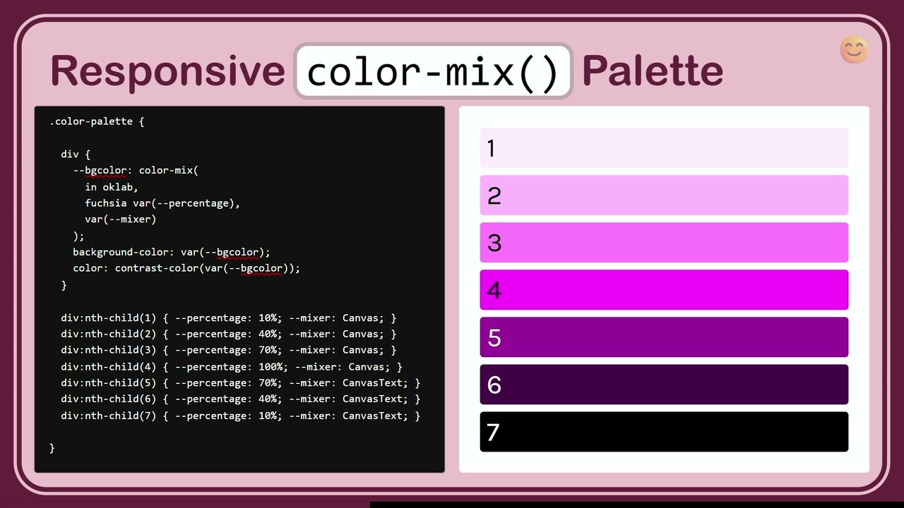
Okay. So that was just a little rant on palettes. We wanna be readable on anything. We always wanna make something readable. The whole point of someone coming to your website is they wanna read your shit. And sometimes, you don't make it that easy, and it is really annoying to them. And it's sometimes not your own fault, but contrast color is here to make that a little bit easier.
Pick white or black. Leave it up to the browser. Pick the best thing. I want this readable. So that's a really quick and easy way to be adaptive to any color, any scenario, any tag, any user generated color, any it's very cool stuff. And then at the end of the thing, I have a, I have a package I'll be sharing with you.
But anyway, it extracts colors out of images. So if you wanna overlay a little caption that's themed with the image, and then you always wanna have text on top of it that is also excessively read. Boom. Contrast color. Okay. And we've also have this one here. So this was interesting. I added this slide after Sarah's talk. Thank you so much, Sarah.
Every single one of the talks, was so inspired. And I think I threw in slides for every single person except you know you were too I had to go right after you. That's too risky. But here's what, like, what the user wants versus what you wanna render. And I know you've seen this where you've got this happens in the Shopify admin. The whole theme is generally white right now, but at the top, we have a dark bar.
We need to know that you want a light theme preference. However, we still need to have dark areas. The power and the contrast can be really powerful and meaningful. So you now you have to balance with your component the difference between a global setting coming from the operating system, a setting coming from the switch, and a setting coming from a localized set of color scheme. Color scheme being set on the component itself.
And at that point, light dark is your best friend because you don't have to care. You're like, I told you what to do when you're in light or dark. Someone can assign me this value at any time and I can be dark here, light over here. I could be moved into the side panel, is a dark side panel, which inherits color scheme dark and now I'm in light mode because I need to pop on the call out.
This is what I mean. You wanna build a system, build a system. If you wanna build Legos, go build Legos like they did ten years ago. I haven't even had any beers yet. I'm gonna get real wicked later y'all. Oh, man. Okay. So now we have like page first component. Actually, think that's a little bit of a doubled one.
Yeah. Oh, but I this one oh, you know what? I added this because of your talk and didn't realize it was in my slides already. But here's the demo that it made me think of. Let's just navigate to that real quick. Right. So I have on this article I wrote on my blog, nerdy.dev. I have three different strategies on how to achieve nested kind of light dark themes.
This And is something that Tailwind touted at one point. It's really easy since we use classes to have a dark area inside of a light area, inside of a dark area. And I was like, I've got three ways to do that without you. It's a cool story. And you can go follow you can go check these out.
It's like using Atscope. What is it? It's Atscope, light dark color scheme and style queries. So three really powerful ways you pick the one that fits your system best. What is your system trying to optimize for? Cool. And I talked earlier about adapter frosted glasses. Just look at it. Right? This one uses light dark to adapt to it so that way you don't have to care.
And I think the the way that it looks and the way that it's meaningful is really nice. I think this one also does prefers reduced contrast because I just like to be completionist like that. I hope it does or otherwise, it just talks shit. I think it just talks shit. Okay. Apparently, I don't like to do that.
Oh, and, yeah. Arc hijacked the command shift c so that I can't do that. And then, yeah, Sarah showed everybody the little paintbrush. You and I had to fight really hard to get this paintbrush in here y'all. It needs to be easier to find that. And now I have dark adaptive frosted glass. Light. It's not just colors sometimes.
You can go way beyond this. You have to be thinking about an an adaptive system. My frosted glass is adapting intelligently, and that's cool stuff. Cool. Cool. Alright. Let's get on. How are we doing on time? We're doing alright. Hey. The irradi irradiation illusion. This is something that I've seen people talk about twice today, but they were using font weight to adjust when they're in a dark text. So light text on dark does look a little bit thicker and sometimes that's undesirable.
However, when you use font weight bold, you can cause layout shift. I'm looking at Barry. Because you literally can. If you set all the text to bold, it all, gets a little bit wider. However, if you use font variation settings grad, if you have a variable font that you're using in your design system, you can just change the gradation of it, which makes it visually look thinner, and it doesn't change the glyph box, which doesn't cause the cumulative layout shift.
Hell yeah. Alright. Let's talk about the viewport. Hey, man. Let's and that's a hot tip. You can even tweak more stuff in there. Like, have a whole blog post. Anyway, I got a blog post for a lot of stuff. You can know when you're in view or not. And this becomes really important. This is about mixing stuff too.
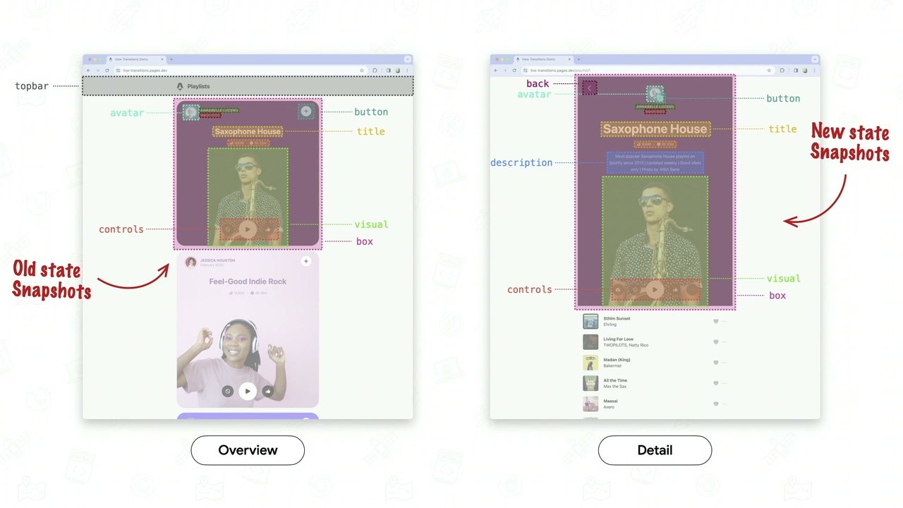
On my personal blog, I have view transitions that go from one blog post to the next. However, only when the card is in view does it have a view transition name. Otherwise, I would have 400 view transition names. And when you click a box, it would take 400 images because the browser's kinda done that way right now.
I try to get them to change it. So instead, took matters into my own hand. And I use scroll driven animations. And when you're in view, you have a view transition name. And now I've isolated and reduced the amount of images that need to be taken when you click, and it's much faster it's and much better. And combining adaptive behaviors and being able to know when you're in view is so cool.
And we saw Eunice showing a natural stagger. At least that's what I called it when we were playing with all these tools. You have a list, a bunch of bullets, and as they scroll into view, as they enter the bottom 25%, they fade themselves in. And each one gets an individual amount of key frames for their own entry.
And it looks staggered, but you don't have to use anything about delays. It's a very cool feature. And my stuck scroll state query, it's really cool when your UI shows that it's stuck. Jake showed my select element, and I knew that he copied a lot of my code, and I'm happy you did. Because when he scrolled up in his demo, the legend that stuck to the top changed colors and highlighted, and it indicated that it knew it was stuck.
That stuck element showed me and showed the user that's cool stuff. And it can be used in so many different ways. You can do it with toolbars that know they're stuck. We've seen, other people oh, man. Another name I'm gonna forget. Roland has a sticky header. When you scroll up and you scroll down, it collapses and expands.
We've seen a lot of really cool demos like that. Use these tools to do meaningful a system that looks intentional and does meaningful cool cool stuff. Here's a cool one. Am I filling the viewport or not? As a component, there's really meaningful moments like border radius. Border radius when you have it and it's touching the edges of the bottom looks stupid.
It does. Looks stupid. And you can very easily know, hey, am I in a container that's fitting the whole full width? Then make my border radius zero, and now I'm appropriately edge to edge full bleed. That's a really cool trick. You can also do it with clamp though. There's been a lot of different versions of this particular way to write this clamp. This is the way I like to use it, which is with the scientific notation for a really big ass number.
That means one followed by five zeros, and I just love that. You can also do it nines and all sorts of So scientific note notation is like 20 years old, and it's badass. So anyway, this just says like, hey, you're either zero pixels or the radius three depending on if you at the 100% size are less than the viewport width.
And so it makes it the clamp in the middle makes you choose one or the other, and you either have a radius or if you're full width, you don't conditional radius. It's cool. Also following that with concentric radius, look intentional. This is another big design mistake that people do. It's just kinda lazy actually, or your eye isn't trained yet.
A lot of this stuff is can't unsee. Right? You saw it, now you can't unsee it. Concentric border radius is one of those things. You'll see a little nubbin next to a really nice rounded corner and you're like, that doesn't look good. And the way that you can do it pretty easily is you take the padding in the border radius.
You make the inner one have a little bit of a calc and it's done. I do have an open draft in the CSS working group for making this automatic with a keyword. And it says like match parent. My border radius match my parent. I wanna look concentric and I don't wanna do the math. And I don't wanna have to pass props and padding just to do that. Fitting and changing viewport.
You've got all sorts of ways to fit the viewport. You need to be intelligent about these. Pick the right one. Pick a 100 d v h for the dynamic viewport height. Usually, that one's not a good choice actually because it can cause wiggles and jiggles. Yeah. Everyone's like, does this? I'm like, yeah. Good call. But you got the LVH, the low large viewport height, the small viewport height. And I'm not gonna lie.
These actually drive me nuts that we have all these options. However, it's nice to have the options because we can do something intelligent with each of these. Knowing what's in the viewport, is that status bar there or not? Where's the notch? This is you adapting to the notch. Being full bleed is a sign of an app a native application.
Are you using this? Does your application know if it's landscape and there's a notch or not? Are you filling that space, or do you have dumbass bars sitting on the side of your application? Wasted space is probably 20% of the space plus all the dorky other stuff that's in there, and now you're down to 30 viewport trying to use your sausage to scroll the screen looking like a dork. Anyway, check out the notches.
Scale with me. This is way for fluid typography. There's so many strategies here. We had a really cool one from Manuel. Now I remember your name. Tall or wide. Sorry, man. I don't know my neighbor's name, so don't take it personal. I wish I did. Tall or wide. What's the orientation? You can do orientation on the container query also.
It's not shown here. That's a really powerful thing. Your container knows if it's in a landscape or portrait mode. That's an opportunity for you to change your bento box. It's an opportunity for you to look adaptive like you were intelligent and you thought of that. You knew that that existed and you built it into your system. We've got interactions. So, it's something being interacted with.
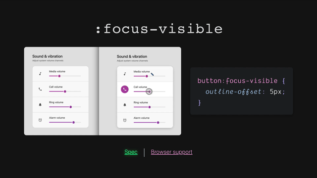
We probably all have these in the design system, so I'm not gonna go over these. Focus visible though is cool. You should check that one out if you haven't heard it before. Focus within, another one that I feel so slept on. It's always it's there, and you it's so powerful for anything to know that your focus is inside of it, and the whole contain and multiple layers of parent elements can look like they know you're there and make it focus you.
And because you're focused there, obviously, your focus is there, so you can make the whole UI make it look like you're focused there. Your UI doesn't look just intentional with like a little focus ring. The whole form is giving you visual focus. Reduce the noise. Nice. That's very catchy. Are things valid or invalid? These are really important too.
Use user invalid or user valid, though, because they don't yell at the user before they've interacted with it. Like, if you use colon invalid, the page loads and it's like, red, you have fucked up. And and I'm like, I haven't even done anything yet. Why are you so mad at me, UI? If you use user invalid, it'll wait for you to touch it and then screw up, and then it'll go red once you blur it. And then it's like, hey.
We saw you were there, and, you did it wrong. You know? Anyway, use those. You can check to see if a video is playing or not. You can also check to see if a video is playing or not inside of you or inside of the component. Yeah. It's not I'm not a Teletubby. I didn't even think about that.
That was funny. Yeah. I know. Got a video playing inside of me. But these are cool. Like, is it paused? Change the UI. Is it playing? Reduce noise. Let them focus. Something's playing. Be cool about it. Picture in picture, a little bit more obscure, but still good to know that if something is in picture in picture, you can do something cool with your UI.
Am I open? Is a popover open? Is a popover closed? There's a lot of cool things that you can do just knowing and being aware that things are open or not. Going big is something full screen. You can do nice and appreciative things to the background of your UI knowing that they're in a full screen mode. Is your design system doing this?
Probably not. But also maybe your design system doesn't have things to go full screen. So you get a get a jail free card on that one. Alright. I'll I'll give that to you. Still empty. This is placeholder shown. This is a really cool one for inputs again. Is the input currently showing a placeholder? If it is, then that means it's empty.
It's a really strong indicator, and you can do cool things knowing that it's empty. You can call attention to it. Maybe it's the first input of the form that has placeholder shown. Meaning, you should start here, your UI can guide your eye, guide the user to this particular moment and thing you want them to do. You can check to see if something is checked or not.
We've been using that one for years. I'll skip over. But indeterminate is cool. You know these things, and you know these things about the components inside of your components, and you know this about the components outside your components. This is what all the checkbox hacks were. We were playing games by just managing checkboxes, knowing that their presence was on or off.
It's really cool. Did the browser autofill it? You can style the browser autofill. I think that's meaningful because it's usually covered in piss yellow. Who made it piss yellow? So gross. Like, I have a beautiful app here, and you wanna put yellow on these? Get out of here. Style it. Make it look like you're intentional. Own your design system.
Can somebody edit something? Change the cursor. If they hover on it, they put focus on it, show them meaningful feedback. Don't just have it be read write in a mystery. That's annoying. Drive things by scroll. Oh, yeah. Hey. This was cool. We it was like a theme of this. And I was like, I got one that does that too.
And here, let me change this to light. Oh, snap. Hold on. Turn up my brightness. Oh, there we go. Where's color scheme? Color scheme, I think you're on the HTML element. Yeah. Here we go. Light mode since better on the screen. This is a sticky element, and sticky elements are observing the scroll position. And look, I get like this natural inertia.
It's very satisfying. Anyway, scrolling. You can do this for all sorts of really cool effects. Knowing and introducing things, keeping track of the scroll, just like view, the scroll one is super cool. Yeah. You cannot save that. That's great. Did I snap? This one's really important too. The one item that snapped it's been a mystery until scroll state queries. Or you had to I did a whole talk on scroll snap here a few years ago, and there was an ugly ugly hack that we did to try to figure it out.
Does anyone remember what it was? It was a we we put a humongous gap on the grid layout or on the flex layout so that all the items that weren't snapped just weren't in the scroll port anymore. And then we looked to see with JavaScript who was still in the scroll port. And we're like, it must be snapped because the gap is a 100 VW, so anything remaining in here obviously snapped.
That was what we had to do. It's ridiculous. Now it's just a query. And you can make that element look promoted. The scroll, did it last year with, remaking the switch home screen. The switch home screen had a really intelligent way of showing the blue border that was shiny just like it does on the actual switch. Could do that with a scroll state query.
What's highlighted? This is another thing. You can change this, and you can use contrast color with that. So you can use your brand, bring in an always accessible contrasting text color on top of be intended. You said you built a system, and most of you didn't do this. This was in the HTML five boilerplate, and it was hot pink. Who remembers that?
Dang. That's not as many hands as I thought. It's all good though. That was a minute ago. So was it Paul Irish that put that in there? Yeah. That was a good choice. He's like, no one's gonna even know this exists. Watch those high everyone knows when they used it because you'd to a site and highlight text about they used the h o five boilerplate. Oh, so funny.
Target text. When someone highlights text, they share it to a friend and it gets clicked to and scrolled down to, you can make it match your theme. It doesn't have to be the browser defaults. You jump to me just like tar so just like the search text, you've got target. Did the browser just jump to me? This one's also been a really old school one, and there's lots of really cool ways to do this.
And in this particular one, I'm using margin block start to make sure that the thing that got scrolled to isn't touching the top of the viewport. Give it some space. Be intentional about your system. Use the tools. Build something badass. Continuity. We saw a whole big talk about how to make your animations look like users can follow something to somewhere else.
The continuity is really important. This helps you follow the differences and change. It's not just a flash of change. Our world things don't flash like that. They always have some motion, and so having the motion helps people feel connected to it. And, of course, like in the beginning, listen to the user preferences for all this stuff so that when they get in the car, it doesn't make them sick.
They get in the car and they say this car is fucking rad. Okay. Now we got to self. Some of these are a little bit more obscure, but, this one's like, hey. Which one am I? So this is using sibling count and sibling index. Where am I amongst my children? And that can make you, that can help you make a lot of really cool effects, staggers, arcs.
I think we had, Patrick Brose had an arc. That's a really cool use case for using the sibling index. Am I upgraded? It was his web component. Have I been defined? Am I not defined? I can make a skeleton state. I can do all sorts of meaningful things because I'm currently empty. I haven't been hydrated. You have a hook for that.
Is your design system using that? Am I the host? You can know if I'm the host of a whole bunch of other elements, or am I the host at the am I at the top layer of this particular thing? It's a cool hook for you to know that you what you can do. Who's rendering me? So this one's kinda funny.
Like, which browser am I in? Does it have the capability? So this is again like knowing enough information about where your component's rendering to make an intelligent decision, build it into the component. You have components now that anybody can use and they always look rad. You know, is that in your system? Are you using, ad supports to do that kind of work?
Am I being printed? I still think this one's fun. People print stuff all the time and you can do lots of meaningful user experience enhancements to something being printed. Don't sleep on that. Does your design system care about thing? And the component can own that. A lot of times people have like a print style sheet and they go in there and they just stuff all the selectors in there and put importance on.
But now your component can own it. If it's doing something naughty that doesn't need to be printed, it can own it and get rid of it. This one is cool because we have nth child but allows you to do what, how many it's like nth child given a filter. And that can be really nice for, again, for Kevin's demo where we had certain elements that were on sale or rare or had a rating and a few other things.
You can specifically count those and look to see where am I amongst that. How many of them are there? I can count every three of just the featured items with this particular query. That's cool stuff. Your components can know so much information about what's going on. Who comes after me? So that was like we looked earlier. You could see who's before me, and you can use has to see who's coming after me.
So again, being hyper aware of your surroundings and the state of the other components around you. So that that's that's where you fix the dumb button scenario. Hey, button. Hey, button. And that's it. That's all they know. But you could be like, oh, snap. I'm next to a reset button. I'm next to a submit button. Hey. There's four buttons here.
I should probably push the reset button all the way to the edge and tuck these other ones over here to the right. Do something intelligent looking at the content that's inside of there. Here's a p w a one. Am I installed as an app? You can just ask the media, what am I? And do something intelligent. Look intentional. Your app now looks promoted.
You do the notches. You do the installed PWA stuff. You look intentional. Your design system looks cool. You can also bleed your way into the title bar. So sometimes we install PWAs. They look like PWAs because they get the, you know, big ugly bar that's at the top. You don't have to deal with that. You can actually say, I wanna account for that.
Give me the environment variables. I'll push away. Make it transparent. And as people scroll, I look like a full bleed native application, and people won't know. The And more you spend time thinking about these things, the more time you spend making it look intentional, the more that they think they're using a native app, and the more that you get success.
Skip me if I'm off off screen. So content visibility. Is this is this particular element not even in the view viewport can be ignored by the browser renderer, and then you give it a placeholder size that says, hey. While I'm off screen, just assume I'm about 600 pixels. And you can do that for humongous lists of content, saving your initial paint, saving your users' batteries, and making it so the browser does the work to render those things as they come into the view. It's very much like a recycler view, but it's quick and easy. It's not devoid of its own little, quirks, but still it can be a very powerful way to have an intelligent list view.
Promising the browser, YFx will stay inside me. So you can say that, like, hey. I have an inch I have a width and a height. I'm like a map. Everything inside of me, you don't have to treat it. If if if things inside of me change, the rest of the page doesn't have to rerender. You can trust me that I contain all of my own work.
And these give hints to the browser that are much like will change, but they're like, I'm gonna manage my own render tree. It's a really powerful way if you're finding that you need to isolate something from the render. We've got relationships. I'm gonna burn through some of these because I wanna get to the, end of the talk here.
But this is we're talking about Anchor, a lot of people are using JavaScript to do this. Anchor, Jake said it, is one of the most powerful things that has entered into our tool belt in a long time, and he is not wrong. And we're still learning what it can do, and I wanna show you this trick that I, came up with called anchor interpolated morph. Who hears heard a flip first, last, and verb play? It's a very powerful way to do dynamic animations that go from two intrinsic states of something, and then morphs between them.
And so I found out that while I was doing git bounding client rect that actually anchor knows all the same shit. It knows the x and the y of anything that has an anchor name, and it knows the width of anything that has an anchor name, allowing me to do something like this. This is just like Yuna's demo with an interest.
The interest, of hover invokes a popover. The popover uses anchor to look at the measured width and position of the target thing being hovered from, and they both work in harmony to appear to morph from it. What's cool and not shown in the demo is that you can also morph to somewhere else. Anything with an anchor name, your element can transition it.
This is also interruptible. There's no JavaScript, and I can hover, not hover, and just cut it off in the middle of it, and it goes back perfectly. There's no key frames. Transitions, by the way, are a much more powerful thing than, transitions are much more powerful than keyframes, and I try to use transitions as often as I can.
And this technique is very powerful. It does use a wild combination of things, though. Uses at starting style. It's using all the pop over things. It's using anchor in a way that you've never seen anyone use before. It's very cool stuff. And I wrote an article explaining how it all works so that you can do it too.
So let me close that out. Yeah. Okay. Matching sizes. So this is again anchor. You can say how, what's your width? I'll just be that width. So your tool tip can match it. You can do again, anchor, so powerful. Light or dark. We kinda beat this one up. Let's just skip it. Counters are super powerful. People sleep on them.
You can nest them. They go all sorts of cool directions. You can adopt a grid. My parent defined some Collins and some Rose. I would like to just use those also for myself. Being aware of the parent grid layout. You can pass that down as many times as you want, and it makes for really meaningful alignment of content.
A distant driver with scroll container or with animation timeline, you can actually observe somebody else's intersection with the viewport. This element is going to spin based off the section and its intersection. So as this goes in and out, that's a timeline. The spin of this is off of that timeline. You can hoist up the intersection of one element into a parent container and have another container observe it.
Really cool stuff. So again, intelligence and meaningful stuff going on here. You can roll back based on cascade layers, revert to something prior, be smart about what you're doing here. Maybe you have like, this could be a blog. This could be something that intentionally needs to revert to another layer. Find my angle. This is where using trig to see, Tamani does this all the time when we saw a demo where it's like, hey. The target thing's over there.
I can use trig to know that it's that way, and then I can use anchor to know how far the distance. I've got x y, and I can calculate the triangulation. And you can get all this stuff with CSS. There's a a tan two trick right there too, which we've seen today already. Sticky can cling to the scroller, so again, being aware of the scroller in its state.
And here's a list of all the stuff that you don't have access to. So if that wasn't big enough, you also don't currently know what the window size is or the visual viewport dimensions is pixels. Jane Ori has a trick using tan and a tan two that extracts the pixel values out of the viewport so that you can use them as pixels and you don't have to use the viewport width and height.
That shit is cool. Scroll bar width. We have thin and we have thick scroll bars that change between every single operating system, and they can make you have if you use a 100 VW prior and it's getting fixed. But still, knowing what the scroll bar width is can make you have a more elegant scroll scenario. We now we don't know what the scroll velocity is.
We don't know the global position of the pointer or the mouse. We don't know the element local pointer position. If I'm hovering on a card, I wanna know where that mouse is. I don't know the element geometry. I only know relative units. I don't know element visibility. I mean, I kinda do. I have intersection observers, and I have, you know, view, with the scroll driven animations and stuff like that.
But I also don't know my elements ratio. I know if it's portrait or landscape, and I can query it, but I wanna be told what it is. I wanna be told what it is and a percentage because then I can do something even more intelligent. My form controls don't tell me the stinking ranger slider value. How many demos here were like, a little bit of JavaScript so that I could oh my god.
That's driving me nuts. Give me the value of the inputs. Tell me the slider value. I wanna fill it with goo. The generic field value. What's the value of the field? I've got meaningful places I can stick that. I wanna know the minute I know the minute and the max give it to me. I wanna know how many characters have been typed.
I can do cool shit with that. What's the we only have active and invalid and, like, a few of these things about inputs, and that's why Angular fifteen years ago came up with dirty states and pristine states and all these more meaningful ways to get has the user even touched this? And we're only just getting user invalid.
That pisses me off, and I want more. The form states. I wanna know more about the form state value in my CSS. I want my select to know what the I want my CSS to know what the select value is. I wanna know what the color input value is. If someone changes the color input, give it to me without JS.
It's driving me nuts. It's color. Device sensors. Is someone moving it? What's the geolocation? I can do cool stuff with the geo. What's the hardware? What's the battery? What's the CPU level? What's the frame rate? What's all this? JavaScript knows this stuff, y'all, but CSS doesn't. It obviously is making me kinda mad. So okay. That's why I made prop for that.
So it's a JavaScript library. You install it and it just you decorate an element and you say, I want props for the pointer. I want props for the pristine and the field values. I want props for all that shit I just listed is basically handled for you in this library so that you don't have to write the JavaScript. You get to be the CSS developer.
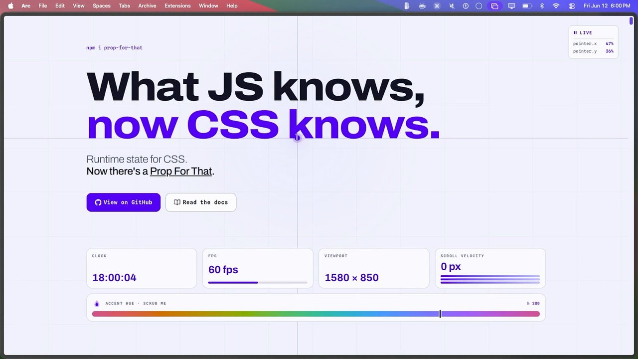
Some other dork, me, wrote the JavaScript for you. And I'm gonna show you a quick demo on that, and then we're, gonna wrap this up. Here, pointer position. CSS knows where it is. That's the global one. You can see it up here. These are live. I can even pause the library, and it stops live updating all the custom properties.
So it's a custom JavaScript just giving over the things that it knows that CSS doesn't straight to CSS' custom property for you to do something cool with. Look at as I hover over here on the edges. I'm using the pointer location to drive a gradient. I know what the frames per second are of the page. Hey. That's funny. When I'm not plugged into the monitor, I have a 120 frames per second, but when I'm plugged into this, I have 60. I can scroll and see the scroll velocity.
As I hover this, I can know where it is on the thing and change the hue of the whole page. Gee. I wonder how I changed the hue of the whole page and maintained contrast. Probably something I told you. So here it is. You import it like this. You put data props for size. Hey. I want props for size on this element.
And the props come in as live w, live h, and it's all plug in based. So it starts out basically giving you nothing. You opt in to every single thing you want to be observed and you tell it which component it's gonna put them on. And let me just show you a few more of these demos. Attract the pointer. Parallax?
Easy. Right? How many times have you wanted parallax because it looks sick, but you're like, that's j s for that. It's just a pain in my booty. And, you know, and I have to do all the trig, but it's once you have the variables, you can do it, and it's not so much of a big deal. And this one actually has it on the outer here.
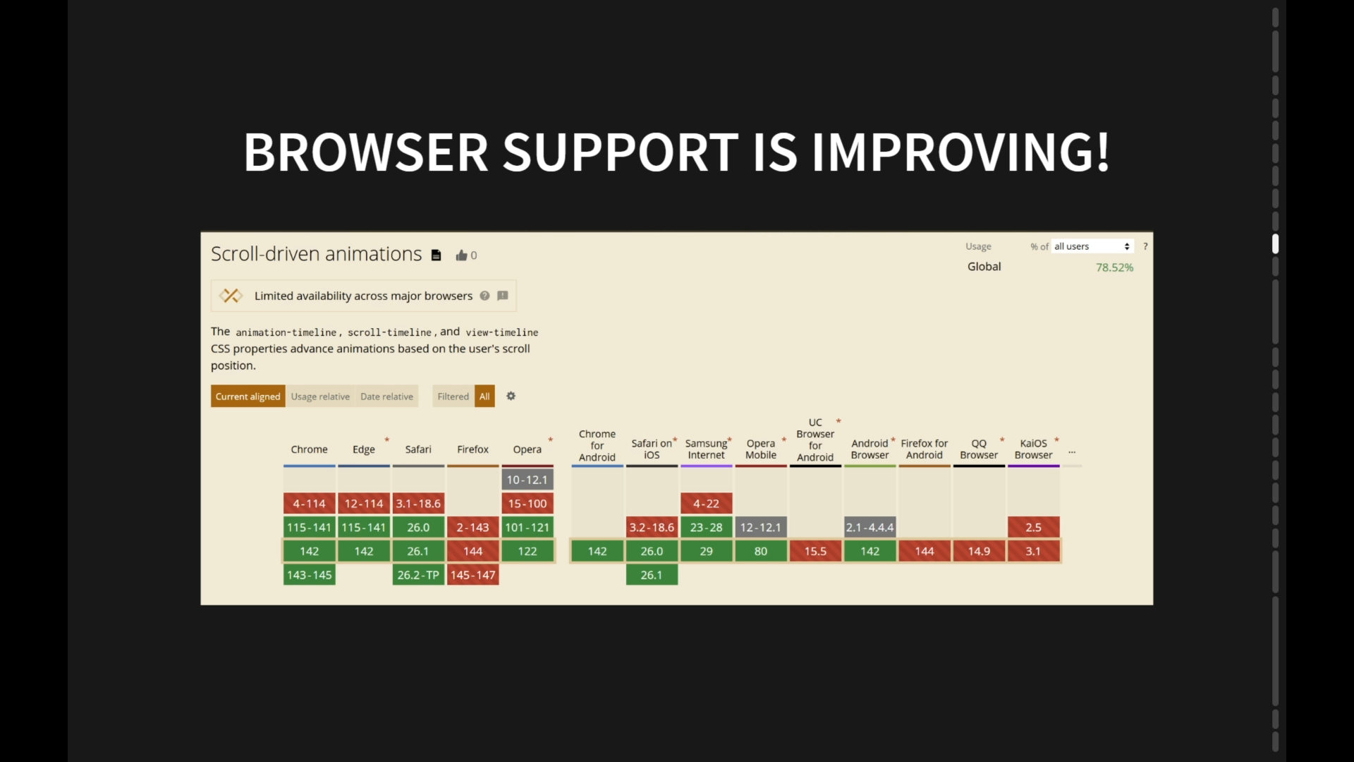
There's a gradient here. There's a border gradient here. It's all in there. And I only wrote CSS. This whole entire page only imports this library. I literally don't write another single line of JavaScript. It's all in my CSS. I have scroll triggered, observers here for you because I don't wanna wait for the scroll triggered spec to have land in two or three years for me to get, to use it.
It has two props. Has it entered and has it gone out again? So you live live visibility in and out binary, and the other one is has it entered at all. Once it comes in, it stays that way forever so it doesn't have to keep animating. You can keep things kinda minimal on the user. We've got slider values.
Doy. Doy. And look at all the cool ways I can respond to that. We've got discrete values. So using style queries, you go up and down, and you can do cool things with color and values, project them as content, all sorts of cool stuff. Live length as you type. Yeah. Satisfying. Trigonometry. Here.
Right? They're all just looking at the pointer, and they're using a little bit of trig to point to it. We're just talking about that stuff. A clock ticking. Who had the clock in their demo again? Eric. Annules. Yeah. There were two clocks. And I was like, I got a clock to show you. It's gonna be really fun.
And it's even got a little pointer listener into it, like it's got some little gooey liquid in But I'm writing to you the seconds to hours and the because JavaScript knows it. Why doesn't CSS know it? You can do cool shit with it. Why should you have to write that JavaScript every time? This one's Chrome only most of the time.
Yeah. It says right here, but I can know if you're online. If you're on offline, what's your battery status? What's the frame rate? Scrolling with momentum. We saw that one already. A card with the shape. I'm gonna skip that one for now. This one is a live video playing, and I'm watching the progress of it because I will give you the progress value so that you can update any part of your UI that knows how far or how not far someone is into the video.
Plus, you see the color changing? Let's oh, I wonder how he did that. Well, here, I'll show you in a sec. Here's simulate low battery mode. So this one will write to you if someone's in a low battery, and then you can go take out your animations and your gradients. CSS working group probably will never give us this.
CSS working group will probably never give you most of these, which is why I took matters into my own hand. And I'm not trying to not trying to say anything mean. They just don't wanna increase the amount of private fingerprinting vectors that people can track on you. However, JavaScript is there doing it the whole time, so is the server. So why can't CSS have it?
Anyway, this one was just a clever use of using the pointers. So once you've hit active, you can see the style there. Once it's active, I track the pointer and then you get this kind of simulated drag effect, which is just kinda cool. Here's all the form states. Dirty, touched, changed. If I go back to ADA, it's dirty but not changed. It's touched.
Right? These are really valuable. What's the value of the currently selected element? How many see? What's the color? Just tell me the stinking color and I will do something cool with it. Now you don't have to. This thing will do it for you. Images. Any image, it will extract all the colors for you. It'll do it to, gradients as well, almost kinda giving you free little cool color palettes out of a gradient.
You can have a video. An off screen canvas will render the video constantly getting the colors out of it and write them back for you so that you can use them to make a cool glow around the edges. You can use either the dominant color or the accent color. And here's every single property that this bra this library supports for you so that not just 80 different things that you can respond to with your components, There's about 25 more here for you.
And I want you to be building the best components in the world and using CSS to do it because it's the one that's most capable ever. There's no design tool as powerful. There's no rendering engine that's as powerful as what we have. This is dynamic and meaningful And to the user, go out and build badass shit, y'all.
Thank you, Adam. That was aggressively smooth.
People
- Bramus Van Damme
- Jane Ori
- Jen Simmons
- Kevin Powell
- Paul Irish
- Temani Afif
Technologies & Tools
- Angular
- HTML5 Boilerplate
- Open Props
- PWA
- shadcn/ui
- Shadow DOM
Standards & Specs
- :has()
- @scope
- @starting-style
- calc-size
- Cascade layers
- Color fonts
- Container queries
- Content visibility
- contrast-color
- CSS Anchor positioning
- font-palette
- light-dark()
- Logical properties
- Media queries
- OKLCH
- Popover API
- prefers-color-scheme
- prefers-reduced-motion
- Quantity queries
- Relative color syntax
- Scroll state queries
- Scroll-driven animations
- Style queries
- Variable fonts
- View transitions
Concepts & Methods
- Design tokens
- FLIP animation
- Intrinsic web design
Organisations & Products
- CSS Working Group
- Shopify