Color-Scheming

Speaker Introduction and Color Scheming Talk Overview

Speaker A introduces Sarah Joy with a playful flapper theme before Sarah takes over to outline her talk on building light and dark modes in modern CSS. Sarah introduces herself as a veteran web developer who made a career change into web development in 2022 and now works at pirateship.com, and frames the talk as an evergreen, practical guide to CSS features that are usable today. She gives an accessibility warning about flashing color transitions and demonstrates a live helper widget that will switch between light, dark, and auto modes throughout the presentation.

Physical Reasons for Preferring Dark or Light Mode

Sarah explores the physiological reasons why people have strong preferences for dark or light mode, covering pupil constriction, visual floaters in the vitreous, and astigmatism. She explains why dark mode suits some users (reducing glare for those with floaters) while light mode suits others (sharper focus due to smaller pupil aperture, and better readability for those with astigmatism, who see light text on dark backgrounds as a blurry, painful blur). Sarah concludes that both preferences are valid and sets up the case for offering users a genuine choice.

CSS Color Scheming Features and Default HTML Dark Mode

Sarah introduces the CSS features she will cover — color-scheme, light-dark(), color-mix(), system colors, and contrast-color() — explaining each one's baseline availability status and what that means for browser support. She then demonstrates that browsers already have a built-in dark mode for default HTML, and shows how a single color-scheme declaration in either the HTML head or CSS root immediately enables it, saving developers from manually re-styling inputs, links, and form elements. A live CodePen demo shows the effect toggling via DevTools.

System Colors and the prefers-color-scheme Media Query

Sarah demonstrates the Canvas and CanvasText system colors, showing how they can be used to make elements automatically adapt to light or dark mode, including locking individual sections (like a header or footer) permanently to one scheme. She explains a key subtlety: color-scheme applied to a child element requires that element to have its own explicit color and background-color, otherwise it inherits transparently and nothing happens. Sarah then contrasts this with the familiar prefers-color-scheme media query, noting that the two mechanisms do not tally up — a point that has been debated but left unresolved due to backwards-compatibility concerns.

Single-Property Dark/Light Mode with Transparency, color-mix(), and light-dark()

Sarah demonstrates three compact techniques for expressing colors that automatically adapt to light and dark mode in a single line: using hex opacity (e.g. 25% alpha on a hue), blending a color 50/50 with Canvas via color-mix(), and specifying explicit light and dark values with the new light-dark() function. She compares the trade-offs — transparency and canvas-mixing always dilute richness, while light-dark() allows full control over both values. Live demos show all three approaches updating simultaneously as the mode is toggled.

OKLCH Color Palettes, contrast-color(), and Upcoming CSS Features

Sarah demonstrates building a coherent color palette mathematically using color-mix() in the OKLab color space, feeding the result into contrast-color() to automatically select black or white text. She introduces the oklch.com tool (by Evil Martians) for exploring OKLCH values and gamut boundaries, and cautions that contrast-color() struggles with midtone backgrounds so it is best reserved for clearly light or dark values. Sarah also previews two upcoming CSS features not yet widely available: image and gradient values inside light-dark(), and a color-scheme() function that would expose the currently active scheme so developers could adjust font weights between modes.

Contrast Accessibility — Migraine Research and the Ravelry Controversy

Sarah shifts focus to the overlooked problem of excessive contrast, explaining that while low contrast is a common accessibility failure, too-high contrast can cause genuine pain for migraineurs. She presents a study in which both migraineurs and non-migraineurs were tested on their aversion to cranked-up contrast in static, drifting, and vibrating grating patterns — finding that a slowly drifting pattern was most aversive for both groups. Sarah connects this to neo-brutalist web design and the 2020 Ravelry redesign controversy, where a stark black-and-white redesign triggered widespread headaches and caused significant community distress, and briefly demonstrates the drifting grating effect live on screen.

Implementing Contrast Preferences and CSS-Only Color Scheme Switching

Sarah shows how to implement the prefers-contrast media query in CSS, applying Canvas/CanvasText for a high-contrast variant and a CSS filter for a low-contrast variant, and how to test these in DevTools rendering panel. She discusses limitations around OS-level contrast support and the confusing overlap between forced-colors and prefers-contrast on Windows. Sarah then introduces a CSS-only approach to user-controlled scheme switching using radio buttons: the CSS checks which radio is checked and sets color-scheme accordingly — extending the demo to include both light/dark and contrast selectors, giving users up to six combined options.

JavaScript Persistence with Local Storage and Session Storage

Sarah identifies the core limitation of the CSS-only approach — preferences are lost when navigating to a new page — and introduces JavaScript to persist the user's choice. She walks through a simple implementation using localStorage (kept across visits) versus sessionStorage (cleared when the user leaves, which she prefers for personal sites to avoid GDPR concerns), showing how to read the stored preference on page load and write it when the user switches modes. A DevTools Application panel demo confirms the mode key being written and restored correctly across page refreshes.

Accessible Button States with ARIA and Full JavaScript Implementation

Sarah adds aria-pressed attributes to the mode-switching buttons so that screen readers can announce which option is currently active, noting that many screen reader users are partially sighted and genuinely care about color scheme state. She shows the CSS to style the active button using the aria-pressed attribute selector and walks through the JavaScript that removes the attribute from inactive buttons and sets it to true on the selected one. The same pattern is then applied to the contrast toggle buttons, and Sarah closes with a summary recommending the use of color-scheme and light-dark() as a free starting point, experimenting with color-mix and OKLCH, and empowering users with up to six combined theme and contrast options.

Q&A: Color Mixing, WCAG Compliance, Forced Colors, and More

Speaker A chairs an audience Q&A covering a range of topics: the trade-offs between color-mix() with Canvas versus opacity; whether contrast-color() complies with WCAG AA contrast ratios; how color-scheme behaves under Windows forced-color modes; when to use the meta tag versus the CSS color-scheme property on :root (Sarah notes the meta tag helps avoid a flash of unstyled content); the flash-of-default-scheme problem when restoring stored preferences (Vadim McKeev's question prompts discussion of a Chrome-only HTTP header); a comment about avoiding inline JavaScript event handlers; and whether dark mode can be implemented progressively on an existing site.

Then, my dear friends, I would like to introduce you to our next speaker. She, she was born in the very early nineteen twenties, and she keeps herself looking so youthful through the power of the Charleston dance. You can see she's demonstrating it now.

So put your hands together for everybody's favorite flapper, Sara Joy.

Thank you.

Where's your banana?

It's down there. I I I'm amazed at who just came before me. Some people seem to be able to think in, like, five d space. I yeah. It's gonna be a little bit calmer from now on, maybe. Just okay, so color scheming, which for me is building light and dark modes in modern CSS.

It is not a fully new talk. I have given variants of it before, but it feels like it is evergreen, because I keep finding new ways to update it. They keep adding stuff that's available to use. Because progress in CSS is lightning fast the last few years. I mean, you sit out for five years, you have a really busy job, maybe you start looking at CSS again and you go, oh my god.

What I wanted to do was make a talk where almost all of it is usable now, and let you be comfortable in just using the thing. Because there's so many cool new things we can do, but they are not always completely available all the way across the board. For those who might find this to be old hat, you can take a nap.

That's fine. Hi, I'm Sarah. I'm both an old hand in that I was building my own website as a teenager in 1999. I kind of fell off the wagon for a while, and then I came back again. I'm not such a newbie anymore. I made my career change into web development in 2022, now working for pirateship.com, which Americans may have used.

Unfortunately, I cannot dog food it. I work in Hamburg and we've got the dev wing in Hamburg. But if you're American, let's parley. You may want to ship your packages cheap. Savvy. Yeah, our customer support do that as well. A little warning, there will be some abrupt changes between light and dark mode. So this whole page is going to flash a bit.

If you suffer from migraines, epilepsy, or strong astigmatism, and I apologize for badly saying that, I'm really, really sorry. My goal is, ideally, to make the web more comfortable for everyone. You may have spotted a little smiley. And at this point, I need to go to my laptop. At the moment here, this is in an auto mode.

I've done this using the technology that I'm going to tell you about. We can have light mode, which is exactly the same in this case, and into Dark Mode. So there's my little helper for this talk. It's mostly gonna sit there and smile at you in Auto Mode. And I need to click away. So Dark Mode versus Light Mode.

We all love a good polarizing argument, right? There are physical reasons to prefer one over the other. You're also allowed to just prefer light or dark themed websites. Even for no good or logical reason, that's totally fine because it's your eyes, your choice. But let's go, why dark mode then? Okay. So, pupils will constrict when they come across a bright page.

And that can be uncomfortable, especially when your page in front of you has way too much contrast with the dark surroundings your bed at night while you're scrolling or something like that. If people have aging vitreous membranes in their eyes or have had various eye problems, they might have floaters in their vitreous. That can get more noticeable when you've got brightness in front of you. If you've laid back and looked at the sky, sometimes you see little white wiggles if you have no actual floaters.

They're literally is it the white blood cells or the blood blood cells? They're literally things going through the capillaries in the back of your eyes. If But you've floaters, you get even more stuff that's in the way and these are like artists' impressions. So people with severe floaters, they might struggle to read text like that. And they might prefer dark mode.

So why light mode? Pupils constrict when coming across a bright page. And in this case, it's actually good because it's easier to focus when your pupil is smaller. If you're a photographer, you know that a small aperture means that your field of view is just much more sharp. You might have to take more light in by having your shutter open for longer, but more of your picture will be sharp.

And that's exactly the same for our eyes. So this is why as you age, as I do, I've started to notice, it's bit a dull in here when I'm trying to read. You may need more bright light to read. Suddenly, those reading laps from IKEA with the little directional down piece is really useful and for crocheting and all that stuff.

So And then also, astigmatism makes light text on dark backgrounds hard to read. And you can This is like an example of what it can look like, and it's not comfortable. And this upsets people enough that they make lots of annoyed simulations because they've had enough of dark mode. So here's lots of examples of strong astigmatism.

And it can cause eyestrain or headaches. And there, yeah, there's enough enough of us fellow nerds busy making examples. I don't only use dark mode. I hate it. Yeah. So, for example, I love this one. I am the douchebag who makes people read white text on a black background. So there are reasons not to like dark mode.

Why not both? Yeah. Alright. Definitely. Good question. So if you're starting from scratch, you've got a greenfield project, you can build up your design, system from scratch. You're starting anew, this is gonna be the easiest time to implement the stuff I'm gonna tell you about. It is slightly harder if you already have a design system and it's mature and you already have all your colors set out and they've already been put in their right places.

That's gonna be possibly harder to retrofit. But I wouldn't stop you. Exactly. So keep it in mind for next time you start a new project. What CSS do we need? So color scheme is widely available across browsers since February 2022. This one is so good it gave its name to the talk, just color scheming. And we'll also look at these helpful features that pair nicely with it.

So we've got light dark, which is newly available, but it's very soon to be widely available, I think in this month, maybe even. Color mix is widely available. That was spoken about by Lia. System colors exist. I'll intro introduce those in a minute. Contrast color is very newly available and has is newly widely available.

And in case you don't know what that means, these are baseline statuses. So you've probably seen them on MDN when you're looking something up or even I think caniuse.com also shows the baseline status. Once a feature is implemented across all the major browsers, it gets its newly available instead of limited tag. And then the clock starts ticking.

And then thirty months or two and a half years later, it's marked widely available automatically. It's not related to a global usage on caniuse.com, but sometimes it's useful to have a coarser measure. So it's just like right here is a gate post on. Right? It can be useful for bosses sometimes. So, right, let's get into actually what I'm trying to do.

We have default HTML themes. This is what we see every day before we've put our CSS reset in. And like Syd, she's desperate to go away from it and doesn't see it very often and takes it out of even her demos, which is fine. Did you know there is also a dark variant built in?

It's just there. It's already lightened up the links. It's already done all your input styles. It's already changed slightly the, maybe not the highlight, Either way, it's already done a lot of different things for you. They're already there. And it saves you having to style all those things already. They've got a nice baseline.

And we don't technically need CSS for this. If that's what we care about, we're not gonna do any other styling. We just want the default modes. We can just stick it in the head. It's another meta. But this is CSS day, so we can also just stick it in the CSS as well. Best stick it under root or HTML.

And what we're doing there is we're telling the browser, this site can be served in both. So if the operating system says, I'm running this one, it will give you that one. If it's running the other one, will give you that one. We're just telling them we have both available. So a little demonstration. Here's our standard HTML.

There's barely any CSS here. Just trying to make it bigger. Oh, and then the result's gone. Okay. Thanks, CodePen. Alright. I'll just get rid of this get rid of this comment even. And then we have our standard WebPerge. I can use my little helper and set it to dark mode, and then it just goes.

And even if we don't like sticking things in the head, we don't trust that. We'll do it here instead. It's not quite live coding, but nearly. And then we can see that it works there too. And just in case you don't trust my little helper, that's fine. I'm gonna be going in and out of DevTools here because it prefers color scheme dark and off it goes.

It's just automatic. It's right there. So we'll kill off that bit. And then there's lots of questions that come up with this, which is great. And I'm gonna get into them now. Where my slides want to advance. There we go. So here, I've started introducing a couple of system colors. We have Canvas, Text, and Canvas, and they do about what you expect them to do.

And you can see that I've switched them for the div, which is where How I Use is, where we have Canvas text is the background color and Canvas is the color instead, just to reverse them. Why not? I can go to my little switchy here and switch it dark. I can also decide that I'm only ever gonna want dark mode here and just do that.

And it can stay like that. And you can have that element, that or that section, maybe it's your head or your footer, you might always want them to be dark. And you can just leave it like that. Or vice versa, you might always want them to be light. Light's spelt the correct way. And then when it goes into dark mode, it stays light, for example. So these these canvas and canvas text are needed here.

If you don't apply a a color in a background color let's just kill those off. It's the elements are kind of just inheriting everything, and they're transparent. And then they don't do anything. Yep. Let's put this back to Inherit. And then because they have no there's nothing sort of for color scheme to work on, so it just follows whatever's behind it.

They need their own. If you're gonna do it on an element, it does need its own color. Right. So there are other system colors. It's not only Canvas text and Canvas. There is also, like, button background and I can't remember them all. There's there's like a stack of about 20 maybe of them, maybe even more. And you can use them, but you can see the sort of roll eye smiley there because this is this one is supposed to be that color.

This one is supposed to be that color. And this one is supposed to be that color. And it's not. Oddly, in dark mode this is Chromium, by the way. In dark mode, it's fine. Well, sort of fine because it's still not actually the active text color. It's a slightly different one. And I did a couple of screenshots just from Firefox because actually they get it much closer.

It's much better. So, you know, Chromium, fix it in light mode, please. So prefers color scheme is probably the thing that's most familiar to everyone. Right? This follows your OS preference. It doesn't follow the color scheme property. So it's it's quite familiar. I've done it in nesting here but, you know, you have your media prefers color scheme dark and you decide in dark I want this color. And I've done that in two different places just for fun. And they are not following color scheme.

So this is this is why it's harder to put it into an established design system or really old website, for example, because maybe you've got quite a lot relying on this, and it can be a bit tricky. If I go back into my Dev Tools, I do like this little button. I want this button to be elsewhere.

You see, the colors do flip then when it's the OS coming in from the outside changing it. So it's it's good to be aware that these two don't quite tally up. And there has been quite long discussions about whether they should be made to tally up, but then we've got backward compatibility issues. So you sort of have to choose one route or the other. But if you choose the preferred color scheme route, you are styling everything, including all your inputs and everything.

Right? What I challenged myself, I find kind of fun, is I wanted to do a one property line that will do dark and light mode at the same time. And I was trying to do this before light dark existed, so forget the bottom one. I thought, well, transparency is fine. So you got yellow here.

It would just be yellow. But I've added a hex four, so 25% opacity on that one. Here, I've used Color Mix. And when you don't give it a percentage here, it just goes fifty fifty. So it's mixing fifty fifty with Canvas. And I can choose to put 60% in here, it would be darker or 80. But we'll leave it like that.

I should have to get rid of it. There we go. And then you can be really specific with light dark. You could have your actual colors. And I've used name colors there because I'm lazy. But you can put anything in there. Anything that's like a proper CSS color can go into the light dark two points. And then, of course, they all change.

Oh, that was too fast. Yeah, 25% yellow on black isn't super nice. And when you're mixing things with Canvas, you know you're never going to get a really rich color because it's always gonna be mixed with something that takes its color out effectively. But then that's where light dark comes in. And you can have a play with that and put whatever you want in there.

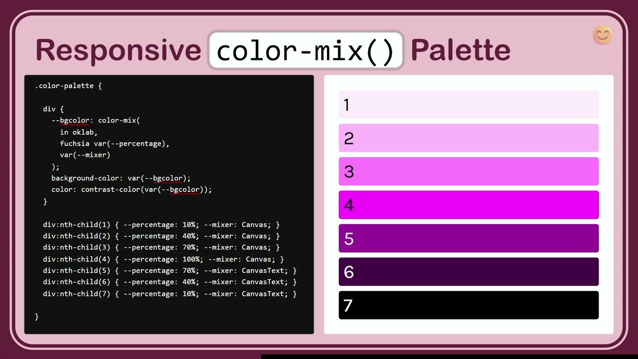
What I quite like, even though Leah basically said it's terrible, it's really rubbish. But I'm quite simple. I quite like to mess around with this color mix. And you can see it's Okay Lab here that I've decided to use as the color space. You have to choose one. You can put sRGB in there or I guess just Lab or LCH. And then I'm choosing to mix things.

Oh, I'm still in dark mode. It doesn't matter. I've chosen to mix Rebecca purple with some percentage of some mixture. And the background color is then, yeah, I've done it as a custom property so I could also feed it into contrast color. Leah's already explained that, but I'll get into that in a second. So I'm quite simple.

I use nice round numbers to begin with. And let me advance this slide, please. Thank you. And you can get quite a nice palette with not complicated code. And I could, of course, choose to make that not Rebecca purple in, fuschia. Did I spell it right? Yes. Instead, for example.

So you could shove different colors in there. It's very likely that your designer, if you have a designer, will look at that and go, oh, and will want tweaks. Or maybe you do want different chromers after all. And, of course, but I'm I'm a simple thing. And I start with this and I try and start with a mathematical thing. And then I'll I'll mess with it until things look even to me. I realize that's like a personal website type of situation. That's not everyone gets to do that.

So contrast color that I'd used there. It's finally arrived across browsers. It was literally like two weeks ago or something. I can't remember. And it takes color and returns which has the best contrast against it, black or white. But then the best contrast here is a little bit tricky. So, I mean, for example, already, the 50% Rebecca purple is quite mid. And the black on the mid, it's alright, but it's not great. If I start going up a little bit, I start I start thinking, 75. You know, you kinda want it to switch it white to white at some point.

I think it's 76. Yeah. It finally goes. So, you know, it's there, and you can use it, but try and avoid the midtones on it. If you're gonna use it, try and keep it at either end. I think that just that saves the controversy about whether APCA or WCAG is the best. It's another can of worms for another time.

So using light light dark. This one's a bit simple, really. You can just use whatever color you want and just stick it in there. Hang on. Did I go back to this? No. No. No. Wait. I didn't even just drop this into dark mode. That's the whole point of it. There we go. So the thing that was really light becomes the thing that was really dark and vice versa because you've mixed them with Canvas and Canvas text.

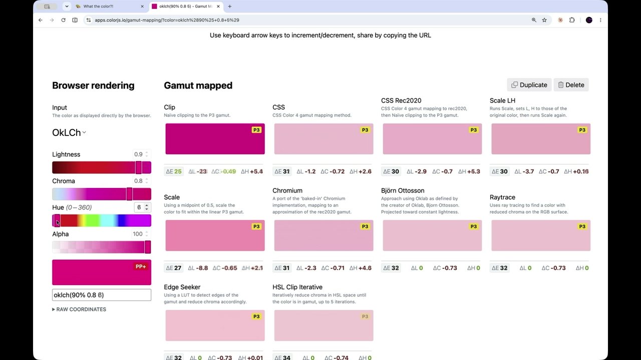
Good. Alright. Next point. Yeah, we can get very specific. I've just shown an example of a named one, a hex, very simple hex, like the old fashioned hex, and OKLCH. Side note, OKLCH, just because I find this really useful, and Leah did a great talk, but this is Okay lch.com, which was done by some software house that I forget.

Either way, Evil Martians. Thank you. Yeah. And it's just super useful because you can plug in a nice turquoise color of a pretty dress. I don't know where she is, but she's somewhere. And you can see whether it Or you can see what OKLC Asia corresponds to, and you can start messing about with that chroma. It will start telling you when you're out of gamut and what your fallback is. So if you start moving it around and you find yourself in a fallback, you know you're out of gamut and it's starting to do something strange.

I don't know why the fallback goes in half though. It's like it's so far off, it doesn't like it anymore. So that was just an aside because I find that super useful. Okay. So so far, light dark is only allowing colors for now. I'm sure one browser's done it. Has Chrome done it already? Firefox has just done it.

I'm sure Safari's not far off, maybe. But we will be able to put images into light dark. So for example, we could change the background of a great big div into a different kind of background if we want a different kind of vibe, it also goes for gradients. So I I don't have examples for this because I'm I haven't played with it, to be honest, because I'm I'm quite lazy.

And when I see that lots of things have got red x's, I go, you know, I'll just check that out another time. I like to wait for things to be across the board. So light, dark, fine, all across the board, very nearly widely available. But image values, it'll be a little while. The other thing, yeah, lots of red.

The other thing I like the idea of is if, and extremely new, only just agreed, is color scheme as a function to tell us what's currently active on the computer that's viewing the thing. So this is what I really want this kind of thing for. You have text in light and dark mode of the same weight.

And I don't know how obvious it is there but certainly here, there's some bleed of the white which makes it look fatter, like it's a heavier weight. That's exactly the same. Don't look for differences between those two but that is then 300 instead of 400. And maybe that'll be even better in the future if we have interpolated variable fonts where we can get like three fifty or something. But I want to be able to do that.

And it's not quite there because we've got some red x's. And they've only I say only just agreed. It was 2025, but the getting this color scheme function will be a little way off. I want it. If you want it, tell them as well. Go to the state of the CSS thing and tell them you want it right there.

Okay. This is a slightly tangent, but I find it really interesting. When we are making UI, we often worry about making it high contrast enough. That's normally the problem, that if we've grays on grays, mean, it's horrible. We don't wanna do that. We want everyone to be able to see it at a high contrast. But it can have too much high contrast.

So migraineur, which is such a lovely word, but people who suffer from migraines can actually suffer pain if the contrast is too high. And of course, you can turn down your monitor. But I I find it interesting that there's a balance here somewhere. Right? So neo brutalistic web design, if if you know what I mean, very square edges, very dark, big drop shadows that are really solid. They've become issues for some of us.

So, migraineurs in high contrast. There was a study, it was a few years ago now, but they tested sufferers for their aversion to contrast based on the movement of a grating pattern. So if you imagine you've got light well, you won't have to imagine because I'm gonna show you in a minute. You've got lines of black and white, and they're either just static and they're constantly cranking up the contrast, or it's drifting slowly and they're cranking up the contrast, or it's vibrating and they're cranking up the contrast. These are the contrast levels at which the people who were not migraineurs and the people who were migraineurs went, no no no, stops too much.

So, it kinda makes sense that the migraine sufferers have lower numbers, but I found it super interesting that drifting was worse than vibrating for both of them. Stark monochrome websites, I think they look super cool. I love that stuff, but they also have similar similarities to a black and white grating pattern. And if we scroll them, they're drifting.

You may or may not be like a yarn crafter if you do crochet or something like that, but there's a website called Ravelry, and I think it was in 2020, everyone was really stressed out, they were stuck at home, they were doing lots of crochet. There was Black Lives Matter and all sorts of things going on. And Ravelry sent out a new website and it was neo brutalistic.

And everyone went, oh my god, I'm getting headaches. And it was terrible. It was a big stress for a lot of people. There was huge arguments. You've never seen so much drama in a crafting community. So what I'm going to demo is just a little little taster of what possibly being in this study was like. Yeah, if you get migraines, if you have epilepsy, please look down.

It probably isn't a good idea to watch. Because this is such a big screen, I'm gonna make that a bit bigger. And I'm gonna set it drifting. And I'm not gonna do it for very long because I feel like it's, I mean, firstly, there's some jaggies as it's updating, right, so it's a little bit wobbly. And it's not pleasant.

And at least you got it on a projection and there's lights here as well. I'm gonna stop it now because I don't like it. Imagine you're watching that and somebody's cranking the contrast and it's getting brighter and yeah. At some point, you're just gonna go, no, stop, please. It's horrible. And you should just be aware of that, I think.

So it's safe to look up. Anyone who is looking down, can now look up. We can increase and decrease contrast fairly easily. So say you've got your site and it might have some nice colors and it might be slightly muted already, in which case you're probably safe but it might not be. You could increase contrast. You could use the media query to begin with.

And you can say your background color is canvas and your foreground color is canvas text. And you might start putting borders in where you didn't have them before, just to really, like, push the push the UI or vice versa, you might. I'll come to this again in a minute. Someone who prefers less contrast, you might just put a filter over the whole thing.

So just a little example. You can test this in DevTools. We can go to Rendering, which is down here, which you can't always find. It might be in this list. Right? There's this whole list that comes out of a Context button. No, I don't want paint flashing. There is a Prefers color scheme. That's media types, forced colors, forced colors, we'll get to that.

Prefers contrast. I could go to more and it's just gone canvas, canvas, text. I could go to Less. And it's just doing a filter of 60%. 60% may be a bit too much, you probably don't need that. But it's a bit more obvious for you guys to see it here. Gonna make sure that's not doing that anymore.

Good. But there are issues. How does a user specify low contrast in their OS? Has anyone ever found a setting like that? I know I haven't. I think preferred color scheme probably came before the OSes started implementing color schemes. You could argue it might come, but I don't know.

And why in Windows do forced colors sometimes equal prefers contrast more? These these two are completely linked in a way that is confusing to me, and also, Killian is here somewhere. He wrote about it. You can ask about him. Yeah. They're they're linked in a way. So if you use windows and you choose your high contrast theme, it doesn't only tell websites, hi, I'd like you to be more contrasty, please. It doesn't do that.

It injects forced colors into them to just make them contrasty. And that probably makes sense if you really need it. You can need it to happen across the board. But it's tricky. So that's an interesting situation. And then also another issue is that some people like to keep their OS UI in light mode and view dark mode web pages or vice versa. I'm kind of vice versa on my phone and the other one on my laptop for reasons I don't understand.

And so I've already said this to someone but I'd love to have the color scheme toggle, maybe even a contrast toggle somewhere in the actual browser, not hidden in the dev tools. I want it in the browser. Anyway. Oh, yeah. You like that one? Okay. So last year, John Olsop gave gave his DAO of CSS.

And I I love this idea of, giving everything up to the browser and the users. This is this is what I want to do. I want to code without coding. I want to stop fighting the browser. I want to trust the user and delete all the unnecessary code and let the system work for me, for you, for everyone.

The DAO of CSS is the path of least resistance. Oh, John, some days I would love to code less. So the deal is to allow true choice. I feel like we need to roll our own switches at the moment. We we have websites and we want to give people choice because they should be allowed choice. And yet the browser doesn't quite do it and the OS doesn't quite do it. So what we gonna do?

We're gonna do it ourselves. So if you rely on Prefers ColorScheme, this is kind of a pain. We override it with JavaScript and injecting classes and trying to check Windows match media thing and then inject the class before the page loads and trying to avoid the FlashArt one style content. Is that right? There's two that sound rude.

I'm not gonna say what they say. And so we can avoid this. It's much easier if we use color scheme to begin with. Can we do it with CSS only? Yeah, sort of. Has is really nice. So please go to HTML without dropping the result. No. Okay. Whatever. We have a field set.

And it has a legend. And it's just got simple radios in it. And when they're checked, they're checked. You know the deal. The CSS checks for the ID mode switcher and checks whether its value light is checked or whether its value dark is checked. And this sets the color scheme.

And you're done. Result. Still in light mode. And because it through the magic of CodePen embedded, it seems to follow, I think. So it just it just does it. And there is a question, and I'll come back to that in a minute. We can also do it with Contrast if we want.

Yeah. I'll show you the picture first. And then I'm gonna disappear here. Oh, I see it, it stayed. Wonderful. Okay. So now we've got two. We've now just got another. We're doing it with Select this time. I mean, I know some people don't like actions to happen on Select or Radios because you should be hitting a Submit button.

That's a thing. That's fine. But I am demoing and we'll come to the other one in a minute. Yeah. So we've got two Selects. And because I'm scaling this, it's very confusing. Let's put the Select dropdown up here. We can get to dark mode. And you know what? I want high contrast dark mode.

Or maybe I want low contrast dark mode. Let's have a look at the CSS. We've got the same things as we have before. And then we've got here we go. Only needed because of a low contrast filter. You need it's the same sort of thing.

You can't filter anything that doesn't already have its own color. So, they kind of have to have a color, the text in the background. Otherwise, you're filtering nothing, sort of. It just doesn't work. Yeah. So we now got all these options depending on what so we've now got, like, a six, effectively, different options depending on whether we want light or dark mode or we want high contrast or low contrast or we don't care.

In this case, it's only four. Yeah. Oh, and they're just pretty fine. You don't need to know that. So, again, we've just put a filter across it. And here, I've just added canvas and canvas text in everywhere because it's just sitting there for me to use. Why the auto setting? You could just have you open up a web page, you're in light mode, you hit a button once and you go to dark mode. That would be simpler for the user, but I kind of like knowing where I am.

Maybe this is maybe this is the tap that I'm that I'm doing. I'm like, there's three settings. Let them have all three settings. Maybe you just want light dark. It does save you work because otherwise you need to check which mode. You're doing the Windows match media thing, you need to check what mode the computer's in so that then you put the right thing on the button to know which one you're switching to.

So you end up having to do all these pre checks just to show your button properly or whichever state you're in properly. And it's a bit tricky. So Having the Auto Setting does save you work, but that depends. You might be slightly more like, no, no, I just want to give the user two and leave them to it, but then it's just a bit more JavaScript, that's fine.

You can do this anyway, And skip order if you like. I won't stop you. It's just your choice to complicate matters. So CSS only limitations. You've probably already spotted this. You it's magical but only works per page. So if you've got more than one page to your website, which you probably do, as soon as you go to another page, it's just gonna flip back into whatever it was.

So it's gonna flip into your OS mode, even if you've chosen dark. And the preferences isn't getting saved while browsing the site. So and you can't use buttons because you you have to put the JavaScript in there to make the button do the thing. So what JavaScript do we need? And I like Jeremy Keith's maxim, which I've decided to call it, but JavaScript should only do what only JavaScript can do.

So, at this point, I've hit my limit on CSS. I'm gonna try some JavaScript. So I I like very simple functions and you're gonna find that this looks very repeated because I want to be very clear with what I've done. So it's gonna look like a lot of code but it's all gonna look quite the same in some places.

You can undry it later. Undry? Just dry. No. You can wet it later. Okay. So we've three things here. We've got some buttons. We've got another field set, and we've got a select. They're very dumb, they're not talking to each other. I can set this one on dark. I can set this one on light. It's just taking the last thing and, like, writing it.

And, back to dark again. Let's leave them all on auto. Right. So HTML is quite familiar, probably. The CSS is super simple. We've just got the light dark and just trying to make it look nice. And then we are getting a variable for HTML because it's much easier that way. And when I want switch auto, I want it to set color scheme to light dark.

So it will do whatever. When I choose Switch Light, I want it to just put light in there, Switch Dark, just put dark in there. And this one is slightly less dry than this is the version you would use when you're trying to save some bytes, which is absolutely fine. And that's what this one is, what that one is using.

We can use buttons. But this still is only working per page, and it's lost when the page is reloaded. Useful. So we need to store the preference for the user. And for this, we can use session storage or local storage. And I think everyone loves local storage or knows local storage, but I have a thing about session storage.

For my personal website, I prefer that because people aren't visiting it very often. It's not like they're logging in every week to check something. They're just not. If I have them automatically land on CSS LightDark, they will always come in on their OS settings. So it won't be jarring, hopefully. And then they can pick one.

And then while they're on my website, they can browse around however they like. It will stay on that one until they leave, and then that information is destroyed. And it's not GDPR to save this stuff in Local Storage, but it makes me feel better. Yeah, Local Storage is kept between visits until the user clears their browsing data. So, let's just do that.

We have three buttons. We have our simple CSS. And we are now just checking for things. There is some redundant code here. I'm alright at JS JS. I would spend more time trying to fix it, I just wanted to make it very clear what I'm doing in every function. So we're now also pulling out the mode from local storage, get item mode, and seeing if there is one.

And if it's dark, I automatically switch dark. If it's light, I automatically switch into light. And Auto, we just remove the Item Mode. Don't need it. And we're setting the Item Mode into whichever one we're switching into. And let's go into, no, not f 11, f 12. I'm gonna go and have a look at the application.

And there's so many Code Blends here. I think, there we go, Mode light. Mode dark. I should be able to refresh the page. At this point, you may have noticed my slides are me subtly changing color the whole time. And it will come back dark. So it's just saving it there. If I go back to auto, it will kill it, and it's gone. So we just got that.

And then every time you come back to that page, it's sorted. Okay. But this is this is still not everything. It's okay, cute. We've got three buttons. But what current what's the current mode we're in? We can see what mode we're in, but it might be auto. I don't know. Am I in light mode or auto mode?

Is it important? I don't know. But I like to know. So it's not too difficult to set a class with your JavaScript while you're at it on the active button, and then style it according to that class. But there's this Harrier Prester attribute, and it's a useful one, and screen readers can read it. Not that someone using a screen reader necessarily wants to know what color scheme they're looking at, but actually a lot of them might.

Not everyone who uses a screen reader is completely blind, often they're just sort of partly, and it'd be really useful for them to see which one is pressed. So that's exactly what this attribute is for. It has the benefit Screen Reader can announce which option is currently active when they're they're going down through the buttons. So we're back. Now our HTML is a little bit more complicated.

Not only has it an ID, but each one has an aria pressed attribute. And the one that is currently active has got the area pressed true. I can switch. And it's not gonna be shown here because that's my starting code. CodePen isn't live in quite that way, but then we can see in the CSS, I've just added a little bit here.

So button, when ARIA pressed equals true, it goes transparent to match the background, and it gets a slightly bigger border width. You might do it much more obviously than that, like, you know, five or something. And then it does get a bit bigger. So now I'm just setting up variables for all the switches, that's because a little bit easier than having Document Query Selector everywhere.

And this is where I think there's probably a smarter way to loop through. But I wanted to show you that effectively I'm taking ARIA pressed off the two others and putting it into true on the one I've just chosen. So switch auto gets area pressed auto, true. Here we are, it's off the other two, and light is true for switch light.

Yes, it's getting a bit obvious at this point. Good. We can also do the same with our contrast switches. The JavaScript now is getting quite heavy, but also because I'm repeating myself a lot. You are very likely to be able to make this a bit less repeated.

So I'm just doing the same thing. Like, here's another bunch of pullings in. I'm just got just it's just contrast buttons instead. I am writing to local storage. I am setting attributes, and they are coming across in their various places. And while we're at it, I do like watching it in DevTools. There we go.

Auto, light, dark, contrast, light, high, low, auto. You guys, oh, you guys will be able to style it a lot more nicely than this. So my summary is, after all of this, is just we can offer choice. And we can offer more choice than the computers are offering right now. So I'd like to say use color scheme, light dark, for your free dark mode.

Get that free, and then start building on top of there. Experiment with Color Mix and Canvas and Canvas text and Okay LCH and all these other things. Yes, if you are working with a proper branding, you will need to specify your colors as to where it is, but then you've got light dark for that, and that's fine.

And you can honor your user's color and contrast preferences. And experimentation and playing at this point is just the thing for me. Get on Neo Cities and do it on your phone. Get on CodePen and just sort of just see what what happens, what works, what doesn't work. And then from the two choices, from the Contrast and the Light mode, you can have up to six options.

And then you've got this whole six options of theming which you weren't sure even existed half an hour ago. There's some further reading. These slides will be up. The I no longer understand first contrast is what Kilian wrote. There's so many, like everything in CSS, there will be some shotguns and some things that are confusing.

Shotguns, footguns. But if we don't try, we don't get anywhere. Thank you.

Thank you, Sarah. To the chair of interrogation, Oh,

wait. I've got to take that out of my back pocket. I'm not getting in trouble.

Lots of questions. Some I don't know when these questions came in, so you might have answered them. Subsequently because I went out for a pee. I'm sorry.

It's okay.

And it took a while.

It's hard when your prostate gets old.

Yeah. It's my age. Anyway, you probably didn't want that. That was not a question that was asked. I just gave you that little extra bit of info. So Gaultier Gaultier, somebody's name begins with a g, said, is there an advantage to using ColorMix with Canvas instead of opacity?

I don't know. I mean, you don't wanna do opacity on a whole div because that takes the text with it. But I I have both methods. I I'm I've been enjoying playing with color mix, but I don't think there's anything wrong with using opacity. It's it's interesting. They're almost the same thing. Right? But there might be slight differences depending on which color space you use. You might end up with something brighter.

It's yeah.

So it's the traditional web dev answer of it depends.

Yeah. Nice.

One that I was wondering about, and Dion has nicely asked it for me, does contrast color give a contrast in color that complies with the WCAG required contrast values?

I think that's exactly what's happened. I think they've gone very exactly on the WCAG based on the mathematical formula that the success criteria will hit. Unfortunately, actually, perceptually, there are times when that thing can be a success, but it can kinda look not so good. There there is movement in that way, but it's it's just avoiding those mids, really, as a background, I think.

And presumably it's the 4.5 color contrast ratio for AA compliance rather than the seven, is it, for Trevali?

I don't I don't know. I imagine it's doing the easier one. It's got to flip at some point. Yeah.

We'll ask Castell later. She'll know. Thysthis said this is a comment rather than a question. Said, thank you for showing the astigmatism examples. They look completely normal to me, so I'm going to the ophthalmologist tomorrow.

Oh, good. Yes, to you. You might save yourself some headaches. Yeah.

Kalil wonders, how does color scheme behave in forced color modes?

I think once you've chosen your forced color mode, it sort of does nothing.

Yeah. That that kinda takes priority over everything, doesn't it?

Yeah. I mean, it just injects. And when you choose the forced color mode in Windows, I think you choose from a light and or dark one. I think you pick one. And then it sticks and force those in. I dare say it breaks some websites. I don't really know. I should test that more.

A guy called Josh Tumath

Oh, dear.

Asked a question, and that's pretty rubbish because he's a speaker, he's supposed to know everything. So Josh said, do you think it's useful to be able to use the color scheme property to change the color scheme of an element in the middle of your page? Do you have use cases for that? Wagging his finger as

you write this.

And when should you use the color scheme meta tag versus setting the CSS color scheme property on the root? Do you wanna read the question? Because it's

I don't know. I don't know. I mean, I just wanted to show that it was possible. Mhmm. But if they had a go at putting color scheme on element, it wouldn't do anything until you gave it some color. I mean, yeah, if you wanted your header to always just be light, you're probably just gonna give it white, aren't you?

You're not gonna give it canvas and canvas text and then say color scheme light is a little bit silly. But it's there and it's possible. What was the second part?

The second part was d and when should you use the color scheme meta tag versus setting the CSS color scheme property on the root?

Again, I don't really know. But if you're not going to use any CSS or if you think your CSS is gonna take a while to load or anything like that, then it's in there early. And you might avoid that Flash of Anstile content where it all flashes white first and then goes dark or vice versa. Not entirely sure, but I'm fairly sure that would help it.

Mhmm. Oh, good. Brahma says yes. Okay. And so does Josh. Yeah. Were testing me.

Happy now, Josh? Yes. Good. Good. Any more daft questions from speakers? Right. This

is my first time here. Know?

On the subject of Flash of Default Color, Vadim McKeev, who is from Firefox and Jolly Good. And we had a podcast together. He's a fabulous chap.

I'm actually using his slide framework. Are you using Showa? Yeah. I was Showering.

SPEAKER Vadim. That's a proper speaker, Josh. Vadim says, have you tried solving the flash of default scheme problem when using stored user color scheme preferences? It can be quite disturbing. There's a Chrome only sexy h not sexy h.

Seck sexy. C h prefers color scheme header.

No. No. Sorry. Was the the question was have you tried? No. No. I haven't.

Should she?

Yeah. Probably should.

Yeah. Let's talk later. This is what we like. Tim feels loudly and wants to say, inline JS in HTML attributes is a crime against humanity. Please don't.

Yeah. I I did that for simplicity.

He'll be waiting outside in the car park with knuckle dusters on.

So I should be using event listener?

Yeah.

Yeah. Use event listener.

Or just use React. Rajeeh says, is there a way to progressively implement dark mode in my existing website, or do I need to implement it everywhere at once?

Not entirely sure how you could do it progressively. Like what starting with one page and then doing the rest? I mean, you need to be quite creative, I think. And if you then do one page and then you don't do the rest, then you've got flashes as you're roaming around. You can maybe do the background, leave the no.

I don't know. I don't know.

Just just do it, Roger.

Try. Yeah.

And with that, I shall release you from the chair of interrogation. It's our first time on this August stage. Give it up for Sarah Joy.

Sara Joy

Color-Scheming

.css-day {
  date: 'June 11 & 12 2026';
  location: 'Amsterdam'
}
#identifier-sponsors {
  Google
  AG Grid
}
selector-sponsors {
  IX
  Polypane
  9ELEMENTS
}
Headshot of Sara Joy, smiling and wearing glasses. Logos for Google, AG Grid, IX, Polypane, and 9ELEMENTS.

LET'S PLAY

A stylized visual display of the words "LET'S PLAY" rendered in black rectangular blocks on a light background.

.now {

14:50 | Sara Joy

Google

AG Grid

Geometric CSS Day logo at the top right. Stylized Google logo. Stylized AG Grid logo with abstract colorful shapes. Geometric CSS Day logo at the bottom right of the slide's sponsor bar.

.now {

14:50 | Sara Joy

Sponsors: Google, AG Grid

Geometric logo for CSS Day.

.now {

  • 14:50 | Sara Joy

.now {

14:50 | Sara Joy

A CSS DAY logo is in the top right corner. The Google logo and AG Grid logo are displayed at the bottom of the slide. A small icon resembling an 'X' and a fast-forward symbol is in the bottom right.

.now {

14:50 | Sara Joy

Logos for CSS Day, Google, and AG Grid with an 'X' icon.

.now {

14:50 | Sara Joy

  • Google
  • AG Grid

Slide showing a schedule item with "CSS Day" logo. Features Google and AG Grid logos at the bottom.

.now {

14:50 | Sara Joy

Color-Scheming

Color-Scheming

A small smiley face emoji is in the top right corner of the slide.

Color-Scheming

Building Light & Dark Modes in Modern CSS

A small smiling emoji is in the top right corner.

Color-Scheming

Building Light & Dark Modes in Modern CSS

  1. This isn't a fully new talk.

    (But it feels like it's evergreen, I keep finding news ways to update it!)

  2. Progress in CSS is lightning fast these last few years!
A small yellow smiling emoji is in the top right corner of the slide.

Color-Scheming

Building Light & Dark Modes in Modern CSS

  1. This isn't a fully new talk.
    (But it feels like it's evergreen, I keep finding news ways to update it!)
  2. Progress in CSS is lightning fast these last few years!
  3. This is a talk where almost all of it is usable now.
A small yellow smiling emoji is in the top right corner.

Color-Scheming

Building Light & Dark Modes in Modern CSS

  1. This isn't a fully new talk.
    (But it feels like it's evergreen, I keep finding news ways to update it!)
  2. Progress in CSS is lightning fast these last few years!
  3. This is a talk where almost all of it is usable now.
A small smiley face emoji is in the top right corner of the slide content area.

Color-Scheming

Building Light & Dark Modes in Modern CSS

  1. This isn't a fully new talk.
    (But it feels like it's evergreen, I keep finding news ways to update it!)
  2. Progress in CSS is lightning fast these last few years!
  3. This is a talk where almost all of it is usable now.

Color-Scheming

Building Light & Dark Modes in Modern CSS

  1. This isn't a fully new talk.
    (But it feels like it's evergreen, I keep finding news ways to update it!)
  2. Progress in CSS is lightning fast these last few years!
  3. This is a talk where almost all of it is usable now.

For those who find this to be old hat, take a nap 😴

Hello!

A small smiley face icon.

Hello! I'm Sara.

A smiley face emoji is in the top right corner.

A cartoon illustration of a person's head with brown hair is peeking from the bottom right of the slide.

Hello! I'm Sara.

I'm both:

  • an old hand 👋
    (I built websites as a teen from 1999)
  • and a not-so-newbie 🦉
    (I switched career into web dev in 2022,
    and began working for pirateship.com)
An illustration of a person with brown hair, red glasses, and overalls, smiling. A small smiling emoji is in the top right corner.

Hello! I'm Sara.

I'm both:

  • an old hand ✌️
    (I built websites as a teen from 1999)
  • and a not-so-newbie 🦉
    (I switched career into web dev in 2022, and began working for pirateship.com)
An illustration of a person with short dark hair, red glasses, and a pink shirt under green overalls. The person is smiling.

Hello! I'm Sara.

I'm both:

  • an old hand 👋
    • (I built websites as a teen from 1999)
  • and a not-so-newbie 🤯
    • (I switched career into web dev in 2022,
    • and began working for pirateship.com)
Illustration of a cartoon character with dark hair, glasses, and overalls, smiling.

Hello! I'm Sara.

I'm both:

  • an old hand 👋

    (I built websites as a teen from 1999)

  • and a not-so-newbie 🤯

    (I switched career into web dev in 2022,

    and began working for pirateship.com)

(Let's parley if ye be American and ship packages! Savvy?)

Illustration of a person with brown hair, red glasses, and overalls. A smiling face emoji is in the top right corner.

A Warning

There'll be some abrupt changes between dark and light mode.

A red alarm bell icon is next to the warning title. A small smiley face icon is in the top right corner of the slide.

A Warning 🚨

There'll be some abrupt changes between dark and light mode.

If you suffer from migraines, epilepsy, or strong astigmatism, I'm really sorry! 😥

A Warning 🚨

There'll be some abrupt changes between dark and light mode.

If you suffer from migraines, epilepsy, or strong astigmatism, I'm really sorry! 😥

My goal: Make using the web more comfortable for everyone.

You may have spotted a little smiley ↗️ let's test it...

A warning siren emoji accompanies the title. A pensive face emoji follows "I'm really sorry!". An up-right arrow emoji is next to "a little smiley". A small smiling face emoji is located in the top right corner of the slide content area. A mouse cursor is visible pointing towards the bottom right of the slide.

A Warning 🚨

There'll be some abrupt changes between dark and light mode.

If you suffer from migraines, epilepsy, or strong astigmatism, I'm really sorry! 😥

My goal: Make using the web more comfortable for everyone.

You may have spotted a little smiley ↗️ let's test it...

A smiley face icon, resembling a sun, is in the top right corner, with a mouse cursor pointing at it.

A Warning 🚨

There'll be some abrupt changes between dark and light mode.

If you suffer from migraines, epilepsy, or strong astigmatism, I'm really sorry! 😥

My goal: Make using the web more comfortable for everyone.

You may have spotted a little smiley ↗️ let's test it...

A purple smiley face icon with a mouse cursor over it is visible in the top right corner of the slide.

A Warning ⚠️

There'll be some abrupt changes between dark and light mode.

If you suffer from migraines, epilepsy, or strong astigmatism, I'm really sorry! 🥺

My goal: Make using the web more comfortable for everyone.

You may have spotted a little smiley ↗️ let's test it...

An emoji of a warning light is next to the title. A smiling face emoji is in the top right corner of the slide.

A Warning 🚨

There'll be some abrupt changes between dark and light mode.

If you suffer from migraines, epilepsy, or strong astigmatism, I'm really sorry! 😩

My goal: Make using the web more comfortable for everyone.

You may have spotted a little smiley ↗️ let's test it...

A button containing a smiling face emoji is located in the top right corner of the slide. A mouse cursor is pointing to the right side of the slide.

Dark Mode vs. Light Mode

We all love a good polarising argument!

There are physical reasons to prefer one over the other.

And you're also allowed to prefer light or dark themed websites, even for no good or logical reason!

Your eyes, your choice!

A small, smiling emoji icon is in the top right corner.

Why Dark Mode?

  • Pupils constrict when coming across a bright page.
  • Light mode has too much contrast with dark surroundings.
  • Floaters may be more noticeable, distorting or blocking vision.
A small, smiling emoji is in the top right corner.

Why Dark Mode?

  • Pupils constrict when coming across a bright page.
  • Less contrast with dark surroundings.
  • Floaters become more noticeable, distorting or blocking vision.
An image depicting multiple eye floaters as dark, squiggly lines and shapes against a bright blue sky with some white clouds.

Why Dark Mode?

Pupils constrict when coming across a bright page.

Two images demonstrating eye floaters against a blue background. The left image shows multiple, indistinct floaters over a partly cloudy blue sky. The right image shows fewer, more clearly defined, worm-like floaters against a solid light blue background.

Why Dark Mode?

Pupils constrict when coming across a bright page.People with severe floaters struggle to read text like this.
Three images depicting the visual experience of eye floaters. The left image shows dark, squiggly floaters against a blue sky with white clouds. The central and most prominent image displays various black and gray floaters against a white background, with text overlaid. The right image shows similar dark floaters against a clear light blue sky.

It's easier to focus when your pupil is smaller.

  • g across a bright page!
  • r pupil is smaller.
  • ay need brighter light to read.
A smiling face emoji is in the top right corner of the slide.

Why Light Mode?

Pupils constrict when coming across a bright page!

It's easier to focus when your pupil is smaller.

This is why as you age, you may need brighter light to read.

Smiling emoji icon.

Why Light Mode?

  • Pupils constrict when coming across a bright page!
  • It's easier to focus when your pupil is smaller.
  • This is why as you age, you may need brighter light to read.
  • Astigmatism makes light text on dark backgrounds hard to read.
A small smiling face emoji is in the top right corner.

Why Light Mode?

  • Pupils constrict when coming across a bright page!
  • It's easier to focus when your pupil is smaller.
  • This is why as you age, you may need brighter light to read.
  • Astigmatism makes light text on dark backgrounds hard to read.
A small smiling emoji is in the top right corner.

Why Light Mode?

  • Less eye strain from scrolling across a bright page!
  • Your pupil is smaller.
  • People with astigmatism may need brighter light to read.
  • Light text on dark backgrounds is hard to read for people with strong astigmatism.
  • This leads to lots of annoyed simulations:
A black box with white text demonstrating the visual effect of strong astigmatism. The text "Strong Astigmatism" is at the top. Below it, "in one eye" is shown with a slight blur, and "in both eyes" is shown with a more pronounced blur, simulating how astigmatism distorts text.

Why Light Mod

  • ...on dark backgrounds hard to read.
  • ...make lots of annoyed simulations:

Astigmatism often looks like this

  • Strong Astigmatism in one eye
  • in both eyes

Reading text when you have astigmatism can cause eye strain or headaches

The slide includes a visual demonstration of text appearing blurred and ghosted on a black background, simulating astigmatism. An arrow points from 'Astigmatism often looks like this' to examples of the blurred text.

Why Light Mode...

Strong Astigmatism

Astigmatism often looks like this → Reading text when you have astigmatism can cause eye strain or headaches.

So many people comment on my light color schemes, this is what dark mode looks like to some people with astigmatism like me.

A slide demonstrating the visual effect of astigmatism on white text against a dark background. Several overlapping black rectangular boxes display white text, with some text appearing blurred, doubled, or elongated to simulate how individuals with astigmatism perceive dark mode.

Why Astigmatism

This is true white text on a true black background. If you can very clearly read this copy, then I am truly envious of your eyesight. If you would care to donate your eyes, that would be great. Thanks. I'm going to fill this whole box now with text, though I'm not sure what to write. Imagine if I filled this rest of this with Lorem Ipsum. No, that would be torture. Here are some fun facts. Did you know that baby rabbits are called kittens? Meanwhile, baby dolphins are called calves. A baby shark is a pup, and a baby swan is a cygnet. For a baby platypus, call them a puggle. And like the baby human, baby goats are called kid.

So this is what dark mode looks like to some people with astigmatism like me.

A black rectangular box displays blurry, glowing white text against a black background, simulating the visual experience of dark mode for people with astigmatism. A yellow smiley face emoji is in the top right corner.

Why

This is true white text on a true black background. If you

and it gets even worse when you have lines of text

I am the douche bag who makes people read white text on a black background.

is what dark mode looks like to some people with astigmatism like me.

Why

This is true white text on a true black background. If you

and it gets even worse when you have lines of text

I am the douche bag who makes people read white text on a black background.

to what dark mode looks like to some people with astigmatism like me.

Why

This is true white text on a true black background. If you and it gets even worse when you have lines of text is what dark mode looks like to some people with astigmatism like me.

I am the douche bag who makes people read white text on a black background.
A slide demonstrating the effect of white text on a black background for people with astigmatism. Several overlapping black rectangular text blocks with white text are presented over a lighter background. A small smiling emoji is in the top right corner.

Why Not Both?

*nods*

GOOD QUESTION!

  • Both.
  • Both!
  • Both is good.

An illustration of two animated male characters, Miguel and Tulio, from the film The Road to El Dorado, shown as part of a popular internet meme template.

Why Not Both?

*nods*

GOOD QUESTION!

Both.

Both!

Both is good.

An illustration featuring Miguel and Tulio from the movie 'The Road to El Dorado' shrugging and pointing at each other, commonly associated with the "Why not both?" meme.

Starting from Scratch

No styles, no problem!

Starting from Scratch

No styles, no problem!

However...

Building this into a mature site or design system may be tricky.

A smiling emoji is in the top right corner.

Starting from Scratch

  • No styles, no problem!
  • However...
  • Building this into a mature site or design system may be tricky.
  • Harder still if everything already has specific colours assigned.

Starting from Scratch

No styles, no problem!

However...

Building this into a mature site or design system may be tricky.

Harder still if everything already has specific colours assigned.

A small, smiling emoji is in the top right corner of the slide.

Keep it in mind for the next time that you start a new project.

What CSS Do We Need?

color-scheme widely available across browsers since Feb 2022

This one is so good it gave its name to this talk :)

We'll also look at these helpful features:

light-dark() newly

A small yellow smiling emoji icon is in the top right corner.

browsers since Feb 2022

talk :)

A small smiling emoji.

What CSS Do We Need?

  • color-scheme (Widely available across browsers since Feb 2022)

    This one is so good it gave its name to this talk :)

We'll also look at these helpful features:

  • light-dark() (Newly)
  • system colors (Widely)
  • color-mix() (Widely)
  • contrast-color() (Very Newly)

What CSS Do We Need?

color-scheme

Widely available across browsers since Feb 2022

This one is so good it gave its name to this talk :)

We'll also look at these helpful features:

  • light-dark() Newly
  • system colors Widely
  • color-mix() Widely
  • contrast-color() Very Newly

What CSS Do We Need?

  • color-scheme (Widely available across browsers since Feb 2022)

    This one is so good it gave its name to this talk :)

We'll also look at these helpful features:

  • light-dark() (Newly)
  • system colors (Widely)
  • color-mix() (Widely)
  • contrast-color() (Very Newly)

Newly, Widely, What?

Newly, Widely, What?

These are Baseline statuses.

Once a web feature is implemented across all major browsers, it is labelled Newly available.

A screenshot shows a card indicating the status of the "::before CSS pseudo-element" as "Baseline Widely available", with icons for Chrome, Edge, Firefox, and Safari indicating full support.

statuses.

Baseline Widely available

is implemented across all major browsers,

available. Then the clock starts ticking.

(5 years) it is marked Widely available.

o its global usage as seen on caniuse.com.

f availability, simpler than a percentage.

A status indicator showing 'Baseline Widely available' with a checkmark and icons for Chrome, Firefox, Safari, and Edge browsers.

Default HTML Themes

Screenshot of a web page demonstrating default HTML elements and styling, including headings, navigation links, a form with text fields, a checkbox, a radio button, a dropdown, and a text area, along with blog post content and comments.

Default HTML Themes

Screenshot of a web page showcasing various default-styled HTML elements. The page includes a main heading 'Website name', a bulleted navigation list with 'Home', 'Blog', and 'Contact', several subheadings like 'Blog title' and 'Comments', and sample text. On the right, there's a form with a text input field containing 'Hellooo', a checkbox, a radio button, a dropdown selected to 'Volvo', a text area with placeholder text, and a 'Submit' button. A small yellow smiley face icon is present in the top right corner of the slide's blue background.

Default HTML Themes

A side-by-side comparison of a webpage displaying default HTML elements in a light theme and a dark theme. The light theme has a white background with black text, while the dark theme has a black background with white text, both featuring various form elements like text fields, checkboxes, radio buttons, dropdowns, text areas, and a submit button.

Default HTML Themes

Two side-by-side screenshots of web pages demonstrating default HTML element styling, one with a light theme and one with a dark theme. Both pages contain navigation, blog content, comments, and various form elements like text fields, checkboxes, radio buttons, dropdowns, and text areas.

Default HTML Themes

A comparison of two default HTML themes displayed side-by-side. The left panel shows a light theme with a white background and dark text, featuring a webpage layout with navigation links, blog post content, comments, and a form. The right panel shows the same content in a dark theme with a black background and light text. Both themes demonstrate default rendering of text fields, checkboxes, radio buttons, select dropdowns, and text areas.

Default HTML Themes

Screenshot showing two default HTML website themes presented side-by-side. The left theme is a light mode with dark text on a light background, and the right theme is a dark mode with light text on a dark background. Both themes illustrate a basic webpage structure including a 'Website name', navigation links (Home, Blog, Contact), 'Blog title', 'Blog post title', 'Blog post content', 'Comments', and a copyright notice. Additionally, both themes feature a form section titled 'What a nice form!' with various HTML input elements: a text field, checkbox, radio button, a dropdown for 'car brands' (showing 'Volvo'), a text area, and a 'Submit' button.

Default HTML Themes

A comparison screenshot showing a light-themed default HTML interface on the left and a dark-themed default HTML interface on the right. Both interfaces display common form elements such as text fields, checkboxes, radio buttons, dropdowns, text areas, and a submit button, along with navigation links and blog post content.

color-scheme

You don't even need CSS for this!

A smiley face icon is visible in the top right corner of the slide content area.

color-scheme

You don't even need CSS for this!

<head>
  <meta name="color-scheme" content="light dark">
</head>

A small smiling face emoji is in the top right corner of the slide.

Color scheme

We don't need CSS for this!

="color-scheme" content="light dark">

color-scheme

You don't even need CSS for this!

<head>
  <meta name="color-scheme" content="light dark">
</head>
:root /* or html */ {
  color-scheme: light dark;
}
A presentation slide demonstrating how to implement a color scheme using both HTML meta tag and CSS. In the top right corner, there is a small smiley face icon.

color-scheme

You don't even need CSS for this!

<head>
  <meta name="color-scheme" content="light dark">
</head>
:root /* or html */ {
  color-scheme: light dark;
}
<!-- <head>
  <meta name="color-scheme" con
</head> -->
<p>Helloooooo</p>

<form>
  <label>text field
    <br><input type="text" plac
  </label>
  <br><br>
  <label>
    check box <input type="chec
  </label>
  <br><br>
  <label>
    radio <input type="radio">
  </label>
  <br><br>
  <label>
    car brands: <select name="c
    <option value="volvo">Volvo
    <option value="saab">Saab</
Screenshot of a code editor displaying HTML code.

CodePen demonstrating HTML form elements

Screenshot of the CodePen online editor, displaying an HTML editor panel, a CSS editor panel (with a mouse cursor hovering over its tab), and a live result panel. The result panel shows a rendered web page with the text "Hellooooo", a text input field with "Hiyaaa" as a placeholder, a checkbox labeled "check box", a radio button labeled "radio", a dropdown menu for "car brands" currently set to "Volvo", and a "Submit" button.
html {
  /* color-scheme: light dark; */
  font-size: 150%;
}
Screenshot of the CodePen IDE displaying CSS code.
<!-- <head>
<meta name="color-scheme" content="light dark">
</head> -->

<p>Hellooooo</p>

<form>
  <label>text field
    <br><input type="text" placeholder="Hiyaaa">
  </label>
  <br><br>
  <label>
    check box <input type="checkbox">
  </label>
  <br><br>
  <label>
    radio <input type="radio">
  </label>
  <br><br>
  <label>
    car brands: <select name="cars" id="cars">
      <option value="volvo">Volvo</option>
      <option value="saab">Saab</option>
      ...
</form>
Screenshot of the CodePen integrated development environment displaying HTML code.

Hellooooo

Screenshot of the CodePen online editor interface displaying a simple web form. The interface shows tabs for HTML, CSS, and Result, with the HTML tab active and a mouse cursor indicating a click. The Result pane shows a form with a heading 'Hellooooo', a text input labeled 'text field' with 'Hiyaaa' pre-filled, an unchecked checkbox labeled 'check box', an unchecked radio button labeled 'radio', a dropdown menu labeled 'car brands' showing 'Volvo', and a 'Submit' button.
<!-- <head> -->
<meta name="color_scheme" content="light dark">
<!-- </head> -->

<p>Hellooooo</p>

<form>
<label>text field
<br><input type="text" placeholder="Hiyaaa">
</label>
<br><br>
<label>
check box <input type="checkbox">
</label>
<br><br>
<label>
radio <input type="radio">
</label>
<br><br>
<label>
car brands: <select name="cars" id="cars">
<option value="volvo">Volvo</option>
<option value="saab">Saab</option>
...
Screenshot of a CodePen editor displaying HTML code.
<!-- <head>
  <meta name="color-scheme" content="light dark">
</head> -->

<p>Hellooooo</p>

<form>
  <label>text field
    <br><input type="text" placeholder="Hiyaaa">
  </label>
  <br><br>
  <label>
    check box <input type="checkbox">
  </label>
  <br><br>
  <label>
    radio <input type="radio">
  </label>
  <br><br>
  <label>
    car brands: <select name="cars" id="cars">
      <option value="volvo">Volvo</option>
      <option value="saab">Saab</option>
      ...
Screenshot of the CodePen online editor displaying HTML code.
<head>
	<meta name="color-scheme" content="light dark">
</head>

<p>Hellooooo</p>

<form>
	<label>text field
		<br><input type="text" placeholder="Hiyaaa">
	</label>
	<br><br>
	<label>
		check box <input type="checkbox">
	</label>
	<br><br>
	<label>
		radio <input type="radio">
	</label>
	<br><br>
	<label>
		car brands: <select name="cars" id="cars">
			<option value="volvo">Volvo</option>
			<option value="saab">Saab</option>
		...
Screenshot of the CodePen online code editor interface displaying HTML code.

CodePen Editor

Screenshot of an embedded CodePen editor interface. It displays tabs labeled HTML, CSS, and Result, with the content area currently blank. A 'Fork on CodePen' logo is visible in the top right. The bottom bar contains a 'Resources' button, zoom options (1x, 0.5x, 0.25x), and a 'Rerun' button.

Demonstration of Basic HTML Form Elements in CodePen

Screenshot of the CodePen online editor interface displaying the rendered output of an HTML page. The main white panel shows a web page with basic form elements: a heading "Hellooooo", a text input field labeled "text field" pre-filled with "Hiyaaaa", a checkbox labeled "check box", a radio button labeled "radio", a dropdown menu for "car brands" currently displaying "Volvo", and a "Submit" button. The CodePen header displays "HTML", "CSS", and "Result" tabs, with "Result" being active. A "Fork" button with a smiling emoji and the CodePen logo are visible in the top right, with a mouse cursor pointing at the emoji. The bottom bar includes "Resources", zoom controls ("1x", "0.5x", "0.25x"), and a "Rerun" button.

CodePen displaying basic HTML form elements

A screenshot of the CodePen web development environment, displaying the rendered output of HTML form elements. The left panel shows a text field with "Hiyaaa" entered, an unchecked checkbox labeled "check box", a checked radio button labeled "radio", a dropdown menu labeled "car brands:" with "Volvo" selected, and a "Submit" button. The right panel, labeled 'Result', is empty. The CodePen interface also shows tabs for HTML, CSS, and Result, along with zoom controls.

Example HTML Form in CodePen

Screenshot of the CodePen online editor, displaying the rendered result of an HTML form. The form includes a main heading "Helloooooo", a text input field labeled "text field" with the value "Hiyaaaa", a checkbox labeled "check box", a radio button labeled "radio", a dropdown menu labeled "car brands" with "Volvo" currently selected, and a "Submit" button. The CodePen interface shows tabs for HTML, CSS, and Result (currently active), along with options for scaling the view and re-running the code.
<head>
 <meta name="color-scheme" content="light dark">
</head>

<p>Hellooooo</p>

<form>
 <label>text field
  <br><input type="text" placeholder="Hiyaaa">
 </label>
 <br><br>
 <label>
  check box <input type="checkbox">
 </label>
 <br><br>
 <label>
  radio <input type="radio">
 </label>
 <br><br>
 <label>
  car brands: <select name="cars" id="cars">
  <option value="volvo">Volvo</option>
  <option value="saab">Saab</option>
...
Screenshot of a CodePen editor showing HTML code.
<p>Helloooooo</p>

<form>
	<label>text field
		<br><input type="text" placeholder="Hiyaaa">
	</label>
	<br><br>
	<label>
		check box <input type="checkbox">
	</label>
	<br><br>
	<label>
		radio <input type="radio">
	</label>
	<br><br>
	<label>
		car brands: <select name="cars" id="cars">
			<option value="volvo">Volvo</option>
			<option value="saab">Saab</option>
			<option value="mercedes">Mercedes</option>
			<option value="audi">Audi</option>
		</select>
	</label>
</form>
Screenshot of the CodePen interface showing an HTML editor with various form elements.
<p>Hellooooo</p>

<form>
  <label>text field
    <br><input type="text" placeholder="Hiyaaa">
  </label>
  <br><br>
  <label>
    check box <input type="checkbox">
  </label>
  <br><br>
  <label>
    radio <input type="radio">
  </label>
  <br><br>
  <label>
    car brands: <select name="cars" id="cars">
      <option value="volvo">Volvo</option>
      <option value="saab">Saab</option>
      <option value="mercedes">Mercedes</option>
      <option value="audi">Audi</option>
...
Screenshot of the Codepen IDE showing an HTML editor with various form elements.
html {
	color-scheme: light dark;
	font-size: 150%;
}
Screenshot of the Codepen online code editor showing CSS code.
html {
  color-scheme: light dark;

  font-size: 150%;
}
Screenshot of a CodePen embed with the CSS panel active, showing an HTML selector applying color-scheme and font-size properties.

Hellooooo

  • Text field containing "Hiyaaa"
  • Check box
  • Radio button
  • Dropdown menu for "car brands" with "Volvo" selected
  • Submit button
Screenshot of a web development environment showing a live preview of HTML form elements. Visible elements include a text input, a checkbox, a radio button, a select dropdown, and a submit button.

Hellooooo

Text field with current value: Hiyaaa

Checkbox

Radio button

Dropdown for car brands with 'Volvo' selected

Submit button

  • HTML tab
  • CSS tab
  • Result tab
  • Resources button
  • Zoom controls: 1x, 0.5x, 0.25x
Screenshot of a web interface demonstrating various HTML form elements: a text field, checkbox, radio button, and a dropdown menu.

Hellooooo

Screenshot of a Codepen instance showing the live preview of a basic HTML form. The form includes a heading 'Hellooooo', a text input field pre-filled with 'Hiyaaaa', an unchecked checkbox, an unchecked radio button, a dropdown menu for 'car brands' currently showing 'Volvo', and a 'Submit' button.

Hellooooo

Screenshot of a web development environment displaying an HTML form with a text field, checkbox, radio button, and a car brand dropdown. Chrome DevTools are open on the right, inspecting the HTML of the current presentation slide.

Browser Developer Tools Inspecting a Web Form

Screenshot of a web page hosted on Codepen, featuring a simple form with input fields, checkboxes, radio buttons, a dropdown selecting 'Volvo', and a submit button. The right side displays the browser's Developer Tools with the HTML structure for the `body.shower.full` element and its associated CSS styles, as well as the 'Rendering' tab showing 'Paint flashing' and 'Layout shift regions' options.

Demonstration of prefers-color-scheme in browser developer tools

Screenshot showing a web development environment, likely CodePen, with a simple HTML form containing input fields, checkboxes, radio buttons, and a dropdown. The right side displays open browser developer tools, focused on the `body` element's CSS styles, with a dropdown menu allowing simulation of `prefers-color-scheme` (light or dark mode) and its effects on the page's appearance.

Hellooooo

Screenshot of a CodePen environment displaying a simple web form with a text field, checkbox, radio button, and a dropdown menu, alongside a browser's developer tools inspecting the element styles.

Hellooooo

Screenshot of the CodePen web development environment displaying an example web form on the left and Chrome Developer Tools inspecting its styles on the right, with the 'Styles' and 'Rendering' tabs visible.

Chrome DevTools inspecting CSS custom properties for color scheme.

A screenshot of a CodePen development environment. The left panel shows the rendered output of a web form containing a text input, checkbox, radio button, and a dropdown. The right panel displays Chrome DevTools, with the 'Elements' tab showing the HTML structure and the 'Styles' panel highlighting custom CSS properties (`--shower-list-scale`, `--shower-full-scale`, `--hue`) and a `background-color` rule using a CSS variable applied to the `body` element.

Helloooooo

text field

check box

radio

car brands:

Screenshot of a CodePen environment displaying the result of a simple HTML form. The form includes a main heading "Helloooooo", a text input field pre-filled with "Hiyaaaa", an unchecked checkbox labeled "check box", an unselected radio button labeled "radio", a dropdown menu labeled "car brands:" with "Volvo" currently selected, and a "Submit" button.

System Colors

.system-demo {
	color-scheme: inherit;

	color: CanvasText;
	background-color: Canvas;
}

div {
	color: Canvas;
	background-color: CanvasText;
}

Helloooooooo!

How are you?

Are you well?

A split-screen view. The left side displays CSS code defining system colors for '.system-demo' and 'div' elements. The right side shows the rendered output of this CSS, featuring three lines of text: "Helloooooooo!", "How are you?", and "Are you well?". The "How are you?" line is highlighted with a black background and white text, illustrating the 'div' styling.

System Colors

.system-demo {
	color-scheme: inherit;

	color: CanvasText;
	background-color: Canvas;

	div {
		color: Canvas;
		background-color: CanvasText;
	}
}

Hellooooooo!

How are you?

Are you well?

A screenshot demonstrating CSS system colors. The left panel displays a CSS code snippet defining `.system-demo` and nested `div` styles using `CanvasText` and `Canvas` system colors. The right panel shows a live preview with text rendered using these system colors, including an element with reversed colors, and a dark/light mode toggle icon in the top right corner.

System Colors

.system-demo {
  color-scheme: inherit;

  color: CanvasText;
  background-color: Canvas;
}

div {
  color: Canvas;
  background-color: CanvasText;
}

Helloooooooo!

How are you?

Are you well?

Screenshot showing CSS code on the left and its rendered output on the right. The code defines system colors for a `.system-demo` class and a `div` element. The rendered output displays three lines of text, with the middle line demonstrating reversed text and background colors as defined by the `div` rule.

System Colors

.system-demo {
  color-scheme: dark;

  color: CanvasText;
  background-color: Canvas;
}

div {
  color: Canvas;
  background-color: CanvasText;
}

Hellooooooo!

How are you?

Are you well?

A code editor on the left displays CSS rules for system colors, including `color-scheme: dark;` and `div` styling. The right side shows three lines of text: "Hellooooooo!", "How are you?", and "Are you well?", demonstrating the application of these system colors, with "How are you?" appearing with a light background and dark text.

System Colors

.system-demo {
	color-scheme: dark;

	color: CanvasText;
	background-color: Canvas;
}

div {
	color: Canvas;
	background-color: CanvasText;
}

Hellooooooo!

How are you?

Are you well?

A screenshot of a code demonstration, split into two vertical panels. The left panel displays CSS code defining styles for `.system-demo` and `div` elements, using `color-scheme: dark;` and system colors like `CanvasText` and `Canvas`. The right panel shows the rendered output of this CSS, displaying "Hellooooooo!", a white input field containing "How are you?", and "Are you well?" against a dark background.

System Colors

.system-demo {
	color-scheme: light;

	color: CanvasText;
	background-color: Canvas;
}

div {
	color: Canvas;
	background-color: CanvasText;
}
  • Helloooooooo!
  • How are you?
  • Are you well?
The slide is split into two panels. The left panel displays CSS code defining system colors and color schemes. The right panel displays text, demonstrating the effect of the CSS rules, showing lines of text with default and inverted text/background colors.

System Colors

.system-demo {
	color-scheme: light;

	color: CanvasText;
	background-color: Canvas;

	div {
		color: Canvas;
		background-color: CanvasText;
	}
}

Helloooooooo!

How are you?

Are you well?

A split-panel layout shows CSS code on the left and its visual output on the right. The left panel displays CSS for a `.system-demo` class, setting `color-scheme` to `light`, and defining `color` and `background-color` for the element itself and nested `div` elements using system colors `CanvasText` and `Canvas`. The right panel, set on a white background with black text, displays three lines of text: 'Helloooooooo!', 'How are you?', and 'Are you well?'. The middle line, 'How are you?', is highlighted with white text on a black background, demonstrating the styling applied to the `div` element. In the top right corner of the slide, a small purple emoji icon with a "dark" tooltip is visible, with a mouse cursor hovering over it.

System Colors

.system-demo {
    color-scheme: light;

    color: CanvasText;
    background-color: Canvas;
}

div {
    color: Canvas;
    background-color: CanvasText;
}

Hellooooooo!

How are you?

Are you well?

A split-screen view showing CSS code on the left and its rendered output on the right. The CSS demonstrates system colors like `CanvasText` and `Canvas` within a light color scheme. The output displays three lines of text, with the middle line, "How are you?", styled with white text on a black background.

System Colors

.system-demo {
	color-scheme: light;

	color: CanvasText;
	background-color: Canvas;
}

div {
	color: Canvas;
	background-color: CanvasText;
}

Hellooooooo!

How are you?

Are you well?

You can apply color-scheme to all elements.

But they need to be assigned both a color and background-color.

The slide is split into two panels. The left panel shows CSS code for `.system-demo` and `div` elements, demonstrating `color-scheme`, `color`, and `background-color` properties. The right panel displays example text outputs: "Hellooooooo!", "How are you?", and "Are you well?", with "How are you?" highlighted. Below these examples are explanatory sentences. A small smiley face icon is in the top right corner of the slide.

System Colors

.system-demo {
	color-scheme: light;
	color: CanvasText;
	background-color: Canvas;
}

div {
	color: Canvas;
	background-color: CanvasText;
}

Hellooooooo!

How are you?

Are you well?

You can apply color-scheme to all elements.

But they need to be assigned both a color and background-color.

A split-screen presentation slide. On the left is a code editor showing CSS rules for `.system-demo` and `div` elements, demonstrating the use of `color-scheme`, `CanvasText`, and `Canvas` system colors. On the right is a preview panel showing three lines of text, with the middle line "How are you?" highlighted, illustrating the effect of the CSS.

System Colors

.system-demo {
  color-scheme: light;

  color: CanvasText;
  background-color: Canvas;
}

div {
}
}

Hellooooooo!

How are you?

Are you well?

You can apply color-s

elements.

But they need to be ass

color and backgroun

A split slide showing a code editor with CSS on the left and a preview of text on the right.

System Colors

.system-demo {
	color-scheme: light;

	color: CanvasText;
	background-color: Canvas;
}

div {
}

Hellooooooo!

How are you?

Are you well?

You can apply color-scheme to all elements.

But they need to be assigned both a color and background-color.

Screenshot of a code editor displaying CSS rules for `.system-demo` and `div`, with `color: CanvasText;` and `background-color: Canvas;` highlighted. To the right, text is displayed against a light background, illustrating the effect of system colors and `color-scheme`.

System Colors

.system-demo {
	color-scheme: light;
}

div {
}

Hellooooooo!

How are you?

Are you well?

You can apply color-scheme to all elements.

But they need to be assigned both a color and background-color.

A code editor displays CSS code. A smiling sun emoji is in the top right corner.

System Colors

.system-demo {
	color-scheme: inherit;
}

div {
}

Hellooooooo!

How are you?

Are you well?

You can apply color-scheme to all elements.

But they need to be assigned both a color and background-color.

A code editor window displaying CSS code. A purple emoji icon with a "Dark" tooltip is in the top right corner of the slide.

System Colors

.system-demo {
  color-scheme: inherit;
}
div {
}
}

Hellooooooo!

How are you?

Are you well?

You can apply color-scheme to all elements.

But they need to be assigned both a color and background-color.

A smiling sun icon with a mouse pointer clicking it.

System Colors

.system-demo {
    color-scheme: inherit;
}

div {
}

Hellooooooo!

How are you?

Are you well?

You can apply color-scheme to all elements.

But they need to be assigned both a color and background-color.

An emoji icon with a mouse cursor pointing to the word "Dark".

System Colors

.system-demo {
	color-scheme: inherit;
}

div {
}
  • Hellooooooo!
  • How are you?
  • Are you well?

You can apply color-scheme to all elements.

But they need to be assigned both a color and background-color.

System Colors

.system-demo {
    color-scheme: inherit;
}

div {
}

Helloooooooo!

How are you?

Are you well?

You can apply color-scheme to all elements.

But they need to be assigned both a color and background-color.

A small smiley face icon is in the top right corner of the content area.

Other System Colors 🙄

.system-demo2 {
	p:nth-of-type(1) {
		color: LinkText;
	}
	p:nth-of-type(3) {
		color: VisitedText;
	}
	p:nth-of-type(5) {
		color: ActiveText;
	}
}

How are you?

Yeah good, you?

Could be worse!

Nice weather, innit?

It's lovely! Storm tomorrow though.

Ooh I love a good storm!

A split slide. The left side displays CSS code defining styles for paragraphs using system colors: LinkText, VisitedText, and ActiveText. The right side shows a simulated chat or message interface with several lines of text, some of which are underlined, demonstrating the appearance of links styled with these system colors.

Other System Colors

.system-demo2 {
  p:nth-of-type(1) {
    color: LinkText;
  }
  p:nth-of-type(3) {
    color: VisitedText;
  }
  p:nth-of-type(5) {
    color: ActiveText;
  }
}

How are you?

Yeah good, you?

Could be worse!

Nice weather, innit?

It's lovely! Storm tomorrow though.

Ooh I love a good storm!

The slide title "Other System Colors" is accompanied by a rolling eyes emoji. The slide is divided into two sections. The left section displays CSS code applying `LinkText`, `VisitedText`, and `ActiveText` system colors to specific `p:nth-of-type` elements within a `.system-demo2` container. The right section presents a conversational example with six paragraphs. The paragraphs "Yeah good, you?", "Nice weather, innit?", and "Ooh I love a good storm!" are underlined, visually appearing as links. A mouse cursor is positioned over the text "Yeah good, you?".

Other System Colors 🙄 😊

.system-demo2 {
	p:nth-of-type(1) {
		color: LinkText;
	}
	p:nth-of-type(3) {
		color: VisitedText;
	}
	p:nth-of-type(5) {
		color: ActiveText;
	}
}

How are you?

Yeah good, you?

Could be worse!

Nice weather, innit?

It's lovely! Storm tomorrow though.

Ooh I love a good storm!

A slide titled 'Other System Colors' with emojis, showing a split panel. The left panel displays a CSS code snippet, and the right panel shows six lines of conversational text, some of which are underlined to demonstrate link states.

Other System Colors

.system-demo2 {
 p:nth-of-type(1) {
  color: LinkText;
 }
 p:nth-of-type(3) {
  color: VisitedText;
 }
 p:nth-of-type(5) {
  color: ActiveText;
 }
}
  • How are you?
  • Yeah good, you?
  • Could be worse!
  • Nice weather, innit?
  • It's lovely! Storm tomorrow though.
  • Ooh I love a good storm!
A thinking face emoji is next to the title. On the right side of the slide, there is a simulated chat interface displaying several short text messages. A mouse cursor is positioned over the word "you?" in the first message "How are you?". Some messages are underlined, visually resembling links.

Other System Colors

.system-demo2 {
	p:nth-of-type(1) {
		color: LinkText;
	}

	p:nth-of-type(3) {
		color: VisitedText;
	}

	p:nth-of-type(5) {
		color: ActiveText;
	}
}

How are you?

Yeah good, you?

Could be worse!

Nice weather, innit?

It's lovely! Storm tomo

Ooh I love a good storm

A thinking face emoji is next to the title. The slide displays a code block and a rendered output on the right, demonstrating CSS system colors LinkText, VisitedText, and ActiveText applied to text elements.

Other System Colors 🙄

.system-demo2 {
	p:nth-of-type(1) {
		color: LinkText;
	}
	p:nth-of-type(3) {
		color: VisitedText;
	}
	p:nth-of-type(5) {
		color: ActiveText;
	}
}

How are you?

Yeah good, you?

Could be worse!

Nice weather, innit?

It's lovely! Storm tomorrow though.

Ooh I love a good storm!

A mouse cursor points to a stylized sun icon with a smiley face.

Other System Colors 🙄

.system-demo2 {
	p:nth-of-type(1) {
		color: LinkText;
	}
	p:nth-of-type(3) {
		color: VisitedText;
	}
	p:nth-of-type(5) {
		color: ActiveText;
	}
}
  • How are you?
  • Yeah good, you?
  • Could be worse!
  • Nice weather, innit?
  • It's lovely! Storm tomorrow though.
  • Ooh I love a good storm!
A split-screen slide. On the left, a code editor displays CSS rules for `.system-demo2` targeting `p:nth-of-type(1)` with `color: LinkText;`, `p:nth-of-type(3)` with `color: VisitedText;`, and `p:nth-of-type(5)` with `color: ActiveText;`. On the right, a series of chat messages are displayed: "How are you?", "Yeah good, you?", "Could be worse!", "Nice weather, innit?", "It's lovely! Storm tomorrow though.", and "Ooh I love a good storm!". The text "Yeah good, you?", "Nice weather, innit?", and "Ooh I love a good storm!" are underlined in a blue-like color. The text "It's lovely! Storm tomorrow though." is displayed in red. A mouse cursor points to "Yeah good, you?".

Other System Colors

.system-demo2 {
	p:nth-of-type(1) {
		color: LinkText;
	}
	p:nth-of-type(3) {
		color: VisitedText;
	}
	p:nth-of-type(5) {
		color: ActiveText;
	}
}

How are you?

Yeah good, you?

Could be worse!

Nice weather, innit?

It's lovely! Storm tomorrow though.

Ooh I love a good storm!

https://notarealsite.com/

A presentation slide titled "Other System Colors" with an emoji of a face with rolling eyes. The slide is split into two panels. The left panel shows a CSS code snippet defining styles for `LinkText`, `VisitedText`, and `ActiveText` within a `.system-demo2` class. The right panel displays conversational text: "How are you?", "Yeah good, you?", "Could be worse!", "Nice weather, innit?", "It's lovely! Storm tomorrow though.", and "Ooh I love a good storm!". Some of the text, specifically "Yeah good, you?", "Nice weather, innit?", and "Ooh I love a good storm!", are styled as underlined links. "It's lovely! Storm tomorrow though." is colored red. A mouse cursor is hovering over the words "good storm!" in the last line of text.

Other System Colors

.system-demo2 {
	p:nth-of-type(1) {
		color: LinkText;
	}
	p:nth-of-type(3) {
		color: VisitedText;
	}
	p:nth-of-type(5) {
		color: ActiveText;
	}
}

How are you?

Yeah good, you?

Could be worse!

Nice weather, innit?

It's lovely! Storm tomorrow though.

Ooh I love a good storm!

A presentation slide with a left panel displaying a CSS code block and a right panel showing a simulated chat conversation. The CSS demonstrates applying system colors (LinkText, VisitedText, ActiveText) to specific paragraph types. The conversation text on the right uses different colors and underlines to visually represent these system color states, acting as a live demonstration.

Other System Colors

.system-demo2 {
	p:nth-of-type(1) {
		color: LinkText;
	}
	p:nth-of-type(3) {
		color: VisitedText;
	}
	p:nth-of-type(5) {
		color: ActiveText;
	}
}

How are you?

Yeah good, you?

Could be worse!

Nice weather, innit?

It's lovely! Storm tomorrow though.

Ooh I love a good storm!
A split layout slide showing CSS code on the left and a series of text messages demonstrating system colors on the right. The text messages include "How are you?", "Yeah good, you?", "Could be worse!", "Nice weather, innit?", "It's lovely! Storm tomorrow though.", and "Ooh I love a good storm!", with some styled as links. A mouse cursor is hovering over the top right of the right panel. Emojis of a confused face and a smiling face are in the top right corners of the slide.

Other System Colors 🤔

.system-demo2 {
  p:nth-of-type(1) {
    color: LinkText;
  }
  p:nth-of-type(3) {
    color: VisitedText;
  }
  p:nth-of-type(5) {
    color: ActiveText;
  }
}

How are you?

Yeah good, you?

Could be worse!

Nice weather, innit?

It's lovely! Storm tomorrow though.

Ooh I love a good storm!

A presentation slide demonstrating system colors in CSS. The left side displays a CSS code block defining rules for `LinkText`, `VisitedText`, and `ActiveText` using `p:nth-of-type` selectors. The right side shows a simulated chat conversation with six lines of text. Visually, "Yeah good, you?" and "Ooh I love a good storm!" appear as blue, underlined links, demonstrating `LinkText`. "Nice weather, innit?" appears as a purple, underlined link, demonstrating `VisitedText`. "It's lovely! Storm tomorrow though." appears in red text, demonstrating `ActiveText`. The other lines are in standard dark text. A mouse cursor is visible in the top right corner.
<section class='slide-text'> <h3>Other System Colors 🤨</h3> <pre><code data-lang='css'>.system-demo2 { p:nth-of-type(1) { color: LinkText; } p:nth-of-type(3) { color: VisitedText; } p:nth-of-type(5) { color: ActiveText; } }</code></pre> <ul> <li>How are you?</li> <li>Yeah good, you?</li> <li>Could be worse!</li> <li>Nice weather, innit?</li> <li>It's lovely! Storm tomorrow though.</li>

prefers-color-scheme

.prefers-demo {
	p:nth-child(2) {
		color: white;
		background-color: Teal;
		@media (prefers-color-scheme: dark) {
			background-color: RebeccaPurple;
		}
	}

	p:nth-child(3) {
		color: black;
		background-color: #0f0; /* lime green */
		@media (prefers-color-scheme: dark) {
			background-color: #f0f; /* magenta */
		}
	}
}

This follows OS preference, not color-scheme property.

How are you?

Yeah good, you?

Could be worse!

Nice weather, innit?

A slide demonstrating the `prefers-color-scheme` media query with CSS code on the left and corresponding styled text messages on the right. The text messages change background color based on the preferred color scheme. A small smiley face icon is in the top right corner of the slide.

prefers-color-scheme

This follows OS preference, not color-scheme property.

.prefers-demo {
	p:nth-child(2) {
		color: white;
		background-color: Teal;
		@media (prefers-color-scheme: dark) {
			background-color: RebeccaPurple;
		}
	}

	p:nth-child(3) {
		color: black;
		background-color: #0f0; /* lime green */
		@media (prefers-color-scheme: dark) {
			background-color: #f0f; /* magenta */
		}
	}
}
  • How are you?
  • Yeah good, you?
  • Could be worse!
  • Nice weather, innit?
Two chat bubbles are displayed as visual examples. The top bubble, colored dark teal, contains the text "How are you?" and "Yeah good, you?". The bottom bubble, colored lime green, contains the text "Could be worse!" and "Nice weather, innit?".

prefers-color-scheme

.prefers-demo {
	p:nth-child(2) {
		color: white;
		background-color: Teal;
		@media (prefers-color-scheme: dark) {
			background-color: RebeccaPurple;
		}
	}
	p:nth-child(3) {
		color: black;
		background-color: #0f0; /* lime green */
		@media (prefers-color-scheme: dark) {
			background-color: #f0f; /* magenta */
		}
	}
}

This follows OS preference, not color-scheme property.

  • How are you?
  • Yeah good, you?
  • Could be worse!
  • Nice weather, innit?

The slide is divided into two main sections. The left section displays CSS code demonstrating the `prefers-color-scheme` media query. The right section contains an explanatory text and a demo output. The demo features four rectangular chat-like message bubbles; the top two have a teal background, and the bottom two have a lime green background. A small smiley face icon is present in the top right corner.

prefers-color-scheme

.prefers-demo {
	p:nth-child(2) {
		color: white;
		background-color: Teal;
		@media (prefers-color-scheme: dark) {
			background-color: RebeccaPurple;
		}
	}

	p:nth-child(3) {
		color: black;
		background-color: #0f0; /* lime green */
		@media (prefers-color-scheme: dark) {
			background-color: #f0f; /* magenta */
		}
	}
}

This follows OS preference, not color-scheme property.

How are you?
Yeah good, you?

Could be worse!
Nice weather, innit?

A demonstration of CSS prefers-color-scheme, illustrated by two conversational message examples that dynamically change their background colors based on the operating system's light or dark mode preference.

prefers-color-scheme

.prefers-demo {
	p:nth-child(2) {
		color: white;
		background-color: Teal;
		@media (prefers-color-scheme: dark) {
			background-color: RebeccaPurple;
		}
	}
	p:nth-child(3) {
		color: black;
		background-color: #0f0; /* lime green */
		@media (prefers-color-scheme: dark) {
			background-color: #f0f; /* magenta */
		}
	}
}

This follows OS preference,
not color-scheme property.

  • How are you?
  • Yeah good, you?
  • Could be worse!
  • Nice weather, innit?
A slide demonstrating the CSS @media (prefers-color-scheme: dark) feature. On the right, two sets of chat bubbles are shown, illustrating how their background colors would change based on the detected operating system color scheme preference.

prefers-color-scheme

.prefers-demo {
  p:nth-child(2) {
    color: white;
    background-color: Teal;
    @media (prefers-color-scheme: dark) {
      background-color: RebeccaPurple;
    }
  }
  p:nth-child(3) {
    color: black;
    background-color: #0f0; /* lime green */
    @media (prefers-color-scheme: dark) {
      background-color: #f0f; /* magenta */
    }
  }
}

This follows OS preference, not color-scheme.

  • How are you?
  • Yeah good, you?
  • Could be worse!
  • Nice weather, innit!
A slide demonstrating CSS `prefers-color-scheme` media query with code examples and simulated chat bubble outputs.

prefers-color-scheme

.prefers-demo {
	p:nth-child(2) {
		color: white;
		background-color: Teal;
		@media (prefers-color-scheme: dark) {
			background-color: RebeccaPurple;
		}
	}
	p:nth-child(3) {
		color: black;
		background-color: #0f0; /* lime green */
		@media (prefers-color-scheme: dark) {
			background-color: #f0f; /* magenta */
		}
	}
}

This follows OS preference, not color-scheme property.

How are you?
Yeah good, you?

Could be worse!
Nice weather, innit?

A screenshot showing CSS code defining styles based on `prefers-color-scheme`, and two chat-like bubbles displaying text styled according to these rules. In the top right, a mouse cursor points to a purple emoji with "dark" text, indicating the dark mode preference is active.

prefers-color-scheme

.prefers-demo {
	p:nth-child(2) {
		color: white;
		background-color: Teal;
		@media (prefers-color-scheme: dark) {
			background-color: RebeccaPurple;
		}
	}

	p:nth-child(3) {
		color: black;
		background-color: #0f0; /* lime green */
		@media (prefers-color-scheme: dark) {
			background-color: #f0f; /* magenta */
		}
	}
}

This follows OS preference, not color-scheme property.

How are you?
Yeah good, you?

Could be worse!
Nice weather, innit?

Screenshot of a code editor displaying CSS code on the left, demonstrating styling with the `@media (prefers-color-scheme: dark)` query. On the right, a rendered webpage shows two paragraphs styled according to the CSS. Adjacent to the rendered output, Chrome DevTools are open to the Styles tab, showing options to simulate the `prefers-color-scheme` setting (light, dark, automatic).

prefers-color-scheme

.prefers-demo {
	p:nth-child(2) {
		color: white;
		background-color: Teal;
		@media (prefers-color-scheme: dark) {
			background-color: RebeccaPurple;
		}
	}

	p:nth-child(3) {
		color: black;
		background-color: #0f0; /* lime green */
		@media (prefers-color-scheme: dark) {
			background-color: #f0f; /* magenta */
		}
	}
}

This follows OS preference, not color-scheme property.

How are you?

Yeah good, you?

Could be worse!

Nice weather, innit?

A screenshot of a code editor showing CSS rules for `prefers-color-scheme` on the left, and a web page preview on the right displaying two chat bubbles with text. The top bubble has a RebeccaPurple background and white text, while the bottom bubble has a magenta background and black text. Overlaid on the right side of the web page preview is a Chrome DevTools panel inspecting the styles, with a mouse cursor pointing to a checkbox.

prefers-color-scheme

.prefers-demo {
  p:nth-child(2) {
    color: white;
    background-color: Teal;
    @media (prefers-color-scheme: dark) {
      background-color: RebeccaPurple;
    }
  }
  p:nth-child(3) {
    color: black;
    background-color: #0f0; /* lime green */
    @media (prefers-color-scheme: dark) {
      background-color: #f0f; /* magenta */
    }
  }
}

This follows OS preference, not color-scheme property.

How are you?

Yeah good, you?

Could be worse!

Nice weather, innit?

A screenshot of browser developer tools on the right, displaying HTML and CSS, with the "Rendering" tab open and "prefers-color-scheme: dark" selected. The main slide content features CSS code demonstrating styling for dark mode using `@media (prefers-color-scheme: dark)`. To the right of the code, a demo area shows two text blocks styled according to the dark mode preference: the first block has white text on a RebeccaPurple background, and the second block has black text on a magenta background.

prefers-color-scheme

.prefers-demo {

  p:nth-child(2) {
    color: white;
    background-color: Teal;
    @media (prefers-color-scheme: dark) {
      background-color: RebeccaPurple;
    }
  }

  p:nth-child(3) {
    color: black;
    background-color: #0f0; /* lime green */
    @media (prefers-color-scheme: dark) {
      background-color: #f0f; /* magenta */
    }
  }
}

This follows OS preference, not color-scheme property.

How are you?

Yeah good, you?

Could be worse!

Nice weather, innit?

Screenshot of a presentation slide. On the left, a code editor displays CSS rules using @media (prefers-color-scheme: dark) to conditionally set background colors (Teal/RebeccaPurple and Lime Green/Magenta) for paragraphs. On the right, the rendered output shows four lines of text: "How are you?", "Yeah good, you?", "Could be worse!", and "Nice weather, innit?", styled with teal and lime green backgrounds respectively. Above these texts is a note: "This follows OS preference, not color-scheme property." To the far right, a browser's developer tools panel is open, displaying HTML elements and the 'Rendering' tab, which includes options like 'Paint flashing' and 'Layout shift regions'.

prefers-color-scheme

.prefers-demo {
  p:nth-child(2) {
    color: white;
    background-color: Teal;
    @media (prefers-color-scheme: dark) {
      background-color: RebeccaPurple;
    }
  }

  p:nth-child(3) {
    color: black;
    background-color: #0f0; /* lime green */
    @media (prefers-color-scheme: dark) {
      background-color: #f0f; /* magenta */
    }
  }
}

This follows OS preference, not color-scheme property.

How are you?

Yeah good, you?

Could be worse!

Nice weather, innit?

A screenshot demonstrating CSS using the prefers-color-scheme media query. The left side displays CSS code defining distinct background colors for paragraphs based on light or dark OS color scheme preferences. The right side shows a live preview of these styled paragraphs displaying conversational text, with their background colors visually changing according to the OS theme. A mouse cursor and a smiling emoji button are visible in the top right corner.

prefers-color-scheme

This follows OS preference, not color-scheme property.

.prefers-demo {
	p:nth-child(2) {
		color: white;
		background-color: Teal;
		@media (prefers-color-scheme: dark) {
			background-color: RebeccaPurple;
		}
	}
	p:nth-child(3) {
		color: black;
		background-color: #0f0; /* lime green */
		@media (prefers-color-scheme: dark) {
			background-color: #f0f; /* magenta */
		}
	}
}

How are you?

Yeah good, you?

Could be worse!

Nice weather, innit?

A screenshot showing a split view: CSS code on the left and a messaging application interface on the right. The messaging interface displays four chat bubbles.

One-Property Color Declaration

.colors-demo {
  p:nth-child(1) {
    background-color: #ff04;
  }
  p:nth-child(2) {
    background-color:
      color-mix(in srgb, Teal, Canvas);
  }
  p:nth-child(3) {
    background-color:
      light-dark(pink, indigo);
  }
}

How are you?

Yeah good, you?

Could be worse!

Nice weather, innit?

It's lovely! Storm tomorrow.

Ooh I love a good storm!

A presentation slide demonstrating CSS color declarations. On the left, a code block shows CSS rules for `p:nth-child` elements within a `.colors-demo` class, applying different `background-color` properties using a hex code, the `color-mix` function, and the `light-dark` function. On the right, three pairs of conversational text lines are displayed, each pair showing a different background color (yellow-green, teal-blue, and pink-indigo respectively), corresponding to the CSS styling on the left.

One-Property Color Declaration

.colors-demo {
	p:nth-child(1) {
		background-color: #ff04;
	}
	p:nth-child(2) {
		background-color:
			color-mix(in srgb, Teal, Canvas);
	}
	p:nth-child(3) {
		background-color:
			light-dark(pink, indigo);
	}
}

How are you?

Yeah good, you?

Could be worse!

Nice weather, innit?

It's lovely! Storm tomorrow.

Ooh I love a good storm!

The slide displays CSS code on the left and corresponding text examples with their applied background colors on the right. The first text example, "How are you? Yeah good, you?", has a yellow background. The second text example, "Could be worse! Nice weather, innit?", has a teal background. The third text example, "It's lovely! Storm tomorrow. Ooh I love a good storm!", has a pink background.

One-Property Color Declaration

.colors-demo {
  p:nth-child(1) {
    background-color: #ff04;
  }
  p:nth-child(2) {
    background-color:
      color-mix(in srgb, Teal 60%,
      Canvas);
  }
  p:nth-child(3) {
    background-color:
      light-dark(pink, indigo);
  }
}

How are you?

Yeah good, you?

Could be worse!

Nice weather, innit?

It's lovely! Storm tomorrow.

Ooh I love a good storm!

The slide displays a CSS code example on the left and its corresponding visual output on the right. The output consists of three pairs of conversational text, each presented within a colored background box. The first pair, "How are you? Yeah good, you?", has a light yellow background. The second pair, "Could be worse! Nice weather, innit?", has a light teal background. The third pair, "It's lovely! Storm tomorrow. Ooh I love a good storm!", has a light pink background.

One-Property Color Declaration

.colors-demo {
	p:nth-child(1) {
		background-color: #ff04;
	}
	p:nth-child(2) {
		background-color:
			color-mix(in srgb, Teal 80%,
			Canvas);
	}
	p:nth-child(3) {
		background-color:
			light-dark(pink, indigo);
	}
}

How are you?

Yeah good, you?

Could be worse!

Nice weather, innit?

It's lovely! Storm tomorrow.

Ooh I love a good storm!

The slide shows a split layout. On the left is a code editor displaying CSS rules for `p:nth-child` elements, defining `background-color` using hex with opacity, `color-mix`, and `light-dark` functions. On the right, corresponding text messages are shown, each pair with a background color applied by the CSS rules: yellow for the first pair, teal for the second, and pink for the third.

One-Property Color Declaration

.colors-demo {
  p:nth-child(1) {
    background-color: #ff04;
  }
  p:nth-child(2) {
    background-color:
      color-mix(in srgb, Teal, Canvas);
  }
  p:nth-child(3) {
    background-color:
      light-dark(pink, indigo);
  }
}

How are you?

Yeah good, you?

Could be worse!

Nice weather, innit?

It's lovely! Storm tomorrow.

Ooh I love a good storm!

The slide shows a code editor on the left displaying CSS code for `background-color` properties using hex, `color-mix`, and `light-dark` functions. On the right, there is a preview of chat messages grouped into three colored boxes (yellow, teal, and pink), illustrating the effects of the CSS color declarations.

One-Property Color Declaration

.colors-demo {
  p:nth-child(1) {
    background-color: #ff04;
  }
  p:nth-child(2) {
    background-color:
      color-mix(in srgb, Teal, Canvas);
  }
  p:nth-child(3) {
    background-color:
      light-dark(pink, indigo);
  }
}

How are you?

Yeah good, you?

Could be worse!

Nice weather, innit?

It's lovely! Storm tomorrow.

Ooh I love a good storm!

The slide presents a code block on the left with CSS rules for setting background colors using hex, color-mix, and light-dark functions. On the right, three pairs of conversational text are displayed, each inside a colored box that visually demonstrates the output of the corresponding CSS color declaration. The top box is yellowish-green, the middle box is tealish-green, and the bottom box is purple.

One-Property Color Declaration

.colors-demo {
	p:nth-child(1) {
		background-color: #ff04;
	}
	p:nth-child(2) {
		background-color:
			color-mix(in srgb, Teal, Canvas);
	}
	p:nth-child(3) {
		background-color:
			light-dark(pink, indigo);
	}
}

How are you?

Yeah good, you?

Could be worse!

Nice weather, innit?

It's lovely! Storm tomorrow.

Ooh I love a good storm!

The slide displays CSS code examples on the left and corresponding text boxes with different background colors on the right, demonstrating one-property color declarations.

One-Property Color Declaration

.colors-demo {
	p:nth-child(1) {
		background-color: #ff04;
	}
	p:nth-child(2) {
		background-color:
			color-mix(in srgb, Teal, Canvas);
	}
	p:nth-child(3) {
		background-color:
			light-dark(pink, indigo);
	}
}
  • How are you?

    Yeah good, you?

  • Could be worse!

    Nice weather, innit?

  • It's lovely! Storm tomorrow.

    Ooh I love a good storm!

A slide demonstrating CSS color declarations. On the left, a code block shows CSS rules for `background-color` using hex, `color-mix`, and `light-dark` functions. On the right, three pairs of example text are displayed, each pair illustrating one of the declared background colors.

One-Property Color Declaration

.colors-demo {
	p:nth-child(1) {
		background-color: #ff04;
	}
	p:nth-child(2) {
		background-color:
			color-mix(in srgb, Teal, Canvas);
	}
	p:nth-child(3) {
		background-color:
			light-dark(pink, indigo);
	}
}

How are you?

Yeah good, you?

Could be worse!

Nice weather, innit?

It's lovely! Storm tomorrow.

Ooh I love a good storm!

The slide shows CSS code on the left and corresponding text examples styled with different background colors on the right. The code demonstrates `background-color` using a hex code, `color-mix`, and `light-dark` functions. The text examples on the right are displayed in chat-bubble like elements with green, teal, and purple backgrounds, respectively.

One-Property Color Declaration

.colors-demo {
  p:nth-child(1) {
    background-color: #ff04;
  }
  p:nth-child(2) {
    background-color:
      color-mix(in srgb, Teal, Canvas);
  }
  p:nth-child(3) {
    background-color:
      light-dark(pink, indigo);
  }
}

How are you?

Yeah good, you?

Could be worse!

Nice weather, innit?

It's lovely! Storm tomorrow.

Ooh I love a good storm!

A slide demonstrating CSS color properties. On the left, a code editor displays CSS rules for `background-color` using hex, `color-mix`, and `light-dark` functions. On the right, six chat-like bubbles display conversational text, each with a background color applied by the CSS code shown on the left.

One-Property Color Declaration

.colors-demo {
	p:nth-child(1) {
		background-color: #ff04;
	}
	p:nth-child(2) {
		background-color:
			color-mix(in srgb, Teal, Canvas);
	}
	p:nth-child(3) {
		background-color:
			light-dark(pink, indigo);
	}
}

How are you?

Yeah good, you?

Could be worse!

Nice weather, innit?

It's lovely! Storm tomorrow.

Ooh I love a good storm!

A split slide displaying CSS code on the left and three example chat bubbles on the right, colored according to the CSS rules. The CSS code demonstrates `background-color` declarations using hexadecimal, `color-mix`, and `light-dark` functions.

Responsive color-mix() Palette

.color-palette {

  div {
    --bgcolor: color-mix(
      in oklab,
      RebeccaPurple var(--percentage),
      var(--mixer)
    );
    background-color: var(--bgcolor);
    color: contrast-color(var(--bgcolor));
  }

  div:nth-child(1) { --percentage: 10%; --mixer: Canvas; }
  div:nth-child(2) { --percentage: 40%; --mixer: Canvas; }
  div:nth-child(3) { --percentage: 70%; --mixer: Canvas; }
  div:nth-child(4) { --percentage: 100%; --mixer: Canvas; }
  div:nth-child(5) { --percentage: 70%; --mixer: CanvasText; }
  div:nth-child(6) { --percentage: 40%; --mixer: CanvasText; }
  div:nth-child(7) { --percentage: 10%; --mixer: CanvasText; }

}
A small purple emoji face with a sly or unimpressed expression is in the top right corner of the slide.

Responsive color-mix() Palette

.color-palette {
	div {
		--bgcolor: color-mix(
			in oklab,
			RebeccaPurple var(--percentage),
			var(--mixer)
		);
		background-color: var(--bgcolor);
		color: contrast-color(var(--bgcolor));
	}

	div:nth-child(1) { --percentage: 10%; --mixer: Canvas; }
	div:nth-child(2) { --percentage: 40%; --mixer: Canvas; }
	div:nth-child(3) { --percentage: 70%; --mixer: Canvas; }
	div:nth-child(4) { --percentage: 100%; --mixer: Canvas; }
	div:nth-child(5) { --percentage: 70%; --mixer: CanvasText; }
	div:nth-child(6) { --percentage: 40%; --mixer: CanvasText; }
	div:nth-child(7) { --percentage: 10%; --mixer: CanvasText; }
}

Responsive color-mix() Palette

.color-palette {
    div {
        --bgcolor: color-mix(
            in oklab,
            RebeccaPurple var(--percentage),
            var(--mixer)
        );
        background-color: var(--bgcolor);
        color: contrast-color(var(--bgcolor));
    }

    div:nth-child(1) { --percentage: 10%; --mixer: Canvas; }
    div:nth-child(2) { --percentage: 40%; --mixer: Canvas; }
    div:nth-child(3) { --percentage: 70%; --mixer: Canvas; }
    div:nth-child(4) { --percentage: 100%; --mixer: Canvas; }
    div:nth-child(5) { --percentage: 70%; --mixer: CanvasText; }
    div:nth-child(6) { --percentage: 40%; --mixer: CanvasText; }
    div:nth-child(7) { --percentage: 10%; --mixer: CanvasText; }
}

A screenshot displaying CSS code in a code editor, defining a responsive color palette using the color-mix() function with oklab color space, RebeccaPurple, and custom properties to set background and contrast text colors for multiple div elements.

Responsive `color-mix()` Palette

.color-palette {

    div {
        --bgcolor: color-mix(
            in oklab,
            RebeccaPurple var(--percentage),
            var(--mixer)
        );
        background-color: var(--bgcolor);
        color: contrast-color(var(--bgcolor));
    }

    div:nth-child(1) { --percentage: 10%; --mixer: Canvas; }
    div:nth-child(2) { --percentage: 40%; --mixer: Canvas; }
    div:nth-child(3) { --percentage: 70%; --mixer: Canvas; }
    div:nth-child(4) { --percentage: 100%; --mixer: Canvas; }
    div:nth-child(5) { --percentage: 70%; --mixer: CanvasText; }
    div:nth-child(6) { --percentage: 40%; --mixer: CanvasText; }
    div:nth-child(7) { --percentage: 10%; --mixer: CanvasText; }

}
Code example showing CSS `color-mix()` function usage for creating a color palette with varying percentages of RebeccaPurple mixed with Canvas and CanvasText colors.

Responsive color-mix() Palette

.color-palette {
	div {
		--bgcolor: color-mix(
			in oklab,
			RebeccaPurple var(--percentage),
			var(--mixer)
		);
		background-color: var(--bgcolor);
		color: contrast-color(var(--bgcolor));
	}
	div:nth-child(1) { --percentage: 10%; --mixer: Canvas; }
	div:nth-child(2) { --percentage: 40%; --mixer: Canvas; }
	div:nth-child(3) { --percentage: 70%; --mixer: Canvas; }
	div:nth-child(4) { --percentage: 100%; --mixer: Canvas; }
	div:nth-child(5) { --percentage: 70%; --mixer: CanvasText; }
	div:nth-child(6) { --percentage: 40%; --mixer: CanvasText; }
	div:nth-child(7) { --percentage: 10%; --mixer: CanvasText; }
}
The slide displays CSS code on the left within a dark editor-like panel, defining a responsive color palette using `color-mix()`. On the right, a vertical stack of seven numbered color swatches demonstrates the output of the CSS. The swatches transition from a very light lavender at the top (1) through various shades of purple (2-4), to dark purple (5), very dark purple (6), and finally black at the bottom (7).

Responsive color-mix() Palette

.color-palette {

    div {
        --bgcolor: color-mix(
            in oklab,
            fuchsia var(--percentage),
            var(--mixer)
        );
        background-color: var(--bgcolor);
        color: contrast-color(var(--bgcolor));
    }

    div:nth-child(1) { --percentage: 10%; --mixer: Canvas; }
    div:nth-child(2) { --percentage: 40%; --mixer: Canvas; }
    div:nth-child(3) { --percentage: 70%; --mixer: Canvas; }
    div:nth-child(4) { --percentage: 100%; --mixer: Canvas; }
    div:nth-child(5) { --percentage: 70%; --mixer: CanvasText; }
    div:nth-child(6) { --percentage: 40%; --mixer: CanvasText; }
    div:nth-child(7) { --percentage: 10%; --mixer: CanvasText; }

}
  1. 1
  2. 2
  3. 3
  4. 4
  5. 5
  6. 6
  7. 7
A screenshot of a code editor displaying CSS code for a responsive color palette.

Responsive color-mix() Palette

.color-palette {

	div {
		--bgcolor: color-mix(
			in oklab,
			fuchsia var(--percentage),
			var(--mixer)
		);
		background-color: var(--bgcolor);
		color: contrast-color(var(--bgcolor));
	}

	div:nth-child(1) { --percentage: 10%; --mixer: Canvas; }
	div:nth-child(2) { --percentage: 40%; --mixer: Canvas; }
	div:nth-child(3) { --percentage: 70%; --mixer: Canvas; }
	div:nth-child(4) { --percentage: 100%; --mixer: Canvas; }
	div:nth-child(5) { --percentage: 70%; --mixer: CanvasText; }
	div:nth-child(6) { --percentage: 40%; --mixer: CanvasText; }
	div:nth-child(7) { --percentage: 10%; --mixer: CanvasText; }

}
A color palette demonstrating the CSS `color-mix()` function. It shows seven numbered rectangular swatches: 1 (very light fuchsia/pink), 2 (light fuchsia), 3 (medium fuchsia), 4 (bright fuchsia), 5 (dark purple), 6 (darker purple, almost black), and 7 (black). The colors are generated by mixing fuchsia with 'Canvas' for lighter shades and 'CanvasText' for darker shades, at varying percentages.

Responsive `color-mix()` Palette

.color-palette {
  div {
    --bgcolor: color-mix(
      in oklab,
      fuchsia var(--percentage),
      var(--mixer)
    );
    background-color: var(--bgcolor);
    color: contrast-color(var(--bgcolor));
  }
}

div:nth-child(1) { --percentage: 10%; --mixer: Canvas; }
div:nth-child(2) { --percentage: 40%; --mixer: Canvas; }
div:nth-child(3) { --percentage: 70%; --mixer: Canvas; }
div:nth-child(4) { --percentage: 100%; --mixer: Canvas; }
div:nth-child(5) { --percentage: 70%; --mixer: CanvasText; }
div:nth-child(6) { --percentage: 40%; --mixer: CanvasText; }
div:nth-child(7) { --percentage: 10%; --mixer: CanvasText; }
A color palette with seven numbered color swatches, ranging from light purple to dark grey, demonstrating the output of the CSS `color-mix()` function on the left.

Responsive color-mix() Palette

.color-palette {
  div {
    --bgcolor: color-mix(
      in oklab,
      fuchsia var(--percentage),
      var(--mixer)
    );
    background-color: var(--bgcolor);
    color: contrast-color(var(--bgcolor));
  }

  div:nth-child(1) { --percentage: 10%; --mixer: Canvas; }
  div:nth-child(2) { --percentage: 40%; --mixer: Canvas; }
  div:nth-child(3) { --percentage: 70%; --mixer: Canvas; }
  div:nth-child(4) { --percentage: 100%; --mixer: Canvas; }
  div:nth-child(5) { --percentage: 70%; --mixer: CanvasText; }
  div:nth-child(6) { --percentage: 40%; --mixer: CanvasText; }
  div:nth-child(7) { --percentage: 10%; --mixer: CanvasText; }
}
A screenshot showing CSS code on the left that defines a color palette using the `color-mix()` function. On the right, a visual representation of this palette displays seven numbered color swatches, transitioning from a light pastel purple to a dark desaturated purple, demonstrating the output of the CSS code.

New contrast-color() Arrival!

.contrast-color {
    div {
        --bg: color-mix(
            in oklab,
            RebeccaPurple 50%,
            Canvas
        );
        background-color: var(--bg);
        color: contrast-color(var(--bg));
    }
}

Look at that, it's finally arrived across browsers!

A CSS code example demonstrating the contrast-color() function, displayed next to a purple box with white text, illustrating the function's output.

New contrast-color() Arrival!

.contrast-color {
	div {
		--bg: color-mix(
			in oklab,
			RebeccaPurple 50%,
			Canvas
		);

		background-color: var(--bg);
		color: contrast-color(var(--bg));
	}
}

Look at that, it's finally arrived across browsers!

A screenshot displaying CSS code on the left and an accompanying text note on the right.

New contrast-color() Arrival!

.contrast-color {
	div {
		--bg: color-mix(
			in oklab,
			RebeccaPurple 50%,
			Canvas
		);
	}
	background-color: var(--bg);
	color: contrast-color(var(--bg));
}
  • Look at that, it's finally arrived across browsers!
  • This takes a colour, and returns which has the best contrast against it, black or white.
  • "Best" contrast here is a little tricky, so avoid mid tones.

New contrast-color() Arrival!

.contrast-color {
    div {
        --bg: color-mix(
            in oklab,
            RebeccaPurple 60%,
            Canvas
        );

        background-color: var(--bg);
        color: contrast-color(var(--bg));
    }
}

Look at that, it's finally arrived across browsers!

This takes a colour, and returns which has the best contrast against it, black or white.

"Best" contrast here is a little tricky, so avoid mid tones.

New contrast-color() Arrival!

.contrast-color {

  div {
    --bg: color-mix(
      in oklab,
      RebeccaPurple 0%,
      Canvas
    );

    background-color: var(--bg);
    color: contrast-color(var(--bg));
  }
}

Look at that, it's finally across browsers!

This takes a colour, and returns which has the best contrast against it, black or white.

"Best" contrast here is a little tricky, so avoid mid tones.

New contrast-color() Arrival!

.contrast-color {

	div {
		--bg: color-mix(
			in oklab,
			RebeccaPurple 70%,
			Canvas
		);

		background-color: var(--bg);
		color: contrast-color(var(--bg));
	}
}

Look at that, it's finally arrived across browsers!

This takes a colour, and returns which has the best contrast against it, black or white.

Best” contrast here is a little tricky, so avoid mid tones.

A smiling emoji is shown in the top right corner of the slide.

New contrast-color() Arrival!

.contrast-color {
  div {
    --bg: color-mix(
      in oklab,
      RebeccaPurple 76%,
      Canvas
    );
    background-color: var(--bg);
    color: contrast-color(var(--bg));
  }
}
  • Look at that, it's finally arrived across browsers!
  • This takes a colour, and returns which has the best contrast against it, black or white.
  • "Best" contrast here is a little tricky, so avoid mid tones.

New contrast-color() Arrival!

.contrast-color {
  div {
    --bg: color-mix(
      in oklab,
      RebeccaPurple 76%,
      Canvas
    );
  }

  background-color: var(--bg);
  color: contrast-color(var(--bg));
}

Look at that, it's finally arrived across browsers!

This takes a colour, and returns which has the best contrast against it, black or white.

"Best" contrast here is a little tricky, so avoid mid tones.

Using light-dark()

.light-dark {
	p:nth-child(1) {
		background-color: light-dark(pink, purple);
	}
	p:nth-child(2) {
		background-color: light-dark(#9CF, #52C);
	}
	p:nth-child(3) {
		background-color:
		light-dark(
			oklch(0.85 0.1 170),
			oklch(0.45 0.1 50)
		);
	}
}
  • Instead of all that mixing we can just be specific ✨
  • Choose exact colours for dark and light mode.
  • But, only colors.

Responsive color-mix() Palette

.color-palette {
	div {
		--bgcolor: color-mix(
			in oklab,
			fuchsia var(--percentage),
			var(--mixer)
		);
		background-color: var(--bgcolor);
		color: contrast-color(var(--bgcolor));
	}
	div:nth-child(1) { --percentage: 10%; --mixer: Canvas; }
	div:nth-child(2) { --percentage: 40%; --mixer: Canvas; }
	div:nth-child(3) { --percentage: 70%; --mixer: Canvas; }
	div:nth-child(4) { --percentage: 100%; --mixer: Canvas; }
	div:nth-child(5) { --percentage: 70%; --mixer: CanvasText; }
	div:nth-child(6) { --percentage: 40%; --mixer: CanvasText; }
	div:nth-child(7) { --percentage: 10%; --mixer: CanvasText; }
}
A color palette displaying seven numbered color swatches, ranging from light pink to dark purple, demonstrating the effect of the CSS color-mix() function with varying percentages and 'Canvas' or 'CanvasText' mixers.

Responsive color-mix() Palette

.color-palette {

	div {
		--bgcolor: color-mix(
			in oklab,
			fuchsia var(--percentage),
			var(--mixer)
		);
		background-color: var(--bgcolor);
		color: contrast-color(var(--bgcolor));
	}

	div:nth-child(1) { --percentage: 10%; --mixer: Canvas; }
	div:nth-child(2) { --percentage: 40%; --mixer: Canvas; }
	div:nth-child(3) { --percentage: 70%; --mixer: Canvas; }
	div:nth-child(4) { --percentage: 100%; --mixer: Canvas; }
	div:nth-child(5) { --percentage: 70%; --mixer: CanvasText; }
	div:nth-child(6) { --percentage: 40%; --mixer: CanvasText; }
	div:nth-child(7) { --percentage: 10%; --mixer: CanvasText; }

}
A screenshot displaying CSS code on the left and a color palette on the right. The CSS defines a responsive color palette using the `color-mix()` function in `oklab` color space. It blends `fuchsia` with either `Canvas` or `CanvasText` system colors at varying `--percentage` values. The visual palette shows 7 numbered swatches: the first four, mixed with `Canvas`, transition from dark purple to vibrant fuchsia; the last three, mixed with `CanvasText`, transition from a lighter pink to white.

Responsive `color-mix()` Palette

.color-palette {

  div {
    --bgcolor: color-mix(
      in oklab,
      fuchsia var(--percentage),
      var(--mixer)
    );
    background-color: var(--bgcolor);
    color: contrast-color(var(--bgcolor));
  }

  div:nth-child(1) { --percentage: 10%; --mixer: Canvas; }
  div:nth-child(2) { --percentage: 40%; --mixer: Canvas; }
  div:nth-child(3) { --percentage: 70%; --mixer: Canvas; }
  div:nth-child(4) { --percentage: 100%; --mixer: Canvas; }
  div:nth-child(5) { --percentage: 70%; --mixer: CanvasText; }
  div:nth-child(6) { --percentage: 40%; --mixer: CanvasText; }
  div:nth-child(7) { --percentage: 10%; --mixer: CanvasText; }

}
A visual representation of a color palette showing seven numbered color swatches. The swatches transition from light pink (1), through fuchsia (4), to deep purple and finally black (7).

Using `light-dark()`

.light-dark {
  p:nth-child(1) {
    background-color: light-dark(pink, purple);
  }

  p:nth-child(2) {
    background-color: light-dark(#9CF, #5DC);
  }

  p:nth-child(3) {
    background-color:
      light-dark(
        oklch(0.85 0.1 170),
        oklch(0.45 0.1 50)
      );
  }
}

Instead of all that mixing we can just be specific 👋

Choose exact colours for dark and light mode.

But, only colors.

Using light-dark()

.light-dark {
    p:nth-child(1) {
        background-color: light-dark(pink, purple);
    }

    p:nth-child(2) {
        background-color: light-dark(#9CF, #52C);
    }

    p:nth-child(3) {
        background-color:
            light-dark(
                oklch(0.85 0.1 170),
                oklch(0.45 0.1 50)
            );
    }
}
  • Instead of all that mixing we can just be specific
  • Choose exact colours for dark and light mode.
  • But, only colors.
A smiling emoji is in the top right corner of the slide. A pointing finger emoji is next to the text "can just be specific".

OKLCH Color Picker & Converter

Screenshot of the OKLCH Color Picker & Converter web application interface, showing color input fields, sliders for lightness, alpha, hue, and chroma, and various settings.

OKLCH Color Picker & Converter

Screenshot of the OKLCH Color Picker & Converter web application, showing a color swatch, OKLCH and RGB color values, and interactive sliders and graphs for Lightness, Chroma, Alpha, and Hue.

OKLCH Color Picker & Converter

Screenshot of the OKLCH Color Picker & Converter web application, showing controls for lightness, chroma, alpha, and hue, along with color swatches and input fields for color values.

OKLCH Color Picker & Converter

Screenshot of the OKLCH Color Picker & Converter web application, displaying color values and sliders for Lightness, Chroma, Alpha, and Hue.

OKLCH Color Picker & Converter

Screenshot of the OKLCH Color Picker & Converter web application, showing controls for lightness, chroma, alpha, and hue, with a green color swatch and a mouse cursor on a slider.

OKLCH Color Picker & Converter

Screenshot of the OKLCH Color Picker & Converter web application.

OKLCH Color Picker & Converter

Screenshot of the OKLCH Color Picker & Converter web application. The interface displays sliders for adjusting Lightness, Chroma, Alpha, and Hue values, along with their numerical inputs. Color values are shown in oklch and rgb formats. A mouse cursor is depicted interacting with the Lightness slider.

OKLCH Color Picker & Converter

Screenshot of a web application interface for an OKLCH color picker and converter, showing controls for lightness, chroma, hue, and alpha, with color swatches and value displays.

Using light-dark()

.light-dark {
	p:nth-child(1) {
		background-color: light-dark(pink, purple);
	}

	p:nth-child(2) {
		background-color: light-dark(#9CF, #52C);
	}

	p:nth-child(3) {
		background-color:
			light-dark(
				oklch(0.85 0.1 170),
				oklch(0.45 0.1 50)
			);
	}
}

Instead of all that mixing we can just be specific 👆

Choose exact colours for dark and light mode.

But, only colors.

A presentation slide showing a CSS code example on the left and three distinct text statements on the right.

Using light-dark()

.light-dark {
	p:nth-child(1) {
		background-color: light-dark(pink, purple);
	}

	p:nth-child(2) {
		background-color: light-dark(#9CF, #52C);
	}

	p:nth-child(3) {
		background-color:
			light-dark(
				oklch(0.85 0.1 170),
				oklch(0.45 0.1 50)
			);
	}
}

Instead of all that mixing we can just be specific 👉

Choose exact colours for dark and light mode.

But, only colors.

Coming Soon: Images in light-dark() 🙂

Coming Soon: Images in light-dark()😊

/* image url values */
light-dark(
  url("light-icon.png"),
  url("dark-icon.png")
);
/* linear-gradient values */
light-dark(
  linear-gradient(135deg, ghostwhite 20%, tomato),
  linear-gradient(45deg, darkslategray 20%, gold)
);

Coming Soon: Images in light-dark()

Desktop Mobile
Chrome Edge Firefox Opera Safari Chrome Android Firefox for Android Opera Android Safari on iOS Samsung Internet WebView Android WebView on iOS
light-dark()
123
*

123
*

120
*

109
*

17.5
*

123
*

120
*

82
*

17.5
*

27
*

123
*

17.5
*
A browser compatibility table showing support for the `light-dark()` CSS function across various desktop and mobile browsers.

Coming Soon: Images in light-dark()

Desktop BrowsersMobile Browsers
ChromeEdgeFirefoxOperaSafariChrome AndroidFirefox for AndroidOpera AndroidSafari on iOSSamsung InternetWebView AndroidWebView on iOS
light-dark()✓ 123✓ 123✓ 120✓ 109✓ 17.5✓ 123✓ 120✓ 82✓ 17.5✓ 27✓ 123✓ 17.5
<image> valuesⓧ 148ⓧ 148✓ 150△ 132ⓧ Noⓧ 148✓ 150ⓧ Noⓧ Noⓧ Noⓧ Noⓧ No
A browser compatibility table illustrating support for the `light-dark()` function and `` values across various desktop and mobile browsers, indicating version numbers where supported, and 'No' where not supported.

Coming Soon: Images in light-dark()

light-dark() image values

Limited availability across major browsers

The light-dark() CSS function accepts, in addition to colors, two <image> values, such as a gradient or URL, and uses one depending on the current color scheme.

Global usage: 0.68%

A detailed browser compatibility table for the `light-dark()` CSS function's image values, showing support status (red for no support, green for supported, brown for partial support or pending) across many desktop and mobile browsers and their versions.

Coming Soon: if(), color-scheme()

A small, yellow, smiling emoji face is in the top right corner.

Coming Soon: if(), color-scheme()

#element {
    color-scheme: light dark;
    font-weight: if(color-scheme(dark): 300; else: 400);
}

Coming Soon: if(), color-scheme()

#element {
    color-scheme: light dark;
    font-weight: if(color-scheme(dark): 300; else: 400);
}

The slide title visually emphasizes "if()" and "color-scheme()" by placing them in distinct rounded button-like elements. A small smiley face icon is located in the top right corner of the slide.

Soon: if(), color-scheme

light dark:

The terms 'if()' and 'color-scheme' are presented within rounded rectangular boxes.

Coming Soon: if(), color-scheme()

#element {
	color-scheme: light dark;
	font-weight: if(color-scheme(dark): 300; else: 400);
}

Some text in light mode

Some text in dark mode

Some text in light mode

Some text in dark mode

A code example demonstrating CSS `color-scheme` and a hypothetical `if()` function for `font-weight` based on the color scheme. Below the code, four rectangular blocks illustrate text appearance: two blocks display "Some text in light mode" on a white background, and two blocks display "Some text in dark mode" on a black background.

Coming Soon: if(), color-scheme()

Desktop BrowsersMobile Browsers
BrowserChromeEdgeFirefoxOperaSafariChrome AndroidFirefox for AndroidOpera AndroidSafari on iOSSamsung InternetWebView AndroidWebView on iOS
if()Yes
137
Yes
137
No
*
Yes
121
No
*
Yes
137
No
*
Yes
90
No
*
NoYes
137
No
*
A browser compatibility table showing support for the `if()` CSS function across various desktop and mobile browsers.

Coming Soon: if(), color-scheme()

css-meeting-bot on Sep 24, 2025

The CSS Working Group just discussed [css-values-5] Using if() to do dark/light switching of image urls., and agreed to the following:

  • RESOLVED: Add color-scheme() test to both @container queries and if(). Open issue on what color-scheme() returns when used in color-scheme property.
  • The full IRC log of that discussion

A screenshot of a message board post from "css-meeting-bot" featuring a CSS sheep logo avatar, discussing upcoming CSS features. A small smiley face icon is in the top right corner of the slide.

Coming Soon: `if()`, `color-scheme()`

css-meeting-bot on Sep 24, 2025

The CSS Working Group just discussed [css-values-5] Using `if()` to do dark/light switching of image urls. , and agreed to the following:

  • RESOLVED: Add `color-scheme()` test to both `@container` queries and `if()`. Open issue on what `color-scheme()` returns when used in `color-scheme` property.

The full IRC log of that discussion

Screenshot of a message from a css-meeting-bot discussing the `if()` and `color-scheme()` functions.

Contrast Concerns

We worry about making a UI high-contrast enough.

A small smiling emoji is in the top right corner.

Contrast Concerns

We worry about making a UI high-contrast enough.

But a UI can have too much contrast, too.

An emoji of a smiling face is in the top right corner.

Contrast Concerns

We worry about making a UI high-contrast enough.

But a UI can have too much contrast, too.

Migraineurs can even suffer pain if the contrast is too high

A smiling emoji is in the top right corner. A pained or nauseated emoji is in the bottom right corner, next to the text about pain.

Contrast Concerns

  • We worry about making a UI high-contrast enough.
  • But a UI can have too much contrast, too.
  • Migraineurs can even suffer pain if the contrast is too high 🤕
  • Neo-Brutalistic web design has become an issue for some of us.

Contrast Concerns

We worry about making a UI high-contrast enough.

But a UI can have too much contrast, too.

Migraineurs can even suffer pain if the contrast is too high 😖

Neo-Brutalistic web design has become an issue for some of us.

Contrast Concerns

  • About making a UI high-contrast enough.
  • can have too much contrast, too.
  • can even suffer pain if the contrast is too

Migraineurs and High Contrasts

...tested sufferers for their aversion to contrast based on the movement of a grating pattern.

StaticDrift
Control (N=25)90.6965
Migraine (N=18)82.8249
A table comparing data for Control and Migraine groups, with columns for Static and Drift conditions.

Migraineurs and High Contrasts

A study tested sufferers for their aversion to contrast based on the movement of a grating pattern.

StaticDriftingVibrating
Control
(N=25)
90.6965.4070.00
Migraine
(N=18)
82.8249.9554.03

Migraineurs and High Contrasts

A study tested sufferers for their aversion to contrast based on the movement of a grating pattern.

StaticDriftingVibrating
Control
(N=25)
90.6965.4070.00
Migraine
(N=18)
82.8249.9554.03

A table showing contrast aversion levels for control and migraine groups under static, drifting, and vibrating grating patterns.

Migraineurs and High Contrasts

A study tested sufferers for their aversion to contrast based on the movement of a grating pattern.

StaticDriftingVibrating
Control
(N=25)
90.6965.4070.00
Migraine
(N=18)
82.8249.9554.03

their

on the

ern.

Static
Control (N=25) 90.69
Migraine (N=18) 82.82
A table showing contrast levels for Control and Migraine groups under a static condition.

eurs and High Contrasts

ed sufferers for their

contrast based on the

f a grating pattern.

Static Drift
Control
(N=25)
90.69 65.
Migraine
(N=18)
82.82 49.

eresting that "Drifting" was the worst.

A table displaying contrast sensitivity thresholds for "Static" and "Drift" conditions, comparing a Control group (N=25) with a Migraine group (N=18).

Migraineurs and High Contrasts

A study tested sufferers for their aversion to contrast based on the movement of a grating pattern.

StaticDriftingVibrating
Control (N=25)90.6965.4070.00
Migraine (N=18)82.8249.9554.03

I found it interesting that "Drifting" was the worst.

Stark, monochrome websites look cool. But they may also have similarities to a black and white grating pattern.

...And as we scroll, they drift.

Migraineurs and High Contrasts

A study tested sufferers for their aversion to contrast based on the movement of a grating pattern.

Results of a study on contrast aversion in migraineurs
StaticDriftingVibrating
Control
(N=25)
90.6965.4070.00
Migraine
(N=18)
82.8249.9554.03

I found it interesting that "Drifting" was the worst.

Stark, monochrome websites look cool. But they may also have similarities to a black and white grating pattern.

...And as we scroll, they drift.

The slide displays a data table showing contrast aversion scores for a Control group (N=25) and a Migraine group (N=18), tested with Static, Drifting, and Vibrating patterns. The scores indicate that for both groups, 'Drifting' patterns resulted in the lowest scores, suggesting they were the most difficult to tolerate, with the Migraine group showing notably lower tolerance across all patterns compared to the Control group.

Grating Demo

Warning! This may be uncomfortable.

If you get migraines or have epilepsy please look down.

A small smiling emoji is in the top right corner.

Demo

This may be uncomfortable.

If you get migraines or have epilepsy please look down.

Grating Demo

Warning! This may be uncomfortable.

If you get migraines or have epilepsy please look down.

A small smiling face emoji is in the top right corner.

Grating Demo

Warning! This may be uncomfortable.

If you get migraines or have epilepsy please look down.

A slide with a warning about a grating demo, featuring a small smiley face icon in the top right corner.

Codepen Interface

Screenshot of the Codepen online code editor, displaying tabs for HTML, CSS, JavaScript, and a blank result pane, suggesting an empty project or initial state.

CodePen Demo of Animation Effects

A screenshot of a CodePen interface, displaying a result window filled with alternating horizontal black and and white stripes. Above the stripes, there are control buttons for different animation effects such as "Whizz", "Scroll", "Drift", and "Vibrate". Tabs for HTML, CSS, JS, and Result are visible at the top.

CodePen Demo of Visual Animation Controls

Screenshot of a CodePen interface displaying a demo. The main content area shows a pattern of alternating horizontal black and white stripes. Above the striped area, there are buttons labeled "Whizz", "Scroll", "Drift", and "Vibrate", with a mouse cursor positioned over the "Drift" button. Other UI elements include tabs for "HTML", "CSS", "JS", a "Result" button, "Stop & Return", "Resources", speed controls (1x, 0.5x, 0.25x), and a "Rerun" button, as well as an "Edit on CodePen" logo.

CodePen live coding result

Screenshot of the CodePen interface showing the result of code execution, which is a full-screen pattern of numerous thin, alternating black and white horizontal stripes.

CodePen demo displaying a striped pattern

Screenshot of the CodePen online editor interface. The main display area shows a pattern of thin, alternating black and white horizontal stripes. Above the striped display are tabs labeled 'HTML', 'CSS', 'JS', and a 'Result' button. Below the display, controls such as 'Whizz', 'Scroll', 'Drift', 'Vibrate', 'Stop', 'Return', 'Resources', and playback speed options '1X', '0.5X', '0.25X' are visible.

CodePen environment showing a horizontal striped pattern

A screenshot of the CodePen web development environment. The central area displays the 'Result' pane, showing a repeating pattern of thin horizontal black and white stripes. The interface includes tabs for HTML, CSS, JS, and Result, along with controls for animation (Whizz, Scroll, Drift, Vibrate), playback speed (1x, 0.5x, 0.25x), and other actions (Size, Return, Resources, Rerun). The 'EDIT ON CODEPEN' branding is visible in the top right.

Increasing & Decreasing Contrast

(Safe now!)

A small smiley face icon is displayed to the right of the slide title.

Increasing & Decreasing Contrast

(Safe now!)

/* increase */
@media (prefers-contrast: more) {
	:root {
		background-color: Canvas;
		color: CanvasText;
	}
}
A small smiling emoji is in the top right corner.

Increasing & Decreasing Contrast

(Safe now!)

/* increase */
@media (prefers-contrast: more) {
	:root {
		background-color: Canvas;
		color: CanvasText;
	}
}
/* decrease */
@media (prefers-contrast: less) {
	:root {
		filter: contrast(70%);
	}
}
A yellow smiley face icon is in the top right corner.
:root {
  background-color: lightcyan;
  color: indigo;
}

@media (prefers-contrast: more) {
  :root {
    background-color: Canvas;
    color: CanvasText;
  }
}
@media (prefers-contrast: less) {
  :root {
    filter: contrast(60%);
  }
}

:root {
  font-size: 200%;
  font-family: sans-serif;
  height: 100%;
  display: grid;
}

The live preview displays: Hello again 👋

Screenshot of a CodePen environment showing CSS code on the left and its live output on the right. The output displays "Hello again" with a waving hand emoji on a light cyan background.

CSS Code for Prefers-Contrast Media Queries and DevTools Panel


:root {
	background-color: lightcyan;
	color: indigo;
}

@media (prefers-contrast: more) {
	:root {
		background-color: Canvas;
		color: CanvasText;
	}
}
@media (prefers-contrast: less) {
	:root {
		filter: contrast(60%);
	}
}

:root {
	font-size: 200%;
	font-family: sans-serif;
	height: 100%;
	display: grid;
}
    

Rendered output: Hello again 👋

Chrome Developer Tools menu with "Issues" selected by cursor, and the "Rendering" panel open displaying options:

  • Paint flashing
  • Layout shift regions
  • Layer borders
Screenshot of the Codepen online code editor and Chrome Developer Tools. The Codepen interface displays CSS code on the left and the rendered output "Hello again 👋" on a light blue background on the right. The Chrome Developer Tools panel is open on the right, showing a menu with "Issues" highlighted and the "Rendering" sub-panel expanded, listing options like "Paint flashing", "Layout shift regions", and "Layer borders".
:root {
    background-color: lightcyan;
    color: indigo;
}

@media (prefers-contrast: more) {
    :root {
        background-color: Canvas;
        color: CanvasText;
    }
}
@media (prefers-contrast: less) {
    :root {
        filter: contrast(60%);
    }
}

:root {
    font-size: 200%;
    font-family: sans-serif;
    height: 100%;
    display: grid;
}

Hello again 👋

Screenshot of a Codepen interface displaying CSS code on the left, a live preview of a webpage showing "Hello again 👋" in the center, and Chrome Developer Tools on the right. The Developer Tools show the HTML structure in the Elements tab, CSS styles in the Styles tab, and the Rendering tab active with a dropdown for "Prefers contrast" open, allowing selection between "No emulation", "More", "Less", and "Custom".

Live preview:

Hello again 👋

CSS code:

:root {
	background-color: lightcyan;
	color: indigo;
}

@media (prefers-contrast: more) {
	:root {
		background-color: Canvas;
		color: CanvasText;
	}
}

@media (prefers-contrast: less) {
	:root {
		filter: contrast(60%);
	}
}

:root {
	font-size: 200%;
	font-family: sans-serif;
	height: 100%;
	display: grid;
}
Screenshot of a web development environment, likely Codepen, featuring three main areas. The left panel shows CSS code. The central panel displays a live preview of the code output, showing the text "Hello again" with a waving hand emoji. The right panel shows browser developer tools with the 'Rendering' tab selected, highlighting options to emulate CSS media features such as 'prefers-color-scheme' and 'prefers-contrast'.
:root {
	background-color: lightcyan;
	color: indigo;
}

@media (prefers-contrast: more) {
	:root {
		background-color: Canvas;
		color: CanvasText;
	}
}

@media (prefers-contrast: less) {
	:root {
		filter: contrast(60%);
	}
}

:root {
	font-size: 200%;
	font-family: sans-serif;
	height: 100%;
	display: grid;
}

In Chrome DevTools, the Rendering tab is open, showing options to emulate CSS media features, including "Emulate CSS media feature prefers-contrast" set to "No emulation".

A screenshot of a CodePen environment showing CSS code on the left, a live preview on the right displaying "Hello again 👋" with a light cyan background and indigo text, and Chrome DevTools open on the far right, with the 'Rendering' tab selected and options to emulate CSS media features visible.
:root {
  background-color: lightcyan;
  color: indigo;
}

@media (prefers-contrast: more) {
  :root {
    background-color: Canvas;
    color: CanvasText;
  }
}

@media (prefers-contrast: less) {
  :root {
    filter: contrast(60%);
  }
}

:root {
  font-size: 200%;
  font-family: sans-serif;
  height: 100%;
  display: grid;
}
Screenshot of a Codepen interface displaying CSS code and its rendered output. The right side shows Chrome DevTools with the Rendering tab open, focused on emulating the CSS media feature `prefers-contrast`.

Hello again 👋

:root {
  background-color: lightcyan;
  color: indigo;
}

@media (prefers-contrast: more) {
  :root {
    background-color: Canvas;
    color: CanvasText;
  }
}

@media (prefers-contrast: less) {
  :root {
    filter: contrast(60%);
  }
}

:root {
  font-size: 200%;
  font-family: sans-serif;
  height: 100%;
  display: grid;
}

Screenshot of a CodePen interface showing an active CSS editor panel with code demonstrating `prefers-contrast` media queries. The live preview panel displays "Hello again 👋". To the right, a browser's developer tools are open, with the "Styles" tab selected, showing a dropdown menu to emulate the `prefers-contrast` media feature set to "prefers-contrast: more".

:root {
	background-color: lightcyan;
	color: indigo;
}

@media (prefers-contrast: more) {
	:root {
		background-color: Canvas;
		color: CanvasText;
	}
}
@media (prefers-contrast: less) {
	:root {
		filter: contrast(60%);
	}
}

:root {
	font-size: 200%;
	font-family: sans-serif;
	height: 100%;
	display: grid;
}
A screenshot of the CodePen online editor, split into two panes. The left pane shows CSS code defining styles for the `:root` element, including media queries for `prefers-contrast: more` (setting background to Canvas and color to CanvasText) and `prefers-contrast: less` (applying a `filter: contrast(60%)`). The right pane shows the live preview with the text "Hello again 👋". To the right of CodePen, Chrome DevTools are open, displaying the "Styles" tab with the "Rendering" emulation tools visible. The `prefers-contrast` media feature is being emulated, with "prefers-contrast: less" selected in the dropdown menu.

Code Editor and Browser Developer Tools Demo

CSS code demonstrating @media (prefers-contrast) rules:

:root {
  background-color: lightcyan;
  color: indigo;
}

@media (prefers-contrast: more) {
  :root {
    background-color: Canvas;
    color: CanvasText;
  }
}
@media (prefers-contrast: less) {
  :root {
    filter: contrast(60%);
  }
}

:root {
  font-size: 200%;
  font-family: sans-serif;
  height: 100%;
  display: grid;
}

The live preview displays the text "Hello again 👋".

Browser Developer Tools are open, showing the emulation setting for CSS media features. The dropdown for prefers-contrast is visible, with "No emulation" currently selected, and options including "prefers-contrast: more", "prefers-contrast: less", and "prefers-contrast: custom" are shown.

A screenshot of the CodePen online editor split into three sections. The left section shows a CSS code editor. The top-right section displays the live preview output of the code, showing "Hello again 👋". The bottom-right section shows Chrome Developer Tools, focused on the Styles panel, with a dropdown menu open to emulate CSS media features for prefers-contrast.

CSS Media Queries for Contrast Preferences

:root {
    background-color: lightcyan;
    color: indigo;
}

@media (prefers-contrast: more) {
    :root {
        background-color: Canvas;
        color: CanvasText;
    }
}

@media (prefers-contrast: less) {
    :root {
        filter: contrast(60%);
    }
}

:root {
    font-size: 200%;
    font-family: sans-serif;
    height: 100%;
    display: grid;
}

The live preview displays the text "Hello again 👋".

Browser developer tools are shown, highlighting the "Rendering" tab with the option to "Emulate CSS media feature prefers-contrast", currently set to "No emulation".

A screenshot of a web development environment, showing a CodePen editor on the left with CSS code, and a live preview on the right displaying "Hello again 👋". On the far right, browser developer tools are open to the 'Rendering' tab, featuring controls for emulating the `prefers-contrast` CSS media feature.
:root {
	background-color: lightcyan;
	color: indigo;
}

@media (prefers-contrast: more) {
	:root {
		background-color: Canvas;
		color: CanvasText;
	}
}
@media (prefers-contrast: less) {
	:root {
		filter: contrast(60%);
	}
}

:root {
	font-size: 200%;
	font-family: sans-serif;
	height: 100%;
	display: grid;
}

Hello again 👋

Screenshot of a CodePen interface showing CSS code in the left panel and its live preview displaying "Hello again" with a waving hand emoji in the right panel.

Issues: OS vs Website Settings

Issues: OS vs Website Settings

Neat! But how does a user specify low contrast in their OS?

A winking face emoji is in the top right corner of the slide.

Issues: OS vs Website Settings

Neat! But how does a user specify low contrast in their OS?

Issues: OS vs Website Settings

Neat! But how does a user specify low contrast in their OS?

A smiley face icon is in the top right corner of the slide.

Issues: OS vs Website Settings

  • Neat! But how does a user specify low contrast in their OS?
  • Why in Windows do forced colors = `prefers-contrast: more`?
A smiley face icon is in the top right corner.

Issues: OS vs Website Settings

Neat! But how does a user specify low contrast in their OS?

Why in Windows do forced colors = prefers-contrast: more?

Issues: OS vs Website Settings

  • Neat! But how does a user specify low contrast in their OS?
  • Why in Windows do forced colors = prefers-contrast: more?
  • Some people like to keep their OS UI in light mode, and view dark mode web pages, or vice-versa.

OS vs Website Settings

  • How does a user specify low contrast in their c
  • How do forced colors = prefers-contrast
  • Some people like to keep their OS UI in light mode,

Issues: OS vs Website Settings

  • Neat! But how does a user specify low contrast in their OS?
  • Why in Windows do forced colors = prefers-contrast: more?
  • Some people like to keep their OS UI in light mode, and view dark mode web pages, or vice-versa.
  • (Psst, browser vendors - 'prefers' toggles in toolbars, please 🙏)

"Honour the User" - John Alsopp 2025

A small smiley face icon is next to the year '2025'.

Issues: OS vs Website Settings 🙂

  • Neat! But how does a user specify low contrast in their OS?
  • Why in Windows do forced colors = prefers-contrast: more?
  • Some people like to keep their OS UI in light mode, and view dark mode web pages, or vice-versa.
  • (Psst, browser vendors - 'prefers' toggles in toolbars, please 💁‍♀️)

"Honour the User" - John Alsopp 2025

Principle 3: code without coding – Wu Wei

  • Stop fighting the browser
  • Trust the user
  • Delete unnecessary code
  • Let the system work for you

The Dao of CSS is the path of least resistance.

Oh John, some days I would love to code less!

A smiley face emoji is shown next to the year 2025 in the main heading.

Manual Switching

To allow true choice, we currently need to roll our own switches.

A small smiley face icon is in the top right corner of the slide.

Manual Switching

To allow true choice, we currently need to roll our own switches.

When relying on prefers-color-scheme, this is a pain.

A small smiley face icon is in the top right corner of the slide.

Switching

choice, we currently need to roll our own st

on prefers-color-scheme, this is a pain

Manual Switching

To allow true choice, we currently need to roll our own switches.

When relying on prefers-color-scheme, this is a pain.

We have to override it with JavaScript and classes, and/or double up the declaration of CSS color custom properties.

A yellow smiley face emoji is in the top right corner.

Manual Switching

  • To allow true choice, we currently need to roll our own switches.
  • When relying on `prefers-color-scheme`, this is a pain.
  • We have to override it with JavaScript and classes, and/or double up the declaration of CSS color custom properties.

Manual Switching

To allow true choice, we currently need to roll our own switches.

When relying on prefers-color-scheme, this is a pain.

We have to override it with JavaScript and classes, and/or double up the declaration of CSS color custom properties.

This is easier now!

A smiling face emoji is in the top right corner. A party popper emoji is at the end of the last sentence.

html {
	color-scheme: light dark;
	background-color: light-dark(lavender,
	rebeccapurple)
}

html:has(#mode-switcher [value="light"]:checked){
	color-scheme: light;
}

html:has(#mode-switcher [value="dark"]:checked){
	color-scheme: dark;
}

fieldset {
	width: max-content;
	margin: 3rem auto;
	font-size: 200%;
}

input {
	height: 1.5em;
	width: 1.5em;
}

Select a color mode:

  • Auto
  • Light
  • Dark
A screenshot of the CodePen online code editor. The left pane shows CSS code, and the right pane displays a live preview of a webpage. The preview contains a form element with the heading "Select a color mode:" and three radio buttons labeled "Auto", "Light", and "Dark", with "Auto" currently selected.

html {
	color-scheme: light dark;
	background-color: light-dark(lavender,
	rebeccapurple)
}

html:has(#mode-switcher [value="light"]:checked){
	color-scheme: light;
}

html:has(#mode-switcher [value="dark"]:checked){
	color-scheme: dark;
}

fieldset {
	width: max-content;
	margin: 3rem auto;
	font-size: 200%;
}

input {
	height: 1.5em;
	width: 1.5em;
}
  
Select a color mode:
  • Auto
  • Light
  • Dark
A screenshot of the CodePen online development environment, showing CSS code in the editor pane and a form with color mode radio buttons ("Auto", "Light", "Dark") in the result pane. The "Auto" option is selected.
<fieldset id="mode-switcher">
  <legend>Select a color mode:</legend>
  <div>
    <input type="radio" id="auto" name="mode" value="auto" checked />
    <label for="auto">Auto</label>
  </div>
  <div>
    <input type="radio" id="light" name="mode" value="light" />
    <label for="light">Light</label>
  </div>
  <div>
    <input type="radio" id="dark" name="mode" value="dark" />
    <label for="dark">Dark</label>
  </div>
</fieldset>
Screenshot of the CodePen online code editor showing an HTML panel with a mouse cursor pointing to the 'HTML' tab. The code defines a fieldset for selecting a color mode with radio buttons for 'Auto', 'Light', and 'Dark'.
<fieldset id="mode-switcher">
  <legend>Select a color mode:</legend>
  <div>
    <input type="radio" id="auto" name="mode" value="auto" checked />
    <label for="auto">Auto</label>
  </div>
  <div>
    <input type="radio" id="light" name="mode" value="light" />
    <label for="light">Light</label>
  </div>
  <div>
    <input type="radio" id="dark" name="mode" value="dark" />
    <label for="dark">Dark</label>
  </div>
</fieldset>
Screenshot of a CodePen editor showing HTML code for a color mode switcher with radio buttons for 'Auto', 'Light', and 'Dark'.
<fieldset id="mode-switcher">
  <legend>Select a color mode:</legend>
  <div>
    <input type="radio" id="auto" name="mode" value="auto" checked />
    <label for="auto">Auto</label>
  </div>
  <div>
    <input type="radio" id="light" name="mode" value="light" />
    <label for="light">Light</label>
  </div>
  <div>
    <input type="radio" id="dark" name="mode" value="dark" />
    <label for="dark">Dark</label>
  </div>
</fieldset>
Screenshot of the CodePen IDE displaying an HTML code editor with the "HTML" tab selected and the "Result" panel empty.
<fieldset id="mode-switcher">
  <legend>Select a color mode:</legend>
  <div>
    <input type="radio" id="auto" name="mode" value="auto" checked />
    <label for="auto">Auto</label>
  </div>
  <div>
    <input type="radio" id="light" name="mode" value="light" />
    <label for="light">Light</label>
  </div>
  <div>
    <input type="radio" id="dark" name="mode" value="dark" />
    <label for="dark">Dark</label>
  </div>
</fieldset>
Screenshot of a CodePen interface displaying HTML code. A cursor is pointing to the CSS tab. The HTML code defines a fieldset for selecting a color mode with radio buttons for "Auto", "Light", and "Dark".
html {
	color-scheme: light dark;
	background-color: light-dark(lavender, rebeccapurple);
}

html:has(#mode-switcher[value="light"]:checked){
	color-scheme: light;
}

html:has(#mode-switcher[value="dark"]:checked){
	color-scheme: dark;
}

fieldset {
	width: max-content;
	margin: 3rem auto;
	font-size: 200%;
}
input {
	height: 1.5em;
	width: 1.5em;
}
Screenshot of the CodePen IDE displaying CSS code.
html {
  color-scheme: light dark;
  background-color: light-dark(lavender, rebeccapurple)
}

html:has(#mode-switcher[value="light"]:checked){
  color-scheme: light;
}

html:has(#mode-switcher[value="dark"]:checked){
  color-scheme: dark;
}

fieldset {
  width: max-content;
  margin: 3rem auto;
  font-size: 200%;
}

input {
  height: 1.5em;
  width: 1.5em;
}
Screenshot of the CodePen CSS editor displaying code related to color schemes, fieldset, and input elements. The CSS tab is active, and the result panel is visible but empty.
html {
	color-scheme: light dark;
	background-color: light-dark(lavender, rebeccapurple)
}

html:has(#mode-switcher[value="light"]:checked){
	color-scheme: light;
}

html:has(#mode-switcher[value="dark"]:checked){
	color-scheme: dark;
}

fieldset {
	width: max-content;
	margin: 3rem auto;
	font-size: 200%;
}

input {
	height: 1.5em;
	width: 1.5em;
}
Screenshot of the CodePen interface displaying CSS code. A mouse cursor points to the "Result" button.

Select a color mode:

Screenshot of a CodePen interface demonstrating color mode selection, with radio buttons for Auto, Light (currently selected), and Dark (hovered by a mouse cursor).

Select a color mode:

Screenshot of a CodePen environment displaying a 'Select a color mode' form with radio buttons for Auto (selected), Light, and Dark modes.

Select a color mode:

  • Auto
  • Light
  • Dark
A screenshot of a CodePen environment displaying a web page with a color mode selector. The selector contains three radio button options: Auto, Light, and Dark, with "Auto" currently selected.

Select a color mode:

Screenshot of a CodePen interface showing a form to select a color mode with radio buttons for Auto, Light, and Dark, where Auto is currently selected.
Screenshot showing UI controls, likely for zoom or preview scaling, with options '1x', '0.5x', and '0.25x'.
<main>
  <div>
    <label for="lightdark">Light/Dark Mode:</label>
    <select id="lightdark">
      <option value="auto">Auto</option>
      <option value="light">Light</option>
      <option value="dark">Dark</option>
    </select>
  </div>
  <div>
    <label for="contrast">Contrast Mode:</label>
    <select id="contrast">
      <option value="auto">Auto</option>
      <option value="high">High</option>
      <option value="low">Low</option>
    </select>
  </div>
</main>
Screenshot of the CodePen online code editor. The left panel shows HTML code defining two dropdown menus for "Light/Dark Mode" and "Contrast Mode". The right panel displays the live result, showing the two rendered dropdown menus with "Auto" selected by default for both.
<main>
	<div>
		<label for="lightdark">Light/Dark Mode:</label>
		<select id="lightdark">
			<option value="auto">Auto</option>
			<option value="light">Light</option>
			<option value="dark">Dark</option>
		</select>
	</div>
	<div>
		<label for="contrast">Contrast Mode:</label>
		<select id="contrast">
			<option value="auto">Auto</option>
			<option value="high">High</option>
			<option value="low">Low</option>
		</select>
	</div>
</main>
A screenshot of a CodePen interface showing HTML code on the left and its live result on the right. The HTML code defines two `<select>` elements: one for "Light/Dark Mode" with options "Auto", "Light", and "Dark", and another for "Contrast Mode" with options "Auto", "High", and "Low". The live result panel displays these two dropdown menus, both currently showing "Auto" as the selected value.
<main>
  <div>
    <label for="lightdark">Light/Dark Mode:</label>
    <select id="lightdark">
      <option value="auto">Auto</option>
      <option value="light">Light</option>
      <option value="dark">Dark</option>
    </select>
  </div>
  <div>
    <label for="contrast">Contrast Mode:</label>
    <select id="contrast">
      <option value="auto">Auto</option>
      <option value="high">High</option>
      <option value="low">Low</option>
    </select>
  </div>
</main>
  • Light/Dark Mode: Auto
  • Contrast Mode: Auto
Screenshot of a CodePen interface showing an HTML code editor on the left and its live rendered output on the right. The output displays two dropdown menus labeled "Light/Dark Mode:" and "Contrast Mode:", both currently set to "Auto". A mouse pointer is hovering over the dropdown arrow of the "Contrast Mode:" select element.
<main>
	<div>
		<label for="lightdark">Light/Dark Mode:</label>
		<select id="lightdark">
			<option value="auto">Auto</option>
			<option value="light">Light</option>
			<option value="dark">Dark</option>
		</select>
	</div>
	<div>
		<label for="contrast">Contrast Mode:</label>
		<select id="contrast">
			<option value="auto">Auto</option>
			<option value="high">High</option>
			<option value="low">Low</option>
		</select>
	</div>
</main>
Screenshot of the CodePen development environment. The left panel shows HTML code defining two dropdown menus: one for Light/Dark Mode and one for Contrast Mode. The right panel displays the live result, where the 'Light/Dark Mode' dropdown is open with 'Dark' highlighted by a mouse cursor.
<main>
  <div>
    <label for="lightdark">Light/Dark Mode:</label>
    <select id="lightdark">
      <option value="auto">Auto</option>
      <option value="light">Light</option>
      <option value="dark">Dark</option>
    </select>
  </div>
  <div>
    <label for="contrast">Contrast Mode:</label>
    <select id="contrast">
      <option value="auto">Auto</option>
      <option value="high">High</option>
      <option value="low">Low</option>
    </select>
  </div>
</main>
A screenshot of the Codepen IDE. The left pane shows HTML code for two dropdown menus. The right pane displays a live preview of the two dropdowns: 'Light/Dark Mode' currently set to 'Dark', and 'Contrast Mode' currently set to 'Auto', with a mouse cursor hovering over the 'Contrast Mode' dropdown.

HTML Code for Theme and Contrast Selection

<main>
  <div>
    <label for="lightdark">Light/Dark Mode:</label>
    <select id="lightdark">
      <option value="auto">Auto</option>
      <option value="light">Light</option>
      <option value="dark">Dark</option>
    </select>
  </div>
  <div>
    <label for="contrast">Contrast Mode:</label>
    <select id="contrast">
      <option value="auto">Auto</option>
      <option value="high">High</option>
      <option value="low">Low</option>
    </select>
  </div>
</main>
Screenshot of the CodePen development environment showing HTML code on the left and its live preview on the right. The HTML code defines two sets of labels and select dropdowns for 'Light/Dark Mode' and 'Contrast Mode'. The live preview displays these two dropdowns, with 'Dark' selected for Light/Dark Mode and 'Auto' selected for Contrast Mode. A dropdown menu for Contrast Mode is open, showing 'Auto', 'High', and 'Low' options, with 'High' currently highlighted by the mouse cursor.
<main>
	<div>
		<label for="lightdark">Light/Dark Mode:</label>
		<select id="lightdark">
			<option value="auto">Auto</option>
			<option value="light">Light</option>
			<option value="dark">Dark</option>
		</select>
	</div>
	<div>
		<label for="contrast">Contrast Mode:</label>
		<select id="contrast">
			<option value="auto">Auto</option>
			<option value="high">High</option>
			<option value="low">Low</option>
		</select>
	</div>
</main>
Screenshot of a CodePen interface showing HTML code in the left pane and a live preview in the right pane. The preview displays two dropdown menus, one for "Light/Dark Mode" currently set to "Dark", and another for "Contrast Mode" currently set to "High".
<main>
  <div>
    <label for="lightdark">Light/Dark Mode:</label>
    <select id="lightdark">
      <option value="auto">Auto</option>
      <option value="light">Light</option>
      <option value="dark">Dark</option>
    </select>
  </div>
  <div>
    <label for="contrast">Contrast Mode:</label>
    <select id="contrast">
      <option value="auto">Auto</option>
      <option value="high">High</option>
      <option value="low">Low</option>
    </select>
  </div>
</main>
Screenshot of the CodePen online code editor. The left panel shows HTML code for two dropdown menus. The right panel displays the live result, showing "Light/Dark Mode:" with "Dark" selected, and "Contrast Mode:" with "High" selected and its dropdown menu open.
<main>
  <div>
    <label for="lightdark">Light/Dark Mode:</label>
    <select id="lightdark">
      <option value="auto">Auto</option>
      <option value="light">Light</option>
      <option value="dark">Dark</option>
    </select>
  </div>
  <div>
    <label for="contrast">Contrast Mode:</label>
    <select id="contrast">
      <option value="auto">Auto</option>
      <option value="high">High</option>
      <option value="low">Low</option>
    </select>
  </div>
</main>
Screenshot of a CodePen interface showing HTML code in the editor panel and its live result. The result panel displays two dropdowns for "Light/Dark Mode" (currently set to Dark) and "Contrast Mode" (currently set to High). The dropdown menu for "Contrast Mode" is open, revealing options "Auto", "High", and "Low", with "Low" highlighted by a mouse cursor.
<main>
	<div>
		<label for="lightdark">Light/Dark Mode:</label>
		<select id="lightdark">
			<option value="auto">Auto</option>
			<option value="light">Light</option>
			<option value="dark">Dark</option>
		</select>
	</div>
	<div>
		<label for="contrast">Contrast Mode:</label>
		<select id="contrast">
			<option value="auto">Auto</option>
			<option value="high">High</option>
			<option value="low">Low</option>
		</select>
	</div>
</main>
A screenshot of a CodePen interface showing an HTML editor on the left and a live preview on the right. The HTML code defines two pairs of labels and select dropdown menus. The first dropdown is labeled "Light/Dark Mode" and shows "Dark" as the selected option. The second dropdown is labeled "Contrast Mode" and shows "Low" as the selected option.

CodePen Interface with CSS Code and UI Controls


  }
  :root:has(#contrast option[value="low"]:checked) {
    filter: contrast(75%);
    /* only needed because of low contrast filter,
     * which needs a declared color to work on: */
    color: CanvasText;
    background-color: Canvas;
  }
  :root:has(#contrast option[value="high"]:checked) {
    & main {
      background-color: Canvas;
      border: 2px solid CanvasText;
    }
  }
  @media (prefers-contrast: less) {
    :root {
      filter: contrast(75%);
      /* only needed because of low contrast filter,
       * which needs a declared color to work on: */
      color: CanvasText;
      background-color: Canvas;
    }
  }

Interactive UI controls visible on the right include: Light/Dark Mode set to "Dark" with a dropdown showing "Auto", "Light", and "Dark" options. Contrast Mode set to "Low", with a mouse cursor hovering over "Low".

A screenshot of a CodePen interface displaying CSS code in a dark theme. The code demonstrates styling rules for low and high contrast modes, and for systems that prefer less contrast. On the right, interactive dropdown menus are visible for "Light/Dark Mode" set to "Dark" with its options "Auto", "Light", "Dark" displayed, and "Contrast Mode" set to "Low", with a mouse cursor hovering over the "Low" option.

Why the "Auto" Setting?

  • Including this saves you work!
  • Otherwise, you need to check which mode the user is in first - and detect the changes if their OS mode switches from light to dark.
An emoji of a smiling face is in the top right corner.

Why the "Auto" Setting?

Including this saves you work!

A small happy face emoji is in the top right corner. A mouse cursor is also visible near the right edge.

Why the "Auto" Setting?

Including this saves you work!

A small smiley face icon is next to the heading.

Why the "Auto" Setting?

Including this saves you work!

A small smiley face icon is in the top right corner of the slide.

Why the "Auto" Setting?

Including this saves you work!

Why the "Auto" Setting?

  • Including this saves you work!
A small smiley face icon is in the top right corner of the slide.

need to check which mode

ges if their OS mode switch

Why the "Auto" Setting? 😊

  • Including this saves you work!
  • Otherwise, you need to check which mode the user is in first - and detect the changes if their OS mode switches from light to dark.

Why the "Auto" Setting?

  • Including this saves you work!
  • Otherwise, you need to check which mode the user is in first - and detect the changes if their OS mode switches from light to dark.
A small smiley face emoji is in the top right corner of the slide.

Why the "Auto" Setting?

  • Including this saves you work!
  • Otherwise, you need to check which mode the user is in first - and detect the changes if their OS mode switches from light to dark.
A small smiley face icon is in the top right corner of the slide.

Why the "Auto" Setting?

Including this saves you work!

Otherwise, you need to check which mode the user is in first - and detect the changes if their OS mode switches from light to dark.

Only then can you show the correct mode indicator, light or dark.

Why the "Auto" Setting?

  • Including this saves you work!
  • Otherwise, you need to check which mode the user is in first - and detect the changes if their OS mode switches from light to dark.
  • Only then can you show the correct mode indicator, light or dark.
  • You can do this anyway, and skip auto if you like, I won't stop you!
  • But it's your choice to complicate matters

A small smiling emoji is in the top right corner of the slide. At the end of the last sentence, there is an emoji with a wide grin and tongue sticking out.

CSS-Only Limitations

  • You get limited pretty fast by avoiding JavaScript.
  • Using `:has()` is magical, but only per-page.
A small smiling face emoji is in the top right corner.
the site.
A small, yellow, smiling emoji is in the top right corner of the slide.

CSS-Only Limitations

  • You get limited pretty fast by avoiding JavaScript.
  • Using :has() is magical, but only per-page.
  • The preference doesn't get saved while browsing the site.
  • You can't simply use <buttons> if you prefer those!
  • So what JavaScript do we need?
A small smiling emoji is in the top right corner of the slide.

Jeremy Keith's Maxim

Jeremy Keith's Maxim

"JavaScript should only do what only JavaScript can do."
A screenshot embedded within the slide shows a speaker at a podium in front of a large screen. The screen behind the speaker displays the same quote: "JavaScript should only do what only JavaScript can do."

Keith's Maxim

JavaScript should only do what only JavaScript can do.

Simple Functions

Simple Functions 🙂

<p>
  <button id="autoSwitch" type="button"
  onclick="switchAuto()">Auto</button>
  <button id="lightSwitch" type="button"
  onclick="switchLight()">Light</button>
  <button id="darkSwitch" type="button"
  onclick="switchDark()">Dark</button>
</p>

<fieldset
  onchange="switchMode(event.target.value)">
  <legend>Select a color mode:</legend>
  <div>
    <input type="radio" id="auto" name="mode"
    value="auto" checked />
    <label for="auto">Auto</label>
  </div>
  <div>
    <input type="radio" id="light" name="mode"
    value="light" />
    <label for="light">Light</label>
  </div>
  ...
Screenshot of a CodePen interface showing HTML code in the left panel and its live preview in the right panel. The preview displays three buttons labeled "Auto", "Light", and "Dark", a fieldset with radio buttons for "Auto", "Light", and "Dark" (Auto is selected), and a dropdown for "Mode: Auto". A mouse cursor hovers over the "Light" button.

<p>
  <button id="autoSwitch" type="button"
          onclick="switchAuto()">Auto</button>
  <button id="lightSwitch" type="button"
          onclick="switchLight()">Light</button>
  <button id="darkSwitch" type="button"
          onclick="switchDark()">Dark</button>
</p>

<fieldset
  onchange="switchMode(event.target.value)">
  <legend>Select a color mode:</legend>
  <div>
    <input type="radio" id="auto" name="mode"
           value="auto" checked />
    <label for="auto">Auto</label>
  </div>
  <div>
    <input type="radio" id="light" name="mode"
           value="light" />
    <label for="light">Light</label>
  </div>
  

The CodePen result panel displays:

  • Three buttons: Auto, Light, Dark
  • A fieldset titled "Select a color mode:" containing three radio buttons: Auto (selected), Light, and Dark.
  • A dropdown menu labeled "Mode: Auto".
Screenshot of a CodePen development environment. The left panel shows an HTML editor with code for three buttons and a fieldset containing radio input elements. The right panel displays the rendered output of this code, featuring three interactive buttons, a group of three radio buttons for selecting a color mode (Auto, Light, Dark, with Auto selected), and a dropdown menu showing "Mode: Auto". A mouse cursor is positioned over the "Light" radio button.
<p>
  <button id="autoSwitch" type="button" onclick="switchAuto()">Auto</button>
  <button id="lightSwitch" type="button" onclick="switchLight()">Light</button>
  <button id="darkSwitch" type="button" onclick="switchDark()">Dark</button>
</p>

<fieldset
  onchange="switchMode(event.target.value)">
  <legend>Select a color mode:</legend>
  <div>
    <input type="radio" id="auto" name="mode"
      value="auto" checked />
    <label for="auto">Auto</label>
  </div>
  <div>
    <input type="radio" id="light" name="mode"
      value="light" />
    <label for="light">Light</label>
  </div>
  <div>
    ...
A screenshot of the CodePen web development environment. The left pane displays HTML code for three buttons ("Auto", "Light", "Dark") and a fieldset containing radio buttons for color mode selection. The right pane shows the rendered output, including the three buttons, a fieldset with "Auto", "Light", and "Dark" radio buttons (with "Light" selected), and a dropdown menu labeled "Mode: Auto". A mouse cursor is hovering over the "Dark" radio button.
<p>
  <button id="autoSwitch" type="button"
          onclick="switchAuto()">Auto</button>
  <button id="lightSwitch" type="button"
          onclick="switchLight()">Light</button>
  <button id="darkSwitch" type="button"
          onclick="switchDark()">Dark</button>
</p>

<fieldset
  onchange="switchMode(event.target.value)">
  <legend>Select a color mode:</legend>
  <div>
    <input type="radio" id="auto" name="mode"
           value="auto" checked />
    <label for="auto">Auto</label>
  </div>
  <div>
    <input type="radio" id="light" name="mode"
           value="light" />
    <label for="light">Light</label>
  </div>
  ...
Screenshot of the CodePen development environment showing HTML code on the left and its live output on the right. The output displays three buttons: Auto, Light, and Dark. Below the buttons is a fieldset titled "Select a color mode:" with three radio buttons: Auto, Light, and Dark, where 'Light' is currently selected. Further down is a dropdown labeled "Mode: Auto".
<p>
  <button id="autoSwitch" type="button"
  onclick="switchAuto()">Auto</button>
  <button id="lightSwitch" type="button"
  onclick="switchLight()">Light</button>
  <button id="darkSwitch" type="button"
  onclick="switchDark()">Dark</button>
</p>

<fieldset
  onchange="switchMode(event.target.value)">
  <legend>Select a color mode:</legend>
  <div>
    <input type="radio" id="auto" name="mode"
    value="auto" checked />
    <label for="auto">Auto</label>
  </div>
  <div>
    <input type="radio" id="light" name="mode"
    value="light" />
    <label for="light">Light</label>
  </div>
Screenshot of a CodePen interface showing HTML code on the left panel and its live preview on the right. The preview displays three buttons labeled 'Auto', 'Light', and 'Dark'. Below the buttons is a fieldset titled 'Select a color mode:' with radio buttons for 'Auto', 'Light', and 'Dark', where 'Light' is selected. Further down, there is a text label 'Mode:' followed by a dropdown displaying 'Dark'.
<p>
  <button id="autoSwitch" type="button"
          onclick="switchAuto()">Auto</button>
  <button id="lightSwitch" type="button"
          onclick="switchLight()">Light</button>
  <button id="darkSwitch" type="button"
          onclick="switchDark()">Dark</button>
</p>

<fieldset
  onchange="switchMode(event.target.value)">
  <legend>Select a color mode:</legend>
  <div>
    <input type="radio" id="auto" name="mode"
           value="auto" checked />
    <label for="auto">Auto</label>
  </div>
  <div>
    <input type="radio" id="light" name="mode"
           value="light" />
    <label for="light">Light</label>
  </div>
  <div>
    ...
  </div>
</fieldset>
Screenshot of CodePen IDE. The left panel shows HTML code for three buttons and a fieldset containing radio buttons. The right panel displays the rendered web page with "Auto", "Light", and "Dark" buttons, a "Select a color mode" section with "Auto" radio button selected, and a "Mode: Dark" dropdown menu. A mouse cursor hovers over the dropdown.
<p>
  <button id="autoSwitch" type="button"
          onclick="switchAuto()">Auto</button>
  <button id="lightSwitch" type="button"
          onclick="switchLight()">Light</button>
  <button id="darkSwitch" type="button"
          onclick="switchDark()">Dark</button>
</p>

<fieldset
        onchange="switchMode(event.target.value)">
  <legend>Select a color mode:</legend>
  <div>
    <input type="radio" id="auto" name="mode"
           value="auto" checked />
    <label for="auto">Auto</label>
  </div>
  <div>
    <input type="radio" id="light" name="mode"
           value="light" />
    <label for="light">Light</label>
  </div>
  <div>
    <input type="radio" id="dark" name="mode"
           value="dark" />
    <label for="dark">Dark</label>
  </div>
</fieldset>
A screenshot of the CodePen integrated development environment. The left panel displays HTML code. The right panel shows the rendered output, which includes a set of "Auto", "Light", "Dark" buttons. Below the buttons, a fieldset titled "Select a color mode:" presents radio buttons for "Auto", "Light", and "Dark", with "Auto" currently selected. A "Mode: Dark" dropdown is also visible. A mouse cursor hovers over the "Auto" button, displaying a context menu with "Auto", "Light", "Dark" options.
</p>
<fieldset
	onchange="switchMode(event.target.value)">
	<legend>Select a color mode:</legend>
	<div>
		<input type="radio" id="auto" name="mode"
			value="auto" checked />
		<label for="auto">Auto</label>
	</div>
	<div>
		<input type="radio" id="light" name="mode"
			value="light" />
		<label for="light">Light</label>
	</div>
	<div>
		<input type="radio" id="dark" name="mode"
			value="dark" />
		<label for="dark">Dark</label>
	</div>
</fieldset>
<p>
Screenshot of a web development IDE (CodePen) showing HTML code on the left and its rendered output on the right. The output panel displays three buttons labeled "Auto", "Light", and "Dark" at the top. Below this, there is a fieldset with the legend "Select a color mode:" containing three radio buttons: "Auto" (selected), "Light", and "Dark". Further down, it shows "Mode: Auto" next to a dropdown selection.
<div>
  <input type="radio" id="light" name="mode"
         value="light" />
  <label for="light">Light</label>
</div>
<div>
  <input type="radio" id="dark" name="mode"
         value="dark" />
  <label for="dark">Dark</label>
</div>
</fieldset>
<p>
  <label for="lightdark">Mode:</label>
  <select onchange="switchMode(this.value)"
          id="lightdark">
    <option value="auto">Auto</option>
    <option value="light">Light</option>
    <option value="dark">Dark</option>
  </select>
</p>
A screenshot of the CodePen development environment showing HTML code on the left and the rendered output on the right. The HTML code defines radio buttons for 'Light' and 'Dark' modes, and a select dropdown for 'Mode' with 'Auto', 'Light', and 'Dark' options. The rendered output displays three buttons labeled 'Auto', 'Light', and 'Dark', a radio button group titled 'Select a color mode' with 'Auto' currently selected, and a dropdown menu labeled 'Mode:' also showing 'Auto'.
html {
  color-scheme: light dark;
}

p, fieldset {
  width: max-content;
  margin: 2rem auto;
}
A screenshot of the CodePen online development environment, showing the CSS editor with code and a live preview of a webpage demonstrating color mode selection. The CSS tab is active, displaying CSS code, and a hand cursor is hovering over the JS tab.
const html = document.querySelector('html');

// three functions used by buttons
function switchAuto() {
    html.style.setProperty("color-scheme", "light dark");
}
function switchLight() {
    html.style.setProperty("color-scheme", "light");
}
function switchDark() {
    html.style.setProperty("color-scheme", "dark");
}

// single function used by select element and radio
fieldset
function switchMode(mode) {
    html.style.setProperty("color-scheme", mode ===
    "auto" ? "light dark" : mode);
}
A screenshot of a code editor showing JavaScript code on the left and a live web page preview on the right. The JavaScript code defines functions (switchAuto, switchLight, switchDark, switchMode) that set the 'color-scheme' property of the HTML document. The live preview on the right displays a dark-themed interface with three buttons ("Auto", "Light", "Dark"), a fieldset for "Select a color mode:" containing three radio buttons ("Auto" selected, "Light", "Dark"), and a dropdown labeled "Mode:" currently showing "Dark".

Woo-hoo, Buttons!

OK great, so now we can use buttons, but this still only works per-page, and is lost when the page is reloaded ♻️

Woo-hoo, Buttons!

OK great, so now we can use buttons, but this still only works per-page, and is lost when the page is reloaded ♻

So we need to store the preference for the user.

o, Buttons!

how we can use buttons, but this still only

lost when the page is reloaded

o store the preference for the user.

A green recycling icon is displayed next to the word "reloaded".

Woo-hoo, Buttons!

OK great, so now we can use buttons, but this still only works per-page, and is lost when the page is reloaded

So we need to store the preference for the user.

For this we can use sessionStorage or localStorage.

Woo-hoo, Buttons!

OK great, so now we can use buttons, but this still only works per-page, and is lost when the page is reloaded

So we need to store the preference for the user.

For this we can use sessionStorage or localStorage.

sessionStorage lasts per visit to a domain. localStorage is kept between visits until the user clears their browsing data.

A smiling face emoji is in the top right corner. A recycling symbol emoji is at the end of the first paragraph.

<p>
  <button id="autoSwitch" type="button"
          onclick="switchAuto()">Auto</button>
  <button id="lightSwitch" type="button"
          onclick="switchLight()">Light</button>
  <button id="darkSwitch" type="button"
          onclick="switchDark()">Dark</button>
</p>
Screenshot of a CodePen interface. The left panel shows HTML code for three buttons (Auto, Light, Dark). The right panel shows the live preview of these three buttons displayed horizontally.
<p>
  <button id="autoSwitch" type="button"
    onclick="switchAuto()">Auto</button>
  <button id="lightSwitch" type="button"
    onclick="switchLight()">Light</button>
  <button id="darkSwitch" type="button"
    onclick="switchDark()">Dark</button>
</p>
A screenshot of a CodePen environment showing HTML code in the left panel and its live result, three buttons labeled "Auto", "Light", and "Dark", in the right panel.
<p>
  <button id="autoSwitch" type="button" onclick="switchAuto()">Auto</button>
  <button id="lightSwitch" type="button" onclick="switchLight()">Light</button>
  <button id="darkSwitch" type="button" onclick="switchDark()">Dark</button>
</p>
Screenshot of the Codepen IDE. The left pane shows HTML code defining three buttons ('Auto', 'Light', 'Dark'), and the right pane displays the rendered buttons. A cursor hovers over the 'CSS' tab.

CodePen Editor - CSS Example

html {
  color-scheme: light dark;
}

p {
  width: max-content;
  margin: 3rem auto;
}
Screenshot of the CodePen online editor interface. The left panel shows the CSS code being edited, which defines color-scheme for HTML and width/margin for paragraph elements. The right panel displays the live result, showing three buttons labeled "Auto", "Light", and "Dark". A mouse cursor is positioned over the "JS" tab in the editor navigation.
const html = document.querySelector("html");
const mode = localStorage.getItem("mode");

if (mode === "light") switchLight();
if (mode === "dark") switchDark();

function switchAuto() {
  html.style.setProperty("color-scheme", "light dark");
  localStorage.removeItem("mode");
}

function switchLight() {
  html.style.setProperty("color-scheme", "light");
  localStorage.setItem("mode", "light");
}

function switchDark() {
  html.style.setProperty("color-scheme", "dark");
  localStorage.setItem("mode", "dark");
}
A screenshot of the Codepen integrated development environment. The left panel shows JavaScript code for switching between light, dark, and auto color schemes, utilizing localStorage. The right panel displays the live result, which includes three buttons: "Auto", "Light", and "Dark".

JavaScript code for color scheme switching in Codepen

const html = document.querySelector("html");
const mode = localStorage.getItem("mode");

if (mode === "light") switchLight();
if (mode === "dark") switchDark();

function switchAuto() {
  html.style.setProperty("color-scheme", "light dark");
  localStorage.removeItem("mode");
}

function switchLight() {
  html.style.setProperty("color-scheme", "light");
  localStorage.setItem("mode", "light");
}

function switchDark() {
  html.style.setProperty("color-scheme", "dark");
  localStorage.setItem("mode", "dark");
}
A screenshot of the Codepen online editor, displaying JavaScript code in the left pane with the "JS" tab selected, and a live preview in the right pane. The live preview shows three buttons labeled "Auto", "Light", and "Dark".
ector("html");
item("mode");

light();
k();

r-scheme", "light
");

r-scheme", "light");
"light");

r-scheme", "dark");
"dark");
Screenshot of a Codepen interface, showing JavaScript code on the left and a live web preview on the right. The preview displays three buttons labeled "Auto", "Light", and "Dark".

JavaScript Code and UI Demonstration

selector("html");
item("mode");
// ... additional logic for setting light/dark modes and auto

Demo UI buttons:

  • Auto
  • Light
  • Dark
Screenshot of a CodePen development environment showing JavaScript code in an editor on the left and a browser preview on the right with "Auto", "Light", and "Dark" mode selection buttons. Browser developer tools are visible on the far right, displaying HTML and CSS information.
const html = document.querySelector("html");
const mode = localStorage.getItem("mode");

if (mode === "light") switchLight();
if (mode === "dark") switchDark();

function switchAuto() {
  html.style.setProperty("color-scheme", "light dark");
  localStorage.removeItem("mode");
}

function switchLight() {
  html.style.setProperty("color-scheme", "light");
  localStorage.setItem("mode", "light");
}

function switchDark() {
  html.style.setProperty("color-scheme", "dark");
  localStorage.setItem("mode", "dark");
}
A screenshot of a web development environment with a JavaScript code editor on the left, an output preview panel in the center displaying "Auto", "Light", and "Dark" buttons, and browser developer tools on the right showing the Elements and Rendering tabs.
const html = document.querySelector("html");
const mode = localStorage.getItem("mode");

if (mode === "light") switchLight();
if (mode === "dark") switchDark();

function switchAuto() {
  html.style.setProperty("color-scheme", "light
  dark");
  localStorage.removeItem("mode");
}

function switchLight() {
  html.style.setProperty("color-scheme", "light");
  localStorage.setItem("mode", "light");
}

function switchDark() {
  html.style.setProperty("color-scheme", "dark");
  localStorage.setItem("mode", "dark");
}

In the browser developer tools' Application tab, Local Storage for codepen.io shows a key `mode` with value `light`.

Screenshot of a Codepen editor displaying JavaScript code for managing light and dark themes, with a live preview showing "Auto", "Light", and "Dark" buttons. The right side shows browser developer tools, with the Application tab open to Local Storage, highlighting the 'mode' key with a value of 'light'.

const html = document.querySelector("html");
const mode = localStorage.getItem("mode");

if (mode === "light") switchLight();
if (mode === "dark") switchDark();

function switchAuto() {
  html.style.setProperty("color-scheme", "light
dark");
  localStorage.removeItem("mode");
}

function switchLight() {
  html.style.setProperty("color-scheme", "light");
  localStorage.setItem("mode", "light");
}

function switchDark() {
  html.style.setProperty("color-scheme", "dark");
  localStorage.setItem("mode", "dark");
}
A screenshot of a CodePen development environment showing JavaScript code. The code defines functions `switchAuto`, `switchLight`, and `switchDark` that modify the HTML element's `color-scheme` property and interact with `localStorage` to save the user's preferred mode. The result pane shows three buttons: "Auto", "Light", and "Dark". To the right, browser developer tools are open, with the "Application" tab selected. Under "Storage", "Local storage" is expanded and highlighted, with a tooltip confirming "local storage". Below this, the "Rendering" tab is also visible, displaying options like "Paint flashing" and "Layout shift regions".

CodePen and Browser Developer Tools Showing Local Storage for Theme Management

A split screenshot showing a CodePen editor on the left and browser developer tools on the right. The CodePen editor displays JavaScript code related to theme switching using `localStorage`, with functions like `switchAuto`, `switchLight`, and `switchDark`. The code manipulates the `color-scheme` CSS property and sets/removes a "mode" item in `localStorage`. A preview panel shows "Auto", "Light", and "Dark" buttons. The right side shows the Application tab of browser developer tools, with the "Storage" and "Local storage" sections expanded. It lists multiple `https://cdpn.io/cp/` entries, with one entry for `mode: "light"` visible, indicating the current theme preference stored in local storage.
const html = document.querySelector("html");
const mode = localStorage.getItem("mode");

if (mode === "light") switchLight();
if (mode === "dark") switchDark();

function switchAuto() {
	html.style.setProperty("color-scheme", "light
dark");
	localStorage.removeItem("mode");
}

function switchLight() {
	html.style.setProperty("color-scheme", "light");
	localStorage.setItem("mode", "light");
}

function switchDark() {
	html.style.setProperty("color-scheme", "dark");
	localStorage.setItem("mode", "dark");
}
A screenshot of a CodePen development environment showing JavaScript code. Below the code, a live preview area displays "Auto", "Light", and "Dark" buttons. To the right, Chrome DevTools are open to the "Application" tab, specifically showing "Local storage" for `https://cdpn.io`, where a key named `mode` has a value of `light`.

JavaScript Code

const html = document.querySelector("html");
const mode = localStorage.getItem("mode");

if (mode === "light") switchLight();
if (mode === "dark") switchDark();

function switchAuto() {
	html.style.setProperty("color-scheme", "light
	dark");
	localStorage.removeItem("mode");
}

function switchLight() {
	html.style.setProperty("color-scheme", "light");
	localStorage.setItem("mode", "light");
}

function switchDark() {
	html.style.setProperty("color-scheme", "dark");
	localStorage.setItem("mode", "dark");
}

Developer Tools - Local Storage

The browser's developer tools show the Application tab with Local Storage selected for https://cdpn.io. An entry is visible: Key `mode`, Value `dark`.

A screenshot of the CodePen online editor, showing JavaScript code on the left, the rendered output with "Auto", "Light", and "Dark" theme selection buttons in the middle (with a cursor pointing at "Dark"), and browser developer tools on the right displaying the application's local storage.
const html = document.querySelector("html");
const mode = localStorage.getItem("mode");

if (mode === "light") switchLight();
if (mode === "dark") switchDark();

function switchAuto() {
  html.style.setProperty("color-scheme", "light
dark");
  localStorage.removeItem("mode");
}

function switchLight() {
  html.style.setProperty("color-scheme", "light");
  localStorage.setItem("mode", "light");
}

function switchDark() {
  html.style.setProperty("color-scheme", "dark");
  localStorage.setItem("mode", "dark");
}
Screenshot of a CodePen editor showing JavaScript code for switching between light and dark themes using `localStorage`, alongside the live preview with "Auto", "Light", and "Dark" buttons. To the right, Chrome Developer Tools are open to the Application tab, displaying Local storage for `https://cdpn.io` with a key of `mode` and a value of `dark`.

Chrome DevTools: Application and Rendering Panels

A screenshot of the Chrome Developer Tools interface. The 'Application' panel is visible on the left, with the 'Storage' section expanded. 'Local storage' is selected, displaying a list of origins. On the right, the main content area describes 'Local storage'. At the bottom, the 'Rendering' tab is active, showing options such as 'Paint flashing' and 'Layout shift regions'.

Developer Tools: Local Storage for cdpn.io

A screenshot of Chrome Developer Tools. The Application panel is active, showing 'Local storage' expanded. The entry for 'https://cdpn.io' is selected, displaying a key 'mode' with a value 'dark'. Below, the 'Rendering' tab is active in the console area.

CodePen Editor and Browser Developer Tools

<p>
  <button id="autoSwitch" type="button"
          onclick="switchAuto()">Auto</button>
  <button id="lightSwitch" type="button"
          onclick="switchLight()">Light</button>
  <button id="darkSwitch" type="button"
          onclick="switchDark()">Dark</button>
</p>

In the browser's developer tools, under Local storage for `https://cdpn.io`, the entry `mode` has a value of `dark`.

Screenshot of a CodePen editor displaying HTML code for "Auto", "Light", and "Dark" theme switching buttons, alongside a live preview of these buttons. On the right, browser developer tools show the "Application" tab with "Local storage" expanded for `https://cdpn.io`, indicating a `mode: dark` entry. The "Rendering" tab is also visible in the developer tools.
<p>
	<button id="autoSwitch" type="button"
	        onclick="switchAuto()">Auto</button>
	<button id="lightSwitch" type="button"
	        onclick="switchLight()">Light</button>
	<button id="darkSwitch" type="button"
	        onclick="switchDark()">Dark</button>
</p>
Screenshot of a CodePen environment showing HTML code for 'Auto', 'Light', and 'Dark' buttons. The live preview displays these buttons. Alongside are browser developer tools with the 'Application' tab open, showing 'Local storage' entries related to `cdpn.io`.

CodePen HTML for Theme Switching Buttons

<p>
  <button id="autoSwitch" type="button"
          onclick="switchAuto()">Auto</button>
  <button id="lightSwitch" type="button"
          onclick="switchLight()">Light</button>
  <button id="darkSwitch" type="button"
          onclick="switchDark()">Dark</button>
</p>
Screenshot of a CodePen environment showing HTML code for three buttons (Auto, Light, Dark) and their live preview. To the right, Chrome Developer Tools are open, displaying the Application tab with Local Storage selected for 'https://cdpn.io', and the Rendering tab with options like Paint flashing and Layout shift regions.
<p>
  <button id="autoSwitch" type="button"
  onclick="switchAuto()">Auto</button>
  <button id="lightSwitch" type="button"
  onclick="switchLight()">Light</button>
  <button id="darkSwitch" type="button"
  onclick="switchDark()">Dark</button>
</p>
Screenshot of a CodePen environment showing HTML code for three buttons: Auto, Light, and Dark. The live preview displays these buttons, and browser developer tools are open on the right, showing a menu for settings and the Rendering tab.
<p>
  <button id="autoSwitch" type="button"
          onclick="switchAuto()">Auto</button>
  <button id="lightSwitch" type="button"
          onclick="switchLight()">Light</button>
  <button id="darkSwitch" type="button"
          onclick="switchDark()">Dark</button>
</p>
Screenshot of the CodePen online editor showing an HTML pane with code for three buttons: Auto, Light, and Dark. The live preview pane displays these three buttons. To the right, Chrome DevTools are open to the Application tab, with Local Storage expanded, showing entries for `https://cdpn.io`.
<p>
  <button id="autoSwitch" type="button"
          onclick="switchAuto()">Auto</button>
  <button id="lightSwitch" type="button"
          onclick="switchLight()">Light</button>
  <button id="darkSwitch" type="button"
          onclick="switchDark()">Dark</button>
</p>
Screenshot of a code editor displaying HTML code for three buttons: "Auto", "Light", and "Dark".
<p>
  <button id="autoSwitch" type="button"
  onclick="switchAuto()">Auto</button>
  <button id="lightSwitch" type="button"
  onclick="switchLight()">Light</button>
  <button id="darkSwitch" type="button"
  onclick="switchDark()">Dark</button>
</p>
Screenshot of a code editor displaying HTML code for three buttons with IDs "autoSwitch", "lightSwitch", and "darkSwitch", and corresponding onclick functions.

But instead

Show State in Buttons

The three buttons are neat, but what is the current mode? 🤔

It's not too difficult to set a class with JS on the 'active' button.

But instead let's use the existing aria-pressed attribute!

This is exactly what it's for, and has the benefit that a screen reader can also announce which option is currently active.

Using aria-pressed for Buttons

<p>
  <button id="autoSwitch" aria-pressed="true"
          type="button" onclick="switchAuto()">Auto</button>
  <button id="lightSwitch" aria-pressed="false"
          type="button" onclick="switchLight()">Light</button>
  <button id="darkSwitch" aria-pressed="false"
          type="button" onclick="switchDark()">Dark</button>
</p>
Screenshot of the CodePen online editor showing HTML code on the left and its rendered output on the right. The HTML code defines three buttons: "Auto", "Light", and "Dark". The "Auto" button has `aria-pressed="true"`. The live preview on the right displays these three buttons, with "Auto" appearing visually highlighted.

HTML Code for Theme Switcher Buttons

<p>
  <button id="autoSwitch" aria-pressed="true" type="button" onclick="switchAuto()">Auto</button>
  <button id="lightSwitch" aria-pressed="false" type="button" onclick="switchLight()">Light</button>
  <button id="darkSwitch" aria-pressed="false" type="button" onclick="switchDark()">Dark</button>
</p>
A screenshot of the CodePen online editor, displaying HTML code on the left panel and the rendered output on the right panel. The HTML code defines three buttons: "Auto", "Light", and "Dark". The "Auto" button is marked as aria-pressed="true". The right panel shows these three buttons, with a mouse cursor pointing at the "Dark" button.
<p>
  <button id="autoSwitch" aria-pressed="true"
          type="button" onclick="switchAuto()">Auto</button>
  <button id="lightSwitch" aria-pressed="false"
          type="button" onclick="switchLight()">Light</button>
  <button id="darkSwitch" aria-pressed="false"
          type="button" onclick="switchDark()">Dark</button>
</p>
Screenshot of the CodePen online editor showing an HTML code panel on the left and a live preview on the right. The HTML code defines three buttons: "Auto", "Light", and "Dark". In the live preview, these three buttons are displayed, and a mouse cursor is hovering over the "Auto" button.
<p>
  <button id="autoSwitch" aria-pressed="true"
          type="button" onclick="switchAuto()">Auto</button>
  <button id="lightSwitch" aria-pressed="false"
          type="button" onclick="switchLight()">Light</button>
  <button id="darkSwitch" aria-pressed="false"
          type="button" onclick="switchDark()">Dark</button>
</p>
Screenshot of the CodePen IDE showing HTML code and its live preview with three buttons: Auto, Light, and Dark.
<p>
  <button id="autoSwitch" aria-pressed="true"
  type="button" onclick="switchAuto()">Auto</button>
  <button id="lightSwitch" aria-pressed="false"
  type="button" onclick="switchLight()">Light</button>
  <button id="darkSwitch" aria-pressed="false"
  type="button" onclick="switchDark()">Dark</button>
</p>
Screenshot of a CodePen interface displaying HTML code in the editor on the left and a live preview on the right. The live preview shows three buttons labeled "Auto", "Light", and "Dark", with "Auto" appearing as the active selection.
html {
  color-scheme: light dark;
  background-color: light-dark(lavender,
    darkSlateBlue)
}

p {
  width: max-content;
  margin: 3rem auto;
}

button {
  font-size: 200%;
  border-radius: 0.25em;
  border: 1px CanvasText solid;
}

button[aria-pressed="true"] {
  background-color: transparent;
  border-width: 2px;
}
Screenshot of the CodePen IDE showing CSS code on the left and a live preview on the right with three buttons labeled "Auto", "Light", and "Dark".
html {
	color-scheme: light dark;
	background-color: light-dark(lavender,
	darkSlateBlue);
}

p {
	width: max-content;
	margin: 3rem auto;
}

button {
	font-size: 200%;
	border-radius: 0.25em;
	border: 1px CanvasText solid;
}

button[aria-pressed="true"] {
	background-color: transparent;
	border-width: 2px;
}
Screenshot of a CodePen web development environment. The left pane shows CSS code with the `CSS` tab selected, defining styles for `html`, `p`, and `button` elements, including a rule for `button[aria-pressed="true"]`. The right pane displays the live result, showing three buttons labeled 'Auto', 'Light', and 'Dark'.
* {
  color-scheme: light dark;
  background-color: light-dark(lavender,
    darkSlateBlue)
}

p {
  width: max-content;
  margin: 3rem auto;
}

button {
  font-size: 200%;
  border-radius: 0.25em;
  border: 1px CanvasText solid;
}

button[aria-pressed="true"] {
  background-color: transparent;
  border-width: 5px;
}
Screenshot of the CodePen integrated development environment. The left panel shows CSS code, and the right panel shows a live preview with three buttons labeled "Auto", "Light", and "Dark".

ntmi {
	color-scheme: light dark;
	background-color: light-dark(lavender,
	darkSlateBlue);
}
p {
	width: max-content;
	margin: 3rem auto;
}
button {
	font-size: 200%;
	border-radius: 0.25em;
	border: 1px CanvasText solid;
}
button[aria-pressed="true"] {
	background-color: transparent;
	border-width: 5px;
}
Screenshot of the CodePen interface, displaying CSS code in the editor panel and buttons labeled "Auto", "Light", and "Dark" in the result panel. The "Auto" button is highlighted with a thicker border.
const html = document.querySelector("html");
const mode = localStorage.getItem("mode");
const lightSwitch =
  document.querySelector('#lightSwitch');
const darkSwitch =
  document.querySelector('#darkSwitch');
const autoSwitch =
  document.querySelector('#autoSwitch');

if (mode === "light") switchLight();
if (mode === "dark") switchDark();

function switchAuto() {
  html.style.setProperty("color-scheme", "light
dark");
  localStorage.removeItem("mode");
  lightSwitch.setAttribute("aria-pressed", "false");
  darkSwitch.setAttribute("aria-pressed", "false");
  autoSwitch.setAttribute("aria-pressed", "true");
}

function switchLight() {
  html.style.setProperty("color-scheme", "light
...
Screenshot of the CodePen IDE showing JavaScript code in the editor pane and a live preview with three buttons labeled "Auto", "Light", and "Dark".
const html = document.querySelector("html");
const mode = localStorage.getItem("mode");
const lightSwitch =
    document.querySelector('#lightSwitch');
const darkSwitch =
    document.querySelector('#darkSwitch');
const autoSwitch =
    document.querySelector('#autoSwitch');

if (mode === "light") switchLight();
if (mode === "dark") switchDark();

function switchAuto() {
    html.style.setProperty("color-scheme", "light dark");
    localStorage.removeItem("mode");
    lightSwitch.setAttribute("aria-pressed", "false");
    darkSwitch.setAttribute("aria-pressed", "false");
    autoSwitch.setAttribute("aria-pressed", "true");
}

function switchLight() {
    html.style.setProperty("color-scheme", "light");
...
Screenshot of the CodePen IDE with the JavaScript editor open. The right panel displays three buttons: "Auto", "Light", and "Dark". The "Auto" button is highlighted with a thick border, indicating it is active.

const html = document.querySelector("html");
const mode = localStorage.getItem("mode");
const lightSwitch =
document.querySelector('#lightSwitch');
const darkSwitch =
document.querySelector('#darkSwitch');
const autoSwitch =
document.querySelector('#autoSwitch');

if (mode === "light") switchLight();
if (mode === "dark") switchDark();

function switchAuto() {
  html.style.setProperty("color-scheme", "light
dark");
  localStorage.removeItem("mode");
  lightSwitch.setAttribute("aria-pressed", "false");
  darkSwitch.setAttribute("aria-pressed", "false");
  autoSwitch.setAttribute("aria-pressed", "true");
}

function switchLight() {
  html.style.setProperty("color-scheme", "light");
...
Screenshot of a CodePen editor showing JavaScript code on the left and a live preview on the right. The preview displays three buttons: Auto, Light, and Dark. The Auto button has a thick black border, indicating it is selected.

JavaScript Code Snippet

if (mode === "light") switchLight();
if (mode === "dark") switchDark();

function switchAuto() {
  html.style.setProperty("color-scheme", "light
  dark");
  localStorage.removeItem("mode");
  lightSwitch.setAttribute("aria-pressed", "false");
  darkSwitch.setAttribute("aria-pressed", "false");
  autoSwitch.setAttribute("aria-pressed", "true");
}

function switchLight() {
  html.style.setProperty("color-scheme", "light");
  localStorage.setItem("mode", "light");
  lightSwitch.setAttribute("aria-pressed", "true");
  darkSwitch.setAttribute("aria-pressed", "false");
  autoSwitch.setAttribute("aria-pressed", "false");
}

function switchDark() {
  html.style.setProperty("color-scheme", "dark");
Screenshot of the CodePen editor showing JavaScript code for switching color schemes. The right panel displays the result with three buttons: Auto, Light, and Dark, with Auto currently highlighted.
autoswitch.setAttribute("aria-pressed", "true");
}

function switchLight() {
	html.style.setProperty("color-scheme", "light");
	localStorage.setItem("mode", "light");
	lightSwitch.setAttribute("aria-pressed", "true");
	darkSwitch.setAttribute("aria-pressed", "false");
	autoSwitch.setAttribute("aria-pressed", "false");
}

function switchDark() {
	html.style.setProperty("color-scheme", "dark");
	localStorage.setItem("mode", "dark");
	lightSwitch.setAttribute("aria-pressed", "false");
	darkSwitch.setAttribute("aria-pressed", "true");
	autoSwitch.setAttribute("aria-pressed", "false");
}

// there are likely DRYer ways to do this...
A screenshot of the CodePen online code editor showing the JavaScript panel with code for `switchLight` and `switchDark` functions. These functions update the `color-scheme` CSS property, store the selected mode in `localStorage`, and manage `aria-pressed` attributes for `lightSwitch`, `darkSwitch`, and `autoSwitch` elements. The live result panel displays three buttons: "Auto", "Light", and "Dark", with the "Auto" button appearing selected.
autoSwitch.setAttribute("aria-pressed", "true");
}

function switchLight() {
	html.style.setProperty("color-scheme", "light");
	localStorage.setItem("mode", "light");
	lightSwitch.setAttribute("aria-pressed", "true");
	darkSwitch.setAttribute("aria-pressed", "false");
	autoSwitch.setAttribute("aria-pressed", "false");
}

function switchDark() {
	html.style.setProperty("color-scheme", "dark");
	localStorage.setItem("mode", "dark");
	lightSwitch.setAttribute("aria-pressed", "false");
	darkSwitch.setAttribute("aria-pressed", "true");
	autoSwitch.setAttribute("aria-pressed", "false");
}

// there are likely DRYer ways to do this...
A code editor displaying JavaScript code for switching color schemes, alongside a live preview panel showing three buttons: Auto, Light, and Dark. The Auto button is currently highlighted with a border.
<p>
  <button id="autoSwitch" aria-pressed="true"
          type="button" onclick="switchAuto()">Auto</button>
  <button id="lightSwitch" aria-pressed="false"
          type="button" onclick="switchLight()">Light</button>
  <button id="darkSwitch" aria-pressed="false"
          type="button" onclick="switchDark()">Dark</button>
</p>

<p>
  <button id="autoContrast" aria-pressed="true"
          type="button" onclick="switchAutoContrast()">Auto</button>
  <button id="highContrast" aria-pressed="false"
          type="button" onclick="switchHighContrast()">High</button>
  <button id="lowContrast" aria-pressed="false"
          type="button" onclick="switchLowContrast()">Low</button>
</p>
Screenshot of the CodePen development environment. The left panel shows HTML code for two sets of three buttons. The right panel displays the live result: two rows of buttons. The top row has "Auto", "Light", "Dark" buttons. The bottom row has "Auto", "High", "Low" buttons. In both rows, the "Auto" button appears visually active or pressed.
<p>
  <button id="autoSwitch" aria-pressed="true"
    type="button" onclick="switchAuto()">Auto</button>
  <button id="lightSwitch" aria-pressed="false"
    type="button" onclick="switchLight()">Light</button>
  <button id="darkSwitch" aria-pressed="false"
    type="button" onclick="switchDark()">Dark</button>
</p>

<p>
  <button id="autoContrast" aria-pressed="true"
    type="button" onclick="switchAutoContrast()">Auto</button>
  <button id="highContrast" aria-pressed="false"
    type="button" onclick="switchHighContrast()">High</button>
  <button id="lowContrast" aria-pressed="false"
    type="button" onclick="switchLowContrast()">Low</button>
</p>
Screenshot of a Codepen interface displaying HTML code in the left panel and its live rendered output in the right panel. The HTML code defines two paragraphs, each containing three buttons: 'Auto', 'Light', 'Dark' for the first paragraph, and 'Auto', 'High', 'Low' for the second paragraph, which are visible in the output panel.
const html = document.querySelector("html");
const mode = localStorage.getItem("mode");
const lightSwitch =
  document.querySelector('#lightSwitch');
const darkSwitch =
  document.querySelector('#darkSwitch');
const autoSwitch =
  document.querySelector('#autoSwitch');

if (mode === "light") switchLight();
if (mode === "dark") switchDark();

function switchAuto() {
	html.style.setProperty("color-scheme", "light dark");
	localStorage.removeItem("mode");
	lightSwitch.setAttribute("aria-pressed", "false");
	darkSwitch.setAttribute("aria-pressed", "false");
	autoSwitch.setAttribute("aria-pressed", "true");
}

function switchLight() {
	html.style.setProperty("color-scheme", "light");
...
Screenshot of a CodePen development environment showing JavaScript code in the editor pane and a live preview in the result pane. The result pane displays two rows of buttons; the first row contains "Auto", "Light", and "Dark" buttons, and the second row contains "Auto", "High", and "Low" buttons.
autoswitch.setAttribute( aria-pressed , raise );
}

// there are likely DRYer ways to do this...

const contrast = localStorage.getItem("contrast");
const autoContrast =
	document.querySelector('#autoContrast');
const highContrast =
	document.querySelector('#highContrast');
const lowContrast =
	document.querySelector('#lowContrast');

if (contrast === "low") switchLowContrast();
if (contrast === "high") switchHighContrast();

function switchAutoContrast() {
	html.classList.remove('low');
	html.classList.remove('high');
	localStorage.removeItem("contrast");
	lowContrast.setAttribute("aria-pressed", "false");
	highContrast.setAttribute("aria-pressed", "false");
}
Screenshot of a CodePen interface showing JavaScript code on the left and its live preview on the right. The code manages contrast settings using local storage and ARIA attributes. The live preview displays two rows of buttons: "Auto", "Light", "Dark" and "Auto", "High", "Low".
document.querySelector('#highContrast');
const lowContrast =
document.querySelector('#lowContrast');

if (contrast === "low") switchLowContrast();
if (contrast === "high") switchHighContrast();

function switchAutoContrast() {
  html.classList.remove('low');
  html.classList.remove('high');
  localStorage.removeItem("contrast");
  lowContrast.setAttribute("aria-pressed", "false");
  highContrast.setAttribute("aria-pressed", "false");
  autoContrast.setAttribute("aria-pressed", "true");
}

function switchHighContrast() {
  html.classList.remove('low');
  html.classList.add('high');
  localStorage.setItem("contrast", "high");
  lowContrast.setAttribute("aria-pressed", "false");
  highContrast.setAttribute("aria-pressed", "true");
  // ...
}

The result panel displays two rows of buttons:

  • Auto, Light, Dark
  • Auto, High, Low
Screenshot of the Codepen IDE showing JavaScript code on the left and a live preview on the right with two rows of UI buttons for theme and contrast selection.
const contrast = localStorage.getItem("contrast");
const autoContrast =
  document.querySelector('#autoContrast');
const highContrast =
  document.querySelector('#highContrast');
const lowContrast =
  document.querySelector('#lowContrast');

if (contrast === "low") switchLowContrast();
if (contrast === "high") switchHighContrast();

function switchAutoContrast() {
  html.classList.remove('low');
  html.classList.remove('high');
  localStorage.removeItem("contrast");
  lowContrast.setAttribute("aria-pressed", "false");
  highContrast.setAttribute("aria-pressed", "false");
  autoContrast.setAttribute("aria-pressed", "true");
}

function switchHighContrast() {
...
A screenshot of a CodePen interface. The left panel shows JavaScript code for handling contrast settings. The right panel displays the live output: two rows of buttons. The first row has buttons labeled "Auto", "Light", and "Dark". The second row has buttons labeled "Auto", "High", and "Low".
const lowContrast =
  document.querySelector('#lowContrast');

if (contrast === "low") switchLowContrast()
if (contrast === "high") switchHighContrast()

function switchAutoContrast() {
  html.classList.remove('low');
  html.classList.remove('high');
  localStorage.removeItem("contrast");
  lowContrast.setAttribute("aria-pressed", "false");
  highContrast.setAttribute("aria-pressed", "false");
  autoContrast.setAttribute("aria-pressed", "true");
}

function switchHighContrast() {
  html.classList.remove('low');
  html.classList.add('high');
  localStorage.setItem("contrast", "high");
  lowContrast.setAttribute("aria-pressed", "false");
  highContrast.setAttribute("aria-pressed", "true");
  autoContrast.setAttribute("aria-...
Screenshot of the CodePen development environment showing JavaScript code on the left and a live preview on the right. The preview displays two rows of buttons: "Auto Light Dark" and "Auto High Low".

JavaScript Code for Contrast Switching

if (contrast === "high") switchHighContrast();

function switchAutoContrast() {
  html.classList.remove('low');
  html.classList.remove('high');
  localStorage.removeItem("contrast");
  lowContrast.setAttribute("aria-pressed", "false");
  highContrast.setAttribute("aria-pressed", "false");
  autoContrast.setAttribute("aria-pressed", "true");
}

function switchHighContrast() {
  html.classList.remove('low');
  html.classList.add('high');
  localStorage.setItem("contrast", "high");
  lowContrast.setAttribute("aria-pressed", "false");
  highContrast.setAttribute("aria-pressed", "true");
  autoContrast.setAttribute("aria-pressed", "false");
}
... function switchLowContrast() {
A screenshot of the Codepen IDE. The left panel shows JavaScript code related to contrast switching. The right panel displays the live result with two rows of buttons: "Auto", "Light", "Dark" in the top row, and "Auto", "High", "Low" in the bottom row.

JavaScript Contrast Functions

if (contrast === "low") switchLowContrast();
if (contrast === "high") switchHighContrast();

function switchAutoContrast() {
  html.classList.remove('low');
  html.classList.remove('high');
  localStorage.removeItem("contrast");
  lowContrast.setAttribute("aria-pressed", "false");
  highContrast.setAttribute("aria-
  pressed", "false");
  autoContrast.setAttribute("aria-pressed", "true");
}
function switchHighContrast() {
  html.classList.remove('low');
  html.classList.add('high');
  localStorage.setItem("contrast", "high");
  lowContrast.setAttribute("aria-pressed", "false");
  highContrast.setAttribute("aria-pressed", "true");
  autoContrast.setAttribute("aria-
  pressed", "false");
}

Theme and Contrast Controls

  • Theme selection buttons: Auto, Light, Dark
  • Contrast selection buttons: Auto, High, Low
Screenshot of the Codepen integrated development environment (IDE). The left pane displays JavaScript code defining functions for `switchAutoContrast` and `switchHighContrast`. The right pane shows the live UI output with two rows of interactive buttons: "Auto", "Light", "Dark" for theme selection, and "Auto", "High", "Low" for contrast selection. The "Dark" button in the theme row and the "High" button in the contrast row are visually highlighted as selected, and a mouse cursor hovers over the "Dark" button.

JS

if (contrast === "low") switchLowContrast();
if (contrast === "high") switchHighContrast();

function switchAutoContrast() {
  html.classList.remove('low');
  html.classList.remove('high');
  localStorage.removeItem("contrast");
  lowContrast.setAttribute("aria-pressed", "false");
  highContrast.setAttribute("aria-pressed", "false");
  autoContrast.setAttribute("aria-pressed", "true");
}

function switchHighContrast() {
  html.classList.remove('low');
  html.classList.add('high');
  localStorage.setItem("contrast", "high");
  lowContrast.setAttribute("aria-pressed", "false");
  highContrast.setAttribute("aria-pressed", "true");
  autoContrast.setAttribute("aria-pressed", "false");
}
...
Screenshot of the CodePen IDE. On the left is JavaScript code. On the right is a live preview displaying two rows of buttons. The top row contains buttons labeled "Auto", "Light", "Dark". The bottom row contains buttons labeled "Auto", "High", "Low". A mouse cursor is hovering over the "Low" button in the bottom row.

JavaScript for Managing Contrast Settings in CodePen

...
41 if (contrast === "low") switchLowContrast();
42 if (contrast === "high") switchHighContrast();
43
44 function switchAutoContrast() {
45 	html.classList.remove('low');
46 	html.classList.remove('high');
47 	localStorage.removeItem("contrast");
48 	lowContrast.setAttribute("aria-pressed", "false");
49 	highContrast.setAttribute("aria-pressed", "false");
50 	autoContrast.setAttribute("aria-pressed", "true");
51 }
52
53 function switchHighContrast() {
54 	html.classList.remove('low');
55 	html.classList.add('high');
56 	localStorage.setItem("contrast", "high");
57 	lowContrast.setAttribute("aria-pressed", "false");
58 	highContrast.setAttribute("aria-pressed", "true");
59 	autoContrast.setAttribute("aria-pressed", "false");
60 }
61 ...
Screenshot of a CodePen environment showing JavaScript code, a live preview, and browser developer tools. The JavaScript code defines functions like `switchAutoContrast` and `switchHighContrast` that manipulate HTML classes and local storage items related to contrast settings. The live preview displays two rows of buttons: "Auto, Light, Dark" and "Auto, High, Low", with a mouse cursor hovering over the "Dark" button. The developer tools, specifically the Application tab, show local storage for cdpn.io, with keys "contrast" set to "low" and "mode" set to "light".

if (contrast === "low") switchLowContrast();
if (contrast === "high") switchHighContrast();

function switchAutoContrast() {
  html.classList.remove('low');
  html.classList.remove('high');
  localStorage.removeItem("contrast");
  lowContrast.setAttribute("aria-pressed", "false");
  highContrast.setAttribute("aria-pressed", "false");
  autoContrast.setAttribute("aria-pressed", "true");
}

function switchHighContrast() {
  html.classList.remove('low');
  html.classList.add('high');
  localStorage.setItem("contrast", "high");
  lowContrast.setAttribute("aria-pressed", "false");
  highContrast.setAttribute("aria-pressed", "true");
  autoContrast.setAttribute("aria-pressed", "false");
}

Chrome DevTools displays Local Storage for `https://cdpn.io` with the following key-value pairs:

  • contrast: high
  • mode: dark

Screenshot of the CodePen integrated development environment, displaying JavaScript code. To the right of the code editor is the live preview of the code, showing two rows of buttons: "Auto, Light, Dark" and "Auto, High, Low". A mouse cursor is hovering over the "Auto" button in the second row. Further to the right, the Chrome DevTools "Application" panel is open, showing "Local storage" entries.

if (contrast === "low") switchLowContrast();
if (contrast === "high") switchHighContrast();

function switchAutoContrast() {
  html.classList.remove('low');
  html.classList.remove('high');
  localStorage.removeItem("contrast");
  lowContrast.setAttribute("aria-pressed", "false");
  highContrast.setAttribute("aria-pressed", "false");
  autoContrast.setAttribute("aria-pressed", "true");
}

function switchHighContrast() {
  html.classList.remove('low');
  html.classList.add('high');
  localStorage.setItem("contrast", "high");
  lowContrast.setAttribute("aria-pressed", "false");
  highContrast.setAttribute("aria-pressed", "true");
  autoContrast.setAttribute("aria-pressed", "false");
}

In the browser's local storage for https://cdpn.io, the following values are set:

  • contrast: low
  • mode: dark

Screenshot of a web development environment showing CodePen with JavaScript code and its live result, alongside Chrome DevTools.

The CodePen editor displays JavaScript functions switchAutoContrast() and switchHighContrast(), which manage CSS classes, local storage items, and aria-pressed attributes based on contrast settings.

The live result pane shows two rows of buttons: "Auto Light Dark" and "Auto High Low". The mouse cursor is hovering over the "High" button in the second row.

Chrome DevTools is open to the "Application" tab, showing "Local Storage" for https://cdpn.io with entries contrast: low and mode: dark.

CodePen: JavaScript for contrast and dark mode switching

if (contrast === "low") switchLowContrast();
if (contrast === "high") switchHighContrast();

function switchAutoContrast() {
	html.classList.remove('low');
	html.classList.remove('high');
	localStorage.removeItem("contrast");
	lowContrast.setAttribute("aria-pressed", "false");
	highContrast.setAttribute("aria-pressed", "false");
	autoContrast.setAttribute("aria-pressed", "true");
}

function switchHighContrast() {
	html.classList.remove('low');
	html.classList.add('high');
	localStorage.setItem("contrast", "high");
	lowContrast.setAttribute("aria-pressed", "false");
	highContrast.setAttribute("aria-pressed", "true");
	autoContrast.setAttribute("aria-
pressed", "false");
}

The live preview shows two rows of buttons: Auto, Light, Dark (with Dark highlighted), and Auto, High, Low (with High highlighted).

In the Chrome DevTools Application panel, under Local storage for https://cdpn.io, the key mode has the value dark. The Rendering tab is also open.

Screenshot of a CodePen development environment split into a JavaScript code editor and a live preview pane, with Chrome DevTools open on the right showing the Application tab's Local Storage and the Rendering tab.

In Summary: Offer Choice

Use color-scheme: light dark; for a free dark mode

A smiling emoji icon is present in the top right corner of the slide.

In Summary: Offer Choice

  • Use color-scheme: light dark; for a free dark mode
  • Experiment with color-mix() with Canvas & CanvasText
A screenshot of browser developer tools on the right side of the slide shows the 'Application' tab with 'Local storage' expanded. The domain 'https://cdpn.io' is selected, displaying a key 'mode' with a value of 'dark'. Below this, the 'Rendering' tab is open. A small smiley face emoji is in the top right corner of the main slide content area.

In Summary: Offer Choice

  • Use color-scheme: light dark; for a free dark mode
  • Experiment with color-mix() with Canvas & CanvasText
  • Use light-dark() to get specific within each mode
  • Honour your users' colour and contrast preferences
Screenshot of browser developer tools showing the Application tab, with Local storage for cdpn.io selected, displaying a key 'mode' with value 'dark'. The Rendering tab is also open below, showing options like "Paint flashing" and "Layout shift regions".

ry: Offer Choice

  • me: light dark; for a free dark mode
  • color-mix() with Canvas & CanvasText
  • (...) to get specific within each mode

A smiling emoji is in the top right corner of the slide content area.

In Summary: Offer Choice

  • Use `color-scheme: light dark;` for a free dark mode
  • Experiment with `color-mix()` with Canvas & CanvasText
  • Use `light-dark()` to get specific within each mode
  • Honour your users' colour and contrast preferences
  • Experiment and play :)
Screenshot of a web browser's developer tools panel, showing the "Application" tab and "Local Storage" for cdpn.io with a key "mode" and value "dark".

In Summary: Offer Choice

  • Use color-scheme: light dark; for a free dark mode
  • Experiment with color-mix() with Canvas & CanvasText
  • Use light-dark() to get specific within each mode
  • Honour your users' colour and contrast preferences
  • Experiment and play :)
Screenshot of browser developer tools showing the 'Application' panel, with local storage key 'mode' set to 'dark' for 'cdpn.io', and rendering options including 'Paint flashing' and 'Layout shift regions'.

In Summary: Offer Choice

  • Use color-scheme: light dark; for a free dark mode
  • Experiment with color-mix() with Canvas & CanvasText
  • Use light-dark() to get specific within each mode
  • Honour your users' colour and contrast preferences
  • Experiment and play :)
Screenshot of a browser developer tools interface, specifically showing the "Application" panel with local storage for "codepen.io" where a key named "mode" has a value of "dark". The "Rendering" panel is also open at the bottom.

In Summary: Offer Choice

  • Use color-scheme: light dark; for a free dark mode
  • Experiment with color-mix() with Canvas & CanvasText
  • Use light-dark() to get specific within each mode
  • Honour your users' colour and contrast preferences
  • Experiment and play :)
A screenshot of Chrome Developer Tools showing the Application tab. Under Local Storage for https://cdpn.io, the key 'mode' is set to 'dark'. The Rendering tab is also visible, showing options for paint flashing and layout shift regions.

From 2 Choices = 6 Options

The two choices are:

  • Contrast levels: more contrast, usual contrast, less contrast
  • Display modes: light mode, dark mode

An example of a display mode preference in a browser's developer tools shows:

A conceptual diagram shows three columns for contrast levels (more, usual, less) and two rows for display modes (light, dark), implying six possible combinations. Adjacent to this, a screenshot of Chrome Developer Tools' Application tab displays the local storage for https://cdpn.io, highlighting a key-value pair for 'mode' set to 'dark'.

From 2 Choices = 6 Options

Demonstration of light/dark modes and contrast options
more contrastusual contrastless contrast
light modeHi!Hi!Hi!
dark modeHi!Hi!Hi!
A visual grid demonstrating six color contrast options, arranged in two rows and three columns. The top row, labeled 'light mode', displays three boxes: a white box with black 'Hi!', a light yellow box with dark purple 'Hi!', and a light green box with dark purple 'Hi!'. The bottom row, labeled 'dark mode', displays three boxes: a black box with white 'Hi!', a dark purple box with white 'Hi!', and a medium purple box with light purple 'Hi!'. A smiling emoji is visible in the top right corner of the slide.

Further Reading

A screenshot of the Chrome Developer Tools showing the Application tab. The Storage section is open, displaying Local storage with an entry for `https://cdpn.io` selected, which has a key 'mode' with value 'dark'. A smiling emoji is visible in the top right corner of the slide content area.

Further Reading

  • Web platform features explorer / Web Platform Status
  • I no longer understand prefers-contrast
  • WCAG3 Contrast as of April 2026
  • A custom --light-dark() function in CSS that works with any type of value (not just colors!) in just 3 LOC
  • Come to the light-dark() Side
A browser developer tools panel is displayed on the right, showing the Application and Rendering tabs with the URL https://cdpn.io visible.

Thank You!

Genuinely honoured to have been invited to speak at CSS Day!

https://slides.sarajoy.dev/CSS-Day-2026

A QR code linking to the presentation slides. Decorative emojis including a heart, a sparkle, and the triple X symbol of Amsterdam. Small icons next to contact details: a house, an elephant, a butterfly, and a projector icon. A small smiley face emoji in the top right corner.

Thank You!

Genuinely honoured to have been invited to speak at CSS Day!

❤️‍🩹 ❌❌❌ 🙏

https://sarajoy.dev/

🏠 sarajoy.dev

🐻 @sarajw@front-end.social

🦋 @sjoy.lol

🪜 slides.sarajoy.dev/CSS-Day-2026

Thank You!

Genuinely honoured to have been invited to speak at CSS Day!

https://slides.sarajoy.dev/CSS-Day-2024

sarajoy.dev

@sarajw@front-end.social

@sjoy.lol

slides.sarajoy.dev/CSS-Day-2026

A sparkling pink heart emoji, the flag of Amsterdam (red with three black X's), and praying hands emoji are displayed.

Thank You!

Genuinely honoured to have been invited to speak at CSS Day!

❤️ ❌❌❌ 🙏

A QR code is displayed, likely linking to sarajoy.dev.

Thank You!

Genuinely honoured to have been invited to speak at CSS Day!

❤️ 🇳🇱 🙏

A QR code is displayed, linking to sarajoy.dev.

Thank You!

Genuinely honoured to have been invited to speak at CSS Day!

❤️ ❌❌❌ 🧑‍💻

A QR code is displayed on the left, linking to the speaker's slides.

Thank You!

Genuinely honoured to have been invited to speak at CSS Day! ❤️ ❌❌❌ 👋

🏠 sarajoy.dev

🐘 @sarajw@front-end.social

🦋 @sjoy.lol

⛩️ slides.sarajoy.dev/CSS-Day-2026

https://slides.sarajoy.dev/CSS-Day-2026

A QR code linking to https://slides.sarajoy.dev/CSS-Day-2026.

.now {

14:50 | Sara Joy

People

  • Jeremy Keith
  • John Allsopp
  • Josh Tumath
  • Kilian Valkhof
  • Lea Verou
  • Vadim McKeev

Technologies & Tools

  • caniuse.com
  • color-mix()
  • color-scheme
  • contrast-color()
  • DevTools
  • light-dark()
  • localStorage
  • matchMedia
  • oklch.com
  • sessionStorage
  • Shower
  • variable fonts

Standards & Specs

  • APCA
  • aria-pressed
  • Baseline
  • CSS System Colors
  • forced-colors
  • OKLab
  • OKLCH
  • prefers-color-scheme
  • prefers-contrast
  • Sec-CH-Prefers-Color-Scheme
  • sRGB
  • WCAG

Concepts & Methods

  • Flash of Unstyled Content
  • neo-brutalism

Organisations & Products

  • CodePen
  • Evil Martians
  • Ravelry

Works

  • Dao of CSS