Form control styling
Why Developers Rebuild Native Controls
Tim Nguyen introduces form control styling as a persistent developer pain point. A case study of Nike’s custom checkboxes shows how styling constraints drive even major brands to replace native HTML controls, creating additional accessibility and engineering work.
The Curse of Native and Primitive Appearance
Nguyen demonstrates the browser’s two historical rendering modes for controls: native appearance and primitive appearance. Switching checkboxes with `appearance: none` removes their intrinsic dimensions and visible states, forcing developers to reconstruct every detail themselves.
User-Agent Styles and the History of Native UI
Ordinary user-agent styles provide useful defaults that authors can naturally override, unlike many form controls. Nguyen traces native controls to the Windows 95 era, when matching operating-system conventions aided recognition, then explains how modern branding made platform-dependent controls an obstacle.
Typography Exposes the Inheritance Problem
Nguyen uses web fonts to show that form controls do not consistently inherit page typography. Developers must explicitly reapply fonts or use `font: inherit`, illustrating why form controls feel disconnected from normal CSS behavior.
Appearance Base and Better Defaults
Apple’s CSS Form Control Styling specification proposes `appearance: base`, a third rendering mode with consistent cross-browser defaults. Transparent backgrounds plus inherited fonts and colors allow controls to adopt a site’s visual identity with minimal CSS.
Principles for Trustworthy Form Controls
Nguyen presents the design principles guiding base appearance: interoperability, recognizability, accessibility, internal consistency, easy customization, and visual simplicity. The proposal favors inheritance and minimal override code so developers can trust built-in controls without complex reset stylesheets.
Content Sizing and International Writing Modes
The `field-sizing: content` property lets text areas and other controls expand and contract with their content. Nguyen also highlights support for vertical writing modes, enabling appropriate form layouts for Chinese, Japanese, and Korean text.
Standardizing Form-Control Internals
Nguyen explains how browser-generated control internals have historically exposed incompatible, non-standard pseudo-elements. Base appearance would unlock standardized parts such as `field-text`, `step-up`, `step-down`, and `step-control`, letting authors restyle text and number inputs predictably.
Custom Checkboxes Without Starting Over
A proposed `checkmark` pseudo-element gives checkboxes and radio buttons a customizable internal indicator. Nguyen demonstrates changing colors, content, SVG artwork, and border radius while retaining built-in sizing and disabled-state behavior.
Customizable Selects Available Today
Nguyen connects customizable select elements to the wider form-styling model and demonstrates `appearance: base-select`. Inherited typography and standardized picker, option, icon, and checkmark parts make a heavily branded select possible in Chrome with direct CSS.
Future Parts for Dates and Sliders
Proposed pseudo-elements expose date components, separators, calendar buttons, slider tracks, fills, and thumbs. Nguyen then introduces the `control-value()` function as a CSS-only way to reflect a range input’s current value.
Anchoring a Live Value Bubble
Nguyen builds and styles a live slider-value bubble with generated content, grid alignment, and rounded geometry. CSS Anchor Positioning attaches it to the moving thumb, while anchor scoping prevents collisions when a page contains multiple sliders.
From Draft Specification to Browser Feature
Nguyen outlines the iterative drafting, debate, prototyping, and implementation needed to ship CSS features. With CSS Forms Level 1 prototypes underway in Chrome and Safari, he invites developers to review the specification and report unmet use cases and pain points.
So, as John said, I'm going to talk about form control styling. So I'll try to demystify form control styling and explain why browsers have historically done a bad job at this. And I'll also cover the exciting future that lies ahead.
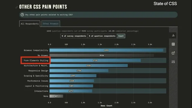
But let's start with how people feel about form control styling today. So form control styling is one of the biggest pain points and it keeps appearing in every single survey, every single year. This is a screenshot from self CSS where it's like the third biggest pain point. And I'm guessing it's probably the biggest pain point for some of you.
Anyone here? I don't know. Okay. Yeah, there's quite a few of you. And same screenshot for state of HTML. So everyone's upset about this, but why? So I'm going to start with a case study on checkboxes and here are some checkboxes from Nike's website.
And if we actually look closely using the Web Inspector, they're actually not using input type checkbox. They're using a button element. And a bunch of divs. They're also trying to take care of accessibility, so I guess that's nice.
My point here isn't to shame Nike, but it's more to say that form control styling is so annoying that even big brands like Nike are willing to rebuild their controls from scratch. Instead of reusing the custom-- sorry, reusing the built-in elements that HTML has.
And one thing I learned in software engineering is that there is a reason behind everything. So let's see why web developers have been working around styling built-in controls. So here I have some checkboxes with no styling.
So you have your native checkboxes as expected. And here I try to add background color light green, and I still have native checkboxes. So are form controls like cursed or anything? Well, form control styling is actually really cursed because there's actually two modes for form controls.
You have-- so as you probably know, you can actually get non-native text inputs and you see them everywhere on the web. I'm not teaching you anything right now. You can apply a background color and that will work on text inputs. But you also get some Windows 95 style borders on the inputs and This is what the standards call the primitive appearance.
And there's actually a couple of properties that get you into this primitive appearance. There's all the background properties and all the border properties. So if you actually put a property that's not any of those, then you still get the native appearance on text inputs.
But for some controls, you actually need to use appearance none to get into the primitive appearance. And this is the case for checkboxes, radio buttons, and range inputs. And that's why when we set the background color, that didn't do anything on the checkbox.
Because the checkbox still kept its native appearance. So let's look at what happens when you force the primitive appearance onto the checkboxes using appearance none. Well, the checkboxes vanished. Well, they're actually there.
They-- like, if you inspect using the Web Inspector, They have a zero by zero size. So if you add the width and height, you can see the boxes again. But then initially, these boxes are not usable because you can't actually see which one is checked or disabled.
So you have to rebuild everything from scratch. Including all the states. And that's the current advice for styling checkboxes. Not great. It's really error prone because you can easily forget to style a certain state. And it can make you feel lost, like just losing the box when applying appearance: none.
So let's see how other things in CSS work. And for that, one really important concept in CSS are user agent styles. And I like this illustration because it represents a customer service agent helping you, which is sort of what the browser is supposed to do with user agent styles.
So here I have a bunch of headings. And a paragraph with no extra CSS, you have different font sizes and font weights. And this is your browser saying that headings are large and bold and that there should be spacing between paragraphs.
And that helps the user recognize and distinguish different types of content. And if you're curious about user agent styles, you can see them in the developer tools in every browser. And if I apply styling on the H1, it just layers on top, right? Like you apply the purple background and the white text color, and you see that in addition to the larger text.
Not what we saw with checkboxes earlier. So why does the browser insist on having native form controls? So let's go back in time to understand the history behind this. So Windows 95, who used this in the room? Yeah. Okay. So this was one of the first OSs I've used.
And here's a screenshot of Google roughly at the time. And notice how the address bar and the search box on the website, they look the same. And the buttons on the scroll bars and the Google search button also look the same. Because good user experience back then was actually following the patterns of the operating system.
And the familiar patterns were really important because this is what you associated with different types of inputs from different devices. You could just tell someone that a 3D looking box on your screen is something you can click using your mouse, and a white field with a 3D border is something you can type in using a keyboard. It was really important to make those associations.
In fact, some of these patterns are still a thing today. This is a link. Like you could recognize it using the blue text in the underline. And browser makers felt strongly about having those patterns stay familiar. And that's why you have form controls that are native by default.
But then if you fast forward to 2010s, people were a lot more familiar with computers. CSS and technology in general got a lot more powerful. And brands also really started to care about how to apply branding to their digital spaces.
I guess a lot of you can relate to that, especially since they had more and more online users. And if I blur the previous slide, you'll probably still recognize most of these logos, and brands want that same recognizability on their digital space. So-- and in fact, it's like crucial for some brands.
Like these are two different messaging apps from Meta with a similar feature set, but you can distinguish them from each other using the colors of their digital space. Native form controls can be an obstacle for that, especially with the look and feel being different across browsers and platforms.
So native controls aren't really an ideal default anymore if you want to get really fancy with branding. And this is why browsers have started relaxing restrictions over time. Typography is also a very important part of branding.
And in CSS, you've got web fonts to make that more powerful. So let's see how you can use web fonts. Here I have a basic website layout with a sidebar and some content. So with such as Google fonts, you can you can use web fonts using just two blocks of code, right?
You can just import the stylesheet for the font, and then you set the font family on the root element. And once you do that, the font changes, and it inherits all the way from the root element down to your headings and paragraphs. But notice something. If you look at the text input, the font actually hasn't changed. So it got stuck in the past.
And this is your browser, again, trying to help you by saying that font controls should have native fonts. But this might have been helpful in the 90s, but I think it's probably mostly cursed now. So a common way people work around this is by reapplying the same font from the root element directly onto the inputs.
There's a slightly less repetitive way to do that, which is font inherit, which tells your browser to reuse the font from the parent element. But wouldn't it be cool if the browser could just do this by default? So at Apple, we've been thinking a lot about how to address these problems. And we developed this CSS Form Control Styling specification, which is now our first public working draft.
And most things I'm going to talk about next are a preview of the future. So part of this draft includes appearance base and it tries to make the defaults less cursed and it lets you start from a consistent set of styles that would be the same in every browser.
So let's see what that looks like. Here I have inputs and a button with no styling. You have the native controls. And if I apply appearance base, I would get this styling.
And here's what happens if we add a gradient in the background of the page. So the background of the form controls in appearance base is actually transparent, so you can actually see through the gradient. And this is a screenshot of appearance base across both color schemes.
So you'll notice that the text color actually matches the parent form by default, and that the border color matches the text color for all controls. So, by adding appearance base, I can simply install one of my parent elements, like the form, and my form controls would just feel like part of my website really easily. So in this case, I've set green text color and black background, and I've added no extra styles on the controls themselves, aside from appearance base.
And that's what you would get as a result. And we've also fixed the font problem from earlier. So if you set a font family on your root element, then it would inherit all the way down to your font control. And to summarize, by default, you have your font family, your text color inheriting, you have a transparent background, and this is very similar to styling a plain div, which is the whole idea behind Appearance Base, because styling form controls should really be that simple.
I don't know if people agree, maybe. So Appearance Base is now a third mode after the native and the primitive appearance. So how do we ensure we get it right this time? So when trying to come up with appearance base, we actually wrote some design principles. And these are some ideals that the working group wants to achieve. So that appearance base stays friendly for developers.
Let's get through some of them. So the styles are identical in every user agent. This might sound obvious, but that's not what you have now, with the native or the primitive appearance. The controls are recognizable and usable on their own without any additional styles. So some of what I said earlier about familiar patterns is still true. We still want users to recognize what a text input or a button is.
So that's why you have borders on the form controls, for instance, so you actually know where to click. The controls pass 100% of accessibility standards. Developers should be able to trust built-in controls, and getting accessibility right is an important part of it.
And we don't want developers to rebuild their own controls. They can easily get accessibility wrong. The styles are consistent across controls in look and feel. So that means that if you put two form controls side by side that have appearance base, they should feel part of the same universe.
The styles are consistent across controls in how they are defined in code. So that means that the same methods are used to define the layouts and styles of the controls. So there's no surprise when you saw one type of control versus another. Like if we use padding one place, we should use padding in another place. The styles are easily adapted to the website's branding without needing complex reset style sheets. They use minimal code and are easy to override.
The first one is so it's not a pain for developers to use. They do not have a strong voice and tone of their own and are visually as simple as possible. As possible. So that means that the design should be timeless because design trends keep changing. So you don't want it to end up in a situation where the default style is stuck to Windows 95, like the primitive appearance.
And finally, they inherit page styles rather than define new styles whenever possible. So this is everything I've showed earlier about the font inheriting, the color inheriting, and yeah. And all these principles play together to achieve the current appearance-based design.
So since we have the chance to restart from scratch with appearance-based, it's really important that we spend time getting those defaults right. So we've actually already been moving in the direction of making things more similar to plain divs.
And one of those things is form control sizing. So here I have a text area with four lines of text. Only two lines of our text area is shown when we render it. So there's actually a really neat new CSS property that can be used to size form controls to their content, which is called field sizing content. It's an extension that Google suggested.
And you can try it in Chrome and in Safari 26.2 beta. And hopefully soon in Firefox. So it's actually very simple to use. You just add field sizing content to the form control. And I also added resize now, so you don't have the custom resizer, which doesn't make sense if you size the content.
But this is how it works. As you add new lines, it expands, and as you delete lines, it will retract. So very similar to a plain div. One other thing that we fixed recently is that you can now lay out form controls vertically for Chinese, Japanese, and Korean texts.
It was the case that until 2024, all form controls were to horizontal writing modes. So now you can actually use vertical writing modes and form controls. So that's nice. I was actually at JSConf Japan last Sunday, and I saw an education platform using vertical form controls for their online quiz.
So that's quite cool. So I talked a lot about defaults and like sizing so far, but I haven't talked about how to style like the bits and pieces inside the font controls, like, you know, the little button in the file input and the little icons in the number input.
So some browsers have generated tree and let you target different parts through what we call pseudo elements. And right now, most of these pseudo elements are non-standard and are different across browsers. And that's awful to use, honestly.
But there are parts that are already standardized that you can already use, like the file selector button or a part that you probably already know about which is a placeholder. But let's talk about the future. So in the future, if you use appearance base, that would opt you into new pseudo elements.
So one of these pseudo elements is field text. So the field text is the area where the user can type. And here I've changed the background to yellow. So field text is actually reused in number inputs.
So in this case, field text is a place where you type the value. And step up and step down are the pseudo elements to increase and decrease the value and step control is a container around those two buttons. So this is how, let's see how you could use those pseudo elements to achieve these results in the future.
First of all, you apply appearance base and that would give you the new default styling and opt you into the new pseudo elements. And we can remove the border to add it back onto the field text pseudo element and we can change the up and down arrow images to our liking by using the content property on the step up and step down pseudo elements.
And that's how you get this result. Next, I want to come back to checkboxes with a preview of how you would use them in the future. So checkboxes would get a check mark, pseudo elements. And by default, the checkmark pseudo-element would have a Unicode character as content.
And input type radio would also get this pseudo-element. So let's go through an example. Here I apply appearance base to get the new default styles and pseudo-elements. And then I change the border color to magenta.
And then we can customize our checked state by changing the background to magenta and the color to white. And the text color actually works here because the checkmark is a Unicode character. And the disabled state already works because appearance base would set the opacity by default.
But if you don't like the Unicode character, you can also change it by setting the content, like setting the content to a custom SVG. And as a final touch, we can apply a border radius to our checkboxes to make it look a bit more fancy, modern.
And that's our result. So notice that I didn't have to set any sizing-related properties. I've only set the styling-related ones because appearance-base would give me a width and height by default, instead of making me start from scratch, like appearance-none would. So next, I'm going to talk about customizable selects.
You've probably heard of this. Who has heard of this, actually? Yeah, nice. So this is already usable in Chrome today, and it's actually also been designed as part of this world as well. With a lot of work from the Chrome side as well to do standards on the HTML side.
You'll notice that it also takes in the font family or the text color from the parent element if you use appearance base. And some of the new pseudo elements are also shared. So you have the check mark, pseudo elements, for instance, or the picker icon. And you also have the new picker pseudo element, which corresponds to the new, to the part that pops out of the select.
So let's see how you can make the select look like this. First of all, you apply appearance base selects to get the pseudo-elements. So it's actually base select until all form controls support base appearance.
But once that happens, appearance base should also be usable in the future. So let's pretend that the page has font-family: Inter, because I don't like Times New Roman. And this actually affects the select because the font inherits with the base appearance.
And now we can style our picker by replacing the border with a box and we can add some padding to the option elements, which are the individual options. And next we can change the selected option and the select text color to magenta. And the picker icon also changes to magenta because it's a Unicode character.
And the border also changes to magenta. Changes because we use the text color as border color by default. And finally, we can customize the icons by changing the content property on the picker icon and the checkmark pseudo-element.
And that's how you get these results. And you can actually already try this out in Chrome today. Dates, so now back to the future. Datetime inputs would also get some new goodies.
You have the fields components, pseudo elements, which would correspond to the numerical components. Of the date picker, you have the field separator, which is a separator between each component, and you would also get picker icon, which is a button to bring up the calendar picker.
So I'm not gonna go through an example for this. Now, I'm gonna show you a Preview of the future of the sliders. So you have slider track, which is the full track for the sliders. You have slider fill, which is the progressed part of the slider. And slider thumb, which is the part that you can drag around the slider.
So we've actually seen a lot of use cases like this, where you have the current value of the slider that's displayed on top of the thumb as a bubble. And right now, if you want to do this, you have to use JavaScripts to reflect the value of the inputs onto the bubble, which kind of sucks.
So there's a new extension in the spec called the control value function. That would allow, oh, what happens? That would allow doing this without any JavaScript. So I'm going to give you an example of how you would use control value to achieve this result.
So first of all, to build our bubble, you can add some content. After our range inputs by using the after pseudo-element. And then we can set the content to control value, which would reflect the current value of the slider onto the pseudo-element.
We can add a background and a text color. And then we can set the width on the bubble But to do that, I need to change the bubble to be inline-block because by default, after is inline-block. I also need to set the aspect ratio to 1 to get a square instead of a rectangle.
And this gets the sizing right, but not quite the alignment. So to get the alignment right, you can swap out inline-block for inline grid and use place content center. And then we can add border radius to actually make it look round. Now I want to display the bubble on top of the sun, like not next to the range input.
So there's a new exciting technology called anchor positioning. Has anyone tried it? Here? Yeah. Okay. So to start, I need to use appearance base to get into-- to get the new default styles, but also to get access to the new pseudo elements.
And once I have access to the new pseudo elements, I can actually set an anchor name on the thumb, and then I can refer to that anchor name by setting position anchor on the bubble. And since anchor name sets the name globally across the page, I would need to set anchor scope to thumb to make sure this works properly when you have multiple range inputs on the page.
So this would scope the name to just the range input rather than leaking it outside the range input. So this anchors the bubble to the thumb, but my bubble is now overlapping the thumb, so I can't actually drag the slider. So you can use Position, area, top, center, and that's how you get the final result.
And control value would not just be for the CSS content property. You can also put it in calc functions to generate like fancy lengths or angles. So hopefully this is a cool little extension. So this was a preview of all the new stuff with forms.
So where are we in the process? So there's a lot of different stages, steps to ship a CSS features. Lots of drafting, debating, decisions, and prototyping. And a lot of these steps repeat and repeat.
And this is where CSS Forms 1 is in the process. There is some prototyping that started happening in both in Chrome and in Safari. But most things can't be used yet. But there's good news. Since nothing has been released yet, that means you can still be part of making this happen and give some feedback.
So if you have any use cases or pain points that we haven't thought about, please let us know. And please check out the spec. There's more in there that I actually haven't covered. So I'll leave this for one, two seconds. Okay. And this is a link if you want to file issues.
You can also find it on the spec. And thank you.
Technologies & Tools
- Web Inspector
- developer tools
- web fonts
Standards & Specs
- HTML
- appearance: none
- CSS Forms Level 1
- appearance: base
- field-sizing: content
- pseudo-elements
- file-selector-button
- field-text
- step-control
- checkmark
- SVG
- appearance: base-select
- picker
- control-value()
- CSS Anchor Positioning
- anchor-scope
Concepts & Methods
- primitive appearance
- user-agent styles
- vertical writing modes
- customizable selects
Organisations & Products
- Nike
- Windows 95
- Meta
- Google Fonts
- Apple
- Chrome
- Safari
- Firefox
- Inter
Works
- State of CSS
- State of HTML