The Accessible Auto-suggest revisited
Introduction
Adem Cifcioglu discusses the evolution of the ARIA combo box design pattern for accessible autosuggest components.
The ARIA 1.0 Combo Box
A timeline of ARIA development, starting with ARIA 1.0 in 2014, which formed the basis for accessible combo boxes using roles, attributes, and states.
ARIA 1.1 Changes and Challenges
Introduction of ARIA 1.1 in late 2017 and the significant changes it brought to the combo box design pattern, introducing a container div and ARIA controls.
Understanding ARIA Owns and Controls
Explanation of ARIA owns and ARIA controls attributes, their roles in establishing relationships between elements, and how they affect screen reader behavior.
The Chaos Years: Issues with ARIA 1.1
Discussion of the period between 2018 and 2023, marked by confusion and inconsistencies in implementing the ARIA 1.1 combo box pattern across browsers and screen readers.
Problems with Naming, Screen Reader Experience, and Developer Confusion
Highlighting specific problems encountered with ARIA 1.1, including issues with naming elements, inconsistent screen reader behavior, and challenges for developers in correct implementation.
Back to the Future: ARIA 1.2
The release of ARIA 1.2 in 2023, which reverts the combo box design pattern closer to the ARIA 1.0 model, removing the container div and simplifying the relationship between elements.
Comparing ARIA 1.0 and 1.2
A side-by-side comparison of the ARIA 1.0 and 1.2 combo box patterns, highlighting the key difference: replacement of ARIA owns with ARIA controls.
Benefits of ARIA 1.2 and Mobile Support
Addressing how ARIA 1.2 solves issues present in 1.1, such as simplified naming, improved screen reader experience, and better developer understanding, while acknowledging ongoing challenges with mobile support.
Conclusion and Checklist for Accessible Combo Boxes
Recap of the ARIA combo box journey, emphasizing the current state of the ARIA combo box, and providing a checklist for developers to create accessible components.
Thanks for coming in and thanks for listening to me.
As John said, I'm here to talk to you about the accessible autosuggest, and I'm here to take you all, back to the future.
This was me seven years ago at Web Directions Respond, that was in Melbourne as well, I believe.
I had a fair bit more hair at that point.
Slightly different wheelchair, because I think this was the one before this one.
And I probably weighed a fair bit less as well.
But the one thing that hasn't changed in all that time is I'm still talking about accessibility and unfortunately I'm still talking about accessible autosuggest or more accurately the ARIA combo box.
And that's because in seven years since my last talk at Respond the ARIA design pattern for combo box has changed pretty significantly and for the rest of this talk I'm going to talk through what changed, why it changed, and what it means for our, auto suggest component.
But I like to start these sort of things by looking at a bit of a timeline.
So let's have a look at how we got here.
In March of 2014, we got the ARIA 1.0 spec.
And that kind of forms the foundation of our combo box or our auto suggests.
ARIA, for those of you who don't know, is about making advanced UI controls accessible by providing a framework for adding attributes to enhance semantics, describe interactivity, and also provide state information to assistive technology like screen readers.
Without ARIA, the auto suggests wouldn't be, accessible to anyone who uses a screen reader.
It's a really kind of key part of what we need to actually make this work.
So at this point in, May of 2017 at Respond, we were pretty happy.
Our combo box kind of looked like this.
We've got a live region to announce the availability of suggestions.
We've got a descriptive label for our input field, because you always need one of those.
You've got an input with the role of combobox to tell screen readers in particular that it's a combobox.
And that's got some ARIA attributes on it as well.
So you've got an ARIA autocomplete attribute.
You've got an ARIA owns attribute.
That points to a list box of options.
And the options are the things that you select as your, you've got your suggestions, you've got an ARIA expanded equals true, when your suggestions are expanded, which toggles to false, when, when that sort of box is collapsed.
And then if you've actually selected an option within your list, you've got an ARIA active descendant attribute that points to the current option.
From a functional perspective, it goes like this, and hopefully the audio will help.
[ auto complete.
Tab, suburb or town, search, edit, type and text.
C R A I.
Two suggestions found.
To navigate, use up and down arrows.
List box, Craigieburn.
Craigieburn East, Craigieburn, Suburban Town, SearchEdit, Craigieburn, Type and Text, Tab, Search Button.
[Adem] So like I said, we were pretty happy, we'd solved the world's autosuggest problems, or so we thought.
And I wanted to put this in here because this is the actual, actually the original video from 2017, the only thing, that's changed is I redid the captions because I looked at them and went, that was inaccurate, but, same video, so that's, ARIA 1.0 combobox with IE11.0does anyone remember using IE11?
And JAWS, I want to say 2018 at that point, because it would have just been released, because they'd released the year before.
But towards the end of my talk at Respond, I mentioned that ARIA 1.1 was in development, and it was in draft, and that they may be looking at changing the design pattern for combobox.
Because it was in draft, I went with what was accepted at the time, and well supported in browsers, which was the 1.00 design pattern.
Unfortunately, or fortunately, depending on who you ask, ARIA 1.1 became a recommendation in December of that same year, and the combo box design pattern was changed forever.
Or so we thought.
I want to take a look at some differences.
In code, so note that I, so I can fit some, both sets of code on the slide.
I've removed the live region from the code.
We still need that absolutely to announce the suggestions.
And I've also removed some divs that I've used for styling.
But they don't really have any impact to the combo box themselves.
There are a few differences, though, that we need to take note of.
The role combo box for the 1.00 pattern was on the input.
The 1.1 pattern introduces a div container to hold the input and moves the combo box role to that containing div, along with the ARIA owns and the ARIA expanded attributes.
The input field keeps the ARIA auto complete, it keeps the active descendant that it had in the 1.00 pattern, but it also gets an ARIA controlled attribute.
That is now also pointing to the list box of options.
I'm just going to scroll my notes.
That was the end of those notes.
So why did we make a change?
The AR1.01.
0 combo box pattern had two parts.
It had the input and the list box, or according to the spec, the pop up.
And, it says that between those two parts, we need to specify a relationship, and that relationship needs to be specified using ARIA owns.
And ARIA owns basically gives you a parent child relationship between two elements in the DOM that you can't do by simply, nesting things within DOM structure and it exposes that parent child relationship through the accessibility tree to assistive technologies like screen readers.
So let's take another look at our ARIA 1.00 combobox code.
So as we had before, we've got the input, it's got the role of combobox, we've got a UL, with the role of ListBox, and we've got the ARIA owns attribute to point to the ID of the ListBox to connect the two, and the ARIA owns is on the input.
And if we take a look at how that's represented in the accessibility tree, and I've used a screenshot here from Firefox, because in my opinion, that's got the best accessibility tree from a representation perspective, but if we take a look at that, we'll see that the ListBox, is in fact represented as a child of the combo box.
So what's the problem?
Because that's what we wanted, right?
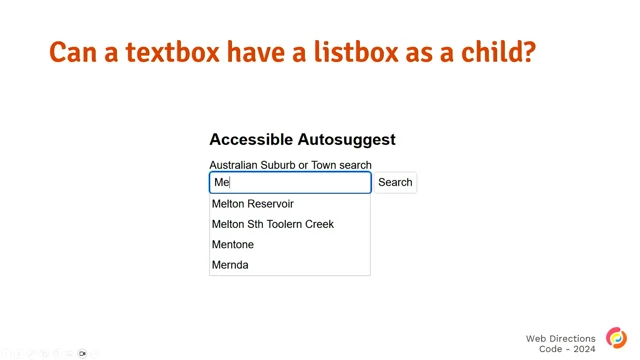
Yes, but can we really have a text box or an input field that has a list box as a child?
Apparently not.
While the role of the text box is a combo box, it still functions like a text box.
You can type text into it and you can't really do much else.
Visually on the screen, the text box input and the list box, popup are two separate things.
And this makes it a bit of a strange experience for screen reader users because in the accessibility tree, as we saw on the screen, the screenshot in the previous slide, an ARIA 1.0 combo box input is also a container because it contains the list box.
Practically a text box can't be both an edit field and a container for other widgets.
And the list box and its options aren't editable, they're selectable, but they're not even part of the value of the input.
So really it's a completely separate widget that helps the user make a selection and then populate that value into the input or the text box.
From an ARIA, from a, sort of relationship perspective, the ARIA 1.00 combo box in the accessibility tree doesn't really represent the semantics of the UI properly, and to add to that the only way screen reader users can access the content of the pop up, in ARIA 1.0 combo box is keyboard, and touch navigation when the screen reader is in interaction or forms mode, no other way of selecting those options.
The ARIA 1.1 combobox pattern aimed to fix these issues.
So let's take another quick look here.
We've got the div with role of combobox.
That's the, container for the text box.
The container now owns the list box because of ARIA owns.
And that's also, the ARIA owns is also moved to that div, so that connection's been made there.
We saw this earlier, but the input field keeps ARIA autocomplete and ARIA active descendant attributes.
And it adds an ARIA controls and points it to the list box.
So our combo box really now has three parts.
It's got the container div with the role of combo box.
It's got the text box or the input field.
And then it's got your list box with options, and we'll take a look and see what that's done in the accessibility tree in a second.
But first, I mentioned ARIA controls and, that's been added to the input, so we should probably have a look at what that is and how it works.
ARIA controls basically specifies that one element controls another element.
In the context of this combo box, ARIA controls is saying that the list box of options is controlled by our input field because the ARIA controls attribute is on the input and it points to the list box.
If we take another look at the accessibility tree, we'll see what this looks like.
And that didn't move.
There we go.
We now see that the combo box is a container and it has the text box or the input field and the list box as its children.
If we dig a level deeper than that and we look at the list box or the list of options in particular, we'll see that the list box is now controlled by the input.
And what we'll do next is take a look at a bit of a demo.
[Screen reader voice] Australian suburb or town search suggestions will appear below as you type edit combo.
To set the value, use the arrow keys or type the value.
M, E, four suggestions displayed.
List box Melton Reservoir.
To move to Melton, STH, Toulon Creek.
Menton.
Mernda.
Melton Reservoir.
Melton, STH, Toulon Creek.
Menton.
Enter Australian suburb or town.
Search suggestions will appear below as you type at a combo.
Menton.
To set the value, use the arrow keys or type the value.
[Adem] Okay, so that was the ARIA 1.1 combo box.
That was, again, with IE 11, with JAWS 2018 or so.
I used IE 11 in this demo in particular, just to do a comparison with the original version.
We'll use Chrome going forward, much cleaner.
So based on that, no big deal though, right?
We had a combo box for 1.00.
We've got a combo box for 1.1.
Seemed to work.
I'm not sure it did anything that we didn't expect it to do.
So we should be set.
We're not.
Between 2018 and 2023 are what I call the chaos years.
And I call them the chaos years because, it was chaos.
You take a quick look around GitHub at the time and you got things like ARIA 1.1 combo box is broken, combo box not working.
Does combobox require an accessible name?
JAWS auto forms mode not recognizing combobox with certain attributes.
There's probably a few more, in fact, there is a lot more.
But if I'm honest, they're not all to do with the change in the pattern, but to do with assistive technologies and browser support as well.
But suffice to say, it was a bit of a mess.
The W3C acknowledged that there were some real problems with the ARIA 1.1 pattern.
It wasn't just me sitting there going, what did you guys do?
Why?
Why?
But, they did acknowledge there were some problems, and we're going to take a look at a few of those.
Now, so the first one is naming, the spec for ARIA 1.1 says to only name the container, but if you follow the spec and only name the container, this leaves the input unlabeled, which fails WCAG, because you can't have unlabeled elements, we input elements, we mentioned that earlier.
In code, because we can name the container, we can name the input, and we can name the list box, people tend to name all three elements.
This can result in verbosity, and it's a less than ideal experience for screen reader users, which leads us to the next problem, and that's the screen reader experience.
Screen readers do really strange things with combo boxes.
It wasn't clear in the two examples I showed there, but depending on your browser combination and your screen reader, you could up against some really, strange things.
For example, in some combinations, the container sometimes gets presented as a group.
That adds elements to the screen reader experience that aren't actually on the screen, and it makes navigating things That's really confusing.
Then you've got the input field, and that's the element that kind of makes the combo box work, right?
Because without the input, you've got nothing to type text into and it doesn't work.
The 1.1 ARIA pattern says that the combo box role is on the container, so the container is a combo box, but it doesn't actually give the input a role.
And the input's what gets focused.
So it needs one.
It needs to tell screen reader users in particular, or it needs to tell, the accessibility tree how to communicate that input to screen reader users, which it doesn't do.
And then finally we've got a bit of developer confusion with the 1.1 pattern as well, because there's multiple things that require multiple ARIA attributes, and sometimes they get confused between the two elements to put things on, and if you couldn't guess, putting things in the wrong place for a screen reader user means often that things become unusable.
Couple of demos here.
First of all, it's the, all three elements being named and we're using, JAWS.
[Screen reader voice] Suburb or town search edit combo.
Suggestions will appear below as you type.
To set the value use the arrow keys or type the value.
M.
E.
4 suggestions displayed.
Milton Reservoir Bullet.
To move to an item, press the arrow keys.
Milton S.
T.
H.
Toulon Creek Bullet.
Menton Bullet.
3 of 4.
Enter.
Suburban Town Search Edit Combo.
Menton Suggestions will appear below as you type.
To set the value, use the arrow keys or type the value.
[Adem] have used a better vocalizer, but anyway.
So that's one.
Now we've got NVDA.
And you'll spot a difference here.
[Screen reader voice] Australian suburb or town search combo box collapsed opens list.
Edit as auto complete suggestions will appear below as you type blank.
M, E.
Four suggestions displayed.
Expanded.
Suburbs list.
Melton Reservoir bullet 1 of 4.
Melton STH Toulon Creek bullet 2 of 4.
[Adem] Did anybody notice the key, there was a few differences in terms of the way things were said, but did anybody notice the key difference there between JAWS and NVDA?
The list, so the label of the list, because all three elements have been labeled, the label of the list was announced in NVIDIA, and it wasn't in JAWS.
Should have been, because it supports it, but it wasn't.
And then finally we've got, demo of the combo box only being named.
[Screen reader voice] Edit, blank.
Suggestions will appear below as you type.
To set the value, use the arrow keys or type the value.
M, E, four suggestions displayed.
Milton Reservoir Bullet, Milton STH, Toulon Creek Bullet, Menton Bullet.
Three of four.
Enter.
Search button to activate.
Press enter.
Edit, combo.
Menton.
Suggestions will appear below as you type.
Type in text.
[Adem] This is following this back exactly.
Only the combo box.
Is named.
Problem is, name for combo box didn't get announced, so all you're hearing is edit combo, which is not helpful to anybody.
Let's take a look at that same thing though in, voiceover now.
[Screen reader voice] Australian suburb or town search.
Suggestions will appear below as you type.
Edit text.
You are currently on a text field inside of a menu pop up combo box.
To enter text in this field, type m Four suggestions displayed.
You are currently on a text field inside of a menu pop up combo box.
To enter text in this field, Melton Reservoir Bullet, Australia, Melton STH to Learn Creek Bullet, Australia, Mentone Bullet, Australian Suburb or Town Search, Australian Suburb or Town, Mentone.
You are currently on a search button.
You are currently on a button inside of Web Content.
[Adem] Okay, couple things happened there.
Apparently I was in a combo box menu pop up.
Why?
How?
Menu?
Pop up I get, but I don't know about menu.
Anyway, so there was, some differences there.
Like I said, we went through some, chaos years, and the W3C was obviously watching and listening, because in December 2019, in the second working draft of the ARIA 1.2 spec, the combo box design pattern changed again, in June of 2013, 2023, ARIA 1.2 was formally adopted and became a W3C recommendation, And basically, in doing this, they got in their spaceship and went back to the future, because I want to take a look at the ARIA 1.2 combo box pattern.
You've got an input with role combobox with the following attributes.
You've got an ARIA autocomplete, You've got an ARIA controls attribute that points to our listbox options.
You've got ARIA expanded equals true when the listbox is expanded, that toggles to false when it's collapsed.
And when a value is selected in your list, you've got an ARIA active descendant that points to your current option.
Let's take a look at a quick comparison between 1.1 and 1.2.
Bit of a difference here, right?
The container, the div with the container, for the container with the roll equals combo box is gone.
Combo box goes back to the input.
ARIA owns attribute is removed.
And ARIA autocomplete and active descendant were on the combo box, that were on the input in the first place, so they stay there for, for 1.2.
But what I want to do now, before we see the 1.2 combo box in action, is compare the 1.2 pattern with the 1.00 pattern.
So if we compare 1.00 on the left with 1.2 on the right, we see one difference.
The 1.00 pattern had an ARIA owns pointing to the list box, and an ARIA 1.2, that's replaced with an ARIA controls.
Let's take a look at the accessibility tree.
We're in our ARIA 1.00 combo box, we had two parts, we had the input and the list box pop up.
Our ARIA 1.2 combo box now only has one part.
It's the input with the role of combo box.
Obviously the list box is still there and it's needed because it's what allows you to select suggestions.
But what they've done is effectively changed the relationship from parent child to related.
So technically in the accessibility tree, while they're related, it's not part of it.
And have we solved our ARIA 1.1 problems?
I think we have.
Naming is solved because there's only one thing to name, and that's the combo box.
While you can name the list box pop up, doing so shouldn't really have much of an impact other than in some screen readers it'll get announced.
Screen reader experience now has been fixed as well, because the container's been removed, there's no chance of the screen reader rendering things that aren't actually on the screen, and causing confusion.
The input is also now unambiguously a combo box, because it's got a role, so there's no confusion there either.
And from an author perspective, there's only one place to put all your attributes, like there was in the 1.00 pattern.
So.
Again, there's no, stress of splitting attributes across multiple elements that could potentially cause us problems.
And last but not least, and I think this is my favourite because it's where the, the 1.2 pattern really comes into its own.
It's fully supported already, and it was even with the draft specification on all desktop browsers.
While the 1.1 pattern wasn't yet fully supported in any browser, that's desktop or mobile.
The 1.2 pattern just works because effectively they went to, back to 1.00 and tweaked the relationship.
I should say for completeness, combo boxes on mobile are still an issue.
That's got less to do with the W3C and the spec, and more to do with the mobile browsers and the mobile screen readers.
They're maturing platforms, so they will get better, but from a spec perspective, I think we've, got it right now.
I'm hoping they don't change anything more.
So I think now we, after going through all that, we finally get a look at our, combobox 1.2, and [screen reader voice] Suburb or town search edit combo collapsed, blank, to set the value use the arrow keys or type the value.
M, E expanded, four suggestions found, swiper use up and down arrows to navigate, suburbs and towns list box.
Milton Reservoir bullet.
1 of 4, to move to an item press the arrow keys.
Milton STH Tulane Creek bullet.
2 of 4.
Menton bullet, three of enter, suburb or town, search, edit, combo, collapsed, menton, to set the value, use the arrow keys, or type the value.
[Adem] So that was, clearly JAWS, but also gave us all the announcements we needed, in the way we needed them, and all made sense.
You didn't really need the list box labeled, but I liked labeling it, because you can put a label there.
Take a quick look at NVDA.
[screen reader voice] Suburb or town search combo box collapsed has auto complete editable blank.
M, E, four suggestions found.
Swipe or use up and down arrows to navigate.
Expanded, suburbs and towns list.
Milton Reservoir bullet 1 of 4.
Milton STH Toulon Creek bullet 2 of 4.
Mentone bullet 3 of 4.
Suburb or town search combo box collapsed has auto complete editable mentone.
[Adem], NVDA functions perfectly, which is expected, hopefully, and it, worked well, so that's good.
And then finally, voiceover.
[Adem] Suburb or town search, list box pop up, menu pop up, combo box.
You are currently on XM.
Four suggestions found.
Swipe or use up and down arrows to navigate.
Melton Reservoir Bullet, selected, one of four.
Melton STH to Learn Creek Bullet, selected, two of four.
Mentone Bullet, selected, three of four.
Collapsed, completion selected.
You are currently on a menu pop up combo box inside of WebContent.
[Adem] VoiceOver kinda works.
That's got nothing to do with the spec.
Did anybody notice, so there's a difference between the other two and Voice, or a couple of differences, but ignore the menu pop up.
There was a difference in here that VoiceOver did that JAWS and NVDA don't do and probably should.
So as you're moving through with the arrow keys, VoiceOver does announce the ARIA selected, which is on the currently selected option.
The others, for whatever reason, don't do that, a little bit strange, but hey, assistive tech.
The unofficial theme for code this year was the state of, and I hope through this talk, I've showed that the state of the ARIA combo box is, same, same, but very slightly different.
Quick checklist, because I put this up at the end of the first talk, so I figured it was worth putting it in here as well.
These slides will be made available, and you'll have all this.
But basically, it gives you a quick checklist of how to make an accessible ARIA 1.2 combo box.
And that's it.
Thank you.
Thank you.
At Web Directions Respond in May 2017, I presented “The Anatomy of an Accessible Auto-suggest” which was a step-by-step guide on how to implement an accessible auto-suggest. In December that same year, the W3C made ARIA 1.1 a W3C Recommendation, and changed the requirements for the combobox pattern that formed the foundation of that auto-suggest component. The changes were made with the aim of more accurately representing the semantics of the user interface in the accessibility tree, and while they did solve that problem, unfortunately, they created many other issues.
Fast forward 7 years to 2024, ARIA 1.2 is a W3C Recommendation, and the combobox pattern that runs our auto-suggest has gone back to the future.
In this talk, we’ll look at changes in ARIA using the combobox pattern from ARIA 1.0 through to ARIA 1.2, and recreate our accessible auto-suggest component.
