Performance Driven HTML

Introduction to HTML and Performance
Mandy Michael introduces her talk focused on HTML and its role in enhancing web performance. She highlights the significance of page weight and the disparity in device capabilities across different regions. Mandy emphasizes the direct impact of web performance on business outcomes and sets the stage to discuss how HTML can offer foundational improvements for performance optimization.
The Importance of HTML in Web Performance
This section explores the importance of HTML structure in creating a functional, optimized DOM. Mandy explains how overlooking HTML can lead to complex DOM structures affecting load times and accessibility. She stresses beginning with a solid HTML foundation, avoiding excessive use of non-semantic elements, and how this relates to better performance and accessibility.
Enhancing Image Performance
Mandy delves into performance improvements specific to images, emphasizing the significance of proper image widths and heights to avoid layout shifts. She discusses the cumulative layout shift metric and how responsive strategies like the use of 'source set' and 'sizes' attributes can aid in optimizing image loads. The concept of lazy loading images to save resources and improve user experience is also covered.
HTML Attributes for Resource Prioritization
The focus shifts to techniques for handling browser resource prioritization. Mandy introduces the 'fetchPriority' attribute, explaining its usage in modifying browser behavior in resource loading. The strategy involves using HTML attributes to influence browser default behaviors, with examples of how priorities in loading can significantly impact performance.
Implementing Priority Hints
Mandy discusses priority hints like 'Preconnect', 'DNS Prefetch', and 'Prefetch', which help prepare resources for future use without immediate demand. She outlines their uses, advantages, and potential pitfalls, emphasizing judicious use to avoid unnecessary bandwidth consumption.
Preloading Resources and Pitfalls
This section explains the 'preload' attribute in HTML which informs the browser about resources needed shortly after the page loads. Mandy explains its correct usage, potential conflicts with JavaScript execution, and common mistakes such as overusing preload, underscoring the importance of testing and correct implementation.
Conclusion and Resources
Mandy concludes by advocating for the effective use of HTML, emphasizing its value in building robust, high-performance websites. She offers additional resources for further learning and invites attendees to engage with her for more insights, ending with a lighthearted note featuring her dog.
Hi everyone.
That was so nice.
Thank you so much.
Thanks for coming to see my talk.
I know that there were other options for you today, but, hopefully you're excited to learn a bit about HTML and how we can use it for performance.
Performance is something that I have a, interest in.
And I'm hoping that by the end of today, you care a little bit more about it as well.
So why should we care about performance?
There are a lot of reasons.
One of them is that page weight continues to increase over time.
This is data from the HTTP archive.
It is from 2022.
I couldn't get the latest, but it is still increasing.
It's not getting any better.
And a good example of this is mobile page weight alone over the past 10 years has grown by 594%.
That's a lot, right?
Everything's getting bigger.
And the gap between high end and low end devices is widening, especially in the mobile web space, where performance is tied to the devices and the networks that people have access to and that they can afford.
And unfortunately, technology on the lower end, is not keeping up with the technology improvements on the higher end.
So we're getting better mobile phones and devices.
So we're throwing more data and more information at it, but the lower end technology can't keep up with the speed at which the higher end technology is improving.
And if you're thinking, my users have the latest tech and the best internet speeds, that's not actually accurate.
This is a map from the world population, review of internet speeds by country.
The red is bad.
Many parts of the world have internet speeds of 50 megabytes per second or less.
Australia is in the 50 megabytes.
It's pretty terrible.
We're nowhere near the top 10 countries with internet speeds.
This little yellow one up in the corner, that's Iceland if you're looking for a place to, to get better internet.
Now, performance plays a really vital role in the success of your products, your websites, your applications.
And there's a direct connection between performance and business outcomes.
And there's lots of data on the internet that supports this.
A slew site is going to have an impact on your revenue, on retaining users, and whether or not people are going to use your product at all.
It can be the difference between whether someone picks your product or somebody else's.
I understand, these days, building websites is hard.
There's so much stuff that we have to think about and performance is just like another thing in a big long list of stuff that we have to think about.
So I'm not going to go through all of the performance jargon and, tell you all of the things that you must be doing.
What I'm going to do instead is give you a starting point, a simple way to get started and laying a good foundation for your performance.
And the best way to do that, is with HTML.
So I'm hoping, to just introduce you to some things and I'll be super honest.
HTML is really, simple, right?
But because it's simple, we make the mistake of assuming that it's not valuable and we don't always dedicate the time that maybe we should to understanding what things HTML can provide.
So I'm hoping that by the end of today, maybe there's some new things about HTML you didn't know about, or at the very least.
It prompts you to go back and look at your HTML and use it a little bit better.
Now, one of the things that is so important about HTML is it plays a really important role in making our websites functional.
And what makes it functional is the DOM tree or the document object model.
And that's constructed of what we provide the browser via HTML.
And overlooking HTML and not thinking about it very much can lead to a large complex DOM tree that's not optimized for performance or other things like accessibility as well.
And a large DOM will impact load times.
Now, it's not going to have the same impact as the bazillion megabytes of JavaScript or unoptimized images, or your really slow backend API requests, but it does play a part, right?
And what we want to do is lay that good foundation and do the best practices.
So everything else, doesn't, isn't adding on top of it.
And as users and scripts interact with the DOM on your page, the browser has to recompute the position and the styling of all of those nodes.
And this can severely impact the rendering and the runtime performance of your websites and your applications.
What we want to do is make things easier for the browser.
And that is a good starting point for all websites, not just for performance.
And the first thing that I highly recommend that you do, which I always say in HTML talks, don't just use divs or spans for that matter, there are a lot of other HTML elements that you can use and, it sounds really simple, but every time I start a new job and I look at the code.
It's like a bazillion divs.
And I wonder if people knew that there were other HTML elements that existed.
This is really important, right?
Because not everyone interacts with your websites the same way.
There are many technologies that are going to try and consume your content that rely on us using languages correctly in order for it to make sense.
So for example, for accessibility tools like screen readers.
They require the browser to do a bit of extra work and that is transforming the DOM into a format that assistive technologies can use effectively.
That's known as the accessibility tree.
And it uses the native semantics of HTML for reading and navigating a page.
So for example, a screen reader is able to interpret the accessibility tree and reproduce it as speech.
Because the accessibility tree is made up of what we provide the DOM, any performance impacts on the DOM is going to further impact the accessibility tree.
Now, a few years ago, I went to this performance conference and there was a great, speaker there called Eric Bailey.
And coincidentally, I just saw him speak two weeks ago as well.
He's a inclusive design advocate who works at GitHub.
And, this is something that's always stuck with me since I saw his talk many years ago.
Is that when the accessibility tree is slowed down by excessive code, it can create a lack of synchronization between, the current state of the page and what is presented to, the user via the assistive tech.
What this means is you get a mismatch between what the user is trying to do and what's actually on the page.
So they might click on a button, but they're not actually clicking on that button, they're doing something else.
This is super confusing, right?
It's like when you have lag, in a video game or something like that.
It makes using your experiences really difficult.
Now, according to Google's Lighthouse performance tool, we want less than 1500 nodes, a max depth of 32, and less than 60 children.
And that sounds like a lot, but more complex pages can accidentally exceed this by mistake.
Especially because we're now very often building at a component level.
You're making a component and you put a bunch of divs in there and then you've got to wrap a component and another one maybe with some field sets and then you've got your layout and your stacks and all of that.
And it's really easy to forget that all of this has to come together on the same page.
At the end of the day, everything we put into our HTML and everything that we build is going to add up.
So we need to dedicate a bit of time, to what we're doing with our HTML and be considered about that.
And we also want to make the most of built in functionality.
It helps the browser knows what something is.
It does needs to do less work.
It also limits what we have to do, right?
I'm a bit of a lazy developer.
I don't want to have to build everything from scratch.
And there's a lot of useful features that don't require us to have extra JavaScript.
And typically.
Not always, but typically they work better with assistive tech and mobile operating systems as well.
There's heaps of complex.
Simple functionality that exists in HTML that don't require all of that additional work.
Popover is a great one, which Zach's talking about next, so that'll be exciting.
Also buttons, right?
Really simple, heaps of functionality.
When you use HTML, as, and the features that it provides, it's like using a pre installed JavaScript library that is already tested, already installed, maintained, updated, for you.
You don't have to do as much work.
It's one less npm package.
Less JavaScript, smaller bundle sizes.
And we like that, right?
Because it's really good for our performance and it makes our lives easier as well.
But the other thing you want to do is make the most of HTML attributes, because there are many attributes in HTML that have a direct and measurable impact on performance.
So that's what I'm going to focus on for the rest of the talk.
And the first area we're going to look at is images.
And the reason for that is that images typically take up more bandwidth than any other resource.
And they tend to be one of the biggest impacts to performance.
There are a lot of things you can do to improve image performance.
Always optimize your images, right?
Super important.
No point doing all this if you've got like 20 megabyte images on your site.
But there are some simple HTML approaches you can take as well.
And a really simple one, which people are often forgetting to do when, looking at websites in my experience is adding a width and a height.
To your image.
The reason that we do this is it improves layout shift, which I'll talk about just in a sec, but the way that you manage this, sorry, you measure this in HTML, in web performance is with a metric called the cumulative layout shift.
It measures how much elements shift on a page as contents being downloaded.
And the reason that it matters for images is because there's typically a delay between the HTML and the image being downloaded.
This can cause any content below the image to be pushed down the page, causing a layout shift.
And this is really disruptive to the user.
Happens a lot on mobile sites because of the smaller screen real estate, when you're reading and then suddenly you're like, where'd my content go?
Because images have loaded in.
So super annoying from a UX perspective.
If there are a lot of images, it can also significantly increase the work of the browser.
Because every time the image loads in, it has to recalculate the layout of the page.
So you're creating more work for the browser by not doing this.
If you add a width and a height, you reserve the space for the image and the image is able to load in place.
Meaning that it's no longer going to shift.
And you would be surprised at what a difference this can make to the performance of your site and how it feels, from a performance perspective as well.
Now, if you've been around in the web for a long time, like me and Ricky, you'll know we used to do this a long time ago for images.
But then responsive became a thing and you don't have a 1000 pixel wide image on a 400 pixel wide screen, right?
So we stopped doing it, because of that, which is bad.
So then they introduced a few, attributes to help us manage responsive images.
So source set is one of them.
It allows you to write a comma separated list of images with a width or density descriptor.
So density being DPI in this case, 1000 W refers to, the pixel bit, the image being 1000 pixels wide.
And essentially tells the browser how wide it is without having to download it first.
And you can combine this with the sizes attribute to define media conditions like we do in, CSS.
So in this case, we saying at a min width of a thousand pixels.
I want a 1000 pixel wide image, and then it'll go to the source set and it'll find the 1000 pixel wide image and it'll use that asset.
If there isn't one in the list that matches, it'll go to the next largest one and use that probably so that you don't get blurry images.
This allows us to have that width and a height without, having the awkwardness of, non responsive images.
There are some other things like, the source element and the picture element that you can do as well, but I, in the interest of time, I wanted to talk about lazy loading.
Many of you are probably familiar with lazy loading.
It's when you defer loading images until it reaches a particular distance from the viewport.
It looks like this.
As you scroll, each image is loaded in, rather than them all being loaded at the beginning of the page load.
And you get to enjoy pictures of my dog, Jello.
It's a really great one at the end.
It's in my, my, as soon as you walk in my house, it's right there.
It's magnificent.
Anyway, previously, we would handle this with things like intersection observer or event handlers, like scroll and resize, but we have had native lazy loading in HTML for quite some time.
It's really well supported in the browsers, really easy to use.
You add a loading attribute of lazy.
I would like to say that's it, but that's not true.
In some browsers like Chrome, you also need to have the width and the height, otherwise it won't lazy load.
For the reasons that we just talked about, no point getting the performance benefits of loading, lazy loading, if you've got performance negatives with layout shift.
So make sure you include the width and the height.
But then that's it, no extra JavaScript needed, the browser works it all out for you.
You can also apply it to iframes, as of this year, I think it was.
Now, the default value for this is "eager", and it's basically the same as not including it at all.
The reason that I mention it is because there's a lot of frameworks, like Next.JS for example, that lazy load images by default, which is really great, until it's not great.
What's really important with lazy loading images is that you only want to lazy load images that are not visible in the viewport when the page first starts loading.
If an image is in view when the page is first loading, it's considered part of the largest contemporary paint.
That is another performance metric, that refers to the render time of the largest image or text block that's visible within the viewport when the page is first starting to load.
If you try to lazy load an image that's part of this, it will negatively impact your performance because that is the most important content you want it to load really fast.
And you're saying you want to defer the loading.
Like it doesn't really make sense.
So it's really important that you don't lazy load images that are part of that largest contentful paint.
And, I mentioned it because at the performance conference I was just at, you would be surprised how often this came up in people's talks.
And about 15 percent of websites, according to the HTTP archive are still doing this.
So if you're using these frameworks and they're automatically lazy loading images, just make sure that you're not doing that in that, first initial top part of your page when the page loads, because, it's not going to give you the benefits that you're expecting.
The last section that I'm going to talk about is, optimizing loading and handling browser prioritization.
Now, before I get into the specifics of this, I want to put like a caveat here.
This is probably the area where you could make the most.
Mistakes.
It's really important that you test this stuff.
You don't just whack it on and assume it's going to work.
And it's also important that you consider your resources and your assets, more holistically.
Don't just focus on images and forget about your JavaScript or your CSS, right?
It's really important.
You think of it as a whole.
I don't want to scare people.
It's really easy, right?
It's HTML.
It's simple.
But it does require some, attention rather than just whack it and leave.
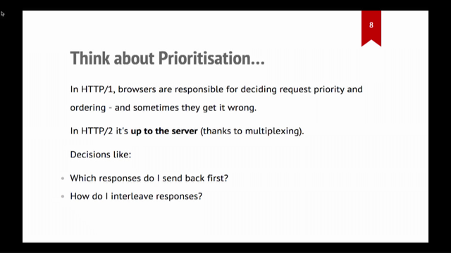
Now, when it comes to, performance in websites, and your resources, the order of prioritization, has a really big impact on your web performance metrics.
And that's because as you prioritize one thing, you're going to de prioritize another.
You can't have everything as important, otherwise nothing is important.
So for example, if you send the JavaScript first, the images are delayed and vice versa.
This can make a big impact on render blocking resources like JavaScript and CSS, because they have to be downloaded in full before they can be applied and executed.
And what is additionally confusing with this is that each browser has different prioritization rules, so you might see slight differences between Chrome and Firefox, for example.
So there are a few attributes that we're going to talk about that will help us manage this prioritization.
But before I go into those, I wanted to briefly mention the as attribute.
Because you will see it in my code snippets that I'm going to show.
This is a really useful attribute that essentially tells the browser what kind of resource you want to load.
It affects prioritization, like we just talked about, because the browser has rules about different kinds of assets.
So if you say that something is a style, which is a style sheet or an image, the browser is going to take that into consideration with its prioritization.
I've listed the options that it lists at the bottom.
They're pretty self explanatory.
If you get the value wrong here, and you say, for example, put style on an image, it will download it twice.
So it is really important that if you're doing this, you get it correct.
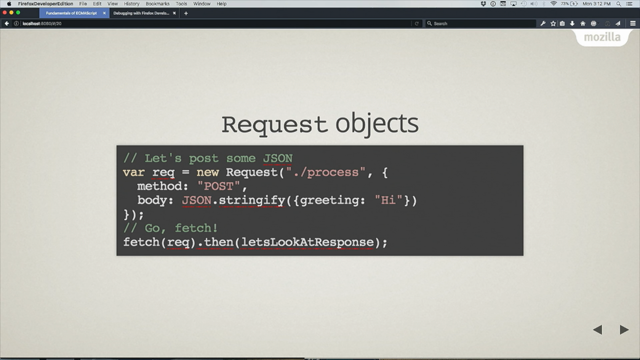
So the first attribute that I want to focus on is the FetchPriority attribute.
Basically, it allows you to specify the priority for resource types like CSS, fonts, scripts, and images.
And what it will do is give us the opportunity to influence the default behavior of the browsers and hopefully try and create a more consistent approach across the browsers as well.
It has three options.
High means you want to prioritize it.
Low means you want to deprioritize it.
And auto is browser can do whatever it wants.
That is the default choice as well.
Now, typically when people go to use this for the first time, they expect that if you set it to high, it's going to be the highest priority.
And if you set it to low, it's going to be the lowest priority.
That's not actually what happens.
Fetch priority sets a relative priority.
So it's just going to raise or lower the priority by a specified amount.
It's more like a suggestion to the browser.
So using an example from, Chrome, web dot dev.
So so chromium based browsers, and a style sheet.
If we add a fetch priority of high to a style sheet by default, it is the highest priority, from Chrome.
If we set it too high, the browser is going to go, Oh, okay.
You think that's a high priority.
I think that's a high priority.
So we're just going to keep it at the highest priority.
We're not going to change.
If you set it to low, you're saying, I don't think this is important or a high priority, but the browser is going to go, I still think this is important because it's a style sheet and it's render blocking.
So instead of making it a low priority, I'll just deprioritize it a little bit and I'll make it a high priority.
Neither of these situations explicitly sets it to high or low, it just shifts it within the rules, based on your suggestion.
A really, useful place for this, if you are building marketing sites, when, you have a big image carousel at the top of your page and you've got one big image and there's like a bunch of images that are hidden off screen.
Fetch Priority is really useful here because you can add it to that first main image that is visible in the page, especially if it's in that largest contentful paint area, and that will mean that you can fetch that image a lot quicker and it'll download it a lot faster and that'll improve your largest contentful paint metrics.
If you set the fetch priority to low for all of the hidden ones, that will deprioritize them and mean the other image loads quicker.
So it's a really good way, to improve your performance, by indicating that you don't need these immediately, but just eventually.
But it's really important, that you get your priorities right here.
If you mix them up, you can negate the benefits.
So you're looking at lazy loading again.
If you have an image that you're lazy loading, but you've set a fetch priority to high, that's two opposing methodologies.
You can't say this is really important, but also defer the loading.
It doesn't really make sense.
So it's really important that when you're thinking about priorities, you don't mix them up.
You keep it to one or the other.
This also came up a few times at the performance conference I was at.
So it is something that is happening, more than you would expect.
Our browser support for Fetch Priority is really good.
It landed in Firefox in October.
But one of the benefits of HTML is that if the browser doesn't understand it, it just ignores it.
So you don't have to worry about fallbacks or anything like that.
You can use it.
Modern browsers will get the benefits and don't worry about it in the old ones.
And the same applies to the rest of the things I'm going to talk about.
So to finish up, we're going to focus on priority hints.
They're a collection of attributes to help inform the browser on how to load and prioritize resources.
And it's an opportunity to give the browser extra information that it's not able to infer from the HTML.
Email on its own.
Now there are quite a few options for priority hints.
In the interest of time, I'm going to focus on three, Preconnect, DNS Prefetch and Prefetch.
And we'll look at a Prefetch first, but the way you use them is the same for each one.
You put it, on the link element in the head of your document with the rel attribute with the associated value.
So looking at prefetch first, it's used to fetch resources that you might need later and store them in the browser's cache.
It's really useful for things that are shared across pages like CSS, for example, and the goal is basically to improve load times of future navigations and hopefully to try and make those navigations in the pages appesr like they are loading instantly.
So if you have a page where you know, the user is going to linger for a bit, you can use prefetch, to prefetch resources so they're ready on the next most likely navigation.
You can get that from, metrics or data that you have, or you can just speculate, if it's a login, they're probably going to go to the login page at the page after login.
And Netflix, for example, takes advantage of this.
They use the time that users spend on the logged out page, to prefetch React, which they can then use once they've logged in.
So it's really useful in those kinds of scenarios.
It's not supported in Safari.
It has like its own thing, but you can still use it in the other browsers.
One thing to note about prefetch is because it's speculative, you're initiating a fetch for a resource that's like a future navigation that may or may not happen.
It's considered a low priority, right?
And the reason for this is that you don't want to negatively impact the page that the user is currently on, for something that you don't need immediately.
So only use it for low priority things.
One of the other things about Prefetch is that, you might have heard about this.
It's been around for a little while, but you can use it to fetch HTML documents as well.
There are some limitations with this.
So while technically you can do it, certain cache header, cache control headers, sorry, could block pre fetching, so it makes the attribute for fetching HTML documents, not very useful.
It's more reliable to use the new speculation rules API.
That's only supported in Chromium browsers.
And I believe there's a talk tomorrow on this as well.
So if you're interested in that, you can go and watch that talk as well.
But yeah, you really want to use prefetch for sub resources like CSS, JavaScript, that kind of thing.
So the next option you can use is DNS Prefetch, which tells the browser to perform a DNS lookup straight away.
It can save like a few milliseconds, which doesn't really seem like a lot, but if there are a lot of external resources, there might be dozens of DNS lookups required per page, especially on like news websites.
That's a really common problem for them.
So that can all add up so you can use it in those scenarios.
Then we have Preconnect, which does the same thing as DNS prefetch.
But it also includes the TLS negotiations and the TCP handshakes.
So it eliminates that round trip latency, and saves even more time than you would get with the DNS prefetch.
It came afterwards, that's why it does a bit of it as well.
It essentially informs the browser that you want to establish a connection to another domain and you want it to happen as quickly as possible.
It's not actually going to load the specific resource like prefetch or preload, which I'll talk about in a minute does.
It's just going to do that first part.
You'll find this really handy for image CDN, streaming media, Google fonts, uses it in their code snippet, places like that.
Now back in 2019, Chrome managed to improve their time to interactive.
So like the time before you can interact with a page, by almost a second by pre connecting important origins.
So you can save quite a lot of time and one second in performance land is, a big deal.
However, if you are making a lot of connections to third party domains, pre connecting all of them is counterproductive.
It's not going to do what you want, and it can take away vital bandwidth from other more important resources.
This is a super common mistake that people make as well.
If you find yourself pre connecting a lot, you probably want to look at how you can self host more of your static assets yourself, and also try and reduce your reliance on third parties.
It's pointing to a bit of a problem there.
As a result, keep pre connect to only critical connections.
If the origin is super important and it's used within the first five seconds of page load, then you probably are going to be able to use pre connect.
Otherwise you can use DNS prefetch instead.
So finally, to finish out, we'll talk about preloading, which is probably the most well known performance related HTML attribute.
It's been around for quite some time and it is intended to let browsers know about resources that you don't need right now, but you're going to need a bit later.
Again, we use it the same, as the other attributes we've looked at with the link element.
Do make sure you include that as attribute as well.
One thing that I wanted to point out, about preload, cause people tend to use it for fonts, which is a use case.
If you, are preloading a font, you need to make sure that you include the cross origin attribute.
If you don't, it will load twice.
The reason for this is that fonts are CORS by default.
So if you don't include the cross origin attribute, it will preload it and then it'll forget and then it'll load it again.
So you're basically negating the whole benefit of preloading in the first place.
You can also use preload with the image source set that we talked about earlier.
You can use the link attribute with image source set attribute, sorry, link element with the image source set attribute.
Just make sure that the source set in your image and in link, match.
That's really important.
And notably, this is a case where you don't add a href into the link element.
And the reason you don't add a href is because you can have issues with the incorrect image downloading.
Like Preconnect, you only want to preload resources that are needed for, critical experience of the page and the initial rendering of the page.
So in Chrome, for example, if you don't use a preloaded resource within three seconds, it will complain at you, because you didn't actually need it as quickly as you said you would.
Again, this is another super common, mistake that people make with these attributes, and they try and preload all the things.
And when I was writing this talk, like over a year ago, or a version of this talk, I came across this funny, comment from Zach Leatherman, who's like a awesome performance person.
And it made me really laugh.
But in response to this, Robin Marks, had this really great example, which I'm going to use to explain some of the pitfalls of preload.
Also, as an aside, he has an amazing talk called Resource Loading at the Cutting Edge, which I found out after I wrote this talk, and it's so much better than mine, and it goes into this in so much detail, so you should go watch it, it's like one of the best talks I've ever watched, it's really interesting.
But anyway, using his amazing picture as an example, thank you, Robin, what we have here is HTML, JavaScript, and an image.
And without preload, they load, one after another, and it takes about 2.25 seconds.
Now with preload, what might happen, if you're lucky, is that the image is requested alongside the other request and everything loads a bit faster, which is amazing.
And that's what we want it to do.
And that's what we would expect.
However, what typically happens is the example at the bottom where the image and the JavaScript, fight over priority and bandwidth often resulting in, like the image or the JavaScript taking longer than if you just not use preload in the first place.
Worse, case scenario, the image could download before the JavaScript and then you get this really awful experience.
It's really important that you test this stuff.
You don't just whack it on and make sure that it's actually going to work for your use case.
You can use preload for assets that aren't loaded by our HTML directly, but are critical to the experience of the page.
So in CSS, that might be things that are inside CSS, like fonts or images.
Similar in JavaScript, things that JavaScript can request, like web workers, imported scripts, JSON, that kind of thing, or critical JavaScript bundles.
There's a maybe on the, large files.
You don't want to be preloading a really large file and take away bandwidth from other resources.
But if it's really important to your page, you can maybe use it there as well.
So with that, HTML is really valuable and it has a lot of really useful features to take advantage of, but don't confuse simplicity with a lack of value.
I really hope that you'll spend a little bit of time to think about how you can take advantage of HTML in your day to day and look at some of the approaches that you can use to improve your performance, but also things like accessibility and the general foundations of your website as well.
There is a lot to be gained from using HTML well, and there's absolutely nothing to lose.
And because it's simple, right?
It's not that hard to learn.
I have a bunch of useful resources up on, GitHub.
You can go there with the QR code or the link.
I'm also on Blue Sky and Mastodon if you wanna ask any questions or I'll be around for the next couple of days, if you want to chat.
Thank you so much, a obligatory picture of my dog.
I hope you enjoy the talk and, please come and chat to me.
Thank you.
- DOM tree
- recompute the position
- accessibility tree
- Google's Lighthouse performance tool
- popover
- buttons
- source set
- sizes attribute
- lazy loading
- intersection observer
- scroll and resize event handlers
- loading attribute
- largest contentful paint
- lazy load
- eventually
- browser prioritization
- render blocking resources
- JavaScript and CSS
- FetchPriority attribute
- image carousel
- priority hints
- Preconnect
- DNS Prefetch
- Prefetch
- link element
- browser's cache
- Chromium
- Google fonts
- interactive
- third-party domains
- preload
- cross origin attribute
- image source set
- href in the link element
- JavaScript bundles
- critical JavaScript
In this talk, we dive into the often underestimated power of HTML in shaping and improving the performance of our applications and websites. With the complexities of modern web development, performance often gets pushed to the back burner. But it doesn’t have to! We’ll look at how we can integrate performance into the earliest stages of development and lay a solid foundation for more performant applications.
Whether you’ve been writing HTML for 20 years or 2 years, you’ll leave this session with an understanding of how to leverage features such as resource hints and priority hints, explore the power of preload techniques and delve into strategies for improving image performance, minimizing the cumulative layout shift, and optimizing rendering efficiency.
We’ll do this all by using a technology we are already using day to day, but with a better understanding of how to leverage it more effectively! The end result will be an improved user experience and increased loading efficiency for your projects.