CSS Containers, What Do They Know?
Introduction and The AI Button
Miriam Suzanne opens her talk with a humorous anecdote about creating an AI-powered button to match her outfit, setting a lighthearted tone for the discussion on container queries.
Container Queries: Unveiling Their Secrets
Miriam introduces the core topic: container queries. She highlights the long-standing developer desire for this feature and its eventual arrival after years of anticipation.
Container Queries in Action: A Simple Example
A concise demonstration of how container queries work in practice, emphasizing their simplicity and ease of implementation in most cases.
The History and Evolution of Container Queries
Miriam delves into the historical context of container queries, explaining why they were initially deemed impossible due to the risk of infinite layout loops. She traces the evolution of web design principles, from the early days of the web to the emergence of responsive and intrinsic web design.
Intrinsic vs. Extrinsic Sizing and the Challenge of Container Queries
An explanation of the interplay between intrinsic and extrinsic sizing in CSS and how this dynamic presented a challenge for implementing container queries without causing infinite loops.
Containment: The Key to Enabling Container Queries
Miriam discusses the crucial role of containment in making container queries possible. She explains different types of containment (size, inline-size, layout, style) and their impact on layout calculations.
Container Types and Naming Conventions
Practical advice on using container types (inline size, size) and naming containers for easier querying and management.
Querying Containers: Syntax and Strategies
A guide to the syntax of container queries, including how to specify container names and query containers further up the DOM tree. Nesting containers and practical examples are also covered.
Container Queries and Element Measurement
Miriam explains how container queries measure elements, which differs from media queries measuring the viewport. This difference allows for referencing element-specific properties like font size.
Calculations and Container Relative Units
Using `calc()` within container queries and the introduction of container relative units (CQI, CQH, etc.) are discussed, along with examples of their practical applications.
Turtle Components: Addressing Grid and Flexbox Measurement
The concept of "turtle components" is introduced as a solution for measuring grid tracks and flex items accurately. This technique involves wrapping elements in an extra container.
More Demos and Advanced Use Cases
Showcasing additional demos, including responsive weather components, web components leveraging container queries, and animation techniques using container units.
Style Queries: Querying Custom Properties
Introduction to style queries, allowing querying of custom properties within containers. The limitations and potential use cases of style queries are explored.
State Queries and Responsive Images
A brief overview of upcoming state queries (e.g., scroll state) and how responsive images can be handled in the context of container queries, including the `sizes` attribute and the `auto` value.
Conclusion: Containers Do Know Stuff
Miriam concludes by summarizing the key takeaways about container queries and their capabilities, encouraging developers to utilize this powerful feature.
It's nice to be here.
I've never been to Australia before.
It's hot here compared to Denver.
We're in the middle of a snowstorm, I think.
Also more sunlight.
I like that.
Yesterday, the trend was to have slides that match your outfit.
So I made myself this little button.
It's AI.
You can tell because it's got the little sparkles.
I'm going to get really confused by this all day.
I'm going to be walking back and forth pointing it.
All day.
I'm on here for, yeah.
Oh, that extracts all your private data in real time, and then matches my outfit.
That's how it works.
I only applied it to one slide, because I like colors.
We're gonna talk about containers.
What do they know?
What aren't they telling us?
What are they hiding in there?
It worked!
Yes!
I got one in the middle.
This is the new trend for today.
Please, all speakers.
Get a, get slides in the middle.
All right.
Off to a good start.
So as long as I can remember working in CSS, developers have been asking, what do containers know?
Do containers know stuff?
In 2010, we got media queries, they finally rolled out in all the browsers, and Ethan Marcotte coined the term responsive web design, and that term has lasted for over a decade, and it was very cool that we could do a lot with that, and immediately, so we can, let's see, let's just look at this, so we can measure the viewport, and we can adapt based on the size of the viewport.
So we can have these cards that have a small layout, and then a larger layout, and then we can, add a sidebar and it all breaks.
That's really powerful, but right away we wanted to know, could we do the same thing with containers?
Measure something smaller, not the entire viewport.
Right away, you can't see this, but this is a polyfill that came out in 2011, to implement container queries.
People wanted this immediately, and over the years it's gone by many names, selector queries, element queries, container queries.
And it became, the most requested feature on all the surveys.
Everybody wants it.
And the browsers were there and they heard us asking and they said, No.
Not ever.
Stop asking.
It's just not gonna happen.
Please do not query the containers.
It's not even gonna be possible.
Because, it would cause infinite layout loops.
The end.
That was the past.
And, we live in the future.
Sorry, not this future, we get rising authoritarianism.
I had a joke here about flying cars and spicy autocomplete and it felt wrong.
Yeah, I don't know.
I'm, really struggling to be in an industry where we get really excited about new toys, without always thinking about how they're used in the world and the damage that they can cause.
That's a different talk, but I want us to think carefully.
About the direction we want to be heading and what direction the web is going and how it impacts real people's lives.
So hopefully you'll take that away.
I'll move on.
I don't remember what I was talking about, but I made another little AI here that will tell me, this is inspired by Phil's, that asks, let's see, what was Miriam talking about?
Okay.
Danger of hypotheticals, no, the other thing.
Should be talking about container queries.
Okay, great.
Let's do that.
So large language models know nothing.
I think Phil said that.
But containers actually do no stuff.
Now, I want you to know that I had this slide before.
Phil, or, before, I, sorry, I missed the slide you actually had, so I replaced it here.
It was something like that.
And then, Chivay had John Snow, and I was like, they're, just stealing my work.
Did I get, yes!
Yeah, so container queries have been available in all browsers for almost two years now.
Still considered newly supported, but, they've been around for a while.
And, yeah, let's just see.
So here we're still getting the media query, effect here, where we're getting the large card in both the sidebar, and the main area.
And what we're gonna do is just change where it says media.
Is that large enough for people to see?
We're going to say in container, if we can type and that's not going to work, but we just have to create some containers, container type inline size.
And now, we know that those two are separate containers and they can move separately.
That's it.
Yeah, there's container queries.
In the browser.
Working great.
We have to create containers, and then we query them.
Any questions?
It really is that easy, 95 percent of the time.
I'm gonna spend the rest of my time talking about all the weird edge cases and complexities.
And you're just gonna have to ignore all that and not think container queries are complicated.
They're not.
That was it.
That's the whole thing.
Now I'm gonna waste the next half hour.
You, so you might be, it'd be fair to ask how, if this was impossible two years ago, or three years ago, because I guess it rolled out two years ago.
How did we get here?
What about those infinite layout loops?
And in order to understand why container queries work now, and how they work, we have to understand why they shouldn't work.
Because the browsers were right, they shouldn't work.
And we have to go back in time a little bit for that.
When the web was first rolled out, Sir Tim and the team at CERN, released the first browser, the Hypermedia www browser and editor, wish browsers were still editors, but they made it for the next machine, which has this fancy graphic interface, but you can't make a web this worldwide by saying it works on my machine and everyone else is an edge case.
So they rolled out a second browser, which you can't see, called the line mode browser.
It's text only.
Loads on any terminal.
You don't even need to install it on your machine.
You telnet into their servers and you can start surfing the web.
You don't need graphics at all.
Really powerful.
This is the powerful, feature of the web.
Is that it can do a worse device.
That's the whole point.
That's what we're here for.
This becomes the mission statement of the W The W3C, the World Wide Web Consortium, Web for All, Web on Everything.
And everything is a whole lot of things.
All of these mobile devices, and then devices without any screen at all.
This was planned for from the beginning.
And then screen readers, which have a screen, and then Read it, which is an interesting combination.
This is also a braille, device there.
Yeah, the web is sticky and getting on everything.
It's just everywhere.
And this is fundamentally different from print, where we can go into InDesign or something and we can, choose the size of the page and we lay it out and we can send it to the printer.
And we can tell them what paper we want it on and, what inks to use.
And we get back something and then you can click on it all you want and it just sits there.
It doesn't do anything.
The fact that we control the paper page is a limitation of that medium.
This is an unknown.
John something.
If you ever meet him, tell him thank you.
This is a fantastic article from 2000 that's still relevant.
We're not alone here.
This project that we're doing, this web, we're not in control of it.
We have to share this space, with the browsers, who are, intermediaries, to the users, who all have these tool belts, all of them, super cute, I love it, and they bring their own devices, with their own preferences, all sorts of different interfaces, and probably aliens, who knows?
Web designs need to adapt in a way that print design doesn't get to.
And not only to the width of the viewport, but, user preferences, device interfaces, browser compatibilities changing over time.
New standards, all sorts of things.
We're trying to do graphic design of unknown content with unknown collaborators on an infinite and unknowable canvas across operating systems, languages, interfaces, writing modes.
This is fucking absurd!
But it's worth it!
Because this is the mission!
This is what we're trying to do, a web for everyone on everything.
It's a political vision, and it's worth fighting for.
Everything that we build is political, and worth fighting for.
And then we get more and more content, right?
And we're shoving it onto smaller and smaller screens, and we gotta figure out how to make it all fit.
How are we gonna get it in there?
We got this context pushing in.
And we've got our content pushing out and everything in CSS is based on this back and forth between extrinsic sizes, anything coming from outside.
And intrinsic sizes, the size that the content wants to be on its own.
And we get that push and pull, that back and forth.
Extrinsic sizes come from the viewport and, boxes getting smaller inside of it.
But they also come from, widths or heights that we apply, right?
We can apply, we can be the outside force.
We can provide context, pixels or percentages or ems or whatever.
It doesn't matter whether they're relative or fixed or fluid.
Those are all extrinsic.
They came from us.
And then we've got the intrinsic sizes that we can now use keywords to access and do some things with, min-content, max-content, fit-content, and often auto.
Auto does everything.
And this all comes together in normal flow, which is so normal in the web.
It predates CSS and we often don't even refer to it by any sort of name.
It's just the default, but it's super powerful.
Look, I can change the size of the box and things just move around.
They just resize to fit.
I can change the size of this box, and everything pushes down.
InDesign can't do that.
That's, powerful.
We can add more text.
And, it'll make that box bigger, and it'll overflow this box.
All sorts of things that are happening to make this negotiation between intrinsic and extrinsic sizes possible.
Flow is really very cool, actually.
It makes the web responsive.
Ho!
I hope you saw a flash of that before it disappeared.
Yeah, CSS really is awesome.
And at this point, I'm just going to fix that the easy way.
And then over the years, we got more ways of flowing content.
So Flexbox or grid.
And Jen Simmons has started to call this intrinsic web design, this new era, an evolution of responsive web design.
But with responsive web design, we had to force everything to be percentages, which means removing the intrinsic sizes.
We always just ripped out the intrinsic size and replace it with a percentage.
And that's forceful and extractive in a way.
And with intrinsic web design, we can start to combine these things.
We can use percentages sometimes, we can use fractions sometimes, pixels.
We can mix and match because Grid and Flexbox are able to do that.
We get truly two dimensional layouts combining fluid and fixed, values.
We get different stages of squishiness.
If you want to understand squishiness, come to my workshop tomorrow.
Nested context that expand and contract with the content and then media queries as needed.
Less necessary because we've got all these other sorts of ways of working with intrinsic sizes, but there's a problem here, right?
Nested context that expand and contract with the content.
Aren't we going to want to measure those?
We're going to want to know the size of those boxes.
But there's, this is, the issue.
We've got forces pushing in, we've got forces pushing out, and we want to measure one of them to change the other one that's going to change the size of the box.
That's going to change the size of the content.
That's going to change the size of the box.
Which is going to change the size of the content.
Which will change the size of the box.
We're going to do this for the next time.
There's your infinite loop.
That's the one.
That's it.
Our queries, if we want container queries, they cannot change the container that they're querying.
That's fundamental.
If the query can change the container, we've failed.
Directly or indirectly.
And there's a lot of indirect things in, in layout.
Because of this sort of back and forth negotiation, a lot of things happen indirectly.
We make something taller, it gets a scroll bar, that makes it narrower.
There's all sorts of these interactions, that we have to stop.
We have to turn them off if we want to query something.
So for size queries, which is the main thing that people were looking for, we have to just turn off intrinsic sizing completely.
That has to go away, which, as you can imagine, is invasive.
But over the years, while browsers were telling us no, they were working on other features that would form the foundation of this.
They had an idea that it might work if we do all these other steps, and they found other ways that these are useful.
Containment was sold as a performance.
A performance enhancer?
Is that the way you say it it was sold for performance, but it's, it will also help us get container queries.
Let's just look at this again, because, so size containment does what we want.
It turns off intrinsic sizes.
But that might not do exactly what you want.
Let's say, contain size.
Nailed it!
It's gonna be perfect!
So it's dangerous to turn off intrinsic sizes for everything.
Boxes just collapse.
But there's a little bit of nuance here.
Okay, I've got this h1, and I have it set to display inline, just so that, we can see that when, it's an inline box, and I add, content, it expands on the inline axis.
If I go to another line, it actually creates a new box, it fragments, fragmenting across pages when we print.
The line box fragments, and we get a new box below.
So the height of an inline box is not impacted by the content.
Only the width is impacted by the content.
The inline size is impacted by the content.
But if we change this back to display block, like an h1 usually is, we see the opposite.
Look, it's full width.
It doesn't care what content's inside of it.
It's always going to be full width.
It only changes on the block axis.
Inline elements only change on the inline axis.
With the content, block boxes change on the block axis depending on the content.
That gives us some possibilities here.
Because only the block size is intrinsic, and we generally want to measure the inline size, and the inline size is already extrinsic, what if we just had inline size containment?
And this stalled the project for, a couple years.
Because of those things where I think, content getting taller can add side scroll bars, which make it narrower.
Like all those sorts of interactions stalled the project.
And Chrome at one point had a working demo, and we still thought the project might fail.
Which was a super weird place to be.
Like I had, I was showing people on stage working demos and saying, we might never ship this.
And then I had panic attacks.
It was great.
So we can see this working.
We'll just, so it's just a box with some content in it.
If we contain size, we saw what happens.
It collapses because it's, pretending it doesn't have content for the sizing.
But if we just, contain the inline size.
We're back to normal.
It's fine.
The inline size was extrinsic anyway.
It will stay that way.
There's certain cases where that becomes an issue if we're doing something where it's going to shrink wrap.
I guess like floats, you know how floats shrink wrap to the content?
So there's times when that won't work for us.
And we might need to provide an extrinsic size.
But generally, that's safe.
I already told you about the dragons.
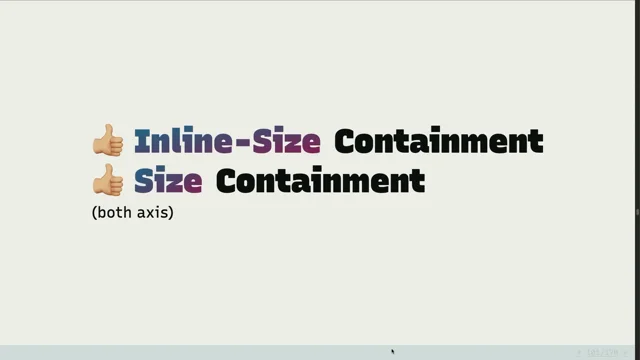
So we got inline size containment.
We made this work, we made it work across browsers.
I didn't.
I was just there being like, here's all the problems.
Hey browser engineers, can you fix it?
And they did.
We did not get block size containment.
There's too many situations, where changing the content on the inline size impacts the block size.
There were too many loops that we couldn't, leaks, of information between the two axes that we couldn't shut them all down.
Most of the time we're going to use inline size containment, we got that.
We can also sometimes use size containment.
It's there, if we want it.
We also need to contain, we thought layout.
And we found that we don't need full layout containment and we're rolling that back a little bit.
This is a difference that you'll see right now.
Chrome has rolled that back and the other browsers haven't yet.
And I'll show you the differences there.
So let's see what all of these, yeah, I'm sorry.
She is so disappointed in you.
I don't know what you did, but she is not impressed.
All right.
We've got, this is the container down here that we're dealing with, and I contain size and it collapses.
I've got a figure inside of each one, and they're using, numbering, counters to do the numbering on the figures.
And then we've got a position, a fixed positioned element there that's fixed to the viewport, right?
If we change this to be layout containment, We see, oh, we wrapped the float.
We did basically a clear fix on the float, but we also contained the fixed position element.
And that's what we didn't want.
That's why we're rolling back layout containment now.
That shouldn't happen.
It still happens in some browsers when we use container queries, but it will stop happening.
And then, if we did style containment, we see that the number changes on this figure.
This is one of the weirdest loops to me.
You could change the numbers inside of a container, and that could, you could do that based on a container query, and that could change the numbers outside of a container, and then the whole page could reflow based on the, based on that number being larger.
And yeah, using counters, you could cause a layout loop in container queries.
So we had to add style containment.
Counter, it's basically just counters.
Counters don't work across the boundary of, of a container.
But we don't want to write this all out, right?
We don't want to write contain, inline size, layout, and style.
And we didn't want to be like stuck to it, right?
We wanted to be able to make adjustments and say, actually, what do container queries actually need?
What do different types of containers need?
Let's just apply the containment that's needed.
And then it's a little bit more flexible.
So instead of contain inline size layout style, you just say, what container type do I want in the browser figures out.
What containments are needed for that.
So container type inline size.
We've now gotten back to where I was five minutes in.
Container type inline size.
That's what you're gonna want.
We can only measure the axis we contain.
So at this point we can only measure the inline axis.
But that's fine.
Whatever.
We didn't even want the block axis.
Leave us alone.
Usually that's all we want.
So we're going to use inline size for most containers.
But we can use size, especially, I mean there's maybe other places, but especially scrolling containers.
If we're adding scroll to a container, then it's already ignoring its content and sizing to something else, right?
It has to have an extrinsic size because the content is overflowing it.
So it's not getting its size from that.
So when we've got containers that scroll, we can apply size containment.
I'll, let you trust me on this one.
I applied size containment to all those things.
They're getting their sizing from the grid, which is based on the viewport.
And, it's fine.
They can overflow.
The content has somewhere to go.
So there are times that we can use size containment and query both axes.
For various reasons, there's no default container.
We need to add containers explicitly.
I have a whole article about the problems with root containment and what it would do, and it breaks everything.
Often this is the sort of thing that I do at the beginning of my project.
I just say, all of these main areas, that are inside my body, they're all containers.
The header, nav, main, aside, footer, whatever I've got there, give me some, low level containers, and then I'll add other containers as I need them.
It's also recommended, but not required, that you name containers.
This can be powerful, so you can say, I think of these both like IDs and like classes, so sometimes I'll be like, it's the main thing.
Call it main, and there's only going to be one of those.
But it's also one of my layout containers.
And I'm gonna have a bunch of those.
So I can give it some names, and I can give it as many names as I want, name it anything I want.
And I can use a shorthand.
The shorthand names are required, so if you're gonna If you're not using names, you've got to use the longhands.
But you can say whatever names you want, and then a slash, and then the type of container.
And then we can start querying those containers.
Anything inside of them we'll look to see.
And it's, oh, and we can add names there in our query.
So we can say, this is because by default, we're just looking at the one directly above.
But sometimes we want to look at like a container farther up the tree, right?
So this lets us do that.
We can say, Oh, actually, go to the main container and tell me what size it is.
There's also, we've decided that you can leave the query out and just.
Say the name of a container, which is a little bit like nesting.
You can just say, am I in a layout container?
Am I in the main container?
And you don't even need to put a size query there.
I don't think this has rolled out in any browsers yet.
But this is coming.
So for finding a container, first we match each element inside of a container query.
We look at those selectors, we match all the elements, and then we find the nearest ancestor that has both.
The container names you asked for and the container types that you are trying to query.
So we'll look for, if you're querying the width of something or the inline size of something, we'll look for an inline size container with the names that you wanted.
Elements can't query themselves.
They're always querying another element farther up.
But we can nest those.
Containers can query other containers farther up the tree.
And, Eric Portis made this demo to try and crash my browser.
It didn't work, but I love it as a demo.
36 chambers of container queries.
There's just each container getting its color from the size of the container above.
Most of the rest of this is just, different demos.
This one from Una Kravitz I like because, container queries aren't just for, big level layout stuff.
We can use them for all sorts of small things and nested things.
She's got a container query here on the button.
And then also on the SVG inside of the button, so all sorts of nested container queries dealing with different parts of that, little button.
We're always measuring an element, which changes some things about what we can do.
With media queries, we're measuring the viewport, which is not an element.
It's like above the root, but it doesn't have, we, it doesn't have a font size that we set or anything like that.
So we get some bonus things here.
In this case, we've got a media query toggling at 20 ems and a container query on the root toggling at 20 ems.
And, the root and the viewport are roughly the same size at this point.
So that's fine.
How come these are changing at different sizes?
They're both 20 ems, and it's because we've got this font size 2 ems.
We're looking at the actual font size of the root element with a container query, whereas they would go together if they're the same size.
If we've got the default size from the viewport on the root, then 20ems is the same.
But now we're looking at the actual size of an em on the root element, and we can adjust to what 20ems actually means for the container query.
So there's a lot of other stuff that we can do with that to, yeah, take advantage of knowing the actual sizes of things on the container because we're measuring an actual element.
We can also do some, interesting stuff by throwing calculations into queries.
I think this works on media queries too.
You're allowed to use calc in there.
So we can say I've got, I want it to go when there's space for three columns that are 30 characters each.
And here I'm doing some weird math to add in space for gutters, too.
We could probably simplify it to just say 32 ems, or 32 characters times 3 or whatever.
But it works.
It doesn't switch until we've got space for three of them.
Use calc.
It's a great little tool.
There's a little bit of a problem here by the fact that we're measuring actual elements, because with a grid track or flex sizing, that's not really what we want to measure.
The element is like a big box around the outside of our grid, and then we got all these grid tracks inside of it.
And we really, we're going to put things into those tracks, and we want to know the size of the track, not the size of the element.
So that's the downside of this.
And the solution is what I call turtle components.
They carry their container with them.
So I use that here for some flexbox cards that change to a different layout.
And it just means it means a little bit of extra HTML, right?
I just added an extra div.
It's not lovely, but it solves the problem.
So then I can set up the card wrapper as a container and the article can query that card container.
So a little bit of extra nesting, but it gets us where we want to be.
If you use web components, they give you that extra container by default.
It's the host element.
This demo by Max Bach I really love.
These are all just web components, that when you drag them into different spaces, they take different layouts based on the size that they have available.
And it's all using container queries on the host, as the container.
Treating that as the extra wrapper div, that we get for free.
This one, I have nothing to show you about it except that Martin Van Hoof did just some lovely work, making this very responsive, weather thing.
We also get container relative units, like viewport units.
We have VI, VW, etc.
Here we've got CQI, CQH.Did you know there's a Q unit?
We couldn't use As our base, we had to use CQ, because there's already a Q unit.
It's a quarter of a millimeter.
I don't remember.
It's useful.
It probably is useful in print.
I don't know.
Scott Kellum has a great demo of adjusting sizes of, of fonts in these different boxes based on the size of the box available.
Val Head has used this for animations to say, take me from just before the container to just after the container, or either inside or outside.
So she has clouds moving across in an animation, and she's using container queries to make that work with this sort of little calculations using CQI and 100 percent .
With these, there is a default while container queries don't have a defaultcontainer that they look to as a fallback.
The units, it was too risky not to have some fallback.
So we use the small viewport.
If you didn't know there's multiple viewports, there is.
You can reference the large viewport or the small viewport or just use viewport or say dynamic viewport.
The, DVW, DVI, there's lots of units here for accessing different viewports.
Brahmus has a whole article about it, but it's basically is the Chrome there or is it gone, on a mobile browser?
So we use the small viewport, figuring that's the most reliable as a container fallback.
If there's no container there to look at, eventually, we're also going to get all the rest of these units, CQM, CQCH, what is the size of the font?
What is the size of a character on the container?
All these sorts of things will be able to reference and then maybe even a functional version where you pass in a container name and you can say, what is the size?
What is the CQI of a specific container?
That's probably coming to yes.
When we shipped this, we thought, what else, what other questions do we have for these containers?
And, OMG, we had so many questions for containers, not just the size.
Oh, look at this, what are we, yeah, alright.
So style queries were one of the things that came up.
What if we could query the style of the container?
This has also shipped.
In fewer browsers.
But we can query specifically the value of custom properties.
So we can say, does the container have the colors custom property set to invert or something?
And then we can do all sorts of things based on that.
We can only query custom properties for now, maybe forever.
Browsers haven't fully defined equality for all 596 properties, and they don't really want to, spend the year just solving equality.
But it's easy for them to do with custom properties, so we have it for custom properties now, maybe forever.
This is, this has limited support.
Firefox still hasn't rolled this out, but hopefully that's coming soon.
I know that somebody's working on it there.
For these, no containments required.
We can just use them.
And, we always query the direct parent, unless we provide a name, and then we can query something else.
But we're just querying if I'm in the context, that has, I don't know, my color's value set to something.
So all elements are style containers by default.
And we're always querying the direct parent.
We can play with this.
Yeah, here I'm using a style query.
Based on the set button theme.
So if I take away the button theme, those styles go away, or if I change the button theme to Mia plus, I get the.
Yeah, I used to be a designer.
All sorts of things we can do with style queries.
It can make light, dark schemes easier, because we could toggle one value and then query that value.
And we could toggle that property, based on both the media query for prefers-color-scheme and then also based on our settings.
We can use this to pass sort of, high level values into, custom elements, web components, and then change the whole design of the web component based on these high level values that we pass in instead of having to pass in low level values every time.
An important thing to remember is that the before and after elements are descendants of the box.
So we can put container, if we, if the box is a container.
We can have, this little arrow be a before element, and it can query the box.
So we can do all sorts of, styling that based on like arrow position, I just have that, arrow position value, and then I'm just doing a bunch of queries to see what that value is on the parent and apply it to, the after pseudo element.
Yeah, we could see how much space is available in a box.
And then change other values.
Where this is particularly useful is, changing other values than the one that we're querying.
So we want one property to change a bunch of properties, and we can do that here.
This is also Okay.
Yeah, lots we can do there.
This is, I'll let you come back to this.
This is just, you turn on test and it puts red outlines on everything.
Tab Atkins at one point tweeted back on Twitter, that this is valid CSS.
And it's true, this is entirely valid syntax in CSS, it doesn't do anything unless you make it do something, and so I have a demo using...
it's useful, You should please ship this in production tomorrow.
And then we thought, what about state queries?
What if we could see if the scroll state of the container is stuck or snapped or overflowing?
And Chromium in particular has been working on these, and, has some demos.
So here is scroll state.
You can see there's still some bugs.
There's a reason it hasn't shipped.
But there's just a scroll state query, for when the sticky header is stuck.
Mandy talked yesterday about, responsive images using the sizes attribute.
This isn't technically container queries, but, when we shipped container queries, everybody asked, what about images?
Can I, get image sizes, responsive images, based on the size of the container instead of the size of the viewport?
And container queries can't really help with that.
But we did get something out of that.
We got sizes auto.
Instead of specifying all the sizes, if we apply lazy loading.
So we can't use this on, say, header images.
But if we apply lazy loading, we can now also apply, auto as the sizes.
And I think back there somewhere I have, the browser support again isn't perfect.
Far from perfect.
The auto value here, supported in Chromium, supported a few places, but not Firefox or Safari yet.
Hopefully that will come.
Do containers know stuff?
Yes.
Containers do know stuff.
Feel free to ask them anything.
They won't always give you an answer.
But it will be determinative.
Is that the word I was looking for?
Anyway.
Things containers know.
Their size, if they're contained.
Their custom property values.
Their relative values, like ems, the size of the font.
Maybe some states, TBD, those are coming, hopefully.
So please do actually go out and query the containers.
Actually, thank you.
- media queries
- polyfill
- container queries
- container type
- Hypermedia www browser
- editor
- contain
- container type inline size
- calc
- use calc
- web components
- viewport units
- CQI
- CQH
- web components
- custom properties
- pseudo element
- state queries
- lazy loading
A deep-dive into CSS container queries.
How did container queries go from ‘impossible’ to ‘shipping’ after so many years? How do we use them, and what hidden powers do they have? What are CSS containers, and what queries can they respond to? Let’s find out!