Web fonts, without the jank
Introduction
Michael Taranto introduces the concept of page jank caused by font loading and how font metrics and modern CSS techniques can create more stable UIs.
FOIT vs. FOUT
Michael revisits the differences between Flash of Invisible Text (FOIT) and Flash of Unstyled Text (FOUT), their impact on SEO, and how browsers have been evolving to handle them.
Unstyled Text and its Challenges
Michael explains why unstyled text is becoming the preferred approach for its immediacy of content presentation despite its trade-offs, particularly layout shifts when fonts load.
Strategies for Better Fallback Fonts
Michael highlights two key strategies to improve fallback fonts: choosing stylistically aligned fallbacks and using new CSS descriptors for better alignment with web fonts.
Introducing Font Aliases and Metric Overrides
Michael introduces the concept of font aliases in CSS, enabling customization of system font metrics like ascender, descender, and line gap to match web font layouts, reducing jank.
Understanding Font Metrics
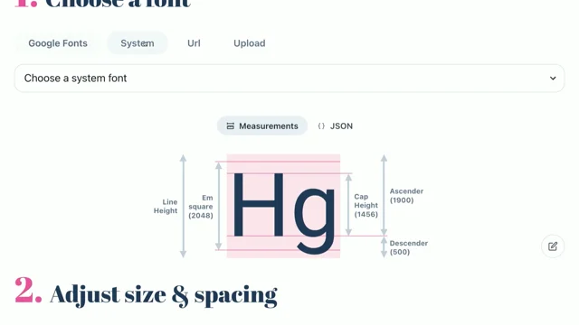
Michael dives deeper into font metrics, explaining key concepts like M square, baseline, ascender, descender, and line gap and how they contribute to the visual appearance of text.
Calculating Metric Overrides
Michael explains how to calculate the percentage values for ascender, descender, and line gap overrides by comparing the font metrics of the web font and fallback font.
Addressing Horizontal Alignment with Size Adjust
Michael introduces the size adjust property, which scales font metrics to align the horizontal spacing of fallback fonts with web fonts, reducing reflow and jank.
The Challenge of Average Character Width
Michael discusses the challenges of calculating size adjust due to the lack of a reliable average character width metric in modern font formats and the need for a custom solution.
Recalculating Average Character Width
Michael explains how they used FontKit to open font files and calculate the average character width by measuring the width of characters A-Z, weighted by their frequency in written text.
Implementing Size Adjust and Handling Font Variants
Michael demonstrates how to calculate and apply the size adjust value based on the average character widths of the web font and fallback font and how to handle different font variants like bold.
Real-World Example: SEEK.com
Michael showcases a real-world implementation of these techniques on SEEK.com, demonstrating the significant reduction in layout shifts and its positive impact on user experience and business metrics.
Introducing Capsize
Michael introduces Capsize, an open-source library developed at SEEK that simplifies the process of accessing font metrics and generating font fallbacks.
Using Capsize to Generate Fallbacks
Michael provides code examples of using Capsize to import font metrics and generate CSS font stacks and declarations for both regular and bold font variants.
Beyond Latin Characters: Supporting Unicode Subsets
Michael discusses the need to support different Unicode character sets beyond Latin characters and how Capsize can be extended to handle this.
Generating Frequency Data Sets for Unicode Subsets
Michael explains how they analyzed localized content from Wikinews to generate frequency data sets for various character sets, enabling support for languages like Thai.
Demonstrating Thai Character Support
Michael showcases the successful implementation of font fallbacks for Thai characters, demonstrating the versatility of Capsize in reducing layout shifts across different languages.
Simplifying Implementation with Metaframeworks
Michael highlights the integration of Capsize into popular metaframeworks like Nuxt and Next.js, making it easier for developers to adopt these techniques without manual configuration.
The Power of Open Source
Michael emphasizes the importance of open-source collaboration, showcasing how tools like Capsize, FontKit, Nuxt, and Next.js build upon each other to improve the web development experience.
Conclusion
Michael concludes by summarizing the key takeaways from the presentation: the importance of fallback fonts, font metrics, CSS techniques for font alignment, and the role of open-source tools in delivering more stable and enjoyable user experiences on the web.
Alright, I'm genuinely excited to give this presentation today.
It's been a long time coming.
So page jank, I'm sure it's something you're all familiar with.
Going to visit a website, about to click on a link or a button, only to have the page shift from underneath you.
I'm here to talk to you about how we can use font metrics and some modern CSS techniques to bring stability to our UIs and improve our user experiences.
But we can't talk about loading fonts without revisiting a couple of key acronyms that we've been talking about for pretty much a decade now.
The flash of invisible text versus the flash of unstyled text.
FOIT versus FOUT.
Now, you'll notice on the left, we have a completed document, just with no font.
There is text on that page, I've just got nothing to render it with.
Then when the font loads, we get our customized user experience.
And on the right here, we have our unstyled text.
Starting first, immediately, with our fallback font, and switching it out to for our web font when it completes loading.
Now both of these come with different penalties, particularly from an SEO perspective, with the invisible text copping a penalty for slow or delayed presentation of content.
And on the unstyled side, there's a penalty due to the layout shift and the instability that is introduced to the UI.
So with that in mind, browsers have been delivering new features and our practices have been evolving as well.
So I'm sure many of you are familiar with the font display CSS property that gives you fine grained controls over the strategy of how to flip between or when to flip between the fallback and the web font.
And on the practices side, we've been looking at how we can shift our font face declarations potentially from external style sheets and into style tags in line in the head of the document.
It feels like the dust is starting to settle on these two where we're opting for swap by default with services Google Fonts.
And that will immediately paint that fallback and swap over to the web font as soon as it's available.
And on the practices side, we've got tooling and frameworks starting to automatically inline into the head of our document in a style tag the, web font declaration so that we can reduce the network hops that are blocking us from presenting the content to our users.
So in many ways, Unstyled is winning the battle against invisible text, and this is just simply due to valuing that presentation of content, the immediacy of presenting that, a much higher priority for our users.
But it doesn't come without trade offs.
That jank in the UI is because we are swapping from our fallback to our web font and they're dramatically different in their layout.
So how can we close the gap between these two?
What can we employ, excuse me, what can we employ as strategies?
A couple of things.
We can start by choosing a better fallback font.
Not simply an exhaustive list of fallbacks or defaulting to the system stack.
If you're using a web font, it makes a lot of sense to select the most stylistically aligned fallback.
In addition to that, we have some new CSS descriptors that we can use to help augment our fallbacks and align that more seamlessly to our web font.
And that's what we're going to explore today.
So we'll start by recapping, with a very basic web font here, so we've given it a name, we've pointed it at a URL to go and fetch.
We can then insert that web font into our font stack as our preferred font, falling back to Arial in this example here.
Now what's new, what's modern in CSS is we can create what's called a font alias.
So it's another font face declaration that we can give a unique name.
But rather than pointing it at a remote URL, we're actually picking up a local system font.
Again, in this case, Arial.
But we're now going a step further, and we're going to customize Some of its font metrics and basically its layout in different ways so that it further aligns to our web font and will help us reduce that jank.
That alias can then seamlessly be included in our font stack as the preferred fallback.
And all of this is static CSS, there's no run time lookups.
Were not using JavaScript to interrogate the font, the environment and find out what fonts are available, we can just progressively enhance into our web font as soon as it's available.
No surprises, there's some pretty wild percentages going on here, so I'm sure we're all asking, where do they come from?
How do we get to these values?
And if we first understand what they're doing, the first three are referred to as metric overrides.
So they're about bringing closer together the line box of our fallback font and our web font.
So the vertical difference between the two.
And then size adjust is scaling and helping us bring the horizontal axes closer together between the two fonts.
Now I've mentioned font metrics a few times, what are they and how can we factor these into our CSS?
For the purposes of today, there's a couple of key ones we'll cover, but font metrics are provided by the font authors when they design the font.
And it's metadata that exists internal to the font.
And I'll highlight a few key ones, so we have the M square.
It's the canvas or the artboard that every individual glyph is drawn against.
We've got the baseline, this is basically the X axis, the zero point that a lot of other metrics are measured from, such as the ascender, so how far above baseline does it rise?
The descender, how far below do our characters drop?
And also line gap, so any additional space that the font author wants between wrapping lines of text.
So let's have a bit of a play with these new descriptors that we mentioned.
We'll first render our web font, and we'll overlay it with Arial now.
What we're seeing on screen is the jank, right?
We would first paint Arial in the browser, that's the fallback font.
We're then going to load the web font, which is the white text in the background, and that amount of reflow is what's going to cause all the movement with our text.
So now if we introduce our overrides, we can see highlighted in green is the line box of Arial.
Now that we know what these metrics are, we can, I'm going to have to change windows.
We can increase the, ascender of Arial and have it move further down to a line with our web font.
Likewise, if we wanna make sure that we're aligning the line box on the lower side, we can play with the descender.
And again, any additional line gap just to bring aerial closer to our preferred web font.
Once we're happy with the vertical alignment, we can then use size adjust to scale and hopefully bring what is just a native system font closer to the alignment of our web font.
Now again, we've got some magic numbers as I drag these sliders around, but I'm sure as devs you've probably all played with values in the browser and come up with things that you don't quite understand, but you'd love to.
So let's go about learning about them.
As mentioned, these metrics exist within the fonts themselves, so we can go grab a tool like FontForge, open the font file, and delve deep within to the font tables and find ascender and descender, the exact metrics that the author gave us.
We can then pull those into a workable format, into a JSON object like this and now we need to go from the font author inputs to our CSS overrides.
And what these overrides are doing is taking each of the metrics of the web font as a proportion of their m square and we're setting those as the overrides for our fallback.
So let's go through and do some calculations.
We first take the ascent of our web font and we divide it by the m square.
That's going to give us our acsender ratio.
We can repeat that for the desender and for line gap.
And now that we've got these three values, if we multiply them by a hundred, that converts it to the percentage that's required to template directly into our CSS.
We can then insert our fallback font into our font stack as a preferred fallback for, our text.
We will instantly load this, instantly available wherever Arial is available, you'll have this, available as your preferred override, and then progressively enhancing to the web font when available.
So let's see it in action.
Again, we'll start with our web font.
We overlay Arial, now it's our version of Arial that we've helpfully called web font, but it's the fallback.
Apply our metric overrides, and you'll see that vertical, Layout has totally been transformed.
We're now sitting on this harmonious baseline between the two.
So they're no longer magic numbers.
We understand where they've come from.
Now we need to go about solving the horizontal axis.
So we'll lock away those first metric overrides and we'll now focus on just the size adjust property.
So again, we can come in and explore what it would be to scale.
And hopefully we can find something that roughly aligns the two.
And if we can do that, then we can stop all the movement in our page.
But what is size adjust actually doing?
I've spoken in detail about what the font metrics are, and they exist internally.
Size adjust is a multiplier for all the other metrics.
It's not the first time we've come across this.
I'm sure everyone's used an SVG before, where the view box is essentially the M square, right?
It's the canvas that something's drawn on.
And that something is the path that's described in relation to the view box.
And that's the same with metrics and the M square.
Then we resize our SVG by giving it a height and width and that's just scaling all those values and that's exactly what size adjust is doing for the glyphs of our text.
So if we're to close in this horizontal axis, we need to get these two green lines closer together.
We need to expand the length or scale out to the width of our web font.
But we are at the whim of what text is used on that line.
And from CSS's perspective, we can't know what characters are being used on every line of text.
So we're going to have to work with averages here.
And so if we compare the average character width between these two, we should be able to find the relevant scale to apply.
So hopefully we can just delve into our fonts and find the average character width.
That'd be useful.
There's the xAverageCharWidth metric that exists in the font tables.
And its very value is the average of Latin characters A to Z, weighted by how often they occur in written text.
And so if we can compare that between the two fonts, we're in a pretty good place.
But it got removed.
They changed it in an early version of the OpenType spec to now be, to now include all non zero width characters.
So this is totally useless for our purposes of size adjust, but they even went a step further and said, you know what, don't use this for computing the layout of lines of text.
This exists in the OpenType spec.
And one can only assume that's due to the globalization of having to support non Latin characters.
In different, yeah, in different character sets.
But it sounds like a really sensible place for us to start.
We went about reinventing that and calculating it manually, measuring character widths.
So let's look at some more code.
Downloaded an open source library called FontKit that allows us to programmatically open a font.
So instead of using FontForge, And manually doing this we could do it from code.
We can then consider the A to Z string that the spec was talking about and we can iterate over each of these characters at build time to work out how wide they are and calculate the average.
The second part of the spec was referring to how often the characters appear.
Now remember, we're working with averages for this horizontal scale, so how frequently a character appears, the difference between the width of the letter W and the I, they're drastically different.
So their influence on that average needs to be a So we went off to Wikipedia and found a letter frequencies table that talked about how likely these characters are to appear in written language, pulled that into a little JSON format that we can use from our code, and now factor that into our calculations, so no longer just returning the width, but we'll multiply it by its likelihood of appearing in written language.
That now gives us a single metric for any given font that is actually the average character width.
And so if we repeat this process for the web font, and we ratio that off the relevant m squares, we've now got a basis for comparing these two fonts on average and scaling their width using size adjust.
I've spoken about this calculation a few times now, if we take the average width of the web font and we divide it by its m square, we do the same for the fallback font, we can now divide one by the other and this is exactly the value that SizeAdjust is expecting.
I touched on the fact that SizeAdjust is scaling all other metrics.
And that's important because previously we calculated our metric overrides off these metrics.
So if we're to change or scale the M square, we need to go back and revisit that.
Produce a scaled M square by multiplying it by our size adjust factor, and then rebase our metric overrides.
Feels a bit involved, but once we multiply those by 100 as our percentages, we can template those back into our declaration.
And this is where our magic numbers come from, but they're no longer magic, they're now data driven.
So let's have a look at it.
We get our web font, we overlay it with our metric override version, And then we apply size adjust.
So you can imagine we're now instantly painting this version of Arial, and enhancing into the web font that's in the background, and there's pretty much zero layout shift.
But how often when using web fonts, do we load a single web font?
Typically load bold at least, like there's going to be a second variant there and that's going to have a dramatic impact on how long a line of text is, so let's take inspiration from the technique that most of us are probably using where we use multiple font face declarations and we use the technique called style linking where we give it the same name But we differ on stylistic properties such as the font weight.
And then the browser will pick up the right declaration when both the font name and the style properties match.
Same thing goes for our fallback fonts.
So we've already created the regular variant of what we need.
We now can generate a second one using the same style link, style linking technique of giving it the same name, and we can include our font weight in this case, but whatever the stylistic variant that we want to include, we can include in that declaration and generate a set of metrics that will scale that version to our web font.
Now importantly you'll notice, we're actually addressing Arial Bold specifically.
This is normally automatically done for us by the browser, but we're having to be a little bit more explicit in these fallback declarations.
So as we mentioned, we're going to calculate the average width, and you can notably see the bold is wider than regular, no surprises there, but we can capture that in our data.
So now if we revisit our example, we bold the web font and we now overlay it with our bolded fallback.
So it's not a perfect science because we are working off averages and you can see the tracking sort of coming in and out because it's average over the different characters but all in all it looks pretty good.
But don't take my word for it, we've actually launched this to production last year.
And you might be able to see it in the bottom corner, I'm highlighting this whole page.
This is the search results of where I work at SEEK.
Particularly performance sensitive from an SEO perspective.
And so if we have a look at it in Arial, and we now switch to our web font, what's one of the core actions you can do on a jobs board?
It's the apply button.
And where's it moving?
It's jumping in and out of the screen, down the bottom.
The save options on the second job in the list, any other links?
It can have a dramatic impact on even business metrics.
As that second job moves in and out of the viewport, that's affecting job impressions, which informs the next set of search results that's going to come back in.
So it's hugely important that we get this right.
Now we switch to our custom fallback.
So this is our version of Arial.
And if I flip to SEEK Sans Did you see it?
Why are we using a web font?
It's almost a stylistic change, but the layout is incredibly stable.
There will be changes, there will be some lines that, that wrap, and that's unavoidable.
But, switching between these two is something that's worth celebrating.
Cue the confetti.
No jank, no ref yeah, go on.
No jank, no reflow.
And, for the first time, we've been able to defeat that jank of unstyled text and have our web font and our designed experience.
But it's been a lot of work to get here.
Does everyone really need to understand this?
Is there a way that we can generate it?
So fortunately at Seek, we've got a bit of experience with font metrics.
We've, built this ecosystem called Capsize that provides access to font metrics to perform other CSS, improvements for our typography.
But if we go to the website, it gives us a means to explore different sets of metrics.
So I can come over to the System tab here and see what Arial metrics look like, or some of these other system fonts, and you'll see it the preview updates, these metrics update here, I can likewise search for any web font and get a lovely white page.
Am I online?
I'll try that one more time.
There we go.
So I can see different web fonts directly from Google, all 1600, available for me to search.
Or point it at a URL.
Or upload a file and see its metrics.
Instead of opening FontForge or needing to drive FontKit ourselves, we can have a much cleaner API for accessing our metrics.
And we can just install that.
It's open source, so we can install the metrics package and now import the metrics for our given fonts that we want to generate the fallback.
Let's go ahead and import Arial.
That'll get us the same JSON object that was powering the website before.
And we can likewise import any Google font.
Statically, this is all done at build time, you're not importing the whole library, only the values that you require for your case.
Now not every font exists on Google, so we had to provide a mechanism to unpack either from a file, or from a URL, the metrics from your custom or licensed font.
And that ends us up with the same data structure that was driving … the same data structure that was driving the static metrics as well.
So we've got our starting point.
We've been able to automate access to these metrics.
We now need to generate that fallback.
So if we have a look at what this looks like with capsize, here we're passing our web font now fallback to our font family property.
What we can do now is pass it to the create font stack API, but rather than passing font names, we're passing sets of metrics in.
So it's the same order as our font stack, but they're now sets of metrics.
And what Capsize is going to return to us is our generated font stack.
And our pre built font declaration, which can be templated in at build time and produce a static style sheet for runtime.
So here we've got our web font falling back to our custom alias.
We've generated our fallback, didn't have to write a single maths equation.
It was all done for you under the covers.
As mentioned, with the fallback variants, we need to generate one of these for every web font declaration we're going to include.
So if we're using bold, as we did previously, we can import the bold metrics.
So Arial slash 700, or slash 700 italic, if you were using that particular variant.
We've got metrics available for the system and Google fonts that exist to be statically imported.
We're going to pass now the bold metrics into createFontStack.
And in addition, specify any other declaration properties such as font weight 700.
What makes this declaration unique against the regular one?
We can pass those values in here as well.
We template that into our style sheet.
And then we end up with a second declaration.
Using the style linking technique that we spoke about, excuse me, that we spoke about earlier, picking up the correct declaration based on its style properties, but I have overstepped something.
We're still depending on Latin characters, A to Z.
Now at Seek, that got us to production in A and Z, and our Latin characters, language…our language is based on Latin characters.
We're all reaping this benefit, but we had to support Thai as well.
So what about these other Unicode subsets?
And unfortunately, Wikipedia only had data sets for Latin characters.
French, German, they were all using Latin characters, but different languages.
So we needed to generate our own.
So we went about generating these frequency data sets that were analysing written language and would produce a data set that could feasibly scale to any character set within the Unicode format.
So off to Wikinews, which is a fantastic source of localised content written in over 20 languages, all different character sets, and in particular we could grab the abstract from any article.
What's important about that is the majority of articles on Wikipedia are full of annotations and markdown syntax.
We didn't want that clouding our averages, so the abstract was a really clean source for us to work off.
So we chose one language per character set, so English for Latin and Thai for Thai, very creative.
And we set about building these custom feeds, so reading in XML data.
We've taken 5,000 of the abstract language and we started counting.
Then we weighted those character counts by the number of characters that we read in and here's where we landed.
So we've moved from the hard coded Latin A to Z to these more dynamic sets where you'll notice.
In the Latin weight table, we've now got punctuation, we've got capital letters, we've got numbers, we've got other characters, we don't really care, they're just other characters that exist commonly.
And if we can treat that as a black box, we've read in a whole lot of articles, we'll just trust that data set.
But interestingly, it's given us ability to support Thai.
So we can now go back and generate a font declaration for the Thai subset.
And if you've ever worked with other character sets and font declarations, best practice is to include the Unicode range that you want to apply that specific font to.
So here we go, another generated declaration for this unique combination.
We've augmented the fallback to align to our web font, and we've isolated it to that specific Unicode range.
We've got to see it in action.
Here's the web font.
If we overlay it with our fallback, you'll see in this case we're sitting lower.
It's got a different line box to what we had with Arial.
Apply our metric overrides, jumps back up onto baseline, and then more fireworks.
So have we solved FOUT related jank?
With this solution, it's the first time the browser's given us these kinds of features that we can leverage.
And it gives us the ability to have that design look and feel without all the typical trade offs.
But I'm sure many of you are looking at even the capsize solution and wondering, How can I get started?
Is there a way that I can make this even easier for you?
So you could manually go off to DevTools and spit out declarations until you're happy.
You could take Capsize's approach and install a data driven solution, that's all open source.
And what we're seeing in the open source community at the moment is the age of metaframeworks.
So we already have community integrations.
Capsize is baked in to Nuxt and Next.
If you're using Nuxt in the Vue community, You can install the Fontaine plug in and it will automatically parse font declarations from your style sheets and generate those fallbacks seamlessly for you.
If you're using Next beyond version 13, you'll automatically have the Next font package generating those fallbacks.
It's the default.
I've highlighted the setting, but it's the default, so it's using capsize under the covers to generate those fallbacks without you even having to worry about this.
And that's really what these meta frameworks are giving us, is they're vacuuming up open source solutions to problems so that you don't have to solve every problem yourself.
And it's really the beauty of open source.
So capsize sits on top of FontKit, Nuxt and Next sit on top of Vue and React, and it's just open source all the way down, hopefully making our experiences a little bit better.
So what have we learned?
Fallback fonts are critical in the story to reducing that page jank.
Hopefully you've learnt a little bit about font metrics if you haven't learnt, discovered those previously, and their, how they affect the anatomy of fonts.
And we can also use those metrics and CSS now to improve the alignment of our fonts.
And if we can do all of that well, we can deliver more stable experiences for our users.
That's all I have for you today, thank you.
I'm Michael, as I mentioned, at Seek, and you can find me pretty much anywhere under my handle.
Fallback fonts. They don’t often get much of our attention, after all, they are only a fallback! But their importance is growing with a focus on user experience metrics like Cumulative Layout Shift (CLS) — a metric targeted at improving janky page load experiences.
In this talk, we will explore modern CSS font-face descriptors, such as size-adjust and metric overrides, and leverage fallback fonts for better alignment with web fonts.
To achieve this, we journey through the world of font metric tables and how we can use them to calculate the required CSS, dramatically reducing layout shift on page load — all the design aesthetic of web fonts, without the jank.

