Fast ≠ good
Opening Anecdote: The Wrong Train to Rotterdam
Speaker F opens with a personal story about living in the Netherlands and mistakenly boarding a fast, direct train that took a visiting family member to Rotterdam instead of Amsterdam. This sets up the talk's central metaphor: AI without direction, no matter how fast or smooth, doesn't guarantee you end up where you actually want to go.
Introducing the Eames and the India Report
The speaker introduces Charles and Ray Eames, who in 1958 chose to travel to India for three months rather than write a report about the country from California. He teases that they coined three important words, to be revealed later, framing the rest of the talk around understanding versus assumption.
Fast Does Not Equal Good
Speaker F argues that the design industry has conflated speed with quality, insisting that 'fast' is measurable and directional while 'good' is subjective, emotional, and requires explanation. He clarifies he isn't against AI tools but stresses that speed alone says nothing about the quality of the outcome.
Interpolation vs. Extrapolation: Blender vs. Chef
Using the metaphor of a blender versus a chef, the speaker explains that AI operates through interpolation—recombining existing patterns—while true design requires extrapolation: lived experience, judgment, and intentional experimentation. He illustrates this with the idea that a chef tastes, adjusts, and decides, unlike a machine that simply outputs an average.
Observing Real Needs: The Pull-to-Refresh Example
Speaker F cites designer Loren Brichter's invention of the 'pull to refresh' gesture as an example of extrapolation born from observing real user frustration, not from existing data. He extends this into a discussion of complex, undefined design problems—like merging multiple products or design systems—that have no simple AI-generated answer.
Fidelity, Confidence, and the Problem with AI's Instant Polish
Drawing on his experience at Shopify, Atlassian, and Booking.com, the speaker explains that design fidelity should match confidence, using rough architectural sketches as an example of intentional incompleteness that invites further thinking. He warns that AI skips this process entirely, always producing polished, 'finished-looking' outputs that discourage further iteration and critical thought.
The Illusion of Completion: Fake Ferraris and False Confidence
The speaker uses the image of an AI-generated Ferrari design to illustrate how convincing, high-fidelity AI outputs create a false sense of completion and expertise. He references Figma's CEO on the pull toward treating first drafts as final, arguing that true design skill lies in knowing when to speed up or slow down, unlike AI which runs at a single, unchanging pace.
Hidden Reasoning and the Loss of Design Thinking
Speaker F discusses how AI tools often hide the reasoning behind outputs, training users to accept results without understanding the process behind them. He shares his own background as a self-taught designer without formal training, explaining his search for wisdom from design pioneers to answer questions about AI's role in the future of design.
Never Delegate Understanding: Lessons from the Eames in India
The speaker reveals the Eames' three-word philosophy—'never delegate understanding'—describing how their fieldwork in India led them to deeply study everyday objects like the brass water pot (lota) to understand generations of embedded knowledge. This exemplifies how genuine design insight requires lived research, not prompts or shortcuts.
Design Wisdom: Ray Eames, Dieter Rams, and IBM's Caution
Speaker F highlights Ray Eames' underappreciated contributions and her quote that 'what works good is better than what looks good,' contrasting AI's focus on appearance over function. He also references Dieter Rams' minimalism and a 1979 IBM slide warning that computers must never make management decisions, reinforcing the theme of human accountability in design.
Designers' Accountability: Mike Monteiro and the Ethics of AI Design
The speaker discusses Mike Monteiro's critique that designers are complicit in harmful patterns like engagement loops and dark patterns, urging designers to reclaim the words 'no' and 'why.' He warns that AI makes it even easier and cheaper to ship poorly considered design decisions at massive scale, deepening ethical risks.
Redefining Design as 'The Labor of Understanding People'
Speaker F critiques classic design definitions (from Jared Spool, Dieter Rams, and the Eames) for omitting people entirely, then offers his own: design is the labor of understanding people. He uses Lina Bo Bardi's Museum of Art in São Paulo as an example of designing for community and public life, emphasizing that understanding requires discomfort, disagreement, and time that AI cannot replicate.
Human Accountability and Paulo Freire's Warning
The speaker stresses that while AI may increasingly handle craft, humans must carry the consequences and accountability for design decisions. He quotes educator Paulo Freire on how removing people from their own decision-making turns them into objects, linking this to the danger of over-delegating design choices to AI.
The Accelerated Double Diamond and the Human Role in Deciding
Speaker F revisits the double diamond design process, explaining that AI accelerates the 'discover' and 'deliver' edges of the process but that deciding remains a distinctly human function. He argues this acceleration frees up time for deeper reflection and better decision-making in the middle of the process.
Three Takeaways: Writing, Failing Faster, and Documenting Thinking
The speaker closes with three practical takeaways: write the design problem by hand before prompting AI, use AI to fail faster by seeking challenging or worst-case options rather than perfect ones, and document the thinking and decisions behind the work rather than just the output. He ends by reaffirming that design is the labor of understanding people, and that striving for 'good' rather than just 'fast' is a responsibility worth fighting for.
We had to start with something. Right? I mean, I had a joke. You kind of stole mine with the airport stuff. Hey, great. Show my emails too. That's awesome. Yeah. So I had a joke about an airport, I took away from my slides because I did the same thing as Millie did, is, like, I read it so many times, I was like, should I just stop reading this with the computer and just write it with my own hand?
Just I did that, and I I really did, so I took that away. But I can bring it back just for, you know, just for this intro to say, you know, I used to live in The Netherlands a long time ago, in a galaxy far not in The Netherlands. And so I used to live there, and a a family member visited.
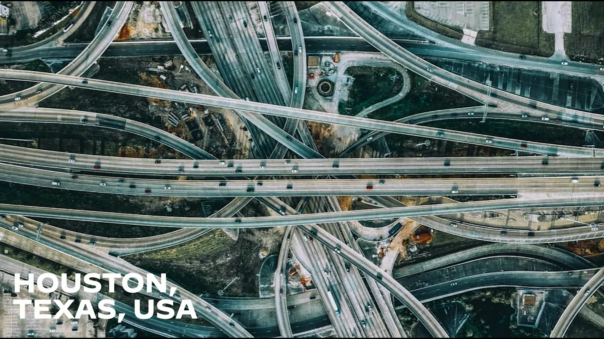
And so the person landed, I went to pick them up at the airport. We saw this train, this beautiful train. The Netherlands has amazing trains. They connect the entire country. I'm like, that's great. We're gonna get on an express train, and we're gonna go straight from here, straight home, awesome experience. They hop on the train with me and they're like, this is amazing, it's so fast, so direct, no stops, it feels like the best experience ever. They live in Brazil, they're like, wow, I've never seen anything like this, this is the future of transport, I love it. And then I look outside and I'm like, oh, we're not going to Amsterdam, are we?
Yeah. So we were on a direct train, no stops to Rotterdam, which was not where I lived. Not at all. So, you know, if if if I don't have slides, we're going to stay with the idea of AI with no direction doesn't really help you. No. We can just stay there. I'm gonna try to figure out what's happening.
Did we get it? Entire screen? Are you
starting to do the name pronunciation?
Oh, my name pronunciation. Oh, my god. Alright. Are we there? Did we nail it? Yeah. Warnap. There we go. Alright. This is just a reminder for me, by the way, to speak a little bit slower because I'm super fast speakers, so if I'm doing too fast, just try keep up. I can't stop. But it was a reminder for myself.
Anyway, so, I'm gonna start way back when, and it's not following me, by the way, guys, if you wanna click on the follow there. We're gonna start in 1958. This is Charles and Charles and Ray Eames. I know if you ever heard of them, but if you did, they wrote this very interesting report about India. We're going to talk about a bunch of stuff, like I said, fast talker, fast thinker.
But they have what I believe is one of the most amazing choices. They were chosen to be going to India to do this report, and they could have chosen to not go. They could have chosen to just be like, you know what? We can do this from home. We live in this beautiful place in California. We have all the credentials anyway.
They chose us, so we can just do it from here. And they didn't. Right? They decided to actually go to India and actually take the time to understand the Indian people. And they have the three words that I think are gonna be the most important ones you hear today. I love them. I keep keep coming back to them all the time. So I hope, you know, you can take it with you from here. But again, they went to India.
They spent three months going from the North to the south of the country. And the only way the three words that I'm gonna give I'm not gonna give them now, but I'll give them later. This is a hook. So the only way those three words are gonna mean anything is if you first understand what the rest of us have been doing with AI up until this point.
We've been going fast, like we've been going super fast. Everyone's just going absurdly fast, and that's all everyone talks about. So you're all being sold the same idea. Go fast, generate faster, come on, explore more, ship sooner. Right? Everyone. It's either a mandate from your team or it's either, oh my gosh, the models are going so fast.
There's a new model. There's a new tool. There's a new thing. Who shipped what? And we don't even know why we're doing it faster. Right? We started conflating the idea that speed is the goal. Speed is not the goal, speed is a lever. Right? Shipping sooner does does not equate shipping better. So that's why I wanted to start with that symbol, that idea of fast and good.
In Brazil, by the way, I would have said different. That symbol means different, doesn't mean does not equal. But in English, usually you say that does not equal. So why am I talking about fast does not equal good? Because I'm not trying to say that fast is bad. Fast is not bad. Right? There's no problem with being fast.
There's no problem with trying to be good. Both things could be good. Right? You can be fast, and that's totally fine. But fast, you can measure. It's a clock. It's a sprint. It's directional. Right? Like that idea, hop on the train, I know where I'm going. Fast is good, but I know where I'm going. It's kilometers per hour, it's seconds to generate.
Easy. What about good? Well, much harder. Harder to measure. There's some emotion behind it. There's some human part of that. It's good to someone. It's good for something. Right? So that idea, it requires the beholder, like beauty. Oh my gosh. Look at that. Poetry. It may also require an explanation. Good requires you to explain how you got there.
You can't just show something and assume that it's just good. It's not ethereal like that. It's not just obviously good to everyone. So it requires a little bit of an explanation. So again, not trying to convince you AI is bad. I've used many of these tools. I even used to do some of the presentation, and then I thought with the presentation and said, no, let's drop it.
They can be quite helpful. You can be fast and good, but you can also be slow and terrible. Speed tells you nothing about quality at all. And the industry keeps trying to tell you that they're the same thing. They're not. It's a false dichotomy. Right? Here's what I noticed. And someone said this just in a presentation before, but I agree.
A lot of the stuff that a lot of people said, I agree, by the way, and you're going hear from me too. AI is confident, extremely confident. It always goes in this straight line into the most probable answer. It's the greatest interpolation machine we've ever built. Right? And interpolation is just finding the patterns between things that already exist and then recombining them fast, and just think of it as a blender. Right? You grab a bunch of stuff, bunch of ingredients you have at home, all your patterns, your components, your design system, your tools, your tokens, whatever you want, you put it on this blender, and then you push a button, and you get served this mush. It's still made of all the things you put in, but it doesn't have any ability to invent anything out of it.
Right? It just blends and then averages everything out. So design isn't a blender. Design is cooking. Right? A chef works completely different than that, than a blender. A chef may use the same materials. It may put everything inside the same way, but it brings the lived experience, the touch, the taste, the timing, the technique.
I promise, those words were not supposed to be altese, but they are. Touch, taste, timing, technique. They change things for fun, for pleasure. Right? They try it. The blender mushes things up by force. It has no idea why it did what it did. But a chef, it adjusts, it judges, it decides, right, it can try something. And it doesn't start knowing what the ending is.
Design doesn't start knowing what the answer is. It's a process. We adjust as we go. It's like this experimental, deliberate, intentional. You try to get to something at the end. And by the way, I know he's a chef, and he's showing you this very, very fancy food. It doesn't matter because, again, it's not a blender. Right? Even if I was producing a hamburger, it would still be something that I tested, and I tasted, and I tried it, and I got to a result at the end.
Because I want to deliver something that tastes good to me, but also, hopefully, tastes good to you. So, that's interpolation versus extrapolation. Interpolation recombines whatever is there, just shakes it up, mushes it up, gives it back to you. Extrapolation is the leap. It's combining things in unexpected ways, creating new things by adding the intangible. Things that you can't see.
It's not just ingredients, it's the amount of heat, the technique, everything that you put in. There's a famous line, again, someone said it, I said, a lot of you did a great job, you mentioned a lot of the things I was going to mention, but you said it in a talk today, if you asked people what they wanted, they would have said faster horses. Right?
So because I knew you had that example, I saw it on the schedule, I thought of a newer example. In 2008, a designer called Lauren Brichte, I don't know how to pronounce his name, I think that's what it is, he watched impatient users tugging at their screens to check if anything was available on Twitter. And because of that frustration, he realized there was something missing.
And he created this gesture, which we all use on our phones all the time now, pull to refresh. He has a patent on this. But he observed it. It. He saw people using something. That was not an any dataset. He couldn't just go like, oh, this exists. I can just copy this. No. It was something observed from real users that had a need, and he was able to say, this is something that I should cover here. Right? So it's not that easy as just put everything in a blender, get something out.
Because not all are problems like that. Not all design problems are just put on a blender and follow the straight line that is never straight. When you're solving big problems, there usually isn't one right answer. And it becomes more, is the answer really hiding in the bushes or do I have to create one? Right? So how should I do something if, you know, let's say, I have three products in my company and now I bought a fourth product and I want to make this interconnected system of all these products? What's the answer?
I don't know. Who gets to own the design system when we do that? No idea. How do I make my five teams come to an agreement? There's no simple solution for that. There's no button to click for that one. Put AI on that, see if it solves it. How do we design tools for what doesn't exist yet?
Right? So these questions, they don't have easy answers. And for those, I usually say there are layers of answers. Right? You almost have to, like, way find or sculpture a way for the answers. You might have a right now answer. You might have an agreed proposed answer, like I proposed something to my team, and they agreed, and we discussed it and all the stakeholders signed it off.
And maybe we get a direction now. And now that's shaped by people and the constraints and the trade offs. Right? And a fair amount of compromise. I mean, who hadn't had to deal with compromise here ever? Right? Can you imagine just every solution is exactly what you wanted from day one? I don't think that's what works in design.
And I don't expect that to be design either. For me, that's not what design is. Design is this, you know, questions that don't have definite answers. Right? They don't have all solutions figured out for us yet, and that's the point. And again, something I have learned in my time at Shopify. Before working for Figma, worked for Atlassian, I worked for Shopify, I worked for a couple of these companies at booking.com, and in all these times, you know, all of them think very different.
Like Booking was very much a fast going company, no design system, let's try a bunch of things and see what happens. But they had a reason for that, the reason was we're testing things to see what the users tell us because we wanna be able to get some results at the end. It's an e commerce company, it's very specific about that.
At Shopify, what I learned from day one was design should match In design, fidelity should match confidence. And that's why you get something like that, where an architect can draw something that is rough, not perfect, but the person knows what they're thinking here. They have an idea. And the roughness is doing some work, the fact that it's not done yet. It's actually allowing you to just accept it as it is and to tell yourself and your team, you know, I'm not done yet. I'm still exploring this.
I'm still going oh, it jumped. Oh, my gosh. The work isn't done. We keep thinking. Right? It protects the idea of from being treated as finished before it even is. Right? So this this kind of exploration, this kind of thinking, it also protects you, the designer, from just falling in love with all your ideas, all your solutions.
Right? Have you ever heard don't fall in love with your solutions? Like that's a thing. We shouldn't just, you know, design design the first solution and say that's the final product. As confidence grows, fidelity grows with it. Right? We sweat the details. We refine. You tighten the screws. Right? You choose the right tools, and then design earns its finish.
That's really the part of design. The problem is AI comes in and skips the heck out of all of that completely. AI just outputs everything at maximum fidelity on the first pass. Every single time. And if you prompt it again, you're going to get a different result. A new Ferrari just for you.
When something looks finished, people treat it as finished because now they have an artifact to point to. Look at that. You have a Ferrari. It's ready to go. And it's so convincing, it's so easy that even you, the person who generated it, and you know you generated it, there's a little AI logo on the side of it.
You know the thinking wasn't done, but the output is ready. The output is pretending like it is. And so we think this now allows us all to pretend that we understand something as complex as designing an electric car for Ferrari, which I promise you, have never designed a car, I have never even been in a Ferrari, so I would have no way to know if this is the right approach.
But no, the image says it's done, and I can pretend I'm done because I have a cool image to put on my screen. Right? So the CEO of Figma said something that I thought was quite interesting. He said, it's very easy to get lost on the momentum of making something. There's a natural pool to keep going. And so the first the first version of something becomes the version of something. And when I read that, I said, well, yes, and now you know why.
Because AI has no confidence lever. It's always going straight to the limit. It has no low fidelity mode. Everything comes out looking exactly like the answer, full steam ahead, straight to Rotterdam, the wrong city, and here we go. Right? And that's not design, like I said, from all these companies that I've worked with and companies I talked to.
I talked to a bunch of you guys as designer advocates, I go and visit a lot of these companies. I hear from all of you. Right? And so, I hear from everyone that design is still not a straight line. There is a lot of this stuff in the messy middle. There's a lot of us that we have to convince and bring along. And I think the skill of the future designer isn't being fast or being slow.
It's actually knowing when you adjust speed. It's try a different technique, try a different tool, try a different flavor here, adjust, taste it, prove it, see if it, you know, you need something different, change the heat on the thing, slow down when you're understanding, sprint again when you're building. Right? Machines, they just run at one speed. They don't pause, kinda like me talking.
Let's go, go, go, go, go.
But they don't review either. They don't adapt. Right? They don't hop on a plane and fly to India to learn a whole culture before accepting to write about it. If you ask, can you write a report about India? Yes, of course I can. Michelle, that was a great question. Let's do it right now. And that's not going to help.
Right? Because of that confidence level that it's always at a 100%. So if we run at one speed the whole way, first of all, we become machines ourselves. But it also allows us to, you know, just become output machines without ever looking at reasoning. Right? I also think that's a lot of the reasons why the reason is that sometimes the reasoning is hidden in these tools.
You type something and the reason just collapses. Right? Because it's training you to accept the output as the solution, not the reasoning. We are designers. We're not just shippers. Yes, ship to git, put this website live, love it, but also think about why you did it, think about what you designed, what you want to achieve with it.
So again, I'm old, and I started in design about thirty years ago, and the video is not going to play, but that's fine. For those who don't know, and I was giving my age with this, this is Photoshop four, where we didn't have infinite layers. And because I started at that time, you know, I also have to admit that I'm not formally trained as a designer.
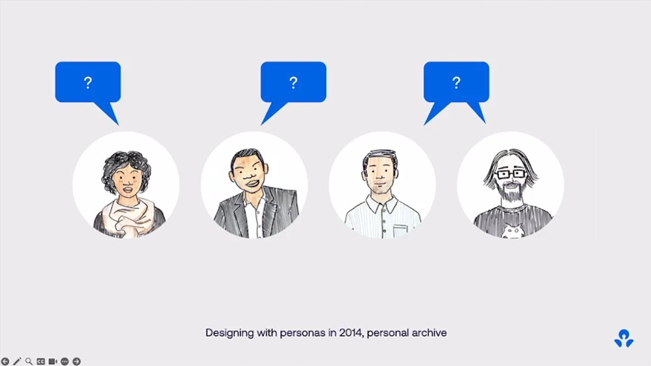
I learned marketing and advertising, and then I started working as designer and playing with the tools and learning a bunch of stuff. So when this whole conversation about where design is going, what is AI with design, what is the future, I didn't have a canon to fall back on. And also, the design books in Brazil, they were very expensive.
I couldn't afford all these books back in the day. So I went looking for people who thought about design to be able to share with all of you and to be able to also learn all these things and realize, do we answers to the questions of the future? So I asked from people who never opened a prompt, never saw a chatbot, never opened Photoshop or Figma, people who didn't have any of the design systems that we have, but they went for their own revolutions. Right? And so we're going back to the past and back to the ins.
And this is the three words that they said. They are famous for this lounge chair, by the way, if you hadn't connected the two. In what they said in their three months in India were never delegate understanding. By the way, in all honesty, those words apparently were written by their grand grandson later when they were refining the documents and, you know, putting all this stuff for presentations to people.
But it still represents the work because the couple lived that work. They went to India and they asked the question. They actually tried to learn about all this stuff. Right? And so they really talked about technology and the way that it was changing India at the time, but they said it wasn't just technology, was communication. The medium of communication was changing India.
And it was changing the way people were living there. And what did they do about it? Well, they, like I said, went there and they studied the actual stuff that Indian people lived with. They studied this thing called alotta, which is a brass water pot that exists in a lot of Indian homes. And they really wanted to study and understand how it carries the water, but also the size of the hands you need to hold it, how it balances when it tips, what does it feel if it's wet, what if it feels if it's dry.
So there's generations of knowledge in that, and refinement, and detail, and they really thought about, like, it's not just a beautiful device, it's understanding how the people got to it. Right? So you can actually think if that's good or not, so you can actually give feedback and understanding to other people of how that can be developed into the future.
No one prompted, can I have a lotta, and this is what it looks like? Right? So someone had to go and understand that. Sorry for the microphone. If I just prompted it, it would just feel like that fake Ferrari that we had. Right? And the India report had one of these lines that, again, I'm gonna read it because it's it's it's just amazing.
I I thought this could have been written this morning. One of the most valuable things a designer can do is ask the right questions. So that's what I ask of all of you, ask the right questions. But also, you know, in recognizing both Charles and Ray, I wanna bring up Ray because usually people forget a lot of the work she did. She has less credit, did half the work at least.
And she said this amazing thing too, which is what works good is better than what looks good, because what works good lasts. Let that sink in. Right? AI is an extraordinary of making things look good. It's much less concerned with whether they work good, and work good, not a typo here. She actually means the adverb.
So working well isn't a property of thing has. It's something it does over time for someone. And if we let AI do the understanding, we become that production operator that we talked about. Right? We just become, you know, people that make things look good, but not work good. Okay. Then we have the person who wrote about good.
Good design is do you know how to quote all 10? I'm not gonna make you guys do it. Deter Rams, who highly influenced Apple in the seventies, wrote that good design is as little design as possible. And, you know, AI makes it very easy and very cheap to add a bunch of stuff to your designs. And now, you have to be the person that reminds yourself and your team that adding is easy, but knowing what to add and when to add and having the restraint, right, is the right thing to do. Because you should only add something if it adds value, if it really solves something for the user.
Then there's this one that's been going around. I don't know if you've seen it. I'm gonna go fast because I have a lot of slides and a very little time because of the beginning there. But, you know, a computer can never be handled accountable, therefore, computer must never make a management decision. This is from a slide deck from IBM.
And if you didn't know, the Eames also worked with IBM to help them understand computers. And IBM said, although we build computers, we will not put them in charge of decisions, which I think is just amazing. You should also remember this guy. Again, in this case, a little bit more recent. This is Mike Montero. He wrote this book called Ruined by Design.
Mike is very rude and very direct online. I love him. He's amazing. And he wrote, designers are not instant in oh my gosh. I can't say that. Designers are not innocent bystanders. We built the feeds, we built the engagement loops, we built the dark patterns, and we cashed the checks. He says that there's two words that every designer should be able to say, no and why.
And he was talking about the social media stuff, but it's even more uncomfortable now with AI than it was before. Because now it's cheaper and faster to ship these decisions to a million people, billion people. Right? Was that what Google said? 2,000,000,000. 2,000,000,000 people. Anyway, it's urgent. We have to be better about design. Remember that even Facebook retired move fast and break things, because they're a real problem when you break things.
Sometimes, even break people on the way. So look at this. It's a design made with AI. It's lovely, maybe, But you start scrolling and you start thinking about it and start going like, who is this for? What is it trying to do? Does it have any idea? Does it understand accessibility, typography, flow? Which person was this designed for?
Why do they all look the same? Right? So don't start digging. Design, again, very convincing, very much a guess, but it doesn't have any idea. And a lot of people will say to you, well, Michelle, but all you have to do is add taste. And, you know, you can say just add taste, but taste is the easiest thing for the machine to add.
Because taste is putting everything on the blender, learning from every culture, and then just spitting something out in the end. It's legally gray. Anyway, what is the point of design? Right? A lot of people try to define design. I loved the Jared Spool line that says design is the rendering of intent. Rams with good design is as little design as possible.
Eames with never delegate understanding. But you notice that no one mentions people? No one mentions the person. All the design canon. They don't say it out loud. What the heck? What are we doing? We're talking about design, we're never putting people, neither in any other sides of the equation. So Lina Bollbarty is this person from actually, she's Italian born, she's an architect from Brazil, and you saw some of the drawings that I was sharing from the beginning.
This person designed the Museum of Art in Sao Paulo. But she didn't design just a museum. It wasn't like, oh, let's make this museum for the city. No, no. She designed how the city works through the museum. The museum is part of the city as a public space. You go through it every day even if you're not in the museum. That's how you think about the public, the people, and what you're trying to build at the same time.
She understood the city, the people, but also how you enjoy it even if you're not in there. Right? But she didn't write a sentence. And so I have a sentence for you. What is design, in my opinion? Well, for me, design is the labor of understanding people. Breathe. Labor. Because understanding isn't free. It costs time. There's discomfort, ambiguity, not a straight line, messy sketch.
There's an argument with your team, maybe we disagree. It's a first pass, doesn't really make sense, you drop it, you go away tomorrow, take a shower, come back, write notes, you know, and then you see if you got it. Right? So there's a labor part of it. Then there's understanding because it's not the same as solving. Solving comes after. You have to understand first, you have to sit with it, You have to really get it.
Maybe you disagree again even about the slide, you're like, oh, no. Don't like it that way. I like it this way better. Right? So that's part of it. Being able to have this argument like, is taste? Is this one better than the other? I don't know. It's a choice. Right? You can make that choice. And lastly, people. Because people may disagree if this version of the slide is better than the other, but they can also compromise and choose one of these.
Right? It's about choosing and deciding together and realizing we're serving that purpose of creating for someone on the other side that's consuming this. So always remember who is this for, and remember that I don't I I don't understand why the entire canon of design wisdom forgot to say it out loud. So design for me is the labor of understanding people.
And there's a possibility that more and more AI will carry the craft from here. Right? But we carry the consequences. Remember that the understanding is ours, but also the consequences is ours. Right? The buck stops with the puck stops with us. Right? No one no computer should be accountable for the solutions. You're the one accountable. You're the one deciding.
You're the one that signs it off. One more Brazilian for you. Just keep bringing all the Brazilians. This is Paulo Freire. He is an educator, and he wrote, to alienate people from their own decision making is to change them into objects. And that's what happened when we let AI decide for the people that we're meant to be designing for, but also when they're deciding for us. Again, the reasoning is hidden for a reason.
So where do I think design belongs? And someone also had the double diamond today. And again, you know, the process doesn't change much. The process is still the same. You're still doing the same idea. You're still discovering and defining. So you diverge and you think out loud, what are all the possibilities? What are all the things I wanna do?
You define, you bring it back, you develop, and then you deliver. Right? But what really changed is that we accelerated the edges. It's much faster to explore. I can explore a lot more ideas. It looks like a bow tie now. I know. We should rename it. That's fine. We'll we'll make up we'll make up we'll all vote on it later. But the idea is, you know, we accelerated the time to discover because now we can explore so many more ideas, but you still have to converge back in.
Right? And then you take a moment in the middle where you decide, is this the one we wanna do? Right? Deciding is a human feature. You are the tool at that moment. And if the tool is saving you time in all these other spaces, then you have time for that center for you to breathe in, and then decide, and choose the right thing to deliver, and then again delivery becomes faster.
Delivery becomes faster because we can code faster, we can deliver the stuff faster, and that's all great. Right? So three things for you to take away. It's the whole I mean, come on. Every eye tool says like, so what are they what are they gonna take away on Monday, Michelle? You know? So here are three things for you to take away on Monday. Alright. Three things for you to take away before you even go into the prompt.
Write the problem by hand. Don't start the problem and then, like, oh my god. I got lost. I'm gonna stop. Draw, sketch, make a rough note. Don't think about the agent yet. Don't think about the orchestration. None of that. One sentence. Who is this for? What do they actually need? What is the hypothesis? What am I testing for?
What do I wanna validate here? Right? What do I wanna learn? If this fails, what do I wanna learn from it? So if you can't write it in a sentence, you're probably not ready yet. Second, use AI to fail faster. It accelerates a bunch of stuff, so fail faster. But don't just ask AI for the right opinions, right options.
Ask for the worst worst ones too. Ask it to challenge you. Ask it to say like, hey. You know what? I don't think this is the best argument, but here's a bunch of arguments for you for you to, you know, think about. Right? Don't expect just to get the perfect ones. Literally say, I don't want the perfect ones.
Just want I just want to hear some options. Be okay with failure. Be okay with it. Test the things out. You arrive at something you don't know if you know that something doesn't work, it actually means you can focus on something that will. Remember that. You decided this doesn't work, that's great. Stop that and say, okay, now I can move to this other thing and decide if this one will.
But again, you can do that part faster. It's not a straight path to the end. Sometimes stop, take a detour. Alright? And then document the thinking and the decisions, not just the output. More than ever, the thinking and the decisions are gonna be more important than the output itself. Because the output, maybe it's the AI, maybe you use more systems.
But what were the frameworks you used? What were the trade offs? Who did you argue this with? How did you get to that decision? What influenced all of this? That's the learning you're accountable for. It's understanding how you got to the decision. That's gonna be way more important than just saying, look at my Ferrari on the screen.
So design is the labor of understanding people. And you remember, speed is just a control, it's just a lever. Striving for good is a responsibility. So fight for it. Thank you.
People
- Charles and Ray Eames
- Dieter Rams
- Jared Spool
- Lauren Brichte
- Lina Bo Bardi
- Mike Monteiro
- Paulo Freire
Technologies & Tools
- Photoshop 4
Concepts & Methods
- Double Diamond
- Extrapolation
- Interpolation
- Lota
- Move fast and break things
- Never delegate understanding
- Pull to refresh
Organisations & Products
- Atlassian
- Booking.com
- Figma
- IBM
- Shopify
Works
- India Report
- Lounge Chair
- Museum of Art Sao Paulo
- Ruined by Design