Designing AI Experiences for High Stakes Industries
The ClickUp Incident: When AI Followed Instructions Too Well
Alex McMahon opens with a personal story about using Claude's ClickUp connector to create templates, which later wiped a week's worth of her team's experimentation notes when she asked for a minor wording update. Although Claude asked for permission before making changes, the vague approval led to a destructive action that looked complete but had erased her team's work, which was only recovered via ClickUp's version history.
Introducing the Authorship Problem in High-Stakes AI Products
Alex introduces herself as head of design at Loan Market Group and connects her ClickUp mishap to larger stakes in AI-powered mortgage products. She frames the central question of the talk: who is the author of an AI-assisted action, and argues designers should focus less on AI accuracy and more on whether users understand what they're approving and who bears the consequences.
Three Frameworks and Designer Accountability
Alex outlines the three frameworks she will cover: identifying where trust breaks down, designing checkpoints matched to risk, and ensuring the human signing off understands what they approved. She emphasizes that designers are accountable for whether AI confidence scores actually change behavior and whether destructive actions show their impact before occurring.
Overtrust: From a Billion-Dollar Fraud to Silent Algorithmic Bias
Alex explains overtrust through CommBank's billion-dollar fraud case involving AI-generated fake payslips and documents that fooled loan approval systems. She then describes a darker, hypothetical scenario with her MyPolicy product where biased training data could silently reduce lender matches for certain suburbs without anyone noticing, arguing that designers must assume bias exists and build in ways to surface it before harm occurs.
Undertrust: Why Showing AI Reasoning Isn't Enough
Alex discusses undertrust, where users ignore accurate AI outputs because reasoning traces (like those from Claude, ChatGPT, or Copilot) show high-level approach rather than verifiable specifics. She presents MyPolicy's solution of linking directly to original lender policy PDFs, arguing that verifiability—not just visibility—is what lets brokers confidently cosign AI decisions.
Miscalibrated Trust: Backwards Confidence in Simple vs. Complex Tasks
Alex describes research into brokers' fragmented workflows across 60+ constantly changing lender policies, and how MyPolicy was designed as a single source of truth. She reveals a paradox from usability testing: brokers trusted AI for simple queries they already knew but reverted to calling bank relationship managers for complex scenarios—exactly where AI could add the most value—highlighting that the real design challenge is helping users know which parts of AI output to trust.
The Fake Case Law Incident and the Common Thread of Design Failure
Alex recounts a case where a senior Australian barrister used AI-generated fake court cases in a murder trial defense, none of which existed. She ties together all three failure stories (ClickUp, CommBank fraud, and the fake cases) as sharing the same root cause: AI output that looked convincingly real with no interface cues prompting closer scrutiny, noting that current AI safety standards address what should happen but not how it should look.
The Checkpoint Spectrum: Matching Friction to Risk
Alex introduces her second framework, a spectrum of checkpoint types—awareness, review, and hard stop—designed to match the risk level and frequency of AI-assisted actions. She explains how awareness checkpoints subtly flag AI involvement, review checkpoints require active verification against source material, and hard stop checkpoints demand deliberate confirmation for irreversible actions, using MyNoteWriter's compliance disclosure placement as a concrete example.
The Three Questions Framework: What Did I Approve?
Alex presents her third framework, requiring interfaces to let users answer 'What did the AI do? What did I approve? What can I still change?' at any moment. She illustrates this across three LMG products—MyNoteWriter, MyDocuments, and MyPolicy—showing how AI drafts work while brokers remain legally and professionally responsible for the final output, with real consequences for clients' loan approvals.
Testing Practices for High-Stakes AI Products
Alex outlines LMG's six-stage testing process before any AI product reaches brokers: golden suite validation, internal compliance/sales stress testing, usability testing, alpha testing, pilot testing, and ongoing production monitoring. She stresses that in high-stakes industries, failures must be caught internally rather than learned in production, since the cost of a bug isn't abstract but tied to someone's home loan.
Closing Reflections: Designing for Authorship and Accountability
Alex closes by revisiting her ClickUp story, admitting that blaming the AI or connector misses the point—she trusted a confident-looking interface that didn't reveal the cost of her actions upfront. She reiterates that the gap between clean and catastrophic outcomes lies in whether interfaces make unverified AI responses look unverified, show destructive actions before they happen, and ensure users know what they're signing.
Q&A: Simplifying Complex Policies and the Value of Friction
During Q&A, Alex addresses a question about simplifying complex lender policies, describing LMG's acquisition of The Brokers Bible to manually translate policies into consumable data behind the AI. She then responds to a question about friction-full design, explaining that brokers actually welcome friction for high-stakes actions and that the key design challenge is placing friction only where verification genuinely matters, not on low-risk routine tasks.
Cool. Thank you. So last month, I wiped a week's worth of content from my own team's work pages. I didn't do it on purpose. I asked AI to do it for me, and it did exactly what I asked, kind of. Here's what happened. I was using Claude with a connector for ClickUp, and ClickUp is our company's task management system like Jira or Notion.
I used the Claude connector to create AI experiment tracking templates for my design team in order to save myself time in having to manually create the pages individually. So Claude generated the pages for each team member on my behalf. Its output was great. It was nicely set out templates in the format that I told it to. It's exactly what I needed.
My team had spent the next week adding their experimentation notes, their observations, their data from the first week of AI experimentation into that ClickUp template. Then a week after my team updated their templates, I asked Claude to update some minor wording across all the pages. So that was just a change in the heading.
It was, some complementary text, instructional text. But what I expected was that Claude would edit that specific text across all the pages, leaving everyone's content intact. But what actually happened was that Claw generated the entire template structure from scratch. It cleared all the contents on every page my team had filled in and rebuilt them as empty templates.
And I didn't realize this until one of my designers had messaged me a few hours later and said, hey, what's going on? My page is empty. So what happened? The Claude interface did ask for my permission before it made edits. It told me it was about to make changes, and I did approve them. What it didn't tell me was that making changes meant wiping every page my team had filled in and rebuilding them from scratch.
The permission I gave was pretty generic. The action it did was destructive. Claude's response looked complete. The regenerated template looked perfect when I looked at my own page, and that's because my own page didn't have any content in it. The output looked right at first glance, so I didn't realize what had been destroyed to create it. My team had to manually recover their work from ClickUp's version history, and we got it back.
But it was damaged that just shouldn't have happened. Let me briefly introduce myself and why I'm here today. I'm Alex McMahon, head of design at Loan Market Group, and we're one of Australia and New Zealand's largest mortgage aggregators. My team builds the AI products that brokers use to help everyday Australians and Kiwis buy their homes and finance their loans.
I'm telling you this click up story because it's a small embarrassing version of a problem that our product teams deal with at a much larger scale. The kind of problem where the consequences isn't a clear template. It's someone's ability to get their first home or their ability to borrow in the future. When my team member asked me what happened to my page, here's the question that stuck with me.
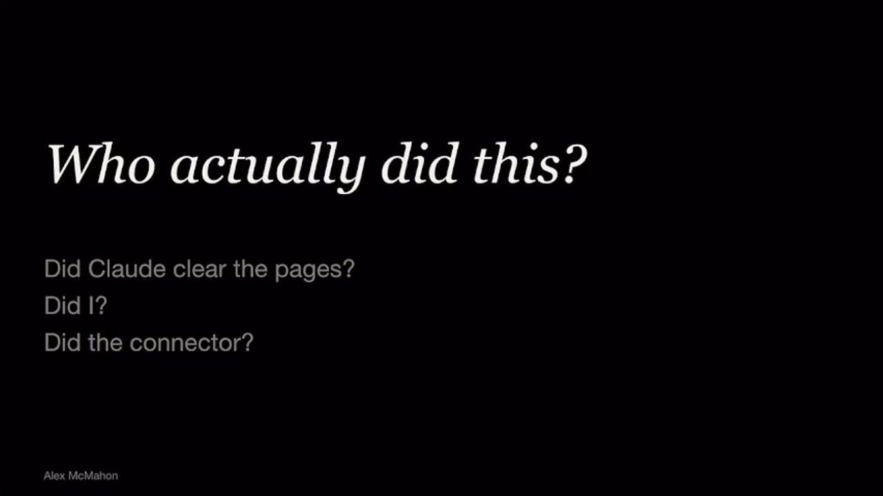
Who actually did this? Did Claude clear the pages? Did I? Was it the connector? My name was on the action. I'm the one who prompted Claude, but I had no preview and no idea of the destructive actions that were about to happen until after it had already happened. The AI did the work. I was the author.
And it's the gap between those two things that I'm going to talk about today. It's the question of who is the author of this action. It's the design question I think we should be focusing on. When an AI helps a broker summarize a client's financial goals from a meeting or extracts a salary from a payslip or recommends which lender will approve a borrower, it's the broker's name that still goes on the application.
The broker is legally accountable. And the question of authorship, who actually did the work, is the one I think we, myself included, could be designing for more deliberately. If you're building AI products in 2026, almost everyone in our industry has been asking the question about how do we make AI more accurate. But I wanna argue there's a more valuable question to ask.
When a user gives a task to an AI, does the interface help them understand the difference between what they think they approved and what they actually approved? And when something goes wrong, who carries the consequences? I'm gonna share three frameworks with you today. The first is for identifying where trust breaks down in AI products. The second is for designing checkpoints that match the risk.
And the third is for making sure the human signing off actually knows what they signed. And then I'll close on some testing practices that our team has developed to support all three of those. In high stakes industry, your job isn't to just design the AI's interface. It's to stress test the intelligence behind that AI product and really push it to its limits.
Designers are accountable for the moment the AI's output becomes the user's decision. We're accountable for whether the confidence score actually changes user behavior or whether it's just that it look reassuring without changing anything. We're accountable for whether the user can tell the difference between an AI suggestion and a verified fact. And we're accountable for whether destructive actions show their impact before they happen.
Engineering can build a model with 94% accuracy, and that number can be less important until design intentionally solves for that user that sees that 6% of use cases where it's wrong. And the way users handle that 6%, whether they catch it, they miss it, or they trust it anyway, comes down to one thing, how their trust is calibrated.
I'm gonna share how that breaks down in three different ways. It's over trust, under trust, and miscalibrated trust. Overtrust. You already heard my personal version of this at the start. Now I wanna show you the systemic version because the pattern is identical. It just operates at a very different scale. Earlier this year, Combank reported itself to police over a billion dollar, over a billion dollars in home loans where professionals such as brokers and accountants, are suspected of submitting fake documents, payslips, income statements, ID generated by AI. The AI had learnt what a real payslip looks like and it could produce convincing fakes.
It had the right logos. It had the right salary numbers in the right formatting. But by the time anyone noticed, the loans had been approved and the money was gone. So that's a billion dollars at Australia's largest bank. My ClickUp incident and CBA's billion dollar fraud, they're very, very different stakes but it's the same pattern. The AI's output did look complete.
And here's the point I'm personally coming back to. Confidence shouldn't be mistaken for correctness. AI can sound completely confident in its responses but it can also be very wrong. The design response to overtrust is to make the unverified clearly different from the verified and to make the destructive actions require explicit preview or confirmation.
A genuine interruption that shows what the user's about to happen and forces them to engage with it before it completes that request. There's a darker version of overtrust I wanna talk about. One of our AI products currently in testing is called MyPolicy. It helps brokers figure out which banks will approve which clients and under what conditions by a simple AI chat.
Imagine if MyPolicy starts suggesting fewer lender matches for clients from certain suburbs. The broker types in the client's details and the AI suggests one or two lenders instead of maybe five. Not because anyone designed it to do that but because the data it's learnt from already carries years of lending patterns that disadvantage certain suburbs. And this is the dangerous part.
The broker likely can't see why that list came back shorter. The client doesn't see it either. And if anyone reviewed the system later, an auditor, a compliance officer, a regulator, their record might just show a confident looking result. Once users bake AI into their workflow, they can learn to overtrust the output. It's the same reason that I trusted Claude with my team's pages. Nothing about it looked wrong.
It's not a hypothetical risk. It's a possible one. It can be a damaging version of overtrust because the the harm happens silently. If you're designing AI in financial services, health care, HR, government or any industry where there's a risk from the AI's output, you should assume your model will have biases the second it goes live. The design question isn't where the bias exists.
It's whether your interface gives anyone, the user, the affected person, an auditor, any chance of seeing it before it's too late. Undertrust is the opposite. It's where the users have access to AI that could help them but they don't use it even when it's accurate. The industry's answer is usually show your reasoning.
So Claude shows its extended thinking. Chattypiti shows its reasoning trace. Copilot surfaces citations. The reasoning is usually always available, but it hasn't solved for undertrust, here's why. Showing reasoning isn't the same as letting the user check the work. AI reasoning is usually high level.
Here's how I approached it. Here are the steps that I took. Here's what I considered. It rarely shows you the things that actually matter. The exact salary figure it extracted from the payslip, it's not going to show you that. The specific clause it pulled from a policy document. The dollar amount it read off a bank statement. An AI can show a perfectly logical chain of thought and still be wrong about every single step.
It can confidently tell you how it analyzed a bank statement without ever showing you a number it actually read. And the reasoning AI shows you today is really high level by design. It walks you through its approach, not its calculations. It tells you what it considered, not exactly what it extracted. Even if a broker read every word of that reasoning.
Brokers are busy, so they often won't read it. The things they actually need to verify aren't in there. The design response to under trust isn't visibility, it's verifiability, giving users a fast and easy way to check the work themselves. So back to the product that we've got in testing my policy.
We designed it so that every response includes a direct link to the original lender policy PDF along with the date of the latest policy. The broker can click through and verify the source in seconds. That's not here's how the AI reasoned. That's here's the source document. Read it for yourself. It's the difference between asking a broker to trust an AI's chain of thought and giving them the one click to confirm against the real source of truth.
And if a broker is challenged on this decision years later, I check the original source is something they can feel confident saying, but the AI's reasoning looked correct isn't. Getting a user to use your AI tool isn't about being accurate. It's about authorship. It's about giving them something they can put their name on. Users need a path to cosign the AI's answer and not just receive it.
Miscalibrated trust. This is the third pattern that can be the most serious because it's the hardest to detect. When we researched the workflow for my policy that it was designed to replace, we found a mess. Brokers are using multiple external tools, PDFs, and making phone calls to bank relationship managers, all to find a single answer to what is the right product for my client scenario.
One participant in interviews told us they spent weeks building their own policy spreadsheet out of frustration but admitted it still wasn't a reliable source of truth. There are over 60 lenders to choose from in my CRM, each with their own policies and the policies change constantly, multiple updates a week across all of the lenders. No spreadsheet can accurately keep up with that.
When we ran the usability testing for my policy, brokers shared really positive feedback. The AI tool we designed gave them exactly what they wanted. It was a single source of truth for all their policy questions. But in our early testing, some respondents told us their trust was conditional in a very specific way. They said they'd trust our AI search tool for simple queries, but for complex client scenarios, they'd still call the bank relationship manager.
And yet those are exactly the scenarios where my policy can add the most value, the complex one where there's no easy answer and where getting it wrong really does matter. Brokers had their trust backwards, trusting AI on the easy questions where they already knew the answer and not trusting on the hard questions where they actually needed the help.
The design challenge isn't whether the AI is trustworthy. It's whether the user can tell which parts of it are. Sometimes the AI doesn't fail because it gets something wrong. It fails because the interface gave no one a reason to look closer. This last case study comes from the legal profession. Last year, a senior Australian barrister used AI to help prepare arguments in a murder trial.
The AI gave him a list of past court cases to back up his arguments, cases with real sounding names, real sounding courts, realistic dates. He put them in front of the judge, and none of them existed. They the AI made them all up. Whatever AI told the barrister used, whatever warnings it might have shown, none of it was enough to make him pause.
The fake cases looked exactly like the real ones, and a murder trial was at at risk because of a design problem. That's three failure stories that I've just shared. A head of design wiping her team's work, a bank approving a million $1,000,000,000 in fraud, a senior barrister handing a judge fake AI generated cases in a murder trial.
At the same root cause, the output looked exactly like the real thing and an interface that gave none of us a reason to look closer. The AI tools themselves in these stories didn't break the law. The Australian government has now set AI safety standards. They call for human oversight and transparency, but they don't tell you whether a confidence score should be a number or a flag or whether a destructive action needs a confirmation step.
The standards say what should happen. They don't say who needs what it needs to look like. That's our job as designers. So how do you design an interface that gives the user a real chance to know what's happening before they sign off on it? This is a checkpoint spectrum that that I've developed. And this is the second framework that I'm gonna share, which is designing checkpoints that match the risk.
The standard industry industry response to AI risk is to add approval steps. That might be a checkbox before submission, a review screen before send, evidence that a human reviewed what the AI had AI had produced. But checkboxes can become visible over time. They become muscle memory. The user clicks through without truly acknowledging it.
That doesn't mean checkboxes are bad design. It means the same checkpoint that works once a month becomes muscle memory once a day. The checkpoint type has to match two things, how risky the action is and how often the user does it. So I wanna share my thinking on a spectrum of those checkpoint types matched to those levels of risk.
And no, I'd never thought that I would be speaking about check boxes, at a conference on AI. So awareness checkpoints. They're for the low stake moments that the users encounter constantly. The goal isn't to stop the user. It's to make sure they know, even subconsciously, that AI is involved. It could be a small AI tag next to a field, a different background color for any text that AI wrote.
The user can ignore it and move on, but the UI indication is there so when they need to look closer, it's been identified. Review checkpoints. They're for meaningful work when the AI has done something that user needs to engage with before accepting it. For example, reviewing an AI generated lender recommendation before it's sent to a client, the design pattern could be to show the AI's output next to the source it came from, the recommendation available on one side, the actual lender policy on the other.
The user can easily read both, verify it and then send it. The friction is the work. The user is doing the verification by reading and not by clicking through a pop up. And the last one, hard stop checkpoints. These are for irreversible actions, submitting a home loan application, locking in a home loan rate. They can't be skipped, and the design has to make the user understand the weight of that action.
A confirmation modal, a type confirmation, or yes, a checkbox, the user has to actively tick. The point is that the user has to do something deliberate before the action goes through. The mistake isn't using checkboxes. The mistake is using the same checkpoint design regardless of how often the user encounters it and no matter the level of risk.
And I'll walk you through one of these. An awareness checkpoint we built for MyNoteWriter, the AI tool that drafts notes for the broker on a home loan application. When we were building my note rider, compliance came to us wanting a checkbox every time the AI generated a note. They wanted to make sure every AI response had documented review.
They wanted evidence of the human review, But I pushed back on it. A mandatory checkbox that pops up on every note becomes invisible by the fifth one. The broker probably isn't reading it over time. They're clearing it to get to the next thing, and note writing is a very common task. What we built instead, every time the AI generates a note in the side panel, we put the compliance disclosure right next to the copy button, the button that the broker has to press to do anything useful with the note.
You can't reach the copy without seeing the disclosure. It's not a pop up, and it doesn't interrupt. It's just always visible text positioned exactly where the broker's attention is the highest. So that's the awareness checkpoint, placed at the moment of the most meaning for the user in their task. Now this is the third framework that I'm gonna share, it's one that asks whether the human at the end of the chain actually understands what they signed off on.
The approach applies to every AI product regardless of domain. Your interface needs to make sure your user, the broker, the lawyer, the doctor, whoever is putting their name on this can answer these three questions at any moment. What did the AI do? What did I approve? And what can I still change? The design response is built directly into those three questions.
Show the AI's work distinctively from the users so they know what to look at. Show them what they're about to sign off on before they do it. And keep the AI's work editable, treat it as a draft, not a final answer, until the user has confidently acted on it. Every AI product we've built at LMG has that same shape.
The AI does the work and then the human puts their name on it. So my notetrader drafts a client note from a meeting, and if that AI note misrepresents the client's objectives even slightly and the broker pastes into the application, the broker is the one who signed it off. The AI helped write it. The broker is responsible for it.
Our other AI tool, my documents. It reads payslips and bank statements so brokers don't have to manually reenter the numbers into an application. If the AI misreads a salary and the broker submits the application using the data, the lender will see a wrong number. The consequences range from a declined home loan application to damaging the client's ability to borrow in the future, and the broker's name is on this too. My policy, it tells a broker which lender will likely approve particular client.
If the AI gives outdated or, as I talked about earlier, biased and incorrect information and the broker uses it to set client expectations and then submits it to a lender who won't approve, every rejected application leaves that mark on a client's record. The mark doesn't go on AI's record. It goes on the client's, and the broker has to explain that.
With these three products, it's the same pattern. The AI does the work, and the human puts their name on it. A job as as designers is to make sure the AI has earned that trust before it acts on it and to make sure the person signing off actually knows what they're signing. Before I close, I'm gonna speak very briefly about how to test, least how we test.
The general intent with product development is to ship fast and learn in production. In high stakes industries like ours, we can't do this so easily. The people who should find the AI's failures are not your users, they're you. So before any broker sees one of our AI products, it's been pressure tested at least six times. Engineers test the model itself against a golden suite of questions, and it's a set of validated answers that they expect AI to get right. Then we run internal tests to stress test it.
That's the compliance team. That's the sales team. It's our own staff, the people whose job it is to be skeptical of it. Then we conduct usability testing on the prototype. And this is probably the second or third time we run this type of test. We start to observe their behavior, understand their perceived intentions, and listen to where their trust concerns are.
Then we move to alpha testing, and this is with a small group of brokers usually in a QA environment. We move on to pilot, and that's a much wider group of people with real client data. And this product is usually ready for release. So only then, after all of these tests, does it reach production. And even there, we keep monitoring and iterating because the testing doesn't stop when the product ships.
And in high stakes industries, the cost of learning in production isn't a bug report at someone's home loan. When I wiped my team's ClickUp pages, I could have blamed Claude. I could have blamed the connector, but the connector was just an agent doing what I'd authorized it. I'd said yes to one vague question and everything flowed from that single yes. Truth is I trusted an interface that was designed to look confident and do the job.
I asked it to do it. It's not designed to show me the cost of my actions upfront. That's a design failure. In high stakes industries, the difference between a clean outcome and a catastrophic one lives in the interface in whether the unverified AI response actually looks unverified to the user, in whether the destructive action shows what's about to be destroyed, in whether the human signing their name knows what they signed.
With AI products, there's no clean line between the AI's logic and the user's experience. The model's outputs are the experience. Its failures should be our failures, and its blind spots are our responsibility. And someone at the end of every chain is putting their name on what the AI just did. Our job is to make sure users know what they're signing.
Thank you. When
you had that last slide up around testing, I, from where I was sitting, I couldn't see this part of it. So I could only see this part of it, and I was reading it in my head as live with users. And I thought,
that is real dedication to your craft.
That is fantastic.
Really getting hands on. And then I thought,
oh, no. Anyway, that's a meeting. Sorry. Questions for Alex, and thank you. That was awesome. Yeah. Yes. Here.
Hi, Alex. Asma. Just have a quick question and I really liked your idea of having the reference URLs where people can, user can actually go and read the policy. I've failed the policies that are often quite complex to understand as a user and even if the user is given the access to a policy document, there's a lot of room for misinterpretation for a human being as well.
How do you solve and improve the experience of the user to kind of simplify the policy so it's understandable?
Yeah. Good question. I was trying to skip through to find a picture of policy just to reference what you're talking about. It's a it's a really good question. You're clearly in this industry, but we, acquired a company called The Brokers Bible, and their that platform specifically was about interpreting policies and turning it into more consumable information.
So the people from The Brokers Bible actually works with LMG now. And so to your point, they are like, it is a mammoth problem that there are so many different policies. They constantly change. They're hundreds 50 pages long, and they're not easy to access if you're not a broker.
And so that's why we've partnered up with the Brokers Bible because that's literally their job is to do, you know, make policy more understandable, and it's manually done as well. So this AI project, as much as it looked so simple in AI chat, like everyone's talking about, oh, that's such the basic thing to do. But that is it's the data behind that that model that is what, you know, makes it, usable and consumable and verifiable is that there's someone that is a broker that does her day to day job is to to to turn the policies into consumable data.
FYI, I'm a design researcher who's built a home recently and got the loan approved. Hence, I know all this.
Ah, right. Close.
The only time I've ever made a lawyer laugh was asking them if they could do a summary version of a product disclosure statement.
And they could do it? Did they pass?
Yeah. Literally laughed at me. No. That was that was the end of that discussion. Anyone else have a question for Alex before we let her go? Yes. Amanda?
Hi. I really appreciated your conversation about calibrated trust. It's something that I'm thinking about a lot as well. And it makes me think about friction full design because so often we see design trying to be more seamless, trying to be more frictionless. But I'm just curious, what have you heard from your users with introducing this friction on purpose?
How does it affect their user experience in terms of their satisfaction? I know it's a little bit different because it sounds like it's compliance related already but I'm just curious what people are saying.
We have reduced as much friction as possible but at the same time I think someone else already spoke about this in one of their talks earlier and it really resonated is that we shouldn't be adverse to to friction, think, especially when it comes to AI and and such high stakes consequences of actions. So part of me is like, you know, that's why I had the the checkpoint spectrum, is that for higher stakes jobs and tasks and output, you really do need to have that friction of like, wait a minute. Here's an old school pop up.
Like, this is about to happen. Are you sure? In some of the testing that we've had, brokers genuinely wanted that. But most of the testing is more around them saying, oh, I wanna do that. Oh, no. No. I I would be the one that pre fills the information. I need to so we're trying to build in these extra steps where they can verify it first.
Even though we can automate their process for them entirely, they're not ready for it or they might need to use the tool a bit more to build that trust. But it's more like, don't have pop ups. It's let me check and verify this first before you go and do that thing. So this is a I just feel like it's a completely different field of like showing, you know, as I mentioned before, like showing the real source of truth against what the AI has just said even though it's something so simple like generating a note, 200 characters. So I don't think they're afraid of this friction but we just have to be careful where we put that friction.
If it's a meaningless task, I'd avoid doing pop ups.
Technologies & Tools
- ChatGPT
- Claude
- ClickUp
- Copilot
- Jira
- Notion
Standards & Specs
- AI Safety Standards
Concepts & Methods
- Alpha Testing
- Awareness Checkpoints
- Checkpoint Spectrum
- Friction-Full Design
- Golden Suite Testing
- Hard Stop Checkpoints
- Miscalibrated Trust
- Overtrust
- Pilot Testing
- Review Checkpoints
- Undertrust
- Usability Testing
Organisations & Products
- Commonwealth Bank
- Loan Market Group
- My Documents
- MyNoteWriter
- MyPolicy
- The Brokers Bible