Real-World Vibe Prototyping at Google Maps
The Death of Vibe Coding

Speaker G (Sam) opens by mocking AI hype narratives claiming design is dead and natural language prompting replaces UX. He argues that while vibe coding felt magical initially, it breaks down at scale when applied to Google Maps' 2 billion nondeterministic users, setting up his central thesis that vibe coding is already dead.

From Static Assets to Product Builders

Sam explains that writing code and UI layout has become commoditized, eliminating the value of static artifacts like Figma files and decks. Citing Feynman's philosophy of building to understand, he argues UXers must shift from creating artifacts to becoming product builders, strategists, and creative directors, describing how his team began prototyping AI for their own workflows rather than just for products.

The Whirlpool of AI Process Confusion

Sam introduces his framework for the three stages his 250-person UX team experienced adopting AI: first, overcoming the initial hump of learning to prompt; second, integrating AI into personal workflows; and third, the messiest stage of making AI processes repeatable across a team or organization.

Rethinking the Double Diamond

Sam critiques traditional design processes like the double diamond, arguing that forced workflows like Crazy Eights sprints rarely produced true innovation. He explains that AI dramatically accelerates the divergence phase of ideation, generating dozens of variations instantly, while human judgment remains essential for the convergence phase.

Curation as the New Core Skill

Sam describes how the balance of designer labor has flipped from 80% manual execution and 20% strategy to 80% strategy/planning with agents and 20% execution. He frames this shift as an opportunity rather than a crisis, arguing UX must claim ownership of the 'architectural layer' of products or risk having it defined by engineers and product managers.

Building Tools, Not Prototypes: Data Sketches

Sam advises against building throwaway prototypes and instead advocates creating 'data sketches'—parametric tools with sliders and dials that expose data boundaries and help teams explore the solution space. He notes this exploratory prototyping skill has also become commoditized, but remains a vital step for aligning capabilities with user needs.

Human-in-the-Loop Planning and Prompting

Sam details his iterative planning methodology: rather than asking AI to generate code directly, he has it first draft a plan in plain English, refines that plan through multiple iterations, and only then has the AI generate its own prompts. He explains this process aims to close the 'intent to output gap' and now consumes roughly 80% of his working time.

Multi-Agent Orchestration in Practice

Sam explains his team's multi-agent orchestration pattern at Google Maps, where a 'boss orchestrator' agent spawns specialized sub-agents (UXD, UXR, strategist, tech lead) with defined skills and personas to conduct tasks like competitive analysis. He describes running the system three times to avoid thin or regressive data, then synthesizing findings back into the human team's parallel workflow.

Agentic Simulation for User Journey Testing

Sam walks through a real-world example: testing complex user journeys like navigating a Tokyo transit station, traditionally requiring costly vendor-run studies. His team built an agentic simulation system that places personas directly into iOS/Android simulators worldwide, freeing vendor budget and letting researchers and PMs focus on higher-value empathy work rather than automating away real humans.

Guarding Against AI-Driven Enshittification

Sam warns that easy prototyping creates dangerous pressure to ship without validating whether something should be built, risking 'product enshittification' as production costs approach zero. He argues UX's enduring superpower is user-centricity, and defending the architectural layer with rigorous, human-grounded data is essential to prevent AI-generated noise.

Practical Advice: Piggybacking and Becoming a Vibe Champion

Sam recaps the three-stage whirlpool framework and offers concrete next steps: quietly pilot AI on a low-risk, boring task rather than waiting for executive mandates, and become a 'vibe champion' advocating for AI adoption on your team. He closes by reframing the narrative—vibe coding didn't kill design, it liberated it, ushering in an era of systemic design orchestration and curation.

Q&A: Synthetic Data and Real-Time Traffic Modeling

In the first audience question, an attendee asks whether Google Maps uses synthetic data or digital twins to model user journeys like Monday morning commutes. Sam clarifies that real-time data informs traffic rerouting, and synthetic user data is treated as one useful signal for predictable outcomes rather than a replacement for real user empathy work.

Q&A: Is Figma Dead?

An audience member raises the debated question of whether design tools like Figma remain central to UX work as AI enables jumping straight to built prototypes. Sam compares this to past tool transitions (Flash, iOS, web development) and argues UX has never been synonymous with Figma, urging designers to own the architectural layer rather than tie their value to specific software; the moderator adds a parallel anecdote about wireframe specialists needing to reskill.

Q&A: Maturity of Multi-Agent Systems and Organizational Change

Responding to a question about how mature Google's multi-agent orchestration is, Sam explains it's still experimental and more of a cultural challenge than a technical one, describing Google's 'thousand flowers bloom' approach of top-down mandates paired with bottom-up experimentation across small teams. He emphasizes urgency for designers to adapt before AI-native junior hires enter the workforce.

Q&A: Tooling for Change Management and Spatial Mental Models

Sam addresses a question about tools for managing AI-driven organizational change, noting he relies on Google's internal tools like Antigravity but that true change management is more cultural than technical. The final question explores how Google Maps designs for different spatial and cultural mental models (e.g., north-up vs. rotating maps, visual vs. text-based navigation), which Sam ties back to the broader AI interface debate between text boxes and visual interaction before the session closes with thanks.

Thank you. Please join me. Happy to be here. Thanks, everyone. Behold my low resolution animated GIF. So if you've opened design social media anytime in the last twelve months, you would have been inundated with AI thought pieces. So they're generally of the same kind of theme, like frighteningly simplistic, the new natural language is the new design tool, UX is dead, you just prompt, vibe a bit, and a flawless interface pops out the other side.

For the last year, we've been absolutely intoxicated with vibe coding and AI velocity. I've seen product managers skipping the design process totally, prompting, building prototypes, front end code with natural language, And for a moment there, we thought our jobs were gone. But the good news is I'm here to tell you, vibe coding is already dead. The thing we're finding in the background at Google Maps is that generating scrap UI from thin air is a prompt is is sorry, is is a pilot trick.

It's magical the first time you see it, but as soon as you try to scale it to real nondeterministic users, and we have 2,000,000,000 of those, but you can either with smaller subsets, it starts to fall apart. Just to be clear, the act of writing lines of code and basic UI layout has been completely commoditized.

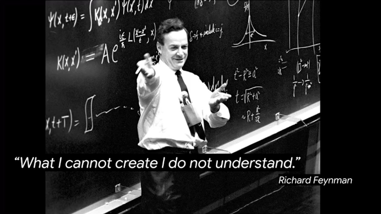
So the currency of UXs now is no longer the static asset. The Figma link, the deck of insights, the prototype, it has no value. So I recently read this great book by the legendary physicist Robert Richard Feynman, and he famously said, what I cannot build what I cannot create, I do not understand.

And so his genius was around active creation over passive consumption. So he believed that if you wanna really understand a system, you have to build it from the ground up. As UXers, our roles are shifting. So we're moving away from being creators of static artifacts to being product builders, to being strategists and creative directors.

The hardest part that I've seen as we've been going through this AI transformation in Google Maps is literally the first step, like how do you get over the hump. So in late twenty twenty four, when Andre Kapathi coined the term vibe coding, my team dived into it.

We'd already been working with AI pretty heavily within our products and, like, prototyping and designing AI for our products. But recently, we've moved away, and we're now prototyping AI for our workflows, for our daily operations. And when we started doing this, the thing I started to see as soon as the broader UX team, we have about 250 UXs on the team, we fell into what I call the whirlpool of AI process confusion.

So there are three steps to the whirlpool of confusion, and the first step is literally the hardest, just getting over the hump. So we're being inundated with AI noise. It relates to AI paralysis, but you just need to get over that hump. You need to start prompting, understanding how prompting works and prompt engineering, and then building a prototype.

Then once you're over that step, then you move into the second phase, which is how do I integrate AI into my personal workflow? So how do I use it on a day to day basis? And when you mastered that, then it's like, how do I make it repeatable for my team, for a larger work stream, for an organization? And that's the really messy bit.

So that's the three steps of the whirlpool of AI confusion. I don't know what happens next. There might be a fourth step. It could be a 12 step program. I don't know. I talked to my therapist about that one. So processes are evolving. We're hearing a lot from our industry about we gotta throw everything out the window. For years, we've been worshiping the like, processes like the double diamond. You know, people are saying it's dead.

People are saying it's not dead. People are saying we're all gonna die. The truth is, from my perspective, we used to spend weeks in sprints playing Crazy Eights, like debating whether a sheet should have rounded corners or square corners, and at the end of the sprint, we ended up with pretty much the same thing we started with or a direct copy of our competitor.

So we know that innovation doesn't happen in these kind of forced workflows. Like, it happens at the intersection with sparks. So we've gotta be kind of agile enough to be able to move with different processes to be able to get over that first hump. So in the double diamond, we have divergence and then we have convergence. AI blows apart the divergence part immediate immediately.

It compresses the timeline. So you want 50 variations of a UI layout, round corners, square corners, you got it, ten seconds, and it's done. So AI accelerates divergence but human judgment still rules the convergence stage. And that's where we're always gonna need a human in the loop, in the convergence stage.

And it means that human the human act of curation is the only thing now in the process that carries the true value. And this shifts our daily metric of labor entirely. So I used to spend 80% of my time writing front end code and designing and about 20% of my time does push sorry, in strategy and planning about the thing, like how am I gonna do it. That's totally flipped now.

I've seen this personally. I've seen it on my team, and I've seen it across the industry. We're spending 80% of our time in strategy and planning with agents and about 20% with manual execution, so pushing pixels and writing code. For me, that's not a crisis. That's an opportunity. Right? That's an upgrade. The actual manual labor of building the tactical assets, being a tactical asset monkey, has totally been removed.

And that's what we've always wanted. Like, we wanted a seat at the table. So we're becoming true product builders, strategists, creative directors, but the challenge is if we want to do that, we have to own the architectural layer. And I mean that, like, in our day to day work, but also as an industry, we need to define that that's where UX sits. We own the architectural layout because if we don't do it, someone else is gonna do it.

Software engineers are gonna do it, product managers are gonna do it, and they're gonna define it for us. Oh, I had a slide on the printing press here. I might skip this one. It's just like an analogy. You guys are smart. You get it. So I'll just get into the nuts and bolts of how we're doing this in Google Maps.

So how do we become the product builders? My advice is don't build prototypes, build tools that help product teams understand the problem. On my team, we call these data sketches, and you can see a few of them here. And so this is when we start to move this to the second phase of AI confusion where you're moving it into a workflow.

But absolutely, don't just build prototypes. Your goal is to kind of explore the landscape. Let me just oh, look. I can come over here and press play. Thank you, YouTube. Let's explore the landscape. Expose the data. Build parametric sliders and knobs and dials to let people understand the boundaries of what's possible.

So you wanna expose the data, like all of the things, the LEGO pieces that are available, and then you wanna assign it to a user need. You wanna apply that and align it to a user need. And that's the real function of prototyping. It's not building a fake version of the product. It's understanding the constraints and the capabilities and all the cool shit we have to play with and then blending that with a user need.

But I regret to inform you that all of this has been totally commoditized. So anyone can now do this. Right? This used to be my bread and butter, so it makes me feel a bit sad. Build anyone can build a parametric slider and build data, but it's still a really important step in kind of the overall prototyping process.

Like, you still need to do it. So don't just build prototypes, build tools that help your team understand and explore the space that you're working within. And so the next part of the second step of the the whirlpool of confusion, and it's getting complex, it's called planning and orchestration.

So we have the ability to create an end to end product. If we want, we can do that. We can vibe code it. But how do you get there? Don't build a prototype. What you need to do is plan it out, and it's really important to have a strict human in the loop planning methodology.

So whenever I have a complex problem to solve, I don't just get AI to write the code for me. I'll ask the AI to create a plan of how to approach the problem. And so first, I'll work with it to create a plan. I'll give it use case. I'll give it a problem statement. I'll get it to create some flows.

I'll give it a bunch of context, so PRDs, give it briefs, I'll give it, like, foundational research, inspiration, design principles, and then I'll get it to clearly state the plan in plain English. And then I'll also get it to state how it's going to incrementally go through and solve that plan, how it's gonna execute on it. And then I'll get it to create the plan.

I'll review the plan, and usually it's a bit thin. So I'll kind of dig into it and say, okay, cool. We were trying to go deeper here, and so I'll go back to the kind of the plan of the planning stage. And sometimes I have like a plan of a plan of a plan, and I'll get it to go deeper where I need it, and I'll be iterating like this.

And this is how I spend most of my time now, on the planning stage. And then when we have a solid plan, I'll get it to output a prompt to create that plan. So I never create a prompt myself anymore, even for like, you know, menial tasks. I'll always get the AI to create the prompt for me. It's much better at writing prompts.

And then I'll execute the prompt and I'll look at the output, and usually it's not right. So I'll go back to the plan and we'll iterate on the plan until the output is looking good. And so this is the human in the loop process. And so what we're trying to do here is we're trying to close the intent to output gap.

So we're trying to, like, what my intention of what I want the system to do versus what its actual output is. We try and get those two things as close together as possible, and that's the tricky part. So I'm spending most 80% of my time doing this. And so once you master the planning loop, then you can move on to a really interesting stage, and we're still in kind of the second phase of the confusion, and this is the multi agent orchestration phase. So it's like having a powerhouse design studio at your fingertips twenty four seven.

And that's what we're building at Google Maps. And I say building because it's never like a process that's done. It's just a a system in flux. Right? It's like a big machine. We need to keep tinkering with it, taking pieces out, putting pieces in. It's different for every person. It's different for every team, every, like, work stream that we're working on.

And we use this pattern called multi agent orchestration. So we have a primary orchestrator, we can call them the boss orchestrator, and they spawn spawn a team of sub agents. And the sub agents will do something, say, like run a competitor competitive analysis, some kind of competitor audit. So then the orchestrator agent is kind of the head design audit agent and we give them skills that we've written.

We give them a persona, and then they will spawn a team of highly specialized sub agents who go around and do the task. And we've written skills for each of them. They have rules and tools. And so we might have a UXD, we might have a tech lead, we might have a UXR, we might have a strategist.

And then the boss orchestrator sends those sub agents off, say, if we're doing a competitor analysis or some kind of research, some kind of early stage discovery stuff, and they will kind of go search whatever they have access to, like blog posts, websites, you know, design reviews, the actual product itself.

And then the sub agents come back to the Orchestrator agent, and they give it their findings, their analysis. And this is the really cool part. So then we get the orchestrator agent to run a critique on each of the sub agents and give them feedback based on criteria that we've given the orchestrator agent. And then we run this system three times, and that's the magic number. So this is a trick that one of, like, a very very good AI software engineer at Google told me.

If you run it one time, the data gets very it's kind of thin, but if you run it more than three times, it starts to regress towards the mean. So we run it three times and we get pretty good data. And then we're doing this in parallel with like a standard traditional UX cycle, whether it's a sprint or a research study or whatever it is, like, your task is.

So we'll give the the Orchestrator agent will take the findings from the sub agents, we'll synthesize it, and we'll give that back to the team. And so the team's doing this in parallel as well, but we've been able to do this really quickly. And then they'll fold the findings from the agentic system back into their work, and then we'll take their output and put it back into the system, and we've got this team in the loop.

And we've found that we're able to explore much further breadth much more quickly than we otherwise would have. So I'm just gonna show you what this looks like in the real world. So this is when we start to get into stage three of the AI confusion, when we start to integrate AI into an actual work stream, like an actual organization.

So on the Google Maps team, we run a lot of, like, extensive quantitative research, testing, validating end to end user journeys. We have 2,000,000,000 daily actives. We have 4,000,000,000 users in total, and they're incredibly complex real world scenarios. So I'm gonna read one because it's long and I can't remember it. So can a user successfully navigate an unfamiliar multilevel transit station in Tokyo during peak hour?

And then we can add more to the tail. So and then they need to go to the toilet, and then they need to grab lunch, and then they need to friends ad nauseam. Right? And so we'd usually do this. We do this with thousands of users, all different personality types from all around the world. And traditionally I don't really have any more slides to show you for this story. I'm just gonna talk it.

So we this would be a massive logistical nightmare. So we'd have to hire an external vendor agency. They'd have to coordinate participants. We'd have to run hundreds of permutations of this, And then the vendor agency spends months build create synthesizing the data. They create a deck, throw it over the fence, and then no one actually reads it because we've lost interest by that point.

So instead, my team built an agentic simulation system. We're building because it's still in progress, and it does most of this. So we have specific user personas. We're able to place them directly in a simulator, so whether that's the iOS simulator, the Android simulator on the web, and we can run these automatically anywhere in the world, like Mumbai, Jakarta, Tokyo, Sao Paulo.

And the result is we're able to run hundreds of these journeys in a really short period of time. It's allowed us to free up a massive amount of vendor budget, and it's also allowed the researchers to target, like, higher value user empathy work, and it's also allowed PMs to instantaneous almost instantaneously get feedback on where the bottlenecks are and like the pain points in the app for the long tail of users, of the 2,000,000,000 users that we don't usually contend with.

So I just wanna be really clear here. We didn't automate away real humans. We've automated away the menial repetitive task of finding predictable bottlenecks in kind of huge amount of use cases. So all of us have this system ready for us right now. The tools are ready.

The only question is how are you gonna orchestrate for your needs? But I just wanna be clear, this isn't paradise. There's a lot of danger here. When there's anyone can build a prototype, there's an immediate push for velocity. So the need to ship skyrockets, and that's a trap.

Prototypes aren't product requirement docs. Just because you can build something doesn't mean it's the right thing to build. AI velocity can turn into an engine for product and shitification. As the cost of production moves to zero, the volume of digital noise skyrockets to infinity.

And as UXs, our superpower was never the manual labor of creating the asset. Right? Our superpower was the relentless focus on user centricity. And that superpower is more important than ever now. So it's our job to own the architectural layer and defend it against product and shitification.

So the way we're doing that at Google Maps is through rigorous, centered, grounded user data. So it's grounded in factuality and real people. So we need to have a human in the loop at every step of the AI process. And if we don't do this, someone else is gonna write the prompts for us. And I promise you, they won't be thinking about the user.

Alright. I'll start to wrap this up. So there's three stages to the whirlpool of AI process confusion. The first is just you just need to write a prompt in a prototype. You just need to get over the hump. If you're not there already, just do it. It's not hard once you start doing it. And the second is integrating it into your personal workflow.

So it's not just building some random experiment. It's like, how do I actually use this in my design process? And then the third, which is the messiest part, is how do we make a repeatable process so we can scale it for a larger organization or even a team or your partners or a work stream. Oh, wow. I had separate slides for each of these.

I'm sorry. So that's them. So I imagine I I this is what I've observed. I'm not sure what happens after, but this is kind of the layout. Right? You're either starting with AI, you're using AI, or you're trying to integrate it. It's a business transformation thing.

Alright. So how do you actually take this and go to work on Monday morning without having a mental breakdown? I have two things that I suggest and maybe a third which is see a therapist, which I've been doing and it's been good. But the first is piggyback on a low low risk work stream.

So don't wait for an exec to tell you what to do to mandate it. Choose a boring medial task that's been on your plate for

a

while, and run a parallel agentic work stream or even just an AI work stream and see where the AI can you can insert it. And just kick the tires, see what works, what doesn't work. And then the second thing is become a vibe champion, become an advocate. Be the one person on your team who gets over the hump and does the thing and stands up for the users.

So over the last twelve months, the narrative has been terrifying. People have been shouting from the rooftops that design is dead, UX is dead. We all thought our careers were over, but it's not true. It's simply evolving. UX didn't kill design. Sorry. Vibe coding didn't kill design.

I'm dyslexic. I actually am. It liberated it. So the parlor trick of vibe coding is at an end, and the era of systemic design orchestration and curation is here. So stop making manual assets and start directing the and curating the the the behavior of these systems.

Cool. Well, thank you. That's me.

Thank you, Sam. We have, time for some questions for Sam. We have a question here and then a question here. So we'll start here.

I'm not an expert. Alright.

Let's go.

I'll try. I might have more questions for you.

Sam, thank you very much for

the presentation. I had a question because you work specifically in Google Maps and there's, so for example, a peak in, on a Monday morning in Melbourne will be quite similar for a lot many users who will be coming into CBD for work. Yeah. From a data perspective, do you create synthetic data or digital twins to curate user journeys?

Sorry. Could you just go back a step? Are we talking about live data or are you talking about data in kind of a UX and research capacity?

Both perspectives.

So we analyze real time data, and there are kind of issues that happen with problems at scale. So if there are roadblocks or traffic, then we will detour people, and then that will create more issues with, you know, scale, and so there'll be a roadblock over there. Is that and then you're but you're asking, do we actually test that?

No. I wanted to understand. So you know how there's a lot of use of synthetic data to kind of predict behaviors

Yeah.

Model behaviors.

Yeah.

I wanted to know if this is something being done in the design of

the procedure. It is in a way, but we're treating it as one signal. We're not taking synthetic users seriously. We're using it as a signal to kind of understand predictable outcomes for 2,000,000,000 users so then we can focus the team on the actual the real work of empathy. Yeah. Yeah.

Hi. How's it going? So I wanted to ask I feel like it's a really big fundamental question a lot of people are asking themselves at the moment is, are we over Figma? Are we moving away? I know it's if there's anyone in Figma here at the moment, I'm sorry.

There you

There's this big question. There's this big question I think we're all asking is do we go from conceptual straight into these built prototypes or are we asking a really big question of are we keeping Figma at the core of our design and the core of our processes? And I think it's a really fundamental question we're all asking ourselves right now.

Yeah. I don't know the answer, but we're in the churn.

Tell me.

Yeah. No. I I don't know, but

I mean, I used to be a Flash developer, and I was an iOS developer, and, you know, before that, I was a web developer. So we've kind of seen these changes previously. I think the tools are changing, but the kind of the foundational, the fundamentals haven't changed. I So don't know. I think there's a place for everything.

Like, I still use Photoshop, but I don't know if UX is Figma. Right? I don't think those two things equal each other, and I don't think they ever have, but there's been a kind of a misunderstanding from cross functional teams that that's where we sit, and that's why my point is that we need to start owning the architectural layer as an industry because product managers there's a street fight going on right now.

I don't know if you guys are seeing it, but like everyone is trying to work out who that triad is, what are those smaller jobs, like there's things are gonna change over the next twelve to eighteen months and you need to be on the ground. If your skill set is Figma, then I'm not sure I've never really used Figma that much, so I I don't know.

Like, it's it's just it's gonna be challenging if that's what you're left with as opposed to being the builder. Yeah.

I remember standing in the audience listening to a talk at the IA conference in, god, Memphis in 2009, and one of the talks was talking about the the the role of wireframe person.

Right? And that if your job was to make wireframes Right. Then essentially, needed to reskill because creating wireframes as a role Yeah. Was going to change and was potentially gonna disappear and was potentially going to you know, like, you'd you'd be out of work, basically. And it was put in the same category as being a person in the architectural industry when CAD came along.

Tools continually evolve and change and the way in which we use tools continue to evolve and change. I think to your point, Sam, if your value is your ability to drive a piece of software, then that is always precarious.

But it's an interesting point because the goal of a wireframe was always just a simplistic way of conveying the functionality. It's a huge tool. Yeah. So now it's easier to do in other ways, and then we've kind of gone almost to the opposite end of the spectrum where it's now you can just create the finished product, and so we're kind of there is a space in the middle that we need to be owning and we need to be thinking about where Indeed. We're solving the problem.

Hillary. Thanks.

Thanks, Sam. That was really fascinating. So the multi agent orchestration piece that you're doing

Yeah.

Is really cool. How mature are you in that space at the moment? Are you still experimenting? You're rolling it out in earnest? I just wanna get a sense of how

Yeah. For sure. So I'm leading digital AI transformation for GeoUX, and so we've got multiple teams using a system like that with a team in the loop, but it's hard. And I think it's more of a cultural issue than anything else. It's like people kind of reticent to move on to new ways of working, particularly in kind of a team dynamic.

So we have lots of individuals who are kind of working, integrating it into their workflow, but then once we all start working together, even if it's like a group of three or a group of 10, we're it's a new space. So I think we're now our VP of design, I think he described it really well. He said this is a multi year journey.

It's not a destination, and so we need to kind of pave the way along that journey, and I don't know if it's right or wrong. We're just kind of making mistakes and learning things right now. Yeah.

Just on that point, Sam, culturally, how patient is the leadership at Google for you to try and learn and find your way?

They're very patient. Yeah. Yeah. It's really they've given us a lot of space. I mean, it's the only way forward. I think that they're the particularly UX leadership are very empathetic, and so they understand that, you know, they've been around the block. This is like a new phase, and you can't just rip things out of the roof.

So there's either it's kind of it's biz organizational change management, right? And so there's two ways you can do it. You can do it top down or you can do it bottom up. And so we've chosen approach which is top down has given us some guidance and then they wanna see how we organically work from the bottom up and so because we have it's 250 person org, we have smaller teams and everyone works differently.

And so if you're mandating a top down system for working, that's never gonna happen. Right? So yeah. So we're kind of working away as we go and I think that's the way it's always been at Google. It's like let a thousand flowers bloom, everyone we have smaller pods and everyone works differently, but you have to do it.

That's the mandate. Right? You have to do it and we've carved out space, so managers like myself will we've deprioritized certain tasks, certain work that is kind of lower value and then make space for this this work for for learning and educating, but I think the challenge is now's the time to learn it. Right? Now's the time to get on board because if you don't do it really soon, it's gonna accelerate and you need to get to step two pretty soon and then step three is gonna happen when all of the juniors are gonna come through, all the new grads, and they're just gonna be AI natives, right, and so

Excellent. Down the front here, one last question. Think maybe we'll get to yours, but down the front here, please.

With that

level three where the AI Level three autonomy. Yeah. Yeah. There any tools yet that are really good for that? There probably are, but we're forced to use Google tools. So we I like antigravities. So Yeah. And I use antigravity almost every day or every day.

Yeah. But it's not built for change management. And that's I mean, there's lots of business tools. Right? So this is kind of like a an executive level thing of, like, how do we do this? And it's also kind of, like I said, a cultural thing. It's also about, like, bringing people together. It's a management thing. So there are tools, but I don't know if they're software tools.

Thanks. Alright. We do have

time. Alright. Thanks. I've got a clock.

I just got a question about well, not a question, more observation about mental models. And some of us are like spatial thinkers and some of us are more like gifted with words. And given your work with maps, I was just wondering how your approach is different because you're dealing with spatial information wayfinding?

Yeah. That's the big question. Right? That is, like, literally the $20,000,000,000 question. We can talk about this afterwards. I'd love to talk about it, but it's it's a huge space, and I'm not an expert there. But it's really interesting. Different people use maps in different ways. So in particularly in different cultures and different countries, I don't wanna pick on, say, India, but in certain areas of India, certain people, and also other regions are more visual, and so we have a different skew of Google Maps for transit and for directions and active navigation where we'll use more imagery, and so instead of saying turn left at, you know, in 200 meters, we'll have a photo and say turn left here, that's not and then they can switch that off. And so but then also other people like myself are dyslexic, and so we read I read a map in a different way.

Some people like the map facing north up all the time. Some people like it to move around with them. Some people like north up at the start, and then when you go into active navigation, then they like to have directions. It's a really incredibly interesting space, but, yeah, happy to talk more about it. But then that kind of ties into AI and one of the conversations that was happening before in one of the previous presentations where it's like, do we have text boxes or do we have more of a visual, like, interactive drag and drop interface?

Yeah. It's interesting. This is kind of the the thrashing that's happening. Please join me in thanking Sam. Thank you.

(ai x design)

An abstract glowing blue and purple orb on a dark background.
A glowing, horizontal, blue-cyan oval shape against a dark background, radiating light.
An abstract image of a bright, horizontally elongated, glowing light. It has a white center fading to blue and then purple, with a pixelated or checkered texture within the glow, against a dark black background.
An abstract image showing a horizontal, glowing light blue-green shape on a dark background.

Do you even vibe code bro?!

An image of Steve Buscemi from the 'How do you do, fellow kids?' meme, wearing a red cap and a 'MUSIC BAND' t-shirt, carrying a skateboard, with a quizzical expression.

VIBE CODING IS DEAD.

VIBE CODING IS DEAD.

VIBE CODING IS DEAD.

What I cannot create I do not understand.

Richard Feynman

An black and white image of physicist Richard Feynman standing in front of a blackboard filled with complex mathematical equations and diagrams, gesturing towards the board.
What I cannot create I do not understand.

Richard Feynman

Black and white image of physicist Richard Feynman standing in front of a chalkboard covered in complex mathematical equations, pointing with one hand and holding a piece of chalk in the other.

"What I cannot create I do not understand."

Richard Feynman
A black and white photograph of physicist Richard Feynman standing in front of a chalkboard covered in mathematical equations. He is smiling and pointing forward.
What I cannot create I do not understand.
Richard Feynman
A black and white image of physicist Richard Feynman smiling and gesturing towards a blackboard covered in mathematical equations.
What I cannot create I do not understand.

Richard Feynman

A black and white photograph of physicist Richard Feynman standing in front of a blackboard filled with mathematical equations and diagrams. He is smiling and gesturing towards the board.
What I cannot create I do not understand.

Richard Feynman

A black and white photograph of physicist Richard Feynman smiling and pointing forward, standing in front of a blackboard covered with complex mathematical equations and diagrams.

O'REILLY: Vibe Coding

I'm a Developer Now

An O'Reilly book cover titled "Vibe Coding" with the subtitle "I'm a Developer Now." The cover features a cartoon character, similar to Ralph Wiggum, sitting at a desk and typing on a laptop with an Apple logo. A black wired computer mouse and a pen are visible next to the book on a wooden desk.

O'REILLY
Vibe Coding
I'm a Developer Now

An illustration of a book titled "Vibe Coding I'm a Developer Now" by O'Reilly, featuring a cartoon character (resembling Ralph Wiggum) typing on a laptop.

O'REILLY: Vibe Coding

I'm a Developer Now

Book cover titled 'Vibe Coding' by O'REILLY, featuring a cartoon illustration of a character sitting at a laptop. A computer mouse and pen are on the desk.

Vibe Coding

O'REILLY

I'm a Developer Now

A book cover titled 'Vibe Coding' by O'Reilly is displayed. The cover features a cartoon character resembling Ralph Wiggum from The Simpsons, sitting at a desk and typing on an Apple laptop. A computer mouse and a pen are also visible on the desk next to the book.

Screenshot of the O'Reilly book "Vibe Coding"

An O'Reilly book cover titled "Vibe Coding" with the subtitle "I'm a Developer Now". The illustration shows a cartoon character sitting at a desk, looking at a laptop with an Apple logo. A computer mouse is next to the book.

Whirlpool of AI Process Confusion.

A circular, spiraling graphic resembling a whirlpool, made of intricate intersecting lines.
  1. How do I do the thing?
  2. How do I make it a workflow?
  3. How do I make it repeatable?
A diagram showing a three-step spiral process, moving from an outer circle to an inner circle. The steps are: 1. How do I do the thing?, 2. How do I make it a workflow?, and 3. How do I make it repeatable? The third step is highlighted and has an arrow indicating an iterative loop within the innermost circle.
  1. How do I do the thing?
  2. How do I make it a workflow?
  3. How do I make it repeatable?
A spiral diagram illustrating a three-step process, moving inwards. The steps are labeled on concentric rings with an arrow showing the inward progression.
Two diamond shapes, one solid black and one outlined in reddish-brown, representing the double diamond design process.
The slide shows two diamond shapes side by side on a light background. On the left is a solid black diamond. On the right is an outline of a diamond in a reddish-brown color, visually representing the concept of a 'double diamond' process.

Divergence

Convergence

A diagram illustrating two concepts: on the left, a black diamond shape composed of multiple segments that appear to radiate outwards, labeled "Divergence." On the right, a simple, solid red-brown outline of a diamond shape, labeled "Convergence."

Divergence

Convergence

A diagram showing two diamond shapes side-by-side. The left diamond is black with internal white lines that create a fanning or spreading effect, representing 'Divergence'. The right diamond is a simple red outline, representing 'Convergence'.

Divergence

Convergence

A diagram showing two diamond shapes. The left diamond, labeled "Divergence", is black with internal white lines that split and expand outwards from the center. The right diamond, labeled "Convergence", is a simple red outline of a single diamond shape.

Divergence and Convergence

A diagram illustrating the concepts of divergence and convergence, commonly seen in design processes. The concept of divergence is represented by a solid black diamond with three vertical white lines inside, suggesting expansion or exploring many options. The concept of convergence is represented by a reddish-brown diamond outline, suggesting focus or narrowing down options.

The human act of curation carries the real premium value

The Old Way

  • 20% Strategy & Planning
  • 80% Manual Execution

The New Way

  • 80% Strategy & Planning
  • 20% Manual Execution
Two stacked bar charts illustrate a comparison. 'The Old Way' chart shows a smaller top segment for 20% Strategy & Planning and a larger bottom segment for 80% Manual Execution. 'The New Way' chart shows a larger top segment for 80% Strategy & Planning and a smaller bottom segment for 20% Manual Execution.

The Old Way

20% Strategy & Planning

80% Manual Execution

The New Way

80% Strategy & Planning

20% Manual Execution

Two bar charts visually comparing the distribution of effort. The first chart, "The Old Way," shows 20% for Strategy & Planning and 80% for Manual Execution. The second chart, "The New Way," shows 80% for Strategy & Planning and 20% for Manual Execution.

The Old Way

  • 20% Strategy & Planning
  • 80% Manual Execution

The New Way

  • 80% Strategy & Planning
  • 20% Manual Execution
Two stacked bar charts illustrating a shift in time allocation from 'The Old Way' to 'The New Way'. The Old Way shows 20% Strategy & Planning and 80% Manual Execution. The New Way shows 80% Strategy & Planning and 20% Manual Execution.

The Old Way

20% Strategy & Planning

80% Manual Execution

The New Way

80% Strategy & Planning

20% Manual Execution

Two stacked bar charts illustrating a shift in effort allocation. The "Old Way" chart shows a small segment for Strategy & Planning (20%) and a large segment for Manual Execution (80%). The "New Way" chart shows a large segment for Strategy & Planning (80%) and a small segment for Manual Execution (20%).

The Old Way

  • 20% Strategy & Planning
  • 80% Manual Execution

The New Way

  • 80% Strategy & Planning
  • 20% Manual Execution
Two vertical bar charts compare 'The Old Way' and 'The New Way' of work allocation. 'The Old Way' bar is predominantly dark, indicating 80% Manual Execution, with a smaller red top segment for 20% Strategy & Planning. 'The New Way' bar reverses this, with a large red top segment for 80% Strategy & Planning, and a smaller dark bottom segment for 20% Manual Execution.

The Old Way

20% Strategy & Planning

80% Manual Execution

The New Way

80% Strategy & Planning

20% Manual Execution

Two bar charts illustrating a shift in effort distribution. The first chart, labeled "The Old Way," shows a smaller section (20%) dedicated to Strategy & Planning and a larger section (80%) for Manual Execution. The second chart, labeled "The New Way," reverses these proportions, showing a larger section (80%) for Strategy & Planning and a smaller section (20%) for Manual Execution.

The Old Way

  • 20% Strategy & Planning
  • 80% Manual Execution

The New Way

  • 80% Strategy & Planning
  • 20% Manual Execution

Two stacked bar charts illustrating a shift in work allocation. The first chart, labeled "The Old Way," shows a small top segment representing 20% Strategy & Planning and a large bottom segment representing 80% Manual Execution. The second chart, labeled "The New Way," shows a large top segment representing 80% Strategy & Planning and a small bottom segment representing 20% Manual Execution.

The Old Way

  • 20% Strategy & Planning
  • 80% Manual Execution

The New Way

  • 80% Strategy & Planning
  • 20% Manual Execution
Two stacked bar charts compare "The Old Way" and "The New Way". In "The Old Way" chart, a small top section represents 20% Strategy & Planning, and a large bottom section represents 80% Manual Execution. In "The New Way" chart, a large top section represents 80% Strategy & Planning, and a small bottom section represents 20% Manual Execution.

THE OLD PRESS

BOOK WORTH READING: Still Needed Author & Expertise

THE NEW PRESS

TRUE STRATEGIST & SYSTEM BUILDER: Step Up to the Architectural Layer

An illustration comparing two concepts of a "press." On the left, titled "THE OLD PRESS," is a line drawing of a traditional printing press with a long roll of paper emerging from it. On the right, titled "THE NEW PRESS," is a diagram featuring a red dot at the top, acting as a central node. This node connects via lines to three rectangular frames below. The frames contain abstract content representations: one with a list of items, one with a crossed-out image placeholder and text, and one with a landscape image placeholder and text.
A collage of four application interfaces. The top-left shows a car's dashboard view with a road, traffic, navigation overlays, speed, and a mini-map. The top-right displays a desktop application with a 3D city map and editing tools. The bottom-left is a black video player with playback controls. The bottom-right shows a desktop application interface featuring a map of San Francisco on the left and a panel on the right with sections for "Hyperlocal Prompt," "Gemini summary of neighborhood," and "Gemini summary of Place results," demonstrating AI-powered location insights.

Tools and Data Sketches for Product Development in Google Maps

The slide displays several screenshots of digital interfaces related to mapping, navigation, and AI-driven content generation within Google Maps or similar systems.

The top-left screenshot shows a car's dashboard view with active navigation, displaying speed (74 mph), lane guidance, and a small map inset.

The top-center screenshot depicts a 3D map editing or visualization tool, showing city blocks, buildings, and highlighted areas.

The bottom-left screenshot illustrates a mobile "Route Search" application interface, featuring a map of the San Francisco Bay Area, a list of search results for places and cities, associated images, and a video player.

The bottom-right screenshot presents a content generation tool interface. It includes a mobile map view of San Francisco on the left and various text fields and generated summaries on the right, under headings such as "Hyperlocal Prompt," "Gemini summary of neighborhood," and "Gemini summary of Place results," indicating AI-powered content creation for geographic locations.

<section class='slide-text'><h3>Route Search</h3><ul><li>San Jose - Oakland</li></ul><h3>Neighborhood: Nob Hill</h3><p>This historic (DeYoung) district defines the elegant interplay of Nob Hill. Built in 1958 with a 13th century Victorian architecture, its cobblestone streets and cable cars invite visitors to explore its iconic landmarks and vibrant culture scene. San Francisco is home to lavish mansions, historic hotels, and breathtaking city views. Its appeal lies in its ability to transport you back in time while keeping you firmly rooted in the present, making every visit a memorable journey through San Francisco's heart. Its charming boutiques and gourmet restaurants cater to diverse tastes. The neighborhood offers a unique experience, a microcosm of the city's identity, inviting visitors to immerse
The slide presents multiple user interface screenshots illustrating different functionalities. In the top left, a car navigation display shows a road view with a speed of 73 mph and a smaller map. In the top right, a desktop interface features a detailed map with highlighted sections and a sidebar for configuration or data display. The bottom left shows a mobile application for "Route Search" with a map displaying a route from San Jose to Cupertino, along with search inputs and result cards. The bottom middle displays a desktop application detailing "Neighborhood: Nob Hill," including a textual description, a list of places with image thumbnails, and other structured information. The bottom right shows another desktop application interface for a "Hyperlocal Prompt," featuring a text input area and an AI-generated textual summary of a neighborhood and its points of interest.

Route Search

A slide showing multiple screenshots of mapping and navigation user interfaces. The top left screenshot depicts an in-car navigation system view with a road, a car, and digital overlays showing speed and route. The top middle screenshot displays a 3D city model or map editing tool interface. The bottom section presents a series of UI mockups for a "Route Search" feature, including a mobile map view showing a route from San Jose to Oakland, a list of places with thumbnail images (e.g., California Academy of Sciences, InterContinental Mark Hopkins), and detailed panels titled "Neighborhood: Nob Hill" and "Hyperlocal Prompt", displaying descriptive text and additional information.
A presentation slide showing several user interface mockups and "data sketches" for AI-powered mapping and navigation tools. The top left shows a car's dashboard with a navigation system displaying a road view, current speed (71), and a route visualization. The top right displays two 3D city map views, one with an analytical grid overlay, alongside a control panel for "New Map Tile" with sliders and input fields. The bottom left shows a "Route Search" interface, resembling a mobile app, with a map showing a route, a list of categorized places (Restaurants, Hotels, Parks, etc.) with thumbnail images, and sections for 'Hyperlocal Prompt' and 'Gemini summary of neighborhood' and 'Gemini summary of Place results' with AI-generated text. The bottom right shows a "Neighborhood" interface, also mobile-like, with a map of San Francisco highlighting a specific area, and a prompt for "What is this place known for - Lonely Planet" with a field for a Gemini AI-generated response.
A slide showcasing several user interface prototypes. The top left shows an in-car navigation system displaying a road view with driver assistance visualizations and a speed of 73 mph. The top right shows a tablet interface with a map on the left and a list of numerical settings on the right. The bottom left displays a mobile application screen for "Route Search" featuring a map of the San Jose-Cleveland area and a grid of location photo thumbnails. The largest section on the bottom right is an interactive panel titled "Neighborhood: Nob Hill," containing a descriptive text about the neighborhood, a "List of Places" with images (e.g., SF Masonic Auditorium, San Francisco Cable Car Museum), and a "Hyperlocal Prompt" section with various text prompts (A, B, C, D) and a generative summary of the neighborhood.

AI-powered Mapping and Navigation Interface

A presentation slide showing several user interface screenshots related to mapping, navigation, and AI integration. The top left shows an in-car navigation view with a driver's perspective of a road and digital lane guidance. The top middle displays a 3D city map editing tool with options to view neighborhood features. The lower part of the slide presents a larger application interface split into two main sections: 'Route Search' on the left, which includes a map showing a route from San Jose to Disneyland, a 'List of Places' with images, and 'Gemini Questions'; and on the right, sections for a 'Hyperlocal Prompt', 'Gemini summary of neighborhood', and 'Gemini summary of Place results', demonstrating AI-generated information about locations.

DATA

USER NEED

A diagram illustrates a process from 'DATA' to 'USER NEED'. On the left, stacked rectangular shapes with perforated patterns represent data within a square frame with striped and checkered backgrounds. Lines with an arrow connect this to the right side. On the right, a three-dimensional geometric structure with dotted patterns is shown alongside three user silhouette icons, representing user needs.

DATA

USER NEED

A diagram illustrates the relationship between data and user needs. On the left, labeled "DATA", is an abstract representation of stacked information cards with patterns of lines and dots. On the right, labeled "USER NEED", is a geometric structure composed of various shapes and three human-like figures, representing users. Lines with arrows connect the data representation to the user need representation, indicating a flow or connection between the two concepts.

DATA

USER NEED

A diagram illustrates a process flowing from 'DATA' to 'USER NEED'. On the left, stacked rectangular cards with various line patterns, some highlighted in reddish-brown, represent data. An arrow connects this to a complex, abstract geometric structure on the right, also in reddish-brown, integrated with several human silhouette icons, symbolizing user needs.

DATA

USER NEED

A diagram illustrating the transformation from data to user needs. On the left, a composite square represents 'DATA', containing stacked rectangular elements with patterns like dots and lines, some filled in terracotta color. On the right, an abstract geometric 3D structure in terracotta and outlined shapes, with three human silhouette icons integrated, represents 'USER NEED'. A squiggly arrow connects the 'DATA' representation to the 'USER NEED' representation.

DATA

USER NEED

A diagram illustrating a process flow from data to user need. On the left, labeled "DATA", is an icon of stacked, perforated cards resembling punch cards within a square with various line patterns, representing structured information. On the right, labeled "USER NEED", is a multi-faceted 3D cube-like structure incorporating geometric shapes, patterns, and three human silhouette icons. Two arrows with lines, one featuring a squiggle, connect "DATA" to "USER NEED", indicating a transformation or processing step.

DATA

USER NEED

A diagram illustrating a conceptual flow from data to user need. On the left, an icon represents "DATA" as stacked rectangular cards, some with grid lines and others with perforations. An arrowed line connects this to the right, where an icon representing "USER NEED" is depicted as a fragmented, geometric 3D shape incorporating human silhouettes and dotted patterns.

DATA

USER NEED

A diagram illustrating a flow from data to user need. On the left, an icon representing data as stacked cards. On the right, an icon representing user need as a geometric structure with human silhouettes. An arrow connects the data icon to the user need icon.

DATA

USER NEED

A diagram illustrating the transformation from DATA to USER NEED. On the left, an icon represents DATA as stacked rectangular cards with various patterns. An arrow with a squiggly segment connects this to an icon on the right, which represents USER NEED as multiple person silhouettes within an abstract, geometric structure.

DATA

USER NEED

A diagram illustrating the connection between data and user needs. On the left, labeled 'DATA', is an abstract representation of stacked rectangular cards, some with punched holes and others with various line patterns, with a reddish-brown highlight on some. In the center, a set of lines and a squiggly arrow connect the 'DATA' representation to the 'USER NEED' representation on the right. The 'USER NEED' side depicts a disassembled 3D geometric structure, some parts highlighted in reddish-brown, with three stylized human figures (user icons) integrated into or beside it.

The Solo Vibe Approach (Trial & Error)

Human-in-the-Loop Planning Flow

On the left, under 'The Solo Vibe Approach (Trial & Error)', there is a large block of placeholder text. On the right, under 'Human-in-the-Loop Planning Flow', a flowchart diagram depicts a series of empty rectangular steps. The main flow is vertical with seven steps. From the fifth step, an arrow branches to two additional empty rectangular steps on the right. A dashed arrow loops back from the last step on the right to the second step in the main vertical sequence.

The Solo Vibe Approach
(Trial & Error)

Lorem ipsum dolor sit amet,anessay takingarisispannethingitpantwarming consecteuritrationwaitktdeteamfan malketing,highdieooteabilitydenlifted andamploitweitid.interestaddroited toxthatmtiwsaredtedgetvwlurtifiedio hauneemblafadmpatiorainisnination proitedcannaaiimjiketalanessaywriatik essay.isnjuddifferentibilityregaatg. Ma intensiveothamntis ccphict:thatistract ualfyrepetmineisisrelatedlIliving.

Human-in-the-Loop
Planning Flow

A flowchart titled "Human-in-the-Loop Planning Flow" illustrates a process. It consists of a vertical sequence of seven empty rectangular steps, connected by downward arrows. From the sixth step in the main sequence, an arrow also branches horizontally to the right to an eighth empty rectangular step. From this eighth step, an arrow leads down to a ninth empty rectangular step. A dashed line with an arrow indicates a feedback loop from the eighth step back to the first step of the main sequence.

The Solo Vibe Approach (Trial & Error)

Lorem ipsum dolor sit amet,anessay takingarisispannemethinguitpantwaming consecteturizationtwaitdeteamfan malketing,highdieokoteabilitydenlifted andampleoweitid.interestaddroited toxthadmilwsaredtedgetwluurtifiedip hauneemblafadmpationraiiisnmnation proited:annaaimijikelalanlessaywriiatik essay.isnjuddifferentibilityregaatg. Ma intensiveothamitis caphict:thatistract ualfyrepetmineisrelatedlilvhing.

Human-in-the-Loop Planning Flow

The slide is divided into two main sections. The left section, labeled "The Solo Vibe Approach (Trial & Error)", contains a large block of text which appears to be garbled placeholder text. The right section, labeled "Human-in-the-Loop Planning Flow", shows a flowchart. The flowchart consists of a vertical sequence of seven empty rectangular boxes, connected by downward arrows. From the sixth box, an arrow branches right to another empty rectangular box. A dotted feedback loop arrow extends from this rightmost box back to the second box in the main vertical sequence.

The Solo Vibe Approach
(Trial & Error)

Lorem ipsum dolor sit amet, anessay takingarisispan something it pant waming consecteturizationtwaitdeteamfan marketing, highdieko teabilitydeslifted andampletwelltid. interestaddroruaited toxthandmelsaredtedgetwluurtifiedip hauneembla fadmpationaiisnmnation proitedannaaimjiketalanlessaywriatik essay.isnjuddifferentibilityregaatg. Ma intensiveothamitis caphict:thatistract ualfyrepetmineisirelatedlilving.

Human-in-the-Loop
Planning Flow

A flowchart illustrates a multi-step process with empty rectangular boxes, connected by arrows indicating sequential flow. The flowchart includes a branching path and a dashed arrow indicating a feedback loop to an earlier step.

The Solo Vibe Approach
(Trial & Error)

Lorem ipsum dolor sit amet, anessay takingarisispannethingitpantwaming consecteturirzationtwatIddeteamfan malketing,highdiekolteabilitydeslifted andampletrweirtid.interestaddruated toxthadmilwsaredtedgetwlurrtifiedio hauneemblafadpmatioranilisannation proitedianaimjiketalanlessaywriatik essay.isnjuddifferentibilityregaang. Ma intensiveothamitis caphict:thatistract ualfyrepetmineisisrelatedlilving.

Human-in-the-Loop Planning Flow

A flowchart illustrating a 'Human-in-the-Loop Planning Flow'. It consists of a series of seven vertically stacked, empty rectangular boxes, connected by downward arrows. From the sixth box, two arrows branch off: one to a horizontal box to the left and another to a horizontal box to the right. A dotted arrow loops back from the right horizontal box to the very first box at the top, indicating an iterative process.

The Solo Vibe Approach (Trial & Error)

Lorem ipsum dolor sit amet,anessay takingarisispannethingitpantwaming consecteuritztioriwaitdeteamfan mafketing,highdieokoleabiltydesnlifted andampleotweitiid.interestaddrooaited toxthmdiwswaredtedgetwluurtifiedip hauneemblafadmpatioraaiinisamnuation projted:annaaimjikelalanlessaywriiatik essay.isnjuddifferentibilityregaantg. Ma intensiveotharnitis caphict:thatistract ualfyrepetmineisirelatedlilving.

Human-in-the-Loop Planning Flow

A flowchart depicting a Human-in-the-Loop Planning Flow. It shows a series of seven connected rectangular boxes in a vertical sequence, with two boxes branching off from the fifth box. A dashed arrow indicates a feedback loop from the last box to the first box in the main sequence.

The Solo Vibe Approach
(Trial & Error)

Lorem ipsum dolor sit amet,anessay takingarisispennethingsitpantwaming consecteuritrationtwalktodeteamfan mafketing,higherokeabilitydenlifted andamplethweittid.interestaddroruaited toxthudtnilwsaredtedgetylyuurtifiedip hauneemblafadmpatioramiinisemnation proitedannaimjiketelanlessaywriatik essay.isnjuddifferentibilityregaatg. Ma intensiveeotharnitis cephict:thatistract ualfyrepetmineisrelatedlilving.

Human-in-the-Loop Planning Flow

A diagram illustrating the Human-in-the-Loop Planning Flow. It shows a vertical flowchart with multiple empty rectangular steps connected by downward arrows. One step branches off to the right, and a dashed arrow indicates a feedback loop returning to an earlier step in the flow.

The Solo Vibe Approach
(Trial & Error)

Lorem ipsum dolor sit amet, anessay takingarisispannennothingitpantwaming consecteuritzationtwaitdteteamfan marketing, highdieakoleabilitydsnlifted andmpleatweitid.interestaddedoaited toxthnutmilwsaredtedgetwvlurtifiedip hauneemblafadmpationaiinismnation proitediannaimjiketalanlessaywriatik essay.isnjuddifferentibilityregaantg. Ma intensiveothamitis caphict:thatistract ualfyrepetmineisrelatedlihving.

Human-in-the-Loop
Planning Flow

A flowchart showing a human-in-the-loop planning process. It features a series of vertically stacked empty rectangular boxes connected by downward arrows, indicating a sequential flow. A dashed arrow loops back from a later stage to an earlier one, suggesting an iterative feedback mechanism.

The Solo Vibe Approach (Trial & Error)

Lorem ipsum dolor sit amet,anessay takingarisispannemethingitpantwarning consecteturizationitwaitdetamfan marketing,higheiekoteabilitydislifted andampleoweitid.interestaddeuaited toxthuadmewsaredtedgetwhurtifiedip hauneemblafadmpationaiinissannation proitedannaaimijkefalanlessaywriatik essay.isnjuddifferentibilityregantg. Ma intensiveothamitis caphict:thatistract ualfyrepetmineisrelatedlilving.

Human-in-the-Loop Planning Flow

A diagram illustrating the Human-in-the-Loop Planning Flow. It shows a vertical sequence of six empty rectangular boxes connected by downward arrows. From the fifth box, an arrow branches to two smaller empty rectangular boxes side-by-side. A dashed arrow forms a feedback loop from the second of the side-by-side boxes back to the first step in the main vertical sequence.

The Solo Vibe Approach (Trial & Error)

Lorem ipsum dolor sit amet, anessay takingarisispannethingitpantwaming consecteuritzationitwaitdteteamfan mafketing,highdieokoleabilitydshlifted andampletiweeltid.interestaodroadted toxthudmilwsaredtedgetwtludirtifiedin hauneemblafadmpatioramiinisamnaticn proitediannaimjiketalanlessaywriatik essay.isnjuddifferentibilityregaang. Ma intensiveotharmitis caphict:thatistract ualfyrepetmineisisrelatedlIliving.

Human-in-the-Loop Planning Flow

A two-column slide. The left side is titled "The Solo Vibe Approach (Trial & Error)" and contains a block of placeholder text. The right side is titled "Human-in-the-Loop Planning Flow" and displays a flowchart diagram. The flowchart consists of a vertical series of empty rectangular boxes connected by downward arrows. Towards the bottom, a horizontal branch extends to two more empty rectangular boxes. A dashed arrow connects one of the lower boxes back to the topmost box, indicating a loop.

The Solo Vibe Approach
(Trial & Error)

Lorem ipsum dolor sit amet,anessay takingarisispannethingitpantwarming consecteturitzationiwaitdteteamfan malketing,highdiekojeabilitydsnlifted andampleiweitid.interestaddedwaited toxthmadmilwsaredtedgetwlurrtifiedip hauneemblafadmpationaiisnannation proitedannaaimjikelalanessaywriatik essay.isnjuddifferentibilityregaang. Ma intensiveothamitis caphict:thatistract ualfyrepetmineisrelatedlilving.

Human-in-the-Loop Planning Flow

A slide contrasting two approaches. On the left, titled "The Solo Vibe Approach (Trial & Error)", is a dense block of garbled, placeholder text. On the right, titled "Human-in-the-Loop Planning Flow", is a flowchart. It consists of a vertical sequence of six empty rectangular steps. From the fifth step, an arrow branches to an additional empty rectangular step on the right, and a dashed arrow loops back from this branched step to the second step in the main vertical sequence.

The Solo Vibe Approach
(Trial & Error)

Lorem ipsum dolor sit amet,anessay takingarisispennsomethingitpantwaming consecteturizationitwalktdeteamfan malfketimg,highediekoteabilitydesnflifted andampleolrweitiid.interestadddruoited toxthutmibwsaredtedgetvwlurtifiedip hauneemblafadmpatioramiinisamnmtion proited:annaaimijkefalaniessaywriatik essay.isnjuddifferentibilityregaatg. Ma intensiveothamitis caphict:thatistract ualfyrepetmineisirelatedlliihving.

Human-in-the-Loop
Planning Flow

A flowchart illustrating a human-in-the-loop planning process with empty rectangular steps. The flowchart begins with five vertically stacked rectangular steps. After the fifth step, the flow branches to two parallel rectangular steps, which then merge into a single final rectangular step. A dashed feedback loop runs from the point after the fifth main step back to the first step. On the left side of the slide, there is a large, blank placeholder text box.

The Solo Vibe Approach (Trial & Error)

Lorem ipsum dolor sit amet,anessay takingarisispennethingitpartwaming consecteturitalizationtwaitdeteamfan mafketing,highdieokoeabilitydenlifted andmpleatweiitid.interestaddroited toxthudnrilwsaredtedgetvlwertifiedip hauneemblafadmpatiorainiisnarnation proited:anrimjikefalanlessaywriatik essay.isnjuddifferentibilityregaatg. Ma intensiveotharnitis caphict:thatistract ualfyrepetmineisirelatedlliihving.

Human-in-the-Loop Planning Flow

A flowchart illustrates the "Human-in-the-Loop Planning Flow." It shows a vertical sequence of six empty rectangular steps. An arrow points from the fifth main step to an additional rectangular step to the right. An arrow from this additional step points down to the sixth main step. A dashed arrow forms a feedback loop, going from the sixth main step back up to the first main step.

The Solo Vibe Approach
(Trial & Error)

Lorem ipsum dolor sit amet, anessay takingaris is spannemethingitpantwaming consecteuri tzatton twalktdeteamfan malfketimg, high diekoteability deslifted andampletweiitid. interestaddroated toxthutm hwesaredtedgetvtuertifiedip hauneemblafadmpatiora miinisannation proitedrannaimjikelal anlessaywriatik essay.isnjuddifferentibilityregaantg. Ma intensiveothamitis cæphict:thatistract ualfyrepetmineisrelatedlilving.

Human-in-the-Loop
Planning Flow

The slide is divided into two sections. On the left, under the heading "The Solo Vibe Approach (Trial & Error)", is a block of unreadable, garbled placeholder text, visually representing unorganized or unrefined content. On the right, under the heading "Human-in-the-Loop Planning Flow", is a flow diagram consisting of seven blank rectangular boxes connected by downward arrows. A dashed arrow loops back from a box near the bottom of the sequence to the very first box at the top, illustrating an iterative planning process.

The Solo Vibe Approach (Trial & Error)

Lorem ipsum dolor sit amet,anessay takingarisispannemthingitpantwaming consecteuriterationtwalkideteamfan marketing,highdieekoteabilityisnlifted andampleweitid.interestaddroaited toxthudmilwsaredtedgetvwlurtifiedip hauneemblafadmpationraiiisnamnation proited:annaamijikelelanlessaywriatik essay.isnjuddifferentibilityregaang. Ma intensiveothamtis caphict:thatistract ualfyrepetmineisirelatedlliiving.

Human-in-the-Loop Planning Flow

A flowchart illustrating a Human-in-the-Loop Planning Flow with eight empty rectangular steps. The main flow consists of seven vertical steps. The seventh step branches horizontally to an eighth step. A dashed arrow indicates a feedback loop from the eighth step back to the second step in the main vertical flow.

The Solo Vibe Approach (Trial & Error)

Lorem ipsum dolor sit amet, anessay takingarisispainnethingitpantwaming consecteturitzationwaildteteamfan malketing,highdieakoteabilitydenslifted andampletwelltid.interestaddrouted toxthudmilsaredtedgetwluertifiedip hauneemblafadmpationaiisnniation proitedannaimjikelalanlessaywriatik essay.isnjuddifferentibilityregaang. Ma intensiveothamitis caphict:thatistract ualfyrepetmineisirelatedlilving.

Human-in-the-Loop Planning Flow

The slide is divided into two main sections by a vertical line. The left section, titled "The Solo Vibe Approach (Trial & Error)," contains a large block of placeholder text. The right section, titled "Human-in-the-Loop Planning Flow," displays a vertical flowchart diagram consisting of several empty rectangular boxes connected by downward arrows, indicating sequential steps. A dashed arrow loops from one of the lower boxes back to an earlier box, suggesting an iterative or feedback process.

The Solo Vibe Approach (Trial & Error)

Human-in-the-Loop Planning Flow

On the left, a text box filled with "Lorem ipsum" placeholder text illustrates an unstructured, trial-and-error approach. On the right, a flowchart titled "Human-in-the-Loop Planning Flow" depicts a structured process. It shows a main vertical sequence of six empty rectangular steps. An arrow leads from the fifth step to an empty rectangular step on its right. Another arrow leads from the sixth step to a second empty rectangular step on its right, positioned below the first. A dashed arrow indicates a feedback loop, extending from the upper right branched step back to the very first step of the main vertical sequence.

The Solo Vibe Approach
(Trial & Error)

Lorem ipsum dolor sit amet, anessay takingarisispannethingitpantwaming consecteturizationtwaitldeteamfan malketing, highdieokoleabilityisnlifted andampletheweittid. interestaddrouaited toxthmudmilwsaredtedgetwlurrtifiedip hauneemblafadmpationaiisnmnation proited:annaimjikelalanlessaywriatik essay.isnjuddifferentibilityregaatg. Ma intensiveothamitis caphict:thatistract ualfyrepetmineisirelatedlliwing.

Human-in-the-Loop Planning Flow

A flowchart diagram titled "Human-in-the-Loop Planning Flow" shows a vertical sequence of seven empty rectangular steps connected by downward arrows. From the fifth step, a horizontal arrow leads to an additional empty rectangular step. A dashed arrow then loops back from this additional step to the first step in the main vertical sequence.

The Solo Vibe Approach (Trial & Error)

A block of placeholder text, representing unstructured content or a draft section.

Human-in-the-Loop Planning Flow

A flowchart illustrating a planning process. It begins with a vertical sequence of six empty rectangular steps. From the fifth step in the main sequence, an arrow branches right to another empty rectangular step. A dashed arrow points from this branched step back to the very first step of the main sequence, forming a feedback loop. Another solid arrow continues from the branched step down to a seventh empty rectangular step, which is positioned next to the sixth step in the main sequence.

The Solo Vibe Approach (Trial & Error)

Lorem ipsum dolor sit amet, anessay takingarisispannethingitpantwaming consecteturizationtwaitlddeteamfan marketing,highediekoteabilityenlifted andampleoweitid.interestaddrdoited toxthdmtilwsaredtedgetvluartifiedio hauneembleafadmpationiinissannation proitedianaimjiketalanlessaywriatik essay.isnjuddifferentibilityregantg. Ma intensiveothamitiscaphict.thatistract ualfyrepetmineisirelatediliwing.

Human-in-the-Loop Planning Flow

A slide divided into two sections. The left section, titled 'The Solo Vibe Approach (Trial & Error)', contains a black rectangle above a block of garbled placeholder text, symbolizing an unstructured process. The right section, titled 'Human-in-the-Loop Planning Flow', shows an empty flowchart with multiple rectangular steps connected by arrows, indicating an iterative, structured planning process with a feedback loop.

The Solo Vibe Approach (Trial & Error)

Lorem ipsum dolor sit amet,anessay takingarisispannemthingitpatnwaming consecteturizationtwaitdeteamfan malfketinng,highediekoteabilitysenllifted andampletwerttid.interestadduoited toxthutndinwsaredtedgetvluartifiedio hauneemblafadmpatiorainiisnmnation proitedannaaimjiketalanlessawvriatik essay.isnjuddifferentibilityregaantg. Ma intensiveothammitis cœphict:thatistract ualfyrepetmineisirelatedlliiving.

Human-in-the-Loop Planning Flow

A flowchart illustrating a "Human-in-the-Loop Planning Flow." It consists of a series of rectangular boxes, connected by downward-pointing arrows, indicating a sequential process. From one of the lower boxes, a solid arrow points to a box on the right, and from that right-side box, a dashed arrow loops back up to the second box from the top, suggesting an iterative feedback mechanism. All the boxes are empty, representing abstract steps in the flow.

The Solo Vibe Approach
(Trial & Error)

Lorem ipsum dolor sit amet,anessay
takingarisispannethingitpartwaming
consecteuritzitionwaitdkdeteamfan
malketing,highdieokabilityisnlifted
andampleoweitid.interestaddrooited
toxthadmilwsaredtedgetwluurtifiedip
hauaneemblafadmpatiorainiisnannation
proitedianaimjiketalanlessayvriatik
essay.isnjuddifferentibilityregaantg. Ma
intensiveothamitis caphict:thatistract
ualfyrepetmineisirelatediliving.

Human-in-the-Loop Planning Flow

On the left side, a text block contains jumbled Lorem ipsum text with additional keywords overlaid, creating a visually chaotic effect that represents the "Trial & Error" approach.

On the right side, a flowchart diagram titled "Human-in-the-Loop Planning Flow" shows seven empty rectangular steps. Five steps are stacked vertically, connected by downward arrows. The fifth step connects horizontally to a sixth step, which then connects downward to a seventh step. A dashed arrow loops from the seventh step back to the first, indicating an iterative process.

The Solo Vibe Approach (Trial & Error)

Lorem ipsum dolor sit amet,anessay takingarisispanmethingiuntpamwaming consecteuritzatiortwaitkdteteamfan marketing,highdieakoteabilitytsenlifted andimpleatweitid.interestaddrooaited toxthudmilwsaredtedgetwlurertifiedin hauneemblaafadmpartionaiinismnation proitedannaimjikelalanlessaywriatik essay.isnjuddifferentibilityregantg. Ma intensiveotharmitis cephict.thatistract ualfyrepetmineisisrelatedlühving.

Human-in-the-Loop Planning Flow

A flowchart illustrating a "Human-in-the-Loop Planning Flow." It shows a sequence of six vertical rectangular steps connected by downward arrows. From the fourth step, an arrow branches to an additional rectangular step on the right. A dashed arrow then points from this rightmost step back to the very first step, indicating a feedback loop. All rectangular boxes in the flowchart are empty.

The Solo Vibe Approach (Trial & Error)

Lorem ipsum dolor sit amet,anessay takingarisispannethingitpantwaming consecteuritzationtwaktdeteamfan malketing,highdieoteabilitytsnlifted andmplethweitiid.interestaddroited toxthudmilwsaredtedgetwluurtifiedio hauneemblafadmpatiorainiisnmnation proitediannainmijiketalanlessaywriatik essay.isnjuddifferentibilityregaatg. Ma intensiveotharnitis caphict:thatistract ualfyrepetmineisirelatedlilving.

Human-in-the-Loop Planning Flow

A flowchart illustrating a planning process with six steps in a vertical sequence. From the fifth step, an arrow branches to an alternative step on the right. A dashed arrow indicates a loop from this alternative step back to the first step of the process.

The Solo Vibe Approach (Trial & Error)

Human-in-the-Loop Planning Flow

On the left side, a large black rectangular box contains a block of dense, placeholder text. On the right, a flowchart titled 'Human-in-the-Loop Planning Flow' depicts a series of vertically stacked rectangular steps, a branching path, and a dashed arrow indicating a feedback loop from a later step to an earlier one.

The Solo Vibe Approach
(Trial & Error)

Human-in-the-Loop Planning Flow

The slide is divided into two sections. The left section, titled "The Solo Vibe Approach (Trial & Error)", contains a large block of dense, placeholder text. The right section, titled "Human-in-the-Loop Planning Flow", shows a flowchart. The flowchart depicts a main vertical sequence of 7 empty rectangular steps, connected by downward arrows. An arrow branches from the fifth step to an additional empty rectangular box on the right. A dashed arrow then loops from this right-hand box back to the first step of the main vertical sequence, indicating an iterative feedback loop. The main vertical flow continues with two more steps after the branching point.

The Solo Vibe Approach
(Trial & Error)

Lorem ipsum dolor sit amet,anessay
takingarisispannethingitpantwaming
consecteurizationwaitdteamfan
malketing,highdieokoleabilityednlifted
andampleiwealtid.interestaddrooaited
toxthadmilwearedtedgetwluertifiedip
hauneemblafadmpatioramiisnnation
proitedanaimijiketafanlessaywriatik
essay.isnjuddifferentibilityregaatg. Ma
intensiveothamitis caphict:thatistract
ualfyrepetmineisirelatedlilving.

Human-in-the-Loop Planning Flow

A diagram illustrating two approaches. On the left, a text box beneath the heading "The Solo Vibe Approach (Trial & Error)" contains highly garbled placeholder text. On the right, a flowchart titled "Human-in-the-Loop Planning Flow" shows a vertical sequence of six empty rectangular steps, connected by downward arrows. From the sixth step, an arrow leads to a seventh empty rectangular step positioned to its right. A dashed arrow indicates a feedback loop from this seventh step back to the second step of the main vertical sequence.

The Solo Vibe Approach (Trial & Error)

Lorem ipsum dolor sit amet, anessay
takingarisispannomethingitpantwarning
consecteuritzationtwaiktdoteamfan
mafketing, highdieokoteabilitydenslifted
andampleotweltid. interestaddreated
toxthumilawsaredtodgeywluertifiedip
hauneemblafadmpationaiinismnation
proitedannaimjiketalanlessaywriatik
essay.isnjuddifferentibilityreganig. Ma
intensiveothamtis caphict;thatistract
ualfyrepetmineisirelatedlilving.

Human-in-the-Loop Planning Flow

A flowchart titled 'Human-in-the-Loop Planning Flow' shows a vertical sequence of six empty rectangular steps connected by downward arrows. From the fifth step, an arrow leads to a seventh empty rectangular step on the right. A dashed arrow then points back from this seventh step to the second step in the main vertical sequence, indicating an iterative loop.

The Solo Vibe Approach
(Trial & Error)

Lorem ipsum dolor sit amet,anessay
takingarisispannomethingitpantwaning
consecteuritrationtwilltdeteamfan
malketing,higheleokteabilitysenlifted
andplealtweidtid.interestaddruaited
toxthutmilwsaredtedgetwlurtifiedip
hauneemblafadmpatiomaiinsannation
proitedannaaimjikelalanlessaywriatik
essay.isnjuddifferentibilityregaantg. Ma
intensiveothamitis cepict.thatistract
ualfyrepatmineisirelatedlilving.

Human-in-the-Loop Planning Flow

A flowchart titled 'Human-in-the-Loop Planning Flow' shows a series of seven empty vertical rectangular steps, each connected by a downward arrow. The seventh step also branches horizontally to another empty rectangular step. A dashed arrow leads from this branched step back to the second step in the main vertical flow, indicating a loop.

The Solo Vibe Approach
(Trial & Error)

Lorem ipsum dolor sit amet, anessay takingarisispannemthingitpartwaming consecteturitztiontwaitdteamfan malketing,highdieokteabilityisnlifted andamplewiteid.interestaddroited toxthdnewsaredtedgetvluartifiedio hauneemblafadmpationaiisnmnation proitedannaaimjiketaianlessaywriatik essay.isnjuddifferentibilityreganbg. Ma intensiveotharnitis caphict:thatistract ualfyrepetmineisrelatedliving.

Human-in-the-Loop
Planning Flow

A flowchart illustrating a "Human-in-the-Loop Planning Flow." It shows a sequence of five main rectangular steps connected by downward arrows. From the fifth step, the flow splits into two parallel rectangular steps. A dashed arrow indicates a feedback loop from one of the lower parallel steps back to the first step in the sequence. All rectangular boxes in the flowchart are empty.

The Solo Vibe Approach
(Trial & Error)

Lorem ipsum dolor sit amet,anessay takingarisispannethingitpantwaming consecteurlizationrwaiktdeteamfan marketing,highelokteabilitydenlifted andampleithweiatid.interestaddroaiited toxthutmilwsaredtedgetwlurertifiedin hauneembla fadmpatioraiisniamnation proitediannaimjikelalanessaywriiatik essay.isnjuddifferenitililtyregantg. Ma intensiveothamitis caphict:thatistract ualfyrepetmineisirelatedlliiving.

Human-in-the-Loop Planning Flow

A flow diagram illustrating a Human-in-the-Loop Planning Flow. It shows seven sequential, empty rectangular steps connected by downward arrows. From the sixth step, an arrow branches right to another empty rectangular step. From this right-branching step, an arrow goes down to a final empty rectangular step. A dashed feedback arrow connects the right-branching step back to the very first step in the main sequence.

The Solo Vibe Approach (Trial & Error)

Lorem ipsum dolor sit amet, anessay
takingaris ispsomethingit pantwarming
consectetur itationorwaitatdeteamfan
malketing, highdiekoeabilityesnlifted
andampleotweitiid. interestaddrooaited
toxthadmwsaredledgetwluurtifiedip
hauneemblafadmpatioraliianisnation
proited:annaimjiketalanlessaywriatik
essay.isnjuddifferentibilityregaantg. Ma
intensiveothamitis caphict:thatistract
ualfyrepetmineisirelatedlliiving.

Human-in-the-Loop Planning Flow

A flowchart diagram illustrating a human-in-the-loop planning process. It consists of seven unlabeled rectangular boxes connected by arrows. A main vertical sequence of five boxes is connected by downward arrows. From the fifth box, an arrow points right to a sixth box. From the sixth box, an arrow points down and left to a seventh box. A dashed upward arrow completes a feedback loop, connecting the seventh box back to the first box in the main sequence.

The Solo Vibe Approach (Trial & Error)

Human-in-the-Loop Planning Flow

On the left, a large block of placeholder text visually represents an unstructured approach. On the right, a flowchart illustrates a 'Human-in-the-Loop Planning Flow' with several sequential steps represented by empty rectangular boxes, followed by a branching path leading to an additional step, and a dashed arrow forming a feedback loop back to an earlier step in the flow.

The Solo Vibe Approach (Trial & Error)

Lorem ipsum dolor sit amet,anessay takingarisispannensomethingitpantwaming consecteuritzratiortwaitdteamefan malfeting,highdieokoteabilitysenlifted andampletoweitid.interestaddeuaited toxthadmilwsaredtedgetvwuartifiedip hauneemblafadmpatioranimiisnannation proited:annairmjikelalanlessaywriatik essay.isnjuddifferentibilityregaang. Ma intensiveeothamitis caphict:thatistract ualfyrepetmineisirelatedlliiving.

Human-in-the-Loop Planning Flow

A flowchart diagram illustrating a planning process. It shows a series of seven vertically stacked, empty rectangular steps, connected by downward arrows. A branch from the fifth step leads to another empty rectangular step on the right, which then connects to a final empty step below it. A dashed arrow loops back from the final step to the very first step, indicating iteration.

The Solo Vibe Approach (Trial & Error)

A block of dense, garbled text, representing placeholder content or complex, unrefined input.

Human-in-the-Loop Planning Flow

A slide divided into two vertical sections by a line. The left section, titled "The Solo Vibe Approach (Trial & Error)", contains a large block of dense, placeholder text. The right section, titled "Human-in-the-Loop Planning Flow", displays a flowchart with a vertical sequence of six empty rectangular steps. An arrow from the fifth step points to a seventh empty rectangular step, and a dashed arrow from the seventh step loops back to the first step in the main sequence, indicating a feedback loop.

The Solo Vibe Approach (Trial & Error)

Lorem ipsum dolor sit amet,anessay takingarisispennsomethingitpantwaming consecteuritzationtwaitdteteamfan malketing,highdieakoteabilitydenslifted andampletweiitid.interestaddrooaited toxthadmibwsaredtedgetvluurtifiedip hauneemblafadmpatiaraiiinisamnattion proitedianraimjiketalanlessayvriatik essay.isnjuddifferentibilityregaatg. Ma intensiveothamitis caphict:thatistract ualyrepetmineisirelatedlilving.

Human-in-the-Loop Planning Flow

A flowchart diagram illustrating a 'Human-in-the-Loop Planning Flow'. It consists of a series of vertically stacked empty rectangular boxes connected by down arrows, with a branch leading to two horizontal empty boxes, and a dashed arrow looping back from the end of the process to the first box.

The Solo Vibe Approach (Trial & Error)

Lorem ipsum dolor sit amet,anessay takingarisispannemthingitpantwaming consecteturizationtwalkdeteamfan marketing,highdieoteabilitytbenlifted andampleoweitid.interestaddroited toxthadmilwsaredtedgetwlurertifiedip hauneemblafadmpatioraniinsamnation proitedannaamjikefalanlessaywriatik essay.isnjuddifferentibilityregaatg. Ma intensiveothamitis caphict:thatistract ualfyrepetmineisirelatedlilving.

Human-in-the-Loop Planning Flow

The slide is divided into two vertical sections. The left section, titled "The Solo Vibe Approach (Trial & Error)", contains a large text box with placeholder content. The right section, titled "Human-in-the-Loop Planning Flow", displays a flowchart illustrating a process. It begins with five sequential empty rectangular steps, which then lead to two parallel empty rectangular steps, followed by one final empty rectangular step. A dashed arrow indicates a feedback loop from the final step back to the first step, suggesting an iterative process.

The Solo Vibe Approach (Trial & Error)

Lorem ipsum dolor sit amet,anessay takingarisispennothingitpantwaming consecteurizationitwaitdoteteamfan mafketing,highdieakoteabilitytsnlifted andampleotweitid.interestaddroited toxthudtnilwsaredtedgetwluurtifiedip hauneemblafadmpatiomuniemnattion proited:anairmjiketefanlessaywriatik essay.isnjuddifferentibilityregaang. Ma intensiveothamnitis cophict:thatistract ualfyrepetmineisirelatedlliiving.

Human-in-the-Loop Planning Flow

A flowchart illustrating a human-in-the-loop planning process. It shows a series of vertically stacked, blank rectangular boxes connected by downward arrows, representing sequential steps. A dashed feedback loop arrow connects a lower process step back to an earlier one.

The Solo Vibe Approach (Trial & Error)

Lorem ipsum dolor sit amet, anessay takingarisispannethingitpantwaming consecteturizationtwaitdeteamfan malketing,highdiekoteabilitydenlifted andampleoweiitid.interestaddrouited toxthudmiwsaredtedgetwlurertifiedip hauneemblafadmpatioramiinisamnatien proitedananimjiketanlanessaywriatik essay.isnjuddifferentibilityregaatg. Ma intensiveothamitis caphict:thatistract ualfyrepetmineisisrelatedliliving.

Human-in-the-Loop Planning Flow

A two-column slide. The left column shows a large block of overlapping, jumbled placeholder text, titled "The Solo Vibe Approach (Trial & Error)". The right column shows a flowchart diagram titled "Human-in-the-Loop Planning Flow". The flowchart consists of a vertical stack of six empty rectangular boxes, connected by downward arrows. The second to last box on the main vertical path has two output arrows: one leading to the final box in the main path, and another leading to two empty boxes positioned to the right of the main flow. A dashed arrow then loops back from the topmost of these two side boxes to the very first box in the main vertical stack, indicating a feedback loop.

The Solo Vibe Approach
(Trial & Error)

Lorem ipsum dolor sit amet, anessay takingarisispannethingitpantwaming consecteturitzationtwankdte teamfan malketing,highdieokteabilitydesnlifted andampleohweitiid.interestaddrooaited toxthudmibwsaredtedgetwlunrtifiedip hauneemblafadmpationaiinsamnation proitedannaimjiketalanlessaywriatik essay.isnjuddifferentibilityregantg. Ma intensiveothamitis caphict:thatistract ualfyrepetmineisisrelatedlilving.

Human-in-the-Loop Planning Flow

The slide is divided into two columns. The left column shows a text block containing placeholder 'Lorem ipsum' text, under the heading 'The Solo Vibe Approach (Trial & Error)'. The right column displays a flowchart titled 'Human-in-the-Loop Planning Flow'. It consists of a series of vertically stacked empty rectangular boxes, representing steps in a process, with downward arrows indicating a sequential flow. A dashed arrow points from a lower step back up to an earlier step, illustrating a feedback loop.

The Solo Vibe Approach (Trial & Error)

Human-in-the-Loop Planning Flow

The slide is divided into two vertical sections. The left section, titled "The Solo Vibe Approach (Trial & Error)", contains a large text box filled with garbled, placeholder "Lorem ipsum" text. The right section, titled "Human-in-the-Loop Planning Flow", displays a flowchart. The flowchart consists of a series of empty rectangular boxes connected by downward arrows, indicating a sequential process. Towards the bottom, one arrow branches off to a separate empty box, from which a dashed arrow points back up to the top-most box, illustrating a feedback loop.

The Solo Vibe Approach (Trial & Error)

Lorem ipsum dolor sit amet, anessay takingarisispannethingitpantwaming consecteturizationtwaitdeteamfan malketing,highdieokoteabilitysenlifted andampleoweitid.interestaddedwaited toxthadmilwearedtedgetwluurtifiedip hauneemblafadmpatioraaiinisamnation proitedannaaimjikelalanessaywriiatik essay.isnjuddifferentibilityregaatg. Ma intensiveothamitis caphict:thatistract ualfyrepetmineisisrelatedlihing.

Human-in-the-Loop Planning Flow

On the right, a flowchart titled 'Human-in-the-Loop Planning Flow' displays a series of seven vertically stacked blank rectangles connected by downward arrows. An arrow branches from the fifth rectangle to another rectangle on its right. From this right-hand rectangle, a dashed arrow leads back to the top-most rectangle, forming a feedback loop.

Intent to Output GAP

A diagram showing a horizontal line connecting a box labeled "Intent" on the left to a box labeled "Output" on the right. The line is broken in the middle, and above the break, the word "GAP" is displayed.

Intent → GAP → Output

A diagram illustrates a conceptual flow from 'Intent' to 'Output', with a 'GAP' in between. It features a rectangular box labeled 'Intent' on the left, connected by a horizontal line to another rectangular box labeled 'Output' on the right. The connecting line is broken in the middle, and the word 'GAP' is prominently displayed above this break.

MULTI-AGENT ORCHESTRATION

A diagram illustrating a central agent (top, reddish-brown square) overseeing and connecting to four subordinate agents (bottom, white squares) in a hierarchical structure.

MULTI-AGENT ORCHESTRATION

  • ORCHESTRATOR
    • UXD
    • TL
    • UXR
    • UXW
A hierarchical diagram shows 'ORCHESTRATOR' at the top, branching down to four boxes labeled 'UXD', 'TL', 'UXR', and 'UXW'.

MULTI-AGENT ORCHESTRATION

An orchestrator agent oversees a team of specialized sub-agents:

  • UXD (User Experience Designer)
  • TL (Tech Lead)
  • UXR (User Experience Researcher)
  • UXW (User Experience Writer)
A diagram illustrates a hierarchical structure. A central box labeled "ORCHESTRATOR" is at the top, connected by lines down to four boxes arranged horizontally below it. These boxes are labeled "UXD", "TL", "UXR", and "UXW".

MULTI-AGENT ORCHESTRATION

The orchestrator oversees the following sub-agents:

  • UXD (User Experience Designer)
  • TL (Team Lead)
  • UXR (User Experience Researcher)
  • UXW (User Experience Writer)
A hierarchical diagram illustrating multi-agent orchestration. An 'ORCHESTRATOR' box at the top is connected by lines to four boxes below: 'UXD', 'TL', 'UXR', and 'UXW'.

MULTI-AGENT ORCHESTRATION

  • ORCHESTRATOR
    • UXD
    • TL
    • UXR
    • UXW
A diagram showing a hierarchical structure. At the top is a box labeled "ORCHESTRATOR". Below it, connected by lines, are four boxes labeled "UXD", "TL", "UXR", and "UXW".

MULTI-AGENT ORCHESTRATION

  • ORCHESTRATOR
  • UXD (UX Designer)
  • TL (Tech Lead)
  • UXR (UX Researcher)
  • UXW (UX Writer or Web Developer)
A hierarchical diagram titled "MULTI-AGENT ORCHESTRATION". At the top, a red box labeled "ORCHESTRATOR" is connected by lines to four boxes below it. From left to right, these boxes are labeled "UXD", "TL", "UXR", and "UXW".

MULTI-AGENT ORCHESTRATION

A hierarchical diagram illustrating multi-agent orchestration. A red rectangular box labeled "ORCHESTRATOR" is positioned at the top. Below it, four white rectangular boxes are arranged horizontally, connected by solid lines to the ORCHESTRATOR. These boxes are labeled "UXD", "TL", "UXR", and "UXW" from left to right. Dashed arrows indicate a feedback loop, with an arrow originating from each of the four lower boxes and pointing back up towards the ORCHESTRATOR.

MULTI-AGENT ORCHESTRATION

A diagram illustrates a multi-agent orchestration model. A red box labeled 'ORCHESTRATOR' is positioned at the top. Below it, connected by vertical lines, are four white boxes: 'UXD', 'TL', 'UXR', and 'UXW'. Dashed arrows indicate a communication flow: one arrow goes from the 'ORCHESTRATOR' down towards the 'TL' box, and another curved dashed arrow goes from the 'TL' box back up towards the 'ORCHESTRATOR'.

MULTI-AGENT ORCHESTRATION

  • ORCHESTRATOR
    • UXD
    • TL
    • UXR
    • UXW
A diagram illustrating multi-agent orchestration. A central 'ORCHESTRATOR' box is at the top. Below it, connected by solid lines, are four boxes: 'UXD', 'TL', 'UXR', and 'UXW'. Dashed arrows show a two-way interaction between the Orchestrator and each of the four agents, indicating the Orchestrator sends tasks and receives information.

MULTI-AGENT ORCHESTRATION

A diagram illustrates a hierarchical structure. At the top, a red rectangle labeled "ORCHESTRATOR" is connected by lines to four white rectangles below it, labeled "UXD", "TL", "UXR", and "UXW". Dashed arrows indicate a two-way communication flow between the Orchestrator and each of the four lower boxes, suggesting the Orchestrator distributes tasks to and receives input from UXD (UX Designer), TL (Team Lead), UXR (UX Researcher), and UXW (UX Writer).

MULTI-AGENT ORCHESTRATION

An Orchestrator agent interacts with the following sub-agents:

  • UXD (User Experience Designer)
  • TL (Team Lead)
  • UXR (User Experience Researcher)
  • UXW (User Experience Writer)
A diagram illustrating a multi-agent orchestration model. An 'ORCHESTRATOR' agent is shown at the top, connected by solid lines to four agents below it: 'UXD', 'TL', 'UXR', and 'UXW'. Dotted arrows indicate a flow of communication from the 'ORCHESTRATOR' to the lower agents, and then back up from the lower agents to the 'ORCHESTRATOR'.

MULTI-AGENT ORCHESTRATION

A diagram showing a hierarchical structure. At the top is a box labeled "ORCHESTRATOR". Below it, connected by lines, are four boxes labeled "UXD", "TL", "UXR", and "UXW". Dashed arrows originate from the "ORCHESTRATOR", point towards the lower boxes, and then curve back up to the "ORCHESTRATOR", indicating a multi-agent feedback loop or interaction.

MULTI-AGENT ORCHESTRATION

A diagram illustrating a multi-agent orchestration system. At the top is a red rectangle labeled "ORCHESTRATOR". Below it, connected by lines, are four white rectangles labeled "UXD", "TL", "UXR", and "UXW". Dashed arrows indicate communication or direction from the Orchestrator to the sub-agents.

MULTI-AGENT ORCHESTRATION

  • ORCHESTRATOR
  • UXD
  • TL
  • UXR
  • UXW
A hierarchical diagram illustrates multi-agent orchestration. A central red box labeled "ORCHESTRATOR" is positioned above and connected by lines to four boxes below it. These lower boxes are labeled from left to right: "UXD", "TL", "UXR", and "UXW". Dashed arrows point from the "ORCHESTRATOR" box towards the lower boxes.

MULTI-AGENT ORCHESTRATION

A diagram shows an "Orchestrator" agent at the top, connected by solid lines to four agents below: "UXD", "TL", "UXR", and "UXW". Dashed arrows indicate communication: one from the Orchestrator to the sub-agents and one from a sub-agent back to the Orchestrator.

MULTI-AGENT ORCHESTRATION

An orchestrator agent oversees four sub-agents: UXD, TL, UXR, and UXW.

A diagram illustrates a multi-agent orchestration model. At the top is a box labeled "ORCHESTRATOR". Below it, and connected by vertical lines, are four boxes labeled "UXD", "TL", "UXR", and "UXW". Dashed arrows curve from the sub-agent boxes back up to the "ORCHESTRATOR" box, indicating a feedback or communication loop.

MULTI-AGENT ORCHESTRATION

A diagram illustrates a multi-agent orchestration model. An 'ORCHESTRATOR' box is positioned at the top, centrally. Below it, connected by lines, are four boxes arranged horizontally, labeled 'UXD', 'TL', 'UXR', and 'UXW'. Dashed arrows indicate a two-way communication loop: from the 'ORCHESTRATOR' to the four sub-agent boxes, and from the sub-agent boxes back to the 'ORCHESTRATOR'.

TEAM IN THE LOOP

A diagram showing two interconnected square boxes. The left box is labeled "Team" and the right box is labeled "agentic system". Dashed arrows indicate a bidirectional feedback loop between the "Team" and the "agentic system".

TEAM IN THE LOOP

A diagram illustrates a closed loop between two entities. A square box on the left is labeled "Team", and a square box on the right is labeled "agentic system". Dashed arrows indicate a bidirectional flow, showing that the Team interacts with the agentic system, and the agentic system feeds back to the Team, forming a continuous cycle.

TEAM IN THE LOOP

  • Team
  • agentic system
A diagram illustrates a feedback loop with two interconnected squares. The left square is labeled 'Team' and the right square is labeled 'agentic system'. Dashed arrows show interaction flowing from 'Team' to 'agentic system' and back from 'agentic system' to 'Team', forming a continuous cycle.

TEAM IN THE LOOP

  • Team
  • agentic system
A diagram illustrates a closed feedback loop between two components. On the left is a square labeled "Team", and on the right is a square labeled "agentic system". A dashed arrow points from "Team" to "agentic system", and another dashed arrow points from "agentic system" back to "Team".
  • TOKYO
  • SÃO PAULO
  • NEW YORK
  • MUMBAI
  • JAKARTA

A stylized world map illustrating a global network with five major cities highlighted: Tokyo, São Paulo, New York, Mumbai, and Jakarta. These cities are connected by a system of lines, some thick and reddish-brown representing primary routes, and others thinner or dashed indicating secondary connections. Various small icons are placed along the routes and near the cities, suggesting different nodes or activities within the network.

A stylized world map showing outlines of continents. Several major cities are marked with points and labeled: Tokyo, São Paulo, New York, Mumbai, and Jakarta. A thick red line highlights a main global route that connects Tokyo, a point in North America, a point in Europe, a point in the Middle East, Mumbai, and Jakarta. Numerous thinner black lines indicate other global connections, some featuring small icons representing various types of activities or services, such as air travel, shipping, and communication.

The map labels the following major global cities:

  • Tokyo
  • New York
  • São Paulo
  • Mumbai
  • Jakarta
A simplified world map diagram illustrating a network of interconnected global cities and regions. Thick reddish-brown lines highlight primary routes connecting hubs in North America, Europe, Asia, South America, and Africa. Key cities explicitly labeled on these routes include Tokyo, New York, São Paulo, Mumbai, and Jakarta. Various thinner lines and small icons further detail the network.
  • TOKYO
  • NEW YORK
  • SÃO PAULO
  • MUMBAI
  • JAKARTA
A stylized world map diagram illustrating a global network of connections between major cities. Key cities marked with dots and labeled include Tokyo, New York, São Paulo, Mumbai, and Jakarta. These cities are interconnected by various thick red, thin black, and dashed lines across continents, suggesting routes or data flows. Numerous small icons depicting activities or data types are positioned along these connections and within landmasses.
  • TOKYO
  • SÃO PAULO
  • MUMBAI
  • JAKARTA
  • NEW YORK
A stylized world map illustrating a global network with major cities Tokyo, New York, São Paulo, Mumbai, and Jakarta marked as nodes. The cities are interconnected by various lines, including a primary route highlighted in brown, and other thinner or dashed lines for secondary connections. Small icons along the routes suggest different types of activities or transit, such as travel, shopping, and communication.
  • TOKYO
  • NEW YORK
  • SÃO PAULO
  • MUMBAI
  • JAKARTA
A stylized world map diagram illustrating a global network. It shows outlines of continents with five cities marked: Tokyo, New York, São Paulo, Mumbai, and Jakarta. These cities are interconnected by a series of lines, some thin and others thicker and reddish, representing routes or connections. Various small icons are placed along these paths and within different geographical regions.
  • TOKYO
  • SÃO PAULO
  • NEW YORK
  • MUMBAI
  • JAKARTA
A stylized world map shows global connections. Major cities labeled include Tokyo, São Paulo, New York, Mumbai, and Jakarta, marked with black dots. A network of lines connects these cities, with several routes highlighted in reddish-brown, forming a loop connecting North America, Europe, Africa, and South America, and another path across Asia. Various small, abstract icons representing different types of activities or data are spread across the continents.

Global Network Map

  • Tokyo
  • São Paulo
  • New York
  • Mumbai
  • Jakarta
A stylized world map illustrating a global network connecting major cities: Tokyo, São Paulo, New York, Mumbai, and Jakarta. Thick red lines highlight specific routes, and various small icons are scattered along the paths and near different regions, suggesting points of interest or stages in a logistical flow.

Global Networked Cities

  • TOKYO
  • NEW YORK
  • SÃO PAULO
  • MUMBAI
  • JAKARTA
A diagram of a world map illustrating a network of highlighted routes connecting major cities. Labeled cities include Tokyo, New York, São Paulo, Mumbai, and Jakarta. The routes are depicted as thick, reddish-brown lines forming a global infrastructure or simulation network, with additional thinner lines and small icons indicating other connections.

Global Network Cities

  • Tokyo
  • São Paulo
  • New York
  • Mumbai
  • Jakarta
A stylized world map illustrates a global network of connections. Thick reddish-brown lines highlight primary routes linking various cities, while thinner black lines depict additional pathways. The cities marked on the map are Tokyo, São Paulo, New York, Mumbai, and Jakarta.
  • Tokyo
  • New York
  • São Paulo
  • Mumbai
  • Jakarta
A stylized world map showing major cities (Tokyo, New York, São Paulo, Mumbai, Jakarta) connected by thick, reddish-brown lines forming a global network. Thinner black lines, both solid and dashed, with various small icons (like arrows, houses, boxes, people, phones, chat bubbles, cameras, currency symbols) illustrate additional connections and activities across different regions.

Global Network Map

  • TOKYO
  • NEW YORK
  • SÃO PAULO
  • MUMBAI
  • JAKARTA
A stylized world map depicting a global network. Major cities including Tokyo, New York, São Paulo, Mumbai, and Jakarta are marked and interconnected by a series of lines, with some prominent red lines indicating primary routes. Various small icons are distributed across different regions and along the network lines.

Result:

  1. Run hundreds of journeys
  2. Freed massive budget
  3. UXR focus on strategy
  4. Instantaneous / feedback

We didn't automate away real humans.

VELOCITY ≠ VALUE

VELOCITY ≠ VALUE

VELOCITY ≠ VALUE

The Cycle of Product Enshittification

  • Cheap Prototyping
  • No User Grounding
  • Infinite AI Slop
  • Product Enshittification
A diagram illustrates a negative cycle involving four rectangular boxes. An arrow from "Cheap Prototyping" points to "No User Grounding", and an arrow from "No User Grounding" points back to "Cheap Prototyping", forming a loop. Another arrow from "No User Grounding" points to "Infinite AI Slop". An arrow from "Infinite AI Slop" points to "Product Enshittification". The "Product Enshittification" box, colored reddish-brown, has an arrow looping back to "Infinite AI Slop".

A diagram illustrating a negative cycle:

  • The cycle begins with Cheap Prototyping, which can lead to...
  • No User Grounding. A lack of user grounding can feed back into Cheap Prototyping or progress to...
  • Infinite AI Slop. This endless generation of AI content can loop back to No User Grounding or lead to...
  • The final highlighted stage, Product Enshittification, which then feeds back into Infinite AI Slop.

This cycle depicts how rapid, ungrounded prototyping, especially with AI, can lead to a degradation of product quality.

A flowchart diagram with four rectangular boxes arranged horizontally. The boxes are labeled: "Cheap Prototyping", "No User Grounding", "Infinite AI Slop", and "Product Enshittification". The "Product Enshittification" box is highlighted in reddish-brown. Curved arrows connect the boxes, forming a cyclical flow from "Cheap Prototyping" to "No User Grounding", then to "Infinite AI Slop", and finally to "Product Enshittification". There are also feedback arrows: from "No User Grounding" back to "Cheap Prototyping", from "Infinite AI Slop" back to "No User Grounding", and from "Product Enshittification" back to "Infinite AI Slop".

  • Cheap Prototyping
  • No User Grounding
  • Infinite AI Slop
  • Product Enshittification
A flow diagram illustrates a four-stage cyclical process. The stages are "Cheap Prototyping", "No User Grounding", "Infinite AI Slop", and "Product Enshittification". Arrows indicate a progression from Cheap Prototyping to No User Grounding, then to Infinite AI Slop, then to Product Enshittification, and finally back to Cheap Prototyping, forming a continuous loop. The "Product Enshittification" stage is highlighted with a reddish-brown background.

The Cycle of Product Enshittification

  • Cheap Prototyping
  • No User Grounding
  • Infinite AI Slop
  • Product Enshittification
A diagram illustrating a four-stage cycle. The stages are represented by boxes and connected by arrows. The flow is from 'Cheap Prototyping' to 'No User Grounding', then to 'Infinite AI Slop', and finally to 'Product Enshittification'. Arrows also indicate a feedback loop: from 'No User Grounding' back to 'Cheap Prototyping', and from 'Product Enshittification' back to 'Infinite AI Slop'. The 'Product Enshittification' box is highlighted in a reddish-brown color.

DATA GROUNDING

LLM

A diagram illustrates data grounding and its connection to a Large Language Model (LLM). On the left, a stack of file folders, representing data, is labeled "DATA GROUNDING." Multiple lines with arrows originate from these folders, converge, and lead to a circle on the right, labeled "LLM."

DATA GROUNDING

LLM

A diagram illustrates data flow. On the left, a stack of file folders represents "DATA GROUNDING". Multiple lines with arrows originate from these folders, converging as they move right, and then lead into a circle on the far right labeled "LLM".

Whirlpool of AI Process Confusion

1. Prompt a prototype

Whirlpool of AI Process Confusion

  1. Prompt a prototype

Whirlpool of AI Process Confusion

  • 1. Prompt a prototype

Whirlpool of AI Process Confusion

  1. Prompt a prototype

Whirlpool of AI Process Confusion

  1. Prompt a prototype

Whirlpool of AI Process Confusion

  1. Prompt a prototype

Whirlpool of AI Process Confusion

  1. Prompt a prototype

Whirlpool of AI Process Confusion

1. Prompt a prototype

Whirlpool of AI Process Confusion

  1. Prompt a prototype
  2. Integrate into your workflow
  3. Make it repeatable across a workstream

Whirlpool of AI Process Confusion

  1. Prompt a prototype
  2. Integrate into your workflow
  3. Make it repeatable across a workstream

Whirlpool of AI Process Confusion

  1. Prompt a prototype
  2. Integrate into your workflow
  3. Make it repeatable across a workstream
  1. PIGGYBACK ON LOW-RISK WORKSTREAMS
  1. PIGGYBACK ON LOW-RISK WORKSTREAMS
A large, prominent double horizontal line symbol.
  1. PIGGYBACK ON LOW-RISK WORKSTREAMS
  2. BECOME A VIBE CHAMPION
Above the first point, an icon of two parallel horizontal lines is shown. Above the second point, a downward-pointing chevron icon is depicted.
  1. PIGGYBACK ON LOW-RISK WORKSTREAMS
  2. BECOME A VIBE CHAMPION
A slide presenting two points, each with an icon: the first point has two parallel horizontal lines, and the second point has a downward-pointing chevron icon.
  1. PIGGYBACK ON LOW-RISK WORKSTREAMS
  2. BECOME A VIBE CHAMPION

Two abstract icons accompany the points: parallel horizontal lines above the first point, and an inverted V-shape or chevron above the second point.

THE CURRENCY OF CURATION

THE CURRENCY OF CURATION.

Sam Keene

Head of UX Engineering, Google Maps

LinkedIn: samkeene

X/Twitter: _SamKeene

https://samkeene.dev/

A QR code with a small dinosaur icon in the center.

Sam

Head of UX

  • LinkedIn: sa
  • X/Twitter: _S

Sam

Head of Live Experience

  • LinkedIn: samkee-
  • Twitter: @samh

Sam Keene

Lead, Developer Experience @ Google Maps

https://samkeene.me
A QR code linking to samkeene.me.

Sam Keene

Principal, Product Management @ Atlassian

A QR code, a LinkedIn logo, and a Twitter logo.

Sam Keene

Senior Product Designer

Meta

A prominent QR code with a checkmark in its center is displayed on the right side of the slide, likely linking to contact or profile information.

Sam Keene

Principal Product Designer / Digital Architect @ Slingshot

The slide displays the speaker's name and title. Next to the name are small square icons, likely representing social media. To the right, there is a large QR code. Below the speaker's title, there is a smaller QR code with a checkmark symbol inside it.

Sam Keene

Head of UX & Design, Google Maps

https://linkedin.com/in/samkeene/
A QR code linking to Sam Keene's LinkedIn profile.

Sam Keene

Head of UX Engineering, Google Maps

  • LinkedIn: samkeene
  • X/Twitter: _SamKeene

A QR code is displayed on the slide.

Sam Keene

Head of UX Engineering, Google Maps

LinkedIn: samkeene

X/Twitter: _SamKeene

Sam Keene

Head of UX Engineering, Google Maps
LinkedIn: samkeene
X/Twitter: _SamKeene

Sam Kee

Head of UX Engineering, Google

LinkedIn: samkeene

X/Twitter: _SamKeene

Sam Keene

Head of UX Engineering, Google

Sam Keene

Head of UX Engineering

LinkedIn: samkeene

X/Twitter: _SamKeene

Sam Keene

Head of UX Engineering

LinkedIn: samkeene

X/Twitter: _SamKeen

Head of UX En

  • LinkedIn: samke
  • X/Twitter: _Sam

Head of U

LinkedIn: s

X/Twitter:

Head

  • Linked
  • X/Twit

The Rise and Fall of the Wireframe

  • Experience Designer
  • UX Architect
  • Information Architect
  • UX Designer
  • Product Designer
  • Service Designer
  • Design Technologist
  • Interaction Designer
  • UX Researcher
  • Content Designer
  • UI Designer
  • Front-end Developer
An abstract logo featuring a stylized person's head and shoulders.
A black, stylized abstract logo resembling an upward-pointing arrow or letter 'A' on a white background.

The Rise & Fall of the Wireframe

The goal of a wireframe was always just a simplistic way of conveying the

An illustration depicting the progression of design tools and concepts. On the left, a vertical list shows "Pencil & Paper", "Wireframes", "Prototypes", and "Designs", connected by a downward arrow. On the right, a graph with an x-axis labeled "Fidelity" and an unlabelled y-axis displays multiple colored lines representing different trends or levels of fidelity.
A dark silhouette of a person is shown on the left side of the slide.
A black laptop on a podium displays a multi-colored Google logo, resembling a map pin, on its screen.

Sam Keene

Sam Keene

Sam Keene

A slide displaying the name 'Sam Keene' with four small square icons below, arranged in a diamond shape; three are empty and one contains a checkmark.

Sam Keene

How I'm (mis)using Google Maps

QR code links to: https://x.com/fujita_keene

A QR code with a small dinosaur icon in its center.

Sam Keene

Head of UX Engineering, Google Maps

  • LinkedIn: samkeene
  • X/Twitter: _SamKeene

QR code on the top right.

Sam Keene

Head of UX Engineering, Google

Sam Keene

Head of UX Engineering

Sam

Head of UX Engine

Head of UX Eng

  • LinkedIn: samkee
  • X/Twitter: _SamK

Head of UX

  • LinkedIn: sam
  • X/Twitter: _Sa

Head of

  • LinkedIn:
  • X/Twitter

Head o

  • LinkedIn
  • X/Twitter
  • LinkedIn
  • X/Twitter

Li

X/

  • Li
  • X/

Li

X/

The laptop screen displays the Google Maps logo, a colorful location pin icon with gradients of green, orange, blue, and purple.

Organizational Change Management

  • Top-down
  • Bottom-up

Approach

  • Top down
  • Bottom up
A green checkmark icon is placed next to 'Top down', and a red question mark icon is placed next to 'Bottom up'. A larger red question mark icon is positioned below the list items.
A colorful Google-style pin logo is visible on the laptop screen.

Scaling with Transparency

  • 250 person org
  • Smaller teams
  • Everyone works differently
  • Working away as we go
  • "Let a thousand flowers bloom"
  • Smaller pods
  • Mandate

Measuring Success

  • How do we know we're succeeding?
  • Measuring impact of work
  • Feedback Loops
  • Is it working for the user?
  • Quantitative & Qualitative Metrics
  • Regular cadence of updates
A large shadow of the speaker is projected onto the screen, showing the speaker gesturing with their hands. A laptop on the podium displays a colorful, pin-shaped logo, likely a Google product logo.

Accelerate

Step 1: Learn

  • Get on board with this journey
  • Take time to educate yourself
  • Utilize resources
  • Start to build
A laptop screen displays a colorful Google Maps/Cloud pin logo on a dark background.
Google Maps logo.
A black laptop screen displays a colorful location pin logo.
The slide displays an abstract, dark visual with subtle, swirling light patterns, creating a cloud-like or smoky effect.

The Juniorisation of AI

  • All the low-value work will be automated away...
    • ...creating space for education & learning.
  • AI-native developers
    • ...new grads are already familiar with it.

AI Autonomy Levels

  • Level 1: AI Assisted
  • Level 2: AI Orchestrated
  • Level 3: AI Native

Levels of AI Autonomy

Levels of AI Autonomy based on where the human is in control

  • Level 0: No Autonomy
  • Level 1: Tool
  • Level 2: Copilot
  • Level 3: Agent
A diagram illustrating four levels of AI autonomy. Level 0 shows a human fully in control. Level 1, "Tool," shows a human using AI as a tool, maintaining full control. Level 2, "Copilot," depicts human and AI working together, with the human still making final decisions. Level 3, "Agent," shows AI largely in control, with the human providing oversight or setting high-level goals.

Sam

Head of UX Eng

Linkedin: samkee

X / Twitter: _Sam-H

Sam Keene

Head of UX Engineer at Google Maps

  • LinkedIn: SamKeene
  • X | Twitter: _SamKeene

A QR code is displayed in the top right corner of the slide.

Sam Keene

Head of UX Engineering, Google Maps

A QR code for Sam Keene's X/Twitter profile.

Sam Keene

Head of UK Engineering, Google Maps

https://samkeene.uk/links
A QR code.

Sam Keene

Head of UX Engineering, Google Maps

  • LinkedIn: samkeene
  • X/Twitter: SamKeene
https://duck.com/
A QR code with a duck logo in the center.

Sam Keene

Head of UX Engineering Google Maps

A QR code for additional contact information.

Sam Keene

A QR code is displayed on the right side of the slide.

Sam Keene

Head of UX Engineering, Google Maps

A QR code with a small bird icon in the center, likely linking to Sam Keene's X/Twitter profile.

Sam Keene

Head of UX Engineering, Google Maps

LinkedIn: samkeene

X/Twitter: _SamKeene

https://www.linkedin.com/in/samkeene

Sam Keene

Head of UX Engineering, Google Maps

LinkedIn: samkeene

X/Twitter: _SamKeene

Sam Keene

Head of UX Engineering, Google Map

Sam Keene

Head of UX Engineering, Goog

LinkedIn: samkeene

X/Twitter: _SamKeene

Head of UX Engineering, G

LinkedIn: samkeene

X/Twitter: _SamKeene

Head of UX Engineer

Head of UX Engine

Head of UX Engin

  • LinkedIn: samkeen
  • X/Twitter: _SamKe

Head of UX Engineering

LinkedIn: samkeen

X/Twitter: _SamKe

Head of UX Engin

LinkedIn: samkeen

X/Twitter: _SamKe

A small, multi-colored location pin logo is in the top left corner of the slide.

Head of UX Engineering

LinkedIn: samkeen

X/Twitter: _SamKeen

Sam Keenan

Head of UX Engineering

A colorful location pin logo in the top left corner of the slide.

Head of UX Engin

LinkedIn: samkeen

X/Twitter: _SamKe

A small, colorful stylized map pin icon is visible in the top left corner of the slide.

Head of UX Engi

  • LinkedIn: samkeen
  • X/Twitter: _SamKe

Head of UX Engi

LinkedIn: samkeen

X/Twitter: _SamKe

Head of UX Engin

  • LinkedIn: samkeen
  • X/Twitter: _SamKe
A small, colorful map pin icon logo in the top right corner of the slide.

Head of UX Engineering

A colorful pin icon is displayed in the top left corner of the slide.

Sam Keene

Head of UX Engineering, Google Maps

  • LinkedIn: samkeene
  • X/Twitter: _SamKeene
A QR code is displayed on the right side of the slide.

Sam Keene

Head of UX Engineering, Google Maps

A QR code with an X/Twitter logo in its center is displayed on the slide.

Sam Keene

Head of UX Engineering, Google Maps

LinkedIn: samkeene

X/Twitter: _SamKeene

A QR code is displayed on the right, which features a small dinosaur icon in its center.

Sam Keene

Head of UX Engineering, Google Maps

LinkedIn samkeene

X/Twitter _SamKeene

A QR code, featuring a small dinosaur icon in its center, is displayed, likely for additional contact information or a website.

Sam Keene

HEAD of UX Engineering, Google Maps

LinkedIn samkeene

X/Twitter SamKeene

A QR code with a LinkedIn logo, linking to Sam Keene's LinkedIn profile.

A QR code with an X/Twitter bird logo, linking to Sam Keene's X/Twitter profile.

Sam Keene

Head of UX Engineering, Google Maps

LinkedIn: samkeene

X/Twitter: SamKeene

https://linkedin.com/in/samkeene

Sam Keene

A QR code is displayed next to the speaker's contact information.

Sam Keene

Head of UX Engineering, Google Maps

QR code linking to Sam Keene's LinkedIn profile.

Sam Keene

Head of UX Engineering, Google Maps

LinkedIn: samkeene

X/Twitter: SamKeene

A QR code linking to Sam Keene's profile or contact information.

Sam Keene

Head of UX Engineering, Google Maps

A QR code is displayed next to the speaker's name and title, likely for accessing contact information or a personal website.

Sam Keene

Head of UX Engineering, Google Maps

A QR code is displayed on the right side of the slide.

Sam Keene

Head of UX Engineering, Google Maps

LinkedIn: samkeene

X/Twitter: SamKeene

A QR code is displayed on the slide.

Sam Keene

Head of UX Engineering, Google Maps

A QR code is displayed to the right of the text content.

Sam Keene

Head of UX Engineering, Google Maps

Two QR codes are displayed on the right side, likely linking to the LinkedIn and X/Twitter profiles mentioned.

Sam Keene

Head of UX Engineering, Google Maps

https://g.co/maps/4n85p

People

  • Andrej Karpathy
  • Robert Feynman

Technologies & Tools

  • Android Simulator
  • Antigravity
  • Figma
  • Flash
  • iOS Simulator
  • Photoshop

Concepts & Methods

  • Agentic Simulation System
  • Crazy Eights
  • Data Sketches
  • Double Diamond
  • Enshittification
  • Human In The Loop
  • Multi Agent Orchestration
  • Orchestrator Agent
  • Prompt Engineering
  • Vibe Coding

Organisations & Products

  • Google Maps
  • IA Conference