Breaking with habits
Returning to CSS Day: Three Years of Unbroken Habits
Speaker A introduces Manuel Matuzovic as a CSS educator, accessibility author, and beloved community member. Manuel reflects on his previous CSS Day talk about evolving CSS practices and explains why his predictions didn't fully materialize — cascade layers are hard to progressively enhance, and long-held habits like BEM are difficult to break when they already solve the problem at hand. He uses a real reader anecdote to illustrate how adopting new CSS features sometimes requires abandoning the very tools that made the old approach work.
An AI Detour: Efficiency, Burnout, and Why Coding Still Matters
Manuel takes a last-minute detour to share concerns about how AI is reshaping developer workflows, citing a friend doing the work of five people and another running six AI agents — including one that summarizes their RSS feed each morning. He argues that manual coding, deep reading, and genuine learning are prerequisites for professional growth, and frames his continued love of hands-on CSS work as both a personal value and a professional necessity rather than a relic of the past.
Rethinking Reset Style Sheets: From Resetting to Improving Defaults
Manuel outlines the five CSS areas he's been reinventing and dives into the first: reset style sheets. He traces their evolution from Eric Meyer's early resets through Nicolas Gallagher's normalize.css to modern approaches by Ella Chachter and Andy Bell, noting the shift toward improving browser defaults rather than wiping them. He then walks through his own reset stylesheet's innovations, including smarter label/input stacking, animated dialog transitions using the transition-behavior property, anchor-positioned popovers, and wrapping the entire sheet in a cascade layer for seamless compatibility with both layered and unlayered CSS codebases.
Enforcing CSS Architecture with Cascade Layers
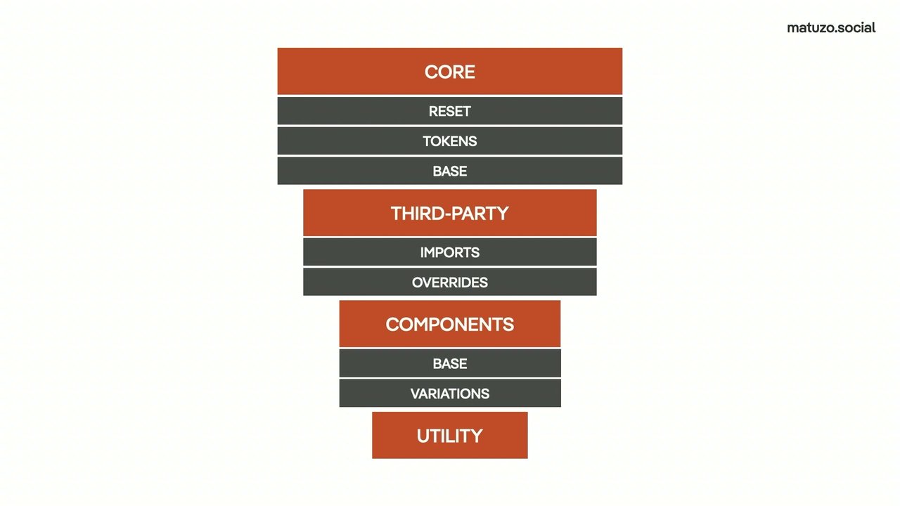
Manuel presents cascade layers as the missing enforcement mechanism for the ITCSS organizational concept, explaining how ITCSS's inverted-pyramid specificity model is a sound idea that breaks down without tooling to enforce it. He reveals his four-layer architecture — core (reset, tokens, base), third-party (imports and overrides), components (base and variations), and utility — and demonstrates how declaring layer order upfront allows CSS to be split across dozens of files without losing cascade predictability. He likens the layers to reusable buckets: you throw styles in without ever redefining the order.
A Mathematical Type Scale Using CSS's pow() Function
Manuel explores making font sizing systematic and scalable, drawing on lessons from his design system work for the City of Vienna, where a no-class framework proved its value when thousands of CMS pages imported cleanly without any custom markup. He walks through building a type scale with CSS's pow() math function, where two custom properties — a base size and a multiplier — drive all heading sizes through an exponential scale. He shows how applying the system to all elements via a universal selector forces consistent sizing while still allowing overrides, demonstrated live with interactive range sliders changing the entire page's typography by updating just two custom properties.
Fluid Typography and Handling Browser Accessibility Overrides
Manuel tackles the challenge of integrating fluid typography with his unit-less custom property system, using a Stack Overflow solution by Temani Afif that strips units from a clamp() expression via nested math functions — a technique Manuel admits he doesn't fully understand but deploys in production. He then confronts an accessibility failure discovered during the conference: Firefox's text-only zoom mode causes his exponential scale to produce enormous text, which he fixes with a simple min() cap that gracefully limits font size growth.
Modern Color with OKLCH and Relative Color Syntax
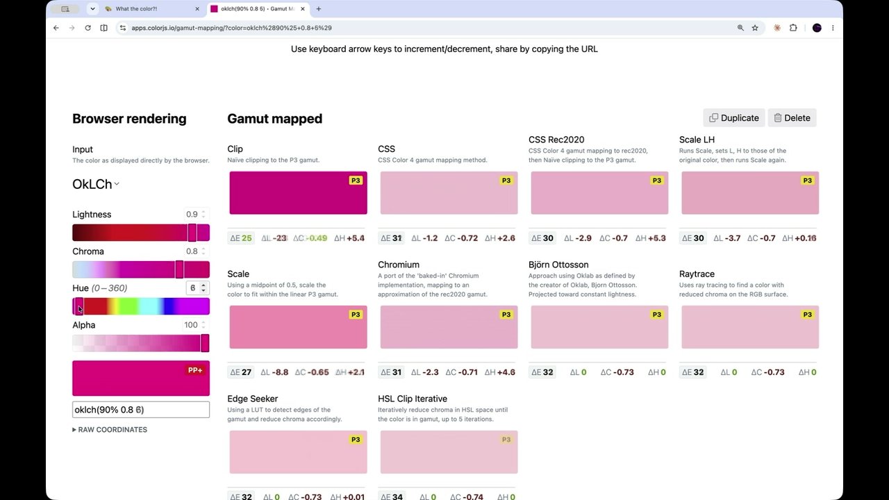
Manuel explains how preparing a color theory talk converted him from hex values to OKLCH, whose three human-readable channels — lightness, chroma, and hue — make colors easier to reason about and unlock 50% more of the color gamut. He shows how relative color syntax makes generating coherent tint scales effortless, then live-demonstrates a surprising and dangerous out-of-gamut edge case where a seemingly reasonable lightness value produces a wildly unexpected result in browser color tools. The segment closes with Manuel sharing what he describes as official confirmation from representatives of each major browser that gamut clipping behavior will be improved.
Opinionated Defaults, the --magic Property, and Simulated Custom Breakpoints
Manuel shows his base stylesheet rendering HTML elements without any classes, then introduces a --magic custom property that uses container style queries to transform plain semantic HTML into a properly laid-out page — complete with styled header, navigation, and footer — without a single class name. He also reveals a creative hack using the min() function to simulate custom breakpoints inside container queries, working around CSS's current inability to use custom properties in media query expressions, and points attendees to a related wild demo at CSS Café.
Componentization as Configuration and New Website Launch
Inspired by Lea Verou's ideas on custom properties as component APIs, Manuel demonstrates how card components can be configured entirely via custom properties passed through style attributes or inherited from parent elements, replacing predefined class variants with a declarative configuration model. He reveals his experimental OlliCSS framework and a newly launched personal website — built specifically for CSS Day — that uses every technique discussed in the talk, including fluid type, container style queries, and whole-site color theming driven by a single custom property. The talk ends with a book giveaway and links to slides, code on GitHub, and documentation on focusofak.dev.
Q&A: On Habits, Naming, Teams, and Learning CSS
The moderator leads a Q&A covering audience questions including why Manuel uses --magic instead of a class, how he identifies habits worth changing, whether 'CSS reset' is still the right term (Manuel prefers 'UA plus'), cascade layers with inline styles, browser support strategies for at-layer, and the challenge of opinionated defaults across multiple projects. Manuel closes with candid advice on keeping up with CSS in a full-time job: write blog posts, present at meetups, and apply Leonie Watson's accessibility principle — it doesn't have to be perfect, just a little better than yesterday.
These days when I walk past a record shop, the first thing that comes to my mind is our next speaker. That if you don't follow them on social media or on our your RSS readers, you should do it now. He's a highly talented individual that everyday makes the web in our community a better place by teaching and bringing their own personality into it. But CSS is not the only thing they excel at.
They also wrote one of my favorite accessibility books that I consult every week. Give a round of applause, Manuel. Thanks
a lot. Hello, lovely people. It's so great to be back again here in Amsterdam at CSS Day. Last time I was here was exactly three years ago with a talk titled That's Not How I Wrote CSS Three Years Ago or you know six years ago counting from today.
Anyways, the core idea of this talk was that in the years leading up to the events, the way I write CSS has changed a lot and I explained how and why. And I also predict that it will even change more with many of the new things that we have in CSS thanks to the Interop efforts. And I think we saw a really good demonstration of that yesterday in Lyra's talk.
Yeah. So this has changed a lot for them but not for me unfortunately because there are several reasons. The first reason is I just didn't have a project where I could put all my ideas and predictions into practice because with some of these things, it's either all in or nothing. For example, cascade layers. They're amazing, they're fantastic, I love them.
But they're also really hard to progressively enhance. That's the first reason. Another reason is that I realized that I've been following certain approaches and principles and an understanding of what's a good or a bad practice for ten years, fifteen years, sometimes even twenty years without second guessing them. And for some things that make sense like progressive enhancement was a really, really great idea twenty years ago and it still is a really great idea now.
But in order to get the most out of some things in CSS, we may have to reevaluate how we approach certain problems in CSS or we may have to break with habits. Here's an example. I wrote a blog post about cascade layers a while ago and I posted it on social media and someone replied and said, hey, Manuel, thanks a lot for explaining cascade layers.
I added them to my website but I didn't see a difference. I'm not sure what they expected but we chatted a little bit and I learned that they were using BAM. So they already had a tool in place that solves the problem that cascade layers are supposed to solve, make working with the cascade and specifically specificity easier.
So in order for them to see a difference, they will probably have to stop using BAM and maybe even change the way they are selecting stuff and maybe also, like I said, reevaluate some of the good and bad practices of working with selectors and changing them maybe completely. Okay, thank you. I hope that works.
Okay. So this is the core idea of this talk now. The first thing I did is I created some side projects where I can test stuff and play around a little bit. And also I was trying to see where I can break with habits, where I can change some of the things that I've been doing for the past twenty years.
And before I go into that, I have to quickly make a last minute change to my talk because I've been to several events this year and some of them feature talks about AI. So I heard a lot about AI, people talking about AI and how they're using it and also had a lot of conversations with people about how they use AI or maybe how they are not using it. And I just can't get certain things out of my head. Like, I I constantly thinking about AI these days.
And if we put the horrible impacts on environment aside and also on culture as a total, then maybe it can be a good idea to use AI excessively. And I think there are smart ways and good ways of using AI and then there are also not so smart and bad ways of using it. And yeah, I just heard some things that I find concerning. I was talking to a friend actually and he told me that he went all in on AI and he's fully integrated it in their workflows.
And he told me that now he has more work than before. And when I heard that, I was trying to like come up with a reason why that was. But then he continued and he said, but I'm doing now the work of five people. And it took me a while to process that and when I did, I was like, is that what we want?
Like, do we want to improve efficiency so much so that we can burn out at age 25 instead of age 35? Is that our goal? Is that what we want? Then I heard about another guy who has six agents working for them, I have no idea what that means, but he says he has six agents. One agent is his CEO, one is his project manager, one is the developer, another one is the designer and assistant and the sixth one is, I don't know, fucking barista or whatever.
I don't know. And he also said that one of them is giving them a summary of their RSS feed every morning. And when I heard that, I was like, no, that's not what RSS is about. You don't want It's not about information consumption. You want to read and learn from your friends, from the people you follow, from the people that you that you respect.
You want to see what they're working on, what's on their minds, the problems they are trying to solve. This is the stuff that they find interesting. It's not just about the what but also about how. It's like how are they describing it? How are they using language? How deep are they getting into the content? That's what you want to learn.
It's not just about stuffing as much information as possible into your head. And one more thing and then I promise I will talk about CSS. I heard another one who who said that they have been they not have they have been using prompting and voice for coding for two years. So they're not touching the keyboard anymore for coding.
And I've heard that several times and I was like, did it happen now? Am I now you know, one of the people who doesn't know how web development works in 2016? Like am I completely out of the loop now? Did I miss the train? Am I like doing the it's the old way? But if that's the new way, I'm not sure if I'm like that, if I want that because I'm in this very privileged position like probably most of you that I really love my job.
I love coding. I love you know designing in in the browser. I love I love playing with dev tools. And I don't see having as much fun if I'm just using my voice and prompting. And also, one of the reasons why I was invited three years ago is that I missed so much of the new CSS stuff that I was completely out of the loop and I had to get back on track, so I wrote 100 blog posts about CSS in one hundred days.
Not just because I hated myself, but because this is my preferred way of learning. And if I'm not coding anymore, I see myself unlearning CSS really quickly. Yeah, I know that's a bit off topic but it was just weighing on me and in my head and I just had to get it out for you.
And the last minute change that I'm making to my presentation now is I'm changing the title. Don't worry PPK, I'm not changing the content of the talk, just the title. And I'm giving you options. Maybe if you like breaking with habits, we're cool. But maybe you like mental health is more important than efficiency better. Or maybe you like something that you can put as a sticker on your wall. Read, learn, grow.
Or maybe being good at CSS is more important than ever. Or it's time to really learn CSS maybe. Oh, that one's controversial. Your profound expertise matters. Or maybe just explore because exploring is what I did for this talk and I was trying to find areas where I can change the way I write CSS.
And I've identified five areas and the first one is reset style sheets. The second one is structure and organization. The third one is scalability, customization and componentization. So this is where I was looking about things that I can change in order to get more out of modern CSS. And we'll start with reset style sheets. I haven't been using reset style sheets for five, six, seven years probably, like for a long time because I just don't see the point anymore. There used to be a time where reset style sheets made a lot of sense because the browser landscape was much more diverse than it is today and they render pages very very differently.
Eric Meyer famously created the first popular reset style sheet, reset CSS, which resets properties like margin and padding and a list style. Nicolas Gallagher took a much gentle approach by normalizing more than than resetting, which made sense and was also super useful. But the thing is, there was a long time ago and many of the problems that these style sheets solve don't exist anymore today.
But reset style sheets are still a thing. There are modern style sheets like the new reset, the new CSS reset by Ella Chachter and his approach is to just reset almost everything. So you see a lot of all unset in his stylesheets and a lot of non keywords and reword. Pretty radical, but if it works for them, it's it's fine I guess. But there are also other style sheets that take a different approach like Andy Bell's A More Modern CSS Reset.
And looking at his style sheet and also other similar style sheets, I realized that today it's less about resetting and normalizing but more about improving the defaults. And I found it super interesting. So this is the first area where I'm trying to see if there's anything that I can change about the way I write CSS and think about CSS.
So I created a reset style sheet and in my style sheet you will find some of the traditional stuff like I'm switching to a traditional box model. I know that there are certain people here, certain influential content creator people here who don't believe anymore maybe in in switching to this box model. But it works for me so I'm keeping that stuff.
But you're not here for that. You want to see some of the modern stuff. Let's look at this wild selector here. If you create a label, a label element and an input field by default it will look like this. So you can see that the input field is next to the label because they're both display inline or inline block or something like that. But I would argue that in 98% of cases that's not what you want or maybe even 100% of cases because you want to be your input field to be below the label because that's what's best for UX and accessibility.
And this is exactly what the selector does. So what I'm doing here I'm saying is if there is a select element or a text area or an input that is not of the type radio or checkbox and it's following a label element, then sets the label to display block. And that's in my opinion a better default. Or here's another example.
By default, you open a dialogue element, just appears and if you close it, it disappears. There's no transition and it makes sense because it's hidden, it's display none and we can't animate display none. Or at least we weren't able to do that for the longest time because now it's possible. Thanks to the I think transition behavior property.
So in your transition you don't just transition opacity but also display and you had to allow discrete keyword so that you can also animate discrete properties like display and then you also animate overlay which is the backdrop so that it fades in and fades out as well. And in order to make the fade in possible you have to define a starting style.
And then you get this. And I know it's not a big difference. It's very subtle but you know it's nice. Here's another one popovers. By default, you open a popover, we heard a lot about popovers yesterday, they almost look like dialogues and that's not a good default if you ask me. What's great about popovers is that they come with an implicit anchor and I think we heard about it yesterday in Jake's talk.
So we don't have to do that. We don't have to select the button explicitly and define an anchor and then reference it in the popover and position the element. We don't have to do that because you don't want very explicit stuff like that in your CSS style sheet. All we have to do is we say, you know what, if the browser supports anchor positioning then select the popover, remove the margin so it's not centered on the screen, and then position it and even add some fallback.
And now we get this. You can see how the popover is positioned closely to the button and if there's not enough space then it just flips. And this is really nice. And a much, much better default if you ask me. Okay. One more thing about my reset style sheet, I wrapped everything inside a cascade layer which is a really smart thing to do.
I didn't come up with that. Emilio suggested it in a GitHub issue and said, hey, why not wrap it? Because the thing is if you're not working with cascade layers, that's really cool because if you add this style sheet you are making sure that your styles will always overwrite these styles because unlayered styles overwrite layered styles. And if you're using cascade layers, then you just integrate it in your pipeline or you reference it and position it wherever you want in your Cascade Layers.
So that's really cool. So to sum it up, you may want to revisit your existing style sheets and see if the stuff in there still makes sense or maybe if you're not using one, you may want to create one. Mine is online on GitHub and also on a website called focus.dev, focusofak because all the good domain names are gone.
And yes, you can you can see a breakdown of all the properties. You can check it out. And the website doesn't look nice. It's just a placeholder for a website. But what's really cool is I built this demo thing. So I list most of the elements in HTML and you can see how it looks like with my stylesheet and compare it to the default user style sheets or with another stylesheet like Andy Bells for example or LR Checkers.
So that's a really nice way of comparing the different reset stylesheets. Cool. A second area where I wanted to see if there's anything I can change is structure and organization. For most of my career, I've been following an approach very similar to Harry Roberts, its CSS or IT CSS, which is represented in this inverted pyramids. The idea is that at the beginning of your CSS file, you start with very general stuff.
Harry created this specifically for Sass so you would use stuff like mixins and function. I don't know. I don't remember anymore. It's been years since I've written Sass but stuff like mixins. Or in modern CSS it would be your add rules. You define your layers. You have your custom property registrations and add font face and stuff like that. And then you have maybe in the universal selector or something that's with very low specificity.
Then you have your tags and you slowly increase the specificity of your selectors. So you go for your class selectors, attributes selectors, maybe even IDs and then at the end you have utility class. And the idea is that by progressively increasing the specificity you make it easier for you to manage specificity in your CSS.
That's a fantastic concept but the problem is that it's just a concept. There is nothing that enforces these rules. So if you throw in an ID selector somewhere in between, then it messes with the specificity of your CSS and I'm really proud of that animation. Yes. Luckily, have cascade layers and they are really cool because they allow us to enforce these rules.
So they allow us to split up our CSS into multiple layers so we don't have to manage specificity for the entire document but just split up in layers. And layers defined later in the document, overwrite layers defined earlier. And within these layers, can even split them up again if you want to. You add more sub layers and make it easier to manage specificity inside the layer.
And for my project, I didn't just want to come up with a structure that I can use for this specific project. I wanted something that I can use in any project of any size and this is what I came up with. I have four layers, core, third party, components and utility. Core is split up into reset. This is where your reset style sheet or mine goes.
Then we have tokens and base. Tokens is just for token space for base style sheets. This could also easily be a single layer. Then we have third party and I split it up in imports and overrides. So in imports, this is where your Bootstrap CSS goes or your Prism CSS. Any third party tool. And if there's anything that you want to override from these third parties, then you have the dedicated overrides layer.
So it's not like you are throwing it anywhere in your document but you have a dedicated place for overrides of third party styles. Then you have a components. Inside components, have a place for base styling of your components like this is how a card looks like by default. And then you have variations where you define your large, small and so on. And that's that.
And now if I want to use it, for example I want to use my UA plus my reset style sheet, I just import it directly into the resets layer inside the core layer. Or if I have a utility inside my utilities CSS, I just call this layer and add my styles or inside my card CSS, I just add my card styles and put them in this layer.
And what's great about this is that it doesn't just make working with the cascade or with specificity easier, it also allows me to split up my CSS into multiple files. So now I'm not just working in a single file, I'm working in, I don't know, 50 files or 30, whatever depending on how many components you have. And I don't have to worry what's happening when I'm putting the files together, maybe inside the build step because in the very first line, the line that you see here, we have already established the order of the layers.
So anytime you're using a layer, you're not redefining them, you're just reusing them. Think of them as buckets like you have four buckets and when you have styles, you just throw them in the first, second, third or fourth bucket. And you're not creating more buckets but reusing them. And I really like that. So this is how my inverted pyramid looks like.
Utility overrides components, components overrides third party and third party overrides core and here are the sub layers. All of that is also online on focus.dev. There is the code. There is also an FAQ. No one actually asked these questions. I'm pretending like people actually asked me something.
But yeah, I'm basically just justifying all my decisions here and explaining what I did and why I did it. Check it out if you want to. Next, scalability. So here I wanted to find out if there's anything in modern CSS I can use in order to make my websites more scalable and more resilient.
One of my clients is the city of Vienna and I was the one who created the concept for a new patent library and I also wrote the big part of it. And the way we designed it, we use native HTML, native CSS and web components with Lit.
And we are big fans of progressive enhancement. So we have a lot of JavaScript in our websites but if you disable JavaScript, the website still works. So you will still It looks a bit different maybe but everything is still accessible because we don't use Shadow DOM too much. I'm not the biggest fan of Shadow DOM necessarily and it just didn't make sense for us.
Anyways, so if you disable JavaScript, it still looks fine. If you use the website and you don't use any classes, it also looks fine because we designed it as a no class framework. So if you take our CSS and you just throw in some HTML, it will look nice. And as it turns out that was a really great idea because we recently switched CMS and we imported a lot of pages, like thousands of pages into the new CMS.
And some of them we touched and improved to make them look really nice. So like the most important pages, the most viewed pages, but most of them we didn't want to touch. It was just too much work. And the guys who imported it wrote me an email or they called me and said, Manuel, we didn't import and it's really strange.
Everything looks fine. What's going on? And I said, yeah, we are selecting most of the elements in HTML and we have just default styles for most of them and that's why it looks cool. So that was a really good idea and yeah, because that worked so well, I wanted to see if there's anything that I can use in my projects.
And here's an example. You can see I'm defining font sizes here and I'm using pixel so that it's easier to read. And if you look at these numbers, does anyone see a system? Some kind of scale? Yes, you're nodding? Okay. I don't see it. For me, these are just random numbers, magic numbers. But there could be a system behind it.
There could be like a system for the headings or for picking the size for each headings. And actually there is. So if we look at one of these websites where you can define the type scale, this is not the best. This is just the first one that I found precise type. You can see that on this website you define a base font size like 16 pixels and then you define a type scale.
And you can see how it starts at 16 pixels and then you multiply the 16 pixels by the type scale, you get 25, no 20, then you multiply 20 again, get 25 and so on. So this is how the scale works. And when I looked at that, I was like, okay, I was really bad at school but I can I understand the system here, I can do this in CSS?
So I just create a custom property for the scale, one for the base, and then I say the h six is just the base, just 16 pixels. But the h five is the h six multiplied by the scale, the h four is the h five multiplied by the scale and so on. Nice. But there are two things that I don't like about it. First of all, the repetition, I don't like that.
And I also don't I don't like the referencing. Another way to write that is like this. I mean you can do that. So the h five is the base times the scale, the h four is the base times the scale times the scale, the h three is the base times the scale times the scale. It doesn't even fit on the screen, so that's not nice.
But again, there is a system and I was like, okay, some dead dude probably came up with a formula for that many many years ago. And I also know that there are math functions in CSS, so I went on MDN and I found the power function. And there it says the math power static method returns the value of a base raised to a power.
I was like, okay, that sounds exactly like what I want. So I tried it out and now we have this. You can see that I'm using the power function now. It takes two values. The first one is the base number and the second one is the exponent. And the number basically indicates how many times you want to multiply the base with the number, yes.
So if you provide zero, it just returns 16 because it just multiplies it once. If you provide one, it returns 20. If you provide two, twenty five and so on. Still a lot of repetition but much cooler repetition if you ask me. But of course, we can improve that. So the next thing it is, I selected all of the headings and instead of defining a fixed number like zero, one, or two, I'm using a custom property with a fallback of zero.
And now instead of defining the font size, you're just defining a custom property. I know that looks strange but it's also kind of cool. And what's great about it is now I'm forced to use the system, very similar to what I was talking about the cascade layer. So this is not just a concept, now I'm forced to use the system that I've defined.
Kind of because you can also say, you know, give me four points two or something like that. So you can trick the system but yeah, it's cool. But I was like, headings but what if I want to use the system on the entire website? So I did this and please don't try that at home. Or actually try it at home.
Don't try it at work. You can try it at home, don't try it at work because what I'm doing here is I'm selecting all the elements on the page and I'm using that. And this can be a problem because first of all, I'm resetting all the font sizes by default to 16 pixels because the default value is zero. That's the first thing.
And the second thing thing is this messes with inheritance potentially. So yeah, be cautious of that. But I tried it and I think it's really cool because now I can define custom classes. You can see that this big class with a factor of 10 and then have a small class with minus one, you can also use negative numbers. Really cool.
But what if I don't want to use the system? What if I want to break out of the system? What if I want to define something like 50% or two REM or something like that? So I split the formula up and now what I'm doing is I'm saying there is a dash dash font size custom property where you can define the font size.
This could be two rem for example. If you're using that, then it's just two rem and that's it. If you're not using it, then it falls back to my formula. Okay? And this is how it looks like. Have two range sliders here, one that can change the scale, one changes the font size and you can see how just by changing two custom properties, we get very different results.
The custom class is not changing because I just defined two rem, but everything else is changing with the scale and then you change the font size. And this is pretty powerful and all we're doing is changing two custom properties. Yesterday in Josh's talk, we heard how cool fluids type is. And I think fluid type is cool, super useful, but how can I do that? I probably can't because you know I've now I've custom properties with unit less numbers.
And of course I was thinking maybe I can use clamp and just use my unit less numbers inside clamp but that doesn't work. You need something like pixel or REM inside the clamp function. But it gets really hacky now and I'm not recommending it to do that. I'm using it in production on my website, it works, it's fine. But it's a bit strange.
What I did is I went on Utopia FYI, I went to the clamp page and I said, okay, at the minimum viewport of three twenty, I want one pixel and at the maximum of twelve eighty, I want 10 pixels because I want to transition my font size from one to 10. So from the value one, exponent one to exponent 10.
And what Utopia gives you is of course a pixel like one pixel to 10 pixel or actually they will give you RAM. So they converts the here's the photo. Okay. So they convert the pixel to RAM. So you can see 0.0625 is one pixel. And but what I need is I need a computed value of that without the units.
And my friend Matthias Ott helped me with that and I did some research and then I found of course a Stack Overflow answered by Timani Aviv with this solution. So he's wrapping the clamp function inside an eighteen two function inside a 10 function. And I looked it up online because I wanted to explain it to you because we're at CSS day.
I didn't understand it so fuck that. So I have no idea what's going on. But what it does in the end is it gives me unit less numbers that I can transition. There's one more step, I just have to register this custom property and then we get this with my dash dash exponent. Yeah. Yeah and that works.
And I'm using it in production on my website and you can see how the h one by default is very large on my website. And yesterday in George's talk I saw this option in Firefox where you can say text only and I wanted to see what happens if I check this checkbox and increase the font size. Oh no no no no no.
This looks horrible. This is one like perfect example for where this doesn't work well. And I didn't use Josh's solution because it's not implemented in any browser yet. But I I just It was the simplest thing fix I can think of. I just use min. So I'm One of the values is my formula and the other one is just a fixed pixel value.
So if the font size is lower than 97, it just uses my whatever I'm doing here. And if it's larger it's limited to 97 and that works. So this is zoomed in with text only and it works. Yes, yes. Alright. Another interesting topic is color and we heard a lot about color yesterday.
And for the most part of my career I didn't care about color at all. Like I didn't know anything about color theory and I I was just using hex values. I just copied it from the design that I got and that's it. But Mark invited me to speak at Beyond Telerent. Mark, are you here? Oh, hi Mark.
That was the third attempt like I'd I'd try to do this joke twice and he was always at the conference where I was speaking but he was not in the room and finally he's in the room so I could do the joke. Okay. Yeah. So he invited me to speak at Beyond Telehand and I presented a talk called color in CSS or how I learned to disrespect tennis. And in preparation for this talk, I learned a lot about color theory.
It took me so so long to prepare this talk because I didn't know anything like I said. And now I know much more, I know how to use color in CSS but I still fucking hate tennis. Anyways, now instead of using hex codes, I'm using OKLCH and we learned about some of the benefits yesterday. One of them is that it's just so much easier to read.
I can't read hex. I know that there are people that can read hex. There's a talk by David DeSandro on YouTube that you can check out where he explains how how you can read it. But I can't. OKLCH is so much easier because it's in a cylindrical shape. We have three channels. The lightness which goes from zero to one or 0% to 100%.
Then we have the chroma which is a strange number. It's between zero and zero point four. And then we have the hue which is a value between zero degrees and three sixty degrees. It's very similar to the HSL color wheel but it's a bit different. And that's actually much easier to read. You can read OKLCH. And the another advantage is you have 50% more color.
So this is also really cool. But if you're working with colors, you can see these are the four colors that I'm using. You're You probably don't want, don't just need four colors. You need different tints, different variations of this color. And that's super easy with relative color syntax. It just works so fine. You would just define your base color and then you reference the base color all the time.
You reuse the chroma and the hue and you change the lightness. Or maybe you maybe you even want to adjust the chroma a little bit but I kept it easy here and I'm just changing the lightness and this gives me these nice color scales. And what's great about it, if I decide to change the green to blue, the the different variations of the color will just update with the color. Okay.
You can see how the dark colors get really dark. The light colors can get kind of light. They're still in in gamut but if you go from 0.9 close to one, it doesn't look great. And that's because out of gamut is the Wild West as we learned yesterday. And actually I took one of the colors and I wanted to see what happens in one of the tools that Leo showed us. So if I take the yellow that you just saw, yeah, the last color, the yellow one.
If I take that and I put it in the tool, you can see, I put it in this tool and I changed the lightness to one and lightness one means white essentially. But we get this light yellow color. But what I would expect is this color. And then I tried the same in this tool because I really liked the visualization here and now you can see the value is a bit darker but it's caused, I set it to 80%.
And I'm slowly increasing it to 90% and you can see it's still in gamut. But as soon as I pass 0.9, we are now completely out of gamut. Like we were so so far away and that's very unexpected. And I wasn't doing anything wild here. I just picked colors that I like. I wasn't deliberately trying to find a color.
I just It was the first color that I actually did it like two hours ago in the back. I just picked one of the colors and I saw this and I was like, okay, the tool is broken but then I changed the value, you know, realized, okay, I'm just so far out of gamut that I don't see the colors in the middle.
Yeah. That's really really bad. But I have good news for you because I have totally official confirmation that browsers will change that. I got a confirmation for free high profile representatives of each browser And they told me that they're going to fix gamut clipping.
Although I have to say it is possible that they didn't know why I was taking that photo and how I'm going to use it. Alright. There are many more rules in my base style sheet and this is how it looks like. So if you scroll through the page, I've added most of the elements in HTML here.
They look okay. I'm not a designer. I'm not good at designing. But it looks fine. So it's good enough for me. And you can see most of the Yeah. There are styles for most of the elements in HTML and different variations of these elements and so on. But if you look at the page, can see how this doesn't look like a website.
And it makes sense because I've just I just have base styles. I'm not using any classes. But in this document there is a header element at the very top and there's also a navigation inside the header element. But it doesn't look like a header of a website. I could add styles and say, you know what, if the header is in the context of the body then please make it look like a proper header of a page.
But that's kind of dangerous because it could also be a header inside the section element or inside an article or there could be a nav element inside the main content somewhere. But then again, I know how I write my HTML and there is a certain structure that I usually follow and maybe I want an opinionated variation of my CSS.
Maybe I want the header to just magically look like a header even though I'm not defining any classes. So I need a level of customization and I need some magic. And this is why I select the HTML element and I set dash dash magic to true. And when I do that, the page looks like this. I can see how there is now a proper layout.
We have a header, the navigation looks like a navigation. And of course, I'm using container style queries here. And I'm saying if dash dash magic is true, then please change the layout of the header and the footer and the main element. And also inside the header change some of the layouts. And I'm using custom properties heavily here.
Yeah, I have different settings so you can turn magic on and off. You can change the layout from a vertical to a horizontal layout and you can also change the font stack. Let me just quickly show you that because I really like that. I have different font stacks defined based on modernfontstacks.com and you can pick one. And what I like about this is it looks like a switch statement almost in CSS in a way.
Yes. So if you go to Olli CSS, that's one of the projects. And you download the file, it's file. It will look like this, but you can also customize it. So you can see how you can change some of the settings. You can disable magic or enable it. Okay. Yeah. You can change the layout, so vertical layout.
And all I'm doing is I'm changing custom properties. So you can see the custom properties that I'm changing here and now I'm changing just the hue and it affects the entire website. Then the chroma maybe a little bit, the lightness, and all I've done is I've changed three or four custom properties. And it doesn't look completely different, but different enough if you ask me. So I'm changing the fonts, the font family, base font size, and the scaling.
And on top of that, have a lot more custom properties. So you can change almost anything on the website. And I even have that. You can define custom breakpoints. So you can see see define where the first breakpoint is and the second breakpoint is. I'll limit it two. Now some of you may be thinking, how are you doing that?
Because that's not possible. We can't use custom properties inside of Miracuries. Yes, true. That's unfortunately not possible. The thing that would get us as close as possible to doing something like that is custom media queries. But unfortunately they are only in Firefox nightly behind the flag as far as I know. So this is also not available. What I'm doing is this.
I'm defining two custom properties. One is my breakpoint, so 48 rem. And then I have another one where I have a min function where I pass the breakpoint and 100% of the viewport width. Before I keep talking and explain what's going on here, let's just quickly talk about the min function because I keep forgetting how it works. So you have this function, I'm passing two values and there's a 10 pixel value and a 50 pixel value and what min does is it always picks the smaller value.
So 10 pixel wins here. If we have 10050%, it depends on what 100% represents or what a computed value of 100% is. If it's lower than 50 pixels then 100% wins. If it's larger than 50 pixels then 50 pixels wins. So in my example I have 48 rem and I have 100 viewport width, so the entire viewport.
And if the viewport width is smaller than 48 rem then we get 100 viewports. And that is whatever is currently the width of the viewport Like 500 or four eighty or three twenty, whatever. But if the viewport is larger, then we get 48 rem. And in my container style query, I'm basically saying, does 48 rem equal 48 rem? And that's only true if the viewport is larger.
Yeah. If the viewport is smaller then it doesn't equal 48 rem so the styles don't apply. But if it's 40 ms or larger then it's equal and this is how I apply these styles. One more thing, you have to register the custom property and that's it. I found it really cool. Hacking as hell but cool.
And yes, if if you want to see a really crazy demo then I suggest you go to CSS cafe tomorrow because Marco Christian Kren did a similar thing and he's going to show something that's really really wild. So it's definitely worth checking out. Alright, the last thing that I want to talk about is componentization because I didn't come up with the idea of using custom properties heavily. Of course, I was inspired by Leah because in a presentation here at CSSD I think almost ten years ago or something like that, she was talking about custom properties and how we are not getting enough out of them.
We're just using them in a very basic way. And this is why I tried using them very heavily. So that's what's happening here. And I'm also using it in my components because Lia said that custom properties with containers like Cypress may allow us to stop using presentational attributes in web components for example.
So stuff like color or size because instead we could just use the style attribute with our custom properties. Here's an example. So I have a card component here. There's a heading, some text, and an image. This is how it looks like. And if I want a larger variation, I use the style attribute. A bad practice. Or maybe not.
Why not? Why why not just use the style attribute and set card size to large? If I want a different variation of that, I just set dash dash card axis to x and then I get a different layout. Course, you don't have to use the style attribute. Can just use classes. Why not? It's not like I hate classes all of a sudden.
You just define a custom class and you change your settings. And what I really like about that is that you're not just randomly defining properties in CSS. You are working with a system that is already in place. You are not declaring, you're just configuring. And I really like the idea of having a config CSS file. There are many advantages but I'm slowly running out of time.
One of the advantages that I also see is the following. So let's say you have a container and inside the container you have four cards and you don't want them to have the default width but you want them to have a smaller width. You can select all of them and set dash dash card size to small or you just select the parent element because custom properties are inheritable. So if you set it on the parent element, the children will inherit from the parent.
And the big advantage here is that you don't have to predefine a class in your CSS that does that. You can just in a very flexible way just put your custom properties wherever you want and then the system does the rest. Cool. Yes. Everything I showed you is on an olliecss.com. It's not production ready because I'm playing around with this stuff.
I'm not sure if it will ever be production ready because a lot of that stuff is very experimental. And yeah, but you can still check it out if you want to. The code is also on Github. And until recently there was another reason why it wasn't ready for production which was browser support. But thankfully Firefox shipped it like three weeks ago with version 151.
So now we can use container style queries. And I was so motivated by that that I went onto my old website which looks horrible of course, but the content is fantastic. So I went on the website, I removed all the CSS, I added some configuration. It looks wild, I know, but you know I'm configuring my CSS and then I got this.
Which looks a bit broken but actually pretty cool because it didn't change much about the markup. I only Yeah. Added my CSS and added some config. But yeah. I changed some CSS, some more CSS, added the components here and there. And then I got this website which is now designed for my new website and I launched it just for CSS day. So you can check it out.
Everything that I showed you today is on this website. So I'm using containers style queries, all the flexible fluids type stuff as well. And yeah, you can see how it uses the fluid type and it's also accessible. You can check out my accessibility statement and see how I tested it. And yesterday during Brahmos' talk I actually also added new transitions.
Yeah. And here's an Easter egg, you can change the color. And it affects the entire website so you can see how the syntax highlighting is changing with the color. And this is just a single custom property. And oh there's my book. I wrote a book about accessibility for O'Reilly. And as it turns out I have a copy here.
And I'm giving it away. I have a really hard question. Who wants it? Who's that? I heard me somewhere here. You? Was it you? Who's that? You? Okay. If you are into front end developments and accessibility then I highly recommend this book. Can buy it anywhere.
Don't buy it on Amazon. My slides are online at matuzzo.at/cssday26 and it comes with a transcript of the entire talk because I care about you. Thank you so much.
That is fantastic. Thank you, Manuel. Join me, please. That is a great example how having your personal website is the best playground to experiment with the best CSS things out there.
Absolutely.
Please do it. And I'm gonna go dive straight in because we only have a few minutes. Mhmm. One of the questions touches something you just mentioned that you wish you had more time to mention, but you didn't. So because you were mentioning so the questions from Sara says, why use dash dash magic in custom properties rather than a class?
Generous curious, but also okay with you just having fun down the rabbit hole. And you were down the card examples, and you said, wish I had more time, so now you have the time.
Yeah. It's it's really about just seeing how far I can push push custom properties and see what we can do with them. And like I said, like the the the core idea was like having a config or or an API that I can configure instead of just redeclaring properties. This is also by one of the examples where I changed the layout. You you didn't see any margin auto or something like that.
All I'm doing is I'm changing custom properties everywhere. So I I try to not really clear any custom property, but really just change the Not really clear any regular property, but just change custom properties. No. It's just really experimentation and classes are fine. But I also really like the idea that building this website, I didn't think much about classes.
I just randomly picked the names. I didn't care about any convention because I only have a couple of them. The heavy lifting does dual custom properties and also the web components that I use.
Nice. Jesper asks, how do you identify habits of yours that need changing?
Yeah. That's a that's a interesting question. It just takes time. Just what works for me is just really diving deep deep into these topics and learning as much as possible about them and then just trying stuff out and seeing where you hit maybe limitations or where you have a situation like the one that I explained at the very beginning where you feel like that doesn't do anything.
It's very unlikely that it doesn't do anything or that there's no reason behind the thing. So just trying to explore it and and see. Yeah. Trying trying to to to forget what you learned, maybe. It's it's tough. Yeah. But it it took me three years to be able to talk. So yeah.
Sean asks, should we still call it a CSS reset? Feels like we are just setting better defaults, so base CSS or something else would make more sense.
Yes. I didn't mention the name of things, but I called my style sheets u UA plus. So u j user agent plus because I'm just, you know, improving the defaults. Yes. I agree.
Mhmm. Mattan asks, how would you combine layer with inline styles or abstract concepts like mixin?
What?
How would you combine at layer with inline styles or abstract cons conspects? I I think they mean concepts like Mixin.
I don't know. Next question.
Yep. Here we go. I have a question about supporting browsers without at layer support. Have you found a way to support these browsers or do you just drop the support for them? Roger said also adds love to talk.
Thank you. I think there is a post CSS plugin that can do that. But I just waited for the support to be great. And also it's my personal website. It's a website that mostly devs visit so your browsers are up to date and good enough. So that should be fine. And if the layers don't work, my HTML is fantastic.
It looks beautiful. So it just falls back to HTML, and HTML is pretty pretty cool.
Yes. Pretty good. Works really well. Asks, opinionated and massive better defaults are unique for every project unlike browser defaults. Do you find getting it it getting in the way when switching between projects?
It's hard to tell because I haven't used it in many projects yet. That's something that I could probably answer in a year or two I guess. I try to not to be too opinionated. Of course there are some things that are a bit opinionated in my reset stylesheet or base stylesheet improvements stylesheet plus thing. But it's just a CSS file.
Just remove stuff that you don't like. And yeah. But yeah. I can't answer that now.
Have you because you're mostly a freelancer and a teacher. But have you experienced pushbacks or friction when trying to bring these modern CSS techniques to establish a team that established routines and ways of doing things? And if so, how did you turn it around?
Not necessarily push back because they don't like it or because they can't use it because of browsers or what. But more because many of the teams that I work with when I consult, they live in a completely different reality than I do in terms of web development. Because I usually write everything from scratch or I reuse the things that I see and I try to get most the modern stuff.
And most teams that I work with just pick a component library and use that. And for them it's really hard to implement some of that stuff because they already have something that works and they are limited to whatever the component library provides. So this is the kind of pushback that I see. But people are usually very excited to see what's possible in browsers.
But in my experience, they immediately forget about it because they just can't use it anyway. Yeah. Yeah. Course, that's not true for every team, but at least most of the teams that I work with.
Yeah. And I and I reckon that, like you've mentioned, like you've done your own a hundred days of blog posts about CSS. We are all working our full time jobs. How do you have any advice on how to find the time to catch up with CSS and learn everything? Because there's a lot.
Everything? Yeah. No. I tried this 100 blog posts and it was such a horrible experience. Yeah. But but yeah. But but I did it. It worked and I learned a lot and a lot of people learned. For me it's pretty easy because I'm a freelancer. So I can just rearrange the my work time just the way I want it and just squeeze in a couple of hours.
But the best thing that works for me is really just writing blog posts on your personal website that you definitely need. This is my preferred way of of learning and also another way is to just speak at meetups for example, or at in house events, or if you have like an in house thing where you can present in front of your colleagues, that's also a good way of doing it. And you don't have to learn everything.
You just pick one thing and do a deep dive. There's a thing that Leonie Watson said about accessibility. She said it doesn't have to be perfect, just a little bit better than yesterday. And you can imply the same thing to learning CSS. You don't have to learn everything, but just pick one thing and you've learned one more thing.
Wow. That was beautiful.
Yeah. We'll get that transcript as well and put on stickers and all that. Yep. We don't have any more questions, which means we can break to launch soon. Thank you so much. Give a round of applause to both our speakers. Patrick and Manuel, thank you so much.
People
- Andy Bell
- David DeSandro
- Elad Shechter
- Eric Meyer
- Harry Roberts
- Lea Verou
- Leonie Watson
- Matthias Ott
- Nicolas Gallagher
- Temani Afif
Technologies & Tools
- Cascade layers
- Container style queries
- CSS anchor positioning
- CSS clamp()
- CSS min()
- CSS pow()
- dialog element
- Lit
- Normalize.css
- OKLCH
- Popover API
- Relative color syntax
- Sass
- Shadow DOM
- transition-behavior
- Utopia
- Web Components
Standards & Specs
- Custom media queries
Concepts & Methods
- BEM
- Fluid type
- Gamut clipping
- ITCSS
- Progressive enhancement
- Type scale
Organisations & Products
- Firefox
- Interop
- MDN
- modernfontstacks.com
Works
- A More Modern CSS Reset
- The New CSS Reset