Why most Mobile UX increases risk — and how to reduce it
A missed trade exposes the cost of divided attention
Emma Buckland recounts how a friend abandoned a share transfer amid interruptions in a doctor's waiting room and missed a trading deadline. He avoided submitting an uncertain transaction, yet still suffered a consequence. The story raises the talk's central question: can mobile experiences remain clear, safe, and recoverable without a user's full attention?
Mobile inherited assumptions about uninterrupted use
Buckland draws on her experience designing regulated services to challenge how teams practise mobile-first design. Interfaces often inherit desktop assumptions about sustained attention, even as people complete consequential tasks while travelling, parenting, and cooking. She argues that the conditions of mobile attention deserve the same consideration as screen size, accessibility, and connectivity.
Research reveals attention in brief, fragmented bursts
Buckland introduces Jan Chipchase's observations of everyday mobile use and research documenting interactions in bursts of a few seconds. She explains that these findings describe attention moving between an interface and its surroundings, rather than a universal limit on interaction length. Consequential services must share users' finite cognitive resources with other people, tasks, and environmental demands.
Short attention carries different consequences across services
Buckland examines how TikTok, news, education, and streaming accommodate short units of attention. High-stakes services require comprehension and deliberate action, and historically prioritised compliance, security, digitisation, and trust. Losing attention during a financial transaction can cause errors, missed deadlines, fees, or abandonment.
Existing products show how to design around context
Google Maps, boarding passes in digital wallets, and fall detection illustrate how products can respond to changing circumstances. These experiences reduce what people must remember or recognise when direct interaction may be impossible. Buckland challenges the assumption that an important task automatically receives more attention and proposes treating interruption as a design condition.
Build clarity, continuity, and control into consequential tasks
Buckland returns to the waiting-room scenario to explain three design priorities: clarity, continuity, and control. She uses the Yerkes–Dodson curve to question additional cognitive demands, then distinguishes preserving a screen's state from helping someone recover their task context. She also explores opportunities to pause, check, and potentially reverse consequential actions.
Test interruptions and measure the cost of returning
Buckland asks teams to interrupt participants during usability testing and observe how they resume consequential tasks. Rechecking, uncertainty, and abandonment reveal recovery costs that completion measures can miss. She recommends testing prototypes in everyday environments and closes by urging designers to treat attention as a condition, support clarity, continuity, and control, and test what happens when attention breaks.
I want to start with something that actually happened to a friend of mine a while ago. And when he told me about it, it seemed like a pretty ordinary story, but I kept coming back to it. So he was sitting in a busy doctor's waiting room with his daughter. It was the last day of the financial year and his accountant had told him that if he was going to transfer his shares, today was the day.
So while they were waiting, he thought, well, I'll just get this done. So he opened the trading app and it asked for his password and he hasn't been into the trading app that often, so he'd forgotten it. Face ID didn't work because he was wearing his sunglasses, so he took them off. And he heard what he thought was his name being called.
He looked up. No. It was someone else. So back to the screen. Eventually, he was in. He started entering the transaction. Then he realized he needed to check the current market price, so he switched over to Google, checked the figures, back to the trading app, reentered the numbers, and then his daughter tapped him on the arm. Hey, dad, look at this.
He leant over, looked at her Instagram stream. Someone at reception started arguing loudly, then he heard another name called, and he looked up, no, not his. And he looked back at his phone and his thumb was hovering over submit. And suddenly, he didn't trust himself anymore.
Not, did I make a mistake? But, have I made a mistake? So he went back. He checked every number. He compared them again. He switched back to Google, checked the market price, read everything a second time, and eventually he locked his phone and put it in his pocket. He thought, you know what?
I'll finish this later when I can focus. But later would be after 4PM, and he'd miss that day's trading rate. He hadn't entered the wrong amount. He hadn't pressed the wrong button. In fact, he'd stopped precisely because he wasn't confident. And there was still a consequence.
And I bet almost everyone in this room has a version of that story. Maybe not a share transfer in a doctor's waiting room, but an important payment you started and had to abandon. A form you're halfway through when something else demanded your attention. Something consequential you tried to do on your phone while the rest of your life was happening around you.
Because this isn't really a story about his waiting room. It's a story about the conditions in which we use mobile. So was that user error? Or did the interface assume something about him that just wasn't true? That it would have his full attention. But it couldn't. I mean, was a parent.
He was a patient. Someone listening for his name and at the same time, he was trying to make a consequential financial decision. So this is the question that I want to explore today. Isn't can users focus harder? It's can we design mobile experiences that remain clear, safe, and recoverable when people can't give us their full attention?
Hi. I'm Emma Buckland. So for the past seventeen years, gosh, golly, it's that long, I've designed digital experiences in highly regulated industries. Banking, utilities, financial services, and superannuation. And I think of these as high stakes services because the interactions can have real consequences for people.
They affect trust, confidence, and of course control. And over those years, I've watched mobile become the primary place where those interactions happen. And the scale of the shift is extraordinary. In 2025, 82% of people worldwide owned a mobile phone.
Mobile is now the part of the fabric of everyday life. But professionally, I've become increasingly uncomfortable with one thing. We talk a lot about mobile first. But in my experience, that's often not how the work actually happens. Desktop defines the experience and mobile inherits it.
And that's not necessarily the problem in and of itself. The problem is is that we can redesign for the device without redesigning for the conditions in which that device is used. Think about the conditions many of our interactions patterns grew up around. It was a person sitting in front of a screen looking at it, moving through the task with enough continuity to remember what they've just done and what they're trying to do next.
We got really good at designing for that interaction. But mobile has changed those conditions. The screen came with us. Into waiting rooms, onto trains, into kitchens, onto streets, and into conversations. The conditions changed, but some of our assumptions didn't.
And one in particular really interests me, that the person using our product or service on mobile is fully present. But we all know that mobile is rarely used like that. We pay bills while we're making appointments. We update insurance while we're boarding trains. And some of us have been known to check superannuation while we're making our dinner. The things we need to get done are increasingly completed inside the rest of our lives on a device that moves through those lives with us.
As designers, we've built really mature practices. I'm speaking to the converted here around usability, accessibility, responsive design. And we also account for, you know, screen size, touch, and of course connectivity. But I don't think we've given the conditions of mobile attention the same status.
So how did we get here? How did one of the defining characteristics of mobile use remain something we accommodate kind of around the edges rather than something that we design around from the very beginning? I'm just gonna take a sip of water. So UX oh, UX has spent decades solving really important problems.
Usability, error prevention, consistency, friction, accessibility of course, design systems to name just a few. And we got very good at them. Those changes transformed our industry. But while UX design was evolving, researchers were looking at something else.
Not just the interface, but the person carrying it. Researchers like Jan Chipchase for instance, spent years observing how people actually use mobile technology as they move through the world. And one of his observations really stuck with me. Unless you have something like a pacemaker, there really isn't such a thing as a twenty four seven user.
We move in and out of interactions with technology all day. Waiting, walking, traveling, between meetings, between conversations. And we also have measured evidence of just how fragmented that attention can become. More than twenty years ago, researchers were already studying this.
In controlled lab conditions, people could stay with an interaction for more than, say, sixteen seconds. But take that interaction out into the real world, where people have to watch what's happening around them, respond to it, and keep moving, and those interactions fragmented into bursts of just a few seconds.
The researchers called their paper Interaction in Four Second Bursts. And more recent HCI research finds something remarkably similar. When people are walking down a busy street, the average glance at a mobile device lasts just three to four seconds. Three to four seconds.
And here's what I find extraordinary. You know, researchers were documenting this more than twenty years ago. We've recognized interrupted attention in research, but we still haven't given it the same status in everyday UX practice. Now, look, I'm not suggesting that every mobile interaction lasts three to four seconds. Of course, it doesn't.
What matters is what the research tells us about the conditions of use. Attention moves between the interface and the world around it. And increasingly, those are also the moments in which we complete consequential tasks. Moving money, confirming our identity, reporting income to Centrelink, making decisions about our health. And those interactions don't happen in isolation.
A mobile interaction doesn't have our attention to itself. It shares it with the people around us, the environment we're in, and whatever else we're trying to do. All those things are drawing on the same finite cognitive resources. The interface is just one participant in that environment.
And that has an implication for design. Mobile interaction cannot always rely on continuous attention. But, you know, here's where it gets kinda really interesting. You know, some industries built products around exactly this reality. Not necessarily because they understood attention better, but because attention was fundamental to their business model.
And you know, TikTok is probably the clearest example. Its unit of interaction is short, self contained, and immediately understandable. If my attention disappears, well, very little is lost. And news does something really similar. It front loads the information that matters, the headline, the key facts, the summary, so I can understand something before I decide to go deeper into it. And, you know, education has adapted too.
Learning is increasingly broken into smaller, self contained units. One concept, one exercise, one piece of progress at a time. I believe it's called scaffolding. And streaming has learned to establish the engagement quickly, bringing the plot, the story, the tension, or the reason to keep watching forward.
Different industries, different reasons. But there's a pattern here. The experience can survive short units of attention. High stakes services, however, are really different. You can't break a $50,000 transfer in entertaining twenty second chunks.
It requires comprehension, continuity, and of course deliberate action. And historically, those services had other very difficult problems to solve first. You know, they had compliance, regulation, security, those legacy back end systems, and of course, digitization. And then of course, there was trust.
We had to get people comfortable enough doing those things digitally even when the stakes were high. But now those consequential interactions live inside the same mobile ecosystem as everything else. An incoming call, a text, a WhatsApp message, a calendar invite, a low battery warning.
When TikTok loses our attention, we lose a video. When a consequential interaction loses our attention, we might send the wrong amount, pay the wrong person, miss the deadline, incur a fee, or as in the waiting room, lose confidence and abandon the task altogether. Same attentional conditions, but very different consequences.
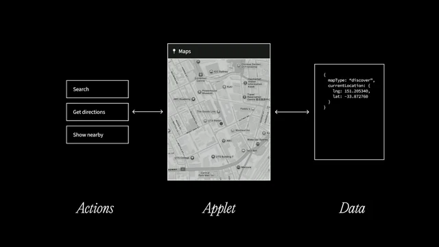
So, do we know how to design differently? Well, I actually think we we do. We already design interactions that recognize that they're happening inside a changing environment. If you think about Google Maps, when we're planning, it can show us the whole journey. And then once we're moving, we put it into our pocket, the interaction changes. As I walk down the street, I pull it out and what matters now is the next turn, the next instruction.
And that guidance can come to us without requiring the same interaction with the screen. The interface changes because our context has changed. Or think about a boarding pass. At home, it quietly sits inside your digital wallet with everything else. At the airport or on the day of travel, it can surface when you're likely to need it.
The environment or the day, date, time is being used to reduce what you have to remember, find, and navigate. And then of course there's full detection. That goes further again. It recognizes that there may be moments in which the person isn't merely distracted. They may not be capable of interacting with the device at all, and friends and family are alerted to assist.
These aren't just clever features. They're examples of designing around the conditions in which the interaction actually happens. Yet across many high stakes products and services, we still design as though people will be focused, uninterrupted, and able to devote their full attention to the task despite whatever environment they're in.
And maybe that's partly because of the stakes. We assume, you know, well, if this is important enough, well, of course, people will pay attention. But importance doesn't make the waiting room disappear, It doesn't stop your daughter tapping your arm and it doesn't stop someone calling your name. The importance of the task doesn't give the person more attention to spend.
So what happens if we stop treating attention as something the user owes the interface and start treating interruption as a condition that we're designed for? So if we accept that attention is going to be shared, interrupted, and sometimes lost altogether, I think we need to start designing for three things, clarity, continuity, and control.
And to explore what that might look like, let's go back to where we started at the waiting room. So clarity needs to help me understand without demanding all my attention. So you're listening for your name, your daughter is talking to you, there's an argument at reception, and you're trying to make a transfer.
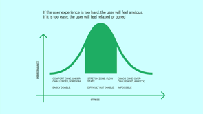
The environment is already asking a lot of you. And at some point, all of these competing demands start to matter. And there's this really useful idea from psychology, the Yerkes Dodson curve. Very simply, as our level of arousal increases, performance can improve.
But only to a point beyond that, performance starts to fall away. And for complex tasks, that point can come much sooner. And look, I'm not suggesting that a waiting room is automatically puts us over the that line. But it does remind us that the person using our interface isn't starting from zero. So if life is already demanding our attention, but but how how much more cognitive work should the interface ask us to do? So could we make matters more obvious?
Reduce what you need to remember, and perhaps make the consequence of the next action unmistakably clear? Because clarity isn't about capturing more of our attention, it's about needing less of it. So if we think about continuity, it needs to help me recover when my attention leaves.
So the doctor calls your name, you lock your phone, you put it in your pocket, you go for the consultation. Ten minutes later you come back. Now the experience might remember the screen you were on, but does it help you remember what you were doing? Could it kind of bridge you back into the task, sort of like a concierge, let's say?
So here's where you were, here's what you've already done, and here's what still needs your attention. Because preserving state isn't the same as preserving context. So think about it. We've all been had that experience of walking into the pantry and completely forgetting what we came in for.
The room preserved our place. It didn't preserve our train of thought. So if we think about control, it needs to help me recover when my when my action has consequences. So you're back at the submit button. You're wanting to kind of transfer those shares. This is the moment where consequence matters.
Can you pause? Can you check? Can you change your mind? And perhaps more interestingly, does control have to end the moment you press submit? What if for a consequential transaction, I could submit it knowing that I could reverse I had until 4PM to reverse it. Some domains already do this.
Now look, I'm not saying that's the solution and there may be very good operational reasons why that is not that particular solution isn't possible. But that's not really the point here. Right? The point is that once we start designing for imperfect attention, reversibility becomes a design question. Different possibilities start to appear because maybe the answer isn't to design isn't to demand more attention from people.
It's to design interactions that need less of it. So what does this all mean for the designers, the product owners, the product managers in this room today? If you're thinking about your mobile journey that you're currently working on, when you sit down in front of it on Monday morning, what do you do differently?
I'm not asking you to add another feature. I'm not even asking you to predict every possible interruption. I'm asking you to challenge just one assumption. Does the experience still work when I don't have the user's full attention? And there's a really simple way to find out.
In your next usability session, test for interruption. We're very good at putting a task in front of users and say and watching them work through it. Can they complete it? Where did they hesitate? And where did they get stuck? But if this is a mobile experience, I think there's another condition worth testing. What happens when their attention breaks?
Halfway through a consequential task, interrupt them. Give them somewhere else for a moment, and then let them return. And don't just watch whether they eventually finish, watch what it costs them to come back. Do they know where they are? Do they remember what they've already done? Do they recheck things because they no longer trust themselves?
Or do they abandon their task altogether? The resumption cost is part of that experience too. And you know what? You don't need a usability lab to start exploring this. Try it try it guerrilla style. Take a prototype into the kinds of environments where mobile actually gets used. A cafe in the back of a taxi waiting to pick up a delivery. Give someone a task and see what happens when the world competes for their attention.
Can they find their way back? Because perhaps we've been asking the wrong question, we measure whether someone can complete a task, we should also be asking whether they can recover when life interrupts it. So if you remember just three things from today's talk, treat attention as a design condition, design for clarity, continuity and control, and test what happens when attention breaks.
Because believe you me, your interface will be interrupted by a message, by a phone call, by a child tapping on your arm, by a name being called in the waiting room. That isn't user error, that's life. And maybe our job isn't to design as though life won't happen, it's to design for what happens when it does.
Thank you.
People
- Jan Chipchase
Technologies & Tools
- Face ID
- Digital wallets
- Fall detection
Concepts & Methods
- Mobile-first design
- Usability
- Accessibility
- Responsive design
- Human-computer interaction
- Scaffolding
- Yerkes–Dodson curve
- Reversibility
- Usability testing
- Resumption cost
- Guerrilla usability testing
Organisations & Products
- Centrelink
- TikTok
- Google Maps
Works
- Interaction in Four-Second Bursts