The Masking Tax: How Workplace Products Charge an Invisible Cost on Disabled Employees
The Hidden Work Behind Looking Productive
Josephine Abbatangelo reframes a registration funnel problem as a mismatch between product demands and human capacity. Drawing on her experience with ADHD and hypermobile Ehlers-Danlos syndrome, she explains the cognitive and physical effort required to appear consistently productive and available.
Why Invisible Disability Stays Out of Research
Abbatangelo connects the risks of workplace disclosure with the silence researchers encounter in screeners, surveys and support tickets. She defines the masking tax as a compulsory, cumulative and largely unseen cost. Product decisions can either increase that workload or reduce it.
Onboarding That Respects Limited Capacity
Front-loaded onboarding demands effort before people can experience value and often punishes interruption. Abbatangelo explains how progressive disclosure, persistent state, deferred decisions and forgiving flows reduce cognitive load. Examples from Notion, Figma and Airbnb show how products can sequence complexity and preserve progress.
Give People Control Over Attention and Visibility
Notification systems turn attention into an obligation through badges, mentions, read receipts and urgency cues. Abbatangelo recommends granular controls, optional social signals and batched notifications. She then challenges productivity tools to reflect work moving forward instead of rewarding constant presence and uniform output.
Make Accessibility Ordinary—and Notice the Cost of Hiding It
Abbatangelo argues that buried accessibility settings make people find, request and justify the support they need. Products can reduce that burden by placing customization in primary settings and surfacing relevant options in context. Drop-offs, support requests and silent churn reveal where products still ask too much.
Research for Needs People May Never Disclose
Narrow, diagnostic screeners can exclude people with invisible disabilities before research begins. Abbatangelo proposes questions about everyday working conditions, energy, focus and workarounds to invite accounts of lived experience. Asynchronous methods let participants contribute on schedules and in formats that suit their capacity.
Three Audit Questions and One Practical First Step
Abbatangelo offers three audit questions about assumed capacity, penalties for non-response and requirements to disclose disability. She highlights Australian organizations that make accessibility visible and treat improvement as ongoing work. She closes by asking designers to change one screener or screen and create environments where colleagues can safely contribute lived expertise.
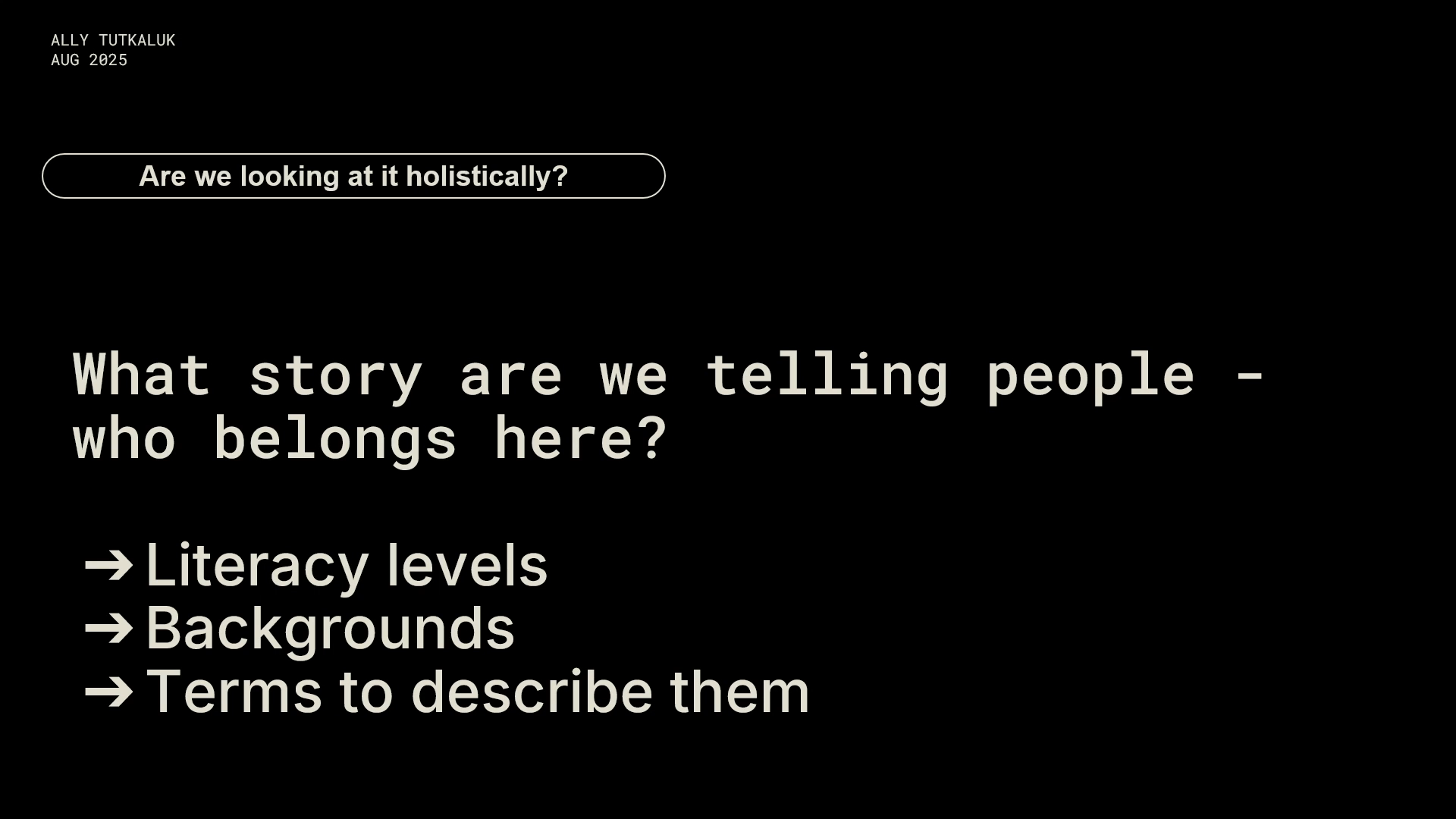
So today I'm talking about the masking tax. Earlier this year, our team looked at, November's registration data. Some people arrive ready to act and others don't, but everyone came through the same flow. We talked about fixing the conversion funnel, but the funnel isn't 100% of the problem. We don't know what someone is ready to do when they arrive, and we treat everyone the same.
And for that, that's that's enough to lose them. I remember thinking, this wasn't just a conversion issue. It was a cognitive one. And I wanna name something really personal here because it shapes how I see this problem. I'm a senior product designer, and I live with h e d s and a d h d.
I've spent years building products and years quietly compensating for the ones that weren't built for me. HEDS, and for those of you who don't know what that acronym stands for, it's Hypermobile Ehlers Danlos Syndrome, means that my body can make ordinary effort feel extraordinary and exhausting. ADHD means my attention and my momentum can drop when a task asks for too much too soon.
So when I looked at this funnel, I didn't just see a conversion issue. I saw a design that required a capacity that people might not have in the moment. And when you're low on energy or attention, being asked to do the wrong thing at the wrong time can be enough to stop you entirely. And that's why I felt like it was bigger than optimization. The real issue was simpler.
These groups are often overlooked in the product design process. And as designers, we often don't know what people need, but we design as if we do. For me, cognitive the cognitive masking looks like compensating for ADHD in environments that reward linear thinking, constant context switching, and visible productivity.
It means putting systems in place to stay organised, to stay focused, and to be on top of things, even when that takes an an enormous effort behind the scenes. ADHD can make it harder to start tasks, to switch between them, and keep track of what comes next. So the masking isn't just about looking productive.
It's about creating enough structure to keep moving even when my brain doesn't naturally feel linear. And then there's the physical masking. It's the effort of managing pain, fatigue, unpredictability while trying to look reliable, steady, available. For me, that's shaped for my by my h e d s, and I wanna name that because it's personal.
Some days, just keeping up already takes more out of me than it might someone someone else. Some days, flare ups change what I can do without warning, And that's why an always on culture feels so loaded. It asks me to perform a consistency my body doesn't always allow. And this is a hidden this is the hidden tax.
It's not just doing the work. It's, carrying the body. Oh, sorry. I just lost. Sorry. It's carrying the body you're in, and it's not oh, sorry. It's carrying the body you're in and doing the work in, and it's not passive. It's labor.
So who pays the tax? Masking can feel individual, but it isn't rare. A large number of people are living with invisible disability, and many don't disclose that at work. And when we think about invisible disability, we need to think more broadly. So chronic pain, fatigue, autism, ADHD, mental health conditions, neurological differences and sensory processing issues all sit within this picture.
The issue isn't just the disability itself. It's the workplace conditions that make disclosure feel risky. In Australia, one in five people live with a disability, most are invisible. Thirty percent of employees with a disability didn't disclose it when their employer asked. And fifty six percent fear career consequences from disclosure.
Those numbers tell us something really important, and the issue isn't just the disability itself. It's the conditions that make disclosure feel really risky. And I want you to notice that the risk doesn't stop at the office door. If more than half of people won't tell their employer, the person with the legal obligations to them and a duty of care, why would they tell you in a five minute research screener or in a support ticket or in a survey after they've abandoned your checkout. It's the same fear and it's the same silence, which means that the people most affected by the masking tax are also the people least likely to appear in your research.
So you have two options. Wait for them to disclose or design and recruit as if they're already here. And you might be thinking, why call it a tax? And I want you to understand that this isn't a metaphor for inconvenience. It's a cost, and it behaves like one. First, it's compulsory. You don't choose whether or not you want to pay it. If you want to participate in work as it currently exists, you absorb that cost yourself.
And second, it scales with usage. The more systems you navigate, the more meetings you perform your way through, the more you have to compensate, translate, manage and recover, the cost compounds over time. And third, it's invisible to everyone else. Most of this work isn't seen by managers, colleagues or product teams.
They don't see the effort directly. They see the downstream effects such as fatigue, inconsistency, burnout, or disengagement. And finally, products either charge it or they waive it, and that's the design implication I want to land. Every product decision either adds to that hidden workload or reduces it, whether the team is conscious of it or not.
And now that I've explained what the masking tax is, I wanna show you where some products charge it and how you might waive it. I've got four patterns that make life harder for people with invisible disabilities and what you could do instead. So pattern one is front loaded onboarding. It's one of the clearest ways that products charge the masking tax.
These sorts of flows ask the most of us at the moment we have least to give. You have to set up first, value later, and then there's rarely a way to pause and come back. Everything's required, so you can't find out whether the product is worth the effort until after you've already spent it. There's no way to skip or explore so that the flow quietly assumes you can finish it in one sitting.
And if you can't, a time out might take your progress with it, which means now you're rushing on top of everything else. And that's what charging the masking tax looks like. It's not just one big barrier, but a series of small demands placed when someone has the least capacity to carry them. And if front loaded onboarding charges the tax, this is then this is how we might waive it.
First, progressive disclosure. Don't ask people to make every decision at once. Let them move forward, then reveal complexity when it becomes useful. A good example would be when a product lets you start doing the thing right away without making you configure everything first. Notion does this really well.
You can open a new page and just begin. The templates, the settings, the integrations, they're all there if you need them, but they're not forced on you upfront. Figma is another good one. I think we all use Figma in this room. You can open a blank file and just start designing straight away. The complexity is there, but it waits until you actually need it.
Good onboarding doesn't just get rid of the complexity. It just doesn't dump it all on you right from the start. Second, persistent state. Let people be able to save their progress automatically. If someone gets interrupted, they get distracted or they run out of energy, they should be able to come back without having to start over. Third, skip and defer.
If something isn't essential yet, don't force it. Let people keep going and fill in the rest later. Underneath all of that is the broader principle of designing for forgiveness. People will lose focus. They will close the tab. They will miss a step. They'll make a wrong choice, or they'll need to leave and come back. Good onboarding doesn't punish that.
It helps people recover, continue, and find their way back in. And why this matters is that onboarding is also a cognitive load problem. Working memory is limited, so every extra field decision or instruction takes up mental space. And when we reduce unnecessary load, people are more likely to understand what's happening, stay orientated, and keep going.
And that's why these patterns work. Progressive disclosure narrows the attention to what matters now. Persistent state protects context so people don't have to reconstruct progress from memory. Skip and defer reduces the pressure to decide everything up front. And designing for forgiveness means building for real human behaviour and not just a happy path.
And that's the shift I'm talking about. The goal isn't to remove complexity entirely, it's to sequence it better, reduce unnecessary cognitive load and build flows that can handle real human behavior instead of ideal behavior. And that's what a more humane onboarding looks like.
It respects interruption, it respects uncertainty, and it respects the fact that people don't always arrive with full capacity. Now some of you are thinking, our flow is complex because it has to be. We have compliance requirements. We have legal steps. We have things that we just can't skip.
And that's fair. So let's look at a product with real unavoidable complexity. If you list a place on Airbnb, they need your address, your photos, your pricing, your legal declarations, your safety details. None of that is optional and none of that is quick.
Roughly one decision per screen. Your draft saves continuously. You can leave for a week, come back, and pick up where you were. The complexity didn't go anywhere. It was just broken into pieces small enough to carry, and the product remembers where you got to. That's the whole argument. I'm not asking you to remove the hard parts.
I'm asking you to stop requiring that someone get through all of them in one sitting at full capacity on their first attempt, because that's the assumption underneath most complex flows. Not that the work is hard, but that the person doing it will be at their their best the entire way through. And the next two patterns live in workplace tools.
That's not a detour because for a lot of designers in this room, the workplace is your product. The second pattern is notification systems, and they can be the clearest way products charge tax. They're often designed they're often designed around systems system priorities rather than the needs of the person receiving the message.
For people with ADHD, badges, mentions, read receipts, urgency cues aren't small distractions. They become attention traps, because these systems treat switching attention as easy when it often takes real effort to recover focus. You can see that in the patents themselves, badge counts that can't be dismissed without reading, mentions that create social pressure to respond, read receipts that make attention visible and urgency indicators that keep escalating.
The issue isn't just the noise, it's that these systems can turn attention into an obligation, placing the burden and the coordination on the recipient. And if notification systems are one of the easiest ways that products charge the tax, this is how we can take that burden back. First, give people granular control.
Let them decide what actually deserves interruption, and let that vary by context. Not everything should be treated like an emergency. Second, remove social signalling where you can. It's not always possible. Read receipts, presence indicators, little status pressures. Those should be opt in, not the default.
People should be able to engage without feeling like they're being watched. And third, batch notifications. Deliver them on the user's schedule, not the senders. That's the that that way, attention becomes something people can manage instead of something constantly being taken from them. So the goal isn't silence, it's control.
Let people choose when they interrupt their own focus instead of having every system do it for them. And pattern number three, designing for variable capacity. Presence and productivity tools often assume capacity stays constant. Workplace systems tend to reward visibility and steady output, even though human capacity changes from day to day.
The result is a system that rewards visible consistency and leaves little room for someone to say, you know what? Today is a low capacity day. The main point is simple. People don't have the same capacity every day. If a system only works when someone is at their best, it's not really working for everyone. Flare days, interrupted days, low focus days, pain cycles, shutdowns, and stop start work, we all know it, the 50,000 meetings in a day, they're often reduced to the same label, under performance.
And this is the pressure that people feel in the system. If you're online, you seem committed. If you reply quickly, you seem productive. If tasks go overdue, it can feel personal. And if progress isn't neat and linear, the system can make that feel wrong too. So how would you waive the tax?
Status dots tell you very little about the work itself. A better system gives you signals about what's moving, what's blocked and what's been completed, so you can understand the progress without relying on visibility alone, especially when someone's capacity changes from day to day. Instead of asking, are they online?
Ask, is the work moving? And design your signals around that. And pattern number four is buried accessibility settings. One of my favorites. When accessibility is buried, it can feel like the product is saying, this isn't important and you aren't important.
The real tax is the extra work of finding it, asking for it, justifying it, or relying on support just to turn it on. When accessibility is hidden in separate settings, absent from onboarding or framed as a special request, access starts to feel exceptional rather than feel expected. Accessibility should feel like a normal preference, not a special request.
Good design lets people adjust things like text size, contrast and layout in clear and familiar ways. When these options are visible in the main settings, they feel standard. When they're hidden or treated as workarounds, people could feel like they're asking for something unusual just to use your product properly. Better design surfaces relevant settings at the moment they're useful, using contextual prompts, onboarding, and visible cues.
So support feels built into the product rather than hidden behind a set setup friction. And that matters because discoverability is part of usability. When products introduce features in context and at natural pauses, people are more likely to find and use them. And when important settings stay buried, the burden shifts back to the user. The design move is simple.
Put accessibility and customization in private in primary settings, where people already expect to shape their experience. When those options are visible and standard, they read as ordinary preferences rather than special accommodations. And the masking tax doesn't disappear just because you can't see it. It shows up in your metrics instead, and then by then, the damage is already done.
It shows up when people drop out of flows at the moments that demand the most cognitive effort. It shows up in support tickets for things that should have been built in. And it shows up as silent churn. People quietly stop using the product and never tell you why. Adoption stalls, and there's no return on investment.
That means these aren't separate problems. They're signals. If you know how to read them, they will tell you where the product is asking too much, and that's where the work begins. But inclusive design patterns are only as good as the people we include in the research that shapes them. As designers that talk to users, well, hopefully you're all talking to your users, Let's chat about changing our practice and recruiting participants for what you can't see.
Many standard screeners unintentionally filter people out, not because they're irrelevant, but because the questions are too narrow, overly diagnostic or focused on visible or already disclosed conditions. As a result, invisible disability is often excluded before research even begins.
This is why asking a question like, Do you manage any ongoing conditions that affect how you work from day to day matters? Open, non diagnostic phrasing gives people space to describe how their circumstances shape their work without requiring them to label or medically justify their experience. It's a small shift, but one that makes invisible conditions more likely to surface in ways rigid screening approaches rarely allow.
The question, do you use any tools or workarounds to help you manage your energy or focus during the day? Matters because many invisible conditions don't show up unless there's direct disclosure. People may never name ADHD, fatigue, pain or burnout in a screener, but they'll often describe the systems, tools and workarounds they rely on to get through the day.
That's why it's a useful prompt. It shifts the conversation away from diagnosis and towards lived experience. Instead of asking people to identify with a label, you're asking how they actually manage focus and energy in real life, which is often where the most valuable research signals are. This is the point where recruitment and method have to line up.
It's not enough to invite a more diverse group of participants if the format of the interview or study assumes everyone can attend live. Respond in the moment, stay focused for long sessions or perform well under pressure. Offering async options is a practical way to reduce this mismatch. Methods like diary studies, discussion boards, asynchronous interviews and video response tasks give people more control over timing, energy, focus and disclosure.
They often produce better insights because participants can engage in ways that fit their actual lives, rather than forcing them into a format built for someone else. And here's an easy way you can do a simple audit on any product, flow or screen in your coming week. First, ask whether it assumes consistent capacity.
And if it does, how could you design for variability instead? Second, ask whether it penalises non response or non presence. If it does, what could be an async alternative? And third, ask whether someone would have to disclose a disability just to use it comfortably. If they would, how would you remove that requirement?
Those three questions are a quick way to spot where the masking tax is hiding. And once you spot it, you can start designing for it. It's not all doom and gloom. I thought I'd mention a few people who are doing it well, and close to home Australia has got some strong contenders.
The City of Cockburn was recognised at the Australian Access Awards as joint website of the year and government website of the year, which shows accessibility can be achieved in real public sector products and not just in theory. The National Library of Australia and Vision Australia are useful examples for different reasons. Both make their accessibility commitments explicit, they treat them as part of the core experience, and describe ongoing testing and improvement rather than just a one off compliance task.
The reason I mention these isn't to say that they're perfect. It's to show that accessibility can be visible, it can be intentional and built into mainstream Australian digital products. And I want to leave you with some practical actions to take. Add a single invisible disability question to your next research screener, or take one screen and run the three audit questions over it.
This will show how inclusive design can begin with one simple thoughtful change. Either one is enough. Inclusive design doesn't need to start with an overhaul. It can start with one question that makes hidden needs easier to see. And the person best placed to spot these problems, they might already be on your team, because lived experience is a form of expertise.
But the work isn't just about getting the person in the room. It's making sure that the room is one where they can speak, be heard and not be left carrying the whole burden alone. And that's where the work starts. It's not just with representation, but with an environment that values lived expertise and makes it safe to use.
And the question isn't whether your users are paying the masking tax, it's whether you've been paying attention. That's the real work. See the invisible cost, design for it, and stop making people carry it alone. Thank you so much, guys.
Technologies & Tools
- Read receipts
Concepts & Methods
- Masking tax
- Conversion funnel
- Cognitive masking
- Context switching
- Physical masking
- Invisible disability
- Front-loaded onboarding
- Progressive disclosure
- Persistent state
- Skip and defer
- Designing for forgiveness
- Cognitive load
- Working memory
- Notification batching
- Designing for variable capacity
- Contextual prompts
- Inclusive design
- Diary studies
- Asynchronous interviews
- Video response tasks
Organisations & Products
- Notion
- Figma
- Airbnb
- City of Cockburn
- National Library of Australia
- Vision Australia
Works
- Australian Access Awards