Native HTML elements you should already be using: building without Javascript.
The Case for Building Without JavaScript
The speaker opens with a provocative question — can you build rich web applications without JavaScript? — and frames the talk as an exercise in expanding the developer toolbox rather than abandoning JS entirely. Drawing a contrast between the static, marquee-tag web of 1993 and today's expectation of rich interactive UI components like accordions, modals, tooltips, and rich selects, the speaker sets up the core argument that many classic UI patterns no longer require JavaScript to implement.
The Hidden Cost of JavaScript Dependencies
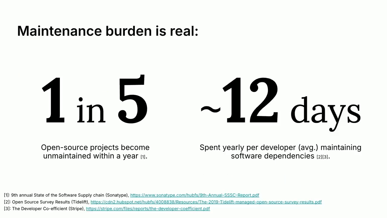
The speaker walks through a familiar scenario — the boss wants a modal, so you reach for an npm package — and exposes the downstream costs: vulnerabilities, transitive dependencies, and the ever-present risk of a maintainer archiving the repo. A 2023 analysis showing nearly one in five maintained open-source JavaScript projects becoming unmaintained within a year, combined with estimates of roughly 12 developer-days per year spent on dependency maintenance, makes the case for a native alternative. The speaker briefly introduces Open UI, the W3C community group whose work underpins the browser-native approaches covered in the talk.
Building Accordions with HTML Details and Summary Elements
The speaker demonstrates how to build accordions — a UI staple for FAQ sections — using only the native HTML details and summary elements, with no JavaScript required. Beyond basic expand/collapse, the speaker covers custom arrow icons, hover styles, animated height transitions, and an exclusive accordion variant using the name attribute to restrict a group to one open item at a time. Both elements have been widely supported across major browsers since January 2020.
Building Modals with the Popover API
The speaker walks through how the Popover API enables modals to be built in plain HTML and CSS, including light-dismiss behavior where clicking outside the modal closes it automatically. The minimal implementation requires only the popover='auto' attribute on the modal element and popovertarget on trigger buttons, with the browser handling visibility toggling. The speaker also covers entry animations using the @starting-style rule, backdrop blur and darkening, and clean JavaScript integration via the showPopover method for programmatic control, noting the API has been supported across all major browsers since April 2024.
Positioning Tooltips with the Anchor Positioning API
The speaker contrasts the legacy approach to tooltips — relatively positioned wrapper divs and manual CSS translations — with the cleaner Anchor Positioning API. By assigning an anchor-name to a target element and using position-area on the tooltip, the browser handles all positioning logic, making it trivial to place and reposition a tooltip relative to any of eight points around its anchor. The speaker notes the API is available in the latest Chrome and Edge builds and rolling out to Safari, but is not yet supported in Firefox.
Rich Selects and the Browser Compatibility Trade-off
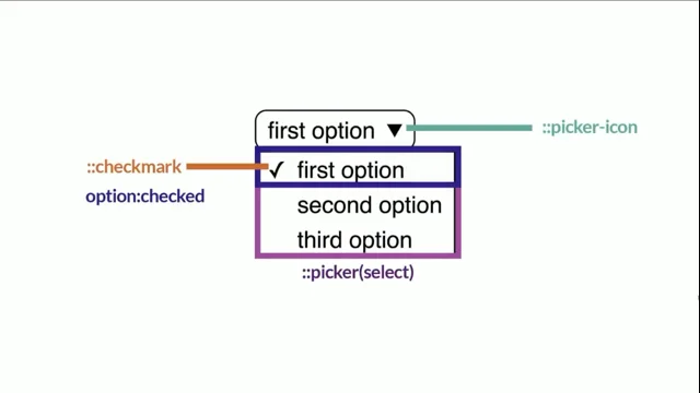
The speaker introduces the appearance: base-select CSS property, which unlocks deep customization of native select elements — styling individual options, their checked states, and the check mark — enabling rich selects without large JavaScript libraries. Acknowledging it is only available in the latest Chrome and Edge builds, the speaker honestly confronts the core trade-off of the native approach: developers cede agency to browser vendors and must wait for full cross-browser rollout before shipping, with Safari's roughly 18% market share making incomplete support a meaningful concern.
Upcoming Open UI Proposals and Key Takeaways
The speaker previews three active Open UI proposals still on the horizon: a combobox element with searchable and multi-select capabilities, a native switch component to replace checkbox hacks, and an enhanced range input supporting dual handles and cross-browser consistency. The talk closes with three takeaways: all four UI patterns covered can be implemented without JavaScript today or very soon; the native APIs are approachable enough to experiment with immediately on CodePen; and while the reduction in maintenance burden is tangible, browser compatibility remains the key trade-off developers must weigh.
Thank you, John, the lovely introduction. And actually thank you, Steph as well for kicking us off this morning. You might hear a few things pop up in this prezi that Steph already touched on. All that should tell you is that they're worth paying attention to and she also explained them much better than I probably will. To get into it though, so building without JavaScript, is that even possible? Of course, is.
Otherwise, I wouldn't be here. And by the end of this talk, I hope I've answered for you, well, what can HTML plus little CSS, what can that really do? Now, I'm not encouraging you to go out and delete all your JavaScript, but rather this talk is about expanding your toolbox, your repertoire of tools and techniques that you as developers use to build your web apps. So we'll get them.
But to start, let me take you all the way back to when John was a bit more young and sprightly back to 1993. In 1993, the web looks like this. Marquee tags were still cool. HTML was just starting to coalesce into a set of standards.
It really was a simpler time. The web was designed around displaying static content, static information, and form controls at this time didn't even really exist. I think this is where a lot of our minds go to when we hear the words HTML. Static content, maybe forms, not too much else.
Whereas if we jump forward to today, thirty two years later, the story is very different. The web has evolved and so have the expectations of our users. Rich interactive UI components are the norm. Components like accordions, tool tips, modals, rich selects, and more.
These have all become classic UI patterns that are expectations in any new app or SaaS these days. For a long time, I think JavaScript really was your only option for implementing a lot of these patterns. And I think we've all gotten pretty used to immediately reaching for the nearest package to implement these features.
For instance, here's I think a pretty common scenario. Say the client, the boss, the product manager, say they want a model. Well, that's fine. We can just install the NPM package. Right? We have thousands of options to choose from. There's gotta be a couple of good ones.
Of course, I'm pretty sure NPM was down this morning, so maybe not as easy as you'd hope. But, assuming it's up, you find your package, that's great. A little NPM install here, copy all the boilerplate into your app and voila. Don't mind all that code. I heard eight imports for a modal is pretty standard these days.
So you've got your modal component, that's great. Everyone's happy, you can move on with your life except, well, what about bugs? What about vulnerabilities? Because they will pop up from time to time, either in the dependency itself that you've just installed or via the transitive dependencies you've pulled in via that modal package you're now relying on.
That's fine though. We can just head over to the packages repo. We can open an issue. If you're feeling particularly generous, maybe we'll quickly draft a new pull request, put that up for review. Hopefully, the maintainer can get onto it quickly. Now that's all good until inevitably one day you'll open GitHub and see this. Oh, shit.
Oh, fork. This repository was archived by the owner. Maybe the maintainer won't even archive the repo. Maybe the maintainer will just stop maintaining. It's almost inevitable that something like this will happen to you. You know, software evolves, people move on, and with the sheer number of dependencies any modern app pulls in these days, something like this is gonna happen to you sooner or later.
Because maintenance burden is real, as developers, I think we all intrinsically know that, but to put some numbers to it, a 2023 analysis of open source JavaScript projects found that nearly one in five projects that were considered maintained in one year had become unmaintained by the following. One in five.
There's also multiple reports breaking down the amount of time devs spend specifically on dependency maintenance. These reports sort of land around that 5% mark or so, which which works out to around twelve days per year spent dealing with dependencies, installing them, maintaining them, upgrading them, etcetera.
So what if there was another way? We can probably guess where I'm going with this. Now, the saying goes, the best code is no code at all. And while we won't be able to get away with no code, what if we needed just a handful of lines of HTML and CSS to build certain features rather than an entire new package plus its dependencies, plus its imports, plus its implementation.
For the UI patterns that I mentioned earlier, accordions, modals, tooltips, rich selects, new browser APIs are making it possible to implement them without writing a single line of JavaScript. I'll take you through a few examples in a second. Before that though, I just wanna briefly mention Open UI.
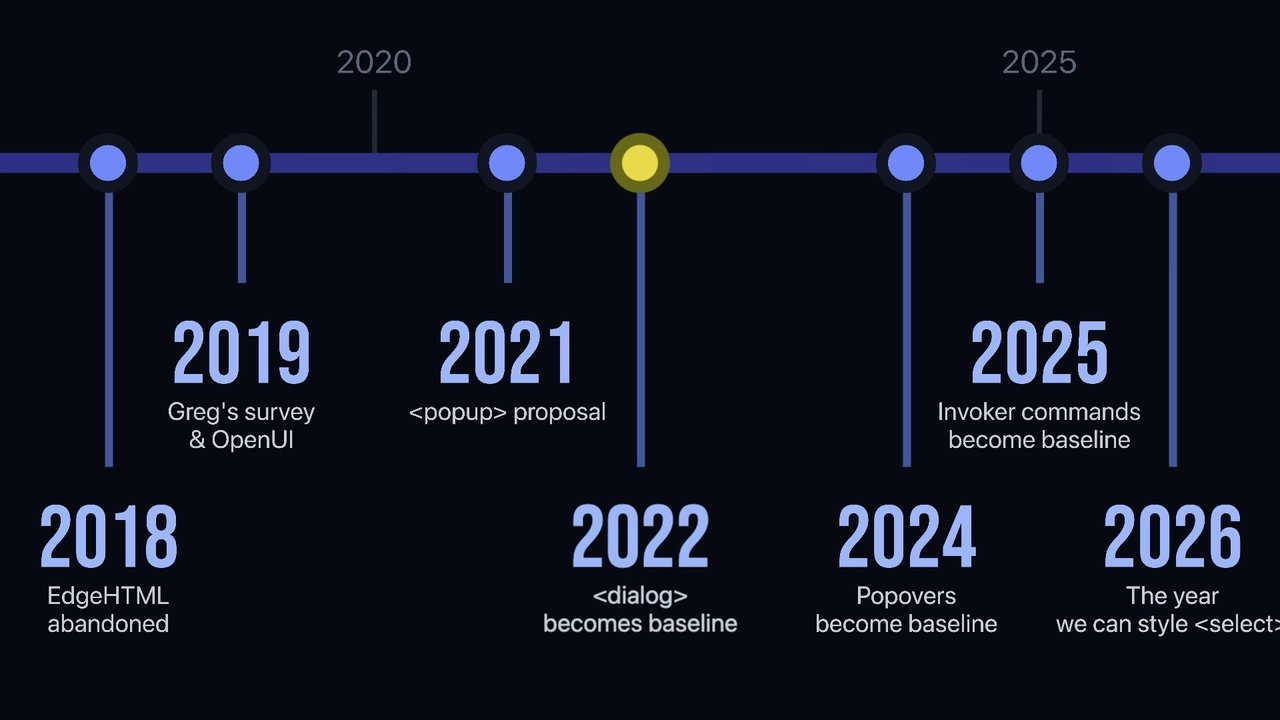
Now you might already be familiar with them. They're a w three c community group formed around five years ago, and their purpose is to make web elements more stylable and extensible. They've done some really cool stuff. A lot of it is actually the foundation for this talk, and there's more coming which I'm going to touch on at the end of this presentation.
Okay then. Let's take a look at some examples. Our first example here is this accordion. You'll see these used all over the place, particularly for FAQ sections, and they're actually really easy to build using the details and summary HTML elements. Each of these questions here is a details element, and when they're collapsed, only their summary element is shown, only the content in that summary tag.
Then when you click and expand them, they reveal the hidden nested content. Now, you can also probably see these elements are quite stylable. For instance, you can use custom icons for the arrowhead of the summary tag. You can conditionally style these elements on hover. You can animate things like the arrowhead's rotation when we open, one of those details using the open attribute selector.
You can also animate the height of these elements. You can see that sort of peeling open when I open one up. Now, a variation on these regular accordions are these exclusive ones. As you can see, only one accordion in this group is allowed to be open at a given time. As well, this is quite easy to do.
By providing a matching name property to a group of details elements, we can treat them as one exclusive group. Now certainly, I think this is a situational behavior. I think the flexibility though is nice and it makes these elements more versatile. Now, we actually got introduced to these tags yesterday, so thank you for doing that for me.
If you remember, green is good, blue is also good, yellow is not as ideal and we'll get to those. The details and summary elements, they're very well supported. They've been widely available since January 2020. Onto our second example, modals or dialogues. Like accordions, modal are a very versatile UX pattern.
And thanks to, as Stephanie mentioned, the relatively new popover API, they're actually very straightforward to implement in plain HTML and CSS. Now to remind you, this new API gives us a simple consistent way to display content like our model, like Stephanie's tooltips on top of the regular page content.
This API even lets us open and close these popovers directly in HTML, plus gives us this light dismiss functionality where I can actually close the modal just by clicking outside of it. You'll see it here. Now here's the minimal code for that example. There's three main things going on here.
The first and most important is the popover equals auto property on our modal div. This tells the browser to treat that div as a popover and unlocks a lot of built in functionality. Next, within our modal, we have a button targeting it targeting it with the popover target property.
And finally, outside our modal, we have something similar. A second button targeting our modal with as its pop over target. So by setting the pop over target property on our buttons, they automatically toggle the modal's visibility when they're clicked. What ends up happening here is first, we'll click that open button.
It opens up our modal. That reveals the hidden sort of close button inside it. We can then click that close button which toggles our modal closed again. Now this behavior, it's all configurable. For instance, you can explicitly set whether a button should open or close a pop over rather than relying on this default behavior.
And now as we've learned, the popover API isn't limited to modals either. Steph showed us how to use them for tooltips. They're also great for things like toast notifications and slideovers. They also play nicely with JavaScript. For example, maybe you want to display a pop up, you know, pop open a modal when your user completes a separate action.
You can do that really easily by calling the show popover method on any sort of popover element. So you're not limited to triggering them just in your HTML. You have plenty of options for styling a popover as well. For instance, you can animate them in when they first appear using the relatively new starting style CSS rule.
Like how that example I shared, that GIF, the modal was sort of popping in when I opened it. It was sort of springing into the page. You can also style the modal's backdrop, for instance, blurring or darkening it. So blurring or darkening the content underneath it. And the models themselves, well, they're just plain HTML elements.
Our model was a div, so they're fully stylable as well. In terms of in terms of compatibility, the popover API is again quite well supported. It's been available across all major browsers since April 2024. On to our example three, tooltips.
We've already learned a bit about them. I think tooltips are a great way to avoid littering labels throughout your UI, and you can already build them without any new browser APIs, but it is a bit clunky. The way I've built them in the past, you need to wrap your target and tooltip in a relatively positioned div, then you can absolutely position your tooltip within that group, translating it into the position you want. Now, course, you can pull this out into a component.
You might not have to look at it as much, but it's still ugly code that someone else, hopefully not you, will have to maintain. Now, fortunately, with these new browser APIs, it's becoming a lot easier to position and build these components. We're talking again about the anchor positioning API. Now this API, to remind you, lets us position elements anywhere on the page relative to a central anchor without regards to other elements in the layout. We can position relative to any of these eight points on an anchor or multiple.
For instance, we can position along the entire left hand side of an anchor. Now we can use this anchor positioning API to rebuild those tooltips without a relative wrapping div or those positioning translations. We could do something like this. We can give our target element, an anchor name. I've called it, Anc.
Then on our tooltip, we tell it which anchor to position itself relative to our Anc and where it should be positioned, I've said on top. Finally, if we set its position absolutely, the browser will handle the rest. This is much simpler than the previous example, and it's also much easier to control where our tools where our tooltip will appear relative to its target.
For instance, if we wanted to change it to appear on say the left, we just change position area to the left rather than messing with all these sort of translations. Of course, Steph showed us, we can integrate the pop over API into this example as well. Now anchor positioning slowly becoming available.
It's out on the newest Chrome and Edge versions rolling out to Safari as well, not there on Firefox. My final example, I've called these rich selects. I've been waiting for years to build something like this without a big old lump of JavaScript, and it's finally, nearly here.
That's all thanks to this new base select appearance. This new appearance base select property lets us deeply customize these select elements. It essentially unlocks the internals of that select element so that we can style them. Here's what I mean.
This new base select appearance unlocks all these different selectors for us to style. Things like styling each option, plus its check state. Styling or hiding the check mark itself for a selected item and much more. Unfortunately, this isn't quite ready for prime time yet either.
It's currently available in the latest few Chrome and Edge builds, but Safari and Firefox are yet to follow. And that leads me into the main downside for any of these HTML and CSS based examples that I've shared. Of course, I'm talking about browser compatibility.
By offloading all these implementation details to the browser, we become reliant on those same browsers to implement new features for us. We lose a lot of our own agency and kinda just have to wait on these browsers. Take Base Select for example, the one I just showed you. It landed in Chrome and Edge in early March this year, and it's actually already pretty well supported for most of their user base.
But Safari, well, they make up around 18% of all web traffic and they're just taking their time. Unless you want one fifth of all your users to see something kinda janky, you just have to wait. Now that is a pretty major downside. But in saying that, we do benefit a lot from simplified code and dependencies within our apps.
Plus there's, of course, entire teams of people working on these browsers. They're fixing bugs. They're adding new features. They're working on this sort of stuff so that people like us, well, we don't have to worry about that as much. Once a feature does land in a new browser as well, it's typically well supported from then on. It's really this this waiting game.
And once we're there, well, then we're good. So at the end of the day, everything's a trade off. But I do think there's a lot to gain from leaning into these browser native approaches in terms of that lower maintenance burden I was illustrating earlier. Now, before I wrap up, I thought it could be cool to take a quick look at a few new HTML elements a bit further out on the horizon.
Here are three active proposals from Open UI, that w three c working group. Now, these are still hash getting hashed out, but let me run you through them. The first is this combo box element. These build on that base select stuff I showed you earlier and combine that with the ability to search results and select multiple options.
They're a bit like a data list with more customization. For instance, customizing the algorithm you might use to actually filter results as you're searching. The second is this switch component. Now these are common elements, especially I think in mobile UIs. And I think having a native implementation will be very nice. We won't have to hack them together with checkboxes like we do now. We'll just be able to drop in a switch.
Finally, there's also plans to enhance the range input. Call it a range v two, if you will. The idea is to fix cross browser inconsistencies, add support for dual range handles, imagine selecting a min and a max, and make these elements more customizable with their own base styling.
I've seen a lot of phones pop up. Just remember these are drafts. Don't quote me on this. Maybe crop me out even. Alright. I'm gonna start wrapping this one up. In summary, first, for each of the four UI patterns I've shared with you today, accordions, modals, tooltips, rich selects, You can either now or soon implement them without writing any JavaScript, unless you want to, but you don't have to.
Two, these HTML elements and these new CSS APIs, they're actually really straightforward, so give them a try. There's a bunch of great resources out there, a bunch of great MDN documentation available to help. A few of you have your laptops out, you could probably hop on CodePen now, whip something up in a few minutes, choose one of these examples and have a play.
It's really not that difficult. Finally, know what you're gaining and the price you're paying. The stuff I've shown you, I believe, really does have the does have the ability to have a tangible impact on the maintenance burden in your apps and software with of course the pretty major downside of juggling that browser compatibility.
That's me. Thank you. I'm sure we'll have a little bit of question time now, but you're welcome to email me if you have any more questions. Cheers.
Technologies & Tools
- @starting-style
- Anchor Positioning API
- base-select appearance
- CodePen
- Combobox element
- details element
- NPM
- Popover API
- Range input
- summary element
- Switch element
Organisations & Products
- Chrome
- Edge
- Firefox
- GitHub
- MDN
- Open UI
- Safari
- W3C