Forging Our Own Paths
Introduction and CSS Offset Path Overview
Speaker A introduces Eric Meyer, highlighting his iconic CSS reset, books, articles in A List Apart, and his influential web components article. Eric takes the stage and introduces the concept of CSS offset path using a solar system information file as a motivating example, noting that transforms and rotates have long made such effects possible but offset path makes them significantly easier. He establishes the talk's theme by citing State of CSS survey data showing 69% of respondents had never heard of offset path despite it being widely available for over four years.
Offset Path Fundamentals: Values, Syntax, and Offset Distance
Eric surveys all available offset path values and walks through the formal syntax, noting its complexity due to human-readable background-positioning syntax. He highlights two key rules: only transformable non-inline elements can be placed on a path, and path elements create a stacking context. He then introduces offset distance, explaining how length units, percentages, calc functions, and CSS custom properties can all be used to position elements along a defined path.
The Ray Function: Angles, Sizes, and Origins
Eric explains the ray() function, showing how it takes an angle value along with optional size keywords (closest-side, farthest-corner, sides, etc.) and a background-position value to set the ray's origin within the containing block. He demonstrates using a CSS custom property with a range slider to interactively move an element along a ray, notes the ray function is approaching baseline widely-available status, and walks through the various size keywords and flexible value ordering the function supports.
Live Browser Demo: Ray Behavior and Size Keywords
Eric switches to a live browser demo to illustrate ray behavior, showing how farthest-corner controls distance rather than direction, how the default origin sits at the center of the containing block rather than the top-left, and how the sides keyword stops the ray when it intersects any edge. He demonstrates the contain keyword intended to keep animated elements within their containing block, expresses frustration that browser implementations appear inconsistent, and explores the effect of square elements on the behavior.
Offset Anchor: Controlling the Element's Attachment Point
Eric introduces the offset-anchor property, clarifying it is distinct from CSS anchor positioning. He explains that offset-anchor defines the point within (or outside) an element that attaches to the path, making it possible to use top-left, center, percentage values, or even negative coordinates to place the anchor point outside the element entirely. He previews how negative offset-anchor values will be used in a later labeling example.
Functional Path Values: inset, rect, xywh, polygon, path, and shape
Eric demonstrates six different functional values for offset-path — inset, rect, xywh, polygon, path, and shape — all producing the same diamond path shape, letting attendees compare their syntax. He notes rect's unique support for rounded corners via the round keyword, introduces the shape function as a more human-readable alternative to SVG path d-attribute syntax, and uses a checkbox hack to toggle the offset-rotate property, showing how to suppress automatic rotation as elements travel along a path.
Offset Rotate, Ellipses, Overflow, and the Solar System Effect
Eric covers the offset-rotate property in detail, demonstrating the auto value that keeps the element's y-axis perpendicular to the path and showing how adding a degree offset tilts the element while still tracking the path. He introduces ellipse paths and notes that rotating the whole ellipse requires using path or shape functions. He then reveals how setting overflow to hidden on the containing block hides animated elements that venture outside it, explaining this is the exact technique used to create the planetary orbit animations shown earlier.
Box-Edge Keywords and Animated Labels
Eric explains the box-edge keywords — content-box, padding-box, border-box, and margin-box (Safari only) — which let elements animate along the actual edges of a containing block's box model. He walks through how he constructed animated diagnostic labels using generated two-em wide divs with negative offset-anchor values to create dot-and-tail indicators, and finishes with a 'move, twirl, and flare' sparkle animation triggered on the content-box edge, showing the minimal markup required.
Sparkly Buttons and Immersive Button Environments
Eric applies the sparkle effect to real button elements, noting the accessibility-conscious choice to use actual button elements rather than styled divs. He then demonstrates a more immersive effect where SVG fish animations run behind buttons at z-index minus one, creating the impression of the button as an environment — culminating in the crowd-pleasing 'belly flop' animation. He attributes the effect entirely to the shape() function and shows how three value changes in a single shape definition switch between animations.
Scroll-Driven Animations with Offset Path
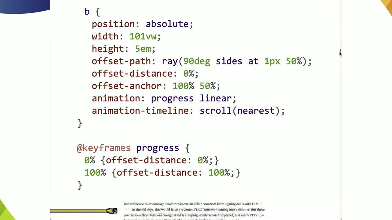
Eric introduces scroll-driven animations paired with offset path, using a copy of Neal Stephenson's 'Mother Earth Mother Board' article on meyerweb.com as a canvas. He animates a decorative b element along a ray to indicate reading progress, driven by a scroll timeline. He then reveals a more complex wiggly progress-indicator shape built with the shape() function — also available as a compact SVG path() value — and adds a second view-based scroll timeline that animates a sailing ship only when the relevant section is in view.
URL References to SVG Paths and the Dash-Offset Technique
Eric demonstrates pointing offset-path at SVG path elements by ID using URL references, animating arrowheads along SVG diagram paths. He explains the classic stroke-dashoffset drawing technique for the arrow tails and shows how to retrieve exact path lengths via the browser console. He then identifies a key limitation: SVG units translate to CSS pixels at a fixed 1:1 ratio, so shrinking the SVG does not scale the path. His solution is converting pixel-based paths to percentage-based shape() values, and he introduces Temani Afif's SVG-to-CSS Shape Converter tool that automates this calculation.
Clip Paths, Positioning Quirks, and Path Alignment Gotchas
Eric explores the interaction between clip-path and offset-path, showing how using the same value for both properties yields different results depending on whether the animated element is inside or outside its containing block, and how setting position: relative makes the div the containing block for the offset path. He then highlights a subtle but important gotcha: offset paths inherit the shape of a reference path but not its position, meaning moved SVG reference elements will cause the animated element to travel the same shape from a different origin — a misalignment that is not automatically corrected.
Missing Features and Ideas for the CSS Working Group
Eric outlines features he believes are missing from the offset path specification: a mechanism to automatically align an offset path's origin with its reference SVG element's position, a way to scale CSS path() unit values proportionally when an SVG resizes, and dedicated browser developer tools analogous to Firefox's polygon editor that would allow visual editing of path points with live animation preview. He closes by reflecting on the expanded landscape of motion tools available to web developers and encourages the audience to use them to make pages more alive and whimsical.
Q&A: Responsive Paths, JavaScript APIs, DOM Elements, Tooling, and Syntax
Speaker A facilitates audience questions covering: using shape() percentages as the best current approach for responsive offset paths when SVGs rescale; unknown status of JavaScript APIs for comparing pointer coordinates with offset paths; using box-edge keywords to follow DOM element edges without a separate path; awareness rather than tooling as the primary barrier to adoption, though tooling would help with complex shapes; calc() support in offset-distance but not in size keywords like closest-side; consistent behavior of negative offset-distance values; animating ::before and ::after generated content on paths (yes, but not on SVG sub-elements); and a final unclear question deferred for in-person follow-up.
You already heard their name earlier today, Emmanuel's talk, and I am certain their famous CSS reset has been in a code base you've worked on at least once in your life. At least on mine, it has happened for sure. They have published books. They have wrote so many articles in iconic publications like A List Apart. They've been in conferences all over the world.
And and and, of course, their blog is a timeless resource, and recently, their web components article made rounds everywhere, particularly my work site. We absolutely adored it. Less lasers this time, less doom, but probably a lot more wonder is coming up. Eric, thank you. Please welcome Eric to the stage.
Thank you. I'd like to thank Peter for putting me on after lasers and doom. Toss her. So hi. Actually, it's interesting. Some of the things that that Neil's talked about are gonna show up in here. And also, Brahmas made a made a reference to this today. So we're gonna see how this goes.
So for example sorry, not Bromis. Patrick, somehow I get those two mixed up all the time, probably because they're on all the same calls with me. Imagine a solar system information file basically. Just a little list of planets and moons of the inner solar system anyway. And here's the markup for that.
There's not a lot to it. But then imagine we take all this text and we bring it to life. Now, like I say, Patrick showed this of thing earlier. And this has been possible for a while now. Right? We can use transforms and rotates to offset the transform into this and that and the other thing.
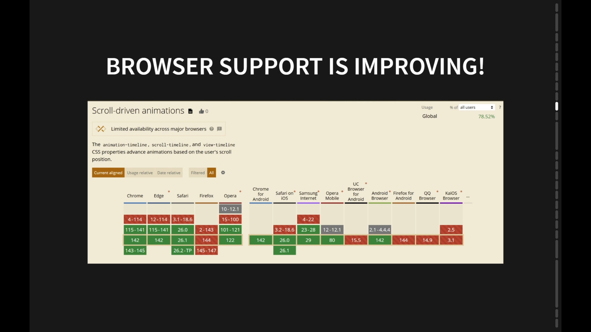
But it's a lot easier now. It's a lot easier to do this thanks to offset path. We can use paths, okay, which are baseline widely available and have been for over a year and a half in the widely available category. Offset path has been supported, as you can see here, for, more than four years, like by the three major engines.
And I wanna talk about it today because in the last state of CSS survey, reminder, fill out the state of CSS survey, for this year. But last year's, when, people were asked, if they'd ever heard of Offset Path, 69% of people said they'd never heard of it. Right? And I have to assume that people who take the state of CSS survey, much like people in this room, know a bit about CSS. And yet, 69% had never heard of it.
Another, basically 20% had heard of it but never used it. So I'd like to explore today with you, the offset path to get an idea of what, some of your options are, and there are a lot of options. These are all the values you can use.
Right? Though one of them isn't widely or, even newly available. We'll get to that. And the formal syntax for this goes on roughly forever because it has, you know, all of these functions that that have to be mentioned. Oh, that's interesting.
And some of them, for example, some of the things that that you can do here require the background positioning syntax, which is always that there it just went past. It's complicated because the values are human readable. So that makes them complicated. But anyway, there are two things that I wanna call your attention to here about offset path.
The first is that you can put any transformable element onto a path That excludes elements that are generating inline boxes. So if you wanna put a hyperlink on a path, you have to change its display box. It can't be inline. It has to be inline block or block or something. The second is that when an element is placed on an offset path, it creates a stacking context.
So if you're trying to be clever with z index, in addition to putting things on paths, be careful. Like, just sort of check your work, as I should have with the transition a couple slides ago. The thing is even with all these path types, and I will talk about the path types here in a moment, it doesn't do a lot of good if you can't put them like place elements somewhere along the path that you are defining.
So thus we have offset distance. Right? So to define a distance, you can use a length unit, you can use percentages, or you can use a calc function value, or for that matter, you can actually use a variable. K? So you can do things like this.
The first example here is the default, which gets you a zero distance. The default is not zero. I just want to be clear about that. But you basically get zero distance. But then with that variable, you could set yourself up a little slider so that you can change it, so that you can provide some kind of interactive way to change the distance along the path.
In addition to things like calculating, I want something five m plus five m past 50%, that's how I'm gonna do it. If I want something exactly at 50%, I can do that. Or I can use JavaScript to change the value of a custom property, a variable, and move the thing around using just a range element and a tiny bit of JavaScript.
And I'm just gonna say right now, I I heard Sarah Sarah's question and answer. Sorry about the inline JavaScript attribute. I'd made it that made this made this slide clearer. In production, you'd wanna attach an observer instead. But anyway, so these linear paths that are being shown that that I was showing are in fact rays with the ray function.
K? And at its simplest, array function value takes an angle value. You can add a few more bits, especially to place the to especially to be able to place the origin within the containing block. Alright? And in fact, the defaults work out like this.
If you don't specify a position or a keyword size or say or add the contain keyword, Basically, your ray will be at an angle, but the origin will be in the center of the containing block. Alright? And, the length of the ray will be the distance to the closest side. We'll get to that in a minute. And then, like I say, you can have a BG position, a background position, which is where you can do things like center or center center or top left or center 50%, etcetera, so on and so forth.
This particular function I'm gonna say is not actually baseline widely available yet. But it will be by the end of next month at the latest. It's baseline newly available, where by newly available, they mean two years and five months at this moment. And then it'll be two years and six months, two and a half years, thirty months, baseline widely available.
Okay. These are the size keywords that you can use, in addition to closest side, closest corner, etcetera, etcetera. And sides. I like sides. Just I don't know. I like the way it sounds. And you don't have to stick to a particular order with these either. Okay? This is the way I wrote the rays in the example. Right? I said 90 degrees.
I want you to go 90 degrees. And I want you to start at zero x 50% y in the containing block, which puts it in the center left. I could have said center left, but, I was feeling concise. But any of these value patterns would work just as well. You don't have to start with the angle. You don't have to start with the position.
You can however it makes sense to you to write these, as long as you have at and then the background position, those have to go together. Right? You can't just put at wherever you want. But, yeah, any of these would work. Okay. So let's go see some of this in our browser. Whoo. Let's see if I can okay.
New. Hold on. There. Oh, I could get the latest version of Nightly, but I'm not going to right now. Okay. So oh, you can't see it. My bad. There you go. Rays.
So I'm gonna be driving it from here because I didn't really think this through. Yeah. So we can make the rays go all the way to the end. And you can see that I started that, the top one there, it's going 75 Sorry. 95.71 degrees, just magic number.
Farthest corner, 95.71 degrees is why it's pointing into the farthest corner. The farthest corner keyword does not help with that. That is only setting the distance from the origin to the farthest corner from the origin. K? I had to work out the magic the number of degrees to make it actually point there.
Okay. And I I bring all that up so that you don't just put in, you know, ray farthest corner and wonder why it's not pointing into the farthest corner. Anyway, so, yeah, at zero zero. So it started at zero zero. And then the second one there goes to basically the same corner, but I I pick sides rather than farthest corner.
In this case, those turn out to be the same distance. But then there's this one, which I started at 050%, the one the the middle one, which, starts at the yeah. The left. Where's this frigging arrow? Come on, mister mouse. There you go. And so let's see.
Are you gonna there. So that visualizes that ray, that that line that just drew in. Okay? So that should hopefully persist long enough, right, to go there. Now notice the fourth one where I said ninety five point seven one degrees far this corner, but I didn't give it an origin.
Remember what I said. The default origin is the center of the containing block. It it's not the top left, so they're not it's not like a background in that way. Right? Backgrounds kinda default up into the top left. Rays don't. Got me. But the distance is to the farthest corner.
Yes. It happens to be pointing into the farthest corner, but that is that it's only gonna go that far. Now, the last one where I changed the magic number to a random magic number by subtracting 50 degrees. That's still going the distance is the farthest corner.
It's just not going there because the ray doesn't point there. So once again, a little bit of visualization. You can see the circle essentially goes through the farthest corner, which would be either of the core any of these corners really because it starts in the center. The farthest corner is, at that point, any corner. But you can see how it goes through there.
But the ray it's actually following is the one that goes up into the right, which is why you end up there. Okay. So when it comes to these keywords, you know, things can get a little weird. So with this one, for example, I I've changed the magic number. The ray is now 91.71 degrees because I just subtracted four degrees because I felt like it.
Okay? But that farthest corner distance, the ray is still as long as the distance from the origin to the farthest corner despite the fact that the ray is not pointing there anymore. So if we take this along, it actually goes just a little bit outside of the containing block as do some of the some of these others, not all of them, but some of them.
Now sides, which is the last one that I really wanna focus on, basically says, go until you hit a side. Any of the sides. Doesn't matter. Okay? Which is why that last one goes out until it reaches exactly that side that it the ray happens to be intersecting and stops. If we were to increase the degree so that it intersected with the bottom, then it would stop at that bottom edge, right, where the ray intersects a side.
Okay. That's all fun. But then there is have I gone to the next one? Yes. Then there's the contain keyword. And I'm gonna tell you right now, I think there might be browser bugs. Either that or I don't get it. Either that or it's badly designed. One of the three.
I'm sure it's not that I misunderstood it. No. That couldn't be it. The idea, as far as I can tell, is that the thing that you're animating along the the path is supposed to be contained within its containing block. So that, for example, the last one there would go until its edge met the edge of the containing block and then it would stop. And there's there's like math described to do that, but it involves like half the longest like half of whichever is larger, the height or the width, which is not gonna get you that result.
Like that that's not gonna work. So it kind of doesn't and I find that frustrating. I also don't have a fix other than to tell you this is a thing. It may frustrate you. Be careful. Sorry. Sometimes that that's all we have. Now, I suppose if you had perfectly square things, maybe it would work out. We can hope.
But anyway, and then there was one more thing I wanted to show you before we go back to the slides. Yeah. Which is what happens if you do in fact set things to be I keep doing that.
Stop that. What happens if you make them square and it seems like it works, but I'm not entirely sure. There might be pixel rounding errors. Right? So anyway. But you might have also noticed that I I changed how those are associated with the the paths. Right? Because sometimes you want a different anchor point.
All of the, the first three examples that I was showing, the anchor point was the top left of the element that was being offset along the path. And, well, we sometimes you want a different anchor point. So enter offset anchor, which is, in my opinion, not really part of anchor positioning. It sounds like it, but it's not.
It's just defining a point inside or actually even outside of the element that's being put along the path. Right? So it defines that point as the anchor for that element that is attached to the path and then can be moved along it using offset distance. Right? So I've gone to movies now.
In this example, we can get any of these values could be used to get the effect that we saw before. So anchor zero zero or 00% or top left. There's probably other variants I didn't think of. And then to center the the the anchor, I just said offset anchor center, but I could have done the any of these as well. Those would have worked.
And as I say, you can also use negative values to put the anchor point outside of an element, which we'll see in just a bit. So that is one path type down. Just a few more to go. So let's continue with the functional values there in that center column.
Here is the same path shape expressed six different weights. I hope that's legible. Sorry. In the back. I made them large ish. Anyway, so the path element, which is actually a span element that I gave a clipping mask to turn it into a hollow diamond, is animated along a path from zero to 100% in four seconds.
Then it pauses for a second before starting over. That's just by setting the the key frame points. Right? So you've got an inset function. Excuse me. You have an inset function that defines the offsets from the top right bottom left TRBL.
Keeps you out of trouble. Old school call out. Thank you very much. But inset zero, inset 10px, inset 30px, then inset another 10px. The second one there is a rectangle, which defines the offset from the top and then the offset from the left and then the offset from the top and then the offset from the left because that's how the rect function works.
I don't know why. The x y w h function. Who's used x y w h? Okay. Other than you, Kevin. YouTube guys. Anyway right. So I didn't see any hands and that does not surprise me in the slightest. Okay. There's one. Awesome. Anyway, x y w h, you set the first two value the first two bits are the x y coordinates of the top left and then the WH are the width and height.
It's kind of like a SVG rect. And then I have a polygon and a path, which I'm just using a straight bit of SVG path d attribute value stuff in a quote because you have to quote them. And then the shape function, which Niels was just talking about, which does not actually take quotes.
I quoted it at first, and it didn't work, I couldn't figure it out. And then I realized, oh, you don't actually quote it, which is essentially a more human readable version of the SVGD path, whatever you wanna get the path syntax. There is a kind of nifty thing that's buried in, hidden in the rect function, which is that it will accept a round value to round the corners.
The other ones don't do that. Right? I could have recreated that with a path and shape functions, but let's let's let Rect have its moment in the sun. K? Where it it kind of stands out, shines. You may have noticed though that the diamond rotates unless you turn that off. So I've done a thing here where I'm suppressing the rotation by checking using a checkbox hack.
So when it's not checked, the diamond turns. When it is checked, the diamond does not turn because you might want one or the other. I don't know. And that's all thanks to the offset rotate property. K? The default value of which is auto, which gets you a behavior where the path element's y axis is kept perpendicular to the path with the up y pointing to the outside of the path.
Okay? So kinda like this. This is offset auto or offset rotate auto, which is what I would you know, what we would wanna use as a default. K? And that basically, it puts an arrow, in this case, on a line. You can also add an you can add a degree value to your auto, which basically means do the automatic thing except rotate it. So if we change this to auto, 45 degrees, then the arrow will proceed along the path and rotate as as it goes along the path, but it will always be pointing 45 degrees away from the path.
Why you wanna do this, I don't know. But if you do, there you have it. So here we have that arrow, which is, again, a span with a clipping path to turn it into a turn it into an arrow. And these are the same shape in various ways, except the polygon, I admit, is just sad.
But there were only so many points I was willing to type in after well, honestly, there were only so many points I was willing to calculate and then type in. But, yeah, if we suppress the rotation, then the arrow points that way. And if we don't, then it follows the path.
You might also notice there's an ellipse function in there. And yes, you can have real ellipses, which you or ellipses, if you prefer, which you can describe in various ways. Although if you wanna rotate ellipses, then path and shape are the way to go. It's you want to sort of start at a point but have the whole thing the whole ellipsis path rotated, that's where you wanna go.
And one of the things that has been happening here as I've been talking is that not only have I been suppressing rotation, but also at some points hiding the overflow. Overflow by default is visible. And that's what I've been doing so far. But in this example, if we set overflow to hidden, then the thing that goes along the path doesn't appear it's hidden when it goes outside of its containing block.
So now you know how Brahma's or sorry, Patrick and I did it again. Now you know how Patrick and I did our solar systems. And I actually I promise, we actually did not coordinate that ahead of time. So thanks, Patrick, for stealing my thunder on that one. But They're following circular paths.
That's it. For scientific accuracy, I should have used ellipses, but I didn't. Okay. So it's pretty straightforward to do. Alright. So that's really all of the center column covered.
Although, I'm not gonna cross shape off the list just yet because I wanna come back to it. So how about those keywords on the left? None, you could probably figure out what that does, I'm hoping. Offset path none, I I think you know where that's going. But those others, you can actually animate stuff in relation to the edges of the containing block, and not just the outer edge, but, like, the various edges.
So here, you can visually attach a label to each of the content, padding, and border boxes and then animate around them. Margin box is on the list and Safari will do that for you, but the other two browsers don't allow that yet. But imagine being able to animate something that goes along the edges of the margin. The diagnostic styles would be really really cool.
And here's how those labels work. K? Before each of those div each of those labels is a little div. I could have gone with other things, but not label in this case. I generated a two m wide box and put little backgrounds in it that creates a little line in the circle, a little dot, a tail if you wanna if you prefer.
Right? And gave it a width, in this case, two m. And then I set the offset anchor to be a little less than two m outside the left edge of that div. Remember, was talking about how you can use a negative anchor, offset anchor to put something outside. In this case, I calculated it to say to be, okay, minus two m for the width of the box, but then the little tail dot doesn't go all the way Like, I need to bring the anchor point in so it's in the middle of that little dot. Make sure they stay upright with a zero degree rotate and then animate. Could also make the size of that little circle tail viable or variable, excuse me, by throwing in a a a custom property. We could do something like this for extra fanciness.
Right? Where they go along the edges and then they like throw out little bits so that the boxes don't overlap each other. Probably should have messed with the z indexes, so that the tails went below the padding box label, but oh, well. And what magic makes this possible? Nothing to do with offset paths. Really tedious math and trial and error to figure out exactly where in each of those animation, like, timelines the corners need to, like the tails need to come out and then come back in.
That's it. Sorry. K. So let's try something slightly more magical. Here, I'm going to animate along the content box, so along the edge of the content box with a slightly off center anchor. Right? I gave a a an anchor position of 60%, 60%, a swift animation and a move and a twirl and a flare.
And this is what the move, twirl, and flare do. Right? The move goes from 20% to 35%. The twirl goes like 50 times or whatever. I don't know. Zero to 1,800 degrees. You you do the math. And then the flare brings it from no size to 40 size and then back down. And offsets are magic.
It's up there in the top, top right.
Wee.
This is all the markup that took. And it didn't even have to be an inline SVG. Could have made it an external one. But it was a small dev SVG that inlining it seemed fine, so that's what I did. And we could apply that effect to anything like these buttons. Right? We could even have the buttons create changes so that the, you know, that changes the path or, prevents them from spinning or slows the whole thing down.
Right? These are literal button elements. They are not divs that are made buttons because I I knew what Niels was gonna say. Right? In this case, I started out like I did with the ponies, but the sparkle with the sparkle SVGs inline, but that got repetitive because I've got like four of these things.
So or three of these things. So I made them external. Like I said, that really simplified the markup. And yeah, now I have sparkly buttons. Might be a little overdone, but in some UIs, I can see where you might wanna call attention to a button and people have already learned to ignore changes of color when it comes to buttons, but have they learned to ignore sparkles yet?
I ask you. Probably not. But that's not all we're limited to. We can make the environments more like or the buttons more like environments in which things happen. Right? Here, I have some SVGs, that are being animated along paths, but I set them to a z index of minus one, so they get drawn behind their containers. Then if you change the path, right, This is my favorite bit.
Belly flops. It just cracks me up every time. It's like, whoo. Okay. This is the markup. That's it. And there's probably better ways to have done this, but, I don't care. This was good enough. So here's how the paths are defined. Right? I said shape would come back.
So these guys are on this path, and that's what the path looks like. I can explain why if you want afterwards. So if you put that path against one of the buttons, you can see what they're doing. And then when we change it, all I have to do is change three values in that shape value. I just have to change how big those jump arcs are.
Shape syntax is kind of bonkers, and I more than kind of love it. I really do. The downside is that shape as a function is only newly baseline as of five months ago. K? So it won't be baseline widely available for another two years. But if you're using these as progressive enhancements, which I hope you are, you might be able to get away with that.
But anyway, so that's shape. We'll get to URLs here in just a bit. But this is my copy of Neil Stephenson's Mother Earth motherboard. It's hosted on myerweb.com, which I originally did because it wasn't available anywhere online. I had to dig it out of the web archive. And I wanted to do some typography experiments.
So we can talk about the typography stuff some other time. But for now, what if we used a path element to indicate progress as you go through the article. K? I'm just animating along a ray. That's pretty much it.
I mean, I'm using a scroll tie you know, a scrolling timeline, a view timeline, whatever you wanna call it, to drive a path to animation, but that's all there is to it. K. So this is set up as a b element because it's decorative or decorative, which defines the wire. It's animated from left to right based on the scrolling progress.
You can cancel me over the b later if you want. I don't care. And you might look at this and say, okay. But I've been able to do this with, like, transform, translate. I could do that without offset paths. And you could. Right? With you could you could do it with a you could do this. But my question is, could you do this?
And this is the shape that I used. Could also be done as an SVG path using a path function, which is more widely available. Remember I said the shape function is baseline newly available as of five months ago? The, path function is baseline widely available as of, like, four years ago.
And it would be a lot more compact, but because I find the shape syntax so much easier to read, I prefer to use it particularly in in situations like this. And we could also turn off that the sort of the side to side of the the, plug head just by, you know, offset rotate zero degrees. There you go.
Whichever one you prefer. Could do either one of those. And if that isn't enough, we could also spice up a piece of the design by adding another scroll timeline. This one's based on whether or not that bit of the page is in view because the section is about the ship, the Lalla Rook, which that is that. And here's the CSS I employed.
I decided to use a sheet this time instead of array. Could have been either one. Once again, though, the animation timeline is linked to the scrollings but it's only when that bit is in view. So the boat only sails when she's in sight. K? And, according to the artist who painted it, yes, that is the actual boat. Okay.
That's probably enough shape for now, although it'll probably come back. Let's see what we can get with URLs. So consider this markup. This is mostly SVG. It's contained in a section, but it's mostly SVG. And I have some paths with IDs and some more of those decorative b elements.
And then we can give those those decorative b's offset paths by pointing at the IDs of the bits of the SVG that have the IDs. Right? And then animate them as well with whatever animation you like. And then with these animations, to trace, sketch, and and fade background, we can turn an ordinary SVG into something a little more dynamic.
So each of those arrowheads is one of those b elements. Their tails are being drawn using the classic dash offset array or whatever you call it that Chris Coyer and a lot of other people have used. And the fills are animated because you can do that with CSS. You can you can style most inline SVG attributes using CSS, including things like c x, c c y, r, x, y, width, height, etcetera, etcetera.
Like, at this point, there are very few things about SVG that you cannot directly manipulate with CSS and specifically CSS animations, as long as the SVG is in line. External SVGs are still mostly untouchable. There are proposals to help address that, but we're not there yet. Okay? Anyway, in case you haven't used the dash offset hack, here are the basics. I use variables to keep from having to rewrite the animation three or four times.
You basically you just need to know how long each of those paths is is pretty exactly. And how did I get those path length values? I use the browser console. There is JavaScript that will tell you exactly exactly how many pixels long each path is. I rounded. So anyway, trouble does manifest itself though if the size of the SVG changes. Right? The SVG was made smaller, but the arrows aren't keeping up.
That's because SVG paths are expressed in SVG units, and SVG units are translated to CSS at at an exchange rate of one pixel per unit. That's it. So that h eight forty up there in the SVG means move 840 units horizontally to the right, which to CSS means move 840 pixels horizontally to the right.
And that's what that particular error had did even though the SVG had been shrunk. It still was going 840 pixels because that's what it knows. So what to do? Well, turning this into a percentage path using shape, it's pretty straightforward. I mean, the original image is a thousand pixels by a thousand pixels. So 840 units of that is 84%, a 160 units is 16% and that's pretty easy.
The letter paths were a little more complex though. And you might ask, how long did it take me to work out those numbers? It took me less than a week. In fact, it took me about ten seconds because Taimania Fief's SVG to CSS Shape Converter, which you paste in a path and it gives you a shape that is completely based on percentages.
Now it's not perfect, because unless you're lucky, it you don't have like, you have to figure out where to start from, but all the rest of it has been calculated for you, and I'm okay with that. Right? Way better than having to do all that math myself. So there are some interesting interactions with clip paths.
You can use a clip path as an offset path basic well, the kind of path you could use as a clip path, can use as an offset path, is what I'm trying to say. Use the same value for both properties. You could even put it in a custom property. The thing is that clip paths clip. So any bits of the path element that stick outside the clipping path will be clipped off.
So the first one here, there's no clipping. Or sorry. There is clipping to make it round, but the span is outside of the div. The second one, I put the span inside the div. It is actually following exactly the same path as the first one. You just can't see it because it's been clipped. But the third one there, I set the enclosing div to position relative, which made it the containing block for the offset path.
And now it's following the outside, basically, of that circle. But the parts of it that would stick outside are being clipped off. It's, I mean, I could see where that would be maybe a useful effect. It's sure. I clipped off half the diamond, but still works.
I also want to point out this is what those paths look like. And some of you, particularly the more designer minded, might be squinting at the screen right now, trying to figure out why those circles don't quite line up. The answer is because they don't. K. Because offset paths well, I'm gonna explain why.
Sorry. Let me explain why. I don't want don't mean to leave you hanging. The fact is that the offset paths take the size and shape of their reference paths, but not necessarily their position. Okay? So in the first three examples, I've got I've got these diamond spans that are following their paths.
But then in the second set of three, exactly the same thing is happening except I've moved the SVGs that are being being used as the references for those paths. They don't line up anymore because the offset path is like, okay, starting from where I start, I'm gonna follow this path that's been defined for me. But there isn't like a way for you to say, okay, but right, make your start be where the path is.
And you can overcome it. Sure. I could have I could have changed where, the the offset path start from, maybe positioning that at the same, extent that I did the SVGs, but it isn't an automatic thing like rotation is. Okay. And with that, we've covered the kinds of paths. So what's missing? Because there are some things that are missing in my opinion.
Well, I mean, we just saw and I complained a little bit about how path elements don't have a way to automatically jump to the SVG element that defines our path. I think there should be a way to do that. Here are two proposals, you know, maybe with offset position, which I didn't even cover because I honestly don't get it.
Like, I can make examples that it demonstrates what it does and I don't understand why it exists. So anyway, also I wouldn't have really had time, but, maybe we could, do do something like this. Say the offset position should be like, go to your shape. Go to the thing.
Go to the path. Go to the thing that defines your path and and and move there. Or maybe adding a keyword to the offset path itself. I don't you know, I'm I'm open. I'm an ideas guy. Anyway, here's another thing that I think is missing. As we saw, these two values are equivalent. Right? Exactly equivalent. The units become pixels.
There should be a way to make the CSS path value scale similarly to changes in the SVG size. Mean, SVGs inherently scale. That is their whole point. We should be able to do to somehow in the CSS say, okay. Well, if the SVG changes from its intrinsic size, you also need to scale your pixels so that they're the correct size.
Maybe an auto scale p keyword? I don't know. Once again, I'm an ideas guy. And especially since path values like, path values are a lot more compact than shape values. They're harder to read, but they're much more like as humans, but they're much more efficient. So some way to scale their units, excuse me, would be really, really handy.
So upstairs, I saw last night someone to put this up there, and I a 100 agree. Also paths. Like, think they're kind of linked together. If you've ever used fire Firefox's Polygon Editor, which this is showing an example of here, you know how useful a good bit of tooling can be in a browser. So how about something similar for paths?
Right? It could look something like this or, you know, probably way better. Again, idea this guy. But some way being able to see the points of the path and then be able to adjust them and see the value update, and if that were paired with animation tools so that you could see the animation of the thing that you're animating along that path and then maybe adjust it a little bit so that it goes exactly where you want it to go and then be able to copy the final value, that would be amazing.
That would be fantastic. So at any rate, looking at the clock, I see that time has continued to march on as it does and that our time together is drawing to a close. So I hope that what you've taken from this is that there are a lot more powerful options now for placing and moving HTML elements. And this is, I think, a time for reevaluating what we can do to make our pages a little more alive, right, a little more whimsical, I grant you that there is the risk of overdoing it. There's absolutely the risk of things flying all over the place. But maybe if we could make butterflies fly around instead of, you know, calls to action and cookie notices, that would be nice.
You know, we have all these options and in the worlds words of doctor Carol Jeanne Faier, what a time to be alive. Right? Because we have this new landscape of tools, of things that we can do, to make just pages more interesting. And, I would really like to see us take advantage of of that new sort of reality.
So those are some examples of things that we could do. And I just wanna say, thank you very much for joining me on this journey along this path. Thank
you so much. That was excellent. Join me, please.
Oh, thank you.
We've got a few questions from the audience.
Okay.
Khalil asks, what is the best way to create responsive offset path when the SVG rescales?
Yeah. That's That is an excellent question. And I really think the shape value is the best way because you can have everything as percentages. SVG doesn't support percentages. It wasn't designed for that sort of thing. CSS does because it was designed for that sort of thing.
So, yeah, it's it's really the only thing I think we have right now, short of the working group listening to me and giving us a thing that allows for that kind of responsiveness.
Yep. Fair enough. Robert asks, are there JavaScript APIs to compare other pointer coordinates with offset paths? Would be helpful to implement video progress sliders with an interesting shapes.
I don't know.
Yeah. And that's fine. Well, we can figure out later.
Yeah. Hopefully. I don't know.
This one is from Sasha. Can you specify a regular DOM element, div, button, etcetera, to be used as the offset path, or do you have to always define a separate path that replicates the same shape?
You can do it as long as you want to follow one of the, like, content or padding or border or margin in Safari edges. Otherwise, no. You you need to like, if you're doing something more fancy, you need to specify the actual path. But as long as you just wanna follow the edge, then you just use one of those keywords in your set.
Yep. Brett asks, do you think the lack of usage is directly related to the lack of debugging tools as tooling can speed up development?
No. I think the lack of usage is due to the lack of awareness. Now I think among those who have tried it, there's probably it's probably only been used a little bit because of the lack of tooling. And for doing anything beyond the the the most basic, I think, it it does get complicated.
I have an advantage in that I can hand author SVGs, right, so that I can sort of think in those ways. The Shape syntax helps a lot, in my opinion, because you can do things like move 30% in a horizontal line. And then from there, I want an arc that is this shape and it has this control point or whatever.
Right? Like, you can get your you can get a lot closer to where you wanna be using that kind of syntax than training yourself to read the SVGD attributes syntax, which I there's still stuff I have to look up. It's it's not meant for humans, the SVG syntax.
So, yeah, I think I think that's a lot of it.
It's also it can be quite intimidating.
I mean, yeah. If you're if you're trying to do something like make dolphins jump Mhmm. Or whatever, you you do have to sort of like, jeez, how am I gonna do this? Do I, like, open up Figma? I don't know. Whatever. Some kind of vector program to, like, sketch these out and then maybe figure out how to animate those to see if it's what I want. And then I figure out how to turn the CSS. And did it turn out the way I thought it would?
And if it didn't, what am I gonna do? Yes. And I think tooling would help a lot with that with getting over that particular hurdle.
Yeah. Yeah. Woody asks, can you use a calc in the ray distance?
Yes. Yeah? But wait. The distance, as in
In the ray.
The distance keywords, like closest side? No. You can't you can't do that there. You can do it in the you can do it in the the offset distance. And I I guess you could calculate the, degrees as well. But those closest side, farthest side, closest corner, farthest corner sides, those are keywords.
As far as I'm aware, you cannot calculate them.
Alright. Someone who forgot to add their name asked, do negative values work consistently too? As work on? Do negative values work consistently too?
As far as I found, they work consistently. Yeah. And you can actually use them on distance as well. If you use a negative value on distance, then it let's say you do negative 20%. It will basically start at the 80 of the path, I believe, and then wrap around. So as far as I'm aware, there isn't a way to do, like, the negative animation delays where you pretend that it's already in progress or not in progress.
Anyway, yeah, there's probably room for growth there.
I should have followed because they followed up with a question. Can you animate generated content on the before or after over an offset path?
Yes, I have done it. Yeah. Unfortunately, you can't generate content on SVG subelements like Rect, which really ticks me off because I had a thing that I wanted to do with the CSS Day logo where I followed each one of those, but there was no way to, like, for each rect, make a before. And then, yeah, I was annoyed.
Anyway.
And the final question is, can OffsetPath and its bodies also be used somehow to position a longer path?
I'm not sure I understand the question entirely. So I'm going to say whoever asked that question, please come find me.
Yes.
And we will I'll see if we can understand it. We'll see who the buddies.
We'll see who the buddies mentioned are.
There
you is it's a once in a lifetime opportunity to be ask asking things to Eric in our break that that is coming up. A immense source of knowledge as you can see. We don't have any more questions, so please give a round of applause for this fantastic speaker. Thank you.
An HTML code example demonstrating an ordered list structure for the solar system, including planets, their descriptions, and nested lists for moons, with image tags for each celestial body.
A stylized diagram featuring a yellow sun-like object and several planets or celestial bodies against a black background. The bodies include a striped planet, a reddish planet, an Earth-like planet with a moon, and another reddish planet. Each body has a text caption next to it.
A diagram depicting a portion of a solar system against a black background. The Sun is central, surrounded by several planets of various sizes and colors, including one with a moon. Each celestial body is accompanied by a rotated text label providing a humorous or descriptive caption. UI controls are visible at the top for simulation settings.
Five horizontal lines are shown, each representing a path. On each line, a green hourglass-shaped marker is placed at a different position corresponding to the `offset-distance` value displayed next to it. The marker's positions demonstrate distances of 0, 50 pixels, 50 percent, a calculated value of 50 percent plus 5 ems, and a variable value.
Small icons representing various web browsers are displayed next to the "Report feedback" link, indicating compatibility information.
A horizontal blue progress bar is displayed near the top of the slide. The slide demonstrates the visual output of 'ray' functions. Several thin gray lines, representing rays, extend across the white background. Small images of a man's face are positioned along these rays, some appearing partially translucent, rotated, or duplicated, illustrating the effects of the different 'ray' function parameters.
Multiple semi-transparent, faded images of a man's face are animated and positioned next to several of the ray examples, demonstrating the visual effect of the ray property.
An illustration demonstrating different "ray" configurations. Diagonal gray lines extend from the left across the screen, with small, semi-transparent images of human faces positioned along these lines at various points, appearing to be projected or animated according to the ray parameters listed.
Screenshot of a web browser displaying a local HTML file named "rays1.html".
The webpage shows five distinct examples of 'ray' definitions. Each example is presented as a line of text, formatted like a code snippet, describing properties such as degrees, 'farthest-corner', 'sides', and specific positions (e.g., 'at 0 0', 'at 0 50%'). To the left of each ray definition is a small, slightly tilted profile picture of a man. The last two profile pictures overlap slightly.
Five lines of ray function examples, each preceded by a small circular avatar. The avatar for the last example is partially obscured by another small, rotated image.
A screenshot of a web browser displaying a live demonstration of CSS ray() function variations. The page lists several ray() definitions with different parameters, each accompanied by a small profile picture and a line extending from it. A large white circle overlay visualizes the "farthest-corner" concept discussed.
Screenshot of a web browser displaying a local development page with a horizontal slider. Below the slider, four lines of text demonstrate different ray function configurations, each accompanied by a small circular image of a man's face.
Four small circular images of a man's face, each appearing next to a list item.
Screenshot of a web browser displaying a web page titled "Progress". The page shows an interactive demonstration of CSS ray functions. Each line lists a ray function, such as 'ray(91.71deg farthest-corner at 0 0)' and 'ray(91.71deg sides at 0 50%)'. Next to each function call is a small circular avatar image, illustrating the effect of the ray. The interface includes "Previous" and "Next" navigation buttons, and a horizontal progress bar.
Screenshot of a web browser displaying four examples of CSS `ray()` function syntax, each accompanied by a small avatar image.
A web page displaying a technical demonstration. At the top is an interactive progress bar with "Previous" and "Next" buttons and a slider control. Below this, four examples of 'ray' function syntax are listed. Each example is accompanied on its right by an identical small circular image of a man's face, likely illustrating the effect of the ray function or a related concept.
Four identical profile pictures of a man's face, each positioned to the right of one of the listed code examples.
Four circular headshot images of a man, each placed beside a line of code. The man's expressions vary slightly across the images, from a curious look to a more pensive or slightly displeased expression, possibly illustrating different outcomes or reactions to the code examples.
Three visual examples, each featuring an image of a man's face warped or clipped by a ray shape, demonstrating the effect of the CSS ray() function with different parameters: 'farthest-corner at 0 0', 'farthest-corner at 0 0 contain', and 'sides at 0 50%'.
Four examples of a ray function being applied to faces, showing two different faces each with and without a 'contain' parameter. The first two examples feature a man with a beard, while the last two examples feature a man with glasses. The faces appear slightly blurred or in motion, demonstrating the effect of the ray function with different parameters.
Three code examples, each accompanied by a small circular profile picture of a man. The images appear to demonstrate the visual effect of the associated CSS ray() function variations.
Browser compatibility icons with green checkmarks are displayed for Chrome, Edge, Firefox, and Safari, indicating the feature is widely available across these browsers.
inset(), rect(), xywh(), polygon(), path(), and shape(). Each is shown within a box with dimension lines indicating their pixel values. Below these examples is a CSS code block defining an animation for offset-distance using @keyframes.Six diagrams illustrate different CSS shape-defining functions: inset, rect, xywh, polygon, path, and shape. Each diagram shows a dashed outer boundary representing a container, and an inner dashed line depicting the shape defined by the respective function, along with dimensional annotations. Below these diagrams is a CSS code snippet demonstrating offset-path properties and a keyframe animation.
inset(), rect(), xywh(), polygon(), path(), and shape(). Each diagram visually shows how the function arguments define the shape's dimensions and offsets, using labels like "10px", "30px", "170px", and "380px" to indicate measurements from various edges or for width/height.Six diagrams illustrate different CSS shape functions (inset, rect, xywh, polygon, path, shape), demonstrating their syntax and the resulting geometric shapes with indicated dimensions and coordinates.
Six diagrams illustrating different CSS shape functions: inset, rect, xywh, polygon, path, and shape. Each diagram shows a rectangle with dashed lines and labels indicating dimensions like 10px, 390px, and 170px that correspond to the parameters of the shape function. Below these diagrams is a CSS code block demonstrating an offset-distance animation.
Six light gray rectangular boxes are arranged in two rows of three. Each box displays a CSS shape function or path definition and contains a small red diamond at the bottom center. The box displaying "rect(0 390px 170px 10px round 50px)" is highlighted with an additional green dashed outline. Below the boxes, a checkbox labeled "Suppress rotation" is checked, with a mouse cursor pointing to its label. Below this is a CSS code block.
A 2x3 grid of six rectangular boxes, each demonstrating a CSS shape function. Most boxes feature a small, rotating red diamond at their top-left corner. The top-middle box, demonstrating the rect function, also has a dashed green outline representing a rounded rectangle, with rotating red diamonds at its top-left and top-right corners. Below the grid, a checkbox labeled "Suppress rotation" is shown with a mouse cursor hovering over it.
offset-rotate: auto; shows a dashed green curved path with five red arrow shapes positioned along it. Each arrow is centered in a light grey square with a crosshair and automatically rotates to point in the direction of the path as it progresses along the curve.A grid of five examples demonstrating different types of paths and shapes, each with a dashed green outline and a red arrow moving along its perimeter. The top row shows a circle, an ellipse, and a hexagon. The bottom row shows two examples of a circular path defined by different methods. Below the examples, a checked checkbox is labeled "Suppress rotation", with a mouse cursor hovering over it, indicating the arrows maintain a fixed orientation.
The slide displays five examples of different drawing commands. Each example shows a dotted green shape (a circle, an ellipse, a polygon, a path-defined curve, and an arc-defined shape) within a rectangular box, with a red arrow pointing rightward along its perimeter. Below these shape examples, a checkbox labeled 'Suppress rotation' is checked.
Five examples of geometric shapes, each outlined with a dotted green line and featuring a red arrow icon that appears to rotate along the path. The examples demonstrate different methods of defining shapes, including a circle, an ellipse, a polygon, and two circular paths. Below the bottom examples, a checked "Suppress rotation" checkbox is visible.
Five distinct drawing examples are displayed, each in its own box. Four boxes show a dashed green circular or elliptical path with a small red arrow pointing along the path. The fifth box shows a dashed green polygon path with a red arrow. Below the examples, a checkbox is labeled "Suppress rotation", which controls the orientation of the arrow.
The slide displays five distinct panels, each showing a dashed green path (representing a circle, an ellipse, a polygon, or an arc) with a red arrow moving along the path. Below these panels is a checkbox labeled "Suppress rotation".
Five rectangular panels, each illustrating a different method for defining a shape using a dotted green line. Each panel includes a small red arrow that typically rotates along the path. Panel 1 shows a circle, defined as 'circle(90px at center)'. Panel 2 shows an ellipse, defined as 'ellipse(90px 90px at center)'. Panel 3 shows an irregular seven-sided polygon, with a static arrow, defined by specific coordinates. Panel 4 shows a path resembling a circle, defined as 'path("M 290,100 A 90 90 180 1 1 290,99")'. Panel 5 shows an arc resembling a circle, defined as 'shape(from 290px 100px, arc to 290px 99px of 90px cw large)'. Below the panels is a checkbox labeled 'Suppress rotation', suggesting a control for the arrow's rotational behavior.
A grid of three examples demonstrating ellipse and arc paths. Each example shows a drawn path or ellipse, represented by a thin line, often with a dashed outline showing the full ellipse if the path is only a segment. A small red arrow is positioned along each path, indicating direction or a specific point.
- The first example illustrates a tall, narrow elliptical path.
- The second example illustrates a wide, flat elliptical path.
- The third example illustrates an arc, representing a segment of a rotated ellipse.
Six visual examples demonstrating different ellipse and arc drawing commands, each with a corresponding text label. Each example shows a dotted green path with a small red arrow indicating direction.
- The first example shows a tall, narrow vertically oriented ellipse.
- The second example shows a wide, flat horizontally oriented ellipse.
- The third example shows a short, rotated arc, part of an ellipse.
- The fourth example shows two overlapping tall, narrow vertically oriented ellipses.
- The fifth example shows a short arc, part of a horizontally oriented ellipse.
- The sixth example shows a short, rotated arc, part of an ellipse, similar to the third example but with different parameters.
Six examples demonstrating different ways to define elliptical shapes and paths. Each example shows a dotted green ellipse or arc with a red arrow indicating the path direction, alongside its defining code snippet.
- The first example shows a vertically oriented ellipse defined by
ellipse(90px 180px at center). - The second example shows a horizontally oriented ellipse defined by
ellipse(180px 90px at center). - The third example shows an ellipse rotated by -45 degrees, defined by a
shapefunction description starting at 380px 100px and arcing to 380px 99px with radii of 180px 90px. - The fourth example shows a path forming a vertically oriented ellipse using the SVG arc command:
path('M 290,100 A 90 180 180 1 1 290,99'). - The fifth example shows a path forming a horizontally oriented ellipse using the SVG arc command:
path('M 380,100 A 180 90 180 1 1 380,99'). - The sixth example shows a path forming an ellipse rotated by -45 degrees using the SVG arc command:
path('M 380,100 A 180 90 -45 1 1 380,99').
The slide displays six examples of drawing ellipses and elliptical arcs, arranged in a 2x3 grid. Each example consists of a text box containing a definition and a dotted green shape demonstrating the output. The top row shows an upright oval ellipse, a horizontal oval ellipse, and an elliptical arc rotated 45 degrees. The bottom row shows three more elliptical arcs, with the last one also rotated. At the bottom, there are two checkboxes labeled 'Suppress rotation' and 'Hide overflow'.
The slide displays a 2x3 grid of six examples demonstrating different ways to define shapes and paths. Each example box contains a code snippet and a corresponding visual representation of the path or shape as a dotted line, often with an arrow indicating its start and direction.
- Top left: Shows a vertically elongated ellipse.
- Top middle: Shows a horizontally elongated ellipse.
- Top right: Shows a wide arc, part of an ellipse, starting and ending near the top, with an arrow indicating a clockwise direction.
- Bottom left: Shows a narrow, vertically oriented closed ellipse path, starting and ending at its lowest point.
- Bottom middle: Shows a wider, horizontally oriented closed ellipse path, starting and ending at its lowest point.
- Bottom right: Shows a single, rotated open arc forming part of an ellipse, starting at the top and sweeping clockwise downwards.
- Below the examples are two checkboxes labeled 'Suppress rotation' and 'Hide overflow'.
The slide displays six examples of shapes and paths, arranged in a 2x3 grid. Each example is contained within a light blue rectangular box with a red border and features a dotted green path with a small red arrow indicator.
- A tall, narrow, vertically oriented elliptical arc, partially clipped at the top and bottom edges of its box.
- A wide, flat, horizontally oriented complete ellipse, fully contained within its box.
- A tall, narrow elliptical arc, rotated diagonally and partially clipped at the top and bottom edges of its box.
- A complex path resembling a figure-eight or infinity symbol, formed by two overlapping elliptical arcs, extending beyond the top and bottom edges of its box.
- A wide, flat, horizontally oriented complete elliptical path, fully contained within its box.
- A wide, flat elliptical path, rotated diagonally and fully contained within its box.
A simulation of a solar system on a black background. It features a yellow sun-like object and four planets, each with a text label. A yellow planet is labeled "Cry HAVOC!", a red planet "Fleet as its namesake", a blue-green planet with a small grey moon "Where (almost) all our stuff is", and another red planet "Canal-free since 4.5 billion BC". At the top left, three checked checkboxes are visible next to the labels "Animate", "Upright", and "Captions". At the top right, a control labeled "One second equals one..." displays five radio buttons next to options "hour", "day", "week", "month", and "year", with the radio button next to "week" selected.
A diagram of a simplified solar system with the Sun at the center. Planets orbit along dashed circular paths. A small red planet, likely Mercury or Mars, is labeled "Fleet as its namesake". A green planet, likely Earth, is labeled "Cry HAVOC!". A larger blue-green planet with a moon, also likely Earth, is labeled "Where (almost) all our stuff is".
A diagram illustrating the CSS box model with nested rectangles. The innermost light pink rectangle contains the displayed HTML code. Surrounding it is a red striped area representing padding, then a green striped area for border, and a blue striped area for margin on the right. A label "content-box" with an arrow points to the top boundary of the red (padding) area.
A code block defines a CSS offset path using custom 'hline' and 'arc' commands. Below the code are three buttons labeled "Slow down!", "Don't spin!", and "Change paths!".
A code snippet defines an 'offset-path' shape using 'hline' and 'arc' commands with percentages and direction keywords like 'ccw' and 'cw'. Below the code, three rounded rectangular buttons are displayed. From left to right, they read: "Slow down!", "Don't spin!", and "Change paths!". Small, dark, stylized figures resembling dolphins or fish are depicted jumping above the buttons, illustrating the defined path. Multiple figures appear above the "Change paths!" button, suggesting an active animation or changing path.
An illustration of a cable connector.
A small line drawing of a cable connector or end piece.
Decorative illustration of a light blue circuit board pattern with wavy lines and circles, extending across the bottom of the right-hand text section.
An illustration of a curving cable with a connector at one end.
An illustration of a snake slithering, with text fragments beside it.
Three light grey rectangular containers with red borders are arranged horizontally. Each container features a black circle. The first two containers display complete black circles with the labels "span outside div" and "span inside div" respectively. The third container shows a black circle that is partially clipped in the bottom right corner, revealing a small red L-shaped area, and is labeled "div {position: relative;}". Below these containers, a CSS code snippet is presented.
The slide displays three pairs of visual examples, each demonstrating the `offset-path` CSS property applied to SVG shapes. In each example, a small red diamond indicates a point along a defined path. The bottom row of examples shows the effect of applying `svg {top: 10px; left: 20px;}` CSS to the entire SVG container, shifting its position.
- Top-left: A black square with a red diamond precisely at its top-left corner.
- Top-middle: A black circle with a red diamond positioned along its top-right circumference, slightly outside the circle's edge.
- Top-right: A black square with a red diamond located near its center-right edge.
- Bottom-left: A black square that has shifted down and to the right, with the red diamond still at its top-left corner relative to the square.
- Bottom-middle: A black circle that has shifted down and to the right. The red diamond is now inside the top-right quadrant, illustrating that the offset path's origin remains relative to the original, untransformed position of the reference path.
- Bottom-right: A black square that has shifted down and to the right, with the red diamond still near its center-right edge relative to the square.
The slide displays a grid of six boxes, each illustrating a CSS shape or path function with an associated diamond icon. Below this, a screenshot of browser developer tools shows the HTML Elements panel on the left and the CSS Styles panel on the right. In the Styles panel, the offset-path CSS property value path('M 10,0 L 390,0 390,170 10,170 Z') is highlighted and circled, indicating an active inspection.
People
- Chris Coyier
- Neal Stephenson
- Temani Afif
Technologies & Tools
- clip-path
- CSS custom properties
- ellipse()
- Figma
- Firefox Polygon Editor
- inset()
- JavaScript
- offset-anchor
- offset-distance
- offset-path
- offset-position
- offset-rotate
- path()
- polygon()
- ray()
- rect()
- scroll timeline
- shape()
- stroke-dashoffset
- SVG
- SVG to CSS Shape Converter
- view timeline
- xywh()
Standards & Specs
- CSS Baseline
Concepts & Methods
- Checkbox hack
- Progressive enhancement
- Stacking context
Organisations & Products
- A List Apart
- Internet Archive
- State of CSS
Works
- Mother Earth Mother Board